Don't wanna be here? Send us removal request.
Text
My inspirations for this module


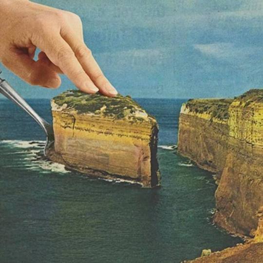
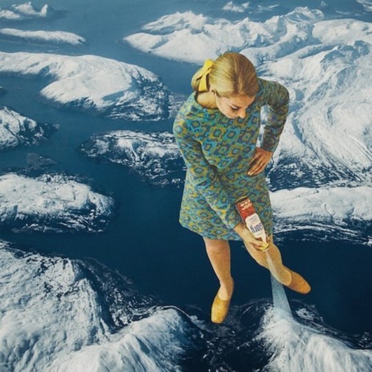
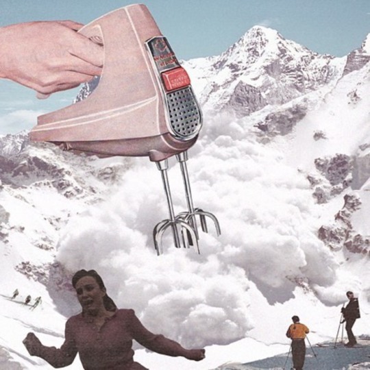
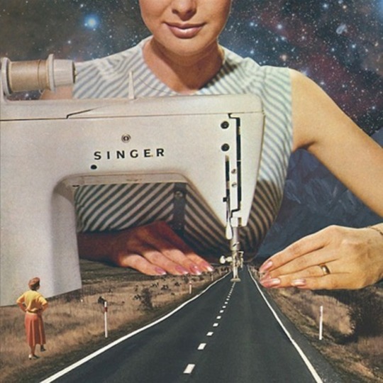
The first image is what inspired my first collage. It is an example of manipulation of scale by Rosie Buglass. I tried to emulate this in my first collage which I don't think ended up being successful because I did not change the scale of my drawings as dramatically as the reference photo. But I do think that this was a good starting point for me.
The other images are collages by Monohad Shuraideh which was my main inspiration at this point. I really like how he takes two unrelated concepts and makes them work together. I think I emulated this style of collage much better.
0 notes
Text


I’m happy with this collage overall but it the pictures didn’t work as well together as I thought they would. I wanted to enlarge the photo of the earth so that the black background would have been hidden but the photos didn’t end up lining up well that way.
I’m still not sure if these colours work well together. They might have worked better with some changes to the hue and saturation in photoshop.
My favorite part of this is the tab that I cut out on the previous page. I was inspired by an interactive book that I have which had lots of cuts outs and removable pages. I would like to look at more interactive books and also pop up books and see how I could incorporate these elements into my work in the future.
0 notes
Text
Review of lectures and studio presentations
Lectures
Study Skills
- This lecture was helpful throughout the whole module because I was able to keep trying to apply the key points to the rest of the lectures and presentations. I started using the cornell method after this lecture and I really like summarising the key issues of the lecture into bullet points. I also tried the pomodoro method which helped me stay productive
Context in art and design
- This lecture was helpful because it gave me key points to think about when looking at other artists work but I'm still trying to understand how context can inform my own work in the future.
Critical thinking
- This lecture helped me understand what to do when looking back at my own work and now if I make a statement I try to give a reason why I made that statement
Visual language
- I enjoyed this lecture and all of the references that were shown. I didn't know about affinity of tones before. It was interesting learning about movement because I'm considering using it in future digital collages.
Photoshop workshop
- This workshop was helpful because I learned about non-destructive editing which I didn't know about before. I am now trying to using smart filters/layers and vector masks especially when removing backgrounds.
Studio presentations
How to be creative - where do ideas come from?
- This presentation helped me change how I think about ideas. The main thing I tokk away from this was to write all of my ideas down and this has been really good because I can keep looking back at ideas.
Academic jargon
- This presentation helped me understand the learning objectives for this module a little bit better because I was able to break them down and use simpler words to get a better grasp on what they mean.
0 notes
Text
1) relationship between your objects
- one a modern electronic dolls house and one is very old (book written in 1869, Victorian era), could compare each time period or join elements of both
- contrast: book = mature object targeted to adults and dollhouse more “childish” and aimed at young girls
2) How you could fragment your object
- initially, I would want to open the dolls house from the back and separate all of the parts
- from there I could use a hammer on the majority of the house
- I would want to keep the smaller objects and separate them from the object
0 notes
Text

I really like this blue lighting as well. It had a similar effect to the yellow lighting because it changed the colour of the green fragments. This time they came out more neon which contrasts well with the more muted colours. The shadows are also really dramatic like the other photos which I like
0 notes
Text

I took this photo in yellow lighting and I really like how this turned out. The lighter blue/green stands out really well and complements the other colours which didnt change too much under this lighting. I like how the direct lighting created dramatic shadows in this photo as well. I stood the green pieces up instead of laying them flat like in my last photos and I like how this looks as well.
0 notes
Text


I decided to take some pictures of my dollhouse object with the larger pieces rearranged and then tweaked them in photoshop. I wanted to see how the dollhouse colours would change and be highlighted in different lighting. This is the dollhouse in pink/purple lighting which darkened the original colours. The blues stand out the most in these photos. They’re deeper than before and I like how they stand out. The orange colours are more muted here as well. This came out nice but it wasn’t my favorite lighting that I used
0 notes
Text

After my first few collages I brainstormed ideas on these pages. Once I ran out of space I started writing ideas in a smaller notebook. This was helpful to look back on and I was able to build ideas off of other ideas. It was also really interesting to look back and see that some of the ideas that I thought weren’t as strong worked better than ideas that I thought were my best. I think that this is because simpler ideas come across better on the page.
0 notes
Text

On these pages I was testing out ideas and colours for the abstract drawing of my fragmented pieces. I wanted to make sure that all of the colours worked together and tried to pick ones that were the closest match to the actual colours of the object. I also tested the weight of different pens. I wanted test out my idea for the drawing to transition into greyscale with heavier lines so I drew some shapes in my sketchbook first. I used a brush pen for this so that I could have more control. I also had the idea to use the technique that is usually used for calligraphy where all downward lines are thicker with the full weight of the pen and upwards and sideways lines and thinner with less weight on the pen. This worked because it created gives the shapes more dimension.
I also drew what my book could look like once I glued pages down and cut out the rooms of the dollhouse. I like how this could have looked and think it was a good idea even though I ended up moving away from it in my work.
0 notes
Text

On the left is a sketch of the book that I chose as my second object. At this point my best idea was to make a new doll house out of the pages of the book by gluing them down and using the hard cover as the walls of the house which is why I drew it in this position.
On the right are all of my ideas for how I could fragment my object what I could do with the pieces afterwards. I found it really helpful to write down all of my ideas even if they weren’t my best because it was useful to look back and reflect those ideas on later on.
0 notes
Text

This is a gif which I think turned out well. I made this in photoshop and it was actually easier than I thought it would be once I learnt what to do. I liked doing this in photoshop because I was able to edit each individual picture to my liking and make the colours pop even brighter against each other.
I put the dolls house back together for this so all of the larger and smaller pieces were together and took pictures so that with each layer the smaller pieces were bursting out from the house as if they had a mind of their own and were trying to escape.
0 notes
Text

I also like the humor in this collage because of how well these two completely different images work together. My favorite part is how the hands over the orange slices replace the woman's eyebrows. I also love how simple this collage is.
Similar to one of my last collages the black and white as a main colour scheme contrasts well with the orange. The fact that orange is the only other colour used adds to the simplicity of the collage. I was going to cut out the eyes on the original picture and put them inside the glass but I decided not to do this because I felt like it took away from the oranges which I prefer as the main focal point of the collage.
0 notes
Text

This collage is one of my favorites especially because it was one that wasn’t planned as much as some of the others. Even though I didn’t pick these photos out to put together at first, they ended up working really well together. I really like that the whole picture is in black and white because it helps the two pictures blend even more.
I also like that the collage takes up the whole space of the page. This is probably because of the white background which makes the collage look much cleaner. This is something I will take into account the next time I am looking for photos to use in my work.
0 notes
Text

I really like how this collage came out. I like how cohesive this collage is because of how well the white and blue colours work together. I’ve learnt that using similar colours can work really well in a collage. I also learned that black and white mixed with colour works really well.
On the left I ripped out pictures of chunks of ice and rearranged them on the page. I used tissue around these pictures and I really like how this looks because they are reminiscent of clouds to me. For the background I used the paper that I coffee stained and I think this came out better than the one I used from a book before. I also used PVA glue all over the collage and this gave it a really nice sheen.
On the right I glued this picture of these boys sliding down some stairs over a skii slope and I think these pictures worked out well together. My first attempt at cutting out the background didn’t work as well because there were originally two people skiing down the slope. I wasn’t able to cover this up so I went into photoshop and edited them out. I thought that the original background was a bit plain so I cut out the snow and put a different picture of clouds in as the background.
0 notes
Text

With this collage I used vintage pictures that I found online. I found this after looking for Victorian photography which I had the idea to look for after doing some research about the era that my book had come from.
I liked the idea of adding humor to pictures that have the complete opposite tone and I feel like this worked well here. The original picture was very stiff but this is what makes adding the broccoli and the eyes funnier. The colours also help because the majority of the collage is in black and white which makes the green pop.
I used the silhouette of the original picture again and I think that the text helped the shape stand out against the background of the photo. I crumpled up the pages of the book to add texture to the collage and layered to different pages over each other to make the collage less orderly
0 notes
Text

After using pages from a book that mimicked coffee stained paper, I was inspired to make my own. At first I wasn’t sure whether to dry with a blow dryer or the oven but after more research I decided that putting them in the oven would work better because this would make the end result look darker and more aged. This worked really well because I wanted the paper to look really old so that it stood out against the pages of the book which are a lot lighter.
0 notes
Text

For this next idea I wanted to mix old and new ideas like I did for my second collage. I found pictures of vintage and modern train stations and I was initially only going to cut out the images from the old train and add them to the tube but after thinking about it I wanted to incorporate pages from books into the collage. This relates back to my book object because I took pages from there and then used pages from another book for the beige background. I thought that the silhouettes from the original vintage picture worked well with the collage because you can now see where the pictures of the people came from and it broadens the context of new and old imagery. I used pva glue and tissue to add texture to the collage and masking tape over my first collage to make the collage look like it was from a scrapbook.
0 notes