Don't wanna be here? Send us removal request.
Statistics
We looked inside some of the posts by twigstick and here's what we found interesting.
Average Info
Notes Per Post
941K
Likes Per Post
549K
Reblog Per Post
391K
Reply Per Post
201
Time Between Posts
25 days
Number of Posts By Type
Text
5
Link
2
Note
4
Photo
6
Last Seen Tumblr Blogs


Fun Fact
25% of US internet users with an annual income of $80-100K use Tumblr.
Text
apparently ppl don’t know about waifu2x??? despite its… concerning name it’s literally the most convenient website i’ve ever come across as an artist
it allows you to resize artwork without it becoming pixellated. this is a MASSIVE help if you, for example, make lineart too small or something. it works best with things that 1. have no textures 2. have smooth lines 3. have cel shading, but it still works really damn well for things that don’t fit that profile
here’s an example:
normal size
2x in paint
2x in waifu2x
so like, there’s that. go wild
237K notes
·
View notes
Text
WIKIPEDIA MONSTER COMPILATION PAGES FOR PEOPLE
japanese creatures
greek creatures
creatures organised by type
creatures listed by letter
humanoid creatures
filipino creatures
chinese creatures
cryptids
‘fearsome critters’
angels
beings referred to as fairies
creatures that pretend to be human
a page on therianthropic creatures
shapeshifters
hybrid creatures
extraterrestrial creatures
deities
a page of mythology page links
a section of folklore page links
flying creatures
theological demons
fictional species lists
mythology related lists
legendary creature related lists
195K notes
·
View notes
Link
More useful articles and resources / support Art-Res | Say hi @astrikos
617 notes
·
View notes
Note
If you don't mind, may I request some art refs for monster fangs/teeth.
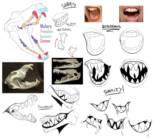
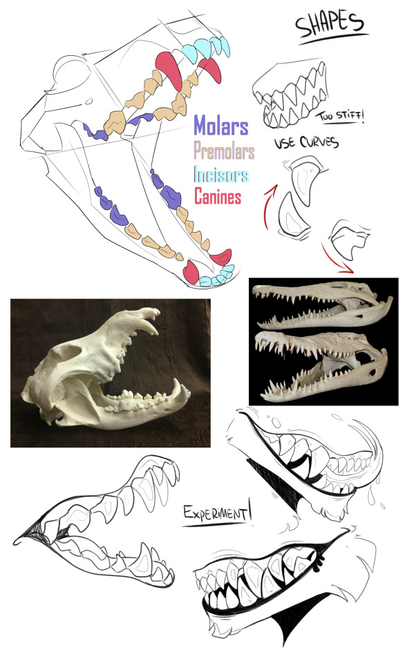
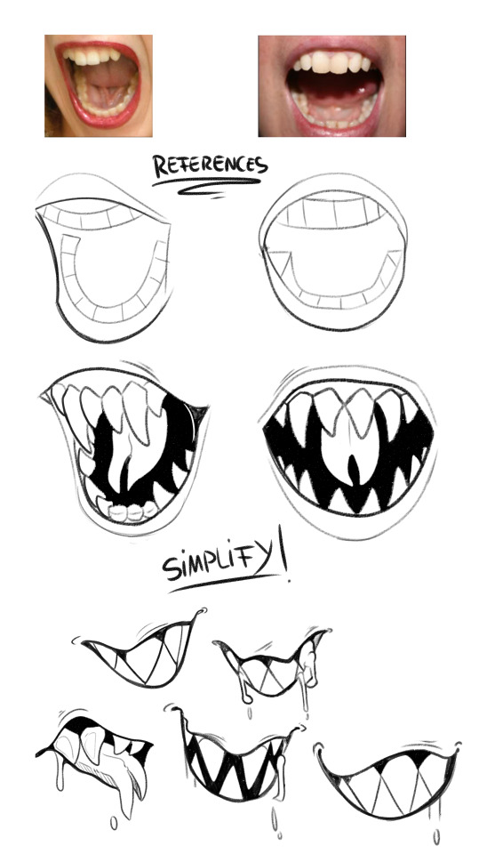
Using references is the most important step. After you get the hang out of shapes, you can start and experiment with different angles and make it more cartoonish, depending on what you want.
Hope it helps!
8K notes
·
View notes
Note
Do you have any kind of process for picking colors for the backgrounds? They all seem to have really nice uniformity, and I would love to read up on how colors like that are picked (or if it's more intuition based). I do remember you mentioning that you also had help from another color lead before, so I was wondering how much of that they help out vs the colors you chose?
hey, thanks so much! this might get a lil long (as it always does!!) so bear with me.
firstly i want to say, there’s no right or wrong way to pick colors. every artist has their own palette they prefer and i think it’s super delightful to spend time developing your own special sense of color. so even though i’m explaining things in a “this is how you do it” sort of way, it’s not the only way! just my way. the best method to develop your own sense of color is to look at a LOT of art, look at a LOT of the world around you, and practice practice pratice.
at this point in my life i pick colors intuitively just because i think it’s something i’m naturally tuned into, and i’ve been doing it for a few years, so i don’t actively plan my palettes. but here are some things that i think about as i pick colors.
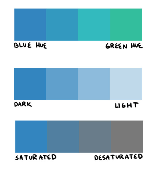
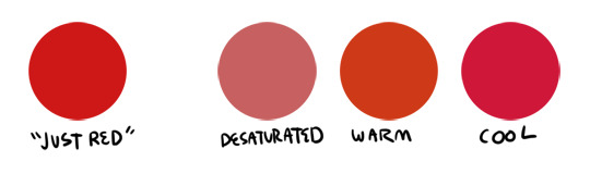
firstly, i want to go over hue, value, and saturation. i’m sure everyone knows these intuitively but i want to explain them in words. hue, value and saturation are what make up a color, and decide how colors differ from each other.
hue: what color the color actually is. red, purple, green, yellow, and everything in between.
value: how light or dark a color is. if you’re painting traditionally, adding more white or more black to a color lowers or raises its value.
saturation: how “pure” the color is vs how much neutral tone is in it.
here’s an example of all three:
this comes into play because a big mistake i see beginners make is that they pick a “just” color, and by that i mean they pick “just blue” or “just yellow”. imagine buying a set of oil paints and only using paints straight from the tube without ever mixing. it would be impossible! so i try to avoid picking “just” colors, except as for a complementary color (more on that in a bit). here are some variations of a red, for example.
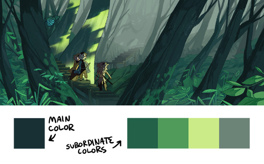
so, the biggest thing for me when i pick colors is that i want them all to be friends. i want them all to have something in common so that they get along. i usually lose control of a painting when my colors feel to different from one another. so, i will usually start a painting with one color i know for sure i want, and “subordinate” other colors to it, meaning every other color i pick has to look good with that color. as to how you figure out what looks good and what doesn’t, that just takes time and lots of observation to build a personal opinion :) here’s an example from one of my paintings. in this case, the main color is the trees.
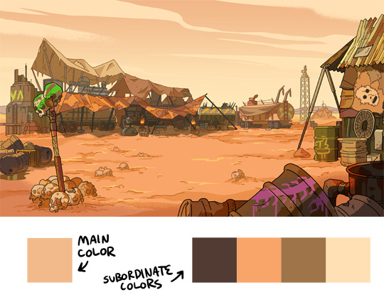
and here’s another from rick & morty, the main color is the sky this time.
now that that’s out of the way, i’m going to give you the Actual Cheat Sheet for color palettes. in color theory, there are 8 basic color schemes that are generally pleasing to look at. here they are.
i usually use an analogous palette or monochrome palette out of preference. the two examples above more or less fall into those categories. however, i also like to use split complementary because the complimentary color adds a LOT of contrast and visual interest. it’s great to use if you have a specific thing in a painting you want to draw attention to. here’s an example:
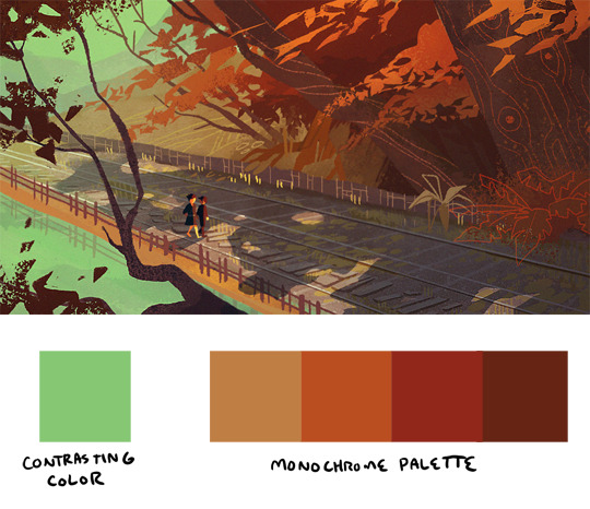
it doesn’t always have to be a perfect split complementary, just one color that differs from the “family” of colors that take up a majority of the piece.
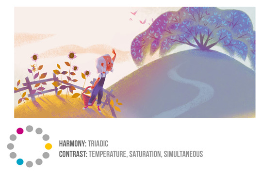
now! you might be wondering when’s the right time to subordinate a color, or where to put it, or how much of it to use, etc. and the answer is: CONTRAST. there is always visual interest in things that are different. i was rifling through my school notes and found these great types of contrast when working with color.
value: things that are light vs things that are dark.
hue: two colors that look different. I.E. yellow vs blue.
saturation: things that are saturated vs things that are desaturated.
proportion: note the example above. a majority of the painting is orange, so the green stands out because there is proportionally less of it.
temperature: things that are warm vs things that are cool.
complementary: red vs green, blue vs orange, yellow vs purple. when in doubt, these colors always contrast against each other because they have nothing in common (there is no red in green, etc).
simultaneous: this is a little advanced and i’m bad at explaining it, so please read up on it here.
a super helpful exercise is to look at your favorite illustrations, paintings, photographs, designs, etc and assess which one of the 8 color schemes (linked above) it has, and which types (can be more than one) of contrast it has. we did this in school and it REALLY helped me look at color better. here’s part of the assignment i did, the artist is annette marnat.
so! that’s pretty much how i think about color and how i pick my colors! i hope it was somewhat helpful! there’s so so so so much about color theory i can’t even begin to cover, i highly urge you to watch some videos and read some books and articles to further your study. a great starting place would be this series of videos. these are made by my teacher Richard Keyes, i think he had a dvd or something. everything i’ve talked about so far i learned from him and he is an absolute expert in color. these videos are invaluable. if you take anything away from this post, let it be to watch these videos hahaha.
to answer your question about my color leads, every painting was a collaborative effort between the three of us, and sometimes other painters too. it was a very hands-on crew, so i can’t say any of the r&m bgs i did are 100% “mine”. however, i think my personal color sense is waaaay different than jason or phil’s, which made the process very interesting because we usually had 3 very different opinions hahaa. you can check out their work here and here to see what things they brought to the table in relation to my own contributions.
thank you for the ask! again, i hope this was helpful :)
20K notes
·
View notes
Link
“We Wear Culture” is a collaboration between Google and more than 180 museums, schools, fashion institutions, and other organizations from all parts of the globe. It’s part of Google’s Arts & Culture platform, which is digitizing the world’s cultural treasures, and functions as a searchable guide to a collective archive of some 30,000 fashion pieces that puts “three millennia of fashion at your fingertips,” Google says.
But it isn’t just a database. Google has worked with curators to create more than 450 exhibits on different topics—say, how the cheongsam changed the way Chinese women dress—making the site an endlessly entertaining, educational portal filled with stunning imagery touching on everything from modern Japanese streetwear to the clothes worn at the court of Versailles.
i can already tell this has made writing for historical fandoms – the worst part of which, for me, is absofuckinglutely hands-down the clothing – much easier.
48K notes
·
View notes
Text
Ruffled Petticoat Tutorial by J.H Design


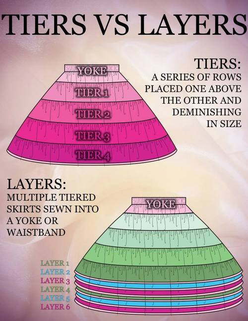


Great Tutorial from J.Hart Design! His Facebook and Tumblr !
._._._.
Also you can also view all my progress photos in my Facebook and Tumblr by Lady Primrose
13K notes
·
View notes
Photo

Magical glowy hair is the best. This was a basic lighting reference for myself but decided to post it anyway in case it helps anyone! Its really important to chose a light source in your illustrations, it actually makes things much easier when you add your lights and shadows.
25K notes
·
View notes
Note
Do you have like, a coloring/lighting tutorial? I'm new to digital art and your latest lighting exercise looks.... so good???


3K notes
·
View notes
Photo

How to draw MONSTER TENTACLES tutorial by STUDIOBLINKTWICE
8K notes
·
View notes

Photo


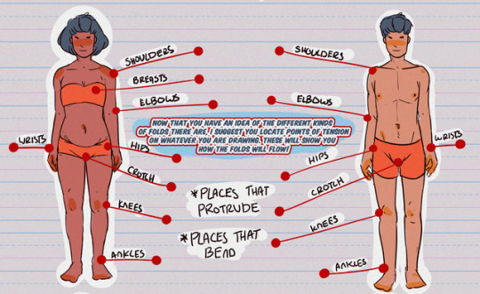

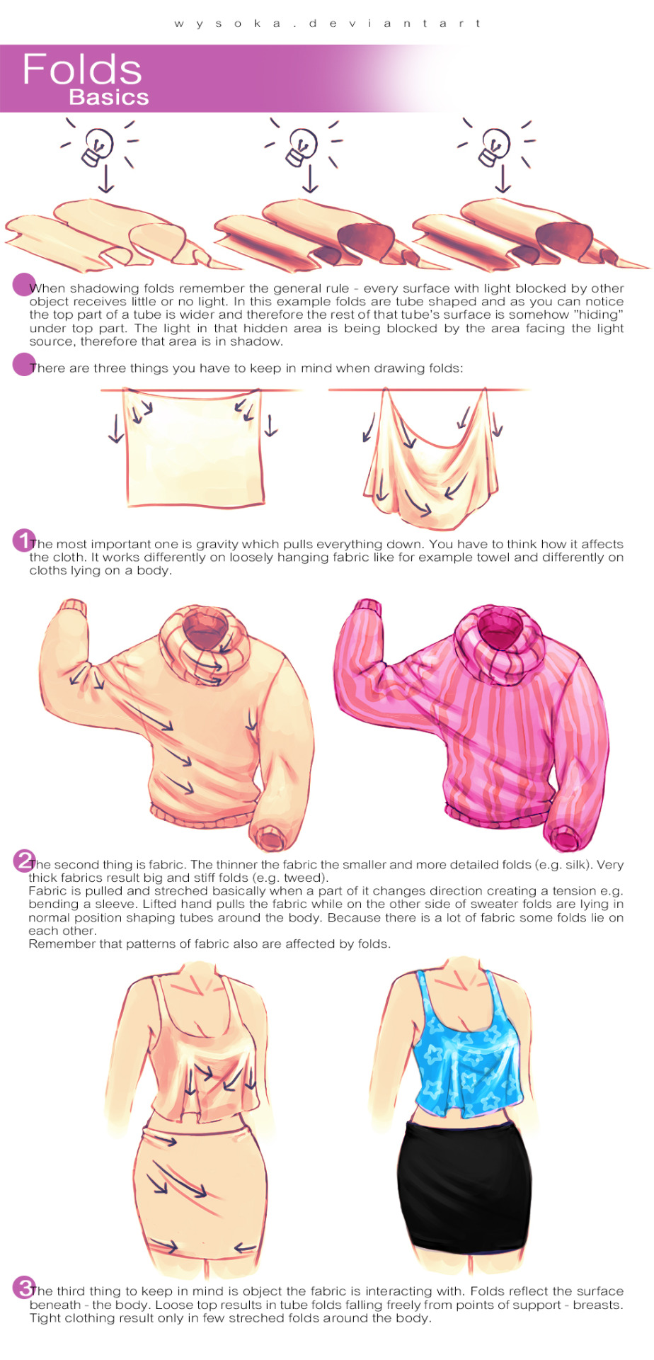
Hey friends!
Sorry for the late TUTOR TUESDAY, but here it is! Today is on clothing folds and was a recommendation from @kitemist, thanks! If you have any recommendations you’d like to see send ‘em in here or my personal! Hopefully I can expand on clothes more soon! Keep practicing, have fun, and I’ll see you next week!
33K notes
·
View notes
Text
HOLY FREE ART PROGRAMS BATMAN
I’ve had this list sitting around for a while (in case I ever want to try something new) and I thought I’d share it, because why the hell not, everybody loves free stuff. I’ve only used a couple, so for all I know these could be complete shit. BUT YOU NEVER KNOW, RIGHT?
*= available for both windows and mac os
GIMP * - Does a lot of the same stuff as Photoshop.
FireAlpaca * - Similar to Paint Tool Sai, so it’s a good alternative for Mac users.
Autodesk Sketchbook Copic Edition * - Simulates the look of copic markers.
MyPaint * - Basic stuff, nothing fancy.
Pinta * - Drawing program modeled after paint.NET.
Inkscape * - Vector/drawing program meant to be similar to Illustrator.
ArtRage * - Digital painting program; you can get the trimmed down version for free or buy the full version with more features.
Sumo Paint * - In-browser drawing app.
DAZ Studio * - Some sort of 3D model poser thing.
Pencil * - Software for animating.
SketchUp * - Tool for making 3D models. Looks handy for stuff like architectural drawings.
Blender * - Pretty popular 3D software.
escape motions * - Some browser apps, fun to fiddle with when you’re bored (the fluid fire simulation is pretty cool imo).
Twistedbrush (Pixarra) - Seems to be meant for replicating the look of traditional media.
Pixia/Phierha - A popular program in Japan, according to the website.
Krita - This was originally made for Linux and it looks like the developers haven’t ironed out all of the kinks in the Windows installer.
Artweaver - Another trimmed down free thing if you don’t want to buy the full program.
paint.NET - Pretty basic kit, probably good for simple stuff.
Project Dogwaffle - I’m not sure what this one is all about because I couldn’t stop laughing at the terrible website.
Speedy Painter - Lightweight digital painting program.
mtPaint - Originally made for pixel art; simple enough to run on older computers.
Chasys Draw IES - Supposed to be some sort of drawing+image editor thing.
PaintRibbon - Seems to be another plain old basic image editor.
DrawPlus - Looks like it’s made for graphic design and vector stuff.
SmoothDraw - I’m guessing this is a basic thing for people who don’t want to bother with complicated stuff.
145K notes
·
View notes
Note
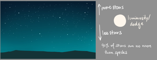
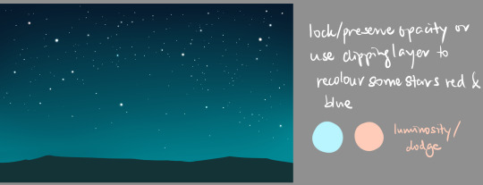
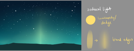
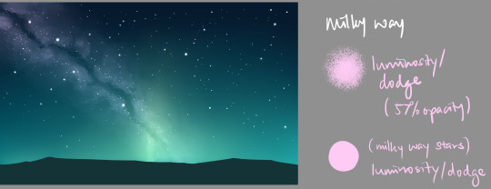
how do you draw space?
Assuming you’re asking about night skies,


27K notes
·
View notes
Text
30 Days of Art Improvement Challenge
Are you tired of feeling like your art just isn’t improving? Do you want to do a 30-day challenge that’s actually useful? Welcome to 30 Days of Improvement Hell. >:D
I made this because I’ve been feeling super ‘blah’ about my art these days, and I needed something to kick-start myself. Who wants to do this with me!? Start now or whenever you can (now you procrastinators!). Challenge yourself and have fun at the same time!
Tag your posts with #Improvement Hell so everyone can follow along and see each other’s awesome artwork. I may even create a blog and reblog them! :D
What are you waiting for? START!
Self-Portrait - Introduce yourself
Draw a figure using a reference - link to reference
Draw a figure that’s in action, using a reference - link to reference
Draw a part of the human anatomy you have trouble with. x20, with atleast 5 being skeletal/musculature studies.
Draw more figures. Quick gestures and silhouettes. x20, with atleast 10 different body shapes
Let’s have some fun. Design a character from either This or This character generator! Be creative and bring something to life!
Pick the weirdest object in your house/room. Draw it. Shadows and Highlights.
Find 2-3 objects, make a scene with them. Draw it. Bonus points for creativity. Double points for dramatic lighting.
Draw a landscape of a place you’ve never been or drawn.
Draw a BG with 1pt Perspective. Negative points if it’s a railroad or an empty street.
Draw a BG with 2pt Perspective.
Look out a window. Draw what you see. Bonus points for adding something interesting.
Draw an interior setting with the character you designed on Day #6 in it.
BG with either bird’s eye or worm’s eye view.
Halfway there! Draw three ‘action’ scenes with different compositions in each. Quick sketches are fine, just make them interesting and understandable! Bonus points if it’s the same scene, but different composition.
Draw a single page comic with 5-7 panels (the story begins and ends on one page).
Draw an animal you’ve never drawn before. x10 Link references.
Draw a car. Negative points for whining. Hint: Use a perspective grid.
Think of the thing you hate drawing the most. Guess what? Draw it! Negative points for lying to yourself.
Pick an object in your house/room. Now design a character from it, using the shapes, forms, textures, purpose and colors as inspiration. Also link/post the object you used. Negative points for using a humanoid action figure.
Draw a character/object/scene, and shade them using ONLY solid blacks and whites. Bonus points for good use of lights/shadows
Draw a different object/scene/character. Shade using hatching, crosshatcing, and/or pointillism. Bonus points for lights/shadows and textures.
Colors! Pick a color palette, and paint a scene/character/object using only those colors (some blending allowed). Bonus points for good use of lights/shadows.
Draw and color a scene/object/character - no lines allowed! (aka - lineless art). Don’t forget light and shadows!
Draw a scene/character in a style you’ve never drawn before. If emulating an artist, credit+link. Bonus for color style.
Draw a character. Draw 10 emotions/expressions. Bonus points for ‘uncommon’ emotions. (i.e. anxiety, guilt, despair, loneliness etc.)
Draw three random shapes using your opposite hand (or your foot). Now design characters from those shapes.
Turn on the tv (or load your illegally downloaded movies). Pick an actor and draw them.
Almost done! Let’s have some fun. Draw some fanart. Bonus points if it’s super obscure and unknown. Make people guess what it’s from.
Last day! Find a drawing you did within the last year. Now draw it again using what you’ve learned! Link it for comparison!
Look at all that amazing improvement! Congrats!
[Update] There is now a sequel challenge, Draw All The Things!
70K notes
·
View notes
Photo
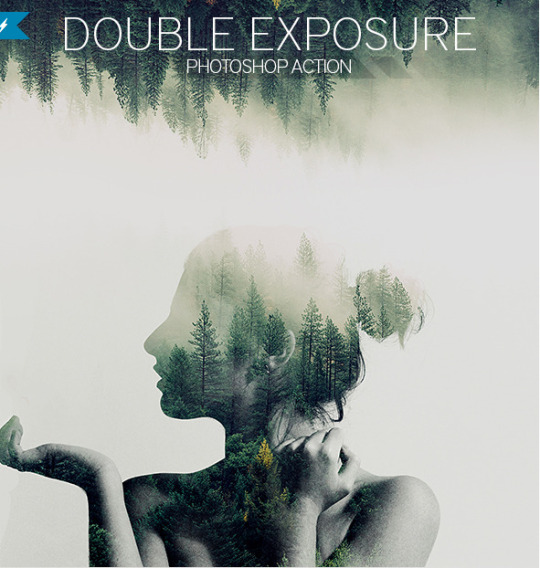
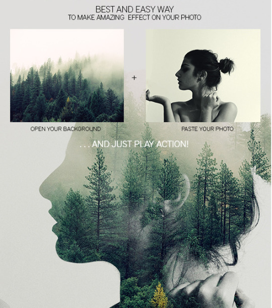
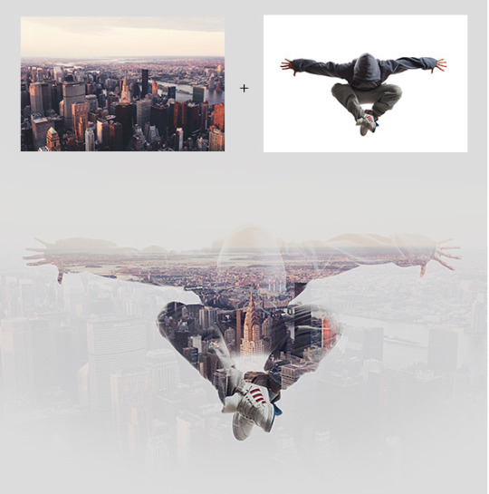
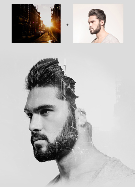
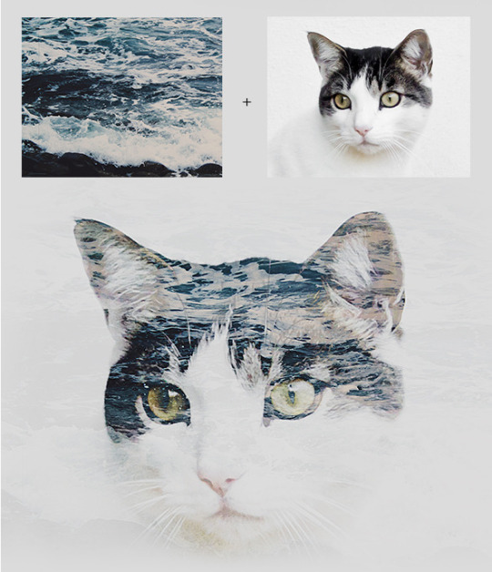
Double Exposure Photoshop Action
Features
all separated and grouped elements;
easy to use;
video and text instructions;
amazing results with your photos
Download it here: http://bit.ly/2xposureps
—–
Check this kickass Glitch PS Action:
http://graphicdesignblg.com/post/131262831243/
8K notes
·
View notes