Come watch as an aspiring author attempts to follow his dreams and show the world what he can do.
Don't wanna be here? Send us removal request.
Text
Having a website can be an important and fun way to showcase your work. I used sproutwp.com to build mine and couldn't be happier with the results. If you have a chance then check it out for yourself at: truequest.info



0 notes
Text

Rejection sucks. As an author your first rejections are usually by literary agents. The pic here shows the names in red are agents who replied that they weren't interested in my book. The ones in black didn't reply at all. Don't get discouraged! Just keep your eyes on the prize💪
0 notes
Text
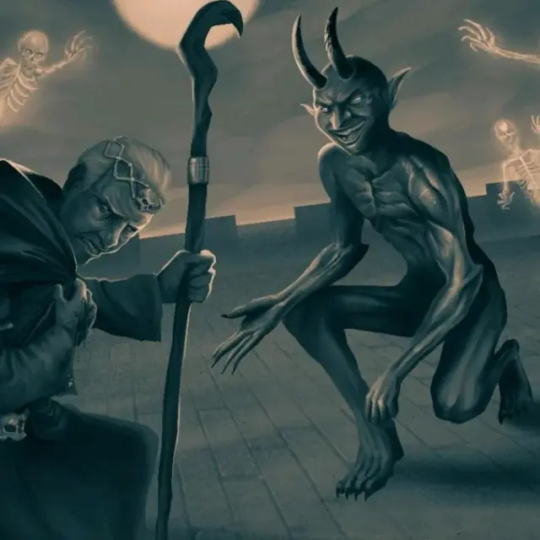
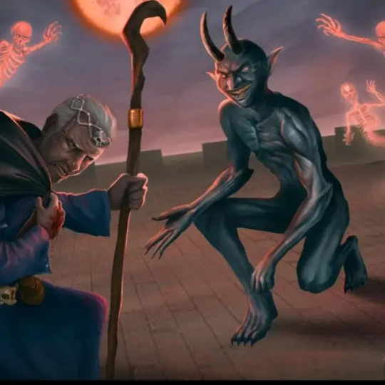
Well I'm torn between which is better the black and white, or the color. I suppose I needed one more draft for the color, so black and white wins this round! 🏆
0 notes
Text
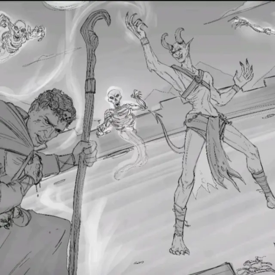
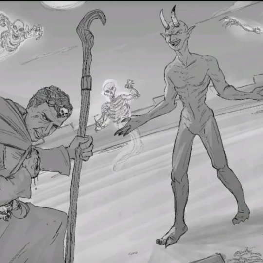

Villains are an important part of every story, and I wanted to be sure to include a depiction of them for the book. Fran nailed the necromancer right away, but getting an accurate design for the demon took a little trial and error.
0 notes
Text
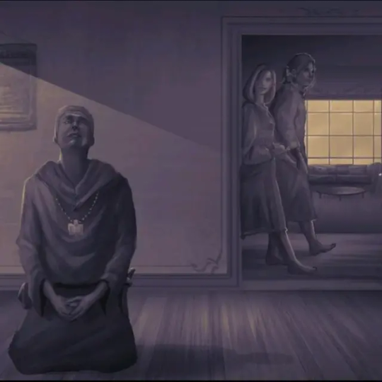

This drives me crazy. The artist's rendition is SO good, but the coloration doesn't match the scene in the book so I had to have it changed. 😭
0 notes
Text
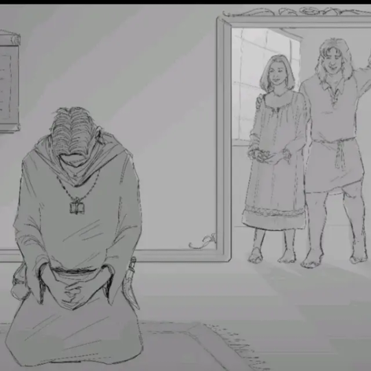
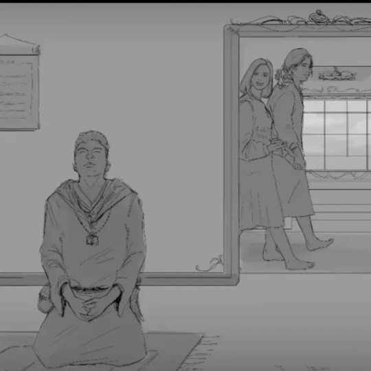
I wanted a visual of one of my heroes outside his armor, and some important support characters as well. The scene where this takes place is a blink and you'll miss it moment in the manor on the back of the sky whale. It wasn't easy explaining the manors layout to Fran, but he eventually figured it out and created a great grayscale.
2 notes
·
View notes
Text
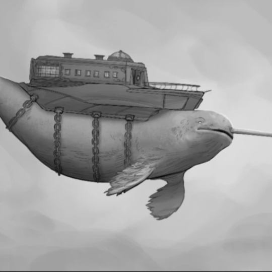

As a mode of transportation there are few things in a fantasy world that provide both the speed and luxury of a sky whale. While Fran got the initial design right off the bat it took him a while to get the coloration right.
1 note
·
View note
Text
0 notes
Text

They say that "Hell hath no fury like a woman scorned." A saying that aptly fits the dark goddess of vengeance, desire, and grief. With that in mind I chose an emblem that subtly conveyed this message.
0 notes
Text

I always associated luck with the flip of a coin. So when it came to the god of luck I chose the symbol of two coins fused together. The gold side with a diamond emphasizes good fortune while the silver side is obviously darker and the skull easily represents bad luck.
0 notes
Text
#book#books#epicfantasy#fantasy#fantasybook#fantasybooks#fantasynovels#fantasynovel#grantandreasen#highfantasy#truequest#funny#pissypinochio#Harry Potter is trademark JK Rowling#Grogu is trademark Disney
0 notes
Text
You know I really liked this emblem for the God of Knowledge. The only reason I didn't pick it for the final cut was because the torch wasn't centered, which I thought would look a little odd.

0 notes
Text
#fantasy book reader#bookworm#authors#reading#funny#funny videos#funny content#worthlessmonkey#critical role#deadmonkey#truequestthestorybegins#truequest#grantandreasen#book#books#newbook#novel#novels#newnovel#fantasy#fantasybook#fantasybooks#fantasynovel#fantasynovels#highfantasy#highfantasybook#highfantasybooks#highfantasynovels#epicfantasy#dungeonsanddragons
1 note
·
View note
Text

Yes! Fran absolutely nailed it when it came to an emblem for the god of crafts. An anvil for the carpenter/mason types with a quill for the architect/composer types. Creation at its finest. 🙂
0 notes
Text

What is the key to the heart of the goddess of love? This first draft wasn't bad, but didn't quite fit for what I thought the goddesses emblem should be.
0 notes
Text

I felt that a spiked gauntlet was a good strong representation for a war god. I had the gauntlet turned around though for the final version to make it more defined, and Fran made it black to contrast with the gray shield.
0 notes