Don't wanna be here? Send us removal request.
Text
Examples Medium 3
Booster Buddy
Self Care App for mental health
https://www.youtube.com/watch?v=YiihOomSYI0
https://keltymentalhealth.ca/blog/2014/10/introducing-boosterbuddy-mobile-app
You feel like shit
http://youfeellikeshit.com
Mood App
Tracks mood, provides resources that help build emotional literacy when you are feeling trapped.
Streak:
Well-being App that helps in building habits
0 notes
Text
Medium 3 Ideas
Idea 1:
Subject Matter: Gamification of Mental health
Medium: App/Digital Product Audience: Young Adults Question: How do we as designers shape individuals and help improve or provide support to their mental health conditions? What if… There is an app that asks you about you mental health symptoms, acts like a companion, asks you about your daily mental health status, if you are having difficulties functioning, it helps towards completing your daily goals. Every time you complete a daily goal your icon feels visually better, and you get points. You can spend points and buy things. For short term bases it provides as an instant reward system. On a long term bases helps to track your progress. 30 days goal completion can have real world rewards. eg: Ecosia, they plant a tree and take care of it. Additionally, the app can have a help guide for common mental health problems like anxiety. Content/Example: Booster Buddy
Idea 2: Subject Matter: Step by step guide for the crapy dysfunctional days Medium: App/Digital Product Audience: Young Adults or anybody Question: How do we as designers shape individuals and help improve or provide support for mental health conditions? What if… There is an app that caters to you and makes you go through slowly and steadily a self care guide for the days it is difficult to function. One step a time to get you prepared for the day and help you pick yourself up. Content/Example: You feel like shit
Idea 3: Subject Matter: Targeted wellbeing Medium: App/Digital Product Audience: Young Adults or anybody Question: How do we as designers shape individuals and help improve or provide support for mental health conditions? What if… There is an app that caters to your wellbeing goals. You pick one target, an area you want to work towards in simple steps. You get one task per day to improve that section for a week. At the end of each task you can track if doing that task makes you feel better. On a large scale you can see improving in which area would help you feel better. This will also help improve and develop habits. Content/Example: Medium 2
Idea 4: Subject Matter: Understanding Emotions/Emotional Literacy Medium: App/Digital Product Audience: Young Adults or anybody Question: How do we as designers help shape individuals and provide support for everyday life. What if… You have an emotion dictionary as an app that reminds you of different emotions you as a human experience. Content/Example: Life School Emotion Cards
Touch-points/Design Elements to incorporate:
Shaking the phone to get assigned new tasks
Color Gradients/transparency
Didactic Communication
Visual Gamification
Instant Reward
Long Term
Real World Reward
Use of short phrases/sentences
Small Steps
Using Swipes instead of clicks
Holding on to buttons to fulfill actions
moving the button from left to right (unlock movement) (used by apple, lyft)
0 notes
Text
Medium 2: Ideation
ONE
Content: The Science of Well-being
Subject Matter: Learning about positive psychology in an interactive way to make it easier to incorporate in our daily lives
Medium: Zines/Book/Periodical
Audience: People interested in self help guides
Question: Can Design change our minds?
What if…There was a happiness cheat sheet. An interactive zine that included flash cards to understand the science behind��happiness, activity booklet with manifesto, quiz, gratitude journal, habit tracker, stickers and media playlist. All content to understand and practice well-being.
TWO
Content: The Science of Well-being + The five minute journal
Subject Matter: Interactive way to make it easier to incorporate gratitude and mindfulness in everyday lives
Medium: Zines/Book/Journal
Audience: People interested in self help guides
Question: Can Design change our minds and frame behavior?
What if…There was a journal that made it fun to practice gratitude and not monotonous. It made you want to practice mindfulness.
THREE
Content: The Science of Well-being
Subject Matter: Visualizing Positive Psychology
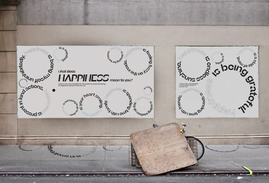
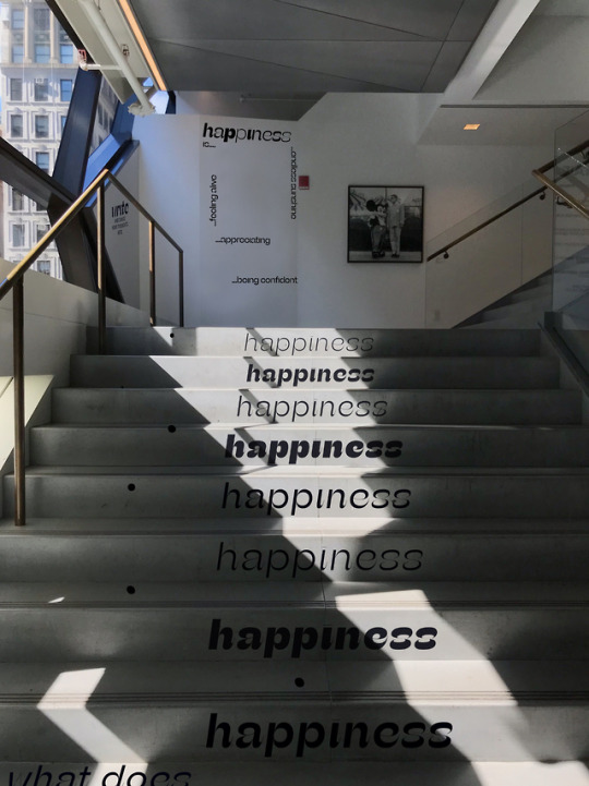
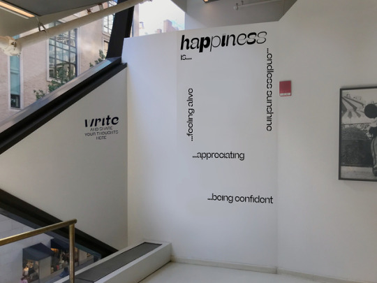
Medium: Posters
Audience: People interested in self help guides, positive quotes
Question: Can Design change our minds and frame behavior?
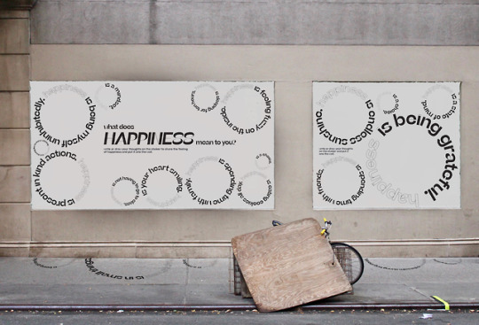
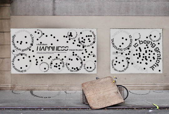
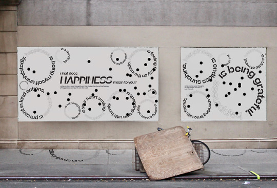
What if…There was a poster series that reminded you to practice mindfulness, gratitude, being in the present, sleeping more and see happiness as a choice.
0 notes
Photo


In-class feedback worksheet for Draft 1 (Medium 1)
Group: Sulamita, Max and Shivani
0 notes
Photo

In-class feedback worksheet for Ideation (Medium 1)
Group: Max and Shivani
0 notes
Photo


A Monument for the Anxious and Hopeful by Candy Chang, 2018
WE LIVE IN A UNIQUELY UNSETTLED MOMENT of technological, political, and social flux. Awash in endless currents of information delivered by glowing screens, each new headline, discovery, and development brings a fresh opportunity for faith or despair, depending upon our individual attitudes and philosophies. By definition, anxiety and hope are determined by a moment that has yet to arrive—but how often do we pause to fully consider our relationship with the future? What apprehensions, expectations, and stories define our field of vision? And how do our private sensibilities square with the current collective mood?
A Monument for the Anxious and Hopeful is a living catalogue of the ways in which we relate to the uncertainty of tomorrow. Located at the Rubin Museum of Art in New York City, the participatory installation is a collaboration between Candy Chang and James A.Reeves that invites visitors to share personal anxieties and hopes on vellum cards and hang them on the collective wall. On view for the duration of 2018, the installation will grow into a monolithic barometer of the year, where visitors can glean the prevailing mood and explore thousands of individual meditations that range from personal, local, and specific statements to political, theoretical, and spiritual reflections.
Over 55,000 responses were received: I’m anxious because… I feel so much responsibility in my own potential, our nation is more socially fragmented than before, I’m afraid of being yelled at online, my dad died and I’m afraid I’ll be sad forever. I’m hopeful because… I’m ready to fall in love again, he seems committed about his recovery, my mother is becoming more accepting of others, music saves my life a little every day.
Chang and Reeves are now working with psychologists, sociologists, information designers, and researchers to examine the themes, what they say about us and our culture today, and strategies to weather the struggles of modern life.
http://candychang.com/work/a-monument-for-the-anxious-and-hopeful/
0 notes
Photo


What to see what not to see by Maurizio Nannucci, 2017
The exhibition consists of a sequence of five new works by Maurizio Nannucci, realized in large neon of different colors that, through images, words and meanings, interact with the gallery spaces. In particular, this project focuses on the reiteration of affirmative and negative phrases that contain some semiological (concerning the sign) and semiotic (inherent the meaning) changes. Through this strict dialectic between two opposing poles, the artist’s research tends to highlight how the fulcrum of his own achievements is to be sought not in the effectiveness of a self-concluded act, in a peremptory affirmation, but in the continuous suspension of the semantic component of the reality in a precarious but generative space between affirmation and negation, between the impossibility of the response and the performativity of the demand, in a continuous expansion of its latent possibilities. What to see what not to see, what to say… what to hear… what to feel… what to love: the works appear as a series of questions in tension that reflect on the condition of man in society in a twofold relationship, with others and with oneself. The urgency that arises every day is to make a choice: what to see, what to say, what to think, what to perceive, what to love … how to orient our decisions. The meaning is always elusive, unresolved, but the purpose of Nannucci is not to offer solutions in itself, but to reflect and allude to the different possibilities of reading and interpreting the signs that surround us, in a continuous opening and declination of the semantic components intrinsic to their own accomplishments.
http://moussemagazine.it/maurizio-nannucci-see-not-see-galleria-fumagalli-milan-2017/
0 notes
Photo

One Hundred Live and Die by Bruce Nauman, 1984
Artwork description & Analysis: Consisting of four columns containing 100 words relating life and death with different actions, emotions, and colors, this simultaneously poetic and vulgar barrage of lights and hues epitomizes the human experience. According to a complex algorithm, one phrase after another flashes on and off individually, followed by each column lit up, and culminating in the illumination of the entire piece, creating a visual symphony that characterizes Nauman's love of word play combined with social commentary, as well as his interest in color relationships.
https://www.theartstory.org/artist/nauman-bruce/artworks/
0 notes
Photo
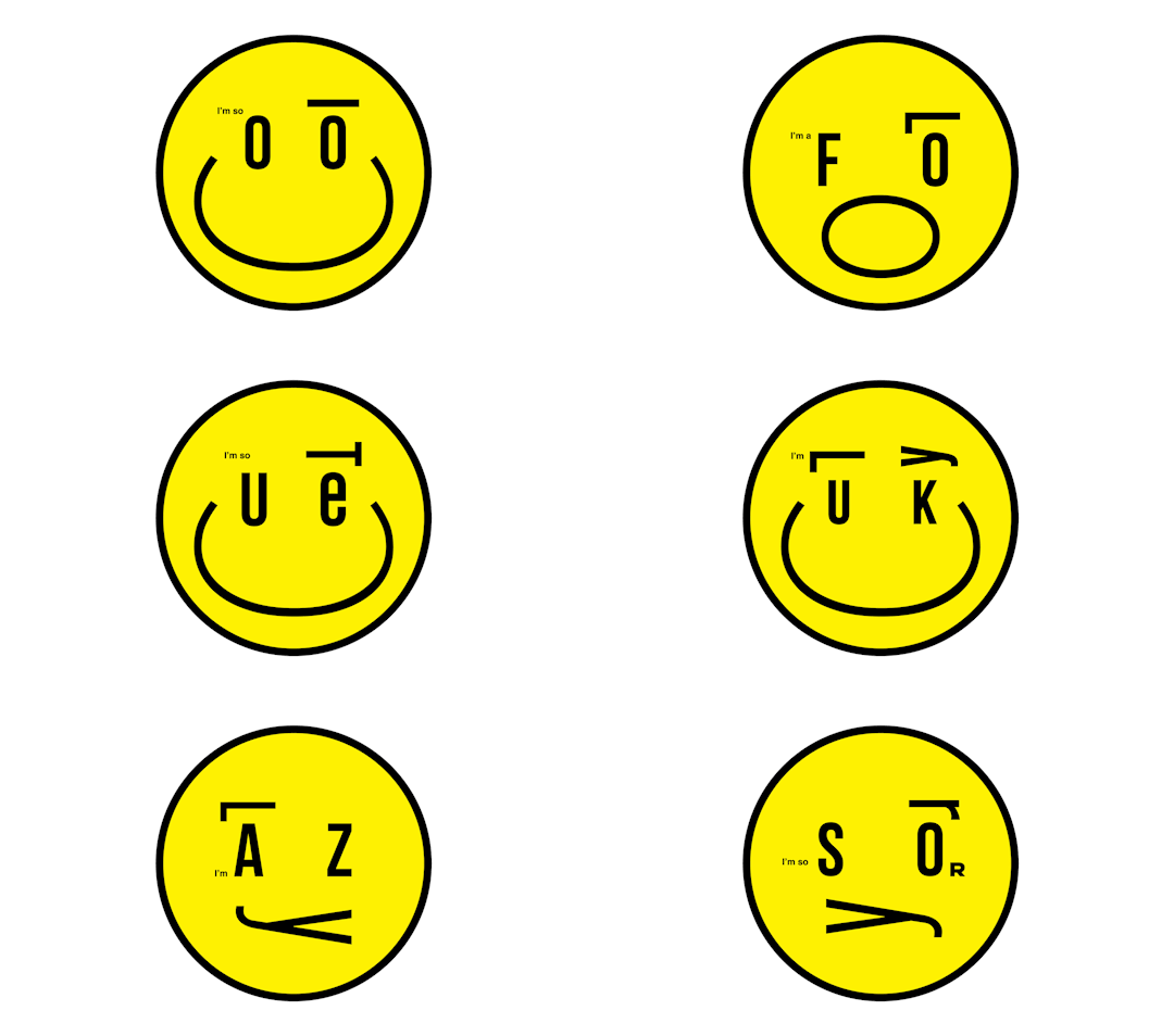


Ball Room, 2019
HELLO EMOGRAMS INSTALLATION AT THE GWANGJU DESIGN BIENNALE
http://kissmiklos.com/ball-room-hello-emograms-gwangju-design-biennale-2019
0 notes
Photo


Ball Room by Kissmiklos, 2016
https://www.behance.net/gallery/37521219/BallRoom-2016
0 notes
Text
Topics to questions: Exercise 2
What if there is a periodical that explores the idea of stripping away identity of brands? The content would range from iconic to everyday brands. This project would explore how design changes commerce and changes our mind. The project targets people of all ages, regardless of their gender. This project makes the audience question the role of design and its impact within the realm advertising and branding.
What if there was a company with no brand identity? How would the design system for an identity-less company look like? Can a visual identity be strong enough to solve a purpose without creating a brand? The medium could be a typeface, identity book and packaging. The project targets people of all ages, regardless of their gender. Advertising and packaging are mediums that people of all ages experience.
What if there was a typeface that represented the values of identity-less? What would be its applications? What would an identity less typeface look like? What kind of barriers would and could it break? Would it be serif/san-serif/monotype? How can design be used to shape our perception and give meaning?The project will primarily target designers. The content would be the characteristics of identity less as a concept and would dictate the values of the typeface.
Feedback for Tommy on the theme of Identity-less
0 notes
Text
Every layer of design rests on another and another and another. It tries to recover the past while design looks forward to possible futures.
Humans have created a world where we experience things through design. Design shapes how we experience things. Design in response to another design or iterations or problem solving or being explorative is trying to create an experience. From how we wake up in the morning to the education we get to how we travel or we engage with one another are all different facets of design. Art movements going from extremely traditional to contemporary in simplest forms, shows this reaction. The education system from valuing academics to creative being a part of academics, the process of shaping the education system is a part of design. Once not recognized but now might fall under service design. The evolution of pc to a laptop, the transformation of screens makes me wonder how we use stereotypes in a positive way as a base and build upon that by eliminating excessive steps. The context on which designs are based, what happens when that is not present, does then design still serve the human and is able to redesign the human. What happens when a certain age group is left out of this? When design keeps getting iterative, focused and starts to create echo-chambers? How does this then frame the society we live in?
(Written Response)
1 note
·
View note


