Don't wanna be here? Send us removal request.
Photo


Trial Print
This the trial print of my completed commentary booklet. I took a lot of inspiration from the creature commentary from Silent Hill 3. The presentation is strong, though given more time, I would have designed my own front and back cover for the booklet. The style suits the concept of the game; the dirty paper texture looking like aged, bloodied bandages. I decided to add a dark line around the white text to make it stand out from the background.
Due to time constraints I had to use the untouched finalised drawings of each character. The quality of my work could have been improved had I digitised these drawings or added colour. While I tried to change the contrast of the images to make them look more interesting, some of the images are too dark around the edges. Since this was a trial print, I’m hoping I can use better quality paper to improve my work. Reading through the profiles I noticed some spelling and grammatical errors which I plan to fix.
0 notes
Photo


These are my notes for character profiles which I plan to add to my commentary booklet. I wish to have a profile for each monster as well as what they each symbolise.
0 notes
Photo


For the protagonist I wanted an old fashioned name to match the character. I decided to the character name more personal to me by using a name from my family tree. After picking a name I felt suited the character, I then had to give him a surname. I didn't want to use my own surname or take the full name directly from my family because I wanted to give my character his own identity. In the end I decided to take a name from my family and a surname from a friend's family. The protagonist is called Ernest Horridge.
0 notes
Photo


Dark Souls II and Twllight Princess Booklet
The content in Dark Souls II's booklet is very minimal. In some cases it makes sense to leave information and monster designs out of the booklet to avoid spoilers of the game and enhance the game's experience. As for the booklet for Legend of Zelda: Twilight Princess, there is a lot of colour and interesting visuals, making an overall better presentation.
0 notes
Photo


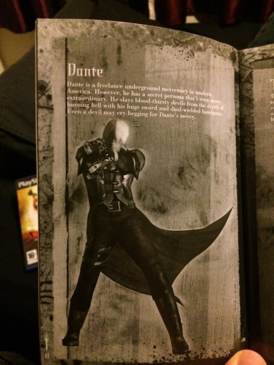

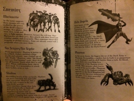
Devil May Cry Booklets
The booklets for Devil May Cry don't do the game justice. The series has wonderful monster designs, but the booklets fail to convey this as well as the in-game visuals. The seem to have bright, vibrate covers, but stick to black and white for the content.
0 notes
Photo


Silent Hill Commentary Booklets
The colour scheme of the Silent Hill commentary booklets are more appealing to me than some of the other game booklets I've looked at. The different fonts, colour and way in which it is presentated is more visually striking and interesting.
0 notes
Photo


Zdzisław Beksiński
Zdzisław Beksiński was a Polish surrealist painter as well as a sculptor and photographer known for creating dystopian worlds.
I find his work mesmerizing; it is equally disturbing as it is fascinating. The themes of death and decay are made even more eerie due to the realism of the corpses or deformed figures.
Beksiński once said “I wish to paint in such a manner as if I were photographing dreams.” I definitely feel like he was able to achieve this; his landscapes and otherworldly architecture look like they come straight out of a nightmare.
Pinterest board: https://www.pinterest.co.uk/sturrockmcmoore/beksinski/
1 note
·
View note
Photo

I tried to make this worksheet more like the worksheet for "The Dancer" but it failed to match its presentation. If I didn't have to worry about time constraints, I would have given this worksheet its own style.
0 notes
Photo


Monster Designs - The Nurse
During the process of designing the Nurse, I sketched equipment used for both a lobotomy and for electroconvulsive therapy e.g. ice-pick, mouthpiece and experiment with ways in which I could incorporate them into the design.

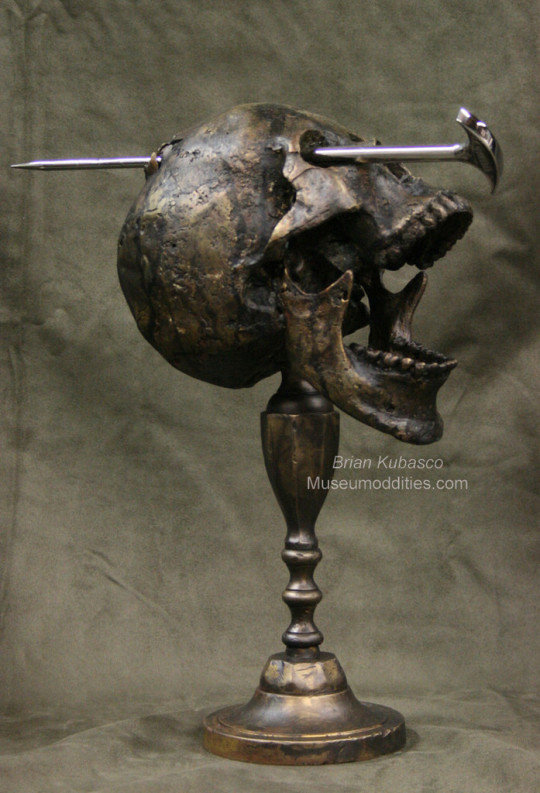
While looking up references for freeman’s ice-pick, I came across the image below which inspired the design of the Nurse. The idea of “a lobotomy gone wrong” is unnerving to say the least.

Designs for Anna’s baby were somewhat inspired by the baby in David Lynch’s Eraserhead.
For the view of the back I used the image below as a reference.

1 note
·
View note
Photo


Monster Designs - Mothman Pt. 4
Looking at the other designs for Mothman, I opted to make him look more mutated. Some of the designs didn’t work because it look more like a person wearing a costume, rather than them being part moth. I also didn’t stick completely to a moth’s design and tried to adapt it to make the character more intimidating. One adaptation was the legs. Using the real legs of a moth wouldn’t translate well because they would look frail and unable to support the weight of the human half of the body. To fix this I used goats legs as a reference, making it more akin to a faun.

This suggests that the creature can move faster and also leap. I used an image of the Crawler from Bioshock 2 as reference for Mothman’s long arms.

Final design for Mothman has design elements of Angelo Agnus from Devil May Cry 4

0 notes
Photo

Here is my worksheet for The Mothman. My gripe with these later worksheets is that I fell into a trap of making them look too similar. I found a method I felt comfortable with and I stuck with it. It can be argued that it shows consistency, but perhaps it would have been more interesting if I had given each worksheet its own style and personality.
0 notes
Photo
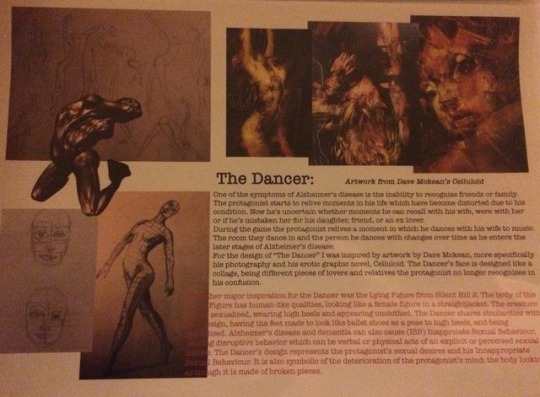
The worksheet for "The Dancer" links the design with work by Dave Mckean and the Lying Figure from Silent Hill 2. It also describes the meaning behind the Dancer's design. This worksheet is the strongest in terms of presentation, having the 3D model of the Lying Figure over the sketches really draws your attention. There's not a lot I would change about this worksheet. Perhaps adding arrows connecting the images to give it a sense of flow.
0 notes
Photo

This worksheet shows the inspirations for the monster “Paranoid Eyes” as well as some insight for certain design choices. While this worksheet is better presented than my first couple, I could have gone more in depth with my thought process.
0 notes
Photo


These are my first worksheets showing my thought process and how I ended up focusing on Alzheimer's disease as a subject. These early worksheets are presented well, though they could use either some sketches or photos to fill out the empty spaces.
0 notes
Text

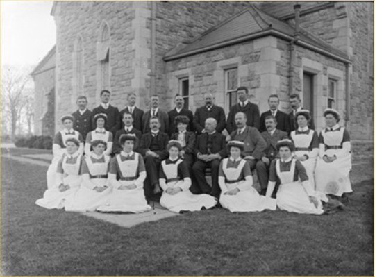

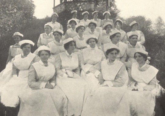
Photographs of nursing staff at Trans-Alleghney Lunatic Asylum/West State Hospital.
0 notes
Photo


Monster Designs - Mothman Pt. 3
To better present my thought process, I was told to sketch multiple variations of a design close to an existing one. This piece of advice is an aspect I wish to improve upon as I do prefer this way of presenting my work. Here I tried to show how I looked at different types of moths and the patterns on their wings, as well as deciding on a which parts of the moth to incorporate into the design.
0 notes


