Everything BioShock & Dishonored and primarily gaming stuff.
Don't wanna be here? Send us removal request.
Photo

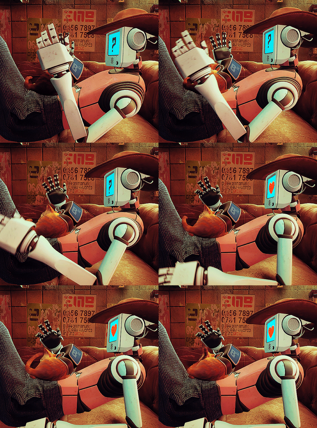
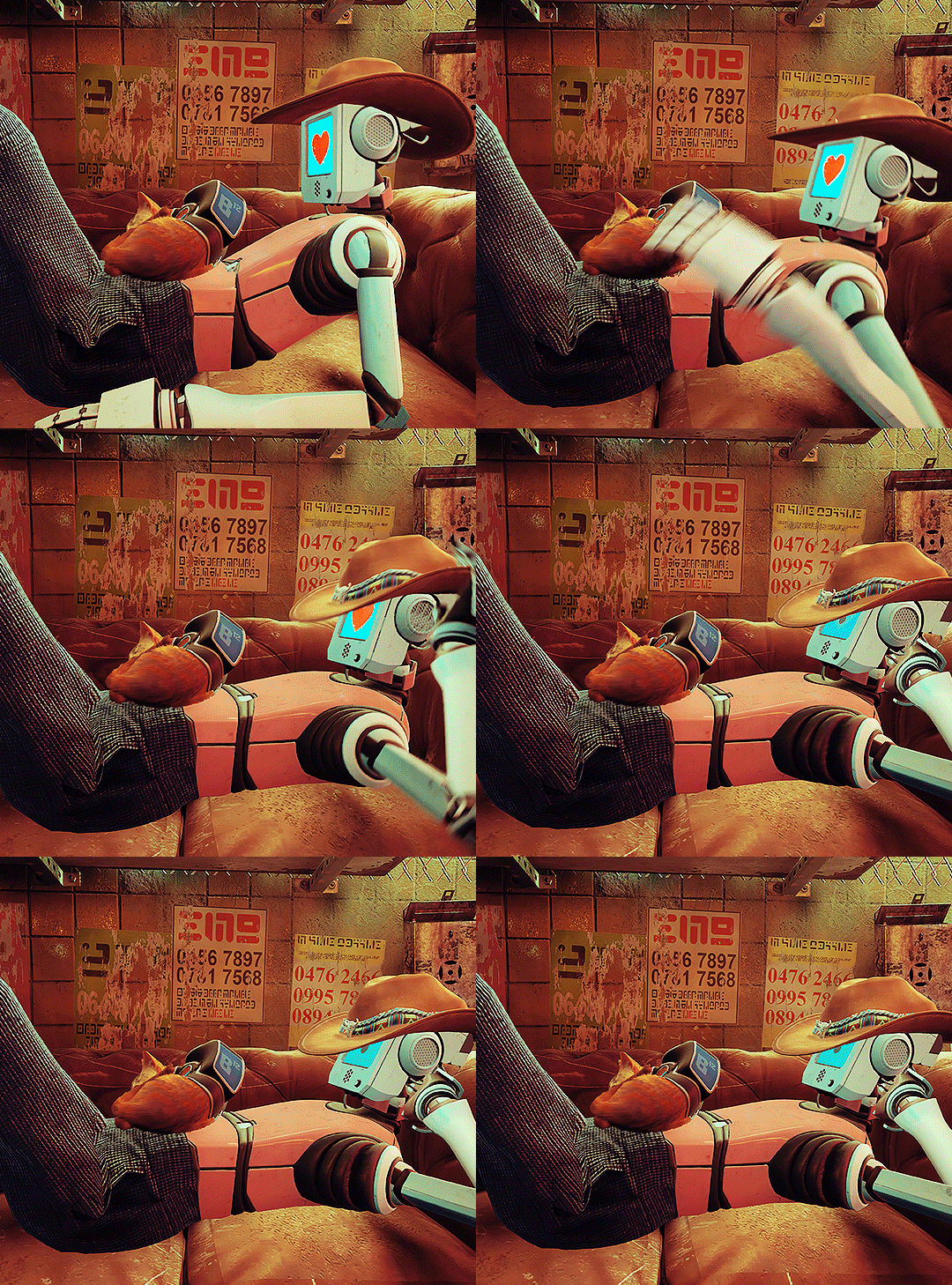
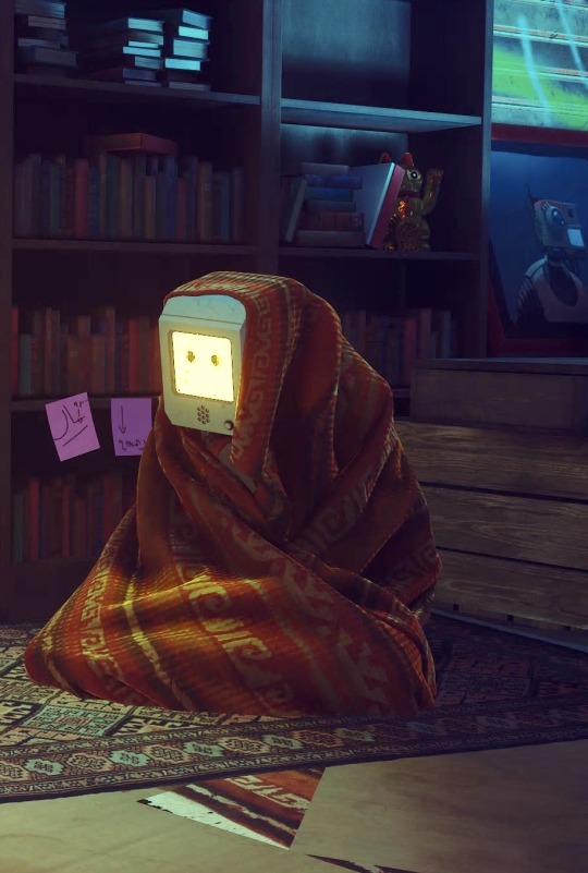
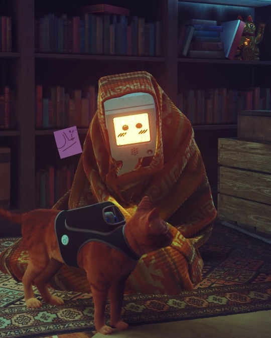
STRAY (2022) dev. BlueTwelve Studio (03/??) 🤖 + 😺 = 💖
47K notes
·
View notes
Text
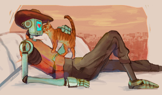
[Image description: A colored illustration of the cowboy robot and the cat from Stray. The cowboy robot is reclining on a white chaise lounge with the cat standing on their belly. It rubs its face against theirs with a closed-eye smile. The cowboy robot runs a hand along the cat’s back, and their face displays a heart on a cyan screen. In the background is the dark orange silhouette of a city underneath a pastel orange and yellow sky. End image description.]
47K notes
·
View notes
Photo


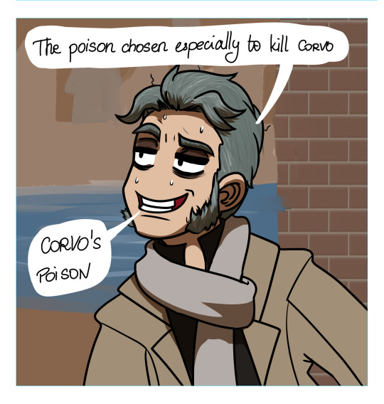
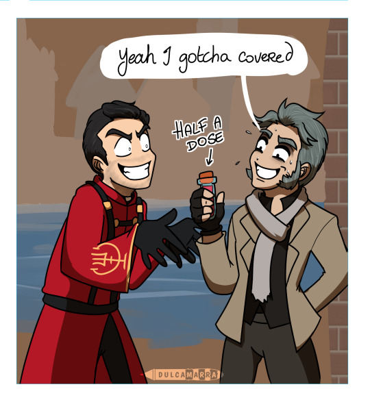
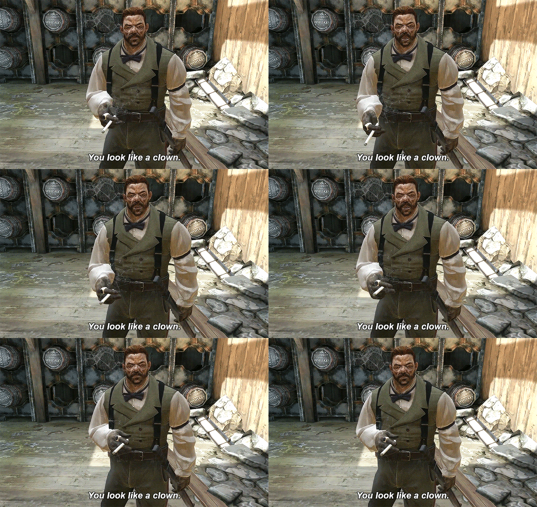
The possibilities of crossovers between Kuzco and Dishonored are endless.
(Note: this bit would also work with Curnow and Campbell. What is it with High Overseers and poison?!)
242 notes
·
View notes
Text
It was easier to contact the international space station than some European countries
14K notes
·
View notes
Text
the backstabbing going on in eastern europe is monumental
96 notes
·
View notes
Text
Me checking the Eurovision tag on Tumblr when all the boring songs come on

5K notes
·
View notes
Text
World Design Blog Post #5:
Lighting Analysis | Bioshock
Contrast Already at the beginning of the game, you can see some great examples of color contrasts through lighting. The dark purplish/ blueish water makes the highly saturated and bright flames stand out even more. By having different tints in the lighting, the game adds variations and breaks repetition. Contrast in the lighting is a great way to add point of interest and to show the player where to go. Thus they can also stage their scenes better, and put more effort into putting details in the areas they know will be more lit and more seen & vice versa. The game has great variations and hues/ tints when it comes to lighting, in this case giving a sense of urgency and alertness (red lighting, triggered when the security has been breached), while blue lighting is more calm.


Light Direction, Use of Shadows & Light Sources Some areas are quite dark to begin with, making them stand out in the otherwise lit environment. Having a dark area like this, it creates a point of interest guiding the player. Upon closes inspection, as the player walks close, the lights are suddenly turned on, egging you to walk further ahead now that the area is not dark anymore. This is called directed lighting, and is something than Bioshock uses heavily in their game. By having flashing lights, and not showing everything; either through flashing lights, obscured views and dark silhouettes- you are leaving more up the imagination, which is far more scary than revealing everything at once. By lighting up an area, while the surroundings are dark, you are guiding the player by showing them where to go. AKA. adding more interest to the more relevant areas. Other indicators like neon signs, posters and text signs are another great way of showing the player where they need to go. In the first picture below; Here there are two door, thus giving the player some room for exploration, and at the same time making the game feel less linear. Most of the light in the scenes are artificial, in the sense that this takes place under water. Obviously, the lighting would have to be internal coming from iridescent light bulbs- which shows well in the game. There is not a lot of fill light, but instead a lot of rim light as the result of bouncing light from the many light bulbs. Sky light cant reach this far underneath the surface, not to mention this place is old and decrepit, so it makes sense to keep it a bit dark and scary.


18 notes
·
View notes
