My Daily Art Blog Dive into my Studio Log and See Daily Images of Process and Progress
Don't wanna be here? Send us removal request.
Text
I Am The Resurrection - but this isn’t a Stone Roses song
As I am starting my FMP for Foundation, one thing I always wanted to do, was Dr Frankenstein my exploratory stage blog. I feel like it was very fun to do and motivated me to document and plan whenI did my blog which is beneficial for my FMP stage. It has to show the culmination of everything i’ve been doing so far. It’s roughly 11 - 12 weeks long, which is longer than everything I have done so far, brief wise. I thought as well as my sketchbook I could document my progress and planning, digitally.
We’ve been in a weird climate, with learning at home and online. I am now back into the studio with everyone and its just weird adjusting back to the normal norm, as digital just felt so easy. But, I am dedicating back to the faithful sketchbook, but thought I would merge these separate entities to help boost my project and productivity.
So, expect regular posts and maybe the name of this page wont be such a lie. TheSiplingArtDaily, becoming more daily.
0 notes
Text
Girls on Film - Film Photography
Aims and Objectives:
- learn how to use a film camera properly
- know the processes and theory behind shooting with film
- how to put in and extract the film
- take some photos with the formal elements with a film camera
In this lesson of photography, Nathan gave us all a film camera and then went on to explain the ins and outs of the camera and how it works. The real name for a film camera is SLR and you have to use a role of film and camera obscura to take photos with the camera.
In a little demo he showed us how to remove the lens, how to change the aperture, how to fit the film and how to properly prepare the camera for photography. We were shown how the dial on the right side of the camera would change depending on how much light the camera is receiving and you can change the aperture depending on how much light there is. There was also a dial on the top of the camera that affected the shutter speed - we kept it at 1/60. He also expressed the dangers of using film as it is very expensive and obviously it is sensitive to light - so if we weren’t careful we could risk exposing the film.
After the demo Nathan tasked us with going out and taking photos with the film camera, we told to look at the formal elements and see how we can challenge them. We had to partner up and share the film. So we went out and shot some photos.
A few days later we came back after everyone had finished taking their photos of their formal elements. Nathan showed us how to use a spool, which was the device used to load the film out of the film canister. We had to practice it a few time as we would have to do this inside a double zipped black bag.
Nathan started to show us what we had to do while removing the film from the canister in the black bag and how to assemble the cylinder box that would keep the film light tight, when we remove it from the bag.
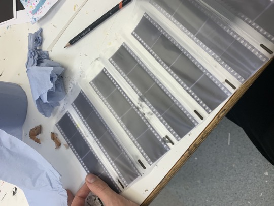
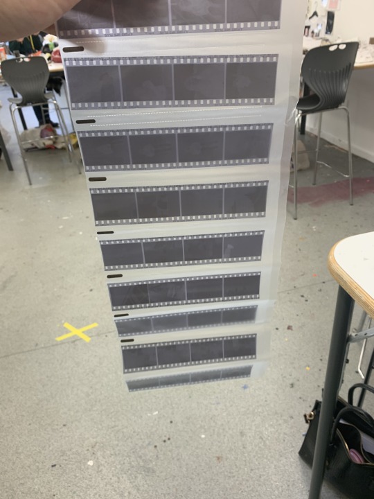
After we processed and fixed the film, we left them to dry and put them into negative bags.
8th October -
Nathan showed us how to scan negative film onto the printer.
Open EPSON Scan, change it to ‘Professional’ mode.
Change it from Reflective to Negative Film on B&W
This will then be ready for scanning and previewing
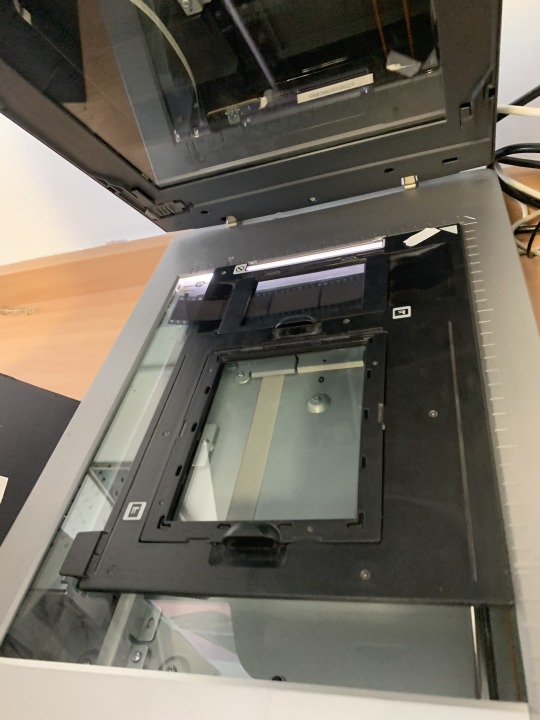
These are the film holders, that we had to put the film in. I wasn’t sure exactly what they did, but Nathan said its about the way the machine scans them.
Once scanned Nathan showed us how to change the levels, contrast and colour of the negatives before scanning so it would scan them right.
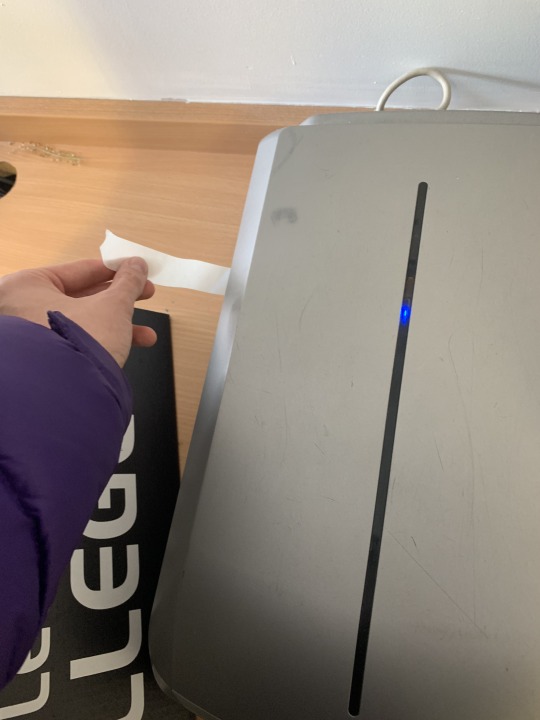
After scanning we were tasked with manipulating and playing about with how we scan to create some effects. Here, i am moving the film about, while its getting scanned. It created a stretched version of the image that glitched and created these lines.
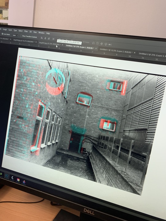
Here, i have played about with the marquee tools and layered them up together, all the while layering the base layers and changing the colour channels in the blending options, to create the glitched effect.
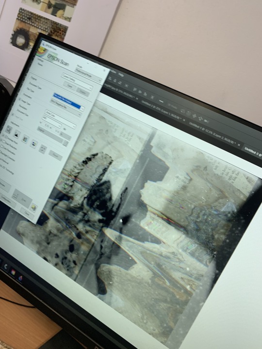
We also scanned in some of our rust prints to layer over our negatives and i did the same glitch effect with the scanner where i moved the print while it was scanning to make it stretch make a rippled wave effect. I can then use this to layer them over the negative films.
0 notes
Text
Prometha-ZINE: Strikes Again (Digital Zine)
Today, is the deadline for our Exhibit and we still haven’t had time to make our digital zines. So, today’s aims and objectives are very clear.
AIMS AND OBJECTIVES -
- Start and Complete the Zine
- Exhibit and separate works which you enjoyed most and didn’t as much
- Wrap up everything
Nathan has given us a template for indesign, so that will cut time hopefully when creating the zine. As i have never made one digitally before and i’m not that familiar with InDesign - i’m more of a photoshop person.
So, update i hate InDesign. Actually, I don’t hate it i’m just unfamiliar and its making everything 10 times harder, so i very much dislike it at the moment. I am verbally abusing the computer at the moment, if it had feelings it would probably be crying. (cheers hun kids crying now) I’m gonna try chill out with some music and push through it.
Another update, i completely gave up with indesign and just used photoshop. But, i’ve got the layout completely messed up and everything is a double page spread. I think i’m gonna improvise and salvage what i can with the time i have. I haven’t even put my exhibit up yet.
Well, the results are fun. I remember stating to Letitia and Nathan that i preferred the physical version, as i have more control of the media and the outcome. But, this is a learning curve and i will eventually learn it better, just time and patience. I guess the zine striking again is like many Hollywood sequels that shouldn’t happen - they’re not always the best idea. All jokes aside, the digital zine has come out fine it’s just not as effective as i would like it to be. This experience has made me more determined to learn InDesign though, so just think of the positives.
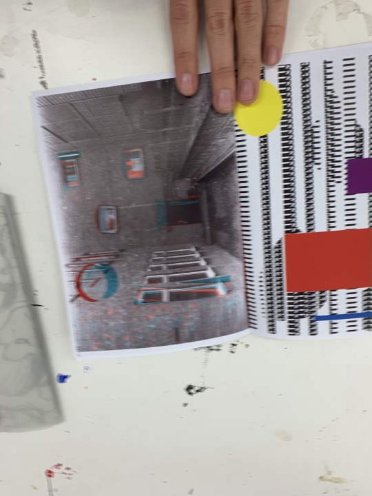
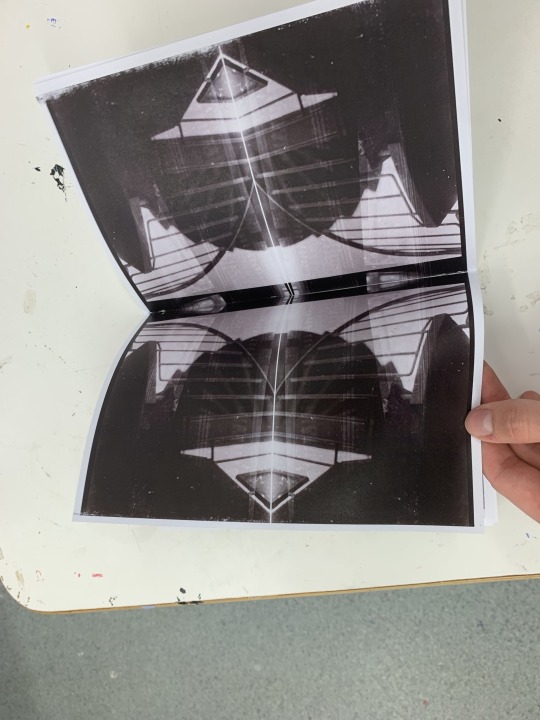
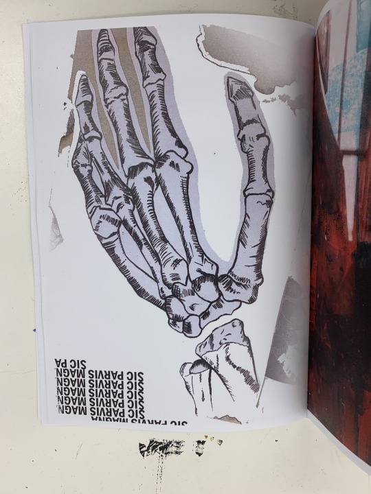
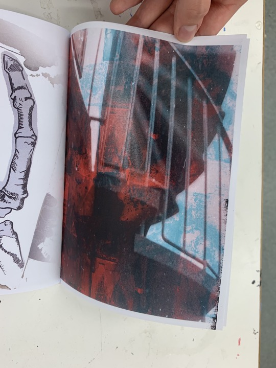
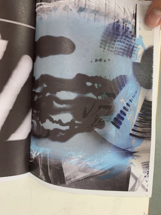
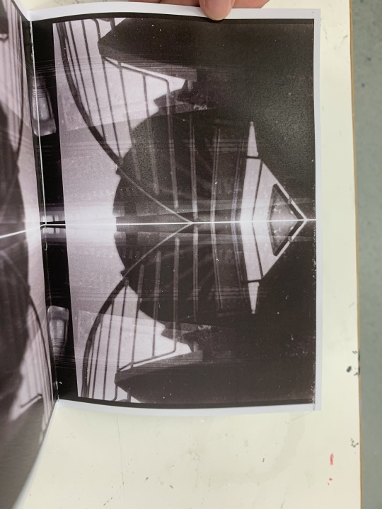
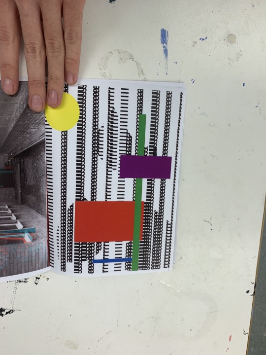
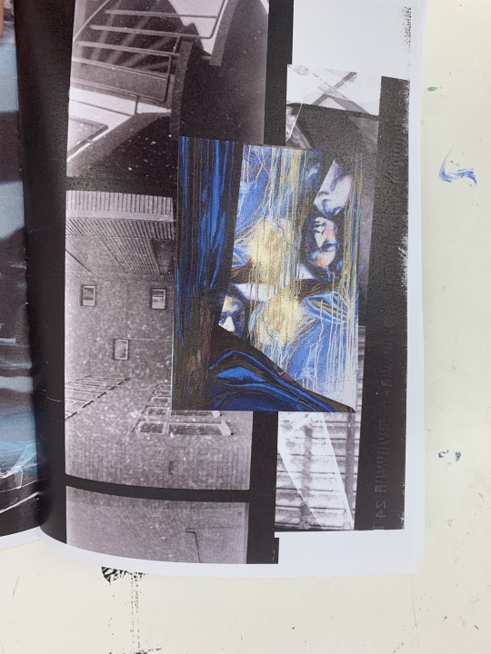
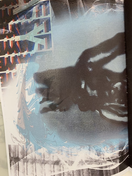
Here, are the pages of my zine that combined elements of all my works that i have created and i have digitally collaged them on both inDesign and Photoshop. I like each page, but there is some inconsistencies and sometimes it doesn’t flow the way i want it too. Also, since i didn’t follow the zine model properly, there are blank pages I need to stick together, as they are just white with no content.
I was able to get my exhibit up in time too, which i was happy about too.
0 notes
Text
Transformer, Fabric in Disguise - Subverting the Shirt (an idea and plan)
For Jo’s task this week, we were instructed to create something completely new with the shirt. That isn’t wearable and is a completely new object. I have to think of a concept and show a clear direction of where this is going. I also need to include a plan and documentation of how this will go.
Initial Ideas -
a laptop cover
a guitar sling ( to hold )
mug cover or kettle


These are just some examples i found online of fabrics that are turned into new objects. There are some goo concepts but none that seem very subversive or unique. The moth is a cool idea i would be open to making something that has character or interesting quality to it.
I’m still on board with making something practical, like the guitar sling. I feel like this would be a cool idea to develop that wouldn’t be overly challenging. I even have a guitar i could model it on too. I don’t know how subversive this will be though. However, the shirt has been repurposed and got a new life, which is subverting its original purpose.
0 notes
Text
Prometha-ZINE (not the drug cause they’re bad) - Creating a Zine Book
This being one of final exploration weeks, this week Letitia has tasked us with making a zine. My first thought was ‘wtf is a zine’ i guess it sounded similar to magazine, so i thought it would be similar to that. Turns out its very similar, its like a small condensed picture boom to show our artwork.
Our zines will showcase our favourite works, so far. So, we had to decide what we were going to choose and showcase.
However, we were tasked with make loads of mini books and making small narratives using dots.
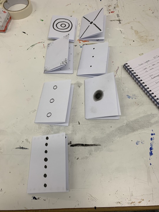
Here are the ones i created. The books were a good way of showing a good narrative structure without using words and showing and explicit or implicit progression as you turn the pages. This will lead into our zines, as it makes you think about how you can arrange your work into a smooth narrative selection of work that will compliment and aid each other as you turn the page. The small books all followed the dots and how they changed, which is nice way to show the zine i make. The exploratory stages and they’re outcomes will be condensed into an exhibit in our zines, so the state of change that the dots took will be similar here in the book with the different outcomes from the stages.
The title for my zine is: Memento Mori. The words from latin have always resonated with me in a weird way. The word means “remember death” or “remember you will die”. Initially, it sounds very depressing when you take it at face value, like a big reminder your going to die some day. This is true, I think death is something thats very definite in life. If you peel the layers a bit more, its more of a question of how you’re going to live today cause your going to die one day, so make sure your doing what makes you happy, as the death weighs ahead at some point, its a reminder to think and focus on the journey and the present and don’t be consumed by its inevitability, but live life to the maximum of each day.
How does this link with my ‘zine’?
This whole exploratory project has been about a journey and the progress between each new week. So, the title Memento Mori, revolves around this idea. The zine follows on themes of Life, Death, Natural and Mechanical.
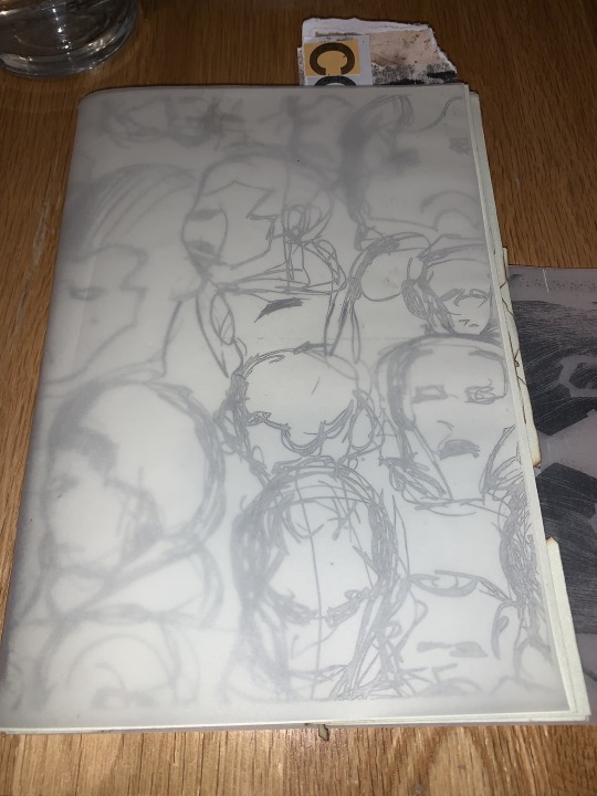
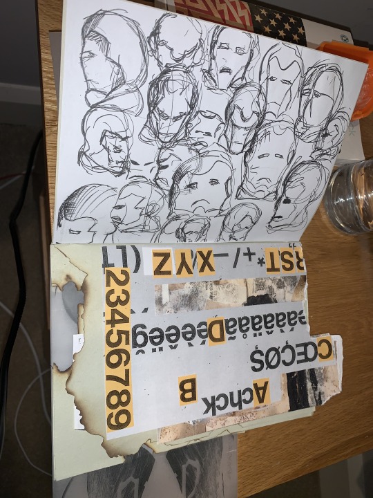
This is a collage of the ‘ugly’ drawings, with different compositions of the head and the way they are facing. I like how there are collected in the middle and there is a nice balance of negative and positive space within the collage. It also features a snipper of the skeleton hand photogram, that feeds into the later pages of the zine. I like this as it connects the book together better.
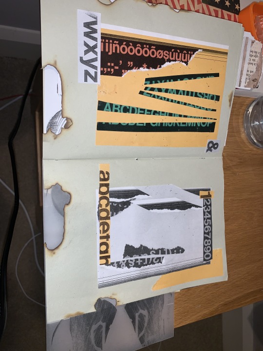
These are graphic Helvetica compositions, one in colour and one in B&W. I think they compliment each other very well, making each of them stand out better, while blending nicely on the page.
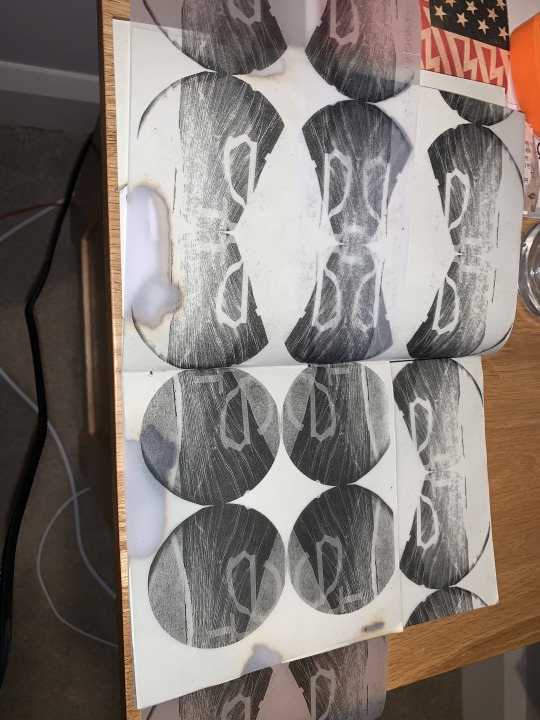
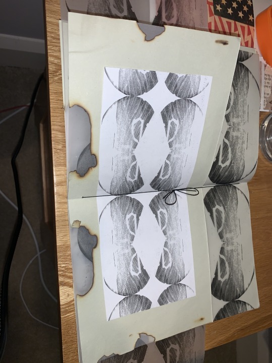
This is the double page spread repeat pattern collage, it opens up into a smaller page and love the dynamic of this. The outside of the smaller page follows the same pattern as the pattern around the smaller page and helps it fit in with to over all spread. Inside there is a clear black and white version, like inside this pocket of the loud spread, is a clearer more definite version that is sure of itself. The outside area with the larger pattern is the big showpiece that is printed on the tracing paper to blend and work well with the background.
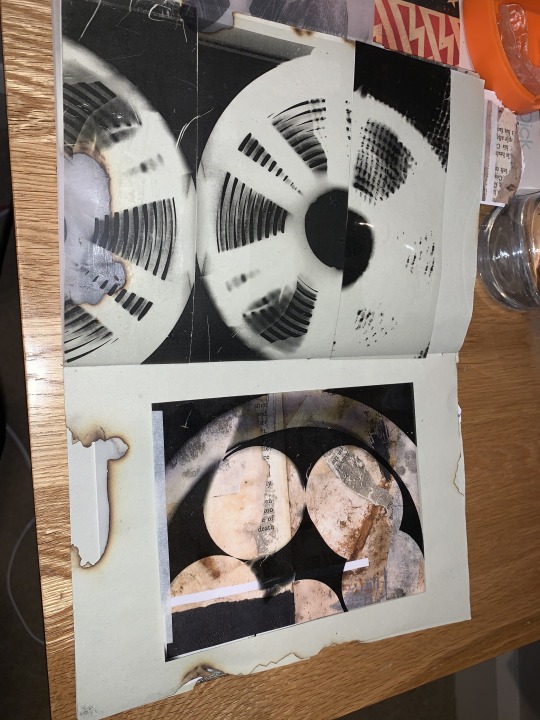
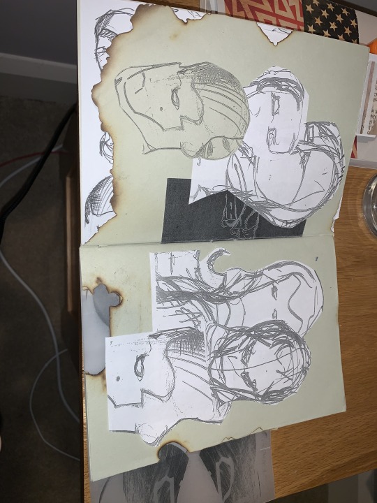
These photograms are on acetate and layered against the burnt pages. I love the way the photogram curves round the burn and emphasises the burn and the contrast between the sharpness of the photogram and roughness of the burnt paper.
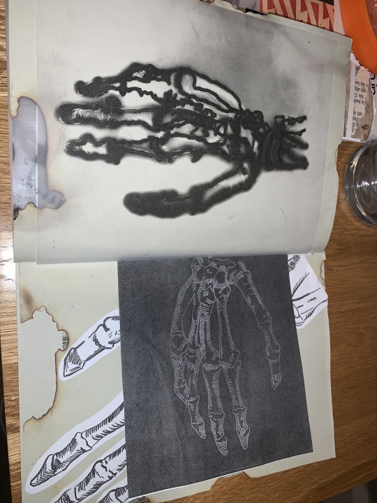
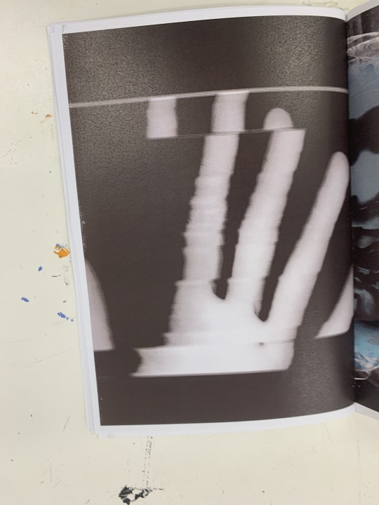
I enjoy these photograms and light drawings from the skeleton that started from the beginning pages of the zine towards the end, where it all wraps together. I enjoy this page as it showcases different approaches to the same and the different effects and outcomes they create. They are all displayed in different angles and express different qualities.
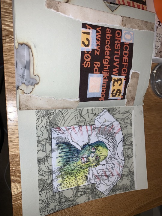
On the left side, the page has a nice contrast of the rust prints with the graphic composition. The way it layers the rust and graphical image creates a nice contrast that helps boost the image.
The final page is grim melting person a T-Shirt with ‘Don’t Melt’ across creating a satire but warning message layered underneath an acetate print of the ugly drawings from the beginning. To tie the start and the ned of the book nicely together.
I have loved making my zine, its a great way of compiling my work and putting it together in its own space, where it can be smoothly viewed and transitioned through for someone to see. This helps someone see your work condensed nicely into the zine form which aids your ideas and themes to let them be presented in a way you wish for the to see it. It can also let someone looking at it gain there own perspectives and understand me better.
0 notes
Text
Helvetica Compositions - Graphics Typography
For our Bruce task this week, we have been given these sheets of paper all different colours. I decided i would choose dark orange, a jade green/black and a mustard yellow. Each piece of paper had a the alphabet and numbers and symbols all in upper and lower case. We were told to make three compositions with the sheets and different colours.
These are my outcomes -
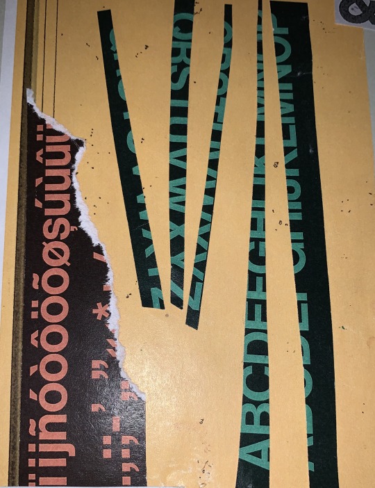
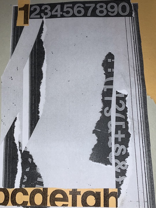
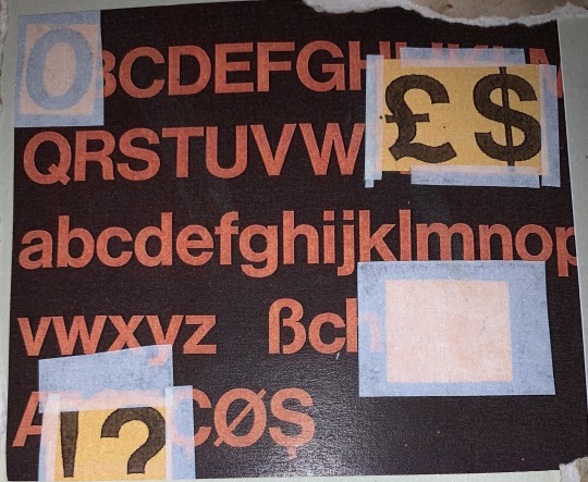
This task was a nice and simple one and was quite relaxing just to sit there and do. It only took an hour. My outcomes are all postcard size.
0 notes
Text
Subversive Video Art - The Plan
What is Subversive?
Examples of Subversive Video
Un chien andalou - Dali and Bunuel
During Brian lesson we were looking into the idea of subversion and we watched the surreal film Un Chien Andalou the full way through. The film was strange and hard to follow, but that was the point. The narrative had many themes that you could pick out but i found it hard to fully piece them together as each scene was drastically different. Which I guess is where the subversive elements come into it?
From this we were told about how we were going to be making some subversive footage and make our own subversive film. So i decided to mind map and scramble ideas -
Subversion - has elements of challenging political structures
I’m passionate about climate change and how that affects us.
How can i channel this through a video?
Ice caps melting, planet heating up.
How can i represent this?
Use ice cube, film the ice cube melting and speed it up.
I could make this subversive if i show the ice cube being water and freezing and then being in put into a drink.
This could be a comment on humanity’s abuse of the earth and how it contributes to global warming and climate change.
When filming, i think it would be best to use. a tripod or something stable, so the shots are smooth and theres no shake. I think it would be a good idea to do this shot fairly close but still have some background in it. Brian has also warned me that sometimes when filming for a long period of time, the cameras footage can look a bit glitchy, so i should consider how long its going to take.
For now, this is going to be a plan and will carry out this task next week when access to the cameras.
0 notes
Text
Subversive Sculptures and Plinths
Yoko Ono is a Japanese Multimedia Artist from Tokyo. Famously with the late John Lennon of the Beatles.
Apple -

In 1966 Ono described the "...excitement of watching the apple decay, and the decision as to whether to replace it, or just thinking of the beauty of the apple after it's gone". The idea behind it is the contrasting ideas of the apple and the brass plaque thats on the plinth. How the apple will slowly decay but the brass plaque will not.
Bruce McLean

His work is humorous comment on the pompousness and monumentality of Henry Moores sculptures on plinths. His work channels a lot of comedy and irony.
Artist’s Shit -

There were 900 of Artist’s shit made since 1961. This imaged here is number 004. When being made, Manzoni was experimenting with using elements of his body for art; the idea that the product of the artist's body, as a consumable object.
For Letitia she wanted us to make a sculpture on a plinth and label it on the plinth with 5 different titles. This is an interesting concept as it makes you think about how the meaning of the art changes.
I was thinking how i could put an object on the plinth that could have 5 different titles - some very basic and some deep and meaningful.
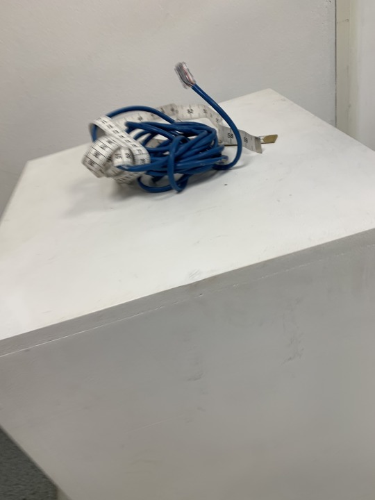
I found an object around me and thought that a tape measure would be interesting thing to use. As i could make some interesting titles with it.
Name Ideas (jot down)
Black and White Tape Measure
Timeline
A Question of Size
Size does not matter
Life and Death
A Day
Distance
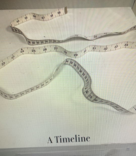
Could connote historical themes. A timeline of someones life. A specific period or season.
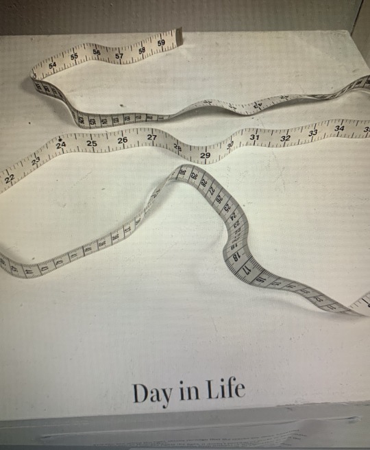
An objects day on Earth from start to finish conveyed by the start and end of the tape measure.
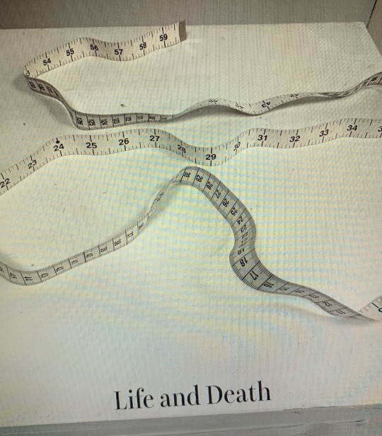
Is a measure of Life and Death with the tape representing the journey through life. The tape is basic in black and white, so it can be applied to the individual audience who looks at it.
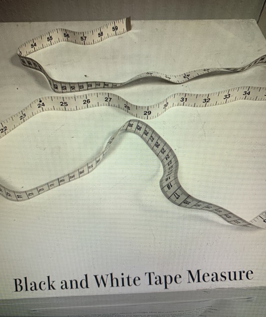
Very explicit of what the object is and doesn’t offer any depth or concept.
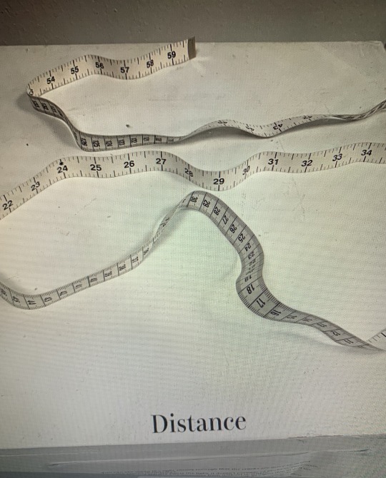
A more literal title but a tape measure being used to measure the distance of something. Wether it be a journey, love or people. Can be very relevant to today and the social distancing measure we all have to endure.
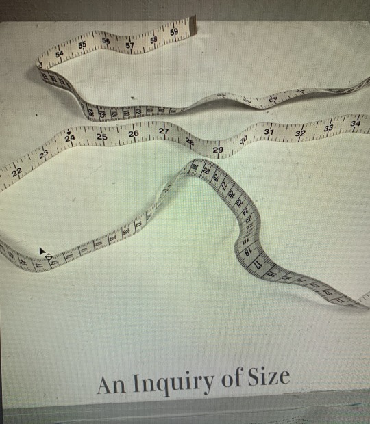
This could suggest issues that deal with weight. It could connote themes of hidden history or story living within the object and all the lives its lived when being used to measure something.
All these titles are so different and all give different concepts to the piece that is on the plinth. For example: Black and White Tape measure, is very literal and explains exactly whats on the plinth. Where as, Life and Death implies ideas of the tape measure being a representation of somethings life from coming into the world and leaving the world; wether it be organic or man made.
Another task we had to carry out was getting into pairs/groups and creating sculptures that incorporated us within in them. As usual I modelled, because i have no shame and don’t mind being in the photos.
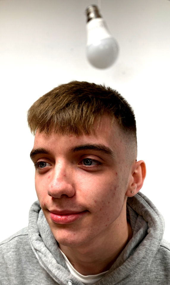
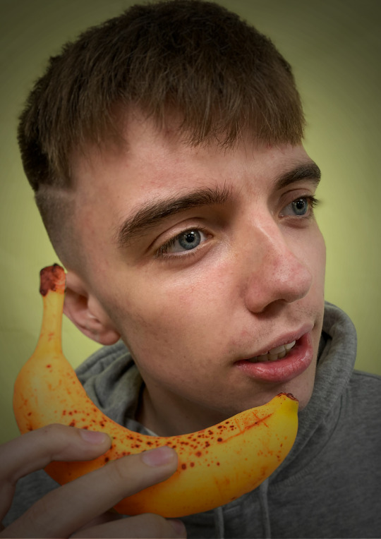
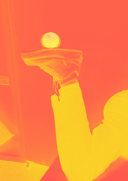
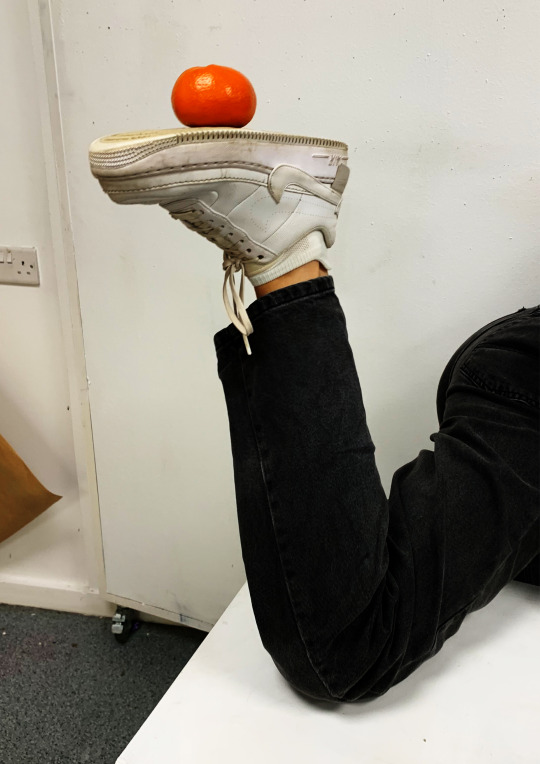
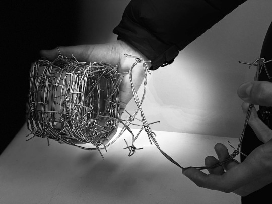
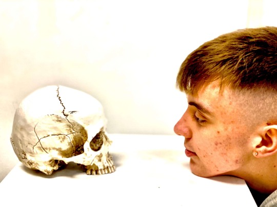
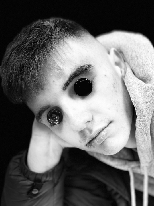
These were all our outcomes. I enjoyed the way we worked together, as it was easier to think of concepts and ideas. I wish we got the plinth in more in the photos because then you’d get more of a sculpture feel to them. However, i was the test dummy in everything, i don’t mind too much but sometimes wish i didn’t have to look at myself all the time, as i feel vein after the end of it.
A.I. -
I’ve been watching a lot of stuff on Tesla and their head chips and the concept of how A.I (Artificial Intelligence) is being integrated into our daily lives. I thought about how i could juxtapose something robotic and artificial with everyday objects to create this contrast between natural and artificial. My outcome looks like a robot animal or dog that can walk on 4 legs. However, it cant and is made out of simple objects. So, i thought this was an interesting way to take the two separate themes and integrate them together the same way technology is becoming more involved with everything in our lives.
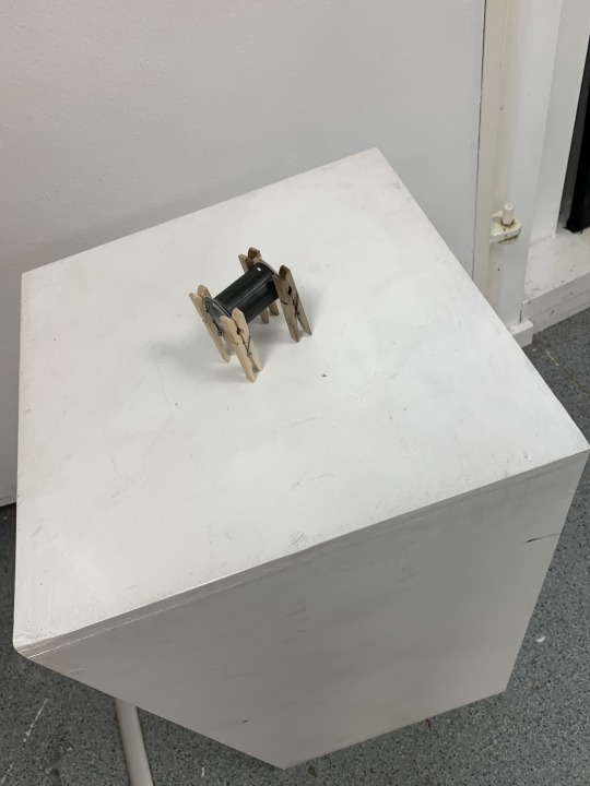
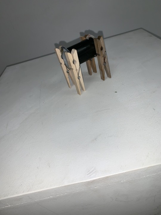
Progress -
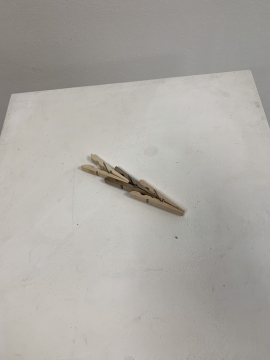
As i am a young person and have a lot of my life left to live. I have many things in life yet to come over. But, you have to take life a day at a time and make slow and steady progress. I liked the way the pegs were in an arrow shape and convey a sense of direction. I thought it would be good to layer them and represent progress in my life. I guess this concept took a personal turn.
Connection -
In today’s social climate, we are so reliant on affection from other people online and can value self worth over how many likes and shares we have. We are constantly connected, but so physically disconnected - creating a big social rift, where people feel safer online and indoors, than real physical connections. I always think of it like this - Can you remember that text you sent someone 3 weeks ago? Can your remember the day you spent with you family/friends? I always find myself remembering more meaningful things, for me real physical connections are more valuable than ones on a screen.
Overall, ive really enjoyed working on these sculptures and developing the concepts its made me think more about the way i approach art. It’s shown me how sometimes spontaneity in art should be embraced, but on the other hand thinking and developing concepts before I create something can make the art more meaningful and thought provoking - which can affect the development of the art itself.
0 notes
Text
Makeshift B&Q in the Foundation Room - ‘Ugly’ Repeat Patterns Pt.1
For this task, we had to make repeat patterns with our ugly object drawings from a few weeks back. In that brief, we had to draw on an A4 piece of paper. However, coming into this project, i realised i had drawn on slightly bigger paper than A4 so i met some complications when it came to photocopying.
I consulted Sam and she recommended doing it all on A3 instead. SO mine was a lot bigger than everyone else. This didn’t make any difference with the outcome, other than mine would be bigger than everyone else’s. Once photocopied, we would cut the paper into 4 sections and label them A1 A2 B1 B2. They would then be arranged as -
A2 B2
A1 B1
When taped and flipped back over it would make a new composition, so when we wanted to photocopy it again it would make a repeat pattern that would align every time. There was some blank spaces that i filed with new lines and drawings. I then would only need to repeat them and stick them together.
Here are photos of my repeat pattern and me making a wall paper out of them:
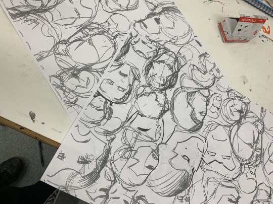
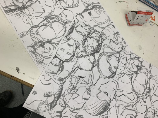
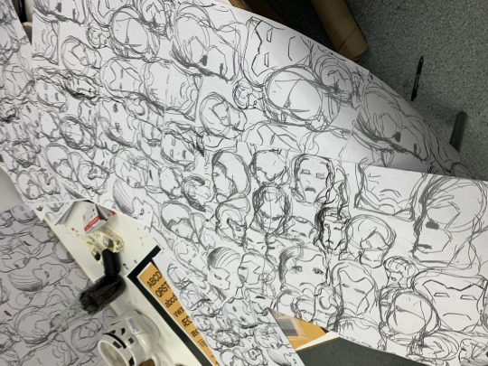
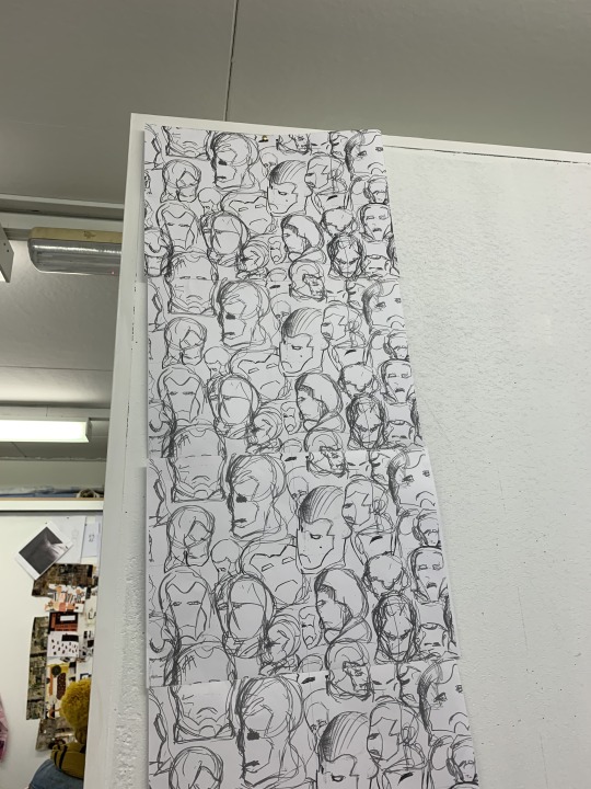
I started my half drop but had some issues with my orientation and photocopy that Letitia and Sam are gonna help me make, as mine is a bit of an anomaly to everyone else’s patterns. Guess its what i get for not following the rules.
This technique was a very quick way of making some repeat patterns that could make some effective pieces in the future.
0 notes
Text
The Reflecting Pool and The Elephant of Time - Video Art Comparison
The reflecting pool by Bill Viola is a 7-minute-long video from the 70s showcasing a man walking up to a pool and jumping in. While jumping in the pool the man is then suspended in air while the pool ripples. He stays static in the air for some time while the pool changes its behaviour and changes tones. After some time, the pool then ripples gently in a radial motion from the centre of the pool, simultaneous with the static man in a scrunched-up position above it. The ripples then move to opposing sides of the pool and start rippling and crashing into each other when they reach the centre. While all the focus is on the pool the static man starts to gradually blend in with his back ground and he becomes more transparent with the green trees behind him. The pool stops rippling and there are reflections of people walking around the pool in the water, there is also another person present. The static man has finally faded into the background and there is nothing left but trees. The pool then starts to become dark and the shadows disappear from the pool. Towards the end the shots are still with the pool and the noise of the forest around them looming in the atmosphere. Suddenly, a naked man exits the pool, climbing out on the side and walks away. There is a persistent nature noise running throughout the whole video too. The whole video has themes of time, the passage of time, reflection and tension. This is achieved when the man is static in the air, while the water moves and ripples. This could connote feelings of being stuck in one place, while everyone around you is moving. While being in this static place there is a lot of tension created while he is suspended above the water. This tension is slowly eased as the time passes and he fades into the back ground, possibly showing some sort of resolve to the problem. The ripples in the water connote a sense of emotion that is trying to get through but can’t due to being stuck, almost as if being static in the air has paused any feeling or emotion that is trying to get through and there’s this struggle, that is reflected in the water.
In the elephant of time, the video follows many themes of time, reflection and life, similar to the Reflecting Pool. The video starts with the Sun, the epitome of life and activity, as we constantly revolve and move around it and it provides us with light, energy and life. We are constantly looping around the sun and use it to calculate time. The video follows a lot of loops and explicit images of time, while they reverse and play again. This was to imply the constant loops we live in everyday, the way we accept that we get up, go to work, come home sleep and repeat it constantly, without question. Almost similar to a feeling of being stuck in a loop like the man from Reflecting Pool who is stuck in his static loop while time passes around him. The only difference in The Elephant of Time, is that the we are living through the passage of time and are not being left behind. However, the emotions in the Elephant of Time are repeated and don’t seem to progress, whereas, by the end of Reflecting Pool, time has passed and the static man has changed and exited the pool. By the end of the elephant of time, there is more explicit imagery of time passing layered on top of looping images, while it slowly fades to black. This presents a constant and that the loops will just carry on and on, changing gradually but staying the same with the passage of life and time. There are further elements of reflection in the element of time, with camera zooming into a mirror as it loops and flips upside down as it zooms in and out.
0 notes
Text
Obscure, Flipped and Lit - Camera Obscura and Pinhole Photography
Photography was credited of being invented in 1839 by Louis Daugerre and Henry Talbot. However, Daugerre is more widely recognised for the correct physical process of photography.
Camera Obscura has been recorded as being used as early as the 4th century and often referred to as ‘fixing the shadows’. For camera obscura we were told the process of it and how it works.
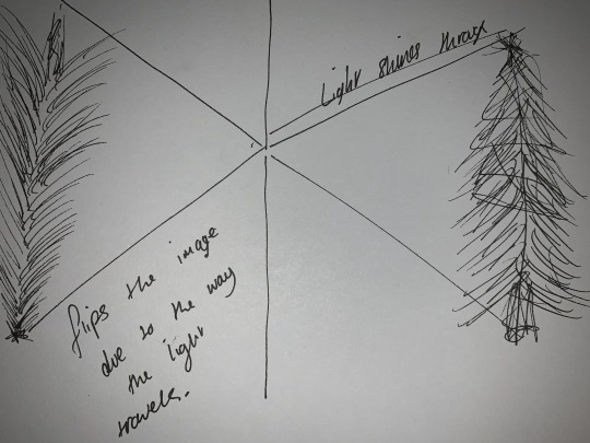
This is a bad sketch but it basically shows how the light is shined through a small hole into a dark room. That light is then projected into the darkroom tThis applies this supplies a flipped image as you can see from the sketch, the top shines through diagonally to the bottom which creates the flipped image inside the darkroom. This is how the insides of a camera works.
After this we watched some videos and researched some artists who have a lot of experience with these skills.
GEORGE DAVISON - used long exposure with a pinhole camera as a way of photography.
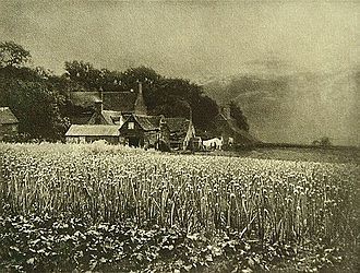
One of his photographs that show a field and house. The house structure is more defined and contrasted due to its stillness and how it isn.t affected by factors such as wind, when its exposed. So, this image is nice and clear. However, the field and trees in the background are all blurry and quite washed out due to the photographic paper capturing their movement while being exposed, so you don’t get a clear defined image like the house.
ADAM FUSS - uses pinhole camera to experiment with the natural distortion of this method. He lives by the way you never truly know what your outcomes going to be.
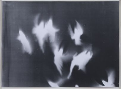
JUSTIN QUINNELL - uses long exposure with pinhole camera over a period of 6 months. His method is very experimental, as he never knows what he is going to get. He has captured really nice images of the sky and his local area over long periods from many vantage points where he hides his pinhole cameras.
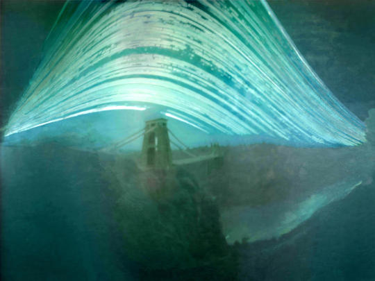
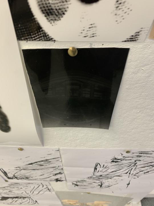
For my experiments with pinhole photography, i used a Pringles can with blacked out lid and a piece of duct tape over the pinhole of the can. This then had a piece of photographic paper slid inside which would be placed near the hole. The photographic paper was only put in and taken out while in the darkroom.
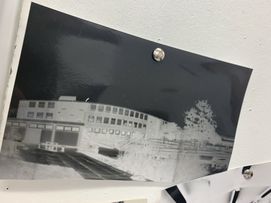
I decided to go outside to take my pinhole photo. We were advised that the paper should be exposed for around 7 seconds, as a starting point. I decided to take a shot of the canteen from the outside and decided to do it for 7 seconds. After this i went up to process the image, but after 2 minutes in the chemicals, the whole image was black, which meant I had exposed it for too long.
Nathan then advised me that it would be better to do it for less time, around 5 seconds, so it doesn’t go completely black again. This time it worked lot better but wasn’t perfect, i just need to find a happy middle that would produce the right kind of exposure.
After this i wanted to do more close up pinhole photography, with a pack of custard creams i was eating while i was taking photos. Nathan told me that a good way of capturing this would be to use a direct light onto the custard cream, by flashing the spotlight onto during the seconds i would expose it for.
To start we tried 3 flashes in 8 seconds, this came out okay and you could make out the light contrasts but was clear enough what it was. So, we experiment with more flashes and they came out a lot better. I think the best result was 8 flashes in 5 seconds.
I also ate the custard cream after the experiment.
Over all the pinhole experiments for me weren’t as effective as i wanted them to be. They’re not as fast as a digital camera, but they offer different outcomes and more organic capturing for the photos.
0 notes
Text
Scorcese or Not - video art
Aims and Objectives:
Complete Video Art
Use editing skills on iMovie
Import images and videos
Today we were looking into experimental video art from the likes of Salvador Dali and others. One of the first videos we looked at was - ‘le chien andalou’ which was joint collaboration with Luis Buñuel. The video had some very interesting shots and almost gruesome scenes with a woman getting her eye slit open, which is paralleled by a cloud going over the moon. The video’s purpose was to show us how art can be achieved through video and some of the interesting and thought provoking shots we can create.
After researching and looking at other examples of video art, we were tasked with making our own video art. It had to be a minimum of a minute and could be anything we wanted it to be; even if it was a group of sequenced stills.
I have experience with the video cameras and editing software from my previous years doing media studies, so i feel super confident going into the task.
From experience, i know that sometimes you can get some great footage by letting the camera roll and not worrying too much about everything looking perfect. I want to get some random shots and be influenced by the surrealist style - with its randomness and strangeness. I decided to film loads of random shots and kept the camera running for things that interested me.
The title of the Video was : The Elephant of Time
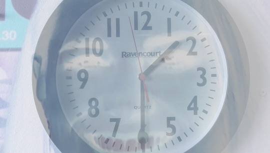
To create this effect, i layered the videos on top of each other and changed the opacity levels on each so the images would mesh together. I then added filters to change the way the layered videos looked. Here, i have used a negative filter so it cuts through the main video.
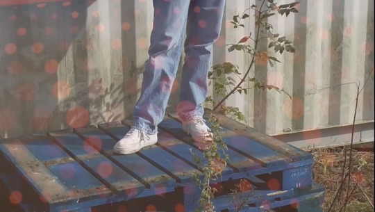
Similar to the previous snapshot, they are just layered together. However, the video doesn’t have any filters as the opacity levels are a lot different. This is to help one image stand out more and the other be more subtle.
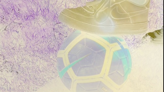
This effect was achieved similarly to the others. However, both videos have heavy filtering and and subtle opacity changes.
I enjoyed the video art experience and was nice refresh for me, as i got to go over current skills i’ve already learnt and help jog my memory. The editing software was simple and easy. Capturing the video was fun and was interesting to see how my camera skills have held up after some time.
0 notes
Text
Simon Cowell and Louis Walsh in an Art Classroom. But where’s Sharon? - Critical Theory Pt. 2
Today, we have done some more critical theory, this time on the Formal Elements.
LINE DIRECTION
- Vertical
- Horizontal
- Diagonal
LINEAR QUALITY
- curly
- straight
- jagged
- smooth
We also got tasked to draw what we considered were masculine and feminine lines.
For my masculine lines i drew straight and hagged lines with heavier strokes.
For my feminine lines, i drew curved and rounded lines.
This was expected of us and usually what is suggested when masculine or feminine are used to describe lines.
DISPARATE ELEMENTS
Kerry Harding - uses disparate elements as her work is very sectioned.
UNIFYING ELEMENTS
- helps connect two disparate sections/ passages of composition
COMPOSITION DESIGN
Rule of Thirds
Counter Balance + Weight
ORIENTAL POPPIES - GEORGIA O’KEEFE
The line quality of the poppies varies within the different sections of tones. In darker areas the line weight is much heavier and curved, balancing between masculine and feminine strokes. This is contrasted with the lighter tones that have lighter fluid more feminine lines.
0 notes
Text
Simon Cowell in an Art Classroom - Developing Critical Theory Skills
For this session, Letitia introduced us into new ways of analysing and interpreting an artists work. I am ready to dive into this, as it has been a while since I have analysed artists work properly.
Primary Colours
- no other colour can make them
- they can make every other colour
Secondary Colours
- Purple, Orange, Green
Complimentary Colours
- enhance
- adding a touch of the colours to each can neutralise them
Harmonious Colours
- calming colours
- emotional qualities
Warm Colours Project
Cold Colours Recede
Chiaroscuro
- the dramatic contrast of dark and light, to suggest volume
We’ve had a chat about these colour theory terms and glimpse into how they can be applied to artists work. Now we have to go away and use the theory ourselves and use it on artists work we’ve selected.
ORIENTAL POPPIES - GEORGIA O’KEEFE
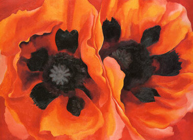
The piece features warm red colours, with contrasts in tone. This is achieved by use of harmonious colours of red and orange. The poppies are from a top down perspective, so their warm tones help them project out towards the viewer, as if they’re coming up out of the paper. The artist has used high contrast tone, with chiarascuro to create depth within the flower to amplify the use of harmonious colours. They have done this to establish a high contrast foreground and background.
THE BLUE RIDER - WASSILY KANDINSKY
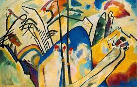
Kandinsky uses complimentary colours of yellow and blue, to establish contrasts. They are placed together to make them more bolder and brighter and reach out the audience as a focus. This is reinforced by the sharp, curved lines that wrap around the colours and present them in a way thats important and eye catching. From these complimentary colours follow the harmonious colour green, in various tones to match the tonal qualities of the blue and yellow. All the colours here are quite warm and do a good job to recede into the back, which is contrasted against the coldness of the white/cream backgrounds its laid on.
TWO BOYS AGED 23 OR 24 - DAVID HOCKNEY
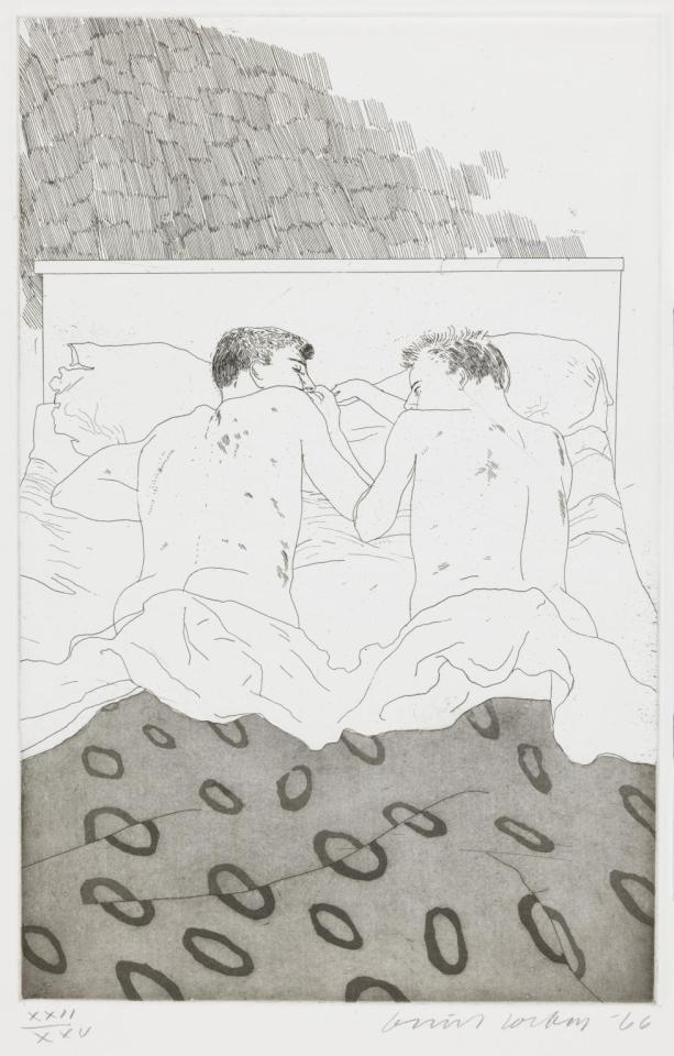
Hockney has a monochromatic palette that oozes with contrast. The obvious chiarascuro between the quilt and cuff of the quilt helps establish the cuff laying above the main quilt; as well it gives separation between the quilt and the people. The whole piece is sandwiched between two dark tones as the bread and a light toned filling. This helps draw focus to the people laying in the bed together, which is what the artist wants us to look at.
DEATH AND LIFE - GUSTAV KLIMT
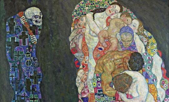
Death looms in the background with its cool colours that almost fade with the background, making the death figure shadow like within its back ground. Chiarascuro is achieved here with the light toned warm colours that contrast against the dark background and death figures. The bodies feature red and orange colours, which are harmonious and represent the warmth the bodies possess being huddled together.
0 notes
Text
REFLECTION “THE MOVING IMAGE (VIDEO ART) HAS BOTH REPLACED AND SUPERSEDED ALL OTHER EXISTING ART FORM”
In today’s technological climate our lives are saturated by mobile phones, TV’s cameras and computers. Everyday we rely on technology. One of the main big uses for technology is the consumption of entertainment through the ‘moving image’. I believe this supports the argument that video art has replaced other existing art forms. Anything we consume via big conglomerates, such as: AMAZON, DISNEY, SONY etc. all contribute to the idea of video art.Video still has the legitimacy to be classed as an art form: it still includes creative people that spend a lot of time and effort to create the video. I believe anything can be classed as art subjective to whomever consumes or creates it, no matter what form form it takes. Thus i agree with the idea that video art is replacing other art forms. If you put into perspective the amount of time you spend consuming video art from whatever you choose to consume it with; compared to other forms of physical art.
0 notes
Text
The Lego Experience without Lego - a 3D Paper Construction
A new week, a new project. Today, we were tasked with making 10 samples of anything with paper, in 10 minutes. So something produced every minute. I found this very difficult and didn’t like the task. However, it was a way of teaching us many paper construction and manipulation methods, by teaching ourselves. I made some strange outcomes: i folded, scrunched, tore etc. IT was a very good way of showing the many ways paper can be used, especially when it was going to be he only medium we will use for the project.
The task we were given was to make a paper construction, that was 3D or wearable - but it had to be 3D. I think it will be a good idea to scratch some ideas down.
PAPER IDEAS -
can be wearable
-hats/headpiece/crowns
-buildings and towers
-bones and weird things
How can i combine these ideas?
-big headpiece made out of bone shapes
I thought some sort of skull crown headpiece would be really fun and different, be a challenge too, see how i can manipulate the paper to make these shapes. I thought i would start with some bone reference pictures and some quick sketches to help me visualise the idea better.
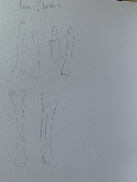
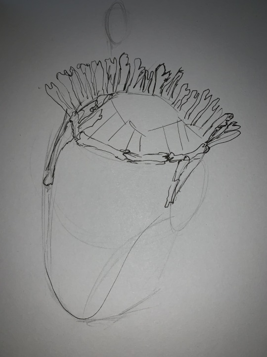
I started playing with shapes to make them like bones and thought i got quite a good shape, but they were starting to look like bow ties and more cartoon-ish. I wanted it to look grungy and messy, i was being too clean and precise. I consulted Rachel, she suggested a different technique by scrunching and shaping and using a thinner paper, as the paper I was using was very thick. This worked and I enjoyed the shapes that were coming form this technique they were more natural and like the sketches and references.
I found the most effective way to create the shapes was scrunching the paper and wrapping them in masking paper, this was followed by twisting and curling the paper to make the longer areas. I was content with this technique and found my stride with it and was pumping out the shapes a lot faster.
After making the bone shapes, I needed a way of framing them so they formed a crown shape. They were good shapes but very light and flimsy, so weren’t good foundations for building a crown. I spoke to Sam about what materials would be good to help build a base for the crown and she suggested using metal wiring and bending it into a circle shape. I decided to mould the wire into a circular crown shape, it was sturdy and bendable, which was a big help to support the paper.
To place the paper bone shapes on the crown, I thought about using masking tape to stick the bones, but it would just fall apart after a few seconds. I decided sticking the bones through the metal wire, kept them in their place and they couldn’t go anywhere. i would reinforce some of them with masking tape (this time they didn’t fall apart)
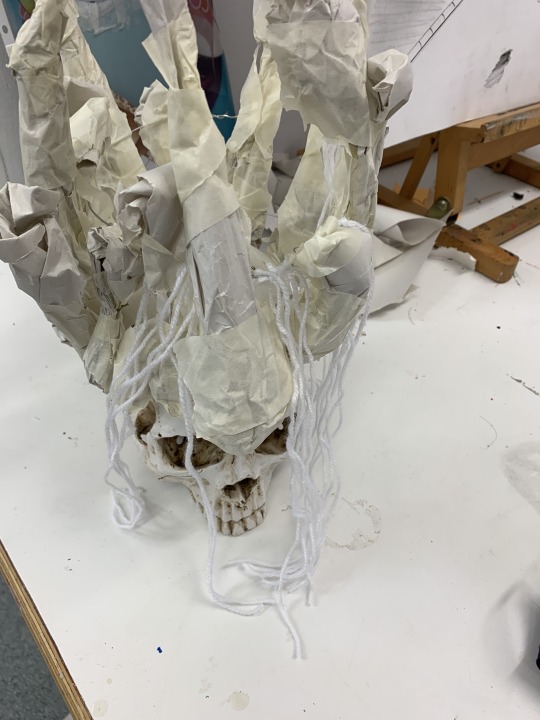
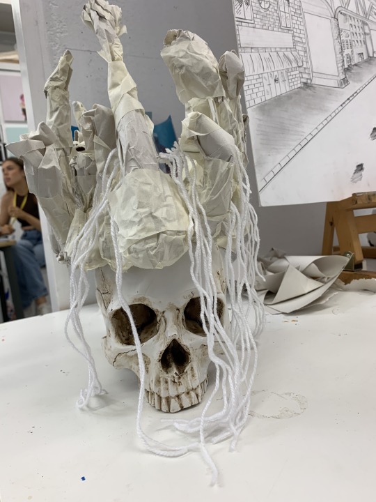
This is the final skull crown modelled on a skull (not real obvs - not a necromancer) I am in love with the way it looks super creepy and horror inspired. I decided to drape some wool thread over it to make it look like it has a veil over it. However, i don’t think this was as effective as i wanted it to be, because it was too far apart. But, it adds to the creepy aesthetic it has.
I really enjoyed this paper construction and the process involved, i had to overcome some very different obstacles and ones i thought i wouldn’t have to deal with especially with a paper medium. It’s all a learning curve and i’m enjoying the process which is the main thing.
UPDATE - THE SKULL CROWN COLLAPSED
The crown crumbled after a while as it was to weak to stand for more than a fw days.
As this happened i thought i would start from scratch and play about with scale for my next construction.
I thought I would go with the cityscape ideas. I decided to make some simple cuboid nets, just to start with some simple building shapes.
I stuck them together with glue and folds, they were sturdy and i tested them by doing keepy uppys cause i was getting stressed and feeling a bit bored, so just thought id experiment with the integrity of them. They were sturdy and strong, so that was the main thing.
I started making more of them and playing with the scale. As well, i wanted to make some more organic shapes and add more curves. I was inspired by the shape of the Gherkin building in London with its curve and point. After talking to Nathan he spoke to me about an artist called Richard Sweeney, who is an expert with paper.
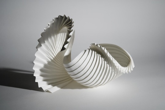
The way he manipulated the paper and shaped it to create the curves was impressive and made me consider how I need to craft my paper to create the curves.
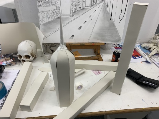
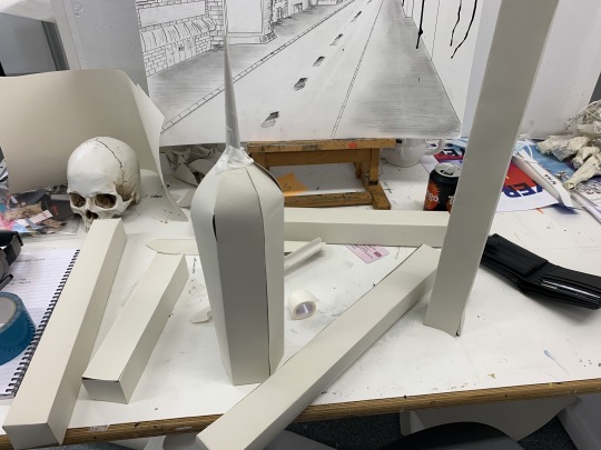
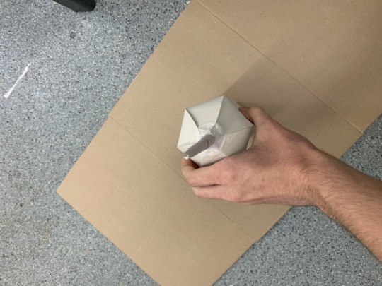
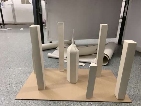
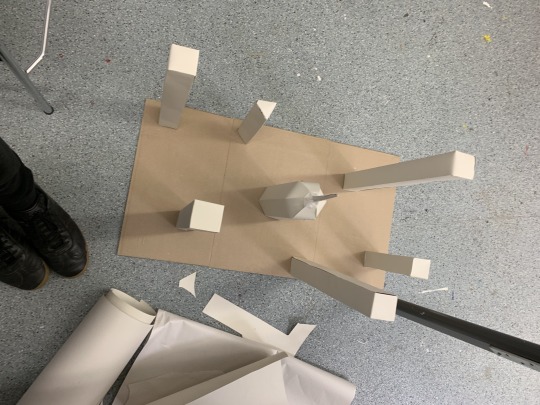
I came up with these shapes and started to composite them on a piece of cardboard. The curved shape i put in the center, as it is the most organic and wanted it to be the focus. It ended up looking like the chrysler building more than the gherkin, but I improvised and moved on.
I decided i would add segments of the skull crown and place them around and draped on the buildings, to kind of break up the uniform and straightness. Letitia explained it like a city of bones from a bird’s eye view, which i liked the idea of that and the way its developed from a bone crown to a bone city.
The base of the cityscape was on a strip of cardboard with folds on either side of the center. This allowed me to fold the structures in on each other which created some interesting dynamics within the construction. It felt reminiscent of the movie - Inception, where all the buildings start folding in on each other. Similarly, Doctor Strange as a similar thing happens in that film too. The cityscape could have had more time spent on it, with crating more organic shapes and diverse building styles. The different sized cuboids look effective but need something more to push through all the straightness.
To finish off the project, we decided to take photos of our construction with the studio with dramatic lighting and dark backdrop. Approaching this was exciting for me, as i was intrigued at how the building would create shadows and how this would affect the construction and give it new depth. I was wondering if the light would make some areas stand out or fade more. As well, manipulating the base and folding it and how this would affect the shadows.
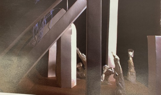
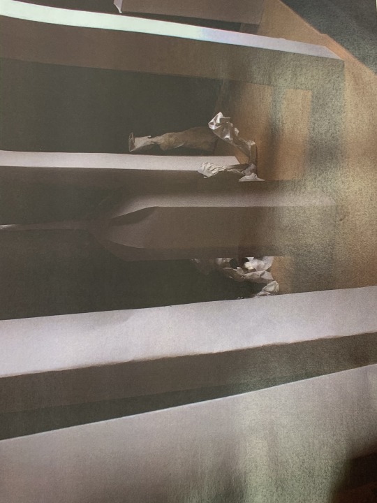
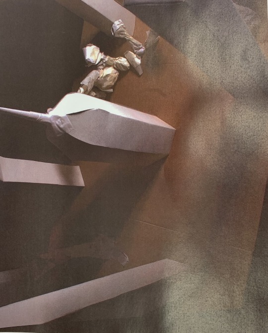
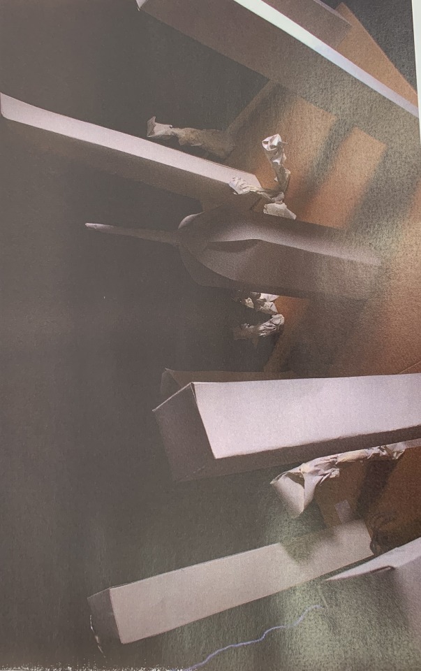
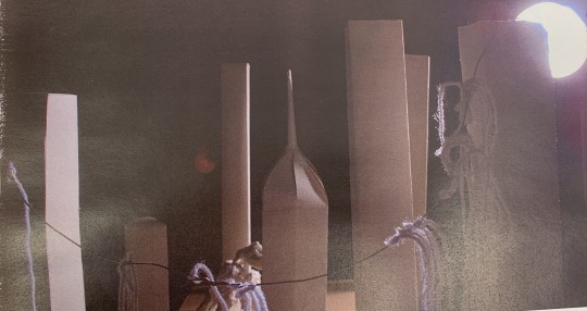
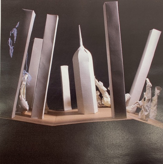
This is the result of the photoshoot, i took a lot of photos but these were my favourite outcomes as i like the way the light is shown and reacted within the images. My favourite image is the last one, I love how each plane of the structures all have different values of light all with shadows that cover the base of the construction. The center structure has a nice gradient of light in the from left to right, which I really enjoy and helps emphasise the dimensions of the structure. The examples here are the printed versions that i have taken photos of again to put on the blog to show as an example, so the quality of them doesn’t look as good here.
Overall, I thought this whole project was very new and challenging in new ways. It made me sit back and think about how i work and the way i approach a media that i find difficult. I also found how going with the flow and just letting things happen is a good way to get a grip of ideas and concepts that come easy to me that i can then concentrate them and dilute them into new ideas. This is what happened here with the folding techniques at the start, that evolved into bones and then into the crown and so on. It’s interesting to see how my brains jumped from a smaller concept to something a lot bigger.
0 notes
Text
T-Shirt Designs
This week in our graphics section, we were tasked with making some t-shirt designs that we would use to promote anything of our choice.
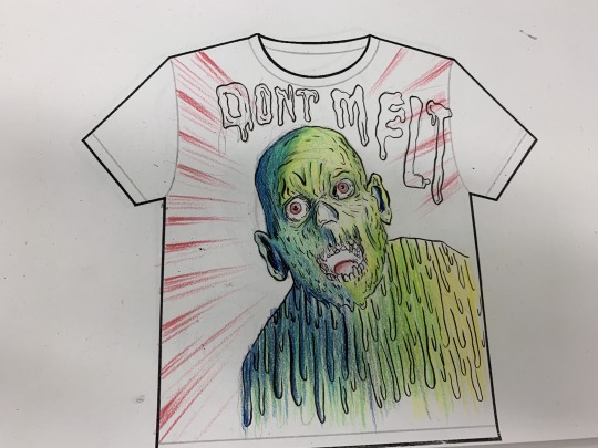
For this design, i wanted to make a satirical comment on global warming, by using a zombified looking character melting in the heat. With the graphic typography above it saying ‘DONT MELT’ as a joke, with serious connotations. I love the colour palette and the contrasting colour of red, green blue and yellow. I think all works very well.
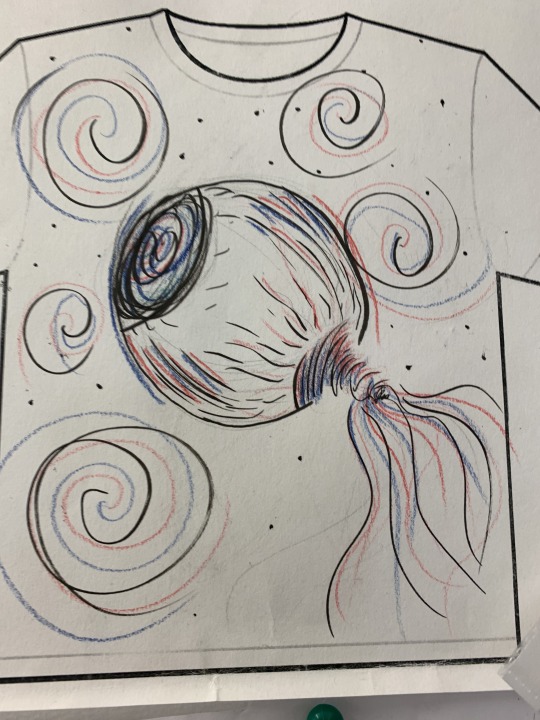
This design was inspired by a documentary on Netflix called ‘the Social Dilemma’ and its about the dangers of social media and how we’re constantly being watched and recorded and our data is being stalled every second we use it. I thought i would take a 1984 approach with a big eye and tendrils out the back that look like wires. The red and blue could be political, as the documentary touch upon political parties using the media to control and influence public opinion.
0 notes