
Statistics
We looked inside some of the posts by theotherkingassblast and here's what we found interesting.
Average Info
Notes Per Post
2M
Likes Per Post
808K
Reblog Per Post
728K
Reply Per Post
793
Time Between Posts
11 days
Number of Posts By Type
Text
16
Photo
1
Last Seen Tumblr Blogs


Fun Fact
Tumblr has a low social media market share in South America.
Text
Need You More Than Ever 💔
Paliliberation posted: Family 167 - Imagine being a mom, a wife, and a dedicated career woman on the brink of life-saving research, only to have everything ripped away. This isn’t just a personal loss; it’s an assault on progress and humanity itself. When the pursuit of knowledge and the chance to help others is brutally stopped, we should all be enraged. A world that allows this to happen is failing us all. It’s time to stand up and refuse to let dreams and lives be crushed.
please support my campaign #167 listed in paliliberation linktree
Also our campaign is vetted
Thanks @90-ghost.. link here
Thanks @dlxxv-vetted-donations.. link here
Thanks @northgazaupdates2.. link here
Thanks @aces-and-angels.. link here
644 notes
·
View notes
Text
*you can change the desicions you make, gowever you do not retain the knowledge of it that you have
reblog for larger sample size!!
30K notes
·
View notes
Text
Kit, Eddie and Elena
I won't go into details, but there is some toxic yaoi action going on between Eddie and his puter


15 notes
·
View notes
Text

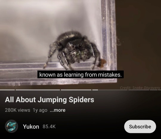
Reblog if you are less advanced than a jumping spider
8K notes
·
View notes


Text
reblog and put in tags your reasoning!!
because i wanted to do one of these things and i chose this :)
19K notes
·
View notes
Text

Dropping this here for anyone who may not already know about it. paywallreader.com
65K notes
·
View notes
Text
Pulp Covers And How To Paint Them
With the rise of cheap printing in the early twentieth century, mass-marked paperbacks swept the world, each offering lurid thrills for obscenely low prices. Sex, sadism, and incredible violence for as little as ten cents. An easy purchase to slot in between fifty cigarettes a day and enough bourbon slugs to kill a small garden.
Pulp fiction is where some of the greats of American literature cut their teeth, including the big three, Raymond Chandler, Ross MacDonald and Dashiell Hammett. The contents of these stories, both the dizzyingly good and astoundingly terrible, have been absorbed and digested and remixed and regurgitated in nearly every permutation imaginable, fuelling pop culture some one hundred years on. This isn't an essay on that. Nobody likes to open a tutorial and be greeted with a wall of text. The history is for another time.
But it is about how to paint it.
Don't let the pre-amble intimidate you, it's not as hard as it sounds. You will need:
Painting software with some image editing capabilities. You don't need all the bells and whistles of Photoshop, but I wouldn't recommend something like MSPaint, at least not to start with. I'm using Clip Studio Paint.
A really beat-up paper texture. The grungier, the better.
A lightly-textured brush. Here are the specific brushes I use, 99% of which is the well-named rough brush. Try and avoid anything with any impasto elements.
Go to your colour-picking tool and use the 'select from layer' option. Doing all the painting on a single layer is going to make your life easier.
A complete willingness to make mistakes and, instead of erasing, painting over them. It generates much more colour variation and interest! Keep your finger off the E key.
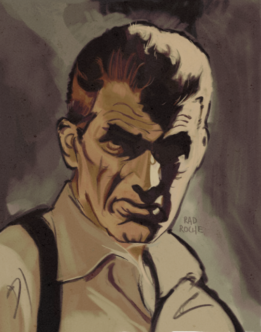
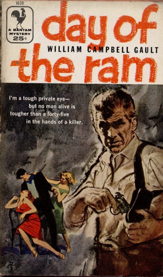
Good reference! That painting is a master copy of Mitchel Hooks' art for Day of the Ram. Find a style you really love and want to learn? Have no clue where to begin? Do direct studies!
Let's not worry about whatever is happening in the background. It's probably fine. Let's get started! Pulp magazine art is a lot more varied than you might first think, so don't agonize over having a style that 'fits' or not. I'm also specifically aiming for something you'd see on the cover after printing, not the initial painting they would use for printing. The stuff I'll show here is a pretty narrow band of it, but here are some general commonalities. This is a painting by Tom Lovell.
Let's dig into this.

The colours are very bright and saturated, but the actual values, the relative lightness and darkness of them, are actually grouped very simply! You can check this by filling a layer full of black, putting it on top and setting its mode to colour. If the value of a painting looks good, you actually get a lot of leeway with colour. But here's what I think is the most important thing to keep in mind.
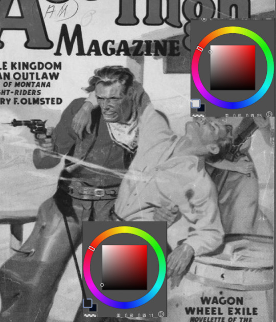
The darks aren't that dark, and the lights aren't all that light! Covers are paintings reproduced on cheap paper. Anything you wouldn't want to happen in the printing process, you lean into. Value wash-outs, lower contrast, colours getting a weird wash to them, really gritty texturing. So let's get painting! Here's my typical setup.
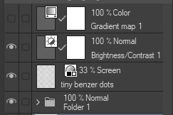
That bottom folder is the painting itself. The screen layer is the grungy paper texture. To get the effect you want, put it down, invert its colour, then set it to screen. That washes out your painting far, far too much, so to compensate, I put a contrast layer up on top. Fiddle around with the settings, but this is where mine ended up sitting.
Note I'm saying this before even starting the painting: you want to do this as early as possible. This is where the 'select from layer' colour picker comes in handy. You can paint without worrying about the screen or contrast layer. Something not looking right? Enable your value check layer and keep painting. When you turn it off, it'll still be in colour. Here's a timelapse so you can see what that looks like.
And when you check the values...
They're pretty simple! This isn't a be all and end all, but I hope it serves as a decent primer. I want thirty dames on my desk by Monday!
364 notes
·
View notes
Text
I need to be the most fuckable person on this public transport
79K notes
·
View notes
Text
My MGS OC (self-insert... Sorry)
His codename is Nitro Tapeworm and he's FOXHOUND's demolitions expert. He's not a Kremlin agent


32 notes
·
View notes


Text
site that you can type in the definition of a word and get the word
site for when you can only remember part of a word/its definition
site that gives you words that rhyme with a word
site that gives you synonyms and antonyms
1M notes
·
View notes
Text
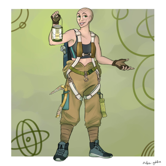
babe wake up new oc just dropped
info below the cut!
Her name is Libby (short for Liberty) and she's an ex-Child of Atom. She's still a fervent believer, but she left her sect over disagreements about the sanctity of fusion. She has the Blessing of Atom, making her immune to radiation, instead feeling it as a comforting glow. She lives in the ruins of New York City. While most people can only survive in the less-irradiated subway tunnels (I imagine NYC being like Metro) she's free to explore aboveground. She makes her living by climbing destroyed skyscrapers and scavenging for valuable tech that nobody else could reach. Libby also occasionally acts as a guide, leading groups of travellers through the city - as long as they provide their own protection, and are willing to listen to her proselytizing. Libby is a peaceful, friendly, and crafty survivalist. She enjoys her solitude, but makes time to be sociable between trips aboveground.
Additional notes:
she's a highly skilled climber and parkour-er(?), and is very athletic
her climbing rig is a repurposed parachute harness
she wears through shoes like nobody's business
she has alopecia, unrelated to the Blessing of Atom. (her brows are part of her tattoo)
originally from Broadway Junction, but does most of her trading in Grand Central Station
really wants to bang a non-feral glowing one
64 notes
·
View notes
Text
20K notes
·
View notes
Text
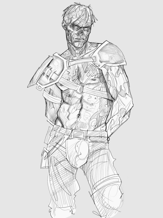
when he’s a 7 foot tall hunk of rotting flesh <3
2K notes
·
View notes