
Timothy Davis | MFA Media Design Candidate | Full Sail University
Don't wanna be here? Send us removal request.
Statistics
We looked inside some of the posts by themoderndesignstudent and here's what we found interesting.
Average Info
Notes Per Post
1
Likes Per Post
1
Reblog Per Post
0
Reply Per Post
0
Time Between Posts
20 days
Number of Posts By Type
Text
12
Photo
5
Last Seen Tumblr Blogs


Fun Fact
Forty percent of Tumblr users are between the ages of 18 to 25.
Text
MDM691 Professional Practices
1. Mastery: Personal Development and Leadership
The first course greatly influenced both personal and professional development through self-discovery and self-assessments while studying leadership and behavioral traits. Personal growth was highly encouraged and fostered throughout assignments and ongoing discussions relating to personalized learning styles and characteristics. The research paper and associated discussions provided an opportunity to analyze and identify personal design approaches through reflection and discussion pertaining to industry specific leaders. Personal triumphs were made through the successful completion, of the Turning Point video assignment, given my disinterest for being the topic of conversation and being seen on camera. In addition, this course laid the necessary groundwork to effectively compose and communicate design projects showcased within the thesis project.
2. Defining Client Needs
The second course segued into the creative process through critiques and initial progress work. Personal and professional development simultaneously grew through concepts pertaining to mind mapping strategies and city project research while the creative design process integrated iterative sketching and logo development. Furthermore, research and discussion relating to client/designer relationships and creative agency insight contributed to my professional development. The biggest triumph is derived from the successful completion of iterative sketching due to my lack of experience with hand-drawings. The foundational techniques of research and sketching served as pivotal milestones to communicate the project development lifecycle throughout the thesis project.
3. Brand Development
The third course highly influenced my personal design growth given the full integration of design workshops and design related research. Professional growth revolved around research pertaining to brand development and conducting effective peer critiques through written and live discussion. The creation of vector work was highly emphasized and explored which led to the successful implementation of design projects within the thesis project. Personal triumph is reflected through the vision board iteration assignment (geography, modern culture, and tradition) as they represent my first formal creation of a vision board.
4. Effective Copywriting
The fourth course inspired personal and professional growth through the ad campaign creation process. Research into a selected non-profit contributed to personal growth as motivation to see how my personal design skills could be positively utilized through creative contribution. Professional growth was influenced through testimonial ad lifecycle, tagline creation workshops, and research into copywriting practices. The creation of target audience personas served as my biggest triumph given my lack of creative writing. Furthermore, the volume of writing assignments and discussion material, within this course, greatly contributed to the successful creation and communication of the thesis project rationales.
5. Design Research
The fifth course served as a pivotal moment for personal and professional development as course material pushed my creative thinking and application of design research. With major emphasis on research, rationale development was greatly focused upon to effectively communicate and defend personalized creative direction. The biggest triumph involved the successful understanding and creation of a customized narrative statement, for the City of Kyoto. This single paragraph statement is directly reflected, within the thesis project, while underlying process development and research strategies contributed to the creation and connection of key defense topics and supporting rationales to the degree learning outcomes.
6. Organizational Structures
The sixth course emphasized personal development through creative writing and individualized creative direction while professional development is reflective upon storyboarding and motion project creations. The process of story journaling, through daily observation and documentation, served as a personal exercise to focus on surrounding environments and flex my creative mind through fictious story development. My biggest triumph would be the creation of the Kyoto dynamic vision board, as countless hours and tremendous work ethic were put into the successful completion of this daunting assignment. Dynamic vision boards and the Kyoto cinemagraph were integrated into the thesis project to showcase motion studies and project assignments while supporting the overall arguments.
7. Design Strategies and Motivation
The seventh course introduced the second city project with primary assignments focusing on exploration and research surrounding my local city. Personal development was pursued through individualized surveys, photo documentation, and identification of area development. Design brief and problem statement creation focused on professional development through brand identity, problem solving, and data presentation. Personal triumph derived from the successful completion of the primary design brief given the vast amount of research and data entry. Data collected throughout this course support thesis project rationales by showcasing background methodologies used to enhance storyline progression.
8. Design Integration
The eighth course continued with the city project through design brief revisions, solution statement identification, and vision board creation. Static and dynamic vision boards elevated personal development by focusing on positive messaging and branding of the local city. Professional development is emphasized through voice and tone case studies, peer reviews, and asset selection via media matrix tools. The biggest triumph was creating the artistic design brief, for consumer viewing, within the consolidated one-week timeline. Asset selection and design brief material is presented throughout the thesis project to support conveyed topics and rationale arguments.
9. Multi-Platform Delivery
The ninth course served as a creative workshop for logo development and asset production. Logo design critique attributed to personal development, for continual design strategy, while production of assets, within a two-week period, reflect an elevated level of professional development. My biggest triumph was the detailed creation of the brand guideline document within the condensed timeline. Logo design process was thoroughly documented, within the thesis project, to showcase multiple solutions and integration into finalized production assets.
10, Measuring Design Effectiveness
The tenth course emphasized target audience feedback and data collection through customized surveys. Personal development is enhanced through receipt and processing of public feedback to analyze various perceptions, of personal creativity, to develop stronger barriers against negative criticism. Professional development is elevated through data reporting practices and proposal of city campaign research via research papers. My biggest triumph was personal reflection and awareness of specific design choices called out, among the target audience, which allowed for additional time to conduct individualized audits on associated assets. Data reporting and analysis is presented within the thesis project to explain McDonough’s target audience demographics and is expressed through the artistic design brief.
11. Thesis Presentation
The eleventh course focused on personalized reflection of course experiences and practices. Personal development is leveraged through application of organizational methodologies to understand and compose key storytelling moments. Professional development is highly expressed through presentation of conducted research and crafted assignments which elevate the support of rationalized defense arguments. Personal triumph is highlighted by the successful completion of original milestones, for website creation, and submission of an enhanced and detailed thesis project. A plethora of research and creative assignments were allocated and used to express personalized approaches and thought processes relating to research and project development.
12. Professional Practices
The twelfth course encompasses research and discussion surrounding advertising ethics and copyright practices. Personal development is gained through reflection of designer responsibilities concerning ethics, on an individualized level. Professional development is fostered through formal discussions and research of ethical and copyright practices used to regulate professional industries and work processes. Personal triumph is reflected through the completion of my final research paper showcasing an elevated awareness and understanding of ethical regulations and practices.
---
The experience map below was created during my final class and depicts personal thoughts, emotions, and actions expressed throughout my program journey.

0 notes
Text
MDM690 Presentation of Design Solution
This past month focused primarily on the development of our thesis site followed by the creation of a Behance portfolio account. The journey to prove mastery can be summarized by three key takeaways: personal development, time management, and content management.
Personal Development
This course has been unlike any other. The bulk of time was spent in personal isolation reflecting on past experiences, projects, and knowledge to construct an impactful story within four unique site pages. While individual isolation was heavily expressed, we were presented with opportunities to interact with peers, through review and feedback, along our developmental processes. The integration of peer reviews was crucial, with site development, as instructor feedback was kept to a minimum. Because of this, review of peer’s progression required thorough analysis, in-depth research to substantiate claims, and personal drive to push beyond the norm. We relied on each other’s feedback to help uncover missed connections, isolate mechanical and technical issues, and further develop personal strategies to deliver compelling and constructive feedback. In addition, personal development was fully explored within the site page Acquiring Competencies which reflects one of the program’s degree learning outcomes (DLO). Content shown mirrors our personal development, throughout the degree program, and emphasizes key concepts, methodologies, tools, and techniques which influenced our personal journey.

Image 1 - Peer review on layout iterations
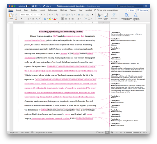
Image 2 - Peer review segment on thesis abstract
Time Management
The amount of detail and thought put into the creation of the thesis site required time. When first introduced to the assignment, I drafted a calendar of deadlines and began constructing a personalized timeline and strategy to balance the full workload associated with this project while working a full-time job. To combat any potential backlog of work, I began collecting and organizing content before week 2 and pieced together my site, in segmented time frames. These time frames included allocated time, on each weeknight, and entire weekends devoted to make ample strides for preset deadlines and personal progression checks. Because of time spent working in advance, the time prior to upcoming deadlines was spent reviewing work and refining minor details before submission. With time built into my schedule, I had the opportunity to provide thorough peer reviews. Furthermore, feedback received could be digested and corrected, in a timely manner, without fear of workload backlog.
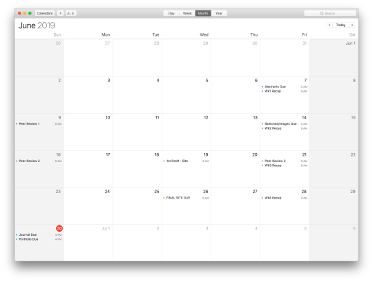
Image 3 - Calendar of course deadlines
Content Management
The biggest takeaway, from this experience, is content management. We were given the option to choose multiple projects and associated components to showcase knowledge and understanding of mastery. Content was categorized and configured, to our choosing, to meet the expectations set within four degree learning outcomes: Connecting, Synthesizing, Transforming, Solving Problems, Innovative Thinking, and Acquiring competencies. With a plethora of configurations, it was pivotal to leverage a personal, file management system to collect and organize content. This system served as a visual guide to connect various project files and relevant screenshots used to support and enhance the written content. The file management system alleviated any issues when site page layouts were iterated. All associated content was easily accessible, when constructing wireframes, as content proportions relative to written content and overall page size were examined. This system proved beneficial when transposing information, into the final format, as content was uploaded in batches for an individual site page.
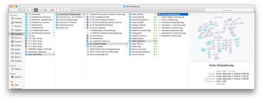
Image 4 - File management system

Image 5 - Overview of layout iterations


Images 6-9 - Initial layout iterations and content selection
Overall, each takeaway served as a key factor to successfully meet course deadlines and produce outstanding work. These three topics will be beneficial through degree completion and continually leveraged in personal and professional applications and environments.
1 note
·
View note
Text
MDM640 Measuring Design Effectiveness
Measuring Design Effectiveness served as the conclusion for the community, branding project. The course focused solely on gathering quantitative and qualitative data, through a distributed questionnaire, eliciting feedback towards appeal, likability, and emotional connection. As Best (2006) states, “value can be measured… by looking at the impact on the value of the brand (customer perception)” (Best, 2006, p. 170). Open and closed question types were blended together to accurately measure and interpret factual and organic feedback, from a pool of targeted respondents. The collected data ultimately served as confirmation to the success, of the McDonough brand identity, with minor adjustments to specific design attributes.
A primary lesson derived from the questionnaire process reveals how every person constructs a specific and unique viewpoint, when presented with designs, while the researcher garners a broad range of genuinely positive, brutally honest, and null responses. Even if the designer/researcher may not enjoy reading through feedback, the obtained data is in a raw, organic state showcasing realistic perceptions, from the target audience. A secondary lesson reveals the benefits of constructing questionnaires to elicit meaningful responses, through targeted question types. To avoid bias integration, questions designed to obtain feedback relative to emotions and personal perceptions can be constructed with positive, negative, and neutral selections with an option for “none listed.” In doing so, the questionnaire maintains neutral bias and will garner viable responses.
This journey as a whole can be transposed, across any genre, given the foundational roots in research and data collection. The practiced methodologies will be beneficial in my role as a visual designer and can be immediately integrated into my personal design processes.
---
Reference
Best, K. (2006). Design management: Managing design strategy, process and implementation. Switzerland: AVA Publishing. Retrieved from https://ce.safaribooksonline.com/book/-/9782940439782.
0 notes
Text
MDM650 Multi Platform Delivery
Overview and Acquiring Competencies
Multi-platform Delivery was a continuation of the previous two courses and associated work. With this class, our three primary objectives included: designing an official logo, producing high quality campaign assets, and designing an extensive brand style guide (guidelines). Several concepts touched upon were both new and repeating but built upon each other to produce our finalized campaign assets and supporting documentation. Logo development refreshed our understanding of the relationship formed between an icon and chosen typography and how the two are combined to appropriately convey the intended brand messaging. Through rapid prototyping and iterative testing, a finalized logo will be chosen as a proper reflection of the brand.
Asset production provided new opportunity to understand the formation of campaign assets while researching potential solutions to communicate our brand campaign. With asset production, it is imperative to focus on the appropriate brand filters to determine how the identity will be reflected, through the designs, while factoring in the brand’s personality. As mentioned in week two lecture, “Finding the brand personality will prevent the limitation of visual identity and media choice to just graphic ‘good looks.’” As we create our production plan and begin developing assets, it is imperative to always refer back to the proposed values and characteristics for guidance. Lastly, designing a brand guideline was a new experience and highly enjoyable. From this experience, I understand how a proper balance of front-end and back-end information is needed to successfully communicate to both clients and designers. When developing the brand guide, the primary focus should be the integration of the desired voice, tone, and brand personality to construct the proper emotional appeal. Every reader will possess a strong-er understanding and clear vision, of the established brand, through strategic placement and balance of background information, key metric data, and technical design specifications. In addition, the use of supporting references and in-text citations can be removed given the high degree of research and rationalization implemented, during the development phase of the pro-posed brand identity.
Click the below link to access my brand guideline document for McDonough, Georgia.
ISSUU Link - McDonough Brand Guidelines
Connecting, Synthesizing, and Transforming
Research conducted, throughout this course, was an integral part of the successful design and development of each campaign asset. These assets include billboards, pole banners, vinyl decals, and exterior wayfinding signage.
Billboards

Billboard designs will garner the attention of any audience through the use of impactful imagery conveying the involved, desirable, welcoming, and charming nature of the McDonough community. Every billboard will visually communicate the small-town atmosphere and Southern hospitality portrayed through inviting color schemes and curated imagery featuring a blend of vivid colors and authentic, candid reactions, from all age-segments. Billboards are effectively used to convey targeted messaging for surrounding communities and businesses based on location. “One of the biggest advantages of billboard marketing is its visibility. When placed in high-traffic areas such as busy highways or streets, you are guaranteed to get a high level of exposure to broad demographic of people” (Ad Impact, 2014, Advantages section, para. 1). Billboards are currently leveraged by the City of McDonough on major expressways and will received updated designs. Furthermore, smaller billboards will be placed at entry points, of city limits, and strategically positioned in backroad commuting areas.
Pole Banners

Pole banners are a cost-efficient solution to promote the city, through seasonal and on-demand rotation. “Pole banners have the ability to decorate and educate while speaking directly to the community. With high visibility locations, pole banners demonstrate pride by promoting the causes and upcoming events that are important to a community’s image” (Howe, 2017). McDonough currently leverages pole banners and will receive updates featuring new branding and design. Designs will feature imagery with similar styling treatments, of other proposed assets, to maintain proper brand cohesion and unify all relevant assets. The geranium icon is integrated into design, with distinguishable coloring indicating the specified community classification. The icon is differentiated, from other printed collateral, given the implied bleed at the bottom left corner, of the composition. The overall designs will focus on imagery content with emphasized height and associated appeal to capture viewer’s attention while walking or driving through the area.
Vinyl Decal

The vinyl decal is a direct adaptation of the official logo evoking the charming and welcoming characteristics, of the community. Each color choice alludes to a generalized community sector and showcases the owner’s support when proudly displayed on their personal assets. These decals offer clear representation of the communal value to “be proud” while sharing personal enthusiasm and passion for the city. The asset is visually identifiable as part of the overarching brand strategy and used as a focal point to generate and strengthen brand recognition and retention. Custom vinyl stickers provide a tactile medium to engage with community members, visitors, and patrons. “Whether handed out or mailed, quality stickers have a higher perceived value than other promotional mediums” (Nicholson, n.d., para. 6). Elevated designs and high-quality material increase positive brand association as individuals see the attention to detail and quality of work put into this asset. Furthermore, “Stickers can strengthen communities and awareness of a particular message” (Nicholson, n.d., para. 9). This small yet impactful sticker will serve as an extension to the McDonough brand identity and will be applied to high-exposure items such as vehicles, laptops, phone cases, and notebook covers.
Vehicle Wraps


The City of McDonough utilizes minimal branding on all non-emergency vehicles, within the city’s fleet. The current small, circular logo is adhered to each cabin door panel and is the only identifiable feature for these vehicles. The application of vinyl car wrapping will provide an additional medium, for brand identity transference, while making all associated vehicles recognizable throughout the community. “Vehicle wraps attract attention without disturbance. Potential customers can easily spot your message without significant distraction from what they’re doing” (Design Office UK ltd, 2016, para. 4). This unique design application will display the city’s new brand identity and will increase brand recognition. The proposed designs exude McDonough’s charming appeal as displayed through the proposed color palette and expressive use of the geranium icon. The vehicle wraps feature two oversized geranium icons alluding to McDonough’s charming and desirable characteristics and playful nature while sparking interest to further explore and identify. The placement of each wrap is custom tailored to the aesthetic features of each vehicle model.
Exterior Wayfinding Signage

The exterior wayfinding design offers a modern twist to the proposed brand identity. The color scheme is chosen to alleviate legibility issues for community members with visual impairments by offering contrasting font colors and larger font sizes. The wayfinding sign promotes a desirable and involved community through clean, organic shapes while individualized locations are called out, for a specific point-of-interest. The geranium icon is strategically placed within the darker material to emphasize the flower shape and maintain a strong connection, to the overall brand identity. The darker area, of the sign, will feature LED lights to provide illumination to the location name and geranium icon, for those travelling at night. The implementation of a wayfinding system will alleviate resident and visitor challenges when exploring McDonough. As an added benefit, “Visitors will thus have numerous “contact points” with the company’s brand, strengthening their experience with it and reinforcing their overall impression of their visit” (ASI Signage, 2017, p. 6). This creative asset proposition will enhance the physical user experience and add cohesive branding to existing and future community locations and benefits.
Problem Solving
As previously mentioned in other posts, the problem statement for McDonough explains how “the citizens of McDonough need a way to identify the benefits of their community, because a lack of unity and excitement is felt by those living in the area.” This eventually led to the derived solution statement to “Identify the City of McDonough as a family/friendly community focused on promoting higher engagement and morale, among members, through the use of identifiable benefits while leveraging community core values.”
With this being said, McDonough’s new brand campaign will leverage categorical indicators derived from the proposed color palettes. Each indicator will be translated throughout various marketing collateral and communication. The four indicators will reflect the following: • Red – Official City Branding • Green – Parks and Recreation • Blue – Auxiliary Services (Fire, Police, Water, Schools, etc.) • Purple – Shopping, Dining, and Entertainment
Innovative Thinking
The pre-existing brand identity contributes very little to the added value of perception and appeal and lacks consistency and harmony. The proposed brand identity evokes a charming, welcoming community filled with vibrancy, involvement, and passion for the community. With every brand identity, there must be a deeper connection to overall design aesthetic and individual components. The tagline, “Community at Heart” alludes to both the mission statement and tone sample embodying a community-centric environment, with emphasis placed on citizens themselves. Community support and engagement serve as quintessential factors in producing the necessary family/friendly environments needed to attract visitors and future residences alike. But what makes McDonough stand out? Having a charming town to explore and call home, welcoming members inviting you to join our McDonough family, involved citizens wanting to promote change and continual growth, and a desirable environment for business establishment and visitor attraction are all prime examples for what makes McDonough unique.
Reflection
Throughout this course, there were several key experiences gained, experiences tested, and an overall satisfaction for the final asset and brand guideline production. The logo development process tested my ability as a designer to defend my work, in our live lecture environment, while gaining a better understanding how other’s may perceive designs. Asset production provided a challenging yet exciting avenue to research and explore new mediums, prototype layouts, experiment with photoshop mockups and 3D modeling, and understand the impact selected assets would have in the real-world environment. The brand guideline process fostered a deeper level of creativity as photoshop mockups are used in tandem with technical and rationalized information to communicate new branding standards. Iterative testing of page layouts was leveraged again to achieve compositional balance while successfully communicating key information.
The methodologies and design thinking used to construct and implement effective designs will be applicable to all future coursework and transposed immediately into my current role. By working in a creative department and creating page layouts on a daily basis, the work utilized in the brand guideline process provides a greater understanding of the work my team produces and implements on a global scale.
References
Ad Impact. (2014, June 9). The Benefits of Billboards. Retrieved from https://www.adimpact.com.au/blog/the-benefits-of-billboards
ASI Signage. (2017, January). Pathways to Success - The Benefits of Wayfinding Signage. Retrieved from https://asisignage.com/wp-content/uploads/2017/01/White-paper_wayfinding1.pdf
Design Office UK Ltd. (2016, May 20). 7 Benefits of Using Vehicle Graphics to Advertise Your Business. Retrieved from http://www.sccci.co.uk/portal/blog/1026/7-benefits-of-using-vehicle-graphics-to-advertise-your-business/
Howe, M. (2014, May 30). OAI Pole Banner Program. Retrieved from https://www.oaicorp.com/polebanners/
Nicholson, J. (n.d.). 9 Reasons Businesses Can Not Ignore Sticker Marketing. Retrieved from https://ducttapemarketing.com/sticker-marketing/
0 notes


Text
MDM620 Design Integration - Journal Post
Overview and Acquiring Competencies
This month focused on a range of creative and operational methodologies used to further develop the proposed brand identity, for McDonough, Georgia. There were several new concepts broadening my understanding, of project scope and process. The construction of solution statements derived from the proposed problem statement pushed our design thinking, from the perspective of a communal brand identity. This exercise required creation of three iterations of constructed solutions and associated rationales to support the integration of unique brand identity approaches. Media asset selection provided new opportunity to research a plethora of viable mediums to integrate into new brand identity system. From this, a media mix chart was leveraged to categorize media assets, into four primary categories (print, online, environment [OOH], and on-air), understand the advantages and disadvantages to each, and serve as a reference tool when making finalized asset selections.
Another major milestone entailed successful design and development of a client-facing design brief. Information collect from the two previous courses and current course are consolidated into a detailed and immersive proposal document with the ultimate goal being to communicate the new brand identity and seek approval for developmental progression. Other core components entailed voice and tone development, (tagline, mission statement, sample tone, and brand voice chart) and the creation of static and dynamic vision boards convey this chosen brand voice, tone, and underlying personality.
Connecting, Synthesizing, and Transforming
When determining three ideations for solution statements, research within associated rationales was used to support each unique perspective. Solution one focused on the identification of McDonough as a family/friendly community focused on promoting higher engagement and morale, among community members. As Cushing (2016) explains “when a community is a good place for young people to live and grow up, it can provide a positive environment for all people and enable healthy and satisfying lifestyle options” (Cushing, 2016). By identifying and attracting family units, there is greater opportunity for growth and livelihood, within the community, as relationships are developed and fostered between children and parents. Solution two focused on the identification of McDonough as an upbeat/cultural/artistic community focusing on citizen’s diverse backgrounds and the city’s rich historic background and architectural elements. Cherbo, Stewart, and Wyszomirski (2008) explain how “art and cultural participation contribute to community conditions in education, economic development, civic engagement, and to stewardship of place” (Cherbo, Stewart, & Wyszomirski, 2008). By emphasizing cultural events, community members have an opportunity to socialize with fellow citizens and understand the dynamic makeup of individuals and their families all while learning about new cultures. This artistic approach will also provide ample opportunity to revitalize all community areas and elevate the historic, architectural charm of McDonough.
Solution three focused on the identification of McDonough as an active community focusing on outdoor lifestyle, via recreational and leisure activities. Wahowiak (2016) mentions “getting outside and being active can work to greatly improve people’s health” (Wahowiak, 2016). This new city identity will demonstrate McDonough’s ongoing effort to take care of its citizens and instill positive thinking, throughout the community. In addition, this identity will promote a more unified, community spirit as an active, healthy lifestyle is commonly pursued with supporting family members, friends, or similar acquaintances. From this, the family/friendly approach was selected as McDonough portrayed stronger association towards familial and relationship development.
Problem Solving
Research conducted through interviews led the creation of a centralized design problem which states, “The citizens of McDonough need a way to identify the benefits of their community, because a lack of unity and excitement is felt by those living in the area.” The implementation of a wayfinding system will alleviate resident and visitor challenges when exploring McDonough. As an added benefit, “Visitors will thus have numerous “contact points” with the company’s brand, strengthening their experience with it and reinforcing their overall impression of their visit” (ASI Signage, 2017, p. 6). This creative asset proposition will enhance the physical user experience and add cohesive branding to existing and future community locations and benefits. Furthermore, an updated brand identity will cater to a community-centered initiative to increase brand awareness, generate positive morale, and instill new the city’s new characteristics of welcoming, desirable, charming, and involved.
Innovative Thinking
Companies are continually drawn towards the adoption and integration of digital and online assets to convey their brand identity. This new wave can result in the abandonment of traditional applications and decrease the physical engagement of brand identity through subsequent marketing collateral. To combat this issue and maintain the historic integrity of McDonough, select physical mediums were chosen to amplify this new identity through common and practical applications. Custom vinyl stickers provide a tactile medium to engage with community members, visitors, and patrons. This small yet impactful sticker will serve as an extension to the McDonough brand identity and will be applied to high-exposure items such as vehicles, laptops, phone cases, and notebook covers. Billboards are effectively used to convey targeted messaging for surrou nding communities and businesses based on location while brochures will serve as grab-and-go directories based on categorical needs (dining, shopping, parks and recreation, etc.). The application of vinyl car wrapping will provide an additional medium, for brand identity transference, while making all associated vehicles recognizable throughout the community. “Vehicle wraps attract attention without disturbance. Potential customers can easily spot your message without significant distraction from what they’re doing” (Design Office UK ltd, 2016, para. 4). This unique design application will display the city’s new brand identity and will increase brand recognition.
Reflection
Through this process, there were three primary takeaways which directly impacted my work methodologies. I relied heavily on strategic planning and organization of material as elements of the design brief were finalized. By simply organizing material into similar categories, thought processes became less strenuous while handling larger amounts of information. Rapid prototyping was heavily relied upon while designing layouts resulting in viable options for other page layouts and the ability to perform personal critiques. Defining the proposed brand voice, tone, and associated personality will attribute to a constructed theme before asset creation and integration is applied to the design brief.
Coming into this process I had a good understanding of the various steps that entailed the successful creation of a client facing design brief. I knew that all relevant information which has been worked on over the last three months would be accumulated and transposed into this single document. What I learned from this experience is the amount of time, patience, and commitment one must put into creating an impactful design brief. I also was exposed to the process of researching, curating, and selecting specific media assets that would pair together and form a cohesive ecosystem for brand identity integration.
The knowledge and experience I have gained through this process can be directly applied to my current role in visual communications. Working with layout design, this assignment provided me with new process and thinking methodologies for designing larger amounts of information. The creative environment I work in allows me to see each phase of this process in real life as new campaigns are created and brand identities are updated. Furthermore, this specific process will be vital to the revision of past assignments and creation of new material for future courses.
References
ASI Signage. (2017, January). Pathways to Success - The Benefits of Wayfinding Signage. Retrieved from https://asisignage.com/wp-content/uploads/2017/01/White-paper_wayfinding1.pdf
Cherbo, J. M., Stewart, R. A., & Wyszomirski, M. J. (2008). Understanding the Arts and Creative Sector in the United States. Rutger's University Press.
Cushing, D. F. (2016). Youth Master Plans as Potential Roadmaps to Creating Child- and Youth-friendly Cities. Planning Practice & Research, 31(2), 154–173. https://doi-org.oclc.fullsail.edu/10.1080/02697459.2015.1110472
Design Office UK Ltd. (2016, May 20). 7 Benefits of Using Vehicle Graphics to Advertise Your Business. Retrieved from http://www.sccci.co.uk/portal/blog/1026/7-benefits-of-using-vehicle-graphics-to-advertise-your-business/
Wahowiak, L. (2016). Park prescription: Recipe for healthy success. Nation’s Health, 45(10), 20. Retrieved from http://search.ebscohost.com.oclc.fullsail.edu:81/login.aspx?direct=true&db=a9h&AN=111926881&site=ehost-live
0 notes
Text
MDM615 Design Strategies and Motivation - Exploration
[Original photography is shown. Out of respect, please do not copy and/or redistribute any of the below images. Thank you]
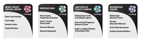
Map of McDonough, Georgia with location identifiers

1. McDonough Square


2. Salem Park


3. Lake Vista at Eagle’s Landing


[Eagle’s Landing, n.d.]
4. Heritage Park


References
Eagle's Landing. (n.d.). Greater Things Commitment. Retrieved from http://www.eagleslanding.org/greater-things-commitment/
0 notes
Text
MDM615 Design Strategies and Motivation - Mastery Journal
Overview
The course introduced the topic of brand identity, in relation to a local community, and the methodologies used to research and identify associated branding problems. The City of McDonough, Georgia was chosen as the overall project scope encouraged the selection of a nearby community/small town. Within this selection, focused is placed on areas with little known awareness where individualized branding/marketing is lacking or needs refreshing. For this project, the areas of McDonough Square, Heritage Park, Salem Park, and Lake Vista at Eagle’s Landing were chosen. Overall, the concepts learned, throughout this course, focused on city research, exploratory documentation (photography), data gathering and analysis, survey development, composing design briefs, conducting SWOT analyses, and generating empathy maps.
Connecting, Synthesizing, and Transforming
At project inception, online research via Google Maps (satellite and street view) and official information outlets for the city (websites and social media) was conducted to understand and narrow down the key areas of focus. Later on, the use of exploratory documentation allowed for opportunity to visit these areas and capture individual characteristics through photography. Conducted research was primarily based on qualitative and quantitative data procured through an in-person and Facebook driven online survey (click here) targeting the emotional appeal, of the respondent, for a specified location. At the time of data analysis, there were 125 survey respondents comprised of all age segments (under 18, 18-24, 25-34, etc.) which revealed the perceptions, attitude, and thought processes concerning the city. In addition, socioeconomic data was also gathered and examined to understand the demographic composition and later integrated into the identity research.
[SWOT Analysis]
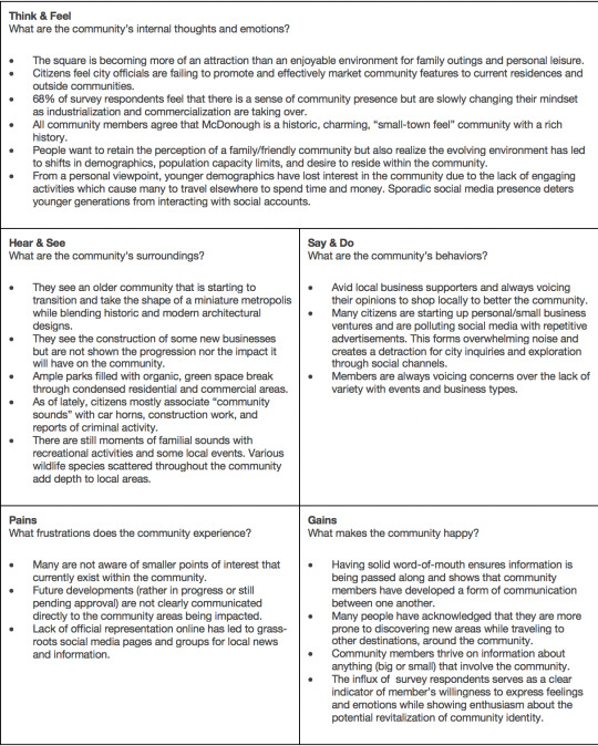
[Empathy Map]
Throughout this process, online presence (social media and websites) received in-depth analysis to understand what processes are used to market the city but also how social media posts and website content affects city identity. Synthesized research findings conclude that members of the community rely on word-of-mouth communication more frequently than official website or social media postings. Given the lack of engaging social media content and difficult website user experience environments, citizens begin to establish their own Facebook new groups to relay news and city information and use these resources to figure out the benefits of local community areas. In addition, the lack of physical marketing, for each location reduces community engagement with location attractions and decreases future visitation.
Problem Solving
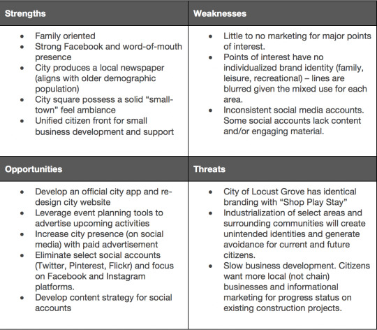
The biggest challenge is understanding the current identity perception, of McDonough, and determining the key areas where process and content improvements would ultimately generate higher community engagement and morale. From this, the formulated problem statement states: “Citizens and visitors, of McDonough, need a way to identify the benefits of local attractions due to the lack of individual branding and marketing associated, with each location.” More specifically, local points-of-interest offer little-to-no distinguishable branding and possess lower levels of awareness in regard to specific classifications (family, nightlife, recreational, consumer, commercial, etc.). The official social media channels, for the city, lack engaging content and reflect inconsistent messaging while most accounts are not properly maintained. The two primary, branded websites, for the City of McDonough, spark confusion and frustration relating to site navigation when searching for current events, city history, and business information. Furthermore, an empathy map and SWOT analysis were conducted to evaluate citizen’s perceptions and emotions towards the city while understanding key factors, both good and bad, that make up the city.
As a solution to this problem, the creation of a new identity system for local attractions will provide the opportunity to leverage iconography, to categorize area benefits, and help establish new brand identities. This new initiative would increase physical awareness of each location as citizens and visitors navigate and explore the city. The two websites would be merged into one primary source of information and given an updated styling treatment to compliment the new identity system. Lastly, social media accounts would be limited to Facebook and Instagram given the lack of attention and maintenance to the Twitter, Pinterest, and Flickr platforms. A lifestyle content strategy would be implemented, on social media channels, to establish personal connections between the city and online visitors.
Innovative Thinking
When exploring other city websites and social media accounts, there was a greater emphasis placed on direct advertising, of specific products, services, or businesses. In doing so, there was a lack of personal connection, to the city, which lowers the desire to engage and explore the city online and in person. Without a personal connection, what would motivate an individual to physically visit a location, within the community? With this said, the new McDonough identity re-design covers location benefits (in-person and online) but will leverage an online strategy to convey the desired lifestyles generated, within each area. This new strategy will capture the attention, of citizens and visitors, and increase the awareness and desire to visit and explore what each area has to offer. In turn, this will help generate a high level of interest and community spirit, for the surrounding population, and solidify stronger connections between each specified area while unifying city perception.
Acquiring Competencies
The course focused on analytical objectives (research, data collection, and problem solving), but provided an opportunity to learn and develop two newly acquired techniques and skills: interview/survey development and empathy map creation. With interview/survey development, it was imperative to understand the differences between open and closed question types. Open questions will lead to an array of answers, with a higher degree of variance from the intended question while closed questions provide a targeted approach to ensure specific information is collected. In addition, careful consideration should be taken when crafting questions to ensure they are not posing as an avenue to fix a problem outside the designer’s control.
Empathy maps are a “collaborative visualization used to articulate what we know about a particular type of user. It externalizes knowledge about users in order to 1) create a shared understanding of user needs, and 2) aid in decision making” (Gibbons, 2018). Designers rely on empathy maps to develop effective branding systems, for products and services, which cater to the needs of a target audience. By utilizing this specific process, insights relating to potential customers are identified and help “produce better services and products for them, enhancing their perception of our brands and services” (Coppola, 2017). Formulating empathy maps require an in-depth exploration of external, observational characteristics and internal thoughts and feeling of desired consumers. Garnering this unique blend of qualitative data will provide easier methodologies in determining the specific direction to design products and services.
Reflection
The course provided an opportunity to change focus, from an outside, design perspective, and transition into an internal evaluation and exploration of our local community. The material covered an in-depth approach to design research, from an observational and analytical standpoint, while challenging students to think about city problems, from the designer’s perspective. This opened up a new understanding into identity design for services versus a standard company/product design process. The research methodologies used to formulate the finalized design problem statement has allowed me to appreciate the work, of city and service designers, and reveal a new pathway for future exploration. Going forward, all work will be integrated into the next two courses as solution design process development and design creation, ideation, and integration are explored. After the conclusion of the program, I will have a greater interest in further pursuing city design (visually) as a potential freelance designer, for my local community.
References
Coppola, G. (2017, November 28). What is an Empathy Map, and why is it valuable for your business? Retrieved from https://medium.com/swlh/what-is-an-empathy-map-and-why-is-it-valuable-for-your-business-14236be4fdf4
Gibbons, S. (2018, January 14). Empathy Mapping: The First Step in Design Thinking. Retrieved from https://www.nngroup.com/articles/empathy-mapping/
0 notes
Text
MDM570 Organizational Structures - 4.5 Mastery Journal
Overview
Throughout the course, emphasis was placed on the exposure and developmental processes relating to motion design. Three of the four weeks were spent concepting, designing, and producing a dynamic (motion) vision board derived from a previously designed static vision board. The fourth week focused on the creation of a secondary motion piece complementing the overarching city project campaign. From a predefined list of motion styles, the motion styling of cinemagraphs was chosen to compliment the dynamic vision board and previously designed campaign collateral. Concepts regarding the effective use of timing, motion behavior, narrative development, story development, transforming static designs into motion artwork, and integration of applied motion work into real-world applications served as central topics of conversation and research. These topics served, in varying degrees, as the basis for writing story journals, planning and sketching motion storyboards, and creating work in Adobe After Effects.
Connecting, Synthesizing, and Transforming
Understanding the power and influence of motion is critical to successfully communicate key storyline and messaging. Summers (2018) reveals how “motion graphics allow you to subtly infuse your brand’s message into every aspect of your video content” (Summers, 2018). As portrayed through the dynamic vision board, the creation of kinetic lines, at various speeds, combined with key transitional effects highlighting particular design elements encompass the three primary brand filters and express nature and correlated messaging through movement. The development of motion paths, for each scene, were inspired by Correa and Schlemmer’s (2016) statement where “motion should above all else help guide users, providing them with the right information at the right time” (Correa & Schlemmer, 2016). Within each segment, the kinetic line moves horizontally, vertically, and diagonally both in and out of frame, on precise paths. These movements help dictate the delivery of information and transition viewers into the next segment of information.
Cinemagraphs will play a vital role in social media marketing, for the Kyoto city brand campaign. This newer style of motion design provides a faster avenue for delivering information while conveying targeted emotional appeal. Most commonly found within social media platforms, cinemagraphs offer the “visual punch and immediacy of video, without the barrier to entry of a play button” (Flicker, 2016). By leveraging cinemagraphs in tandem with social media auto-play features, companies have the ability the expose brand content and messaging by disrupting the traditional static advertisements found within social media timelines. The designed cinemagraph showcases a first-person observation of nature allowing consumers to experience a brief moment in Kyoto. As Flicker (2016) expresses, “it is the moment, both with and without time, that can create a lasting impression for brands” (Flicker, 2016). The design and implementation of these key moments will generate stronger relationships, with consumers, “by drawing the eye to small details” (Flicker, 2016) all while capturing the emotion and majestic beauty found within nature.
Problem Solving
The primary concern, of the dynamic vision board, is ensuring all information, from the static vision board, is accurately represented and transformed into motion-oriented graphics while maintaining thematic integrity. Implied focus is expressed on segments with a higher degree of relevance including imagery, video, logos, diction, and brand filters. To solidify intended messaging and convey a unified thematic experience, the categorical segments are given longer exposure times for individual elements and incorporate strategically timed transitional effects. As Xia (2018) explains, “[transitions] helps the audience receive the information immediately and understand the core concept in it” (Xia, 2018). The transitional effects used are either minimal - to maintain aesthetics and show similarity between elements, or expressive - to isolate a particular section and signify importance. The remaining categorial sections, of typography and color palette, have shorter transitions, among individual elements. This decision is based on ease of legibility and corresponding size of each element allowing additional time to be allocated to smaller and more complex elements. The proposed design solution eliminates preconceived time constraints and delivers all supporting information into one cohesive motion experience.
Social media accounts promoting the City of Kyoto lack content needed to generate intimate relationships, with consumers, in order to solidify brand awareness. Currently, the City of Kyoto manages two primary social media channels. The Facebook account, “VisitKyoto” consists of 522,000 likes with posts dating beyond 2015 (Visit Kyoto, n.d.). The associated Instagram account “@visit_kyoto” has 2,220 followers with original posting dates of October 2016 (City of Kyoto, n.d.). A second Instagram account, with the handle “@visit.kyoto” is managed by Visit Japan International and has a base of 19,700 followers with an initial post dating back to January of 2017 (Kyoto, n.d.). The integration of cinemagraphs featuring curated natural photography provide greater depth in content offering, on social media channels, and entice consumers to maintain attention on displayed motion pieces. By utilizing cinemagraphs, consumer engagement among platforms will increase and generate a higher following base as the percentage of social media users in Japan steadily increases (Neely, 2018). In addition, the dormant activity, of “VisitKyoto” Twitter account, also managed by The City of Kyoto, is a missed opportunity to showcase unique designs and generate a larger following given that “Twitter is and has been the dominant social network in Japan for a long time” (Neely, 2018).
Innovative Thinking
Industry social media accounts predominately showcase urban tourist destinations and big picture natural environments. What accounts lack are detailed, intimate imagery expressing moments of alluring natural environments. The integration of close-up imagery, in the form of cinemagraphs, provide consumers with a detailed perspective of nature. Described as “a living photograph,” a cinemagraph “emphasizes that live aspect that all great photographs have” (Mevorah, 2017). This unique combination, of close-up and motion imagery, entices consumers to further examine the location, of each image, while noticing the commonly overlooked intricacies of Kyoto. These posts will ultimately drive brand awareness and consumer retention leading to a greater interest in dynamic and engaging content, among the accounts.
Acquiring Competencies
There are three main topics, derived from this course, where comprehension levels and an understanding of the material are solidified. Story journaling was an essential part of the course development and is utilized as a tool for generating narratives. Understanding the unique blend of observations and ideas help formulate a given narrative. Through this process, designers are able to pick out relevant themes, from an individual or collective set of entries, and establish a dominant theme. This chosen theme provides the foundation for identifying and creating story kernels which are used as a guiding template for developing stories.
Adobe After Effects is heavily relied upon to produce motion assets. The creation of course assignments provided a beneficial understanding of key production tools and motion-oriented design processes. Keyframes serve as the primary tool for achieving desired motion behaviors and visual effects while allowing designers to make minute adjustments. The utilization of alpha matte layering combined with linked shape layers contributed to the visual effectiveness of hiding and revealing information, throughout the dynamic vision board. Understanding the concept of timing, in relation to object behavior, ensures key information is appropriately conveyed to the target audience. The creation of parallax imagery and cinemagraphs provided exposure into two of the primary types of motion. Parallax imagery is integrated into the dynamic vision board to emphasize the alluring aspects of imagery while cinemagraphs serve as the choice of motion for the second project.
Lastly, the topic and application of audio identity was completely foreign, at first. As discussed throughout the course, audio is broken down into three primary classifications: voice, music, and sound effects. At this stage, the three classifications are sorted into two categories, diegetic and non-diegetic sound. Diegetic can refer to the voice or sound produced by characters and objects, in the story, and can be represented onscreen or offscreen (Blazer, 2015, p.89-90). Non-diegetic sound encompasses sound the characters are unaware of, including narrator’s commentary and mood music (Blazer, 2015, p.89-90). At any given point, both diegetic and non-diegetic sounds can transition into opposite categories based on the content displayed, within the composition (Blazer, 2015, p.89-90).
Reflection
The course provided a challenging yet motivating environment when learning motion design. Having no prior knowledge and experience relating to the subject required additional time spent understanding the foundational concepts and applying new knowledge to application-based development. At the beginning of the dynamic vision board process, storyboards required undivided attention to ensure desired messaging and thematic integrity were properly conveyed and aligned to the associated campaign elements. Detailed sketching and layout design were pivotal components to express implied motion and showcase key transitional effects. Translating designs into a digital environment and applying motion behaviors required the use of various Lynda courses and YouTube tutorials to understand the After Effects workspace and key features. Having extensive knowledge and experience working with Adobe Creative Suite (Photoshop, InDesign, and Illustrator) offered an advantage given the seamless transfer of essential characteristics and operating methods between the software platforms.
The idea of implementing motion design into future projects is highly plausible. The course transition, into thesis work next month, will provide time to reflect upon the various methodologies and practices associated with motion design. As a result, better planning and integration of motion work will provide opportunity to explore new design strategies and elevate future projects. In addition, the information accumulated, throughout the course, can be directly applied and custom tailored to fit current and future projects at work. Additional project opportunities, with cross-functional team members, and exposure to new creative roles will foster an expanding, creative mindset.
References
Blazer, L. (2015). Animated storytelling: Simple steps for creating animation and motion graphics. Peachpit Press Publications.
City of Kyoto Official Account (@visit_kyoto) • Instagram photos and videos. (n.d.). Retrieved from https://www.instagram.com/visit_kyoto/
Correa, S., & Schlemmer, J. (2016, September 23). Making Motion Meaningful - Library. Retrieved from https://design.google/library/making-motion-meaningful/
Flicker, M. (2016, January 05). Why Brands Should Embrace Cinemagraphs for Storytelling. Retrieved from https://adage.com/article/digitalnext/brands-embrace-cinemagraphs-storytelling/301977/
Kakroo, A. (2015, March 31). Closeup of a Bird. Retrieved from https://www.videvo.net/video/closeup-of-a-bird/3557/
KYOTO 京都 (@visit.kyoto) • Instagram photos and videos. (n.d.). Retrieved from https://www.instagram.com/visit.kyoto/
Mevorah, V. (2017, May 21). What is a Cinemagraph? Retrieved from https://www.widewalls.ch/cinemagraph/
Neely, C. (2019, January 28). Japan's Top Social Media Networks for 2019. Retrieved from https://www.humblebunny.com/japans-top-social-media-networks-for-2019/
Summers, S. (2018, June 20). Why Motion Graphics Are Effective For Content Marketing. Retrieved from https://bottlerocketmedia.net/blog/why-motion-graphics-are-effective-for-content-marketing/
Visit Kyoto. (n.d.). Retrieved from https://www.facebook.com/visitkyoto/
Xia, R. (2018, January 29). 4 Types of Transition in Motion Graphics – Muzli - Design Inspiration. Retrieved from https://medium.muz.li/4-types-of-transition-in-motion-graphics-3ec29ffa3e19
0 notes
Text
MDM570 Organizational Structures - Projects


[Storyboard Process for Dynamic Vision Board]
https://www.youtube.com/watch?v=hyI9OT6UD8E&feature=youtu.be
[Dynamic Vision Board - Click link to watch full video]

[Cinemagraph - Second Motion Project]
0 notes
Text
Design Research - 5.4.1 Journal Entry
Overview
The primary objective of Design Research focused on the identification and development of a specific campaign direction, for our chosen city. Pre-existing campaign collateral received in-depth analyses and revisions, based upon a newly developed theme. In addition, new campaign elements were created and integrated, into the vision board, to effectively convey established brand voice and personality. Throughout the course, extensive research was utilized to support pertinent design decisions aligning to the four Degree Learning Objectives (DLO) including: Synthesizing, Problem Solving, Innovative Thinking, and Acquiring Competencies.
Synthesizing
The theme of “Majestic Nature” was formed to elicit consumer travel and generate positive brand awareness, for a city surrounded by natural beauty. Oxford Dictionary defines majestic as “having or showing impressive beauty or scale.” With this in mind, Acayo and Schwanbeck (2015) explain how “Understanding context allows designers to take a critical look at what they’re creating and figure out whether or not it’ll generate the desired outcome” (Acayo & Schwanbeck, 2015). The use of majestic natural imagery serves as a dominant feature, of the vision board and infographic, and effectively supports the chosen theme while creating concrete relationships between campaign elements. Figure 1a displays a campaign ad for Cumbria, England (Cactus Creative, n.d.) and features a majestic image serving as the primary component, of the design. Figure 1b depicts my vision board concept, with the dominant landscape image.
[Figures 1a & 1b]


The integration of a phrase association chart captures key samplings, of the intended voice, and provides a clear understanding of the desired diction. Relationships between the targeted expressions and the overall theme support a singular mindset and corporate image. Figure 2a is an example of Park City, Utah advertising campaign, with key phrases including “charming town” “scenery is inspiring” “nightlife is electric” and “adventures are unmatched” (Murray, 2018). Figure 2b showcases the comparison between generic and elevated phrases, for my campaign, and captures appropriate brand voice and personality.
[Figures 2a & 2b]


Problem Solving
Throughout the development of the campaign, the logo presented various challenges. The primary concept design involved the substitution of an entire letterform for a mountain shaped icon (See Figure 3a). Kevin Larson (2017) argues how “Word shape is no longer a viable model of word recognition. The bulk of scientific evidence says that we recognize a word’s component letters, then use that visual information to recognize a word” (Larson, 2017). There were multiple classroom discussions surrounding the perception of the mountain representing the letter “A” instead of the intended substitution, for the letter “O.” The use of the mountain shape in place of the letter “A,” for other campaign elements, led to additional confusion when referencing back to the primary logo. To combat this problem, the mountain shape required further refinement and later integrated into the secondary “O” (See Figure 3b). The final iteration alludes to the majestic mountains while line structure, styling treatment, and visual integrity were maintained.
[Figures 3a & 3b]


Innovative Thinking
When developing a brand campaign, a narrative statement “can help clarify any important information or fill in something that the images don’t communicate or that you don’t have room to show” (Kliever, 2018). When analyzing various narratives of professional advertisements, the narrative specifically calls out the city and references the mantra of “go here and do this” (See Figure 4a). I challenged myself to formulate a specific narrative that speaks to the majestic and natural elements, of Kyoto, without mentioning the city itself. As Glitschka (2013) mentions, “… a well-crafted story should raise customer expectations about your client’s business, service, or product” and “…enhance the experience of the brand in the minds of the reader” (Glitschka, 2013). To achieve this goal, a personified version of nature is utilized to speak directly to the reader and communicate the unique experiences one would embrace (See Figure 4b). Having nature serve as the “tour guide” evokes a deeper connection, to the city itself, and allows readers to see that Kyoto is more than just a standard tourist destination.
[Figures 4a & 4b]


Acquiring Competencies
There are three primary competencies I acquired, during the campaign development process, which has helped me grow as a designer. Developing rationales proved to be a challenging phase, at the beginning of the course, but grew to understand and appreciate the process behind explaining and supporting design decisions. As Aitken (2013) expresses, “Don’t just say what you’ve done – explain why you’ve done it, referring back to the creative brief, the audience, your research, and the information that is to be communicated” (Aitken, 2013). Figure 5 displays a rationale statement, within the infographic, that summarizes a high-level overview of the chosen typography. In addition, this mastery journal post serves as an expanded rationale detailing specific design process, related to the coursework.
[Figure 5]

The second competency, effective research strategies, sheds light onto the background process of exploring and identifying various secondary resources and associated topics related to a given project. Acayo and Schwanbeck (2015) explain how “Research can help your process evolve and change with each problem” (Acayo & Schwanbeck, 2015). With every checkpoint, for course assignments, the research methodologies altered as various details and reasonings were requested. Acayo and Schwanbeck (2015) later discuss how “Understanding what research methods are and how they work will help you better plan and discuss your research process” (Acayo & Schwanbeck, 2015). When asked to provide rationales, about a given project, my initial thought process isolates a specific topic expressed within a given design. I then conduct sound research methodologies to locate factual information, to support my decisions. Figure 6 demonstrates the conducted research applied, from the supporting claim, where “diagonal lines suggest a feeling of movement or direction” (Jirousek, 1995). As shown, the diagonal line, of the triangle, serves as a natural guide for eye movement down the section.
[Figure 6]

The final competency, maintaining brand consistency, derives from a culmination of previous courses combined with current coursework. Jackson (2018) describes brand consistency as “the pattern of expression that affects what people think about your company” (Jackson, 2018). Widjaya (2017) notes that “consistency is an essential element to any brand’s growth and longevity” (Widjaya, 2017). As the city of Kyoto campaign grew and additional elements were created, final adaptations had to align with the pre-existing theme, brand personality, and visual aesthetic. Brand consistency not only applies to elements, within a given piece, but to every piece of campaign collateral regardless of the medium used. Figure 1a (vision board) and Figure 8 (infographic) showcase congruent relationships, by maintain consistent branding, while displaying identical information in two unique forms.
[Figures 1a & 8]


References
Acayo, P. & Schwanbeck, A. (2015, February 24). Learning Design Research[Lynda.com online course]. Retrieved from https://www.lynda.com/Design-Foundations-tutorials/Foundations-Design-Research/182890-2.html
Aitken, C. (2013, June 12). Writing a Project Rationale: A guide for students. Retrieved from https://gdc.design/article/2013/06/12/writing-a-project-rationale-a-guide-for-students
Cactus Creative. (n.d.). [Ullswater Steamers, Glenridding]. Retrieved from https://cactuscreative.com/work/cumbria-tourism-campaign/
Glitschka, V. (2013, June 28). Learning Logo Design[Lynda.com online course]. Retrieved from https://www.lynda.com/Illustrator-tutorials/Foundations-Logo-Design/112674-2.html
Jackson, S. (2018, September 07). Importance of Brand Consistency: 7 Key Approaches for Keeping Aligned. Retrieved from https://www.clearvoice.com/blog/brand-consistency-why-its-so-important-how-to-achieve-it/
Jirousek, C. (1995). Introduction to the Elements of Design: Point. Retrieved from http://char.txa.cornell.edu/language/element/element.htm
Kliever, J. (2018, October 26). How to create a moodboard and get your creative juices flowing – Learn. Retrieved from https://www.canva.com/learn/make-a-mood-board/
Larson, K. (2017, October 19). The science of word recognition - Typography. Retrieved from https://docs.microsoft.com/en-us/typography/develop/word-recognition#model-1-word-shape
Majestic | Definition of majestic in English by Oxford Dictionaries. (n.d.). Retrieved from https://en.oxforddictionaries.com/definition/majestic
Murray, C. (2018, August 6). Park City Chamber Rolls Out New Advertising Campaign. Retrieved from https://www.kpcw.org/post/park-city-chamber-rolls-out-new-advertising-campaign#stream/0
Tourism Ireland. (2016, August 2). [Ireland. The Drive to Beat Them All]. Retrieved from https://www.tourismireland.com/Press-Releases/2016/August/20-million-Britons-see-promotion-for-car-touring-h
Widjaya, I. (2017, March 02). 5 Crucial Tips for Maintaining Brand Consistency. Retrieved from https://smallbiztrends.com/2017/03/brand-consistency.html
0 notes
Photo


Effective Copywriting - 4.4.1 Mastery Journal Post
Key Takeaways
Throughout the course, I have gained a better understanding of the various copywriting techniques used to communicate key messaging, while learning about design methodologies and practices associated with the effective implementation of advertisement pieces. Through extensive research on brand personality, voice, and tone, I can properly analyze any future client and/or employer to identify the style of copywriting needed for campaign messaging. In-depth workshops, research, and assignments into the creation of headlines, taglines, and body copy provide me with the resources needed to create personal copywriting for marketing pieces. Lastly, the research and creation of testimonial ads identifies the designer’s responsibility to understand the direction and story of specific copywriting, in order to design artwork supporting the overall messaging. In this course, students selected a nonprofit organization (I chose Samaritan’s Purse) which served as the base for a majority of assignments.
Target Audience Profiles
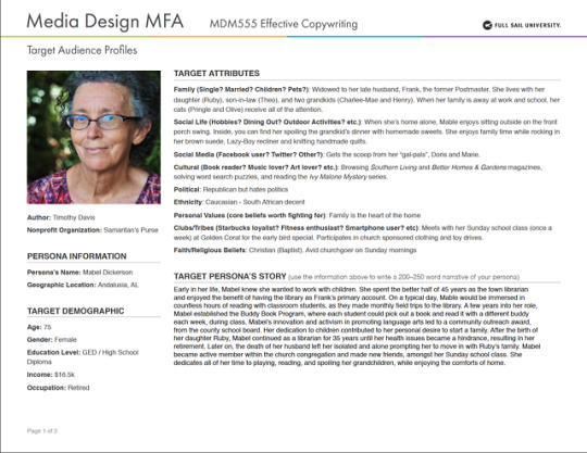
One of the primary assignments focused on the research and creation of target audience profiles used to identify select consumer pools, relative to our nonprofit. I created two custom profiles based upon the Settle and Alreck’s Catalog of Needs for Nurturance, defined as “the need to provide care for others, to have and protect” (Felton, 2013, p.27) and Exhibition, defined as “the need to gain public attention, show off, be noticed” (Felton, 2013, p.26). The profile related to Exhibition targets philanthropic millennials, ages 25-32, who actively volunteer, within their local communities, and are highly engaged with social media. My second profile based upon Nurturance successfully identifies older women, ages 70-85, who are involved in the lives of their family and grandchildren and previous backgrounds pertaining to the betterment of children’s education and lifestyle. By generating target audience personas, copywriters have clearer direction into the styling and diction used within messaging to develop stronger connections with the consumers.
Testimonial Ad Sketches
Another primary assignment focused on a three-step process involving the creation of six testimonial ads and the processes utilized to identify specific messaging and tailored artwork. Smallish (2013) emphasizes sketches as being “…produced quickly and without much concern for composition or even aesthetics” (Smallish, 2013). My six sketches are based on Felton’s (2013) testimonial concepts, including: extreme user, expert, something associated with the person, the wrong person, ironic testimonials, and just plain folks (Felton, 2013, p.241-246).
Sketch #1 shares the story of a volunteer’s first experience working in an Operation Christmas Child process center. The primary figure aligns to Felton’s definition of extreme user, where a “over-the-top user” is selected to “let that person demonstrate…how great the product is” (Felton, 2013, p. 241). Alternative approaches included a spotlight feature on a volunteer delivering shoeboxes or a volunteer collecting shoeboxes, at a donation site. Isolating a story, at either end of the volunteer process, would make it harder to establish emotional connections and associations, with the consumer. Sketch #2 blends an expert opinion with unreal person (Santa Clause) to increase brand association and gain the reader’s trust. Felton (2013) states “Character’s from history, legend, literature, movies, and cartoons can be used for their attention-getting quality as well as their unusual “relationship” to the product” (Felton, 2013, p. 246). The use of an elf or Santa’s hat, as the primary subject, were both considered but later rejected as stronger associations to Santa Clause would dominate consumer mindsets.
Sketch #3 displays the physical perspective, from an individual in need, by looking up to see a helicopter, in the sky. The unique angle conveys Smallish’s statement where a “…different perspective of the scene can set a different tone for the story” (Smallish, 2013). Alternative considerations included a sailboat or airplane but lacked true versatility (in the literal sense and design direction sense), as a helicopter has greater opportunities to reach more people. Sketch #4 targets individuals who buy into the subscription box services, while the subhead creates a slight jab towards users who do not effectively utilized the contents, of a paid box. The sketch aligns with Felton’s category of ironic testimonials where “Many ads play ironic jokes on their own clichés, sharing a wink with viewers at the testimonial genre” (Felton, 2013, p. 245). The body copy offers an alternate solution to spending money and forms dynamic relationships between all components of the ad. The expression of “throwing your money away” with supporting artwork of trashcans proved ironic, but later removed from consideration as the message would create an adverse effect on consumer association, with the company.
Sketch #5 focuses on a little boy, who asks a question directed towards the reader. The ad focuses on Felton’s testimonial concept to use “plain folks” given the notion “people trust other people more than they do corporations” (Felton, 2013, p. 246). Alternatively, a group of boys paired with the headline “We deserve a thumbs up too” had been created but later removed, as the messaging did not align with Settle and Alreck’s Catalog of Needs for Nurturance. Sketch #6 alludes to Felton’s testimonial approach, of the wrong person, where “…consumers are persuaded to buy things because of a negative endorsement” (Felton, 2013, p. 243). The headline relates to the illustration depicting a plumber filling a shoebox, with the contents of a sink drain, while the subhead encourages readers to pack a shoebox with essential items used for Operation Christmas Child. The advertisement relates to the statement to “take all or part of an idea and flip it over entirely and examine what the reserves or negative image of our concept might be” (Smallish, 2013). Both bikers and construction workers had been considered but the integration of either character, into a proper messaging package, offered little amusement and lost connections to the process for packing shoeboxes.
Testimonial Ads – Initial Comps
The first comp was chosen based on the emotional appeal displayed throughout all written elements and supporting imagery. The testimonial example of a child instills trust and empathy to the consumer and ensures the company can be trusted. With Comp 1, both heading, and subhead were written in the voice, of the little boy, to emphasize a greater connection towards the reader. The subhead is a miniature story expressing concern, about the mother’s well-being, and poses another question to ask for food. Both elements align with Felton’s (2013) observation how “People speak in fragments. So make your ads sound the way people talk” (Felton, 2013, p.209). The body copy is categorized as “the middle” according to Felton’s (2013) checklist for body copy, wherein the statement says something new, gives specific details, and advances the story (Felton, 2013, p. 128).
The second comp was chosen to provide readers the perspective of a volunteer participating midway through the lifecycle of a shoebox. This particular point is crucial, for Operation Christmas Child, as an increase in volunteer awareness and participation will have a positive growth in the number of shoeboxes sent out to children. The heading directly engages the reader and sets a theme for the entire ad. The subhead supports the theme by describing feelings commonly expressed when participating in a group setting, while highlighting positive associations for volunteering.
The third comp effectively displays the vantage point of an individual in need looking up towards the helicopter. The combination of intentional perspective and curated headline and subhead copy sets the overall tone for rescue. The headline forms a deep emotional connection, to the reader, and personifies the helicopter, by utilizing Felton’s (2013) observation how “People speak in fragments. So make your ads sound the way people talk” (Felton, 2013, p.209). The subhead clearly indicates the purpose of the helicopter and creates the tone as if the helicopter were yelling down to the person in need. The body copy is categorized as “the close” according to Felton’s (2013) checklist for body copy, wherein the statement pulls everything together to end the message, while providing a call-to-action for readers. (Felton, 2013, p. 128).
Testimonial Ads – Revised Comps
All three testimonial ads evoke varying degrees of emotional appeal, while generating proper awareness for the efforts put forth by Samaritan’s Purse. The first comp offers the reader a glimpse into the lives of those facing famine and malnutrition, in third world countries. The ad is designed to elicit donations for emergency supply kits filled with various food essentials. The second comp tells the actual story of a volunteer’s first experience with Operation Christmas Child. The imagery chosen displays an individual helping inside a processing center, with the background of other volunteers assisting in a production line. The third comp uses unique visual perspectives which are not commonly found among advertisements. The use of a personified object contributes to Settle and Alreck’s Catalog of Needs for Succorance, defined as “the need to receive help from others, be comforted, be encouraged and supported” (Felton, 2013, p. 27). The advertisement pieces form a unified design campaign by highlighting three different service programs of Samaritan’s Purse. In addition, the use of rounded rectangles, within all three pieces, create visual unity for the testimonial ads.
Research References
Felton, G. (2013). Advertising: Concept and Copy (3rd ed.). New York: Norton & Company.
Smallish, C. (2013, August 16). Developing Ideas and Advertising Concepts [Lynda.com online course]. Retrieved from https://www.lynda.com/Design-Business-tutorials/Welcome/126121/145380-4.html?org=fullsailold.edu
Photo References
Samaritan’s Purse (n.d.). Operation Christmas Child Media Resources. Retrieved from https://www.samaritanspurse.org/operation-christmas-child/occ-newsroom/#photos
Unsplash. (2016, November 29). Man, beard, male and guy HD photo by Drew Hays (@drew_hays) on Unsplash. Retrieved from https://unsplash.com/photos/agGIKYs4mYs
Unsplash. (2017, October 29). Havana, Cuba photo by Craig Philbrick (@craigcudi) on Unsplash. Retrieved from https://unsplash.com/photos/kfxPVP_7P7U
Unsplash. (2018, March 2). Elderly woman, elderly, smiling and bokeh HD photo by Anthony Metcalfe (@antsphotography14) on Unsplash. Retrieved from https://unsplash.com/photos/QQsRTGAZp9o
Unsplash. (2018, October 23). Helicopter photo by Chandler Cruttenden (@chanphoto) on Unsplash. Retrieved from https://unsplash.com/photos/N4nc-ishmS0
0 notes
Photo


Brand Development - 3.4.3 Journal Entry - SWOT Analysis
[Pictured above are my finalized vision board designs. Out of respect, please do not copy designs.]
---
[Revised] As part of the mastery journal process, classmates are given the opportunity to review each other’s journal posts and provide feedback for improvement. The feedback I received suggested a revision to a statement made about my personal writing style. As a result, I have updated the first point of the final paragraph.
--
Throughout the Brand Development course, I have gained insight into the methodologies and decision factors used to construct effective brand strategies. I have also identified several key points related to internal strengths and weaknesses, and external threats and opportunities.
My background in marketing and design contributed to an elevated understanding of the concepts and strategies discussed, over the span of the course. My keen eye for detail and advanced knowledge of Adobe creative software garnered additional time used to explore and create impactful designs elevating the visual aesthetic, of my chosen city. In addition, my strong organizational and time management skills increased personal productivity and formed a balanced workload, during the integration of major deadlines.
There are a few areas I deem as personal weaknesses, which I have discovered along the way. I tend to adhere to predefined guidelines and overthink assignments, due to the natural pressure and elevated grading criteria associated with a master’s program. Along the same line, my curious nature forms the mindset of wanting approved examples to use as a reference tool, to help establish the parameters of a given design assignment. Lastly, when immersed in a scenario where multiple iterations and concepts are requested, over an extended period, my creativity begins to decrease resulting in safe and generic designs concepts.
In any classroom environment, there are always potential threats and opportunities for self-improvement. As assignments and critiques are uploaded to discussion boards, I always ponder if my posts and critiques lack personality. To combat this threat, I must maintain the mindset of working in a master’s level environment, by providing accurate and honest feedback, to fellow peers and ensuring posts are written in a professional manner. There are some moments when submitted designs elicit mixed feedback, from peers, resulting in unknown forward progression. To alleviate this confusion, I will ensure all designs effectively communicate targeted messaging and accurately convey the meaning behind specific design choices. When designing within a specific scope, some design elements or layouts may overlap between peer submissions, due to commonality. To combat this threat, I will continually research effective ways to communicate messaging and create impactful designs, which will set myself apart from other designers.
Reference:
Quast, L. (2013, April 15). How To Conduct A Personal SWOT Analysis. Retrieved from https://www.forbes.com/sites/lisaquast/2013/04/15/how-to-conduct-a-personal-s-w-o-t-analysis/#7f876f0c28d8
0 notes
Photo


Defining Client Needs - 2.4.3 Final Sketches
Above are the final sketches based off the highlighted versions, from my previous post.
0 notes
Photo


Defining Client Needs - 2.4.3 - Design Process and Reflection
Task 1
Throughout this course, I have gained a thorough understanding and increased knowledge of the methodologies utilized, in the logo development process. After reading the assigned text, “A Designer’s Research Manual: Succeed in Design by Knowing Your Clients and What They Really Need” by Jennifer Visocky O’Grady and Ken O’Grady, I identified the first linear model as an accurate depiction of my personal design process.
During the Research phase, an in-depth analysis was conducted to research specific details relating to geography, modern culture, and traditions, of three predefined cities. Mind maps were created to help filter and sort collected data, forming strong thought processes and overall depictions, of each city. Although classified under the Concept Development phase, mind maps played an essential role, during the Research phase, creating detailed visualizations, resulting in targeted research of critical information. Once the mind maps were complete, conceptual logo designs are drafted, based on specific word selections taken from each categorical mind map.
At this point, the Concept Development and Prototyping phases begin to overlap, as a result of the combination of thought processes and word selection. As sketches are made, a transition into the Prototyping Phase occurs, where multiple version, of a specific design, are explored through experimentation of line weight, font choice, proximity, object form, and scale. After 100-150 sketches are produced, designs are posted to the assignment discussion board, for peer review and critique. Upon receipt of feedback, select designs will undergo prototyping and refinement, leading to a new set of one hundred sketches, which will be converted to digital forms, in the Design + Production phase. Although the Design + Production phase is not explored in this course, sketches will be transformed into vector graphics and will undergo another round of prototyping with the integration of color and font choice, leading to a finalized logo design.
Across the three categories, the sketches outlined in red are ideal representations, of my personal design process, showcasing initial concepts and further developed prototypes.
------
Reflection
My peers provided great insight and guidance, through feedback of my sketches. While many enjoyed the simplistic designs, some suggested to experiment further, with font manipulation and placement. The use of arched lettering around minimalistic symbols and filled typography on brick wall designs were mentioned, potentially leading to more dynamic and congruent design compositions. In addition, my tea ceremony and temple designs were specifically called out, as key sketches to focus on, during the progression of this project into the next course. All feedback received has been processed and implemented, among my revised sketches, serving as an important resource as I continue my mastery journey.
References:
O'Grady, J., & O'Grady, K. (2009, February 01). A Designer's Research Manual: Succeed in Design by Knowing Your Clients and What They Really Need. Retrieved from http://ce.safaribooksonline.com/book/graphic-design/9781592535576
0 notes
Text
Journal Reflection 2.1.4
What are the key takeaways that will have the most impact on your experience as a graduate student?
During my graduate studies, I am excited to explore new concepts, methodologies, and approaches of design, while studying the impact design has in various industries. This program will provide exposure to unfamiliar content relative to the brand development process, including copywriting, design integration, and multi-platform delivery. As a graduate student, assignments and research conducted, throughout courses, will elevate existing research and technical skills, fostering greater motivation towards creative thinking and effective design solutions.
What are some questions and/or concerns that you may have about the program that may impact your future success?
I think my biggest concern involves other people’s opinions and understanding of the program itself. There have been several instances where I mentioned my enrollment, into the program, and people were unsure of what I would be studying, since the title was not related to a specific pathway, such as “graphic design” or “web design.” My goal is to effectively communicate the primary objective and attributes of the program, ensuring future career opportunities are not impacted. A primary question that has come to mind: Given that the program touches on various mediums, is there a point where students are able to focus in on a set pathway (i.e. UX design) and leverage future projects to research and further explore this area?”
Write an action plan that includes your vision and expectations of the MDMFA program, your expected level of commitment, and your long-range goals as a professional media designer.
Within the MDMFA program, I strive for new opportunities to broaden my understanding, of graphic design, while gaining insightful knowledge into new forms and process used by industry professionals. I have high expectations and confidence, in the faculty members of the MDMFA program, to guide and foster innovation and challenge myself to push through pre-conceived notions of design and focus on new perspectives to effectively communicate ideas. In the video, “What is Graphic Design?”, Sean Adams states (2017) “The media isn’t as important as the concept itself and that’s where good graphic design really takes hold, smart ideas that communicate a clear message and do it with skill and craft.” The MDMFA program’s approach towards the development of innovative design concepts and strategies, the execution of impactful designs, and implementation of strong verbal communication, will be paramount, in my growth, as I become one step closer to Adam’s definition of good graphic design.
My strong work ethic and passion for continual learning, both inside and out of the classroom, are direct reflections of my inquisitive nature and personal commitment to my on-going education. Upon graduation, my goal is to become a production or graphic designer, within my current retail creative department. From this point, I plan on gaining professional experience and industry insight, into the brand campaign process, leading to future promotions as a design manager and art director.
Adams, S. (2017, May 31). What is Graphic Design?[Video file]. Retrieved from https://www.lynda.com/Graphic-Design-tutorials/What-graphic-design/614734/625796-4.html?org=fullsail.edu
0 notes
Photo

This quote serves as a key theme to summarize my first graduate class, Mastery: Personal Development and Leadership.
“...the Ancient Greek poet Pindar wrote, ‘Become who you are by learning who you are’” (Greene, 2012, pg. 28).
[Image Credit - Quotefancy]
0 notes