A journal of reflections showcasing my experience of design thinking.
Don't wanna be here? Send us removal request.
Text
A final reflection
Design Thinking Tools finishes today with the completion of the final assignments. I have learnt a huge amount and am definitely considering completing a few more of the units. Some of my key takeaways are:
1. Designers have a huge amount of named tools such as journey mapping and service blueprints that will be useful for my community development practise. I reflected on this in an earlier post.
2. Good brainstorming is very challenging but can yield excellent outcomes. It needs be well designed, highly focused and held at the right time to access those results. Its a skill I will definitely be honing.
3. Sketching has so many benefits to project development and I use it a lot more then I thought. It is also another skill that I will continue to practise to push my creative thinking and my drawing skills.
4. I am really frustrated with my lack of technical skills and this an area I will focus at developing. I have been reminded through this course that visual representation is very powerful. I want to have those skills to be able to translate my ideas from initial concept.
5. I have appreciated the direction of a strong and passionate facilitator (thank you Erica). Although the workload for this unit has been significantly above normal for any post graduate units I have undertaken, I have learnt so much. I can see how the structure of the assignments, the courses content and the real life practical link together and I have learnt a lot because of it.
Finally, I have realised that I have been tinkering at the edges of service innovation for a while. Many of my previous projects have used design thinking to reimagine service delivery from working at FORM on social housing to recent roles at Lendlease and Save the Children, the one consistent theme has been redesigning the way communities relate to each other. I now have a language to explain this.
#503designthinkingtools
0 notes
Text
What is the difference?
Between God and a Designer?
God doesn’t think he is a designer.
When I started reading about Hilary Cottom, a UK based social scientist who was the 2005 Designer of the Year, I had a huge ‘Aha’ moment. Hilary was award the honour despite not being a trained designer. She used a design approach to social policy and pulled together teams of designers to implement changes. She received hate mail from designers. Design media criticised the British Design Council for their decision. It took fortitude and guts but is a true demonstration of how good design thinking can be used to create great social change not just small things.
youtube
0 notes
Video
tumblr
Cultural organisation FORM has a fantastic exhibition at the moment. Plasticology features artists from Indonesia, Phillipines, Taiwn and Hong Kong and is a commentary on waste and single use plastics. Artists including Angela Yuen and Eko Nugroho have used recovered plastics to create 2D and 3D installations.
The video shows one Angela Yuen's intricate cityscapes made entirely of reclaimed plastic toys. It uses light and shadow to showcase the city. it comments on urban life in a myriad of ways showcasing a cities intricacies and detail in its size and complexity, the throwaway society through the use of reclaimed plastic toys to create the sculpture and the light, shadow and sound to represent the different sensory experiences. The artist suggested that even collecting the pieces used to form the model was in itself an artistic expression.
This exhibition by FORM is exactly the space I believe SCITECH should be operating in but on a much broader scale and focused on STEM. FORMs creative learning program aims to improve learning outcomes by using creativity and arts based pedagogies and establishing partnerships between teachers, schools and artists.
The resulting exhibitions including Plasticolgy and A Man, the Monster and the Sea have each used different materials to explore the waste management and the natural world. Imagine the level of engagement SCITECH could achieve if it used an arts based practise to drive exhibitions.
0 notes
Video
tumblr
I have been frustrated by my skills in design particularly relating to graphic design, animation and editing software.
in our group assignment, I ended up writing the script we used. This was fine, as writing for production is a strength of mine. However, I was frustrated as my skill deficiency meant I wasn’t involved in editing, animating or designing the final product.
Once I had completed the script, I decided to try and push my skills downloading Indesign and playing around with animation software. There is huge activity in the design space with companies like Canva and Adobe creating programs for non designers. These programs have inbuilt templates for posters, animations, magazines etc that make it really easy for those that appreciate the power of good design but don’t have the skills to create the collateral.
I created one animation for our group presentation by playing around in Biteable, an online platform for infographic style animations. It wasn’t used in the final presentation but I thought I’d share it here. I used some of the concepts we created in one of the brainstorming sessions.
0 notes
Photo

I’ve been doing a little more research into why sketching is beneficial to the design process. It turns out it also has significant benefits for health and well-being, cognitive processing and creative thinking. Who knew?
I didn’t actually realise how much I use sketching through out my day to day processing until I read some of the articles I found. I’m always sketching out layouts before pulling together information. I doodle prolifically during lectures and meetings, often times noting key information and sense making complex ideas. I often copy shapes that I see in lectures and books to act as prompters, markers and explain ideas simply. Interesting. I never considered this sketching.
This article on design tuts+ inparticular got me thinking about the sketching I do. It suggests that sketching is critical in communicating ideas, useful for developing lay out and handy to explore concepts.
0 notes
Text
Sketching
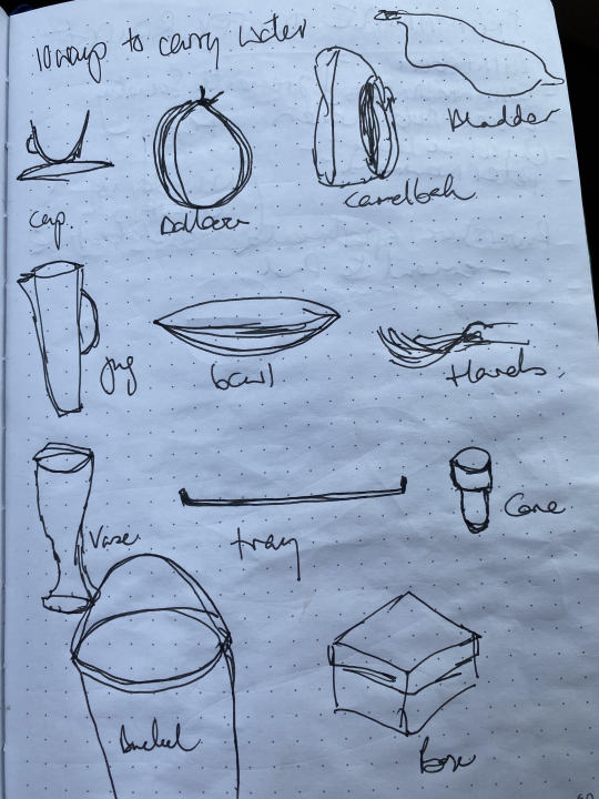
Watching the Ted Talk featuring Tim Brown talking about creativity and play was very enlightening. In it he talks about the importance of practising creativity. He demonstrates a simple exercise known as 30 circles and pushes his audience to sketch as many different things those circles could be in 1 minute.
I tried this exercise and initially froze, as I always do when pushed to be creative, but after a little while, I let go. I made a pair of glasses from two circles, a snowman out of another three, a frisbee, plate, pizza, apple pie, blueberry, out of others.
I realised two things:
1. I really enjoy sketching, I always have. I’ve always been someone that doodles when someone talks to me. I can’t take in information properly if I’m not doing it.
2. The more of these activities I do, the better I will become, at both sketching and creative thinking.
I’ve been practising both regularly in my journal. Trying to push my boundaries of creativity and stop the critic in me yelling out too loudly.
0 notes
Text
Final Presentation
The COVID Pandemic has influenced the outputs and outcomes of the design thinking unit in interesting ways. For the most part, our internal unit has been delivered entirely online since 30 March. This has changed everything.
We have not been able to visit SCITECH (the focus for the design thinking course), conduct any group co-design sessions or interviews and our final presentation will now be a series of video episodes instead of a presentation.
This is all manageable due to the different technology platforms we have available to us but I miss seeing and working with people. I’ve always found that being physically co-located with people brings interesting output and outcomes that you don’t get when collaborating online.
My small group working on the introduction of the presentation has completed this without any face to face contact. I feel that whilst we will still delivered a good product, it hasn’t been enhanced by the conversations, discussions and debates that occur when you physically work next to someone. The organic cross - pollination of ideas that happens when you physically sit next to each other.
This experience has pushed my technology skills to the limit and forced me to participate in the online world more than usual, which is a good thing. It is beneficial in this day and age of flexible working. I do feel that for the assignment I was involved in, the process was too linear. We each had our specific roles and tasks along a linear project timeline and the resulting presentation, lacked the collaborative outcome.
When all is said and done, I prefer working alongside people.
0 notes
Text
Designers verses others
I have always felt a tension between the designing profession and outsiders. As a community development professional, I have sometimes felt excluded by the likes of architects and urban designs when creating places for people. I have also observed designers deriding design thinking, as ‘other professionals’ trying to be designers with out the use of training, aesthetics and ability (need I say god given skill?).
One thing I have noted during this unit, is that the tools of designers (journey maps, service blueprints, heat maps) are not dissimilar to the tools I use as a community development professional We just don’t have complex names for them in the same way that the design professions does.
This is not a judgement. Its actually a really good way of working.
I think this is indicative of a different ways each professional approaches their job. Many design professionals sit in agencies who pitch for work. When you bring together all the critical information used to inform your design, you need to explain how you came to the conclusion and step the client through the process. Working inside government and big business, I have never had to do this in such a comprehensive way.
I will definitely adopt this approach going forward. Its useful to bring together a comprehensive brief to really understand what you are doing and why you are doing it.
0 notes
Text
Concept Stories and Service Blueprints
I enjoyed testing out some new tools to develop ideas and concepts, take them to the next level and integrate them to existing infrastructure.
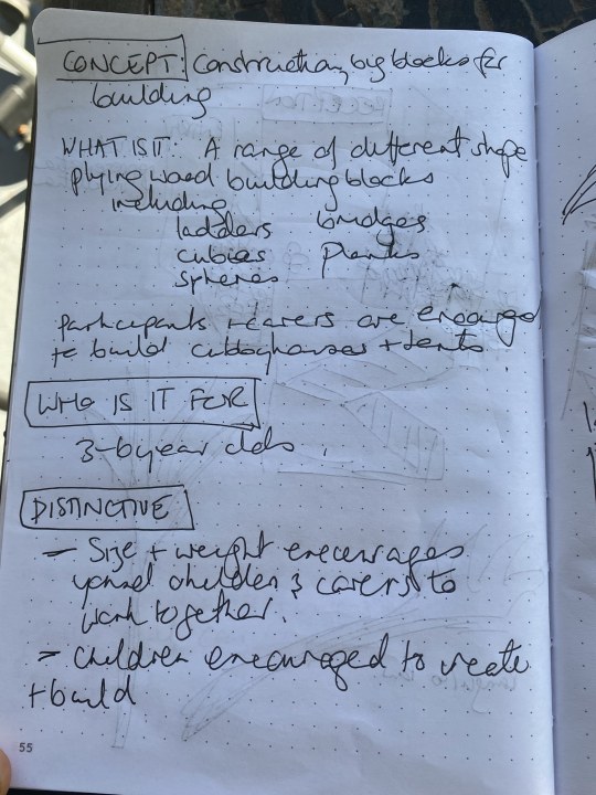
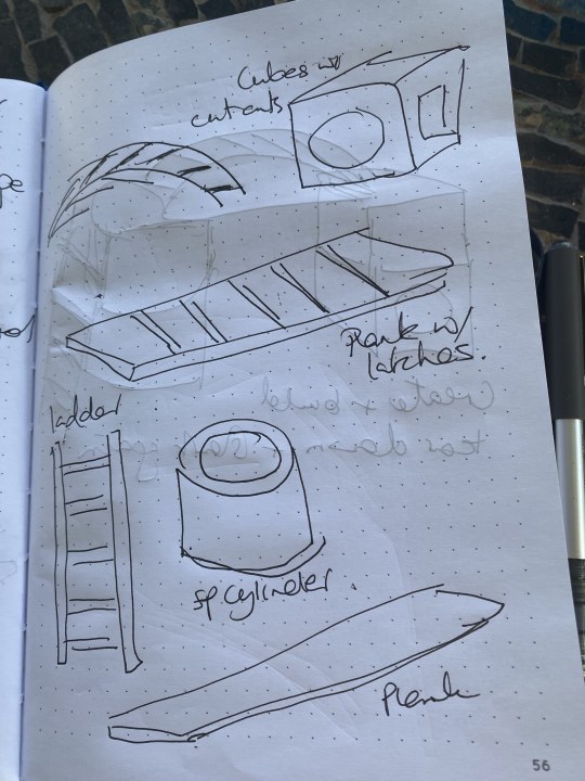
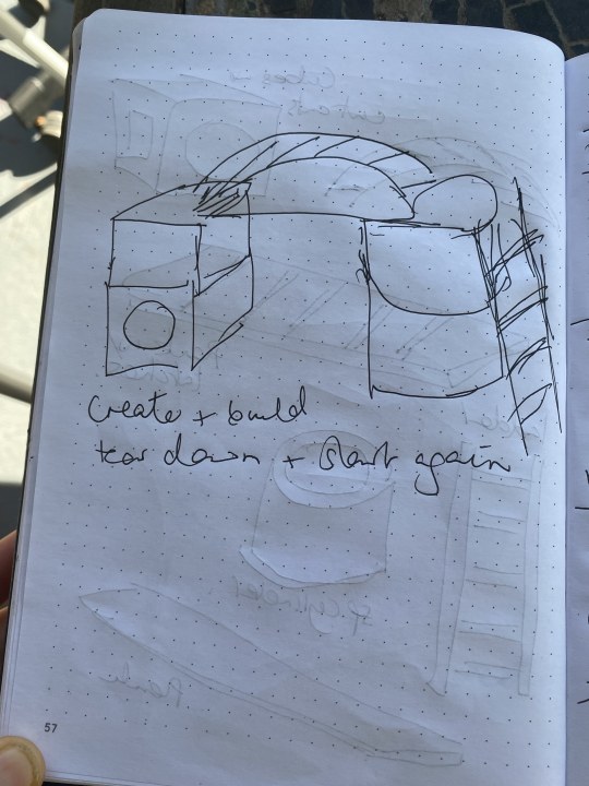
Concept Stories are a one page document destining the idea to a few sentences, responding to a few prompts and then a few sketches to showcase the idea. Our prompting headings included a brief description, target age group and what is distinctive?


The Service blueprint demonstrated how the service would be integrated in a customer journey map, identifying the different inputs (training, materials etc) and outputs (collateral, branding) required. Each layer of the experience is considered including the physical evidence, front of house, back stage and technical input.
0 notes
Photo


I loved the documentary on Cas Holman and the ‘build your own’ play equipment aimed at young children. The concept is definitely not new, as I found out with a iittle bit of help from google. I started receiving advertisements in my facebook feed for Montessori inspired play equipment! Thank you cookies!
The concept is fantastic and I really believe something similar would be great for Discoverland. The challenge is trying to make it not like something you already have / could have at home.
The beauty of these pieces is that they could be easily prototyped in quite a low fidelity way.
0 notes
Link
One on the concepts I’m working on for the unit is inspired by the Language of Flowers installation profiled in the above story for Curtin News. In 2016, I worked for FORM and was lucky enough to work on PLATFORM, a design challenge hosted in the Town of Claremont’s High Street.
The installation used crepe paper to create beautiful flowers which where then hang in a small thoroughfare between a cafe and shop. Secret messages were hung with the flowers to engage the public.
i plan to do further research by speaking to the artist behind the work and research florigraphy. I would like to modify the installation t suit a very young audience and their carers and use it as an engagement activity.
0 notes
Photo


I’ve really enjoyed the past two tutorials for Design Thinking Tools. I have felt I have pushed myself out of my comfort zone and forced myself to be creative on call. The two images were screenshots from the most recent tutorial.
We road tested a few different activities to generate ideas using text, drawings and word association. I have summarised them below.
Mind Mapping / Word Associations: We used mind mapping to generate adjectives / nouns related to our experience of STEM and Play. We completed one mind map per word and then put them together. We created some really great descriptors such as serious unschooling and free dimensional learning.
Crazy 8s: Folding a piece of paper into 8 pieces we filled in each square with a different way of learning. This including building, cooking, make believe and cops and robbers.
Multi Universe: We described an experience of learning both from our an experience and what we would have liked learning to be. This included ideas such as being a baby monkey learning how to use his tail and attending Hogwarts and learning magic.
Full 30: Drew 30 different ways to learn whilst playing on one sheet of paper.
0 notes
Quote
Serious Unschooling, Free Dimensional Learning, Curiosity Theory, Experimental Mechanics, Geometric Chaos
Mind map descriptors of STEM and PLAY
0 notes
Text
Forcing creative thinking
We completed a mind mapping exercise in our lab this evening (Tuesday 7 April). I found it challenging to really open my mind and just brain dump. We used two words, STEM and PLAY. A few observations:
1. I had a hard time doing this activity in a group. My mind froze and I couldn’t just dump everything I thought of on the page. I tried the same exercise the next day and had a great time.
2. The words I wrote for STEM were quite boring, where as the words associated with PLAY were much more fun.
The intent of the exercise become much clearer when we shared our group work. One group had completed the exercise really well and all sorts of fantastic descriptors were created.
I do find it challenging to generate a broad range of ideas on command. I consider myself a creative person but I find it difficult to be creative at a particular moment. Most of my ideas come to me when I’m running.
I’ve been reflecting on this (how to overcome this ‘stuck’ feeling) whilst watching a range of resources on design thinking. I can see how it's useful, as great ideas come to fruition when generated between people.
0 notes
Link
I love Takahara Tezuka’s kindergarten. It is so perfect in its simplicity. It engages with children at their level and is an inspiring example of designing with and for the end user.
Tezuka is a Japanese architect who is known for his though provoking architecture. He is committed to the belief that architecture should change peoples lives.
0 notes
Photo

I argued for the relevance of the British Design Councils (2019) Double Diamond framework for design thinking. For me, it provides a simple map which articulates what the process may look like and how it might be implemented. I understand that the actual experience of design thinking might look and feel nothing like the map but at least we can start with some kind of order before descending into chaos.
0 notes