My name is Helen. This is where all my NWK Media Production work is. I aim to be a Music Video Producer at some point and vlog in my spare time. Any extra film work will also be posted here.
Don't wanna be here? Send us removal request.
Video
youtube
Arcadia Club and Bar ---------------------- Did an edit for a promo video
0 notes
Video
youtube
Perfectly Normal~RIOT Official Music Video
0 notes
Text
Editing Essay
In the film industry, there is a variety of specialists and teams to make a films look as real to life as possible. Over the past 2 years I have been learning the essential skills in or to recreate these types of shoots and how much work goes into producing them. Film editing is when you piece together certain footage, sound and animation to create a moving image that expresses a message or tells some kind of story. It is usually for entertainment purposes but it is always to appeal to a certain audience. In order to do this, the editor must feel the story and edit to that audience. The process of editing can take an exceptional amount of time and can take months if editing a lengthy project. If some shots look good on camera but not on screen, editing is a way to rectifying any mistakes to make the shots look more visually appealing than before. The editing process should flow and look seamless, making it an enjoyable experience to watch for an audience.
I have always been rather comfortable with editing and while on the course, my confidence has grown even more so. The majority of times I enjoy it, however there are times when software has crashed or one shot is out of sync so has interfered with the rest of the timeline. However, the part I find most difficult of an edit is the beginning; if I am unsure of what story/message I am trying to say, it can be difficult. But, as soon as I sequence together the first few shots, it’s pretty easy to form a rough edit thereon out. Since I vlog and edit videos for my Father’s business, the skills I have learnt have become more polished and things have become second nature when editing. I tend to sync to music well as well as match movements and imagery with the sound/music I am given. I try not to make shots too long as the audience would lose interest; I enjoy working with faster paced projects.
However, editing was not always this way. In fact, with early films it was one length of film with no editing or cutting involved; the films were one take films. This made films difficult as they were lengthy, at times boring and if any mistakes were made, you could not use editing to cut them out or edit around them. In the early days of editing, film had to be manually cut by hand with a sharp tool, frame by frame, then use heat or glue the shots back together. It was a lengthy process and took patience and skill. Compared to how long editing a film takes now, to then, the process time was much longer; with 25 frames per second and the average film time being an hour, editing frame by frame took immense time and perseverance. Nowadays, there are computer programs for editors such as Adobe Premiere and Final Cut Pro, so that post production takes up less time and editors have more creative freedom as they can experiment with different shots and effects as well as being more accurate with their cuts frame by frame. On my course, I have used Final Cut Pro to edit, whereas at home I use Adobe to edit my personal videos (as I have a PC). Even though Final Cut can be more user friendly, Adobe has taken over from Apple in the Media industry, as Adobe is much more reliable than Final Cut. Both of these programes allow the user to add to the edit; adjusting colours, adding images and text and effects. Also, Adobe After Effects gives the option of adding animation and graphics to the edit, adding extra creatuve flare to an edit.
The skills that are needed to edit are very straight forward and become second nature over time. Before transferring any footage, I tend to make folder for the footage, what it is, and the transcoded folder (for after transcoding) To transfer footage from the SD card to the computer, you will need a card reader, move the footage from the card into the appropriate folder. After the footage is copied, the software MPEG Streamclip will be used to transcode the footage into Apple Pro Res 422 in order for the footage to be placed into the timeline and edited smoothly. In order to do this, you would need to export to Quicktime, set the dimensions to 1920x1080 custom, 25 frames per second and select Apple Pro Res 422. The editing programme I use is Final Cut Pro 7 which is simple and easy to work with. Before editing, I tend to create bins in Final Cut where the footage is stored and name and place the footage in the appropriate bins/folders so footage is easier to find and edit to; rather than guessing where certain shots were.
These skills will help me when I create future projects for my Father or if I decide to do independent work later on. It is always a high point on my CV, expressing that I have knowledge in both editing and Photoshop programs. Apprenticeships and potential employers, always look for some kind of editing or film experience so I am not going in blind. Thankfully, I have been taught the basic fundamental ‘building blocks’ of editing in order to move up to something more advanced. Having my own camera (Canon 650D) I can practice my film and editing skills in my spare time.
I find that the easiest way to edit is to find what you are trying to project with the final product. A rough plan before editing will help with this, but an accurate plan is hardly possible as some shots may look better in other sections of the timeline or cut completely. When editing a film or a project with a lot of scenes, it’s easier to edit scene by scene so you can gage the length of how long each scene will be before starting the next; letting the sequence to tell the story fluently.
When I edit, I tend to have a rough idea already in my head and will jot down notes on the go about what kind of story or emotion I want to portray in the timeline. I, personally, tend not to storyboard; I find that I produce a better edit when I am not constricted to a specific shot by shot frame. However, when editing film, I would have a storyboard to follow; as an editor, I would have to try and add my own flare to the project (almost like an editor’s signature) without straying from the director’s/producers initial vision of the moving image. I usually add in sound effects or music last, as it can distract from the story when editing. However, when editing music shows, music videos or a promo/corporate of some sort, I tend to find the perfect music that reflects the story/emotion of the project and then will edit. I do this because, in film, the story is what is most important and therefore the music adds to that story and hints at what the audience is meant to feel. For example, if an interviewee was talking about a sad moment, emotional music would be appropriate; if I chose the music beforehand, it may not have fit with the flow of the edit and distracted the audience from what the interviewee was saying. Whereas when I use the music for my base, it is usually a project that doesn’t necessarily follow a narrative structure, so I have more freedom when choosing what shots will go with the predetermined music.
Syncing sound is made easier for the editor when the assistant director uses a clapper board on set; this gives a definitive mark on where the editor should edit from as well as making syncing the audio easier. I found this very useful when working on music shows as it gave me and the editing team a place to start instead of getting footage mixed up or watching an entire shot and having to guess what take is what and whether not the audio is the same as the shot I am trying to edit to. If the audio is not the same as the one recorded, then the edit can be out of sync with other scenes and become difficult to watch for an audience.
A Rough Cut is when I put all of the shots in sequence, roughly in sync, still raw but in a story I like. It is the first part of a 3 step process called Offline Editing. It is when the sequence starts to take form and look like the final product; however, director/producer will have to give feedback in order for the project to undergo more editing. A Rough Cut is for the editor to show the framework of the final product without any effects or colour correction; something very raw. This can help inspire direction from the director/producer and give guidance on how the editor is to proceed with the story, as well as to decide whether or not to add or cut scenes. Once the Rough Cut has the seal of approval, adding diagetic and non-diagetic sound to the edit, as well as any graphics or titles, can commence.
The next process is Colour Correction. This can be one of the hardest stages when editing. Colour correction uses the ‘Looks’ effect in Final Cut to adjust things such as colour, exposure, contrast, tinting, effects etc. The colour correction can set the tone and atmosphere of the moving image and what the story is trying to portray. Colour correction has to look somewhat realistic and easy to watch. Anything with harsh colours and strange effects will be hard for an audience to watch. This process used to be done in a room called a ‘colour suite’ which used light to change the colours.
The Final Cut is when your final idea is put together and approved by not only yourself but by colleagues. It helps to go over the cut again a few times to see if anything needs changing or adding and if the story is fluent and seamless. Now that the Final Cut has been put together, audio and picture quality is heightened; this is known as Online Editing.
One the project is complete, it can then be exported. Exporting is piecing all of the footage together into one seamless file after the editor and producer/director is happy with the Final Cut. It can be exported into a number of consumer files, most common being H.264 (MP4) which most sharing sites such as YouTube, Facebook and Dailymotion. Currently, films are exported to 2K but there has been a recent development of changing to 4K, meaning higher resolution for films. Although, few monitors can handle that much data, as well as there not being enough computer storage to stock the footage.
In conclusion, editing is an essential stage in the film industry as it can create amazing imagery when done correctly. For example, you may end up with bad footage, but a good editor will find a way to adapt and create a decent edit. By using Final Cut and Sfter Effects, footage and scenes can be saved and can make for an interesting edit. Alternatively, you could have beautiful footage, but in the hands of a bad editor, can be wasted by creating a bad edit. Some can edit for half an hour and create something amazing, whereas others may take a day to create something just as good. A boring edit can have a negative effect on audiences if they become bored and lose interest; quick shots or interesting effects/angles can keep an audience’s attention. Even though in the industry time is money, an edit can never be too rushed as it may not do the film/footage justice. It is important that an editor takes care in their work to produce the best edit they can achieve in what time they have.
0 notes
Text
Animation Evaluation
My animation I think is well drawn but the actual animation is lacking somewhat. The initial idea was exactly how I imagined it to look like. However, now that it is finished I maybe could have added more scenes or extra movement in scenes so it wasn’t so still.
My actual storyboard was also lacking in detail slightly but I have never done well when storyboarding; maybe this is a skill I need to work on.
Since I missed a few animation lessons to do filming, I had to rely on YouTube and my peers when animating, creating very basic movements in my animation. However, I have used Photoshop for a few years and use it when colouring my art at home, so the imagery in the animation was actually decent. I used the knowledge I learned in animation (the pen tool) to create smoother and cleaner cut images. As I have never been very good at animating, I am actually pleased with the result. It was a slow process but I actually produced something I like.
I have gathered feedback from friends and family members for honest feedback. I asked about imagery, length, smoothness of the animation and any other comments they wanted to make:
George said:
Imagery: good photoshop skills
Length: too long in each section
Animation: could do with more animated pieces to fill the scenes
Other: add more scenes
Heidi said:
Imagery: really like the art, very detailed and I like the use of memorable scenes
Length: maybe a bit short for a Disney film but the scenes need to have more pace
Animation: add little movements in the background so the audience isn’t bored
Other: the music was cut quite short at the end
James said:
Imagery: detail on the images is good, I like the use of iconic scenes
Length: the animation is the right length but it needed more pace
Animation: very basic and not too complicated
Other: I didn’t like the abrupt stop at the end
From this feedback it seems more scenes and small animations within those scenes would have made a better title sequence. Everyone liked the detail I put into my images but maybe that effort was lost due to the slow pace and basic animation.
0 notes
Text
I was wondering where part 3 of my essay was...it was in my drafts, not my posts. Idiot.
1 note
·
View note
Text
Music Video Essay Part 3-Justin Timberlake-Suit & Tie (Ft Jay-Z)
Justin Timberlake’s video Suit and Tie is a performance based black and white video (with small sections of narrative) directed by David Fincher (DF). The video was shot in black and white for two reasons; so colour correction wouldn’t be needed and it went with the Jazz theme that the video has. The music itself is very old school Jazz using modern techniques. DF represents this by using a 1950’s style Jazz club for JT to perform in. The time period is shown through iconography such as the microphone JT uses and the locations such as the dome stage and the smokey club.
Jazz was popular in the 50’s and the time period is shown throughout the video. For example, when shown in the studio, all the musicians are black. This is to create an ‘authentic’ image of Jazz; when most audiences think of Jazz they think of black men in smokey clubs. The aura of the video is quite laid back and fun, another stereotype of Jazz music and musicians (being energetic but laid back about their music). Another example that DF uses to represent the era is at the end of the video; JT is shown jumping around and splashing in water, creating the imagery of Gene Kelly’s ‘singing in the rain’ performed in 1952.
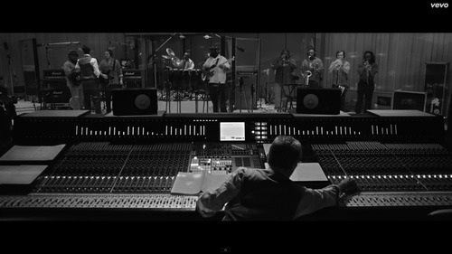
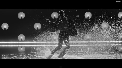
The black and white also adds a certain class to the video; suit and tie, pianos, smoke. DF uses all of this imagery is to create a high class powerful persona for JT. The video is very masculine; the men are shown drinking whiskey, smoking and watching sports, all of which are stereotypes of men. Women on the other hand are shown as sexual objects. For example, at the beginning of the video there is a small narrative intro to the main song showing JT getting ready for his performance that evening, there is a half-naked woman JT is playing chess with; since JT is clothed and she isn’t, this suggests that she is a weaker, sexual object under his power; he can have her at any time. It may be implied that they are playing strip chess, reinforcing the idea of the more intelligent man, winning over the woman.
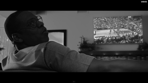
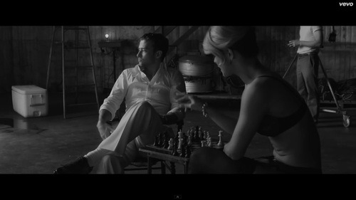
DF makes certain that JT is always in the spotlight; the dancer’s faces are never seen and are always silhouetted. This is so JT is singled out as the performer and the dancers are only there to support him and his image, who they are is not important. The angles and shots DF uses are very clean cut and simple; this is so the audience is not distracted by too much movement or loses the plot. DF is trying to give the ambience of a real performance; as if the audience were right there watching in the club. Keeping the shots clean helps to do this, if there was too much movement or fast cuts, the illusion of a ‘true performance’ would be lost. However, DF does use clever techniques such as mirroring JT’s movements with one another. For example, he’ll be dancing in the club and in the next shot, JT’s movement will be correspondent to a move he’ll be doing in the dome. This is so the illusion of watching one entire performance is not broken. The only time the illusion is broken is when the video cuts to the studio. This is to introduce new but interesting images as the audience could become bored just watching two locations. Cutting to the studio also creates an opening for another section of the song that includes Jay-Z. Before Jay-Z performs on stage, he is shown to the left of the stage to continue a fluent narrative.
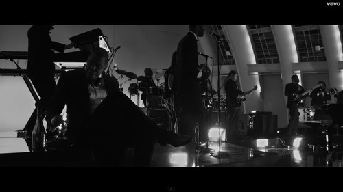
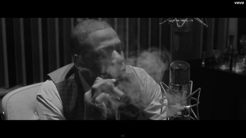
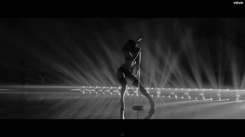
Jay-Z r is not really shown performing on stage however, he is shown in the studio for a few seconds and then it cuts to a scene with female dancers in lingerie. This is very typical of the rap/hip-hop genre that is to modernise the main Jazz theme. However, DF shoots the scenes in slow motion; the shots aren’t extremely slow but just enough to show fluent movement. This keeps with the high class theme as even though the women are scantily dressed, their performance has a sense of artful seduction rather than smut, which is a very post-feminism ideology.
1 note
·
View note
Photo
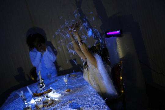
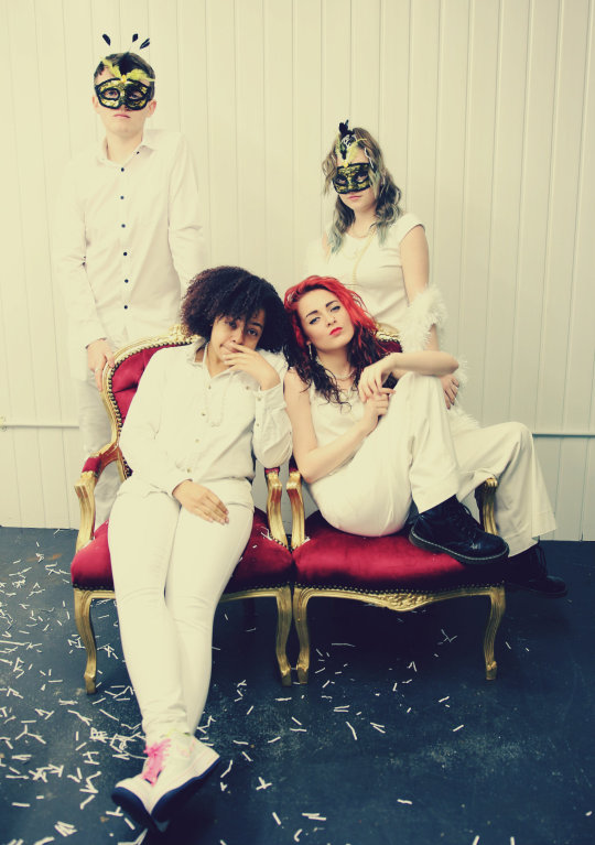
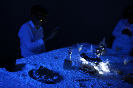
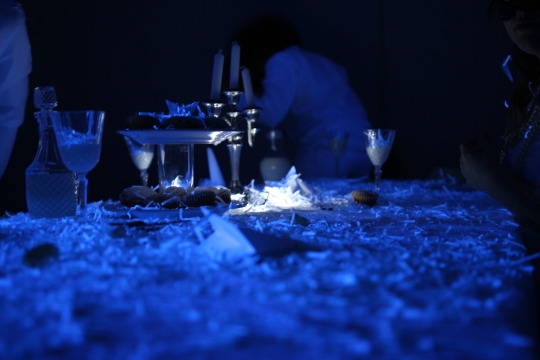
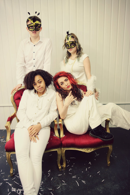
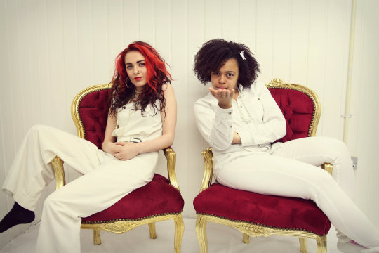
shots from today's UV/tea party shoot. I edited my favourite photos
3 notes
·
View notes
Text
Music Video Essay Part 2-Zedd-Stay The Night (Ft Hayley Williams)
Zedd ‘Stay The Night’ ft Hayley Williams (HW) is a surrealist video directed by Daniel Cloud Campos (DCC). The first shot is that of a close up of HW implying that she, not Zedd, is of more importance. DCC does this because HW is a well-known artist and has been around for years whereas Zedd is relatively new in comparison and is more of a DJ than an actual artist. This close up of HW has a slight soft focus and the colours are very warm. Her makeup and lighting create a very feminine shot; this is typical of the dance genre to create feminine imagery for females whereas rock music (HW original genre) is typically male and the female rock artists are more masculine but with sex appeal. Sex appeal is represented in this shot via red lipstick; red connotating passion, love, sex.
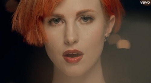
However, later on in the video, we see that HW is wearing black and white with metal buckles; the white has connotations of femininity and innocence, but the black and metal buckles keep the sense of her rock background.
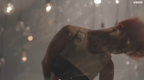
Since the song is about love and romance, DCC kept the colours very warm with orange colour casts. The orange lights throughout the video represent the ‘flame of love’ that the two characters in the video carry for each other and the question ‘are you going to stay the night’ implies that they don’t know whether or not to let go of the flame; the flickering of light bulbs and shakey cam reinforces this idea. Orange is not the only colour code in this video; the blue and red represent the characters.
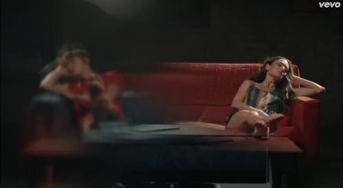
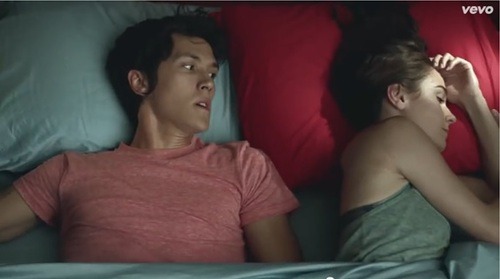
The fact that the boy is in red but on a blue sofa and the girl in blue on a red sofa, shows the characters inner thoughts and emotions toward the other; they are both missing and thinking about the other but neither of them say anything so there is this invisible wall between them and they go back and forth; illustrated by the camera effect at the beginning where it looks as though the characters are in two dimensions from one another. DCC visually demonstrates the character’s emotions by creating a blue tint on the couple’s shots, connotating cold and icey feelings of isolation; particularly in bed which is where ‘Stay The Night’ comes from. HW metaphorically sympathizes with the characters as she mirrors a lot of their dance movements throughout the video. DCC uses genre typical techniques in this video. For example when the beat drops and speeds up, the camera shakes and the shots are sped up in post to create a surreal and quick paced video; which most dance videos are as the music is usually a DJ or a series of electronic sounds which requires no performance so surreal music videos often accompany them.
2 notes
·
View notes
Text
HAVING TO UPLOAD MY ESSAY IN PARTS COZ MY INTERNET KEEPS FAILING
0 notes
Text
Music Video Essay Part 1-Beyonce-Run The World (Girls)
Francis Lawrence (FL) directed Beyonce’s music video ‘Run the World’. The video is an impressionist video using a feminist perspective of a matriarchal society, challenging the ideologies of the more traditional patriarchal society. Through various imagery, FL creates this powerful perception of women. For example, one of the first shots of Beyonce is a low angle of her riding a black horse.
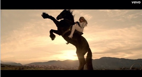
This imagery is a metaphor for the phrase ‘dark horse’ meaning ‘a little-known person or thing that emerges to prominence, especially in a competition of some sortor a contestant that seems unlikely to succeed’. In this case, Beyonce is trying to empower women, being the so called weaker sex, by showing they aren’t just housewives or mothers but that they can become much more than that. In a modern society there will still be a battle of the sexes, a competition of who has more power. The fact that she is wearing white implies that on the outside women may appear innocent, gentle, feeble but that they can be a ‘dark horse’ within. The theme of power and rebellion runs throughout the video; in one split second shot a black bull is shown, creating the sense of authority, strength, power. The woman climbing out of her cage, freedom. The woman lying on a crucifix; like Jesus, women have had to make sacrifices to obtain power.
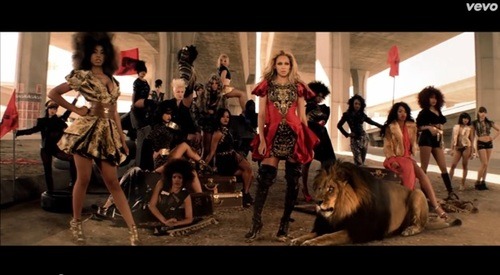
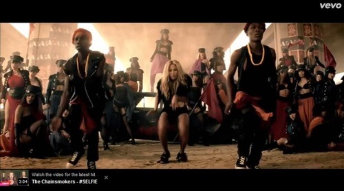
Another theme is this idea that women have a hidden animalistic anger ‘hell hath no fury like a woman’s scorn’. This is reinforced by animal print and wild animals in the video either by Beyonce’s side or on leashes like pets. For example in this shot, a lot of the women are wearing fur and Beyonce has a Lion at her side. The fact that it is a Lion and not a Lioness is important; it implicates that Beyonce, a woman, can tame a strong male Lion who is a stereotypically male icon/symbol. The Lion (men) are beneath her.
FL chose to wash out/desaturate the colours to give a warm, desert feel to coincide with the desolate war/battle of the sexes theme. The iconography of the fire, burning cars, debris and smoke reinforce the theme of war. Red is the colour code in this video; red representing power, rebellion (of which is painted on a car), violence and sex. Sex appeal can be used in the sense of post-feminism; the ideology that feminism is all but abolished and women are using their sexuality on their own terms as opposed to being sexual object for men. FL knows that Beyonce is both a sex symbol and an aspirational icon for many women. So in order to create this balance, Beyonce is dressed in leather with heels and short attire, while having many low angle shots of her. This creates the imagery of both sex appeal but without being derogatory. Many female artists have close ups of legs or panning shots of their body to create something sexual whereas in ‘Run the World’ at no point are these angles used. Whenever FL does a close up of Beyonce, it is always of her face, eyes or hands to show expression and movement.
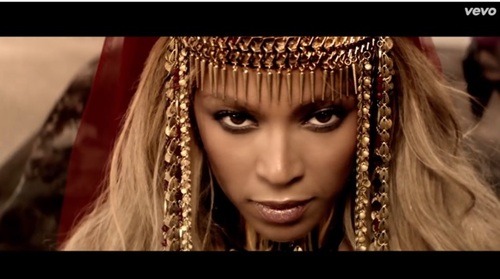
As I have said, FL uses the ideology of war between the sexes as a theme throughout the video. FL have portrayed men as the ‘enemy’ of women by having the men dress in riot gear, opposing the women who just want to be free of their stereotypes and gain power for their own. The men are always dressed in black (a villainous colour) and use riot shields to suppress women and hide behind years of ‘tradition’. However, there are men in this video who are not within the opposing side. These men look almost identical and stand in front of Beyonce. They copy her dance moments which are very puppet-like, suggesting that she is in control of them, the fact that they wear gold chains almost like collars reinforces this image. FL uses the rule of thirds to produce this metaphor. The war theme continues with the use of propaganda posters, ripped flags and clothing incorporating army style boots and jackets.
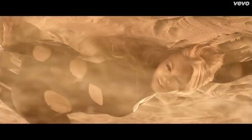
In one shot Beyonce rolls in the dirt and dust at the lyric ‘bare the children.’ This infers that rasing the children is hard workl but also that women aren’t afraid to do the ‘dirty work’ that men do.
All the women in the video wear different coloured capes; this not only suggests a ‘superwoman’ persona but also the variation of women when it comes to appearance, race etc. Woman of the world unite.
0 notes
Video
youtube
This short film was simple but rather effective putting a message accross. I really like the way it was shot :)
2 notes
·
View notes
Text
Animation
Keyframing is used in animation in the programme, After Effects. You put a keyframe in to mark a certain point in the timeline. A key frame is the starting and ending point of any transition or effect in an animation. A key frame can be changed at any point during an animation and will change the movement or timing of any objects or titles that may be in the timeline. For example, if you wanted a title to fade in, you would set the Opacity to 0% then move along the timeline, drag the Opacity back up to 100% to produce the fade effect. If the fade needed to be slower or faster, you would just move the second keyframe further along or closer. .
Pose to Pose and Straight Ahead are used when storyboarding an animation. Straight Ahead is used when going step by step; the animator draws out each individual frame from the beginning to the end of the animation. The animator will draw it in chronological order so as to see what movement would be next. Pose to Pose on the other hand, is when the animator would draw a starting point, then draw the finishing point and using software, it would fill in all the missing movements for the animation.
Slow In and Slow Out in animation is the exaggeration of movement in the sequence. This technique creates a more life-like and accurate to life animation. It focuses on the timing and shapes of the subject; if a ball was bounced, the animation would exaggerate the ball’s movement by stretching the bounce and then rounding the shape again while in the air; the animation starts off slow and then gathers speed in the middle, then slows again toward the end.
Arcs are mainly used in animation to portray a realistic animation. It is known as an arc because real life movement has no straight lines but instead uses an arc shape or circular path. In animation, it is attractive to look at an arc’d line rather than straight. Arcs represent more motion in the sequence and therefore flows better.
Rendering in animation is what you do so that your animation is watchable. Rendering footage allows the animation to have a smooth playback once exported. Adding the file to the Render Queue allows you to export the file to the appropriate codec in able for it to be played on different platforms. The queue also allows you to change settings such as file type, frame rate and video quality.
Compositing and Layers are what makes up an animation. The different layers allow the animator to have several different objects/titles in the timeline such as audio, footage, shapes etc. You can merge these layers together by ‘pre-composing’ them. This then creates the full animation.
1 note
·
View note
Text
Filming schedule: 12-13/05/2014
We are planning to film two days on the 12th and 13th of May at Hannah's Dad's workplace (see Hannah's tumblr for references)
The scenes filmed will be the tea party scene and one of the main performance scenes to which I will use raw and urban lighting with a dark blue tinge; in post I will desaturate.
Waiting on Location Recee to finalise lighting ideas.
0 notes
Text
Production Log-24/04/2014
We went to Southbank Skate Park to film the urban scene in our music video. At first it was a little rocky since we wasn't sure where all the members were or what they were wearing.
Eventually everyone arrived and George styled the girls and set up the sound; wiring the girls with headphones so they could hear the track.
I was on camera for the day using my Canon 650D and Sigma lens. The singers kept moving a lot in and out of the frame so keeping up with them was slightly difficult but I managed well. I was also on lighting using 2 flo lights and a dark blue filter to add contrast and a cool feel to the videotography.
The colours of the graffiti and the black, gold and red colours meshed wel together and gave an authentic urban rock composition
0 notes
