
Statistics
We looked inside some of the posts by thaliatraynorlmju and here's what we found interesting.
Average Info
Notes Per Post
2
Likes Per Post
2
Reblog Per Post
0
Reply Per Post
0
Time Between Posts
3 days ago
Number of Posts By Type
Text
17
Last Seen Tumblr Blogs


Fun Fact
The most popular pages on Tumblr are about Minecraft, GIFs, and David J. Peterson.
Text
DIGITAL SKETCHBOOK - 4102 - EVALUATION
I am pleasantly surprised with the outcome of this project; I think I did everything I possibly could to produce a successful shoot/editorial and I am pleased with the narrative I created. One thing I did struggle with, however, was working from home. I moved back to my family home when lockdown began and I found that being taken out of the studio and my accommodation, the spaces that I now associate with doing creative things, did really take its toll. I feel that, if circumstances were different (or normal), I could have produced work of a higher standard. While it has been incredibly stressful, this was a huge learning curve for me. It has given me ample time to think about how I work in isolation and how I react to bumps in the road. I now feel that I can move forward in my degree with a deeper understanding of how to adapt my working methods to fit confusing, difficult situations like these.
Going into this project with a strong, clear concept definitely kept me on the right path and the fact that I focused in on something that interested me gave me a lot of motivation. The adaptation of my concept happened quite naturally, I focused less on the idea of having imaginary friends, and more on how having a childlike outlook on this strange, difficult time we are living in can make things seem a little bit lighter and optimistic. I actually prefer what my concept has changed into and I feel like I used this project to take my mind off things, too.
I really like the narrative running through my editorial and the fact that I could include artwork produced by my little cousins even though I can’t see them right now. I had an advantage on the photography side of things as I have a camera and I have done outdoor shoots before, so I knew what to expect and how to get the best out of the shoot. I think I ended up with professional, interesting images that told the story well. Putting together the editorial in InDesign definitely tested me and forced me to review the InDesign tutorials on canvas to refresh my memory. I got the hang of it in the end and I now feel a lot more confident using InDesign. I feel that I can now take these new skills forward in my studies and continue to develop on them.
Despite struggling with being away from our usual creative environment, I have enjoyed my time working on this brief thoroughly. I feel that I have been given time to fully immerse myself in the industry and I have discovered practitioners that I wasn’t aware of before who have ended up becoming some of my favourites. I actually feel extremely inspired and motivated after completing this project. I am very grateful to have had this time to extend my fashion knowledge and to indulge in thinking about fashion magazines 24/7. :)
0 notes
Text
DIGITAL SKETCHBOOK - 4102 - FINAL EDITORIAL LAYOUT ANNOTATION

My opening page includes my favourite image from the shoot. I think it captures the essence of the character ‘imaginary friend’ perfectly; childish, silly, but also a little unsettling. I also included a small piece of text that tells the reader the story behind my editorial.

This page is a full text page, which is something that isn’t uncommon in The Gentlewoman. It’s just there to further explain who this character in the editorial is.

This page is a full image page with a small outfit description, the character in this editorial is reffered to as ‘imaginary friend’ throughout to create a narrative.

This page includes a medium sized image and a small slogan, in a style that The Gentlewoman would use.

This page includes the first still life image in the editorial and a small commentary on the subject matter. Also a large ‘YOUTH’ to bring the page together.

This page kind of explains my thinking behind the shoot; finding child-like joy inamongst all the chaos - along with another subtitle, a medium sized image and a description of what Imaginary Friend is wearing.

This page has two images of similar sizes and text that reads ‘i’ll count to ten’ as the top image made me think of kids playing hide and seek.

My final page includes images of my third outfit, a small description of the outfit and a little ‘everything is going to be okay’ corner which I thought could be a cut out poster if this were a real magazine.
0 notes
Text
DIGITAL SKETCHBOOK - 4102 - LAYOUTS

I looked into how The Gentlewoman organised their magazine and pointed out important features that I liked, including large, slogan headlines, full page images and pops of colour.
I then drew a digital sketch of what I wanted my layout to look like:

0 notes
Text
DIGITAL SKETCHBOOK - 4102 -STILL LIFE

Still life was something that I did struggle with quite a lot, as I had a certain plan before lockdown happened but what I wanted to do didn’t end up being possible. I explain more above.
My favourite still life images:


0 notes
Text
DIGITAL SKETCHBOOK - 4102 - FAVOURITE IMAGES FROM SHOOT AND EDITING

These are all of my favourites from the shoot, although I wont be using them all. I havent yet picked my final pictures to include in the editorial as I would prefer to just place them onto my layout and see which ones fit best.
EDITING
I didn’t feel that my images needed too much editing, but as I was creating a character (imaginary friend) I wanted to ensure the images were quite mysterious and whimsical, so I used the curves tool to enhance the highlights and to deepen the shadows.

0 notes


Text
DIGITAL SKETCHBOOK - 4102 -PLANNING MY EDITORIAL SHOOT
I started my planning by looking back at images of Robert Smith, the initial inspiration for my shoot concept. I then looked into how I could include his look on my model (my sister). The model I planned on using had dark brown, crazy, curly hair which was perfect for a RS inspired shoot, the model I am now using has long, frizzy, ginger hair that also has pink and blue streaks in it, so I will have to make that work!

For makeup, I am obviously going to use the iconic Robert Smith look of big smudgy, black smokey eyes, a pale face and messy red lipstick. I included some images of Robert himself, along with more recent interpretations of his look by Pale Waves frontwoman, Heather Baron Gracie. I’ve also done a digital sketch of the makeup look to see how it would look on a face shape similar to my model’s.

The poses I would like my model to do aren’t very complex at all, I’d like her to be moody and slouchy in some images, but also quite free and childish in others.

These are the outfits I chose to style my model in - they are all oversized, clashing and very slouchy:

0 notes
Text
DIGITAL SKETCHBOOK - 4102- CHANGES

The first change that I had to consider was where I will shoot the editorial. My family home is very small and not really appropriate for thr shoot I have in mind, so the only place I reallt have available to me is my backgarden.

I also have had to think about how I will style my shoot now that I no longer have the shirt available to me. Unfortunately I had to move back home, away from Liverpool pretty much as soon as a lockdown was imminent. This means I only had the time to pack essential items and left all my interesting clothes in my uni accomodation! The only clothes I have access to at home that are photographable are my sister’s clothes, so I guess I will use those. I researched a little into styling that inspired me and this shoot:

I loved these shows in particular as they each had something out of the ordinary about them; the Mulberry and Matty Bovan shows are full of clashing colours, prints, fabrics and oversized garments. The Gucci AW20 show was based on the perfection and freedom in childhood and in childrenswear, which obviously really fits in with my theme as it is based around childish ideas like having imaginary friends!
0 notes
Text
DIGITAL SKETCHBOOK - 4102 - CORONAVIRUS HAS CHANGED EVERYTHING
Since we presented our ideas in class and began thinking about where we will take our project, the Coronavirus has spread all over the world and so we are going through a global pandemic. This means that our normal lives have been cancelled, and we have a new normal to get used to. Here are a few examples of how the fahsion industry is changing and adapting to fit our new normal:


This also means that we will have to adapt our projects to ensure that we can complete our first year of university fully, safely and creatively. Luckily our brief was adapted to make sure that everyone had a fair chance of creating something submittable. I had initially planned to conduct a studio photoshoot in uni, using a model I found and styling them using my designer’s shirt. Obviously, this now can’t happen, so I have to find ways to ensure I can communicate my concept as well as I had planned to, but from home.
Not much that I had planned needs to be changed to allow me to keep my concept the same, really. The only things that aren’t possible now are having access to a studio, a model I had selected, and the shirt that my collaborator made. I will have to keep these things in mind as I move forward in this project and make any necessary changes along the way.
I think I am going to change my concept from featuring a person and their imaginary friend to focusing in on the imaginary friend creature itself. Meaning I will create a whimsical character and create a narrative around them in the editorial. I will also have to find somewhere to shoot my editorial in or around my house. I am going to try my best to style my model (my mum or my sister, probably) in clothes available to me at home that fit with my theme.
0 notes
Text
DIGITAL SKETCHBOOK 4102FC - COLLABORATION FEEDS FASHION - MY STARTING POINT
I began thinking about my concept for my editorial when I saw my collaboration partner, Jasmine Howard’s shirt design. It was quite slouchy and gothic, which reminded me of one of my idols, Robert Smith. Jasmine unfortunately wasn’t in on the day of our planned meeting, but I did get the chance to take a look at her develpoment sketchbook a few days later. Funnily enough, her concept was actually gothic fashion in the 1980′s, which perfectly aligned with my initial thoughts.


I then went on to research Robert Smith further and I found this article that really resonated with me:
https://i-d.vice.com/en_uk/article/a3gaab/in-praise-of-robert-smith-patron-saint-of-suburban-teen-goths-everywhere
The part that I particularly liked was when Sandberg said ‘As a gay, goth adolescent in the American suburbs - furious, skeptical, paranoid, isolated - I was drawn to Robert Smith's unfathomable majesty. He was almost like an imaginary friend.’

From here, I made my moodboard:

This moodboard explains everything from my initial inspiration, through to the hair/makeup/styling/buzzwords/colours/photography/styling and poses. The ‘imaginary friend’ element made me think of the use of shadows in photography which could be an interesting way of encapsulating the concept. i looked into photographers such as Alessio Albi who uses shadows quite a lot in his imagery:


I also thought it would be a good idea to look into both Robert Smith’s style, which was usually very slouchy, and the childish nature that comes along with having imaginary friends. I feel like children are also quite slouchy in general as they are growing into their clothes, also not forgetting that my collaborator’s shirt design is very very slouchy - I’d like to style this shoot using oversized clothing, big pieces of fabric and gothic elements to combine all of these things. The hair and makeup will be heavily inspired by Robert Smith, to keep him involved.
0 notes
Text
SELF DIRECTED STUDY WEEK RESEARCH TASK
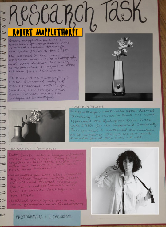

STYLISTS
HISTORIC
GRACE CODDINGTON
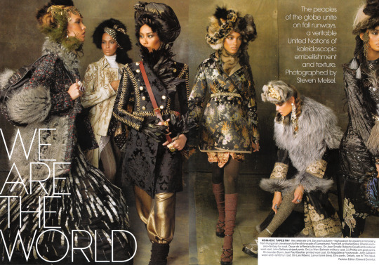
Grace Coddington is a former model and the creative director of American Vogue. She is known for styling and creating large, complex and dramatic photoshoots and has produced some of fahsion’s most memorable imagery. She flawlessly creates narratives with her styling that have been described as both jolly and decadant and moody and mysterious. Coddington is one of the most accomplished stylists in fashion and she has collaborated with some incredible creatives, from the legendary likes of Tim Walker, Arthur Elgort and Steven Meisel to rising stars such as Jamie Hawkesworth and Karim Sadli.

RAY PETRI
Ray Petri was a fashion stylist and the creator of the fashion house Buffalo who changed the face of British menswear. Petri was working in the early 80′s, when being seen on the streets of west London and the nightclubs of Soho embracing your own uniqueness was sort of a right of passage. Petri was actually the first person to ever be considered a stylist and was the most influential fashion stylist of the 1980′s. His strongest work was documented in The Face magazine, where his ‘Buffalo Boy’ look was first released. Below is an example of the Buffalo boy.
EDWARD ENNINFUL
Edward Enninful OBE is the editor-in-chief of British Vogue and is one of the most sought after stylists in the industry. Beginning his career at the age of 18, Enninful was appointed as the Fahion Direcror for i-D Magazine, a position he held for two decades. This also made him the youngest ever Fashion Director for an international publication. Edward has been massively influential in the industry, mainly for creating iconic images and shaping numerous advertisising campaigns for brands including Comme des Garcons, Christian Dior, Dolce & Gabbana and Calvin Klein.
CONTEMPORARY
HARRY LAMBERT
Harry Lambert is a young, self employed stylist working in London who has styled numerous editorials for the likes of Beauty papers, Style magazine and up and coming CSM Fashion designer, Harris Reed. While he has worked closely with many magazines and creatives, he currently is known best for being singer Harry Styles’s personal stylist, a position he has held for the majority of Styles’ career. Lambert styles imagery that is uncomfortable and whimsical, they are asymmetric and haunting, they are moody and unsetlting, but they are also so clever and beautiful to look at. Lambert is definitely one of my favourite young stylists in the industry right now.

DORIA SANTLOFER
Doria Santlofer is a stylist born and based in New York. She was previously the Fashion editor at New York Magazine, but is now a freelance stylist. She has worked with all kinds of publications from smaller magazines such as Wonderland and Violet Book, to huge, iconic publications such as Allure and Glamour. She has an eye for high impact colour and volume in her styling. She describes her own style as ‘classic, tailored, teenage’ which is mirrored in her lighthearted, youthful editorials.

EWELINA GRALAK
Another New York stylist Ewelina Gralak was actually born in Poland, where she began styling. Her career has landed her in downtown Manhattan, where she now resides. She is very influential on Instagram and posts outtakes/photos from editorials she has been a part of alongside her own outfits and sources of inspiration. She has worked with brands such as local Polish brand MISBHV, reserved and KPODONOU. She perfectly finds the balance between ugly and pretty in her styling and puts together the most obscure outfits consisting of high end designer brands and brands not many people have evr heard of, making her signature style hard to describe.
2 notes
·
View notes
Text
STYLING CHALLENGE
WFor this styling challenge, we were put into groups and were given a designer each to use as our inspiration for the styling. Our group was given Molly Goddard who makes very layered, voluminous dresses mainly. We began by brainstorming what we knew about the brand.

we then looked at Molly Goddard’s AW20 collection and were really inspired by the volume of the dresses, the layering and the oversized bow headpieces.


We then dug through the box of materials - fabric offcuts, bublewrap, costumes, previous students’ work. I ended up being the one being covered in bubblewrap as we found a blue bow that would match my hair.


When we decided we had finished, we mad eout way down to the photo studio. We tried using both high and lowkey photography, but decided we liked the images we got from the lowkey background the best.


Here are the contact sheets for our shoot!


And these are the favourite final edited images, we used photoshop to edit each image in a way that suited the mood of the image. I thought they were quite cold and moody, so I edited accordingly enhancing the cooler, blue tones,


0 notes
Text
INDESIGN MAGAZINE LAYOUT WORKSHOP
We had a workshop with Nicole where she went through InDesign layouts and fonts for The Gentlewoman and Fantastic Man
We started by going back to basics and going through the toolbar to get to grips with the tools we will be using, such as:

We then learned how to set up a document on InDesign, in accordance with The Gentlewoman’s usual page layouts.

The document then looks like this!

I then experimented with inserting images. To do this, you have to draw a shape (rectangle/circle/etc) and insert you image into the frame. This may cut off parts of your image off, but you can fill the frame proportionally using this tool:


I also experimented with some text! This is Arial Narrow Bold Italic.
This is how to insert pictures as shapes other than rectangles:

When setting up a page design, you might want to see what the spread will look like with text, but you might not have written the text yet. In this case, you are able to fill your columns with placeholder text using this button (see below image). This gives the designer a better idea of what the finished product will look like before its actually completed.

I then played around with fonts and taking away the fill so it was just outlined font which I think looks really effective next to solid text.

This was my practice outcome!
0 notes
Text
CONTACT SHEETS AND FINAL IMAGES FROM THE STILL LIFE DAY!

0 notes
Text
STILL LIFE PHOTOGRAPHY DAY
We began our day by looking at a few inspirational still life photographers to get us thinking about what we might do for our shoot. We then split into groups of three and were told to pick a theme/concept out of a hat; we ended up with the word CLASH.
Our group then brainstormed the meaning of the word clash and came up with the following ideas
- opposites
- contrasts
- The Clash (punk movement)
- feminine/masculine
- light/dark
- hard/soft
- clashing personalities
I also had a look through Fantastic Man, i-D and The Gentlewoman to find inspiration.


We decided to focus on mainly the last 3 points as our starting points and began thinking about the objects we could find in uni to feature in the shoot. We came up with the idea to use vintage tea sets (fragile/pretty) paired with smeared lipstick stains (messy) and silver chain necklaces (masculine/heavy) to represent a person with many characteristics that are clashing. We also found a quite beaten up mannequin’s head that we considered using.
We were kindly loaned a vintage tea set by Lee and used our own jewellery/make-up as the other props. We conducted a few test shoots using natural lighting and a reflector, but the images came our quite unevenly lit and washed out, so we decided it would be best to go down to Carlos and Milo’s room to use the proper cameras and lights.


When we went down to Carlos and Milo’s room, we decided against using the head as a prop, as it made more sense to focus on the tea set and the jewellery.

CONTACT SHEETS AND FINAL IMAGES ON SEPERATE PAGE :)
0 notes
Text
PHOTO STUDIO INTRODUCTION & HIGH KEY/LOW KEY PHOTOGRAPHY


We started the day by learning about the equipment needed in a photo studio, the possible hazards in a photo studio, lighting techniques (see above pics) and the meaning of high key and low key photography (see below pics!)
HIGH KEY PHOTOGRAPHY -
‘a high-key image is one that is almost entirely very bright with very little or no dark shadows present. This is usually a creative decision made by the photographer, in order to create a certain mood in the image.’
The mood of high key images is quite positive, I think. Colours are brighter, skin tones appear smooth and even and the model’s features are very flattered.

LOW KEY PHOTOGRAPHY -
‘A low key image is one that contains predominantly dark tones and colors. Like high key images, low key photography conveys atmosphere and mood.’
The mood created by low key photography is dramatic and mysterious, sometimes quite haunting and ghostly.


Low Key images found at: https://www.deviantart.com/polyaray/art/Dark-side-370076345
We were then given a chance to experiment with Low and High Key photography and get some camera practice in:


We experimented with both high and lowkey lighing set ups, but had the most success with High key photography as we preffered how the model lights made the face look.

Here are our favourite images from the day:


These two images of my friends Sophie (above image) and Katie (below image) are my personal favourites. They’re both unedited. The above image of Sophie is really symmetrical and really provides an atmosphere of determination and focus - I feel like it would work in a sportswear/Nike campaign.
The image of Katie is almost the direct opposite, I love the way that almost every inch of the image is filled with either a hand or a face but I do wish the top corners were covered too! I love the colour tones in this picture and it gives an atmosphere of warmth but it’s also a little bit uncomfortable since there are so many hands. I think it would work in a skincare/beauty campaign.

0 notes
Text
FINAL WEEK! WINDOW INSTALLATION & FINISHED TOTE BAGS
This week was all about bringing the whole project together and to a close. While the other teams were at Scope, installing the window and handing out leaflets; the tote bag subteam of the Physical Marketing team were busy finsighing of the bags.
At the end of week 4 (Thursday afternoon/Friday) we managed to efficiently and productively print our bags!


So, on Monday all we needed to do was attach the limited edition labels that we made to the bags. Unfortunately we couldn’t do this straight away because the labels had been misplaced. However, we quickly located them and got on with finishing our tote bags.


We finished our bags and delivered them to the Scope Liverpool store, which brought an end to the Scope project!
I personally think the Physical Marketing Team worked incredibly well together. We made decisions quickly, while still considering how realistic the idea was, if it was in our budget or not, and how much work it would take. The decision to make tote bags and leaflets worked well as it linked back to our original brief (making the sustainable bags) and the leaflets allowed us to tell the public about our project concisely. Everyone in the group contributed to the outcomes and there wasn’t anyone slacking or not turning up.
0 notes