
My Research Journal Entries For Painting Meaning Spring 2025 n
Don't wanna be here? Send us removal request.
Statistics
We looked inside some of the posts by teo-visual-research-journaling and here's what we found interesting.
Average Info
Notes Per Post
2
Likes Per Post
1
Reblog Per Post
0
Reply Per Post
1
Time Between Posts
2 days
Number of Posts By Type
Text
17
Last Seen Tumblr Blogs


Fun Fact
China blocked Tumblr because of pornography and censorship problems in 2013.
Text


Marc Chagall. Was introduced to him by Lillian in class! I want to talk specifically about these flying people because they're similar to what I'm trying to accomplish with my current painting. They almost look as though they are floating or gliding instead of flying. I love how the bodies bend, it adds a bit more life in the people.
0 notes
Text


Shara Hughes. She is a bit of a mixed medium artist, combining oil paint with ink or acrylic, depending on the piece. The first thing I'm drawn to is the vibrant colors of her art however I also enjoy the movement created by the different shapes in her pieces. The curly tree branches and the thick, winding, waves.
2 notes
·
View notes
Text


Mario Malfer. His paintings are almost quilt-like with how he paints different sections. Different colors and textures right next to opposing ones make for an interesting painting.
0 notes
Text


Amanda Nolan. Learned about this artist from the class slideshow. I'm drawn into by the checkered imagery and how inside each box is a flower. The colors are are soft and muted and overall these paintings feel very graceful.
0 notes
Text


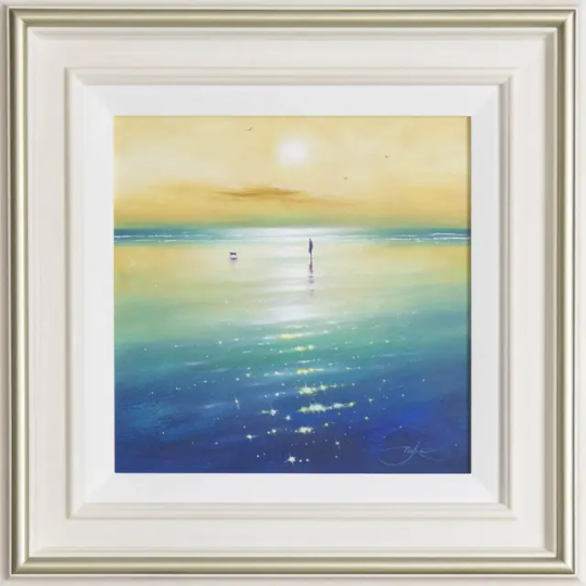
Edward Hersey. I just wanted to say, that I'm impressed with how the artist is able to portray the time of day in this piece through the color choice and the placement of the shadow. Everything looks like it is effected by the sunsets light and is in the same scene.
0 notes
Text


Lisa Yuskavage. There's something soft and stylized about how this artist paints scenes and people that I really enjoy. I'm also drawn by the bold colors the artist often uses in her artwork.
0 notes
Text


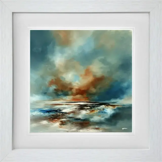
Andrew Grant Kurtis. What interested me about this artist is the colors he uses is very similar throughout his paintings; there is a dreamyness about them with the purples and blues. I especially like how he uses intense colors as lighting on his water. Like the orange on purple water or the teal on dark blue.
0 notes
Text


Colin Carruthers. This artist often uses palette knife to paint their paintings. I personally find it difficult to paint details when I used a palette knife but I love how it's easy to see the blades of grass and the little flowers look just like flowers. Also the texture is nice.
0 notes
Text


Ben Payne. I just love how this artist uses very soft colors. The way the paint is blended makes these look so realistic.
0 notes
Text
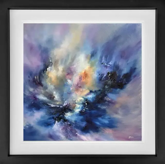

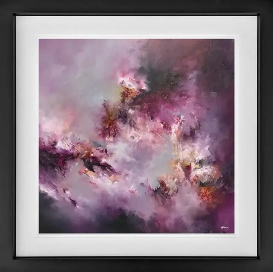
Alison Johnson. What caught my eyes about this one is the cloud like or galaxy quality of the paintings but with so much color.
0 notes
Text


Benoît Havard. What caught my eyes about these paintings were the bright colors on relatively dark or muted colors. I like how the light is painted and blurs into the background.
0 notes
Text


Frank Getty. I'm really liking the texture being created by how the paint is put down.
0 notes
Text


Lynette Yiadom-Boakye. Was introduced to her through the class slides and was amazed that she created her own people in these paintings. I love how there is just enough details to make out the faces and limbs but the paint is laid pretty broadly.
0 notes


Text


Chloe Cumming. I love how this artist puts the paint down on the canvas. It feels very expressive. Also it almost creates a feeling of movement.
0 notes
Text

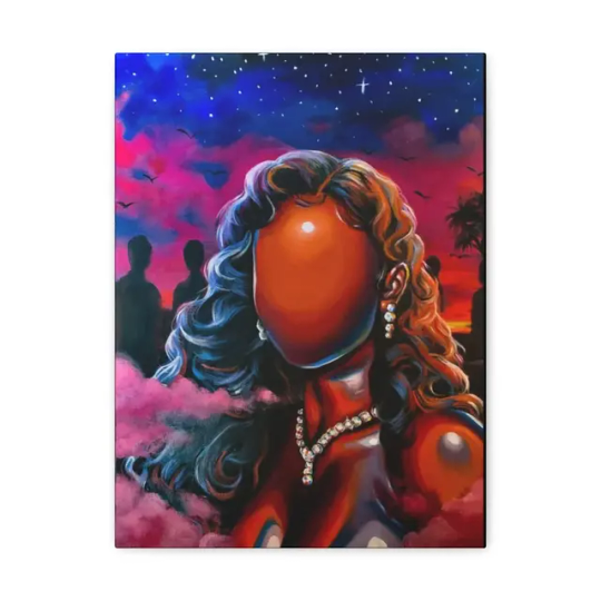

Cerena Robertson. I'm once again drawn in by how the artist paints skin. Using a lot of reflective blues and red in the skin make it look less flat and more pleasing to the eyes. I also enjoy the blues and purples in the hair that I believe is supposed to be black.
0 notes
Text


Claude Monet. 1840-1926. An impressionist painter well-known for his paintings. I always appreciated his interpretations of the world and how very painterly strokes can still express a place.
0 notes