
Statistics
We looked inside some of the posts by teambunt and here's what we found interesting.
Average Info
Notes Per Post
9K
Likes Per Post
7K
Reblog Per Post
2K
Reply Per Post
17
Time Between Posts
5 days
Number of Posts By Type
Text
10
Photo
6
Link
1
Last Seen Tumblr Blogs


Fun Fact
Tumblr.com is the 103rd most visited website in the world.
Text

New art, new inspo 🍰
I love this new framed piece- the simplicity, the flat vector imagery and particularly the typography. Eve thing here is really quite simple but it works so well. I’m going to try to replicate something soon myself... we’ll that’s when I’ve done the 4 impending assignments left to do this semester 🤯
5 notes
·
View notes
Photo


Next assignment almost in the bag! 🏁
So I’ve been working on my last Visual Communication assignment which is all about making up a film concept and then designing the poster. I’ve absolutely loved the whole process and enjoyed the research phase too, lots of inspiration out there!
I’ve played with lots of different designs and sourced a fair amount of feedback. Which is your fav design of the poster? I personally love the gradiant tone that the picture (of a finger print!) behind the design brings although people are currently connecting more with the plain black and white version... apparently this adds more drama and impact - what do you think?
2 notes
·
View notes
Photo


⚫️⚪️ Black and white for the win ⚪️⚫️ I’ve heard that black and white is a very inflexible palette, but I actually think it is quite the opposite. B&W is incredible versatile, easy to use, and can be effective for any type of design... even at McDonalds as seen here! When researching a bit about colour theory, I hear the following about black: “Black is the strongest of the neutral colours. On the positive side, it’s commonly associated with power, elegance, and formality. On the negative side, it can be associated with evil, death, and mystery. Black is the traditional colour of mourning in many Western countries. It’s also associated with rebellion in some cultures, and is associated with Halloween and the occult.“ ... which tells me that it TOTALLY should not work for a fast food outlet who is the opposite to elegance, formality, death and mystery although the use of simple black and white here adds a fun and energetic tone to the place of eat which I think would appeal to most audiences. Also note how the level of contrast alters particularly on those fries - it is great to see how you can achieve such a high level of contrast through black and white blocking alone... NICE WORK service station!
PS; this is my last planned post for this visual diary assignment and after reviewing the posts to date I find it insightful that both my first and last post are black and white designs... am I boring or consistent?!
4 notes
·
View notes
Photo


Mobile photo editing ✄
Firstly, who knew DSLR cameras were so bloody expensive!? My plan was to get one for Christmas to use on my College course but that was soon out of the window when I learnt that there wasn’t really anything out there which could beat my iPhone 11′s capability which was in my budget.
In an initial effort to better exploit my camera’s ability, my first task was to play with some editing software. Here I have used ‘Snapseed’ which has some fab features and filters to enhance photos. In this example (before and after) I have tried to emphasise the resistance and anger of the message captured and by increasing contrast in black and white, I love the effect achieved!
I’m actually a bit gutted that I captured this photo after my recent photographic assignment as I think this does a fab job of capturing ‘anger’ (in a different way that the obvious) which I would have probably included in my report! Anyways, this will still be great inspiration for my final ‘Visual Communication’ assignment to create a film poster as I think a high contrast photo would be perfect for my vision... more to come soon!
I’ve also been playing with #VSCO #Afterlight and #Lightroom with some awesome results although they certainly need some more practice!
0 notes
Text
Research begins 👀
My next assignment is to create a film poster (completely fictitious!). This will be a real challenge and test of my new design skills.
The first task is to decide on a genre (I love the idea of cult classic and would love to bake in the overall theme linking to the pandemic/ lockdown... as that’s life right now for us all!)
My next task is research and inspiration hunting - I am still thinking about whether to use photos, create custom graphics in illustrator or both but here are some of the designs (and similar imagery) that have caught my eye so far - any other suggestions for me to consider?


0 notes
Link
What not to do 🤦♂️
Sharing an article I found today about the most common graphic pitfalls which I found interesting and super insightful now that I am starting to work in this space with several graphic design assignments progressing (from movie posters to logo design).
I don’t necessary agree with everything listed here but some new learnings from this article which I will consider in my next design:
Kerning: the space between letters and words does matter! Mobile First Design: design needs to work small and be fast to load Designer bias: you need to design for the target market, not yourself
2 notes
·
View notes
Photo
🟪 Psychedelic design 🟪
I love the busyness and eclectic nature of this design. It is hectic, overcrowded and both the colour and use of texture is excessive... BUT it works!
This will be great inspiration at a time when I am investigating ideas for my next assignment... a movie poster! 🍿

✧ Looking Glass ✧
9K notes
·
View notes
Text

Visual Awareness 🔎
I love this visual information guide about internet safety. The use of colour enables the reader to easily link the specific part of the content with the explanations. It would be easily for this to be busy or confusing but the layout is so simple and easy to read.
I also like the use of flat vector images - cartoony and fun whilst still appropriately paired with the serious education topic... nice work Gardai!
0 notes
Text

Colours of the year 🎨
One of the benefits of signing up to the new free design resources that I’m discovering as part of my @griffithcollege interactive digital media postgrad course is all of the new insights that are being delivered to me.
I’m currently designing a logo and I’m already taking inspiration from these tones - they may both fit perfectly! 🤞

0 notes
Text

Hidden message? 🔎
I’m not sure if this was on purpose by the marketing and design team but as soon as I saw this packaging, I saw the iconic 2020 blue mask in the gap between the models fingers... was this on purpose? What did you see?
If it was on purpose this is probably quite clever to exploit everyone’s increased health concern over COVID-19 but if not, a happy coincidence for the brand perhaps.
0 notes
Text

Visualizing movement ♾
On my hunt for inspiration on how to beat visualize movement and motion in graphic design this advert popped up on my Amazon Prime!
I love how the designer has extended tones and recreated a sudo blur using shapes - this is a great design and super effective!
Source: Amazon Prime Video
1 note
·
View note
Text

Basic bubble, Lush logo 🫖
Here is an example of a logo which I think works really well - a clean and simple design which symbolizes the product really well and I love how it lets the product shine. I also really love how the logo is transparent which means whichever coloured bubble tea you select, defines the logo on your cup (just like the Guinness logo on pint glasses!)
2 notes
·
View notes
Photo

Opening my eyes to iconography 👀
I wouldn’t normally take a second to examine an icon and just hastidly click to get the job done however my studies in digital media and visual communications have recently led to a pause in thought and an appreciation for the effectiveness of some icons.
Whilst browsing on LinkedIn today, I saw these icons/ images which I really appreciated. They are simple, flat and adhere to a consistent colour pattern but they are not too simple to be confused over the meaning or intent. I especially like how the yellow tone is used sparingly to highlight and for emphasise and I an surprised that the use of (several tones of) grey is more than enough to add the required depth which the icons need.
Great inspiration for my upcoming logo and design assessments ahead!
Source: LinkedIn
0 notes
Text

Good Morning Sunshine! ☀️
Some unexpected inspiration this morning on my daughter night dress... I like this typography, the colour, the texture and the vibrance of the design. In particular I like the additional pattern on the growing shadow and the overlay stroke which adds a sense of movement/ motion!
0 notes
Text

Simplicity wins 🟣
I saw this logo on social media today - I do not think it is definitive enough to be effective as a logo however I think it is a beautiful design and it reflects the RGB splitting which we covered in this weeks visual communications lecture - I love how the two circles create a new shade on colliding... quite artistic!
0 notes
Text

Street art 🖼
Here is such a great example of typography in street art - what a talent!
I love how the shine over the type face adds depth to the design and how the night sky on the design blends well with the actual Bristol sky whilst also allowing the text to pop... great inspiration for my upcoming Typography poster assignment at college!
0 notes
Photo


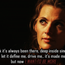
Exploring typography 🅰️
Lecture 3 of my visual communications college module was today and I learnt about typography, which was fascinating!
I also learnt about the many free online resources for graphic design - special shout out to unsplash for photos and dafont for typography
Here is my attempt within the lab session (3) to use different font types where I challenged myself to tackle a black lives matter design brief for a beauty company.
I absolutely love how the type face feels like makeup painted on the model’s face and how I have played with the colours to make her eye’s pop through the black and white style which does a great job of catching the audience’s attention. Yes, the main ‘BEAUTY’ title does take time to interpret which could be an issue usually however this is on purpose and a deliberate design that mirrors the additional time that it takes to better understand the race divide
@maccosmetics what do you think?
photo credit: ‘smiling woman’ by Houcine Ncib from unsplash.com font credit: ‘a attack graffiti’ by sourced from dafont.com design credit: me
2 notes
·
View notes