
Don't wanna be here? Send us removal request.
Statistics
We looked inside some of the posts by taylormcampbell346 and here's what we found interesting.
Average Info
Notes Per Post
1
Likes Per Post
1
Reblog Per Post
0
Reply Per Post
0
Time Between Posts
23 days ago
Number of Posts By Type
Text
17
Last Seen Tumblr Blogs


Fun Fact
Tumblr posted its first advertisements in May 2012 and subsequently earned $13M in revenue.
Text
ARTS 346 - Week 6 Blog
What's Wrong With Plagiarism (pp. 147-158): These pages were fascinating because they presented plagiarism in a broader ethical context, challenging the typical understanding of it as simply theft. The discussion on the difference between ethics and morality was particularly insightful, suggesting that plagiarism is more of an ethical issue within specific fields, rather than a universal moral wrongdoing. This distinction made me think about the varying attitudes toward plagiarism in different contexts. The comparison between plagiarism and property rights was intriguing, questioning how ownership works in creative fields. It made me consider how designers claim ownership while also drawing from others' work, blurring the line between influence and theft. Additionally, the section on plagiarism as deception stood out. It emphasized that the real harm is not just copying but misleading others about the originality of work. This perspective gave me a deeper understanding of plagiarism as a trust issue, not just a legal or moral one.
Helen Armstrong Talk - Chatbots, Agents, and Beyond: AI is a strange and rapidly evolving tool, blurring the lines between human and machine interaction. It can act as a helpful assistant, automate tasks, and even mimic human emotions, yet it also raises ethical concerns about privacy, dependence, and authenticity. As AI develops, it becomes more integrated into daily life, sometimes in ways that feel unsettling—whether it’s personal AI companions or digital “twins” used for medical testing.
Helen Armstrong’s talk, Chatbots, Agents, and Beyond, was especially interesting because it explored both the history and future of AI agents. From early experiments like Eliza to modern AI assistants like ChatGPT-4 Voice, she showed how AI has transformed from a simple program into a tool capable of independent decision-making. The discussion on AI’s ability to use tools, simulate humans, and make personal connections made it clear that we are entering a new era where AI isn’t just assisting us—it’s becoming part of our world.
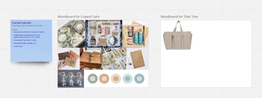
Project Process: On a Miro board I created, I have developed a mood board for a Calm/Mental Health Survival Kit designed for evacuation scenarios. This kit focuses on things people often overlook, such as comfort and ease anxiety during a storm. Additionally, I am exploring the idea of a tote bag with Velcro pockets, allowing users to customize their kit by adding essential survival supplies such as snacks and water. However, I feel that my current packaging concept does not fully align with my narrative. The Gray Man serves as a warning to locals in Pawleys Island when a storm approaches. While many residents choose to stay and secure their homes, others decide to evacuate. To better reflect this reality, I am considering two distinct packaging approaches—one for those who remain, prioritizing products that help manage stress and anxiety, and another for evacuees, designed as a practical survival kit. Additionally, I am developing a third concept, A Piece of Pawleys, a sentimental kit for evacuees that provides a sense of home while they are away. For my on-screen component, I am reconsidering the current “EVACUATE NOW” messaging, opting instead to provide a useful resource, such as a website link for evacuation details. While I have several ideas, I am working to refine my approach to ensure cohesion between the packaging and the overall narrative.
0 notes
Text
ARTS 346 - Week 5 Blog
Reacting (pp. 149 - 165) - The passage explores how designers use their creativity to respond to world events and social issues. It begins with a personal reaction to the fall of the Berlin Wall, emphasizing how designers have the power to communicate beyond words. Several examples demonstrate this impact, such as Geoff Wagner's protest signs against Proposition 8, Justin Ahrens' nonpartisan “29 Reasons to Vote” campaign, and Brian Ponto’s anti-Republican posters. These projects show how design can inspire activism, spread awareness, and even raise funds. Other initiatives include product design with social commentary, such as Modern Dog’s Obama Gum, and environmental efforts like Sprint’s eco-friendly packaging. The Hurricane Poster Project raised thousands for disaster relief, proving that design can be a tool for real-world change. This text was fascinating because it showed how creativity extends beyond aesthetics—it can spark movements, influence public discourse, and make a tangible impact on society.
Project Process - I have the finished product for the on-screen version of the Gray Man story! I wanted the radar to identify the Gray Man as a tease at the beginning. Whenever he is detected again, it urges the user to evacuate due to the storm heading towards the beach (hence the power going out from the thunder sound).
After some critiques, I believe I will add a more subtle thunder in the back to then having a louder thunder fade in then back out so it's not so out of nowhere like I currently have. I also think I want to add only the dot of the Gray Man still beeping when the screen goes black to show that he is still here while the storm is here as well. I am very happy with this outcome!
Now for packaging, I'm thinking of doing a survival kit to continue the story (as if you were in the storm), and after some talks, I was suggested to think of a survival kit that is personalized for me. More sentimental and something I want to help my mental health through the storm. Some items I have in mind are a curated beach scented candle with waterproof matches, something for the fur babies, etc. I am still stirring up some ideas but the packaging will be super fun!
0 notes
Text
ARTS 346 - Week 4 Blog
Responsible to Whom (pp. 196-198) - Ken Garland recounts his time in corporate boardrooms, where CEOs insisted their main duty was to shareholders. Though he played along, he recognized that executives privately admitted shareholders were easy to manipulate. His manifesto, First Things First, which criticized commercialism in design, led to subtle warnings but was largely dismissed as harmless idealism. Unexpectedly, his bank manager saw his televised stance as mere entertainment, reinforcing the idea that dissent is tolerated as long as it isn’t truly disruptive. What makes these pages so interesting is Garland’s sharp wit and irony. He exposes the gap between corporate rhetoric and reality, showing how responsibility is often just a performance. His choice to embrace “irresponsibility” challenges the idea that designers must conform to commercial interests. Through humor and reflection, he highlights the power dynamics in business and the need for creatives to question their role in reinforcing the system.
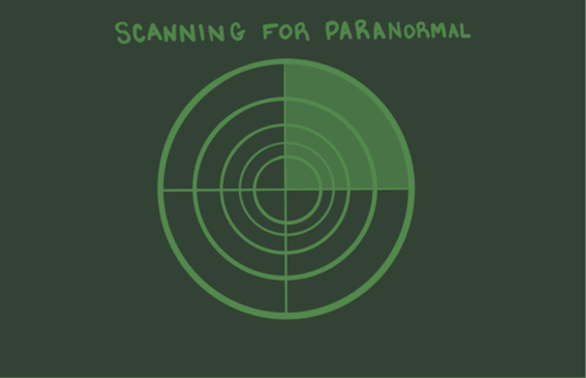
Project Process - This week I finally was able to mess with Adobe After Effects, and it was probably the hardest thing I could've learned. The whole platform itself looks super confusing and there's coding involved which I am not a professional at. I've watched some videos regarding how to make a paper fly around or how to create a spine to create multiple movements. I did that and it looks very not professional. I know I have to trust the process but I just didn't know where to go after the steps I went through. I decided to do a different animation and keep the idea of having the 3 forms tell a story as if you're going through the storm (going from color to back and white, then back to color). The new animation is going to be a radar that is detecting for paranormal. Once it detects the Gray Man, it will start peeping and glitching to reference the storm coming and the power going out. It will also indicate that evacuating isn't optional and will start flashing "Evacuate Now!" on the screen. I want to add sounds to this animation so I started drawing this within Adobe Fresco and it's already going better than before! This is just a rough sketch. The radar will stay the same but I'm thinking of adding a typeface that represents a retro old computer.
0 notes
Text
ARTS 346 - Week 3 Blog
Weaving Design Community (pp. 95-99): This section of Weaving Design Community highlights how graphic designers are using their skills to forge deeper connections with their communities, moving beyond commercial work to contribute meaningfully to social causes. The essay discusses the shift in graphic design over the past few decades, particularly the growing integration of design with advertising and consumerism, raising ethical concerns for designers. In response, many professionals, such as Mark Spangler, Ken Friberg, and Sue Crolick, have embraced pro bono work, using their talents to support nonprofit organizations and underserved communities. Their efforts reflect the ethos of First Things First Manifesto 2000, which calls for a reevaluation of design priorities, advocating for work that fosters positive societal change. Through volunteerism and civic engagement, these designers demonstrate that design is not just about aesthetics or profit but can be a powerful tool for social good, strengthening the fabric of society through creativity and generosity.
Project Progress: This week, we were assigned to create a storyboard for our on-screen story. I sketched Pawley’s Island Beach in a loose, sketchy style, which I plan to maintain moving forward. After receiving feedback, I was encouraged to tell the story fluidly across all three formats. For example, my animation could start off vibrant and colorful (representing the calm before the storm), then transition into a dark, monochromatic style (as the storm intensifies). My packaging could reflect the storm’s peak—possibly as a hurricane safety kit—while my book could return to bright, lively colors to symbolize the aftermath and recovery. The animation will be in the works to show the first sighting of The Gray Man. My storyboard is shown below!

0 notes
Text
ARTS 346 - Week 2 Blog
Citizen Scholar (pp. 20-31) - "Citizen Scholar describes not only who I am but who I strive to be and who I want to be around" reflects Randy J. Hunt’s philosophy of responsible design and aspirational living. As the founder of Citizen Scholar, a Brooklyn-based design studio, Hunt seeks clients who value the bigger picture and share his ethical commitment to creating meaningful, impactful work. This approach extends beyond design into Hunt’s broader career, including his role as the co-founder of Supercorp, a company supporting community-driven commerce through its e-commerce platform, Supermarket. Hunt’s dedication to responsibility in design and life is evident in his lectures, writings, and collaborations with universities and publications. His ethos centers on awareness, intentionality, and the belief that good design should serve practical needs and foster a better, more sustainable world. Through Citizen Scholar, Hunt exemplifies a designer’s creative and ethical steward role.
Meeting w/ Sarah Matthew - The talk was entertaining and inspiring, filled with personal stories and meaningful projects. Her story began with her mother, a seamstress, sparking her creative journey. In 2000, while collecting wedding invitations, she realized she disliked the designs, which she thought resembled graduation announcements. This motivated her to design her own wedding invitations and later create some for her sister. By the time she attended art school, she had already been designing invitations for 10 years, exploring a variety of creative formats like pop-ups. Her talent even earned her scholarships solely from her invitation designs. She draws inspiration from Amos Paul Kennedy, Jr., her favorite printer, who uses his platform to amplify voices. This inspired her to pursue meaningful work that resonates deeply with her. Another major influence is Ben Blount. Her passion for layers and letterpress printing shines in her projects, including a series titled Space: Known / Unknown (2021–2022). This series featured hand-carved letters and prints using wood and metal types on French paper in bold colors like white, yellow, orange, and silver. One of her standout creations is a flag book that is both fun and uniquely tied to its story. Another deeply personal project, A Mother’s Love, was inspired by her grandmother’s passing. Her grandmother used to send her handwritten notes, which she later compiled into a stunning artist book, beautifully crafted with Blurb. She even turned her grandmother’s notes into Palmer Plates. This was such a fun and inspiring talk, and her passion for her craft was absolutely contagious!
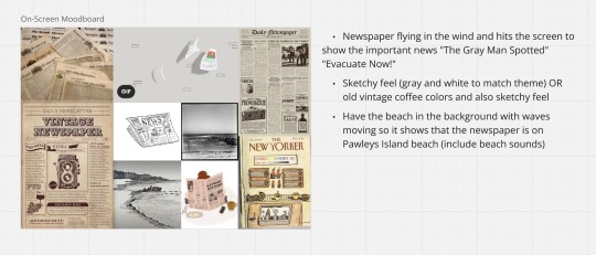
Project Process - This week's process on The Gray Man story, I have made a mood board of what I would like my on-screen animation to look like. I have only ever made a 2-3 second GIF as a project, but I would love to learn Adobe After Effects for this story and create something longer with sound. This will definitely take some research and questions. I want my animation to have a newspaper flying in the wind on the Pawleys Island dunes. Then the newspaper will hit the screen to show the viewer the important news, such as "The Gray Man Spotted!" "Evacuate now!" (since the Gray Man pops up to warn locals and visitors that a hurricane is on its way). I'm looking for a more monotone feel, made up of messy sketches or bold black outlines. Think The New Yorker, something along those lines. Below is my mood board of pictures and a GIF I took inspiration from!
1 note
·
View note
Text
ARTS 346 - Week 1 Blog
Good Citizenship Reading (pp. 2-8): Good Citizenship: Design as a Social and Political Force explores design's influence on society and politics. Pages 2-8 highlight how design goes beyond aesthetics, shaping civic behavior, public well-being, and community structure. The author uses historical and modern examples to show how thoughtful design fosters inclusivity, engagement, and cultural identity, while critiquing practices that perpetuate inequality. A key theme is the ethical responsibility of designers to prioritize collective needs over personal or commercial interests, framing design as a tool for activism through empathy and collaboration. I found these pages particularly compelling as they reveal how even subtle design decisions, like typefaces or spatial layouts, can shape interactions and opportunities. The connection between design, social change, and challenging power structures resonates with my creative aspirations, inspiring me to think critically about the impact of my work and how it can contribute to meaningful change.
The Project: In our Process and Systems course, we have one project that runs for the remainder of the semester. What is it, you ask? Whatever we want it to be. The overarching theme this semester is to create three forms of a story that express who we are or what defines us as individuals. It could be a story passed down to us, an object with deep family significance, or anything else that resonates personally. The question is ours to answer. I’ve chosen to tell a piece of folklore from my hometown, a story I grew up hearing from family and locals: the tale of the Gray Man of Pawley’s Island. He is a ghostly figure said to warn visitors and locals of approaching hurricanes. It’s a fascinating story, and I’m excited to share it in three distinct forms: on-screen, through packaging, and as an artist’s book. This week, we focused on the artist’s book, and my mind was buzzing with ideas. The beauty of the artist’s book is that it doesn’t necessarily require words, which makes the creative possibilities even more exciting. I will get back to you on what I decide for that! For the on-screen form, which is due first, I’m considering an animation of some sort. By next week, I hope to have some process work to share!
0 notes
Text
ARTS 245 & 246 Final Reflection
Throughout these typography courses, I've journeyed through the intricate world of letterforms, learning how to manipulate and harness their power to convey messages effectively. From understanding the anatomy of type to mastering the principles of hierarchy and contrast, each lesson has deepened my appreciation for the art and science of typography.
One of the most valuable insights I've gained is the importance of intentionality in design. Every typeface, font size, and spacing choice carries meaning and influences how a message is perceived. Through countless exercises and projects, I've honed my ability to make deliberate decisions that align with the intended communication goals.
Moreover, these two courses have expanded my creative toolkit and instilled in me a keen eye for detail. Whether crafting a headline for a poster or refining the typography of a website, I now approach each design task with a heightened sensitivity to typographic nuances.
Looking back, I'm proud of the progress I've made and the skills I've acquired. However, I also recognize that typography is an ever-evolving field, and there's always more to learn. As I continue my design journey, I'll carry forward the lessons and insights gained from these courses, confident in my ability to leverage typography as a powerful tool for visual communication.
0 notes
Text
Week 12 Blog Post
Chapter 11 - Typographic Design Process: The typographic design process is a meticulous endeavor that merges artistry with functionality. It begins with a comprehensive understanding of the project's objectives, audience, and brand identity. Typographers meticulously select typefaces, considering factors such as readability, tone, and aesthetic appeal. They experiment with various font pairings, sizes, and spacing to achieve harmony and visual hierarchy. Iterative refinement through sketches, digital mockups, and feedback loops ensures the alignment of design intent with client expectations. Attention to detail is paramount, encompassing kerning, leading, and typographic nuances. Ultimately, the typographic design process culminates in a cohesive and visually engaging composition that effectively communicates the intended message.
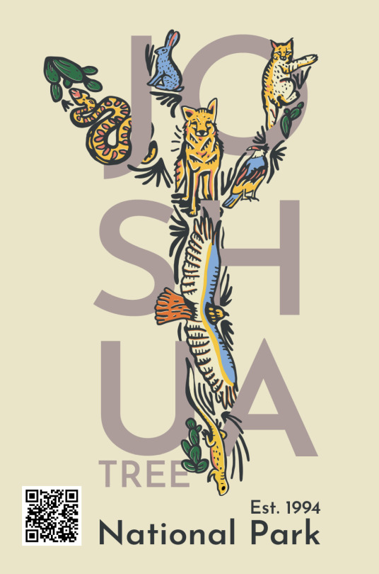
Assignment 4 - TypeHike Finalizations: We are coming to the end of our TypeHike posters and postcards. I finalized my poster by printing it on the assigned 16 x 24" size and it looks even better in bigger form. I created my AR experience in Artivive at this point which is linked with my type specimen and my postcards are ready to hand off to each individual in my class! This project was definitely a fun experience! I now have to visit Joshua Tree soon!


0 notes
Text
Week 11 Blog Post
Chapter 10 - Typographic Design Education: Typographic design education immerses everyone interested in the artful balance of form and function, where letters dance across the page to convey meaning and evoke emotion. Through rigorous study, aspiring designers delve into the rich history of typefaces, mastering the subtle nuances of serif and sans-serif fonts. They learn the principles of hierarchy, spacing, and alignment, honing their skills to create visually captivating compositions that communicate effectively. From classic typography to cutting-edge digital design, these ambitious creators explore the limitless possibilities of letterforms, preparing them to shape the visual landscape of tomorrow with creativity and precision.
Assignment 4 - TypeHike Cont/Type Specimen: We are continuing with our TypeHike posters this week. After our recent critiques, I was told to move the words "National Park" and "Est. 1994" somewhere along the word "Joshua" so it didn't look so choppy and safe. From my last blog post, as you can see it was down at the bottom and centered so it needed to be changed. What I ended up doing was putting the words inside the word "Joshua" and having it use contrasting colors used in the poster. I wanted to curve it on the two of the letters so it didn't look like it was just placed onto the word. Another suggestion I was told was to play around with the placement of my QR code. Once I had those two words moved, it didn't look right; something was off. Now that I am basically finished with my poster, it is time to start on my type specimen! What is a type specimen you ask? A type specimen is all the characteristics of a typeface you have chosen to work with. It basically just shows the viewers information on that specific typeface. I want mine to incorporate the colors of the tree of my poster with the accents of blue. I was told the blue was very interesting and appealing to the eye! I am still messing around with it but I do have a rough draft ready for show!

0 notes
Text
Week 10 Blog Post
Chapter 9 - Typography in Time and Motion: Before I was interested in graphic design, I never realized how significant the placement of typography could drastically impact the overall mood or feeling of a piece of work. I tend to always work with traditional compositions and straightforward arranged types. I thought the image of the Interventionist Demonstration was an intriguing visual of how arranging the type in dynamic ways can create a sense of motion or guide your eyes around the composition. This inspired me to try to step outside the box and try working with more fun and funky compositions. Maybe even play with the placement of type to create more of a flow through my future works. I actually use this sense of motion within my national park poster! You'll see...
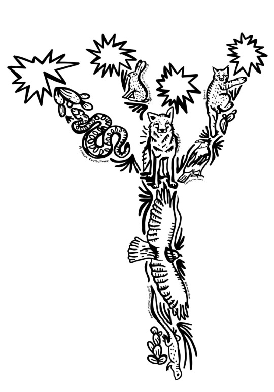
Assignment 4 - TypeHike Cont: As we continue on with the TypeHike, I have made a lot of progress with this poster. In my last post, I showed the animals making the shape of a Joshua Tree. I then colored it in using the color palette that was provided. We were given a list of typefaces to use within our poster but then I found out that I don't necessarily use the typeface list to say "Joshua Tree". I wanted to create my own font so I hand drew this really fun and funky typeface but when I placed it with the colored in tree, something was off. I felt as if the typeface didn't pair well with the drawing due to it being bold along with the thin lines of the tree. I wanted to make this typeface work by adding some features in the tree to the typeface, and it did look better but something was still missing. During our in-class critiques, I was told the typeface is fighting the drawing and they are both so interesting to look at that it doesn't balance well. I knew that I needed to sacrifice either the drawing of the tree and do something interesting with the font I created, or use the tree and use a different typeface. I decided to use a simple typeface that was from the list to pair with the tree and I will say, it looks absolutely amazing. The colors look super good together and I wanted to have the tree kind of intertwine with the tree and I feel I portrayed that very well. We will wait and see if this poster is better in our next critique so I can start working on the type specimen!
This was my first sketch/idea of my poster:

This is my new poster idea that I love:
0 notes
Text
Week 9 Blog Post
Chapter 8 - Typography on Screen: Typography's relationship with screen environments is pivotal, particularly concerning legibility, visual hierarchy, and structuring type on digital pages. Legibility relies on font choice, size, and spacing to ensure text is easily readable, even on varying screen sizes. Visual hierarchy guides users through content, using font weight, size, and color to emphasize important information and create a clear reading path. Structuring type on digital pages involves careful consideration of alignment, line length, and spacing to maintain readability and visual balance. In the dynamic digital landscape, responsive typography ensures text adjusts seamlessly to different devices and screen orientations, preserving legibility and enhancing user experience. By harmonizing these elements, designers can create engaging digital experiences where typography not only communicates information effectively but also enhances the overall aesthetics and usability of digital interfaces.
Assignment 4 - TypeHike: This project is the one assignment I have been so excited about since the beginning of the semester. This assignment is based on TypeHike which is our inspiration for this project. We are instructed to make a poster and postcard for one out of the 63 national parks. I am very passionate about national parks so this will feel close to home for me. Everyone has to have a park with no repeats and a specific typeface that we have to use at least once through these posters and postcards. I chose Joshua Tree National Park to work with and I have many ideas. When looking up Joshua Tree works, it's all about the tree itself. That makes sense obviously but I wanted to change it up a bit. I was thinking of doing the tree, of course, but researching the animals throughout the park and creating an abstract tree that uses the animals to shape the tree itself. I have other ideas such as using the tree and the environment as the main picture but I want to somehow use the type in a fun way which is still getting me in a sticky situation. I am really for this animal tree idea so I am going to work further with it!
I do plan to color this sketch in but we have a limited color palette so I will play around with those once I see the choices.

0 notes
Text
Week 8 Blog Post
Chapter 7 - The Evolution of Typographic Technology: Typographic technology has evolved dramatically since its inception. From Gutenberg's movable type press in the 15th century, which revolutionized printing and mass communication, to the advent of digital typography in the late 20th century, the journey has been profound. The introduction of phototypesetting in the mid-20th century marked a significant shift, allowing for greater flexibility and speed in typesetting. The digital revolution further transformed typography, with the development of desktop publishing software enabling designers to create and manipulate type with unprecedented ease and precision. Today, we witness the fusion of traditional typographic principles with cutting-edge technologies like variable fonts and responsive design, empowering designers to craft dynamic, immersive typographic experiences across various mediums, from print to web to mobile. This evolution continues to shape and enrich the visual language of communication in the digital age.
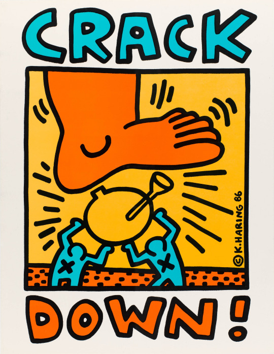
Assignment 4 - Zine: As I have talked about in my last blog post, we are creating a historical zine of a designer and I chose Keith Haring. I mostly finished this zine and I am very proud of the result. I created/drew my own typeface that I believed was inspired by Haring himself which is what this project is all about. I then typed out all the history behind Haring which happened to be so much; I can't miss any information on this man, he is too interesting! However, I do have to fix the rags before I print. I wanted to add some graphic elements that he uses within his pieces and I did just that. Keith Haring really works with this project because we have to use black and white and Haring uses big, bold outlines when drawing so either way, it looks good in black and white and color. I will be using colored paper when it's printed for sure but for my process book, I will definitely create another version of it colored in.

0 notes
Text
Week 7 Blog Post
Chapter 6 - The Typographic Message: This chapter was really well put. I have always seen typography as a creative expressive form, but this chapter opens up how typography is a language intended for educating, persuading, and pleasure. Us graphic designers love to use typography to explore the interaction between the look of type and what type actually says. In communicating a message, a balance has to be achieved between the visual and the verbal aspects of a design. Sometimes, however, designers explore the visual aspect of type to a much greater extent than the verbal. In these cases, the visual language does all the talking. This chapter explores when the visual elements of typography speak louder than words.
Assignments 3 & 4 - Logo Development Cont/Zine: We have finally put an end to our project 3; our logo and business systems. Along with my business card, I successfully finished my letterhead and envelope. After some trial and error with printing, it all turned out really great!

Our next assignment is creating a zine for a specific designer of our choice. What is a zine you ask? A zine is most commonly a small circulation publication of original or appropriated texts. For this zine, we were told to use only typography to really speak for our designer, and I chose the beloved Keith Haring. The type has to be its own art since we can't include imagery. Haring was inspired by the graffiti he encountered in the subway stations and the vibrant energy of the city streets, so he began creating his own art in public spaces. He used simple words and bold colors which will be great for adding the simplistic yet funky typography for this zine. I want this zine to have the history behind Keith Haring but I want the type to tell the story of Haring, not just hold a buttload of information.

0 notes
Text
Week 6 Blog Post
Chapter 5 - Syntax and Communication: Typographic syntax encompasses the structural and aesthetic elements governing the arrangement of text. Kerning regulates the spacing between characters, ensuring readability and visual harmony. Leading determines the vertical space between lines, affecting legibility and text flow. Typeface selection imbues personality and tone, conveying meaning beyond words. Alignment dictates the placement of text relative to a margin, influencing readability and visual rhythm. Contrast in size, weight, and style creates hierarchy, guiding the reader's attention. White space, or negative space, frames and separates elements, enhancing clarity and focus. Together, these elements form the grammar of typography, shaping the visual language of communication.
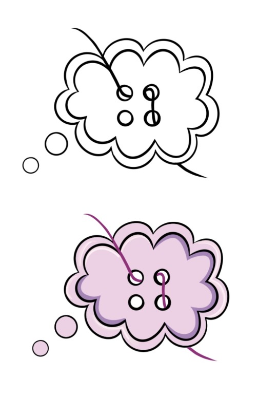
Assignment 3 - Logo Development Cont: This week's progress was working with our stationery products. We are creating an envelope, a business card, and a letterhead but crafting it all physically. Our mission was to make these products in a unique way that you wouldn't normally see in the business world (but still realistic). Since my whole logo and app are based around the idea threads, buttons, and the infamous thought bubbles, I wanted to keep that in mind. I knew I wanted to use thread (yes, hand-threading paper...) and the ideas started flowing. Brown card stock is what I will use for all the products because I feel that really fits in with the theme when using thread and buttons. I just finished my business card after some blood and tears of poking the needle through my fingers BUT it looks great! I'm going to post my layout ideas and my finished business card!
I also wanted to mention that I changed the color of my logo as I said in the last post so I will post that as well!


0 notes
Text
Week 5 Blog Post
Chapter 4 - The Typographic Grid: The typographic grid is a fundamental tool in graphic design, providing structure and harmony to layouts. Consisting of intersecting horizontal and vertical lines, it divides space into columns and rows, guiding the placement of text and imagery. This grid system ensures consistency and readability across various design elements, allowing for easy navigation and comprehension. By adhering to the typographic grid, designers can create visually appealing compositions with balanced proportions and rhythm. Whether used for print or digital media, the typographic grid serves as a foundation for organizing content effectively, enhancing communication, and fostering cohesive visual identities.
Assignment 3 - Logo Development Cont: The continuation of the logo development project is still in progress. We have had many critiques since the last blog post with our actual logo development. I have had multiple trials and errors with my logo but I have found the perfect one. As I had said before, I wanted to use a thought bubble as the main part of the logo, hence the name of my app. I started off strong with two logos and got feedback from my peers on which was best. I took out the "Thought Thread" within the logo that I originally wanted to do and decided to use that as a secondary logo for my stationary products; I figured that would work best. Although color does not matter within the logo, I currently have it in multiple colors of purple. I believe my change with that is changing it to a gender-neutral color so my app could be used by everyone and it's not just centered on one specific group. The next stop is the stationery products! Until next time...
0 notes
Text
Week 4 Blog Post
Chapter 3 - Legibility: Typographic legibility, the art of crafting readable text, blends form and function seamlessly. Careful selection of typefaces, font size, and spacing ensures effortless reading, enhancing user experience across various mediums. Serif fonts, with their elegant strokes, often find favor in print, fostering clarity and flow. Conversely, sans-serif fonts prevail in digital realms, promoting screen readability. Proper kerning and leading create balanced letter spacing, reducing eye strain and bolstering comprehension. Color contrast and background choice play pivotal roles, emphasizing content visibility. In this intricate dance of design elements, typographic legibility emerges as a silent yet powerful conductor orchestrating harmonious communication.
Assignment 3 - Logo Development Cont: To continue with the logo development project, we are at the point now where we collected some critiques on our name for the association and started sketching out some logos to work with. As I talked about in my last post, I wanted to create a self-reflecting journal app where someone can keep their thoughts out on their phone in an organized but playful way. The association name I came up with was "Thought Thread"; I called it this because if you look at my mind map for the word "Many", I have a list of buttons that led to thread and sewing so I got an email thread from that idea. With an email thread, you are keeping one chain message with whoever you are speaking to so in this context, you are keeping a note thread with your thoughts. I thought it was a perfect idea for what I was creating and have many options for logos. I wanted to use a button of some sort but have the thought bubble as the button and maybe mimic the font to look like thread. I have great ideas that keep flowing through so there will definitely be some progress!

0 notes
Text
Week 3 Blog Post
Chapter 2 - The Anatomy of Typography: Typography is the art and technique of arranging type to make written language legible and visually appealing. It involves the study of letterforms, spacing, and overall design to convey a message effectively. The anatomy of typography delves into the structural elements of typefaces. Characters are composed of various parts, such as serifs (small lines or projections at the ends of strokes), ascenders (parts of letters that extend above the x-height), descenders (parts that extend below the baseline), and counters (enclosed spaces within letters). Understanding typographic anatomy empowers designers to create compositions that seamlessly merge form and function, influencing how information is perceived and enhancing the overall visual experience.
Assignment 3 - Logo Development: This week's project has us developing a logo based off of an adjective and noun that everyone randomly selected. The two words I got were "Many" and "Moods"; at first I had no idea what in the world I was going to pull from those because they are such broad words. I actually found that since they were so broad, I actually had a ton more options than I thought. I got my ideas through a mind map that led me to 4 different associations which were a self-reflecting journal app, a flower shop that caters to special occasions, a soda or sparkling water, and a crochet/sewing app that has tutorials (video or step-by-step directions) on how to do so. My favorite one out of all 4 is the self-reflection journal app and I could come up with a fresh app name and logo along with a fun stationery product!


0 notes