Don't wanna be here? Send us removal request.
Note
Take whatever time you guys need! I love your analysis, but taking a break is important too.
Thank you!
2 notes
·
View notes
Text
Quick note...
Bolo here! Tondy and I have decided at the last minute to take a break during AllStars. As much as we enjoy blogging about the episodes, we thought it might be nice to sit this one out and just enjoy the show. We may be back from time to time with thoughts on the season (which we’ll still post on the Wednesday after the relevant episode airs), and we’ll definitely do a “thoughts on the season” post after the finale. We look forward to coming back full-force with whatever comes next, presumably season three of Project Runway: Junior.
Enjoy the season!

1 note
·
View note
Text
Rookies vs. Vets
Project Runway: All Stars Season 6, Episode 1
{ The Rookies }

Stanley, Kimberly, Edmond, Candace, Merline, Kelly, Char, Amanda
{ The Veterans }

Melissa, Joshua, Fabio, Ari, Ken, Helen, Casanova, Anthony

The Challenge: The designers must create a fierce cohesive collection in teams: All Stars rookies (theme: fall) vs All Stars veterans (theme: spring).
{ Prelude }
Tondy: There are quite a few familiar faces and a few that I have never seen before… I think this is going to be a very interesting season. Will Candice keep doing Goth? Will Casanova still be a favorite of mine? Who will charge ahead and who will limp behind?
Bolo: I actually remember everyone, though I’m obviously more familiar with contestants from more recent seasons. I’m excited that most of the rookies are from season fourteen. I loved that season and am excited to see how they do this time!
{ The Workroom }

Tondy: The veterans are already out-diva-ing each other. Anne Fulenwider, who is the new “Mentor,” doesn’t seem to give very pertinent advice or helpful advice. I wasn’t a fan of Zanna Roberts Rassi, but I want her back with a passion! Bolo: Oh my... the workroom dynamics being set up here sure seem to imply we’ll be in for a dramatic season! I’m kind of underwhelmed by a lot of what I’m seeing here, so it’ll be interesting to see everything on the runway!
{ The Runway }
Stanley (Team Rookie)

Tondy: I really like this one! I think the wide woven tan belt really makes it, but I love the cut and the fit! Score: 4.0 Bolo: I agree! There’s almost a warrior element to that belt, and I love the fullness of the skirt. This feels both classic and modern to me. Score: 4.0
Amanda (Team Rookie)

Tondy: This is pretty ho-hum for me. The pants are OK and seem to fit well, but the blouse doesn’t really go. I am not sure if the tan accents on the blouse are to make the collection cohesive, but they don’t work for me! Score: 2.5 Bolo: There’s a definite disconnect with the tan, but I’m not sure what it is. I also wish the neckline was a tiny bit less open. Other than that, I like it. Score: 3.5
Char (Team Rookie)

Tondy: This is OK, but I detest the one-sided cape look. It was really popular on the red carpet last year and should have disappeared with 2017. Score: 3.0
Bolo: I would normally agree, but it works for me here. I love the color, too, but I don’t understand why she styled it with yellow shoes... Score: 3.75
Merline (Team Rookie)

Tondy: First, I hate the color! I also don’t care for the asymmetrical cut-outs on the sleeves. It just looked sloppy. Score: 2.5 Bolo: I actually could be okay with this except for the sleeve cutouts. Maybe if they were on the outside instead of the inside? Score: 3.25
Kimberly (Team Rookie)

Tondy: Another not so great look. This one just seemed poorly made to me, and very ill-fitting. Really not impressed. Score: 2.0
Bolo: I think if the shorts were yellow, this look might make more sense. As it is, it has the effect of giving her a painfully long torso. It’s just odd! Score: 2.5
Kelly (Team Rookie)

Tondy: I have mixed emotions about this one. I like the design, but the fabric makes me dizzy. Also, that neckline is way too plungey! Score: 3.0
Bolo: I’m right with you.It’s cool but also kind of frenzied and busy. I’m honestly not sure what to think! Score: 3.0
Candace (Team Rookie)

Tondy: I loved that she used color. I like the skirt and I loved the way the fabric flowed. I get where she was going with the top, but something about the part that went up around the neck reminded me of a noose. Score: 3.25
Bolo: I really love this look. It’s very costumey, but super cool nonetheless. I do think the top would look better with an updo hairstyle, though. Score: 4.0
Edmond (Team Rookie)

Tondy: That color is the worst yet. He loved the fit and I hated the fit. I didn’t get the squiggles down the side of the front. The train was OK. Score: 3.0
Bolo: I don’t mind the color, but it clashes with the model’s skin tone. I’m not a fan of the squiggles, either, or the cut of the sleeves. Score: 3.0
Ari (Team Veteran)

Tondy: OK, finally a design I really liked. I love the white lace inserts, I love the cut and flow AND color of the dress. She said beautiful, and I agree. Score: 4.0
Bolo: This is beautiful! Such a great use of the lace fabric. I love the flow of the blue fabric, as well as the ombre effect. Absolutely lovely! Score: 4.0
Ken (Team Veteran)

Tondy: I really disliked this one, mostly because of the pants, but the top is really poorly made too. I did like the back of the top, but, really, there so many mistakes in the construction! Score: 2.5
Bolo: I really like the design. It has a cool futuristic vibe to it. The lower front hem of the top is a mess, though, and I’m not sure about the butt crack line in the back of the pants. Score: 3.5
Casanova (Team Veteran)

Tondy: I adore Casanova, but this design isn’t very good. The dress with the high slits is sort of a cliché these days, and I hated the way the middle panel went between her legs. That top was just fitted so poorly! Score: 2.5
Bolo: Yeah--there’s something off about the pants. I wish the lace cut-out didn’t overlap the pants in back. Score: 2.75
Joshua (Team Veteran)

Tondy: I am somewhat mystified by this design. I can’t quite figure out what it is. Is it weird pants, or is it a really drapey top? It’s a whole lot of fuchsia and a whole lot of skin. Score: 2.5
Bolo: This confuses me, too. And those flaps that hang down between her legs... yikes. Definitely not a good effect. Score: 2.0
Melissa (Team Veteran)

Tondy: Um… this is just blah and boring. I don’t really have any other fault to find with it, except that although it looks like a summer dress, it’s made out of leather. Score: 2.5
Bolo: I don’t like the effect of the lace on the top for some reason. It’s kind of turning my stomach, actually. I like the cut of the dress, though. Score: 2.75
Helen (Team Veteran)

Tondy: I thought the top was cute, and I actually liked the tailored ruffle. I didn’t much care for the color-blocking effect. Score: 3.0
Bolo: I actually do like the color-blocking here. It’s a cute dress, just kind of run-of-the-mill, though. Score: 3.5
Fabio (Team Veteran)

Tondy: I have mixed emotions about this one. I loved the front, the simplicity of the design and the cut of the top, but I hated the fringe. However, when I saw what the fringe on the back did when she moved, I really loved it. I would have scored this higher if he had left the fringe off of the sides of the top. Score: 3.25
Bolo: I like the fringe, but this look is all over the place. There are four different shades of blue--that don’t all play nice together--plus off-white shorts and black shoes? I like the cut of the top, though! Score: 3.25
Anthony (Team Veteran)

Tondy: Having gotten sort of over my Phringe Phobia due to Fabio’s look, I really liked this design. I think the thickness of the fringe and the ombre effect of the whole dress was lovely! Sadly, I saw some construction issues on the back of the top. I would have given a 4* if not for those. Score: 3.75
Bolo: This is a MUCH better use of the fringe, and actually I love it. This would be a really lovely/unusual red carpet look. Very pretty! Score: 4.0
{ The Results }
Judges’ Top Three: Char, Edmond, Merline Our Top Three: Stanley, Ari, Anthony
Judges’ Bottom Three: Helen, Ken, Casanova Our Bottom Three: Casanova, Kimberly, Joshua
Judges’ Winning Pick: Merline Our Winning Pick: Stanley
Judges’ Losing Pick: Casanova Our Losing Pick: Kimberly and Joshua (tied)

Almost no agreement with the judges this time around!
{ Afterthoughts }
Tondy: Well, Bolo, it’s good to be back, isn’t it? I found this first episode a little boring, but, perhaps boring is good after the high drama of the twins, etc. in the last Project Runway… I think the big surprise for me was that Candice used color! The biggest disappointment was Anne Fulenwider, who needs lessons from Tim Gunn. I'm glad the whole team thing is over, for sure, though!
Bolo: Oh yeah! It would have been a nightmare if they’d stayed in teams the whole time. Yikes! Hopefully we’ll get used to Anne as she finds her footing as a mentor. It can’t be easy to follow up Tim Gunn! :) With all these strong personalities and so much talent, I’m excited to see where the season goes!
Looking forward to tonight!

5 notes
·
View notes
Text
Finale, Part II
Project Runway Season 16, Episode 14

{ New York Fashion Week }
Margarita

Tondy: My favorite looks were the long yellow dress with the great pattern and the amazing flow, Jazzmine’s swimsuit reveal which was stunning, and the red dress with the patterned jacket. I also loved the sequined top and the black skirt. My favorite, and one of my favorites of the runway, was those amazing pants with the perfect navy blue top! My least favorite were the first look, too potato-sackish, the short shorts look, although I did love the jacket that was with them, and the striped dress with the uneven hem. Overall, this was probably my second favorite collection!! Bolo: I thought Margarita’s collection was stunning, cohesive, bold, and really well designed. I think it was the strongest of all four collections, and honestly, it was my favorite. The bright colors and busy patterns may not be for everyone, but these looks would appeal to a lot of women, and I think she did a great job fusing the Puerto Rican vibe with wearable, beautiful fashion.
Brandon

Tondy: My mother always said, “If you can’t say anything nice about someone, then don’t say anything at all!” My guess is that she would have applied it to “someone’s” collection as well, but I have to say something. Everyone knows that I think Brandon is a one-trick-pony. He does the same thing over and over again. That said, the first look is really cute, and I love the white back pack. I wish it didn’t have the dipped hem, though. I got bored of the flamingo material really quickly. The rest of the collection flew by in a rash of shapeless designs dripping with ribbons. I did wake up when Liris came down. I still hate the paper-bag waist, but Liris could make a paper bag look great!
Bolo: Ah, I can’t even imagine what Gaga would have said about what qualifies as fashion these days. We may not have inherited her tasteful, classic fashion sensibilities, but I have to think she’d probably side with us more often than not! ;) So--I think Brandon’s probably a really nice guy, and I do think he’s a talented designer, I just don’t feel the range that he’s shown is all that impressive. These looks are just re-hashes and re-interpretations of looks he’s already made. There’s nothing new here, nothing that was a “wow” moment for me.
Kentaro

Tondy: I just don’t know what to say here. I can’t imagine anyone wearing the first dress. It just doesn’t make sense to me. An explosion of black tulle in front, and a plain dress in back? Really? The next look was a straight-jacket, how would someone eat with their hands sewn into the sleeve? I thought the red and black dress was really cute, but WAY too short, and I hated the white nightgown. I literally have that nightgown, although it is in a peach color. I would have liked to see the last look without the black tulle cage, because it looked like it might be intriguing. The peach dress with the long pleated skirt is one of my all-time favorite designs EVER!!!
Bolo: I hate this collection. I hate this collection and I’m sick that he won. There’s no cohesion whatsoever, not in style, not in color or fabric, not in style, and not even in degree of fashion. The first look is way too avant-garde for the rest of the collection. The peach “ballet instructor” dress with the black tulle overlay looks like something he dug out of his “trashed ideas” pile. That white dress looks like something a sixth grader made at fashion came--I mean, really? That’s a look in a winning collection? And that last look--all I could freaking think was Kentaro has somehow managed to embody Pigpen from The Peanuts in terrible, ugly fashion:

This collection was fifty shades of bizarro, and I’ll never understand why he won.
Ayana

Tondy: I was worried when I saw her first look as I didn’t care for it at ALL. Her second look wasn’t much better as the top didn’t fit very well. Ditto the third look which was just dowdy! But then, the rest of her collection was amazing. I am in love with all of her silver-gray looks! That jacket with the collar that fastens on the side of her neck, the material of the next silver top with the lace trim and the bell sleeves and the amazing flow, the gold and silver top with the skirt with pants under – (not one of my favorite design elements, but in this case it looked great!), the somehow sort of Victorian dress, the two next silvery looks and then that drop-dead gorgeous show-stopper dress. Wow!!! She blew this Runway out of the ballpark!!!
Bolo: Were it not for the first three looks, I would have had a really tough time choosing between Ayana and Margarita in terms of who deserved to win more. However, look number four and on just got better and better, ending in that absolutely STUNNING finale piece, which is easily one of the most beautiful looks ever to grace a runway on this show, NYFW finale collection or otherwise. That she was able to hold true to her modest aesthetic and still create a collection of this magnitude says a lot about her talent. I think she’ll probably make a huge name for herself in the fashion industry.
{ Afterthoughts }

Tondy: Well, Bolo, I don’t know when I have ever been so confused by a Project Runway finale in my life, and you and I have watched them all. For me, the clear winner was Ayana, next should have been Margarita, then Brandon and finally Kentaro. I truly have no words to express my utter and total shock! I truly wonder if the judges were deadlocked between Brandon and Ayana. I don’t really think the judges considered Margarita to be really in the running and shame on them because she put on a great collection, and I think they just decided to default to Kentaro. Don’t get me wrong – I adore Kentaro and I think some of his earlier designs were great. I just thought his NYFW designs were pretty awful. There are 4 judges. Perhaps they should consider a 5th for the NYFW runway? Thoughts, Bolo? PS: Can’t wait for the Reunion!!!!!!!!! Bolo: That was beyond confusing. I adore Kentaro, at least as far as who we “got to know” over the course of the show, but I just don’t see how his collection was win-worthy. Even if Brandon had won, I would have gotten it, because at least you could tell he put his heart and soul into every piece, but Kentaro’s entire collection looked like an afterthought. There was nothing there that said this was a designer who made it to New York Fashion Week. It just wasn’t good. I do think it would make sense to have one judge more than the number of NYFW contestants, because yeah--if you get one judge for each designer, someone has to change their vote, and that just doesn’t seem right. Definitely can’t wait until the reunion tonight!
It’s been an amazing season! Be sure to watch season six of Project Runway: All Stars, beginning in January, and check back here for re-caps!
Until then!

2 notes
·
View notes
Text
Finale, Part I
Project Runway Season 16, Episode 13

The Challenge: The designers must return home to create ten cohesive looks with a budget of $10,000. Two preview looks will be shown to the judges, who will then choose at least three designers to show at New York Fashion Week.
{ Prelude }
Tondy: Tim visits each designer in their home studio after meeting their families (this is one of my favorite parts every season, Bolo!) He offers a little constructive criticism. Bolo: The home visits are always interesting. It’s fun to learn more about the designers, “meet” their family and friends, see where they live, etc. It’s also fun to get an early peek at their collection and see how it changes before New York.
{ The Runway }
Brandon


Tondy: I don’t care for look one at all. I’ve never liked “paper bag waists,” and I thought they went out of style years ago. If not, they should have! The second look was better, but I think Brandon was so sure of the win that he didn’t try very hard. The flamingoes got old really quickly. Score: 3.5 Bolo: The first look is awful. It’s ill-fitting, the top looks poorly made, and the crop top looks terrible with the skirt waist. The second look is cute, and I like the way it’s styled. Score: 3.75
Margarita


Tondy: I loved her first look! The pants fabric was awesome and pairing with a fairly simple, but well-cut top was a great decision! The second look wasn’t quite as successful for me. The shorts looked like the shorts that boxers wear, and another paper bag waist! They weren’t very flattering, but the jacket was amazing! Score: 4.0 Bolo: I’m completely in love with her first look. That’s the girl I want to be! I love the pants, print and cut, and I love the top. The second look, though. Yikes! I don’t understand why she chose to show a bathing suit covered with shorts. The jacket is lovely, but the print-on-print with solid bottoms look didn’t work for me. I really wish she’d at least left out the shorts. Score: 4.0
Kenya


Tondy: Look one was adorable! I loved everything: the fabric, the long over vest, the pants! Then came the big OOPS moment with look two! Even with the black trim on look one, it wasn’t enough to tie-in with the all black dress and negligible peach sheer jacket. Although I liked the black dress, especially the unusual cut on the top and the fit, I didn’t care for the ruffled bottom. It just did NOT look like it belonged in the same collection as the first look. Score: 4.0 Bolo: I thought the first look was adorable, and I was confused as to why the judges liked it better with the jacket off. They never tear layers off Brandon’s absurd creations. If he’d sent this down the runway, they would have peeled off their faces from sheer ecstasy. I actually love the black dress in look two, and I liked the sheer jacket-thing, too, I just didn’t like them together, and they definitely didn’t make for a cohesive preview. Score: 3.75
Kentaro


Tondy: I hated the first look. It would have been really cute without that awful poofy atrocity on the side of the skirt. I don’t know what he was thinking!!! I really like the long peach pleated skirt, and I thought the top was amazing. It was very “sculptural” and just lovely, as was the flow of the skirt! However, I also hated those awful black eyebrows on the models! Score: 4.0
Bolo: I have a visceral negative reaction to that first skirt. The poof is just bizarre and has a very fungal feel that is extremely off-putting. Look two is quite lovely, but the styling of the models--with those thick dark eyebrows and strange top knots, just throws it completely off for me. Score: 3.5
Ayana


Tondy: I adored the jacket on the first look, and I thought the pants were great, too, and so beautifully fitted. The second look was also beautiful. The material on the blouse was so pretty, and the top with its beautiful flow would be flattering on so many different shapes! Score: 5.0 Bolo: Ayana knocked this preview out of the park! I’m SO glad she stuck with showing these two looks. I love everything about look one, but my favorite part is the way it looks in back, with the cute waist of the jacket and the shirt peeking out. This look has a cool, gritty edge to it without losing her modest aesthetic. Look two is adorable! I would LOVE to wear this! I love the shape of the top, the unusual trim, the slightly fluted sleeves, and the high neckline. Modest but also sophisticated, cute, and again, a little gritty. Score: 5.0
{ The Results }
Judges’ Top Four: Brandon, Ayana, Kentaro, Margarita Our Top Four: Ayana, Margarita, Kenya, Kentaro Judges’ Bottom Choice: Kenya Our Bottom Choice: Brandon
{ Afterthoughts }
Tondy: Honestly, as much as I love him, I think that Kentaro should have gone home. I just thought he kind of lost his confidence, and also his desire to go to Fashion Week. I know that Brandon has no doubt that he’ll win, but at this point, I’m pulling really hard for Ayana. I admire her desire to create modest clothing, because, religious beliefs aside, not all women are comfortable showing a lot of skin. I love Margarita, too, but I just think that Ayana is the more talented designer. What do you think, Bolo? Bolo: I’m very confused about what happened to Kentaro here. The peach look was lovely, but the fungal-poof and styling of both was off-the-charts bizzarro. Still, I think he’s a super talented designer, and I want to see his whole collection. And as much as Brandon annoys me--for many reasons, not the least of which is the fact that he is the judges’ pet, and as such can do no wrong--even though he had our lowest score, I wouldn’t send him home either. Truth be told, although it was not (apparently) possible, I think I would have let all five show. I don’t think Kenya’s black dress and peach wrap were any more offensive than Kentaro’s fungal-poof or Brandon’s paper-bag-waist catastrophe. In fact, I felt her black dress was the best out of the three. So why is she going home? Who knows? It’s a shame, because I thought the rest of her collection looked top notch. And frankly, there didn’t appear to be anything really new or interesting with Brandon’s collection. It’s just the same crap he’s been making all season, with a few minor tweaks and flamingo fabric. I felt like Kenya, at least, put a fresh spin on her aesthetic.
I can’t wait for tonight! See you all here next week for the finale wrap-up!
And thanks again to our guest judges from last week, Daisy & Sam, for picking up the ball and running with it while we were on vacation. :) <3

#project runway#fashion#fashion designer#fashion show#runway show#new york fashion week#nyfw2017#tim gunn
5 notes
·
View notes
Text
There’s Snow Business Like Sew Business
Project Runway Season 16, Episode 12
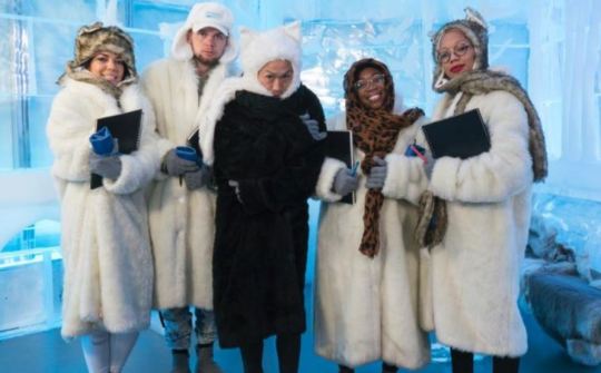
The Challenge: The designers must create a winter-themed look that will decide who goes to New York Fashion Week and who gets left out in the cold
{ Prelude }
Bolo: Since Tondy and I have been on vacation this week, I’m excited to introduce our guest judges, our dear friends and Project Runway fans, Daisy and Sam! Take it away, ladies!
Daisy: Thanks Tondy and Bolo for inviting us to be guest judges for this challenge. This is the last chance for the designers to show that they deserve to go to New York Fashion Week, and the challenge is to create high fashion winter looks. Growing up in the Midwest, winter has always had a special place in my heart, and I’m excited to see the spin each designer will put on winter wear. It seems like Brandon - who has always been the judges’ favorite - has an advantage in this round, having come from Utah, and Margarita - who benefitted from the Tim Gunn Save in the last episode - is at a disadvantage. Sam: I’m also thrilled to be guest judging! Thanks Tondy and Bolo! When I heard that this challenge was for winter wear, I was excited. We’ve already seen some great outerwear from a few of these designers. Brandon does seem to have the advantage, not only because he’s from Utah, but because he’s this seasons teacher’s pet. Margarita being from warmer climes, is most likely going to struggle.
{ The Workroom }
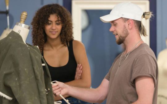
Daisy: The designers seem eager to get started and I’m already in love with Kenya’s coat fabric. The brothers start working on their jackets as well, and I’m interested in seeing how Brandon uses that fabric that creases easily. Margarita still seems to be struggling and it’s hard to tell if that’s from being saved last week, or the problems at Mood with her initial selection of real fur instead of fake fur, but she’s clearly having a hard time with this challenge. Kentaro seems to be back in his element and with Meisha as his model, I think that gives him the confidence he needs to succeed in this challenge. I like Ayana’s choice of colors for her coat, but the painting of the coat may be a problem.
Sam: I wasn’t impressed with Margarita's choice of faux fur for the dress. To be honest, I would have had the same reaction to real fur, it’s just not flattering. I think the debacle at Mood coupled with being saved last week has her frazzled. I think Kenya’s coat fabric is gorgeous! I’m hoping the brothers can make distinctive looks. They were way too similar last week. Since they have started their bro-fest, Kentaro has been struggling. That makes me sad because he has a very distinctive point of view, and his friendship with Brandon seems to be affecting his aesthetic.
{ The Runway }
Brandon
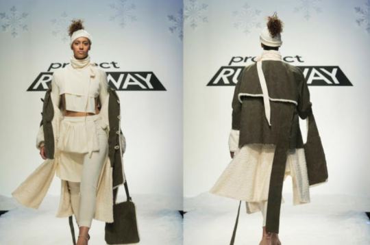
Daisy: The coat turned out better than I thought it would. I really love the fabric and how it compliments the white trim. I could do without the headband and the handwarmer. Score: 3.5 Sam: I love the color palette, the winter white and green. The coat is lovely, but the outfit has me a little perplexed. Only a true fashionista would wear a crop top in the middle of winter. The headband is ok, but I hated the hand warmer. I’m also tired of the ribbons. They’ve become a cliché instead of a signature for me. Score: 3.25
Margarita
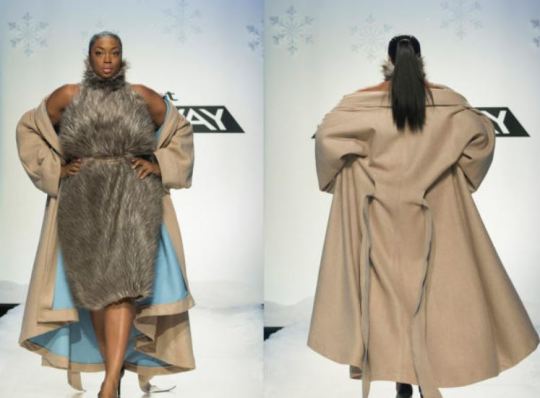
Daisy: I swear Liris could make a paper bag look good. I love the faux fur around her face peeking out of that gorgeous jacket, but the dress itself is just not flattering to me. Score: 3.0 Sam: Poor Liris! She is a fierce goddess who can work an outfit and a runway like no other. Kentaro made her into Pocahontas, and now Margarita has turned her into Wilma Flintstone! No one wants to wear a fur dress! I do love the coat, and the beautiful blue lining, but that dress is just awful! Score: 2.0
Ayana
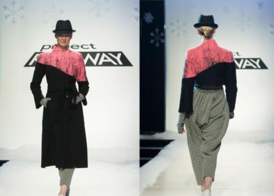
Daisy: The trench coat style is nice, but I’m not crazy about the patterned jumpsuit underneath. I think a different pattern would have paired better with the coat. Score: 3.5 Sam: I love the jumpsuit, and the trench coat, just not together. I’ve been very impressed with Ayana the past few weeks. She is really coming into her own as a designer. She is living proof that modest can be fashionable. Score: 3.5
Kenya

Daisy: If I lived up north still, I’d buy that plaid jacket tomorrow. I really love how it looks on Jazzmine, but the pants and top just don’t suit her figure at all. I really wish she would have chosen a different outfit to go under the coat. Score: 3.5 Sam: That plaid coat is everything! I would buy it today. I was disappointed that Kenya’s outfit didn’t match the aesthetic of the coat. It was nice, but it didn’t blow me away. Score: 3.0
Kentaro
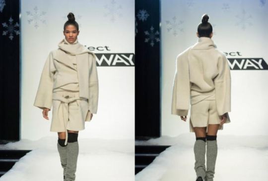
Daisy: I actually really like the way that Meisha looks in this outfit. From the leg warmers, to the shorts, to the jacket, everything is very classy and it seems that Kentaro finally got his mojo back. Score: 4.5
Sam: Meisha and Kentaro are adorable together. The jacket is gorgeous and innovative, but seemed a little complicated. Once again, wearing shorts in winter is odd to me, but the overall look of the jacket paired with shorts and leg warmers made me forget that little detail. Score: 4.0
{ The Results }
Judges’ Top Three: Kentaro, Brandon, Ayana Our Top Three: Kentaro, Ayana, Brandon
Judges’ Bottom Two: Margarita, Kenya Our Bottom Two: Kenya, Margarita
Judges’ Winning Pick: Kentaro Our Winning Pick: Kentaro
Judges’ Losing Pick: No one! Our Losing Pick: Margarita

Total agreement with the judges, with the exception of no one being out, which was a big surprise!
{ Afterthoughts }
Daisy: I’m so excited that all five designers are getting to create a collection for Fashion Week. While I have to agree with Bolo and Tondy that the judges are head over heels in love with Brandon and his ribbons, I’m hoping that all the designers come up with a collection that just wows the judges and makes the final decision all that much harder for them. I’ve really become attached to these designers and it will be hard to see any of them lose. Sam: I can’t wait to see what these five designers put together for their Fashion Week collections. I hope that being back in their home environment brings out the best in each of them. I can’t imagine how stressful it must be to be creative and innovative under that pressure. I can’t wait to see Tim do home visits! Will Kentaro stick to his clean, minimalistic vibe? Will Ayana continue to show amazing growth? Will Margarita be able to shake off her disappointments and show that she has a point of view? Will the warm and genuine Kenya be able to infuse her clothes with her amazing personality? Will Brandon run out of ribbon? Next week Tondy and Bolo will return to answer those questions and more! Thanks again for letting us have a little fun this week!
10 notes
·
View notes
Text
Warrior Fashion
Project Runway Season 16, Episode 11

The Challenge: The designers must create a high-fashion editorial look inspired by women who have survived breast cancer.
{ Prelude }
Tondy: This challenge is dear to my heart as my Mom died of this awful disease! Bolo: So did our dear friend’s mom. Fighters, both, like the many other women (and sometimes men) who battle this disease.
{ The Workroom }

Tondy: The designers seem a little tired and burned out at this point. Brandon made me laugh (not in a good way) when he said he’s the only one with a “consistent story” on the runway. True, if you like designs that have more ribbons than a track meet... As he leaves the workroom, Tim says he’s blown away by the designs so far.
Bolo: As always, some of the designers seem to hit the ground running, while others are struggling to keep their heads above water. So far, the looks that are coming together are very intriguing! A challenge like this is a breeding ground for costumey interpretations, but we’ll see how these looks actually turn out!
{ The Runway }
Brandon

Tondy: Am I the only one who wishes that at least one of the judges would say, “We’ve seen this before!” ??? I hate the drop-crotch, and he really got carried away with the ribbons. Score: 2.5
Bolo: This look is just weird for me, and it looks like she’s wearing a diaper on her head. Not a fan. Score: 2.5
Ayana

Tondy: I like this look a whole lot. The blouse is really different and beautiful, and I love the elaborateness of it paired with the almost menswear plainness of the trouser and overskirt material. A real hit for me!!! Score: 4.75
Bolo: What I love about Ayana is that she’s not limited by her modest aesthetic. She’s able to take risks and show that modest can still be sophisticated, fashionable, innovative, and even sexy. Really well done! Score: 4.75
Margarita

Tondy: Well, I love this one. Yes, it is a little costumey, but considering the challenge, it absolutely works and is drop-dead gorgeous. I especially love the red poof on the top of the bodice, one-side only. It echoes the ruffling on that side of the dress! Score: 4.75
Bolo: It is a tiny bit costumey, but I don’t think a look like this would be out of place on the red carpet. It works, and the “Wonder Woman” vibe of the armor is awesome. Plus, I do think her narrative comes across. Score: 4.5
Kentaro

Tondy: I don’t care for this at all. I wish his design had not been so similar to Brandon’s. It was shapeless, and not at all flattering. I didn’t like the all-black look either. I adore him, but this look just didn’t work for me! He also shouldn’t have put the damned ribbons on it! Score: 2.5
Bolo: The problem with this look, aside from it just not being good, is that if I didn’t know it was Kentaro’s, I would have thought it was Brandon’s. And I’m not accusing Kentaro of copying Brandon, but I do think their aesthetics merged after they first teamed up together. Score: 2.5
Kenya

Tondy: I wasn’t sure about this look at first, but I ended up liking it! Liris looked great in it, as she does in everything, but I thought this was particularly flattering. I loved the petal “armor” look, the color is gorgeous, and I think it represents the challenge very nicely! Score: 4.75
Bolo: There are so many things I love about this look. For one thing, it’s just beautiful, and it’s a really great interpretation of the challenge. The “warrior” aspect comes through without being too literal. Plus, the color is beautiful and I love that this look really wouldn’t be amiss on a movie premiere red carpet, but wouldn’t be over-the-top at a fancy restaurant, either. Score: 4.75
{ The Results }
Judges’ Top Three: Brandon, Ayana, Kenya Our Top Three: Ayana, Kenya, Margarita
Judges’ Bottom Two: Margarita, Kentaro Our Bottom Two: Brandon, Kentaro
Judges’ Winning Pick: Brandon Our Winning Pick: Ayana & Kenya (tie)
Judges’ Losing Pick: Margarita (SAVED!) Our Losing Pick: Brandon & Kentaro (tie)

Well, Tondy! Our agreement with the judges wasn’t bound to last long, so here we are back to having (according to them) no taste! We hated Brandon’s look but they thought it was amazing. They hated Margarita’s look, but we loved it!
{ Afterthoughts }
Tondy: I’m so sick of Mr. One-Trick Pony winning for the same damned design, over and over and over! Thank Goodness that Tim used his save for Margarita! I think that we can basically quit blogging for this season, Bolo, because I will be absolutely stunned if Brandon doesn’t win it! I predict that, if I am right and he does go to Fashion Week, at least one of his designs will consist of nothing but ribbons….
Bolo: I hate to say it, Tondy, but I think you’re absolutely right. It doesn’t matter who else goes with him, as long as Brandon sends some boxy tunics draped in randomly placed dangling ribbons, he is sure to win. And what sucks about that is if you go back and look at all his designs, he actually has shown some versatility. It’s just that he tends toward the boxy/layered/ribbon look, and those are the looks the judges seem to like the most.
Well, at this point I don’t know who will go to Fashion Week with Brandon. I honestly think all of them have a shot. I think Ayana is probably the strongest contender, followed by Kentaro if he can’t get out of his rut. But Kenya is a really strong designer, too, and so is Margarita when she finds a way to reign things in without going too far. I can’t wait to see what happens next!
Until next week!

4 notes
·
View notes
Text
Driving Miss Unconventional
Project Runway Season 16, Episode 10

The Challenge: Unconventional Challenge - the designers must create a look that doesn’t “conform to the rules” using road safety materials.
{ Prelude }
Tondy: I know the designers usually hate “Unconventional Challenges,” but I must admit I enjoy them, although not as much as “Runway Ready” challenges. This will be fun, Bolo!!! Bolo: Have they ever done an unconventional challenge this late in the game, Tondy? I’m curious to see if the looks reflect the skill of the remaining designers, or whether this throws them for a loop!
{ The Workroom }

Tondy: Everyone is stressed because of the unconventional materials, and many are perplexed by what to do with them. Tim is perplexed by some of the designs but intrigued by others--especially Brandon and Kentaro. The model mirror reveals mixed reviews; Michael’s model (who will basically be naked) is especially concerned. It’s a VERY intense workroom!!!
Bolo: The thing I said in the prelude? Looks like it’s the latter. Even the designers who are confident seem to be struggling--even if they don’t realize it.
{ The Runway }
Brandon

Tondy: I have mixed emotions about this one. It is not a typical Brandon design, although it does, of course, have ribbons hanging off it. (One is so thin I just want to pull it and see if it is just a thread he forgot to cut off!!!) Frankly, I like it better than his usual boxy, shapeless looks! Score: 3.0
Bolo: I actually really like this look overall. I don’t like the cliche Brandon ribbons, the skirt is just a little too short in back, and I wish the front opening didn’t tip up so much. Score: 3.75
Kentaro

Tondy: I adore Kentaro, but this is probably my least favorite of his looks. I don’t know why he gave it such a Navajo vibe. It could have been great if it was a cultural design challenge, but this just didn’t work, and the model’s hair was just way over the top! Score: 2.5
Bolo: I think this would have been great without the pink and yellow arrows. The skirt (sans arrows) is adorable, and I think if he’d found other material to incorporate into the top, he would have had a winning look. Score: 3.0
Michael

Tondy: Try as I might, I just don’t like this look. I see where he was going, but, sadly, he just never arrived… Score: 2.5
Bolo: It was a really good try, but I think he just got swamped by the materials. It’s a very “red light district” sort of look. Score: 2.5
Ayana

Tondy: Well, this was amazing! I loved everything about this, even the really hokey ripping off of the yellow caution tape at the top of the runway! I loved the mosaic top, the hat, at that red net ultra-poufy overskirt!!! Wow!!! Score: 5.0+
Bolo: Ayana STOMPED this challenge with this look. It was such a creative use of the materials, and the shape of the jacket (with the slightly flared sleeves) balances well with the big poof skirt. So well done! Score: 5.0
Kenya

Tondy: Surprising myself, I actually like this look, hip-emphasizing skirt and all. It’s just so different and so, sort of, weird!!! I don’t know why it works, but I sorta think it does! Score: 4.0
Bolo: I like this look a lot. I’m super impressed that she made it out of seatbelts, which couldn’t have been an easy material to work with. The shape is weird, but you’re right, Tondy--it works somehow! Score: 4.0
Margarita

Tondy: Another one that I didn’t expect to like as much as I did! It is actually quite flattering on the model, and it’s kind of a fun look. I could see some rock stars wearing it!!! Score: 4.0
Bolo: I like this one, too. I think the one thing I’d change is making the skirt all one color, and maybe just plain red or black without text. It just seems a tiny bit busy, but overall it’s really amazing! Score: 4.0
{ The Results }
Judges’ Top Four: Ayana, Margarita, Brandon, Kenya Our Top Four: Ayana, Kenya, Margarita, Brandon
Judges’ Bottom Two: Michael, Kentaro Our Bottom Two: Kentaro, Michael
Judges’ Winning Pick: Ayana Our Winning Pick: Ayana
Judges’ Losing Pick: Michael Our Losing Pick: Michael

HOLY MOLY, TONDY!!! 100% agreement with the judges. That has NEVER happened before!

{ Afterthoughts }
Tondy: I am so happy that Ayana won! I have kind of thought that she was being overlooked, but this outfit just blew me out of the water. Not only was it made of really weird stuff, it was truly stunning!!! That said, I am so sorry that Michael went home. I truly believe that he may be the most admirable person ever to be on Project Runway. I will miss him, and I expect to see more from him in the future!!!
Bolo: I really really thought Tim would use his save on Michael. BUT... I agree wholeheartedly, Tondy! Michael is really talented and kind, and I think he’s going to go far in the fashion world.
We’re getting down to the wire here. Fashion Week is fast approaching!
Until next week!

16 notes
·
View notes
Text
A Little AvantGarde
Project Runway Season 16, Episode 9
{ The Fallout }

Tondy: Michael and Margarita explain to Tim their issues with Claire’s win, including that she has been measuring garments in her hotel room. Meanwhile Claire tells the judges she “referenced” a pair of pants and a tank top.
Bolo: The judges were surprisingly unconcerned about this so-called “referencing,” contending that it’s normal for designers to reference each other and existing fashion--which struck me odd in light of their typical “we’ve seen this before” refrain.
Tondy: Claire wins the challenge and Batani is sent home, but back in the greenroom, Claire spills that she has a tape measure in her room. Enter Tim (looking very serious), who proceeds to ask Claire if the accusations are true, and she admits they are in a sort of robot-like voice. Tim informs her that they must rescind her win and send her home. Brandon’s design is selected by Dixie Cup, and there is some major second guessing by Margarita and Michael about how they handled things with Claire.

Now, onward and upward!!!

The Challenge: The designers must crate an avant garde look inspired by “Shopkins Shoppies” characters.
{ Prelude }
Tondy: This should be interesting, and a nice breath of fresh and innocent air after the recent goings on! Each little girl tells her designer exactly what she wants. Bolo: OH, this is FUN! This is exactly the kind of challenge I’d like to see more of on Project Runway. It’s different without being pointless or weird, and there’s lots of room for interpretation and for the designers to get really creative!
{ The Workroom }

Tondy: Wow! This is a whole different workroom. Everyone is focused but still having fun. It’s like a black cloud has lifted!!! When Tim comes in, some designers are confused and Tim suggests editing. Others know exactly where they’re going. I wish Amy, just once, could do something that wasn’t black! Bolo: I am pretty intrigued by the concepts so far, but I have a feeling this will be one of those episodes where the initial designs are very different from what ends up walking down the runway...
{ The Runway }
Brandon

Tondy: I liked this a little better than I usually like his designs, that is, until he turned around. There were so many ribbons she looked like a Maypole! I’m grading him down ½* for the ribbons on the back. Score: 3.5
Bolo: I don’t know that I’ve ever been so conflicted about a look. On the one hand, I like it more than any of his previous looks. I love the green, and I love the way the straps criss-cross. I don’t get the giant cuffs, though. At all. Score: 3.5
Batani

Tondy: Oh dear! I was so happy when she got her reprieve, but this look is not good. I do like the colors, but it seems like a mishmash, and I don’t understand the ribbons across the chest. Then the back is almost tailored… Score: 3.5
Bolo: I could almost see this coming together, but it just didn’t work. It’s a total mess, and that keyhole in the back is so bad. Very disappointing. Score: 3.0
Kenya

Tondy: I thought this was just adorable!!! I thought the print was cute, and, although theoretically, the layered peplum should have made her hips look too big, it didn’t! Very flattering and really well done! Score: 4.5
Bolo: My only complaint on this one is that I’ve never been a fan of the “layered-flap-boob” look. But, I love everything else! Score: 4.0
Ayana

Tondy: While I can’t say that I liked this look, it certainly fit the “avant garde” criteria! I did love the giant bow, and once again Liris worked it like the pro that she is! Although I don’t know who would actually wear this, I think it would make a fun dress for a Shoppie! Score: 4.0
Bolo: I feel like Ayana was the only one who was actually inspired by the Shoppies at all. This look is so freaking cute and fun, and definitely avant garde. I feel like she really nailed this one, and yeah--Liris rules! Score: 4.25
Kentaro

Tondy: I loved this one. It looked almost like a Wedding Dress, but it would look great in other colors. I thought the draping that was in the top material was beautiful, and I liked the layered effect of that and the tulle skirt, and then the skinny pants. Really adorable and another cute Shoppie! Score: 4.0
Bolo: This isn’t one of my favorites but it’s really fun to look at. It’s weirdly ethereal with the tulle and muted colors. Score: 3.75
Amy

Tondy: Well, I am not so impressed with this look. If they had a wedding dress challenge, Amy would make a black wedding dress. All of the little girls I have known have wanted color in their doll dresses. The dress wasn’t very impressive either. Amy said that although the dress was simple, it looked like her “design character”. She is so bound up in her “design character” that she can’t do anything else, not even a doll dress. Score: 2.5
Bolo: Unless Shopkins has a line of futuristic vampire Shoppies, I’m not seeing the inspiration here. Not her best work, for sure. Score: 2.5
Margarita

Tondy: I loved this design. I loved the material of the skirt and the drape of it, and the sparkly material of the sleeves, which almost looked like a stole in the back, was just what her little client asked for! I think this would be a popular Shoppie look!!! Score: 4.5
Bolo: This was my favorite look, I think. It really is dreamy and ethereal. I love how fluffy and cloud-like it is. And the top is out-there in a good way! Score: 4.0
Michael

Tondy: Another amazing design! This almost looked like a high-fashion spacesuit, and he certainly got the disco ball look! I can see this one being a really popular Shoppie look and it was totally avant garde!!! Score: 4.5
Bolo: I LOVE the way he interpreted what his small client wanted for her Shoppie. I adore the flare and movement of the flared cuffs, and I love the way the fabric glitters. It definitely reminds me of a melting disco ball. My one complaint is that I wish there was more definition in the breast area, and I’m not a fan of the whole “Bib Fortuna” situation. I get a weird Elephant Man vibe from her hips, too. Still, really well done, though. Score: 4.25
{ The Results }
Judges’ Top Four: Michael, Ayana, Margarita, Brandon Our Top Four: Michael, Margarita, Kenya, Ayana
Judges’ Bottom Two: Batany, Amy Our Bottom Two: Batani, Amy
Judges’ Winning Pick: Michael Our Winning Pick: Michael
Judges’ Losing Pick: Batani and Amy Our Losing Pick: Amy

It doesn’t happen often, but we pretty much NAILED this one! Our only point of disagreement with the judges was we felt Kenya belonged in the top rather than Brandon, but we agreed on everything else!
{ Afterthoughts }
Tondy: Whoa! I didn’t see that one coming! However, I do think it was fair. I would have been very upset if just Batani had gone home as she’s done some really good designs. However, Amy was very much a one-trick pony in my opinion. I think she was a good designer, and I think she had a niche for the women who think that the only color is black, but she was a really boring designer for me. I also thought that Brandon should not have been one of the top four over Kentaro and Kenya. The judges surely do love him and his ribbons though!
Bolo: I agree wholeheartedly. Amy has a very limited range, but what she can do in that range is good. It’s just outside of that range that she doesn’t do so well. Batani is a very talented designer, but she just didn’t seem to do well within challenge parameters. And the fact that she stuck by this design is a bit concerning, because it really wasn’t good. That said, the judges made the right decision.
We’re really getting down to the cream of the crop now!
Until next week!

5 notes
·
View notes
Text
Client on the Go
Project Runway Season 16, Episode 8
{ The Twins Faceoff }

Tondy: Of course, the first thing we get to see is The Twins faceoff. I am going to let Bolo handle this part because I don’t honestly know what to say about it!
Bolo: Since the twins were in the bottom last week, and the judges didn’t know who to eliminate, they were given one hour to create a new look to help the judges decide. It was instantly clear which of the two twins was the better designer. Not only did Claire come up with a design, but she executed it quickly and flawlessly despite the pressure. Shawn couldn’t even figure out how to drape something. It’s obvious she could never have made it this far in the competition without her sister to execute her designs for her. Shawn did the right thing and conceded, leaving Claire to move on to the next round.

We now continue with your regularly scheduled program...

The Challenge: The designers must create “Women on the Go” looks for their clients, who are friends and family members of the Project Runway crew.
{ Prelude }
Tondy: I always enjoy the client challenges because it’s interesting to see who actually listens to their client’s wishes.
Bolo: Yes! It’s fun to see who can balance their aesthetic with what the client wants. Also, they have to create a print, which always makes things interesting. I have high hopes for this challenge!
{ The Workroom }

Tondy: The designers are really spooked about creating a print, and most don’t have a clear idea of what their designs will be. Claire is copying Margarita’s winning design from last week, and Margarita is angry! And now for the DRAMA, Prelude! Michael and Margarita are sitting at a worktable speaking in Spanish and Margarita tells him that Claire has a pair of pants in the hotel room similar to the ones she’s making, and worse--she has measuring tape in her room and has been using it, which is against Project Runway rules.
Bolo: HOLY SMOKES this workroom is tense! I do feel like Margarita’s concern over Claire’s top was excessive. I could see where she was coming from, but it’s a shame she let it destroy her focus.
{ The Runway }
Amy

Tondy: I actually like this design better than I usually like her designs. It is her ubiquitous black, but the top is actually cute. I’m not quite sure about the side panels, but the fabric is OK. Score: 3.0
Bolo: I don’t get this look at all. I kind of like her print, though. Score: 3.0
Brandon

Tondy: I would actually like this look if it didn’t have the “side-apron”, and all the ribbons, so damned many ribbons!!!! It just is getting so old and I would have given him a much higher score without them! Score: 2.75
Bolo: This looks like a server uniform in a restaurant based on an 80s arcade. Honestly. It makes me want to tease out my hair and play Pacman while eating greasy pizza. Score: 3.0
Batani

Tondy: I liked the color combinations and the flow of the dress, but, sad to say, I thought her use of the fabric was almost invisible until she took the cute long vest off, and then there was hardly any of it to be seen. Score: 3.0
Bolo: I think this is really lovely and the client seems happy. She did a great job of making a dress that is mature but not matronly. Score: 3.75
Margarita

Tondy: Her anger-caused lack of focus really showed in this design. The best thing about it was the print, but other than that, it was pretty awful! Score: 2.75
Bolo: Since she had the blue dye, I wish she’d thought to dye the jacket. It might have tied this look together a bit. Score: 3.0
Claire

Tondy: I thought the top was actually cute, the “knock-off” pants were not awful. Without the drama, I would have given her a 3.5* and I think I will let that stand. After all, innocent until proven guilty, etc. Score: 3.5
Bolo: I really hate that there’s the specter of cheating hanging over this look, because I really like it. I wanted to be able to say, “Finally! We see what Claire can do without Shawn weighing her down.” But we’ll see... Score: 3.5
Ayana

Tondy: I really think this is an adorable look. Ayana overcame her “modesty ethic” to give her client what she wanted, and you could tell that the client loved it. I think this was my favorite fabric of the runway, and the design of the dress was fun and flirty, and the model looked fantastic! Score: 4.75
Bolo: This dress is gorgeous! I love the color, I love the hemline, and it’s just overall really pretty. I give Ayana HUGE credit for being able to step outside of her comfort zone to give the client what she wanted, while not completely abandoning her aesthetic. This is a nice marriage between the two. Score: 4.75
Michael

Tondy: First off, I really liked the fabric. I thought the layered pants were interesting, but I’m not sure if they were that flattering. Overall, as much as I adore Michael, I just didn’t think this was a top look for him. Score: 3.0
Bolo: I didn’t get the pants at all and I don’t think they look good. I love the top, though, and he had one of the coolest prints of the day, I think. Score: 3.5
Kenya

Tondy: I love the fabric, but I have mixed emotions about the design. I am not a fan of peplums because I have never seen one that was in the least bit flattering, whatever size the model might be. That said, the client really seemed to love it, and I give major points for that! Score: 3.25
Bolo: I also have mixed feelings here, but overall I think I like it. I love the color scheme and I think the design looks great on the client. Here again is a look that is mature without looking matronly. Plus, I love the print! Score: 3.5
Kentaro

Tondy: I thought this was gorgeous. I loved his fabric, and I loved the flow of the dress. The back of the jacket was adorable and when she took it off, the dress was smashing! His client looked pretty happy, too! Score: 4.5
Bolo: This look is gorgeous! I think my only complaint is I’m not 100% on the colors together, but I love the design, flow, cultural flair, and it looks beautiful on the client. Really well done! Score: 4.5
{ The Results }
Our Top Three: Ayana, Kentaro, Claire Our Bottom Three: Amy, Brandon, and Margarita Our Winning Pick: Ayana Our Losing Pick: Brandon/Margarita (tied)
Tondy: THE DRAMA ESCALATES - When Claire is named the winner, Michael stalks off stage-left. Someone stops him and he says, “I came to play fair, and there is no fairness in this game.” He goes on to tell Tim it has nothing to do with the design but what’s going on behind the scenes. Back on stage, Heidi asks what is going on and Margarita answers, “None of us want to point fingers.” Heidi replies, “At who?” And then the episode ends.
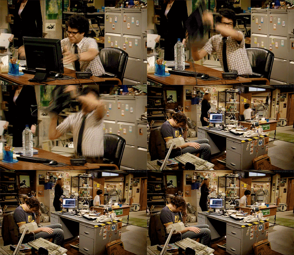
(let’s just pretend Moss is throwing his television across the office...) Bolo: Due to the drama at the end of the show, as well as the mixed/confusing critiques for Batani, Michael, and Kenya, it was unclear to me exactly who was in the judges’ top and bottom three. Claire and Kentaro were definitely in the top, Margarita was definitely in the bottom. The other three I’m not sure about. So, for now, the judges’ top and bottom three, as well as their winning and losing picks, are TBD.
{ Afterthoughts }
Tondy: Fasten your seatbelts, it’s going to be a bumpy ride. The judges are dumbfounded, except for Heidi who is patently thrilled at the drama! Tim says Michael’s concerns will be looked into, but we’ll have to wait until next week to find out what in the world is going on. And that, ladies and gentlemen, is indeed, a Project Runway first!!!
Bolo: We’ve made 95 posts on this blog, and I think the vast majority of them are episode reviews. I can honestly say I don’t think we’ve ever had to end a post without having a clear picture of who’s in the top, who’s in the bottom, who won, and who’s going home. I don’t think we’ve ever ended on a scandal this huge. As hard as we’ve been on the twins, I’m going to be sick if Claire really did cheat. On the other hand, I don’t want Margarita and Michael to have gone this far on a misunderstanding. I am both excited for and dreading tomorrow night!
Until next week!

12 notes
·
View notes
Text
The Ultimate Faceoff
Project Runway Season 16, Episode 7

The Challenge: JC Penney Challenge - The designers must create fashion-forward looks inspired by menswear, using men’s fabrics from JC Penney’s. This is a team challenge with teams of two.
{ Prelude }
Tondy: This should be interesting as some of the teams seem like a disaster looking for a place to happen… The designers who got to pick their team-mate pick people they think they can work with, but there are some strange pairings!!! Bolo: I am super excited about the pairings in this one! It would have been fun to see the twins work with other people...
{ The Workroom }

Tondy: The workroom, aka “Days of Our Strife” – The designs are a mixed bag from OK to awful! Tim has a LOT of criticisms for most of the designs. Favorite moment: Tim says, “I’m an old fart!” He isn’t, of course, but I loved his saying that! Shawn tries to make excuses for her work saying that they don’t usually do “plus-size” designs, but Tim points out that no one in the room does.
Bolo: Yeah--I’m over all the “I don’t do plus sizes” crap. Imagine a home architect saying they only design small houses and can’t design larger ones. It’s absurd! Plus size bodies aren’t that different from average-sized or petite bodies. Everything’s bigger--yes--and there are differences in what you do or don’t want to accentuate, but if you can make clothes for an average-sized person, you should be able to make plus-sized clothes. The whole vibe in the workroom is weirding me out for some reason.
{ The Runway }
Ayana

Tondy: This look is just OK for me, but I honestly think the horrible “hospital gown” fabric brings it down. I did think the back was cute, and I think she did the best she could with the fabric she was given. Score: 2.75
Bolo: I have mixed feelings about this one. In terms of her culturally modest aesthetic, I think it’s nice, but I agree that the fabric doesn’t work great for this design. I can’t really get a good look at the pants. Score: 3.25
Michael

Tondy: I really didn’t care for this one. I love Michael, but I thought this design was just dowdy. It didn’t seem to fit the model well, and the jacket was sort of extraneous. Score: 2.5
Bolo: I like the dress a lot but I’m not sure about the jacket. It doesn’t see to go together well, I don’t think. Score: 3.0
Kenya

Tondy: This was OK, but, frankly, kind of boring. It just didn’t stand out for me, and I wouldn’t have noticed this dress in a crowd. Just boring! It did seem to be well-made and it fit! Score: 3.0
Bolo: What’s funny is I liked this until the model said it made her feel like a flight attendant. Once that was in my head, I couldn’t un-see it. I feel like this might have worked better with a slightly shorter skirt, maybe? Score: 3.0
Amy

Tondy: Whoa! The décolletage on this one should be x-rated! I don’t know any woman who would be comfortable with this amount of skin showing. I think this might have been cute if it weren’t for that neckline. Also, the pants didn’t fit well. Score: 2.5
Bolo: In Amy’s defense, she had intended there to be a black tank top underneath, but for some reason Kenya cut it as a V-neck instead of a scoop and it looked weird so she trashed it. Amy wasn’t crazy about the tank top anyway, but I actually think it would have looked nice. Score: 2.75
Kentaro

Tondy: This design was just adorable! I loved the jacket and I loved the sophisticated “grunge” look of the rest of the outfit! I can see this selling like hotcakes! Score: 4.5
Bolo: Very cute! Not sure what else to say. Score: 4.25
Brandon

Tondy: I like this better than I usually like his designs! I thought it was really cute, although I wish he would lose those darned ribbons! This collection was super cohesive!!! Score: 4.25
Bolo: I would like this 100% better without the dumb strips hanging down. So over those. I really love the jacket, though. Score: 4.0
Claire

Tondy: This one was just weird! The top had mismatched sleeves, the pants didn’t fit well and the whole design was sort of schizophrenic! And, what was with the shirt tied around the models hips? Score: 2.5
Bolo: I just don’t get this at all. The sleeve situation is so weird it’s upsetting. The pants fit weird. The plaid sash seems like an afterthought. Score: 2.0
Shawn

Tondy: Actually, I think this was a good effort. Liris looked like she felt good about the design, and I thought it was very figure flattering. I also like the darker grey peeking out at the wrists and the hems. It fit really well! Score: 3.5
Bolo: This is okay but I’m downgrading her for having random hanging straps. That’s an automatic one-point deduction from me for now on. Ugh. Score: 2.0
Batani

Tondy: Well, this was just adorable! I loved everything about it. First of all, I am a sucker for coat-dresses, and this had everything that I love about them!!! The back of the skirt was also amazing! Score: 4.5
Bolo: This is super cute! Very “updated regency” which I love! Score: 4.25
Margarita

Tondy: Another adorable design! This was so different, and yet, it shared the same silhouette as Batani’s! I think this was a fabulous look, and I think it would be flattering on many figure types, as would Batani’s! Score: 4.5
Bolo: I think this dress is so ridiculously cute! There’s just a bit of a fit issue in the shoulders, I think, but overall really lovely! Best use of the gingham for sure! Score: 4.25
{ The Results }
Judges’ Top Two Teams: Brandon/Kentaro, Margarita/Batani Our Top Two Teams: Margarita/Batani, Brandon/Kentaro
Judges’ Bottom Two Teams: Shawn/Claire, Amy/Kenya Our Bottom Two Teams: Kenya/Amy, Shawn/Claire
Judges’ Winning Pick: Margarita Our Winning Pick: Batani, Margarita, Kentaro (three-way tie)
Judges’ Losing Pick: Shawn or Claire... to be determined... Our Losing Pick: Claire

Our order was a little different, but for the most part we agreed with the judges across the board!
{ Afterthoughts }
Tondy: The twins are obviously pissed and they just don’t get it. First of all, apparently they think that J.C. Penney is not where people of taste shop… Amy was busy trying to throw Kenya under the bus. Very distressing all the way around. That said, I am so happy for Margarita! I think she deserved the win! Now, more importantly, had Zac been drinking chocolate milk, or is he growing a little mustache?????

Bolo: Looks like a little mustache to me, Tondy! I don’t know how I feel about this! I can’t imagine Zac with more facial hair than a light stubble. Curious to see if this trend continues! Now, on to my thoughts on the episode... I LOVE that they pitted the twins against each other, because it lays everything out on the table. It gives Claire an opportunity to prove that she has taste and good design ideas without Shawn’s feedback, and it gives Shawn the opportunity to prove she can sew two pieces of fabric together without asking Claire to do it for her. THIS IS GOING TO GET INTERESTING!!!

I mean, I feel kind of bad bagging on them. I’m sure they’re very nice young women, but when it comes to them as fashion designers, two images sum it up pretty nicely, I think:

From the ardent awe on their faces, you would think Versace himself had miraculously appeared and was wearing their looks down the runway.

But Heidi’s look of sheer “underwhelm” is how most of the rest of us feel.
{ One Last Note... }
Happy Birthday, Swatch! <3

Until next week!

14 notes
·
View notes
Text
Models Off Duty
Project Runway Season 16, Episode 6

The Challenge: The designers must design a street-style look for their clients who are their off-duty models.
{ Prelude }
Tondy: We have had similar challenges where the designers have to create a look according to what the clients want, but I think this is a first where the clients are their actual usual models. The models get to pick their designers. Bolo: I love this idea! It was fun to see who the models trust and identify with. It’s always awkward to see the people left on the sidelines, though.
{ The Workroom }

Tondy: Just like past designers with challenges like this, the designers are having difficulty doing what their clients want, instead focusing on what they want. I’m beginning to feel sorry for Claire, who’s spending most of her time helping Shawn, who apparently can’t actually sew for herself. Kentaro and Meisha are adorable together! A lot of the designers seem to be designing the same thing they always design…
Bolo: The interaction between the designers and the models in this episode is a lot of fun. You can tell which models feel comfortable with their designers and which don’t.
{ The Runway }
Kentaro

Tondy: I adore this one. It fits her perfectly, you can tell that the model loves it, and it is really different! The back of the top, where they thought it was too loose, he just sort of tucked in and it is amazing! Score: 5.0
Bolo: I love this look SO MUCH! I really love the blend of Japanese and American style, and it’s new and fresh without being overly weird. Score: 5.0
Claire
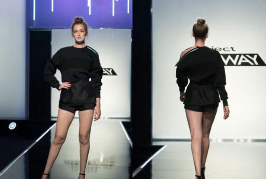
Tondy: Oh my… This is sort of a shapeless, hot mess. The black material is just drab, and the shorts are way too short. Perhaps if she hadn’t had to sew Shawn’s outfit, she might have made this into something better. Score: 2.75
Bolo: Ugh. I don’t get this at all. Long sleeves and shorts is a pairing that rarely works. The shorts are way too short... I can see her butt cheeks! Score: 2.0
Ayana
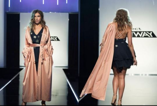
Tondy: I love her designs, usually, but this one, with the lovely robe that would be great for a wedding night, just looked so out-of-place for street wear! I did think the dress looked cute, but we only got a glimpse of it. Score: 3.0
Bolo: I don’t get the robe at all, but I LOVE the dress! I think it’s super cute and well made. I wish it had been the focal point. Score: 3.75
Michael

Tondy: He seemed to be having so much trouble with this design, but it really turned out great. You can tell that Liris really liked it as well. And, it is nice to see something really totally new!!! Score: 4.5
Bolo: This is a cool, unusual look that looks fantastic on the model. My favorite part is how the slashing accentuates her upper thighs. Amazing! Score: 4.75
Brandon

Tondy: Well, Brandon is really turning out to be a total one-trick-pony. All of his designs are shapeless, with extraneous pieces hanging off of them, and with odd ribbons hanging off of odd places. I am not a fan! Score: 2.5
Bolo: At first glance I kind of get/like this look, but when I start looking more closely is when it falls apart. I like the colors, but the pants look dirty. I like the layered look of the top in an unusual, futuristic way, but I don’t like it in the back. And yeah--the extraneous straps hanging off is getting old. Samantha beat me to the Star Wars/Rey comparison. Score: 3.25
Shawn
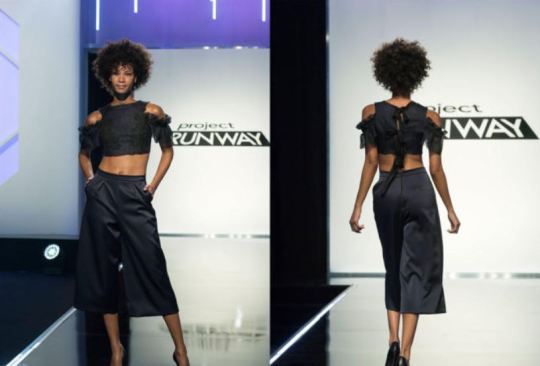
Tondy: This is just OK. I don’t care for the way the pants fit, but the top is actually kind of cute. However, I think that Claire pretty much made the top, so I can not score Shawn for the top. Score: 2.5
Bolo: I honestly can’t score this seriously. She came up with a nice design, but she couldn’t have sewed it without her sister's instructions. I could probably design a nice look if someone else would tell me how to sew it. Doesn’t make me a fashion designer. Score: 1.0
Margarita
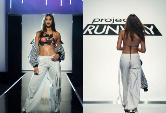
Tondy: I love the bomber jacket, and I think the print bra top is actually a nice pop of color. The pants have a nice flow, but they are a little tight in the crotch and butt area. Score: 3.0
Bolo: I really love this look except for--again--the extraneous long straps. It’s starting to be a cliché for this season. Score: 3.75
Batani
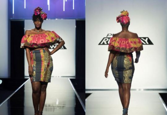
Tondy: I love this design. It is so fun and colorful. It fits beautifully, but, personally, I thought the headpiece took it a little too far into costume land. Score: 4.0
Bolo: I think the headpiece is traditional, so I’m okay with it. I like the look, but I think within the cultural context, it probably isn’t anything new or interesting. But then you look at what she’s got on herself, and then I think THERE is traditional cultural fashion met with modern street fashion. Score: 3.75
Amy
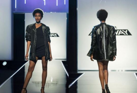
Tondy: What a surprise. Her model is wearing black! Oh, wait, her models are always wearing black. I think there was a grey something at some point, but it was probably my eyes being tired or something. And it’s way to short. No bending over for her!!! Score: 3.0
Bolo: So boring. Jacket’s okay but I didn’t see a transformation when she turned it inside out. Looked the same to me. Score: 3.0
Samantha

Tondy: Well, this is very much what Samantha designs for herself. It’s not everybody’s cup of tea, but I think it is what the model wanted, so I am marking her up a little for that. Score: 3.25
Bolo: I think this is an awesome, well-made, lovely look. I’m so confused as to how Brandon can churn out the same weird look over and over again and be exalted, but Samantha makes a gorgeous Lolita dress with some cool street elements, and she is told to GTFO. I don’t get it at all. Score: 5.0
Kenya

Tondy: I was a little worried about the black-and-white cow print but I think it actually looked pretty good with the dark green pants and tiny vest! I loved the ruffled collar on the blouse as well. I don’t think this should have worked, but it really, really did! Score: 4.25
Bolo: That’s the thing I find fascinating about this look--it shouldn’t look good, but it really does! It works and looks great on the model, too! Score: 4.25
{ The Results }
Judges’ Top Three: Kentaro, Kenya, Shawn Our Top Three: Kentaro, Michael, Kenya
Judges’ Bottom Three: Claire, Margarita, Samantha Our Bottom Three: Brandon, Claire, Shawn
Judges’ Winning Pick: Kentaro Our Winning Pick: Kentaro
Judges’ Losing Pick: Samantha Our Losing Pick: Shawn
Our only agreement with the judges was Kentaro as the winner, Kenya belonging in the top three, and Claire belonging in the bottom three.
{ Afterthoughts }
Tondy: Another interesting challenge! Bolo, I’m amazed that Brandon and Amy were safe. Amy keeps slipping past, never in the top and never in the bottom. They should have a special category for ���run-of-the-mill, put you to sleep, drop-dead boring”!!! Ah well…. I am sorry to lose Samantha, because I liked her, but I did think her design was not that great. The best thing about the end, where the judges get up close and personal with the best and worst designs, was that Tim outed Shawn and Claire, and the fact that Claire couldn’t finish her own design because she was making Shawn’s pants! Zac, “ You know, I’m starting to smell something. I don’t like what’s going on, I don’t like it at all!” Well said, Zac, well said!
Bolo: I’m honestly in shock that Samantha went home while Claire escaped the bottom two. Yes, it was a Lolita dress and maybe not stunningly different from any other Lolita dress, but that was not a look to go home on when ANOTHER MODEL WALKED DOWN THE RUNWAY WITH HER ASS CHEEKS HANGING OUT. It honestly couldn’t be more obvious that Claire got a pass this week because the producers like the drama brewing with her presence on the show.
Let’s break this down...
Claire - Judges’ Negative Comments 1. Nina - missing a “pop of color” 2. Nina - “blob of black,” doesn’t photograph well 3. Zac - doesn’t make a fashion statement 4. Heidi - unflattering on the model 5. Heidi - but cheeks hanging out because shorts are too short 6. Georgina - no waist/bad silhouette 7. Chelsea - would like top better as separates 8. Nina - we’ve seen this sweatshirt before 9. Heidi - didn’t give the client the pants she wanted 10. Chelsea - Claire’s poor time management is her own problem Claire - Judges’ Positive Comments 1. Nina - liked the idea of doing sportswear 2. Zac - crisply made 3. Chelsea - loved the sweatshirt
Samantha - Judges’ Negative Comments 1. Georgina - too costumey 2. Georgina - not exciting, fresh, or modern 3. Zac - I’ve seen it/no evolution from standard Lolita look 4. Chelsea - liked it better without the vest 5. Heidi - liked it better without the vest 6. Nina - Samantha’s own dress is much better 7. Nina - plaid and other details don’t help 8. Nina - didn’t shine
Samantha - Judges’ Positive Comments 1. Chelsea - loved the details of the dress 2. Heidi - great workmanship 3. Heidi - loves the bodice 4. Nina - a lot of workmanship went into it Not only did Samantha have slightly more positives and slightly fewer negatives than Claire, but she gave the model what she wanted, managed her time well, and put a lot of work into the outfit, and that workmanship shows. The worst complaint is that it didn’t shine because it’s a standard Lolita dress. Claire had slightly more negatives and fewer positives, didn’t give the model what she wanted, didn’t manage her time well (the decision to help her sister was on her), and made a look that is not just boring, but has also been seen before, doesn’t photograph well, and is unflattering on the model. How is THIS the look that is safe when Samantha goes home?
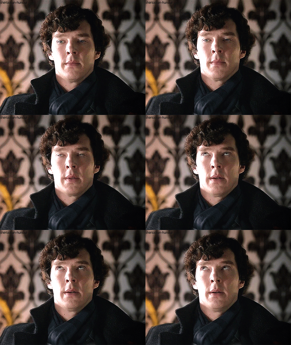
You can’t even make the argument that Claire has done historically better than Samantha because they literally have identical histories on the show. They were both safe in episodes 1, 3, and 4. They were both in the bottom in episodes 2, 5, and 6. And neither one has ever been in the top. So... Tondy and I are ready for the twins to GO!!! Until next week!

36 notes
·
View notes
Text
Descending Into Good and Evil
Project Runway Season 16, Episode 5
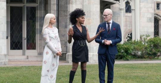
The Challenge: The designers must create a look that is inspired by either good or evil.
{ Prelude }
Tondy: This should be fun, Bolo! The challenge is issued by guest judges, Dove Cameron and Chyna Anne McClain, who are in the new Disney made-for-TV movie, Descendants II. Michael, as the winner of last week’s PR, gets to pick who must design which choice of Good or Evil. Bolo: I am definitely looking forward to this one. It’s fun to see how the designers will interpret “good” and “evil” in their looks, and there’s a lot of wiggle room for them to get creative and show off what they can do.
{ The Workroom }
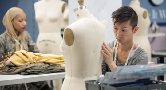
Tondy: There are some intriguing designs and materials! Some of the designers are upset with their fabric choices, and most of them seem to be struggling a bit. Tim is worried that many are heading down the dreaded “costumey” (how in the heck do you spell that, Bolo?) path…
Bolo: Yeah... that’s the drawback to a challenge like this. Fewer restrictions and a dramatic theme is a recipe for costume calamity. I see some odd things happening on those dress forms... a few good things, too!
{ The Runway }
Shawn
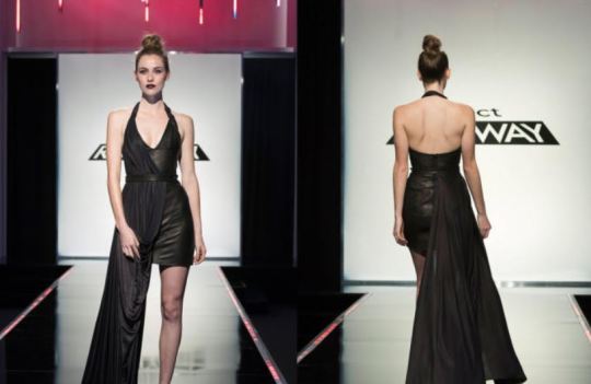
Tondy: I don’t care for Shawn, but, I must admit, she is starting to design some pretty cool stuff. This dress is a pretty good “Evil” dress, and I love the soft draped fabric over it. Score: 4.0
Bolo: I love this look. It’s really well made, it’s different, the black and eggplant look amazing together, and it has a good “evil” vibe. Score: 4.0
Kentaro
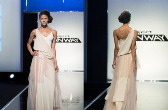
Tondy: I like this and I love the flow, but for me there is a real lack of innovation here. That said, I do love the material and the color gradations! Score: 3.75
Bolo: I think this is really lovely, but at the same time--you’re right, Tondy, it’s kind of bland. Still, I think it makes a nice “good” look. Score: 3.75
Margarita
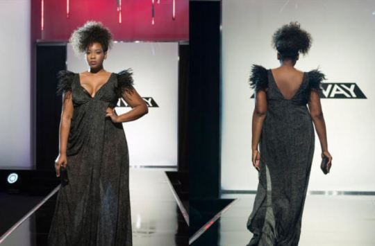
Tondy: Well, I love this one, and what I love the best about it is that you can tell that the model loves it too! I wasn’t impressed with the material, but she really “made it work” beautifully! Score: 4.0
Bolo: LOVE this look! The model looks stunning, it fits her well and hugs her in all the right places. Very dramatic “evil” look, but soft and flirty, too. Score: 4.5
Brandon
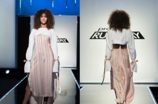
Tondy: Wow! Talk about mixed emotions on this one! I love the striped fabric, and I would absolutely love pillows on my deck that were made from it. I just don’t get this dress. All I can say is it smacks of costumey with the bows on the sleeves, and I do NOT get that white top and I hate side-boobage! I marked him up for the cute little suspender thingie in the back, though. Score: 2.75
Bolo: Mixed feelings here, too. I adore the fabric and I like the combination with the white top. I like the idea of the top, the way it halters over the skirt and hangs open in back. I just don’t dig the distinctively NOT “little princess” side boob. I also hate the straps tied around the sleeves. It makes me think of a straight jacket. All of this ruins the “good” aesthetic for me. Score: 3.0
Samantha

Tondy: Not one of my favorite designs, and I get why Tim said it looked like a craft project. The skirt helped, but, overall, not a hit for me. Score: 3.0
Bolo: I actually really liked the idea of this look and I thought it was a unique interpretation. I just wish it fit better and that the flare started lower. Score: 3.25
Aaron
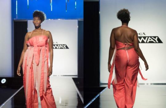
Tondy: Well, this was truly awful. I think he knew where he was going, but he got lost along the way. Sadly, even if the design worked, the lack of finishing would have doomed it for sure. The looks on the judges’ faces, though, get a solid 5+ stars from me! But, for the design: Score: 2.5
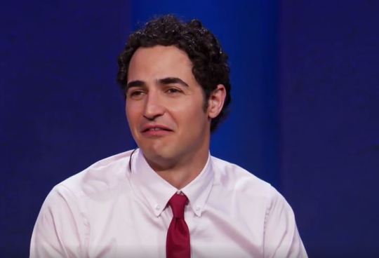
Bolo: This was such a disaster. It’s like he just gave up and threw every piece of fabric he had onto a random jumpsuit. The sewing was not good. Score: 2.0
Michael
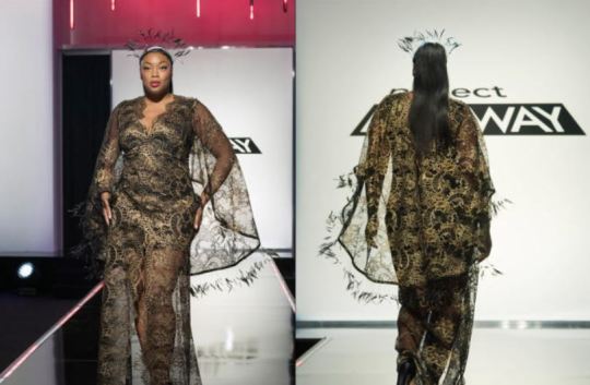
Tondy: This one blew me away! Another one where you can tell the model feels great in this design! And, that headpiece absolutely blew me away! Score: 5.0
Bolo: So stunning! Great interpretation of “evil” and such a beautiful dress. The feathers are just a nice bonus! Score: 5.0
Amy
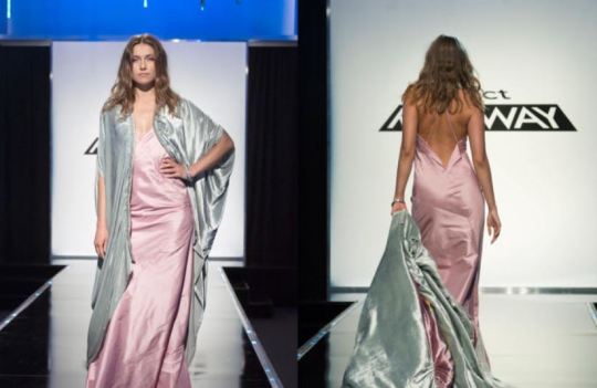
Tondy: I am hoping she got confused and thought this design was for Heidi’s sleepwear line, because I think it would have been really nice for that. The nightie underneath didn’t even fit that well... Score: 3.0
Bolo: I agree... this would have been great in the sleepwear challenge, but I don’t get it as a “good” look at all. The color in back of the robe confuses the absolute hell out of me. How does that relate to anything? Score: 3.0
Batani
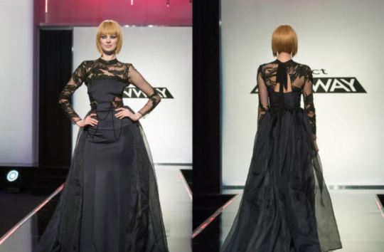
Tondy: Loved, loved, loved it! The skirt, the lace on top, the fit! Loved the sparkly trim on the front, and I loved the sheer floaty train. Score: 5.0
Bolo: Also stunning! Nice fit, beautiful design, great interpretation of “evil,” and just overall interesting to look at. I love it! Score: 5.0
Claire
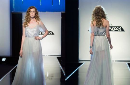
Tondy: Aaacckk! So bad. I know she struggled, but really, this is not a design that I would expect to see on PR. I just don’t get the “sheer skirt over short shorts” look at all! It’s just dreadful as was this design. (Zac’s look for this one topped his look for Aaron’s design. Score: 3.0
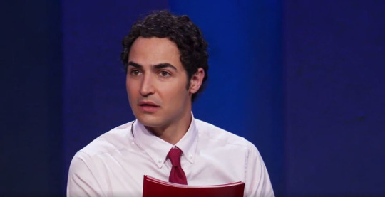
*jaw drop* Bolo: I don’t get this design at all and agree that shorts under sheer is not a good look. The top looks like it’s falling apart. It’s all poorly made. Score: 2.75
Ayana
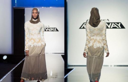
Tondy: I was so disappointed in this design. I wish she hadn’t added the flowers. I did love the top and the fit of it. She sort of saved the skirt when she added the white net over it, but somehow it just didn’t work. Score: 3.0
Bolo: I liked the dress so much better before she added the netting and flowers. I thought it was just lovely then, and I don’t know why Tim called the uniformity into question. I think it all worked great as it was. Score: 3.5
Kenya
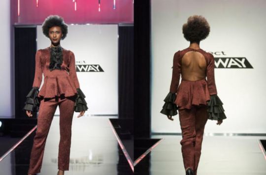
Tondy: Wow! This is a great evil look, and I like that it’s not black like most of the other “evil” looks. And that back! Breathtaking! Score: 5.0
Bolo: SO MUCH WOW! This was my favorite look of the night. She looks like a badass pirate captain you’d better not double-cross. So well done! Score: 5.0
{ The Results }
Judges’ Top Three: Brandon, Kenya, Michael Our Top Three: Kenya, Michael, Batani
Judges’ Bottom Three: Claire, Samantha, Aaron Our Bottom Three: Brandon, Claire, Aaron
Judges’ Winning Pick: Brandon Our Winning Pick: Kenya, Michael, Batani (three-way tie)
Judges’ Losing Pick: Aaron Our Losing Pick: Aaron

We disagreed with the judges’ choice for winner so much that he was in our bottom three. We agreed with them on choosing Aaron to go home, though, and agreed with some of their other choices as well.
{ Afterthoughts }
Tondy: Well, Bolo, this was a personal first for me! I think this is the first time that I have ever given out more than one 5* in one episode, but I know for sure that I have never given out three 5*s in one episode! Anyway, Claire was VERY resentful of the fact that she was in the bottom three, and Shawn didn’t look relieved at all that she was safe. I really have had it with Claire. At least Shawn has a some talent! I also am sick of Claire and Amy critiquing everyone else! The can do that once they make it into the top 6, but not if they are spending their time in the basement. Wise up, ladies!! You’re not as good as you think you are….
Bolo: This was certainly an interesting episode. Several of the designers took the inspiration and flew with it. Others let it drag them down. Once again, I think the strongest designers are rising to the top... which is not to say I think Brandon deserved to be in the top tonight, much less win. But this wouldn’t be the first time we disagreed with the judges. He’s clearly “teacher’s pet” as far as they’re concerned, and like all of their “pets,” he could poop on a plate and they’d call it high fashion. :\
Until next week!

8 notes
·
View notes
Text
We’re Sleeping Wear?
Project Runway Season 16, Episode 4

The Challenge: Heidi Klum Sleepwear Challenge - the designers must use inspiration from their Empire State Building sleepover to design a look for Heidi’s sleepwear collection, also incorporating a textile of their own creation.
{ Prelude }
Tondy: Wouldn’t you know that at least one of the twins was going to be afraid of heights, apparently even if you are just going up in an elevator at that point. A lot of the designers are inspired by the Art Deco design of the building! Bolo: I can’t decide whether I find this challenge to be awkward and odd or really fun and unexpected. I can’t imagine what other inspiration the designers could get from this experience, so it will be fun to see!
{ The Workroom }

Tondy: It appears that all of the fabric is silk, a notoriously difficult fabric to work with. Kenya and Samantha are helping Kentaro design for a curvy model. Nice to see designers helping each other! The twins, surprisingly, are driving everyone crazy as they are constantly asking advice from each other and they just…won’t….shut….up! Thanks to Heidi, the workroom critique is a little risqué!
Bolo: As much as I’m not a fan of most of the Heidi challenges (because of the types of garments more than anything else), I really enjoy seeing her in the workroom. Also: I’m still laughing about the “anal” thing. So funny!
{ The Runway }
Amy

Tondy: I think this looks like a hospital gown I once had to wear, especially from the rear, although this is silk and floor length. I am not a fan of the fabric or the design. Score: 3.0
Bolo: I’m generally a fan of that shade of blue with black, but you’re spot on, Tondy! The droopy left side is also weirding me out. Score: 3.0
Brandon

Tondy: I really liked the design, although I think the fabric was a little bit of a cop-out, but I liked it! I loved the pajama look, the cropped top, and the wide-legged pants. Score: 4.0
Bolo: I really love this! I’d wear it anywhere, but it’s super cute as sleepwear. It seems like it’d be a comfy garment to sit around in, maybe. Score: 4.25
Margarita

Tondy: I loved the ombre fabric, and I thought the design was nice. It looked fairly comfortable and a lot of shapes could wear this. Score: 4.0
Bolo: I love this design because it actually looks like wearable sleepwear. The cut is comfortable but not frumpy, and the dye job was well done. Score: 4.25
Claire

Tondy: I actually like this design, but the fabric just looked like it was just plain pink. I guess her created fabric was the little tie in the front, and I don’t think that really counted as “design your own textile”. Score: 3.0
Bolo: I agree. The design is cute but I didn’t see a created textile here. I’m also not sure how functional or comfortable it would be as sleepwear. Score: 3.25
Batani

Tondy: This design was just lovely. I loved the color, and the textile. The flow was amazing, and I especially loved the detail of the hem in the front. Score: 4.0
Bolo: This was beautiful! The design was simple yet elegant, and sexy but not to the point of being uncomfortable as sleepwear. Score: 4.0
Michael

Tondy: I thought this fabric was amazing. The Art Deco influence is clear, and it was so flattering on the model! I liked the intricacy of the straps, too!! Score: 4.5
Bolo: Michael nailed this one! I was really impressed with how well the art deco elements translated. The color, fit, and design are beautiful! Score: 4.25
Deyonte

Tondy: While I did like the ombre fabric, I thought the actual design was a little ho-hum. The best thing about it for me was the fact that you could pull the top out of the waistband, but still, I just didn’t care for this look. Score: 3.0
Bolo: I liked that it looked like a one piece garment until you pull it out. It doesn’t *look* tucked in, and that makes it versatile, because it can look nice if you need it to, or you can un-tuck it and lounge around. Score: 3.0
Aaron

Tondy: Again, I liked the fabric better than the design. I did like the detail on the top front, and I get where he was going. Just a little boring, I think. Score: 3.0
Bolo: This look confounds me, because I think the textile was amazing, and I actually think his design is also cute. I even love the color! But something is really off--is it the weird puckering, maybe? Score: 3.25
Ayana

Tondy: This was really pretty, and I love pink and grey combo. The juxtaposition of the more tailored pajamas and the flowy cape was really nice. Score: 4.5
Bolo: This look manages to look comfy, modest, sophisticated, and a bit sexy all at once. How is that even possible? Somehow, Ayana pulled it off! Score: 4.25
Shawn

Tondy: This is really nice. The fabric detail is much like the design that Michael used, but it is a standard Art Deco design. Just like Claire’s design, the “created textile” was more just a decoration than the actual textile. Score: 3.5
Bolo: This was actually my favorite look tonight. The color is so pretty, and I like the simplicity of the textile decoration. I also like the simplicity of the design. It’s wearable, comfortable, but super cute and fresh. I’d wear it! Score: 4.5
Kenya

Tondy: This was cute, but if there was a design on the fabric, I couldn’t see it. I loved the front of the top, and the robe was cute, but I thought the shorts were a little too short and a little tight in the crotch area. Score: 3.0
Bolo: Pretty colors and shape, just not well executed. I like the way the robe dresses it up. If your boss Skypes you in the middle of binge-watching The Handmaid’s Tale, it’s okay. You can pull on your robe and look like Joan Collins for ten minutes. Except that you have cheese in your hair. Score: 3.0
Kentaro

Tondy: This was one of my favorite textile designs. It was very original, and I loved the pattern with the ombre effect at the bottom of the skirt. I loved the detail on the top neckline in front, too. Score: 4.5
Bolo: I love everything about this. The cut and shape, the ombre, the textile design and colors, the hang of the hemline, and the delicate scalloping along the neckline. Really elegant but also cute. Score: 4.75
Samantha

Tondy: I loved this design a lot. I love sexy menswear look pajamas, and these fit that bill perfectly! I love the banding on the bottom of the pant legs, and on the back of the jacket. Its cut was perfect. Score: 4.75
Bolo: This is my second favorite look of the night. I love the colors, I love the design, it looks comfortable and wearable but stylish and fun. Of all the looks tonight, this is the one I’d be most likely to actually wear. Score: 4.75
{ The Results }
Judges’ Top Three: Michael, Kentaro, Shawn Our Top Three: Samantha, Kentaro, Michael and Ayana (tied)
Judges’ Bottom Three: Deyonte, Kenya, Aaron Our Bottom Three: Deyonte, Kenya, Amy
Judges’ Winning Pick: Michael Our Winning Pick: Samantha
Judges’ Losing Pick: Deyonte Our Losing Pick: Deyonte, Kenya, Amy (tied)

{ Afterthoughts }
Tondy: Well, that was overall a really good challenge! I truly enjoyed it, and I was so happy with Michael’s win. I can’t believe that the Twins did as well as they did. Quite the shocker! I am really looking forward to next week and a battle of Good and Evil!
Bolo: I enjoyed it, too, and I think everyone did pretty well considering how difficult the fabric is and how challenging it probably is to design multi-faceted sleepwear. The strongest designers are starting to rise to the top, I think. Looking forward to the new one!
Until next week!

12 notes
·
View notes
Text
A Leap of Innovation
Project Runway Season 16, Episode 3

The Challenge: The designers must create a look inspired by dance, movement, and innovation, with inspirational help from the animated film Leap and the ballet/hip hop dance group, Hiplet.
{ Prelude }
Tondy: This should be fun, Bolo! Sometimes I think the challenges are getting a little “been there, done that”, but this seems a little different to me. Bolo: The inspiration is definitely something fun and different, Hiplet, especially, since they really combine all three element: dance, movement, and innovation.
{ The Workroom }

Tondy: I love Brandon’s “Zen Zone,” and that Margarita and Michael are bonding! Somehow, Deyonte manages to sew through his finger! Owww! The twins are getting on everyone’s nerves, and Tim seems to like more designs than he dislikes. A first!
Bolo: This was one of the more hectic workrooms I can remember, and I’m not really sure why. It was a really low-pressure challenge, but there was so much chaos. The twins were positively loopy! Kudzanai: “Project Runway: PLEASE stop sitting me next to the twins!” Hahaha!
{ The Runway }
Kenya

Tondy: I really love this look, although the fabric is a little dizzying. The cut and fit are wonderful, and it looks like the back has a lot of movement. Score: 4.0
Bolo: I LOVE this look. I’m not sure about dance, but she nailed innovation and movement. Even the print seems to move! Score: 4.5
Brandon

Tondy: I am not sure about this. It looks like the tailoring is impeccable, and I know those button loops are painstaking and difficult to make. Just the design is sort of off-the-wall for me. I don’t quite get it. Score: 3.0
Bolo: It’s definitely innovative, but it’s visually odd. I can’t wrap my mind around it, like someone pulled random garments out of their whites load laundry basket and made an outfit. “These crop pants will make great sleeves!” Score: 3.25
Michael

Tondy: I would have liked to see more of the coat which she took off way too soon. It looked really lovely and I think would have made a huge difference to the somewhat boring dress. The part around the waist was just odd! Score: 3.0
Bolo: This is just okay for me. The design is interesting and I like the fabric, it’s just very puckered and the sheen makes it hard to see the design. Score: 3.0
Margarita

Tondy: I love this designer, but this look crosses the fine line between design and “costumey.” That said, I could certainly see women buying it for a tropical vacation! Score: 3.25
Bolo: I really like this look and it definitely has “movement” and “dance.” It’s got a little innovation with the cut and flash of color. It does make me think of a dance costume, though. Score: 3.5
Deyonte

Tondy: I would like this a whole lot better if it wasn’t that awful shade of yellow-green. I do love the flow and I think the model loved the way it fit too. The skirt was a little short for me! Score: 3.25
Bolo: This look has good bones but needs serious renovation. I wish the skirt was longer and not so choppily cut. I wish the bodice had a satin liner beneath it and didn’t have all the goppy lace around the neck and down the back. I love the train and I’m actually okay with the color without the sheer bodice. Score: 3.0
Amy

Tondy: This was not a favorite of mine. The only dance aspect was if you count the body-suit as a leotard. I do think the double look aspect is really gimmicky. The fit is awesome, but it didn’t fit the challenge! It said “workout” not “dance” for me. Score: 3.0
Bolo: I actually really loved this one. The only thing I didn’t like was the drop-crotch in the first version of the look. I loved the bodysuit, though, and the look of the top over it. Definitely super innovative! Score: 3.75
Kudzanai

Tondy: This was another look that crossed that border into costumey. I do get where he was going, I just don’t think it got there. The color was a little garish, and there was too much going on with all the ribbons and feathers. Score: 3.0
Bolo: This is a really fun look but it’s too busy and didn’t quite meet the challenge for me. I feel like there’s a place for this, I just don’t know what that is exactly. Score: 3.25
Claire

Tondy: This was just OK for me. I think that particular shade of red-orange would be better in smaller doses. I did like the overall design, but the long streamers on the bow made me wonder if her scissors broke. Score: 3.0
Bolo: I love this color and think it looks lovely on the model. I feel like the design isn’t super flattering, though, and I wish the sleeves were either gone or attached at the shoulder. Not terrible, but not a top look for me. Score: 3.25
Ayana

Tondy: OK, finally a design I really love! I think this is adorable and really is true to the challenge. I love the layers, and I love the material. This design proves that pants CAN have a whole lot of flow and movement. I wish she would have used that gorgeous blue material though! Score: 4.25
Bolo: I’m crushed that she didn’t use the blue, but I trust her judgment. This look is still fantastic. It’s unusual but not weird, has visual interest and flow without resorting to gimmicks, and I am all about those stars! Score: 4.25
Shawn

Tondy: Hmmm. Well, the pants just seemed baggy, and the top looked more like something you might wear to the gym. Also, having a ribbon on the pants that was made from the top material doesn’t mean those two fabrics went well together at all. Score: 2.75
Bolo: This okay as a chic post-workout look. The colors clash, I think, and the seat of the pants are saggy. My main issue, though, is with the long, narrow strips hanging off, she just seems to be imitating Brandon. Score: 2.75
Aaron

Tondy: I like this look better than I thought it would, but again, I think that the lavender sleeve and pant just made me think of a costume. Sadly, I think the challenge pushed people over that costume line. Score: 2.75
Bolo: Oddly, I totally loved this look! I loved the fabrics/colors and I thought the flared sleeve/leg was really cool. I actually like the asymmetry of the neckline and the sleeves, too. Score: 4.0
Batani

Tondy: Well, I loved this design. I loved the material, and I loved the way she put all those cape panels together with the black sheer fabric.The fit of the body suit was great, too. This really embodied the challenge for me! Score: 4.5
Bolo: This was my favorite look hands down. I loved the print, colors, and design. It’s innovative, has beautiful movement, and works for dance. I loved the butterfly metaphor, too. She really thought about this! Score: 5.0
Kentaro

Tondy: Yet another ath-leisure look. Again, I get where he was going, but, like several of the other designers, I feel like the dance part of the challenge was added as an afterthought, in this case, a sheer skirt. Score: 3.0
Bolo: For some reason, this made me think of something Debbie Allen might have worn in Fame. The boots even look like leg warmers. “You want fame? Well, fame costs.” It’s okay, just not amazing. Score: 3.0
Samantha

Tondy: Another look I can really get behind. This was adorable, different, and I loved the zippers on the skirt! The fit was impeccable and I just can see so many starlets and rock stars wearing this fun and different little dress! Score: 4.5
Bolo: I really loved this! It’s super innovative, could work for dance, and has lots of movement in the skirt. It fits like a glove and you can tell a lot of thought went into the design and little details. Score: 4.75
{ The Results }
Judges’ Top Three: Batani, Brandon, Margarita Our Top Three: Batani, Samantha, Kenya & Ayana (tied)
Judges’ Bottom Three: Kudzanai, Deyonte, Kentaro Our Bottom Three: Shawn, Michael, Kentaro
Judges’ Winning Pick: Brandon Our Winning Pick: Batani
Judges’ Losing Pick: Kudzanai Our Losing Pick: Shawn

We just did not agree with the judges this week! Our only agreement was that Batani belonged in the top three, and Kentaro belonged in the bottom three.
{ Afterthoughts }
Tondy: Well, Bolo, I was really excited about this challenge, but I felt kind of let down. I don’t think I have ever given so many 3 stars or lower in any Project Runway ever. I think a lot of the designers, and the judges, missed the mark with the spirit of the challenge. I think Brandon’s design was more avant-garde. The only other note I have, Bolo, is that we are not the only ones who find “The Twins” supremely annoying. I am a little worried about the next challenge on top of that very tall Empire State Building. I hope the other designers don’t get too irritated with them…
Bolo: I liked the idea of the challenge--but yeah... I don’t get why they bother to dictate what the inspiration should be if they don’t care that much. I think they could have been more clear that the look should be one of those things, but didn’t have to be all. Anyway, it’s always fun when we disagree so much with the judges, and you and I had some pretty disparate scores as well!
Until next week!

8 notes
·
View notes
Text
An Unconventional Recycling
Project Runway Season 16, Episode 2

The Challenge: Team Challenge/Unconventional Challenge - the designers must create a high fashion look out of recyclable materials, as part of a cohesive mini-collection created by their team.
{ Prelude }
Tondy: I do love an unconventional challenge, but this seems pretty early for one. This should be very interesting. Bolo: I kind of love that they’ve combined two already difficult challenges into one for this episode, and again, hitting the ground running!
{ The Workroom }

Tondy: I think the designers are slightly thrown by having new models! Shawn is having a meltdown and she seems totally lost! Tim seems to be concerned about cohesion with all of the teams. As he leaves, he says that he is worried!
Bolo: Despite the extra challenge, the workroom wasn’t nearly as hectic as I’d expected. Shawn, however, was more thrown off by having a “curvy” model than by the materials she had to work with.
{ The Runway }
Team Wabi-Sabi ~ Margarita

Tondy: This is an OK look, it’s not my favorite. The materials look like they were from recycled, and the design is lacking for me. Score: 2.5
Bolo: It’s all right, but I don’t get the roll on the back at all. Is she carrying a telescope in there? Score: 2.75
Team Wabi-Sabi ~ Kentaro

Tondy: I thought this little dress was adorable, but I wish he hadn’t added the 6-pack rings. They didn’t do anything for this design. Still, I do love the dress. Score: 4.25
Bolo: I actually really loved the 6-pack rings, and I loved the sheen created by the clear plastic overdress. Score: 4.5
Team Wabi-Sabi ~ Deyonte

Tondy: This was just OK. Again, I don’t think the design rose above the materials. I liked the back better than the front. Score: 3.0
Bolo: I thought this was a really cool look--“paper-shredder chic” if you will. That he managed trumpet sleeves with this material is a miracle! Score: 4.25
Team Wabi-Sabi ~ Kudzanai

Tondy: I liked this, but he should have stopped before he added the clear plastic cape. I thought the top looked a little too stiff. Overall a good design. Score: 4.0
Bolo: I agree--I think this would have been better without the outerwear. Still, really well done and goes well with the last look. Score: 4.0
Team Wabi-Sabi ~ Michael

Tondy: Another design that I would have liked better without the clear plastic. I guess they were using clear plastic to show cohesiveness. It didn’t work. I did like the decorations on the front. Score: 4.0
Bolo: I have to say that, once again, I really like the use of the rings here. I just can’t decide if I like that with the confetti collar Score: 3.75
Team Tsunami ~ Sentell

Tondy: I get where he was going, but this looks like it was made out of green plastic trash bags. Oh, wait, it was. I did not like this one at all. Score: 2.5
Bolo: He definitely wasn’t able to elevate the materials to something more expensive looking, but the asymmetry is nicely done. Score: 2.75
Team Tsunami ~ Samantha

Tondy: I liked this one a lot. I think she actually transformed the trash bags into a pretty cool top. The belt, like the one that Sentell’s model wore, looks great here. Score: 4.0
Bolo: That top really turned out amazing, and the belt definitely looks better with this look. I’m ambivalent about the skirt, but overall the look is great! Score: 4.0
Team Tsunami ~ Amy

Tondy: I like the skirt a lot, but I don’t care for the leather-look cape. It just, again, looks like “Hey, let’s add a little more recycling to this outfit, whether it goes or not!!!” However, the lace-up back was cool. Score: 4.0
Bolo: I actually really like the cape on its own, especially the back. I’m just not sure it goes well with the skirt, which is cool in its own right, but unfortunately still looks like recyclable materials to me. Score: 3.75
Team Tsunami ~ Shawn

Tondy: This turned out better than I thought it would. I liked the belt and the top, and the back was nice. It was flattering on the model, too. Score: 4.0
Bolo: For all her whinging, this did turn out reasonably well. Despite her inexperience designing for average-sized women, she used color blocking in a way that made the look even more flattering. Score: 4.0
Team Tsunami ~ Claire

Tondy: This was just so-so for me. I get where she was going, but I don’t think it got there. It was not very flattering on the model, and it was another one that did not transform the material at all. Score: 3.5
Bolo: I *kind of* like the asymmetry of the skirt and the way it hitches up to show the clear underskirt--although she did something similar last week. The fit of the top could have been better. Score: 3.5
Team Ballin’ on a Budget ~ Batani

Tondy: I loved this dress. It really did look high-end. It had it all: flattering, well-made, material transformed!!! Score: 4.5
Bolo: This look is amazing! It could have come down the runway in a conventional challenge and I wouldn’t have blinked. I love the design, colors, cohesiveness, the back! All of it! This is the Batani I was excited for! Score: 4.5
Team Ballin’ on a Budget ~ Aaron

Tondy: This is actually pretty cute. The model loves it, and it fits really well. I love the back! Score: 4.0
Bolo: I completely agree. It’s super cute, looks good on the model, and it doesn’t necessarily look like recyclable materials. Nicely done! Score: 4.0
Team Ballin’ on a Budget ~ Kenya

Tondy: I think this is just adorable. It fits the model beautifully, and the skirt and puffy sleeves look so cute together! Instead of being made from recycled newspaper, it looks like the fabric was specifically designed for this dress. Score: 4.5
Bolo: This is easily one of the cutest looks I’ve ever seen on Project Runway, and maybe THE cutest unconventional challenge look. I agree--it looks like a newspaper print fabric, not actual newspapers! So lovely! Score: 4.5
Team Ballin’ on a Budget ~ Brandon

Tondy: I liked this design, and kudos to him for making the fabric. I liked the back a lot. Score: 3.75
Bolo: Brandon did a great job with this look. It’s flattering, it’s cool, the materials are transformed. I love it! Score: 4.0
Team Ballin’ on a Budget ~ Ayana

Tondy: I thought this was gorgeous. I am usually not fond of ribbons hanging around the skirt, but in this case, I think they really made this look. Score: 4.5
Bolo: Fringe looks are hit or miss for me, but this one is a big hit! There are a lot of things going on with this look, but it all goes together well. It’s not busy at all. The back is absolutely stunning! Score: 4.5
{ The Results }
Judges’ Winning Team: Ballin’ on a Budget Our Winning Team: Ballin’ on a Budget
Judges’ Losing Team: Team Tsunami Our Losing Team: Team Tsunami
Judges’ Winning Pick: Ayana Our Winning Pick: Three-way tie: Ayana, Batani, and Kenya
Judges’ Losing Pick: Sentell Our Losing Pick: Tie: Margarita, Sentell

Um... Tondy? Is that two wins in a row for us?! Well, there’s a first time for everything!
{ Afterthoughts }
Tondy: Well, Bolo, this episode goes down as one of my favorites. It had it all, drama, hysteria, meltdowns, and a whole lot of throwing under the bus, but most of all, it had Ballin’ on a Budget’s designs. I truly think that this was the most cohesive team challenge in the history of PR, and it was an unconventional challenge! Amazing!
Bolo: This really was one of the best episodes yet, and certainly the best unconventional challenge I can recall. With the exception of a couple looks on Team Tsunami, I felt like these were some of the best unconventional looks I’ve ever seen. So much of what came down the runway looked like it could be just regular high fashion. It’s super impressive and speaks to the talent of this group.
Looking forward to tomorrow’s episode! Until next week,

42 notes
·
View notes