#who have boring and ugly shoes with 0 detail
Explore tagged Tumblr posts
Visit Tumblr Blog
Explore Tumblr blogs with no restrictions, modern design and the best experience.
Last Seen Tumblr Blogs


Fun Fact
Tumblr has been providing a Korean-language service since 2013.
Text
When it comes to the whole "object heels" thing, my opinion is basically that sometimes they're clever and cool, and sometimes they're a little too on the nose where they just come across as kinda corny (and downright ugly in some cases)
Overall though, I think the designers at Mattel are over-relying on them right now for Skullector dolls, to the point where they're not really exciting. You can design really cool shoes without defaulting to just slapping an overly complicated shape as a heel and calling it a day. Gen 1, and even Gen 3, have plenty of examples.
#monster high#monster high dolls#monster high skullector#not that anyone asked for my opinion lol#the alleged m3gan heels are ugly i hope they go with something else#and its crazy too that they're so specific that we can easily tell who they're for because they're so on the nose#as much as i love the sdcc ghoulia doll i do think her heels are kinda corny#like we get that she's ms deadfast you dont have to literally put deadfast on her shoe lol#but then on the other end you get dolls like howliday drac and midnight masquerade cleo#who have boring and ugly shoes with 0 detail#between the two ill take the object heels for sure#the object heels worked best in the beginning because they felt like neat little easter eggs#compared to now where they're just a given feature#and some objects just plainly dont work well as heels#text post
121 notes
·
View notes
Text
alright, here are my ramblings about the hellfire gala outfits, with ratings:
these are just my opinions, you can ask about them but be polite. also this post is long, hence the keep reading.
faves first, let’s start this on a positive note.
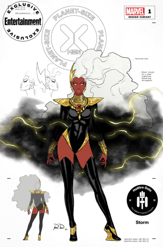
Storm’s is the best without question. The black and gold color combo, the jewelry, the shoulder pads, the flowing hair, the cape made of clouds and lightning! Perfection. The only thing I dislike about it is the heel of the shoes but that’s easy to ignore. 5/5.
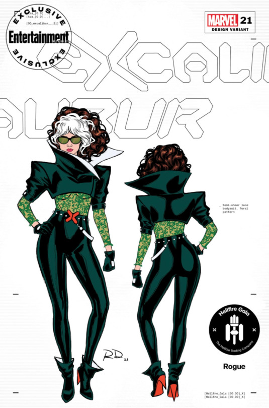
This gives me such 80s/90s rogue vibes. Lace and leather (I’m just gonna assume it’s leather, could be latex idc) is a perfect combo for rogue. The colors are great and I’m a big fan of the sunglasses. However, I’m not a huge fan of how high the cut of the jacket goes. On the other hand, I do like the shoes. 4/5.
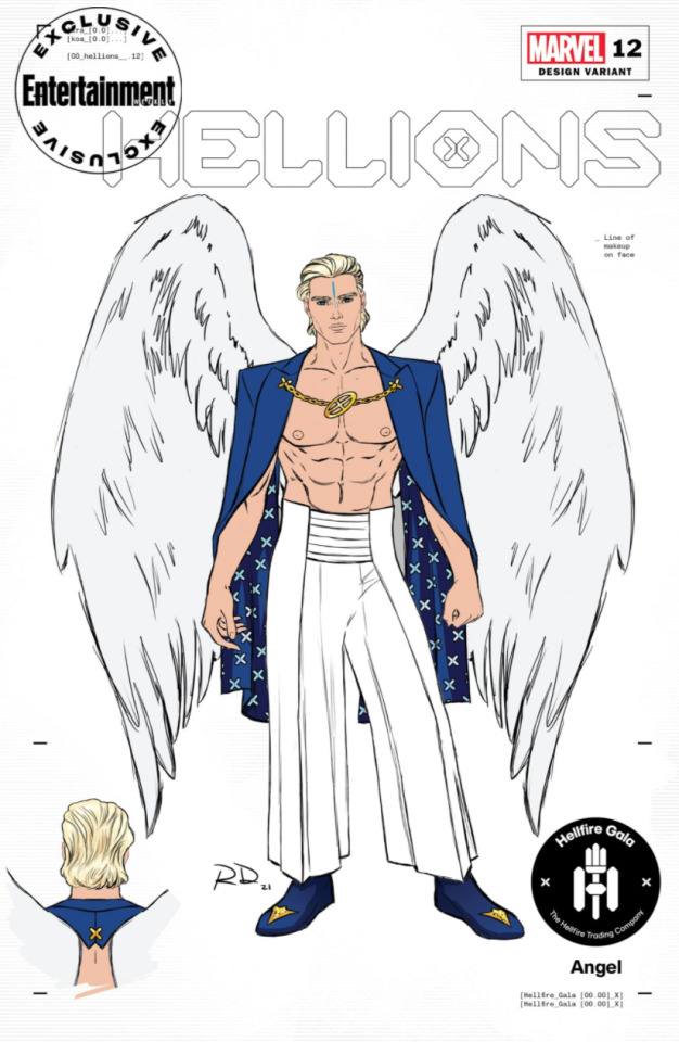
Now warren doesn’t have as much going on as some of the others, but I appreciate the look for what it is. I like the jacket/cape and the gold chain holding it in place. Love that there’s no shirt <3 and the flowey pants are nice. The shoes boring but...whatever. 3/5.
alright faves out of the way...let’s get on with the others...
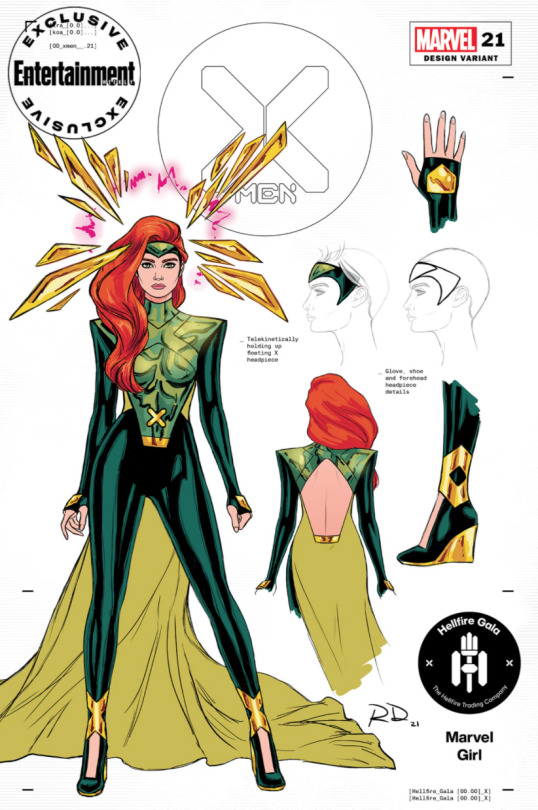
I really like this outfit, the colors are nice, the shoulders are very much padded. However this looks like Jean’s new costume, not the special gala attire it’s meant to be. If it were Jean’s new costume, it’d be a 4/5. In reality, it’s a 3/5.

...Sigh. I see...something here. Potential for something nice, not amazing, but nice. However the weird red stomach and bulky build just overpower the good elements of this outfit. I like the visor but not when it’s paired with this bulky piece. This outfit has the same problem as Jean’s. This feels like a costume he would wear to the next mission rather than fancy gala attire. 2/5. That rating feels a bit generous but in comparison to some other outfits...it’s deserved.
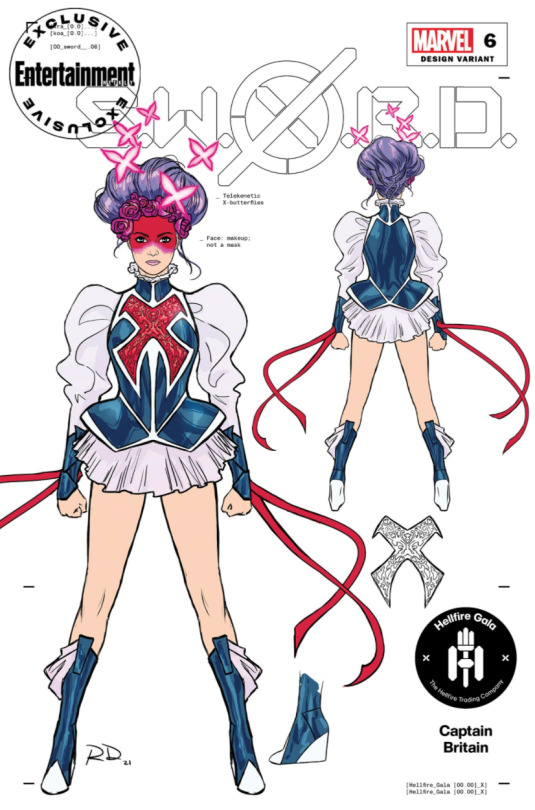
Speaking of other outfits. I will start this by admitting that I am absolutely biased against this outfit due to it being worn by Betsy “Body-snatcher” Braddock. However, you could put this outfit on literally any of my faves and I wouldn’t feel any kinder towards it. First off, why did they give her the cartoon old lady updo and expect it to work with her magical girl cosplay? (not that it could work on it’s own, mind you.) The red face paint is...there, it’s not really doing anything but it’s there. The sleeves are working for me, as I am a lover of puffy sleeves. However, the chest armor and short skirt are not. The boots would be fine on their own but the weird fabric hanging off them just makes them look plain ugly. Also, glove ribbons...no. 1/5.

Oh boy. So I’m not going to point out why using rachel’s hound costume was a bad idea, as others already have. But I will say that while yes, rachel’s hound costume is admittedly very cool looking to me, this is just a much, much, much uglier version of it. Also adding a muzzle was certainly...a choice. Not gonna touch on the leash made of human hair, 1/5. Seriously though, who’s hair is that. Did they make out of donations?

If I had to some this look up in one word, it’d be “Disappointing.” Monet Yvette Clarisse Maria Therese St. Croix may not have the most memorable looks but she oozes glamour out of her pores. This could’ve been her moment to get the luxurious, glamorous, memorable look that she deserves. But we got this...okay look instead. It’s fine. I don’t know how I feel about the sheer pants, I think the headpiece is out of place, the shoes are just ugly, and for whatever reason this look screams beach at me. 2/5.

Oh kitty...never did learn how to put a decent outfit together, did you?
I’m joking. Even though that look might’ve been very...very, it was charming in it’s own special way. I love it in all honesty. I can’t say the same for kitty’s- or should I say, kate’s, gala attire though. This is, in my humble opinion, the worst outfit. There’s so much going on here, I can’t even fully describe how much I hate it. The weird half cape, half prom dress look is ambitious but does not hit the mark. (hit? make? whatever.) Then it just gets worse with the half collar, the marching band sleeve, and the seven of nine eye detail. But what really solidifies it’s place as The Worst...is the brown boots. Just look at them! 0/5. Sorry, kitty.
Last but not least...maybe. We have all three of emma’s looks. Starting with-

This!..whatever it is. Now the idea of putting emma in a big fluffy coat is a good one, one that feels oh so right. But putting her in only a big fluffy coat...with a boob window and some ugly pumps, is not a good idea. I don’t even want to talk about the headpiece, 1/5.
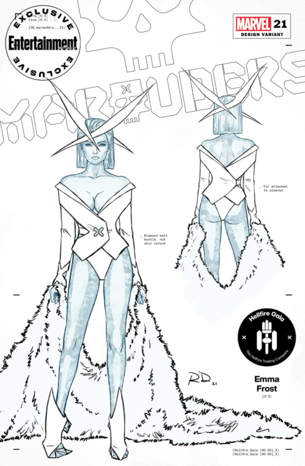
Now this is better. Though not by much. I like the middle piece, I like the cut and the x shapes on her sleeves. I like this...uhm...fur carpet she’s dragging around. Would look nicer as a cape, maybe a boa. But sure, put it around your wrists, you’re Emma Fucking Frost, you can do that. Looking down, however...is when the outfit gets worse. Looking up isn’t such a good option either. What is it with Dauterman and these ugly headpieces? 2.5/5.

And now the final emma look. Which just so happens to be the best. I love that emma’s diamond form is apart of the look. The slicked back hair is lovely. I don’t mind the finger gloves, which is surprising since I’m not the biggest fan of them. I could talk about how I hate the shoes but I’d like to be positive about at least one emma look. 3/5.
9 notes
·
View notes