#when im just drawing whatever i keep the canvas size as the default size of my phone screen (i do all digital art on my phone)
Explore tagged Tumblr posts
Text


some recent Globby doodle pages, digital this time! found a new brush I like a lot ✨
@drama-glob @enbydemirainbowbigfoot
#bh6 globby#globby bh6#globby#bh6 honey lemon#bh6 noodle burger boy#bh6 crushroom#bh6 hangry panda#bh6 hyper-potamus#big hero 6: the series#big hero 6 the series#lorddd thats a lot of tags. ok done with that now.#when im just drawing whatever i keep the canvas size as the default size of my phone screen (i do all digital art on my phone)#hence long rectangle#i lovelovelove honey lemon's sticker parties and it has been a headcanon of mine for quite some time that globby attends them#but nbb is very enthusiastic about stickers in his debut episode and in some other s1 scenes#so of COURSE he should be invited too post-s3#and he's gonna wanna bring his sisters and HL is happy to have more sticker enthusiasts#tbh i think sparkles could have come if he wanted to but HL had a whole episode with him. i dont think theyd be friends#so this is the ex-villain sticker party 🎉🎉🎉#hangry panda is eating the stickers btw. she's just busy glaring at Globby and HL.#my art
93 notes
·
View notes
Note
what program do you use to do animations? ive been wanting to get into it but im not sure how and i know you draw in photoshop which i do too. thanks!!!
it really depends!! for longer stuff, i use adobe animate, just because photoshop tends to start chugging if i do animations longer than like, 20-ish frames. I do all the compositing and tweening for my animation memes in animate as well.

in addition to roughing frame-by frame stuff for my animation memes, (such as tirona's dance for the fortnite one haha) i like to do sketching/doodly animations, like this lil kitty, in photoshop, since it feels most organic drawing-wise to me. BUT, photoshop animation is a bit tricky, and deff opaque to anyone whos never done it before. heres a basic guide, under a cut cuz it got long LOL
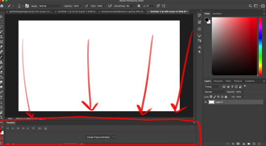
create a new canvas. you can do whatever resolution you want but keep in mind, larger canvases will lag more. i do 1920x1080. if you select window>timeline, a new menu will pop up at the bottom of the photoshop interface

you'll notice a dropdown menu, that has two options: "create video timeline" and "create frame animation". i use create frame animation , just because it's more fitting for what i do.
selecting that option will give you a timeline with frames and everything! each frame's delay can be chosen individually. during playback in photoshop, it will play a little slower than the actual speed when exported as a gif, so keep that in mind

i would advise you to think of layers (or layer groups, if you plan on cleaning up and coloring) as frames for this. a layer's position, visibility, and style can change from frame to frame.
pay attention to these following options, they will appear over your layers menu on the far right once you create an animation timeline.
Unify: can be applied to position, visibility, and layer effects. it will change all the other frames to match what the layer is like in your currently selected frame.
Propogate frame 1: if this box is checked, any position, style, or visibility changes made to a layer on frame 1 will be applied to all the frames. unchecking it disables this.

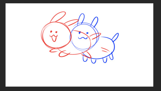
editing a layer with the eraser or brush (or any other tool) will apply the changes to every single frame. so to create the next pose, you will have to go to the next frame, hide the first layer, and draw the next pose on a new layer. I've colored the layers in 2 different colors here for clarity.

the blue is layer 1, and the red is layer 2. on the first frame, i will make layer 2 (the red pose) invisible and leave layer 1 (the blue pose) visible, and then on the second frame i do the reverse. You kind of have to do this manually for every single frame, so it gets a bit arduous if you have more than like 7 or 8 poses.
AND, exporting as a gif is also ridiculously silly and opaque too. go to file > export > save for web (legacy)


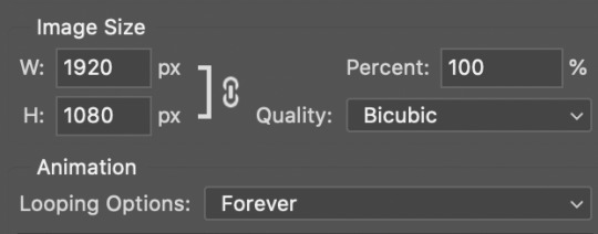
that will bring up this menu that is super complicated. the only stuff you really need to pay attention to is near the bottom, as everything else will work just fine on default settings (i've never messed with them in the 9-10 years ive been animating in photoshop, lol)

down towards the bottom you can change the export size, which is useful if you drew it on a big canvas but dont want the gif file to be enormous. also, you can choose how many times it loops. i usually just keep it on "forever", so i can watch it over and over again lol
and finally, make sure you click "save" and NOT "done". if you click done.. it does not export the file. i will not tell u how many times ive been in speed mode and click "done" and then get frustrated when the file dosnt appear in my folder. i am not smart.
anyways hopefully this is helpful.. ive been using ps so long i have extreme tunnel vision re: mentally filtering out all the useless extra stuff in photoshop's interface so i have no idea if this is confusing or not to someone who's never done it before. if you have more questions just let me know!!
76 notes
·
View notes