#we don't have to do icons/gifs if you don't want btw! it's just a default for me
Explore tagged Tumblr posts
Text


It felt strange for her, as someone unconnected to magic, but it wasn't so much. Nimue had plenty, already, that was too much. Her senses did feel wrong here, though. Scent and sound. There was an absence of it. No birdsong, no wind. The smell, or lack of, was exceptionally bothering. She could focus on the scent of the coffee Cole held, that was something--- not as bitter as Lucanis' norm.
However, Cole was right about it having a beauty to it. At the question, her doe's gaze flicked back to him. "It left an impression... and I don't have many memories to go off of, you know?" Ten years worth, nothing more. Perhaps that was a good amount, but she wasn't certain. How much did people normally remember?
"I didn't take you for a coffee drinker. You seemed more tea, to me. Something sweet."
His first round in the Fade, physically, was panic-inducing. Compressed and closed in, air that was sour and hurt to breathe, mind being pulled and pushed at the same time. Back then, it was disorienting and painful. He blamed it on them being in the Nightmare's domain. It wasn't like "home."
This time was...a little more bearable. He had warning before he went into it and could mentally prepare himself for the onslaught of sensations. It was still overwhelming if he focused too much on their surroundings, but it wasn't painful here.
"The Nightmare demon made it hurt, made it unbearable. Can't breathe, can't think. Choking and clutching at nothing." He paused, fidgeting with the cup of too-sweet coffee he'd asked Lucanis for.

"This time it's...still a lot. Still overwhelming when I let it be, but...I can breathe here."
And rest. He doubted he'd ever be able to sleep in the Nightmare's home, but here, he was able to take a nap every now and then. Distracting himself with the others helped beat back the worry that he shouldn't be here, not in this form, anyway.
"And this place is beautiful." A little run down from age and disuse, but still lovely and warm. That helped.
"Why do you still think of that place?" It was not one of his fondest memories. Who would dwell on it willingly?
#we don't have to do icons/gifs if you don't want btw! it's just a default for me#the redeemed | inquisitor#threads | bushelofmuses (cole)#bushelofmuses
23 notes
·
View notes
Note
Hi may I ask on how do you color your gifs too? they all look so lovely, especially with the skin color, how do you get it right? I am finding it really hard and always struggle with it btw thanks for you tutorial.
Hi! Yeah I can try!
We'll be doing this scene, and I'm going to stick to the more basic way to color:
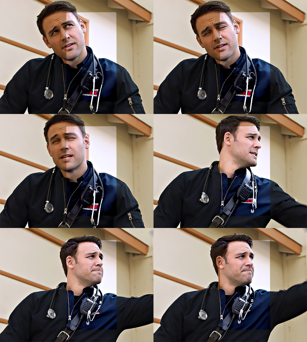
(This tutorial assumes basic knowledge of gif-making and adjustment layers.)
Super-long tutorial under the cut:
Few tips before you start:
Adjust everything little by little to prevent extreme changes/washed out gifs.
Don't worry if one adjustment layer makes the other ones look bad. You can always go back and keep adjusting.
Trust the process! The gifs will look different at every stage, as you'll see here, but as we go, they'll turn into properly-colored ones.
A lot of coloring - especially with skin color - is trial and error. Some scenes are inevitably going to be better than others.
Sometimes, it helps to have a few references of the actor/character in good lighting (preferably images of actors, because they won't have the horrible TV filters) so you can refer to that.
Keep in mind that the lighting of the scene (aka, if they're outside, or if they're in a dark room) will affect how they look in your final gif.
First, start with your gif cropped and sharpened (if you need a tutorial, here is my sharpening one!). Fair warning, I'm new to this, and I don't know the super-technical terms so hopefully this makes sense xD.
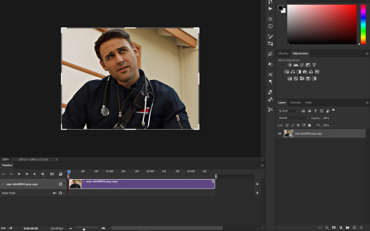
I'm working in timeline here, and this is what my starting page looks like. Those adjustment icons below the color wheel is what we'll be using:
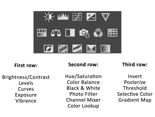
Here's a small guide if you don't know which icon is which. You can also get these names by hovering over each icon:
My first adjustment layer is always an Exposure layer. This is a pretty bright scene, so we won't need to do too much exposure, but we do need something:
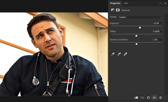
Alternatively, you can use the three droppers over there. I sometimes use the white one (first one on the right) to click on certain white spots to brighten the image automatically, but it doesn't work for all scenes. I prefer manual!
Next, we'll add a Levels layer. I use that middle slider to lighten up the scene, since sharpening and resizing tend to darken the scene.
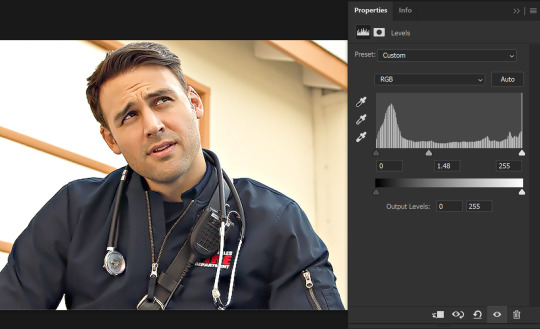
Then the black slider to put some shadows back into the image. (be careful with this, because it's very easy to make it too dark.
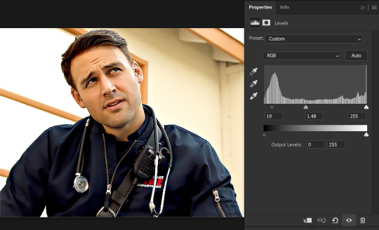
NOTE: some people use Curves to do the work of the exposure and levels layers, but I don't like curves too much. I can make a tutorial on how to use it if you need it, but for now, this is what we'll be going on.
Next, we'll add a Photo Filter layer to get rid of that yellow. Here is where you have to start experimenting with what works best for you.
Photo Filter will have all these options to use:
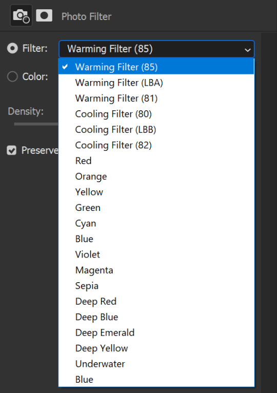
I usually use any of the three cooling layers to get rid of most - if not all - of the yellow of a scene. The one I use most is Cooling Filter (80). The default is 25%, but depending on your scene, you'll want to adjust things accordingly:
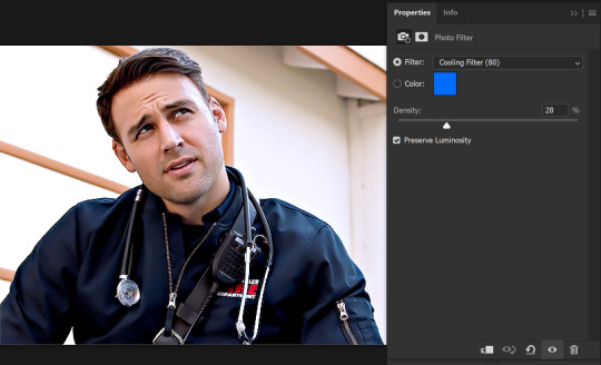
A good rule of thumb is to focus on a part of an image that you already know the color of. For example, this wall is clearly white, not yellow. If the wall looks too blue, then I've done too much of the filter, and need to tone it down. With photo filter, 10-15% works for most scenes, but this scene was super yellow for some reason.
Just for a comparison, here's where we're at right now, with only the photo filter removed (see how he looks more minion on the left side of his face? Photo Filter is a gift xD):
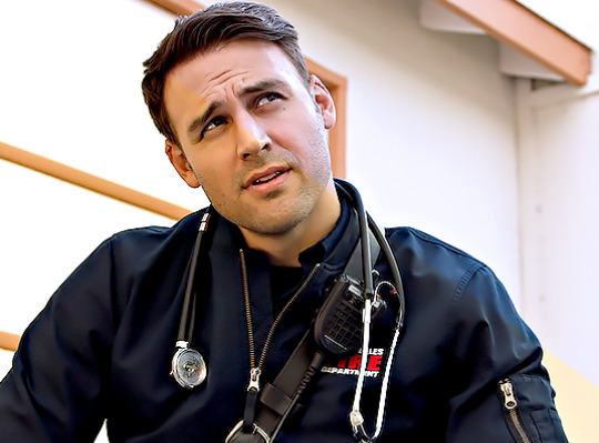
Now, we'll use a Selective Color layer for two things: to remove some of the reddish undertone from his skin, and to add shadows back in.
First, hit the dropdown for Colors and select Red. To remove the reddish undertones, we'll add some cyan to the reds. Here, you really have to play around with things until it looks good. That means adjusting the sliders in a lot of different ways.

(Don't worry about how ashy and "blue" he looks, we'll fix that later)
Next, to add shadows back into it, hit the colors dropdown, and select Black. Here, I move the black slider to add back a few of the shadows. Usually, +3 or +5 are good enough. I've added +13 just because it's what I personally want out of this gif.
(By the way, you can do this on two separate selective-color adjustment layers. I just prefer to do it all on one.)

Next, (this is usually my last adjustment layer) we'll add a Vibrance layer. I do this layer just because I like to add a little bit of warmth back into the gif. The same thing can be achieved with another Photo Filter layer, I just like the pop of color I get with the vibrance layer.
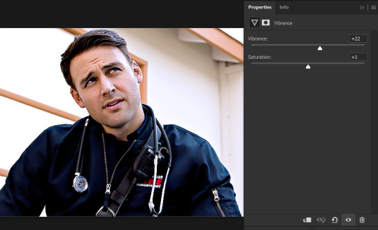
And that's all! Here's what the final gif looks like:
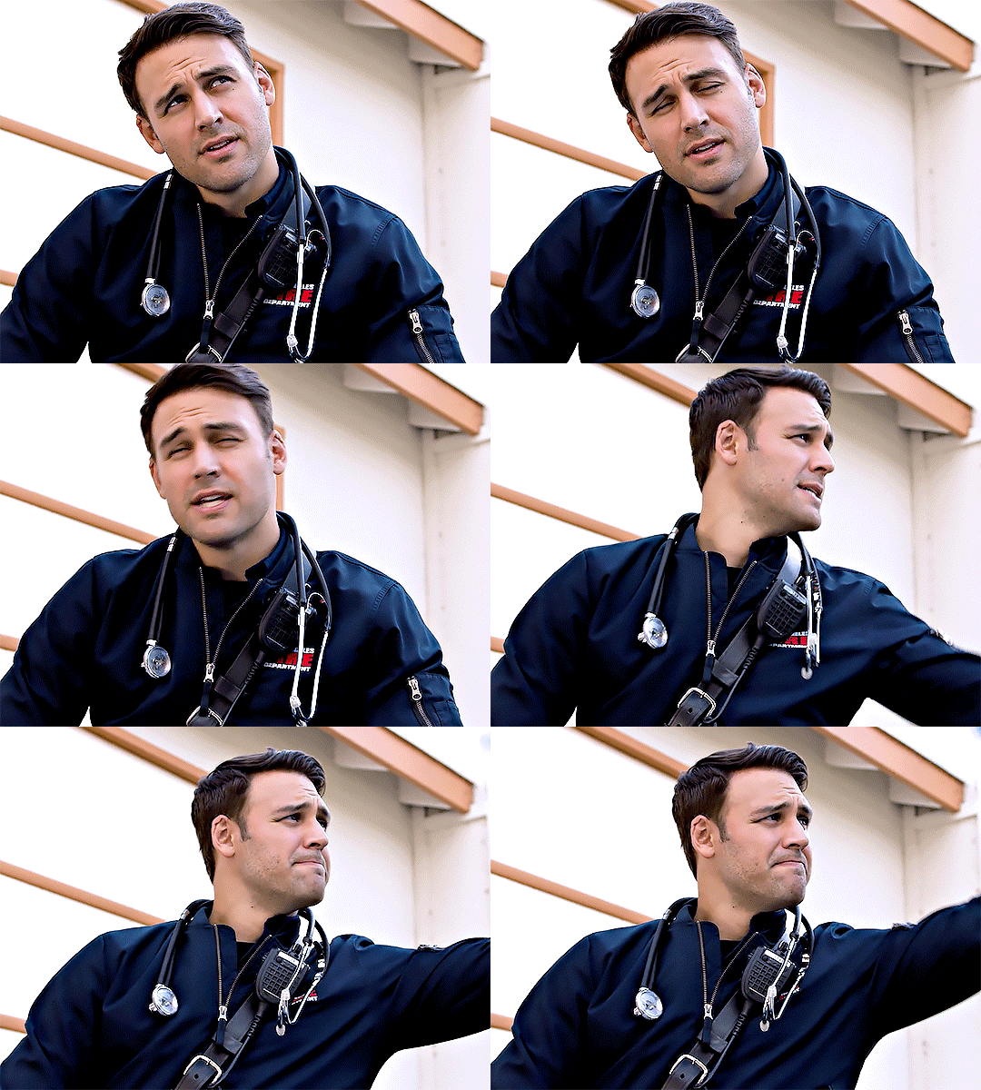
Skin-color tips and other last tips:
For this gif, I didn't really need to go back to adjust the previous layers (for example, to remove more red or something), but sometimes, you have to keep playing around with it.
Some scenes have them very red, and sometimes, removing yellow by adding blue to a layer will make a gif look more red - in cases like these, using a color balance layer helps on top of the photo filter. Adjust midtones and highlights to have more cyan to remove the redness.
For darker skin-tones, I find that removing all the red will take all the warmth out of the skin? You have to be more careful then, to not completely change the undertones. Just remove the excess reds that come from the filters/film/lighting. (I can try to make a tutorial with a dark-skinned character if you'd like.)
An unavoidable part of adding adjustment layers is that it will decrease your quality just a lil bit - not enough to be noticeable, but just so you're aware in case that's a thing for you.
Sometimes, if you're going to gif a scene multiple times, it helps to just make note of the settings you're using somewhere so you don't necessarily have to start from scratch.
It also helps to step away from the gif for a bit and then come back to view it with new eyes. This is because you can get desensitized to all the changes, and I often find myself picking up errors in my coloring when I do this.
Gifs look different on different devices! Just a thing to keep in mind.
I hope this helps, and it wasn't too confusing! A lot of this tends to be practice, so just keep on trying. I usually try giffing multiple types of media for practice (i.e. multiple shows/movies - that's why there are so many Bollywood gifs on my blog!).
Happy giffing!
#zee's tutorials#tutorials#coloring tutorial#coloring#photoshop tutorial#resources#completeresources#ps help#userkosmos#userrin#tuserkay#usermarsy#userphotoshop#usermare#userdahlias#userisha#thank you neethu and isha who had to put up with my panic over this djsklj#and nova for helping me pick a scene <3
146 notes
·
View notes