#vilmos huszár
Text

Maquette for an Artist's Chair (n.d.) by Vilmos Huszár
90 notes
·
View notes
Text
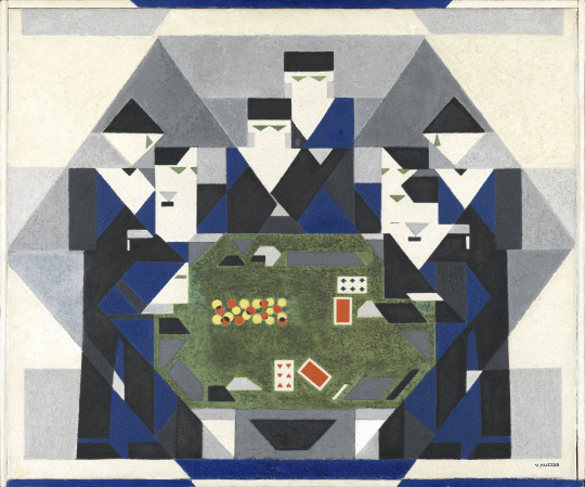
Vilmos Huszár, Baccarat game, ca 1928-29
22 notes
·
View notes
Text
Project One/Letter Blog
As someone familiar with art in a general sense, I’m no stranger to type in the medium. Though, previously, when I involved types or letters of some sort in my work they were often bubbly and playful. Something similar to simplified graffiti or if I’m trying to get a more polished look, I will attempt to sketch in an almost square-like font as I find it easier to rearrange with measurement lines. It’s by no means professional grade designs, there are always imperfections, but it gave me a slight understanding of what I needed to correct to enhance readability or polish the text into something more organized.
Type is important. Well, specifically letters and the alphabet as it is how people commonly communicate. I believe subconsciously I was aware that type has a greater impact on my current way of life (as I use the computer regularly and on each key there is a letter) and therefore has greater significance in general; however, I don’t believe I truly recognized the importance of type as I do now after reading, “Thinking with Type” by Ellen Lupton.
There were a lot of interesting facts and concepts I had not previously regarded. Though I will admit the reading did overwhelm me a bit. There were a lot of pretty, intricate fonts but sometimes I found the letters to almost blur together—it’s hard to explain. For example, on page 14 (or 16 on the pdf), all the fonts appeared to be rather complicated for me when compared together. I’m not sure if having all that text crammed together on the screen initially startled me or if my brain was briefly overloaded, but I noticed evident strain the longer I looked at the letters. It was like my brain said, “No, we are not reading any more text for at least 5 seconds” and promptly shut down. I could not read strangely.
Well, that might just be a me thing—some sort of processing disorder within me—or perhaps it is normal. Maybe I should approach this like I approach an Intro To Math where something new, complex, and challenging presents itself from the unknown. The brain then says, “I don’t like challenging” and tries to abort. If I plan to pursue Graphic Design, I know I need to overcome this; paying attention to fonts and remembering names will likely come in handy.
While the font was intimidating, the book explained many details about types I had not previously known. I find it very interesting that Italics were used in the 15th century for inexpensive books where humanist scripts were considered the expensive type. The line “...The cursive form saved money because it saved space,” (15, Lupton) really stood out to me. It makes me wonder about the process of printing and what a book would like fully printed in the font. What may libraries look like in that period? It's all speculation on my end.
People initially being hostile to the idea of change in type (gothic script) also piqued my interest. The thought of backlash somewhat reminded me of current times and how change can still occasionally be met with opposition. However, I find it slightly amusing that the rise of advertisement and industrialization gave rise to bold fonts in the 19th century. It makes complete sense. While reading, I found myself more engaged by page 24 (page 16 on pdf) where the designs featured by Vilmos Huszár and Herbert Bayer caught my attention the most. It may be personal bias but I find both fonts vastly appealing and recognizable compared to the previous cursive and other humanist fonts. Both characteristics are perfect for advertisement! Honorable mentions include the electronic types featured on page 27 (page 29 on pdf). I enjoyed delving into that bit of history.
While Project One has begun, I must admit I’m failing to make any strong connections between it and the reading. Where the reading details type, our first project seems to be based on precision and visual recognizability. However, I suppose the idea of visual recognizability holds significance in both my project and type in general. Additionally, the making of type from previous technology also required extreme precision. With this project, students are tasked with learning and manning an Exacto knife to cut paper in the outline of their chosen pop culture artist. The work is supposed to match as closely as possible.
In my opinion, precision is the overall goal and link between my project and this week’s reading. We, the students, are using this Project to learn precision and how to craft accurate replications of our original work. This will help students build skills up to polishing their type—if we get there. Once again, it's all just speculation.
Though, as of now, the Project is quite frustrating. It’s time-consuming and I strongly dislike the finickiness of the Exacto blade. It’s quite tedious. That and depending on the type of paper, cutting is made to be a more difficult process. Especially since accuracy is the goal. One wrong cut might mean a student will be starting over. While I’m a little irritated with my lack of initial progress, I think I can see what the purpose is and how learning the skill will benefit me in the future. For now, it’s trial and error, and I’ll just have to settle with my paper and my trusty Exacto blade.


0 notes
Text

Vilmos Huszár, Baccarat game, ca 1928-29, oil on canvas
1 note
·
View note
Text
Delving into the world of type, I found the exploration of this chapter remarkably enlightening! I had never really though about certain fonts being created for specific purposes under certain conditions. Typefaces have evolved over time to suit the needs of a changing world, and the way we view certain fonts continues to change as well. I think that it is awesome that font creation has become so much more accessible over time, and with that a plethora of artistic expression through type. In this chapter, I personally found the fonts from the 1900's to be more visually appealing than examples shown from the past. My favorite was the logo Vilmos Huszár designed for De Stijl magazine in 1917. I think the ability to create unique, almost abstract, type that is still clearly legible to the reader is skill that deserves appreciation.

Throughout my process of this project so far, I have struggled to break away from the computer. Obvious steps in the artistic process have become obstacles that require me to exercise my creative problem solving skills. Finding suitable photos of a celebrity figure that I had any amount of knowledge of was particularly difficult. Finding craft materials with limited resources has also been challenging.
0 notes
Text

Week 1 - Letter
In the reading, we read about how typefaces were created and revolutionized throughout the years. I resonated mostly with the section on "Reform and Revolution" because of the unique and different typefaces of that timeframe. I believe that art keeps moving forward because of revolutionary ideas such as some that came from Vilmos Huszár and Herbert Bayer. I am a big fan of bold and quirky typefaces myself and I use that in most of my graphic design work.
When referring to Project 1, I kind of had a hard time adjusting to the workflow of the class and just to an art class in itself. Up to this point, I have only done minuscule projects and none concerning actual art "theories" and "wording." I feel that so far, my line drawing is great but I am having trouble with the negative drawing. I know that I will find difficulty moving forward but asking questions and looking at examples of work makes things clear for me.
0 notes
Text

Vilmos Huszár / Untitled, 1920
160 notes
·
View notes
Photo

«De Stijl», Vol. 3, No. 9, (cover and frontispiece), 1920 and Vilmos Huszár's 'Vignet for De Stijl', 1917
#graphic design#art#typography#geometry#magazine#cover#de stijl#theo van doesburg#vilmos huszár#1910s#1920s
241 notes
·
View notes

Photo

Composition in Grey (Composition No. 10)
Vilmos Huszár (Hungarian; 1884–1960)
1918
Oil on canvas
Kunstmuseum Den Haag, The Netherlands
#Vilmos Huszár#Huszár#Hungarian artists#De Stijl#Hungarian art#Hungarian painters#modern art#Modernism#avant-garde#abstraction#abstract art#patterns#gray#grey#20th-century art#1910s#Hungarian modernism#20th-century painting
36 notes
·
View notes
Photo

Vilmos Huszár (Hungarian, 1884-1960) - Composition abstraite, oil on panel in the artist's painted frame, 42.3 x 38.9 cm, ca. 1918-1928
139 notes
·
View notes
Photo

© Vilmos Huszár - blue gerberas in earthenware pot
7 notes
·
View notes
Photo

Theo van Doesburg (NL 1883-1931)
Self-portrait (1913)
Oil on canvas (40.5 × 30.5 cm).
Van Doesburg was in 1917 one of the founders of the magazine “De Stijl” wich became an important modernistic movement with related artists Piet Mondrian, Bart van der Leck, Antony Kok, Vilmos Huszár and Jacobus Oud,
#theo van doesburg#emil küpper#de stijl#centraal museum#utrecht#self portrait#1913#mondrian#bart van der leck#antony kok#vilmos huszár#joacobus oud
55 notes
·
View notes
Photo

Wendingen: Diego Rivera. Issue 3, 1929. Cover design: Vilmos Huszár.
45 notes
·
View notes
Photo

Vilmos Huszár, Ragazzo che guarda una nuvola bianca, 1912
12 notes
·
View notes
Photo
Vilmos Huszár (1884–1960), Composition 6, 1940.
31 notes
·
View notes
Last Seen Blogs

shadytrashkoala
sad puffpiece

derpythoughts
deez nutz

depobro58-ez
DEPOBRO58 🏅 Situs Rekomendasi Admin Jen Berlisensi PAGCOR

evasillanpaa
Saavutetun vapauden sinetti

shahidulspecialistofseo
Shahidul Specialist Of Seo