#using the tumblr scroll feature in my composition again
Explore tagged Tumblr posts
Text

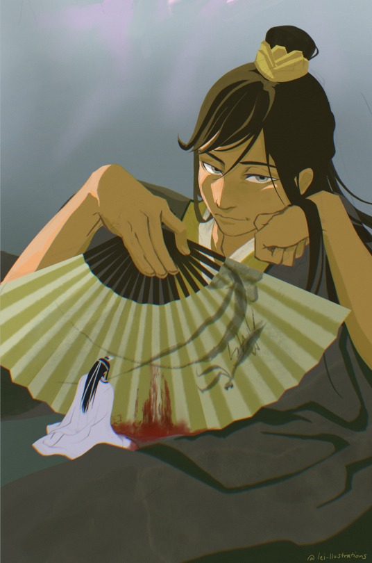
Oops.
Huaisang’s fan inspo: 螳螂捕蝉,黄雀在后 “The praying mantis stalks the cicada, not knowing that the oriole is lurking behind.”
#mdzs#mdzs fanart#魔道祖师#lan xichen#nie huaisang#nie mingjue#my art#jin guangyao#nielan#nieyao#3zun#xiyao#cql#The imagery came to me from the danmei gods#this is a banger to me okay#using the tumblr scroll feature in my composition again#If u noticed the fan in the first image you have NHS obsv skills
4K notes
·
View notes
Note
Day 11
The Mix Up, Yoongi x Jimin, 1/1 Chapters, 5.8 k
OOOMG I almost missed today because I had a shit day at work, but hell nahhww. I made a commitment and we doing this fam!
Ok, lemme tell you about when I first read this. I had recently gotten my AO3 account, before I started using bookmarks. There are a few writers I had subscribed to, for this fandom and others. You were, of course, one of the first authors I subscribed to. You have no idea how exciting it is to get an email saying you posted something, it literally makes my whole damn day!
Anyways…one day I was scrolling through my subscriptions and I stumbled upon this incredibly sexy piece of writing! I read it and was floored. Then I forgot who had written it!!! I lost it for months! I couldn’t remember if I had read it on AO3, Wattpad, or Tumblr. I was so sad because I couldn’t go back to read it again, it was so frustrating!
One day I finally decided to go through all of the authors I subscribed to and then I found it again! I was like, ofc it was written by you! Lesson learned, USE THE BOOKMARK FEATURE ON AO3!! Anyways, let’s get to the screeching cuz this fic is so fucking hot it should be illegal. And have I mentioned that Jimin and Yoongi are my biases??? I don’t know if that makes it better or worse for my emotions, honestly. AHHHH!
Yoongi really said, “Now he had his own room where he could eat, jerk one out, and go to sleep, in that order. All in peace.”
A man after my own heart, I swear!
“The shaft was incredibly veiny, similar to his own”
Ummm….I really did not need a mental picture of Yoongi’s impressive, veiny shaft. THANKS FOR THAT! I betchu it’s like...a dusty rose in color. It’s pink, like his strawberry nipnops. I betchu it is.
Have I mentioned that I majored in Biology? Wanna hear a random bit of information? Ok good. So, the skin on the lips, nipples, and nether regions are very similar in terms of composition, overall. So, if you know the color and texture of a person’s lips and nipples, you get a very good idea of the color and texture of their other bits. Can you picture it?! Can you??!! Cuz I can and it is mouthwatering!!! Send halp!!!
“Oh, I’m sorry you had to see that, Yoongi hyung.”
“I’m not.”
THAT’S RIGHT YOONGI, SHOOT YOUR SHOT!!!
“Did you like it because you want to borrow it or because you liked me using it?”
“Yes.”
It was official. Min Genius was no more. His brain was fried and he was only capable of one-word answers that made no sense.”
I fucking love you! I love the way you make this so damn relatable. OFC Jimin would be able to reduce everyone and anyone into a blithering mess. And then Jimin admitting that he had the dildo made to look like Yoongi’s dick. AAAHHH! Yoongi is a goner!
“He was beautiful all over; from his innocently seductive face to the hard planes of his abdomen, the powerful thighs. That fucking glorious ass…”
Need I say more?!?! RIP Yoongi, you will be missed.
“Hyung, you like your cock worshiped? I suppose it’s worthy of it.”
I love Jimin!!!
“As long as this won’t fuck things up, or not if you’re like just bored right now and just messing around. Because you know I don’t do stuff like that. I’ll kick your ass, Park Jimin.”
Even when Yoongi is beyond lustfull, in his very core he remains a romantic. When he loves, he loves hard, and I love that about him. He wants to make sure Jimin isn’t just fucking around. There are real emotions lurking behind that facade.
This fic felt raw, and real, and almost like a culmination of something that had been brewing for a long time. I really don’t understand how you are able to build the emotions so well, good fucking job!
I am a whole mess, so I will leave you for today!
Puppeee
I more than understand those kind of days at work, fam. You are good, and like I said, I totally won’t actually hold you to sending these every day. But I’ve been loving them regardless!
Also, MY DUDE, my friends and I from r/bangtan have very involved discussions relating to Pinkgi and his pinkness that spans his entire body. Pink lips, pink nips, pink knees and elbows, so it stands to reason that he’d be pink errrrywhere.
2 notes
·
View notes
Text
Kill la Kill Books!
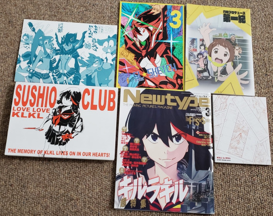
Got a small haul of Kill la Kill books the other day!
SUSHIO CLUB LOVE LOVE KLKL has been a glaring omission from my collection, so when I saw a listing of the book for 3,600 yen—which usually goes for 10,000+ these days—I bought it right away.
And I figured I might as well pick up a few more things while I was at it, right? To make the shipping more cost effective?
That’s definitely the only reason.
But anyway, my growing mass of Kill la Kill books and magazines has now reached 36 items.
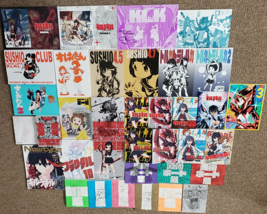
And I’ve talked about some of this merch before; you can find my post about the Febri volume 21 issue here, my post about Fractal 10 here, my post about the Talking About Composite books, The Complete Script Book, and The Art of KLK Vol. 3 here (and I have a whole tag for the script book, #klk-script-book), and I yammer on about the nine Blu-ray key art collection and artboard books here. I also have several essays discussing the official manga adaptation:
Kill la Kill Manga Chapter 7
Kill la Kill Manga Volume 3, Chapters 8-17: Thoughts and Impressions
Kill la Kill Manga Volume 3: Translation Notes, Anime Differences
Kill la Kill Manga Volume 3: Worth it?
Manga Differences
And now, I wanna briefly (lol) yap about the six new additions to my collection.
Because I have a lot of love in my heart for this ridiculous, ridiculous anime.
SUSHIO CLUB LOVE LOVE KLKL
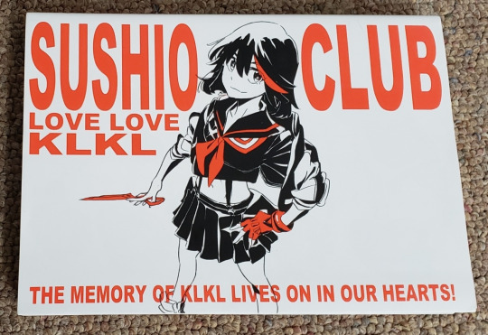
So, I got this book for cheap because it was allegedly in poor shape and “not suitable for collection.”
(My reaction to “not suitable for collection” is always, “It’s suitable for my garbage collection! I’ll give your ‘ugly’ copies a loving home!”)
But, like? There are a couple of dents and folded corners, but the condition is really not bad at all. The art is completely intact and beautiful.
Sushio—who is the character designer for Kill la Kill—has shared much of this book on his Twitter, and I would definitely recommend fans of the series to scroll through his photos and have a look. There’s such a cute, sweet charm to Sushio’s work, and along with the polished, colored pages from LOVE LOVE that he shares online, he also shares sketches of his own fanart for the series, too.

(Okay, maybe this isn’t exactly the best demonstration of Sushio’s absolutely precious artwork, but. It’s one of my favorites from the book. Ryuko resorting to such wild extremes to be with Senketsu again is just. My heart. Kill la Kill is actually adorable.)
In any case, I don’t think any of the content in LOVE LOVE was new to me, but there’s just really something about having the book in my hands. I know there’s such a strong desire for digital media these days, but call me old-fashioned—there’s nothing quite like holding this art and really seeing every stroke and line in person.
Being able to physically flip through the pages also makes me notice things I didn’t before. For instance, I found myself charmed by the little detail of Barazo, Mako’s father, loving and adoring Sukuyo, Mako’s mother.
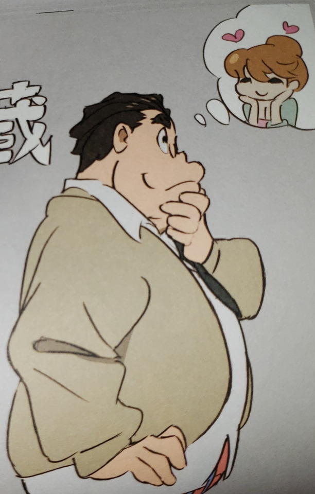
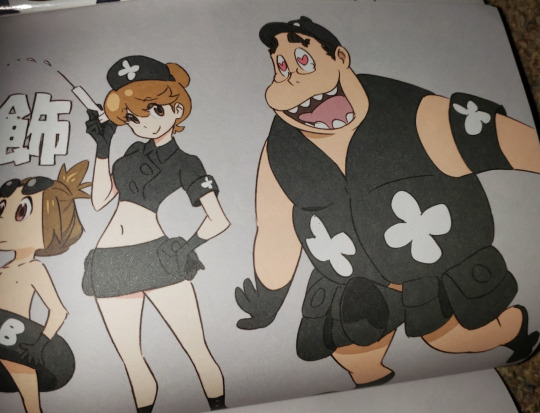
I mean, aw? It’s stuff like this that really makes me wish Kill la Kill were a kids’ show (as Sushio himself seemed to want!) Barazo is so much more likeable when there aren’t any signs of his less-than-pleasant behavior and he’s a loving, supportive husband and father.
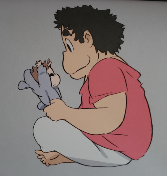
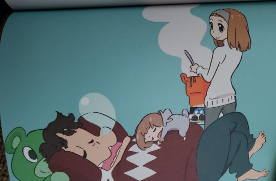

Seriously!
Another thing I notice from having the book now is the order in which the pages are organized. Like, I couldn’t help but be amused about how Ryuko gets her own page here...
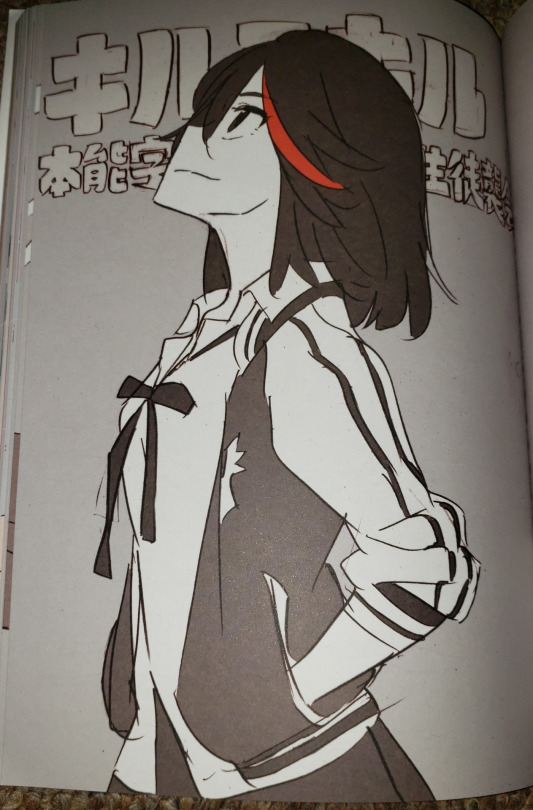
(Smiling for her Starketsu in the sky, right? Just like he asks her to in “Till I Die”?)
...and then the next pages have Satsuki beside Nonon and Mako (and Mataro) beside Ira...
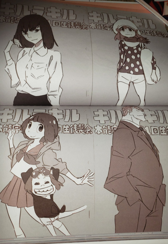
...which strikes me as a bit funny because this isn’t exactly how Sushio organized his Tweets of these images. There, Satsuki was next to Ryuko, Nonon was next to no one, Mako and Mataro were next to Ira, and Uzu was next to Houka:


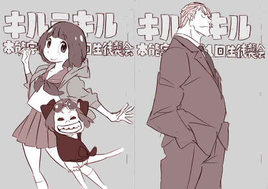

So, in LOVE LOVE, is Sushio deliberately trying to say something with the changed placement? Especially when it comes to the direction of the ladies’ eyes?
Yeah???
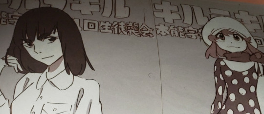

I kid, I kid.
(But really, it looks much better to give Ryuko her own page and not have Nonon standing next to nobody.)
Also, one of the first things that popped out to me about LOVE LOVE is how Senketsu’s pages are right next to Ryuko’s pages. As they should be.

They belong together, okay?!
And speaking of Senketsu and Ryuko, I remember a comment years back that said you could probably find pics of your OTP with matching expressions in this book.
But, uh. Just compare Senketsu posing to Ryuko posing...
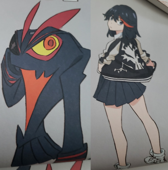
They’re kind of different types of people, lol.
But hey, they do both make cute sneezy faces.

As a final note about my copy of LOVE LOVE, I will say that my only disappointment is that I received the version with print errors. As such, this page of Nui...
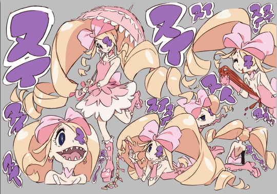
...was accidentally printed twice, and I miss out on this page of Nui as a result:

There are also some minor goofs, like Mako’s arm getting cut off by the background here:

But considering I got this beautiful thing for only 3,600 yen, I really can’t complain!
Now I just need Sushiotan 2 to complete my Sushio Kill la Kill doujin collection....

Takepro

This charming little volume is a collection of animator fanart for the show (and other shows). The book includes a short profile for each featured artist, and their big Kill la Kill pieces are—like all titles in Kill la Kill—named after classic Japanese pop songs. You can read and see more about Takepro here.
It’s hard to pick favorites from this doujin because there is so much adorable and wonderful artwork, but I especially love Naoki Takeda’s “ここに幸あり,” or “Here is My Happiness,” named after the song by Yoshitsu Ootsu.
youtube
The picture features Ryuko, Mako, and Satsuki sitting together, all having a good time, and there’s just something so sweet about seeing happy Satsuki.
I also found an English translation of the song’s lyrics, courtesy of beast-senior 810:
The storm breaks and the rain falls Thorny as the women's path might be I would still keep on living with you And my happiness is here in the blue sky
I could not tell anybody of my scars A bird of love that resided in my chest If only I wander about crying and evading A sorrowful night wind will blow through the streets
I call out your name from the bottom of my heart Who will be awaiting me at the end of the echoes? Snuggle up to you and cheerfully look up to your face And my happiness is here in the white clouds
Aw. This song is so Satsuki.
And speaking of Satsuki, I can’t get over how cute she and Ryuko look on the cover of this book. Like??

Aw!
I also am quite fond of a small piece by Syuichi Iseki, which is in a super-deformed style and features Satsuki comforting Nonon after her uniform is destroyed during the Naturals Election. Nonon cries, and Satsuki pats her head. In the background, Ira looks distressed at the display, Houka seems to be deciphering it, and Mako smiles. It’s really, really cute.
Yoshie Endo’s “僕笑っちゃいます,” or “I’m Laughing,” named for the song by Shingo Kazami, is also real cute. It depicts Mataro holding up Guts, who licks his face. It’s another one of those, “I-so-wish-Kill-la-Kill-were-a-kids’-show” kinda pieces....
youtube
Hiroyuki Imaishi’s Doujin
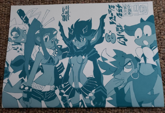
Admittedly, I don’t actually know the title of this one, but it’s a very small doujin by Kill la Kill director Hiroyuki Imaishi. There isn’t too much Kill la Kill content, but there are two pages of Ryuko and Satsuki in their respective Kamui, accompanied by some text.
I thought the text might be something about the show, but it seems like it’s actually about Imaishi’s experience working on the show. And... it’s rather sad? He talks about how he’s able to accomplish more now, but he also has to consider a lot more as well, and he doesn’t have the time and energy that he used to. It’s a lot about aging and growing old.
At least, I think that’s what’s being communicated. Here’s a transcription, though:
なんだろう。
初会社役員とか。
昔よりやれることは増えたが考えなきゃいけないことも増えて時間と体力は足りなくなっていく。
年相応とも言える。
だけどいつまでも大人気なく生きていきたいものだ。
One last interesting thing about this doujin is the material it’s made from; it’s different than any other book in my collection. I’m not an artist, so forgive me if I sound totally ignorant here, but the paper reminds me watercolor paper. It definitely took me by surprise!
SL Sketch 3
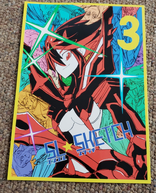
SL Sketch 3 is a small fan doujin by Buzin. You can find most of the art in this book on their Tumblr!
Sketch 3 is a really fun collection of sketches, and I especially love the cover. I’m so desperate for art where Senketsu is acknowledged as an actual person that I’m just all heart eyes over Ryuko smiling at him here.
March 2014 Newtype

Okay, so this one’s really a magazine, not a book, but wow. I was taken aback by what’s inside!
I’ll definitely have to look at this issue in more depth because there are a bunch of Kill la Kill goodies in here that I didn’t even expect. And I don’t think most of it has been translated at all!
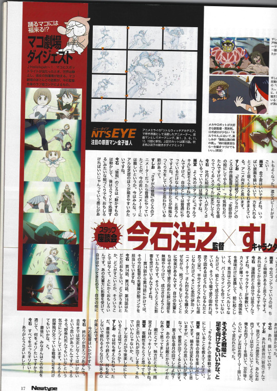
I also realized that I’ve been mixing up my Newtypes and will have to fix my resources page. But on the bright side, there is so much to love about this issue.
Like, the Elite Four Light Novel got reprinted in the Kamui Bansho, but it’s way better here because it has pictures!

I also love how Nonon, out of all the Elite Four, is the only one who stands beside Satsuki in these illustrations.
And I don’t even know what this is (VR or something with Ami Koshimizu, Ryuko’s VA?), but it’s cute and got me smiling:
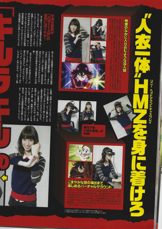
And Ryo Akizuki, the mangaka for the official Kill la Kill manga, made a small comic about his experience working on the project. I like the little title panel with Ryuko, Senketsu, and Mako a lot:

Plus, there’s a shiny ad for the manga’s second volume, too:

One of the things that most caught my interest, though, is an article about the second opening song for Kill la Kill, GARNiDELiA’s “ambiguous”:

I got so curious about this bit because I’ve heard varying, conflicting information regarding the meaning behind the song’s lyrics. On the one hand, I’ve heard that half of the song is from Ryuko to Senketsu, and the other half is from Satsuki to Ryuko. On the other hand, I’ve heard that the whole song is from Satsuki to Ryuko. But I’ve never found any concrete sources for either of these claims!
So, I was hoping the Newtype article would help, but it’ll take a lot more digging into. Still, briefly looking over the page, I did find this bit:
そんな私の思いと歌詞が一致しました。 『キルラキル』でいう流子ちゃんと神衣・鮮血の関係に近いかもしれませんね。
Roughly, it says, “As such, my thoughts about the song agreed with its lyrics. You might say it’s like the relationship between Ryuko and Kamui Senketsu in Kill la Kill.”
I’m not totally sure about the context here—and I admittedly don’t even know the author’s involvement in the making of "ambiguous”—but this article might explain where the Ryuko-and-Senketsu reading of the song came from. It’s definitely something I’d like to delve into more.
Because I really love the Ryuko-and-Senketsu reading of the song, okay, and I’d love some actually official backup for it!
Finally, another favorite part of the Newtype is simply all the art. Takafumi Hori’s spread is particularly great:
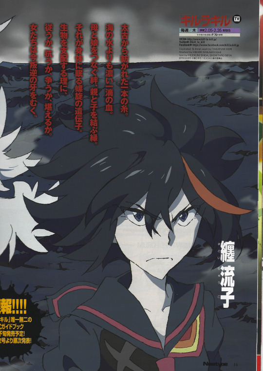

(You can find a cleaner image here.)
Just... dang. I wish I got a little poster of this instead of the ones actually included in the Newtype! The artwork is just stunning.
And one of the cutest things about the Newtype is all the fanart from its readers! I particularly love the little Valentine’s Day special; there’s an illustration of Ryuko giving Senketsu chocolate, and there’s also a Ryumako piece, too!
Kill la Kill Storyboard Ep. 01
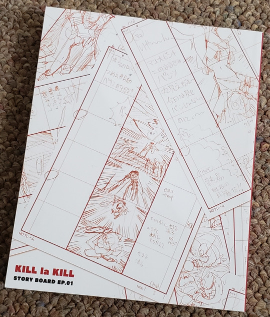
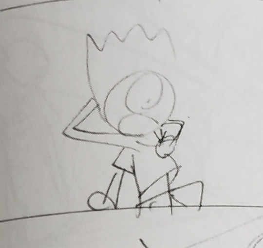
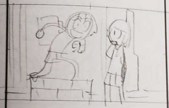
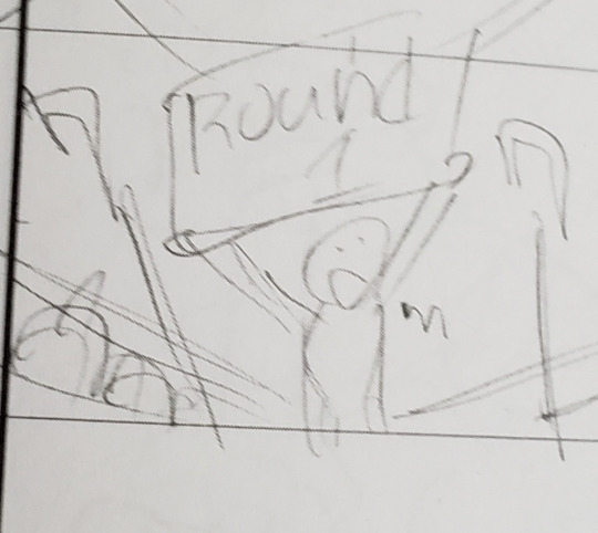
Finally, one of my favorites from this haul is the Kill la Kill Storyboard Ep. 01. The book was included as a shop bonus for the original Japanese Blu-ray/DVD release, though I was able to win it by itself in an auction. I do think I overpaid a bit, but gosh, it’s a lovely addition to my collection. It’s just really neat to see the production process of an anime in action. I wish there were storyboard books for every episode in the show!
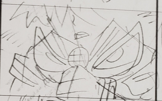

Hiroyuki Imaishi’s storyboards are also just super amusing. Here is a small sampling of some of my faves (because there is so much gold in here, my goodness):






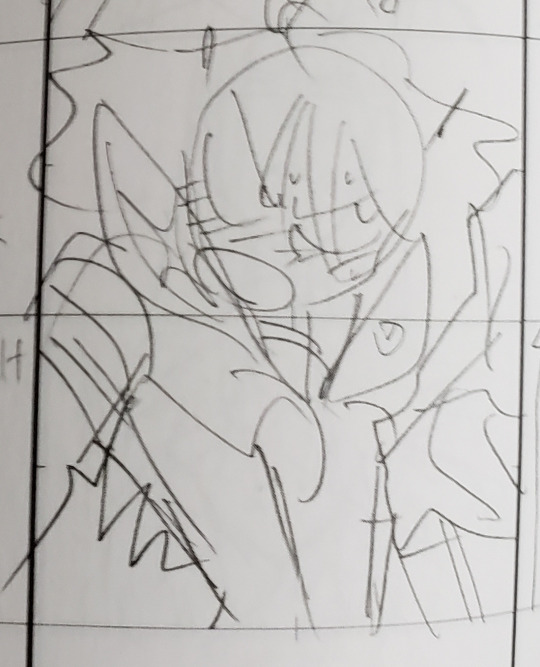
And that’s all for now!
...I guess this really wasn’t so brief at all, huh?
Shocker.
#kill la kill#klk official art#sushio#hiroyuki imaishi#sushio club love love klkl#takepro#sl sketch 3#newtype#klk storyboard ep. 01#naoki takeda#syuichi iseki#yoshie endo#buzin#ryo akizuki#takafumi hori#video#music#ramblings#long post#blood#i still have to pick all my books up off the floor....
35 notes
·
View notes
Text
How to Submit a Good Portfolio
Since public applications will be opening soon, I thought I would make a simple guide on how to send a good portfolio when you apply to zines.
I’ll mostly be referring to art, since that’s what I’m most familiar with, but I’m sure a lot of these points can apply to writing as well.
A lot of my drawn commentary is meant to be lighthearted (and oh so messy), so please don’t take anything too seriously.
What is a portfolio? Anywhere you post your art is technically a portfolio, since you’re showcasing your work to a potential audience. If you showcase your artwork via Tumblr, Instagram, or any other site, you’re free to submit it for review. You don’t need to have a fancy, paid website to showcase your work. Let your art speak for itself.
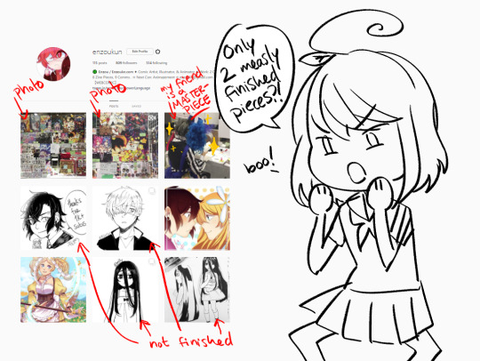
What makes a portfolio bad? Like I mentioned before, anywhere you post your art is technically a portfolio. However, that doesn’t necessarily mean that it’s a good one. In a portfolio, you want to show us your best work. While instagram may be a good place to show us your artwork, if there are some food pictures, con pictures, memes, or any random posts, it’s a bad portfolio. We don't want to sound harsh, but we would appreciate only seeing your work and not your outside life. That way, we can solely focus on your portfolio.
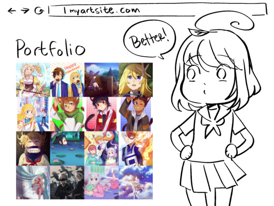
What makes a portfolio good? Good portfolios showcase completed pieces that demonstrate your best skills and capabilities. If you post your artwork on tumblr, you may have some random content in your blog, but if you have a tag specifically for your finished pieces and best work, please send us the link with that certain tag. It will save us the hassle of scrolling down multiple pages and it tells us you’re serious about the project by showing us your true potential.
What to submit:
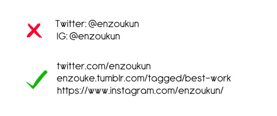
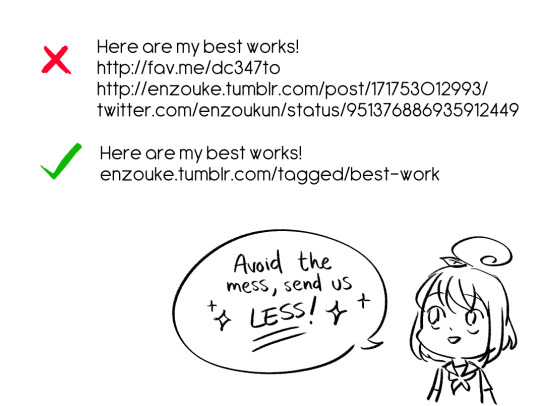
1) Submit complete URLs. We want to easily copy and paste your portfolio onto our browser. We don’t want to type out the whole website. We have hundreds of applications to go through, so typing up the website can eat up a lot of our time. I’ll admit that I’m guilty of doing this, but I’m also learning from my mistakes. Typing up the URL (even if it’s as simple as mywebsite.com OR myartblog.tumblr.com/tagged/best-work) only takes a few seconds to do, and we’ll definitely be grateful to you for doing this.
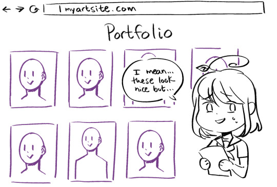
2) Show us how versatile you can be! While we can appreciate the beautiful technical skills from various artists, if you submit a portfolio that only includes headshots and not much else, you run the risk of being declined. We want to see different compositions, interesting uses of color, or cool angles! You don’t need to show us that you can work with 10 different types of media, or hundreds of different angles, but give us something more than just the same pose.
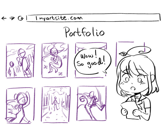
3) Send us completed work. While sketches DO look nice, a majority of zines want to see your completed artworks. In most cases, they are going to be releasing a finished, printed project, so it’s reasonable that we would want samples of what your completed art looks like. By looking at your finished pieces, we can gain a better insight of what to expect from you.
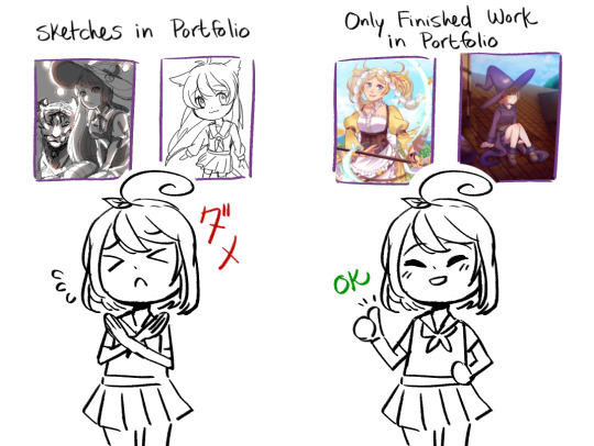
What to avoid:
1) Don’t send us a portfolio full of sketches, as mentioned above. If you have a sketchier / messy style, that’s fine. What you consider as finished is what you should be trying to send to us.
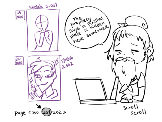
2) Don’t make us scroll through tons of pages. This one applies similarly to the previous point. If your blog only includes doodles and a few finished artworks, don’t make us scroll for so long just to get to the completed stuff. Please save a life and tag your finished works. We will thank you for it.
3) Don’t send us multiple links. Some zines may ask you to link them to 3 of your best works, but instead of sending us 3 different links, create a tag or Google Drive folder with those 3 pieces included. This saves us the time of copy/pasting every single link into our browser, plus it allows us to better compare your work side-by-side. You also get the added benefit of not needing to copy/paste multiple links for your next zine application.
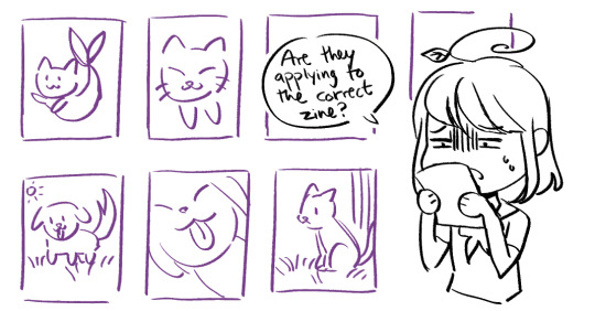
4) Don’t send us a portfolio that doesn’t include humans. This one is kind of weird, but I have received some applications that only feature animals or backgrounds in their portfolios. If you’re applying to a zine that needs certain people or characters drawn, we can’t properly judge your portfolio if you don’t show us that you can draw the subject matter. The same can be applied vice versa. If I made a corgi zine and you send me a portfolio full of humans, how am I supposed to know if you can draw a dog or not? When applying to zines, take note on what they’re looking for, so you can submit accordingly.
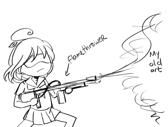
5) Don’t submit work that’s older than 2+ years. As an artist, you’re always growing and learning. A lot can change in a year or two. We want to see your recent stuff, since that’s the most accurate representation of your current skills and knowledge.

A Simple Suggestion
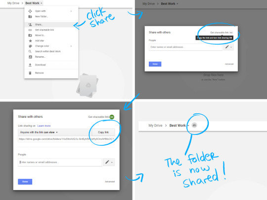
1) If you don’t want to tag your work or delete some things from your social media just to show us your best & completed work, make a Google Drive folder that shows us your best pieces. Keep it short and simple by including a minimum of 3 pieces and a maximum of 8 pieces. Make sure the Google Drive folder permissions are changed to shared! (This is very important).
Advice & Final Thoughts
Don’t be afraid of rejection. Spots are usually VERY limited in zines. There’s no way we could fit everyone into one zine (that would be a heavy and thick book, not to mention SUPER expensive). I’ve been rejected multiple times, but you can’t let that discourage you! Just keep applying and continue to improve your artwork. And even if you’re accepted, still continue to improve your artwork! Practice, practice, practice a whole damn lot!
If you know you won’t have enough time to dedicate to the zine, please don’t apply. If you apply and get the slot, only for you to drop out last minute, you just took the spot of a potential artist that actually wanted to be a part of the project and it’s unfair to them.
If you get accepted and life gets too hectic for you to continue with the project, PLEASE don’t vanish and make the zine organizers hunt you down. It will not make us want to work with you again. We want things to be pleasant between the both of us. Life happens, but communication is ESSENTIAL in every situation.
I’m not against having sketches in a portfolio (I have a few on my own website as well), but a majority of applicants can’t afford their own website, so they use free sites like Tumblr or Instagram. These websites don’t really allow you to properly separate your doodles / finished work, so this is why I keep reiterating this point.
Zines are meant to be fun and something to bring the artist community together! Interact with your fellow artists and let’s all have a good ol’ time.
1K notes
·
View notes
Text
Head Turn Re-action
Research
I first began by undertaking some research into the mechanics of animating a head turn. As I have had some issues embedding the links at the beginning of my post, my research material will be found at the end of this post. Thank you.
Reference Videos - Recorded Myself
Now having a better understanding of what is required to animate the head turn, I once again had someone record myself completing various head turns with different moods. Accompanying the new recordings, I further studied the video footage taken of myself from Assignment 1 where I had begun to explore and study the head turn earlier. When studying the recordings, I focused primarily upon the timing and easing in and out, the arcs - either a subtle downward or upward arc - the head structure and the various expressions in mood portrayed. Recording myself proved highly beneficial as the footage was not only important to study, but by completing the actions myself, I developed a better understanding of the motion.
Please Note: Due to unfortunate issues with uploading gifs or videos, I have been unable to upload the extra footage of myself completing other head turns that I did not use.
Chosen Video to Rotoscope
This time, I decided to rotoscope the recorded footage of myself, through interpreting and exaggerating, rather than purely animating and drawing each frame freely and only using the recording as a somewhat vague reference, a process I have undertaken in all my previous animations. As this was to be my first attempt at rotoscoping, I thought it to also be good practice for the rotoscoped choreographed action I will complete. After watching many rotoscoped examples (which I will include with my choreographed action animation later), I gained an understanding of the visual aesthetic and how, in many cases, rotoscoping can cause the animation to appear unnatural and stiff, lacking exaggeration, loose curves accompanied by the line of action, and fluid character. I reminded myself constantly when I began animating to use looser lines to avoid the appearance of stiffness, to push the curves, interpret and exaggerate, along with simplifying the form as to not become trapped within the issues of rotoscoping.
After deliberation, I decided upon the footage to rotoscope.
Please Note: Please scroll up a few posts to find the post titled ‘Head Turn: Chosen Footage to Rotoscope.’ I had initially uploaded the footage as a gif, however found once I viewed my Tumblr blog out of my account, the gif did not work. Unfortunately, the only way Tumblr would allow me to upload this video, is as a new post. Thank you, and I hope you have no issue finding the footage and post.
Planning, Thumbnails and Spacing Charts
Before I began animating and after further studying my chosen video, I drew up some rough and quick thumbnails of the keyframes and breakdowns, along with a rough spacing/timing chart.

My Process
Stage 1:
I first began by animating pose to pose, where I drew in the key frames and breakdowns of the action.

Stage 2:
I then, still in a pose to pose manner, added a frame in-between each breakdown. Here, the motion is still very clunky, however by adding a few in-betweens, you can already see where the animation is a little smoother.

Stage 3:
I then changed my technique and approach to straight ahead animation. Here, I have begun to draw in every in-between from the start of the animation, so when the head eases into the turn it comes smoother now.

Stage 4:
At this stage, I have completed adding all the in-betweens for my animation. The overall motion is smooth, and at my desired pace. Happy with the number of frames, I then corrected the inconsistencies of my frames - the left slope of my neck, and collar bone for instance.

Stage 5:
Once I had corrected the inconsistencies and smoothed out some glitches, I was left with the below, completed animation.

Onion Skin
I turned on the onion skin and lengthened the viewing range, so I could view and study the arcs. I have included some images breaking down the motion and frames so the arcs are clearly visible.
The first image is of the entire animation and its frames. I also drew in a rough line to indicate the subtle downward arc of the chin/head, along with the nose. I wanted to ensure all the facial features and structure of the head responded correctly to the downward dip. While I was rotoscoping, I still drew upon my knowledge of the structure and anatomy of the human head, remembering key landmarks and their position and angle depending on other facial components -such as the way the eyes, eye brows and nose all correlate and line up with the ears.


I then studied the end of the head turn animation where the secondary action of the hair continues to move (follow through and overlapping action) when the head turn is complete. The red onion skin portrays the motion of the hair while the head was still moving, and the light green onion skin portrays the overlapping action of the hair once the head had stopped moving.

Stage 6:
The last correction I made, was to adjust her placement amongst the composition, as there was a little too much head room.

Please Note: Please scroll up to view the post titled ‘FINAL Head Turn Re-action’ to read my discussion and view the final animation as a video. Thank you.
Research
youtube
youtube
0 notes