#typefound
Explore tagged Tumblr posts
Visit Tumblr Blog
Explore Tumblr blogs with no restrictions, modern design and the best experience.
Last Seen Tumblr Blogs


Fun Fact
The total number of visits Tumblr.com received during January 2021 is 327 million.
Text
I bought some mushroom borders (from typefounder Val Lucas, Bowerbox Press) and what better way to test them than with a legendary Tumblr quote (from user @personsonable, apparently):
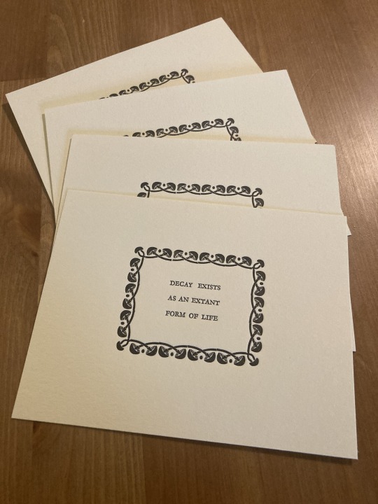
(If we’ve interacted before and you’d like one, and you have an address you’re comfortable sharing, message me! I have 30 of these things!)
#Claire and moki you’re getting one whether you want them or not#letterpress#letterpress printing#typesetting#hand press
51 notes
·
View notes
Photo
This is actually my field of research (broadly speaking), so I wanted to throw in a few more things:
Being "out of sorts" comes from literally running out of sorts (characters of type) in your case.
Stereotypes are made from molds made from set type. So once you've put together the text you want to be able to reproduce quickly, you take a mold of the type, and then make a stereotype plate from that mold. Printers sometimes offered stereotyping services, which could include storing the plates indefinitely, as with Rand, Avery & Co.
The linotype machine is named that because it literally makes a line o' type on demand. I can't explain all the mechanics, but when you type a line, the machine casts it into a single line of lead type. This was hugely helpful for printing things quickly, especially things with tight deadlines like newspapers. But I do want to mention that typesetters (who were assembling texts with single characters instead of lines of type) could be extremely fast, to the point that typesetting races were an actual spectator sport in the 19th century in the US.
Before standardized point sizes, typefounders in the US used actual names for their sizes, like diamond, primer, and pica, but there was a ton of variation as to how big these sizes were in practice, both between and within foundries. The switch to point sizes was complicated, but clearly stuck. If you want to know more about the switch, Wesley Washington Pasko talks about this under Standards of Type in American History of Printing and Bookmaking (1894).


TiL (click to go to the thread, which probably has more interesting tidbits I missed).
Bonus:

#unironically if you have a printing/book history question I may be able to help you find the answer#I'm not an expert and my focus is mostly on 19th century US printing but#printing history#book history#undescribed#describe later
165K notes
·
View notes
Link
0 notes
Photo

Frabill Blue Waters #vintage Minnow Bucket. Not much use yet here in New England, until the ice thaws. It is a nice 1-color water scene on the front on the blue metal bucket. . ➡️ Follow us at @type.found #typefound #foundtype #typehunting #typehunter #vintagegraphics #vintagelettering #vintageadvertising #802 #Antique #Antiques #Americana #FleaMarket #midcentury #vintagestuff #typography #fishing #water #milwaukee #goodtype #designinspiration #branding #visualidentity #rust #typographyinspired #rustic #patina #tv_hiddenbeauty #typevstime #can https://www.instagram.com/p/Bu6iT7vgRV1/?utm_source=ig_tumblr_share&igshid=2esr2rbs35by
#vintage#typefound#foundtype#typehunting#typehunter#vintagegraphics#vintagelettering#vintageadvertising#802#antique#antiques#americana#fleamarket#midcentury#vintagestuff#typography#fishing#water#milwaukee#goodtype#designinspiration#branding#visualidentity#rust#typographyinspired#rustic#patina#tv_hiddenbeauty#typevstime#can
0 notes
Photo

An essay on the forgotten art of the punchcutter
1965 :: USA :: R. Hunter Middleton
An essay that was published as a keepsake alongside a talk given by R. Hunter Middleton to the School of Library Service of the University of California at Los Angeles (UCLA).
Language: English
3 notes
·
View notes
Photo
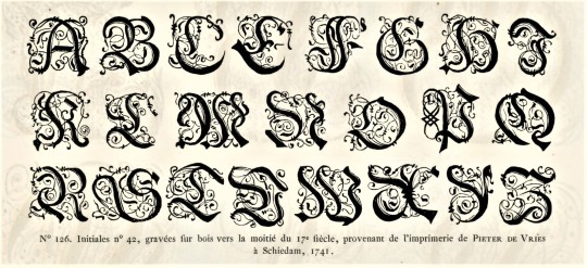


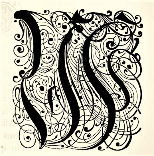
Typography Tuesday
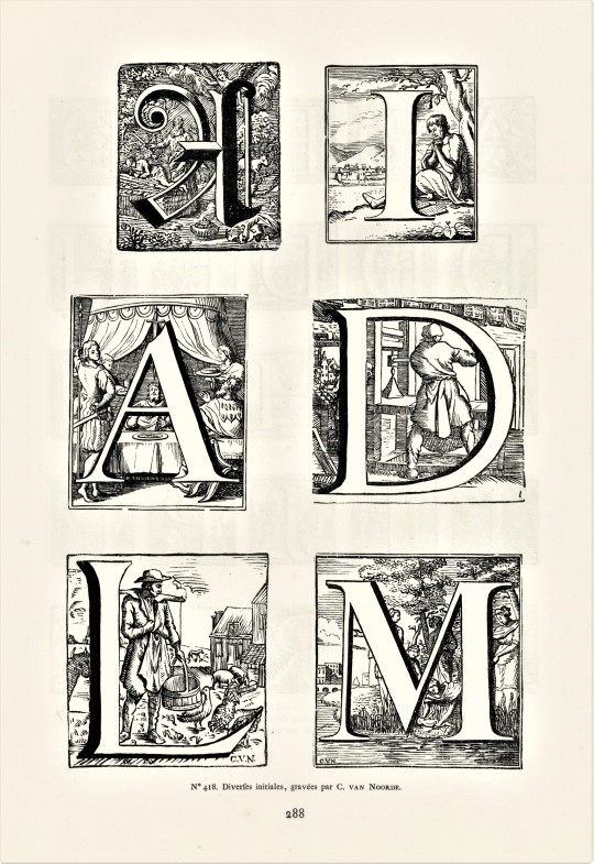
Here are some fancy, schmancy wood-engraved initials from our recent acquisition, Fonderies de caractères et leur matériel dans les Pays-Bas du XVe au XIXe siècle by Charles Enschedé (1855-1919), with specimens from the extensive typographic collection of the venerable 320-year-old printing and typefounding firm Joh. Enschedé en zonen, published in Harlem by De Erven F. Bohn in 1908.This title is one of type historian and designer Jerry Kelly’s recent One Hundred Books Famous in Typography (The Grolier Club, 2022).These highly calligraphic Gothic initials were engraved in wood in 1741 and were from the printing house of Pieter de Vries in Schiedam, Netherlands. Our copy of Fonderies de caractères is from the collection of New York artist Elijah Silverman and bears his signature.
View other posts related to the Enschedé firm.
View more Typography Tuesday posts.
#Typography Tuesday#typetuesday#Joh. Enschedé en zonen#Enschedé#Joh. Enschedé#Enschedé type foundry#Enschedé Font Foundry#Charles Enschedé#De Erven F. Bohn#initials#wood engravings#Gothic type#Typography Tuesday#Fonderies de caractères et leur matériel dans les Pays-Bas du XVe au XIXe siècle#Jerry Kelly#One Hundred Books Famous in Typography#Elijah Silverman#18th century#18th century type
118 notes
·
View notes
Photo

Rotham Industria Rotham Industrial. Stylised lettering for industrial flavoured projects. Imagine, if you will letters shaped from metal tube, or perhaps from a solid rod, or perhaps made from brass handrails?
0 notes
Note
PLEASE elaborate on the printing press thing.
Okay, here goes.
First, type metal. You've got your metal pieces, with your letters and whatnot to be printed on their surface, raised and mirror-reversed, which gets inked and pressed to the paper, yes? And these were made by carving your letters, or your illustrations, or whatever, into a material that forms the end of a mold in which said metal is cast. Casting metal with molds was a fairly well-known technology in Europe at that time — particularly for a goldsmith like Gutenberg.
Now, you want this metal to have several properties:
Forming a sharp and accurate impression of the mold, and its nooks and crannies.
Relatively easy to cast at comparatively low temperatures.
Not too brittle, so it doesn't crack or chip or shatter under the stresses of the press
Not too soft, so it doesn't deform and wear down quickly under the stresses of the press
Not too expensive.
Now, lead was cheap, easy to cast, and not at all brittle. But I don't know if any of you have ever used lead fishing weights, or done any lead casting, but I've done a fair bit of fishing, and my dad used to cast his own fishing weights. And lead is soft. And it doesn't hold sharp edges. And then there's thermal expansion — most materials expand when heated… and thus contract when cooled, particularly from molten to solid. Lead is particularly bad in this regard. From the moment you take the cooled metal from the mold, you'll find a less-than-accurate impression.
Well, people of the day, particularly the pewterers, knew you could toughen up lead, and let it flow more fluidly into the crevices of a mold while molten, if you alloyed it with some tin — which also has an even lower melting point than lead. But this doesn't solve the contraction problem. What does is adding antimony. Now, the sources I've read seem to disagree as to whether or not European alchemists figured out how to isolate antimony from stibnite (antimony sulfide) ore before or after Gutenberg's time; but they agree that early typefounders mostly just added stibnite to the alloy along with some scrap iron (horseshoe nails), causing a reaction between the stibnite and iron, wherein both the iron and the sulfur are rejected from the resulting alloy while the antimony is left behind.
Now, while type metal alloys vary somewhat in their proportions (depending on intended use and which properties take priority), they're generally in the ranges of 54‒86% lead, 3‒18% tin, and 11‒28% antimony.
Second, there's the ink.
Inks are traditionally a pigment or dye in a liquid solution, occasionally with binders. Most early inks used carbon-based black pigment — "lampblack" soot, charcoal, "bone black," graphite, etc. "India ink" — invented in China — consisted mostly of these bound together with animal glue into an "inkstick," which is ground with water on an inkstone to form the ink. Or then there's iron gall ink, mixing iron (ii) sulfate with tannic acid from oak galls into a solution, with gum arabic as an added binder (the soluble ferrous tannate formed penetrates the paper, then darkens and becomes insoluble by oxidizing via exposure to air into a ferric tannate; however, excess tannic acid generally meant that it could slowly eat through the paper over time). Or then there was cephalopod ink — see the origin of the word "sepia."
But what all of these have is that the solvent for the solution is water. And all these water-based inks will generally run right off your metal type. To adhere to the type metal, the inks used by Gutenberg and his successors weren't just thicker than those used with pen or brush, they were oil-based — closer to an oil paint or varnish than a traditional ink. (Hence, why they're applied to, spread across, and smoothed over the type via ink balls and rollers.) And while his inks used carbon soot as their pigment, they also contained high levels of metal, including copper, lead, and titanium (and thus his printed works have text which is actually rather shiny). Later printers mostly converged on a black ink recipe combining walnut oil, turpentine, and soot.
(And while I said earlier it wasn't about the paper, but Gutenberg also figured out how to moisten the paper to allow the type to better "bite" into it.)
So you see, there was a lot more to the printing revolution than just making the mechanical press.
#johannes gutenberg#printing press#printing#type metal#thermal expansion#lead#tin#antimony#alchemists#ink
129 notes
·
View notes
Photo


0 notes
Photo

A poster about old style serif typeface Sabon. It is designed by Jan Tschichold in 1964. Its design is based on the types of Garamond and the name comes from the French typefounder Jacques Sabon.
Material: 150gsm uncoated matt paper Available Sizes: A4 / A3 / A2 Tools: Illustrator, Photoshop, After Effects, Lightroom, Blender
1 note
·
View note
Text
Week 6
Final Informational side:

I really enjoy the way this came out in the end, despite the two widows in the middle column. I unfortunately am noticing them now after having turned in the final posters. However, as I am always looking to move forward, I have made note of this for editing before the end of the semester when I will be producing a process book for all of my graphic design work. I would also like to adjust the alignment of later paragraphs in second and third columns, aligning the first baseline of all top paragraphs (rather than to that first sub-header).
Final conceptual side:

Overall the Conceptual side hasn’t changed much since last week There is some small text within the image now, two simple lines “John Baskerville sends his regards.” As well as “Breaking moulds as a transitional typefounder.”
This week our reading further elaborated on grid layouts. Specifically going over single column girds, multiple column grids, and modular grids. Through this project I’ve worked with each of these grid types (conceptual-single column; informational v1.1 was a modular grid; and the final informational poster is multiple column).
Topics covered in the reading this week:
Structure and spacing
Proportion
Grid Structures
Improvisational structures in response to specific elements of structure
Grids and type on screen
As a digital native, I often find the sections focused on designing for digital life and screen viewing to be the most interesting. Specifically this week learning about adaptive and responsive grid systems. Adaptive systems use independent units of measurement and scale to the user’s screen resolution. Proportions of the page are altered in the process.
Responsive systems can be flexible or fixed to a set composition. The grid responds to width and arrangement on the screen; this is the type of grid I often see online.
1 note
·
View note
Photo


27 Feb 2019 | Der Klubhaus
Focus this week has been construction of the one-of-a-kind covers for Typesetting on a Winter’s Afternoon. The covers are wrapped with folios carefully unbound from a copy of the 1923 Specimen Book & Catalogue of the American Typefounders Co.
First step was to deconstruct the catalog and dissect individual folios from their signatures until I had about twice as many as I would need. Then I cut them in half (horizontally) because half of a 2-page spread (vertically) is what it takes to wrap the front and back “boards,” which aren’t boards at all, but the remainder of the Zerkall Litho that is featured as just one folio within the book block. I must have had about 200 and I needed 52 (to cover 26 books), so I swiftly filtered through the stack, weeding out the weaklings and creating two stacks of potential front cover wraps and back cover wraps. Counted them AFTER initial filtering to find 26 back cover wraps and 27 front cover wraps. Someone’s in tune. After wrapping the front and back “boards,” five of the wraps were replaced because they didn’t make the final cut. Next step, pair up a front cover and back cover. Now we have 26 pairs of wrapped cover boards needing spines. The paper spine is Zerkall Ingres, which also serves as the front and back fly leaf folios within the book block. Too much information, I know, but you’re still interested or you wouldn’t be reading this. By 4:55 pm, all spines scored, and thirteen of them folded with covers inserted, waiting to be stitched together with book binder’s thread on Friday.
Trying to get them all done to take to the Manhattan Fine Press Book Fair on Saturday, 9 March 2019...a little more than a week away.
Request a prospectus for this extremely limited edition of 26 copies by post or email today. Thank you.
#book binding#twa#book arts#fine press#typography#manhattanfinepressbookfair#der klubhaus#heavydutypress#winter art#winter#type#typefaces#typeface#typefoundry#letterpress#artists books#artist studio#artists on tumblr#driftless
6 notes
·
View notes
Photo

Have you ever wondered how designers of the past chose fonts? They couldn't just use the drop-down menu! Instead, typefounders would produce huge tomes of type specimens -- this one is nearly 800 pages long. #typographytuesday . . . . Z250 .D2733 1896 #design #graphicdesign #typography #fonts #typeface #typespecimen #bibliophile #bookstagram #booklover #rarebooks #specialcollections #librariesofinstagram #iglibraries #mizzou #universityofmissouri #ellislibrary #ifttt
#bookhistory#special collections#rare books#mizzou#university of missouri#libraries#typography#design#graphic design#typography tuesday
140 notes
·
View notes
Photo

Jiffy Way Egg Weight used to check weight and grade of eggs. Circa 1950s. Love the bright colors, the contrast with the green and the fonts on this. . ➡️ Follow us at @type.found . . . #typefound #foundtype #typehunting #typehunter #vintagegraphics #decor #vintagelettering #vintageadvertising #802 #Antique #Antiques #Vintage #Collectible #Americana #FleaMarket #midcentury #typography #goodtype #designinspiration #lettering #typespire #typelove #branding #visualidentity #rust #typographyinspired #rustic #patina #typevstime #1950s https://www.instagram.com/p/BuoWUhZAj81/?utm_source=ig_tumblr_share&igshid=186ku20ebkzl9
#typefound#foundtype#typehunting#typehunter#vintagegraphics#decor#vintagelettering#vintageadvertising#802#antique#antiques#vintage#collectible#americana#fleamarket#midcentury#typography#goodtype#designinspiration#lettering#typespire#typelove#branding#visualidentity#rust#typographyinspired#rustic#patina#typevstime#1950s
0 notes
Photo

WAD to RR: A Letter about Designing Type
1940 :: Cambridge, Massachusetts :: William Addison Dwiggins
An essay in the form of a letter, expanded and edited for publication, from William Addison Dwiggins to Rudolph Ruzicka on the subject of typeface design. It is especially interesting because it explains Dwiggins' own process and goes slightly beyond abstract "design" and outlines the interactions between Dwiggins and the type development organization at Mergenthaler Linotype. "G," mentioned in the text, is Chauncey H. Griffith, typeface designer in his own right, but also the vice president in charge of typeface development at the Mergenthaler Linotype
Language: English
Printer: Gordon Taylor Inc.
Publisher: Harvard College Library Department of Printing and Graphic Arts
1 note
·
View note
Photo

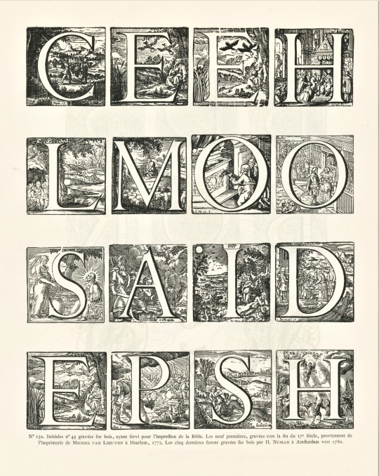
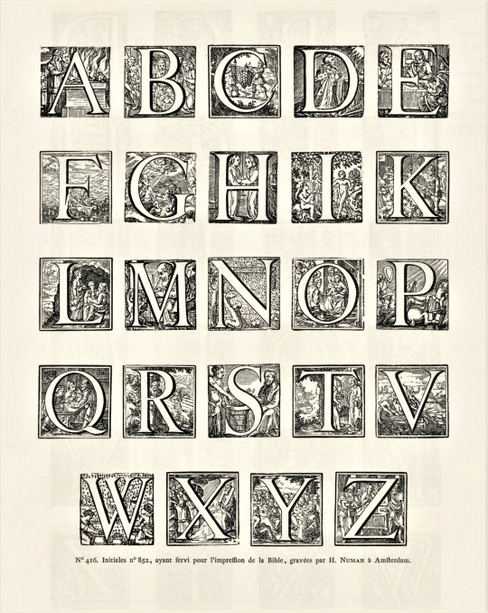

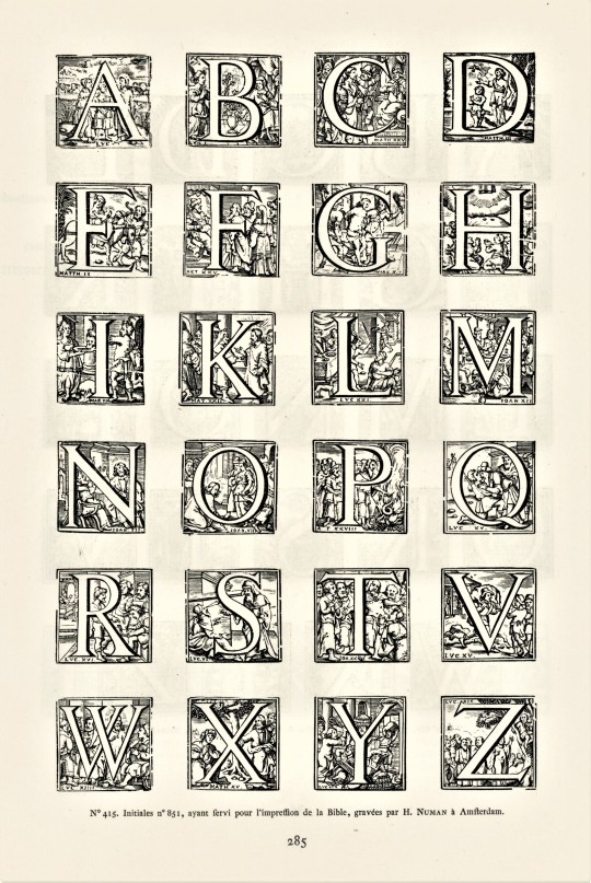


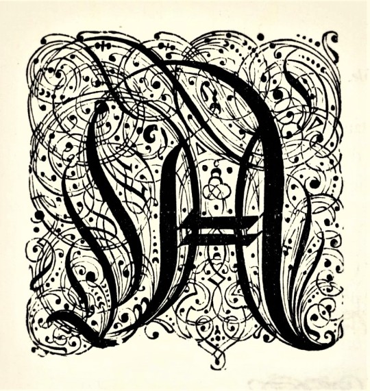
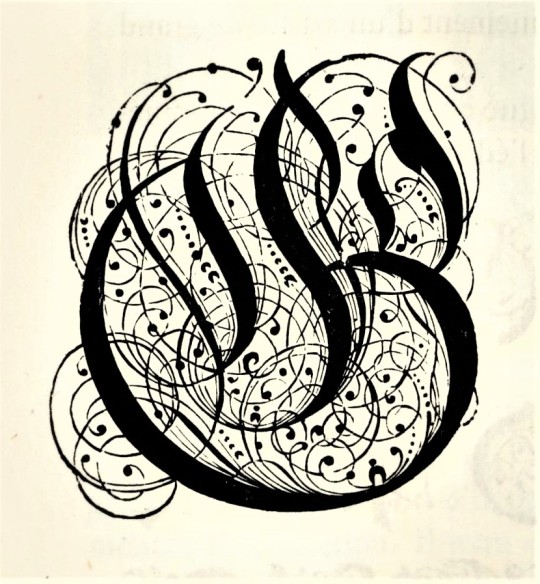
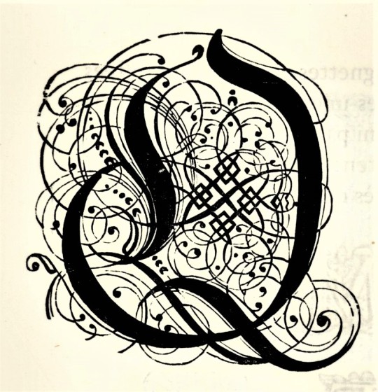
Typography Tuesday
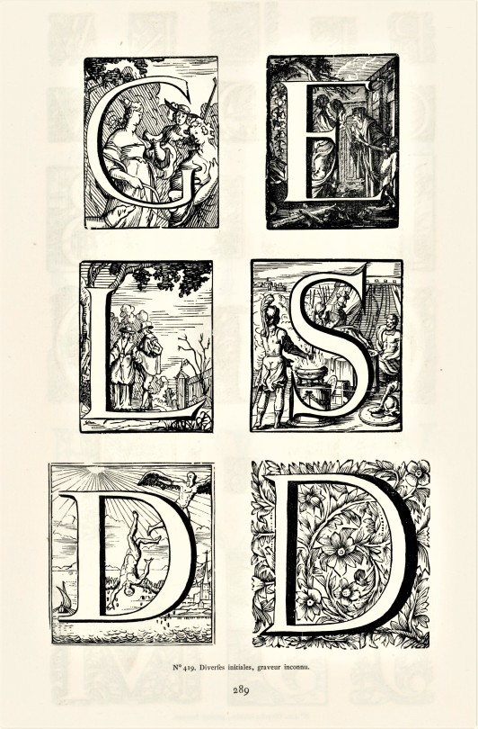
HISTORIATED INITIALS FROM THE ENSCHEDE COLLECTON
A couple of weeks ago, we highlighted some fancy-pants wood-engraved initials from Charles Enschedé‘s historical survey of Dutch types, Fonderies de caractères et leur matériel dans les Pays-Bas du XVe au XIXe siècle, published in Harlem by De Erven F. Bohn in 1908. This week we present some wood-engraved historiated initials from the 18th century. These specimens were drawn from the extensive typographic collection of the venerable 320-year-old printing and typefounding firm Joh. Enschedé en zonen. Click on the images for the engraving credits.
This publication contains nearly 5,000 type specimens including alphabets in a variety of languages, as well as ornaments. The author, Charles Enschedé, was a member of the founding family and one of the firm’s directors. He began this work in 1893 on the occasion of the 150th anniversary of the Enschedé type-foundry, taking 15 years to bring to completion.
View other posts related to the Enschedé firm.
View more Typography Tuesday posts.
#Typography Tuesday#typetuesday#Joh. Enschedé en zonen#Joh. Enschedé#Enschedé#Enschedé type foundry#Enschedé Font Foundry#Charles Enschedé#De Erven F. Bohn#initials#historiated initials#wood engravings#Fonderies de caractères et leur matériel dans les Pays-Bas du XVe au XIXe siècle#18th century#18th century type#Typography Tuesday
51 notes
·
View notes