#tumblr hates when i try to format asks I'm so sorry if this looks ugly
Explore tagged Tumblr posts
Note
for ask game... cwilbur and/or yasha >:}
OUTUGHGHG GOD DONT MAKE ME CHOOSE. I LOVE THEM BOTH SMMMM im gonna do both. cwillba: First impression: oh this man is so british and so mentally ill (<< started watching dsmp during pogtopia arc) Impression now: he's a whore he's my cat he's my best friend i hate him I'm the only one that understands him correctly I'm in love with him he's the worst Favorite moment: the button room. that one part where tommy and q talk him out of pushing the button Idea for a story: have u heard of this little thing i say sometimes called president of lmanburg is synonymous with corruption avatar (<< is in the process of writing that fic) Unpopular opinion: cwilbur is not a villain Favorite relationship: crimeboys (platonic. obviously. they r brothers) Favorite headcanon: he's a textbook definition heart player. also in a tma-type scenario his alignment would go from corruption -> buried -> desolation -> end -> corruption
yasha:
First impression: hot strong goth lady that could snap me like a twig Impression now: hot strong goth lady that could snap me like a twig but now she has angel wings and hypnosis trauma Favorite moment: oh fuck. oh shit. my cr2 memory is so shit i need to think abt this one. when she collects flowers. Idea for a story: IM A LIL NO THOUGHTS HEAD EMPTY WHEN IT COMES TO CR2 but... if they don't go into it in canon i would rlly like to read smth about hers and molly's friendship pre-campaign Unpopular opinion: i... have not finished cr2 yet. i don't know what the popular opinions are bc i have not looked at ANY fan content yet (have been told to avoid spoilers at all costs) Favorite relationship: again i have not finished cr2 i don't know if there r any canon ships/dont know the most popular ones. rn i am feeling. yasha x beau perhaps Favorite headcanon: UHHHHH UHHH UHH kinda the same boat I've refrained from thinking too hard abt headcanons until i finish the campaign bc i don't know whats gonna change :eyes: can i claim her as autistic.
#tumblr hates when i try to format asks I'm so sorry if this looks ugly#i love love love love love yasha shes so hot <3#I AM ON. EPISODEEEE. 106. IM SO CLOSE YET SO FAR#im gonna become completely insufferable when i finish c2 my friend doodle has made so much art#and i havent looked at ANY of it#so im gonna go thru their entire blog and then also have them send me all their favorite posts#my blog is going to become a MESS of cr2 content i cant wait#anyway. if u have any non-spoilery yasha headcanons i would love to hear them pleas please im in love with her so muhc#(IM AT TRAVELERCON BTW. REALIZING THAT NUMBERS DONT RLLY HELP hehehehhehehhee)#asks#swordkind#ask game#hehehehehehhehe this is so fun
5 notes
·
View notes
Text
How I Make Aesthetics.
Long post ahead, sorry :(
In the past, I've been asked multiple times how I create my aesthetics and where do I get the best pictures for them, so I figured I'd make this master post of what exactly I do. Btw this is coming from a person who has studied graphic design for 4 years and had about 4 years of experience in making zodiac collages here on tumblr. Do what you want with that information.
A few disclaimers
There are different types of aesthetics and in this post, I'm going to be specifically talking about a certain type that I like to make. Here, examples:
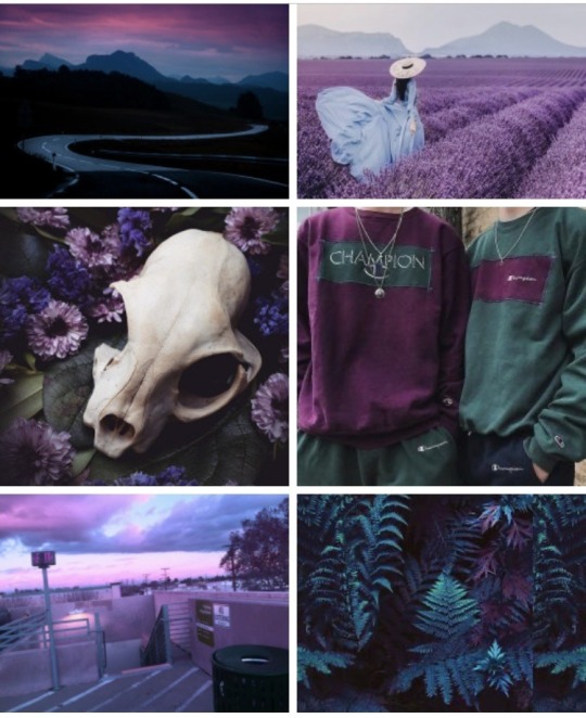
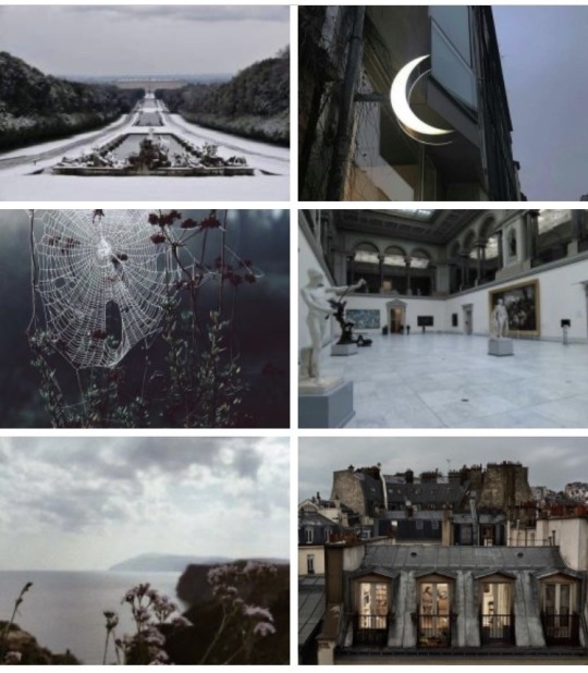
My most used format is 6 pictures in 3 rows, but I've also tried 4 pictures, like here for example:
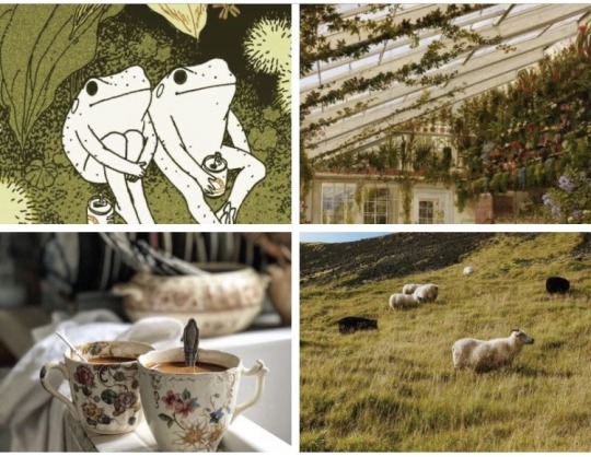
There are other types such as minimalistic photos, dark academia, grunge, and SO many more. Please keep in mind that I'm not hating on these types and when I mention a rule such as don't use photos that are too minimalistic, I am not saying that minimalistic aesthetics are wrong or ugly or anything of that sort!
Just because I don't choose a certain photo doesn't mean I don't like it, it just means that the photo is not exactly what I'm looking for. By me showing you the examples below, I'm just trying to paint a picture. No hate here, okay?
I don't own any of the pictures I use (I've only used like one or two of my own photos in the past) but then again this is just for entertainment, I don't make money doing this or anything. If I ever get a message from an owner of any of these photos and they want me to delete it, I will delete it.
Where to get the photos
Pinterest! Period. AHAHAHA
No but seriously, pinterest and tumblr are my two favorite sources and you will find pretty much exactly what you need there. pinterest specifically.
On tumblr, I usually search for hipster, grunge, indie, and nature, but it also helps to just find specific blogs that focus on photography, follow them and then just download anything from your dashboard that you fancy.
I'll share what I search for on pinterest below👇. My secret tip would be to not always go for the first photo you find but rather to open a picture that sorta has what you like in it and then scroll down, because pinterest is going to recommend you similar, sometimes better fitting photos. On tumblr, I sometimes go to the blog of the person whose one photo I like, and there I tend to find many more of the same kind (since these bloggers usually post a specific kind of aesthetic).
How to choose photos
My number one tip would be to seek texture. Avoid photos that have little going on in them and anything too empty or minimalistic (unless that's what you're aiming for, obviously). Also, don't choose pictures that are very light or very dark, as they tend to stand out in aesthetics and that's not really what you want. At least in the type of aesthetics that I make, I want the final product to be almost a new picture in itself if that makes sense. To show you an example, look at this photo of two sleeping cats:
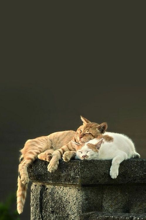
This photo seems like a good fit; it is well balanced in colours (there are shades of white, beige/ginger as well as some greens) and c'mon, it's two cats, what more do you need!!! However, let's look at it in a complete aesthetic:
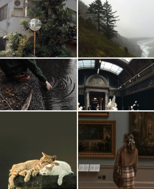
While this aesthetic has a nice color scheme to it (well, it doesn't, I threw it together super quickly, but you get the gist), the photo of the two cats just stands out because the khaki background creates this kind of block of color that your eye will automatically go to and it sort of breaks the collage apart. So, by texture, I mean that a picture is filled, for example with trees, flowers, architecture, little people in the background, etc., etc. Furthermore, I prefer when there are more things photographed (for instance, look at the first picture of the aesthetic above; it has a mirror (and a tiny person in it), architecture and leaves all in one picture)
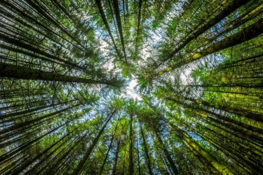
Next, personality. Go to Google Images and search 'Nature Photography' or 'Sunset Photos'. You might get something like this:
Or this:
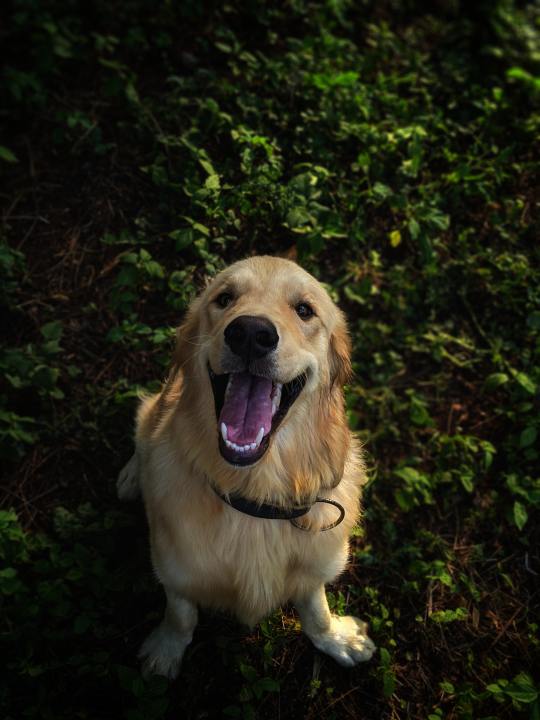
Look at this absolute angel of a boy💚💚💚💚💚💚Isn't he the cutest freaking thing you've ever seen?????? I just want to give him all the treats and all the pets and — ...ehm, sorry, that's not why we're here.
So I don't quite know how to explain this point, but I guess usually professional photos like this are just so well done that they work perfectly well on their own and you usually don't put them in a set (only with other photos from the same photoshoot maybe). They're obviously well-balanced color-wise and high in quality, but they're just very individual and don't really need any addition in the form of other photos. This point also applies to the previous one (textures, in case you forgot); for example, a bunch of blueberries creates a nice texture, however it might be difficult to pair them with other photos. They have enough personality on their own (and this is not meant in a bad way to the photos I do use).
Related to this, you're looking for a story. Usually, if a photo gives off a certain vibe, tells a story, or just leaves any kind of strong impression, it might be a good indication that this is a good photo to use (given all the other rules as well, of course).
The main themes I search for are:
cities, villages, or abandoned places
related to that — architecture or only parts (details) of it
nature, specifically forests with either road or a body of water nearby, beaches, deserts and so on. plus points for tiny people in the distance
animals, usually with the addition of maybe the texture of a sweater sleeve or some blankets, something of that sort
people, my favorite kind is people turned away from the camera with an interesting background, because by them not having a face, they become a bit more relatable in a sense?
people in a river or some kind of water
museums, sculptures
etc.
Usually, I tend to avoid:
photos with text in it (though as an exception I would mention neon signs or letters/words that are for example above shops, on books, etc.)
heavily filtered pictures
photos with very specific (often bold) colors in them, unless you find multiple photos with that same shade. this again distracts the eye too much
GIFs, animated pictures, illustrations/drawings. also, don't use collages (cause you are creating a collage, duh)
black & white pictures
blurred pictures (or those that are purposely grainy — that goes back to the filters above)
anything obviously photoshopped
When trying to figure out where to put each photo
Squint your eyes. The photos should create a nice harmony, there shouldn't be a corner where it gets too light or dark or where some textures blend together, for example, if using multiple flower patterns, try to place them in different corners.
When to know your aesthetic is done
Actually even before you start, you should be in the mood. I have to admit, there have been times where I've felt pressured into making aesthetics, and now, looking back at them, I'm really ashamed of them. That is why I don't always post aesthetics as soon as I get them requested because I genuinely want them to look good.
Sometimes, it helps to not post the aesthetic straight away but to come back to it later with a fresh look. I'd say go with your gut. You should have a good, satisfying feeling about the aesthetic.
Last note
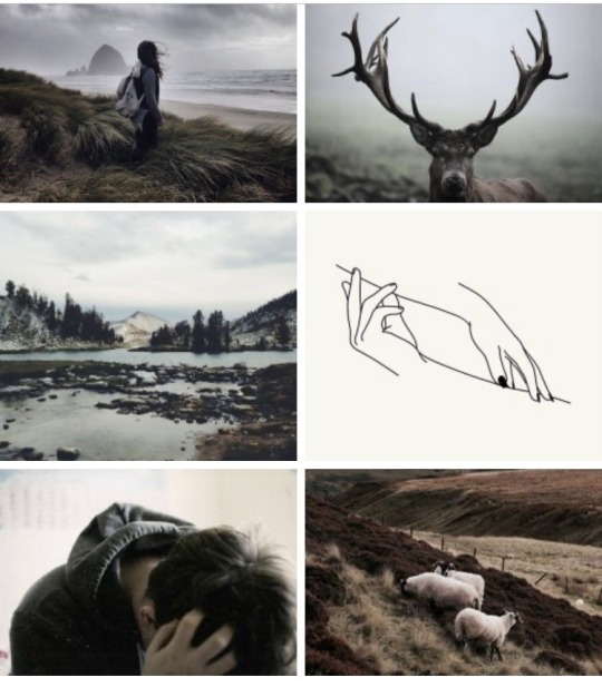
Rules are meant to be broken. Look at the aesthetic below. I used a minimalistic illustration (two birds with one stone I guess) (and admittedly, that one picture does stand out) and yet the aesthetic still came out pretty nice. So, just play around with your ideas and see what you like the most! I'm just a random person on the internet, you literally don't have to listen to any of the tips I gave you here today.
I know this might seem like a lot (honestly, if you've read this entire thing, you're crazy), but it gets easier and easier with practice, soon you won't even think about it.
Hopefully these tips will help you and please let me know if you decide to make any aesthetics. I would love to see them!! <3
#does anyone even care#this post makes me feel like i forgot how to write in english#also#i was thinking we might do this thing where I like... rate your aesthetics?#idk am I being too confident LMAOOOO#oh well#aesthetic#aesthetics#aesthetic masterpost#masterpost#how to#how i create aesthetics#how to create an aessthetic#aesthetic tips#aesthetic advice#collage#collage art#zodiac#astrology
70 notes
·
View notes
Note
Hi~~ I'm really sorry to bother you! But I saw your gifs in my dash and they're so pretty! I don't even stan wanna one but I just went through your gif tag for so long cause they're so nice 😍 Would you ever share your sharpen / action / topaz or coloring settings or tips? 😊
ahh omg anon thank you so much for your kind words! you’re so sweet
i think i’ll just share generic tips! From each stage of the giffing process. i still have so much i can improve with in giffing, so i’m sorry if i give you super wrong advice ahhh but i hope this helps a little?it got super long so it’s under the read more!!
Downloading Videos
make sure it’s the highest quality video you can get. 1080p is your friend. ok honestly, when i’ve giffed, i havent really noticed a difference in quality between 2k/4k and 1080p? maybe im doing it wrong but honestly the only thing ive noticed is that 2k/4k just slows down my computer drastically and takes up way too much space on a computer that already has like zero space to begin with. so i tend to stick with 1080p.
Also! if you can get 60fps, thats also nice bc it helps your gifs look smoother.
yaknow how i said 1080p is your friend? well ts files are your best friends/family. if you can torrent them or download the, your gifs will look super pretty. i highly recommend this for live performance gifs. you can find ts files for a lot of shows, but again, since my computer has
kpop24hrs and kpopexciting are two places i go for those live perf ts files! kpop24hrs tends to have more i feel (it’s where i go when i want to gif my rookie groups that dont have too much attention on them)
you can also find torrents on twitter, if you search the right things
Extracting Videos
ok for this, if you have a pc (so like not a mac) i HIGHLY recommend looking into avisynth. there’s this tumblr account named brandinator who i’ve heard gives really awesome tips for avisynth and made it really easy for people to get avisnyth.if youre like me and your stuck with a mac, or if you just want to stick with photoshop then you can read the rest of this
i have photoshop cs5? so my tips are generally based around that.
for youtube videos (so basically mp4/avi format) i use photoshop’s video extraction feature. file—>import–>video frames to layersif your photoshop is like mine for whatever reason and it doesnt want to recognize mp4 files, then what i do is changed the .mp4 extension to a .avi extension (and its super easy to do on mac….i dont have a pc so idk how different that is) the quality doesnt really change either with that simple changing of the ending it sorta just tricks photoshop i guess lol idunno
when youre on the ‘video frames to layers’ window, make sure you don’t hit the ‘limit to every _____ frames’ bc that makes it lose the smoothness quality of gifs. maybe back when the gif limit was like 1mb that would have been important, but we live in a world of luxury now. so for smoother looking gifs, make sure that box is unchecked. other ppl (pc users i think) tend to use other video extraction softwares. i cant remember the name, but all i remember is that for macs, that software cant extract frames so its useless for us. i think it was kmplayer? not sure. like you can download kmplayer on mac but it doesnt have the same features rip.for ts files, i use vlc player (since ps can’t open it) and sit there and capture each and every frame lol.
Actually Giffing
here’s where things get a bit interpretive
(im assuming you know how to make a gif since you’ve asked for specific things like sharpening and stuff)
for coloring,
ive found that not changing the lighting too much of the video youre giffing leads to higher quality stuff…but i also hate not changing the lighting too much which is why a lot of my gifs turn out grainy hahah (my coloring is really centered around how to make the person in the gifs look the most ‘natural’? so that usually involves trying to take out video filters). but yea the gifs in which i didnt change too much with coloring, tended to be my most high quality gifs.
i don’t use other peoples psds and make my own everytime for each gif, and i only usually just adjust ‘curves’ and ‘exposure’ yea.
if there’s an ugly color background that you want to make look more white, when youre in ‘curve’s, go to each color (red green and blue) and drag the little line thing in the top right corner a little to the left. idk what is actually happening there and why it only really addresses the bg but thats a good way to try to make your bg whiter without actually whitewashing the gif.
for sharpening
lol sharpening, my enemy. its what i struggle with the most
i use .4 at 500% for smart sharpen
and then for topaz i make sure clean color is at 0 first of all, and i mess around with ‘overall strength’ and ‘reduce blur’ until i get the quality that i wanted. i nvr go higher than .07 strength.
but an important thing for sharpening i think is deciding when you want to crop the picture? do you crop it before or after the sharpening/topaz? i dunno honestly, but for me ive found that cropping first, and then applying sharpening settings leads to the highest quality (or maybe thats what im used to so it turns out better).
oh yea i dont resize, i crop instead. i’m not sure if that does anything but when i was first starting i found that resizing made my gifs look more blurry…? and that cropping was nicer to my gifs? i’m not sure if that does anything though lol maybe cropping is worse who knows, but its something ive stuck with ever since ive started
save settings
i’ve recently switched over to diffusion! but sometimes that doenst work out so i use the pattern one. i play around with adaptive/selective to see which one looks better or takes up less space haha
last but not least: pray
i spend a lot of my time praying that my gif will come out good haha bc even if you think you did everything right, once you hit that ‘save for web’ button, it’ll look like the ugliest thing in the world it’s really frustrating. like even when i make a gifset from the same video using the same everything (coloring, sharpening, save settings) one gif will look like trash and the other one will be like the best thing ive ever giffed so its like?? pray
#anon#replies#anon i just realized my theme really isnt that pretty if you oepn it on a read more and it actually totally screwed up the entire formatting#oh my god
0 notes