Don't wanna be here? Send us removal request.
Text
Unit 2 & Unit 37 Personal Portfolio Project
I was allowed to do whatever I want as a project so i decided to do character design. This is because I like to come up with different ideas for characters and it is what I enjoy the most. First I made 3 different Character Portfolios.
Name: Adam Smith
Age:19
Gender: Male
Family: He lives Alone
Likes: Gaming and Pizza
Dislikes: cats and cabbage
Occupation: Works at store
Hometown: Florida, US
Height: Quite tall
Weight: Light
Music Interests: lofi Hip-Hop
Fashion: Casual
Personality: Awkward, Confused
Favourite animal: Rabbit
Name: Rose Blanc Height: medium/short
Age: 30 Weight: Medium
Gender: Female Music Interests: Rock/Jazz
Family: Lives with mother Fashion: Torn/Punk clothes
Likes: playing guitar and people Personality: Helpful
Dislikes: Furry animals Favourite animal: Lizard
Occupation: Musician
Hometown: Paris, France
Name: Bill Height: Tall/Giant
Age: 145 Weight: Heavy
Gender: Other/monster/orc Music Interests: Grime
Family: lives with children Fashion: Heavy Armour
Likes:Crushing people that attack Personality: Angry but nice
Dislikes:Animals being hurt Favourite animal: Cats.
Occupation: Battles/War
Hometown: Bottom of mountain
Sketchbook
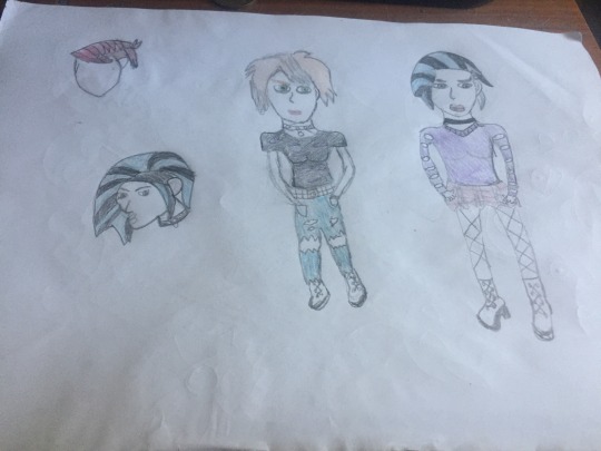
Here I drew some hair designs for my character then I drawn 2 full designs for Rose and I think the second one is better fitting her character portfolio.
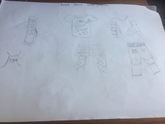
This here is the start of my idea generation for Rose. The way I came up with these ideas is looking at the portfolio I did for her, for example her fashion is torn/ Punk clothes so i obviously made her clothes like this also i took music interests into account. When making her clothes I could’ve made them lizard themed as well, as that is her favourite animal. Also I had to do research and look at the different punk styles but I ended up making basic clothing with tears in it.
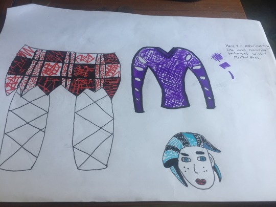
I then went onto drawing bigger images of her clothes and I used fine pens and coloured markers to show line making experimenting. This gives a nice effect for the character also it shows different techniques used. I like the design on the skirt and the hair.
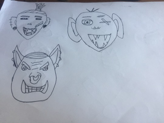
After drawing ideas for Rose I wanted to do another one so I decided to go with Bills portfolio. As it says he is an Orc character so I researched on what they look like and what type of clothing do they wear also what weapons they use. After looking into this it helped me understand and then I drew whatever came to mind for my designs. I chose the bottom face for my final design because i like the way hes expressing anger and rage. The third face is a friendly looking type and my first one looks like a Archer.
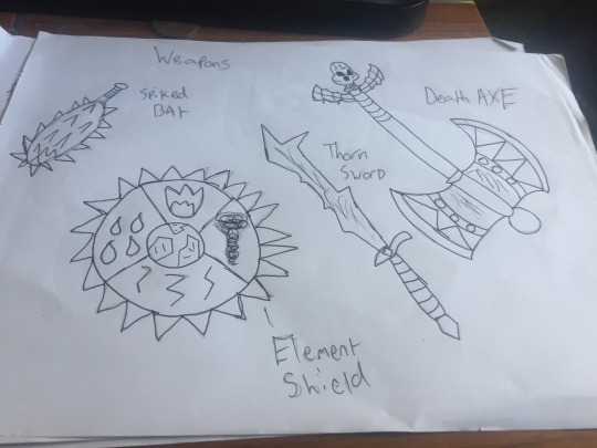
Here this is where I made all the weapons. I drew them so that they look like fantasy weapons and they have their own powers in them. For example the shield i made which ever part gets struck that element will activate and the opponent will get blasted with that power. In my design I chose the Death Axe and the shield because I felt that these weapons are most fitting.
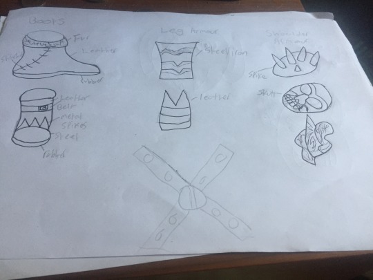
This page is full of armour and clothe designs. I wanted to make them look old and fierce looking because he scares and fights people.
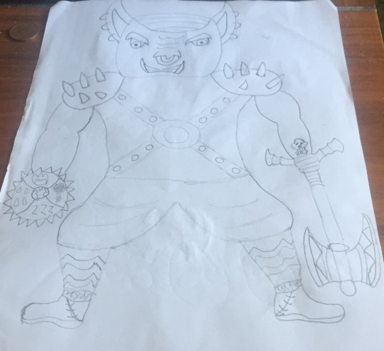
This is my final design. What I did well was make it look like something from the portfolio description and I like how he turned out. To improve I should make multiple designs for better outcomes.
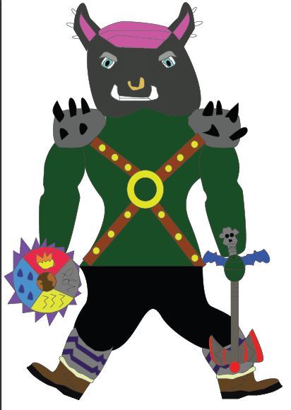
I then made my design on adobe Illustrator cc. to make this i used the pen tool and shape tools. I used multiple colours to bring the design to life.What I did well was make it look like my original design.To improve i would make it look neater maybe do different coloured versions and make a turn around sheet.
0 notes
Text
The Fox In Socks
Research
First i looked at different Dr Suess Poems to decide which one i wanted to do for my animation.
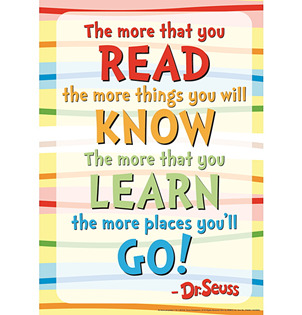
This is the first poem section i had selected my idea was to do an animation where each scene is based off of each line.
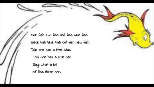
This is the second example i could’ve made something else instead of a fish to make it my own animation and it doesn’t look like I've copied.
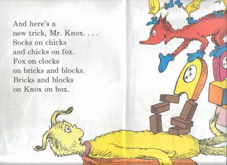
This is the third example and this is the one I chose to do for my animation.
Poem Analysis
Fox in Socks is about a fox playing a game with someone called Mr Knox. The game is to try and get Mr Knox to say a tongue twisting rhyme. The fox says multiple rhymes throughout this long poem however Mr Knox can’t say any of them as they are too complicated for his mouth. At the end of the poem however the fox asks him to describe tweetle Beetles and then Mr Knox came up with a rhyme all on his own and then he thanks the fox in socks for a great game. In the rhymes the fox mentions many things like goo, bricks, chicks, clocks and many more. Every rhyme is different but they are all catchy. In this poem the main Characters are Mr Knox and Fox in socks. Mr Knox’s personality is very timid and shy I know this because he gets scared and feels embarrassed when he says he can’t speak such words. Whereas the fox in socks is very energetic and consistent, I know this because he’s always going at a fast pace throughout the poem. Also he wouldn’t stop coming up with rhymes until Mr Knox could say one, he is also very cheerful. I chose the verse above because it is not an over complicated one and I think it would be good to animate and see the outcome.
Character Design
When making my characters i wanted to do the original ones but in my style.
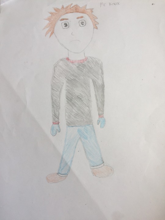
I made Mr Knox a human character rather than a fury one like Dr Seuss did.
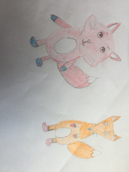
I drew 2 designs for the fox, the first one looks more like a cat and the face has a different shape. The second design i used simple shapes like a triangle for the shape. In the end i decided to choose the second design as it’s simpler and looks more fox like to me.
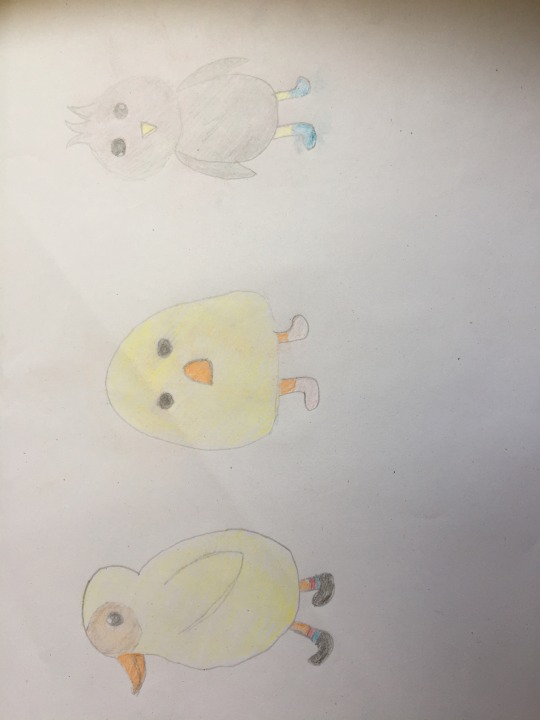
Finally i needed baby chicks in my animation. I chose the second design i made because i’s the most simple. All of the designs look similar but i tried to use different colours so there’s a difference between them.
Story Board
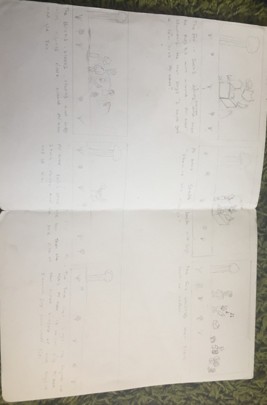
I then made a story board, this is to plan my animation and to show what’s going to happen.
Adobe Illustrator Designs
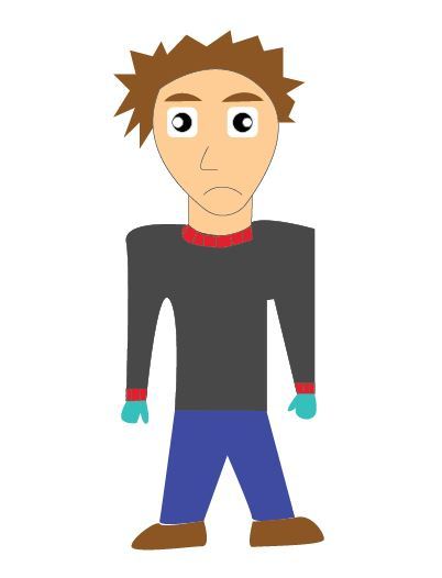
This is the Illustrator version of Mr Knox. I created everything on separate layers and to make him i used the pen tool, Shape tool and line tool. Then filled the layers with the chosen colours above.Everything I’m about to show is made in the same or a similar way.
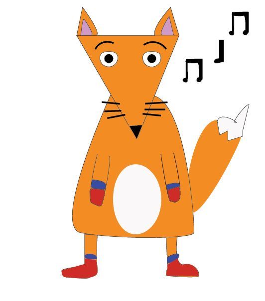
This is The Fox in Socks. I added musical notes because he sings during the animation.
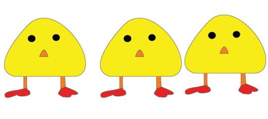
Here there are 3 baby chicks because everything comes in threes that approach Mr Knox and the Fox.
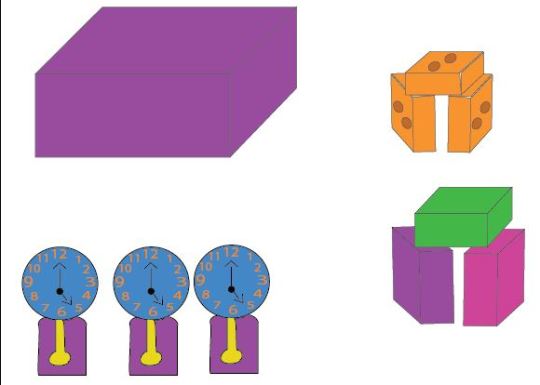
These are the Objects that are in the rhyme and the animation. The purple box is the at the beginning where it comes down and the fox jumps on it. Then halfway through the animation the other objects come in and the baby chicks. They then circle Mr Knox and The Fox after they all climb up onto Mr Knox then they leave near the end,
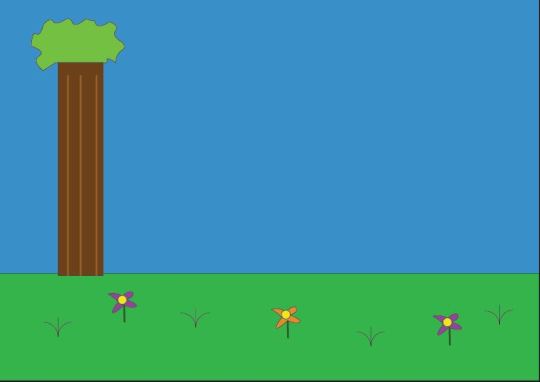
Finally I had to make a background for my animation. I wanted to make it simple so i added a tree and some flowers to the sky and grass.
The Animation
Due to a lot of difficulties I was only able t make one Scene. I am unable to show it because of an file opening error but I will explain what I have done in as much detail as I can. First I Imported my illustrator files into Adobe After Effects CC. When they transferred all the layers were mixed up so i had to rearrange them so they were in order. After I made my layers into a composition this is so it’s easier for me to switch between characters. Once this was done i then put my background layer on first, this just stays still and didn’t need animating. After i had Mr Knox and The fox on the screen. Then i animated the purple box which comes down from the sky onto the grass. I did this by going to transform then i selected the position option, from here I placed Key Frames on my timeline and moved the position of the box a bit at a time then when played it drops/floats down. After using the same method I moved Mr Knox and the fox closer to the box (they are on different sides). Then the fox jumps onto the box and puts his arm around Mr Knox. His arm lifts upwards. Then I animated the faces of Mr Knox and the fox so they showed expressions. I did this by selecting the layers one at a time and placed key frames. For example the left eye was separate to the right eye. Whilst they were showing expressions I added text to the animation which says “I have got a new trick Mr Knox”.When animating Mr Knox i had to use a puppet tool for his body this is so i could move his arms as they were not separate to the body. Another thing I had to do when animating was to use the Pan behind tool (Y) this allowed me to move the position of my Anchor points so for example i could raise the eyebrows to the side rather than it sitting straight and going up. That is all i can describe on what I did for my animation.
Evaluation
First I did my Dr Seuss research before starting the animation, this is so I could get an understanding of what he did in his work.After I then looked into what poem i wanted to do an Animation for, in the blog I mentioned what poems i researched. They’re just simple poems because I didn’t want to over complicate things. Then i wrote a poem analysis on my selected poem this is so i could understand the meaning of the poem and have an idea on what to make. I think I did good research but to improve I could look into more poems for a wider range of ideas.
In my character design I just made my own version of the original characters used and didn’t really change any of the poem in my ideas. When making my storyboard I just wanted to bring a verse of the poem to life with my designs. Then I came to animating I have explained what I’ve done above and I think what I did well was making a good looking animation in my first scene. However It’s not completely smooth. I have learned new skills like the puppet tool and this helped me a lot. When animating I used some techniques from the 12 Principles of Animation to help me make it look good. If I were to do this Project again I would use all time given effectively and use my skills to my full potential in order to make a good complete animation.
0 notes
Text
Dr Seuss
Research
Dr Seuss was born March 2nd 1904 and died at the age of 87 September 24th 1991. During his life Dr Seuss was a German American author, Political cartoonist, poet, animator, book publisher and artist. He is best known for authoring more than 60 children books. More than 600 million copies were sold and were translated into more than 20 different languages before his death. His real name is Theodor Seuss "Ted" Geisel and he was born and raised in Springfield, Massachusetts. His father managed the family brewery and was later appointed to supervise Springfield's public park system. Seuss was raised a Lutheran. A Lutheran was a follower of Martin Luther.
He enrolled at Springfield Central High School in 1917 and graduated in 1921. He took an art class as a freshman and later became manager of the school soccer team. He then attended Dartmouth College and graduated in 1925. During his time there he was caught drinking gin with nine friends in his room. At the time, the possession and consumption of alcohol was illegal under Prohibition laws, which remained in place between 1920 and 1933. Due to this he had to give up his extracurricular activities however he still wanted to work on the college humour magazine therefore he started using the pen name Seuss. He was encouraged in his writing by professor of rhetoric W. Benfield Pressey, whom he described as his "big inspiration for writing" at Dartmouth. Upon graduating from Dartmouth, he entered Lincoln College, Oxford, intending to earn a PhD in English literature. At Oxford, he met Helen Palmer, who encouraged him to give up becoming an English teacher in favour of pursuing drawing as a career.
He left Oxford in 1927 with no degree and returned to the U.S immediately submitting writing and illustrations to magazines, book publishers and advertising agencies. His first nationally published cartoon appeared in the July 16, 1927, issue of The Saturday Evening Post. This single $25 sale encouraged Geisel to move from Springfield to New York City. Later that year, Geisel accepted a job as writer and illustrator at the humour magazine Judge, and he felt financially stable enough to marry Helen. His first cartoon for Judge appeared on October 22, 1927, and the Geisel’s were married on November 29. Geisel's first work signed "Dr Seuss" was published in Judge about six months after he started working there. In early 1928, one of Geisel's cartoons for Judge mentioned FLIT, a common bug spray at the time. He was then hired for FLIT, his first Flit ad appeared on May 31, 1928, and the campaign continued until 1941. As Geisel gained notoriety for the FLIT campaign, his work was in demand and began to appear regularly in magazines such as Life, Liberty, and Vanity Fair. Geisel supported himself and his wife through the Great Depression by drawing advertising for General Electric, NBC, Standard Oil, Narragansett Brewing Company, and many other companies. In 1935, he wrote and drew a short-lived comic strip called Hejji. By 1936, Geisel and his wife had visited 30 countries together. They did not have children, neither kept regular office hours, and they had ample money. Geisel also felt that the traveling helped his creativity. In 1936, they were returning from an ocean voyage to Europe when the rhythm of the ship's engines inspired the poem that became his first book: And to Think That I Saw It on Mulberry Street. Based on Geisel's varied accounts, the book was rejected by between 20 and 43 publishers. Then before he was going to burn the manuscript he encountered an old class mate and it got published by Vanguard press. He wrote four more books before the US entered World War II. This included The 500 Hats of Bartholomew Cubbins in 1938, as well as The King's Stilts and The Seven Lady Godiva’s in 1939 and following with Horton Hatches the Egg in 1940. After this he decided to go back to poetry.
I think that it was his parents and wife that encouraged him to do the work he did but it was the world around him that inspired him. What I mean is a lot of his work was done through real life surroundings and products, as he started doing advertising and then he did a lot of work during World War 2. Also he was encouraged because his father inspired him to draw then his mother would make rhymes at night to make him sleep, this could’ve been a good memory. His Wife then mentioned he should put work into becoming illustrator rather than an English teacher.
I believe that the work that got him the most success was when he decided to make children books. This is because they became popular really quickly and I think this was his most favourite work he did. His top selling books are Green Eggs and Ham, Cat in the Hat and many more. Live action movies were made from his books which are the Grinch stole Christmas in 2000 and the cat in the Hat made in 2003. There is going to be a new release of these 2 stories as animated movies.
Overall Dr Seuss was a great interesting man that had a very busy and fulfilling life. I believe he had a natural talent to produce good pieces of work. His stories enlightened children back when they were first made and they still continue to enlighten many children to come even though he has passed on.
0 notes
Text
The 12 principles of Animation
1. Squash and Stretch
The squash and stretch principle gives the illusion of weight and volume to a character as they move. This is done by expanding and compressing the character’s body.
2. Anticipation
Anticipation is used to let the audience know that a major action is about to take place. To do this, animators will often work in a smaller action or two, right before the major action to signal that something is coming.
3. Staging
Staging is the principle that every pose or action that a character makes should convey a clear intention. Staging also applies to the movement and placing of the camera.
4. Straight Ahead and Pose to Pose
Straight ahead and pose to pose refers to the techniques by which animation is crafted. The pose to pose technique involves drawing the key poses that you’d like the character to take first and then filling in the transitional poses second. The straight ahead technique is more nuanced and involves an animator literally crafting one frame after another. Straight ahead is better for creating fluid, realistic actions while pose to pose is more effective for dramatic or emotional scenes where it’s more about conveying an idea than a sense of realness.
5. Follow Through and Overlapping Action
The follow through principle argues that when a character is in action and stops, nothing stops all at once. So when a character is running and stops, their main body will stop, but the other parts of their body will keep moving for a bit after. For example if a head stops the hair would stop moving after. Adding to this idea is the overlapping action principle, which expresses the idea that if a character is in motion, some parts of the character move faster than others.
6. Slow-In and Slow-Out
Slow-in and slow-out is another principle designed to add realism to the movement of characters. When characters are performing actions, animators will draw more frames at the start of the action, less frames in the middle, and more frames again at the end of the action to create this slow-in/slow-out effect.
7. Arc
The arc principle has a slightly circular motion. When a head turns or an arm moves, rarely will it thrust straight in and straight out. Often it will have a little curve to it.
8.Secondary Action
A secondary action is an additional action that reinforces and adds more dimension to the main action.
9. Timing
Timing helps create the illusion that an action is abiding by the laws of physics. By adjusting the timing of a scene, animators can make that scene look either slower and smoother with more frames or faster and crisper with less frames.
10. Exaggeration
Exaggeration is all about overstating certain movements in a way that helps evoke a point, yet doesn’t ruin the believability of the scene.
11. Solid Drawings
This principle encourages animators to be mindful of the fact that while forms may be presented in 2D, they should strive to look 3D.
12. Appeal
Obviously, not every character should be appealing. But this principle posits that animators should strive to create images that will be interesting and compelling to audiences.
The founder of these 12 principles were Ollie Johnston and Frank Thomas in their 1981 book called the Illusion of Life: Disney animation.
0 notes
Text
Bouncing ball
In this task i made a circle look like it’s a bouncing ball. First I made a blue rectangle for the surface and then i made a orange circle to represent the bouncy ball, this was placed outside the area. After i started to make my key frames and the positions were changed so that it started falling and when it hit the surface it would bounce back up. For the first half of the bouncing ball i used normal key frames which are more on a angle this gives the ball a fast and direct motion. In the last half of the animation i learned something new which is a key frame called easy ease. Easy ease goes in a more curving direction this allows the ball to go at a slower concentrated pace which represents the ball losing its momentum and coming to a stop.

Here the ball falls from the sky and hits the ground.
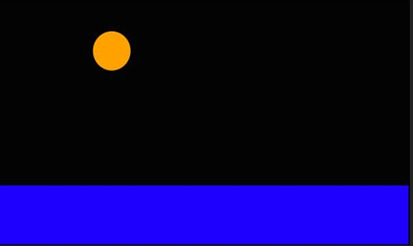
Next the ball bounces back up after hitting the surface.

Here the ball falls into the easy ease and starts to lose momentum causing it to come to a stop.

This is an image of the Key frames placed.
0 notes
Text
Shapes
In the first session we used after effects and we just explored and learned the basic different ways of using this. We just used simple shapes to create something of our own. In this session i used a square and a star making it look like they were constantly bouncing off of each other flinging them in different directions. It can also resemble a fight between 2 objects. The layer transform option i used to make this was the position. All i did was make multiple key frames constantly changing the position of the shapes and then this formed the animation. What i learned was how to make layers and shapes in after effects also i learned how to make key frames and change the position. The way i did this was to go along the timeline select the layer i wanted tho change and then i move the position. Now it has changed position however if i go back on the timeline the position will change to where it was before.
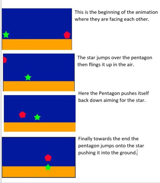

This is where the Key frames are placed and i can change the position.
0 notes