#tumblr always to browse on desktop
Explore tagged Tumblr posts
Text
Thursday, September 26th, 2024
🌟 New
We’ve launched new search operators that work on all platforms so you can find the exact post you’re looking for.
You can now mute the unread count from a joined community via the meatballs menu at the top-right of the community.
Community admins can now allow moderators to invite new members too. Check out your community’s settings!
The ability to search for communities on web is rolled out to everyone. There’s a new dropdown option on search that lets you browse communities related to your search term on the web (this will be in the apps with the next update), and there’s a new “Related Communities” section in the sidebar on the web.
We’re recommending communities for folks who have already joined communities in more places, including a new carousel in For You.
Backdating posts has always had the potential to act in unexpected ways, so we’ve added new warnings about this.
🛠 Fixed
Ads in the iOS app no longer interrupt your background audio. Please update to version 36.4 for the fix.
When leaving a longer reply on desktop web in certain cases or mobile web on Android devices, the cursor will no longer jump up unexpectedly in the text area.
Custom domain verification emails were briefly not being sent September 18th. This was fixed and all pending verification emails were re-sent.
🚧 Ongoing
No ongoing incidents to speak of right now.
🌱 Upcoming
No upcoming launches to announce today.
Experiencing an issue? Check for Known Issues and file a Support Request if you have something new. We’ll get back to you as soon as we can!
Want to share your feedback about something? Check out our Work in Progress blog and start a discussion with other users.
Wanna support Tumblr directly with some money? Check out Premium and the Supporter badge in TumblrMart!
347 notes
·
View notes
Note
Hello!
Thank you for running this blog, and showing us gorgeous historical outfits! I have a question for you and the followers about the October polls.
If you don't mind me saying, the outfit images seem very small compared to the bracket letter (the center, black image). Perhaps it's because I'm browsing through the app, and not the desktop version. Do the images seem much smaller than before to anyone else? Is it due to the format, because you have to merge several images?
I hope this ask doesn't come off as too entitled. In any case, I still enjoy these polls, and can always zoom in on images if I want to see the details. Thank you again for sharing your love of fashion.
hi dear anon! 💕
thanks for reaching out with this question, and I'm glad you're enjoying the blog! ☺️☺️
the reason the images are formatted differently for the tournament is because of the way that tumblr "adjusts" images that are placed next to each other. normally, for the most part, I'm just posting a single plate or image that has multiple illustrations on it, so I don't need to worry about adjusting things 💖💖
however, for the tournament I'm taking "cuttings," so to speak, of different plates, which means I have images that end up being very different sizes. on tumblr, if you try to post a tall and thin image next to one that is more square, tumblr's formatting defers to the one that is shorter and wider, and cuts off the top and bottom of the taller image (I've discovered this through trial and error lmao 😅😅). because of that, if you're planning to post two images next to each other, you need to make sure they're roughly the same proportions so that one of them doesn't get cut off
I really went back and forth for a long time on how to format the images for the tournament. because of the huge range of sizes and shapes of "cuttings" that I had, I would need to make adjustments to pretty much every pair of images to bring them to similar proportions. unfortunately, that was time I just didn't have, so I opted to format them in powerpoint and lay them out as part of one single image that I could post without needing to make adjustments 💕💕
whew! 😅😅 that was a really long explanation, but I hope that makes sense! I was hoping folks would be able to zoom in if they wanted to see individual images better, and when we return to normal posting, the images will also return to normal! ☺️☺️ the formatting here is just a result of the weirdness of these types of comparisons in particular
thank you so much again for reaching out, and I hope my long ramblings answered your question! ☺️💕 I hope you continue to enjoy the tournament! 🥰🎃
23 notes
·
View notes
Text

some quick info: ↳ this is specifically for the screencapping method. i use mplayer osx extended to get my caps, but there are a few other programs you can use as well. i’ll specifically be going over mplayer here. ↳ i’m using ps 24.4.1 on a 2020 m1 macbook air
[tysm to @kyubinz for looking this over and adding some things ily]
☆ feel free to send me an ask/message with any questions you have! ☆
「 setup 」
1. finding videos
one big thing to remember is that the overall file size of your video will impact the quality of your gif. the larger, the better. i almost never use anything below 1080p, and try to use 2160p whenever i can. 4k video downloader is the program i use for downloading videos from youtube, it’s free to install and works great! because of how large some files can be, i always store any media on my hard drive. i highly recommend using one if you plan to keep lots of files on hand.
.mkv files are best, but .mp4 works fine as well (.mkv files are usually bigger aka better quality).
2. getting your screencaps
after downloading mplayer, go to the top bar and click file > open. open the video you’ll be screencapping.
you can either drag the little time indicator or using the arrow keys on your keyboard to move to the spot you want to capture. the > key can also be used to move forward frame by frame. to start capping, pause the video and press shift + cmnd (ctrl if you’re on windows) + s to take a screencap. i usually just hold it down until i’ve gotten all the screencaps i need.
by default, screencaps go right to desktop. you can set up a folder for them to go to automatically by going to settings > general and then selecting a spot in the menu under “interface”, but i just let them go to desktop and then sort them into individual folders so they’re easier for me to find while i’m giffing. in general, i try to stay under 80 frames so my gifs fit into tumblr’s 10mb image size limit.
3. importing screencaps into photoshop
to import your caps into ps, go to file > scripts > load files into stack. this window should open:

click browse, and navigate to the folder with your caps in it. select all of the caps you want to import, and then click open.
click ok to create a file with your caps, and then wait until it’s finished loading your caps into the layers tab. once they’re loaded in, this is what your screen should look like:

(if you aren’t seeing the timeline at the bottom of your screen, go up to the top bar and go to window > timeline)
click create frame animation, then go to the hamburger menu at the top right of the timeline and select make frames from layers. once your frames have loaded in, select the same menu again and click reverse frames. play through your gif to make sure everything looks good.
if you were to save your gif at the speed it’s set at now, it would be way too fast. to fix this, you have to set the frame delay. do this by selecting all your frames in the timeline using shift click, and then clicking (on any frame) where it says “0 sec”. select other from the menu that comes up, and you should get this popup:
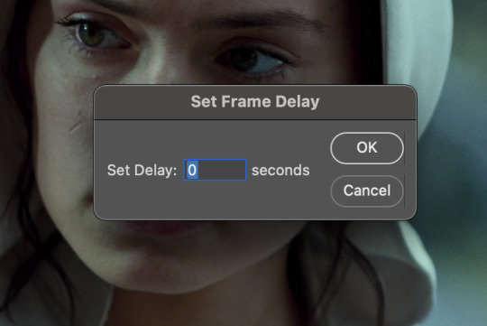
the general rule of thumb for gif frame delay is 0.05 seconds. there are some cases — certain animated movies or video games, for example — where other delays are best, but for the most part, 0.05 is what you want to use (0.05 can slightly slow gifs, and sometimes using 0.04 better matches the clip's original timing. this is really a "train your eyes" thing, and picking the best delay gets easier as you gif for longer). you can set this by typing the number into the text box and then hitting the ok button or enter on your keyboard.
at this point, i’d go ahead and save your file. you can go to file > save in the top bar, or just hit cmd/ctrl + s on your keyboard.
「 making your gif 」
1. sizing
after your frames are ready, the next thing is to size your gif. to crop your gif, press c on your keyboard to open the cropping tool. white borders will show up around your gif.
before doing anything, i would suggest making sure “delete cropped pixels” is unchecked. this will allow you to drag your gif around later if you want to reposition. you can find this option at the top of your screen. drag the borders on either side until you have the area you want selected. mine looks like this:
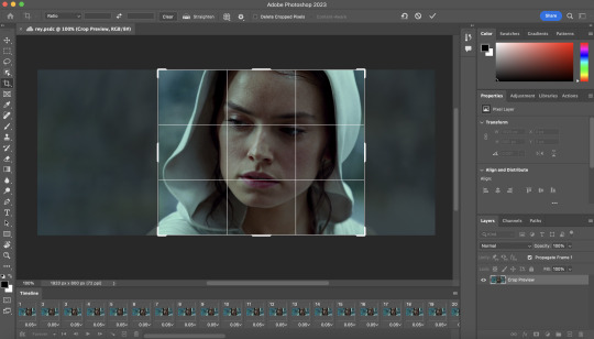
once you’re happy with your selection, hit enter on your keyboard to finalize it.
the tumblr image guidelines require gifs to be 540px across (here’s a post detailing this). to change your gif’s image size, go to image > image size in the top bar. you’ll get this popup:

instead of setting the width right to 540, i’ll be setting it to 544, and then trimming down the edges using canvas size. this makes the quality just a little better, and also prevents any weird borders being made around your gif on the off chance photoshop decides to add them. this isn’t necessary at all, you can absolutely size right to 540, but i just like doing this. if you choose to do this, open canvas size right after you set image size (image > canvas size in the top bar), and trim your width down to 540 and your height down a few pixels as well.
2. sharpening & other filters
sharpening is essential for good-quality gifs. the first step to this is converting our timeline from frame animation to a video timeline. select this little icon in the bottom left of your screen:
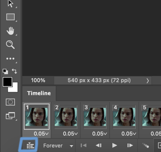
this is what your timeline will look like now:

you can use the little slider with mountains on either side to change the width of your frames in the timeline for easier access when editing. now that we’ve got all this set up, we can sharpen! i use this action pack to sharpen my gifs in addition to a few of my own settings (here is a video on how to install actions into photoshop). go to window > action in the top bar if you aren’t seeing the action tab.
i’ll be using the sharper action from the pack. to use an action, select it from the list and press the little play button at the bottom of the panel to apply it.
in addition to this, i usually also add unsharp mask at 50% amount with a 0.5px radius:


there are a few other filters than can be helpful when giffing:
a. add/reduce noise noise (aka grain) can be added with “add noise”. go to filter > noise > add noise.
these are the settings i usually use, but the amount depends on the gif (i don't ever go over 3.5 for the most part):
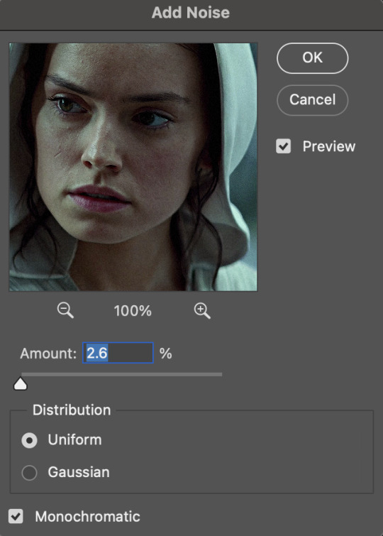
(if you want a grain effect but moving noise doesn't work for the gif, you can also add a grain overlay and then mess with blending mode and layer opacity until it looks how you want)
reduce noise can be used to remove some of the pre-existing grain on a clip. go to filter > noise > reduce noise. here are my settings:

leaving reduce noise on its own at 100% is a bit too much, so double click this icon and change the opacity (i usually do around 45):

b. gaussian blur if your clip is a bit pixelated, gaussian blur can help with smoothing it out a bit. go to filter > blur > gaussian blur. my settings are 1 pixel radius w ~20% opacity (this changes based on the gif).
3. coloring
time to color! i want you to keep in mind during this section that everyone likes different colorings, and this is just my process! please don’t feel pressured to follow exactly what i’m doing, the best way to find what you like is to just mess around and experiment!
i like to start off with lighting adjustments: brightness/contrast, levels, exposure, and curves.
a. brightness/contrast i usually start out with this first, just because brightening the gif right away helps me start thinking about how i want to color! here are my settings:
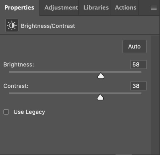
b. levels/curves levels and curves can either be used interchangeably or together. i usually use levels to adjust lighting and curves to adjust color values, but i’ll go over using both for lighting as well as using curves for adjusting color values.
for both of these adjustments, i use the eyedropper tools to pick out white and black points. for levels, the top eyedropper tool to the left of the graph is used to pick out a black point. i do this first. use the tool to pick a spot on your gif that you want to be the base for black values. for me, that’s the shadow inside rey’s hood. the bottom eyedropper tool picks white point. use the tool to pick a spot on your gif that you want to be the base for white values. i chose the outside of rey’s hood. make sure you’re doing this on a new levels adjustment layer.
now, on to curves. you can either use the same eyedropper method or manipulate the graph directly. using the eyedropper is the same as levels, so i’ll just go over graph manipulation.
shade lightens as you move to the right along the x-axis of the graph — black is the far left, white is the far right, middle is the midtones. generally, i don’t work with midtones.
i’m going to use levels for this gif’s lighting, and curves to adjust color values. here’s how to do that:
curves can be used to adjust the amount of a certain color in different lighting areas of a gif. for example, i can specifically decrease the amount of green in the gif’s whites. to edit these values, select the rgb drop-down menu and adjust them one at a time. here are my final graphs:
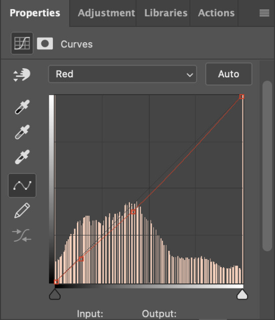


c. exposure this one’s pretty straightforward. the exposure slider adjust general exposure. the offset slider adjusts how dark your dark points are, and gamma correction can be used to lighten/darken scenes as a whole. here’s my settings:

d. color balance color balance is used to adjust overall tint of a clip. this is in general pretty simple, but i do want to point out that using the shadow and highlights tabs in addition to just the midtones can really help. here’s my settings:

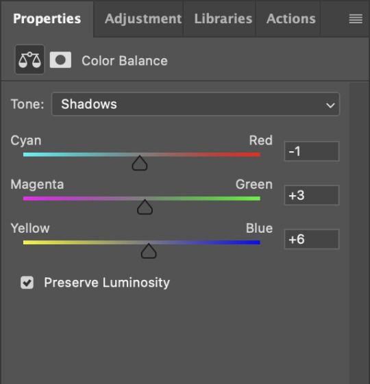
e. channel mixer channel mixer is one of my favorite tools in ps, especially for coloring scenes that are a pain in the ass without it. to avoid taking up too much space, here’s a great tutorial covering channel mixer. here’s my settings:


[at this point, i’m noticing my gif is still a bit darker than i’d like it, so i’m adding just a bit of brightness/contrast to fix it. there’s also a patch of blue over one of rey’s eyes, so i’ve used a hue/saturation layer to get rid of that bit and masked it to her eye. i’m not going to go over masking here, but there are lots of great tutorials out there!]
f. selective color selective color can be used to adjust the amount of specific colors within a color. for example, if i were to go into the red tab and take out cyans, the reds would become more red. if i were to add yellows, the reds would become more orange, etc etc. this can be especially good for color manipulation. for this gif, i’d like to make the background more blue, so i’m going to use selective color to do this. here’s my settings:

g. color lookup color lookup uses 3dlut files to remap gif colors (it’s a preset — think instagram filter or something similar). i don’t always use these, but when i do, i almost never leave them at 100% opacity. color lookup is great for giving gifs a film-type look if you want to do that, it’s got loads of different options. here’s my settings (adjustment layer is set to 20% opacity):

atp i’m pretty much done with coloring! i usually end up doing a few extra little lighting adjustments at the end. for this gif, i added some brightness/contrast at +8. i’ve also noticed that my gif’s looking a bit grainy, so i’ve added some noise to lean into it. this is usually the way i fix it, but you can definitely do reduce noise/gaussian blur as well if you don’t want a grainy look.
here’s my fully colored gif + a process gif (fast images warning):
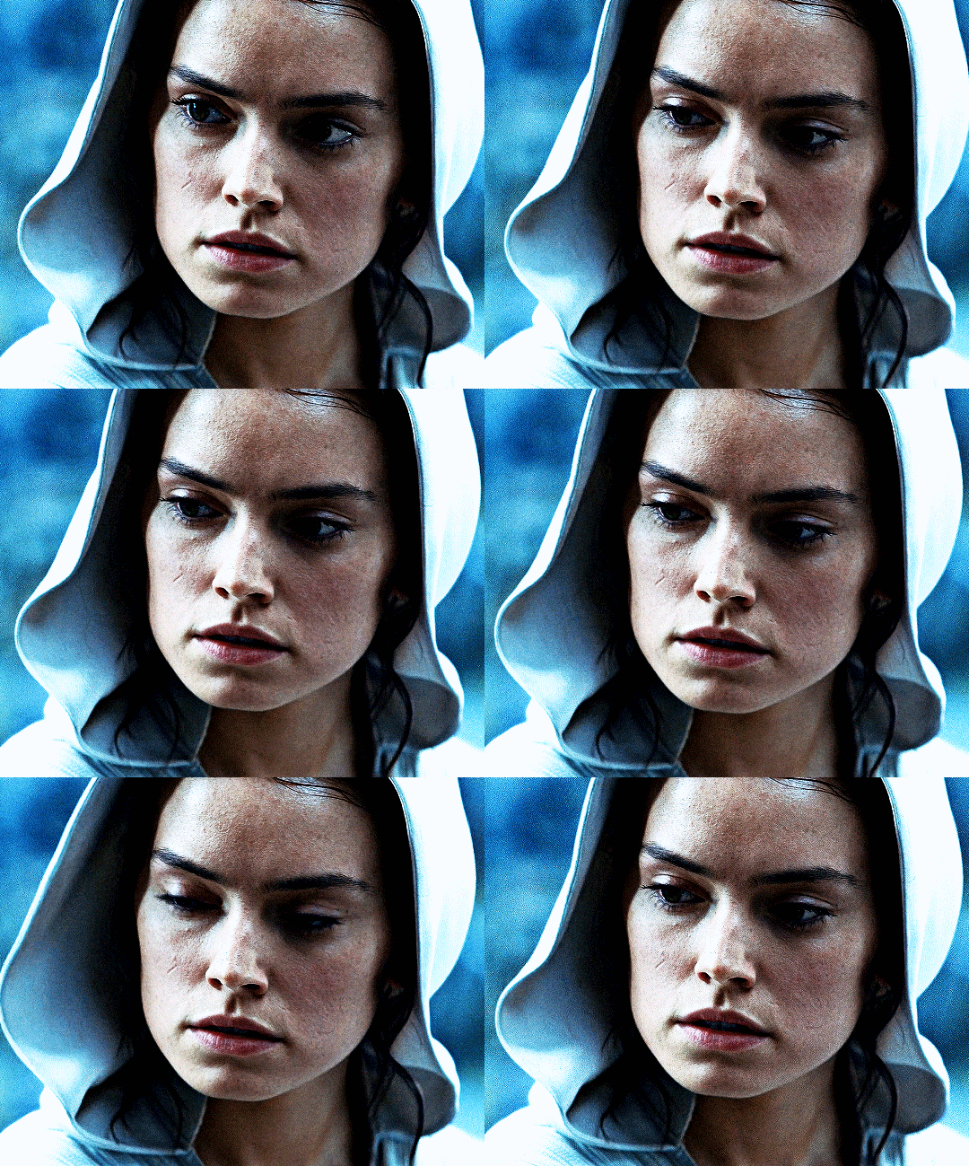

「 saving gifs 」
1. frame rate
one thing you may have noticed is that my gif is looking a bit choppy. photoshop has a tendency to mess with frame delay after gifs are converted to video timeline. here’s how to fix that.
select all of your layers and convert them to a smart object (right click > convert to smart object). next, click on the hamburger menu in the top right of the timeline and go to convert frames > flatten frames into clips. now we need to change the timeline from video timeline to frame animation. click the little 3 boxes symbol in the bottom left corner of the timeline:

go to the hamburger menu again and select make frames (this is the same one you used earlier), then go through your frames and delete any duplicates. the first frame usually needs to be deleted specifically. once you’ve done that, set the frame delay back to 0.05 the way you did earlier.
2. exporting
once you’re happy with how your gif looks, go to file > export > save for web (legacy).
these are my export settings, but feel free to experiment with the menus where i have selective and diffusion selected, different settings work best for each gif. in general, most gifmakers only use selective/adaptive and diffusion/pattern because they generally work the best for tumblr. before saving, make sure your looping option is set to forever:

gif size for tumblr has a 10mb limit. my gif is under this, so i don’t need to make any changes, but if yours is over, you can either delete some frames from the beginning/end of your gif and/or adjust the height of the gif (width needs to stay 540px so your gif doesn’t get stretched/compressed on tumblr, but height is fair game).
here's my final gif!

happy giffing, and please don’t hesitate to send me any questions you have! ♡
#*mine#gif tutorial#tutorials#allresources#usertheos#userzesty#userzaynab#usershreyu#rogerhealey#userabs#userhekaates#usermaria#userraffa#usermorgan#uservivaldi#tuserheidi
357 notes
·
View notes
Text
(google doc here)
hiya all, i thought it was finally time to make an Official collab post on tumblr, lol, i have one floating around somewhere but it's not very detailed, so! lets create something together?
fic examples 💕

Must be 18+!!!!
Must be okay with me sharing the finished gifs/stills on twitter bluesky/tumblr at some point (with a link to your fic, of course)
You can either: tell me what you’d be interested in writing and I will do my best to create gifs/stills to match that, or, if you don’t have any specific ideas, I will make some random gifs and send them your way, to see if you vibe with them
If you do have specifics, lmk! I will try to accommodate as best I can. Examples include: position/act, who tops/bottoms, clothes (or lack thereof), facial hair/accessories etc
This is mostly for smutty oneshot type things, anything too plotty gets too complicated
I reserve the right to not do stuff that I simply don’t vibe with, lol, or stuff that just isn’t easily accomplished/is outside my skill level
In general, will not do: Ed and Stede with anyone but each other, animations for fics that are already written (because I do not make the animations myself, and I only can use what is available for download, so I don’t like having to find something super specific unless I’m working on my own longfic), and like, anything that squicks me out or makes me uncomfortable
Can do other pairings, but my other character sims are way less detailed than Ed n Stede
Can do lesbian Ed n Stede
My sims are cis, but that can also be changed with a few clicks if you’d like!
I’ll send you an album of all the gifs I make, and you are free to use as few/many as you like, in whatever order you like. Whatever inspires you!!!
You’re obv free to post your finished work on ao3 or whatever site you want, just pls link back to my twitter bluesky or tumblr in some way. (Or add me as co creator, but that is totally optional!)
(If you need help posting gifs to ao3, click the google doc link at the top of this post!!!)
I’d prefer if gifs weren’t uploaded to any twitter/bluesky/tumblr but my own, with the exception of a title gif that I will send you, so you can make your own tweet/post, if you’d like! and ofc go nuts on ao3!
(To censor a gif on twitter, you have to be on desktop and click add description, and the flag option will be in there. make sure to add the appropriate label on bluesky as well! post spicy stuff on tumblr at ur own risk 😂)
Finished fics are all compiled on @m3rmaided, feel free to browse them ;)
Any questions, hmu!
Seriously, though, feel free to DM me at any time if you’re interested in creating something together, I am pretty much always open to it. And it is NOT just a mutuals only deal!!!
Will update this post periodically if I think of anything else!

so, yeah!!! u can DM me or reply here and i'll get in contact w/ you, whatever you prefer! 💕 this is meant to be fun and stress free, so no time restraints or anything like that, just! creativity!!! yeah 💕
#mine#ts4#sims 4#the sims 4#simblr#sims#ofmd#gentlebeard#ofmd sims#i havent done any collaborations in a while#and since im on tumblr now more than i used to be#i thought i'd make an actual post abt this lol#im not rly anticipating a ton of response BUT just in case pls be patient w me
24 notes
·
View notes
Note
Different anon then one from AI, but do you know any RP servers for Scarecrow, that are also oc or self insert friendly? Or know where to start looking for them?
I honestly, don't--and as a pillar of the fandom I probably should, but I literally only RP with one person and that person I've known since I was in middle school so we work very well together.
I can suggest a few things though
check out tumblr communities, on desktop it is to the left under home and explore. There is probably several DC RP communities, and you'll only find RP peeps there. That's where I would look first.
You can also make a post and put it in the tags, asking for people to RP with ya. Normally, in the RP community it's frowned upon to put your roleplay in the tags unless you're looking for someone with roleplay with. (they call this a starter) Though personally, I'd make an exception for someone trying to avoid AI or trying to find a partner. (if you mention that you're trying to find options other than AI, I think people would understand and be interested)
Also do research into tumblr rp etiquette, and be open to all offers. there can be some snobs in the community from what I used to see just browsing. BUT, you can always sniff out the good people.
So yeah, talk to people. Put yourself out there. Ask around. It's just another form of networking. Instead of looking for a job though, you're looking for someone to tell a story with
and remember, everyone starts out small. It took me years to get to where I am now, and lots of hard work and dedication, as well as kindness to others.
10 notes
·
View notes
Note
hi!! I was wondering where or how you do you research for players and teams, and just hockey in general? do you have any favorite blogs or other resources? thank you~
okay picking thru web rot for the sharks primer has prepared me for this one lmao here's the quick answer because i really need to eat some pie and go to bed. Hockey is my all-consuming interest at the moment and I haven't watched actual television or films; or read anything non-academic that isn't about hockey in.... 9 months? If it seems like I am taking in a LOT of information in a short amount of time it's because I am. I listen to hockey things at 2-5x speed depending on if its a video on youtube (locked to 2x), a podcast (3.5x is my ideal speed), or my screenreader (5x) and often take notes, save articles as pdfs to go back to, and transcribe things for fun (only recently am putting my transcriptions as addendums to gifs... very rewarding <3). When not studying for my actual degree, I am reading about hockey or listening to something hockey related or watching hockey or writing about hockey or learning how to play hockey. i am so serious. please don't assume that this is normal, optimal, or even something I would wish upon other people. I am in Love with her in thee most wretched and irrevocable way. She's my hobby in the sense that shes my sun and im building my wax wings and looking directly at her light and thanking her for blinding me. amen.
more seriously, if I'm going down a player rabbit hole I will try many of these things - though not necessarily all of them, and not in this order (and i'm sure i've forgotten one or two things I usually try... lordy):
I go to spotify/apple podcasts and throw in player names just to see what comes up and listen to basically everything.
if they are on an NHL team, there are likely MULTIPLE podcasts dedicated to that team. trawl through their podcast archives, especially post-game podcasts where discussion is happening about their performance. sometimes there are even interviews <3
i do the same with youtube if I can...!
throw their name into reddit, tumblr, twitter and scroll. endlessly. just trawl through everything that I can possibly get my hands on. The more obscure the player the easier this is, because there really aren't that many things to find out about them and not many people are talking about them at all. <- this is how I make contact with people who are the only person that knows about this one (1) guy and then we hold fins forever. <3
find out who the teams beat reporters are. if youre looking into prospects, even juniors teams have people covering them. the writing might not be the highest quality but you WILL eventually find fun details if you go digging.
check: elite prospects articles, the hockey writers articles, find out the player's home town and see if their local paper has anything on them (basically, check any and all databases that use a tagging system or have a functional search engine)
helpful things to tack onto the end of google/youtube/database searches: "media availability" "post-game" "interview" "feature" "profile" "scouting report" "draft" "debut" "review" "highlight" "tournament"
if they're a player from a non-english speaking country it's worth throwing their non-romanized name into google to see what you can get. google translate the website // chatgpt translation are two options - not ideal and not to be trusted 100% over actual translation done by a fluent human speaker.
Instagram stories are the bane of my existence because they're so ephemeral
tiktok is a parallel universe to me. I do not have the app. any browsing I do on it is solely via googling "[team name] tiktok official" and clicking around on my desktop PC. I've only ever done this for M.Chrona's gf (who is much more famous than him) but if you're really doing down the rabbit hole of player research, some of their WAGs will post about them. <- as always, be respectful/not weird.
facebook for older stuff... genuinely makes my skin crawl so I avoid it and its a last resort LMAO but yeah teams used to post on facebook and everything!!! <- again. dont be weird and stalk peoples families or friends asjklakjl
"[player/team name] gettyimages [day/month/year]" <- substitute getty images for: flickr, hockeyshots, dreamstime, alamy
Substack is good for general hockey stuff if you can stomach the dreaded idea of subscribing via email or getting the app <3 I like: Jack Han (hockey tactics newsletter), Sean Shapiro (shap shots), Adam Gretz (adam's sports stuff), Thibaud Chatel <- for the analytics nerds, Alex MacLean <- his Scouting The Scouts series is what got me into substack in the first place, Greg Revak (hockey IQ newsletter) <- this is the one that's got me on development stuff atm SUPER rec because there's gifs and charts and many many hyperlinks included for citations <3
i should do a book rec at some point but uhhhh its getting late and im hungry <3 thank you for asking + reading if you got this far, I hope it was a helpful peek into my process?
19 notes
·
View notes
Note
Do yall still see spoiler jokes in the tags if the person tags it book spoilers?
that's a great question, and the answer is YES. disclaimer that i'm a tumblr elder who still uses the tumblr savior chrome extension rather than tumblr's built-in tag filtering system (i was so used to only having filtering options on desktop and not mobile for so many years that i've just trained myself to only ever browse on desktop and to use mobile solely for checking my notifications lmao), so i'm not 100% sure everything i'm about to say applies to the built-in system, but after reading through the info page on the built-in system i think it works in about the same way.
in total, there are 4 places where tags can be seen:
the original post on your dashboard/on OP's blog/in the relevant tags you're searching or browsing. OP's post tags are visible here.
a reblog of an original post on your dashboard/on the reblogger's blog. the specific reblogger's tags are visible here.
in the notes of your own or someone else's post, when you see a post and click to show all notes. all rebloggers' tags & comments are visible here (provided that you haven't blocked or been blocked by any of them)
in your notifications, when you get a notification that somebody reblogged your post and here are all the tags they put on it. all rebloggers' tags & comments are visible here.
of these 4 places, blacklisting a tag ONLY safeguards against the first two. if i have the book spoiler tag blacklisted, that will prevent me from seeing an original post or a reblogged post that contains that tag.
it WILL NOT prevent me from seeing a post that does not contain that tag, opening it up, and reading all the notes on the post. reblog tags that contain the blacklisted tag will still be visible to me if i'm accessing them via opening up the notes on a post. however, this would be something i'm doing deliberately and so it's only me who's accountable for any spoilers i might see, not the people putting spoilers in their reblog tags. (and as some of you can attest, 85% of the WOT spoilers i encountered were ones i deliberately sought out and then got mad about seeing djkfgj i only have myself to blame for those scenarios!)
so the key issue is category #4. if i make a post, i will get notifications for EVERY SINGLE REBLOG TAG, COMMENT, AND REPLY that is EVER made on that post. likewise, if i've reblogged a post that someone else made, both i and the OP will get notifications for every single reblog tag, comment, and reply that is made to my reblogged version of the post. nothing is filtered out. if i make a post saying "i'm a show-only and i don't know what's to come in the series" and you reblog it going "#oh they're gonna die when [massive spoiler] happens #wot book spoilers" i will see 100% of those words in my notifications, even though you've added the book spoiler tag and i have that blacklisted. tag blacklisting does not work for notifications.
this is why i always say, if you do not know for a fact that the OP of a wot-related post AND the person you're reblogging it from BOTH have full book spoiler knowledge, then do not put any book spoilers in your tags (even vague ones) when you're reblogging their post because they WILL see it, no matter how good a blacklisting system they have.
and it's especially egregious with gifsets! if somebody's made a text post then oftentimes it can be fairly clear from what they're saying if they're a show-only or a reader and so most rebloggers will consciously go "oh, seems like this person doesn't know X yet, i'll keep quiet". but for gifsets of the show, people will just reblog them putting full-on late series book spoilers in the tags with no thought for whether the gifmaker OP might be a show-only, because they're too excited thinking about how this scene in s2 will relate to something in book 12 to spare a thought for wondering if the real human person who created the gifset will be okay with seeing them discussing all those spoilers in the tags. i was spoiled that the man rand fought at the eye was not the dark one within 1 hour of watching 1x08 because everybody was reblogging my gifset and talking about ishamael & the forsaken in the tags lmao and there were definitely some other examples from my show-only-s1-giffing days too.
thus, When In Doubt, Be Silent! or make a separate post saying "guys i just saw this other post [link/screenshot making sure to include op's name for credit] and here are my book spoilery thoughts on it". but, of course, if you are confident in going "hey i recognize this blog and i know they've read the books" then no harm in letting spoilers fly in reblogging the original post!
8 notes
·
View notes
Text
what's up
I live.
My theme is currently extremely broken, which means a lot of my posts are going to look pretty terrible on a desktop/laptop. I'd advise browsing my blog on mobile for now.
I've always formatted my <<next and previous>> links with arrows, but some kind of change in tumblr's code has caused those arrows to be read as fragments of code, which broke some posts. I am planning to go through chronologically and update all of my story posts to get rid of the arrows and fix my posts, but this is a big undertaking and I'm not sure when I'll finish. It seems like posts on mobile are still working, though, so there's another reason to read on mobile right now!
Chapter 4 is in progress! I'm working slowly, but making good progress. I have NO idea when story posting will resume, but rest assured, things are happening behind the scenes.
I'm feeling better than I have been, but unfortunately I'm still not capable of more than the bare-minimum of effort. Apologies to everyone who's sent me an ask or a discord message lately, I promise I'll get to it when I can :sob:
14 notes
·
View notes
Text
Everyone else on Tumblr desktop:

Me, browsing on 150% zoom like always:

Seriously, folks, it's so restful, check it out:

24 notes
·
View notes
Note
yo dunno if you've been asked this question before or not (sorry if you have) but where'd you get your tumblr theme? and are the colors customizable or at least have theme variants (like royale or maybe royale noir, but i honestly have never been able to find anything for the latter)??
Hey, I'm always open for questions like that! So, when you say theme, there are a couple different possibilities you might be referring to: either the colors of a basic tumblr blog (the small popup window you see via Tumblr directly) or the desktop site you receive automatically upon acquiring a URL. You should get everything you need for the in-site customization when you first make a tumblr blog--and I'm most familiar with this on desktop, so forgive me for not providing details on mobile--but anyway, it would be discoverable through your blog editor in the same place you go to edit your description, title, pfp, etc. As for my desktop blog, this was made using customizable HTML (hypertext markup language), or a basic programming language for websites used in tandem with CSS (cascading style sheets). There is also a section of JavaScript on my blog which is for the sparkles that follow the cursor on my page. All three of these languages can be used to make your blog virtually whatever you want, but considering the question, I'll operate on the basis that you don't know how to code. How can you get a customizable theme?
Follow these simple directions:
go to settings
select your blog on the right sidebar (should look like this but with your blogs instead of mine)
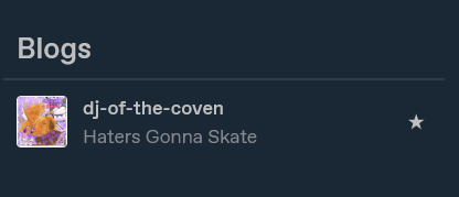
scroll until you see this setting

if not enabled, enable custom theme
click edit theme
At this point, you should see an editor much like this, but with your desktop site, which is likely going to be a generic model.

I will be proceeding in this guide assuming that you don't know HTML. To get a custom theme, select the icon on the left sidebar that says browse themes.
You will then see the sidebar change to feature Tumblr's generic theme and probably one or two paid ones. Look to the bottom of the sidebar to find this fun lil guy:

Then do me a favor and select it.
On the new page that pops up, you should be able to find hundreds and hundreds of themes made both by professionals and amateur programmers, some of them with price tags, but plenty of others totally free! To install a theme onto your blog, first find one that fits your tastes about right. Don't fret too much about colors and images, because the vast majority of themes will allow you to customize that--you just need the computer to know where to put things. Let's take a look at some of the featured selections here.
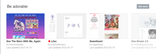
Let's say you want to try the first theme! Select it so this window pops up on your computer.

Preview and install do exactly what it says on the tin. For now, let's scroll down a little bit to check this theme's stats...

Take a look at all of this stuff to make sure that it does what you like, and make sure that you understand what you're signing up for. It's totally reversible in the sense that you can install the generic theme again at any time, but remember that whatever theme you already have WILL change when you install this. Always check for accessibility features as well! Depending on your needs, you might need to know if the programmer whose code you're borrowing has put any flashing lights or gifs in the layout before you download. Better safe than sorry.
Once you've decided on a theme, go ahead and click install.
It shouldn't take long afterwards for your blog to finish rearranging itself. Once it's finished, mosey over to your desktop site to check out how it's changed!
Most themes that you can download will include their own customization options that you can find using the same method we used earlier to open up this part of the blog editor:
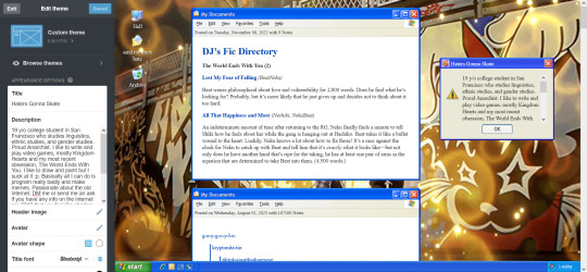
Just use the left sidebar to make any changes you might want to make to your theme in there. The theme description should've listed everything you can customize before downloading, and it'll all be right there in that menu! Most themes will let you change the color, images, backgrounds, links, music, or any other custom features to your heart's content through those controls. And if you're still unsatisfied, you can open up your blog's HTML file by clicking the edit HTML tab at the top of the left sidebar. Make sure you read some basic guides on code insertion if you do, though. It can be a little tricky to reverse garbage code if you put it in the wrong place.
Let me know if I can do anything else, anon! Good luck and happy customizing!

13 notes
·
View notes
Text
Uhg tumblr is broken again
I had a tag I would go into every day on tumblr to brows, and a few weeks ago it just stopped working. As always i clicked on latest posts, and after 5 posts it would just end like I'd reached the last of the tag content. All the stuff I'd seen the day before just 'gone'. So I switched to a different version of that tag, it worked, and I browsed it daily on the latest posts. And now today it's cutting off after 5 posts and acting like "there's nothing more here haha :)". Both were main tags for a well known show, which have plenty of posts that I KNOW ARE THERE tumblr just started pretending that they aren't out of nowhere. My app is fully updated, so maybe its just a mobile bug cause I haven't checked desktop to see if it does the same thing. Would love for the tags to work properly... anyone else have this issue???
#tumblr problems#idk what to tag to get this out but heyyy#if it helps at all they were the mp100 and mob psycho 100 tags#sorry if i show up in said tags now i just dunno whats wrong????#maybe its cause i use the tags a lot for some fkn reason?? idk why thay would be the issue but its the common denominator here#tumblr work properly challenge (hard)#max text
6 notes
·
View notes
Note
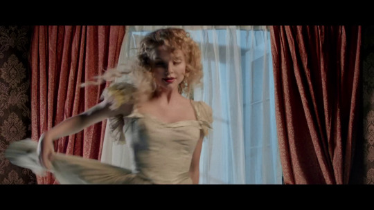
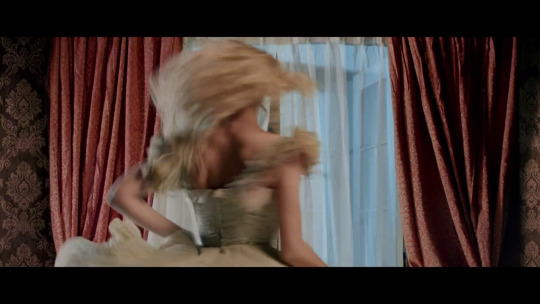
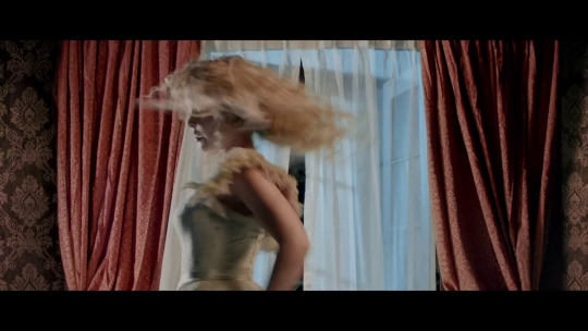
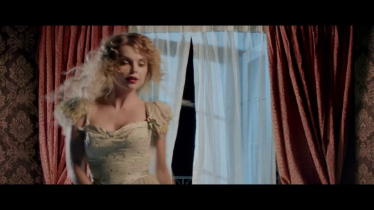
hello!! I have a few questions if that’s okay..? first question, do you know anything about the K thingy? the one they have on set! I’m planning to make my own (a much shorter version!) so do you know anything about it, the side detailing etc etc. also, in the Miss Atomic Bomb music video, do you have a screenshot of the scene where Izabella is dancing? it’s quite a specific scene and I’m not sure how to describe it, sorry!
first of all it's always ok to send me asks... this made me so happy, like we were back when there was a still thriving fandom on tumblr! 😭 second of all that seems quite a nice project i hope it turns out fine!!
now to answer your questions: the k debuted as a keyboard stand decoration for the day & age tour and after that has been consistently used for any off tour performance (2016 to any 2017 show before the official start of the ww tour, 2019 shows etc). for photo references the best is to just browse my the k stand at https://hotfuss.tumblr.com/archive/tagged/the%20k or https://hotfuss.tumblr.com/tagged/the%20k if you are on desktop/browser or just type #the k on the search bar of my blog if you are on mobile!
additionally sunsets and neonlights used to make nice hd edits of pics and mostly close ups, so it's worth browsing their d&a tag too if needed. i'm the only freak with an overly detailed tagging system so that's a more general era tag tho. but you can check it at https://sunsets-and-neonlights.tumblr.com/archive/tagged/day%20%26%20age and https://sunsets-and-neonlights.tumblr.com/tagged/day%20%26%20age!
for the mab video i took some screenshots and i'm posting them under the read more, hopefully there's the one you are looking for!
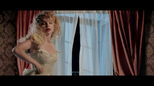
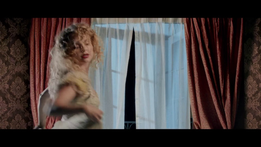
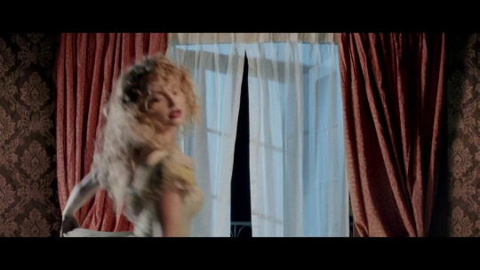
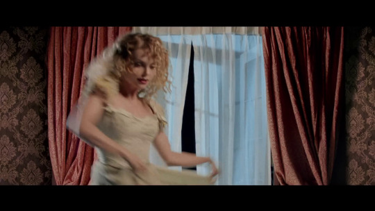
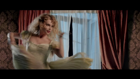
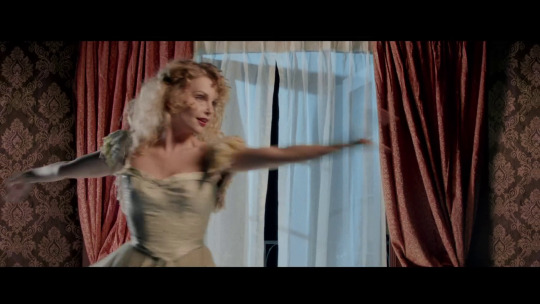
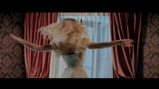
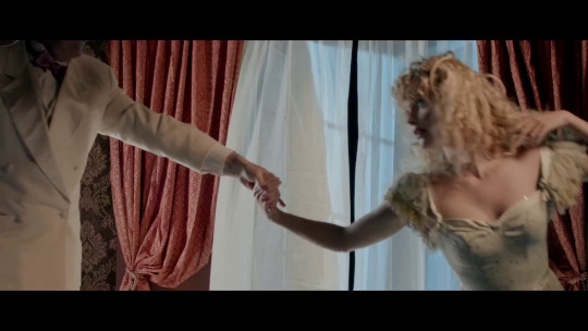
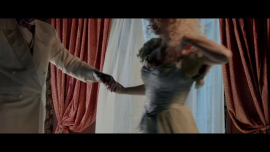
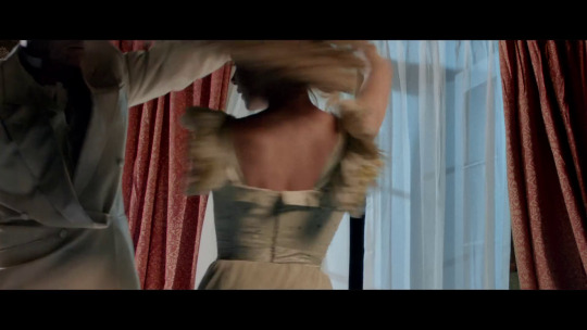
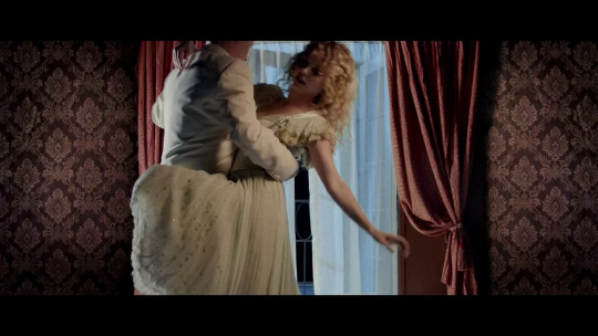
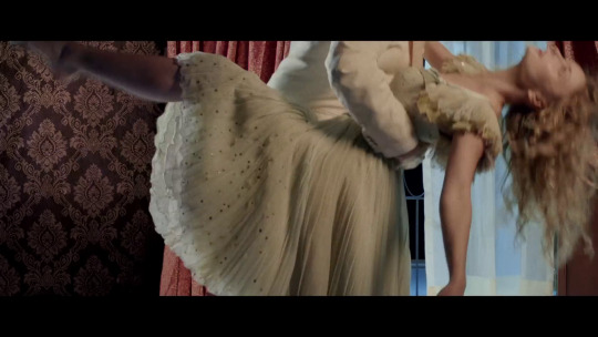
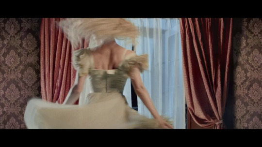
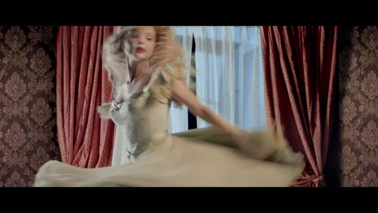
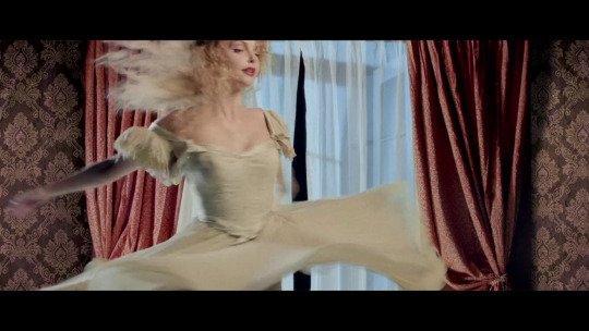
#a tk related ask... in 2024? unbelievable! 😭😭#anyway i'm always down to help i might just be slow at replying sometimes#dany answers#pumpingonyourstarsthatalign
3 notes
·
View notes
Text
tumblr still is the premiere browsing experience. even before the elonening twitter sucked to browse normally but tumblr has always had my good friends j, k, and l on desktop and double-tap like on mobile
4 notes
·
View notes
Note
omg this is so asdsfjsd but i'm a rina too and the past days i been obsessing over everlark again like u asdfsd but i feel a little alone in that hahaha i'm trying to convince my family to watch but it will be hard I have a question who do you think would be cast as Katniss and Peeta today? I been thinking about it and tbh I could see Joshua as Peeta if we were talking 5 years ago I could see Tom Holland because i feel is more about the vibe than the looks also Kit Connor maybe? Katniss no idea
Hii this is an incredibly late response, I’m sorry! I haven’t been on Tumblr on my desktop lately so I never saw the notification.
Everlark has had me in a chokehold for over a month now after rereading the series after 10+ years. All the fan art, fanfiction and think pieces on Tumblr/Twitter/TikTok are just feeding it. I can’t get over them, I go back and reread chapters just to feel something lol. So if you’re seeing this anon, my inbox is always open to discuss Everlark!
To answer your question I have no idea. I’ve gotten really attached to some fan art depictions of Everlark that I can’t imagine them looking like anything else. I assume you mean Joshua Bassett as Peeta and honestly, I don’t see it, but maybe? I think acting wise it wouldn’t be bad but I don’t think he fits Peeta’s physical description at all. Same with Tom Holland even vibe wise. Like Peeta is cheeky is a dark, sexy way instead of a goofball which is how I associate Joshua and Tom lol. Even browsing online, there’s no one in Hollywood right now that I think could do Peeta justice (he’s just soooo perfect lmao). Same (and especially) with Katniss. There is an abundance of young white men in Hollywood but only a select few young women of color.
I remember not wanting to watch the first movie when the cast was announced because Jennifer Lawrence looked nothing like how Katniss is described. It just wasn’t how I imagined her. And to an extent same with Josh Hutcherson. I only remember watching the first one. After watching all the films before they left Netflix, I think they are good movies even with their issues. And to be honest, acting-wise I don’t think anyone could have played the roles as good as Jennifer and Josh. They had great chemistry and I think they really understood Katniss and Peeta. The only young person I think could pull off Katniss right now is Zendaya, but she doesn’t really fit Katniss’s description either and she’s a kinda too old now. I know if they were to do a reboot today they would probably white-wash the cast again so I hope that doesn’t happen.
6 notes
·
View notes
Note
Mie do you read on here or ao3 more? And also which ships do you enjoy reading the most or do u stick to x reader for the most part?
ive been reading so much less overall lately rip <\3 but i’d say it’s an even split? i feel like i spend more time Searching for something to read than actually reading when it comes to x reader but that’s mostly bc i can be picky, but when i do find x reader it’s usually on tumblr and when i find ship fics it’s on ao3 and i am so so bad at cataloguing what i read omfg. i’m always signed out on my phone so it doesn’t save on my account history and then i always only have ao3 open on private browsing. i truly do mean to go back and add to favorites or bookmarks when i get back to desktop but i’m so bad </3 i have a folder of fics i mean to add LMAO.
that being said, itfs writers on ao3 put their lungs into those fics i swear… i think i read every single inuokko fic published from 2020-2023 LMAO i haven’t read one in a while but love them it fueled me when i first got into jjk. also love itafushikugi fics my beloveds <3 haven’t read for aot in a while but the eremin tag was very very serious to me as were all ema fics. more recently i’ve been floating around mha fics and i really don’t discriminate lmao i’ll read most tdbk/bkdk/tddk/tdbkdk fics except i do get confused and it’s such a stark reminder that i have no clue about how quirks work or the mha lore. the other day i read a shinsou/bkg fic and it was really cute even if i don’t ship them yk. i’ve said before that ships aren’t Serious to me, there are very few i distinctly disengage with so as long as the tags look appealing to me and i more or less like the characters in the show im watching, im down to read it at least once <3
#anonymous#i do read x reader on ao3 too but i feel like they are few and far between when compared to ship fics#three weeks after starting mha i accidentally read a 35k word tdbkdk fic and didn’t even realize LMAO. loved it too i should find it again#i am way less picky when it comes to ship pairings than i am with x reader#the only things i look out for are the warnings yk but i’m down to read most
1 note
·
View note
Note
gasp 🔴 live viewing of soulmates au unfolding irl
yes in fact i am (confirmed)
to be fair i haven't been on tumblr that long i joined somewhere btwn jan-mar of this year and so i don't think ive experienced many of your themes (blog profile wise), but i remember stalking the tags and it was easy to spot what works were yours based on the header edit, it stands out and is v eyecatching among other stuffs in the tags ^_^
mhm i think your style is very deviantart fs hehe,,, NAUR FR they r the ogs i used to want to be them so bad. for reference i started getting into kpop around 2/2.5 gen,, i was an admin on a facebook snsd fanpage and posted like png shadow/swirl edits 😭😭😭 simple times
hell i'd love to! i don't think i'm mentally there i fr lack the creative capacity, its in very rare circumstances do i see something that i kind of envision and edit in my head and ill usually screenshot it to keep the idea there but i even more rarely ever jump into starting the edit.
yes it is! i still have and use it, it was the 'it' app for photo editors back then me thinks, kind of like the ae of photo editing... at least from my viewpoint on the ig fanpage editing scene. it was the hotter sister to picsart lmaoo
see soulmates au!! we couldve crossed paths but we didn't!! until now!! 😾
omg wait stop it cus i used to love reading imagines n shit on ig but im pretty sure i stopped because i felt like it wasn't a popular content type esp since its a photography platform. i browsed the tags for imagines n stuff but it was meh,, i only followed ONE imagines account 🥲
wait so to clarify, u also edited on ig alongside writing?? imagine if we crossed paths on the algorithm dats crazy 😭 you're the cool one i wish i could be skilled in both literature and art ?? i simply do not have enough brain cells for that ^_^
canva on phone is my enemy‼️ at least the last time i used the mobile app,, bc i now use it only on desktop, sometimes on ipad... cus u alr cannot see the layers i cannot be doing anything complex bc i will def tap on the wrong layer and thats annoying -_- the patience u have ㅠㅠ well assuming the app is still like that idk maybe it changed
HAHAH i used to draw before like pencil paper shit so i thought i could do it digitally....and after years of not drawing on pencil paper too 💀💀
u are so much more articulate than me goodbye thats embarrassing 4 me T_T
soulmate does exist <3 look at us being prime example!!
actually i think ive active with my account within the time frame as well, probably feb-march i think, but before that i didn't care about the account that much but like slowly started make headers im a tryhard ( only after i stopped obsessing tumblr themes bc i couldn't figure it out) ARE you fr?? like u could tell my works in the tags of my header?! dude that's so,,, that's like such a huge compliment that I've got something that makes someone go ah yes it's that same. author like it feels so fulfilling, YOURE REALLY BUTTERING ME UP ILYSM!!! thousand consentual kisses!!!!
YOURE SO COOL WTH YOU'VE BEEN HERE SINCE 2/2.5 GEN PLS THATS SO awesome ive been into kpop since mid 2017 so most of my groups like og ones were third gen but I listened to 2nd gens too and SNSD my beloved!!! genie was my introduction of kpop tbh and replay by shinee is what made me stay so i can say im a child of 2nd gens too lmao but holy shit I want YOUR PLAYLIST!!!!!!!! GIVE ME SONG RECS!
tbh i get you i only edit for my headers or blog too tbh like usually if there is no purpose you don't really feel like editing bc it's like what are you even gonna do with it? and you've said that you've always posted them so maybe the fact you don't have anywhere to showcase your art has you feeling like that too?
"hotter sister of picsart" this is so real bc all the hot editorson Instagram ( the western artists collage style specially) all used superimpose and thr fact they used to pay for it too.
bro like imagine if we did cross paths i think i was more active on ig during 2019-2021? imagine if we had ever crossed paths since we both worked on kpop lmao, okay but if you like posted your work under #kpopgfx im pretty sure i have came across at least once!
did kpop have imagine accounts? i knew a lot of dating door accounts tho lmao but then again i was stuck in wattpad, and that's all the delulu you need lmao.
lmao yeah i always wrote with my works, most of my edits were based on stuff i wrote basically like love stories based on songs, certain ideas (was BIG on mythologies and all the other things.) but really fr tho i wonder if I actually ever saw your work tho because i never had the guts to interact with other editors.
lmao im the same with canva but on laptop i for the life of me cant do that plus i just use it get pngs and other stuff also when i want to do masking lmao. i usually collect shit on there and then manipulate those on my own app.
bro that is insane that you used to actually drawing like as someone who can't draw a single straight line this is so cool to me i really wish i could draw tbh
articulate and me? lmao im literally all over the place but it's so sooo fun to talk to you!!
0 notes