#tiary degrate
Explore tagged Tumblr posts
Text
Organizational Structures: Final Reflection
The Organizational Structures course has been relatively challenging. Having never worked with After Effects, Adobe Premiere Pro, or animations, I truly struggled with grasping some of the concepts that I needed to obtain in order to make effective design solutions. However, I am proud of my success. I can honestly say that I know a lot much more than I had known prior to beginning this course.
I am not afraid to admit that I feel as if my work could have been a lot better. Had I had more experience with the software, had more time to learn the software’s characteristics, had the ability to focus only on learning the software (instead of having to balance work), and/or been guided or taught, I know that my solutions would have been a lot stronger. This is not the end of my journey with animations and videos, however. I intend to incorporate the skills that I have learned in this course throughout the duration of my Mastery program, and further into my career as a designer. I am confident that I will continue to learn the ins and outs of Adobe After Effects and Adobe Premiere Pro.
This term, I created a logo for my charitable sea turtle event. I also created a motion graphic, or animated logo, and a 30 second promotional video.
Although I had created and pondered the thought of three different logo designs, the design below is the solution that I decided to use in order to represent The Painted Hatchling and its brand overall. The sea turtle not only incorporates the colors that are highlighted in my mood board, but it also includes a wave in the body of the turtle shell. This is representative of the aquatic and unity characteristics that this event is intended to exude.

Other logo options


The rendition of the motion graphic is a subtle expression of empowerment. While the logo interacts with the wave, it is reintroduced by itself, reiterating its importance. It symbolizes the ability to rise after falling. This is a metaphor for the extinction of sea turtles. Although sea turtles are slowly becoming more and more extinct, this event is meant to enlighten, promote action, and contribute to a reintroduction of sea turtles overall.
youtube
The 30 second promotional video
youtube
Below are wireframes and static design comps of the website


Final Mood Board for the event:

1 note
·
View note
Text
Design Research: Final Reflection
My journey as a designer began over a decade ago. As a teenager who grew up taking apart and rebuilding computers with my dad, it was no surprise that I had taught myself how to code. When I entered the Media Design program at Full Sail, Web Design was the area that I had accumulated most of my prior knowledge from. It was also the area that I had believed I would be most comfortable in. I entered this program not to feel comfortable, however. My desire to pursue my Master’s was driven by the need to be better. To know more. Although I had had some knowledge in the industries of art and design, I felt as if I did not know enough. I wanted to be the best that I could be at my craft. I craved more knowledge, and now that I am finally doing exactly what I love to do, it feels like Heaven on Earth.
Being that I have experience with coding, I fully intend to increase my coding knowledge and build websites from start to finish. I also want to learn to use web design software applications that don’t require coding. While in this Design Research course, this was my first time using Adobe Illustrator to create website design comps, and I am eager to learn how I will be turning these designs into an actual functioning website. It’s one thing to teach myself something, but to learn about this-to be taught what I love- feels incredible. I have yet to reach a point of not looking forward to my next assignment.
As I continue on my Mastery Journey and open doors to my career, I will utilize all of the tools, feedback, and skills that I have accumulated throughout this process. I will be able to better plan and map out my designs and projects before getting them started. I will also be able to effectively conduct usability tests before launching them (thanks to “Don’t Make Me Think!”). Additionally, I will never be out of the loop when it comes to staying on top of design trends!
During this course, I took my digestion of feedback to another level. I strived to truly internalize the critiques I received and worked to effectively incorporate them at the highest level. I feel as if I am getting a better understanding of putting the client first. I also plan to continuously read the texts and course material, for I feel that it is essential to my growth as a Media Designer. I feel as if these are texts and resources that I should purchase in hard copy, add to my library, and reference for the rest of my life.
I am extremely, extremely happy with my decision to attend Full Sail University, and I feel like the luckiest, most grateful, and blessed woman alive.
Here are my final designs for my Design Research Course:

My Final mood board for The Painted Hatchling, a fictional charity concert for sea turtles.


These are my final design comps for The Painted Hatchling’s event website, and Here is a link to my Behance account.
References:
Krug, S. (2013). Dont Make Me Think, Revisited: A Common Sense Approach to Web Usability (3rd ed.). New Riders. Retrieved May 15, 2018, from http://ce.safaribooksonline.com/book/web-design-and-development/9780133597271/title-page/title_xhtml?percentage=0&reader=html
Turner, A. L. (2017, December 23). 11 Eye-Popping Web Design Trends You Can Expect to See In 2018. Retrieved May 15, 2018, from https://thenextweb.com/contributors/2017/12/23/11-eye-popping-web-design-trends-can-expect-see-2018/
#tiary#tiary degrate#design research#media design#masters#grad school#graduate school#designer#graphic design#branding
1 note
·
View note
Text
Digital Marketing Foundations Mastery Post
This summer, I had the opportunity of interning at an advertising agency known mostly for its impeccable SEO strategies. Although I had recently graduated from Full Sail with a Master's of Fine Arts in Media Design, the internship inspired me to re-enroll and increase my knowledge of Digital Marketing strategies. One of the things that I noticed immediately was how much the concepts, terminology, and assignments were not new to me. Because of the internship, I found that I comprehended the assignments on a much deeper level. At the same time, I realized that my love for and passion of the digital marketing industry was completely warranted.
Because of the internship and the Digital Marketing Fundamentals course, I truly believe that I am instilled with a strong (and knowledgable) foundation in Digital Marketing. Throughout this course, I increased my knowledge of digital marketing strategies, digital marketing terminology, and metrics. One of the areas that I feel as if I have benefited from the most was the creation of a digital marketing strategy for a company that I selected. Through this course, I began laying down the foundation for enhancing the digital marketing strategy and overall brand for Trees Atlanta. In doing so, I also got the opportunity to analyze competitors, and get to know Trees Atlanta on a microscopic level.
The Digital Marketing Fundamentals course has been the perfect beginning to not only creating a powerful digital marketing strategy for Trees Atlanta but also allowing me to be a seasoned professional within the Digital Marketing industry. I benefited a lot from the Lynda tutorials and weekly reading assignments. As I progress throughout my career, I intend to always be able to revisit the resources and assignments that this course has provided me with. I plan to always be able to use the competitor analysis assignment in order to analyze the competitors of any brand that I am working on optimizing. Additionally, I will continue to benefit from reading and responding to the discussion posts of my peers. This has helped me internalize explanations other than my own. It has also given me the opportunity to explore additional options. In a digital industry that is constantly changing, this skill will forever be one that I should constantly utilize.
I am extremely appreciative of the Digital Marketing Fundamentals course, and truly look forward to what the rest of this program entails!
0 notes
Text
Professional Practice: Reflection & Final Post
Although we’ve commeeeee to theeee endddd of theeee roadddd, still I can’tttt let you goooo *In Boys II Men voice*
Wow. I honestly can’t believe that this journey is finally coming to an end. It’s hard to believe that graduation is only 2 days away! As I look back on my creative journey and look forward to my professional career, there are many things that I’ve gained from being a part of the media design program. This post highlights how each course contributed to my personal and professional growth as a media designer. It will also expound upon how these courses aided in the construction of my thesis project.
Mastery: Personal Leadership and Development
This course was a true gem. I’ve always felt as if it was the perfect way to start off graduate school. Through the reading assignments, turning point video, and research done in this course, I learned a lot more about myself, my passion for designing, and what I’d like to do with my life following graduation. This course reiterated that I was exactly where I needed to be. I remember a particular assignment that required us to answer a lot of questions about our upbringing and journey prior to enrolling in this program. This assignment was an incredible eye-opener for me. My excitement for this program grew immensely while taking the Mastery course. One of the biggest things that I both learned and grew increasingly excited about was the opportunity that I would not only be learning more about design, but I would also be learning much more about myself. Now that is a quality that is priceless.
Defining Client Needs:
Prior to this course, I knew that it was something that I desperately needed. I needed it back then, I needed it now, and I would need it forever. For this reason, this was one course that I really looked forward to. I enrolled in this program because I wanted to know much more than the things that I had taught myself. I wanted to know the professional side of designing. And this course was the perfect example of this. Although I had grown up doing web design and working within the media industry in one way or another, I had never learned what contributed to defining a client’s needs. Therefore, this course was (and is) essential to my journey as a media designer. It helped me set the foundation for all successful media design projects by instilling the ability to determine exactly what it is that clients desire when they come to me for a project. One of the ways that this course helped achieve this was by giving us the task to pick a city and map out every aspect and important characteristic of that city in order to create logos, toolboxes, and a well polished brand later in the program.
Design Research
This course expanded my knowledge of web design. I had entered this program with some coding experience under my belt, but this course proved that there was a ton of additional information that I still needed to know. For example, creating web comps was a great way to map out the elements that I wanted in my website. This course allowed me to exercise the importance of doing research and applying that research to make my design solutions fluid according to its brand. One particularly beneficial asset of this course was examining the resources. The Principles of Beautiful Web Design is a resource that I will use throughout my career. This is because it provides the guidelines needed to make website functional, visually appealing, and effective.
Organizational Structures
This course was the most difficult for me. I often felt frustrated because I didn’t understand the software needed to create the motion graphic. I also expected my motion graphic to be as good as others (for example, Julia Royal), and I seemed to not be able to allot enough time to figuring out the software. I did, however, learn a lot about After Effects. It helped me grow as a professional because I know that anytime I am given a task, I can always go out there and watch tutorials and practice until I learn. I also know that I can get better with motion graphics the more I study and practice the software.
Design Strategies & Motivation
This course truly showed me the value of reiteration. Although I thought it was annoying at times, the reiteration process helped me grow as a designer and a professional. It gave me time to think about my design solutions, internalize feedback, and apply new revisions. As a result, I created design solutions that were stronger. As a professional media designer, I will plan to constantly reiterate.
Design Integration
In this course, I began to further explore the idea of inspiration to the media designer. It was the beginning of an important realization that a lot of designer’s work comes from reiterated or reinterpreted past projects rather than being newly introduced to the world. With this in mind, this course helped me to further explore the idea of innovation and test the boundaries of how I could innovate my own work. I also dissected how my innovations can influence the future of the design industry.
Multi-Platform Delivery
This course built on the understanding of inspiration. The Mastery Paper in this course was actually one of my favorites! I also worked on more reiterating. I ended up perfecting the promotional video for my charitable sea turtle event, and learned that I was pretty good at creating videos. This course allowed me to take the material that I had learned in previous courses and apply it to another format of visually telling a story. It will help in my professional career any time I may need to create visuals in the form of videos.
This course also helped me understand the importance of delivering solutions on multiple media platforms. As a media designer, I will be designing on multiple platforms. Therefore, understanding these platforms and how to best manipulate them will be pivotal to my success and ability to assist clients.
Measuring Design Effectiveness
This course was incredibly informational. In it, I learned a few methods in testing how effective my design solutions were. I created a survey in which I asked questions that would prompt the target audience to give their thoughts on the project. The responses both confirmed, and refuted some of my design choices. As a result, I was able to make relevant changes in order to make my design solutions more effective. In the professional field, I will also work to test the effectiveness of my design solutions by utilizing the material I’ve learned in this course.
Presentation of Design Solution
In this course, I was tasked with proving my claim to mastery in the four degree learning outcomes. In order to do so, I needed to revisit my work throughout this program and choose solutions that would convey a visual story that supported these claims. It was a fun and rewarding course because I got to make a website and revisit my past work. Revisiting my work helped me to see how far I had progressed in this program. This course also served as a means of highlighting exactly why each course and its relative projects were essential to this program. By using the projects to explain and support the degree learning outcomes, I also learned how to articulate and defend my design solutions.
Each course contributed to creating my thesis project because it provided the means for me to explain exactly how I mastered the four degree learning outcomes. For example, in the Brand Development course, I created toolkits that represented Kyoto as a brand. The design solutions in this course were utilized to support the argument that I had connected, synthesized, and transformed. Another example was the ability to solve problems. This came in a number of course through the requirement of me internalizing feedback and reiterating my work. Each course was essential to this program; it was the thesis that served as a representation of my ability to internalize and apply the assignments and resources given along the way. I was also able to use my ability to synthesize, research, and defend my arguments as a part of the thesis project. These are all skills that I learned throughout the courses as well.
In the final course, I’ve created an experience map which documented my journey throughout the program. As illustrated by the images below, I had high points and low points! Overall, the experience was a true blessing and I am incredibly grateful for this opportunity. I am proud to be a media designer and happy with my decision to attend Full Sail.


Here’s to graduating in a few hours!
#tiary#tiary degrate#grad school#graduate school#design#web design#graphic design#graphic designer#media design#media designer#masters degree#branding#copywriting
0 notes
Text
Presentation of Design Solution: Reflection
It’s seriously surreal to be nearing the completion of this program. The Presentation of Design Solution course proved to be one of the most crucial assets to the Media Design program. This was only partially due to the creation of the thesis project, however. Most of the importance of this course was behind the process of actually presenting design solutions. I mean, it sounds like a given because that’s what I’m here for, right? Isn’t the goal of a designer to present design solutions? It’s neither as simple as it sounds, nor as simple as I had initially thought that it would be. I honestly hadn't realized the complexity of the presentation until this course!
The first key takeaway that I'm leaving this course with is the importance of telling a visual story. While this characteristic is a key asset towards creating design solutions that encourage audience participation, it hits home for me on a much deeper level. This is because aside from being a designer, at the root of my core, I am a writer. This concept, has allowed me to merge two of my passions into one, ultimately creating strong and effective design solutions. As this course and it’s resources have reiterated, the ability to visually tell a story is one tactic of being able to convince others. This is a skill that I plan to continuously work on throughout my career as a media designer. One of the best ways that this course has helped me strengthen my visual storytelling skills was through the creation of the thesis presentation. The following images represent the ability to utilize resources, and synthesize information to create a powerful visual story. These images depict the Connecting, Synthesizing, Transforming page of my thesis presentation. The page effectively combines relevant examples of being able to connect, synthesize, and transform design solutions. In doing so, it provides an example of the ability to tell a visual story that is convincing and a representation of my mastery of this degree learning outcome.


Another key takeaway during this course was the importance of displaying my “design thinking.” More specifically, accurately providing relevant captions and explanations for my design solutions. This is a concept that I slightly avoided in many courses because I felt as if it took away from the presentation of my designs (I honestly thought a lot of it looked really ugly, and/or that people didn’t want to read my thoughts). However, I’ve learned that the ability to walk someone through the process it took to reach my design solutions can be a strong representation of my ability to solve problems and consistently create effective design solutions. With that being said, I was slightly confused with the Behance and Mastery Journal expectations throughout this program. I thought the Behance was intended to be the portfolio and the mastery journal was intended to serve as the means of explaining the design process. It was difficult for me to explain the process on Behance because at times, I merely wanted to treat it like a portfolio. However, I’ve learned the importance of this and it contributes to the idea of being able to visually tell a story. Here, I combined the ability to tell a story with the visual display of my design solutions, learning that I can incorporate both without jeopardizing the quality of my design projects. The following images are pulled from my Behance and highlight a few examples of this concept.


The third and final takeaway that I will highlight is the ability to choose only design solutions that are the most effective. This is because I often struggle with narrowing things down. I’ve always been the type of person that wants to include everything. Throughout this program, I have struggled with the ability to be able to tell what solutions were most effective. A huge part of this problem has been my ability to differentiate between my own personal preferences and the preferences and requirements of the audience and/or client that I am designing for. Many times I believed that the solutions that I found more visually appealing (or those that I was personally proud of creating) were the solutions that were the most effective. However, this course has reiterated that I must go beyond my own thinking and preferences and always focus on the client and intended target audience. One such example of this was through identifying which projects represented my ability to solve problems. In my initial draft of this project, I chose a personal problem (which I honestly thought was a client problem). After instructor feedback, and a deeper look into this project, I was able to identify a problem that the client would present with my project. From there, I was then able to address and explain how I worked towards solving these problems.
As I push forward as a designer, I will continuously revisit the tools, resources, and final design solutions that I have created throughout this program. This program has provided an invaluable experience that has allowed me to get first-hand experience and knowledge of industry standards. I truly appreciate the opportunity to create and display my work in the form of a thesis that outlines my mastery of the four degree learning outcomes. By having to present the thesis in this manner, it truly forced me to evaluate my thinking, challenges, and successes throughout this program. It allowed me to synthesize my journey in reference to each of these four outcomes. It also challenged me to revisit old material, to provide concrete examples, to tell a compelling visual story, and to choose only the best, most effective examples of my work.
#tiary#tiary degrate#masters degree#grad school#graduate school#graphic design#graphic designer#media#media design#media designer#branding#copywriting#social media#advertising#advertisements#digital advertising
0 notes
Text
Design Integration Reflection
The Design Integration course has definitely been a treat. For the first time throughout my mastery journey, I have been able to focus solely on elevating my work to professional levels.
At the beginning of the course, I mapped out the exact projects that I would revisit and revise. During this course, I chose to revise the charitable sea turtle event that I had created. I chose this because this is the last project that I had completed, and it was still fresh in my mind. I still had a grasp on exactly the vision I had for this project, and had grown an emotional attachment to it. I also truly saw the potential of this project being a part of my professional portfolio, and worthy of client presentation.
While revising the elements of my charitable sea turtle event, I conducted resources on a number of sources. One of the first sources was that of prior courses (Branding, Defining Client Needs, Organizational Structures, Design Research, Copywriting). Revisiting these courses allowed me to draw on past skills and knowledge that I had attained. For example, I drew inspiration from the characteristics in creating a brand that I learned from the branding course. Here, I made important decisions that would enhance the effect of my brand (like changing the event name, creating fluid colors, relevant texts, and incorporating elements that were reflected in the mood board). I also utilized some of the copywriting skills that I have learned in order to create ads, and work on the branding for the website and logo.
Additionally, I used a number of texts that we had previously studied. I often referred to David Airey’s “Logo Design Love” in order to make sure that I always incorporated his seven elements of iconic logos. I used his knowledge (as well as the instructor’s) in order to propel the elevation of my logo. Here, I ultimately made the decision to get rid of the sea turtle graphic, and stuck with a logo type. The logo type was representative of a strong logo that was simple, memorable, focused on one thing, and distinct.
Being that this project included my web design comps, I also used “The Principles of Beautiful Web Design.” I pulled information from this text in order to create web design comps that were more effective and user friendly. For example, I utilized suggestions like making elements visually appealing and not making things too wordy. This is because web viewers and consumers respond to things that are easy to navigate and provide quick solutions to their questions.
For this project, I was solving the problem of fluidity and coherence. My previous charitable sea turtle event included elements that did not necessarily fit well together. For example, the event was a sip and paint entitled “The Painted Hatchling.” Elements in my mood board and logo did not accurately display the element of painting and sipping. Therefore, there was a disconnect between the brand and brand elements. The logo I had created did not convey this aspect of the event either. Additionally, the logo also posed some design constraints. The logo type and logo mark did not fit well together. Without the logo type, the logo mark risked appearing too much like clip art. Yet, together, they did not provide the most effective solution because the logo type was confined into the tiny space of the logo mark. This problem made it difficult to read the logo type across multiple media platforms.
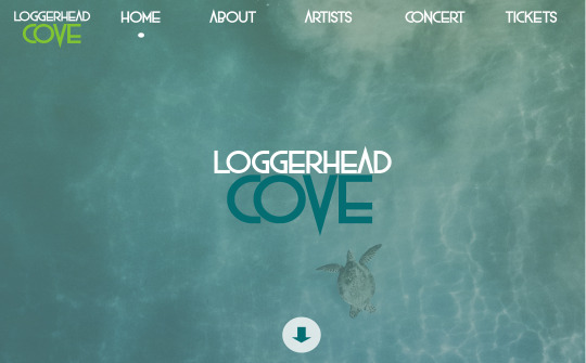
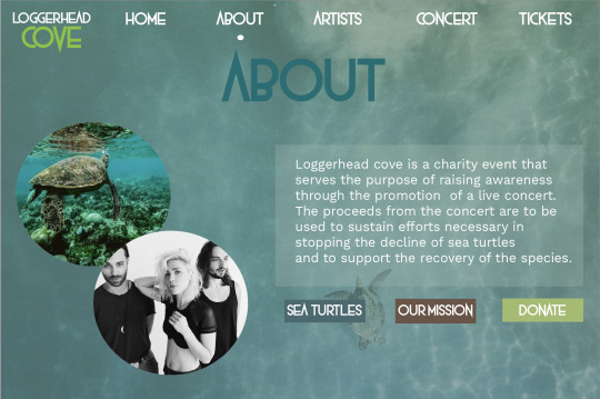
In order to solve these problems, I changed the name of the event and completely rebranded. I removed the element of the sip and paint, which allowed me to focus more on the bands and sea turtles. I also changed the logo by removing the logo mark and sticking to a logo type only. According to the industry, these revisions portrayed a stronger branding solution. For example, the revised mood board now included a font called “rock out” and this was indicative of the “alternative” characteristic and type of bands headlining the event. To continue, the logo type also accurately portrayed this element. The web comps also included elements of the “aquatic” characteristic by incorporating blue and green colors and utilizing a background image of an ocean.
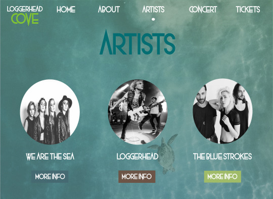
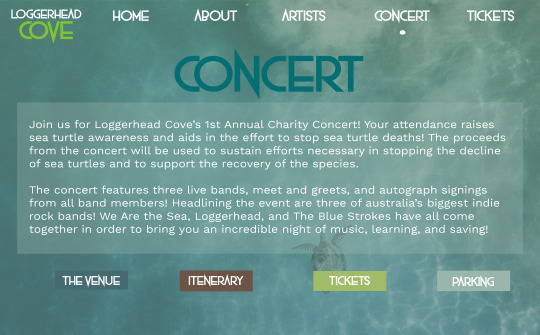
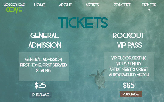
My work is innovative because the subject matter is an oxymoron. On the one hand, sea turtle relief efforts are usually not considered very alternative or hard core. Therefore, adding the element of alternative indie-rock bands makes this event that much more appealing and inclusive. I also created ads for the event. The ads state “Let’s talk trash. It saves lives.” This provides a uniquely interesting call to action that stands apart from previously done charity design projects in the industry. This is because it takes a subject that is sentimental and puts an edge on it by adding the alternative elements and indie rock bands.
These advertisements will be what the first phase of revisions for the following course.

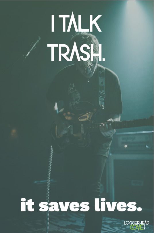
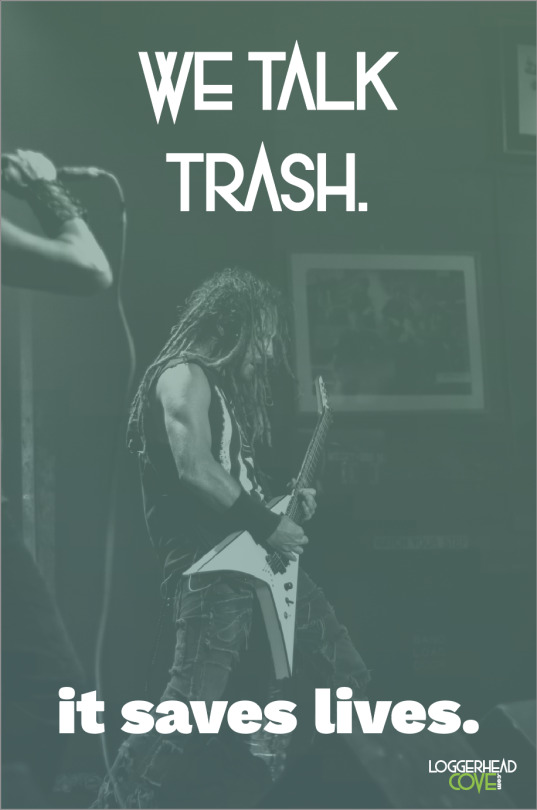
Throughout this process, I learned the importance of a fluid brand. I learned how to create a mood board that accurately portrays all elements included throughout the brand material. For example, each element that I went on to design displayed the key characteristics that not only the mood board portrayed, but also the brand in its entirety. I learned how important it is for consumers to be able to easily identify the brand and brand elements.
I also enhanced my skills with Adobe illustrator. I learned how to better navigate across the program, and manipulate problems in order to achieve ideal solutions. As I progress, I plan to continue working on elevating this project in order to be able to put it in my graduate professional portfolio. Although I did not get to in this course, I plan on creating a better motion graphic and promotional video. I also plan on creating more digital advertisements.
This course has helped reiterate how nonlinear the design process can be. It has also shown me the value in diligently revising my work and constantly striving for the most effective solutions. I will carry these tools into my professional career.
References (below):
Beaird, J., & George, J. (2014, June 17). The Principles of Beautiful Web Design, 3rd Edition. Retrieved August 17, 2018, from http://ce.safaribooksonline.com/book/web-design-and-development/9781457174353/the-principles-of-beautiful-web-design/ch01_html?percentage=0&reader=html#X2ludGVybmFsX0h0bWxWaWV3P3htbGlkPTk3ODE0NTcxNzQzNTMlMkZjaDAxX2h0bWwmcXVlcnk9
#tiary#tiarydegrate#tiary degrate#graduate school#grad school#design#graphic design#advertising#web design#copywriting#digital advertising
0 notes
Photo

see my logo in action below.
just a basic logo for the purposes of this week’s assignment.
[references located below as well]


References:
Logo Design • Create a Logo - The Custom Logo Designer. (n.d.). Retrieved January 19, 2018, from https://www.logogarden.com/
0 notes
Photo

LinkIn with me, yo.
or, you know, connect with me on LinkedIn.
Whichever you prefer.
www.linkedin.com/in/tiarydegrate
This is cool. I have truly enjoyed this Mastery Course. I feel fancy.
*sips tea with pinky out*
references below:
References:
Tiary Degrate. (n.d.). Retrieved January 19, 2018, from linkedin.com/in/tiarydegrate
0 notes
Text
My Life’s Task: Week 3 Discussion Post
I love multiple things, but the two things that I love the most are writing and designing. I truly believe that my life’s task is to inspire others, specifically through my writing and design endeavors. Although I have a strong inclination (and underlying wish) that my endeavors will eventually lead me on the path to writing books, I need to focus on the truth. I am a phenomenal writer, but I do not enjoy writing like I enjoy designing. I am passionate about communicating across various media platforms. I love designing different campaigns and providing for a broad audience. I hope to bridge the gap between social, cultural, and racial barriers in art.
As a freshman in college, I started an inspirational blog that received great praise. My current desire is to start a new lifestyle blog that will allow me to incorporate all of the things that I love doing. Although I had been coding since I was a teenager, my first blog was the first endeavor that I had truly realized the depths of my life’s task. I believe that this was the first personal step on my Mastery Journey that I took towards pursuing my life’s task. One positive thing that I gained from that experience was the understanding that I had a powerful voice that inspired thousands around the world. With all great success, comes struggles, however. This leads me to my negative experience, and what I learned from it. As my blog grew, I began to feel more and more pressure to perform and constantly outdo myself with my content. While I had a ton of positive people in my corner, I started to see a trickle of negative people who either did not agree with me and my viewpoints or did not like my persona entirely. This negativity started to consume me, made me feel insecure, and made me question my life’s task. Because of my newly discovered low confidence, I stopped blogging altogether.
This brings me to Robert Greene’s “Strategies for Acquiring Social Intelligence.” In it, I found a sort of stressful, yet comforting concept. A negative thing about being a Master (or a human being in general), is that there will always be some sort of parasitic counterforce that attempts to pollute your mind. This very thought invokes a sense of fear, reminding me of the challenges that I have had to overcome in order to have even earned my seat in life present-day. However, I believe that for every negative thing, there’s also something positive. The positive here is that the negative can be combatted. Sometimes, standing up for what you believe in can result in your demise. In Greene’s section “Speak Through Your Work,” he tells the story of Ignaz Semmelweis, who, through his insistence of improper protocols enforced his beliefs upon many in the medical field with great frustration. Although his frustration was cultivated through the amount of people who constantly shunned his theories when he thought the evidence was blatantly apparent, Semmelweis carried his negative resentments throughout the rest of his career. This reminded me of many martyrs who have changed the scope of mankind. Martin Luther King Jr., for example, was one such martyr. While his beliefs, sentiments, and speeches gave way to the more inclusive society that we live in today, they led to his own assassination. Speaking through his work brought him great recognition. Even in death, his voice still resonates.
To stand far more “socially intelligent,” as Greene calls it, can often pose a threat to those within our society. People are so used to either doing things by the book or giving away what power they hold themselves, that they are often uninviting to new innovations. One powerful take-all that I have gained from this week’s reading is the understanding and courage to stand firm in what I believe. As Greene points out, we will always encounter fools along our journey. However, we can “Suffer Fools Gladly,” and truly prevail.
Another negative thing that I discovered is that our personality and our actions will reflect on the world, and if we are not careful, our persona can come in between our Mastery Journey and our success. This concept tugs on the strings of my heart. We have all heard that you should “never judge a book by its cover.” I try to practice this principle in all of my affairs, and I truly despise people judging in this manner. I truly believe that it is important to consider the content of someone’s character. A person’s outer appearance is hardly ever an accurate depiction of who they truly are. It also isn’t fair to judge someone for these reasons. I will choose to introduce Donald Trump for explaining purposes here. A close friend of mine and I have been debating on politics for some time. While neither of us support Donald Trump as a president, I am not afraid to express my sentiments on the fella. She, however, hates hearing of my sentiments in the way that I so deeply present them. I do not know Donald Trump personally, so the way I speak about him is unfair to her. While many American citizens may understand and value his points as a valid businessman, others refute him as the president of our country because they despise his persona. It is the characteristics that he portrays, his actions, and his words that inevitably led people to deem him untrustworthy and unfit to run or represent our country as a whole. My fear of a brewing war-zone is her fuel to turn the other cheek. Through my debates with her, I have realized that I am a fool myself! In many ways, I have had a double-standard. Greene insists that if we are able to see the fool in ourselves, we will be better able to handle others and overcome difficult situations.
Again, as I mentioned earlier, for every negative, there is a positive. Just as people judging one on their physical characteristics or persona overall is negative, I find positivity in Greene’s dissection of Temple Grandin’s experiences. In the “See Yourself as Others See You” section, Greene argues that it is important to be able to recognize the positive and negative attributes that your audience experiences in relation to you. Because Temple Grandin wanted to perfect her craft and her persona, she truly absorbed the feedback from others. Rather than taking things personally and quitting or putting others down, Temple Grandin would take her shortcomings and use them in order to further advance herself towards being the ideal individual that she wanted to be. In doing so, she learned exactly how to have a more positive impact on others. I aspire to be more like Temple Grandin in my Mastery Journey. I want to utilize my negative and positive attributes in order to become a better Master. Even with the negative situations and difficult fools that are still waiting to pursue me, I will prevail.
References:
Greene, R. (2012). Mastery. New York, New York. Penguin Group (USA).
0 notes
Text
The Last Lecture:
"The Last Lecture," given by Randy Pausch, left me no choice but to reflect on my own existence. As I took inventory on my life, and all of the events that encompassed it, I was compelled to revisit what once was my greatest fear: death. As a child, I possessed an innocently beautiful perspective that Robert Greene calls the Original Mind. With this mindset, I perceived everything in life as glitter and rainbows. Possibilities were endless, and nothing bad or evil existed. The world as I saw it was shattered when I was six years old, however. My best friend had died in a terrible accident, and the remnants left me entangled within the Conventional Mindset before my time.
"The Last Lecture" has provided me with a deeper understanding of my life, and the way that I perceive the world. Before I had experienced death, the thought of the pure, limitless, and creatively beautiful life that I had witnessed seemed incapable of being disrupted. Life coming to an end, even for something as small as an ant, seemed unfathomable. How could a world so beautiful bring such detriment and turmoil? I struggled with understanding this possibility, just as I had struggled to understand that my best friend, whom I had just played with prior to the weekend, was never coming back. As a result, I grew extremely terrified of death. My fear of dying led to an obsessive and compulsive childhood in which I desperately tried to combat death in every way possible. I kept myself from living, because I was afraid to die.
This is why Paush’s lecture moved me so much. To be on his deathbed, and choose to live rather than exist is truly remarkable. It reflected the opening and awareness of his Dimensional Mind. He was both knowledgeable, and welcoming to using his knowledge in new and original ways.
I also found myself envious for a short period of time. Pausch appeared to have such a good life. He also possessed the loving, affectionate, and validating parents that I had always longed for. I noticed myself thinking “of course he would be able to defy his existence in his final days; he knew what it meant to live!” I had to realize that I was starting to look at the things that I did not have, and inevitably clouding the message. This concept is synonymous to Greene’s dissection in Cultivating Negative Capability. According to Greene, John Keats introduced Negative Capability as the ability to transcend the ego, experience what you are seeing, and avoid the desire to make a judgement. Pausch exuded Negative Capability in his entire aura. To be dying, and successfully living at the same time is impeccable. Even in the midst of decay, he is still able to endure and embrace the mystery and uncertainty that each day brings.
One of Greene’s Creative Strategies is Altering the Perspective. I chose this concept for two reasons: first, I had to alter my own perspective in order to understand Pausch’s lecture and parallel it to Greene’s Mastery suggestions; and second, because I believe it is a vital component in Pausch’s life, and in life in general. Everything is about perspective. As human beings, we receive and process information much faster than we are able to truly comprehend. Pausch admits his distaste of dying, and while he may not understand why he is dying, (especially while having three young children), it is the ability to alter his perspective that allows him to surpass his circumstances and make the most of the time he has left. Instead of occupying his time consumed with the “how,” he exercised the “why” by constructing valuable ethics. In turn, these ethics will be embedded in the souls of his children, inevitably allowing him to live on forever.
Understanding Greene’s suggestions in Awakening the Dimensional Mind is crucial to my life and my Mastery Journey. His concepts (as well as the concepts of Randy Pausch), show me how to live. Although I am only in week two of this course, I truly feel as if I am getting a second chance at life. In combatting the inevitable counterforces that have clouded my creativity, I will utilize Greene’s suggestions every-day for as long as I live. His concepts do more than merely guide Masters; they build character and create leaders who will change the scope of the world. Greene’s concepts are helping me understand myself, and the world we live in. Understanding these concepts inspires me to give back what was so freely given to me.
Bibliography
Greene, R. (2012). Mastery. New York, New York. Penguin Group (USA).
The Last Lecture.” Performance by Randy Pausch, Youtube, 26 May 2008, www.youtube.com/watch?v=BODHsU3hDo4.
0 notes
Text


As I press forward on my Mastery Journey, it is important to do a SWOT analysis in order to determine my current strengths and weaknesses and fully understand my threats and opportunities. As a result, the SWOT analysis will reveal areas that need improvement and encourage a solution-driven approach to increasingly striving to be the best in my field.
In the Media Design industry, potential threats are both abundant and inevitable. This industry is much different than that of Psychology or Medicine. Here, there are a number of solutions to one problem. There are growing numbers of people who have more knowledge. There are always people who have the potential to present solutions that are more innovative or convincing. As I learn more about myself and my capabilities, I look forward to gaining a better understanding of Tiary Degrate as a brand. I intend to further discover what sets me apart from my competition. What makes me unique? What are some of the key characteristics I can provide as a designer, but no one else can? In order to surpass my threats, I have to gain a better understanding of my strengths.
During my time in Brand Development, I have noticed that one of my biggest strengths is the ability to design solutions that are instilled with big personalities. This strength has highlighted my ability to see things differently. Because I see things differently, I am often able to think outside of the box and provide solutions that are either innovative and creative or exceed the minimum qualifications.
While giving my designs life is a strength, some facets can pose signs of weakness. For example, at times, I struggle with allowing the client’s needs to prevail over my own personal choices. To combat this, I strive to learn how to not only take direction better but to also take that direction and elevate it to heights that exceed expectations. While doing my final revisions, I took suggestions from my professor and fellow classmates. One of those suggestions was to focus on the need of the client but still incorporate my own personality. Also for my final toolbox revisions, I worked to create a cohesive brand toolbox with the highest level of accuracy and professionalism. In doing so, I narrowed my logo designs down to the final solution that not only best conveyed the culture, geography, and traditions of Kyoto, but also worked harmoniously with the colors, typography, and overall brand. I also changed the designer's notes so that they highlighted the reasoning behind my design choices, rather than describing the toolbox that they represented.
Part of my decision to get my Master’s in Media Design was because of the opportunities that it would present. My biggest goal is to have my own culturally diverse lifestyle magazine. The skills obtained throughout this program will present much more than the opportunity to fuel my own dream, however. My magazine has the potential to be either a hobby that I only do on the side, or a major source of income. Still, the tools that I master in this program will aid in me being more of a viable candidate in the fields of media and design. With this program, I truly feel as if the opportunities are limitless. I have already seen that I am laying down the building blocks towards my ideal future. Even beyond the program, the skills obtained will continuously teach me and encourage further growth.
0 notes