#this was mostly an exercise in cool panel layouts and i still like it
Explore tagged Tumblr posts
Text

Study of Figure Drawing for All it's Worth, by Andrew Loomis, pages 106 and 107 (Clip Studio Paint)
Been a minute, huh? For the first year since I started teaching myself to draw, I didn't post my daily October drawings. I did them, but that was a rough month, so they were below even the low standards I set for those.
It's understandable, since it's been almost two years, but I didn't realize I was redo-ing these pages literally until I went to export this. I guess I'd skipped ahead before back tracking then. Oh well. I can compare and contrast. (Doing so: a rather subtle improvement. I no longer track my exact hours, but I'd be surprised if it's less than 150. I guess at least it's not stagnation?)
I said it before, but I was really unprepared for how much I enjoy doing these studies of figure drawings, or studies of photographs. Maybe that will change when I get a little more confident in drawing from my imagination, but for now it's quite soothing.
I've fiddled a bit with the pressure options for my tablet, but still want to experiment with other brushes. While I'm not unhappy with this one it's striking how much I can't capture since I only know the default pencil. Loomis' rendering of the back of the fifth figure here, it's amazing how much detail he gets with just graphite.
Little aside, I've started doing at least one of these warmup squares every time I sit down to practice a little, leaving them on their own layer (I erase and start over if it fills up).

It's helping a bit with my mark making; which obviously needs it. I almost didn't want to post this because of how embarrassing my ellipses are.
I think I'll move to another artist before circling back again, maybe do some studies of panels from my favorite mangaka.
I eventually want to get back to perspective stuff (mostly using Perspective Made Easy by Ernest Norling and Perspective by William Powell, with some exercises from Draw a Box), but it's much less interesting, and it's not like I'm in a hurry.
Drawing is half a skill I feel incomplete without, and half an exercise in understanding my own perception and imagination. I've noticed repeatedly that I will feel like I have a flashbulb impression of some really cool pose or action shot, and then when I sit down to try and do a layout for it, and immediately realize I don't know where anybody's limbs are. It's just a vivid feeling that attaches itself to a vague blob of imagery.
2 notes
·
View notes
Text
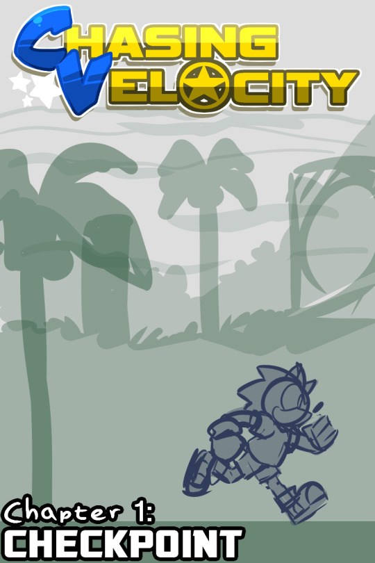
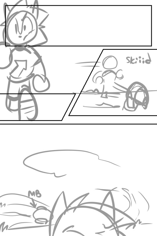
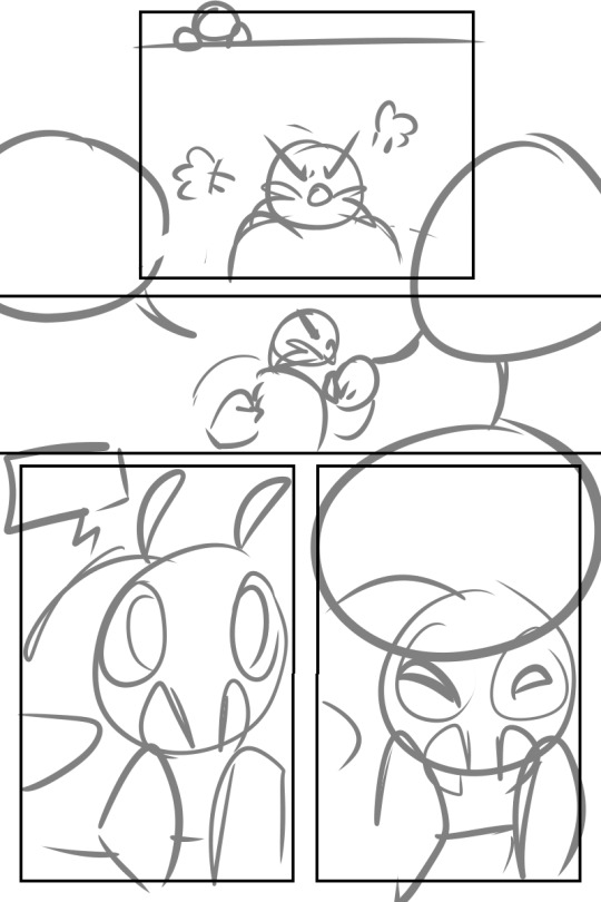
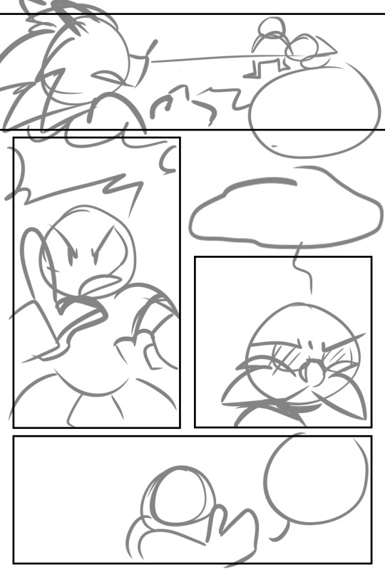
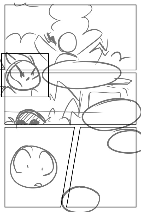
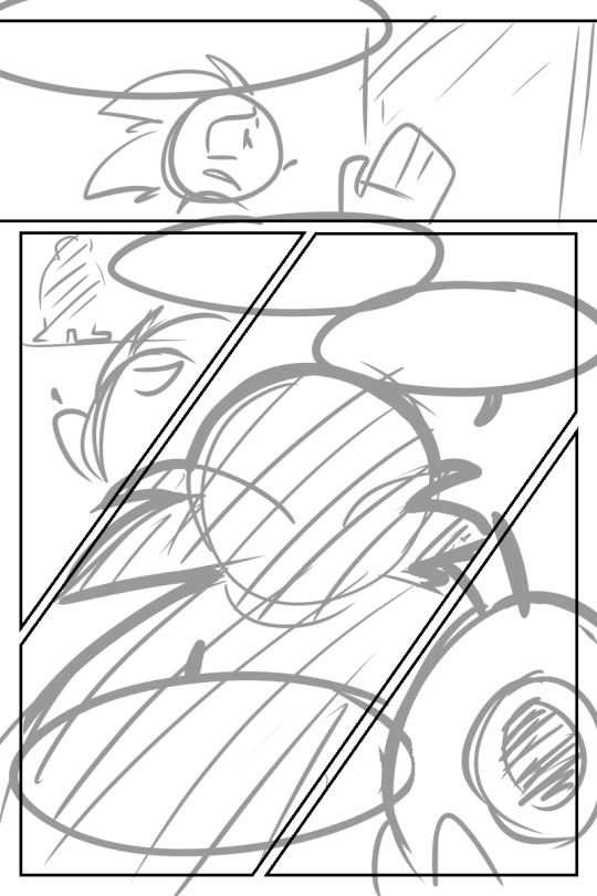
sketches for what was going to be the first full issue, Checkpoint! a loose adaption of Sonic 1, doing the whole origin story thing with Sonic running into Eggman for the first time and trying to get the Chaos Emeralds before he could so she can save the island and her friends. normal stuff.
i still have the full script for this chapter, so i could make something out of it maybe? im making absolutely no promises though because my current plans are to continue the out-of-order random character comics seeing as anything else seems to make me explode
#chasing velocity#chasing velocity comic#cv: sonic#cv: eggman#good lord this is one of the only times ive drawn eggman. what the heck#mostly because i kept procrastinating trying to figure out how to draw him in the first place#as you can imagine this was going to become an issue for me#this was mostly an exercise in cool panel layouts and i still like it#cvcomic
5 notes
·
View notes
Text
April 4th-April 10th, 2020 Creator Babble Archive
The archive for the Creator Babble chat that occurred from April 4th, 2020 to April 10th, 2020. The chat focused on the following question:
What is something you’ve improved with in regards to writing or comic creation thanks to working on your story?
carcarchu
Oh this one i can answer definitively. it's 100% lineart. forcing myself to have to do lineart for hours everyday is definitely a way to force yourself to get better at it while i still don't like it it's something that i can do now without being scared about it
shadowhood (SunnyxRain)
Colouring. I had to get really creative in expressing emotion and hinting plot devices with colour. Also got much better with drawing gesture drawings due to looking at a lot of references!
Cronaj (Whispers of the Past)
Either writing dialogue or drawing/painting backgrounds... I used to be particularly awful at writing dialogue. It was too stiff and formal, and sounded a lot like old prose. Now, because of writing a comic and going through several scripts, the dialogue is a lot more natural, and the pacing is more realistic to actual conversations. And the other: backgrounds. I really used to not even draw them at all, and doing a comic forced me to have to think about environments in scenes. So I went from drawing floating characters to having to consider where they are and how it affects the story/mood.(edited)
Feather J. Fern
Paneling! That was my main focus to figure out how to do good paneling to have clearer pages
Deo101 [Millennium]
Honestly? Everything. It's all gotten better and I've learned so much. I would say my biggest improvement is probably in my time management, and art wise is probably composition and layouts. But it's hard to pick because I've grown so much in every aspect!
chalcara [Nyx+Nyssa]
Biggest thing I learned was to keep the story small and focused - and that the smaller, more human struggles are much better in creating tension than the whole default "the world's gonna end!" thing. Mind you, I still love a good "world's ending" story, but you gotta make people CARE about the people in that world first!
Holmeaa - working on WAYFINDERS
ohohohoooo I have done more drawing in photoshop in this short time I have worked on Wayfinders, than the rest of my life! That has given me some skills for sure! Coloring is another one, and generally just efficiency and flow in a comic
Nutty (Court of Roses)
For me it's been my use of color, and getting more confident in experimenting with it to really drive home a scene's mood!
LadyLazuli (Phantomarine)
The clearest improvement I always notice is my layouts - I’ve gotten more adventurous with panel shapes and placement as time has gone on, experimenting with more interesting designs for the whole page. Some of those experiments haven’t been totally successful but it always feels like a worthwhile try. I’ve gotten some really, REALLY cool layouts out of these experiments, and I love seeing how dynamic the panels have become compared to my first chapter. Also speed. I’m so much faster now. Thank gooooooodness (edited)
Eightfish (Puppeteer)
@LadyLazuli (Phantomarine) I've definitely noticed the experimental panel layouts! They're really cool.
AntiBunny
Planning. Book 2 is when I started using sketchbook thumbnails to plan ahead. The luxury of that first draft meant I could rethink panel layouts and how to best express the events happening if I first had an idea of what was happening laid out.
Also digital art by necessity since I switched to digital during the current arc. I was decent at lineart already, but other aspects have really challenged me to grow as an artist. I had to totally rethink the way I create backgrounds for instance. During this time the background quality actually declined a little while I got used to a new method, but experience has improved my skills greatly as I force myself into new methods.
DanitheCarutor
Hmmm maybe paneling, speechbubbles and backgrounds? My current project is my second real attempt at doing a comic, but I have learned a lot of stuff from the community and general art and story tutorials. Backgrounds and bubbles were the worst for me when first starting out, I only read manga before starting so the speechbubble shapes did not fit with how English is written. Plus I've only drawn wooded fantasy settings before making my comic, so using a ruler, figuring out perspective points and drawing buildings was very new to me. I still hate drawing cities and such, but I've gotten a lot better at it and it is easier to do now. Since I mostly stuck with B&W before my current project, coloring also kind of improved? Depending on who's looking at it. Lmao If I were to think about story/characters/dialogue, I have no idea if I've improved. Honestly, I don't pay much attention to the quality. Also my brain kinda says it's all bad regardless of what I make.(edited)
Joichi [Hybrid Dolls]
For my Improvements: I'm getting better at my comic panels, as I adjust to the vertical style. Before I've always drawn the standard format. It's more than just boxes, I try to keep a variety of sizes. I'm picking up roughly how much 'gutter space' I need per 2-3 panels.etc I'm also improving on choosing colors that fits my love of detailed linework.(edited)
OH! I'm also learning about Clip studio shortcuts, how to use the assets they provide which makes the process, abit easier on me. Things I need to change, is I want to get a good speedy coloring style, without referring to my usual coloring.(edited)
Tuyetnhi (Only In Your Dreams!)
the more I worked on the comic, the more I feel ambitious in making different angles and perspective. So it's really hitting me out of my comfort zone which is good! lol Though I'm trying to keep in mind of my speed, what I feel like I've improved a bit is trying to keep in mind of paneling and dialogue.
FeatherNotes(Krispy)
Process! Space and i have definitely figured out the most productive way to produce content at the rate and quality that also provides us with time for our own projects. Comics are a useful tool that helps you discover ways to better organize your creative workflow for sure!
sssfrs (JOE IS DEAD)
I think probably scenery. I used to dread drawing inanimate objects but now I feel more confident in filling in a scene & even look forward to it sometimes. Maybe also page composition and paneling but I still have a lot to learn there
eli [a winged tale]
One of the reasons I embarked on the webcomic journey is to push myself to improve not only storytelling but also utilizing art to create a reader experience that would be difficult to replicate with just words. I’d like to think that 9 months into making A Winged Tale, I’ve improved on deciding when is a good opportunity to invest more into backgrounds vs character dynamics and when should be focused more on sequences of panels and composition. While the comic is written in a four panel format, more and more I’m finding areas where the story could be told by breaking those rules (attached pic). It’s a balance and I hope going forward I will improve more in pushing the limits of panels and find ways to express the story in fun and interesting ways.(edited)
Joichi [Hybrid Dolls]
Wow that's a very good description @eli [a winged tale] I look forward to reading more of your story journey
eli [a winged tale]
Thanks so much Joichi! I’m eager to keep learning~
Capitania do Azar
I'm gonna go with planning and actually getting it done. I'm so much faster because now the process is much more streamlined to me
kayotics
My whole comic was started s an exercise to just get better at comics generally so I’d probably say every part I’ve improved at? The biggest things are probably colors and the upfront planning process
Phin (Heirs of the Veil)
Ooof hard question. I think my main improvement lies with page and speechballoon layouts and writing natural feeling dialouge. I'd say maybe also character acting?
Joichi [Hybrid Dolls]
I'm slowly learning how to create more engaging comic narrative. I read and research in the polished prem webcomics to see what makes them engaging? Like I'm going to challenge myself by creating a series of short stories with a reoccurring set of characters. Every new comic series I create is an experience, trial and error. Sometimes I skip the writeup and just go in blind, trust my own instincts. I'm glad to reach out and talk about it than in my own head. I hope by this year, I'll have at least 2 chapters of Hybrid Dolls out.(edited)
keii’ii (Heart of Keol)
I've definitely gotten better at planning/ outlining multiple chapters ahead of time. I did not even do this when I was doing the first 10 something chapters. (I did attempt an outline before I began the comic, but the story changed significantly from the outline by the time I started the comic, and I did not try to do it again for a long while.) I can't remember when I started, but I do recall having a lot of trouble the first time I tried to do it. It's gotten a little easier each time, though. In fact, I just spent the past few days outlining the next few very important chapters, de-tangling some big tangles. I'm really glad my outlining (and overall writing) skills had leveled up, because HOO boy, I don't think my 2014-2015 self could have done this!
I also became friends with enviros. I had already become somewhat comfortable drawing perspective when HoK started, but I had a sort of mechanical approach to it, like "oh I need some enviro for these establishing shots, guess I'll draw them." But now I LOVE drawing enviros! (some types anyway...) It's my comfort activity, something I treat myself to after a long day! In the thumbnails for my next few pages, there's a few enviro-heavy panels that I have to remove, because I drew too many of them (and the pacing got too slow as a result). I have to stop myself from drawing too many of these.
My biggest improvement is probably I've come to understand my characters and my themes much better, but that's more of a "I got better at making HoK" than a "I got better at making comics." There's definitely a difference between the two.
Joichi [Hybrid Dolls]
@keii’ii (Heart of Keol) ah I totally understand I tried the outline method before I start but my story changed alot after I drew it. So it start to feel like a waste of time for me, but I'll still write an outline to make sure to plan where my story heads(edited)
keii’ii (Heart of Keol)
Yeah! I needed to draw those first few chapters to understand the direction of my own story.
The drawing part is an essential part of self-reflection, to try to understand what it is that I want out of the story. The answer has always been there in my heart, but I'm not able to see it clearly from the get-go.
Joichi [Hybrid Dolls]
I end up breaking scenes and put them in for future episodes, since I want to get a certain flow in the story.
It could be tricky to see what it is you want out of the story until you are in at least 3 chapters in?
keii’ii (Heart of Keol)
I needed way more than 3 chapters -- though granted, my chapters are short, so that could be a part of it
Joichi [Hybrid Dolls]
I see the early first script as testing the water. like a test to figure out the characters personalities. Unless you are bringing in old characters which you knew before?(edited)
keii’ii (Heart of Keol)
Even if the characters have been with you for a while, unless I have made a comic with them, there is a big chance that the characters will completely change, too.
DanitheCarutor
You know, I was thinking about about this, mostly about how I wouldn't have been happy if I was able to finish my comic the day I started. Then I realized I'm happy that I didn't. The first chapter wasn't the best, I was just learning how to coloring a comic, still fleshing out my characters and was still brainstorming small kinks in the story. I also still didn't have as much of an understanding of perspective, or panel and bubble layout. Even though I still have a lot I need to work on, I've gotten a lot better in all those aspects. Even though my use of color is weird, I've definitely gotten much more confident in it, enough so that I experiment and take a lot more risks with style. Even though my panelling can be boring, I have a much better understanding of how I want a page to look. I've improved a lot with my planning as well, like even though my thumbnailing/storyboarding only takes maybe 30, I've learned to step away for a bit if I don't like a layout, or analyzing why I don't like it and brainstorming ways to make it better. If I had magically finished the comic all at once, it would look really bad and may have been less readable.
Joichi [Hybrid Dolls]
That is inspiring to hear about your improvement @DanitheCarutor
Natsu-no-Hikari
Chiming in! Just this week, Miko (my co-creator) and I were discussing how far we've come from when we started our first comic (https://liarsgotoparadise.com/) vs. where we are now. I think there have been a lot of learn experiences, such as art, dialogue, general editing - but especially with pacing and character interaction. We regret that we didn't stop to focus more on that interaction, as we wanted to move ahead in the story...and now we can't change that, except to start now and not allow ourselves to grow impatient. Take our time and enjoy the journey - that's our new motto. There's a time to rush ahead in perilous moments, but there's also definitely a time to catch our breaths and let the characters mingle and speak. It's an improvement that will become more noticeable going forward in Liars and our second comic as well.
#ctarchive#comic#webcomics#indie comics#comic chat#comic discussion#creator interview#comic creator interview#creator babble#comic tea party#ctp
1 note
·
View note
Photo

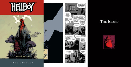
Strange Places: The Island
Words & Art: Mike Mignola | Colours: Dave Stewart | Letters: Clem Robins
Originally published by Dark Horse in Hellboy: The Island #1 & 2 | June & July 2005
Epilogue - Originally published by Dark Horse in Hellboy - Volume 6: Strange Places | April 2006
Collected in Hellboy - Volume 6: Strange Places | Hellboy Library Edition - Volume 3 | Hellboy Omnibus Volume 2: Strange Places
Plot Summary:
Hellboy emerges from the depths of the ocean to a crag of wrecked ships and navigates an island of ghosts, ruminating on who he is, who he was, and who he’s meant to be.
Reading Notes:
(Note: Pagination does not represent anything within the issue or collections themselves, it is solely in reference to the chapter.)

pg. 1 - The bleakness in these panels from the white skies, white water, the faded colour to the gulls and the ships, this feels like purgatory. In his introduction to this story, Mike Mignola said that he was inspired by William Hope Hodgson’s Sargasso Sea stories, which explains the setting, but this feels so much further removed from the world. That Hellboy has landed himself in a no man’s land.
Also, I think a potential interpretation of “The Third Wish” and “The Island” is to see them as two parts of the death and resurrection of Hellboy. Maybe not literally, maybe so, since everything here seems to be an existential exercise. In the former, you could see Hellboy going to a “hell” in the underworld of the sea and the final panels are vague enough that he could have drowned. Then in “The Island”, his soul is traversing this kind of purgatory, facing his demons and angels, while searching for a way to exist again.

pg. 3 - Absolutely stunning work from Mignola and Dave Stewart. The fading, distant sunset just adding to the feeling that wherever Hellboy is, there’s soon to be no light or warmth.

pg. 4 - This is a nice summary of the last story. The appearance of others is certainly strange.
pg. 5-6 - The sea shanty, what’s actually looking more like flaming mugs than just sloshing ale, and weird orange colour definitely give it a feel that something’s wrong here.

pg. 7 - And there’s the rub. You do wonder, though, if Hellboy’s drinking with ghosts or if his loneliness and drink have him hallucinating happier surroundings.
Also, I just love the presentation here. The layout for the page and bottom tier’s grid is just interesting.
pg. 8 - Hecate’s looking a bit different from her last appearance, but it’s interesting to see her here to lay claim on Hellboy. The moon in the background is a nice little hint to her identity, if anyone was confused at the onset before she’s explicitly named.

Also, like the monkey with a gun panel, this is probably one of the funniest sequences in a Hellboy comic.
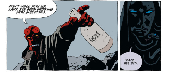
pg. 9-11 - Hecate’s reasoning for Hellboy to join her is kind of weird, reiterating a binary choice that Hellboy himself has rejected the notion of before.
That’s also probably one of the creepiest, most terrifying “I want you inside of me” propositions from a woman...or iron maiden. Somebody should probably do a study of the sexual innuendo in Hellboy and how awkward and strange much of it happens to be.

pg. 11 - Hellboy atop the cliff, tossing away the rum bottle, discovery of another skeleton, and then fade to black is probably one of the scenes in this story that most reminds me of The Seventh Seal.
pg. 12 - And then things possibly get stranger. Being unfixed in time and place give you a lack of orientation literally, so the appearance of a castle randomly on this island is even an odder prospect.

pg. 13 - When has Hellboy ever done the “sane” thing?
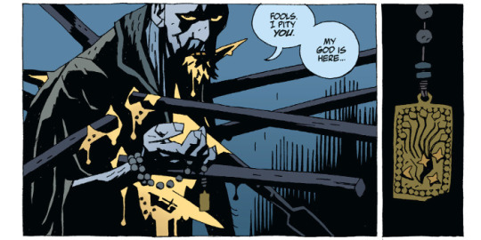
pg. 14-15 - Like the castle, the appearance of the priest, knights, and the man they’re judging as a heretic is hard to place, unexplained, making you wonder if it’s something currently happening, something that has happened previously and we’re just getting a flashback, or what.

pg. 18 - Sudden monster appearance is sudden.
pg. 19-21 - Impressive battle, though there’s an interesting level of futility that Mignola introduces through referencing Moby Dick. That Hellboy is losing himself in continuing this battle.

pg. 22 - Yeah...grievous impalement probably isn’t good.
pg. 24-25 - I definitely seems more now that the bit with the priest is in the past. With the heretic telling the priest that he’ll rise again some time in the future.
pg. 26-27 - The juxtaposition of the heretic’s words in the past over the events in the present with Hellboy are well done. The art as well is just phenomenal. The darkness, the spot colours of red, the designs for the sculptures and decorations, the resuscitation of the old heart, you kind of just have to stare at these pages a few times to take it all in.

pg. 28 - Aside from just looking cool, there are also possibly some hints as to some of the story elements in what otherwise may just seem like random images.

pg. 30 - Mohlomi’s reappearance is certainly interesting. Especially serving as a kind of psychopomp for Hellboy. It makes you wonder if his role even in “The Third Wish” was merely a passive guide, ferrying Hellboy from one place to another.
pg. 31 - I absolutely love that the heretic has taken Hellboy’s colour scheme, along with his blood. It helps reinforce the idea that this is an assumption of Hellboy’s life and destiny, that he’s basically stolen everything of Hellboy’s existence to spur his own resurrection. And in doing so, Hellboy’s colour has faded and left him grey.
There’s also a visual similarity to the wound pattern and silhouette of Rasputin. From a conceptual standpoint, it sets up Hellboy against not just someone who has taken on his essential life spark to serve as a kind of doppelganger, but also a representation of his opposite.

pg. 32 - The heretic basically explaining it to us, and Hellboy just not having any of it is typical. Absolutely gorgeous art still from Mignola and Stewart.
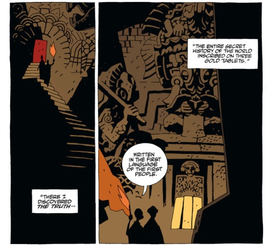
pg. 34 - The legend of those gold tablets (alternately copper in some tellings, I think, but mostly gold) is real. Again, it’s a testament to how Mignola tells a story, weaving in bits of pre-existing folklore, urban legends, mythology, occult, and magick with his own inventions to tell a bigger story.
pg. 37 - I find it very interesting that as soon as Mignola goes into the creation story for Hellboy, the constrained layouts and grids ends. Suddenly we get a full bleed page, something we’ve not seen often in the series. Visually, it signifies that something bigger is being told here, even if you don’t necessarily comprehend that on a first reading.

pg. 39-40 - And that full-page storytelling continues through with the creation of the Ogdru Jahad and their offspring.
pg. 41 - And just weird happenings regarding the creator race of Watchers and the one who basically constructed their “devil” in Ogdru Jahad, and how his bits and pieces ultimately come down to Hellboy’s conception.
pg. 42 - This conception of the creation of gods and monsters, of mice and men, is interesting. Even if predicated on a faulty understanding from Blavatsky.
pg. 44 - Just stunning use of colour from Stewart.

pg. 46 - And it gets woven back into the narrative that started in Seed of Destruction and is currently running through this narrative movement in BPRD.
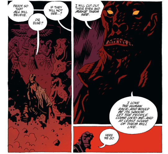
pg. 47 - It’s interesting that it always cycles back to the crazy. Delusions of grandeur and an attempt to run the world, to have it accept him as a saviour, anyone who disagrees be damned. It’s an interesting counterpoint to Hellboy, who doesn’t want to be a hero but tends to do the right thing just because it’s “right”.

pg. 50 - I love it when Hellboy provides his own sound effects.

pg. 51 - It always sucks when hurting the villain hurts you yourself. This mirror nature between the heretic and Hellboy is fascinating. It’s also interesting to see what effect Mohlomi’s trinkets are having.
pg. 52 - The heretic’s assumption of Hellboy’s “true” form, even as this nascent Anung Um Rama demon--though looking a wee bit more like Astaroth--is interesting. It’s a sign of a path not taken.
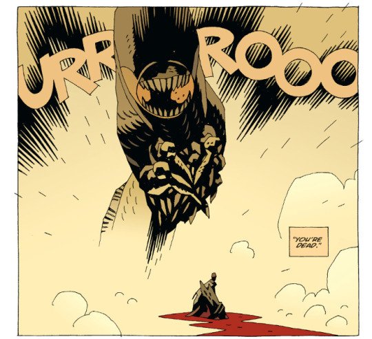
pg. 53 - Creepy worm is back.

pg. 54 - The heretic suffering as the worm creature thing dies is an interesting touch. Gorgeous artwork.

pg. 56 - After all that...

pg. 57 - Ominous hint of things to come.

pg. 60 - Love the use of the fairies and night creatures and whatnot again as a kind of Greek chorus for the epilogue.
Also a hint for what comes next in the main narrative, “Even now he is bound for England.” which I think picks up in Darkness Calls.
pg. 61 - I find it interesting that Hecate has apparently fallen silent, likely living by Hellboy’s wish for her to leave him alone (at least for the time being).
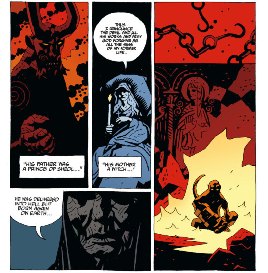
pg. 62-63 - Nice reiteration and reinterpretation of who Hellboy is.
pg. 63 - It’s also interesting as to just how much of Hellboy’s eventual fate is shaped just because this little hobgoblin, Gruagach, couldn’t handle his smackdown from being a jerk back in “The Corpse”.
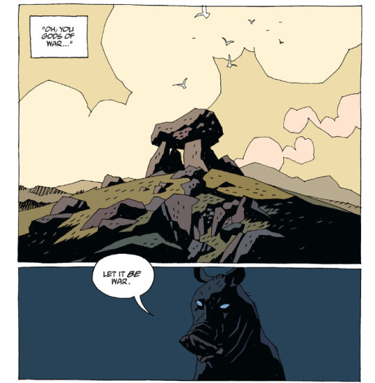
pg. 65 - Just let it go, pig dude.
Final Thoughts:
So...if “The Third Wish” was a fairy tale, Mike Mignola’s tragic take on Hans Christian Andersen’s The Little Mermaid, this is something else entirely as a follow-up, somewhere between The Seventh Seal and Black Narcissus. It’s bleak, distant, esoteric, and absolutely lush when it comes to its use of colour to set mood and atmosphere.
While it is a resumption of the origin cycle for Hellboy that has played out before in the narrative a few times now since Seed of Destruction, it’s also a bit of transference and confrontation of Hellboy’s destiny that plays out here. Where previous iterations may have been an emotional response and rejection, here we get a more measured physical and intellectual rejection.
This also feels kind of like a dry run for the storytelling approach that we’re going to eventually be seeing in parts of Hellboy in Hell. This story definitely takes us to some strange places.

d. emerson eddy is just a broken machine, with all the layers of dust some things have started to fail. Some things. Some.
2 notes
·
View notes