#this was a super fun experiment with thicker lineart and other stuff
Explore tagged Tumblr posts
Note
Hi! I wanted to ask for advice on finding an artstyle, I've been drawing for sometime but I still dislike my style.
Thank you in advance :D.
Hi hiii
Whenever my artstyle gets kinda boring to me, I try asking myself questions to figure out what exactly is it about my artstyle that I don’t like. Things like what is it about my art that feels boring to me while this other’s artist’s work excites me? What makes me most insecure about this piece? What do my favorite artists do in their artworks that I don’t do?
This isn’t to put yourself or your work down, make sure to go out of your way to still note anything you like or are particularly proud of in any of your artworks, you work hard on your art and that deserves to be appreciated, even if your artstyle isn’t quite at where you want it to be yet! But this is mainly what I do to try to address reasons my artstyle isn’t giving me as much joy, and what changes I can make that might make me happier. Most of the time I can’t really put my finger on what it is that I dislike about my art, so I keep these questions in the back of my mind while I try experimenting through doodles and messing around with my style in each one. Have some doodles dedicated to things you dont normally try in your artstyle. Varying eye sizes and distance from each other, some doodles with different ways of stylizing noses, trying varying levels of realism vs cartoonishness when drawing characters, and trying different brushes if doing this in digital art. If any specific doodles jump out to you as kinda neat, take note of whatever you did in that doodle and try it more often!
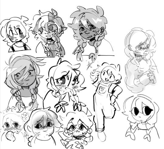
(Sorry i was doing this in a hurry but definitely couldve utilized more full body shots, varying poses, face at more side angles, coloring styles, would 100% reccomend experimenting with that too. But this is mostly what those batches of experiment doodles usually look like for me)
As always, it doesn’t hurt to also study other artists’s whos stuff makes you so happy and figure out what it is about their art style that excites you so much. Whatever that may be, think about if its something you want in your own art style and try replicating and practice doing it if you do want to take your art in that direction.
Quick example from me but november 2023 i remember starting to feel super uninspired with my artstyle. I asked myself what felt like the most unrewarding part of the process for drawing and realized the answer was my lineart. At the time I was seeing a lot of @/bixels ‘s artwork of drawing mlp characters as humans from the 1920’s americana and was so delighted by their lineart. I kept experimenting with brushes in my doodles and realized that using the gel pen reminded me somewhat of bixels’ art, so I took that and ran. It was a neat change after a while of having thicker lineart and actually having fun with pressure sensitivity and how the brush is able to taper.
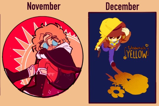
This is what i found works for myself so im not sure how well it applies to other people or if i worded everything well, but I hope its at least a bit helpful in some way!
#tldr main tactic for is asking myself questions on how i feel about my art and why i think i feel the way that i do#asks#moth talk#love u abi. she is one of my oldest oc’s and usually the one i draw for art experiments
50 notes
·
View notes
Text
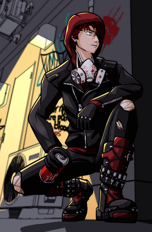
#rwby#rwby fanart#adam taurus#uat art#this was a super fun experiment with thicker lineart and other stuff#came out way more comic-book-y than i expected tbh and i'm vibing with it
131 notes
·
View notes
Note
How do you ink and color? Any tips? I love your art! 💜🖤
oh shit i got this ask months ago and forgot to answer
inking: god i hate lineart so much. the trick is to not do it 😂 unfortunately, i still find myself spending hours on lineart all the time @_@
the biggest thing i’ve found is making your lines varied in thickness. it adds to the interest. i also try to make my outside line thicker than my inside ones to break up the figure from the background. don’t be afraid to skips some lines and imply them with shading instead. i will color over my lines at the end to make them not as strong, but i’ve learned to still keep some lines black for extra emphasis.
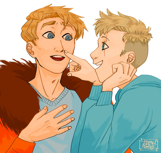
^ here’s one of my older pieces that i’ve been considering redoing. it has very little line variation, ALL the lines are colored so there’s no solid black, and there’s very little hard contrast in shading values. overall, it looks flat and uninteresting and if i had the time i’d redraw this one.
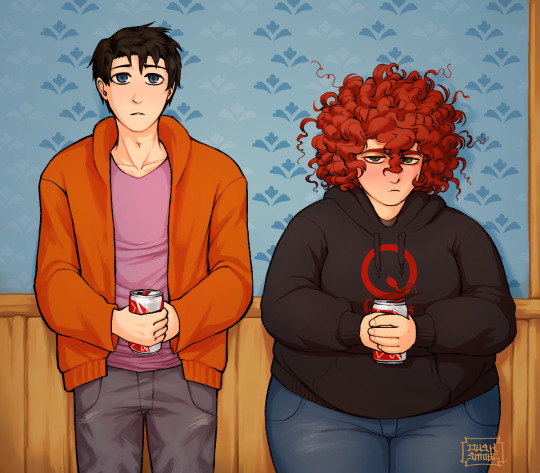
this is a more recent example of lineart that i think works a lot better. the characters are really well defined with a strong outline, but the inside lines aren’t harsh and distracting. you can see i recolored the lineart in kyle’s hair to be a dark red, and in some places it blends with the shadows to imply areas with more highlights. stan’s pants don’t have and lines in them, just the outside shape and pockets.
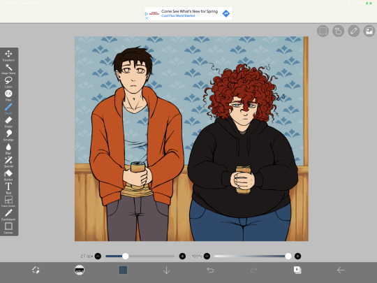
you can see in this wip what the lineart looks like before i do all the shading and fancy stuff. stan’s pants look totally flat and straight until i start shading.
a lot of the time though i won’t even do lineart, especially if it’s a big scenic piece. the more zoomed out less detail you can convey, and lineart takes up a lot of space.
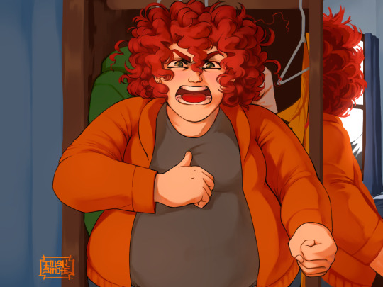
^ this piece is an example where i do both, lineart and no lineart. the mirror image of kyle isn’t the focus, and i honestly didn’t feel like going in and drawing exact lines because they’d probably look fucked up anyway. i typically don’t put hard lines in backgrounds because it would take FOREVER and just be distracting.
the one thing you do have to be careful of with lineless art is contrast. hard lines are good contrast that show you what you’re looking at, and without them your image can blend together.
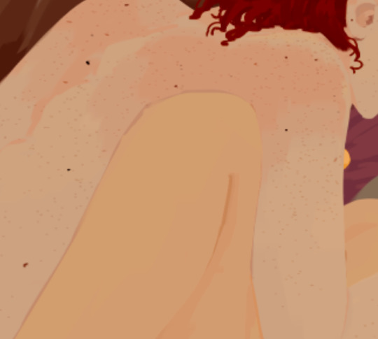
here’s part of a painting i did last august, when i was first experimenting with lineless styles (full image on my NSFW twitter). can you tell what’s going on here? i sure as fuck can’t. there’s no contrast, and it makes all the skin tones blend together in an unintelligible mush.
contrast has always been one of my biggest weaknesses as an artist, so i’ve been trying to improve over time. here’s a more recent lineless drawing:
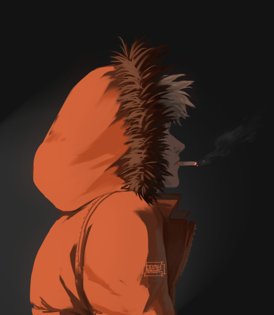
this one works because it had high contrast. the highlights are really bright and the shadows are really deep. you can still make out the facial features too, but there’s no ‘lineart’ layer’. everything was painted on in the same layer.
-
-
coloring: oh my god i love coloring. it’s my favorite part of drawing and the reason why shit takes forever. a lot of the same stuff from before comes into play, like contrast. you can also portray some really interesting moods based on colors if you’re being stylistic, but also pay in mind to your environment.
i always color my background first. in fact, a lot of the time i’ll do the entire background before coloring a piece. the environment establishes your light levels and light source, and it’s typically easier for me to tweak colors on a figure than the ones in the background. in the above example with kenny, the background is a mostly solid black with a beam of light from the left. i picked kenny’s colors to fit in this environment.
it’s also important to use references.
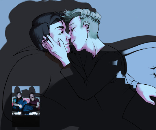
you can see in this wip i’ve got a reference image for how light from a TV looks against figures and the way their shadows are cast across the wall. it also helped me figure out what colors to use in this situation.
a lot of coloring is just trial and error to see what works. i usually start with a flat base color and add value to it. if you put all your colors on different layers it’s really easy to change them quickly.
here’s an example:
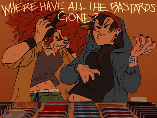
i got my base colors down and here i can see the skin tone is blending with the background, so i lightened it up for better contrast
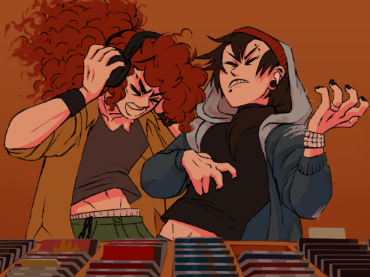
i typically shade the skin first, then clothes. you can see here i did a dull skin tone with a bright colored shadow. this adds more contrast and interest. i always try to avoid doing dull shadows where you shift toward black. black shadows are really uninteresting and they can make your piece look muddy. i’ll typically shade with an orange, red, blue, or purple.
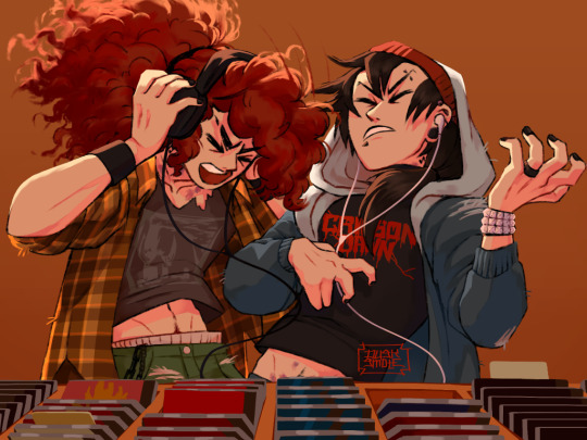
the final piece has a really bright highlight on it coming from behind. this just adds more visual interest and contrast. you can also see i’ve gone back into the pink shadows and added an even lighter, brighter peach value in places to show reflected light. this also gives the darker pink shadow an added outline effect, because it touches the base skin tone but looks lighter within.
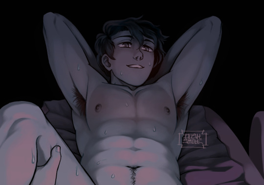
^ this one’s a good example of light and shadow (full image on my NSFW twitter lmao). there’s not a lot of color because it’s dark out, so everything had to be conveyed in values. there’s hard light across the stomach and then a shadow over the chest, but there’s still light being reflected up into stan’s face that lets us make him out. the rest is deep shadow and unimportant, so it’s all black.
that’s the other part, color and value determine where your eye is gonna look, so consider that when drawing.
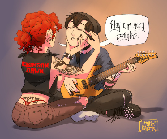
^ consider this piece i drew like a year ago. it has a lot of blues and reds, and originally i was going to make stan’s guitar blue. i don’t have the wips anymore, but it didn’t stand out and it didn’t look right with the image. after a lot of playing around i went with yellow because it’s bright, it breaks up the image, and it adds another color to the piece to balance it out.
the same thing happened when i was working on the cover image for What They Say About Us.
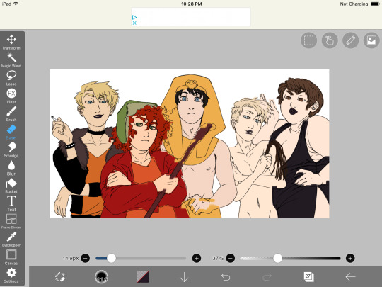
you can see in this really early wip that i’d blocked in the colors and butters is totally naked. for one, i was like “damn that kid is WAY too naked in this image” and he also blended in with stan and cartman. additionally, there was a lot of warm colors on the left, a lack of color on the right, and an overall lack of blue.
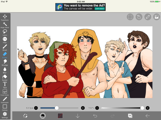
first change i made was throwing a shirt on him and it made a huge improvement. the image looks much more balanced now and he’s not super distracting with his naked-ness.
other than that, coloring is just picking your base colors, blocking in shadows, adding highlight, and cleaning it up. if you wanna improve, look at photo references. look at other people’s art and examine how they use color and value. practice practice practice. have fun with it. the most fun i have coloring comes from figuring out interesting textures like the pharaoh headdress or kenny’s leather jacket.

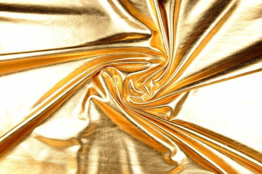
i find stock photos like this and study them to see how the light works
other than that, the rest is just playing around, seeing what works, and making things up as i go!
70 notes
·
View notes