#this probably wasn't the best pic of dan to use lmao but! what can ya do!
Explore tagged Tumblr posts
Text
long-awaited icon tutorial!
i’ve had several people ask me how i make my icons, so i decided to give y’all quite a lengthy, super detailed tutorial on how i create them ^-^ ~having basic photoshop knowledge is expected~
i’ll be showing you how to make this

i’m using this screenshot here :)
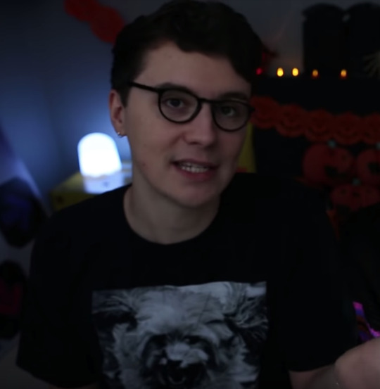
first i like to colour. i use a base colouring that i alter depending on the image you wanna make sure the skin is lightened — especially for this particular image bc dan is shrouded in darkness be sure to use adjustments such as Exposure > Gamma Correction & Levels bc they will be of great use in livening up the picture.
after that, you’ll want to cut your image out with the Quick Selection tool on the left hand side of your screen then you’ll essentially just be holding & dragging over your subject until all of it is selected
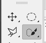
SIDENOTE: ~ if you find that the tool is being troublesome in selecting your image, you can always erase around it by adding a Layer Mask. (select the paint brush to do this) erasing this way is more time consuming though ~ [THIS IS A LAYER MASK BTW ↓ ]

in this tutorial though i’m demonstrating with the Quick Selection tool :)
once dan here is selected,
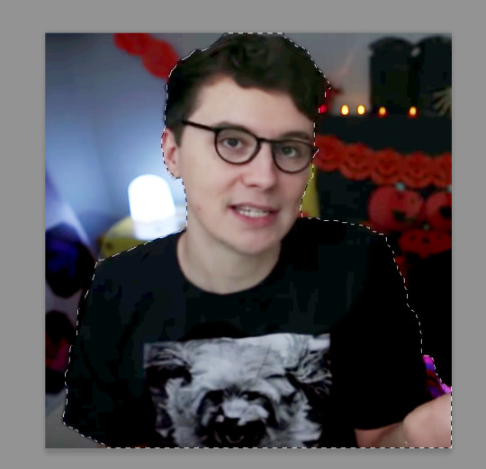
you’re going to right click the image and Select Inverse
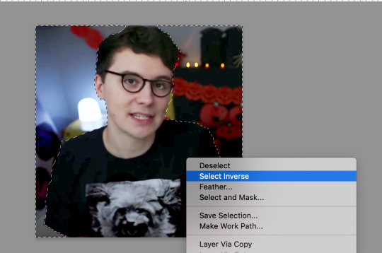
as you can see it has also selected my background automatically. now all you gotta do is press COMMAND X (ctrl x for windows i think) and it should remove it
now i’m left with this:
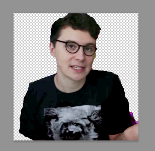
because this was a pretty dark pic with a low resolution background, it made it harder for the tool to make an accurate selection. so, as you can see, i’m left with a lot of impurities
but! that’s ok! because now you just gotta add a layer mask to this image and use the paint brush tool to erase
layer mask:

brush tool:
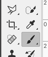
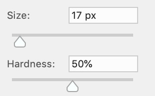
erase around ur image until the the edges of it are smoother. i recommend not having too harsh of a brush setting for this i had the hardness set at 50% and alternating the sizes throughout
after the erasure this is what it looks like:
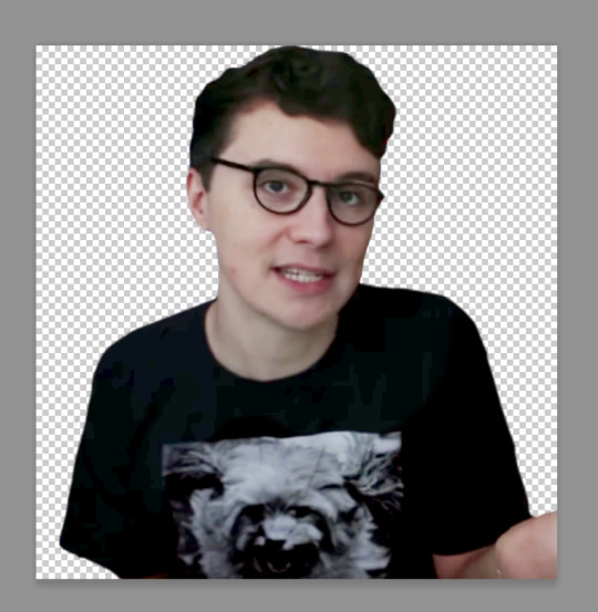
this next step i incorporate because it means i have an even smoother, feathery outline to my subject.
i’m going to delete the layer mask i just had beside my image, use the quick selection tool again, select all of dan and ~then~ at the top of the screen should be this setting:

this should take you to a page where you can apply several alterations to your masking. as i said before, it creates a softer outline! i am always changing up the settings but for this particular icon, these were the values i used:
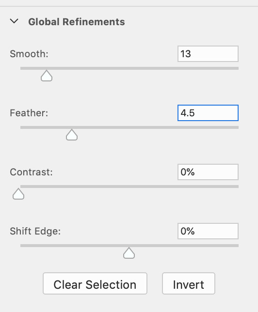
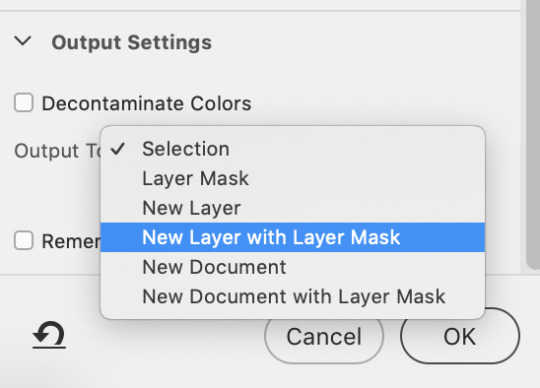
and below i just make the choice of a new layer with layer mask (just incase u wanna erase anything on ur layer mask after) hit OK when you’re done!!
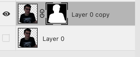
this is now what your workspace should look like on the right and the result of the extra masking:
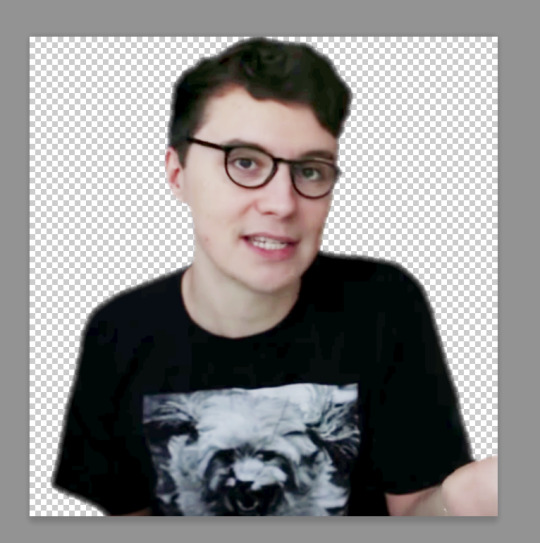
righteo!!! now that’s done it’s time to ensure my canvas has a 1 x 1 ratio (square) and by doing that u can just drag the crop tool outwards or go Image > Canvas Size > Pixels > and make sure the dimensions are the EXACT same. Now that your canvas is square, move your subject around until you’re happy with the placement.
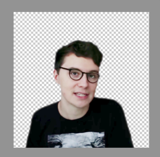
now is a GREAT time to save your work as a .psd, because the step after this takes us to the next stage and you won’t be coming back from there. so, make sure your work at this point is saved!!!!
the next step you’ll be highlighting all your layers, right clicking, and Converting to a smart object. this just compresses everything to one layer basically.
NOW, go to Image, Image Size, type in 128 x 128 and click OK.
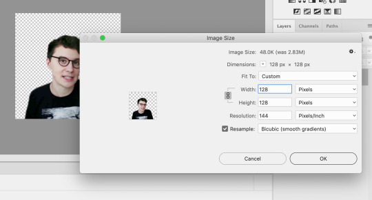
this downsizes your icon a considerable amount, to the specific set tumblr dimension now it’s pretty simple from here on out, i add some extra adjustment layers on the image such as Vibrance, Brightness, Selective Colour, Colour Balance and Levels just to make everything pop a little more now that the image is smaller. (and then compressing those + the image again to a smart object, before adding a background)
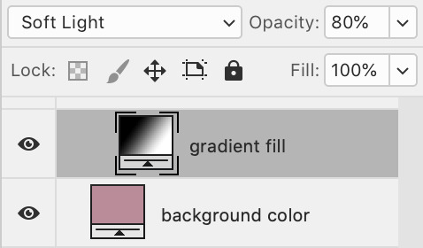
when adding a coloured background with a gradient, i add a black and white gradient map above my background colour, and set it to Soft Light at 80%
this next step i’m going to add in is mainly for images that lack the colour you want due to darkness, poor quality, etc. dan’s hair (for example) is something that doesn’t show up with vibrancy a lot of the time so i’m going to show you how you can bring those features out more.
i add a new layer right above my image

go over to my colour picker a select a rich brown colour i can paint over dan’s hair. (#853e25)
it looks pretty ridiculous, but...
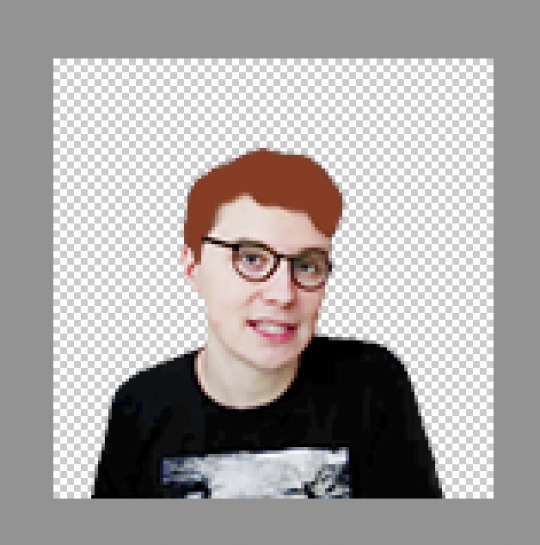
i then set this layer to Colour, 52%
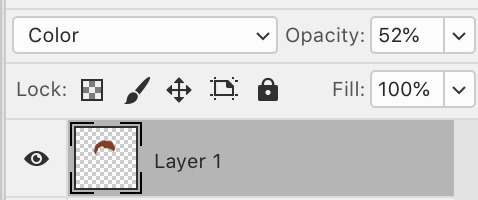
i also want to make his skin stand out a little more, so i repeat the same process as just then, with a new layer, and a skin tone colour instead.
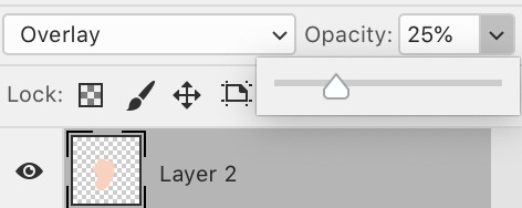
this is now set to Overlay, 25%
you can also use this step for any features, it works on clothing too! generally with the setting Soft Light.
these steps + more colouring this is what my icon now looks like :)
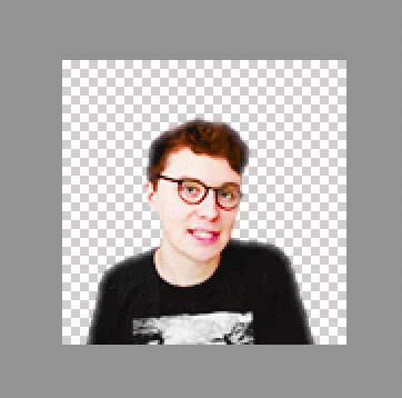
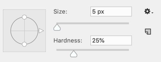
i also further softened the edges of my icon, you can do this by simply using a small, soft brush on a new layer mask with these settings & going around the outskirts
OR you can use the quick selection tool again (make sure your coloured background is unchecked at this point so ur background is transparent) and repeat the process from earlier by going to Select And Mask and softening it a little there!
now add a coloured background if you haven’t already + a gradient if you wish!!
This is the final step i do, especially if i’m making an icon where either dan or phil are wearing black which happens a lot with dan rip
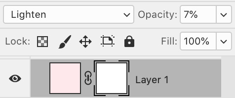
i add on a colour fill layer of pink with a low opacity to kind of make the black of his shirt look less intense. (you can use whatever colour based on what you choose for your background - just make sure it’s super light!)
setting here: Lighten, 7%
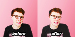
do you see how that simple adjustment kinda just makes it look a little less contrasty?
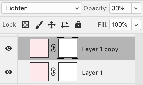
now i’m going to duplicate this layer once more, only i am going to be erasing on the layer mask and changing the opacity to around 30%
my icon now looks like this:

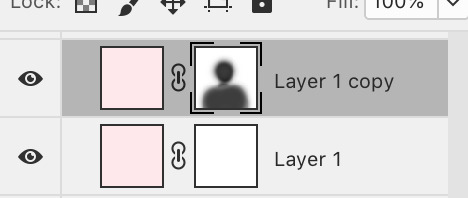
so i’m going to be erasing dan’s body on this layer mask very lightly with a medium sized brush with hardness between 0-10%. over on your colour picker once you’ve selected the layer mask (like above) instead of black, i’m going to change it to a dark grey and erase with that.

when erasing, try not to erase right to the edge of your subject, let some of the pink (or whatever colour) blend into the image because it overall makes the image softer and less contrasty
this is the result, it’s subtle but yeah
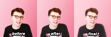

and that’s basically it! if you have any further questions ask off anon here :)
#icons#tutorial#there's probably typos. don't yell at me. i'm dumb#and tired#this probably wasn't the best pic of dan to use lmao but! what can ya do!
65 notes
·
View notes