#this one was an appeal and they got cute pixel art so I was like sure
Explore tagged Tumblr posts
Text

Cute Rinko pixel art by もち! 🍓
#sasashi rinko#original character#silver comms#this one was an appeal and they got cute pixel art so I was like sure#I was expecting one of the other formats they do but this is cute too so it's ok
7 notes
·
View notes
Text
I spent most my entire day yesterday playing Tales of Mistria. (For the first time.)
For context, none of the other Farming Sims have really done much to convince me to buy them. And I don't even go back to my modded Stardew Valley saves.
You all have no idea how much I needed a fantasy farm game with a Dragon Guardian spirit and a Dragon themed Tavern.
The cast of characters that actually feel like a community remind me that the number of people I actually play and share video games with has shrunken dramatically since coming out as trans.
The main sibling I talk about Stardew with has been kinda unavailable lately. So you're gonna receive my posts instead.
The pixel art, customization, and how immediately available the community's resources are really appeal to me. No needing to upgrade a house to start cooking.
So much of the cast shows up for each little stage of progress. Characters drag us from scene to scene as we ask other members of the community for help. No dialog will play as the dog walks up to my avatar, receives pets, and returns to his lil cushion all independent of the unfolding dialog. It's just a cute thing happening on screen that sells the world and its characters.
I can even get perks that make my cooking sometimes considered a universal like by the townsfolk. Which means a lot to me, because I like to cook food I like to eat and share it with others.
I'm really glad this game exists.
I think I might be playing a lot of it.
Hopefully no one minds if I share a lot of my experience with it.
I... really like taking screenshots but don't wanna drown my partners' DMs.
Anyway, here's my cute little horned Fray (She/They) with the progress I have made on my home throughout the first season. I've got a new bed and rug pattern. I have just yet to set aside the personal time needed to craft them when my focus has become breeding chickens and expanding the amount of farmland available for Summer crops.

22 notes
·
View notes
Note
I've read your addition to your post about the fatphobia and ableism inherent in Wall-E. In the last sentence, you say something like "I could go on about how I'd fix [the film] but this post is getting too long."
If you haven't done so already, could you please post your thoughts about how you, personally, would rewrite Wall-E to get rid of the fatphobia and ableism? And also, do you know of any similar media that gets its messages across in a better way?
(this two month old ask references this three month old post)
thanks for writing in corey. hmm. good questions all around. lemme throw this under a readmore
unfortunately, having fat characters/actors in sci-fi is pretty rare. falls into the (bullshit and lazily written) presumption that characters can't do sick stunts or action shit if they're quote unquote overweight. if anyone can dispute this or has evidence against the contrary id love to hear some suggestions. if not for me for people like me who're looking to get into that type of thing
as for the first part of your question: ive been thinking about this for a while. there's a pretty big difference between what id like to write in order to make a compelling story and what would be easy to portray/fit into a movie-length easily digestible childrens movie, if that makes sense
seeing as wall-e is a movie about life, id like to see the humans on the axiom be given a bigger role. as of now, they're pretty heavily sidelined and reduced to fat jokes (even the captain, who's name is forgettable even if his personality and role isn't). wall-e is a product of its time; one of the first "big things" that had a strong concept of a post-capitalism ecological apocalypse (ironic now from the minds of disneypixar).
something that has definitely been left untouched in mainstream movies of this type is how capitalism and the government fucks over disabled people, and centering a concept around this idea without portraying people who use disability aids as lazy and privileged could be interesting i feel like.
i'm not entirely sure how this could be done, ill admit. im not a film student i do pixel art and reblog other peoples posts. but i'd really like to see someone smarter than me try. wall-e is a movie that's extremely dependent on the cute robots to do the heavy lifting moral-wise, so squeezing in anything apart from that while appealing to the disney audience would be difficult.
what i'd do personally is turn the inside of the axiom into a work of art.
700 years is a long ass time. the nature of humanity is to create. wall-e failed hard in that regard, showing us a snapshot of a miserable looking world where "everyone got dependent on technology to cater to their every need until they couldnt even move for themselves". that sucks balls and i dont agree with it at all LMAO. humans will always have a sense of boredom, a sense of drive. there will always be people who want change, who need something different that their environment can't provide for them. and it'd be up to them and their community to provide that change, not just the robots.
the beginning of wall-e sets up the idea that the affluent plan on leaving earth on spaceships to escape the trash-ridden world. a small scene with an ad showing the sad minimalist inside of one of these ships would be enough to introduce the idea of a boring cruise ship into peoples minds. i really enjoy the idea of contradicting this as soon as he makes it to the axiom: the doors, white and boring on the outside, open up into a brilliantly colorful banner-ridden repurposed hub for creativity. it would still scratch that "this place is so much different/cleaner than what wall-e is used to" itch that they attempted to do through the clean and sad capitalist hellscape they threw us ass backwards into
and to really answer the question you originally asked: i would show how humans on the axiom live. there's plenty of scenes of storybuilding showing how everybody brainlessly lived in these conditions for hundreds of years; i would replace those scenes with showing how people have changed the axiom since it's launch. and instead of relying on how it changed everyone to look like the same unoriginal blob, i'd highlight the differences between everyone. ways of life that would be necessary in order to live in such an environment.
people who have named their own accessibility robots and customized them, people of all different body types. people who need canes, people who prefer the chairs. lifts with space for hoverchairs, benches and rest stops and signs about how to exercise properly without hurting yourself in gyms. people walking with difficulty, people of different ages, people who've identified others as friends and family who can help out with their disabilities. people who are actually human rather than props, you know? if you think that's too much to ask for or unrealistic fuck off, cities are like this every single fucking day. go outside and admire the strangers in your everyday life.
it would still scratch the itch of "everyones mindset has changed" without it being "everyones mindset has changed for the worst". wall-e is about hope, goddamn it, where's the fucking hope for humanity?
there's still innovators, there's still scientists, there's still people with fucking hobbies and honestly it's disrespectful to think that nobody would know about how life used to be on earth. there's still going to be historians, there's going to be people who want to help those around them, theres going to be people who want better for themselves and others. 700 years is an insane amount of time. god damn.
ok tldr cause i went off again: the way id rewrite wall-e to combat the rampant fatphobia and ableism is not by removing the reliance on mobility aids and fat body types, but by normalizing and highlighting the everyday use of mobility aids and showing the different lifestyles different people partake in day-to-day. basically doing the opposite that wall-e did for us. i know for a fact that there is absolutely no way that every human in a ship of a few thousand would all have the exact same mindset, all id do is highlight these differences and show how things have changed for the better since the capitalists who made their prison died out. yknow
it mightve been too much to ask for in 2008 and itd probably be labelled by way too woke for people with no brains but that's what i've got
thats it thanks
#.txt#questions#wall-e#yeah sure ill put that in there#dont make me regret it#also this was my 81800th post. not a noteworthy landmark of a number but nice to look at nonetheless
2 notes
·
View notes
Text
I think if I were to design my own ideal virtual pet I'd want it to be like a cross between tamagotchi, digimon, animal crossing, and pokemon.
I think the core of Tamagotchi and Digimon is what's most important to me about virtual pets. Feeding, playing with, cleaning up, keeping alive/healthy, and watching them grow and change into exciting new forms. When you take out feeding and minigames it loses a lot of appeal, which is why the vital bracelet and digivices don't do a lot for me.
Digimon has a bit of edge to it with more fierce designs and battling, but it really has not advanced much since it debuted. It's thoroughly stuck in the 90's. Yeah there was the vital Bracelet but again, that's hardly a virtual pet. Tamagotchi on the other hand has a lot of features. Multiple minigames to play, the ability to get new backgrounds, accessories, items, currency, travelling, online multiplayer, NPC encounters, shops, there's so much to it, it's kind of ridiculous. I genuinely hope the next Digimon device is a color screen that's a significant leap up from the Digimon X and Pendulum Z. I digress though.
Tamagotchi was very appealing to me or it's diverse line up of critters when it started. I feel like some of the diversity got lost along the way and everything ended up looking like a Sanrio knock off, even the "Bad care" adults who were supposed to look kinda ugly and mean ( but still kinda cute ) ...Digimon has the opposite end of the spectrum where almost nothing at the end of the evolution charts is cute, and in fact, most of them are not even monster like and tend to be humanoid, or they look mechanical.
That's where Pokemon comes in because I'd love an art style influenced heavily by early pokemon, which I find strikes the perfect balance between cute and cool, with some designs leaning one way more than the other. Hell, the thing that drew me to pokemon in the first place is the language they used in one of the articles. "Raising your monster friend" "watch them grow and change" it led me to believe Pokemon was going to be a virtual pet in video game form. This wasn't the case, it wouldn't be until gen 6 that they added anything that resembled v-pet mechanics and even that was completely optional. But I still enjoyed Pokemon, at least in it's earlier years and it had a strong influence on my art style and creature design... also from pokemon, the ability to keep several pets at once, including storage, a small competitive single player campaign with a story, and maybe even the ability to trade. As for Animal crossing... just decorating your little guy's enclosure with furniture, and chatting or doing small errands for npcs, and having daily tasks to do, special events. I guess Tamagotchi is currently doing a lot of this, sans the errands, but I think they could take it further. I still want there to be a cute and cozy factor here, Digimon kind of lacks in this department I feel.
I imagine this would have to be a very advance device, it sounds like a larger Gameboy Advance game to me, and idk how big the rom size is for the most advanced virtual pets are right now but I can't imagine they're the size of MOTHER 3.
I'd still want it to be pixels. I'm not ready for handheld virtual pets to shift to 3D. I think that might kill some of the appeal tbh.
4 notes
·
View notes
Text
domino high school host club
this was a dumb whim i had a while back and will probably abandon, but i'm kind of enamored of the idea of duke and seto being friends who get into wacky schemes together. like many things in my backlog, i'm just going to throw this out there and see what the response is
It was the giggle that caught Duke’s attention. They looked up from the video game they’d been perusing and saw two girls from their class at the other side of the shop. Their names escaped them, but they lifted up their chin and smiled. Both girls ducked together, still giggling, and they grinned.
So, Domino. Duke’s dad had kicked them to the city last month to start attending the prestigious Domino Academy. Booted from their last school, it was this or a private boarding school in England. They’d shown up day one to school in their uniform with their long hair pulled back, pierced earlobes, and eyeliner on. It’d sent all the girls in their class into a tizzy. Surely it was just new kid exoticism, but no, their appeal had staying power. They dropped the game back onto the case and waltzed over to them.
“You’re in my class, aren’t you?” Duke said with a cool look.
The two girls giggled to each other again. They both still wore their Domino uniforms, bright teal blazers and skirts. One was taller, with cat shoes on her feet, and the other had her hair in a braid. Both cute and blushing pink.
“Hi,” the tall girl said. “I’m Junko. This is Hoshi. You’re Duke, right?”
“You caught me.” They tossed their hair back. “I didn’t expect to see such cute girls here.”
More giggling. Duke practically preened.
“Junko’s totally insane for this series,” Hoshi said. “We thought you might be too cool for video games.”
“My dad like owns a whole franchise of gaming shops,” Duke said. “All I think about is games. What series is it?”
Junko flushed bright red. “It’s really stupid.”
“It’s her favorite series,” Hoshi said.
Duke smiled at Junko. “Well now I have to know.”
“It’s called Kiss Academy,” she said, her face totally red. “The newest one released last week. It’s one of those games where you date people.”
“I knew it had to be,” Duke said with a laugh. “That’s so cute. I’ve never played it.”
“Do you play those types of games?” Hoshi asked.
“Sometimes.” They gave a shrug. “Like I said, all I think about is games. I think it’s cool to get invested in characters like that. It’s a whole other experience. Do they have it here?”
Junko took her copy of Kiss Academy in Bloom, the newest chapter of the hot series. Duke looked over the box art as she waited in line to make her purchase. The anime boys were certainly cute, emblazoned in pink uniforms as sakura blossoms whirled around them. Girls really went haywire for this stuff. Even Hoshi, who didn’t seem much of a gamer, pointed out her favorite boy to Duke. It was the goth one in a choker. They almost laughed out loud.
“Are you buying a copy too?” Junko asked as she took her bag.
Duke placed it on the counter. “Why not? If you like it, it must be good.”
Junko and Hoshi walked around the mall with Duke a little while longer until it was time to head home. Duke almost forgot about the game until they got back to their apartment. Takeout sushi in hand, they fiddled with their phone a while before dumping out their purchases for the day. Their dad may be pissed, but his credit cards still went through. Sorting out the clothes and the comics, they found the game and popped out the cartridge for it. They booted up the game and downed spicy tuna as the pixelated loading screen came into view. Along with the art of the titular Kiss Academy gently blowing sakura leaves in the background, a soft and gentle soundtrack started playing. Okay, Kiss Academy. Show them some boys.
Duke didn’t really expect much out of the game. They played strategy and RPGs with complex character customization and a load of cute outfits to buy. Not that they’d never fallen in love with a video game character. But hitting A to talk and follow dialogue trees wasn’t really up their usual creek. But it’d been nice, chatting with Junko and Hoshi. And it wasn’t like the boys weren’t cute. They grabbed a sparkling water from the fridge and started the game.
Here was the thing. Duke didn’t expect the game to be good. They just wanted to talk to Junko about something in class tomorrow. They definitely didn’t mean to open the games’ wiki and look up what stats they needed to get a kiss around here in Kiss Academy. They didn’t mean to open a tab about the deep lore of one of the series mainstays, nor learn his tragic backstory before it was time. They didn’t mean to spend the whole night in their living room curled up on the floor as they hit A through the dialogue trees trying to hunt for the secret ending. They definitely didn’t mean to sleep through their alarm the next day with the game ending screen still on the TV as they rushed to get on their uniform.
This wasn’t supposed to be their whole personality.
School was a droning series of lectures that did nothing for Duke’s vibrant mind that morning. They sat hunched over their notebook as they wrote out ideas. Kenji was cute and they’d fallen down Isamu the kendo captain’s path twice, but none of the characters had the edge they were looking for. It needed bad boys with a heart of gold and unattainable hotties that talked down to the player. They sketched out the idea for a board game, or maybe a deck building game, with archetypes gaining points and power. They couldn’t quite see it in their head, and by lunch time they were doodling aimlessly.
“Did you like the game?” Junko asked over their shoulder.
Duke beamed a winning smile up at her. “You know, I think I did.”
“You drew Isamu here,” Hoshi said with a giggle. “Junko was wondering if you even liked girls.”
Duke dropped their pen on their desk and sat back. The dreaded question. Since they were young, it’d always been ‘are you a boy or are you a girl’, and the answer had never been extremely obvious to Duke. Now that they were dressing up more, wearing the makeup, painting their nails, everyone assumed they were gay. Duke didn’t have an easy answer for them, so they relied on their charm.
“I like Junko plenty,” they said and winked at her.
Junko’s face flushed. She pointed to the paper, quick to distract everyone. “Isamu kind of looks like the kendo captain here. You draw their hair the same.”
“He’s not captain anymore,” Hoshi sang. “I heard he got banned for fighting.”
“He didn’t get kicked out of school?” Junko gasped. “It’s because his family donated all that money I bet.”
“Who’s this?” Duke asked, happy to have the gossip be on someone else.
“You’ve probably heard the name before,” Hoshi said. “He’s in the class next door. Seto Kaiba.”
Duke sat straight up. “Sorry, did you say the Kaiba heir is here right now?”
Junko gestured to the wall behind them. “Next door, yeah. He’s kind of a jerk.”
“Riko gave him a love confession last year,” Hoshi said. “Then she dropped out of school entirely. Never to be seen again.”
“He didn’t kill her,” Junko said.
Hoshi whistled a note. “Maybe.”
Duke tapped their pen to their notebook. “Would you say he’s the cold and silent type that occasionally talks down to you?”
“Occasionally?” Junko huffed. “Try all the time.”
“Everyone tries to get to know him,” Hoshi said. “The Kaiba Corporation is literally headquartered in Domino. And everyone knows when he turns eighteen he’ll take over the company. But he quit all his clubs and doesn’t talk to anyone.”
“I’m learning so much,” Duke said. “And he doesn’t hang out with anyone?”
The two girls shook their head. The wheels were turning in Duke’s brain.
“I bet most people would lose their minds for a chance to talk to him,” they said. “I bet he gets lots of love confessions too.”
“Only from the girls who never talk to him,” Hoshi said. “Not like Bakura.”
Their pen scratched against the paper. “Who’s that?”
“Ryou Bakura,” Junko said with a sigh. “He’s, like, the cutest boy in school.”
“Very mysterious,” Hoshi said with a giggle. “He can be a little spooky sometimes.”
“No after school activities either.” Junko shook her head. “All the cute boys are so busy.”
“You haven’t joined anything yet, right?” Hoshi leaned over Duke’s desk. “Junko is in the photography club, and I’m on the school events committee. It’s basically the best job.”
“You know,” Duke said as they slapped the cover of their notebook shut, “you two have really given me a lot to think about. I should check out the club situation.”
“Right now?” Junko asked as they stood up from their desk.
“Right now.” They grabbed their bag and slung it over their shoulder. “Don’t worry. I won’t be gone too long.”
They tossed her another wink, which sent Hoshi into a fit of giggles. They took that as a chance to escape. Apparently this school was brimming with eligible bachelors. They popped into the hallway, where several students were relaxing by the windows or walking to meet up with friends. Duke paused by the door to the class beside theirs. It was propped open, and the those that ate at their desks remained, while a few groups of students chatted with each other. They scanned the crowd of ho-hum nobodies and stopped when they saw a tall figure in the back corner. A laptop was open in front of him as he typed away, his head down in focus. Hoshi was right, he bore somewhat of a resemblance to the kendo captain of their dreams, if he had more muscle to him. He looked lean and skinny in his uniform, and the mess of dark hair brushed over his eyes. But they caught a glimpse of that focused expression, the wide blue eyes, the narrow pupil, fingers flying away.
Okay. They could work with that.
They turned away and ran straight over someone. Books and papers dropped to the ground, and Duke nearly bowled over the person. They managed to collect themself and readied an apology when they stopped. In front of them was a lovingly crafted expression of hair. Curly black hair linked together in violet ends with blonde streaked bangs that flopped over large eyes. The school uniform was undone with a black shirt underneath and a heavy black choker, and winged eyeliner just to steal their whole look. The offending student scrambled for his books, and when he looked up to stutter out an apology, a grin stretched across his face.
“Oh my gosh,” Yugi said. “Duke!”
“No,” Duke said and turned on their heel to march away. To their horror, he followed.
“I didn’t know you were going to school here!” Yugi said, keeping a step behind them. Curse his little legs. “I haven’t seen you in forever. How’re things going? How long have you been in school? Do you wanna eat lunch together?”
“No,” Duke repeated and squeezed their eyes shut. “No, no, leave me alone.”
“It’s really cool that you’re going here! Have you made an friends yet? Are you in any clubs?”
No, no, no. The last time they’d seen Yugi Muto he’d been receiving a prize that should’ve gone to them, and then throwing it in their face. Years and years spent chasing a golden ticket that went to someone who didn’t even want it. Of course he was at this school. Why wouldn’t he be? Everything had been going so well so far, it was bound to crash and burn.
And as if things couldn’t get any worse, the door to the stairwell swung open, hitting Duke directly in the face. They were so disoriented they didn’t even realize they’d fallen to the floor until the room stopped spinning. Sharp pain punched through their nose. They clutched their hand to it, feeling a few drops of blood escape.
“You stupid idiot!” they shouted. “Watch where you’re going!”
“What did you say to me?”
They looked up and sucked in a breath. The guy standing over them was large, heavy underneath the unbuttoned uniform, with an uneven shag of bleach blond hair that was already dark at the roots. His hands were back in his pockets, foot keeping the door propped open, with a bandaid across his right cheek. A cloud of cigarette smoke whirled around him. This was the kind of guy who could and would beat the absolute shit out of Duke, unless they kept their mouth shut.
“I said watch where you’re going,” they snapped. Keeping their mouth shut had never been their strong suit. “You almost broke my nose.”
“I can break more than that,” he said with a grin.
“Hey, Jounouchi!” Yugi chirped.
The big guy’s eyes moved to Yugi. He gave him a once over before shaking his head.
“Tell your friend to look out,” he growled and marched away.
Duke slapped Yugi’s hand away as he tried to help them up. The big guy trekked into the same classroom Duke had just been peeking into. Struggling to their feet, they wiped the blood from their nose and picked up their messenger bag.
“Can you do me a favor, Yugi?” Duke asked.
“Sure,” he said. “Anything.”
“Leave me alone,” they snapped and let the door swing shut behind them.
That night, with the game music of Kiss Academy still playing on the TV, Duke did some research. A few business blogs gave the cut and dry story of the Kaiba ascension, but a little digging online found even more. Duke took notes, made a coffee, sat down at their table, and they started a plan.
—
It turned out the best thing that happened to Duke’s popularity was their run in with Jounouchi. All the girls gathered around Duke the next day to view the bruise on their face.
“He’s totally insane,” Hoshi said. “He threatened one of our event coordinators.”
“I heard it was a teacher,” Junko said. “And he slashed the tires on his car.”
“I can’t believe you stood up to him,” Hoshi said. “You’re, like, the bravest person we know.”
“It’s really not a big deal,” Duke said. “He just threatened to break all my bones.”
The girls all gasped and fawned over Duke. The class was in their athletic uniform, but Duke still wore the blazer and pants. No way were they undressing in that locker room. A round of doctors’ notes took care of everything.
The girls raced off to join the other two classes, and Duke blew a kiss after them. Making their way to the bleachers, they settled into a seat with their notebook in hand. It was easy to distract themself from the whistles and stampeding feet on the track below them. It might’ve been an otherwise boring hour, if they hadn’t glanced up in time to see Seto Kaiba also taking command of the bleachers. He had his laptop in front of him, still plugging away.
Duke grinned. This was the perfect opportunity. Folding their things into their bag, they strolled up the metal steps to slink into the row behind Kaiba and propped their feet up beside him. They saw his eyes glance their way. His fingers didn’t stop moving.
“Ask me what you’re going to ask,” he said. “I don’t have all day.”
Duke eyed the laptop over his shoulder. Emails and messages piled on top of each other.
“Are you working right now?” they asked.
His hands kept moving. “I like to know what’s going on in my company.”
“I heard you won’t get it until you’re eighteen,” they said.
He stopped typing. Looking back at them, he said, “Tell me what you want.”
“I bet you get proposals from every halfwit.” Duke curled a hair around their finger. “Is it true you kicked a girl out of school?”
His brow knit together. “What? No. Is this about the girl with the love letter? Her family moved.”
“Is it true you got kicked out of kendo club?”
He grit his teeth. “They thought my training methods were too strict. Only one person was hospitalized.”
“And not a single girl wants anything to do with you.”
“What would I care about that for?”
Duke let the curl spring and grinned. “You’re missing a grand opportunity here.”
“Here it is.” Kaiba rolled his eyes. “Go on with your pitch.”
“I’m not pitching you to become business partners,” they said. “I want to become friends.”
Kaiba closed his laptop screen and stood. Duke jumped up as well.
“Okay, okay,” they said. “That wasn’t entirely true. I think a man like you has access to power and resources I don’t, and I have a really stupid idea forming. But I know what you don’t have.”
He turned to look at them. On the bleachers, with him two steps down, they were almost the same height.
“What’s your name?” he said.
“I’m Duke Devlin,” they said.
He scoffed. “Not a prestigious family name. What exactly is it that you do?”
“My father owns a successful games franchise,” they said, only a little defensively. “I’ve released two licensed games under the Mr. Clown name.”
“Oh, good.” He took a step up. “A clown. Your family runs a mildly successful toy shop for children, and you think you can tell me what it is I don’t have? I am thrilled to hear what you say next.”
Duke looked up at him, still grinning from ear to ear. “You’re so exactly who I was looking for. Do you know what I have that you don’t? Social capital.”
“Ah,” Kaiba said. “Thus the proposition to become friends. You want to make me popular. Hope I’ll exchange money and influence on the off chance that girls send me love letters in my locker. I repeat: why should I care?”
“Alright,” they said, pulling out their notebook. “You’re painfully aware the Kaiba Corporation has their CEO position left unfilled, and instead is currently being controlled by a board of directors. Oh, they even have a cute nickname. The Big Five. Isn’t that sweet?”
Kaiba’s eyes widened as his pupils became pinpoints of rage. “You are treading on dangerous territory.”
“I know, I know, let me finish.” They held up the notebook to him. “See, I did my research. Everyone thinks you’re going to wake up one morning the new CEO of a multi-billion dollar company, but what they haven’t realized is that you weren’t even Gozaburo Kaiba’s biological son. You’re legal adopted and entered into the registry, but your future is in the hands of five wizened old men who, by the by, seem to hate you like everyone else. I assume that’s why you’re here instead of just, you know, being a billionaire.”
“Does this have a point?” he said through gritted teeth.
They flipped the book back over. “That’s just what I found searching online. Do you wanna know what I learned from my new best friends over there?”
Kaiba turned as Duke waved down to the field. Junko and Hoshi were whispering to each other and quickly waved back.
“That’s Junko Nakamura,” they said. “She’s really the inspiration behind this whole endeavor. She’s my muse. Her family owns a motorcycle company that buys 1.3 million dollars in plastic from your company every year. And that right there is Hoshi Oshita. You would not believe who her grandfather is.”
Kaiba turned slowly back around to them. “Konosuke Oshita.”
They couldn’t stop from doing a little dance. “He’s on your board of directors! Isn’t that just so good? I don’t even know if she knows, but I do know one thing. Those two girls think you’re a psycho. Most people do. So let’s say, in a few years, when it’s time to take your power back from the Big Five, you’re convincing the board to vote you in as CEO. You’re a strong candidate. Driven, smart, but those aren’t the things people look for. People will say he’s unhinged. They’ll say you can’t be trusted. And all those hopes and dreams and presumably billions of dollars will be flushed away with one fell swoop. But what if Junko talked to her father about the potential issues with such a massive changeover. Or better yet, you had Oshita’s granddaughter on your arm. Could he really say no to that?”
“You really think I’m stupid,” Kaiba said. “You think I haven’t considered these outcomes already?”
They tapped their nose. “I think you should work smarter, not harder.”
“Manipulation is a coward’s tactic,” he snapped. “All I’ve learned from this is you have all the benefits of a Google search.”
He started down the steps, and Duke hopped after him. They nearly slipped and caught themself on his uniform, swinging around to stand in his way.
“I’m not saying you have to manipulate anyone,” they said. “I’m saying I have a way of making them come to you. You can engage in social situations, no pretense that it’s anything more, and I can guarantee you won’t have to speak to anyone for more than, say, thirty minutes.”
He lifted their hand off his arm. “That’s oddly specific. What do you call this dream scenario?”
“A host club,” they said.
Kaiba blinked once, twice, and then his face cracked. A huge smile spread across his lips, and he opened his mouth to guffaw. Loudly. Insolently. He clutched his laptop to his chest as he bent over with laughter. Duke sighed and folded their arms.
“I told you it was stupid,” they said.
“It’s insane!” he shouted between his laughter. “A host club? You think the school is going to let you pour alcohol so girls can feel you up?”
“Think of it more like tea ceremonies,” Duke said. “Maybe a booth at school festivals. Hoshi is on the events committee, I bet she’d be happy to help. And judging by the sizable donations you’ve made to the school, I think they’d give us a pass.”
He wiped a tear from his eye. “So I’m crucial in this plan of yours. To–I can’t even say it–to start a host club on campus.”
“Just think about it,” they said. “Access to influential people, a money making opportunity, a chance to show people how you really are, and an opportunity to make people happy.”
“Why would I care about that?” he asked.
“You’ve got everyone else around here fooled,” Duke said. “But not me. I read about your restructuring plans for Kaiba Corp, and the prototype game you released. And there were rumors of an amusement park?”
“Money making ventures.”
Duke smirked. “Entertainment focused on children. You act cold as ice, but I have a feeling that’s all it is. An act.”
Kaiba lifted up to his full height, towering over Duke. “You don’t know the first thing about me.”
“And now you have a chance to show everyone,” they said. “Just give it some thought.”
“It’s an insane idea,” he said.
“Good.” Duke gave him a wink. “I wouldn’t want to bore you.”
To their absolute delight, the tips of his ears went pink. Without another word, he pushed past them. Duke kept their chin up as he left, and as soon as he was out of sight, they did another little jig. This was too perfect. Junko and Hoshi were still watching, and they danced down the steps to greet them.
#domino high school host club#my fanfic#silly ideas#this was actually junko's first appearance and then i put her in dueling dragons#i like my collection of ygo ocs
2 notes
·
View notes
Text
smash or pass: pokémon professor edition
providing you with the content markiplier is too afraid to give
Under a read more cuz this'll be long
Professor Samuel Oak (Red & Blue)

pass. i'm sorry he seems nice but he's not doing anything for me in a smash sense. would love to discuss pokémon with him tho
Dr. Mason (TCG for GameBoy Color)

it might have been a smash if not for the fact that he seems to permanently have a pokémon card stuck on his head. either he's too stupid to remove it or he's a weirdo. pass either way
Professor Elm (Gold & Silver)

he's so close to being a smash. he has the kindness, the wits, the disheveled dad energy. but something about him only triggers platonic switches in my brain. so i'm sorry, kind sir, but it's going to be a pass.
Professor Philena Ivy (anime)
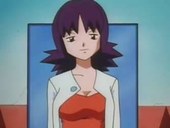
pass. I understand the appeal but i would need to know what the fuck she did to traumatize brock before i could say yes
Professor Birch (Ruby & Sapphire)
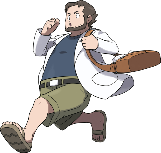
you know. he's not my usual type. but something about his chaotic dork nature is appealing to me. smash
Professor Krane (Pokémon XD)
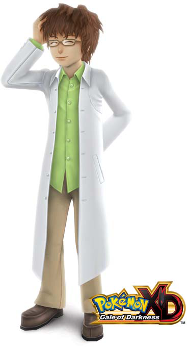
smash. i know nothing about pokémon xd but this fucker right here is ADORABLE
Professor P (Pokémon Trozei)
...if he weren't a chibi, maybe. but pass
Professor Rowan (Diamond & Pearl)
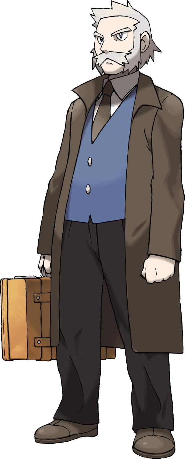
this is the first one i'm genuinely struggling with. i like his aesthetic and personality, but it's something about his face. so it's ultimately gonna be a pass but i absolutely get it
Professor Hastings (Pokémon Ranger)
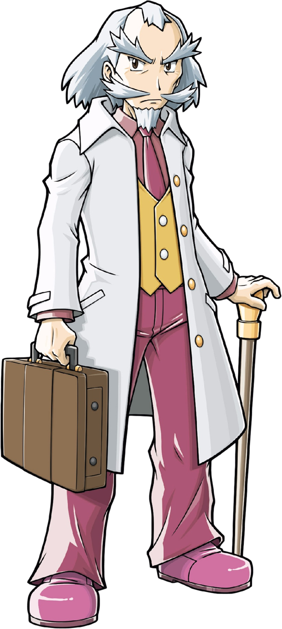
like rowan, something about this guy's face is offputting to me. but somehow, it's a smash. idk he's a tad more dapper than rowan. maybe it's the cane. maybe it's the color palette.
Professor Yanase Berlitz (Pokémon Adventures)

another character i'm not super familiar with. i've read some of Adventures, but only the random disparate volumes that my public library had, which did not include the Diamond & Pearl chapters for some reason. because i know nothing about her, this is aesthetics only with no knowledge of her personality. in which case...it's a smash. she cute
Professor Aurea Juniper (Black & White)

...eh. i like her vibe and personality, but something appearance-wise isn't clicking. pass
Professor Cedric Juniper (Black & White)

snazzy dresser, but his beard is unnaturally round, pass
Dr. Fennel (Black & White)

some of her art like the one above is really cute but in other drawings she looks like one of those danganronpa girls who is secretly a perverted murderer. so pass
Professor Holly (TCG Online)

pass, she looks like she's about to tell my mom that i'm a smart kid, really, i am, but i just need to apply myself more
Professor Augustine Sycamore (X & Y)
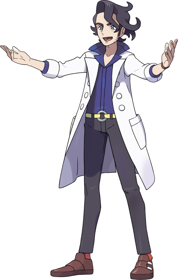
S M A S H. The hardest smash in existence. I got Pokémon X as a Christmas present when I was like 14 and this man Awakened things in me
Professor Tetra (Pokémon Picross)
insufficient data because she has no official art and her sprites are chibi pixels. i can neither smash nor pass
Professor Kukui (Sun & Moon)

smash. he's self-confident. he's smart. he's loving to his wife. my only complaint is that his shoes are ugly, otherwise he's a solid 10
Professor Burnet (technically originally from Dream Radar but that game wasn't popular so shut up)
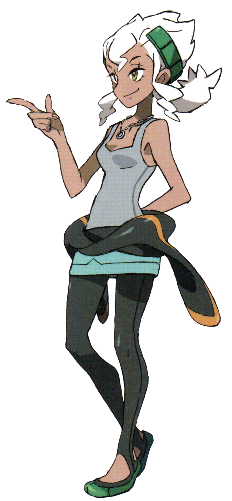
smash. absolute queen. she and kukui are the ultimate power couple change my mind
Professor Samson Oak (Sun & Moon)

closer than his cousin, but still a pass
Mohn (Sun & Moon)

i'm gonna say pass but only because i would want to have a date with him first. i need more info to decide if i want to go all the way to smash town
Professor Willow (Pokémon Go)

smash. originally i wasn't into him but then it was revealed that he's canonically shy and prefers to spend time alone in nature and he instantly became 700 times hotter. i dont make the rules of thirst, i just am tossed around by them haphazardly
Professor Magnolia (Sword & Shield)

pass, not my type. bonus points for the corviknight cane tho
Sonia (Sword & Shield)

pass. i get the sense that most people like her character, but honestly? not that into her. (however please note that i am only like 3 gyms into pkmn shield because i got it for christmas but have been focusing most of my playing onto my crystal catch-em-all so i haven't had time to get very far in it)
Professor Cerise (anime)

smash, i haven't watched journeys but he's fuckin adorable
Professor Bellis (Pokémon Masters EX)

pass. would be a smash if not for the hair. (also not relevant but fun fact i ship her with sycamore)
Professor Amaranth (anime)

my initial reactions are mixed. he's a little older than I usually go for, but i like his face. so smash i guess
Professor Mirror (New Pokémon Snap)
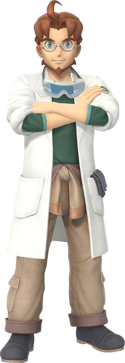
also on the fence here. his hair is weird but otherwise he's a certified hottie. a cautious smash
Professor Phorus (Pokémon Unite)
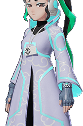
i really like her dress but she looks depressed. pass
Professor Laventon (Pokémon Legends: Arceus)
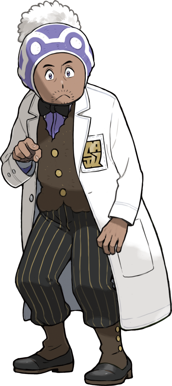
Originally I thought this was gonna be a pass but then i saw this concept art of him without his hat and it became a smash. once again, i don't make or even understand the rules that my brain operates under
Professor Sada (Scarlet)
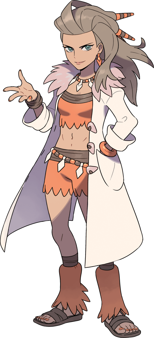
for some reason my gut instinct is to be on the fence, but ultimately i'll go smash because of just how cool her outfit is
Professor Turo (Violet)
[i have hit the post image limit so you'll have to either imagine or google the rest]
smash, he's the futuristic gigachad we all need in these trying times
Friede (anime)
smaaaaaaaaaaaaaaaaaaaaaash
Professor Neroli (Pokémon Sleep)
SMASH HE'S SO HUGGABLE AND PLEASANT LOOKING
1 note
·
View note
Text
random game roundup 3
A Hell of a Journey - PWYW

what if it was the divine comedy but virgil was just an absolute piece of shit. he had no fucking idea what was going on. you have to go through hell to get to purgatory and this idiot is no help at all
this is a short & sweet twine game. the illustrations carry it. it's pretty cute and took me under 5 minutes to read
Samorost 2 - $4.99
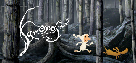
hey i said this was random game roundup not random itch game roundup. i just have 3000 itch games
amanita design is literally like the all-timer for 00s indie devs. ive known of their point-and-clicks for basically the entire time ive been conscious. i think ive only played samorost 1 and machinarium before now.
its hard to beat the level of vibes-based gaming samorost operates on. this is what gnome tumblr is all about
apparently in 2020 this got a remaster that let the game support modern resolutions using AI upscaling on old assets, and to its credit it ran awesome for a game this old. it didnt fuss at all about tabbing out or using a second monitor while playing. however i think the upscaled assets look pretty shit? lol. like the art direction in this game is extremely strong but the raster images definitely were not meant to be seen bigger than 1024x768 and it makes the characters who scaled up much better stick out suuuper bad.
music completely rips ass tho. hell yeah brother
i actually went ahead and finished this at an entire half an hour playtime. big fan of samorost 2
T.A.R.S - $1.99
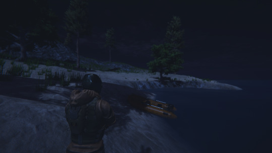
included in: Bundle for Ukraine
first thing i got struck by with this game is that it is extremely good looking for the price tag and my lowered standards. there is also a lot of voice acting which is pretty amateur but a lot of heart went into it. i could not find an option to subtitle the dialogue which kinda sucked
T.A.R.S is a third person shooter with a focus on difficulty via being killed in one hit and having very limited resources. you're fighting werewolves or something. i didn't play long enough to see them do more than just chase after me in a straight line so idk if the enemy AI is interesting
one of the big downsides of T.A.R.S is that the game is dark as fuck. shot like a modern hollywood film. like that one episode of game of thrones. i cant play this on my high refresh rate monitor because the sun is up right now and the ambient light in my room is too much and i cant see anything. also the game emphasizes wearing headphones and focusing on hearing the enemies before you see them but the sound design is um. not great. i kept getting snuck up on because the guys dont make any noises until theyre two inches away
i don't think i gave this a good enough chance but i'm not a horror fan nor am i a shooter fan so it's really not for caelums. maybe you'll like it tho
Panic Factory - $1.50
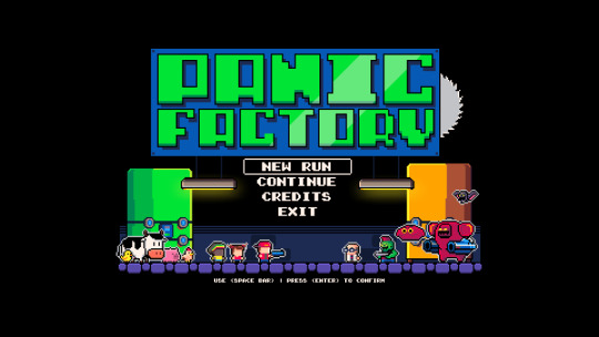
included in: Bundle for Ukraine
panic factory is a puzzler pretending to be a shooter. you are an eco-activist that has been trapped in a torture dungeon by a corporate CEO and need to figure your way out. with a shotgun. and whatever ammo you can scrounge up
the voice acting in this is very hammy and the pixel art is appealing to look at so the presentation is pretty solid. i found this difficult to spend a lot of time in because again i don't like shooters and i found that the reaction times this game expects out of you in the first level to a be a bit extreme. also required arrow keys to move :thumbsdown:
Weird Grief - PWYW


im so fucking sorry for how hard i laughed
i honestly really liked this. weird grief is a twine about the immediate aftermath and slow recovery after the death of a loved one. and you are poly. and furry. it has explicit sex scenes so watch out for that. but this is worth reading imo
0 notes
Text
I rate Sigma Overwatch’s sprays from 0-10
alright lets go, just going in the order that these files come in this folder

1000/10: Because I get to see him sitting and even though he’s thinking hard about something he’s throwing a bouncy ball to help him focus. Also his hair is particularly white here and I think thats very sexy old man of him.

50/10: Catbox, Catboy, its all the same theory. Sigma likes catboys, not up for debate. We know why.
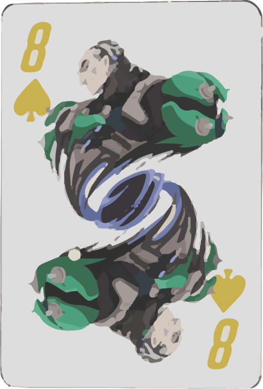
3/10: Just not fond of it. I know the sprays and their rendering gets super obscured but this one just got absolutely decimated I guess. Just being real with yall.
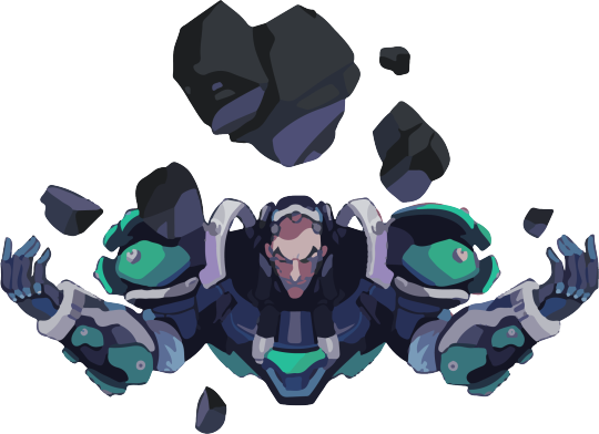
10/10: Like the shading colors, he’s smirking. Rock vaguely looks like a heart. Love that for him.
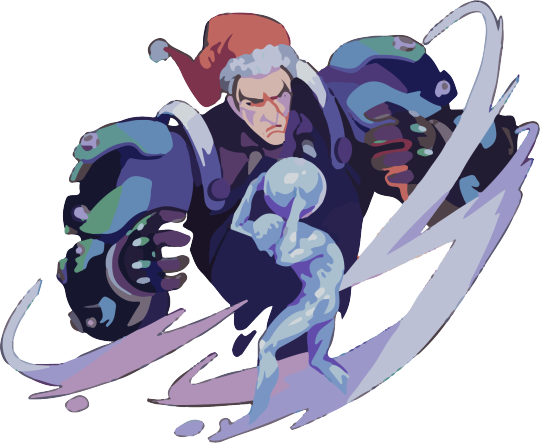
6/10: I just don’t like how the hat was drawn. I don’t think it needed to be there or could’ve been shaped better. Other than that decent spray. Wish he was happier looking though.

9/10: I have this spray as a sticker and its just very cute fsr. Its simple and the color is exquisite and nice on the eyes.
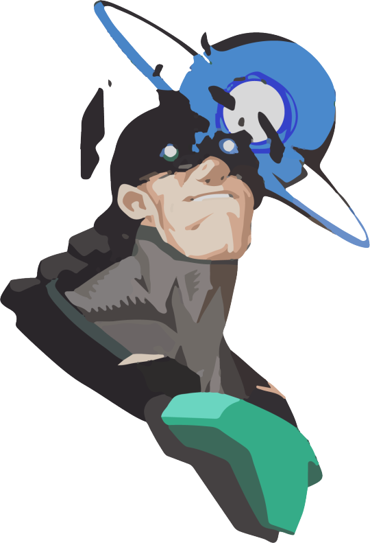
100000000000/10: There is something mysteriously and eerily sexy about this spray and it’s one of my favorites.
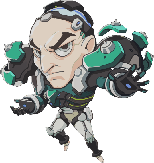
2/10: Just because he is my husband doesn’t mean I’m not going to be an honest man. I Highly Dislike this spray because I think the art style is unappealing af. It’s just a personal preference, I hate all of the sprays that come in this style. i didnt realize how long this post was going to be so im doing the rest under the cut to spare everyone else’s life:

9/10: Solid rating with no goofing. While I take up some issues with some of the expressions in his other sprays showing pain, there is something about the composition of this one that I absolutely love. Its very aesthetic for me, speaks to his character, and the colors are beautiful. Wish his eyes were his usual periwinkle though which is why this isn’t receiving a perfect score.
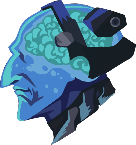
5/10: Not really sure what it is about this one that I’m not so fond of. I can appreciate the colors and his profile. But other than that theres something visually here that I don’t find appealing. Not sure what it is.
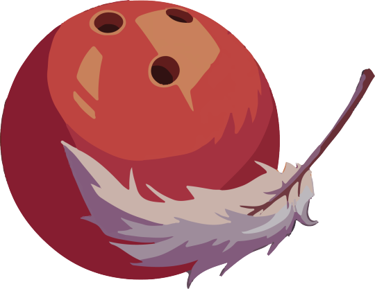
8/10: Decent rating, its nothing crazy. Since reference and has nice colors but thats about all my critique for this one.
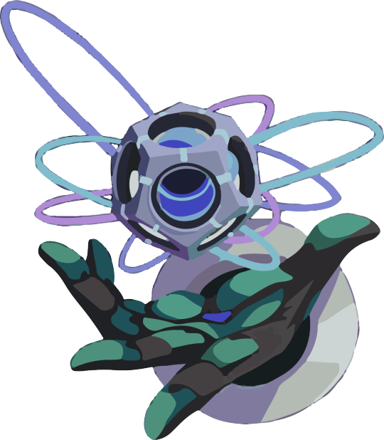
11/10: Lovely hand, lovely gesture. Wanna squish the bean pads. Nice colors.
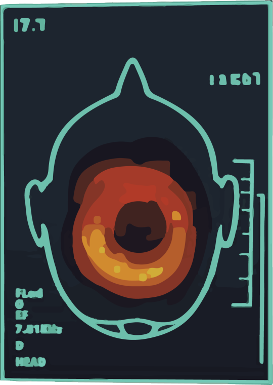
6/10: This one is actually one of my favorites despite the rating not being solid. Only because while I love the colors and the concept, the idea of it makes me sad. The idea that it reflects Sieb’s trauma makes me sad, despite it being a rational depiction of such.

50000000/10: love little christmas charm sieb, hope he gets a skin of this outfit some day. Hes so cute. Happy smiles thats all I want. I could kiss him.

3/10: CONTRARY TO POPULAR BELIEF I’M NOT ACTUALLY SUPER ABOUT THIS SPRAY. WHY? Because I’m being nitpicky and I want him receptors on the sides to be THE TEAL THAT THEY ARE. Not GREEN.

5/10: I feel like halfway rating with this one is fair. I like to imagine that thats Sieb’s hand writing and that makes me happy. But this spray is hard to look at for long periods of time because this kind of text squish is hurtful on my eyes.
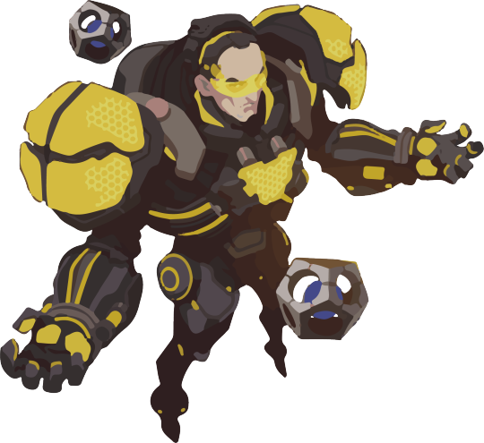
9/10: I actually hate this skin but fsr the spray makes it incredibly sexy. It actually got sexier the second time (this time) that I looked at it. Good for him.
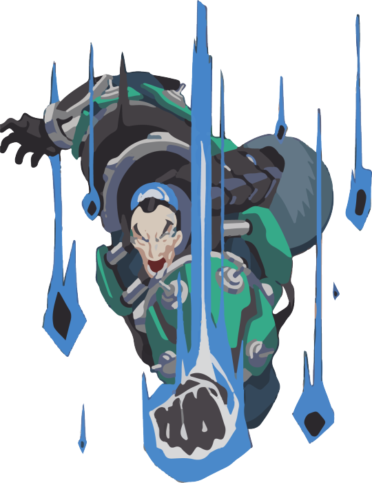
6/10: Reasons for this rating, while I love the pose and intimidation this spray is posing, I also get sad to see Sieb’s strained expressions. I think his powers do have limits and they do effect him depending. And seeing all this big ass heavy equipment on him gives me conflicted feelings. He has a lot to carry, and he’s just lucky he has gravity powers to help. (I mean this metaphorically and literally.)
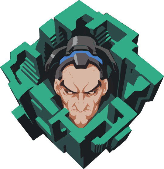
7/10: I love the art and concept on this one. He’s just so grumpy looking is all. My poor boy.
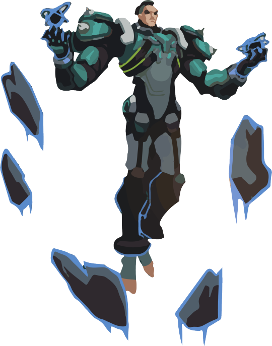
9/10: He’s 7 ft tall and it shows and I am here for it.

9/10: Remember when I said I was conflicted about seeing all that equiptment on him? Well its true, but I’m just going full thirst on this spray to say look at how fucking massive this man is. I want him to grab me with those hands and pitch me like a baseball.
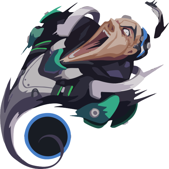
4/10: The pained expression in this along with the concept of it (as well as connection once again to his trauma) unsettles me and makes me feel the brain hurting juice. Nothing further.

1000000000000000000/10: This is one of my favorite sprays because its just casual work setting and gives me more insight on his lab uniform. His hair here also gets me barking like a rabid chihuahua.
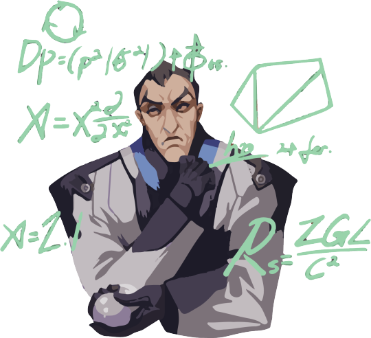
10/10: This gets a solid rating for A) Lab Coat Outfit and B) Seeing him again with the help of an object to stim while he thinks. (The squeeze ball)
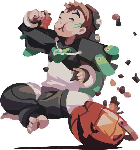
10/10: I cant not give halloween Sieb a solid score. I think this is adorable, but I don’t believe it’s Sieb as a kid. I think it’s just a child dressed up like him with no attachment to lore or anything. But its still very cute.

100/10: I love the pixel sprays so much, simple and cute.
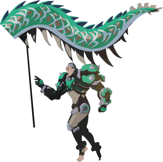
6/10: I’m really not too crazy about the pose for the dragon spray. I feel like they could’ve done something a little more dynamic especially given he has gravity powers. But alas.

9/10: This spray is on the same level as the apple head spray from earlier on in the post. Congrats if you’ve made it this far btw. But I love the soft expression on the left being challenged with the frightened/frustrated one on the right.

0/10: I am not fond of this spray because of how much pain he appears to be in along with the implications all the junk flying around him has. Upsets me.
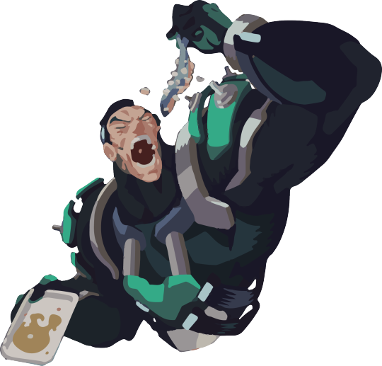
50/10: I don’t care about the fish onions I just care about looking at my husbands huge ass arms and seeing him enjoy a smelly fish treat. Its what he deserves. Also what that mouth do.
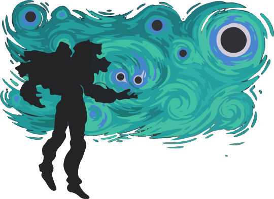
10/10: Solid perfect score because I have strong emotions about Van Gogh. And I think the interest between Siebren and Van Gogh, especially as two men who were/are fighting with mental illness speaks volumes about Sieb’s character. This spray makes me feel something in my chest that I can’t whole heartedly explain, but it isn’t a bad thing.

10/10: Another perfect score, because I think this spray is a good mixture of Sieb’s character between the musical elements and his scientific work. He’s also smiling which is rare to find in his sprays.
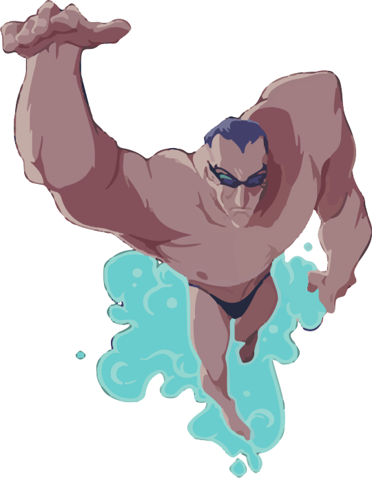
544386238043723507435742634387236804307403857435748035474803548744307384385740385748037408357438570480bark bark barK BARK /10: sexiest image in the entire game of overwatch nobody @ me i dont take constructive criticism
#this is a half serious half shit post post#siebren de kuiper#sigma overwatch#sigma#ita speaks#i have spoken
170 notes
·
View notes
Text


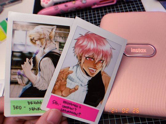
Random long update post about my life i guess? LOL
Been enjoying messing with tamagotchis lately!!! I’ve always wanted ones with a colored screen, so I caved and bought some Tamagotchi On and it’s SO fun! Like, I just play with a lil pixel friend and can marry them off. It’s a commitment, but also, easy to just take a breather from my day to see how they’re doing and then continue working on whatever I was doing. I also downloaded the MyMeets thing bc I kinda want to try and make my own pixel bg bc wouldn’t that be cute??? Would also want to commission Poo for one as well bc I always liked their pixel works. I’ve also wanted a Sanrio Meets one, but they’re SO expensive, so I’m going to wait a bit before buying one. I really want to marry Sanrio meets tamas to my On and I think it would be cute to see. The blue one is technically my fiances (though I’m the one that mostly looks out for it) and the other one is mine. I named my first tama child Denjitchi, after Denji from Chainsaw Man bc I read that a couple weeks back and FELL IN LOVE. I really love the characters and world, and it’s how I felt with Dorohedoro, where the world seems so dire? But the character relationships are so fun and you get attached to so many. I also really love how it’s violent, but also fun??? Not only that but the concept fo their abilities are weird in a cool way, the devils are kinda freaky too and I love that. Also love the entrance of the Darkness Devil and the name itself made me laugh bc u know. LMAO-- I like the sense of dark humor it has. After that, I made sure to preorder both Denji and Power nendoroids bc I love their relationship the most! I wonder if there’s gonna be a part 2... I need it, after the heartbreak I experienced with Aki...
I also figured out how to buy nijisanji goods, so I caved and bought chronoir kuma rubber charms and they’re so cute, I don’t want to take em out of their plastic-- I have no idea where I want to hang these either bc I don’t want them to get dirty or lost bc they’re expensive. I also preordered two Kuzuha nendoroids from different sites (bc they have different preorder bonus LMFAO) along with Himawari nendo bc I like her too and I swear nendos NEVER really caught my attention before, but for SOME REASON goodsmile started coming out with REALLY good ones that appealed to me and now I find myself wanting a new one every month??? Smh, calm down!! Anyway, Idk why I like vtubers-- something about watching someone with a cute anime avatar just doing something so mundane such as playing video games or singing is a nice comfort to me ever since quarantine happened. Like not only that, but all the Holostar goods I ordered months ago are all finally being shipped and idk where the heck I’m gonna put those either LMAO.
Hmm what else, in February, I got a instax printer thingy and I’m having fun testing out how my art works look on it! I think it would be cute to make personalize polaroid pics for others too as a commission, though I’m a lil hesitant atm because it’s kind of hard to not have the colors too washed out. When I was testing it on Kii, I had to bring the brightness down along with increasing the saturation and contrast just so that his colors wouldn’t be so washed out!
Besides talking to close friends, I’ve been keeping mostly to myself on social media, not even posting art everyday, which is nice, but also social media has skewed my relationship with art where if I’m not posting it, then I’m just wasting time. I’m still trying to get over the fact that I’m not just an artist and that I’m allowed to venture out into new things and work on projects myself without having to post every single detail about it on the internet. Every since I graduated university, I shifted from just drawing all the time to having more time to find more interests outside of art. Sushi and Poo convinced me to do journaling as well, so I started that in February and it’s been fun to write down unfiltered thoughts, even though it’s a mess, along with making random spreads. I enjoy being able to still be creative without having to post it, you know? I’m still trying to find my flow when it comes to balancing commissions and my own projects and interests-- I have to keep myself accountable with my own schedule.
There are so many things I want to do, but it’s easy to feel so overwhelmed that I end up not doing any of it at all and reverting back to whatever I’ve always done. I enjoy immersing myself in my work, my projects, my interests. I want to do that, but at the same time I do need to be active on social media from time to time because I still need to do commissions. I like sharing my work to have that connection with others, I just don’t like the pressure of trying to upkeep an audience or anything that social media culture pushes onto people. I guess that’s why I still like tumblr because I can just post whatever and not care too much lol. That’s all I can think of from the top of my head in this convoluted, messy, post about my life (I say this as if it's not some essay or some shit lmao). Nothing really eventful tbh??? Just been doing my own thing and then I would have weekly voice calls with Sushi and Poo and then catch up to other friends once or twice a month.
Hope everyone else is doing well~
#x#just a lil update on my life eheh#this is still a personal blog and ya guess i just wanna get a lil personal but not really? LOL
42 notes
·
View notes
Text
Slightly late 2021 resolution!
Here I go~
So each year I do a resolution but I first checkmark my 2020 resolution and then talk about my 2021 one!
Let’s goo see what I did~ (and didn’t do :v ) -2020 Resolution-
1) DO 80% 3D -20% ART!!!!! Better up those 3D skills bub.
My biggest year in growing my 3D Art!! I’m pretty happy actually!
2) Learn 100 new Kanjis!!
Kinda did YEAH!
3) Don’t be harsh on your own heart. It’s alright to relax.
I tried. Specially 2020 being so terrible it was a bit hard to relax.
4) Sing 3 covers at least!~
I did! In secret hahA. Also I got a blue yeti mic and I’m just super happy about it! :D
5) OPEN PATREON!!
Whoops...I’m still disorganize to open one ;;; I really need to...
6) Make Artstation Portfolio!
I DO GOT ONE YEEEH!! I need to add new work...
7) Travel for work or vacation!
PANDEMIC, THANKS COVID.
8) Try to take things calmly. Please play 3 different games and learn to relax.
I Hope the Mario All Star game counts XDD Though I did ended playing Among us, Animal Crossing New Horizons, Genshin Impact, OMORI!! : D
9) Work on a game project! :3
Kinda...haha :v but not done ;;
10) Enter an Art Competition or Zine!
I did my own!! : D #Kemonoctober!!! I never drawn so much in 1 month!!
I also joined Artfight hell yeah!!
11) Finish Chapter 3 of Pixel Cat!
I DIIIIID!!! I’m surprise!! :OOO
12) Finish a course study of anything!
3D Appealing Character Design with Dylan Ekren. IT WAS SO GOOOD!!
13) Do a full body PBR!
HELL YEAH I DID!! and it was a commission too ! :D
14) Study Colors MORE! I want to see colorful pieces!
I did break through some colors!! But I need more experimentation!
15) Dejar el miedo en el gavetero.
TRATANDO.
16) Color hair white mYSELF!!
:C Nope....but I did get a haircut ;u; so to be easier!
17) Do traditional and 3D studies!
Not much traditional ;; BUT 3D STUDIES PLENTY!
18) Do Art Livestreams!! BE BRAVE!
I DID ONE HUFFF....and A GAME STREAM TOO. I be sweatiiing.
19) Get or do Real Kimu Rabbit MASK!
I still need to do it OTL;;
20) Learn/Do something new you didn’t expect this year to learn or do! Surprise me!
+ I learning to do rigging?? AAA
+ Also I’m giving basic Japanese classes! Really surprised myself.
+ I learned to clean my models better!
+ Learn to eat some veggies I used to hate! (mushroom, spicy sauce, cabbage, pastel.)
+ Went to a digital convention? XD Lightexpo was great!
+Liking a lot tiktok and starting to move my works there!~
+Found new Utaites to follow! <33
+GOT A POWERFUL PINK PC YOOO!!
Honestly not my worst year and honestly one of my best one for growth!
~~~~~~
2021 RESOLUTION!
1) MORE 3D!! Maybe this time 50% 3D 50% 2D.
2) Study colors! Let’s go explore new palettes!
3) Learn 100 New Kanjis!
4) Sing 3 Covers!
5) Travel (if safer) ?~
6) Finish Pixel Cat Chapter 4.
7) Enter an Art Competition or Zine!
8) DEJA EL MIEDO EN LA GAVETA!!
9) Do ArtStream!!
10) GET A REAL RABBITMASKS MASK!
11) Color your hair white!!
12) Play at least 3 new games!
13) Organize Shop Inventory and make the packing cute and make new shop cards! Do Brand Study!
14) Study FACES MORE THIS YEAR and also Do style experimentations.
15) Model and finish a FULL 3D character. PBR or Handpainted.
16) Work on a game project!!
17) Work a short animation!
18) Make a day for just relax. Do not work anything, RELAX, RELAX, LEARN TO RELAX.
19) Make room more aesthetic pink and clean!~
20) Finish at least 1 anime season.
21) Open Patreon finally?
22) Learn/Do something new you didn’t expect this year to learn/ do! Surprise me! (Or happy new memories you got! ) Take it easy future me. The pandemic really slow things down so it’s alright to slow down too...
2 notes
·
View notes
Text
OKAY SO my master propaganda list!! this is ordered roughly from most recommended to least and Is open to change i just havent played as many games as i say i have. also i shortened it down to 14 because a few were like. extended
wandersong (VERY charming little music based adventure game where youre a bard and you save the world w the power of singing!! its Full of heart and changed my life and i think everyone in the world should play it. i have a separate propaganda post for it alone if i rambled abt it here id be all day. please play wandersong it makes me cry so frequently and it will continue to make me cry. its very sweet though most of the tears are happy ones. also the artstyle is really cute and the ost is really fitting and a!)
pokemon mystery dungeon: explorers of sky (definitely the least obscure thing here but for those who havent played it its a roguelike pokemon game with Easily the best plotline in anything pokemon related. its kind of a staple for a lot of gen z kids ive met. also it has really pretty pixel art and just an Iconic soundtrack and god please play pmd. u can also emulate this one its okay i wont tell)
ghost trick: phantom detective (another Relatively less obscure one but its like. cult obscure. anyway its a puzzle mystery game by the ace attorney guys and it has The most well woven narrative ive ever played. its one of those games i wish i could play for the first time again but i can also tell you Nothing about the plot. it plays like youre a poltergeist making a rube goldberg machine and thats all i can tell you. its good. also has a not-ass apple port with a free demo but honestly its another u can just emulate its fine)
live a live (VERY lovingly remade hd version of an square enix rpg from 1994!! and i love it dearly!! its a bunch of mini-stories basically from different time periods, one in wild west one in the future etc etc. they've all got different genres and the chapters respect ur time for the most part and really aren't too grindy (the longer ones take like, 2 hours at most). anyway it is mostly silly but does eventually go for your knees later. also the strategy rpg-ish? gameplay is real fun and the music slaps. also its all voice acted and its very good. please play live a live)
hatoful boyfriend (okay hear me out. it is a Very absurd very jokey dating simulator where you date birds and thats part of the appeal but it Does have a fantastically written character drama in there. you do have to get to it though and it may take a while. its best to get into it for the novelty and take what More comes your way as a pheasant surprise. if you want something to pique your interest check the hatoful boyfriend tw list its a lot. also if u like it please remember to play holiday star people always forget holiday star and it makes me sad)
everhood (VERY baffling music RPG that i have. feelings about. it changed the way i view a lot of things the ending messed me up but i Will mention that its Wild. i love it. would not recommend it to anyone who is easily overstimulated by either visuals or sound but everhood Is a religious experience)
mad rat dead (very fun rhythm platformer with a solid story and really fun pick up and playable gameplay!! also the art style is Really unique and there isnt a song in the ost id say Isnt a bop. u guys like fake type. the composer there did a good chunk of the music for it. also mad rat dead has a Meaty free demo on the switch and ps4 eshops!! warning for cartoon gore though, that's Very present even in the demo. I have a whole propaganda post for mrd too)
chicory: a colorful tale (really unique, calming and sweet little game with the same writer as wandersong!! it's basically a coloring book, the world's gone blank and you have to color it back in. it tackles a lot of personal struggles that come with making art and while it didnt hit me as hard as wandersong it is. fantastic. what if a coloring book had impostor syndrome. its most fun to play on touchscreen so id definitely recommend the switch version)
oneshot (REALLY unique little 4th wall breaking rpgmaker game where the relationship between you the player and the protagonist and the world is the most important part. i wish there were more games that break the 4th wall and mess with files on your computer and use this for things that arent horror. probably the most unique game ive ever played, also the OST is perfect (tunes to sink into the moss to) vibes yknow)
bug fables: the everlasting sapling (silly silly little paper mario esque turn based rpg!! theres a lot i can say about bug fables but what i wanna highlight is that they do character writing Really well. your main trio of characters has so much good team banter and i love it dearly its just so much fun to read every line. also the music bops and its a joy to look at and i love my weirdo bug found family)
shovel knight: treasure trove (okay again not obscure everyone and their mom knows shovel knight but You Should Play Shovel Knight. 3/4 of the campaigns are absolute Pinnacles of level design and they make you really feel cool when you get through them, and the design overall only gets better as you go through the campaigns!! also the storylines are solid at least!! also plague of shadows' storyline in particular is Really sweet so id recommend it just for that one. also the music just gets better and better i think i should mention that)
the world ends with you (ALSO not obscure but id be remiss to not mention it because its my first hyperfixation really. anyway twewy is a real fun action rpg with a plot about learning to trust others and open up and its Really Nice i havent played in a bit but it does make me emotional. very mid 2000s vibes in the funky bitcrushed way. there are ports and im sure theyre good but id honestly say the best way to experience it is the original ds version so if u happen to see it id recommend it with my life. I have not played neo yet)
toem: a photo adventure (another Very cute charming little game about helping people via taking pictures!! its adorable its very (take this at your own pace) and it doesnt have stakes at all the main goal is just to experience. its all handdrawn and its really cute and i love it dearly. also your camera gets a honk button this is not a drill u can honk at everything and anything)
later alligator (silly little hand drawn point n click adventure!! another where the writing is just A Joy to read, also its animation is so bouncy and Very cute. its set like a noire mystery but with pretty low stakes for cowards like me! its entirely silly. i love it so much)
pikuniku (another Very Silly. half this list is silly. anyway pikuniku is a short game where u play as a tictac to punt capitalists and its Very absurd. i love it. it has very little replay value but its dirt cheap on sale usually. another where the dialogue is very fun to read. its so dumb. its so dumb.)
one time I was joking about how I will tell anyone and everyone to play all 17 of my most recommendable games Right Now and tell me all about their experience playing it and. well. I didn't think before saying that exactly but I did make a list of 17 whole games. it can be my master recommendation list do u wanna see it
#its weird most of the silly charming ones are at the bottom bc i love them dearly but they didnt Affect Me#then theres wandersong which is silly charming And affected me. so much#i cannot overstate how much i recommend wandersong. if you liveblog wandersong to me ill cry#also an important thing to note about mad rat dead is that rat god is there. the wlws should pay attention to this note#the gossip button in bug fables is like. a little feature. but it made the entire game for me honestly#i love team banter so much#i have opinions on the sk campaigns i wont get into but ill basically say that uh#none of the campaigns arent worth playing but pos is the only one id say has an above-Eh plotline#i love sot but all of the character dynamics are implied and the mc talks in ellipses for 95% of the game#id still say sots my favorite though because the music is great and it makes me feel cool while playing#i played it deathless one time!!#uhh is there anything else#oh yeah also pos kinda sucks gameplay wise sorry#veespeaks
11 notes
·
View notes
Text
Okay!! Here we go: this one’s gonna be long, and it’s for @avariea Here are my top like 14 and then bottom 6 (pictures not included because that would make this post that much longer rip)
Miracle comes up first! She’s a very pretty Spiral and I the burst of purple caught my eye. You know what then caught my eye? She’s a gen 1. A spiral gen 1. A shadow spiral gen 1 that happens to be shadow/shadow/grey. Your luck astounds me, and so does her beauty. I love the accent on her. Her lore makes her someone in the chaotic alignment but I love her so it doesn’t matter.
Next up is another spiral: Terrali!! I have a soft spot for Terracotta when it’s used correctly. And boy oh boy did you use it correctly. Terrali looks amazing. Her crystal makes her seem so dark and mysterious already, and then the apparel just tops it off. She doesn’t have lore herself in her bio (it’s her parents’) but the implied information from it is amazing and I could rave about her for awhile. If I got to take a dragon from your lair, I’d nab her in a heartbeat.
I have mixed feelings on the next dragon. Etheria is pretty, sure. I think I clicked on her actually because I’m digging the subtle red mixing things up with her otherwise monochrome coloring. I’m a little skeptical of the eye apparel but I love her color scheme! She has no lore so onto the next dragon it is!
I spotted Dream and I’m hardcore digging her. There’s a lot of colors on the color wheel that have taken my heart, and abyss is definitely up there with them. She’s such a pretty guardian, and maybe part of a breeding pair with one of the other dragons I picked? I’m not entirely certain honestly but she’s never been bred so I guess the future holds the answers.
Zirjiru is one of my favorites from your lair, if not my favorite. He’s dressed in such nice colors to match how he looks. The accent plus the apparel on his head only serve to make him regal where I’m certain others have failed trying to do the same. He also seems to be a pretty cool guy. Especially considering he came back from the dead by someone that most certainly did not plan to use that ability to help him. I would’ve been much more upset. But if he is alright with it than everything is all good
Okay, I clicked on SoulsLove not expecting to be hit in the feels? I’m so sorry about your loss, and this is a really beautiful tribute dragon. You’ve adorned her well. I can’t say anything else about her or I’ll get too emotional and this is a lair review, not a crytyping mess
GoldenHeart is another fan fav here (it’s me, I’m the fan!) I have a soft spot for speckle/freckle when it looks good, and boy does she pull it off. Clicked on her because she seems out of sorts in a gem gene lair but she works it, and she works it well. I love her antlers and I love her lore, even if my immediate thought is to feel sorry for her. But don’t tell her that because I think she’d kick my butt for even thinking that, and then it would be a mess. But I can love her from afar and that’s all that matters.
Polaris! He’s the one I thought was with Dream, but he is also unbred. Nevertheless, once again I’m floored by his colors + apparel. He’s wearing a lot of stuff from one set + the horn apparel + wings are kind of off but somehow it works? He’s a very blue (da ba dee da ba da) dragon and I hope if you were trying to get a dream dragon that you got it! Breeding projects are absolute hell.
Leviathan simultaneously scares and fascinates me. I clicked on them (and are their pronouns he/him and she/her? They’re referred to with both in their bio but I don’t wanna presume) because a lot of dragons with the plague doctor mask have interesting lore, and they definitely didn’t let me down. I have a sinking feeling that one day they’ll escape, and that their captors will pay for what they’ve done. I also have the sinking feeling that this’ll destroy Leviathan, too. You did a really good job on the apparel, by the way. They look fittingly creepy and suspicious.
Mina!! I recognized her as being from the specific parents that she is from, and had to click on her. It’s such a good color combo, and you really played up the yellow accents from her genes with the apparel. Why do the silks look so good on skydancers? How does Mina look absolutely precious in both the in-game art and the art she has in her bio? The world may never know.
Isabar is next. He seems like such a good, green boy. Especially since he’s a gen 1 with matching eyes. And another one of my favorite colors (peacock! Doesn’t matter that his tert is basic, still counts!) I am pretty certain I’m digging how you put orange all over this green boy, too, as it appeals to me. Something about him is just vaguely alluring and calming but I can’t pinpoint what and it’s throwing me off. I like him but why
Next is Damian! He looks stuck up, but I mean, he’s a double rose gen 1, so I guess it’s rightfully deserved. The blue + pink is a godly combo, and I like how you combined the sage apparel with the birdskull apparel. My mind tells me it shouldn’t work, but it does so well. The wings kind of fade into the background, too, providing a nice little backdrop for the purple
!!! You have the LiveUpdate skydancer!! He’s right side up but he looks wonderful!! Look at his green-ness! Look at his cute apparel and anklets. Look at the wonderful art in his bio!!! He looks like a skydancer that is, or should be, spoiled, and I love it. Just looking at him raised my confidence stats by like 5. He’s that powerful. Reblog LiveUpdate in 10 seconds to possibly feel your own confidence boost. I gotta show the picture of him

Look at him!!!
Now it’s time to be mean. Beirtan is my first victim from your lair, and it’s mostly because something about his apparel seems uncomfortable. Tundra dragons aren’t known for exuding confidence in the pose the site has them in- especially if they’re m pose- but I wouldn’t want to bring him in battle with me. I might die. Or be stuck on babysitting duty, watching him to make sure he doesn’t somehow injure himself. I really dig the art for him, but the apparel doesn’t sit well with me and I keep side-eyeing him.
I want to like Krista and Anduril. I really do. Their overall aesthetic is like creepy autumn, which is something I can respect. But I’ve combined them into one to say that there’s something about them that doesn’t sit well with me. Even ignoring that they’re supposed to be off-putting. I want to blame it on the Eye Spots for both of them, or maybe Anduril’s accent. He’s got like really bad morning breath, apparently. Can I get him a breath mint?
I Dislike-with a necessary capital ‘D’- Necropsis. His crown is distractingly pixelated on the edges. The snow makes lines a little fuzzy and makes me squint. Plus, he’s a m post nocturne, which I dislike on principal, and has cherub, which I also dislike on principal. I would’ve tossed him to Earthdad awhile ago. Although he does have pretty cool lore. (Ha! You get it? Cool?)
I’m calling you out on Hydragea’s unfinished lore. He only got a paragraph, the poor dude. He also got the misfortune of being a male snapper. All the apparel looks automatically clunkier and less fashionable on him than it might on other dragons. He’s like a mix of two clunky styles, actually: big knight and mysterious guy on the boardwalk at 2:49 am. Like the kind of guy you cross the street to get away from, especially if it’s getting dark. Looking at him activates my fight or flight reflex.
Last, but certainly not least in my dislikes is Xander. Now, I am in complete awe of your ability to find and acquire these doubles that also happen to be gen ones. But Xander is, how do you say….ugly. I don’t like him. I don’t like the way bar looks, or that he has spines. The light brown isn’t throughout his body, so it looks uneven with the lion’s headdress and then the black-grey of the other apparel items. I don’t like him. I wouldn’t fight him- because, you know, he has a lion’s head draped on him and I’m not dumb or extra enough to fight someone potentially that predisposed to violence, but I would totally hide in my house so he wouldn’t see me and ask to come play. Something juvenile, like that.
(Thank you again for the gems!!)
#long post#jacks lair reviews#i can add pictures if you'd like i just didn't want to make this all laggy bc you know how tumblr is#liveupdate gets a pass because he's a celebrity and green
1 note
·
View note
Text
Evaluation
My project has changed a lot throughout the course- my final outcome has differed greatly from what I set out to make at the beginning, mainly due to the fact that I was trying a lot of new things and they didn’t all work as expected. But i’m glad that my project evolved.
The social issue I decided to choose for this project is the Environment and Climate Change- I wanted to make a game concept that would encourage people to fix the planet before it’s too late. There are many issues that are affecting and changing our planet currently, most of which are direct result of human activity. We are responsible (directly or at least for the majority of) for the Earth’s changing in climate- we release too many greenhouse gases through various means such as transport, factory farming and deforestation.
One of the things that has remained consistent in this project is that the social issue being a key part of the game - I haven’t diverged much. The character design and game themes definitely incorporate some fantasy themes (such as the main character) but the underlying issue about the world being uninhabitable and ruined is still a very obvious feature. I would have created a project that more subtly related to climate change, but it’s something i’m very interested in so I thought it would be a good idea. I was aware that a game based very obviously on a social issue may not attract a lot of attention as people tend to avoid things that are ‘politcal’ but I think it works - I tried to make the character design and magical elements very visually appealing so the game so that it would appear more interesting and attractive to play upon a first glance.
The work I have created - Echo - is for a game concept. I created some concept art for the character and landscape, made some pixel animations to show how the game could potentially look, and made a model of the main character’s head. The model was created so I could get a better idea of how the character could look from all angles, thus making it easier to draw. I am also very interested in modelling so I thought making a model would be a lot more interesting than just two dimensional artwork.
The Character Design/Concept
I wanted to create a concept for the game’s main character. At the start of the project I envisioned them to be a cute & brightly coloured animal - to try and contrast with the bleak reality in which the game is set. I made a pinterest board to try and establish the kind of look I wanted it to have, and came up with some concepts. At the time I was also really inspired by Kitsune & their magical connotations in Japan so I wanted it to look somewhat fox like.
I jumped straight into the character design without really considering the rest of the work I wanted to do which would involve it - which is where I started to make some questionable choices. I decided to give Echo four ears to make them look very unique and otherworldly - but didn’t really consider the practicality of having these, nor did I think ahead to when i’d actually have to make them later. I also have a tendency to design the character’s appearance first before coming up with their personality - which also meant that the second set of ears didn’t really have a purpose of being there. Alongside this I also gave them an enormous mane and extravagant tail to help them stand out - this was also annoying to animate. However, despite the impracticality of their design, I really like how the final appearance turned out - it definitely looks aesthetically appealing and different compared to something you’d expect to find on Earth.
Another problem I had when drawing the character was trying to establish their anatomy and keep it consistent when creating the concept sketches for them. I wanted to make Echo walk on two legs yet still have an animalistic appearance so I made them anthropomorphic with shorter digitigrade legs than those of a human - this made a lot of poses quite difficult to draw as his body proportions were very different than the references I used - so in some sketches his legs are far too long.
I created several pieces of game art featuring Echo although I’m not totally happy with any of them- this is due to my experimentation with new programs and different techniques. All four of the artworks were created outside of my comfort zone - 3 of which were created using Procreate and a shading style which I am not as proficient in - and the final one was created in Paint Tool Sai with a wacom intuos (which was a vastly more complicated task than using my Cintiq). I felt that some of the work just didn’t have atmosphere I was trying to create- some of the pieces looked flat, and using the iPad to paint meant that I didn’t have access to my usual tools for painting. To improve next time, I will practice more both with procreate and the Intuos tablet, but also try and create some artwork that i’m actually happy with by spending a lot of time on it rather than giving up after 2 hours - which was very common with a lot of my work in this project as I felt like the deadline was approaching too fast.
I really like Echo’s overall character design but I think that it could have been developed a lot better if I had spent more time on it, and used more realistic animals as reference material. My favourite parts about their design are the glowing colourful ears and tail, as well as the mask, which I think gives them a very mysterious and ethereal appearance (which I think it suitable considering they’re meant to be a space deity). If I could design them again I would have also created a wider range of concepts before creating the final design so fast, as I ended up having some really cool ideas later on. I would have also reduced the number of ears and made the tail/mane smaller to try and make this character actually easily reproducible.
I did also design Radio and Pix, the other two main characters, but these were done very quickly near the end of the project so they are also not as developed as i’d like them to be. I think my target for next time would definitely be to not try and rush my projects as much and actually put thought and consideration into them. It would have also been nice to do more environment design as this was something I was really keen to explore at the start of the project but didn’t have enough time to explore - I would have rather put more time into this than trying to create finished artwork of Echo.
Pixel Art/Animation
For this aspect of my project I aimed to design some animations and sprites/environments to show what the actual game would look like if it was made. This was one of my first experiences with pixel animation and sprite artwork which made it quite a challenge for me, especially in the beginning.
Animating in pixel art is a really different experience, as I found that almost every pixel had to be placed perfectly to make the movement look smooth - quite often I found that just by changing a few pixels on one frame completely changed the shape of the head in another - but this paid off as I got used to it. Overall, i’m really happy with the way my weapon summoning animation turned out - I think the movement looks really fluid and even though it’s small and pixelated, you can still make out the individual parts of the character.
Some parts I should have done differently were definitely the smoke animation and effect - I made the smoke and staff Glow using an overlay layer on Photoshop - which messed up the transparencies of the finished sprite. When I tried to export it as a gif with no background, there were white pixels surrounding the body due to the partially filled in pixels from the glow layer, which the PNG could not interpret properly. To fix this, I added a grey background to the animation when exporting it so that it would display correctly on my blog - but this was only a temporary fix, as It would have had to be transparent to import into Unity, for example. I think that the glow could have worked if it was added afterwards once imported into the games engine rather than as part of the animation, but it worked to show my ideas.
Another problem I had was with the animation cycle itself - this was another project which I rushed into a bit - as I ended up not being able to loop it due to Echo taking a step forward midway through, so ending up in a different location to where they started off. I should have also made the overall pixel sprite smaller I think and maybe tried a lineless style - as the 120ish pixel height of the character meant that it took a while to replicate for each frame.
In term of success though i’m happy with the actual artwork of the pixels - I also really like how the icon of Echo and the dialogue box turned out, as they fit together well and match the aesthetic of the game. As well as this, the text animation I created also looks really cool I think - there isn’t anything I would change about that. The pixel art backgrounds I created also turned out pretty well, but I think it would have been nice to create a more refined and clean, lined background rather than the sketchy lineless style it ended up having.
Model/Mask Attempt
This was the project I had the most difficulty with out of all three I attempted. I started off wanting to make a super sculpey model of Echo, which soon changed into a wearable mask of his head, and then finally changed into a small model.
The first thing I tried was making the mask in Blender - which I have no experience with - which may have been the cause of some of the difficulties I had. I first sculpted the shape of the mask and decided to try and print it out as a pepakura file - which didn’t work initially due to the high number of polygons. if I was to make another pepakura mask I would instead work with a very low number of polygons instead to start with rather than trying to retopologise the model later which was also rather tedious.
After retopologising the model, the option to 3D print it was available - unfortunately since I hadn’t planned this from the start my model also was not suitable for this. I think that all of these attempts didn’t work properly since I hadn’t researched them enough and built them with these results in mind - I had to strongly rework my model again to get it to work in a 3D printer. Despite this difficult stage though I do really love the look and anatomy of the model I made - it actually looks how I intended it to and has the perfect cartoony/realistic mix I was going for. The 3D print had to be split up into sections and then printed one at a time. This process had some flaws which I would execute differently if I had more time - I didn’t realise how difficult it would be to make the 3D model look presentable (sanding and filling etc) so I should have printed it in a higher resolution to start with, as it was too low res to make a smooth model out of. On top of this, there were some scaling issues which meant that several pieces were very slightly different sizes to each other. To fix this, I should have kept each piece on the same document and scaled them all up together rather than each one individually. That being said, the mask I did 3D print did end up fitting my face which I consider a definite win, as I measured it all beforehand in the hopes that it would not be too small or big for my head. I should have done a lot more research into 3D printing before rushing into it.
Unfortunately due to the quality and mishaps with the 3D print (the hollow surface meant it could not be properly sanded, and one corner was missing due to the supports collapsing during the printing process - causing it to droop down and break off), I had to move to a different method. My main regret during this stage was my time management - I tried out 3 different techniques during 3 days and none of them worked to my standard so I scrapped all of them. The first was the EVA foam patterned model. I really like how all of the edges are crisp and fit together really well but unfortunately the pattern was not able to capture the exact head shape, which ended up looking a bit weird. I think this could have been remedied if i’d kept working on it and made manual adjustments. The foam I used was also far too thin (5mm) which caused the model to be very weak as it kept squashing and changing shape. It would have worked a lot better if i’d used 10mm foam I think.
The two upholstery foam attempts were actually probably fixable, again if i’d spent more time on them. The carved block head especially, I think it would have worked a lot better if my electric knife had been sharpened. I like the way which they started to turn out but I got a little too ambitious and removed too much material too fast. These two attempts were another case of me not doing enough prior research into them beforehand, and could have turned out a lot better if I watched more than one tutorial for each.
The last thing I resorted to was a super sculpey model, which has turned into one of my final outcomes. While it is unfinished, I am really really pleased with how it looks for the most part. I used my original 3D sculpt as a reference to model the head out of super sculpey, then sealed and painted it with acrylics. I’m really happy that I used sculpey as the material as it keeps its shape well and was very smooth - although I think it could have been smoother if I had used some sculpting tools or turpentine to help even out the surface.
0 notes
Text
EVALUATION
For this final project, we had the choice to create either a game, animation or an interactive graphic novel. I chose an interactive graphic novel and to work by myself since it would give me enough work and I wouldn��t have to worry or rely on someone else which could backfire if issues such as communication occurred. The theme of this project was “Thrive or Survive”, we had the choice between the two which gave us a lot of creative choices for this project which was good since I could get creative but with so much choice it was intimidating at first. In the end I choose survive, with the idea of good vs evil being the main focus of the story. I finally came up with the story of two witches having a rivalry between them but having to work together in the end to survive an evil monster.
Research: I collected primary and secondary research all throughout my project, to help with the progress of my graphic novel, from the art to the story. I started by collecting primary research to help develop my idea first, I created surveys and used it to help shape my graphic novel such as what the story should be like, if they wanted a long continues story or short stories and if my little idea of animated panels would work. This helped me decided what needed to be added and how it should be presented in my graphic novel. This helped to finalise my idea and give me a set structure to work around. I collected more primary research all through the project such as play tests where I collected useful feedback which told me all the issues people found with my graphic novel, while also telling me what I could add and what was already good, this helped me come up with ideas and develop a working interactive graphic novel.
I then started collecting secondary research by looking at books, animations, graphic novels with similar themes to my graphic novel, this helped me develop the characters in my graphic novel; their looks, their personality and their purpose in the story while making sure it fit my story and art style. I got a lot of creative choices from research such as having all the background being silhouettes to save time and create a creepy atmosphere to fit my story while allowing the reader to imagine what everything would look like.
Research greatly helped me come up with the idea, improve my project and greatly impact the progress by giving me things to add or change or make my graphic novel better and better for my target audience. I could have done more primary research such as focus groups so I could have collected more research directly from my target audience helping me come up with more ideas I could have added to my project.
If I was to do it differently, I would have collected more primary and secondary research and apply more ideas to my graphic novel so there is a lot of things they are interested in and want in the novel.
Target audience: I determined my audience by research and figuring out what I wanted to do and add, as I came up with the idea of the witches I wanted it to be light hearted and funny, not dark and serious so I thought about aiming it for a young audience around 7+ and as I designed the characters I made them look cute and simple to appeal to the younger audiences. However, as I started coming up with the survival element I figured out it would be much easier to age up the audience just a little higher so they are young but can understand some of the mature themes like death (due to the grim reapers and the fight), so I decided on my target audience being 13-16 year old, both genders since I want it to appeal to a large audience but aim slightly more towards females due to the main characters being female and the style being cute.
I made my project appeal to them by making sure that the tone of the graphic novel was light hearted and fun while also having its intense, action moments, it isn’t too graphic or intense where it would be inappropriate or boring to the younger audience. All the interactive elements I added were to appeal to my target audiences and were so they would enjoy and stay interested in the story; I made it so the speech bubbles got larger when you clicked them so it is easier to read and made sure all the text and story was simple and not over complicated so my young target audience can understand the story. I added animated panels, sound effects and music to help them stay immersed and interested since they could become bored with reading, and adding all these interactive elements adds more for them to play around with while still paying attention to the story.
Pre-Production: I started by creating a proposal to help write down my idea and the skills I’ve learned and will need to use for my project, then I created a one sheet explaining all my idea such as the characters, stories, where I finalised my ideas such as how I wanted there to be two main characters and with the help of surveys I decided to do 4 stories instead of 1 long story. I created character profiles to finalise my character designs and their personalities so I know my character inside and out so it is easy to write and draw them. I also created 4 scripts which helped a lot especially when storyboarding since I already knew what the scenes were. I had some issues at first with my pre-production which mostly involved the scripts since it took a while to write them out and when I started storyboarding and drawing my product I discovered that some of my ideas would take too long to design and I discovered I added too much dialogue which would have cluttered and bored the reader so I had to leave out and change most of the dialogue to keep it short and simple to fit my young target audience. There was a lot of stuff that worked out too, such as the character designs since I knew from research what exactly I wanted the characters to look like and how they should behave, and the storyboard’s helped me plan out how the panels should look and what the scene should look like.
I could have improved my pre-production by better planning my scripts, making sure my ideas were realistic in the time limit I had and make sure I don’t add too much dialogue. I could have improved by having only 1 main character so I can have more development and personality to the story since this time with some many characters there was very limited development due to the stories being short, so characters like Coffee and Marshmallow got very little development. Next time I would improve my work by planning out my scripts better so it doesn’t take too long to do and when I start production I don’t have issues that takes more time to fix or work around. I would also plan out the length of my story better so all characters get development or have less characters so everyone gets development.
Production: For my product I created an interactive elements, I wanted there to be a variety in interactivity to help the reader stay interested and appeal to my young target audience who are very likely to get bored with just reading. So I added a variety of interactivity from clicking the speech bubbles to make them easier to read for the young readers, added sound effects to add immersion to the stories while there not being too many it becomes annoying and there is also free music I added to each story to help add more atmosphere and create the intended tone to the story. The biggest interactivity feature I added throughout the novel was animated panels, panels that change slightly (and create sounds) when clicked, giving the reader the choose to interact with the story if they wanted to.
I faced challenged while creating this project, such as flash crashing a lot so I lost work, flash pixelating my work so some of the images and mostly the speech bubbles became harder to read so I had to work around that (making the larger text more readable) and due to the time limit I wasn’t able to add as much detail to the art so they art is very simple and very little variety since there wasn’t enough time to test out and sketch out different poses and looks which would have just taken too much time and would have resulted in only half of the stories being completed. There was some issues I found with the sound effects and music such as there being no time to create my own sound effects so I had to use free sound effects which was very limiting and sometimes the sounds weren’t as fitting or were too short or long than I wanted which I did try to fix but I couldn’t fix some of them without it sound worse. The music was also long and the stories were short so I added an on and off music button by the music can play over each other and can only be stopped with the off sound music which turns off all sounds including sound effects which can be confusing and annoying.
There was a lot that went well, like the speech bubbles working, the animated panels change how I wanted them to change and have working sound effects. I was also able to add all the pages I wanted to do even the author sections where I explain more of the world. It also ended up being suitable for my target audience with the colourful characters, the story, the variety in panel layout and the interactivity helps keep my target audience interested (discovered though play tests) and resulted in most of them wanting to read it again and again. The final product was very close to my initial ideas, the story worked out how I planned it with some scene changing, the characters were the same and the layout of the whole graphic novel worked out how I wanted it to work, I even added more than I originally planned such having more sound effects and music and I even created a trailer which I created since I discovered how most graphic novel were marketed and I wanted to practise creating a trailer as if I was actually realising an official graphic novel.
I could have improved my graphic novel by changing it to be just one story instead of 4 so I could focus more on the art and story, allowing me to create more variety in the art due to there being more time to focus on it. I originally planned to have fully animated panels but due to there being very little time and there being loads of animated panels so I could only slightly animated them, so if I could do it again I would have improved the animated panels and make them fully animated and more detailed. I would also could have improved by learning how to use flash more since I found so many issues with it, such as discover and fix the issues I had with colour or worked around it such as not use the colour red since that was the colour that had the most issues, I would have also tried to fix the issues I found with the buttons so the music and sound effects don’t overlap each other and cant be spammed since this can ruin the immersion I wanted to create which makes it annoying or confusing for my audience.
So next time I will give myself less work, so I can put full effort on the little work I have, by developing all the characters, giving time to carefully create each panel so they are detail, individual and a variety in images to keep the reader interest and have it clearly explain the story and the work/ characters even without dialogue. Next time I will also create my own sound effects and either buy or ask someone to create the music for me so all the sound effects are fitting and made exactly for my graphic novel, so it is perfect together fixing all the issues I found this time with the music and sound effects. I would also like there to be more of the theme in the graphic novel since there was only little moments of survival in the graphic novel, next time I would plan more around the theme better.
Conclusion: I’ve learned so much from this project such as how to create animated buttons on flash, add music and sound effects and how to overall create an interactive graphic novel on flash. I also learned more drawing skills on Photoshop and how to create/design a graphic novel; from the panel layout, the speak bubbles and the how to plan such as storyboards and scripts for a graphic novel.
My favourite part of this project was designing the individual character, I liked the whole Halloween theme so designing characters under the Halloween theme was fun, from the colours, to the outfits to all the different monster species were fun to think up and design.
The most challenging part of the project was using flash since so many issues came up and I had so many limitation due to limited time and lack of knowledge on how to use to flash, so it was hard to figure out how to create buttons and other features and also having issues with the colour and with the software shutting down. So next time I would save more often so I don’t lose as much work and try to work around the issues and learn more about the software so I know what I can and can’t do.
I will use all the knowledge and skills I have developed in this project for the future, like my new knowledge of how to use flash like how to create buttons, add music and sound effects and how to use the layers correctly. I can use my new research method and what I collected like CELTX for writing out scripts, and I know how to create and design a graphic novel from the layout to the complete final graphic novel. I also know a little of how to create a trailer and promote a graphic novel so I can try to do this again for the next project of use the knowledge I have and develop it more to learn how to promote our projects/products.
Overall I am proud of my graphic novel and I am proud of how I managed to complete it, and I am happy to know what I could improve for next time and what my weaknesses and strengths were.
8 notes
·
View notes
Text
My Top Ten Favorite Video Games of All Time
As of right now.
10. Madeline European Adventures (Creative Wonders, Microsoft Windows, 1996)
Image
Keywords: point-and-click adventure, single player
This short, cute PC game from my childhood follows young Madeline on an adventure through Europe. The game has the same sweet, unassuming art style as the books and cartoon. You help Madeline by completing simple tasks like collecting flowers and piecing together a ripped up train ticket. The simplicity and childish wonder of this game fill me with nostalgia.
9. Spaceteam (Henry Smith, Android, 2012)
Image
Keywords: couch co-op, multiplayer, party game
I think this might have literally been one of the official tag lines of the game, or maybe it was in the trailer or something, but I commonly introduce this game as “a game where you get to scream at your friends.” Also, chaos. The premise of the game is that you work with your friends to fly a spaceship. Each player has a unique dashboard, and some of the instructions that appear on a player’s screen will be for controls on another player’s dashboard, meaning that everyone has to yell out their commands as they get them (while also listening for instructions for their own dashboard).
The aesthetic of Spaceteam is simple and elegant. The background music is a perfect fit. I love the uniqueness of the characters in the Waiting Room. Even though your character’s appearance has no bearing on the actual game, it’s a nice aesthetic touch that seems superior to simple sprites distinguished from each other only by color or something like that. It adds that small, additional silly moment of “I’m the pink guy with the elephant trunk and pageant queen sash.” (I also love that silly moment when playing with someone new: “Is that who I’ll be in the game?” “Nope.” “Oh.”) And the opening lines (“...as a SPACETEAM!”) are so satisfying and iconic.
I love the complexity of the controls; rather than just tapping buttons, playing Spaceteam involves turning dials, moving notched sliders, and swinging broken panels back into place.
The picture sectors are by far my favorite because of how ridiculous and diverse the verbalization that people come up with are. Sometimes it’s as simple as yelling “California! CALIFORNIA!!!” over and over again, but other times it seems impossible to communicate with anything less than “Partially drained pool on a hot day! PARTIALLY DRAINED POOL ON A HOT DAY!”
Spaceteam is a simple game and not as popular as it was in its heyday, but it’s still a fun icebreaker and party game.
8. Old School RuneScape (Jagex, Microsoft Windows, 2013)
Image
Keywords: role-playing game (RPG), massively multiplayer online (MMO), third person
I never played RuneScape Classic, I only recently got into OSRS, and I only play free-to-play (FTP) because I’m too cheap with money to spend it on RuneScape and too cheap with time to try to generate enough in-game currency to buy membership. As I understand it, RuneScape has something of a reputation as a game of mindless grinding and meaningless achievement. This is probably somewhat deserved. There is a lot of repetitiveness in improving skills (“skilling”) in RuneScape, and it’s not really balanced by any creative aspect in the way that the gameplay in Stardew Valley is. There are quests, but I quickly ran through all of the free-to-play quests (with the exception of two that called for me to murder innocent people and therefore, to this day, lie incomplete in my quests list...). There’s also player-versus-player (PVP) combat, but besides the aforementioned aversion to murder, I don’t really stand a chance against even a mediocre player.
But there’s a lot to love about OSRS. While I initially cringed at the extremely dated aesthetic, I grew to love it. Is it ugly? Yes. Do everyone’s eyes look like unholy, black, triangular voids? Yes. But the same things that make it dated and ugly also make it visually interesting and unique.
What really redeems RuneScape for me, though, is the other players. RuneScape was the first MMO that I ever played, and I was really pleasantly surprised by how genuinely kind, helpful, and thoughtful the other players are. Veterans are eager to help out new players. Multiple people have given me super high value items or gold for little or no reason, pretty much out of the blue. One player asked me if I help other people; when I said something like, “Most of the time,” he rewarded me for my honesty with gp and told me to always be good to others. Another gave me gold for complimenting his outfit. Someone gave me a shit ton of runes because he had just won a game of hide and seek and I happened to be walking by, and another person gave me a piece of gilded armor for doing a trivial task.
Part of this, as one player who I talked to pointed out, might be that veterans like to “flex on” noobs, as the kids are saying these days. But I think that part of it is really just that RuneScape is a world of abundance, and when people prosper, they’re eager to share that prosperity with others. I really love that, and I wish that the real world was more similar.
That same conversation leads me to another important point of the social world of RuneScape: surprisingly long and deep conversations. Conversation with the players around you is a way to pass the time while skilling, but, then again, maybe playing RuneScape is an excuse for or avenue to conversation. As far as I can tell, it’s near impossible to find someone to have a pleasant, real-time chat with on the Internet. Sites like Omegle tend to be plagued with bots and horny men (although, actually, I once met someone on Omegle and we’re Tumblr mutuals to this day. So sometimes good things do happen). But everyone I’ve met on RuneScape seems happy to chat about the game and life and whatever else, and I’ve had some really interesting conversations.
7. Swapples (OMGPop, Web, c. 2006)

Image
Keywords: tile-matching, match 3, multiplayer, online
It’s not that Swapples, a fairly generic tile-matching game, is especially stunning. The game is cute and fun, but what I really appreciate is the OMGPop model. One of my favorite things about playing video games has always been playing with other people. Back in the day, my friends and I would drop OMGPop links in our Skype group chat to invite each other to play these silly games. I love the simplicity of that: no one has to make an account, or friend the other user, or download or buy anything, they just click the link and you’re ready to go. Sadly, OMGPop no longer exists, and I don’t know of any other site that does this.
6. Mario Party 8 (Nintendo, Wii, 2007), Mario Kart Wii (Nintendo, Wii, 2008), Super Smash Bros. Brawl (Nintendo, Wii, 2008)
Image
Keywords: party game, competitive, multiplayer
I grouped all of these together because they’re the three multiplayer Wii games that I would play with my brothers and friends when I was a kid. I don’t have that much to say about them except that playing games with people is fun!
I’m neither competitive nor at all skilled, but I still enjoyed Brawl for the following reasons:
1) Chaos, comebacks, and rooting for one player or another. I think “Stay out of the way and try to let the big guys beat each other up” is a pretty standard tactic, but yeah; it’s a good one. Even if you don’t win, you get to watch the match, and hey, maybe one of them will kill the other and you’ll survive slightly longer!
2) Badass female character action. It’s superficial, but hey, I loved playing the female characters in Smash: Peach kicking people in the face in her pink high heels; magic-wielding, gender-bending Zelda/Sheik; Samus turning into hot as fuck Zero Suit Samus after her Final Smash.
3) The drama of the story, perhaps exaggerated by my young brain, but a factor contributing to my liking of the game regardless. The idea of all of these different characters coming together to resist being forced to fight each other to the death is pretty romantic.
5. Undertale (Toby Fox, Microsoft Windows, 2015)
Image
Keywords: role-playing game (RPG), single player, third person, overhead perspective, pixel art
It took me a looong time to get around to playing Undertale. I had known about it for awhile, but I only actually decided to play it after everyone on Tumblr started freaking out about Delta Rune.
I definitely wasn’t disappointed. This game is iconic.
The tag line pretty much sums it up: “The RPG game where you don't have to destroy anyone.”
Historically, I’ve had two problems with video games:
1) Too hard. Games that are too difficult are basically unplayable, and unplayable games aren’t very fun. While I get that if you work at anything long enough, you’ll probably be able to do it eventually, I’d still rather start with an easy game and work up to more difficult ones. I don’t have years of video game experience that would have improved my reaction time and hand-eye coordination and given me a knowledge of strategy. While any game is playable with time and effort, games are most fun (at least for me) when level of player skill and level of challenge are in some kind of balance (there are those masochists who will plug away at games like Getting Over It for hours upon hours, and power to them, but I am not one of them, at least not currently).
2) Too violent. This problem is twofold and relates to the above. The first problem is my general distaste for violence, even fictional. I’d rather help someone than hurt them, if possible. The second problem is that I often get bored by combat. Again, this is partially due to the difficulty being too high; repetitively training myself to improve things like my reaction time and aim seems rather dull to me on the face of it, although I now understand a little better how it could be a welcome challenge. Other times, it seems like combat boils down to just numbers (player stats, etc.), which again, I didn’t immediately see the appeal of, although I now get how it could be intellectually stimulating to calculate and strategize.
Undertale manages to craft a unique and entertaining game without having either of the above problems or reducing the game to a more visual novel-like format.
The save points (which sport the text “...fills you with determination”) feel like a promise from the game that as long as you stay determined, you will be rewarded. I really appreciate that.
This is a fantastic game. It’s sweet, ridiculous, suspenseful, funny, creepy, tragic, and inspirational. The pixel art aesthetic is wonderful. The soundtrack is excellent. Everyone, especially people who think that they don’t like video games, should play this game.
4. Stardew Valley (ConcernedApe/Chucklefish, Microsoft Windows, 2016)

Image: my own screenshot
Keywords: farming simulator, role-playing game (RPG), single player, online co-op, multiplayer, third person, overhead perspective, pixel art
Stardew Valley is a lovely, whimsical farming simulator/country life role-playing game that feels like home. I haven’t played any other farming sims (other than a brief stint with FarmVille, which I pretty quickly abandoned), but what seems to set it apart is the relationships that you build with the other villagers. They’re simplistic in some ways; a big part of the social dynamic follows the typical RPG format of “give person gift, now they love you,” but each villager’s likes and dislikes are (mostly) unique, and the dialogue and cut scenes help to make the relationship feel more real. You can even marry one of them and have children.
You also get to know the villagers’ schedules to some extent and get used to seeing them on holidays, which is weirdly pretty realistic. Predictability makes things easier to code, but human beings also just are predictable. We have routines. We look forward to holidays. The game can get boring, and obviously there are limitations in what you can do to affect things in the game that would not exist in real life, but it still feels pretty real and satisfying.
Co-op mode, in which one player can invite other players to work on their farm with them as farmhands (and may ultimately propose to and marry them, if they wish) feels like a weirdly accurate simulation of what it’s like to run a household together. You worry about money and talk about how much each person should be able to spend. You think about the relationships that each of you has with other people. You collaborate on furnishing and decorating choices. It feels like good practice for the future.
3. Pokémon Leaf Green (Nintendo, Game Boy Advance, 2004), Pokémon Sapphire (Nintendo, Game Boy Advance, 2003)

Image
Keywords: role-playing game (RPG), single player, third person, overhead perspective, chiptune
My Pokémon games were me hand-me-downs from my brothers. I’m not really sure, but I don’t think that they’re the most popular ones of the series. Regardless, I loved them. I loved caring for each of my precious Pokémon, training them to grow big and strong, and watching them improve and evolve. I caught a Ralts very early on in one of the games, which is apparently quite rare, and lovingly raised it up to a Gardevoir. As a Psychic Pokémon, Gardevoir became kind of a sign of protection and positive mental health for me, a sort of good luck charm. I had a Blaziken named Peeta, after the Hunger Games character. I tried to make sure that each of my Pokémon got time to play and didn’t have to spend eternity cooped up in my Box; this wasn’t always super compatible with my other goal to “catch ‘em all,” but the thought was there. I have such happy nostalgia associated with this game and each of its different aspects: the different biomes and weather, planting berries, the shops and Pokémon centers, the Poké flutes, the different types of Poké balls, the ancient Pokemon, the thrill of potentially catching a legendary Pokémon, the music.
2. Humongous Entertainment suite - Pajama Sam (1996-2003), Freddi Fish (1994-2013), and Putt-Putt (1992-2003)

Image: my own screenshot
Keywords: point-and-click adventure, single player
The HE games are point-and-click adventures featuring a young boy with a silly superhero alter ego (Pajama Sam); a fish (Freddi) and her friend (Luther); and an anthropomorphic car (Putt-Putt). These exploration games fascinated me as a child, and the Pajama Sam aesthetic had a huge impact on me. “No Need to Hide When It’s Dark Outside,” in which Sam journeys through the fantastical Land of Darkness that he never knew was in his closet, is the most iconic. The game is mostly dressed in shades of purple, blue, and black, with occasional pops of bright yellow and orange thrown in. The game effortlessly tows the line between creepy and charming, with characters like two doors that come to life and act as game show hosts to test Sam before he can pass through. Beyond those two doors lies one of my favorite scenes of the game, a hallway of logic-defying doors: doors of all sizes, shapes, and colors, on the floor, walls, and ceiling. Gravity doesn’t seem to work normally in this strange, liminal space. The mines in the game, in contrast to most of the other imagery, have a lot of stark red and gold, but black border and background elements make the mines just as creepy as the rest of the game, and perhaps more menacing. Like a lot of children’s games, “No Need to Hide” also contains a lot of wacky, mismatched imagery (hot dogs as the ends of cattails, giant paintbrushes next to multi-color geysers that double as paint pots) which, in this case, can be attributed to the fact that the Land of Darkness, for all its forests, rivers, mines, and more, is still contained within Sam’s closet. The confused chaos somehow feels very representative of what the inside of a child’s mind is like.
“You Are What You Eat from Your Head to Your Feet” and “Life is Rough When You Lose Your Stuff” are similar to “No Need to Hide,” but the soundtrack improves, bringing in varying kinds of jazz music, from swing to bossa nova, as the final element tying the Pajama Sam aesthetic together.
I also have to give a nod to the first Freddi Fish game. The aesthetic of “The Case of the Missing Kelp Seeds” is similarly bizarre and wonderful. The dark and creepy junkyard guarded by an angry “dog” fish, the sketchy manta ray watch salesman, the “peanut butter and jellyfish” sandwich that you have to feed to a hostile lurking eel, the fish cabaret. It’s just really creative and aesthetically interesting.
1. Paper Mario series - Paper Mario (2001), Paper Mario: The Thousand Year Door (2004), Super Paper Mario (2007)
Image
Keywords: role-playing game (RPG), single player, third person, player-controlled party members/allies
Paper Mario, Paper Mario: The Thousand Year Door: turn-based combat
Super Paper Mario: real-time combat, action role-playing game, side-scroller, platformer
The only Mario games that I’ve played other than the party games, I used to play these with my younger brother. We’d take turns playing and watching the other person. I love the idea of Paper Mario, and of course the characters and art style are unique, creative, iconic. We started with Super Paper Mario, and I remember that one the most vividly. In Super Paper Mario, the paper version of Mario actually has the ability to go 3D, finding secret locations and paths inaccessible to those restricted to two dimensions. Something about that is just really cool to me, and it expands on the theme of exploration of all nooks and crannies (check ceilings, look under loose bricks!) from the game’s predecessors.
So much weird stuff happens in this game (note: some spoilers ahead, obviously): seemingly cute and innocent Mimi forces Mario into slavery after he accidentally breaks a vase, then later transforms into a horrifying spider monster; Mario visits the underworld and swims in the river Styx, where long, creepy white hands grab at him; there’s an entire secret alternate version of one of the central locations, “Flipside,” called “Flopside.” This game is just wild, and I love all of the different settings and characters and how the plot progresses.
Honorable mentions/good games that didn’t make my top ten: Frog Fractions, Jackbox games (Drawful, Quiplash), Zoo Tycoon, Depression Quest, The Stanley Parable, The Beginner’s Guide, Doki Doki Literature Club, Firewatch, Donut County
So that’s my list! I’m still very new to the world of video games. There are a lot of genres that I haven’t even tried yet. I’m very open to recommendations!!!
0 notes
Text
GameDev
I periodically get emails from indie devs who are just getting started. They're looking for advice. Sometimes, their questions are so relevant to the kinds of things that I'm currently thinking about that I end up typing way too much in response to them. Seems like a waste of typing for just one person's benefit. I post what I typed here, hoping that it will benefit multiple people.
In this case, the person was looking for advice based on specific games that weren't total failures, but didn't sell as well as they were hoping. They were thinking about giving up, getting a job, etc.
The games in question are here:
Pillar (https://www.youtube.com/watch?v=0z7AAJbMFeU)
The Path of Motus (https://www.youtube.com/watch?v=WXEjMuZmVww)
It's a little weird to make a public example out of someone, but it's hard to understand what I wrote without this context. And furthermore, I think this particular designer is doing something pretty cool, and above-and-beyond what I usually see from first-time designers that email me. So I feel okay elevating the profile if this work while also dissecting it at the same time.
To summarize the question with condensed quote:
I've come to the conclusion that maybe my games just aren't appealing to the mass amount of gamers. Both titles are really strange conceptually... but then I see your games do very well and I feel that debunks my theory as your games also stand out conceptually. I also feel I've made a mistake in taking too long on my games. Perhaps I need to churn out games faster and work on building up more of a following. I'd appreciate hearing any thoughts or advice you have. What do you think helped your games have financial success?
Here's what I wrote in response:
Well, Step #1 is email me so that I watch your Pillar trailer and have my mind kinda blown by the vibe that it's giving me. :-)
Really complicated and haunting feeling. Reminds me of the feeling that I got years ago from "I Have No Mouth and I Must Scream."
Next step is read this Reddit post of mine:
https://www.reddit.com/r/gamedev/comments/7wnud8/note_i_didnt_make_any_money_until_game_14_if/
And gird your loins to keep failing and not give up yet.
That said, when I look at these games, I'm not at all shocked that they're not selling well. I can't put my finger on it.... but there's something about the presentation that feels a tad amateurish. I think part of it may be that you're overshooting your abilities in terms of content creation/animation/etc. You're trying for a "pro" polished look, but falling short. I mean, these games don't look as put-together as Braid, for example, but they're clearly shooting for something like that. Whereas, The Castle Doctrine achieves a cohesive "nu low-fi" look, and no one would try to compare the look to Braid.
I'm too close to One Hour One Life to judge it properly (I absolutely LOVE the way that it looks), but I think that other people describe it's look as "charming". Somehow, these simple cartoons "work" and are seen as cute. Again, the low aim disarms people a bit. It's not pixel art.... but it's like the hand-drawn equivalent of that. Doodles. My first non-pixel-art game in like a decade, but I somehow hit a different kind of sweet spot.
So that's the look component of it. The Pillar look is actually the better of the two. The only thing that feels slightly off on that one is the walking animations, but it almost works anyway.
Next: WTF are we doing in these games?
Weird new games need to be CRYSTAL CLEAR about how they are innovative. The trailers need to get people's gears turning, and make them understand exactly why they've never played a game like this before.
Take a look at the The Castle Doctrine trailer or the One Hour One Life trailer. After watching those, you really have a deep understanding of how these games work (the trailer is almost like a tutorial), and you can clearly see why there has never been a game like this before.
And that may be another canary in the coal mine moment for you. Even if your trailer did explain it better, would the core "what people are doing in the game" part be mind-blowing enough to even be included in the trailer?
"A game where you build security systems and then try to break through security systems designed by other people"
"A game where you're born as a helpless baby to another player as your mother, and you live an entire life in one hour"
Pretty much everyone I've ever told those elevator pitches to (even non-gamers) was instantly intrigued.
I often wait until I have that kind of idea before making my next game. A "Holy crap!" idea. An idea that is so obvious and perfect that I rush too Google, hoping that no one else has thought of it yet. An idea that will make everyone else say, "Why didn't I think of that?"
In the case of The Castle Doctrine, I had at least 5 designer friends of mine sheepishly admitted to me that they had been working on exactly the same game. So I was right to be nervous about someone else doing it first. Then I saw the movie The Purge. A lot of people were thinking along the same lines around that time....
And if you have that kind of idea, it's easier to communicate that in the trailer and get people really excited about it.
Finally: Value proposition
When people decide to plunk money down for a game, they are generally doing one of two things:
They are so overwhelmed by the emotions stirred up by the very idea of your game that it's an impulse buy. Games with extremely evocative visual styles can often pull this off. The Last Night is a great forthcoming example of this. It will make enough people scream HERE DAMMIT TAKE MY MONEY that it will sell well no matter what. Hyper Light Drifter is another. These are first-week games. These games are like Levitron Tops. The idea of a floating top on your coffee table is enough.
They conduct a careful research project about your game, and the math works out to them. This is a deep game that they could get into for a long time and reap many weeks/months/years of enjoyment out of. They kick the tires, pinch the fabric between their fingers, heft the thing in their hands.... yes, this is gonna be worth $20. These games are like backpacks. You spend some time finding just the right one. You're going to be wearing it on your back for a while. (Monkey-on-my-back metaphor is not lost on me here.)
Single-player games usually have to rely on #1 to sell well. There are a few exceptions---usually some kind of endless building games where what the player does is up to them (Stardew Valley, Factorio, Subnautica), or steep-curve rogue-likes (Spelunky, Nuclear Throne). Emergence and long-term replayability is key, either way.
Sadly, as a result, I think single-player games are kindof a dying breed in the modern ecosystem. We're not going to see many Braid or Fez type success stories these days. And the few that do succeed will do so on raw emotion alone (pure #1). But the road is currently littered with big-budget single-player indie failures that totally would have been successful five years ago. Also, we must keep in mind that even Braid- or Gone Home-level success is small potatoes next to Stardew Valley or Factorio.
Thus, I'm skeptical of the indie apocalypse. People are just generally playing different types of indie games now than they were before. The old guard is experiencing system-shock when their short, consumable, single-player games aren't selling like they used to, and first-time indie devs are experiencing the same thing for the same reasons (because first games are almost always short, consumable, single-player games). But indie games are making way more money now than they ever have made.
So, if you're making this kind of game.... you REALLY better be sure that you're punching #1 square in its impulse-buying heart. If your game's initial impression gives people pause, it's already over.
But it's much more viable to target #2.
Many people played The Castle Doctrine every day for 11 months straight. Many people have played One Hour One Life 900 hours over the past seven months. Can your game do that? If so, then it can fit into the #2 ecosystem.
These games are NOT first-week games. These are the types of games that have their biggest week a year after launch, when people collectively realize just how deep the value proposition of the game really is.
Multiplayer is the easiest way forward. But there are also single-player paths here, as mentioned above. But my first "hit" game (14 games in, Sleep is Death) just happened to be a multiplayer game....
Even so, you still have to have a tiny bit of #1 in there to get people intrigued enough in the first place that they conduct the research project and find the value proposition. But it doesn't have to punch them in the heart. It can also tickle their brain conceptually. If they walk away from the trailer musing about the game, that's the seed that will grown into a research project where they will eventually decide to buy it.
But most importantly, you're only two games in. You have a lot of learning to do, and you will keep getting better and better at designing and making and selling games. Go back and look at my second game, and imagine if I had given up there.
0 notes