#this might be the most technically ambitious thing i’ve ever attempted to draw please be nice with my crappy perspective skills
Explore tagged Tumblr posts
Text
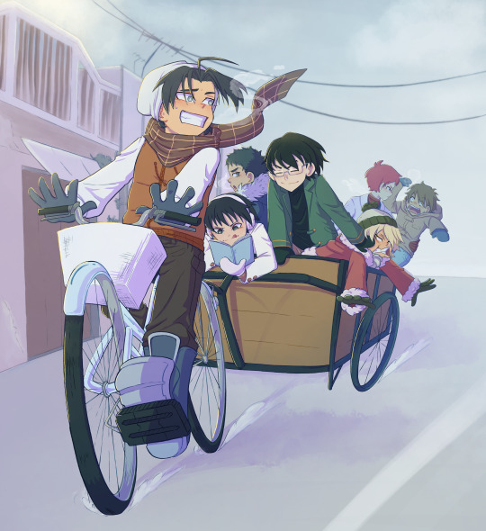
Moreeee point guards stuff!! :D
#knb#kuroko no basket#this might be the most technically ambitious thing i’ve ever attempted to draw please be nice with my crappy perspective skills#takao kazunari#izuki shun#imayoshi shouichi#fukui kensuke#kasamatsu yukio#akashi seijurou#furihata kouki#unsubtle ship is unsubtle tehehehe#akafuri#this took me way too long lmao#i just realised i’ve drawn akashi more than any other knb character#he’s not even my favourite iuztgfghj#he IS very fun to draw i won’t lie#takao is very very sTRONK as you can see#(HE’S actually my fave)#art
494 notes
·
View notes
Text
Behind the Font: Stentorian, a Luxury Signature Font by PeachCréme
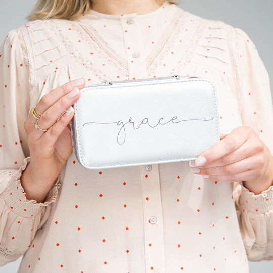
Talk to enough type designers and you will quickly realize something: there is a story behind every letter form. during this Behind the Font series, we're on a mission to reveal the creative process behind a number of the foremost popular font families on Creative Market. this point around, we talked to Gulya Yeap — the talented designer behind Stentorian.
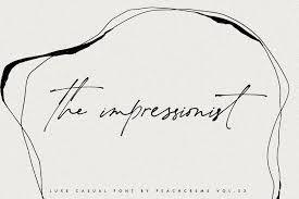
1. What inspired you to style Santorini? Where does your creative process usually start?
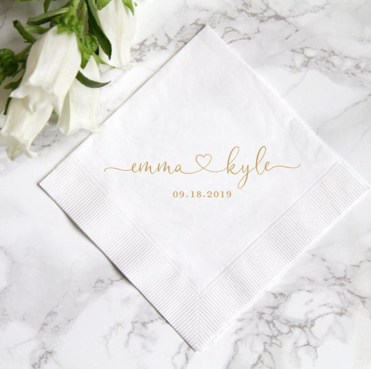
Santorini was originally inspired by my logo design practice. tons of my clients were posing for logos that reflected the spirit of handwritten letters. However, calligraphic script fonts weren't as readily available in 2018. Therefore, i started to pilot my design ideas inspired by handwritten letters and was happy when it took off, and get start course of graphic designing today from the best institutions which has providing the best graphic designing institute in Delhi. My creative process generally begins with a focused purpose. for instance , Sophia Ronald was specifically fashioned to be a marriage font.
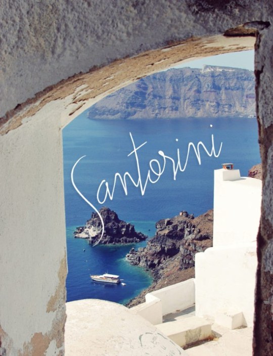
Santorini itself was made brooding about signatures and therefore the handwritten aesthetic. Perhaps that's one among the key success factors here: all of those fonts were crafted with a selected use case in mind.
2. Why did you name it Santorini?
Santorini was chosen by me together with another Creative Market shop owner, Lara's Wonderland. i'm especially grateful for her support. Over the years, I've found true friends at Creative Market and have always felt a spirit of comradeship here that may not tainted by toxic rivalry.
3. What’s your favorite feature during this font which will not be immediately apparent?
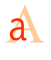
Here my three favorite features in Santorini: 1. The contrast in these big uppercase letters paired with miniature lowercase letters.
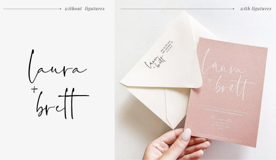
2. Santorini includes 106 ligatures of commonly-used English letter combos, which provides natural handwriting a particular flair.
3. it isn't too thin and features a legible thickness. this is often vital for various techniques like foiling and embroidery.
4. How has your style evolved since you initially started your craft?
When I first began my font design journey, I remember never abandoning until I had completed a final product. which also goes for all the ideas that I even have ever had and set my mind to realize . Over time, my "raw" ideas became more polished, but many of my concepts do remain behind the scenes within the refinement process.
One side effect of being a font designer is that regardless of what proportion you've evolved throughout the years, you will always get that "I've seen this work before" feeling. no matter having worked with numerous clients over the years, it'll still dawn at you from time to time. it's a as long as even the foremost experienced font designers face this issue after having worked for years. A few years back, I wont to be tremendously inspired and delighted whenever I found a bit of labor that I liked. Whether it had been perfume packaging or a random check in the road , I wont to be in awe of other creators' work without giving enough considered the creative process behind it. That has changed. once I check out products that draw my eye now, I immediately consider the creative process that went behind it and the way it had been crafted on a technical level. Fear dominated my early design days because I wont to worry about losing my job. Creative Market sets a really top quality bar for creators and shop owners aren't always successful at staying afloat. The euphoria that you simply feel when everything goes well can become depression when things start to travel south. I owe tons to Creative marketplace for not only giving me financial independence but also for providing me with a way of creative freedom. I want to use this chance to thank all of these who have created and are participating during this marketplace's success.
5. Some say that finding the right font seems like falling crazy.
Please describe a brand that might be an excellent match for Santorini in three words.
"Workhorse" isn't my favorite word, but it does describe Santorini. I've seen an enormous amount of branding, packaging, and style projects made with this font and it's phenomenal.
"My grandma will like it" is another one. This font is extremely much liked by different generations, which helps you avoid age-related taste conflicts. "Just enough". Santorini is carefully balanced: there's just the proper amount of boldness, style, romanticism — that is what i really like most about this font!
6. How would you define your typographic design style?
The journey of making my typographic style is ever-evolving. I wont to stick with making only calligraphic fonts but, lately, i have been mixing things up a touch with sans serifs and serifs. So there has definitely been a change in my work from once I first began and it's pretty evident in my recent products.

One trait that's very distinctive in my design style may be a certain "no filter" or "no makeup" approach to typography. The concept of "no makeup", as applied to font design, means a client of my client might not even notice that a font is getting used . This natural, hand-lettered vibe feels tons closer to me and therefore the quite work i prefer . La Bohemia, for instance , exudes custom, fine calligraphy and doesn't desire a font per see.
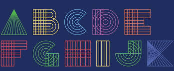
7. What advice does one have for aspiring typographers looking to create a brand? Any specific resources or tools?
For me, it's about staying on the brink of clients' interests. I usually attempt to navigate my creations in ways in which will work both on behalf of me and my buyers. Once you've got an overall idea about their sense of taste, the remainder will fall under place as you continue with the work. Prioritizing their interests has helped me find solutions to problems that i'll not have stumbled upon on my very own . While this method won't be right for everybody , it works just fine on behalf of me — I enjoy working through problems. I often refrain from personalizing anything an excessive amount of because i would like the top product to be useful to them, thereby serving its purpose. Chic Societé for instance , has been made specifically for Instagram quotes thereupon trendy bohemian flair because I could see that it had potential and would work well within the market at that point . Maison de Fleur was also created to enrich a marriage theme.

As for useful resources and tools for ambitious typographers, Fontself are often an honest place to start out . it's budget-friendly and it comes with an Illustrator extension. If you would like to possess a deeper understanding of the method , I'd suggest finding out these type design courses on Lynda. Sites like Dribbble and Pinterest also are great if you are looking for inspiration. Investing in an iPad also can be a game-changer if you haven't already done so. It makes your entire typography experience thousand times easier and better.
0 notes