#this is my third or fourth time redrawing this image. i do it often
Explore tagged Tumblr posts
Text

straight people⁉️
#t#eliseart#mairimashita! iruma kun#iruma suzuki#ameri azazel#irumeri#its not very iruma he needed this hairstyle#this is my third or fourth time redrawing this image. i do it often
60 notes
·
View notes
Text
What Makes Good Branding?—Case Study
The beginning of week 5 marks the time where I am starting to develop my ideas through more independently lead research and practical work. To begin with this, I did a case study on branding so I can understand how I can be successful in my own work.
What is a logo/symbol for? Where do they come from?
A logo is a piece of imagery which is used to represent a brand and its core values through visual recognition. The use of a symbolic graphic to represent a brand makes the brand identity more successful as it is more instantly recognisable to an audience, and this is what makes some of the most iconic logos have such a high value. Because of this, it is crucial to get it right. A poor logo design will carry negative connotations with the brand such as a lack of professionalism or experience. Some of the most successful brands use their iconic imagery as a tool to market their products to their audience.
Through the evolution of corporate identity in an increasingly competitive environment, more complex logo systems are being used to further push the visual identity of a brand through consistency. Logo systems are the fourth type of the logo, the remaining three are:
Wordmark - The most universally recognised type of logo, consisting of the brand name as the primary mark.
Pictorial - A recognisable graphic which illustrates something representing the brand. As an example, a pictorial logo showcasing a Lion would represent pride, which could be one of the core values of the brand.
Abstract Iconography - At first possibly not carrying as much meaning to an audience, but due to its symbolism, an abstract symbol logo becomes more effective over a long range of time.
How do we, the viewer/audience, look at, consume, and read logos/symbols?
When referring to a familiar corporate identity, the viewer will often naturally associate them with the logo which represents them, which is why logos are often compared to the “face of the company”. Once a logo is stapled into mainstream culture, an example being Nike, the iconic “swoosh” becomes influential. Through a logo system and effective marketing, Nike promotes an entire lifestyle through its brand, which the audience adopt by wearing the merchandise. This shows how a good logo can transform from an image to an icon representing a lifestyle over time, without having to drastically change its appearance.
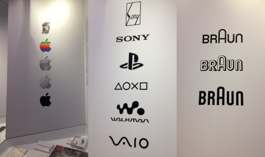
When I visited the design museum, the section on how the brand identities of Apple, Sony and Braun have evolved over time demonstrated exactly this. Both the Apple and Braun logos being the clearest examples, the brand reframe from diverting from the original concept of the logo to further ingrain the concept into the company’s identity.
What are the key principles of successful logo design?
Successful logos most of the time follow a set of characteristics which set them apart from the amateur logo. These are:
Works in a single colour first.
Adaptable: Can be used across multiple mediums and sizes without the recognisability being sacrificed.
Memorable: It must be simple enough to easily redraw. This is a common rule to gauge how effective the memorability of a logo is.
Unique: With an environment full of millions of corporate identities and logos, it can sometimes be hard to produce a logo which is completely unique, but it is important for a brand’s image to stand out from its competition.
Relevant to the brand. If the logo represents something which the brand doesn't, there will be a conflict in the brand identity.
History
The first example of iconographic imagery being used to represent a brand is during the 14th century. Craftsmen would use them to attest to the quality of precious materials. In particular, the Leopard (4th from the right in the image below) has been used to represent ‘The Goldsmiths' Company Assay Office’ since as early as 1300. Being the earliest examples of imagery being used to capture a company’s values, they show how logos can be used to signify quality in a product.

As ‘The Goldsmiths' Company Assay Office’ has evolved, so has the hallmark. However, in a similar way to Apple and Braun, it remains as the same concept—the Leopard’s head. The most recent version fits the guidelines of a good logo but the concept is identical to the first hallmark produced in 1300. By doing so, the icon “continues to be internationally recognised as the stamp of approval and guarantee of quality from the renowned home of hallmarking”.

The ways in which logos were used and made started to develop with the introduction of printing and advertising. During the industrial revolution, businesses started to be founded more often and along with this, advertising products on posters also became a lot more popular. With this, businesses would use imagery and a lot of the time typography to represent and advertise themselves and their products.
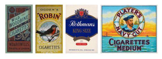
In a similar way to how the Hallmark was used to signify quality, the imagery that was used on posters had connotations which the audience would understand and assign to the product. For example, the coat of arms on the third example would represent patriotism, therefore would suggest that the product being sold was authentic.
The Apple, Sony and Braun logos at the Design Museum offer an insight into how effective logos have evolved along with a constantly changing industry. Another example of this is the ‘McDonalds’ logo.

For the majority of modern logos, the older variations are more complex. As the brand evolves with its logo, the elements which become recognised are kept and overtime, the rest is removed to result in a minimalistic mark. Looking through logos through time, they simplify as they become more modern. I chose the McDonalds logo specifically because it is widely referred to as the “golden arches”. This shows how iconic the simplicity of the logo has become.
Techniques of Branding
Consistency is key amongst a brand identity. This could be through the construction of the logo itself or just how it is used in different ways. There are several techniques for constructing a logo which is consistent.
Grids
I have already seen how grids can be used to produce typefaces that are consistent from the earliest days of type design. Grids can also be used to create logos where the ratios are balanced. The most recent ‘Braun’ variation is an example of this. The logo uses a square grid to keep the line weight of the type, the kerning and the letterforms exactly the same throughout.

Grid techniques aren’t limited to square grids. Some other variations include isometric grids and circle grids, but there is also the possibility to make more unique grids such as the one used in the Apple logo.
Golden Ratio
By using a more ambitious grid, the Apple logo can remain as an organic shape representing an apple. The grid uses the ‘golden ratio’, a value which is found both in nature and some of the oldest architectural designs, which creates compositions that are visually pleasing to the human eye. The golden value is 1.61803398875 and is met when the ratio between the largest value of two values and the smallest value is equal to the ratio between both of the values combined and the largest value. It is easier to demonstrate visually.
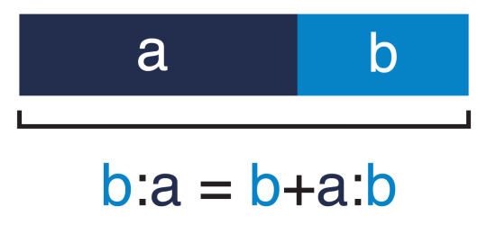
The golden ratio is not only used in logo design but has been seen to appear in some of the oldest architectural designs in history.

The golden ratio can be found in the Fibonacci sequence. This is a numerical sequence where the next number is determined by the sum of the previous two numbers (1,1,2,3,5,8,13,21...). The higher the values go through this sequence, the ratio between two consecutive numbers reaches closer to the true golden ratio. When this sequence is visualised with squares, this ‘Fibonacci spiral’ pictured above is produced. This is the spiral that appears in nature in things like sunflowers and spiral shells. It is also the grid that the Apple logo uses.

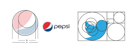
Some other brands that implement the golden ratio are Twitter and Pepsi. By using the golden ratio, each of these logos has a consistent structure which is visually pleasing to the eye. The form of these isn’t limited by grids which use squares or triangles, so the recognisable form of the original imagery (like the bird in the Twitter logo or the apple of the Apple logo) is still clear. The Pepsi logo is slightly different as it is more of an abstract mark, an example of a symbolic logo.
Geometry
Using shapes to construct logos is popular because of how simple and familiar they are to us. This owl logo made by Ethan Fender demonstrates how far you can abstract a natural form into only using basic shapes. All of this is done whilst retaining to a grid system, ensuring the logo is as balanced as possible.

Negative Space
Negative space is just as important as positive space when considering balance in an image. By controlling the space surrounding the logo just as much as the space covered by it, you avoid there being any question about what is connected and what isn’t. In regards to gestalt, the proximity between two objects is what determines whether they are grouped or not. In a similar way, with too much negative space between two elements in a logo, they may become disconnected and perceived as two separate elements.

The old Verizon logo uses negative space poorly in my opinion. The large tick is over-powered by the wordmark because of how much negative space there is in relation to its positive space. It is also perceived as separate from the ‘Verizon’ type because of the large amount of negative space between them. The right example (the updated Verizon logo) has a lot less space between the two elements and the tick being smaller accounts for the more space around it.
When negative space is used effectively, it can create balance. More imaginatively, however, negative space can actually reveal imagery which at first would be passed off as part of the space around the primary logo. The most notable example of this is in the ‘FedEx’ logo.
Overshooting
This is something I have already identified as being used in type. Overshooting also occurs in other areas of design where there are discrepancies in human perception. For instance, a triangle has more negative space at the top and none at the bottom. This causes the shape to seem bottom-heavy, so when centred correctly it appears to be off-centred downwards. Therefore, many ‘triangular’ logos will be overshot upwards to make them appear centred.
Black and white will also affect our perception of size. White optically expands, meaning that when white and black are used alongside each other, the white space will appear to dominate the black space if they are both equal. Again, to counter this, overshooting is done to make both the black and the white spaces seem to take up the same amount of space.
This is also the reason why the Google logo isn’t a perfect circle. The shape of it has been overshot by being stretched slightly inwards towards the bottom right section of the ‘G’ to account for the flaws in the way humans perceive curves.

Logo Systems
As the commercial environment became more and more competitive, brands starting adopting more ways to implement their logo into the face of their identity. This is where logo systems originate from. They use other visual elements which continue through every aspect of the brand to accompany the logo. An example of this is

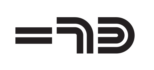
Focusing less on the logo itself, but more on the elements of the logo that are the same throughout the entire brand identity, this ‘Barwis’ example by Michael Bierut and his team demonstrates an effective logo system. There is a range of iconography illustrating various athletic activities, each still being restricted to the simple geometry of the main logo, whilst still being easily recognised.
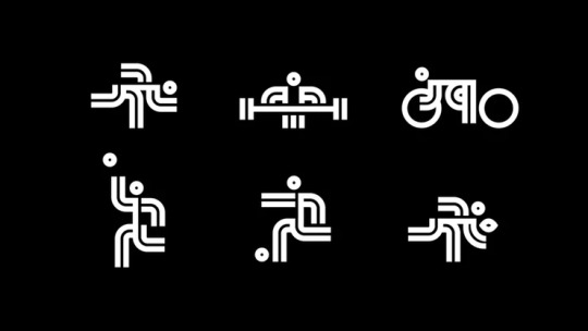
Every icon created to accompany the logo design follows the same strict rules the logo does but are different enough to have their own individualism. The negative space between two areas of positive space never changes throughout the entire iconography, meaning Bierut was able to create the different stances through simple line work at the same time as reflecting the visual style of the logo. Although no part of the actual logo has been maintained, there is a strict set of rules in terms of the spacing and thickness of the lines which is what creates the visual link to the viewer throughout all of the imagery. I like this link in imagery especially because it’s more subtle than anything I’ve looked at. The branding behind Barwis shows how abstracted you can take real-world examples of inspiration whilst linking to a modernistic logo through only using simple shape and structure.
Looking Back
My research has allowed me to draw many connections between branding and typography. I now realise how similar both of these are to each other and how the skills and things which make successful outcomes transfer between the two. Both type and branding attempt to do one crucial thing—communication. They are both examples of the success of the outcomes coming from how they work, rather than how they look. The best types of logos and typefaces are often minimalistic and have no features which don’t have a specific purpose. I see a resemblance between more modernistic, symbolic logos and the quotation by David Carson “don’t mistake legibility for communication”. In a similar way to his type work, more abstract logos may be harder to understand initially, but they work better at communicating the core of the company and being easily recognised.
Moving Forward
After looking further into logo design and brand identity, it is definitely something that has piqued my interest as something to explore even further. I believe the work I have done so far (and will continue to do) on type will transfer to a further understanding of brand identity. I would consider branding one of my main strengths, but looking at logo systems is something I want to do more of in the future.
When I looked at gestalt, I identified patterns as a large part of logo systems because of the similarities they share with the overall logo of a brand. Because of this, if I want to look into logo systems more than logos, I need to start developing my skills with creating things such as patterns. This is a potential for me when I start to make practical outcomes soon. Having mentioned Michael Bierut as an artist above, I want to go more depth into his work so I can understand what it takes to think about a logo as a system rather than just an individual icon.
0 notes