#this is a joke buut i hope whoever finalized this got fired
Explore tagged Tumblr posts
Text
oh yeah, now that it's closed, here's the post i wanted to make about that rt rebrand poll i made last week. this will be pretty long and kinda rambly, so feel free to just blacklist the "long post" tag :)
so like, i made the poll because of 2 main reasons: 1. because of a mix of comments i saw on other sites from people who also didn't know what color it was supposed to be, and 2. because of myself confidently believing it was some shade of orange until i switched from looking at it from my laptop screen to my phone screen.
it being a godawful shade of red/red-orange was mentioned in the article itself, which is why my question was phrased "what color do you guys think it is?" since either red or orange is both technically correct. going more into the specifics of the poll numbers:

tumblr doesn't show the specific number of people who voted for any given poll option by default, just the percentage, so i went digging and followed this tutorial to get the raw data using firefox's inspect tool. the final results are, with 934 votes total, red at 551 votes (59%), orange at 303 votes (~32.4%), and other/a secret third thing at 80 votes (~8.6%).
red winning wasn't a surprise, really, but i was pleasantly surprised at how many people didn't have a definite answer or switched between answers like i did. i can't exactly pin down why that is, but if i had to wager some guesses...
the color scheme has a high chance of being a callback to rooster teeth's Popular Web Series Red Versus Blue™:

and with a want/need for rt to rebrand, the idea of keeping the color scheme while also making it modern and pop out is really cool, but its execution is uh...

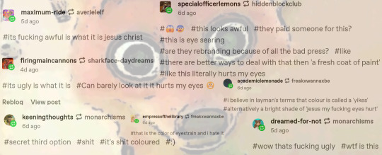
i couldn't fit everyone's tags, but you get the gist. it fucking sucks, man.
as @god-of-arts-and-crafts has pointed out:


orange and blue are complementary colors, with them being opposite each other on a color wheel except the people who made the rebrand chose a deeper shade of blue??? they couldn't even get that right, oh my fucking god, so while its technical color is red-orange, it can be overwhelmingly orange when paired with a similarly bright shade of blue, which is what's causing many people eyestrain. hell, the first time i looked at the picture when the news dropped, it literally gave me a headache lol
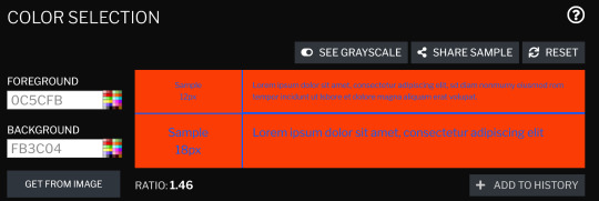
finally, as i've said in the tags of a different post about this eyesore, this is an accessibility nightmare. with the worst color combination possible, the colors used for the new font and logo are definitely not ada-compliant. there are free sites out there to test images for general accessibility issues. contrastchecker is what i use sometimes, and below is what i got using red-orange as the background and blue as the foreground, and vice versa:


(both versions had the same ratio and color difference lmao)
the americans with disabilities act recommends that the contrast ratio be 7 at the lowest, but should ideally be higher than that, if possible. this is objectively and subjectively a very bad corporate rebrand, and i really, really want rt to break their "no jokes on april 1st because that's our anniversary" rule this year. if for nothing else, then just so that people who haven't read the variety article and/or the reactions on social media aren't jumpscared once the new intros/endcards/whatever else start rolling in.
#i almost made the third poll option be ''it's bad/ugly whatever it is''#but i knew that would win by a landslide#roosterteeth#rooster teeth#achievement hunter#funhaus#rvb#red vs blue#rwby#eyestrain tw#this is a joke buut i hope whoever finalized this got fired#i would say someone in-house could've designed a better one#but given how many people got their roles dissolved or voluntarily chose to quit last year#i genuinely don't know how many graphic designers are left at rt hgfdhhgfdxgh#long post
53 notes
·
View notes