#theyre all great though
Explore tagged Tumblr posts
Text


if you told me these were all the same man i would believe you
48 notes
·
View notes
Text
spoilers for the end of episode 1 (past the 8 hour mark) of curse of strahdanya below the cut
sarnax going down and shepherd trying so hard to save him oh my god dude….that was wild
i have this little document where i put down important moments / notable character interactions / jokes etc, and—
8h30m-8h43m “sarnax! no!”, “sarnax! I’m comin’ for you buddy!”, “sarnax, are you alright?!”, “get back where you [unintelligible] buddy come on!”, “alright buddy dont worry about the tail, we’ll reattach that bit, but you gotta get up on your feet and get goin’!”, “you can do it buddy, i believe in you!”
(context: sarnax went down and a bit of his tail was cut off)
i just Feel the gears turning in my head…one day ill be going feral over them i think (and i cant wait)
ALSO idk if im right about this (in my defense my brain stops working after 3 pm) but there are a handful of possible CoS references in OUaW? the spirit halloween bit with the spooky voice and shepherd (ooc) saying what-a-do specifically
#im enjoying curse of strahdanya so far!!#victoria sarnax and shepherd my beloveds#theyre all great though#legends of avantris#curse of strahdanya#silas shepherd morgan#sarnax of the edelwood#not art
24 notes
·
View notes
Text
oops uh sorry for the sparkledog spam. I found a good blog and went crazy
1 note
·
View note
Text
zutaras are about to be baited so bad for the second time in a row and frankly idc can i get ten more scarf scenes please
#zutara#watch as they milk zutara for all theyre worth and still not make them canon#yes i watched natla and i dont feel strongly either way about it#it was neither great nor bad but some secret third thing#dallas makes an EXCELLENT zuko though
699 notes
·
View notes
Text
Everyone with autism loves Shion, thats just the truth (its me, im talking about me)
I hope Live Emotion can help people discover their Heavens oshi, or learn more about them in general, and I'm curious if the new character bios will help people decide, or if there'l be any changes. So, I'll be hosting a poll before the Heavens Live Emotion introductions, and another one afterwards to see if anything changes.
*Your "oshi" meaning your favourite member.
#what can i say#the guys got that autism spark#i love him#you can guess who i voted for#theyre all great though
87 notes
·
View notes
Note
deeply refreshing to see someone critical of Swift who also like, genuinely likes her. Like i'm neutral to positive on her, but the online discourse has been absolutely rancid. flipping between "Taylor Swift has never done anything wrong ever and she's a fucking genius" and "Taylor Swift is the worst lyricist of all time and also a bad person" is exhausting, so thank you for like. nuance or something lmao
not to make it serious for a sec but i genuinely think that being able to like things that are bad is really important. like I think that it's an important skill to be able to look at something and see what you personally enjoy about it and then take a step back and acknowledge that objectively it's flawed. and to also be able to acknowledge that liking something isn't necessarily an identity or a moral stance. and i think that fandom space in general could really benefit from more people taking the time to learn how to do that. it's okay to like things that are bad
#people ask me sometimes why ill occasionally talk about something i like and then go 'but it's bad' and the answer is usually because it is#i love teen wolf. i love genshin impact. i love detective conan. and i fucking LOVE taylor swift. that doesnt mean theyre good#it just means i like them. and recognizing their flaws actually helps me better identify what i like about them!#it's like. in my mind bad > good is the x axis and i like it > i dont like it is the y axis yk. they're not mutually exclusive#tldr it's not that serious. we can all relax a little#irt taylor swift i do also think she has done some real harm to her fans in enabling them to deflect all criticism of her as misogyny#and i don't think it's fully the fault of these people who are parroting that response bc so much of her marketing has deliberately#reinforced this idea that to be a swiftie is to be a part of a sisterhood and that any attack on taylor is an attack on all of those women#who are in that in-group. when that's obviously not the case. but she's marketed herself as. for lack of a better term. 'girl music'#to the point where it makes her fans feel as though any criticism of the music or the woman responsible for it is an attack on their#personal experience of womanhood/girlhood/sisterhood/etc. and that's how you get all of thess bad-faith accusations of misogyny#i don't necessarily think this was her deliberate goal with her marketing tho because like. on first glance such a strong sense of communit#among fans sounds like a great thing. the friendship bracelets i got at the eras tour movie are really genuinely special to me.#but it does present a problem when your fans are unable to separate how they feel about the community and experience your music has fostere#from how they feel about you as a person. especially when you are a billionaire who absolutely CANNOT be above criticism in this economy#anyway. tldr i love taylor's music and i don't think swiftie hivemind is as deliberately malicious as it may seem#but it's obviously necessary to be able to take a step back and look objectively at what you're participating in.#anyway stream ttpd or don't idc <3#taylor swift
203 notes
·
View notes
Text
can the mtt commit more crimes that just murder please i know theyre the MURDER time trio but ppppleasse,,,, please,,,,,,
they'd be terrible to be next to on the highway. horror's going 160 mph amd has long past gone over the speed limit. dust's out for BLOOD and by blood i mean your tires. he's somehow sniping those round rubber wheels from the high moving vehicle with the precision of a master fruit ninja player. if your car explodes or flips over in the process that's not his fault. and then to make matters worse for everyone on the highway killer's in the backseat scratching up the doors and windows of your car with a knife everytime horror gets close to another car and oops he accidentally just disfigured your face also did i mention theyre all drunk during this
ok so theyve all got the classic face WHY DONT THEY ABUSE IT!!!! horror gets to do a little paper mache to cover up his head hole and then wearing glasses. killer i dont know what the FUCK he can do to get rid of his perpetual tears but let's just pretend that theyre conveniently gone for now. and then all dust has to do is put down his hood! anyways identity theft is cool. imagine how much they could totally fuck up classic's reputation with this. set up fake tinder profiles and then scam people for their credit card info/free dates (while ordering every expensive thing) and stealing wallets. walking into various grillby's's around the multiverse and telling terrible jokes. like ACTUALLY bad jokes. and then of course just being a huge piece of shit at the bar. god theres so many things they could do pretending to be classic. which one of us is hikaru looking ahh except the only difference between the three is the color of the stains on their clothes (either gray (dust) black (killer) or red. well faded red (horror))
ROBBERY!!!! ROBBERIES PLURAL!!!??? train robbery gas station robbery bank robbery GOVERNMENT robbery (what would you rob the government for?? documents??? idk) anyways. mtt robbing a train except its just a really shitty plan and they dont know jackshit about what theyre doing. killer's taken over the conductor's cabin and now he is booking it. how fast are trains allowed to go idk but the maximum. anyways meanwhile horror's on the tracks fucking up the rails with his strength or whatever (listen i know he's weak but picking and choosing what hcs i believe in is my art) and dust is there to teleport him away before the train crashes into him and turns him into a trolley problem victim. and then of course that shit doesnt fucking work and the train just ends up flipping over and catching on fire or something (killer survives because of course he does he's killer). and then in the end dust just has to flip the entire train over and they just stroll into the part that actually HAS the money
and then they go out and get ice cream. sometimes the murderers need to take a break from murdering and just do NORMAL crime yk???
#dragging this absolutely ancient draft out of the trenches because i've been having a scene in my head that fits this#i mean not REALLY related to this since its not a crime. more like him reckless abandon of life! their own lives! yeah they die#imagining.... trio driving around in the mountains. dust's driving ans horror's in the passenger and killer's in the back seat because he i#and dust just starts speeding up like...... much more than he really should be in the fucking mountains#and killer points it out and now all of a sudden horror is absolutely terrified LMAOOOO trying to get dust to slow down#and then they crash. but if there's no one more determined in the world killer can always load a save and theyre alive again#and dust is STILL speeding when they come back even with the knowledge that they die and horror's still terrified#but dust just tells him to calm down and loosen up a little bit!!! theyll come back afterwards anyways and they dont even die in pain#and after a few more deaths horrors just like. ugh. fine. you know what FINE ILL GO ALONG WITH IT#he says as he starts laughing along with dust because man!! the feeling of looking out at nature right before they die in a blaze of glory#is GREAT!!!! and then you know something something horrordust have trust in killer to bring them back after they all die#something something horror is willing to give up his usual reservations to have fun with the other two#and its so fun afterwards.... because nobody but them gets hurt!!! dust and horror wouldnt wanna hurt anyone after their au lore#and killer has no reason to in this scenario. so it all works out for them!! the only people getting hurt are them and lowkey they deservei#the sans in the au is probably sooo confused as to why the world is reloading even though theres no human doing so 💀 killer you GOOF#theyve probably all died so many times but only they remember it. soooo cute.... only they get to see each other at their weakest 💔💔💔#killer absolutely abuses the save point when theyre all together i just knowww ittttt sooooo well#he wants everything to continue not restart or go back??? ok but everything IS continuous with these two#not like they stay doing one thing over and over anyways so its not really perpetual. anyways dust and horror would get bored along with hi#if they just kept doing the exact same thing over and over trying to find every possible ending. nahhhh#triglycercule this is sooo unhealthy none of them would do this!! ok well they make each other worse who said it was ever gonna be healthy#screw EVERYONE in the violet banquet discord server who indulged me in my trio waltz dancing in a field of flowers at 3 am. brainrot now...#this scene i described in tags totally happened in my trio meet each other fic btw. just that it hasn't gotten to this point at ALL yet 💀💀#tricule rant#killer sans#dust sans#horror sans#murder time trio#sans au#utmv
69 notes
·
View notes
Text
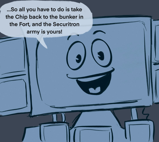
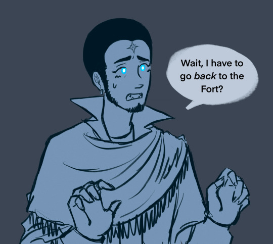
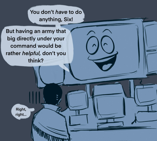
fun fact: when i first went to the fort to kill caesar i completely forgot about the bunker. it was a stressful return trip
#fallout new vegas#fnv#new vegas#courier six#courier oc#yes man#this is old art but i wanted to post smth while im recovering from the Illness (Mental)#fr though i was like great! well thats done and then yes man was like hey you fucking idiot#this is completely canon for him. his ultimate ADHD moment#yes man: about that bunker at the fort…#sirius (still on edge from killing caesar): about the huh at the what 😀#at least he got to take arcade with him the second time around#also. yes man only calls him six while theyre first working together#since ‘courier six’ is all he really knows him by and sirius is kind of nervous around robots and isnt keen on giving him his actual name#i imagine their relationship is kind of strained in the beginning bc of that + yes man thinking he’s an airhead (this moment Did Not Help)#but then they become Super Special Besties eventually <3#ok im off to draw new stuff. probably.#and to work on wips dear god help m#my art#☄️: sirius the dog star (courier six)#📺: yes man
113 notes
·
View notes
Text
Something really great about the persona 2 cast is that they all individually fucking SUCK to talk to casually. Every single one of them. They are all infuriating. We have:
Tatsuya, who will stare at you blankly if you try to initiate conversation (IS) and will dip without saying a word afterward (EP)
Batsuya, who will scoff and brush you off/otherwise act dismissive
Eikichi, who might honestly be the best to talk to in the IS crew and that is not saying much, who WILL talk extremely loudly over you (probably not on purpose?) and will not be paying particularly close attention to the conversation beyond whatever he wants to say (gets points for talking about his gf. gets points taken away for constantly talking about his gf)
Lisa, who will automatically assume bad faith and will be rude to you the entire conversation unless you manage to defuse her temper (good luck)
Jun, who is uncommunicative at BEST and requires an encyclopedic knowledge of flowers, metaphor and body language just to get a HINT on what he’s thinking, and who will be extremely polite but completely unhelpful. If you tried asking him what he wants for dinner I guarantee it will be the longest 30 minutes of your life as he goes “oh I have no opinion :) whatever you want. :))” EXCEPT HE DOES HAVE OPINIONS. He has SO MANY OPINIONS. He is Expecting you to be able to pick up on his “obvious” clues. He will be passive aggressive if you don’t. (Jun babygirl you suck so bad I love u)
Maya, who is a delight but will very quickly become grating if you try to talk to her about anything serious as she hits you with the white suburban mom's "how to live a happy, healthy life" lifecoach slogans. You can’t even mention, like, stepping in a puddle or something without her hitting you with the positivity beam.
Yukino is great actually. 10/10. She’s fabulous we love her. Incredible conversationalist, chill and fun and easy to get along with. But she’s from Persona One, she doesn’t Count.
Ulala, who WILL bring up her relationship problems in every conversation within 10 minutes at least once. Any longer and she will start talking about Maya.
Do I even need to explain Baofu. Have you seen him.
And finally, Katsuya, who is a cop and a kiss ass and Very Obvious about these things. Also he can't talk to women. He can barely talk to men. Help Him.
And yet they all work wonderfully as a group. They are so annoying I love them
#long post#Nanjo and Elly don't count btw#hi I fucking adore them#I missed them <3 Suou Brothers crawling back into my brain#Persona 3-5 have a very charming casts that are easy to like immediately. Persona 1 & 2 are filled with the most annoying bitches alive#exaggeration obviously. not by that much tho#persona 2s cast in particular is very charming. when they're TOGETHER. Individually? Wellllll...#hmm something about p2s cast in particular feels less. gimmicky? I guess? than the newer persona games#which isn't to say that those casts are worse or that the p2 cast ISN'T gimmicky because they are#but idk. you kind of always know how Ryuji or Ken or Yukiko will react to a situation. but the p2 cast may surprise you#again: doesn't make any of the later casts bad! I absolutely adore them. That you can predict them is evidence of strong character writing!#The p2 cast just feels a little more fleshed out is all. probably because the lack of social links means they're able to progress#throughout the story and change without worrying about conflicting with a link yanno?#I love social links though I think they're a great edition!#They need their kinks ironed out a bit but Yosuke has already proved that they are absolutely capable of working hand in hand with the#development of characters in the story as well#and theyre still fun even when they don't impact the story. I like getting to know side#characters too! (Naoki and Ei and Ai and Daisuke and Kou and the old lady and Akinari and-)#tag ramble#persona 2#tatsuya suou#eikichi mishina#lisa silverman#jun kurosu#maya amano#yukino mayuzumi#ulala serizawa#baofu#katsuya suou#Also um. hi. Its been a while lol
84 notes
·
View notes
Text
Scar and all the ghosts are stuck eternally in secret life because Jimmy failed to fulfill the role of canary so everything broke, it's also why he could come back as Grian's guardian angel, cause no one can leave.
#trafficblr#solidaritygaming#goodtimeswithscar#and so everyone is stuck in purgatory and no one but ranchers are having a good time#ranchers are doing great though they get to hang out and stare into each others ghost eyes or whatever the hell they do#or theyre all at lizzies sleepover party in the void which is a pretty great place to be#me? coming up with hc that probably 50 other people thought of half a year late? its more likely than you think.
57 notes
·
View notes
Note
Hiii, do you have any tips for drafting out embroidery patterns? I've got one in mind, but drafting it out and color picking is so nerve-wracking!!
[Hi!!!! this got kinda really long so I'm gonna crop it under a read more. And I honestly don't have any real training/instruction in fiber arts so this is just how I do things, and probably others do them very differently!]
Haha so my fandom embroideries are VERY different from my non-fandom personal pieces in this respect. For non-fandom things i just kind of throw myself in like WAHOO FREEFORM LETS GO and go for a kind of messy colorful approach that ends up as things like this:
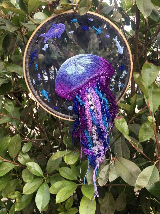
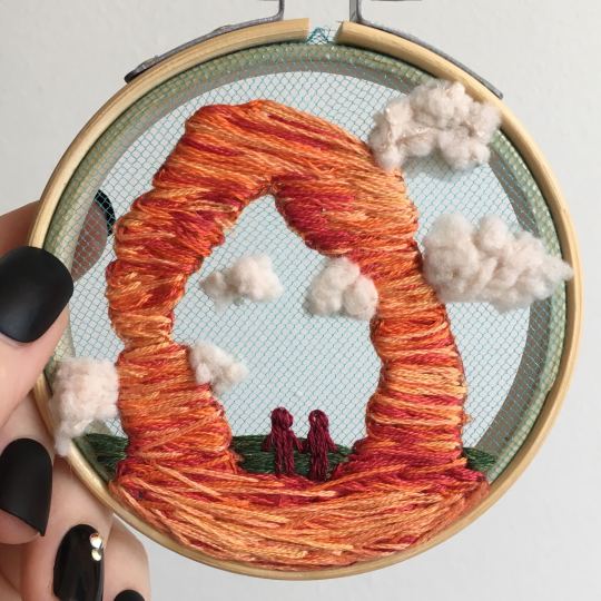
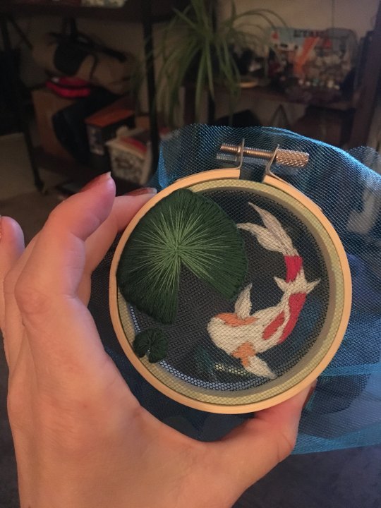
Versus my fandom stuff is way more structured and designed to fill space, be very precise, etc. So for those I do go in with a digital mock up of the design I make in photoshop, that I then color in, and then as my last step translate to thread colors.
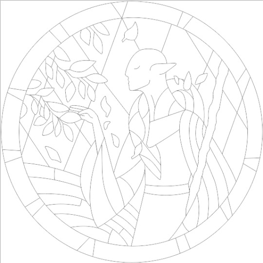
For my Dragon Age series. this has been because I'm specifically trying to mimic the stained-glass style of art you see in parts of the game like the dialogue wheels, some icons, windows, etc. The icons in particular were really easy to copy into embroidery because they already come in handy circles:

This is mostly because I have desperately wanted to pick up stained glass work as a hobby for like 6 years now. As in once every 3-6 months I put everything I'd need to start doing it into an online shopping cart and look at the price total and then sadly close the window because I just don't actually have any space I could do it in (I live in a 2bed apartment so i have no garage or yard or anywhere it wouldn't make everything else a mess or be a hazard). The day after one of those events I impulse bought and completed a floral embroidery kit from the craft store and kinda was like... ok, well, I did this once how hard can it be to use this medium to mimic the hobby I wish I could be doing? Plus, it's only like 60 cents per color! I can afford that! So I took the first design I wanted to do, the romance icon, and basically redrew it sloppily in photoshop, then freehand-copied the design onto fabric and stitched it the next day:

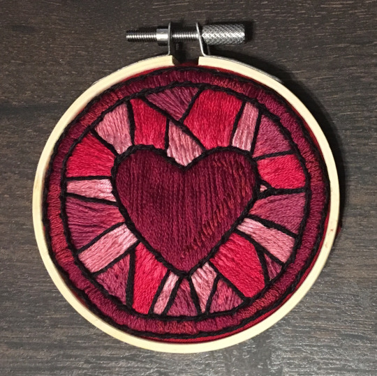
I learned a lot from this piece and changed my approach a little. Here you can see I tried shading in the parallel direction to my thread, which looked messy and added texture, so now I shade horizontally to my thread direction instead.
But it gave me a basic approach for turning the Tarot cards or DA Keep tiles (or any other art!) into embroidery patterns, which I couldn't copy as directly into this really smooth stained-glass style. There's a basic process I follow when doing these conversions that generally follows the same order, which I'll go through below.
STEP 1: SHAPES
The first thing I do is pick the shape of my display frame which is usually a circle, but could be an oval or rectangle too, since I hang the finished pieces on my wall to have nice way to show them off. I like to fill the whole space so knowing the size and shape of what I want the finished project to look like is a good goal for me. Since I am doing fandom pieces I want to be recognizable, I do stick pretty close to the "original" character design/art, but you can absolutely change as much as you want and freehand draw your own interpretation instead. If you're doing original art just substitute the below composition notes with "sketch out roughly what you want it to look like". I personally do my pattern drafting digitally as I find it easier, but you can do this part by hand too.
First, I keep the reference image I'm working off of open next to me while I work, and draw in the shape of my frame (here, a circle). If I'm adding in the little border to be fancy, I add a second inner circle. I keep these as their own top layer so I always know I'm working within the final "frame" and don't spend time designing any section that will fall outside it. Then I will take copies of the reference image and knock the layers down to 25-50% opacity, and start moving them around underneath the 'frame' layer until I like the way their positioning looks as a composition. Sometimes elements of a card I want to include don't all fit in, so I'll chop the section out and add an additional layer to throw in (like the background circle things in the Hermit design below). Or I'll just freehand things like adding much bigger diamonds behind Solas in my Hierophant design because I did NOT want to do 1000 tiny ones. Then once I'm satisfied with the general composition, I'll use the plain ol circular brush tool to trace out the major shapes of each element. I try to keep in mind that I can't go too small, and curvy lines are more difficult to fill in than straight ones. I usually do a rough messy version first, make it mostly transparent, and then a cleaner and more precise one over that.
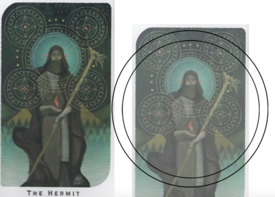


(you can see parts of the rough one on the left and the fully 'cleaned up' on the right for the Hierophant design)
Now: depending on what you are doing next with the pattern, this might be where you stop and start coloring. If you are planning to freehand your design or just trace it onto fabric (or even print it onto fabric here), there's no need to do more than this kind of lineart! However, if you are working digitally and want to create a scalable vector so you can print it at different sizes, you can use the pen tool in photoshop to trace your design and make a "work path" of the lineart. However, another note: THIS PART IS VERY FRUSTRATING AND TEDIOUS BECAUSE THE PEN TOOL WAS CREATED BY THE DEVIL TO TORMENT US. It is so so so easy to accidentally delete a line or even the whole path and not notice later on. Ask me how I know 😭 Anyway I'm not going to include a pen tool tutorial because I don't even know how to use it well and have to google or watch videos every other time I try to use it. But if you can muddle through it gets you some really clean lines that eventually look like this:

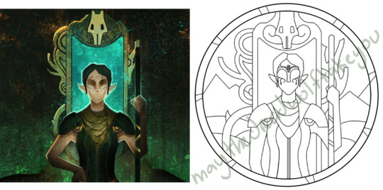
With the work path selected, you can select the brush tool/size/color and use the "stroke path" option to create lineart of the vector. Then you can save this as a transparent png file for use at different sizes and for printing and it looks so nice and clean! one of the big benefits to this is that you get really fine lines that are easier to be precise with stitching on. This is extra perfect if you are printing the design directly onto your fabric (which you can do with an at-home inkjet printer for designs under 8inches wide, as long as you stick a piece of stabilizer on the back of your fabric and cut it down to printer sheet size--this is what I do and can make another post about that process if people want haha), or if you are printing onto transfer paper like you can buy at craft stores.
This is where I end the lineart for my designs. After I have this, I move on to the next phase, which is...
STEP 2: COLOR
For interpreting my designs into thread, I start by thinking of it as flat colors first. You can't "shade" as easily with threads as you can with things like paint or brushes in digital art (though you can A Little, which I will get into), so to start color planning I pick the "main" color each section will be in the piece.

For the existing icons this was simple--I kept the same sections as the original designs, so for each I just color picked or eyeballed the color in photoshop and colored it in (but you could do this on paper with pencils, markers, whatever as well--they don't need to match your threads exactly and usually won't, it's just to give you an easy reference to follow as you go). For the tarot cards which were more complicated in coloration, I just did my best and went with what looked good next to each other, even if it was a little off the original art. It will be off more later anyway when you have to pick threads so don't stress it too much honestly. I will often make layers with different color options and turn them on/off for direct comparison to try to determine what I think looks best as well, like below where I was debating between more blue/desaturated for the background or brighter colors.

I do wanna note I have regrets about the color selection, shapes, or shading in EVERY SINGLE ONE of my finished pieces. But no one else ever comments or probably even notices! One aspect of this hobby is just learning to be satisfied with what you've made and using what you learned to get closer to your preferences next time. I'm only going back and redoing some of my designs' colors because I want to make it easier for others to choose on the patterns I sell, more than I care for just for myself. Also since I'm doing this lineart/stained glass looking approach where I go over the distinct shapes with black thread at the end, it means I get these clear delineations between sections you might not necessarily have in your own pieces, and that's ok.
Ok right. Now while shading/coloring in detail is hard with thread, you CAN make whats essentially dithered gradients. "Dithering" in the concept of art means using 2 (or more) colors to give the impression of a third color, or to gently scale between the existing binary rather than a hard line. Think of it like blocky pixel art or gameboy game images. If you're doing needlepainting, you use really small stitches close together to get this effect, which translates to "smaller pixes"--if you look at the jellyfish in my first photos that's a very messy casual version of that. If you want a better example, I recommend looking at @ammocharis 's pieces like these in her pinned post, which are truly amazing! I simply do not have the patience myself 😂 For my stained glass style, I work only in very long straight stitches, so I can only shade in one direction and have to be a little more precise with it.
So for shading, I think about in each section which direction my threads might go. Then perpendicular to that direction I pick which side will be the light one and which the darker one. Sometimes I color this in on my pattern mockup, but sometimes I don't! Or I'll only do it for certain sections to make sure I don't forget. Like for my Tower design I only colored it as flats, and waited until I selected threads to decide how the shading would go. I am currently working on a smaller, simplified version of my Hierophant design and I did add shading digitally for that one just for fun. But it's not as important as having the flat color version you can use to quick-reference how you want your design to go while you're stitching. You might also notice I don't actually color my gold--I just throw in a stock image of gold foil for that layer so I can't confuse it with any of my yellow thread sections.

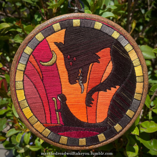

Here's a close up where you can kind of see what I mean by the "dithered" effect between colors--some are more obvious (like the red on the far left or middle orange) and others pretty subtle (dark grey to dark red on the wolf face):
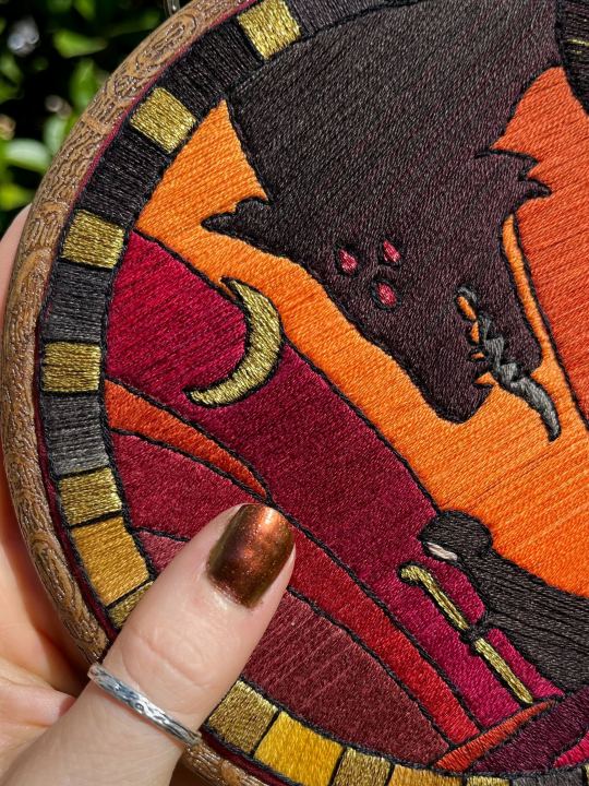
Now, while I use single layers of satin stitches for this, and just alternate thread colors increasing/decreasing as I go, you can accomplish the same thing with short overlapping stitches like with needlepainting, or with clusters of french knots, or whatever else. But in GENERAL you are going to be able to trick people into seeing gradients out of dithering best when you are using the same type of stitch for that whole area. So if I was using multiple stitch types like having french knots, daisy chains, ladder stitching or whatever else for some sections, I would keep those to contrasting areas/colors. A fantastic example of using different layered types of stitching to create more intricate color/texture in an embroidery would be these incredible tarot card depictions by @hattedhedgehog, which I like even better than my own embroideries. Here's his take on the Tower card as well for comparison to mine (I'm so in love with it!!!).
But anyway, at this phase, your design is actually still digital--the above is just to explain how it translates later in the process. The next step is...
STEP 3: THREAD SELECTION
I will admit here I am not great at this part. I am constantly second guessing my thread colors, and can spend over an entire hour in the thread aisle at the craft store agonizing over choices. Really, I think this is just one of those things that takes practice and you get better at it over time. What I have had the best luck with is actually printing out a reference photo of my design/the original artwork and taking it with me. If you already have threads you can do this part at home too, but DMC alone has over 500 colors and I definitely don't even own half that so I like to torture myself by looking at them all together on the thread racks. Plus Anchor and Artiste and whatever other brands there are out there. One approach is to just sit there and pick out what you want for each section and line it all up together on top of your printout. Or in the case of my Tower I laid a bunch of options out on top of my template in the hoop to guess how they'd look in the frame.
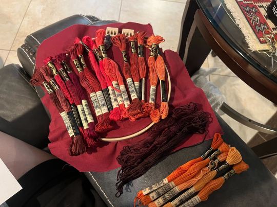
For me since I am also doing this dither shading thing, I also need 2-3 colors per sections depending on its size. Sometimes it's easy and the threads have a color just a little darker or lighter right next to them in the numerical lineup! Other times, there is no good match, or it looks too far away to shade nicely, or I want one to be a warmer or cooler tone than the other... which means a lot of standing and fretting to myself over it. I actually take a lot of photos at this stage because it can be easier to see how they will look in the end from a photo than in person to me? Idk why. Plus then after they get scrambled in my bag I remember wtf order I meant for them to go in later. But as long as you're not preventing other customers from shopping themselves, you can spend as long as you want staring at thread in the embroidery aisle and they won't kick you out unless it's closing time, so take your time.
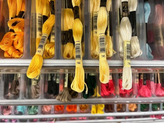
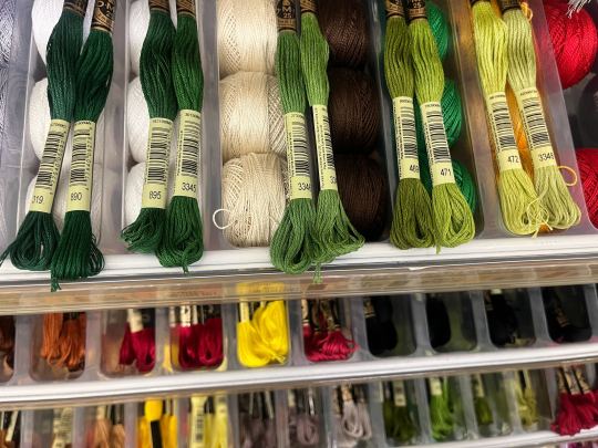
Now, IN THEORY, you can sort of combine steps 2 and 3 by color-selecting from your threads and using that to color in the design. However I have tried this and it led to mixed success because the photoshop eyedropper brush simply isn't actually that exact (in my experience, it desaturates compared to what we actually see). And because then you have to have the threads on hand while you're coloring... which means you might buy ones you don't end up using if you don't like them. So I prefer to just use this as a refinement step where I pick threads based on the design colors, then will re-color the design a second time to match those threads more closely to be sure I like the effect.
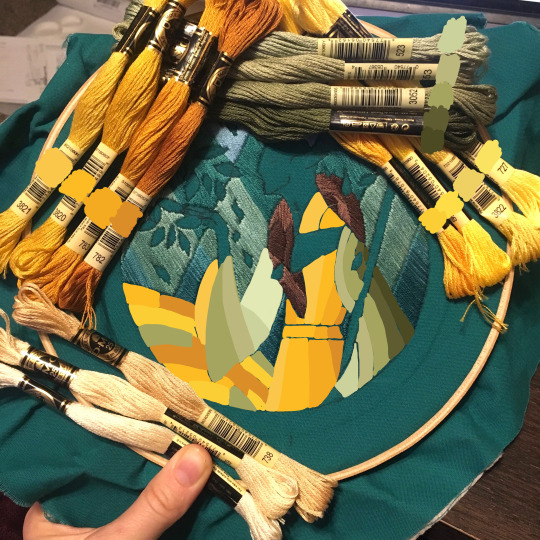
I've even used this as a tool when I needed to adjust my color choices mid-project, by digitally coloring over over my WIP:
Or here's a design (but I haven't posted the finished piece yet bc it's a gift so shhh) I made with certain color tones initially, but after buying thread I re-did the color mockup to be more vibrant, because I liked those threads better in the store:


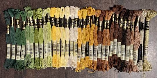
Once you have your thread, you can make yourself a little reference chart with the colors you intend noted on the sections you want them, like below:
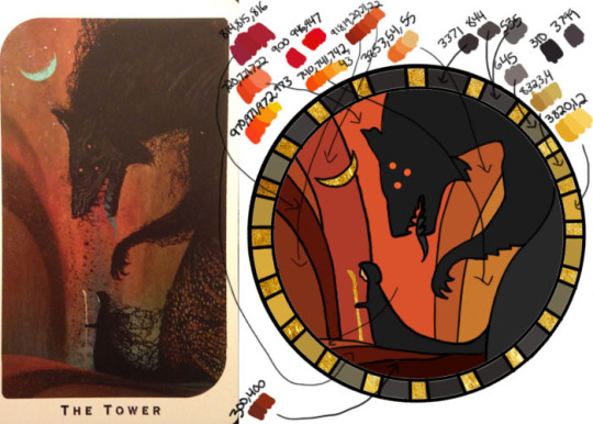
(note: i didn't end up sticking to these colors because I ended up dying my own thread for several sections. And then forgot I made this entirely and picked new ones because I put the project down for a year between design and stitching. Sigh).
Or for my Solas pattern I did this in a really detailed way, which i am sorry but i have redacted because... i have it for sale now and don't wanna just give that away haha. But if you buy the pattern from my shop this is one of the files you'd get with it, for ease of reference. I do also include a text-only list of them as well.

Now I don't go to this much trouble for all my designs, just the ones I put up for sale (or plan to). You can also just make a text list of your color plans if you want. Though for fun I also have been using my scrap thread to make these little "color palette" keyrings for my finished pieces, so if I ever remake them or update their patterns I will know what the original colors were, plus I can compare what i used to other threads if I wanna change part of the design up. This step is absolutely not necessary and I'm just doing it because I'm selling the patterns now, but they are kinda fun to look at.
And don't forget.. if you start a section in a certain color and decide you don't like it, you can just cut the threads and pull them out! I did that with my original hierophant piece actually. I had an entirely different color for one row of diamonds i thought just clashed way too much with the others, so I used photoshop to paint over it with some alternate options until I found one I liked better. Then I cut away all the old threads and put in the new color. It can be a little harder to fill a piece the second time since the fabric will have stretched out a little, but as long as you're using a good stabilizer it usually doesn't move too much.
You can also just make test swatches on spare fabric to test before you add them to your real piece. I wish I'd done this for some color transitions that didn't end up looking the way I wanted, but I am simply too lazy most of the time. My exception is usually for metallic, satin, or sparkly threads, because I want to know how they feel while embroidering. But if you're really worried about a certain color or shade it's a good thing to remember you can just do.
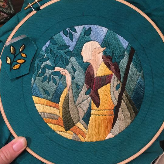
SO yep, that's my general process for drafting patterns. I start with the shapes/design, then do my flat color version, then I pick my threads. Makes it sound easy and short when phrased like that :) But I can honestly spend 8-10 hours just on making the lineart and coloring it in. If I was better at art, probably this would be less, but I'm working with what I've got (not much) 😂 I think all aspects of this are also something that gets easier over time, but it will probably never look as bad as you worry when you start out. I think all my pieces look awkward and rough right up until I do the finishing steps and move them to the display frame sometimes.
I hope this was helpful and answered your questions!! Feel free to post/share your WIPs to ask for feedback or advice ever too :) I've only ever had people in the embroidery community on tumblr be encouraging and helpful to me, and I'm happy to answer any questions myself when I can or if parts of this were confusing
#ramblings#my stuff#my embroidery#embroidery#dragon age embroidery#calicostorms#oh god tumblr changed the alignment of all my images so theyre all huge now great#WELL I keep tryign to rearrage them to be on the same line and it is NOT working so. thats how they will look i geuss#this is gonna annoy me all night... thats what i get for expectign a Functional Website though
29 notes
·
View notes
Text
some will think it's a stupid pet peeve but why are u guys writing fics in which ians not bipolar? cause it's not reasonable for the plot? doesn't really make sense for the narrative? you find irrelevant? unconventional?
I mean it's fanfic do whatever the fuck you want but mhn. reflect upon why ur erasing the OCs disability, whatever is the reason ur doing it, and the repercussion of u doing so.
#ill say it with all of my heart: do the research to properly write it. its sooo worth it.#sometime in the past i read this great fic in which ians an alien and the writer still made him bipolar theyre a real one ill just say this#“its not that serious” it is though. if u just reflect upon the matter youll see it#just google it real quick. the importance of media representation of disabilities and minorities. the disservice of it erasing.#ian gallagher#shameless#shameless us#og.
37 notes
·
View notes
Text


new rt everyone shes a freak whos pretty sure shes been been given the role of rogue trader as an act of divine intervention to eventually replace the godemperor and bring new glory to the imperium which she thinks is dull and stagnant. dont worry about why she keeps marazhai caged in her trophy room like he's bait its not important and completely irrelevant to the fact ive joke nicknamed her simon thresh. has anyone noticed a lot of slaaneshi demons during warp jumps lately
#warhammer rogue trader#rogue trader#marazhai aezyrraesh#von valancius#if i ever mention about marazhai going insane on the voidship this is what i want you to think of#understimulated predator animal in a cage claws itself open#its worse with her but i do think he generally feels kinda insane anyway#yeah he's tricked into thinking she's tolerable and a fair alternative to the arena then hes taken to the voidship#yrliet [who was the fixation until now] tries to warn him about her before getting her head bashed in infront of him#spirit stone smashed into shards for ritual use body dragged off for vague poor medical knowledge dissection#he is now thinking the arena might not be so bad after all. except he's got no way to back out of this so hes screaming clawing at the wall#shes not giving him up willingly and the only person who could take him by force is calcazar whos not a great alternative tbh!#so he gets to go insane being bait for the chaos god he's already ocd fixated is stealing his soul [on top of normal drukhari fears]#and he's not able to maul anyone else while locked up so its just him dealing with this alone! yay#she doesnt give a shit about pasqal until he gets xenotech in him. then he goes to the trophy room too for study/more grafts#heinrix is most likely captive in the trophy room too with his death faked so he cant snitch#idira Almost got in trouble too for the implant she gets from tervantias but then it breaks and this lass is just angry at her#the Only reason she doesnt feed her to the wolves and kick her out is her door. and she is now trying to force it open with a crowbar#abelard has to deal with her shit and manage it socially. he never thought he'd want to retire but fucking hell when can he quit#she likes jae mostly for her connections. toxic yuri theyre both using eachother#she briefly idolises achilleas for bringing her to commorragh but then finds out he did it under torture and didnt want to. mad at him#he can make it up to her once hes a wrack though [he is going next to marazhai. this will only improve both their mental states]#can you tell this freak is a piece of work yet#shes got screams of the damned volume 3 playing across the ship and shes having a great time but is completely deadpan the whole time#unrelated! you can finally see my idea of marazhai next to a normal fucking human good god. yeah i think hes huge
24 notes
·
View notes
Note
Fighting DEMONS rn trying not to get invested in one piece to figure out wtf you're posting about!!!!
come here cyber.... we have this thang
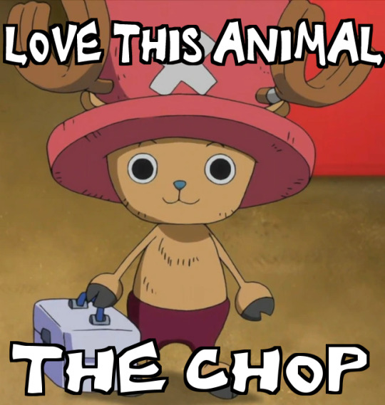
#mp answers#i've been trying so hard not to be annoying to my bnha friends but if you will allow me to push this for this ask let me say 🙏#if you're afraid of the episode count for one piece the manga is a lot quicker read while being just as enjoyable because the art style is#an actual delight. its great its fantastic im absolutely in love with it#the series is soooo good and i know luffy can seem unappealing to people before they start but he's just SUCH a great character & continues#to be even now. the story is SO GOOD the characters are SO GOOD... theres so much lore and world building that its insane#if you read the manga we get 'cover stories' on what's going on with previous characters to see what theyre up to even though we moved on#from where we left them. a lot of these cover stories blend into the main story so well its just seamless#there's one where we get introduced to a character we dont see hundreds of episodes into the anime and they show up like; during the second#saga. the series is about traveling to other islands and every single arc has been tied to another in some way or form that shows up later#even if its sagas and sagas later- it still becomes relevant again!! it's a huge ongoing story and there isnt a single arc that feels like#it has no purpose (sans filler in the anime-but even then!! some filler arcs are really entertaining!)#it's emotional! its sad! its downright stupid and silly but GOD... you can feel the love that oda put into this series and his characters#and the emotions in the expressions and the messages the story gives off it just makes me UEUHGHHAHGHH!!!#it's all about the adventure and the romance of it all! its about the freedom it brings and bringing freedom to others!#its a series where treasure should be a focus given its pirates and the its a giant treasure hunt for the one piece and yet! and yet so man#of the characters treasures are things that are not coins and gems but people and promises and family and and#im going to EXPLODE i love one piece
202 notes
·
View notes
Text
telling myself i can't start another tdwt rewrite but dear god do i want to write one focusing on alejandro and courtney in this weird situationship thats a lot more nuanced than just alejandro manipulating courtney and her falling for it. like theyre best friends they dont trust each other theyre the same person they dont know anything about the other one theres a mutual attraction theyre pining for other people theyre codependent they dont care about each other theyre platonic soulmates like i just want to do a deep dive into how messy that relationship couldve been building off of their friendship that exists in my head except the line between romantic and platonic is so fucking blurred they have no idea what they are to the other person
#they live rent free in my head as you can tell#ive been writing some intense moments for them in amicus curiae and im having a lot of Feelings about platonic alecourtney#tbh the whole concept of them replacing the best friends has been a great avenue for me to do a deep dive into their friendship#aughhhh i just. love them so much#and i do want to explore them in a situation where there is relationship potential even if that relationship never actually happens#because everything between them during tdwt could be so MESSY!!#like alejandro says he's just manipulating courtney but he's also doing it to make heather jealous but he's also genuinely worried about he#after the duncan thing but this is the only way he knows how to express that concern without making himself look weak#meanwhile courtney is falling for the act but she also knows its an act and is going with it for the emotional support it provides and shes#just doing it to make duncan/gwen jealous but she also is starting to see the real alejandro underneath it all because he does care even#though he doesn't want to and they do feel a strong connection that they dont know whether its platonic or romantic because romance is bein#shoved down their throats on this show and theyre both in complicated romantic dynamics with other people that theyre the easier option for#one another but they dont really want to be with one another like it just doesnt feel right#okay okay i legit have to stop and go to bed but just. them. im thinking so hard about them#platonic alecourtney
87 notes
·
View notes
Text

meet my son his name is maunder he has br-HOLY SHIT DID ANYONE ELSE JUST SEE THAT?
#now that i look back on this sprite i shouldve done his buttons n cheeks with circle tool . Oh well#cosmosdex#fortuna#the tragedy of fortuna#sterotypical art tag#i got nofin to rant about this time . surprisingly .#OHHH WAIT . im using him in a dnd campaign thats like the worst ever#(its 5 apollos a cupid(IN AN ARTEMIS SHELL.) and a bia)#the bia has been named our twink rangler because otherwise were gonna tear eachother apart#Also willy wonka is on our crew .#insane shit . i should infodump about them sometime . Not now though ......#*ALL BEING APOLLOS WASNT EVEN PLANNED I. i just called up whopping 6 fortuna friends and was like#hey man do you guys wanna play dnd.#and they were all like Fuck yea man.#the bia isnt really a fortuna fan theyre gonna read it but their computers broken.#i get to infodump to them about all the important game mechanic stuff#its great !!!!!!!!#anyway the apollos wasnt planned we just all ended up pulling up with our horrible twinks.#aw. fuck i ranted too hard . UM WHAT EVER!#just ignore that =]#edit i realized after posting this that its spelt wrangler not rangler. Fuck my stupid fungus life
13 notes
·
View notes