#they work differently and that doesnt apply here but it still adds layers
Explore tagged Tumblr posts
Visit Tumblr Blog
Explore Tumblr blogs with no restrictions, modern design and the best experience.
Last Seen Tumblr Blogs


Fun Fact
Average visit duration of Tumblr.com is 10 mins and 25 secs.
Text
im aware that daniel calling armand "boss" is a one time thing in the book and at some point it became like a fanon nickname that gets used frequently and some people don't like it. but personally i am a daniel caling armand "boss" enjoyer. i think it's cute. especially when it's like... it just started out as a snarky passive aggressive thing whenever armand got really bossy and bitchy and daniel bit back and then it evolved into a term of endearment
#which is how it is in the book anyway since its a sarcastic reaction to armand getting annoyed + wanting him to shut the fuck up lmao#but hes his minion yknow. he can act like a little henchman if he wants 🫡#i also like it in the show context w/ daniel being aware of the whole maitre thing. its not the same kind of dynamic for them because#they work differently and that doesnt apply here but it still adds layers#+ it definitely for him would start out as mocking/completely insincere/sarcastic. and then one day he says it a bit too fondly#iwtv#devil's minion
182 notes
·
View notes
Note
3 and 10 for everyone on nessus for the oc ask game!
3. What does your oc look for in a romantic (or perhaps even sexual) partner? Is this always healthy?
Rodya: I feel like he's not looking for one, at least not for a romantic partner. His sexual life is kind of different though, bcuz i imagine he likes one night stands and whatnot for the instant gratification they give him. Its like he doesnt have the patience for a romantic relationship (how did even him and davey work...thats a whole another question that i really need to delve in) or more so he doesnt know what he wants bcuz he doesnt give it too much thought. Which is how he easily hurts other people who happen to be intrested in him haha
Davey: im gonna be real honest i think hes a simple man who is a friends to lovers believer. He earns for vulnerability and intimacy on all levels from platonic to romantic to sexual.
Morgan: i think shes simmilar to rodya in a way that she doesn't exactly know what she wants, but to her its very deeply rooted in her transness that she hasnt realised yet. She tried to be a gentelman, a family man even and it actually worked, and she enjoyed a lot of it but it just felt off, hollow in a way. Most of her life she performs relationships for one reason or another. So at some point she just gave up on them
Mariana: shes looking for maturity and stabilty, with its own layer of fun. She's always on the move though so she needs someone who can keep up. Luckily she found a partner like that
Fifth character that still doesnt have a name and a solid design: i think they want to someone courteous ^_^ i think theyre kind of tired of working so hard and just want someone who will sweep them off their feet
10. Does your oc have a type? Have they ever been surprised by their feelings to someone that doesn't fit this?
Rodya: i think his type is just generally dominant people. Or .....bears.... Which is why his whole relationship with morgan confuses the hell out of him but i think he just doesnt realise that he can actually be ...close friends with people..... Loving your friends is normal 😭.... But also its so complicated i cant really explain it.
Davey: considering what hes looking for in a partner i think he doesnt have a specific type visually at least. HOWEVER people with dark/brown eyes are his weakness
Morgan: I think her type if confident outgoing people . Yeah. Dont know what to add here. It might stem from her self image too
Mariana: butch women. Sorry it had to be said
Fifth character that still doesnt have a name and a solid design: butch women also. ALR im joking i think they dont have a type at least not yet theyre pretty young (not super young but still) so theyre ready for their brain to impress them . Actually wait I think their biggest thing are gnc people T4T FOREVA! (t4t applies a lot to both rodya and davey too btw IF YOU CAREEE)
3 notes
·
View notes
Note
If you don't mind, could you give us a tutorial or brief explanation on how you render hair? /nf
YES!! unfortunately i got. very tired after making this so this is only one hair type :( was gonna go into all the different types of hair textures but. i will just have to do that later. also keep in mind i drew this in like. 7 minutes its just a simple guide to get out the basic steps
^i didn't put music in this so. listen to whatever u want while ur watching this (its 6 minutes 40 seconds). also its slightly sped up this isn't real speed
elaboration of each step under read more:
step 0: look at other hair tutorials/pictures of real hair to figure out how light reflects off of them. then completely disregard that and just make things up (this is the best artistic process trust me i do it every day)
step 1: just get out that basic shape. it doesnt have to be anything fancy,
step 2: just fill it in and adjust the shape as needed
step 3: figure out how the hair moves and flows, which parts go out more (highlights), which parts are closer to the head (shadows/base), etc. i highly recommend just looking at pictures of hair online, or taking pictures of your own hair. for coily/curly hair, you just kind of have to do this for each curl/coil. one thing to keep in mind the highlight is in the middle of the curl/coil and the shadows are on the edges (usually). i'll elaborate more on that once i have an actual video for it
step 4: just make it so the edges of the highlights transition a bit more smoothly into the base color. it just helps for later steps tbh. try not to over do it, don't want to completely get rid of the highlight, just soften it
step 5: add more highlights with thinner brush. this should be where the light would bounce off the hair the MOST. i think i forgot to say in the video uhhh add in some base value too. maybe a few shadows. mostly this step is for highlights tho.
step 6: idk what else to put here sorry. ngl just get silly with it
step 7: it is very important to do one stroke per area in this one. do not lift your pen off the screen/tablet/whatever until the little area youre working on is one smooth transparent shade, then move on to the next. idk if i'm explaining this right hopefully this makes sense.
step 8: complete opposite as step seven. make as many strokes as you feel it needs. not TOO many, just enough to get some texture and then some yk? i recommend making a copy of the layer youre working on before doing this so that if you mess something up you can always go back to square one.
also a lot of these steps apply to pretty much any hair type just. in a completely different shape with completely different rules. which is to say its exactly like this but it actually isn't like this at all. which is why i plan on making other videos some day (hopefully) also look up "hair texture chart" it will help you find the words you need to look up good refs
remember: always get silly with it. the only rule to to make things up and change your mind 400 times. bring a 'fuck it, we ball' mentality to your art program that the haters (your brain) really won't like. practice makes perfect and all that, do NOT expect to get something good first try, sometimes i still struggle with drawing hair in a way that i like and just scrap the whole thing. also i'm not kidding about those real hair reference pictures it helps so so much
hope this helped at least a little bit bc i am not good at explaining things 👍
#foster's art tag#asks#someday i will make refs for how i draw long/med length and straight/curly/coily hair but. todays not that day rip#edit: just realized a bit of text pops up in the middle of step 3 that is. not supposed to be there so i editted it out👍
21 notes
·
View notes
Note
hi! i was reading your post about underpainting but i couldn't figure out how to get the underpainting to show /through/ local colors. i might've missed something while reading but do you use layer modes on the local colors or something? thanks!
hey there! my "underpainting" layer is usually an overlay layer! there's a lot of ways to do it, so check out other artists via speedpaints or their tutorials and see which version works for you (some people put in greyscale for their underpainting and then add local colors -- i have yet to try this out but i might soon). the only big thing id watch for is making sure it doesnt lighten any of your hues too much if you do it the way i currently do, because its really easy to lighten stuff via layer modes. i would not take my word on my step by step method as law here, i'm still figuring out how to paint but the general "use a layer in tandem with your local colors because color theory uses inherent light" rule works well. many different ways to apply it though
17 notes
·
View notes
Note
Hello! Could you share some psds, our tips etc that you use to edit? :0 Thanks in advance!
hi!! i’d be happy to share some tips!! this might be a bit long, i think i went a bit overboard…… i hope it helps a bit though… !!! also im assuming you have access to a program that can open psd files. and i use photoshop so i’m not sure this will be very helpful unless you have access to it or a program with similar capabilities..
i’ve made up a few examples (using the so what mv bc i just edited that) of how i usually go about editing, you can find the file here but i’ll explain a bit here as well!
0 : psd & general stuff
i feel kinda weird about this but i’ve included my psd in the attached file... if you’re going to use it i dont mind but please don’t say that you made it yourself, and a credit would be nice but i guess it’s not strictly necessary.
first of all, i pretty much always use the same psd with very minor adjustments. i do this to try to maintain a similar look to all of my edits & because i like this psd (i’ve been evolving it with minor adjustments every so often for years…). i always edit below the psd (as in the psd is applied over all the layers of my editing) and i usually edit with the psd on (i used to edit and then put the psd on after and that took so much longer because i couldnt see how the psd was affecting the way the image looked as i was working..)
this is basically how all of the psd files for my graphics look (usually with more descriptive names rather than numbers though), where each of the numbered groups is a graphic panel...

1 : colour correction
i basically start off by trying to normalise(?) the image as much as possible (trying to return the colours to what they would be naturally, without colour correction/filtering…)
first i use curves!!! curves are a lifesaver for me. most images/screencaps will have some kind of colour correction / filtering, i use curves to (somewhat) remove those effects. if you go here, i use the method described as “remove colour cast using auto colour” (except i basically ignore the steps 4/5)! sometimes this works, sometimes it doesnt… if the result isnt quite right i lower the opacity on the curves layer until it looks right to my eye.
if the image is still too bright/dark i add another curves layer with auto set to enhance brightness and contrast! and i again use opacity to make this look more natural!
if the image is still looking unnatural (usually this occurs on especially dark images, and the problem areas are usually on faces…) i use colour fill layers set to soft light or colour balance layers to adjust the colours until the image looks more natural? you can see this in group 8. yves face has a blue discolouration on it (if you untick the colour fill & balance layers you should see what im talking about), to counteract this i added a yellow/red layer and set it to soft light & then added a colour balance layer to make the image a bit more yellow/green. overall the image doesnt look exactly natural, but the colours are more smooth and i’d probably lean into the yellow/green tinge if i was making a graphic with this image!
2 : selecting subjects
there are so so so many ways to extract people or objects from images. i vary the method i use depending on the image in question and the effect im going for. i’m not going to explain every method because you can google “how to cut out an image in photoshop” and get some pretty good tutorials on how to do it in lots of different ways.
recently i’ve been using “select subject” (described here). you’ll likely have to clean up the selection using other tools such as lasso & selection tools, and it helps if you cut out a smaller square/area around the subject before trying to use the select subject tool. theres an example of this in group 9.
another method i use is selecting a range of colours from an image using “colour range” (described here). i use this to both change colours in an image and to remove backgrounds that are of a (relatively) uniform colour. you can see an example of this in group 10, i isolated the fire from the dark background by selecting the shadows & then inverting the selection but because olivia hye was also quite dark i had to select her separately.
theres no real easy or quick way to cut out things, it takes time and effort if you want it to look neat. but it really depends on how you want it to look and basically just practicing is the most important thing… over time it will get more straightforward and you will understand how to cut out different things depending on the image..
3 : colours & textures
probably my favourite part of editing! the fun bit!!
i’m not going to explain much of this right now bc i’m exhausted & i’m not sure how detailed this should be. but if you have specific questions i’ll be happy to try to answer them!!
anyway here are some basic notes on my editing style:
if i’m editing a music video i try to use other caps as textures, you can see this in groups 11, 14 & 15.
i like to layer different caps as seen in group 12
i use colour fill layers set to different blending modes (i mainly use soft light, color/hue, screen and multiply) as seen in basically all of the examples
i havent really put in any examples of this here but i use selective colour & hue/saturation adjustment layers to change/enhance specific colours
i have this one texture that i put on basically all of my edits, i’m not sure why but i like the way it looks... its in the “PSD + TXT” folder and its set to soft light & i put it on top of the psd bc otherwise the psd messes with the smoothness of the texture
(fyi,,, i shrunk the image size just so the file size wouldnt be too big and so the sitting kimlip is bigger than the cap it came from bc of that; the mv was in 4k so the caps were HUGE)
4 : other tips/notes......?
don’t get discouraged if you find it difficult at first
i’ve been editing for years and i’m still not that great and i find it hard sometimes but i do it for fun. i make probably 3 times as many things as i end up posting because i enjoy it and because i use it as an artistic outlet.
i hope someone found this useful? i think i went way overboard but i thought it was better to be thorough !! anyway i hope you have fun editing ! its always great to have more creators in the tumblr community!
8 notes
·
View notes
Text
‘Portrait’ – Vector Workshop
This workshop looks at a basic digital process of converting an image into a vector illustration. By using the subject of a peer, it also looks at a possible way to look at people and use graphics to change their image. This session is a part of a weekly practical development workshop which mainly looks to improve technical skills in digital packages, build up a portfolio of work/experimentation and inspire processes I could use within my project.
Process
Initially, I had to take a photograph of a peer but there were certain requirements I had to keep in mind to ease the later steps. These included:
Contrast (Areas of light as well as areas of shadow)
High enough quality so that there is enough visual information in the image to be kept when making digital manipulations
Avoid complex backgrounds to simplify the vectorising stage.
Once I had a suitable image, the next step was to make image adjustments in Photoshop before vectorising in Illustrator.
Increase the contrast of the image using the levels adjustment to darken the shadows and lighten the highlights
Duplicate the image layer, add the ‘High Pass’ filter and set this newly created layer to the blending mode ‘Hard Light’. This will exaggerate the details of the face.
Add a ‘threshhold’ layer adjustment to convert the image into only black and white pixels. The black pixels will be the darker parts of the image, and the white pixels will be the brighter parts. This will act as the outline of the vector.
Duplicate the original source image and add a ‘cutout’ filter (found under Filter>Filter Gallery>Artistic>Cutout) to limit it to 2 or 3 colours.
Save both the outline and cutout versions as JPEGs and add them into Illustrator

By making these adjustments, it made sure that in Illustrator, when vectorising, all the necessary visual information is maintained and the image doesn’t become too far from the original to the point where it is unrecognisable.
In Illustrator, all I had to do was convert these images into a vector format. To do so, I used the ‘Image Trace’ feature in Illustrator which automatically converts bitmap images into vector paths and expanded them so I could edit each path individually as well as edit the colours. Using this method means that sometimes some parts of an image may be lost/disturbed as it is an automatic process, but this is why I made the adjustments first in Photoshop to lower the chance of this happening.
Lastly, I overlapped the outline version and the cutout version with the outline on top and edited the colours. To do this, once I aligned both layers, I chose Edit>Edit Colours>Recolour Artwork. This allows me to edit each colour as a whole and is a quick way to convert many colours at once without making a final decision.

What is the effect of this outcome?
In comparison to the original photograph, this illustrative rendition features more personality in my opinion. Everyone is familiar with photographic portraits as well as how people look. When you manipulate this look and limit it to just 4 colours, the viewer can still recognise the person in the image but they become more intriguing to them. Using the effect learnt from this workshop is a good way to celebrate someone as the vector version can be used to spark curiosity in an audience rather than using an accurate photograph of the person.
What is the potential for the outcome of this workshop?
Following on the idea of using this technique as a better way to celebrate someone, I carried on by applying the illustration to an advert in a similar way to the way I did in the ‘Runner’s workshop with Mo Farah and Nike. I used ‘Vans’ as the company as their logo was present in the image and was carried through the vector.

Many companies have used celebrities as part of their marketing in order to get the celebrity’s audience on board with their own message. Through the celebrity endorsing the company and being part of the message (much like Mo Farah and Nike) the company’s message can be tied along with the values of the celebrity, benefiting both parties.
What new ideas does this give me?
Before this workshop, I was still unsure of how I could use people to push my message forward. This showed me the possibility of using a portrait of someone and creating a graphic with this as the main focus and how this can actually gain more of an audience, especially when the subject has their own following.
Looking Back
Although the outcomes are very different, the ‘Runners’ workshop and this one both link with the theme of people and have given me inspiration of what I could produce for my own final outcome. In terms of the visual language, for my animation, I wanted to maintain the original texture of my sketches so I used a bitmap file type. Although this limits the resolution of an image, it is better for accurately keeping textures and similar complex imagery. This portrait workshop demonstrates the pros of using vector a format. Although there is no texture, this can give it it’s own look separate from bitmap graphics. On top of this, the accessibility is better in terms of how you can apply vector graphics as there is no limitation to its scale - this means it works a lot better for large prints (such as poster adverts and billboards).
Moving Forward
I aim to use the skills I have practised here to help me develop ideas on how I could manipulate the portrayal of a person to my advantage. I have done traditional animation, basic digital manipulation; I feel like the next step I should take is trying to combine my digital and animation skills together to expand on different ways I can animate. I looked at After Effects animation with keyframes instead of frames in my last brief (Glitch) and this is what I aim to use to my advantage to expand upon the fundamentals I have been given and create some work which is more imaginative to me.
0 notes
Text
Bright and pop are the colors you always look out for the summer season, but how about a more candied perspective, literally! The bubble gum – Ice cream trend is here and no I’m not writing about rainbows and unicorns, but something that may take you there… I’m talking PASTELS ! Say it with blush and pink this summer to look as cool as a cucumber.Get those blush pink crops, mellow yellow dresses and washout out blue jeans out of the closet and dazzle from dawn to dusk throughout the season. For today’s post I have put together a look-book of 2 Pastel favorites which I personally find comfortable for a casual day out or for a lazy day by the beach.

Through this series you will be able to gain insight into my favourite pastel shades and about the pastel trend in general…. What’s more? I will also be doing an #Insta story with interesting polls and trends you & I both are loving this season!

If your not a Pistachio girl , you sure are into strawberry smoothies and if that too doesnt do you good then a dash of vanilla may just do the trick! Haha got you hungry already? Yes I like to co-relate fashion & food, and if you love them both, you are definitely in for a treat!
So let’s get going…
Blooming in Blue
My take on the pastel trend is not to go overboard with one color…It’s sexy when mixed with a few tricks that work superbly when putting contrasting pastel shades together. Going by my previous posts, I’m not much of a risk taker with fashion but I do believe some challenges are a must. So here goes nothing!


My comfort zone in most cases is a solid A-line dress that fits just well, but for today’s look I’m donning a very girl next door persona in these comfortable sky blue frill layered dress and a neat pair of peach brogues that offer the right amount of comfort and fun to create this easy – breezy look.


To avoid a skin tan you can style this lovely dress with a denim jacket and wear the most comfortable yet stylish pair of casual shoes like brogues or oxfords ( some fave’s are listed at the end of this post ). Wear a slightly pink/ purple tinted pair of your favourite eyewear and beach hat while you travel this summer season.

Hair & makeup needs to be minimal and matte as you can keep it! I for one love matte lip shades and am going crazy over nudes … For this look I’ve also applied little makeup, bearing in mind it’s a day look and a little eyeliner and kajal is more than enough to give your eyes definition! You can try a few lighter hues of pink, reds and maybe whites as well to bring out the beauty in the color of your eyes.


2. Blushing in Pink
Pastels have this very subtle yet fun character that somehow rubs off on one’s personality and makes one feel free and refreshed. Among pastels, Pinks are a favourite. A tee or an off-shoulder top over your washed out jeans or denims makes for a very casual yet chic look. This way you can be ready to take on any challenge and still look your best under the sun…


Shorts are just as comfy and make it easy to move around in. While many of us will be traveling and packing for the holidays, lightweight cover ups, overalls and dresses in blush pinks,mint greens, sky blues would definitely help stay cool in the scorching heat.

For my look I’ve worn a fringe design off shoulder pink top with a light blue pair of shorts and white gladiators which offer a comfortable yet stylish look to beat the heat this summer time. Off-shoulders can transform your casual outdoor look to a classy brunch to beach look. Avoid too many accessories in the summer and wear easy relaxed footwear if you have to run around or head out to the beach or do a little of everything…


Trend Snapshot
The ice cream, bubble gum trend is something we can never get enough of. Just look into your wardrobe and you will definitely find a pastel color or two that will go with the current trends.
As much as I love blacks, whites and some pop colors here and there, I love the subtle comfort I feel in my pastel clothing. These are easy to wear and hot to flaunt. Not only do pastels work throughout the year but they also look flattering when paired with the right fabrics. So to give you a little insight to the #pasteltrend, here are a few looks from PINTEREST to beat the heat in the best way possible and in style !
The Pastel Bottoms
The trendy coral, light yellow or even a purple can change the mood for you when worn along with sober pastels like a white shirt for starters or layered with light blue denims. This works very well for summers and can help beat the heat.
Add a little pop of maybe a orange tee or a light lemon green tank top, making it light on the eyes and a very cool look to pull off.
Go all Block:
Block color pastel shirt dresses, a-line dresses and jumpsuits can make a very fun outdoor ensemble. Lighter colors let you shine brighter and keep you cool in the summers making it a lot more fun when capturing moments with friends and family. Mint greens,lilac and olive are great colors to pull off the evening look for parties and events.
Sober Wedding Shades
Attending a wedding in the summer? or are you looking for the best look as a Bride? Check out the various lehengas, salwars and gowns available on azafashions from the recent spring – summer collection of Lakme Fashion Week and more.
The floral design on a pastel shades of pink, peach, light blue or even white is now trending all over and makes for some beautiful bridal wear this season. A very popular example is that of Anushka sharma & Virat Kohli gave us #weddinggoals in their pastel couple outfits for their day wedding ceremony and Anushka definitely stole our hearts in that gorgeous lehenga by Sabhyasachi.
I for one would recommend pastel gowns, sarees or a lehenga for a day event in this season. You can definitely try going pastel for a indoor night function as well like in these looks below.
Pastels Mix Match
If you have never tried pastel on pastel, let me give you a few #fashiongoals with a few of my picks this season that are trendy, comfortable and definitely wearable to work, play, party … you name it! When pairing pastels always find one color that will look like the hero of the ensemble or at least a neutral hue. Pastel on pastel isn’t easy but avoid wearing clothes that look worn down over time, and you will able to pull a rabbit out off your hat making the bystanders appreciate fashion and maybe inspire a few as well.
I know I may be contradicting myself when I say Pastel of same hues match, but at times this rule may not apply, especially with same color but different tones. So if you go in for a very light shade of blue shirt on a 2x shade darker blue pencil skirt, this look will definitely make a wonderful combination, moreover, this can be bettered with a long white formal coat making you look like a model who deserves her very own magazine cover.
So to sum up my undying love for pastels, I share with you a #InstaChallenge! “ A week of Pastels” I want all you girls to post 3 of your very own pastel looks and use the #materialgirlindia #goingpastel hashtags when sharing it …No big wins here but it will be great fun. Details will be up on my insta page soon.
Pretty in Pastels this Summer Bright and pop are the colors you always look out for the summer season, but how about a more candied perspective, literally!
#fashion clothing#fashion week#lehenga#pastel#pastel colors#pastel fashion#pastel lehenga#pastel pantone#pastel suit#pastel summer#pastel trend#saree#summer dress#summer pastels#summer trend#wear pastel fashion#wedding outfits#wedding pastels
0 notes
Text
JUMP + MAIN SHOT MOVEMENT
for the jump towards the fence, I done pretty much the exact same method i used for the first, opening effect. The only difference being, I changed the direction of the ghosting effect. so it moves towards the gate. Other than that, there wasn't anything else i had to do differently.
Now for the main shot, I AM SOOOO EXCITED TO DO THIS.
so im just going to get straight into it because i dont want to keep on.
3D SOFTWARE
First thing i done was think about different ways it would be possible to create this effect. I watched the clip over and over so i could confirm that the camera does in fact, move from one side of the keyhole, through and out from the other. Meaning, they couldn’t have physically done this with an actual camera unless it was one of those spy snake camera things... (it wasn’t)
So, seeing as they used CGI, my first idea was to go to cinema 4d and try to recreate a keyhole and animate a camera coming through, and by adding greenscreen footage of me jumping, i may e able to achieve the effect with motion blur added to hide the imperfections. Although thats never a good idea to have in mind, and an easy way out.
Problems with this is, i need to have an effect that is the most realistic it can be and i dont think i will be able to achieve this in 3d software with my limited knowlege within the software. So, that idea is out of the cards.
FILM IT
The second idea i had was to put either an extremely wide angle lens on my camera and see how far into the keyhole i can get it, so that, with a digitally added zoom, i may be able to fake the effect of coming from one side to the other. The only problem with this is that i’m filming in 1080p and if I zoom in any more than 25%, which i probably will need to, the video will be really pixelated and not look good. still an option though.
PHOTOGRAPH
this is my favourite trick, and i come across it myself actually when trying to animate a friends photo. But the idea is simple, My camera takes images at 18mp, which is 5184 x 3456 pixels, which is the equivalent to a 5k video ratio. That meant i would be able to zoom in to the image to a super small size, and still remain an HD image. Heres an example of how much i can zoom.
i just pulled an image of google, but you get the idea, its a lot. and thats only 1080p, theoretically i could go another 20% and still, remain HD. Bad hd, but its HD.
So, i wanted to test out this method as i’ve done it before with my instagram, but i needed to make sure it would work as its the most important effect in the film.
(This will be quick as ill get into the main effect afterwards)
I first took a photo of the keyhole on my shed, i know i’m not going to be doing a keyhole, although i just wanted to test it because if it works with the keyhole, it will defiantly work on the fence.
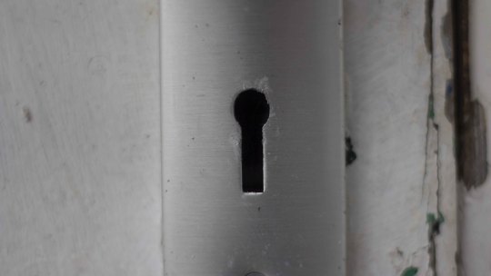
Once i had that i took it into adobe photoshop raw to edit the details and also then cut out the black from the photo.
I then took a random image off google to use as the background as it was only a test.
In after effects i opened up both photos and placed them in 3d space.
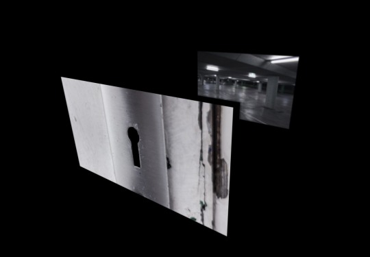
to give the keyhole a 3d depth look, i duplicated the keyhole layer and moved it back in space slightly. This is a simple trick to fake 3d.
After keyframing the keyhole layer to move back extremely fast, with motion blur, this is the effect i achieved. I think i nailed it if i do say so myself.
youtube
Its quick, but i matched it to the speed of the one in the film, and that was the rsult, super happy with it, and i now know ill be able to pull of the effect for the main video.
NOTE: There was a lot more to it than i made it look like
MAIN SHOT
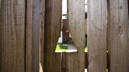
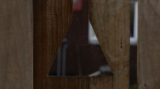
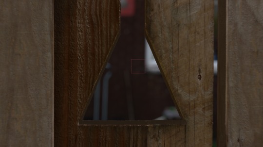
So for the main shot, i first went out and used my 50mm 1.8 lens to take a photo of the gate triangle hole. i took a few photos at different exposure as i never like to rely on the cameras screen.
I then opened the photo up, yet again in photoshop raw, which i would first tweak with the shadows and highlight, and most importantly, increase the clarity to 100%, i wanted to punch out those wood grains.
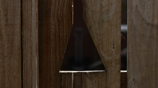
After this i opened it in photoshop and started to manipulate the photo to make it better for the video, and more visually pleasing. I used the spot removal tool to fix a few minor things just to clean up the wood, and mainly, made the hole symmetrical, so that it didn’t look odd in the video. This is the process of the photoshop edits.
GIF:
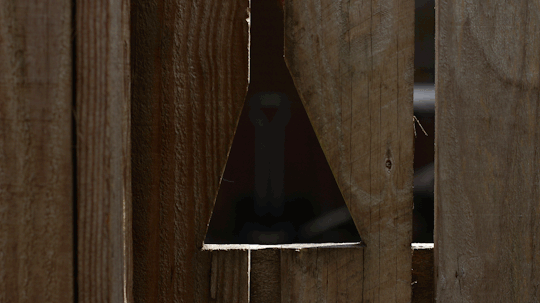
its a simple clean up process, but it makes it a whole lot nicer to look at. and will be better for video.
Once i had this i then took an image through the fence hole of the background.
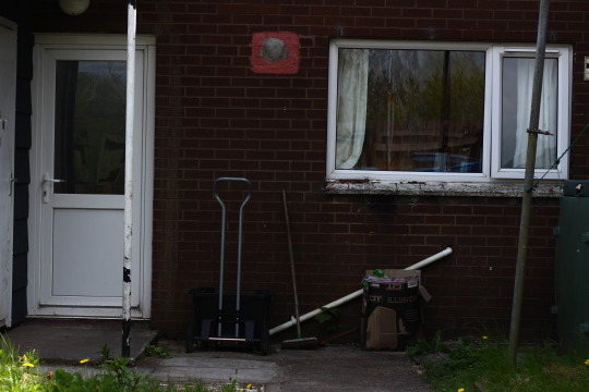
This is in focus so that i can choose how out of focus I want it to be when coming around to editing in.
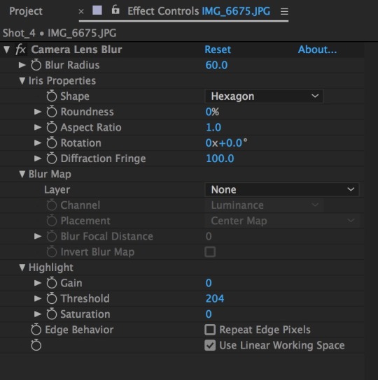
To blur the background, i applied camera lens blur these were the settings i used to get the blur i wanted.
Once i had done that, i the background layer back in 3d space, and then scaled it back up to fit the size of the comp.
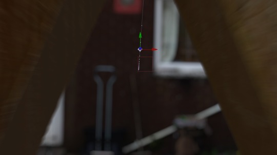
Then i added in the Fence layer and brought that forward in 3d space. I tried to align the images as close as i could to how i seen them in person, and this is the result i had.
Now it looks okay, but theres still so much that needs to be done. First off, the image is too flat, although theres depth, a camera has a field of view, meaning theres perspective. This means i need to fake the 3d perspective of the fence and add it back in.
to do this i’m simply going to do what i done for my test and duplicate the fence layer. once i done this i pushed it back in 3d space slightly until it was around about the same thickness as the actual fence was in person.

I added a fill and used the colour picker to match the wood colour and this is the result I had from doing that.
Still has a lot of problems, but its getting there. Next i am gong to bring back the wooden textures as at the minute, it doesnt look right. to do this i simply am going to duplicate the wood fence layer and place that ontop of the 3d depth layers. and then by using a blending mode, i can maintain the wood textures on the 3d depth.
Its subtle, but they are there. Now the effect is starting to look much more real. Obviously, because you know i’ve edited it, you a prone to see its fake, but to any average person. They wouldn’t know, hopefully.
KEYFRAMING
now to create the effect of the camera moving from the one side of the fence to the other, i am not actually going to create a camera, but move the entire scene itself. Using keyframes i am going to move the fence from off camera, to fly past and slowly come to a stop in frame.
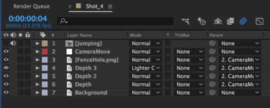
As you can see i have set the 4 layers to be parented to the null object, which is what i use to move all layers together without having to do them individually.
Once I had done this, i then just key framed the fence to start off screen, at a really far distance, and then end up on screen towards the end of the comp.
And thats the movement sorted. Because i have used a parent, i didn’t need to separately keyframe the depth of the wood, which is good because by doing it manually, it would have been jerky and not smooth. With motion blur applied, the effect works wonders, and you can see the 3d depth take place when the camera is coming through the hole.
and thats the movement for the main shot done. Now i just need to add the footage of me jumping and then i can take it into premiere to edit all the footage together.
0 notes