#they look like theyre made to be like .posters made in illustrator
Explore tagged Tumblr posts
Note
Hello! It's me the owner of the Kinitopet blog :) Just thought I'd send you more drawings of Kinito since you like the way I draw his frills so much :)) I like his frills too!!! The bigger the better!


UAAAAAA THESE ARE SO BEAUTIFUL!!!!!!OHHYGOD!£!!!!dudr the lineless srt + the pleasant colors + the round shapes …. this works so sososos perfectly for kinito n so many ways THE COMPOSITIOND TOO
#they look like theyre made to be like .posters made in illustrator#in tbe sense that they are clean and appealing and a little corporate lookimg(IN A GOOD WYA)#look at this guy !! smooth n inoffensive!!!youcan handle him w his files promis e!!!!#whilw at the same time they have the appeal of sanrio like thegee so cute n bouncy annd endearing#TH CUTE LITLE BARET THE LITTLE ACCESSORIES#so SILLY!!!SOSILLY ABT THIS!!!!#TY FOR SHARING YOUR ART IMGOINN2 LOOK THESE OVER A LOT
16 notes
·
View notes
Photo


wasnt even gonna post this but i think its one of my nicest tiny drawings yet. even if the likeness is a little off
#scheiße#art#the frighteners#i need to get back into the swing of drawing tiny im getting better at it#i started in college did i tell yall this story? i couldnt decide what to do for my illustration final#so i just made a bunch of tiny little drawings of old pet pics#all an inch or less#so like clearly the appeal is that theyre tiny#like if they were big theyd look like shit#& then during the critique this guy goes 'i think these would look really cool blown up to poster size' this man was dead serious#im like Bro What#anyways ive gotten much better since then
70 notes
·
View notes
Note
hii! just wanted to say that i really love your edits (i was looking through your tag and didnt realize how many edits i loved are actually all done by you!), theyre all so creative and well done! i was wondering if you had any tips for someone like me who wants to branch out with their edits more? like how do you think of all the different effects? or if you have any resources to share (like how to articles/videos, textures, etc)? thank you!
Hi!! I seldom made edits the last couple years so it's really great to hear they still effect people!! 😭
So, I personally get inspiration from like-- anything visual. I get inspiration from movie posters, book covers, websites, illustrations, pixel art, anything visual that triggers the thought "ooh, I could make a GIF of something like this in photoshop!". Like this edit really was inspired by Steven Universe, a medium so vastly different from edits themselves. Like even now, I recently watched this music video and thought "god, if only I still made edits..." LOL
I also followed a bunch of different blogs even if I weren't in their fandom just because I admired their edits (or, taste in edits if they weren't a editor themselves). Star Wars edits differ so much from anime edits, which differ from cartoon edits or book edits, etc etc. Even within videogames or anime, like KH edits look different from Pokemon edits. Even design blogs that aren't nerdy at all, like I remembered these two posts I was really inspired by even though I never did make anything based off of them. I often reblogged these to a sideblog under an inspiration tag.
The last piece of advice I have is-- don't be afraid to add static details into your edits like images or text! I notice a lot of edits these days, it's very popular to just add psd's to gifs and post them. And of course those are still gorgeous and made with love, but I can't help but miss an era of KH edits that had so many little details 😭 PLUS static details will help gifs be lower in file size and thus easier to upload!! Here's an old post I made with those types of tips.
7 notes
·
View notes
Text
my long ass review for S32E03 Now Museum, Now You Don’t
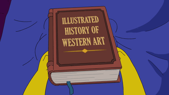
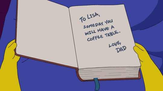
warning: LONG because i rambled about history more than i thought i would
id been looking forward to this one because i like art history, especially after seeing how they tried their best to stick to historical accuracy in the previous episode I, Carumbus. this time however….they didnt try that hard. i dont know why i thought theyd go through that sort of trouble again LMAO
but its okay, i dont really expect the simpsons to be the paragon of historical accuracy or anything. especially in anthology episodes told through a particular character's lens (in this case, lisa, whos already feverish so whatever)
first i just wanna say that this is, i guess, less of a review and more of an accidental list of history fun facts. so im just gonna get my general thoughts out of the way first.
the episode was fun! to me at least haha. i mean it got me to think and do a lot of research on my own so that must count for something. besides a couple of really weird ones, the jokes were good. anthology episodes tend to be….not that good but i thought this one was one of the better ones so far. idk.
anyway on to lisanardo da vinky its the renaissance! jesus christ the italian accents in the beginning of this segment were annoying as hell but i also feel like that was the joke lmao. ill be real i kind of tuned out for a second there when grampa started rambling so idk what he said.
i told myself i wouldnt get nitpicky with historical accuracy if the jokes were funny (final edit: so that was a lie) but this meh bit with the pizza guys and mascots was really not worth ignoring the fact that its impossible for italy to have any tomato-based food in the 15th century (tomatoes were brought to europe from the americas in the 16th century, and pizza as we know it today—flatbread, cheese, tomato—originated in the late 18th century)
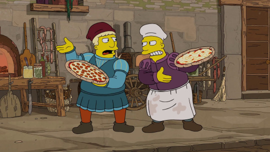
oh this next part was kind of legit tho. lisanardo, like the real leonardo, became andrea del verrochio's apprentice at his workshop. i loved this next bit:
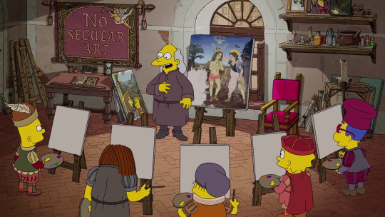
"Whoever paints the sweetest cherub will have the honor of having MY name signed on their work. That's what great artists do!"

SO YEAH as it turns out, lisanardo painted the sweetest cherubs. the painting here is called The Baptism of Christ, and the real leonardo assisted verrochio in finishing it. specifically, he painted the cherubs in the corner.

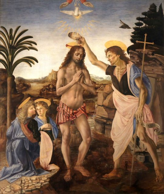
this causes verrochio to quit and go someplace with less talented people: a music school (yes, verrochio did quit painting after getting owned by young leo and his mad angel painting skills. he never did anything with music tho, he was more of a sculptor)
alongside lisanardo, in mr largo-verrochio's workshop we have barticelli (botticelli bart), dolphatello (donatello dolph), ralphael (raphael...ralph) and mediocrito (no one that i know of. sorry milhouse) (and kearney i guess but they dont refer to him by name). botticelli and donatello are said to have also been apprentices at verrochio's workshop, but raphael came a couple of decades later so he couldnt have been there. and donatello was too old so that claim is a bit questionable. but anyway
it IS true that leonardo's peers envied him, to the point where he was anonymously and purposefully accused of being gay (a major crime punishable by death in 15th century florence) while he was still working at verrochio's workshop
we are then treated by what im pretty sure is the fourth time the show has used 'at seventeen' by janis ian, this time sung by a dejected lisanardo (man they really do keep making yeardley sing these days huh) who only wishes to be appreciated and not envied.
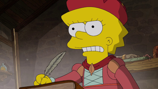
"I'll show them all! I'll show them all in a secret diary that no one will decipher for 400 years!"
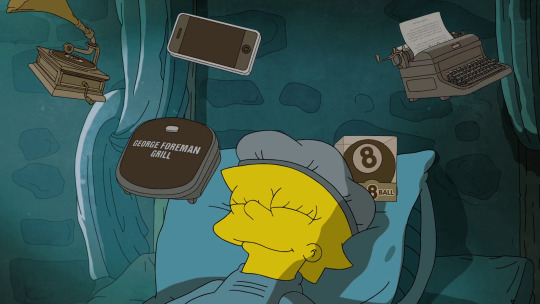
some of lisanardo's future inventions. who wouldve known
so after barticelli, for some reason (revenge??? or something?? what was his plan here idgi) steals lisanardo's diaries full of blueprints of her inventions and takes them to mr burns who i have to assume is pope alexander VI here, they decide to use her inventions for war.
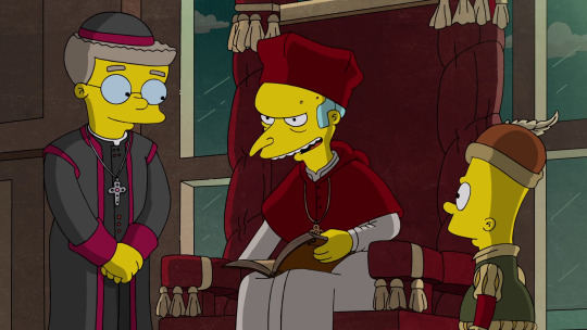
"With these, we can kill the most evil people in the world!! ....Slightly different Christians."
leo actually did this of his own accord. im surprised this is what they decided to do with lisanardo instead of talking about leo's love of nature and vegetarianism (not a single mention of that in this episode? come on...) then again, trying to do good only to end up indirectly making things worse is a very standard lisa storyline. i guess they didnt want to miss the chance to have evil pope burns (very fitting, especially for that era since they were all about money and controlling the people)
so lisanardo decides to leave for france, unlike the real leonardo who was more or less persuaded by his ultimate fanboy king francis I to move to france.
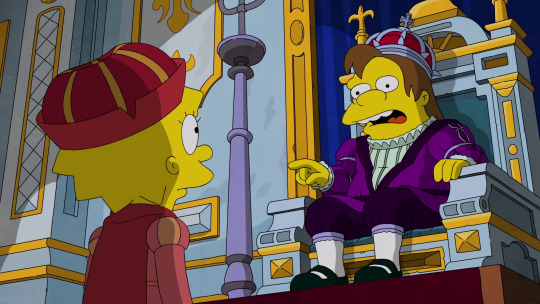
"Lisanardo, I have many questions. Why are you hitting yourself? A nerd says 'what'? And how is it possible that I am rubber and you are glue? Et cetera, et cetera."
that line may seem a little random, like hes just nelson saying nelson things (and i mean, obviously he is) but the real francis also "had an unquenchable thirst for learning, and Leonardo was the world’s best source of experimental knowledge. He could teach the king about almost any subject there was to know, from how the eye works to why the moon shines." so yeah, he did have many questions and lisanardo, finally being appreciated for her intellect, was happy to answer them all. its very interesting how lisa assigned this role to nelson in her retelling of da vinci’s life :^)
and so she lived the rest of her days in france, nat king cole's 'mona lisa' plays because duh, and they make a da vinci code reference because duh. and the segment ends. and not a single time did they show the actual mona lisa painting. the fuck?
(ngl i was fully expecting bart to say 'leonardo da vinky' for a second here)
so this next segment is about french impressionist painters, most likely the batignolles group, a name adopted by the early representatives of impressionism. its much more vague than the lisanardo segment since no one here is referred to by name (except moe, more on him in a sec) but i dont feel like it really matters in this case. bart is prrrrooobably claude monet but its hard to say, this segment is kind of a mish-mash of a lot of things. also i gotta say i really liked how lisa introduced the story to bart with an 'if you hate the formal study of art' and not 'if you hate art' because thats exactly my headcanon. i LOVE the concept of artist bart and whenever its referenced it just makes perfect sense to me.
anyway the segment opens in 1863 at the école des beaux-arts (back then it was actually known as the académie des beaux-arts), preserver of traditional french art styles. skinner reviews his students’ paintings one by one. praises the plain, unimaginative paintings depicting your typical european countryside landscapes. very run-of-the-mill (haha get it...cuz theres….a windmill) (although the real académie didnt approve of such basic stuff, they wanted artists to draw epic historical and mythological scenes) then he gets to barts painting and he gives him an F- because the painting made him think.

(the paintings in this scene arent real famous paintings as far as i know but they are inspired by real paintings enough to get the point across)
in comes barney dressed as bacchus as a model for the students to sketch, which i just loved:
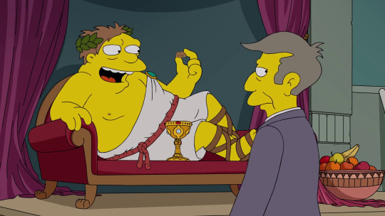
barney: “You prefer robe open or robe off?” skinner: “Just cover your privates with this walnut shell.” barney: “Whoa!!! So roomy!”
skinner gasps in horror at bart’s sketch, which “looks nothing like him” and bart explains that “it shouldn’t; we’re making the art that we feel because we can’t compete with a camera.” damn, you go bart. take that, realism. draw what you feel!!
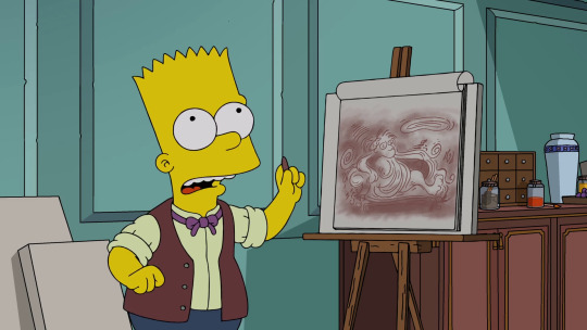
(also no, you didnt need to hold still for 17 hours for a daguerreotype. 30 min tops.)
nelson haw-haw of the week: FOIE-gras!
so here they are at the moulin rouge (“enjoy it before baz luhrmann ruins it” hey shut up. i love that movie), which wouldnt be built for another 26 years, but it is the most widely known gathering place for bohemians in the public consciousness so i can understand why they went with the moulin. nelson delivers this anachronistic line:

“This époque keeps getting beller and beller!”
which alludes to la belle époque, the golden age of france usually dated from 1880 to 1914. made me snort so ill let that slide
and heres moe! as henri de toulouse-lautrec, who was actually born a year after the year this segment is set in. yo moe szyslak he was just 1
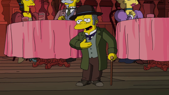
toulouse-moetrec introduces himself as the chronicler of the demimonde (not an actual job). an iconic figure associated with the moulin rouge (largely due to his affinity for alcohol and prostitutes), toulouse-lautrec was also a painter, having illustrated a series of posters for the moulin himself. he simply had to be in this segment, anachronisms be damned, just because they decided to include the moulin. cant have one without the other.
and yes he did have a walking cane where he kept his liquor.
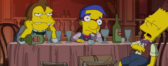
i love how everyone drinks absinthe in this place. theyre bohemians what else would they drink
toulouse-moetrec points out that barts paintings are the greatest thing hes ever seen (and hes seen like five things!) and that hes a genius. milhouse realizes that they should stop doing what the teacher says and use their own minds to instead...start doing what bart says lmao. to the easels!
next we have skinner hyping up chalmers about the art his students made for the salon de paris, an art exhibition that the emperor of france will attend. he assures him that none of these paintings will encourage debate, provoke thought or be out of place at a dentist’s office. when they unveil the art, theyre both SHOCKED at how scandalous the paintings actually are.


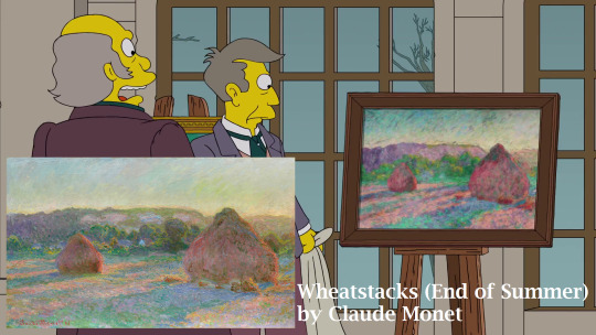
this reaction was kind of accurate. impressionism was severely rejected at the salon de paris, due to paintings not looking finished enough to them, they thought they were ugly and vulgar for depicting nudity in a contemporary setting (historical and mythological nudity was fine). these impressionist paintings were sent to the salon de refusés, which is. yeah. the place where they sent the rejects. the salon de refusés does not make an appearance but this scene makes a reference to it when the artists get expelled from the royal salon. also:
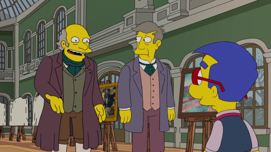
“What about our student loans?” “Oh they’ll be refunded. We are not barbarians, I mean, come on.”
(god if only)
so the painters are down because they want the emperor to actually see their paintings. toulouse-moetrec pipes in once again with an idea.
“There is one thing the emperor loves more than anything.” “France?” “No, he hates France.”
apparently the emperor really loves cheese, which makes sense since its napoleon III (who loved cheese) and homer (who loves cheese.) so the painters roll into the salon inside a giant wheel of cheese (obviously.) as lenny said, “Eh, you know French cheese. Very runny.” napoleon III chases after the wheel into a room, where the wheel falls apart after getting chomped on by the emperor. now that they got his attention, the painters proudly show the emperor their impressionist art, which he couldnt be more indifferent about because he just wants to eat his cheese dammit, and he awards them with the royal medallion just to kind of get them out of his way. skinner immediately starts kissing ass (as he does) until marge’s like ‘hey wait a minute. you expelled these students from the royal salon’ and an executioner immediately starts ominously measuring skinners neck.
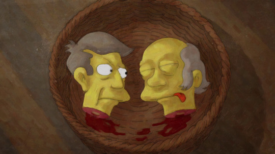
“Uh, sir...is your tongue sticking out because you’re dead or because you’re mad at me?”
and thats the end of that lmao (gore in this episode, gore in the last episode, and next week we’re getting gore too cuz its THOH, what the hell is goin on)
we get a short intermission with maggie, who wants a story for her too! lisa tells her that renaissance artists loved to put babies in their paintings, especially baby angels.
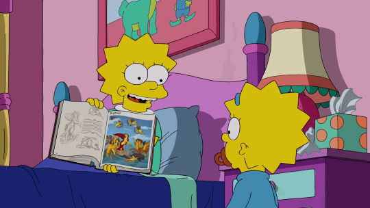
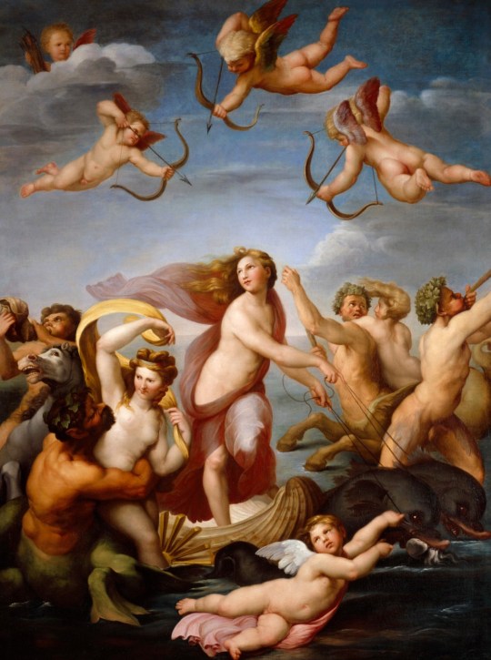
here she is showing her The Triumph Of Galatea by raphael:
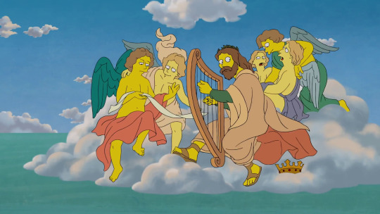
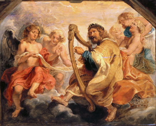
King David Playing The Harp by peter paul reubens:
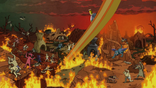
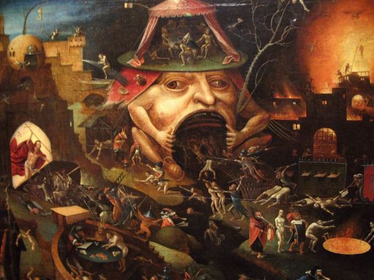
and a very simplified version of pretty much any depiction of hell by hyeronimus bosch lmao:
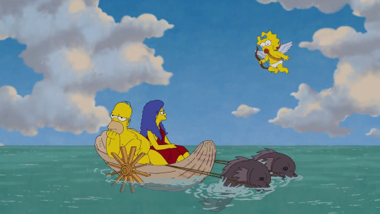
not much else to say about this one, really. but i really liked that sky!
the last segment is about frida kahlo and diego rivera. or as bart puts it ‘the one about a fat guy whos wife is too good for him.’ i was REALLY looking forward to this one because i love frida and i thought itd be a cool opportunity for animators to go bonkers and do really cool shit with her art as inspiration…..but the segment is not about frida, its about diego and his selling out to capitalism. and its also yet another story with homer and marge drama. no funky cool animation here. sigh i guess i’ll take it
the story begins in 1929 at la casa azul, frida’s home (now museum dedicated to her life and work.) frida and diego are getting married. this courtyard definitely did not look this way yet back in 1929. also theres something very cringy yet funny about lovejoy saying spanish words the way he does, i honestly cant decide how i feel about that one
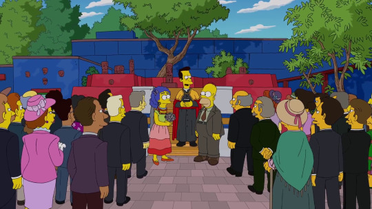
the writers know theyre being cringy with their gringoness so they go along with it.
moe: “Spanish for ‘best wishes’!” mel: “Spanish for ‘congratulations’!” bumblebee man: “Spanish for ‘muy bueno’!”
OH YEAH BUMBLEBEE MAN this is his new voice actor, eric lopez! hes not mexican but its still great to finally have a latino actor voicing a latino character and hes very excited to be part of the show so i hope to hear more of him!! im rooting for him
el barto/zorro makes an appearance which i am very confused about. he has jack shit to do with frida and diego and mexico in the 20s-30s. el zorro was set in the spanish california of the early 19th century. their use of the original theme song makes me think they just wanted to flex their disney privileges tbh

lets not talk about that that whole scene was bad
anyway diego announces he and frida are going to new york, without even asking her first. frida is obviously pissed.
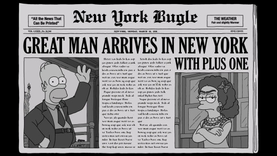
“Don’t worry, as a woman, you’ll be treated with much more respect in America.”
so in new york, diego is having a bit of a business meeting with mr burns as one of the members of the rockefellers, who is commissioning him to draw a mural for the rockefeller center. its kinda funny how he refers to him and frida as socialists even though they were very much communists lmao its okay you can say it. ok so far, but then frida says ‘yes, we hate the capitalists! right now, a young socialist is being born who will take them down! mr. bernie sanders. i hope hes quick about it’ and that was a simple enough joke and couldve been left at that but then its immediately followed by this weird as fuck family guy-esque cutaway gag to bernie as a baby:
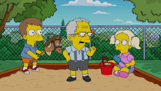
“Getting a cootie shot should not cost your lunch money. And if you don’t listen to me, listen to the Bernie Babies! What? Everybody’s got goons.” *larger babies start beating up this other baby* “I disavow that, and welcome it.”
this confused me so much that i had to ask one of my american friends to help me understand, but even she was like ‘uhhh yeah thats a weird joke,’ especially now that hes been out of the race for months (then again these episodes take almost a year to produce. i guess they couldnt be bothered to replace it with something more relevant.) whatever that was weird and confusing and unfunny moving on
frida is pretty irked that diego is going through with this deal. after all, it goes against everything they believe in. im not sure how the real frida felt about diego doing the mural, but she did feel a bit of rage during her visit to the united states, especially the obvious disparity between rich and poor. she hated having to interact with capitalists and found americans very boring. in this segment, frida seems to be acting more like the american communist party, which diego got kicked out of for accepting commissions from wealthy patrons. in any case, frida is pretty upset about this whole thing.
and finally we get the first and only kind of surreal frida moment. kinda. maybe. its more cartoonish than anything but im desperate ok
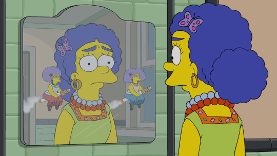
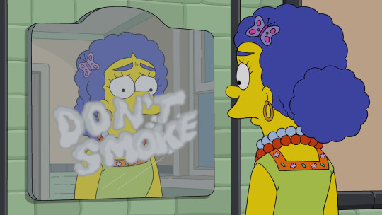
interesting how they felt like they had to add a “don’t smoke” in big letters after showing patty and selma flying away on their giant cigarettes. i wonder if this is something theyre making them do now? i remember hearing something about them toning down patty and selma’s smoking
diego comes home to frida, drunk as hell, followed by the marx brothers. i cant believe they didnt make a marxism joke come on it was RIGHT THERE. THE MARX BROTHERS. KARL MARX. COME ON
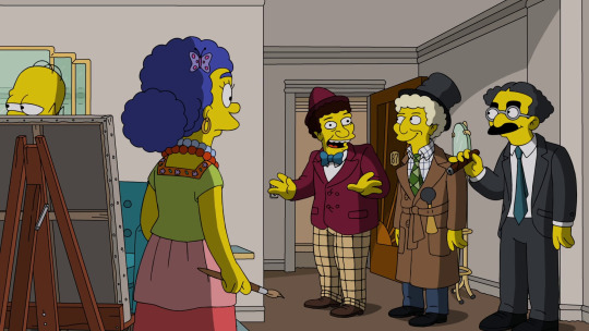
frida paints her feelings.
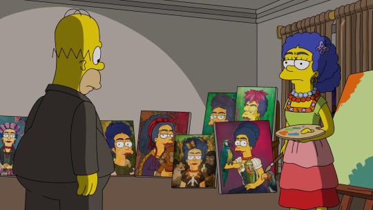
this makes diego realize that frida is a genius and he is not half the artist she is. he proclaims he will now show his awe of her by sleeping with other women, starting “an hour ago.” to which frida replies, “and i will start sleeping with other women, starting two hours ago.” yes this was pretty much their relationship. though im just wondering how the hell did diego not know frida was this kind of artist until now? i know homers an idiot but jeez. art was how frida and diego met, diego knew from the get-go that frida was an incredible artist. i guess the fame got to his head or something. again, homer just being stupid.
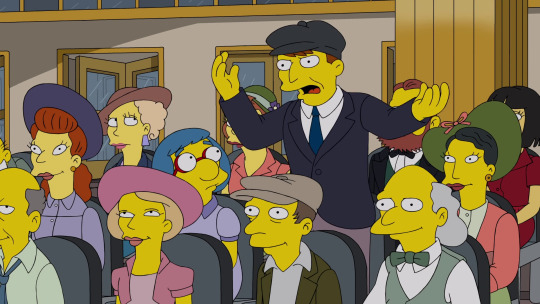
“well enough already, while the art is still deco, okay?”
its time for the mural diego painted, Man At The Crossroads, to be unveiled:
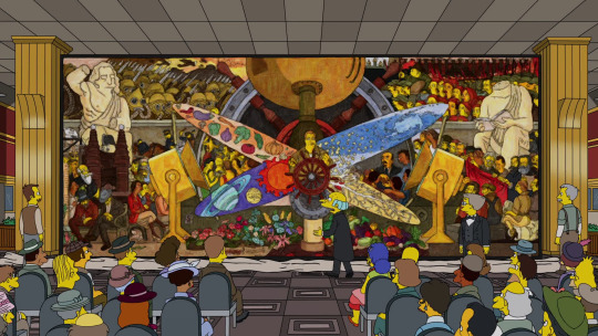
rockefeller examines it. good and great so far, and then...uh oh
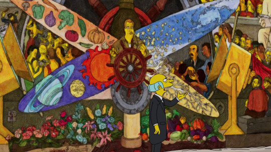
“Who’s that fellow…? With the beard, and the bolshevik smile…” “That’s the founder of Soviet Russia, Lenin!”

“B-b-but he’s a communist!” “Oh he just attended a couple of meetings.”
rockefeller will not have this communist in the temple to capitalism that is the rockefeller center, so he orders diego to paint over it. diego stands his ground and refuses. despite rockefeller’s threats, diego says that theres only one person he wants to be proud of him no matter what and in true homer & marge fashion, frida is touched by this. they happily leave the rockefeller center.
now, the real story of Man At The Crossroads and the rockefeller center was actually not that different. as soon as the rockefellers found out diego had snuck in a portrait of lenin into the mural, they ordered him to paint over it, to which he refused. diego even offered to include abraham lincoln and even american abolitionists in the mural as a compromise, but the rockefellers simply did not want any references to communism whatsoever. they did not complain about the hammer and sickle, though. yes, they did know diego was a communist and hired him anyway. what did they expect? lmao. diego said:
"Rather than mutilate the conception [of the mural], I shall prefer the physical destruction of the conception in its entirety, but preserving, at least, its integrity."
so they decided to destroy the mural before it was even finished and they never talked to each other again.
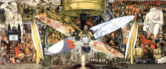
diego then repainted the mural at the palacio de bellas artes back in mexico, this time known as Man, Controller of the Universe. this new version included even more communist leaders and a depiction of john d. rockefeller jr. drinking at a nightclub, right underneath a depiction of syphilis bacteria. cue nelson haw-haw:
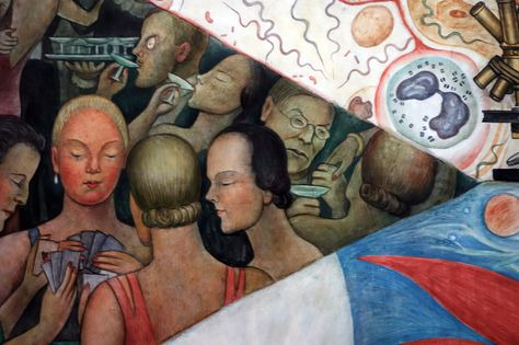
this was the version they used in the episode also, since the original was, well, never finished and also destroyed. only a black and white photograph of it exists, taken by diego before it was destroyed so he could remake it.
right so, homer!diego then pulls a Barthood and finishes the episode with a large mural summarizing the entire episode. he says some rick and morty thing i didnt get because i dont watch the show idk idc

the end
ALRIGHT NOW ITS TIME FOR THE STORY OF VINCENT VAN MOE
#if you read all of this bless you#the imageless gdocs version of this is 8 pages long#hope you...enjoy?!?! these art history fun facts?!?!#dont let me do something like this again but also let me know if i should do something like this again#i was really only motivated to do this because im already passionate about the subject so idk if i could do it otherwise#anyway. this took me all day yesterday because the power kept going out#but im finally done#bye
55 notes
·
View notes
Note
What’s your process when you go about designing your posters? Is there any particular guide or rule set that generally applies to making good posters for movies you use or are you just shaping it based on poster styles or is there specific things you do? I wanna try my hand at fake promotional content/posters so I was curious
Well I want to start off by saying, I’m a graphic design major, it was never necessarily a big passion of mine but yes there are very specific rules and angles you have to take when dealing with things like posters and typography.

I’ll go through a break down of some basics and some videos that really help.
So…there’s no specific thing I’m doing as far as planning goes that I don’t do for refular illustrations – I usually think of a scene… and then I think about the best way to dramatize it. This is best expressed in my PMD Poster where I remembered the snow area in the game held some significance to me, it felt larger than life when I was a kid because the game made me feel like I was dragging my feet to some inevitable end. And so I framed it in a way that feeling was captured, and took a quote from the game to intentionally contrast it.


You have to have a good grasp of color theory, I started off this poster by color picking blues from the game, but the eevee I had to adjust (red and blue contrast, and her brown was creating a vibration against the blue so she had to be dulled)
DETAILED VIDEO ON COLOR THEORY.
As for typography, it becomes an eye for eye thing but you really have to think about text and whether or not it meshes well with your composition, this is one of my weaker spots on a professional level however her are some basic rules:
- Dont center text. I break this rule a lot but the idea is text needs to stay right aligned or be closely justified so u can create a rectangle around it.

This is just me personally, but I think centering text is fine in moderation, you would need a program that alters text specifically to get these things cleaned up like Adobe Illustrator or other alternatives.
- Don’t use outdated fonts. This seems pretty obvious, like for one instance you shouldn’t use comic sans, but I also personally make it a rule not to use text I’d use for a paper… like Times New Roman or Arial…something that tends to be used a lot in the graphic world is “Gotham” and “Domus Tilting”… those are really good so I’d download them.
- Never alter or stretch typefaces. You shouldn’t do this starting out, it’s way more preferred and recommended you go find a typeface that suits your needs rather than try to alter it, and if you do alter... make it super minor like the bottom of a T or something.
- Simple is better. Don’t make anything overly complex, your composition or your text, and don’t overwhelm a poster with long walls of text, condense all and anything you have to as few sentences/lines as you can.
Again this is kind of a weak sport for me and there’s so many little intricacies I’m not gonna be confident I can explain correctly so:
DETAILED VIDEO ON TYPOGRAPHY.
In general, I wouldn’t say there’s a big secret to how I’m doing these posters, being in school and having been constantly critiqued to the bone on the tiniest details has made it where avoiding little mistakes is instinctual and have to memorize all these rules has made it second nature, but anyone can do it. I do suggest getting opinions from your peers about little things, like ask them if anything looks out of place, ask them which typefaces look better with your composition, and also ABSOLUTELY look at movie posters, especially ones by graphic artists. Those are the ones I studied the most on my personal time.
I hope these little tidbits of information helped, absolutely look at those videos I linked and more by them, theyre super helpful!
195 notes
·
View notes
Text
2000 words on soukoku romance-coding in episode 26
i’ve talked a lot on here about how there’s a lot of romance-coding in the canon content featuring dazai and chuuya. here’s a rundown of my base theories here
i didnt add this in my original above post, but ill say now that diegetically chuuya and dazai are usually quite levelheaded and manipulative - both are the two youngest port mafia executives in history. even when dazai is annoyed with other characters (such as kunikida or atsushi) it is clear that he is play-acting. chuuya, meanwhile, is extremely level-headed and doesnt get upset at all - even when yosano and kenji appeared heavily armed. dazai is only slightly upset by shibusawa and dostoyevsky. the only person to genuinely get a rise out of both chuuya and dazai are each other. even so, their arguing has, from the beginning, been petty on the surface, yet upon reading into dialogue and animated/written/illustrated facial expressions show deep hurt at each others actions, particularly on their 4 year separation and dazai covering up his loyalty to chuuya by betraying his trust in episode 21.
i have two more points to add on concerning their non-diegetic relationship. firstly, that official merchandise and posters almost always depict chuuya and dazai either ogling each other (theres a trend of dazai ogling chuuya’s ass in particular) or doing something romantic together (for example there’s a poster where they are depicted hanging around together with no other characters near a christmas tree - christmas is considered a romantic holiday in japan. the same coding is given to many canon fictional couples in japan, and to another studio bones production pairing in bnha kiribaku, which has a similar level of gaycoding).
the second non-diegetic point you should understand about soukoku: it’s one of the most popular ships in japan, and japan’s anime industry tends to be a lot more open about showing same-sex relationships/gay-coding than the west is.
---
and for a note on my authorship - i admit that i do ship soukoku, and that this gives me a bias. i am also bisexual and am much more sensitive to noticing homoeroticism than many straight audiences. however, to counter this point id like to clarify that it takes a lot to make me believe a same-sex ship has even the slightest chance of being canon. also, id like to say that i am an author in my second year of a creative writing degree and my first year of a film studies minor. these degrees both involve analysing text within production and authorial context (a lot...). in my free time i read a lot of papers and articles on the production context and general views of lgbt representation in different countries’ media, in particular the usa, australia, and japan. i consume every piece of media i view with an intensely critical eye and i specialise in connected diegetic elements with non-diegetic elements in terms of production, authorial, and social context
---
*NOTE* im going to be doing things out of order here for no other reason than that i realised them in that order as i thought about the episode analytically
today i want to talk about something extremely specific that came up in episode 26, and it has to do with the use of symbolism and shot composition. it’s just a short, short sequence but to me it speaks volumes, both for their canon relationship and their coded romantic relationship.
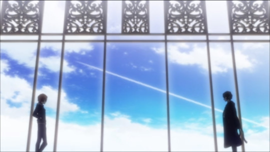
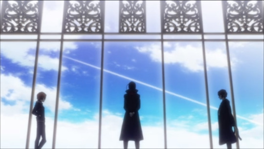
specifically this sequence. this is just one shot and to me it portrays soukoku’s dynamic as explicitly romantic in a mise-en-scene sense.
before we like to go in, id like to clarify that the dialogue doesnt matter - it’s mainly expository stuff.
the first sc is the first shot we see of dazai and chuuya ‘alone’ in this scene. it’s unclear where mori is exactly. even though mori is clearly orchestrating the two of them and this entire scene’s dialogue, he isn’t in this shot until the very end. this defines the soukoku relationship, as well as their first meeting being entirely incidental, as being something that was supposedly orchestrated by mori but on a deeper level something they created and grow themselves. it is their relationship from the beginning, not mori’s. even though we know that mori is orchestrating this, we are told that this story will be about chuuya and dazai, not mori’s plans. along with that, it’s also the first shot of open sky we get in this scene, and it’s with just chuuya and dazai looking at each other, silent. it’s open and refreshing and new, but there’s something there already - which i will discuss now.
so. let’s talk about the vapour trail. the vapour trail has no real relationship to the scene or story at all. it would be perfectly logical to just place clouds here, or even place the vapour trail somewhere else. but this vapour trail is very specifically placed to form an arrow to comes from dazai’s heart and reaches towards chuuya, passing over mori’s head narrowly. mori watches the trail, dazai and chuuya watch each other. mori knows the middle part - that they will be tied together to be a device of violence of his own making. but at the other ends dazai and chuuya are tied together in a way that goes above and below mori’s knowledge. this symbolises their future together, and indicates a subtextual level to their dynamic.
the choice i want to focus on here, however, is the choice to have this arrow reach from dazai’s heart. as a writer, if i was trying to symbolise the general strategic soukoku dynamic i would have this arrow go from dazai’s head (the brains) to chuuya (the recipient and conductor of dazai’s plans). in fact, i have a dynamic im writing right now that is similar to this, in which one is defense and one is agility. however, these two also end up in a same-sex romantic relationship together later on. in order to code and foreshadow this, as well as add romantic subtext, often when using symbology i adjust my symbols to fit a romantic context subtly. as an author myself, this shot is a clear hint of adjusted symbolism in order to code dazai’s feelings for chuuya.
and if i’m to read further, i would even say that the fact that the arrow flies over chuuya’s head suggests that dazai currently has romantic feelings for chuuya that chuuya does not yet return (but comes to, something that i have discussed in my linked post above).
---
secondly, tumblr user @cream-and-punishment made a fun joke post about dazai and chuuya “exchanging wedding vows” at their first meeting. firstly, it’s funny as fuck and when i first saw the post my reaction was just “haha it does sound like that!”. however, i keep looking at that post, keep returning to the script and that scene, and my reaction is now “wow. it does sound like that. like. exactly what soukoku wedding vows sound like. huh.”
for the lazy here’s the script (translated by the funimation subtitle team):
Dazai: You’re a cocky, overconfident child. You’re the kind of person I hate the most.
Chuuya: And I hate condescending pricks like you more than anything in this world.
and because im thorough, i ignored my english subs and listened the original japanese script as well (with my limited japanese to basically check for anything that could be translated differently or means something in japanese that is culturally untranslatable). what i found was that the english subs are right, and capture the original lines quite well.
dialogue can function as a tool for multiple results. in this two-line exchange, neither of the lines are meant as views into the character’s true interiors. instead, the purpose of this interchange is meant to be foreshadowing, specifically into the fact that this is how chuuya and dazai spend the rest of their relationship (up until the current point in the canon manga plot) expressing their opinion towards each other. it mirrors the kind of dialogue we see in episode 10 in which dazai and chuuya’s dialogue works as exposition for their past and their base dynamic, and here it is used to foreshadow what is considered backstory in the main plot (if that makes any sense?).
however, chuuya’s response to dazai is where im interested. im gonna pull my writer’s card here and say that if i was, again, just foreshadowing hatred and frustration as well as cooperation, i would cut chuuya’s line to something like this:
Chuuya: And I hate condescending pricks like you the most/just as much/etc.
“more than anything in this world”, of course, could just be incidental. but considering how a lot of soukoku’s dialogue is clearly double-entendre (read my original post linked above), it makes me consider a second option: that we are already putting that romantic double-entendre into their dynamic. if we refer to the future soukoku dynamic, in particular in episode 21, we are shown multiple times that chuuya genuinely cares for dazai’s well-being (secondary to rimbaud’s hat of course hahaha). chuuya would be genuinely upset if dazai died, and its implied (though still up to interpretation as opposed to the explicitness of chuuya’s shown feelings, however i would argue that dead apple is fairly explicit in dazai’s trust and feelings) the vice versa is also true.
going off that, often how both of them express concern for each other is by making ‘hateful’ comments towards each other. in episode 9, it’s clear there is uncomfortable tension in the room. there is 4 years of unspoken confusion lingering and chuuya is clearly, clearly upset. so dazai, in referencing an unchanging nature of what makes them them, calls back to one of his first mocking entries - how short chuuya is. it’s funny and it’s mocking, but the blows they trade are familiar and even when theyre brawling, despite being on opposite sides they take genuine pleasure in each others company. considering both of their personalities and histories as well as their trauma, both of them tend to struggle with interpersonal relationships and opening up. but chuuya and dazai canonically feel comfortable with each other, and know how to read each other well enough to both bounce off each other while also understanding what lies beneath.
so when chuuya says something like “i hate you more than anything in this world” we are pulled back to the present (in the plot), where chuuya says these things but moments later is concerned or worried for dazai’s wellbeing. chuuya in this line prioritises dazai as the foremost person in his life within minutes of meeting each other. diegetically (to the characters) we know this is them exchanging tense negotiation. non-diegetically (to what we know of the script and their future, as well as this entire exchange being mostly foreshadowing), we are clearly meant to interpret this to mean that chuuya will, eventually, hold dazai to be incredibly important to him, and vice versa.
of course, we also have the fact that the phrase “more than anything in this world” is yet another soukoku romantic double-entendre. as i mentioned with things such as “the silent treatment” and mentioning drinking heavily when someone abruptly leaves you, it’s clear that these are used almost entirely as romantic tropes. i’ve discussed this before so i wont get too much into it, but just say that this scene adds yet another line to that long list of soukoku double-entendres.
---
considering at least the first 3 episodes will be related to exploring the soukoku backstory, ill be trying to post an analytic of soukoku for each episode of the 15 adaptation. furthermore, these posts won’t be explicitly about the potential of canon romantic chuuya/dazai, but will analyse soukoku scenes in a focus that i see fit for each episode. whether this is examining it like this post again, or examining it for foreshadowing or cinematographic details etc, will be decided once i watch each episode.
anyway lol! yet another rambling analytical of something nobody cares about haha
#long post#skk#soukoku#double black#bsd#bungo stray dogs#bungou stray dogs#damn i feel like a hack fraud tagging for attention but i wrote all this out so
124 notes
·
View notes
Text
My Three Ideas
Idea One:
Dog Friendly App
My first idea is a 'dog friendly' app. This app would consist of lots of information on areas which are dog friendly in Belfast/Northern Ireland. Belfast specifically, is continuously becoming more dog friendly - therefore I believe people need a more easily accessable way to find out all of the pooch-friendly places.
Pros:
A huge pro is that I am part of the target audience! I have two dogs of my own, and I am always looking for dog friendly things to do. I have joined Facebook groups, and researched deep into the internet to find fun things to do with my pups. Therefore I not only understand how much of an unnecessary hassle this can be, but I also am widely knowledged in this area!
This is something that has little to no competition as it has not been done before within Northern Ireland. The information is online, however this means people have to go out of their way to find it, and it is very difficult to find specifics such as whether they want to find a dog friendly hotel, or a dog friendlt cafe etc. I would include a filtering option on the app, so that users can filter by area, type of venue or activity.
Cons:
I would use Adobe XD for the design creation of this app - which I am completely new to. I would need to do vast research on how to use the programme efficiently - which is fine because I have a huge interest in learning XD anyway, this just gives me a push!
This will be my first time creating an app, so I will need to research further into User Experience, and how to make the user journey as easy and as fun as possible! I will also need to consider accessability issues, so that the app is free to be used by all!
Target Audience
This app would be specifically for dog owners/lovers in Northern Ireland; however, I do believe most users will come from Belfast as that is the more popular area for dog friendly activities at the current time.
What's the business model?
If I created this app, I would like it to be free. This is because the information is already out there, I would just be making it more user friendly. Making it free could also then boost the amount of users, therefore helping me gain exposure! I could attempt to get featured in articles, since this is new and specific for the local area, news companies may be interested in featuring this new and exciting application.
As the app grew, I could start to earn money through some dog friendly advertising. Such as dog day cares, dog bakeries, and even the dog friendly companies who maybe have events going on.
Idea Two
Paw Prints
The idea of this product is dog themed printables. This will include digital drawings of multiple different dog breeds with dog related quotes, dog memorials and maybe even birthday cards!
Pros:
Being a dog lover, I have looked a lot into this type of product myself. Being the target audience for your own product will definitely aid the creation process, as I will be making things that I would want to buy.
I already know typography basics, which will benefit me for any text focused posters. I am also reatively experienced in Illustrator and InDesign - therefore, I will not need to learn any new programmes.
I worked with Belfast Met for 7 months on full time placement, creating posters and other things for print. Therefore I generally know the rules for print, like what resolution is required and how to stay within the bleed etc.
One of the designers I keep up to date with, Alice Thorpe, just opened her own printables site on Shopify, I have kept up to date with her journey and I have been very inspired! I could base my knowledge of watching her journey, to help with my own!
Cons:
I have not made anything like this before, therefore I know I am going to struggle with with a few things. Being a perfectionist doesn't help either, and I know I am going to spend a while trying to perfect this new 'skill' of making printables.
Even though I am relatively good at using Illustrator, that does not mean that I am any good at drawing. Therefore, this will be something that will be very challenging. The drawings may be downgraded to silhouettes rather than detailed drawings. However, I am willing to challenge myself as this may be a project that could pay off if the additional hard work is put in!
There would be a lot of world-wide competition, especially if selling on Etsy. I would try to stand out with my different aesthetics, and also my contribution to animal charities could aid my ability to stand out.
I would also need to use my own money to do multiple test prints
How will it be built?
As I mentioned before, I will be using Adobe Illustrator and (maybe) InDesign. Illustrator will be used for the custom text and drawings, then InDesign can be used for positioning of everything and making sure the documents are print ready.
I also mentioned that I have been following a girl called Alice Thorpe, who released a similar product on Shopify, therefore I know that this is an option. However, I think it would be easier and more efficient to open a shop on a site like Etsy, and let people download the PDF printables to print at home, rather than to have it printed and sent out to them? Maybe there could be an option for them to download them on the promotional website as well?
Target Audience:
This product is definitely not for everyone, however it is widely targeted to dog lovers. Dog lovers are not age specific, however I'd say between 18 to 40 would be the main target audience of the type of products I would product. This may also only be targeting to an audience who own the breed specific products I design, therefore I am aware to make some more neutral dog themed products in order to widen the number of people who may be interested. The audience would be world-wide, since the product is just a PDF.
What's the business model?
Since I am only interested in making PDF printables, I believe the price should be very low. I considered free but then I had an idea to give a percentage of the profit to an Animal Rescue Centre? Not only is this something that I would love to do, but it is also something that could get the product more exposure! Being a dog lover myself, I know of some of the best Animal Rescue Centres in Belfast, and they have some impressive audiences themselves. If every print goes for £2, then the Rescue Centre could get £1? I could also work on a specific print where 100% of the profit goes to the chosen centre, maybe with "adopt dont shop" quote etc.
If I make rescue specific prints, I could print a few myself and give them to a few centres, for them to sell to new rescue dog owners. They would keep this money, but I could attach my business card and a web address to where they can buy similar prints. Therefore I am loosing money, but potentially gaining more exposure.
I could have an email list set up on the promotional website, and anyone who pre orders one print, gets it for 50% off, or something similar in order to try and boost the initial sales.
Idea Three
Quirky Quards
This product would be cards for all kinds of events. I have always been fussy when buying people cards, I prefer the simplistic and funny cards to the over crowded tacky cards. I therefore would create cards similar to those that I would love to buy people myself. These cards would be fun and creative, I would include lots of different options for different audiences. Cards for dog walkers, people with foster parents, congratulation cards for transgenders and much more!
Pros:
I would once again be the target audience and therefore all I need to do is make things that I would like to buy! Cards like these are relatively hard to find, or when you do find them theyre usually about £4/5 for a basic simplistic card. I would like to try and do the same style of card, for a much cheaper price.
"The average person recieves 20 cards a year". Cards are always being purchased, and different types of cards are always required!
I already know the software in order to create the design of the card.
Cons:
Learning to draw, and learning how to print these cards in the most cost effective way.
There is also a good bit of competition when it comes to making cards. Although I will be trying to stand out with the ability to create unusual cards and keeping them affordable.
How will it be built?
I would use illustrator for the creation of the illustrations and typography of the card. I would consider printing these myself, however I know it would be an investment. If this was not possible, then using websites like Shopify and Printify to print on demand might be an option.
Target Audience:
People like me who have a certain aesthetic when it comes to cards, I always shop at Urban Outfitters and Paperchase for cards, this is where they are usually priced at around £4/5 for a basic small square card. I would use these shops as inspiration, and target the same audience. This audience would definitely be mostly teenagers, probably 16 to 23. As I said previously, I would also be targeting these cards to minority groups who do not usually have many card options, although this is not the specific audience.
What's the business model?
As I mentioned before, these would need to be sold somehow. As it is going to cost money one way or another to create.
I could also promote the cards by making them out of recyled paper and envelopes, not only is this a great thing to do for the environment, but it will gain interest of those who wish to help the environment also!
If this idea does not go to planned, I could always create the graphics and come up with a new technology focused way of sending cards! Rather than E-Cards, I could create the graphics so people could share the card over messenger and text etc. I could maybe even create some sort of Instagram story template for peoples friends to post and tag them on their birthday - many people wish their friends and family a happy birthday over social media now, so this could be a more fun way of doing it!
1 note
·
View note
Text
Week 3
I first began working on my brain concept to see where i could go with that, I started by working on some quick thumbnails to get down some ideas.

I wanted the ideas to be quite crazy and out there to really show how ‘wack’ a childs brain is. from this I think im going to look into developing the sort of idea of the top two on the right. I like the use of different lines and i think it will look interesting rendered in colour. I also feel that they have a good mixture of crazy yet clear enough to understand what is it showing.


I began creating different renders of the brain. when it was in black and white it looked quite simple but adding colour made a huge difference. I wanted to go for light yet bright colours to bring in the childish aspect. the rainbow tie dye brain i chose not to go forward with as it wasnt matching up with the direction i wanted to go in. I added in larger blocks of colour and shapes to give more dimension to the illustration but I may want to work on my sizing at theyre taking over the brain.

This is what i finished with. I preferred this approach with the big blocks of colour over the other shapes as it brough focus to the brain while still adding a pop of colour which is eye capturing, I extended the lines to largen the image and help give more direction into the centre. I am unsure if the lines are possibly too thin but ive decided to leave them for now to see what my peers think at the interim.
I then worked on my next concept which was the dog. I wanted to make a balloon dog so i created one in illustrator using masking to create the shadows. I was really happy with the balloon dog but it took a very long time for a concept that i may not end up using. Because it was a simple concept I decided to play with the text and bring some of it in.

I feel that the thicker type works better as my eye is drawn to it faster but the body text in the second poster has a better flow to it.

having the dog in colour and everything else in black and white adds a point of interest to the poster and can be used as something to draw the viewer in to read more. I need to adjust my paragraph rules and heirarchy in my text as looking at it now i dont like how it looks. the straight box looks a bit too showy like im trying to display something, but the rocky path also isnt quite right to me so i need to experiment with that more

I chose to change the colour to purple as i wanted a brighter colour and i put the box on a slope to help with the direction and flow. I feel that there is still a lot of work to be done with this and im not happy with it but ill see how it goes at interim.

I played around with the text for this concept and decided to use a similar structure to the previous poster but instead have three columns and have them centre aligned to have consistent flow down the centre of the page. I can see theres a lot of improvements needed but im liking where this is going especially with the illustration side of it. I also decided to have the illsutration a thicker stroke as i found it more capturing yet balanced that way.

i didnt have much time to work on this concept but i really wanted to show my possible concept of using photography so i found a placeholder image and greated the scribbled illustration on top, theyre similar yet different to show how each child is different. I wanted to go for a vintage look with a bright colour on top to add contrast. to add to this i used a san serif font to give a more vintage feel to it. although this was a quick render I am quite liking the direction this is going in.
0 notes
Text
If You Really Like What You Create, It Will Sell
Sponsored by Adobe
Becoming a Freelance Stock Contributor
With every other creative career option at her fingertips, versatile Milwaukee-based graphic designer and illustrator Diane Murphy ultimately chose becoming a freelance stock contributor.
With a B.A. in fine arts from Carroll University, a private liberal arts institution in Waukesha, WI, Murphy has been an art teacher, a portrait photographer, a children’s clothing and giftware designer, a muralist, and an all-around freelancer doing logos, print collateral and apparel. She spent thirteen years designing large-scale graphics and signage for a Milwaukee interior design-build company that serves restaurant, educational and retail clients. After breaking out on her own in 2008, she became a self-styled “vector dynamo” who as “TeddyandMia” now makes two-thirds of her income from stock licensing and one-third from freelance design directly for clients, many of whom first saw and bought her work on stock sites. Murphy is one of Adobe Stock’s best-selling vector illustrators, and I was delighted to have this Q&A with her on behalf of HOWdesign.com.
Q: Diane, you’ve done many prestigious projects, including wall graphics for schools and fast-food restaurants, and logos and packaging for clients all around the country. What got you interested in becoming an Adobe Stock contributor?
A: When I worked at the interior design firm, although I love kids and schools, I sometimes got frustrated with the limitations in subject matter, so in the evenings I started illustrating other subjects that interested me. When I felt confident enough, I tried 99designs and had great success with logo design competitions. I then branched out more and applied to stock sites. I only draw what interests me now. Lots of retro themes, logo designs, holidays, font sets, and midcentury style patterns are some of my favs. I quit my full-time job when I felt confident enough I could make a living as a stock artist and freelancer.
Your screen name is TeddyandMia. Some artists want to be off the radar as a stock contributors because it’s a side gig to their full-time employment. I know that’s not your case. But is there a real Teddy and Mia? Do you have a partner?
It’s really just sentimental. And just me. No partner. Teddy and Mia were my Pomeranians’ names. And those names just seemed to fit. My work is lighthearted and all over the place, just like the dogs.
How did you learn what kind of images would be most saleable?
If you follow themes and styles of other contributions that are selling well, it won’t be satisfying. I don’t pay attention to the tab that sorts by “popularity.” I’m not interested in drawing icon sets or landing pages, one after another. And I don’t like flashy, techie gradients. I prefer flat colors, simple textures, and simple compositions. Less is more. If I really like what I create, it will sell.
What percentage of your income comes from stock?
I started in 2008, and now about two-thirds of my income comes from stock. The other income comes from several good, reliable clients. I also have a contract position with another stock company as a vector reviewer; I inspect files for technical and esthetic quality, and send them back if they don’t meet the qualifications so the artists can make corrections and resubmit.
That shows how really good you are. We love your fruit and vegetable backgrounds reminiscent of Herman Miller picnic posters from the ’70s. And your USA state travel posters. And the license plates and psychedelic backgrounds and all your midcentury modern stuff. You are incredibly versatile. Do you recommend that contributors offer a whole range of styles?
Versatility has always been part of my plan, and I definitely recommend it for others. I love trying new styles, and it always keeps it interesting. For example, the travel posters. Growing up, my family took many road trips around the county. I’m very nostalgic and started the poster series as a personal challenge. I’ve sold many extended licenses of those.
Do you also upload to other stock sources, like iStock or Shutterstock? If so, is working with Adobe in any way different or superior?
I upload to the all the major sites and a couple of smaller ones as well. My sales have noticeably increased since the Adobe took over Fotolia. That gives me incentive to keep up on new submissions and continuously offer different and new vectors. With some of the other sites, my sales go up more slowly.
What’s your favorite stock success story? For example, one illustrator made a series of simple borders that have been downloaded more than 10,000 times. Others have gotten large freelance commissions because a buyer loved their style and approach. What have you experienced that’s especially noteworthy?
I recently started working with a Vermont candle company, Aunt Sadies, Inc., that uses my state poster images on their candle canisters. I’m negotiating to create original designs for them in the future. A nonprofit organization liked my ’60s psychedelic-style images, like my Earth Day posters, and I’ve been creating posters and other print materials for them ever since.
Our readers are especially interested in “tips and tricks,” especially for people who’ve never thought about making their work available through stock sites. What do those illustrators need to know? For example, how often do you upload? How many images at a time?
I try to upload 20 to 30 images every month. I work on several ideas at a time. That way, when I’m stuck spinning my wheels on one image, I can put it aside and work on another. After a break, I go back to the first one with a fresh perspective and can move forward. It’s important to avoid frustration—and you have to to have faith in yourself that the answer is within you. Be patient until it comes to you.
How many vectors or illustrations need to be in your library for the effort and the income to pay off?
I started by uploading maybe 20 images, and on the third day online I made $11. I was ecstatic. As time went by I added more and more, and when I got to around 400 I consistently made a few hundred dollars every month. Certainly not enough to live on, but I was still working at the interior design firm and my freelance time was limited (but those few hundred extra bucks bought me a lot of shoes). After I left the firm, I worked hard to double my portfolio, and was making $1,500 to $2,000 every month. Adding more stock sites helped. One thing I know for sure, the more you create and upload, the more money you make.
What makes your illustrations stand out among others with similar subject matter?
I think of my images as tools for designers to use. The license plate set not only contains the complete character set, but several examples that show designers how the set looks in different color combinations. One way to stand out is to create a series of coordinating images that create a unified set, like the fruits and veggies. Often buyers will download the whole set. In the card series with the lightbulb numbers, I include the complete set of numbers along with the card design so buyers can easily use any combination of numbers.
How do you prepare the files so they will be the most user-friendly?
I don’t use a lot of fancy gradients, meshes, and complicated tools and patterns. I try to keep layers simple and organized. Buyers most likely have many different skill levels. I make my images are user-friendly for all levels.
What is your biggest piece of advice for a new contributor?
Set aside regular time to draw and develop images. Don’t try to churn out images for quantity. And don’t follow the herd. The world has enough icon sets. Take time to draw what you’re interested in and you will never be bored. You may not make a million dollars, but developing your artistic talents will eventually bring in enough money, and it’s a fantastic journey. Make sure you list your contact info on your portfolio page so future clients can find you.
We hope to once and for all remove the “stigma” from creating and buying/using stock. We’ve found several interesting advertising and marketing campaigns that use stock backgrounds, infographics and logo elements, but the agencies wouldn’t agree to publicizing them. What are your thoughts on this?
The agencies are not going to say they use stock, even if they do. Imagine what the clients would think! The good thing is that they’re using stock, and let’s hope that in time the stigma will recede. I don’t worry about it. Because of online agencies like Adobe, my images are sold the world over. I think that’s pretty cool. They don’t lead to big national accounts, but they do bring me many reliable clients like the candle company, a big carpet cleaning operation, and my favorite, the International Tea Sippers Society.
Thank you for your candid answers, Diane, and Happy New Year!
If you are interested in bringing your illustrations and vectors to a worldwide audience of buyers, sign up to become an Adobe Stock contributor today – it’s free to sign up! A sweet side gig—or possibly an almost-full-time career like Diane Murphy’s—awaits. Sign up now!
The post If You Really Like What You Create, It Will Sell appeared first on HOW Design.
If You Really Like What You Create, It Will Sell syndicated post
0 notes