#they have visual access to any depth that they can explore unlike a broken thing that is forced to bank on
Explore tagged Tumblr posts
Text
The level design of V&A Design/Play/Disrupt
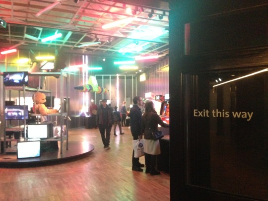
Recently went to the V&A expo on videogames and thought it might be fun to try and think about it’s ‘level design’. I realise its silly to call it that and is more informed by planning an exhibition/ event planning and architecture, but w/e.
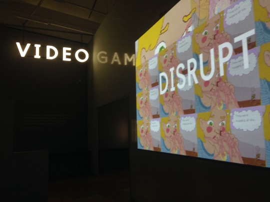
[pictured: how do you Do it?, 2014 - Nina Freeman, Emmett Butler, Decky Coss, and Joni Kittaka]
This is mostly gonna be some simple thoughts on the experience of traversing the space of this exhibition, and how that space is used effectively to create different effects/ experiences, as well as notes on the smarter considerations on how the experience is paced/sequenced.
This warped/truncated/inaccurate/drawn from flawed memory map roughly shows the layout of the V&A expo:

The whole exhibition can be roughly broken up into four fairly distinct parts:
Exhibits of the design of different video games from differently sized studios ~2009 onwards. [blue]
Articles, talking points, video discussions and exhibits of games as part of our broader social context, concerned with violence, gender, sex, sexuality, race, language, protest etc. [orange]
A large video theatre showing some of the communities that form around games. [red]
An arcade showcasing several more experimental games and projects, that is open to free play. [yellow]
DESIGN
When you walk in you are greeted by a huge projector flashing between collages of the various exhibitions and the alternating titles DESIGN, PLAY, DISRUPT.
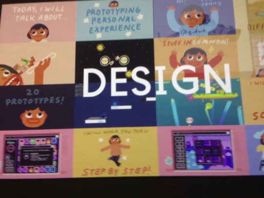
[pictured slides from Jenny Jiao Hsia’s talk on prototyping to make her game: ‘Consume Me’, 2016]
Seeing this is unavoidable when entering, and it serves as something of a banner to signal the transition into the formal exhibition space. YOU HAVE ENTERED THE WORLD OF THE VIDEO GAMES.
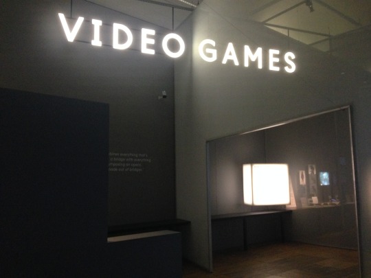
Mapping this first area of the 1. Design section of the exhibit we get something like this:
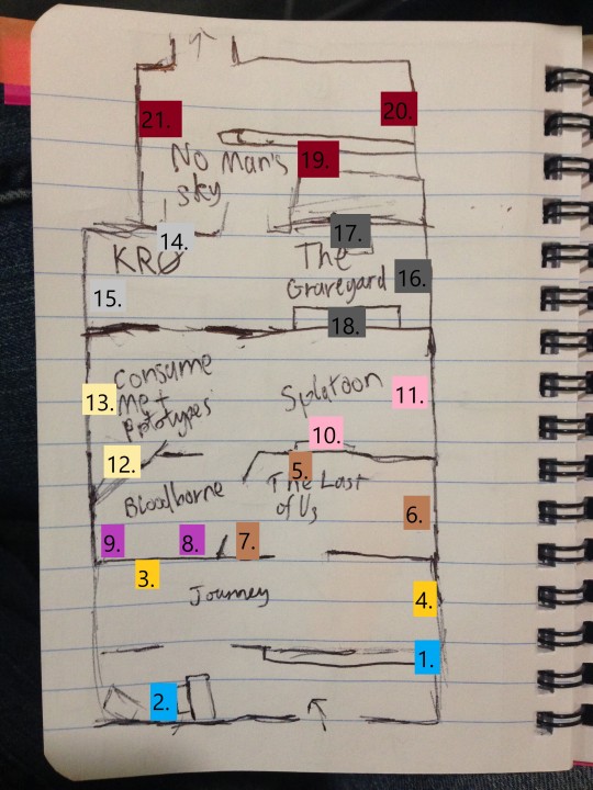
Note that these numbers are in an arbitrary order of roughly when I encountered them, and are not indicative of density, just general location of possibly several bits of each exhibit. Also this list is not exhaustive, nor is the map strictly accurate, I do not have an eidetic memory, but I do have a notebook and a smartphone.
Design/Play/DIsrupt screen
Large Print Text Binders
‘Journey’ gameplay montage projection
Notebooks, sketches, a headphone + video prototype demo, inspo photos/footage, graph and board of intended player journeys/narrative threads
‘Last of Us’ Dual screen demo showing gameplay and some of the work relevant to make that part of the game happen
Sketches, notebooks, board plotting out story events/setpieces in seasons, film made for atmosphere reference, blue sky concept art, colour scripts
Mocap footage +suit
Matt Lees @jam _sponge describing the anxious, excitable play of ‘Bloodborne’ between 3 screens.
Notebooks, sketches+concept art, level design docs, and SketchUp pics of early levels, headphones to listen to a recording of the soundtrack
Bunch of top designs for ‘Splatoon’
Early Prototype, creature sketches, fashion asset design
Playable prototypes from the making of Consume Me
Notebooks, corkboards, workplace ephemera, unity project demo, headphone + video 40 minute talk on prototypes
Music from ‘Kentucky Route Zero’ / KR0, visual representation of branching dialogue in twine, Margritte’s ‘Spring in the Forest’
Inspirations, typeface considerations, group wiki, twine showcase
Realtime Art Manifesto, Even more notebooks, with sketches and details of designing Tale of Tale’s ‘The Graveyard’
Playable demo of The Graveyard
Bench
Multi-screen montage of generated worlds in ‘No Man’s Sky’
Blueprint tool for spaceships, terrain debug tool, sci-fi inspirations
Visual inspirations
So what are some of the ways we can think about how this expo was laid out?

For a start it’s fairly linear, there are no branching paths at Design/Play/Disrupt, it’d be a layout ill-suited to somewhere like this where there’s a strong desire for the audience to see all the content and assets (the exhibits) and not miss any pieces that time was spent curating. Thankfully unlike some videogames, this linearity is not gated. There are no attendants fiendishly running up behind you and closing doors as you move from one game to another, people might have missed something, or want to visit an earlier piece while friends are preoccupied with something for a little longer.
Exhibits are visited for the most part in a defined order, with some freedom in the Kentucky Route Zero/Graveyard room as well as the Splatoon/Consume Me room. You are encouraged to experience what is on display for each work and are being guided in a deliberate order, as opposed to set loose in an open hall with no boundaries where some attendees might skip or miss a part of the exhibition.
One thing tying sections you can explore or skip is their loose thematic / tonal linking:

To put it another way, there is a good reason that Bloodborne is next to The Last of Us. Both are triple-A big budget, rated 16+, 18+ action games for blood guts and all the cheery stuff. Consume Me and Splatoon work well next to eachother as the cute aesthetic and playable prototypes hanging from the ceiling work well across from Nintendo’s colourful and playful Splatoon. It would be a bit less natural to have the grotesque and rapacious sounds of Bloodborne echoing within the exact same room as Splatoon. I’m not saying any of these works don’t have some commonality beyond the arbitrary border I’ve drawn, but they fit better together.
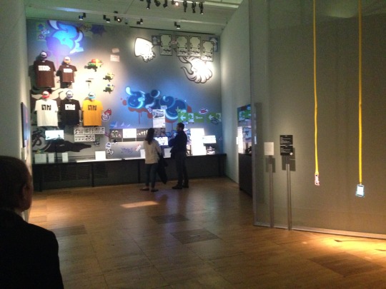
- Plus this open space invites an atmosphere of play after having just been cramped into two games rooms that feature horror elements
[Pictured: Splatoon’s section, as well as Consume Me minigame prototypes open to play, suspended from the ceiling]
This also showcases another thing about this event applicable to level design: the same space can be made appealing to different types of audiences. This is an exhibit about video games. I’ll admit this is just my gut but I’d be willing to bet that this exhibit is more likely to be attended by parents and their children than it would most other exhibits. I don’t know exactly what the V&A’s idea of the ideal attendant is, and that’s probably owed to the fact that this event catered to lots of different levels of assumed knowledge and engagement with videogames.
Parent’s who might be a little out of touch with mainstream games, are quite likely to have been put off by bringing their kid to something that was entirely wall to wall Bloodborne, Dark Souls and other things as frightening (as much as I personally would have enjoyed that). Standing watching a parent pull their rapt child away from dulcet descriptions of how deadly mistakes are, in the big monster game, the success of the exhibition is apparent; the next room is a bit more targeted towards that kid’s age range (even though they did seem pretty into Bloodborne).
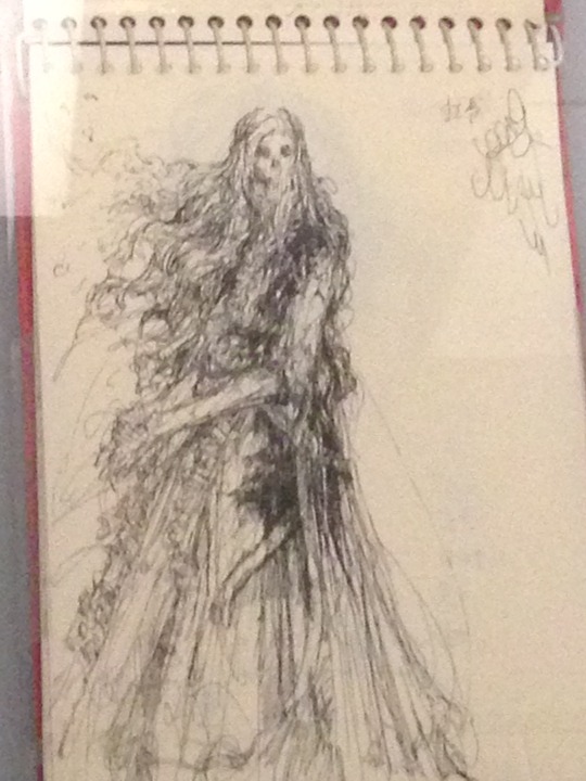
[The concept art from Bloodborne is such a treat]
It’s no surprise as well that the first game is not The Last of Us, but Journey. More people are playing games now than ever but there remains a fair few people who still don’t really know what’s going on in games. As an exhibition that in part is attempting to show the breadth and depth of games being designed, it makes sense that the first introduction to what games are being made is a game without much in the way of traditional combative interaction.
To wafflingly reiterate: the sequence of how things were placed matters: The accessibility options: 2. [Large Print Binders] are available at the start. Benches and places to sit are placed later throughout the exhibit (including rather wittily across from The Graveyard; a game where the entire goal is to make an old woman sit on a bench).
Reinforcing this point of how the same space can be made to cater to different people this event was extremely Multimedia. Explanations of parts each games design process written up, sketchbooks, and lots of different drawings, scrawled graphs, charts and plans. Concept art, drawings. Video of prototypes and animation, Sounds of ‘Long Journey Home’ echoing up the hall, and the omnipresent dread of Matt Lees echoing down, as well as headphones to listen to specific parts of the exhibition that might be less suited to how crowded the soundscape is or be for a more narrow audience (I wonder how many of the attendants listened to all ~40 Minutes of Jenny Jiao Hsia’s talk on prototyping. I did. It was good). Just in this section of the exhibit, there were so many different means of engagement, and they all felt very well matched to the story of each games development that they wanted to tell, while still offering different types of engagement. People can be looking at a video display showing how the layers of environmental concept art become important and manifest in The Last of Us, while someone else is poring over sketches of Ellie’s design.
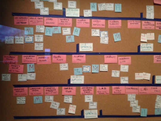
[Corkboard plotting out events + setpieces across the timeline of The Last of Us]
As an exhibition space, it is made with the fact that multiple people are occupying it at the same time in mind. If something is not available you can engage with something else. And if one type of engagement is not to your tastes there’s a good chance something else will be- not bothered about the wiki used to help the team of KR0 to communicate? Maybe you’ll be more interested in some of Ben Babbit’s sonic improvisations, or the visual inspirations involved in the creation of the game.
There’s more I could talk about wrt this first sections layout of how it winds you around instead of giving you a straightline to the exit, the choice of games playable being fundamentlly simple, an anecdotally sweet image of a child holding the obscenely big original xbox ‘duke controller’ on a pedestal and their dad cradling their hands. But I’ll just leave off this post here for now and maybe continue looking at V&A things and posting about it later.
To be continued..?
2 notes
·
View notes