#they have too many programs with blue and green icons so I used the yellow one for publisher ok
Explore tagged Tumblr posts
Text
Reminder not to take this too serious. It’s a silly little tumblr poll, be kind to each other and have a good time.
#they have too many programs with blue and green icons so I used the yellow one for publisher ok#ms office#microsoft#ms word#ms powerpoint#ms excel#ms Publisher#ms Access#outlook#onenote#my stuff#my polls#was thinking about PowerPoint and ended up with this poll
23 notes
·
View notes
Text
detailed giffing + basic coloring tutorial for beginners
so a lot of gif/coloring tutorials are pretty outdated or not that detailed & i wanted to put my own out there! in this:
how to get the screencaps for your gifs
how to make a general gif
basic coloring (no psds here, it just gives you a basic idea for making colors pop and look nice. you can look up how to use psds, but i prefer making my own for every gif as it’s much more personal, gratifying, and creative. there’s nothing wrong with using psds as long as you don’t claim them as your own, it’s just not my personal thing)
how to save a gif
we’ll be going from this:

to this

what you need:
photoshop (cc 2019 is what i’m using, but this works with any version of photoshop really as long as you download a version with the timeline feature) i won’t add download links here since i don’t want this deleted, but you can look some up on tumblr or use the pirate bay (current url is pirateproxy.blue as of 4/29/2020) & follow the instructions there.
for windows: potplayer/kmplayer (both use literally the exact same instructions) this tutorial uses potplayer but kmplayer uses like literally the same instructions, it just doesnt work right on my computer
for mac: mplayer. this tutorial does NOT cover this so find a tutorial on tumblr on how to take screencaps with mplayer & then skip to the “how to make a general gif” section. though, again, i’m on a pc so i have no idea if this is entirely accurate for mac.
if you’re downloading from youtube: clipconverter
if you’re Definitely Legaly torrenting: utorrent + the pirate bay (again, current url is pirateproxy.blue as of 4/29/2020) or another torrent site + you should really consider getting a VPN when torrenting (i use privateinternetaccess but you can find one that suits you)
note: download an adblock of some kind, disable automatic downloads on your computer, & download an antivirus program if you want because some sites are sketchier than others! this is ESPECIALLY crucial on sites like piratebay. keep your computer safe babes.
1. screencapping
there’s several ways to get screencaps on photoshop, but this is the easiest imo and i’ve never done the whole convert video frames to layers thing. like i said, you’ll need potplayer or kmplayer. i’m using potplayer. important note: don’t accidentally download viruses here! read each screen carefully & make sure you’re not hitting accept to download any secondary programs.
1. download your .mp4/.mkv. you can go to youtube & find a clip/scene/whatever and use clipconverter to download it. just make sure you download it at 720 (or higher) as anything lower than that will give you a poor quality gif. you can also download using somewhere like the pirate bay, but for this you need utorrent & i would HIGHLY recommend using a vpn if you live in a country where torrenting copyrighted content is illegal, as your internet provider may flag your ip address if you don’t & you torrent too often.
2. download potplayer/kmplayer & get it set up
3. create a screencaps folder. i always put mine on my desktop. in your screencaps folder, make a folder for however many gifs you want in your set. i just have one for mine so:
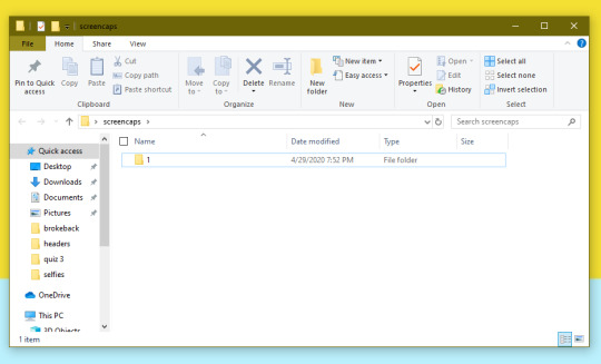
4. open up your .mp4/.mkv
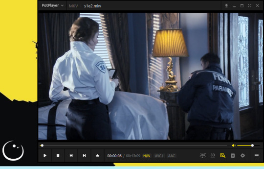
5. hit ctrl + g to bring up the screen capture pop-up & set your settings to these. click the button w/the three dots next to the storage option & select the folder you created for your first gif
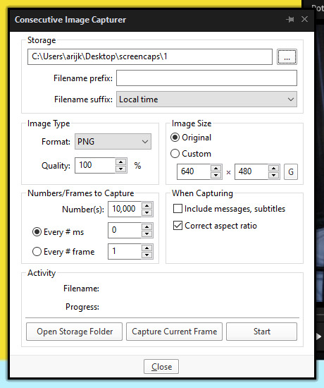
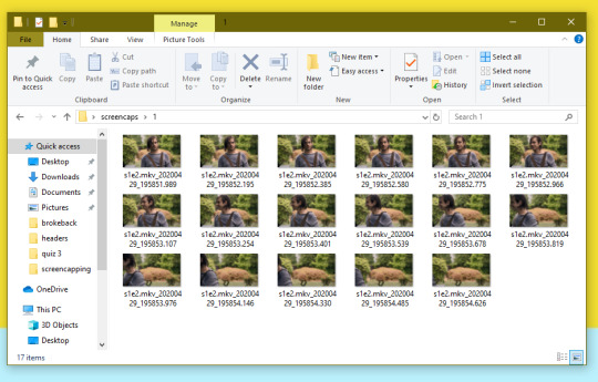
6. navigate to the scene you want to gif. when you’re there, pause it and hit the start button on the consecutive image capture screen, then play the video. how many screencaps you need depends on the size of your gif. for larger gifs (so like 540px wide gifs), you’re probably going to want to keep it below 30 frames. for smaller gifs (268px wide or less) you can maybe stretch it to 60, depending on how much coloring you add. you can always delete screencaps later though in photoshop, so don’t worry about it too much. for this gif, i only had 17 frames because the scene was really short lmao
7. go to your screencap folder you made & delete any unnecessary frames. it’ll look like this:
8. repeat the process for any other gifs, making new folders in your “screencaps” folder, numbered for however many gifs you’re making. make sure to change the folder you’re loading the images into on the image capture pop up though so they don’t all go into folder 1.
2. making a simple gif (+sharpening)
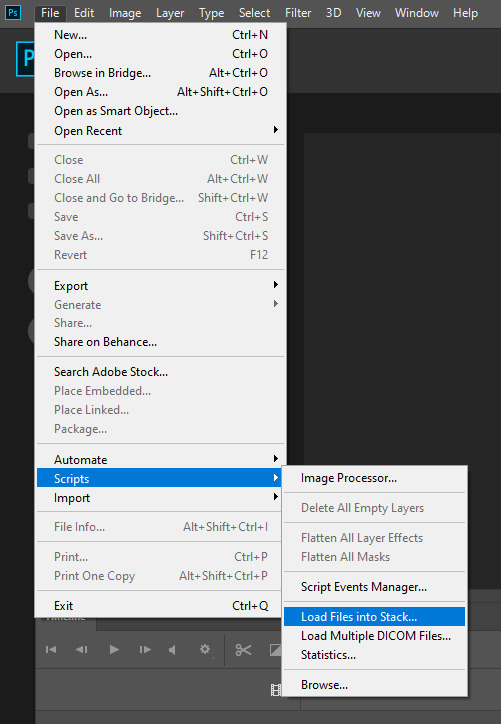
1. first, you need to load your screencaps. when you open up photoshop, go to file > scripts > load files into stack
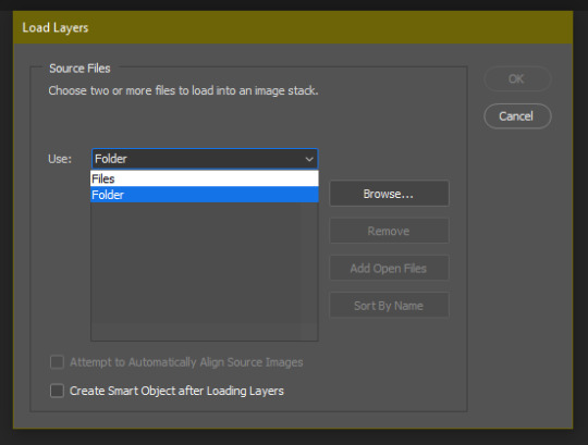
2. when the window pops up, switch the “file” option to “folder”
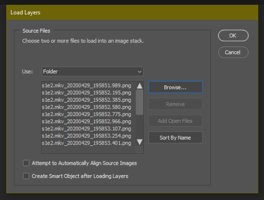
3. click browse and find your screencap folder for your first gif (in my case, desktop > screencaps > 1) once it’s all loaded, click “OK”
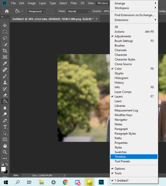
4. it’ll take a minute to load all your screencaps into photoshop. when they do, go to the upper bar on photoshop > windows > timeline
5. when the timeline bar shows up, click “create frame animation”

6. hit this button and click “make frames from layers”

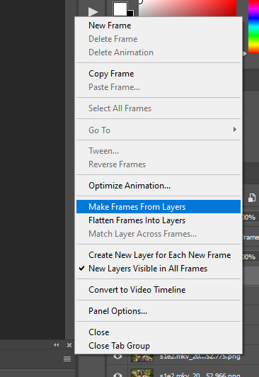
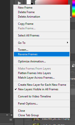
7. hit the button again and click “reverse frames”
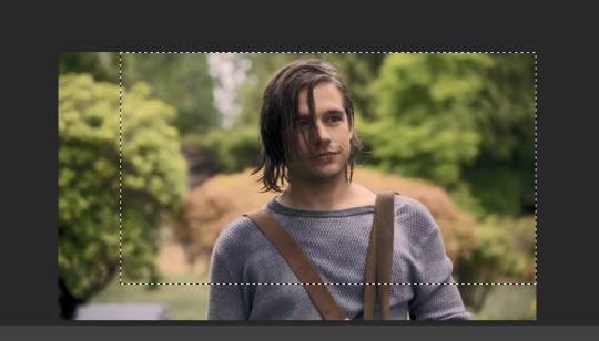
8. click back onto your first gif. then select the rectangular marquee tool and set it to whatever gif size you want. the width for 2 small gifs next to each other is 268px, the width for full size gifs is 540px. most people use 268x150 px for gifsets of 4+


9. use the marquee tool to select what area you want for your gif, like this. it’s up to you how to crop it! get creative!
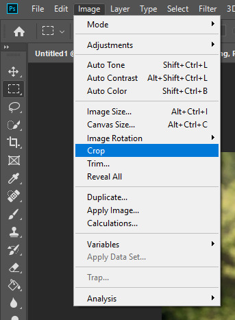
10. go to image > crop
11. now that your image is cropped, go to image > image size. change the size to your desired gif size (in this case 268x150). hit “OK”. then make sure it’s zoomed in to 100%
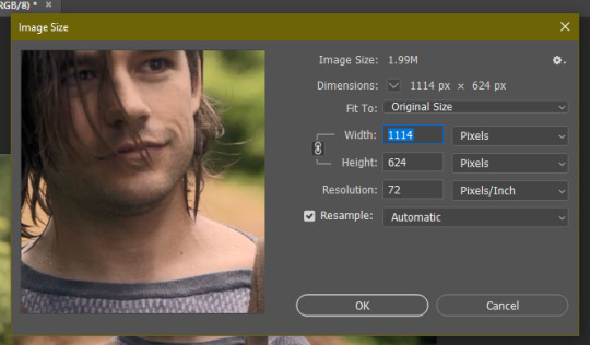
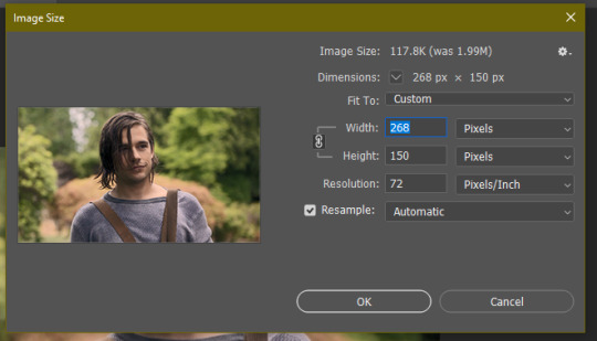

12. now, you COULD just save this gif, but they look way better sharpened. so you need to convert this to a smart object. to do so, first select all your layers in the righthand layer window. to select all the layers, click on your top layer, hold shift, and scroll down to your bottom layer & click on it as well while still holding shift
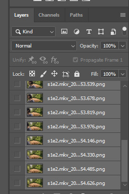
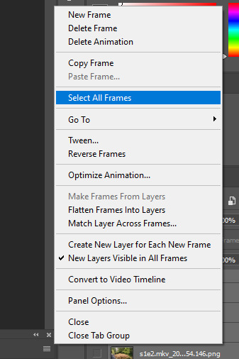
13. next, you need to select all your frames. go back to the options button from part 6 > select all frames
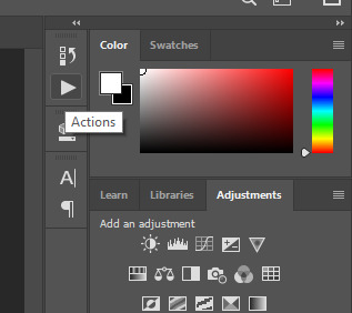
14. next, we’re going to create an action to make your life 100x easier when it comes to sharpening gifs in the future. to do so, go to the actions icon (may look different on different versions of photoshop, but basically just find the actions window)
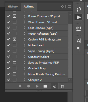
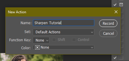
15. create a new action with this button. name it something. i named this one “sharpen tutorial” and hit “record”
16. click this button to convert to video timeline
17. go to filter > convert for smart objects
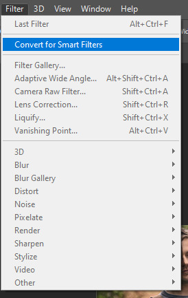
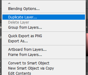
18. go to your single created layer and right click and click duplicate layer. this helps get rid of the transparent border around the gif.
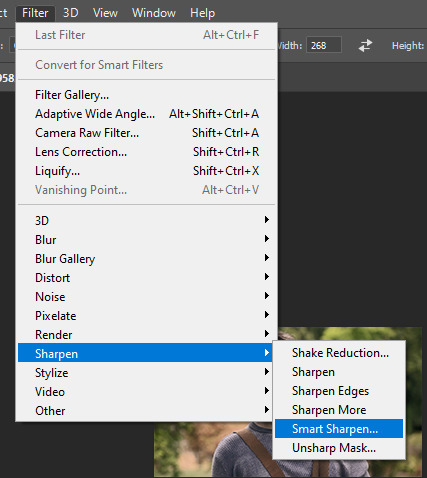
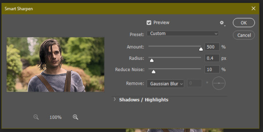
19. go to filter > sharpen > smart sharpen & use these settings
20. go to filter > blur > gaussian blur. set it to these settings.
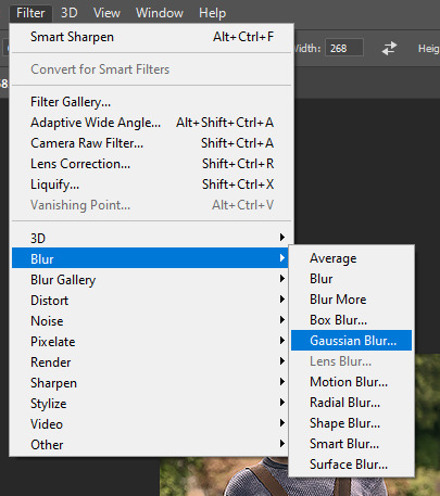
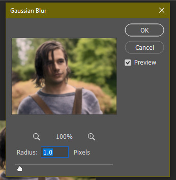
21. go to your second layer with the filters on it & right click on the gaussian blur filter to select “edit smart filter blending options” and set the opacity to 50%. you can mess around with this for different levels of sharpness. the closer to 0%, the sharper your gif will be.
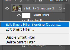
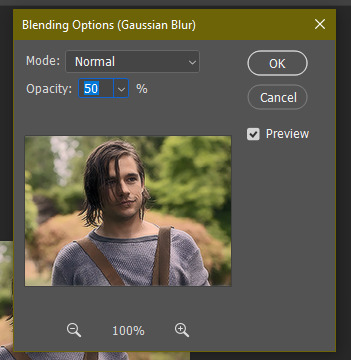
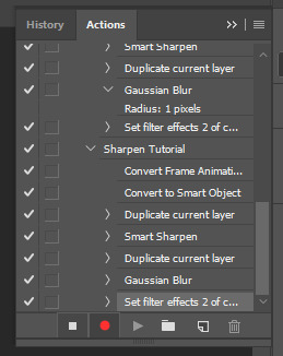
22. hit the stop recording button on your sharpen action. now you’ll have an action to use next time you make a gif! after you’ve followed all the steps 1-13 you simply go to actions, click on your saved sharpening action, and hit play instead & it’ll do steps 14-21 in a few seconds. here’s a pic of the stop button on the actions window
23. our gif is now sharpened! you can end with this & skip to the saving a gif section, or you can continue to coloring. here’s what we have so far.

3. coloring
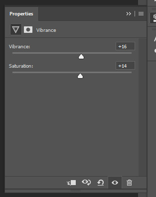
now on to coloring. this is pretty basic coloring and it probably won’t work if you follow my numbers exactly, as every single scene is different color + lighting wise. but this is just an example of the kind of thing you could do. basically, if you’re making vibrant gifs, you want to up the brightness + contrast + vibrance and make the colors already present pop. if you want anything more complicated (pale gifs, changing the colors to make, say, quentin’s shirt in these gifs red instead of blue), you’ll have to find other tutorials or experiment on your own. learning how to color & finding your style takes time! you can download psds if you want, but imo those kinda take the fun out of making gifs? that’s just me though.
after each step, i’ll show you what the gif looks like.
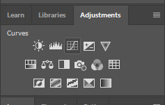
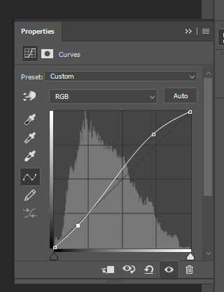
1. i usually start with a curves layer. i usually don’t mess with the color curve options, just this one:

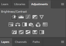
2. next, i do a brightness/contrast layer
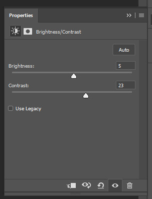

3. next, i do a vibrance layer. make sure not to make it TOO saturated or it’ll look bad.
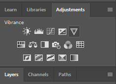

4. next i do a color balance layer. this is where it really starts differing depending on what color you want your gif to be.
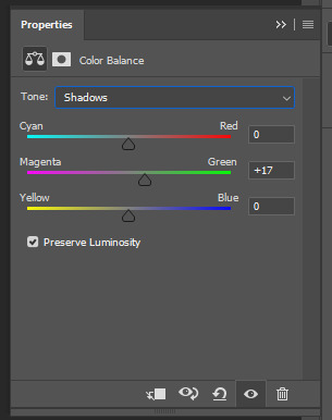
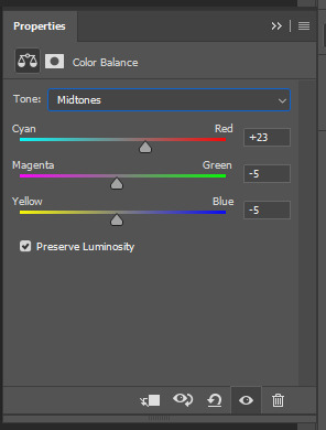
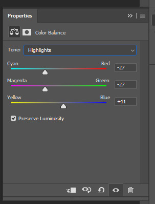

5. next we move to the selective color layers, which are arguably the most powerful. here you can make colors pop, change colors, etc. it’ll take lots of practice & messing around with, but here’s what i did with this gif. this one is making yellow + blue pop
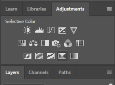
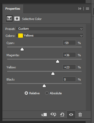
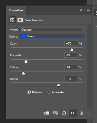

6. next, i did two more selective color layers editing the blue tab to make the blue pop even more
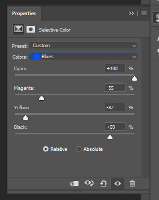

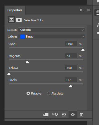

7. i still wasn’t quite happy with it, so i added another selective color layer to edit the blacks + neutrals + greens
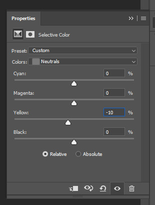
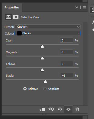
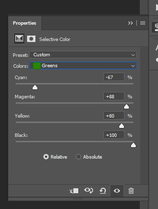

8. for good measure, i added one more brightness/contrast layer
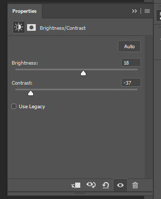

9. and the gif is done! however, you can play around with various adjustment layers until you’re happy. again, this is just an example of how to do basic coloring. it’s a skill like any other & takes practice. to keep consistent coloring in a gifset,
9b. you may want to make a psd of this coloring. to do so, you need to put all your adjustment layers in a folder, delete your frame layers, and click file > save as. save it as a .psd. then you can open it and drag it onto any other gifs you make, adjusting the coloring accordingly but still with the same vibes. you don’t have to do this, but it makes life easier. here’s how to use your saved psd, though obviously you’re using your own in this case and not a downloaded one.
4. saving your gif
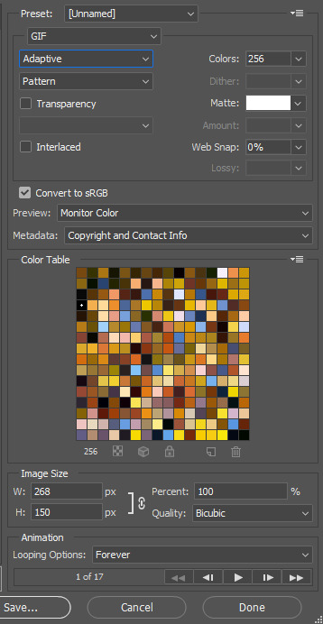
1. on photoshop cc 2019, you go to file > export > save for web (legacy). for other versions, you can just go to file > save for web. use these settings. the gif size limit is 3mb per gif, so make sure your file size is under that. if it’s not, you’ll need to delete some frames or some adjustment layers.
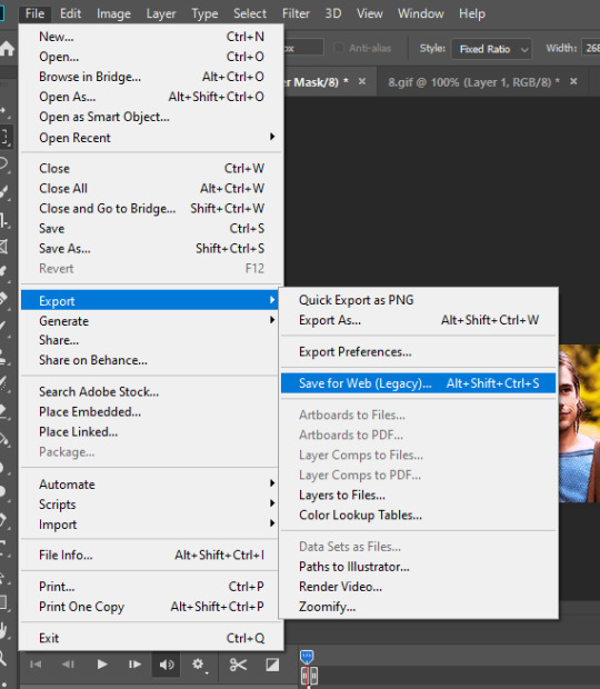
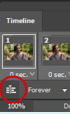
2. now, photoshop is a bit of a pain & this gif timing will not be right. so you need to open your newly saved gif. then you hit this button + select all frames


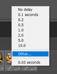
3. click this button & select “other”. tumblr gifs are typically .05-.08. my photoshop is glitchy and i have to set mine to .1-.15 or they’re WAY too fast. but usually, go with .05-.08 unless yours ends up glitching too.

4. save it like you did the first time and ta-da! you’ve made a gif!
#gif tutorial#photoshop tutorial#edit tutorial#coloring tutorial#yes im using the magicians its my hyperfixation and i get to choose the gifs
164 notes
·
View notes
Text
Destiny-Islanders Frequently Asked Questions
Can you tell us more about yourself?
She/Her
Born to love Kingdom Hearts on June 19th
26 years old
Lives in the US hellstate of Florida
Twitter: @DaPandaBanda
Sideblogs: @legendary-defenders, @dapandabanda, @traitorsandpancakes
Got any quick KH-related fun(?) facts?
Favorite KH game: KH2FM
Favorite character: Sora (duh)
KHUX union: Unicornis
Favorite Keyblade: KH1 Ultima Weapon
Station of Awakening Weapon of Choice: The Sword
Are you Novallion?
Novallion and I are, in fact, two different people. I am the president of their fan club, though
What do you use to draw your doodles?
Tablet: Wacom Intuos Pro (medium)
Programs: Clip Studio Paint for line-art, Photoshop for color
Do you have a shop?
Yes! https://www.redbubble.com/people/DaPandaBanda/portfolio?asc=u
Can I repost your art?
Since there seems to be some confusion: reblogs are different from reposts. REBLOGS are encouraged and much-appreciated. REPOSTS will be set on fire and served over steamed veggies.
That said… DO NOT EVER POST MY ART ANYWHERE WITHOUT GETTING DIRECT PERMISSION FROM ME FIRST
I DO allow reposts with permission on FACEBOOK ONLY with credit and DIRECT LINKS to my Tumblr and Twitter
DO NOT REPOST MY WORK ON TUMBLR, TWITTER, INSTAGRAM, OR ANYWHERE ELSE, NOT EVEN WITH CREDIT
YouTubers who’d like to dub my comics may do so with permission and, once again, direct links to my Twitter and Tumblr
Can I use your art as an icon/header?
Yes, as long as credit is presented, preferably somewhere in the description of your blog
Can you draw _________ for me?
I don’t take requests! Sorry!
Do you accept commissions?
Tbh commissions are very draining work, so I do not open them very often. (I don’t want to accept money from anyone for my work unless I am 100% satisfied with it. I want to be deserving of such patronage. Therefore, I only open commissions when I feel like I’m in a place personally and artistically to accept them.)
Why do you draw _________ like that?
(This section may be continuously edited to reflect changing ideas. Also I may have forgotten something.)
I’ll break down each non-canon feature I include in my doodles and the characters who have that feature
Yellow rings in the eyes and pointed ears
Side-effect of attempted or successful transformation into a vessel of Xehanort
Organization XIII, as vessel candidates, also undergo this change
Characters who are steeped in darkness (e.g. Vanitas and Aqua) are affected, too
Characters affected: Sora, Riku, Terra, Ven, Aqua, Vanitas, all Organization XIII members
Note: Organization XIII members who have been fully Norted have a ring of their original eye color around their pupils (e.g. Larxene has green rings)
Blue rings in the eyes
Side-effect of being in Sora’s heart
Characters affected: Kairi, Ven, Xion
Note: Roxas doesn’t count because he and Sora have the same eye color; Vanitas also has a blue ring thanks to his connection to Sora
Scars
Sora: Scar over heart from his sacrifice in KH (I always forget to draw it but I do headcanon him having a scar there)
Riku: Scar across his right hip from Xemnas’s ethereal blades when he protected Sora in the Realm Between
Kairi: Scar across the back from Xehanort’s fatal blow
Terra: Scars across the mouth from the shackles of the Guardian
Lea: Faint marks on his cheeks from the tear drop tattoos that will never fully fade
Is that a lucky emblem?
Yes.
I will indicate how many there are in the tags of each post that has them
The prize for finding them all is that warm fuzzy feeling of accomplishment
Do you have AUs?
Yes, and you can explore each of those tags to learn more about them:
Kingdom Hearts / Final Fantasy XV AU
Spider-Man!Prompto AU
Hocus Pocus / Final Fantasy XU AU
#destiny rambles#long post#faq#apparently my theme is really outdated and tumblr will not let me easily make edits to it anymore#so i guess i'll have to put the FAQ link in my description
142 notes
·
View notes
Text
Holding Court In A Crown {Roger Taylor}
Sequel to And All The Queen’s Men {Roger Taylor}
A/N: 3630 words. Giselle is fun to write and I love her. Another article style, based off of many conversations between @ginghampearlsnsweettea and I. Let me know what you think.
[And All The Queen’s Men ‘verse masterpost]
HOLDING COURT IN A CROWN - GISELLE TAYLOR in conversation with Vogue UK about her fashion evolution through the decades. (Published June, 1991)
When stepping into the Taylor home, it becomes immediately apparent that this is a home in which public image has always been very important. Gold and Platinum albums alike line the front foyer, shining reminders of the achievements of both artists who reside here. It’s surprisingly modern, hardwood floors and large windows that allow light to stream in, though the house itself is smaller than one might expect. Giselle herself greets me in the front hall, looking carefully casual in a flattering, warm yellow summer dress, that hits just above her knees, and a pair of matching yellow slip on shoes.
I’m lead through the house, past closed doors, one of which I’m told is a personal recording studio, into a open-planned kitchen-dining area. It’s a strange marriage of two aesthetics, no pun intended, the German-inspired open planned living with the dark counters, appliances, and features that make the space feel a little smaller, though it comes together to make something modern and chic, and perfectly suited to both Giselle and her husband’s images.
“Roger’s with the girls,” she tells me, referring to her daughters, pouring us both a glass of water in some of the fanciest crystal glasses I’ve ever seen, “not that he wouldn’t jump at the chance to talk about his “fashion choices”,” her air quotes, not mine, “but I thought I’d spare you the half hour argument about the wine stain, and all the other, sundry fashion choices of mine that he likes to take credit for.”
Giselle herself admits that she’s always been very fortunate in terms of fashion, “I mean, I look good in everything,” though there’s an air of self deprecation about it, “Actually, I’ve had a certain liberty with my work attire that not a lot of people have, unless you’re in the entertainment industry.” What began with a rented cocktail dress bloomed into one of the most influential fashion timelines of the 70s and 80s.
Beginning her career in an establishment modeled after American prohibition-era speakeasies, Giselle started off wearing cocktail dresses rented from the pub itself. “I actually did start off as a waitress, but for that you just had to provide your own black pants and white top, you know, wait-staff attire.” When the pub’s regular singer leaves, Giselle auditions to be her replacement, “they were just grateful I could fit into her dress, I could lipsync for all they cared.” Except, as well all know, Giselle can sing, and begun to make a name for herself in the community that frequented the pub.
Pulling out a polaroid of herself and music industry giant Ray Forrester, she shows me the only proof she has of the dress that started it all. It’s a rather ill-fitting, wine-coloured, sateen slip dress, it looks cheap, and according to Giselle, “it itched like crazy, it was cleaned once a week, and I was just glad that I was the only singer, some of the members of the jazz band had interchangeable costumes.” We both shudder at that, and she puts the photo on the counter.
As soon as she was given some modicum of control over her wardrobe, she took full advantage of it. Without a coherent aesthetic solidified by the release of her first album, Giselle admits she used the tour for Velvet Roses to experiment with both fabrics and styles. I personally have always favoured the midnight blue, velvet bouffant-style dress she wore during her stops in Belfast and Paris, but she goes on to praise the white, silk slip dress she had during her stop in West Berlin.
“Silk! Oh the silk, I dream about that dress sometimes,” she laughs a little, and now that we’ve begun to discuss her tour outfits, she leads me upstairs, “at the time it was the most comfortable thing I’d worn… ever; being able to work, to perform in something so luxury? It was a blessing.”
Her closet, at least the closet she stores her tour garments in, is separate from her bedroom, and locked. She’s got the key in her pocket, prepared, of course, for the interview, and as we step in I can hear the hum of a dehumidifier, and feel the chill of the air conditioning.
“It’s my one real extravagance.” As she turns on the lights, we’re greeted to the sight of a room, approximately four meters deep and half as wide, lined with railings that are practically stuffed with garment bags of varying sizes, and the end of the little room has a built in area for her jewel toned and bejewelled shoes alike. Three mannequins pose in the ample amount of space in the centre of the room, each wearing one of her most iconic outfits.
Each section of the racks around the side are carefully labelled by year, and it takes only a moment for Giselle to go through the section labelled 1971 before she’s pulling that same white dress from a garment bag. It still looks pristine, and when she offers for me to feel it, I understand what she’s saying.
“I’ve always tried to keep a very high standard in term of the materials I wear,” it was the first part of her aesthetic identity that was formed. “I’d never really had access to luxury on this scale before; I’d lived in sweaters and jeans for most of my [university] days; I was one of those girls in the little skirts and beaded tops at clubs- I lived my life in gogo boots every weekend of my first year.” Apparently she still has her favourite pair in the back of her personal closet, but seems hesitant to show me.
When asked what prompted her aesthetic shift, she reveals her passion for luxury stage-wear was only part of the decision. “I’d go on stage in silk pyjamas like Hugh Hefner if I could, but it’s not my brand.” Forrester was a big motivating force behind her solidification as the picture of elegance.
We get to the first of the mannequin dresses now, the fitted, black, off the shoulder cocktail dress, shining with sequins and beads, a perfect frozen reminder of her performance on Top of the Pops. To see it in person, still pristine, I get hit with just a hint of nostalgia, as does Giselle herself it seems. Marvelling at it with arms crossed over her chest, I’m granted a closer look at what was quite possibly the most iconic outfit of the 1972 lineup on the hit British musical program. The gloves themselves are more intricate than first imagined; what was assumed to just be red glitter is actually hand stitched, red sequins from the tips of the finger all the way to the wrist where it fades to chunky, red glitter, glued on and somehow width standing the test of time, to then dissolve into fine and sparsely scattered red glitter from the mid-forearm to the elbow. The beads and sequins on the dress itself are affixed with barely noticeable, shiny red thread, that gives the dress dimension up close. Giselle cites Gothic Romanticism as an inspiration to add depth to her jazz-bar persona, as well as the theatrics of musical theatre, going so far as to called the dress the ‘Merry Murderess’ despite the fact that the musical Chicago premiered almost three years after the dress’ initial debut.
Despite this look being regarded as one of her classics, and therefore setting the standard for her public image for the years to come, there’s no denying that Giselle didn’t enjoy experimenting with her outfits.
“I’ve never technically worn pants on stage,” as we move further into the room, she begins to pull various garment bags from the racks seemingly at random, “skirts, skorts, shorts - which some might argue are close enough - dresses, and even full jumpsuits, but never actual pants; I’ve always been worried that they were too masculinising for my act.” Moving on to the rack labeled 1975, she pulls out a particularly slim bag, and from it she pulls a pair of shorts made of what looks like liquid gold, but I know is made of velvet, with suspenders to match. It hangs over a sheer, flowing, cream crop-top with bell sleeves.
This outfit is cited as the first time she had deviated from her skirts and dresses, though the outfit itself is still exquisite and has an air of regality. “I was in Phoenix in ‘74 when I wore this; I’d had it included in my repertoire for the Hand Held Heart tour in case it became especially hot, which, being Arizona in the summertime, it was.” It’s here we start to see the influence of other artists bleed into her work; the occasional feathery flamboyance borrowed from Elton John, the avant-garde pattern and makeup work popularised by David Bow, and of course, the extravagance and glitz of Queen’s Freddie Mercury.
“You always have to specify that it’s [Freddie Mercury],” she’s very serious on this point, holding up her iconic, short, incredibly sheer white, long-sleeved fitted dress, marbled with red sequins to protect her modesty. It’s reminiscent of the red and white shorts Mercury had been known to favour on tours. “The others, while, yes, they could be well dressed on occasion, [Roger Taylor]’s lime green jeans aside, they never had the flair or audacity that Freddie had to be truly influential.”
After recording a cover of Queen’s Jesus for her third album, Giselle entered into an unofficial partnership with the band, which she tells me included a collaboration with Mercury himself on their costumes.
“I’d spent a long time trying to merge my style and my musical origins with modern aesthetics; I worked very closely with a designer, since it’s not technically my strong suit.” She pauses for a moment, and we make our way to the mannequins again, this time to the second, a floor-length, evening-gown style dress in lilac, capped sleeves, looking as though it’s tie-dyed with blackcurrant glass beads instead of fabric dye. “Getting to collaborate with the band was easy enough; I did talk with [Jim Beach] regarding the use of the song, but he ultimately he ruled that it was up to them, and so once that connection was established, I actually asked Freddie to help me with some tour outfit designs.”
People often assume Giselle is referring to her team contacting Queen’s lawyer, but she goes on record now to explain that it’s not true. “I’m a lawyer, my own lawyer, and I also work for several big-name bands in the music industry today. EMI picked me up halfway through my final year, but I still continued to go to [university], and I did actually intern under (sic) [Beach] while writing my second album. “ I’m assured that she had just regular suits in her personal closet; three, in grey, black, and cream, well fitted, ‘but not why you’re here’ she adds with a self-deprecating smile.
The lavender and blackberry dress was one designed by Mercury himself, the pale lavender representative of elegance and femininity, while the darker blackcurrant is used to bring depth to the dress the same way Giselle’s unwavering, calculated persona brings depth to her performances. It was Mercury’s idea to interweave the two in the tie-dyed style, keeping Giselle’s traditional aesthetic through the glass beads and the cut of the dress.
As we continue along the timeline, it’s clear to see the effect Mercury had on Giselle’s stage wardrobe, the use of geometric patterns coupled with bold colours, and more glitter and sequins than you can shake a stick at becoming more prominent throughout the late 70s, somehow still managing to keep in line with her traditional aesthetic simultaneously.
“I refuse to wear print.” She’s adamant about it when the possibility of wearing a garment like Mercury’s vest with his cats painted on it comes up. “Geometric doesn’t count; the texture in my wardrobe is always going to be,” she pauses for a moment, searching for the right word, fingers brushing through the fur of the fur-cuffs of a long-sleeved purple velvet number, “diegetic.” She settles on, and it’s clear what she means; patterns on her clothes are always wrought through beads or diamonds or fur or other things attached. “It’s the reason I have it locked, [Lilith Taylor, 7] has left the ‘indiscriminately grabbing things that feel nice’ stage a few years ago, but Rosie [Rosemary Taylor, 4] is just at the tail end of it. They’ll have free reign of this place one day,” she looks around at the fashion legacy she has built for herself, she wears an expression of pride, though it’s more focused on her daughters than the clothes themselves, “but for now I want to keep choking hazards and expensive furs out of danger.”
Around the very end of the 70s to the beginning of the 80s we see a return to form, with the resurgence of her form-fitted cocktail dresses. “There was a lot of change happening in my life at that time, and as much as I enjoy experimenting with my looks, it helped me feel secure to know I was in what was objectively my strong suit, pun not intended.” According to her, she’d just begun seeing Roger Taylor, and she used her fashion choices to exercise control in her life that she felt she was losing.
“My private life has always been very private, now here I am with the man who trashes drum kits and throws TVs out window; I was so afraid that every time people took a photo of me, or even looked at me, they’d think I was compromising my morals or integrity - which I’m not, and I wasn’t then.” She quickly clarifies. “Our personal history is not void because of where we are now, but Roger and I have also changed as people, and we’re allowed to have our feelings change. I’m honestly a little offended people think I we would have gone through all we did for mere publicity.”
Speaking of Roger, I’m a little surprised her wedding dress isn’t one of those on the mannequins, but I understand her choice, and we’ll certainly get to that soon. Her wedding dress sits at the back of one of the racks, carefully distant from any of the year labels. As she removes it from the garment bag, she gives it a softly nostalgic smile, brushing the fabric gently. “This should really go in my own closet.” It’s unlike most of her other outfits here, such a pale cream it’s almost white, floor-length and sleeveless with a Roman-inspired cinched waist topped with what I hesitate to even call ruffles, their drapings so loose it’s reminiscent of curled hair rather than a traditional ruffle. The material is so soft and light that even on a hanger it looks a little ethereal. It’s simple, elegant, and the very sight of it brings joy to her face.
“’81.” The year is surprising, as is the revelation she shares about how they celebrated their tenth anniversary a few months prior. Putting the dress away, we move to the early eighties, and it’s almost cyclical the way we’re brought back to the ‘Merry Murderess’ aesthetic with the lineup from her ‘The Bend Before The Break’ tour.
“Everyone and their mother seems to have read the article [All The Queen’s Men, Rolling Stone, 1985] and figured out I was in a shaky place at the time; it’s again about having that modicum (sic) of control. Part of me reverted to portraying myself in the way when I felt like I was at the height of control in my relationships and career. It’s a pretty aesthetic,” she gently pulls a velvet, wine-coloured cocktail dress from the rack, giving it a gentle pat, “it made my stage presence feel good, honestly.” It doesn’t sound bitter, but she puts the dress back.
Apologising for a moment, she explains the large gap between ‘82 and ‘84, with her Finally, Sunlight tour. “After coming home from the [The Bend Before The Break] tour, I took some time to myself; I was, of course, still writing, but I couldn’t really perform or make any big public appearances after like, July in ‘83, because I was quite pregnant, and, again, I’m a private person.” The Finally, Sunlight tour is known for two things, Giselle wearing gold, silver, and copper, in any and every way she could, and the Atlanta Breakdown.
“I wore metallics because Finally, Sunshine is about my baby girls, and they are so precious to me.” As was made clear in the Rolling Stone article, Giselle and Roger lost one of their twin daughters to illness in Autumn of 1984, though Lilith survived, it took a devastating toll on the couple. Moving past that, we’re finally brought to the crown jewel of the collection; her Live Aid dress.
It’s almost the antithesis to the ‘Merry Murderess’, though it shares a similar neckline and off-the-shoulder style. The Live Aid dress, which Giselle calls ‘Queen Midas’ for reasons I’ll get into later, has a white, crushed velvet bodice with an inbuilt corset, and basque waistline. Beneath the waist is a enough layers of thin and flowing georgette to become completely opaque, like a waterfall from the waistline, the colours fading from a bright, sunshine yellow at the hip, to a rich, sunset orange by the knee, and finally to a smokey, warm-toned charcoal where it brushes the ground, with gold jewels dotted around the bottom and creeping almost to the knee in some sporadic places, reminiscent of embers in a fire. Her gloves are white velvet, and just like with the first of her most iconic outfits, it’s gold sequinned fading to actual glitter and diamonds.
“I took a hard look at where I was and what I had achieved, and... whether or not I can help it, I effect people, through my music, my actions, through what I wear, and can be a double edged sword. Sometimes it can hurt, or I can hurt others by saying or doing the wrong thing, but sometimes I find myself wanting for nothing; everything I’ve held close has turned to gold. I wanted to show that, to be able to be a part of something that gives back to the world where it’s given me so much.”
With all her most well-known outfits having been covered, there’s one more that comes to the top of my head; the jacket of 1980. The tabloids had a field day with her choice of wardrobe as she stepped out of a car with the rest of Queen wearing a salmon and green floral, double breasted suit jacket, with silver buttons and silver stilettos, with sheer, thigh high white socks held up by a garter belt, hair fashionably messy, but makeup pristine. The deviation from her usual pristine image had shocked both paparazzi and public alike, however the daring outfit had quickly been lauded as one of her best, many publications who ran photos even citing it as the entertainment industry’s hottest innovative look of the decade. Even since it has stood the test of time, and has been attributed to the rise of patterned and bold suit jacket purchases by men and women alike, with the outfit have been cited as inspiration for more than one celebrity’s red carpet look.
Now, however, something, possibly amusement, possibly annoyance, crosses her face, and she tells me it’s not here. The jacket is Mercury’s. “We were on our way to a party being hosted by [Elton John], and I’d only been with Rog for a few months at this point; so we’re in the back of the limo with the other [members of Queen] and Roger’s spilled his wine on my nice, white cocktail dress.” It seems like a bittersweet memory, and she reminds me of her earlier comment about the ‘wine stain argument’. “In hindsight, everything worked out, but at the time I was absolutely livid; very nearly killed him in that backseat. Poor [John Deacon] literally had to drag me off of him. [It] took both him and Freddie to hold me back when Roger got out once we arrived, and they had the driver circle the block again so I could change into Freddie’s jacket, which he so kindly lent to me.”
From her tone, and her following comments about how her husband likes to bring it up, it seems as though it’s a well worn argument of how Roger Taylor enjoys taking credit for the look, though Giselle doesn’t seem like she enjoys giving him the satisfaction.
“My image has always been about how much I can control what people see of me, and to have that control taken away by a careless action, it really hurt. A man like Roger, in the entertainment industry, is never going to face the kind of scrutiny that I do, it’s the reason you’re here at all, talking to me about fashion rather than say, how difficult it is to be a practicing lawyer in the music industry while raising two beautiful daughters. And I still write music on occasion. But people remember what you show them, how you present yourself; my tour wardrobe is a reflection of the persona I let interact with the world, and it’s beautiful, and a legacy that will probably outlive me to some extent.
“Do I regret any of my fashion choices? I don’t really have the liberty to, do I? And either way, they’re part of the reason I’m where I am today; I made a niche for myself that was built initially on my aesthetic, if I’m being generous, so I suppose I’ll always be grateful to it.”
#roger taylor#roger taylor x oc#roger taylor imagine#bohemian rhapsody#borhap#bo rhap#queen#borhap imagine#the angry lizard writes
137 notes
·
View notes
Text
What Color Ties Do Republicans Wear
New Post has been published on https://www.patriotsnet.com/what-color-ties-do-republicans-wear/
What Color Ties Do Republicans Wear

The History Of Party Colors In The United States
Tie-Dye 101: Tips & Tricks
Prior to the United States presidential election of 2000, which party was Red and which was Blue was largely a matter of which color a news outlet chose. On the October 30, 2000, episode of the Today show, Tim Russert coined the terms red state and blue state.
As far back as the 1888 election blue was used to represent the northern Union states and red the south, but this wasnt consistent throughout time . In the 70s and 80s the major networks starting using lighted maps to illustrate election results. Democrats were often coded blue and Republicans red, but it wasnt consistent. This inconsistent coloring continued throughout the Clinton years and up to the Gore Vs. Bush. This can all be varied by old videos and articles.
Customers Who Viewed This Item Also Viewed
Get it as soon as Monday, Sep 13FREE Shipping on orders over $25 shipped by AmazonOnly 1 left in stock – order soon.
Get it as soon as Thursday, Sep 9FREE Shipping on orders over $25 shipped by Amazon
Get it as soon as Thursday, Sep 9FREE Shipping on orders over $25 shipped by Amazon
Get it as soon as Friday, Sep 10FREE Shipping on orders over $25 shipped by AmazonOnly 3 left in stock – order soon.
Red White And Blue: How Color Defines Politics
In early October, Pew Research Center noted a 1.2-point increase in voters for Republicans and a 4.6-point increase for Democrats.
Turnouts for early voting amongst young voters, ages 18-29, have been proving astronomical versus 2014, particularly in red states.
According to The Hill, as of November 2, 2018, early voting polls showed:
Arizona: +217%
Tennessee: +767%
Texas: +448%
But why do we Americans associate political leanings with a specific color? Why do we know what it means to discuss voting in a red state or blue state? And what impact does the psychology of color have on individuals and communities?
Recommended Reading: Can Republicans Vote On Super Tuesday
A Final Word On Colors
Many political parties around the world often choose their colors because of their connections to political stances, groups, or ideologies.
For example, red has historically been a color often linked to socialism and communism after a red flag was used by the revolutionaries during the Paris Commune. Revolutionaries may have picked red flags during this time as a possible reference to the 13th century red naval flags of defiance that meant a ship would kill any enemy it saw and so was flying a bloody flag.
As another example, many environmentalist parties around the world will often use the color green to symbolize nature. Finally, fascist parties have often used the color black such as Adolf Hitlers Nazi party and Benito Mussolinis Italian Fascist party because the black color represents what they intend to bring to their enemies: fear, intimidation, and death.
Lets finish with a quick trip around the globe to see the colors associated with some prominent political parties. In the United Kingdom, the colors are flipped compared to the United States: the right-leaning Conservative Party uses blue and the left-leaning Labour Party uses red, as do the Canadian parties of the same names. Australias oldest party, the Australian Labor Party, uses red while the Christian Democratic Union of Germany has used orange and black, and Emmanuel Macron of Frances En Marche! uses yellow.
Why Is Hillary Clinton In Red And Why Is Donald Trump Wearing A Blue Tie

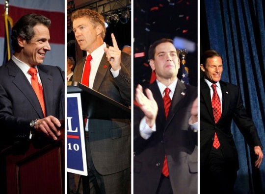
Id expect the republican candidate to wear red and the democrat to wear blue, but its quite the opposite. Why is this?
The color red is thought to convey strength and aggression, which is why a lot of men use that color for power ties. The Clinton camp probably wanted to her appear commanding and authoritative, particularly when debating a loud and aggressive opponent.
Blue is viewed as more calm and soothing. Trumps camp may have wanted him to appear calm and restrained.
The whole red/Republican, blue/Democrat thing is a pretty recent association anyway, starting in the 2000 election. Its not as if those are the official colors of those parties.
It was around before that but iirc they switched colors every election.
i did not realize red/blue as party association was only that recent
Clinton was expecting Trump to wear his red tie its a power color. So she preemptively wore a red suit. He was expecting her to expect that, so he wore blue as a counter-power move.
You know, I think you might have said that as joke but with consultants and strategists and yadiyadiyada, I might just be what happened.
If he wore a red suit he would have appeared dangerously unstable, for what he wore, not what he said.
These are no official colours of either major party. Neither has official colours of any kind. Both have used red, white, and blue for their entire histories.
Also Check: What Caused Republicans To Gain Power In Congress In 1938
The Color Psychology Behind Inauguration Fashion
Inauguration day isnt just about politics, its also all about fashion.
Inauguration day isnt just about politics, its also all about fashion.
All eyes were on Donald Trump Friday as he took oath as the 45th president of the United States, but it was hard to miss the stylish outfits surrounding his inauguration.
Dressing for a major political event is an event in itself. Outfits worn by powerful leaders and their families are carefully selected and crafted by high-profile designers and stylists. Fashion experts often dig deeper into the meanings behind the colors picked for outfits that will be seen by millions around the globe.
Public image is important for all politicians, especially for the first lady, said Dr. Dong Shen, professor of Fashion Merchandising and Design at California State University, Sacramento. Colors and brands are very important.
The first lady is often an American icon but traditionally, their main role is to support their husbands presidency. Their outfits tend to balance or compliment their husbands attire, avoiding to overpower.
Shen explained, for this reason, first ladies are usually seen in softer colors or floral patterns.
Blue is often associated with the sky and the ocean, Shen said of Mrs. Trumps inauguration outfit. It often symbolizes loyalty and trust.
Why The Red Tie
So why do so many politicians wear red power ties?
Unless we ask them its impossible to know for sure. Some journalists have speculated that red is a popular color because it features in the American flag and so advertises its wearers patriotism. If this is true, though, we should see as many blue ties as red.
Perhaps the clue is in the name: power. Could it be that politicians suspect that a red tie makes them appear more powerful, dominant, and authoritative?
Read Also: Are There More Democrats Or Republicans In The Senate
Gop Candidates Stick To Red Ties At Debate
GOP presidential candidate Mitt Romney stood out at last night’s GOP debate, mainly for his $10,000 gaffe.
But we couldn’t help but notice the former Massachusetts governor’s other major distinction: a blue tie.
While its exact point of origin is murky , the color-coding of American politics has become common knowledge: red for Republicans, blue for Democrats. The primary-hued shorthand has extended from election night dry-erase boards to candidates’ closets, as male candidates have been known to indicate their party alignment by tie color.
And though it’s not an exact science , the red-blue divide was on full display at last night’s GOP debate — with one exception. Rick Santorum, Newt Gingrich, Rick Perry and Ron Paul all wore red ties, while Mitt Romney wore light blue.
Michele Bachmann, for the record, wore a royal blue blouse.
Romeny’s blue wasn’t too surprising, as it’s been his go-to hue throughout the debates. Men’s fashion expert Hendrik Pohl, the CEO of ties-necktie.com, told ABC, “Blue is the color that people most commonly name as their favorite color and it has very calming effect on people” — and sure enough, eight out of the ten major debates have seen Romney in the safe color.
What gives? Afraid of standing out, Newt? Is wearing anything other than red an affront to Texas, Rick? Trying to prove your Republican affiliation, Ron?
See pics of the candidates’ ties below… what style of ties would you like to see at the next debate?
How Did Red And Blue Come To Represent The Two Major Us Political Parties
What To Wear To A Formal Event | 3 Suit Options
It all started with television. In the early 1970s, networks like ABC, NBC, and CBS were seeking a way to demarcate which states in the electoral college had been won by each candidate. More American households had color TV sets than ever before, giving news programs covering the election an opportunity to show splashy graphics when a state was called in favor of a given candidate.
The first network to color-code states during an election results broadcast was CBS in 1972. However, at that time, blue represented the states won by the Republican incumbent Richard Nixon, and red stood in for those taken by challenger US Senator George McGovern of South Dakota.
Theres a good reason why those colors were chosen for each party at the time: global precedent. In Great Britain, red had long been used to represent the more liberal party, which in this American use case were the Democrats. Blue stood in for Republicans by default, in part because the colors in contrast were striking on screen.
But by the late-1980s and early 1990s, those color assignments reversed. Blue became more consistently used for Democrats and red for Republicans.
Nevertheless, it still wasnt until 2000the race between Democrat and Vice President Al Gore and Republican Texas Governor George W. Bushthat those colors became synonymous with the name of each party.
Recommended Reading: How Many Republicans In The New Senate
Which States Are Considered Red And Which Are Blue
To go along with the colors, the terms red state and blue state were popularized by anchorman Tim Russert during and immediately after the 2000 election. Today, these terms are used to refer to which party a state voted for during a presidential election.
Generally speaking, the Northeast and the West Coast are considered a collection of blue states as most of them have sided with the Democrats since the early 1990s.
The Southern states have sided with Republicans since the 2000s, while the Midwest tends to be tougher to predict. For example, Illinois and Minnesota are currently considered blue states, while Missouri and Nebraska are red. Hawaii and Alaska have been traditionally considered blue and red respectively as neither has switched parties since the late 1980s .
The Southwest has been split since 2000 with Nevada, New Mexico, and Colorado going blue more often than red and Utah and Arizona voting predictably red. Finally, we come to the coveted purple states or swing states, such as Florida, Ohio, Pennsylvania, Iowa, Wisconsin, and Michigan. These states switched colors in recent elections and are often a key focus of electoral campaigning and strategy. Swing states can vary by election year.
Shopping On A Hill Staffers Salary Means Deal
Kate: A lot of people dont realize how little Hill staffers make, so they probably dont realize what a struggle it is to find clothes that youre able to wear to work and that are still acceptable. Im just trying to make rent! I make $65,000, but I know some staff assistants that make $25,000.
I shop at , T.J. Maxx, and Nordstrom Rack I go to the Nordstrom in the mall, and then I go to the Rack and find the same stuff. I would never pay full price for something. On birthdays and Christmas, I try to get as many clothes as I can.
Heather: I typically shop at Marshalls and Nordstrom Rack. I still shop at H&M, but some of their stuff is more expensive and wears out quickly. Ill only shop at J.Crew Factory and Banana Republic Factory if its something that I love and fits me really well. Otherwise, I wont splurge on it. Anthropologie is where I wish I could shop if I had that kind of money, but I dont.
I wont spend more than $80 on one particular item of clothing, unless its a coat. For dresses, I wont go over $70 unless I love it. Tops I like to be $20 to $30. Pants and shirts, $40.
In a place like this, with a lot of powerful people, you want to sprinkle in items that do cost a lot of money. Ill wear a Burberry scarf with an overcoat; I carry a Tumi bag. If they see items on you that they can recognize and that they know the value of, they then assume that is expensive, when little do they know you got your suit for under $300 and your shoes were on sale for $50.
Also Check: Who Is The Speaker Of The House For Republicans
From Pleather To Puffy Coats Swapcom Uncovers The Hottest Fashions Trending Across The Country For Red And Blue Voters
October 26, 2016 05:00 ET | Source:Swap.comSwap.com
CHICAGO, IL– – With less than two weeks to Election Day, the candidate’s personal style and wardrobe has been an ongoing talking point for politicos and news anchors. From patriotically-themed pantsuits and ties to poor tailoring to disheveled hair, it is clear fashion plays a powerful role in politics. For a less serious spin on politics and fashion, Swap.com — the largest online consignment store-dove deep into millions of previous purchases to uncover how style preferences of Democrats and Republicans sized up. Based on a breakdown of how red and blue counties voted in the 2012 election, Swap.com has revealed the most popular picks among liberals and conservatives.
That’s A Lot of Look
When it comes to clothes, both Republicans and Democrats are buttoning and bundling up in interesting ways. Republicans prefer dresses to skirts and, when it is warm, buy more Capri pants and Bermuda and cargo shorts. Meanwhile, Democrats are pairing jeggings with a blazer and their favorite sports jersey topped off by a puffy coat.
Democrats are
69% more likely to wear jeggings
39% more likely to wear jerseys
31% more likely to wear sweaters
30% more likely to wear blazers
22% more likely to wear puffy coats
21% more likely to wear button-up shirts
14% more likely to wear skirts
Republicans are
Methodology:
Color And Clothing Choices


When we see certain colors, they produce chemical reactions in our brains that can make us feel certain emotions. For example you are more likely to order more food in a restaurant that is decorated with a lot of red because that color makes us hungry. Sports teams often paint the opposing teams locker room pink because that color makes people tired. Guests on late night TV hang out in the Green Room before coming on stage because that color is the most calming and relaxing. So what could certain candidates be trying to sell you via their color and clothing choices?
Read Also: What Cities Are Run By Republicans
The Psychology Of Tie Colors In The Race For President
Have you ever asked yourself the question why we only see red and blue ties on presidential candidates as of recently? Some might argue that candidates will choose those ties that best reflects their partys identify, meaning red ties for Republican Romney, and blue ties for Democrat President Obama, but this is only partially true.
Take Tuesdays Presidential debate for instance. Romney wore a bright blue and white striped tie while Obama opted for a burgundy-red piece, a change that I was very happy to see. Pre-debate I was actually hoping that Obama would be wearing a red tie a color that is synonymous with power, confidence, and excitement all things Obama lacked in the first debate.
Obama is Taking Charge, Wearing a Burgundy-Red Tie
I am now making the argument that Obamas red tie helped him step up his game during the last debate. Not only did the tie grabbed the audiences attention, but I strongly belief that it gave President Obama a boost of confidence after taking a look in the mirror.
The psychology & emotional effects of colors is definitely nothing new. In fact, psychologists have been researching the meaning of colors for decades, if not centuries, and evidence does indeed prove that certain colors do evoke certain emotional responses in people. This is nothing new to presidential candidates who pay attention to what colors to pick out for a public appearance.
Other Suggested Articles:
No Consensus On Colors Before 2000
Before the 2000 presidential election, television networks didn’t stick to any particular theme when illustrating which candidates and which parties won which states. In fact, many rotated the colors: One year Republicans would be red and the next year Republicans would be blue. Neither party really wanted to claim red as its color because of its association with communism.
According to Smithsonian magazine:
“Before the epic election of 2000, there was no uniformity in the maps that television stations, newspapers or magazines used to illustrate presidential elections. Pretty much everyone embraced red and blue, but which color represented which party varied, sometimes by organization, sometimes by election cycle.”
Newspapers including The New York Times and USA Today jumped on the Republican-red and Democrat-blue theme that year, too, and stuck with it. Both published color-coded maps of results by county. Counties that sided with Bush appeared red in the newspapers. Counties that voted for Gore were shaded in blue.
The explanation Archie Tse, a senior graphics editor for the Times, gave to Smithsonian for his choice of colors for each party was fairly straightforward:
I just decided red begins with r, Republican begins with r. It was a more natural association. There wasnt much discussion about it.
Also Check: What Republicans Voted Against The Wall
Red Vs Blue: Why Necktie Colors Matter
ByRobert Roy Britt01 March 2017
In high-stakes politics and business, there are only two colors of ties: red and blue. Oh, sure, you might spot purple or yellow now and then, but those are clear statements of aloofness, be they calculated or careless.
Few world leaders or CEOs want to be seen as aloof.
But does it matter whether one wears red or blue? Yes, suggest several studies, including one published in the journal Science on Feb. 6, 2009. More on that in a moment.
First, some color:
Tonight , during his first address to a joint session of Congress, President Donald Trump wore a blue and white striped tie. Seated behind Trump, Vice President Mike Pence and Paul Ryan, Speaker of the U.S. House of Representatives, both wore blue ties.
For his inauguration on Jan. 20, President Donald Trump wore a red tie with his dark suit, while outgoing President Barack Obama donned a blue tie. Their wives wore the reverse, with Michelle Obama in a red dress and Melania Trump wearing a powder blue ensemble.
In the first presidential debate of 2016, then-nominee Donald Trump donned a blue tie, while the Democratic nominee, Hillary Clinton, wore a red suit. The Democrats may have decided on “red” during the election, as Clinton’s running mate, Sen. Tim Kaine donned a red tie during the first vice presidential debates on Oct. 4, while Trump’s running mate, then-Indiana governor Mike Pence sported a blue necktie.
Related:
Republican Party Platform 2016: We Fact-Checked the Science
Desks Are Closets Too
How To Tie Dye
Heather: I have an emergency blazer in my desk that I can whip out if I feel I need to, and then an extra pair of flats in my desk. You do so much walking in DC that flats wear out really quickly. Ill keep Band-Aids and Neosporin in my desk, too, for when Im breaking in a pair of shoes. Ill get new flats every four months Ill just go to Marshalls and get whats on sale.
Jen: Im a big fan of having a lot of jackets that I keep in the office. You never know what day youll need to go staff your boss on the senate floor. Jackets that you can put on regardless of whether youre wearing slacks or a dress or a skirt and a top I think thats one of the easiest things to keep on hand. Then I have a black sweater, because these buildings can be terribly temperature controlled.
Don’t Miss: Did Republicans Riot After Obama Was Elected
The Best Presidential Suits Ever Worn
The diplomatic protocol and the demands of the presidential dress-code leave a narrow margin of freedom to express themselves freely. Who has the best taste when choosing what to wear to take charge of governing his nation? That question causes you great curiosity, because although you know that the presidents of the list below have a group of image advisors behind them, some do not look as good as they should, considering the media exposure to which their posts compels them.
Even the presidents and high official of a country cannot escape from the sharp eyes of fashion police. The following list spotlights the powerful men and women in the world who accessorize political acumen with perfect tailoring and their idiosyncratic touches.
Barack Obama
Barack Obama has declared that he is not a fan of fashion. However, Obama knows how to wear a suit and he wears it well. During his presidential campaigns he was seen with a more casual look of jeans and shirts, but in office, he has opted for an obligatorily more elegant image, based on classic two buttons. His favorite colors are the dark ones and he mostly wears white shirts combined with ties in red or blue tones. Among his favorite designers are Ermenegildo Zegna and Hart Schaffner Marx.
The former President explained the logic behind this routine:
John F. Kennedy
Harry S. Truman
Ronald Reagan
Vladimir Putin
Blue Ties Symbolic As Bush Democratic Leaders Meet
Story Highlights
NEW:
WASHINGTON Now facing Democratic control of both chambers of Congress during the last two years of his presidency, President Bush on Friday continued to move toward building a working relationship with Democratic congressional leaders.
Bush met in the Oval Office with Sen. Harry Reid of Nevada, who is expected to be the Senate majority leader when a new Congress convenes in January, and Sen. Dick Durbin of Illinois, expected to become assistant majority leader.
I assured the senators that we will cooperate as closely as we can to solve common problems, Bush said after the meeting.
The president also congratulated the senators on their election victory and said, I know they were proud of their teams efforts. And they ran good campaigns and they talked about issues that people care about, and they won.
The new dynamic of checks and balances between Congress and the executive branch provide a great opportunity for us to show the country that Republicans and Democrats are equally as patriotic and equally concerned about the future, and that we can work together, Bush said.
Reid concurred, saying, Elections over. The only way to move forward is with bipartisanship and openness and to get some results. And weve made a commitment the four of us here today that thats what were going to do.
From our side, we think that is a symbolic indication, and were off to a good start, Durbin said.
Recommended Reading: Who Was The Leader Of The Radical Republicans
How The Colors Came To Be Red White And Blue
Of the 205 sovereign nations in the world, 21 share red, white and blue as their flags colors. But why do so many share the same trio of colors, and what do they represent?
On July 4, 1776, a resolution was passed by Congress authorizing the development of a seal for the new country which reflected the Founding Fathers values.
When presenting the seal which was officially adopted on June 20, 1782 Secretary of the Continental Congress, Charles Thomson, explained, White signifies purity and innocence. Red, hardiness and valor, and blue signifies vigilance, perseverance and justice.
The meaning behind the colors have since shifted slightly. In 1986, President Ronald Reagan declared it the Year of the Flag, stating, The colors of our flag signify the qualities of the human spirit we Americans cherish. Red for courage and readiness to sacrifice; white for pure intentions and high ideals; and blue for vigilance and justice.
According to TIME Magazine, however, Mike Buss, a flag expert with the American Legion, points to the red, white and blue used in the Union Jack of England.
They come from the three colors that the Founding Fathers had served under or had been exposed to, said Buss.
Therefore, some of the correlation between the United States use of red, white and blue along with 20 other countries, including Puerto Rico, Australia and Cuba, could come from their historical correlation with England.
0 notes
Text
What Color Ties Do Republicans Wear
The History Of Party Colors In The United States
Tie-Dye 101: Tips & Tricks
Prior to the United States presidential election of 2000, which party was Red and which was Blue was largely a matter of which color a news outlet chose. On the October 30, 2000, episode of the Today show, Tim Russert coined the terms red state and blue state.
As far back as the 1888 election blue was used to represent the northern Union states and red the south, but this wasnt consistent throughout time . In the 70s and 80s the major networks starting using lighted maps to illustrate election results. Democrats were often coded blue and Republicans red, but it wasnt consistent. This inconsistent coloring continued throughout the Clinton years and up to the Gore Vs. Bush. This can all be varied by old videos and articles.
Customers Who Viewed This Item Also Viewed
Get it as soon as Monday, Sep 13FREE Shipping on orders over $25 shipped by AmazonOnly 1 left in stock – order soon. Get it as soon as Thursday, Sep 9FREE Shipping on orders over $25 shipped by Amazon Get it as soon as Thursday, Sep 9FREE Shipping on orders over $25 shipped by Amazon Get it as soon as Friday, Sep 10FREE Shipping on orders over $25 shipped by AmazonOnly 3 left in stock – order soon.
Red White And Blue: How Color Defines Politics
In early October, Pew Research Center noted a 1.2-point increase in voters for Republicans and a 4.6-point increase for Democrats.
Turnouts for early voting amongst young voters, ages 18-29, have been proving astronomical versus 2014, particularly in red states.
According to The Hill, as of November 2, 2018, early voting polls showed:
Arizona: +217%
Tennessee: +767%
Texas: +448%
But why do we Americans associate political leanings with a specific color? Why do we know what it means to discuss voting in a red state or blue state? And what impact does the psychology of color have on individuals and communities?
Recommended Reading: Can Republicans Vote On Super Tuesday
A Final Word On Colors
Many political parties around the world often choose their colors because of their connections to political stances, groups, or ideologies.
For example, red has historically been a color often linked to socialism and communism after a red flag was used by the revolutionaries during the Paris Commune. Revolutionaries may have picked red flags during this time as a possible reference to the 13th century red naval flags of defiance that meant a ship would kill any enemy it saw and so was flying a bloody flag.
As another example, many environmentalist parties around the world will often use the color green to symbolize nature. Finally, fascist parties have often used the color black such as Adolf Hitlers Nazi party and Benito Mussolinis Italian Fascist party because the black color represents what they intend to bring to their enemies: fear, intimidation, and death.
Lets finish with a quick trip around the globe to see the colors associated with some prominent political parties. In the United Kingdom, the colors are flipped compared to the United States: the right-leaning Conservative Party uses blue and the left-leaning Labour Party uses red, as do the Canadian parties of the same names. Australias oldest party, the Australian Labor Party, uses red while the Christian Democratic Union of Germany has used orange and black, and Emmanuel Macron of Frances En Marche! uses yellow.
Why Is Hillary Clinton In Red And Why Is Donald Trump Wearing A Blue Tie

Id expect the republican candidate to wear red and the democrat to wear blue, but its quite the opposite. Why is this?
The color red is thought to convey strength and aggression, which is why a lot of men use that color for power ties. The Clinton camp probably wanted to her appear commanding and authoritative, particularly when debating a loud and aggressive opponent.
Blue is viewed as more calm and soothing. Trumps camp may have wanted him to appear calm and restrained.
The whole red/Republican, blue/Democrat thing is a pretty recent association anyway, starting in the 2000 election. Its not as if those are the official colors of those parties.
It was around before that but iirc they switched colors every election.
i did not realize red/blue as party association was only that recent
Clinton was expecting Trump to wear his red tie its a power color. So she preemptively wore a red suit. He was expecting her to expect that, so he wore blue as a counter-power move.
You know, I think you might have said that as joke but with consultants and strategists and yadiyadiyada, I might just be what happened.
If he wore a red suit he would have appeared dangerously unstable, for what he wore, not what he said.
These are no official colours of either major party. Neither has official colours of any kind. Both have used red, white, and blue for their entire histories.
Also Check: What Caused Republicans To Gain Power In Congress In 1938
The Color Psychology Behind Inauguration Fashion
Inauguration day isnt just about politics, its also all about fashion.
Inauguration day isnt just about politics, its also all about fashion.
All eyes were on Donald Trump Friday as he took oath as the 45th president of the United States, but it was hard to miss the stylish outfits surrounding his inauguration.
Dressing for a major political event is an event in itself. Outfits worn by powerful leaders and their families are carefully selected and crafted by high-profile designers and stylists. Fashion experts often dig deeper into the meanings behind the colors picked for outfits that will be seen by millions around the globe.
Public image is important for all politicians, especially for the first lady, said Dr. Dong Shen, professor of Fashion Merchandising and Design at California State University, Sacramento. Colors and brands are very important.
The first lady is often an American icon but traditionally, their main role is to support their husbands presidency. Their outfits tend to balance or compliment their husbands attire, avoiding to overpower.
Shen explained, for this reason, first ladies are usually seen in softer colors or floral patterns.
Blue is often associated with the sky and the ocean, Shen said of Mrs. Trumps inauguration outfit. It often symbolizes loyalty and trust.
Why The Red Tie
So why do so many politicians wear red power ties?
Unless we ask them its impossible to know for sure. Some journalists have speculated that red is a popular color because it features in the American flag and so advertises its wearers patriotism. If this is true, though, we should see as many blue ties as red.
Perhaps the clue is in the name: power. Could it be that politicians suspect that a red tie makes them appear more powerful, dominant, and authoritative?
Read Also: Are There More Democrats Or Republicans In The Senate
Gop Candidates Stick To Red Ties At Debate
GOP presidential candidate Mitt Romney stood out at last night’s GOP debate, mainly for his $10,000 gaffe.
But we couldn’t help but notice the former Massachusetts governor’s other major distinction: a blue tie.
While its exact point of origin is murky , the color-coding of American politics has become common knowledge: red for Republicans, blue for Democrats. The primary-hued shorthand has extended from election night dry-erase boards to candidates’ closets, as male candidates have been known to indicate their party alignment by tie color.
And though it’s not an exact science , the red-blue divide was on full display at last night’s GOP debate — with one exception. Rick Santorum, Newt Gingrich, Rick Perry and Ron Paul all wore red ties, while Mitt Romney wore light blue.
Michele Bachmann, for the record, wore a royal blue blouse.
Romeny’s blue wasn’t too surprising, as it’s been his go-to hue throughout the debates. Men’s fashion expert Hendrik Pohl, the CEO of ties-necktie.com, told ABC, “Blue is the color that people most commonly name as their favorite color and it has very calming effect on people” — and sure enough, eight out of the ten major debates have seen Romney in the safe color.
What gives? Afraid of standing out, Newt? Is wearing anything other than red an affront to Texas, Rick? Trying to prove your Republican affiliation, Ron?
See pics of the candidates’ ties below… what style of ties would you like to see at the next debate?
How Did Red And Blue Come To Represent The Two Major Us Political Parties
What To Wear To A Formal Event | 3 Suit Options
It all started with television. In the early 1970s, networks like ABC, NBC, and CBS were seeking a way to demarcate which states in the electoral college had been won by each candidate. More American households had color TV sets than ever before, giving news programs covering the election an opportunity to show splashy graphics when a state was called in favor of a given candidate.
The first network to color-code states during an election results broadcast was CBS in 1972. However, at that time, blue represented the states won by the Republican incumbent Richard Nixon, and red stood in for those taken by challenger US Senator George McGovern of South Dakota.
Theres a good reason why those colors were chosen for each party at the time: global precedent. In Great Britain, red had long been used to represent the more liberal party, which in this American use case were the Democrats. Blue stood in for Republicans by default, in part because the colors in contrast were striking on screen.
But by the late-1980s and early 1990s, those color assignments reversed. Blue became more consistently used for Democrats and red for Republicans.
Nevertheless, it still wasnt until 2000the race between Democrat and Vice President Al Gore and Republican Texas Governor George W. Bushthat those colors became synonymous with the name of each party.
Recommended Reading: How Many Republicans In The New Senate
Which States Are Considered Red And Which Are Blue
To go along with the colors, the terms red state and blue state were popularized by anchorman Tim Russert during and immediately after the 2000 election. Today, these terms are used to refer to which party a state voted for during a presidential election.
Generally speaking, the Northeast and the West Coast are considered a collection of blue states as most of them have sided with the Democrats since the early 1990s.
The Southern states have sided with Republicans since the 2000s, while the Midwest tends to be tougher to predict. For example, Illinois and Minnesota are currently considered blue states, while Missouri and Nebraska are red. Hawaii and Alaska have been traditionally considered blue and red respectively as neither has switched parties since the late 1980s .
The Southwest has been split since 2000 with Nevada, New Mexico, and Colorado going blue more often than red and Utah and Arizona voting predictably red. Finally, we come to the coveted purple states or swing states, such as Florida, Ohio, Pennsylvania, Iowa, Wisconsin, and Michigan. These states switched colors in recent elections and are often a key focus of electoral campaigning and strategy. Swing states can vary by election year.
Shopping On A Hill Staffers Salary Means Deal
Kate: A lot of people dont realize how little Hill staffers make, so they probably dont realize what a struggle it is to find clothes that youre able to wear to work and that are still acceptable. Im just trying to make rent! I make $65,000, but I know some staff assistants that make $25,000.
I shop at , T.J. Maxx, and Nordstrom Rack I go to the Nordstrom in the mall, and then I go to the Rack and find the same stuff. I would never pay full price for something. On birthdays and Christmas, I try to get as many clothes as I can.
Heather: I typically shop at Marshalls and Nordstrom Rack. I still shop at H&M, but some of their stuff is more expensive and wears out quickly. Ill only shop at J.Crew Factory and Banana Republic Factory if its something that I love and fits me really well. Otherwise, I wont splurge on it. Anthropologie is where I wish I could shop if I had that kind of money, but I dont.
I wont spend more than $80 on one particular item of clothing, unless its a coat. For dresses, I wont go over $70 unless I love it. Tops I like to be $20 to $30. Pants and shirts, $40.
In a place like this, with a lot of powerful people, you want to sprinkle in items that do cost a lot of money. Ill wear a Burberry scarf with an overcoat; I carry a Tumi bag. If they see items on you that they can recognize and that they know the value of, they then assume that is expensive, when little do they know you got your suit for under $300 and your shoes were on sale for $50.
Also Check: Who Is The Speaker Of The House For Republicans
From Pleather To Puffy Coats Swapcom Uncovers The Hottest Fashions Trending Across The Country For Red And Blue Voters
October 26, 2016 05:00 ET | Source:Swap.comSwap.com
CHICAGO, IL– – With less than two weeks to Election Day, the candidate’s personal style and wardrobe has been an ongoing talking point for politicos and news anchors. From patriotically-themed pantsuits and ties to poor tailoring to disheveled hair, it is clear fashion plays a powerful role in politics. For a less serious spin on politics and fashion, Swap.com — the largest online consignment store-dove deep into millions of previous purchases to uncover how style preferences of Democrats and Republicans sized up. Based on a breakdown of how red and blue counties voted in the 2012 election, Swap.com has revealed the most popular picks among liberals and conservatives.
That’s A Lot of Look
When it comes to clothes, both Republicans and Democrats are buttoning and bundling up in interesting ways. Republicans prefer dresses to skirts and, when it is warm, buy more Capri pants and Bermuda and cargo shorts. Meanwhile, Democrats are pairing jeggings with a blazer and their favorite sports jersey topped off by a puffy coat.
Democrats are
69% more likely to wear jeggings
39% more likely to wear jerseys
31% more likely to wear sweaters
30% more likely to wear blazers
22% more likely to wear puffy coats
21% more likely to wear button-up shirts
14% more likely to wear skirts
Republicans are
Methodology:
Color And Clothing Choices

When we see certain colors, they produce chemical reactions in our brains that can make us feel certain emotions. For example you are more likely to order more food in a restaurant that is decorated with a lot of red because that color makes us hungry. Sports teams often paint the opposing teams locker room pink because that color makes people tired. Guests on late night TV hang out in the Green Room before coming on stage because that color is the most calming and relaxing. So what could certain candidates be trying to sell you via their color and clothing choices?
Read Also: What Cities Are Run By Republicans
The Psychology Of Tie Colors In The Race For President
Have you ever asked yourself the question why we only see red and blue ties on presidential candidates as of recently? Some might argue that candidates will choose those ties that best reflects their partys identify, meaning red ties for Republican Romney, and blue ties for Democrat President Obama, but this is only partially true.
Take Tuesdays Presidential debate for instance. Romney wore a bright blue and white striped tie while Obama opted for a burgundy-red piece, a change that I was very happy to see. Pre-debate I was actually hoping that Obama would be wearing a red tie a color that is synonymous with power, confidence, and excitement all things Obama lacked in the first debate.
Obama is Taking Charge, Wearing a Burgundy-Red Tie
I am now making the argument that Obamas red tie helped him step up his game during the last debate. Not only did the tie grabbed the audiences attention, but I strongly belief that it gave President Obama a boost of confidence after taking a look in the mirror.
The psychology & emotional effects of colors is definitely nothing new. In fact, psychologists have been researching the meaning of colors for decades, if not centuries, and evidence does indeed prove that certain colors do evoke certain emotional responses in people. This is nothing new to presidential candidates who pay attention to what colors to pick out for a public appearance.
Other Suggested Articles:
No Consensus On Colors Before 2000
Before the 2000 presidential election, television networks didn’t stick to any particular theme when illustrating which candidates and which parties won which states. In fact, many rotated the colors: One year Republicans would be red and the next year Republicans would be blue. Neither party really wanted to claim red as its color because of its association with communism.
According to Smithsonian magazine:
“Before the epic election of 2000, there was no uniformity in the maps that television stations, newspapers or magazines used to illustrate presidential elections. Pretty much everyone embraced red and blue, but which color represented which party varied, sometimes by organization, sometimes by election cycle.”
Newspapers including The New York Times and USA Today jumped on the Republican-red and Democrat-blue theme that year, too, and stuck with it. Both published color-coded maps of results by county. Counties that sided with Bush appeared red in the newspapers. Counties that voted for Gore were shaded in blue.
The explanation Archie Tse, a senior graphics editor for the Times, gave to Smithsonian for his choice of colors for each party was fairly straightforward:
I just decided red begins with r, Republican begins with r. It was a more natural association. There wasnt much discussion about it.
Also Check: What Republicans Voted Against The Wall
Red Vs Blue: Why Necktie Colors Matter
ByRobert Roy Britt01 March 2017
In high-stakes politics and business, there are only two colors of ties: red and blue. Oh, sure, you might spot purple or yellow now and then, but those are clear statements of aloofness, be they calculated or careless.
Few world leaders or CEOs want to be seen as aloof.
But does it matter whether one wears red or blue? Yes, suggest several studies, including one published in the journal Science on Feb. 6, 2009. More on that in a moment.
First, some color:
Tonight , during his first address to a joint session of Congress, President Donald Trump wore a blue and white striped tie. Seated behind Trump, Vice President Mike Pence and Paul Ryan, Speaker of the U.S. House of Representatives, both wore blue ties.
For his inauguration on Jan. 20, President Donald Trump wore a red tie with his dark suit, while outgoing President Barack Obama donned a blue tie. Their wives wore the reverse, with Michelle Obama in a red dress and Melania Trump wearing a powder blue ensemble.
In the first presidential debate of 2016, then-nominee Donald Trump donned a blue tie, while the Democratic nominee, Hillary Clinton, wore a red suit. The Democrats may have decided on “red” during the election, as Clinton’s running mate, Sen. Tim Kaine donned a red tie during the first vice presidential debates on Oct. 4, while Trump’s running mate, then-Indiana governor Mike Pence sported a blue necktie.
Related:
Republican Party Platform 2016: We Fact-Checked the Science
Desks Are Closets Too
How To Tie Dye
Heather: I have an emergency blazer in my desk that I can whip out if I feel I need to, and then an extra pair of flats in my desk. You do so much walking in DC that flats wear out really quickly. Ill keep Band-Aids and Neosporin in my desk, too, for when Im breaking in a pair of shoes. Ill get new flats every four months Ill just go to Marshalls and get whats on sale.
Jen: Im a big fan of having a lot of jackets that I keep in the office. You never know what day youll need to go staff your boss on the senate floor. Jackets that you can put on regardless of whether youre wearing slacks or a dress or a skirt and a top I think thats one of the easiest things to keep on hand. Then I have a black sweater, because these buildings can be terribly temperature controlled.
Don’t Miss: Did Republicans Riot After Obama Was Elected
The Best Presidential Suits Ever Worn
The diplomatic protocol and the demands of the presidential dress-code leave a narrow margin of freedom to express themselves freely. Who has the best taste when choosing what to wear to take charge of governing his nation? That question causes you great curiosity, because although you know that the presidents of the list below have a group of image advisors behind them, some do not look as good as they should, considering the media exposure to which their posts compels them.
Even the presidents and high official of a country cannot escape from the sharp eyes of fashion police. The following list spotlights the powerful men and women in the world who accessorize political acumen with perfect tailoring and their idiosyncratic touches.
Barack Obama
Barack Obama has declared that he is not a fan of fashion. However, Obama knows how to wear a suit and he wears it well. During his presidential campaigns he was seen with a more casual look of jeans and shirts, but in office, he has opted for an obligatorily more elegant image, based on classic two buttons. His favorite colors are the dark ones and he mostly wears white shirts combined with ties in red or blue tones. Among his favorite designers are Ermenegildo Zegna and Hart Schaffner Marx.
The former President explained the logic behind this routine:
John F. Kennedy
Harry S. Truman
Ronald Reagan
Vladimir Putin
Blue Ties Symbolic As Bush Democratic Leaders Meet
Story Highlights
NEW:
WASHINGTON Now facing Democratic control of both chambers of Congress during the last two years of his presidency, President Bush on Friday continued to move toward building a working relationship with Democratic congressional leaders.
Bush met in the Oval Office with Sen. Harry Reid of Nevada, who is expected to be the Senate majority leader when a new Congress convenes in January, and Sen. Dick Durbin of Illinois, expected to become assistant majority leader.
I assured the senators that we will cooperate as closely as we can to solve common problems, Bush said after the meeting.
The president also congratulated the senators on their election victory and said, I know they were proud of their teams efforts. And they ran good campaigns and they talked about issues that people care about, and they won.
The new dynamic of checks and balances between Congress and the executive branch provide a great opportunity for us to show the country that Republicans and Democrats are equally as patriotic and equally concerned about the future, and that we can work together, Bush said.
Reid concurred, saying, Elections over. The only way to move forward is with bipartisanship and openness and to get some results. And weve made a commitment the four of us here today that thats what were going to do.
From our side, we think that is a symbolic indication, and were off to a good start, Durbin said.
Recommended Reading: Who Was The Leader Of The Radical Republicans
How The Colors Came To Be Red White And Blue
Of the 205 sovereign nations in the world, 21 share red, white and blue as their flags colors. But why do so many share the same trio of colors, and what do they represent?
On July 4, 1776, a resolution was passed by Congress authorizing the development of a seal for the new country which reflected the Founding Fathers values.
When presenting the seal which was officially adopted on June 20, 1782 Secretary of the Continental Congress, Charles Thomson, explained, White signifies purity and innocence. Red, hardiness and valor, and blue signifies vigilance, perseverance and justice.
The meaning behind the colors have since shifted slightly. In 1986, President Ronald Reagan declared it the Year of the Flag, stating, The colors of our flag signify the qualities of the human spirit we Americans cherish. Red for courage and readiness to sacrifice; white for pure intentions and high ideals; and blue for vigilance and justice.
According to TIME Magazine, however, Mike Buss, a flag expert with the American Legion, points to the red, white and blue used in the Union Jack of England.
They come from the three colors that the Founding Fathers had served under or had been exposed to, said Buss.
Therefore, some of the correlation between the United States use of red, white and blue along with 20 other countries, including Puerto Rico, Australia and Cuba, could come from their historical correlation with England.
source https://www.patriotsnet.com/what-color-ties-do-republicans-wear/
0 notes
Text
Behold: A color-changing smart bulb that isn't stupidly expensive
New Post has been published on https://appradab.com/behold-a-color-changing-smart-bulb-that-isnt-stupidly-expensive/
Behold: A color-changing smart bulb that isn't stupidly expensive

I’ve long held that connected lighting is one of the most sensible smart home upgrades you can invest in — in part, because it really doesn’t need to be much of an investment. Perfectly decent smart bulbs can be had for less than the price of a pizza, and once you buy in, you’ll use them each and every day, complete with the convenience and comfort of automated lighting that you can control with your voice.
Like
Terrific value
Supports voice control via Alexa, Siri and Google Assistant
Fully featured app
Bright, good-looking white light tones, mostly accurate color quality
Additional bulb shapes coming soon
Don’t Like
Many color presets don’t play well with Alexa or Google
Not compatible with Philips Hue’s apps or integrations
Can’t trigger animated presets with voice
No Apple HomeKit support
There’s an exception though, or an asterisk perhaps, and that’s smart bulbs that can change colors. Even as the price of LED lights fell steadily over the past five years or so, color-changing bulbs from well-established names like Philips Hue and Lifx continued to sell at a steep premium. Even if you caught a good sale, you’d be lucky in most cases to get one for anything less than $30.
Things seem to be turning a corner in 2020, though — most notably with the Philips Wiz Connected Smart Wi-Fi LED. Available at Home Depot for just $13 each, it’s a full-fledged color-changer that needs no hub, and it supports voice control via Alexa, Google Assistant or Siri Shortcuts. Its colors aren’t quite as bright or vivid as you’ll get from our top performer in the color-changing category, the Lifx Mini LED, but they still do an admirable job at splashing accurate, eye-catching shades across your walls. Despite the fact that it doesn’t work with the Philips Hue app or with Hue’s immense list of third-party integrations, the bulb still finds plenty to offer via the surprisingly well-featured Wiz app.
All of that makes these bulbs a terrific and worthy value pick if you’re interested in changing up the colors in your home — and newly announced bulb shapes like a candelabra bulb and an outdoor-rated PAR38 bulb make it easy to expand your setup to include any fixture you like. If you’re interested in deeper integrations with third-party products and services, or advanced features that can sync your lights with your TV or with your music, then you’ll still need to spend up on something from Philips Hue, Lifx or Nanoleaf — but for simple, voice-activated, color-changing light that you can control and program from your phone, these Wiz Connected bulbs will do the trick for a fraction of the cost.
Light bulb basics
For the most part, the Philips Wiz Connected LED works like any other light bulb — just screw it in and turn it on when you want light. The default setting puts out a claimed 800 lumens of brightness at a yellowy color temperature of 2,700 K. That’s the same as you’ll get from a standard 60-watt incandescent light bulb, but since this is an LED we’re talking about, the power draw is much less — just 8.5 watts.
Those energy savings are worth noting. If you turned the Philips Wiz Connected LED on at full brightness and left it on for an entire year, it’d only add a little over $8 to your energy bill. For comparison, that old-fashioned, 60-watt incandescent would add almost $60 to your bill over the same stretch. Replace a bulb like that with the Philips Wiz Connected LED, then use it for an average of three hours per day — it’ll pay for itself in energy savings in about two years, then keep on shining for another 20 years.
The Philips Wiz Connected LED (center) is about as bright as a Lifx Mini White or Philips Hue LED at its default, soft white setting — but its colors aren’t as bright as those competitors.
Ry Crist/CNET
As for the brightness, I’m still working from home without access to my lighting lab, so I can’t double-check the specific lumen count just yet. Still, in comparison with other bulbs I’ve tested in the past, including the Philips Hue White LED, it’s easy to see that the Philips Wiz Connected LED does just fine at default settings. That’s much better than the original Wiz LED, which was released before 2019, when the Hong Kong-based startup was purchased by Signify (formerly known as Philips Lighting). That bulb was too dim at its default setting, and only hit peak brightness at an awkward white light color temperature of 4,200 K.
The colors are much less bright than the white light settings, which is to be expected. What’s important is that they’re bright enough to make an impact, and for the most part, accurate in tone — though, it struggles to put out bold shades of yellow or orange. In some cases, the presets used by Alexa and Google aren’t the greatest, either. Ask either assistant for pink, for instance, and you’ll get milky white light.
Color quality is mostly accurate, but the bulb’s palette has a few weak spots.
Ry Crist/CNET
Ugly-looking pinks aside, stalwarts like red, blue and green come through just fine — and if you open the Wiz app, you’ll find a color selector with dozens of different settings, including oddball Crayola rejects like “Razzmatazz,” “Free Speech Green” and “Gorse.” What’s extra odd is that Alexa and Google seem to recognize some of these settings (including a great-looking “Deep Pink”), but not all of them. Google Assistant seemed to recognize more of them, at least, sort of. When I asked it to jump to the “Macaroni and Cheese” setting, it triggered that ugly, milky white again — but that’s better than I got from Alexa, which just looked at me funny before adding mac and cheese to my grocery list.
The app also features a number of “dynamic” color settings that cycle through various shades. Some, like “Ocean” or “Forest,” follow a theme, while others just dance between random colors for romantic mood lighting, party-appropriate dance floor lights, or a simulated candle-like flicker. My big quibble here? There’s no way to activate these with your voice or via any third-party integration. You either have to turn them on in the app, or buy a physical Wiz remote and assign them to its customizable preset buttons.
The Wiz app lets you choose between a long list of simple and dynamic color presets, as well as timed fades and a full color selector.
Screenshots by Ry Crist/CNET
An app that’s filled with tricks
With a clean interface and plenty of guidance, the Wiz app is simple enough to use — but what’s striking about it is the number of features it boasts, some of which you won’t even find in the Philips Hue or Lifx apps.
You’ll start by turning your bulb on and beginning the pairing process, which requires you to connect to the bulb’s Wi-Fi network so the app can add it onto your home network. It’s especially simple because the bulb uses its color capabilities to signal you along the way. For instance, when you set the bulb to pairing mode, it’ll start pulsing purple once its Wi-Fi network is ready for you to connect.
With the bulb up and running, you’ll specify the room it’s in and give it a name. From there, you’ll be able to turn it on and off and dim it up and own from the home screen. To change the color, tap whatever color is listed as “now playing” to pull up a full list of preset options, as well as the color selector where those oddly named shades are located. I just wish Wiz would relocate this color selector to the home screen so you don’t need an extra tap and scroll in order to pull it up.
Tapping the little gear icon pulls up the system settings, as well as the specific light settings for all of your bulbs. There are tons of neat features tucked away here, including an option to customize how long it takes for the light to fade between changes, and also an energy use tracker. You won’t get either of those with the Philips Hue app.
The Wiz app features a bounty of interesting features, including scenes, schedules, energy monitoring, automated vacation lighting, custom fade durations and a “Rhythm Mode” that lets you plot out a day’s worth of repeatable lighting changes.
Screenshots by Ry Crist/CNET
Other features include the usual options for saving scenes and for scheduling lighting changes, as well as a “Rhythm Mode” that lets you set the lights to automatically cycle between up to five custom settings at different times of the day. The app starts you off with a circadian mode that automatically adjusts the lights between energizing cool white tones when you wake up and relaxing soft white tones in the evening, with a night light for when you’re asleep. If you’d rather build your own Rhythm that automatically triggers Party Mode whenever your work-from-home day is over, hey, more power to you.
What’s especially nice about the feature is the way Wiz visualizes it with a ring-shaped timeline. Once you plot a lighting change on it — say, lights on at 7 a.m. — it’s a cinch to slide that marker around the ring to make fine adjustments to the schedule. It’s similar to the Lifx app’s Day & Dusk feature, which plots lighting changes along a line graph. I like the Wiz approach even better.
The Wiz app makes it easy to connect with third-party platforms like Alexa.
Screenshots by Ry Crist/CNET
As for integrations, the Wiz app supports Alexa, Google Assistant, IFTTT and a handful of other, smaller smart home platforms. The app does a great job of making it easy to connect with them — for instance, when you tap the option for adding Alexa, it’ll switch apps and send you directly to the authentication page in the Alexa app.
The big, missing integration is Apple HomeKit, but you can still use Siri to control these bulbs if you’re willing to use Apple’s Shortcuts app, which lets you trigger your apps with custom Siri commands. It’s a more limited experience than you get with HomeKit, which lets you program and control devices from various brands in Apple’s Home app, but it does the job. For example, I created a shortcut that turns any Wiz lights in my bedroom on just by saying, “Hey Siri, cue the lights.” That’s probably not enough for anyone who’s already seriously invested in Apple HomeKit, but it’s enough for the bulb to say that it supports voice controls by all three of the major voice assistants, so I’ll give it a passing grade.
I also appreciated the Wiz Connected privacy policy, which does a better job than most of explaining the company’s data practices in plain English. Per that policy, the only info Wiz collects when you use its bulbs are unique product identifiers and diagnostic information, as well as things like a Home ID and specific user preferences from using the app. Wiz also says that it does not share user data with any third parties for the purposes of targeted advertising.


Ry Crist/CNET
The verdict
Color-changing smart bulbs are futuristic and flashy, and they make the smart home fun. That’s why they’ve always been so much more expensive than white light smart bulbs — not because RGB diodes cost a fortune, but because they can have a dramatic impact on the way your home looks and feels. For years, manufacturers have translated that into markup, positioning full-color smart lighting as a luxury.
That’s all well and good for manufacturers, but look back through the last five years of smart home coverage on our site and on others, and count how many times we’ve used pictures of bedrooms and living rooms lit with fancy colors to connote the connected living space. It’s an easy visual for the fun futurism of the smart home, and it’s become one of the first things people imagine when they envision the category as a whole. In other words, these things shouldn’t be seen as a luxury any longer. For many, they’re a staple of the smart home experience.
The Philips Wiz Connected Smart Wi-Fi LED reflects that reality better than any other color-changing smart bulb I’ve tested to date. At $13 each, it’s as affordable as the smart home gets, and with no need for a hub, you can connect it with Alexa, Google or Siri as soon as you screw the thing in. That makes it an excellent pick for beginners, and also a great choice for anyone who’s already invested in a voice-controlled smart home, and who would enjoy expanding the setup to include a fresh pop of color or two.
0 notes
Text
Tiny Living is a stuff pack for The Sims 4 available for purchase on January 21, 2020 for PC and Mac and February 4, 2020 for consoles. I was provided with media pre-release access to the pack as part of the EA Game Changers program. Thanks, EA, for making this content possible.
One of the changes I really love that came about in preparation for this pack was actually added to the base game and is available to everyone–now decor items with books have the functionality of bookcases. This isn’t just great for tiny builds, it’s also easy on the budget.
The Build/Buy Items:
Style-wise, the items in the pack are boxy, evoke enamel and/or melamine finishes, and can blend with Swedish style furnishings (IKEA’s plywood and veneer construction) and mid-century modern and seem to complement the styles from the Bowling Night stuff pack, Get Famous expansion pack, and Discover University with a more modern style. The Gurus called it hygge (pronounced like “hoogah”) style–and explained it is a Danish word which can mean cozy and warm.

The shapes of the upholstered chair and love seat are curvaceous with angled, peg legs most evocative of the Bowling Night soft furnishings. The case furnishings are square with a plywood look and can have veneer/wood or enamel/melamine inserts, like Get Famous, Bowling Night, and Discover University. The textures of the items
For build/buy, there are 34 items including two types of Murphy beds (one with a love seat, one without), a single bed, a bathroom sink and toilet, a picture with various images depending on the swatch, a stool, a dining chair, a living room chair, a love seat, three side tables (including the knit ottoman which only acts as a surface, not a chair), a coffee table, a desk, a counter-height glass table, a rug with a diamond pattern, a table lamp, a floor lamp, a ceiling lamp with three different lengths, three wall decor items (kitchen shelves, bathroom shelves, and plants for the wall), a tray with lit candles, a table top decor of books which also functions as a bookshelf, a bookcase which can snap to the sides of the Murphy beds to create a wider object, and two dressers.
Most of the items have a white and black swatch, including the wood color, making it easy to blend with other pack items, add to any color room, or create a white or black space. There are three natural wood tones: a light yellowish natural color like maple, an orange color like a natural cherry, and a dark brown which is an accent color to the light wood (none of the pieces are only dark brown).
If you are into exactly matching wood tones, I will warn you the wood matches very little from the base game. Personally, I like to coordinate tones more than match. Here’s the info for how they might match. The orange wood tone most closely matches the Mega mission-style objects. The dark wood is also close to a swatch available for the Mega mission-style furniture and French country furniture. The light wood tone works with the Anglette desk and coordinating bookshelf and Moon-Gazing chair and Shadow of the Moon table added in an update.
Mega Mission-style Furniture Wood Swatches Compared to Tiny Living Furniture Wood Swatches
French Country Style Furniture Wood Swatches Compared to Tiny Living Furniture Wood Swatches
Base Game Contemporary Furniture Wood Swatches Compared to Tiny Living Furniture Wood Swatches
Anglette Desk Wood Swatches Compared to Tiny Living Furniture Wood Swatches
The orange wood tone matches some of the swatches from the following packs: My First Pet Stuff, Parenthood, Bowling Night, Get Famous, Spa Day, Get Together, and Seasons. The other packs with similar light wood tones include Get Famous, Realm of Magic, Bowling Night, My First Pet Stuff, Spa Day, Vampires, Parenthood, Island Living. None of the wood tones match the modern furniture from Discover University though the light wood tone matches a swatch available on the more traditionally styled furniture.
My First Pet Stuff compared to Tiny Living Wood Swatches
Spa Day compared to Tiny Living Wood Swatches
Vampires compared to Tiny Living Wood Swatches
Realm of Magic compared to Tiny Living Wood Swatches
Seasons compared to Tiny Living Wood Swatches
Island Living compared to Tiny Living Wood Swatches
Cats and Dogs compared to Tiny Living Wood Swatches
City Living compared to Tiny Living Wood Swatches
Get Famous compared to Tiny Living Wood Swatches
Bowling Night compared to Tiny Living Wood Swatches
Discover University compared to Tiny Living Wood Swatches
Get Together compared to Tiny Living Wood Swatches
Parenthood compared to Tiny Living Wood Swatches
Along with wood tones, the items include multiple color swatches. The color combinations include: cyan and yellow, yellow and dark, greenish blue (not the navy blue used in base game or other packs), cyan and orange, orange and purple (a dusty hue of purple which matches the purple used in Seasons), a warm red, think brick, and grey, orange and green. It’s a pleasure to see limited wood tones because it’s easier to use the swatches with each other and all of the items have swatches for the various colors.

The Game Play:
The Tiny Living pack comes with a game play mechanic that provides benefits for living in a tiny home which is triggered when you choose to change you lot type to a tiny home. Once you have selected the Tiny Home lot type, you can select the blocks icon next to the home icon to get more information about the build. There are three tiers of benefits depending on the house size from 100 to 64 to 32 tiles. The tiles are counted by whether they are a floor (basically, if they have, or would have if they were on the ground level, a foundation). Look under the tool bar to see how many tiles have been used (circled in red below).
Benefits:
The most benefit is at Tier 3, only 32 tiles. Bills are less, skills increase twice as fast, relationships increase faster, gardening is accelerated, items are more comfortable, and positive emotions last longer.
Here are some examples of a 32 tile lay out:

32 tile house for Tier 3 home in Tiny Living. A typical layout with all of the living space enclosed in rooms.
A 32 tile modern home with some sneaky space.
The room with the dining table is just a glass roof without a floor–the floor texture is applied directly to the ground (saw Zylria use this idea for a living room area). The patio is also texture directly on the ground.
A 32 tile cabin. Look bigger than 32 tiles? It actually is but the extra space isn’t counted.
This entire second floor does not count because it is technically not a room with a floor. It is individual walls built over the ceiling.
The patio and porch also do not count toward the 32 tile limit.
Space Saving Furniture:
TV/Radio/Bookshelf:
I was in love with the all-in-one wall unit bookcase-radio-TV and how little space it took up even though it cost 2,260 simoleons–until I realized the cost was far more than the items purchased separately and the fun was a one. Watching TV (the cheapest of which, apart from Tiny Living, has a fun of four) became just as inefficient at raising the fun bar as listening to a cheap radio. If you want to use the TV to raise fun, you are better off, and will spend less, buying all of the items separately. You can purchase a radio and a bookshelf that use wall space so the only surface area needed is for the TV and it will have a fun of 5 for the TV and only cost 875 simoleons, saving 1,385. Of course, it won’t look as sleek.
If you can find more surface area, you will save 1,775 simoleons by purchasing the cheapest of each type available in base game for only 485 simoleons and do better for fun while watching TV, a four instead of a one. Remember, book decor items now work as book shelves.
The Murphy Bed:
The Murphy bed is an interesting addition to the game regularly requested by some Simmers. You still need to have just as much floor space available as for a regular bed, including all of the space to walk around it (if you want to access both sides). It costs 2,100 simoleons. The original bed has an energy of one and breaks every time my Sim sleeps in it. With a single bed with an energy of 4 in the same lot, I had to force my Sim to use the Murphy bed since Sims will automatically sleep in the better bed.
With the included love seat and added game play around the Murphy bed, even though the energy is low, it offers something the other beds at the same price cannot: injury and death! I think this is a fairly reliable way to get your Sim killed in the game–which I expect will be a welcome and entertaining way to off your Sims and add some randomness, meaningful consequences, and finality for some players.
When the bed breaks, it can pound your Sim to the floor when trying to lower it, or swallow them up by folding up with the Sim still in it if the Sim is sleeping. Once that happens, your Sim will be scarred for a while!
New Death:
Trying to lower the Murphy bed while it is broken makes the chance to meet a violent end more likely though even when it is fixed there is a small chance for death.
Ghosts from the Murphy bed death have a new power: possess to drain energy. This is a necessary power for the ghosts since they are so traumatized by their violent death by bed that they develop a phobia to sleeping in beds.
New interaction: Possess to Drain Energy
Yikes!
Evil laugh
Like vampire drinking plasma
Upgrading Beds:
Once my Sim reached a handiness of eight, which didn’t take too long with the 2x skill bonus and the amount of the times I had to repair the Murphy bed, I was able to perform an upgrade to increase the energy gained while sleeping and it was much quicker. Upgrading beds is now available for all beds in the game except for toddler beds. You can also upgrade the Murphy bed to reduce how frequently it breaks.
Tiny Living Benefits:
The benefits to keeping the home at the Tier 3 level are strong. The increase in skill gain and relationship gain is very noticeable. 32 tiles is larger than the 25 squares allowed for the Tiny Living Challenge. Fitting in items for more than two Sims is difficult. I took most of the these game play images in a 32 tile starter home which sleeps three and I often considered what I could have replaced the single bed with. Skill items can be kept outdoors in a “fake” room made with floor texture directly on the ground and walls drawn in place so they don’t create a full room with a roof.
*some images have been edited to convey additional information and are not standard screen shots.
Tiny Living Sims 4 Stuff Pack Review–Build/Buy and Game Play Tiny Living is a stuff pack for The Sims 4 available for purchase on January 21, 2020 for PC and Mac and February 4, 2020 for consoles.
0 notes
Text
Author DIY Graphic Design - Tools and Technicalities
Previously in the Author DIY Graphic Design blog series, we have looked at:
The Basics of Design
Colour Theory
Typeface
Layout
These are all very theoretical based, and we have yet to discuss graphic design tools and technicalities. The theory is highly relevant because what you learn can be applied to an array of situations. The tools and technicalities are more constrictions on how you can integrate the theory. In the Layout issue, we go to explore some technicalities due to the nature of formatting a document. Now, we get to go further into the parts of a document and how to properly read the specs seen in print shops so you too can communicate with the printers.
Common File Formats
If you’ve worked on a computer, you must be familiar with file formats. Now, some computer settings hide the file format, but this can be disabled depending on your device. For example, most writers work in word documents which usually a .doc or a .docx.
For design work – and keeping in the scope of the series – such as a book cover, you will be looking at a range of file formats. Some of the common ones are below:
JPG: Used as a standard for web and print. A JPG file is for photos or high-detailed renderings, such as book covers.
PNG: This file format is on the web due to its support of transparency which works great for logos and icons. However, they are generally much more extensive in file size.
TIFF: A print file format that stores a lot of the original quality of the image, whether it was scanned from a scanner or exported from graphics software, like Photoshop.
PDF: A very versatile file format, often seen in print. A PDF can serve many functions and needs. Some print shops prefer if you only provide PDF formats of your designs.
PSD: The standard for Photoshop documents. Other graphics software can open PSDs.
SVG: A graphic format seen on the web that supports vector graphics, more info below.
What file format do you use?
Remember the common theme? Scope. Each of the file formats mentioned server a unique purpose. Recall what the scope is for your project and then you can make an educated decision. Read the specifications from the print shop, such as Kindle Direct Publishing, or on the printer company’s website. These will tell you what files they prefer.
Print Vs Digital
Some of the file types mentioned previously are in print and web. While others, such as TIFF, cannot. All files also have two primary specs that you should be aware of:
Colour Format: There are two main colour formats – and several less important ones – that everyone uses with graphic design. CMYK (Cyan, Magenta, Yellow, and Key Black) and RGB (Red, Green, Blue). Without getting too technical, CMYK is for print and RGB is for the web. If you end up using the wrong colour format, your colours will be a mess. Colour formats are controlled in the graphic design software of choice.
DPI: Dots Per Inch controls how detailed the design is. It dictates how many times the printer drops ink onto the page in a square inch and how many pixels to render on a screen in a square inch. There are many more technicalities to how this works. I’d recommend googling it to learn. In general, print often works at 300 DPI and digital works at 72 DPI.
Raster Vs Vector
wikipedia.org
In addition to the file specs mentioned above, you have two types of renderings: Raster and Vector. Raster images are what we are most familiar with seeing. These images are made up of hundreds or thousands of tiny square coloured pixels that create the image. Vector images are based on math and are resolution independent. The diagram below elaborates more in the difference between raster and vector graphics when zooming in.
Print Specs
We’re going to jump over web specs. The colour format and DPI are the two most important things for the web. For print, there are more specs to be aware of. Below is a demonstration of a book cover. On the left side is an empty document with coloured boxes. The right has the same coloured boxes and the book cover design.
Depending on your graphic design software, each program will display these bounding boxes differently. Some print shops even offer templates – in PSD or PDF – formats that have these set up for you.
Crop Marks: These small slits help the printer to know where to cut the paper.
Bleed: When you are printing on paper, and what to take up the full document from corner to corner, the way to do this is with bleeds. Bleeds are an additional space beyond the document itself, and the design elements are also on the bleed. Crop Marks align with the bleeds so when the printer cuts, it doesn’t leave any white space behind. Try printing out a photo and then cut it out, it is challenging to exclude white slivers on the edges. Bleed sizes will range, be sure to check with the print shop on what bleed size to use. Often 0.125” or 0.25” on each side is standard
Final Trim: This is the edge of the finished piece after the printer has trimmed off the bleeds and crop marks.
Page Margin: The page margin is the safe space to include all of the critical information on the document. Margins will range depending on the project. The safe-zone for your content is there in case of a printer shifts the paper, or when trimming the crop marks, they cut too close. Stay within the recommended margins, and you won’t have any information cut.
Print Specs vary from Shop to Shop
The technicalities mentioned above will vary depending on the shop. There are some standards across the board since a lot of them use similar printers and processes. Especially in digital printing vs offset printing. Be sure to ask your print shop or review their specs online. Amazon’s Kindle Direct Publishing outlines all the specs needed.
Graphic Design Tools and Technicalities Resources
Okay, we’ve covered many technicalities, now, let’s go over some tools. We will not be discussing each software and how they work. There are full resource books, courses, and website dedicated to learning how they operate. What we will do is separate the resources into paid and free categories so you can determine how you want to control your budget.
Doing graphic design as a profession, I am biased and would recommend the paid software. The reason for this is you get more tools readily available, and you get to work with industry standard files. Freeware can also be buggy and limited.
Paid Tools and Resources
Adobe Stock (graphics and stock photos)
Photobucket (graphics and stock photos)
Corel Draw (Software Suite)
Adobe Creative Cloud (Software Suite)
Photoshop
Illustrator
InDesign
Free Tools and Resources
thenounproject.com (graphics)
vecteezy.com (graphics)
color.adobe.com (colour)
pexels.com (stock photos)
freeimages.com (stock photos)
canva.com (software)
Gimp (software)
Your Exercise
We’ve covered graphic design tools and technicalities from a high-level perspective. Now, in preparation for the final blog post, obtain a graphic design software and become familiar with the interface and the tools within the program. Gimp is a free program that mirrors a lot of Photoshop’s capabilities. Alternatively, you can download a trial run of Photoshop for 30 days. For the final blog post, we will combine our new knowledge and design an awesome book cover.
0 notes
Text
29 Office Costume Ideas for Marketing Nerds & Tech Geeks
Halloween is a fun holiday, and it doesn't get the attention it deserves. It doesn't have recognizable songs or vacation days associated with it, and it falls on a busy time of year for most people in the workforce.
But that doesn't mean you should skip the festivities at your office Halloween celebration.
How many days of the year are you encouraged to dress up and goof around at work? Probably just one -- Halloween -- and even then, it can be hard to know what's office-appropriate.
We want you to have fun this Halloween, so we're taking the work out if it for you. We've compiled a list of DIY Halloween costume ideas that are easy to put together, inexpensive, and perfect for the digital marketer or tech professional.
If your family and friends don't get your costume, your colleagues definitely will.
29 Office Costume Ideas for Marketing Nerds & Tech Geeks
Computer Costumes
1. Alt Text
Alt text isn't just the metadata of an image published on the web -- you could also say it's an "alternative" fashion statement with the text to describe the era. This was HubSpot Director of Content Corey Wainwright's office Halloween costume a few years ago. It's great because you don't even look dressed up if you have a casual office dress code, so you can just blend in.
To dress as alt text this halloween, break out your best 90s alternative garb -- our coworker Corey went with black jeans, combat boots, and a flannel. Then, tape hyphenated text that best describes what you're wearing, much like an image of your outfit would do online to help search engines read the file.
We edited a sash of alt text on to the alternatively dressed girl below, just to help you picture your awesome costume.
Source: That's Life
2. SEO Ninja
Speaking of dorking out on SEO, you could be everyone's favorite LinkedIn title -- the SEO ninja. Dress in all black, buy a black ski mask, and tape keywords all over yourself. Voila ... you're an actual ninja -- just one much more concerned with search engine optimization than lurking in the darkness.
Source: Pinterest
3. Mobile App
Wander around holding an appetizer -- candy, cheese and crackers, chips and dip ... whatever you have on hand. Boom. You're a mobile "app."
This costume also doubles as a great way to introduce yourself and make friends at a party.
Source: Opportunity Max
4. Instagrammer
Want another way to turn handing out food into a costume? Dress up like a hipster and hand out graham crackers. You're an "instant" "gram" cracker server -- or, for short, an Instagrammer. Pun absolutely intended.
5. Ghostwriter
Have you ever written something for somebody else's byline? Such is the life of a "ghostwriter." Turn your author-less accomplishment into this year's office Halloween costume.
To dress up as a ghostwriter, grab a white sheet and cut a hole for your head and arms. Dob some black ink spots on the sheet, get a book and one of those feather quills (or just get a feather, I suppose), and boo -- you're a ghostwriter.
6. Whitespace
Whitespace on the internet might just denote all the blank space you use to help your design stand out, but on Halloween, "whitespace" isn't just the absence of space.
Dress in all white -- add white face paint and a white wig if you're ultra-committed. Then add a hint of color somewhere on the outfit, like a colored tie or scarf, or even a paint splotch. That color splotch will make the white space more prominent, transforming you into "whitespace."
7. Error 404 Code
You've most likely encountered a funny error 404 page before, and you can make it a funny costume, too. Grab a sheet of paper, write "Error 404: Costume Not Found," and tape it to your outfit.
A photo posted by RachAel Klopfenstein (@theklopf) on Sep 5, 2015 at 12:33pm PDT
8. (Monty) Python
If you're into programming code, British comedy, and low-effort costumes, being (Monty) Python is perfect. Dress up in anything remotely snakelike in your closet: olive green clothing, snakeskin accessories, and fake vampire teeth that can serve as your fangs.
Then, to amp up the dork factor on this costume, add two coconuts or a gold chalice to embody Monty Python on his quest for the Holy Grail.
9. Facebook
Grab face paint or eyeliner and write "book" across your cheeks. Just like that, you're the world's biggest social network for Halloween.
And for your sake, we hope your colleagues actually get it:
Source: AndPop
10. Unicorn
Here's another tech-friendly, double-entendre costume: Be your own version of a tech unicorn. Here at HubSpot, we love this tech icon, and you can easily make your own version of a unicorn horn with help from this article.
Source: WikiHow
11. Phishing Emails
Phishing emails are nothing to joke about -- they can seriously threaten your technology and data security. But on Halloween, you can dress up as a play on phishing emails for an easy DIY costume. All you need are a stick, a piece of string, and an envelope. Bonus points if you own a bucket hat and vest to complete the ensemble. Check out an amusing version of this costume below.
Source: Car and Driver
12. Copycat
"CNTRL + C" is the popular keyboard macro allowing you to copy items from one place to another on your computer. Well, here's a technology spin on a classic Halloween costume. All you'll need are cat ears, eyeliner-drawn whiskers, and a sheet of paper. Write "CNTRL + C" on the paper, tape it to your outfit, and you're a "copycat."
Source: BuzzFeed
13. The Blue Screen of Death
You know the screen, even if you don't know the morbid nickname the tech world has given it. This classic error screen is known for signaling the end of a computer's useful life, and you know it when you see it. It causes so much stress on site, in fact, that the color alone is scary enough for October 31.
Believe it or not, there are official T-shirts you can get with the blue screen of death copy printed on them. Want to make your own? All you need is a royal blue t-shirt and a printed version of this horrifying error message to pin to it.
Source: Spreadshirt
Emoji Costumes
14. Information Desk Girl
This genius professional found a golden (or, rather, purple) opportunity to be the "information desk emoji, the many gestures of whom we've all come to know, love, and use at some point in a text conversation.
The best part about this awesome tech reference is that you don't need to alter your regular attire to make it work. As Naomi shows us below, it's all in the hand gestures.
View this post on Instagram
No one recognized my Halloween costume for work until I started texting and striking poses #emojicostume #lazycostume
A post shared by Naomi (@naomi_yyz) on Oct 30, 2015 at 3:26pm PDT
15. Dancing Girls Emoji
If you're the owner of one of the nearly more than 1 billion Apple iPhones sold worldwide, you're probably familiar with the dancing girls emoji, shown below.
The easiest version of this costume is to find a buddy and dress all in black together. If you're committed to emoji authenticity, buy black bunny ears to complete the look.
Source: Brit + Co
16. Heart Eyes
Are you just in love with Halloween? Prove it with this passionate emoji face. You don't have to paint your entire face, chin to hairline, to get the Heart Eyes Emoji just right, but it certainly helps. It'll also disguise your stress when you're at your most focused during the day.
"This employee just seems to love her job, I can't put my finger on why," your manager will think ... See how to paint this emoji onto your face below (you'll need some help for this one).
youtube
Topical Office Costumes
17. Fully Vested
At work, "fully vested" usually refers to one's ability to earn all matching funds of a 401(k) retirement plan. But for some, you just can't help but picture someone wearing lots of sleeveless jackets at the same time. Now's the time to personify that image.
If you work in a company where people would get the joke, put on a bunch of vests (at least three, but even more is encouraged), and that's about it. You're fully vested.
18. Nerd
What I love about the nerd costume is that it's effortless and always unique -- there are many ways to be a nerd in this day and age. Are you a tech nerd, a video game nerd, or a book nerd? The sky is the limit with this costume. Show up wearing glasses with your favorite accessories, such as a magic wand, book, or lightsaber, to complete the effect.
19. A Solar Eclipse
Last year, the solar eclipse took over the internet -- and the country. As millions of people flocked to the path of totality to (hopefully) catch a glimpse of this rare event without burning their corneas, millions more made jokes about it on social media.
To dress up as a solar eclipse for Halloween, you'll need a work pal to dress up as the sun and the moon with you. One of you wears black, the other wears yellow, and you both wear dark sunglasses. Then, at the Halloween party, the one dressed in black spends the whole time standing in front of the one in yellow.
Source: Pinterest
20. The 'Evil Kermit' Meme
If you haven't heard of this mega-popular meme this year, you've probably seen it somewhere: It features Kermit the Frog, face-to-face with his evil twin, Evil Kermit. Evil Kermit looks identical, except for the black cloak.
For this costume, you and a coworker can keep it simple: You both wear green shirts, and one of you wears a black hoodie or jacket on top. If you really want to commit to the costume, you'll spring for some green face paint to complete the ensemble. Walk around the party together, facing one another, for maximum effect.
21. Eleven from Stranger Things
Eleven from Netflix's hit series Stranger Things is universally beloved, and it's a bonus that her signature look is a comfortable and easy-to-assemble costume. Rock your best Eleven with a dress, a denim jacket, and a box of Eggo Waffles.
Source: Business Insider
22. Pokémon GO Trainer
Pokémon GO had roughly 45 million people walking around in cities glued to their phones last summer (I, among them). To pay homage to the explosion of this tech trend, you'll need a t-shirt that's red, yellow, or blue. Using fabric paint or permanent marker, write Valor (for red), Instinct (for yellow), or Mystic (for blue) on your shirt.
Spend Halloween walking around pointing your phone at objects, and you're the spitting image of a Pokémon GO trainer. Gotta catch 'em all, right?
A photo posted by Odinia (@marshmallowsie) on Aug 9, 2016 at 4:44pm PDT
Group Office Costumes
23. Google Algorithm Update
Find a couple of office buddies for this one -- one panda, one penguin, and one pigeon. You might be thinking, "what the heck is the pigeon algorithm update?" 1) It's a thing, and 2) we checked Amazon for hummingbird costumes and there aren't any cheap ones available.
Source: Opportunity Max
24. Black Hat and White Hat SEO
This is another SEO-related costume, and I think you can figure this one out on your own. I recommend wearing a black hat for one, and a white hat for the other, and having "SEO" embroidered on each one -- which you can easily custom order.
Source: SEO-Hacker
25. Series A Round of Funding
Get a bunch of people together, write the letter "A" on your shirt, and line up. (You could do subsequent funding rounds using the same principle, too.)
26. Snapchat Filters
Here's another group costume idea that pays tribute to Snapchat's filters feature.
There are numerous options that you and your team can choose from to embody this costume. You could dress up as vomiting rainbows, cat and dog ears, a flower crown, or a face swap, and this could be as DIY or store-bought as you're interested in pursuing. For example, here's some inspiration for a couple of the dog filters:
Source: PopSugar
27. Snapchat Ghosts
Put a marketing spin on a classic Halloween costume by arriving as a Snapchat ghost. You'll all need a white sheet and to pick which ghost you like the most.
Source: YouTube
28. PAC-MAN and Company
Here's yet another awesome ghostly costume idea your whole team at work can get in on. Have your team lead wear the yellow pie-shaped garb of PAC-MAN, with each team member dressed as the multi-colored ghosts that roam the screen in this vintage arcade game.
Just make sure the team lead doesn't actually try to eat the ghosts -- you're in an office, and you're all technically on the same team.
Source: Meningrey
29. Instagram Filters
For this group costume, you'll need white t-shirts and fabric markers. Draw an Instagram photo frame on the front of your shirts, and each team member can write a different Instagram filter's name inside the photo frame. Or, create frame props with different filters on them like the group did below:
Source: Nails Magazine
The clothes don't make the marketer, but the costume can certainly make the culture at your company. Find out what it takes to hire and train the best fits for your open roles in the free ebook, available below.
0 notes
Text
15 Best Rainmeter Skins to make your Desktop new Again [2018]
Rainmeter is a lightweight application to theme your desktop and explore many new features. Though Windows is fairly customizable on its own, this Software can take desktop theming to the next level, and today we will discuss some of the Best Rainmeter Skins available out there (May 2018).
Now, we know there are almost same themes on every webpage you go, but here we made sure that you will see some pretty amazing stuff, that no one ever showed, and we will keep exploring and will update when we will find something new and better.
Also, we tested these skins first and then placed it accordingly on our list.
Best Rainmeter Skins
Another thing about these themes, they are easy to download, and we gave direct links to download, you can just click the Download Button and it will take you to the download page.
1) Minimal
As the name suggests this is a minimal skin, with a beautiful look and features. The wallpaper you see above is included in the theme pack. So, what you have to do is just apply the theme and change the wallpaper and you are done!
After installing the theme you can find the wallpaper here Documents\Rainmeter\Skins\Simple\minimal wall.jpg
Download Minimal Rainmeter Skin
2) Spirit
A classic card themed skin with all the basic things you need like, Email, Dropbox, Chrome, Notes, Stats and more. Also, this theme sets up with every wallpaper you apply. This card design is also trending nowadays.
Download Sprit Rainmeter Skin
3) Mystic VR1.1
This is a theme for the people who love Owls, this theme has a beautiful design and features, plus it supports 8 languages and can display most important things like Weather, HDD, Music Player and Much More right on your home screen.
Download Mystic VR1.1 Rainmeter Skin
4) Comic Clock
This is one of the Best Rainmeter Skin out there. It’s not fancy or minimal but it will surely give your desktop a great and funny look. It’s not a whole theme pack, it’s just a clock, and if you like the wallpaper you can get that here.
Download Comic Clock Rainmeter Skin
5) Papyros
Now, who don’t love the Google’s Material Design and the Material Colors and if you do, then this theme is for you, this theme has some basic elements Material Designed like Google Search, Basic Info, Current Music, Weather, File Manager, and Secret Notes!
I personally used this theme for a long time, and I found it amazing.
Download Papyros Rainmeter Skin
6) Newspaper
This theme will turn your desktop into an old Newspaper. along with that, this theme has a lot of features too, check out!
You can Set up 4 RSS feeds on your desktop
You can Set up 14 desktop launchers
Mailbox skin (for Gmail only)
Weather skin
Working pocket watch and a cigarette that burns with time
notepad pop-up (on the left, above Uncle Sam) and a system stats pop-up
Download Newspaper Rainmeter Skin
7) Shield OS
Perfect theme for an Avengers Fan, This theme is beautifully designed to mimic the interface of Shield Computers from the Avengers movie. This theme can be easily customized and can change colors too.
Check out the list of features
Clock – Intricate clock design as well as the actual number version for clear understanding
Program Launchers – 6 small and 6 big launchers for opening programs/folders etc…
Web Launchers – 6 text-based launchers for opening web pages
CPU Monitor – Support for 1-4 Cores. The monitor is designed to be more visually appealing then functional so the accuracy of the actual levels is off. I plan on fixing this in the next update
Ram Monitor – Shows Ram used percentage
HDD Monitor – The outer ring on the clock skin displaying your HDD used space Date – Date, month and day
Music Player – Can open your music player directly from the skin. Playback buttons, progress, player volume control and album artwork all incorporated
Shutdown Buttons – Buttons to shutdown, restart and log off
Recycling Bin – Opens the recycling bin. Also shows a current deleted item count
Volume Control – Adjust the system volume
Options menu – Easily edit launcher names, paths, and icons
So, Download this awesome Rainmeter Skin from the link below
Download Shield OS Rainmeter Skin
8) Crypto Ticker
Interested in cryptocurrencies? but tired of opening your phone or webpage to check the prices? then this skin will help you a lot, this skin will show you the exact prices of the trending cryptocurrencies on your desktop. Also, it comes in two designs a semi-transparent background, and a fully transparent one, so it’s your choice, which one you want to choose.
Download Crypto Ticker Rainmeter Skin
9) Crypto Wallet Monitor
After you buy Crypto Currencies you need a wallet to manage those, this Rainmeter skin allows you to monitor the money in your crypto wallet. Currently, Bitcoin, Ethereum, and Ripple are supported.
Download Crypto Wallet Monitor Rainmeter Skin
10) Ironman and Jarvis Theme
This skin is for Ironman and Marvel Lovers, everything is themed as Jarvis UI in ironman which looks very cool to have, also this theme has tons of features like
4 predefined colors (Red, Green Yellow, Blue)
System usage info CPU, RAM, and swap)
Weather Now and 4 days to come (°C or °F)
Audio visualizer (color changing)(right click over it to see customization options)
iTunes and Spotify music player with music controls, artwork, spinning vinyl, song info, etc
Date and Time
IP and Network info
Battery level for laptops
Recycle bin info (# of items and size of all the items)
Hard drive info
Notes section
Folders, apps and websites shortcuts
This skin is super customization and easy to use, download the theme below
Download Ironman Jarvis Rainmeter Skin
11)Aliens
This is a cool Rainmeter Skin for a Tech lover who wants every information displayed on his desktop, this theme covers almost every info including RAM, ROM, CPU temperature and much more.
Also, customizing this theme is also very easy, and the wallpaper is included in the theme itself.
Download Ironman Jarvis Rainmeter Skin
12) Realistic Mac OSX
Love Apple Notebooks but can’t afford one? then this theme is for you. This skin is the closest to what you can get on a Mac, though this is not perfect, but its the closest one, you have to install ‘ObjectDock’ to complete this theme. You can get all of the files from the link below.
Download Realistic Mac OS X Rainmeter Skin
13) Batman
After that awesome Ironman theme, here is a theme of a guy who “Bought the Bank” the one and only Batman. This theme features some cool icons and weather skins. Though the clock is my favorite thing. Though you get the wallpaper used above in the skin file, but if you cant find it, Here it is.
Download Batman Rainmeter Skin
14) Battlefield 3
Now, this is something for gamers, though this is no actually 1 skin, but its a set of the skins, using specific items of those skins. The end result you can see is terrific! This skin will be loved by all the Battlefield fans here.
Battlefield 3 Rainmeter Skin
15) Pirate
This good looking theme is probably one of the best Rainmeter Theme, as this looks good with any wallpaper you got. Also, it supports 8 languages and can display most important things like Weather, HDD, Music Player and Much More right on your home screen.
Pirate Rainmeter Skin
So, these were 10 Best Rainmeter Skins of 2018, do let us know if you like it via comments below. Also, we will regularly update the article to get you more great skins, and features!
To get that Subscribe to likelyfad by clicking the bell icon on the bottom right.
That’s it for now. If you liked this post, share it with your friends and don’t forget to like and follow us on Facebook and Twitter.
Subscribe to LikelyFad to receive all the latest updates about Tech and Entertainment in your Inbox. If you want our content to get delivered to your mobile as soon we post, Text us on 7011469316, our official Business Number.
Here you will get the latest news, tailored for you, and personal assistance for your problem related to Technology.
Have a Nice Day.
The post 15 Best Rainmeter Skins to make your Desktop new Again [2018] appeared first on LikelyFad.
from WordPress https://ift.tt/2JfP2kN via IFTTT
0 notes
Text
BatteryBar Pro 3.6.6 Crack
BatteryBar Pro 3.6.6 Crack is charging, it will show the blue of the battery stick. Central, at the same time it will also show you the remaining time until the battery is fully charged. The software also provides the time to use the battery. It has two options, a battery toolbar and a floating toolbar. It depends on which one you want to download, or you can download both. The program has set each color for a specific state. For example, color green refers to a load greater than 40%; for yellow, the load is between 25% and 40%; and for red it is less than 25%.
Have you ever found yourself in a terrible situation where your laptop was shut down during work on an important project? I believe most of us want to avoid this unpleasant incident because it falsifies our creative flow. What you need is a reliable and efficient battery management software for your PC. BatteryBar Free is the latest 2016 version.
The most unexpected battery power circuit breakers on our laptops were mainly due to inaccurate predictions from our battery monitors. For example, Windows’s battery manager bar life prediction has many flaws and it is found that misleading users think they have more or less time than they really have.
Review BatteryBar Pro
Battery Bar Free Download Full Version The final development of Chris Thompson is a reliable and convenient laptop battery supervisor that provides customers with detailed details about the status, utilization, and energy level of the BatteryBar Pro 3 cracks. For those who used to suddenly appear in your laptop and work, this means that you do not handle battery power.
When all main window options are on, you may want to show some meaningless closure. This program allows us to regularly extend battery life, as an alternative, to do many problems manually similar to using black wallpaper and disabling the air in the home window, and expanding back all the problems that consume energy on your pc.
Battery Bar Full Download Full Version will increase the life of PC batteries by providing a large number of assets for home windows customers. The battery level indicator is a built-in home window. This is all legal changes. After downloading and operating the device, an icon will be immediately placed in the taskbar to show the share of battery power in the actual time.
BatteryBar Free is a light weight, but a strong battery meter. Over time, it will shield your battery to calculate the correct estimate. The device is a present/disguised bar, you can go into it alone by going to >> Taskbar >> Taskbar > BatteryBar. BatteryBar Download means that you will be able to access this system from C:ProgramFiles, except if you want to uninstall.
Battery Bar Free Download toolbar, as well as the Win Mouse display on the MessageBox contain important information such as battery capacity per mWh, song battery drain (discharge rate), air conditioning, battery drain, and more. In addition, select the battery profile (details) of the battery curve, charging time, etc., and select the preferences to access the basic configuration software that can program parameters such as the subject toolbar, if the specified value of the low battery level, the power plan you will Change to the desired mode (eg power saver).
Have you ever found yourself in a terrible situation where your laptop was shut down during work on an important project? I believe most of us want to avoid this unpleasant incident because it falsifies our creative flow. What you need is a reliable and efficient battery management software for your PC. Battery Bar Free Download Full Version is the latest 2016 version.
BatteryBar Pro 3.6.6 Crack Plus License Key Free Full Version Is Here
BatteryBar Pro 3.6.6 Crack is why I introduce you to -Batterybar Pro Crack. BatteryBar Download is a very effective battery management software, and its bar life prediction is extremely reliable. It is famous for always giving its users accurate battery status information through its highly advanced smart calculator function (get smarter use). This tool is designed to take away fear of accidental battery power failure.
Battery Bar Free Download is a perfect battery stick for you. It is the best battery precision meter. You can also use custom sounds for critical and low-battery warnings, turn notifications off automatically after a period of time, adjust warning levels (based on remaining minutes until discharge), disable aviation effects, specify power schemes to automatically switch laptops to battery mode, or Battery mode, and record all details and reset all settings and stored battery profiles.
It shows the exact status of your battery at the bottom of the screen’s task bar. The best thing about this software is that it keeps the history of your battery, the speed of its discharge and charging. During discharge, it shows the percentage of battery in the horizontal bar. The percentage of batteries shows different colors for your convenience. Designed by Chris Thompson, the BatteryBar Pro 3.6.6 Final is a reliable and handy portable computer battery manager that provides users with all the details regarding battery status, usage, and performance levels.
If your laptop suddenly has no battery during work, you are not managing your battery power. If all Windows features are enabled, some features may need to be disabled. This program allows us to automatically extend battery life rather than performing many manual operations, such as: using a black background image and disabling the air effects in Windows, and reducing everything that consumes power in the computer.
The color of the battery is green, if it is above 35% when yellow, it is between 20% and 35%, and when it is red, it is less than 20%. The amazing thing about this software is that it tells you the battery The time and number of minutes. This is why it is the best battery software. Download BatteryBar Pro, many people around the world, use this application, and give positive responses. BatteryBar Download Series increases the life of the PC battery by providing different options to Windows users. The battery level indicator is built into Windows.
This applies to all versions. After downloading and running the application, an icon will be directly displayed in the system tray to show the real-time percentage of battery power. To access the details application, just mouse over the icon showing the percentage of battery power. Cracking with Battery Bar Free Download Full Version users can see detailed information about the condition of the battery. Among other things, symbols indicate loading speed, capacity, wear and maximum autonomy.
BatteryBar Pro 3.6.6 Crack + Serial Key Free Download
BatteryBar Pro 3.6.6 Crack is the software that you can use to learn more about the battery, the PC you are using, we usually only see the percentage of battery when not using other software, now use the Batterybar Pro Crack in favor of this One point, then you can also find other details such as percentage, estimated time, battery capacity, battery health, more details please feel free to jump to try.
BatteryBar 3 crack is lightweight, but with a powerful battery indicator. It monitors your battery over time to calculate accurate estimates. Are you tired of guessing when your laptop’s battery is recharged (and tired of guessing the so-called battery meter)? Try BatteryBar once. BatteryBar Pro 3.6.6 Crack is an unobtrusive but capable utility that accurately shows the status of your laptop battery during use or during charging. It is also “smart” and gives a more accurate estimate of the remaining battery or charging time.
It shows the complete information of the battery. Once you place the mouse on the battery icon, it will tell you the complete battery information. It is very lightweight software and will not spend too much space on the hard disk. You can also download GetFLV Crack + from this site. BatteryBar Free’s main interface is a small icon that graphically displays the state of charge. If you click or hover over it, a small dialog with the detected battery details will appear. If you right-click it, a menu with some resource settings will open, and the settings menu will activate the “Settings” dialog box.
Here, we found the program’s display, alarms, and battery profiles, including many “subjects” of the display, an unexpected, but appreciated touch. You can adjust the slider to configure warnings about the remaining time or percent of remaining costs. This is a huge improvement in the normal laptop battery charging table. We have chosen the pop-up alert warning as an option of choice, although we do not doubt that many users will appreciate these two memories.
BatteryBar Pro Crack is a free version available, with reduced functionality, but Full Battery Bar Free Download is available with several low-cost licensing options, each cheaper than a new battery. Although it does not charge your battery faster, it can save time and accurately display when they are finished. The BatteryBar Download displays information about the battery in the laptop, such as: B. The full battery life and operation. With its help, you can track battery life and learn how to better maintain your laptop. The installer includes a Batterybar Pro cracking toolbar and a floating toolbar.
You can choose which components (or both) to install. It also provides support for other topics and language translations. BatteryBar Pro 3.6.6 Crack The tool’s interface consists of a very small frame, similar to a battery indicator. It shows the current percentage of your remaining battery, but you can hover over it for more details. Therefore, you can determine the current percentage, capacity, charge rate, status, elapsed time, battery life, and battery wear.
Key Features Of BatteryBar Pro 3.6.6 Crack:
It is a lightweight tool that occupies a small part of your memory space.
It is very smart and uses your history of batteries to better provide accurate forecasts.
With its color characteristics, you can track your battery status by simply learning its color code. For example, the color green shows a load of 40%, the red shows a load of less than 25%, and so on.
This highly reliable battery indicator gives your battery the exact status. With smart intelligence, you can know when to charge (and discharge).
It has a time display to show you how many hours/minutes before you run out of battery life.
The BatteryBar further helps you to understand the overall state of the battery, such as: percent wear, percent charge, battery length, etc., to make you more concerned with your personal computer.
It allows you to track battery usage. You can view battery history from its taskbar.
It has language features. You can choose your language preference.
It has an efficient automatic update function. It will automatically download any latest version.
This is very effective to help users automatically extend the life of their laptop batteries. It can disable unnecessary use of battery power.
This is a very friendly user. You can customize this tool to your liking. For example, you can modify its power saving features, modify its font style, adjust the theme, and more.
It provides you with a battery status profile and a graphical display of the laptop’s power system.
When you run out of battery power, it gives a warning warning very thoroughly.
It is a lightweight tool that occupies a small part of your memory space.
It is very smart and uses your history of batteries to better provide accurate forecasts.
With its color characteristics, you can track your battery status by simply learning its color code. For example, the color green shows a load of 40%, the red shows a load of less than 25%, and so on.
This highly reliable battery indicator gives your battery the exact status. With smart intelligence, you can know when to charge (and discharge).
It has a time display to show you how many hours/minutes before you run out of battery life.
The BatteryBar further helps you to understand the overall state of the battery, such as: percent wear, percent charge, battery length, etc., to make you more concerned with your personal computer.
How To Download This Application:
Run [BatteryBarSetup 3.6. 6 .exe] and install the software.
Do not open the program. Close it completely.
Copy “Patch.exe” to the installation directory and run the patch as an administrator and perform the patch.
And that’s all. Enjoy the full version of BatteryBar Pro 3.6.6 download.
The post BatteryBar Pro 3.6.6 Crack appeared first on CrackInstaller.
from CrackInstaller https://ift.tt/2knOzCJ via IFTTT
0 notes
Text
What Color Ties Do Republicans Wear
New Post has been published on https://www.patriotsnet.com/what-color-ties-do-republicans-wear/
What Color Ties Do Republicans Wear

The History Of Party Colors In The United States
Tie-Dye 101: Tips & Tricks
Prior to the United States presidential election of 2000, which party was Red and which was Blue was largely a matter of which color a news outlet chose. On the October 30, 2000, episode of the Today show, Tim Russert coined the terms red state and blue state.
As far back as the 1888 election blue was used to represent the northern Union states and red the south, but this wasnt consistent throughout time . In the 70s and 80s the major networks starting using lighted maps to illustrate election results. Democrats were often coded blue and Republicans red, but it wasnt consistent. This inconsistent coloring continued throughout the Clinton years and up to the Gore Vs. Bush. This can all be varied by old videos and articles.
Customers Who Viewed This Item Also Viewed
Get it as soon as Monday, Sep 13FREE Shipping on orders over $25 shipped by AmazonOnly 1 left in stock – order soon.
Get it as soon as Thursday, Sep 9FREE Shipping on orders over $25 shipped by Amazon
Get it as soon as Thursday, Sep 9FREE Shipping on orders over $25 shipped by Amazon
Get it as soon as Friday, Sep 10FREE Shipping on orders over $25 shipped by AmazonOnly 3 left in stock – order soon.
Red White And Blue: How Color Defines Politics
In early October, Pew Research Center noted a 1.2-point increase in voters for Republicans and a 4.6-point increase for Democrats.
Turnouts for early voting amongst young voters, ages 18-29, have been proving astronomical versus 2014, particularly in red states.
According to The Hill, as of November 2, 2018, early voting polls showed:
Arizona: +217%
Tennessee: +767%
Texas: +448%
But why do we Americans associate political leanings with a specific color? Why do we know what it means to discuss voting in a red state or blue state? And what impact does the psychology of color have on individuals and communities?
Recommended Reading: Can Republicans Vote On Super Tuesday
A Final Word On Colors
Many political parties around the world often choose their colors because of their connections to political stances, groups, or ideologies.
For example, red has historically been a color often linked to socialism and communism after a red flag was used by the revolutionaries during the Paris Commune. Revolutionaries may have picked red flags during this time as a possible reference to the 13th century red naval flags of defiance that meant a ship would kill any enemy it saw and so was flying a bloody flag.
As another example, many environmentalist parties around the world will often use the color green to symbolize nature. Finally, fascist parties have often used the color black such as Adolf Hitlers Nazi party and Benito Mussolinis Italian Fascist party because the black color represents what they intend to bring to their enemies: fear, intimidation, and death.
Lets finish with a quick trip around the globe to see the colors associated with some prominent political parties. In the United Kingdom, the colors are flipped compared to the United States: the right-leaning Conservative Party uses blue and the left-leaning Labour Party uses red, as do the Canadian parties of the same names. Australias oldest party, the Australian Labor Party, uses red while the Christian Democratic Union of Germany has used orange and black, and Emmanuel Macron of Frances En Marche! uses yellow.
Why Is Hillary Clinton In Red And Why Is Donald Trump Wearing A Blue Tie


Id expect the republican candidate to wear red and the democrat to wear blue, but its quite the opposite. Why is this?
The color red is thought to convey strength and aggression, which is why a lot of men use that color for power ties. The Clinton camp probably wanted to her appear commanding and authoritative, particularly when debating a loud and aggressive opponent.
Blue is viewed as more calm and soothing. Trumps camp may have wanted him to appear calm and restrained.
The whole red/Republican, blue/Democrat thing is a pretty recent association anyway, starting in the 2000 election. Its not as if those are the official colors of those parties.
It was around before that but iirc they switched colors every election.
i did not realize red/blue as party association was only that recent
Clinton was expecting Trump to wear his red tie its a power color. So she preemptively wore a red suit. He was expecting her to expect that, so he wore blue as a counter-power move.
You know, I think you might have said that as joke but with consultants and strategists and yadiyadiyada, I might just be what happened.
If he wore a red suit he would have appeared dangerously unstable, for what he wore, not what he said.
These are no official colours of either major party. Neither has official colours of any kind. Both have used red, white, and blue for their entire histories.
Also Check: What Caused Republicans To Gain Power In Congress In 1938
The Color Psychology Behind Inauguration Fashion
Inauguration day isnt just about politics, its also all about fashion.
Inauguration day isnt just about politics, its also all about fashion.
All eyes were on Donald Trump Friday as he took oath as the 45th president of the United States, but it was hard to miss the stylish outfits surrounding his inauguration.
Dressing for a major political event is an event in itself. Outfits worn by powerful leaders and their families are carefully selected and crafted by high-profile designers and stylists. Fashion experts often dig deeper into the meanings behind the colors picked for outfits that will be seen by millions around the globe.
Public image is important for all politicians, especially for the first lady, said Dr. Dong Shen, professor of Fashion Merchandising and Design at California State University, Sacramento. Colors and brands are very important.
The first lady is often an American icon but traditionally, their main role is to support their husbands presidency. Their outfits tend to balance or compliment their husbands attire, avoiding to overpower.
Shen explained, for this reason, first ladies are usually seen in softer colors or floral patterns.
Blue is often associated with the sky and the ocean, Shen said of Mrs. Trumps inauguration outfit. It often symbolizes loyalty and trust.
Why The Red Tie
So why do so many politicians wear red power ties?
Unless we ask them its impossible to know for sure. Some journalists have speculated that red is a popular color because it features in the American flag and so advertises its wearers patriotism. If this is true, though, we should see as many blue ties as red.
Perhaps the clue is in the name: power. Could it be that politicians suspect that a red tie makes them appear more powerful, dominant, and authoritative?
Read Also: Are There More Democrats Or Republicans In The Senate
Gop Candidates Stick To Red Ties At Debate
GOP presidential candidate Mitt Romney stood out at last night’s GOP debate, mainly for his $10,000 gaffe.
But we couldn’t help but notice the former Massachusetts governor’s other major distinction: a blue tie.
While its exact point of origin is murky , the color-coding of American politics has become common knowledge: red for Republicans, blue for Democrats. The primary-hued shorthand has extended from election night dry-erase boards to candidates’ closets, as male candidates have been known to indicate their party alignment by tie color.
And though it’s not an exact science , the red-blue divide was on full display at last night’s GOP debate — with one exception. Rick Santorum, Newt Gingrich, Rick Perry and Ron Paul all wore red ties, while Mitt Romney wore light blue.
Michele Bachmann, for the record, wore a royal blue blouse.
Romeny’s blue wasn’t too surprising, as it’s been his go-to hue throughout the debates. Men’s fashion expert Hendrik Pohl, the CEO of ties-necktie.com, told ABC, “Blue is the color that people most commonly name as their favorite color and it has very calming effect on people” — and sure enough, eight out of the ten major debates have seen Romney in the safe color.
What gives? Afraid of standing out, Newt? Is wearing anything other than red an affront to Texas, Rick? Trying to prove your Republican affiliation, Ron?
See pics of the candidates’ ties below… what style of ties would you like to see at the next debate?
How Did Red And Blue Come To Represent The Two Major Us Political Parties
What To Wear To A Formal Event | 3 Suit Options
It all started with television. In the early 1970s, networks like ABC, NBC, and CBS were seeking a way to demarcate which states in the electoral college had been won by each candidate. More American households had color TV sets than ever before, giving news programs covering the election an opportunity to show splashy graphics when a state was called in favor of a given candidate.
The first network to color-code states during an election results broadcast was CBS in 1972. However, at that time, blue represented the states won by the Republican incumbent Richard Nixon, and red stood in for those taken by challenger US Senator George McGovern of South Dakota.
Theres a good reason why those colors were chosen for each party at the time: global precedent. In Great Britain, red had long been used to represent the more liberal party, which in this American use case were the Democrats. Blue stood in for Republicans by default, in part because the colors in contrast were striking on screen.
But by the late-1980s and early 1990s, those color assignments reversed. Blue became more consistently used for Democrats and red for Republicans.
Nevertheless, it still wasnt until 2000the race between Democrat and Vice President Al Gore and Republican Texas Governor George W. Bushthat those colors became synonymous with the name of each party.
Recommended Reading: How Many Republicans In The New Senate
Which States Are Considered Red And Which Are Blue
To go along with the colors, the terms red state and blue state were popularized by anchorman Tim Russert during and immediately after the 2000 election. Today, these terms are used to refer to which party a state voted for during a presidential election.
Generally speaking, the Northeast and the West Coast are considered a collection of blue states as most of them have sided with the Democrats since the early 1990s.
The Southern states have sided with Republicans since the 2000s, while the Midwest tends to be tougher to predict. For example, Illinois and Minnesota are currently considered blue states, while Missouri and Nebraska are red. Hawaii and Alaska have been traditionally considered blue and red respectively as neither has switched parties since the late 1980s .
The Southwest has been split since 2000 with Nevada, New Mexico, and Colorado going blue more often than red and Utah and Arizona voting predictably red. Finally, we come to the coveted purple states or swing states, such as Florida, Ohio, Pennsylvania, Iowa, Wisconsin, and Michigan. These states switched colors in recent elections and are often a key focus of electoral campaigning and strategy. Swing states can vary by election year.
Shopping On A Hill Staffers Salary Means Deal
Kate: A lot of people dont realize how little Hill staffers make, so they probably dont realize what a struggle it is to find clothes that youre able to wear to work and that are still acceptable. Im just trying to make rent! I make $65,000, but I know some staff assistants that make $25,000.
I shop at , T.J. Maxx, and Nordstrom Rack I go to the Nordstrom in the mall, and then I go to the Rack and find the same stuff. I would never pay full price for something. On birthdays and Christmas, I try to get as many clothes as I can.
Heather: I typically shop at Marshalls and Nordstrom Rack. I still shop at H&M, but some of their stuff is more expensive and wears out quickly. Ill only shop at J.Crew Factory and Banana Republic Factory if its something that I love and fits me really well. Otherwise, I wont splurge on it. Anthropologie is where I wish I could shop if I had that kind of money, but I dont.
I wont spend more than $80 on one particular item of clothing, unless its a coat. For dresses, I wont go over $70 unless I love it. Tops I like to be $20 to $30. Pants and shirts, $40.
In a place like this, with a lot of powerful people, you want to sprinkle in items that do cost a lot of money. Ill wear a Burberry scarf with an overcoat; I carry a Tumi bag. If they see items on you that they can recognize and that they know the value of, they then assume that is expensive, when little do they know you got your suit for under $300 and your shoes were on sale for $50.
Also Check: Who Is The Speaker Of The House For Republicans
From Pleather To Puffy Coats Swapcom Uncovers The Hottest Fashions Trending Across The Country For Red And Blue Voters
October 26, 2016 05:00 ET | Source:Swap.comSwap.com
CHICAGO, IL– – With less than two weeks to Election Day, the candidate’s personal style and wardrobe has been an ongoing talking point for politicos and news anchors. From patriotically-themed pantsuits and ties to poor tailoring to disheveled hair, it is clear fashion plays a powerful role in politics. For a less serious spin on politics and fashion, Swap.com — the largest online consignment store-dove deep into millions of previous purchases to uncover how style preferences of Democrats and Republicans sized up. Based on a breakdown of how red and blue counties voted in the 2012 election, Swap.com has revealed the most popular picks among liberals and conservatives.
That’s A Lot of Look
When it comes to clothes, both Republicans and Democrats are buttoning and bundling up in interesting ways. Republicans prefer dresses to skirts and, when it is warm, buy more Capri pants and Bermuda and cargo shorts. Meanwhile, Democrats are pairing jeggings with a blazer and their favorite sports jersey topped off by a puffy coat.
Democrats are
69% more likely to wear jeggings
39% more likely to wear jerseys
31% more likely to wear sweaters
30% more likely to wear blazers
22% more likely to wear puffy coats
21% more likely to wear button-up shirts
14% more likely to wear skirts
Republicans are
Methodology:
Color And Clothing Choices


When we see certain colors, they produce chemical reactions in our brains that can make us feel certain emotions. For example you are more likely to order more food in a restaurant that is decorated with a lot of red because that color makes us hungry. Sports teams often paint the opposing teams locker room pink because that color makes people tired. Guests on late night TV hang out in the Green Room before coming on stage because that color is the most calming and relaxing. So what could certain candidates be trying to sell you via their color and clothing choices?
Read Also: What Cities Are Run By Republicans
The Psychology Of Tie Colors In The Race For President
Have you ever asked yourself the question why we only see red and blue ties on presidential candidates as of recently? Some might argue that candidates will choose those ties that best reflects their partys identify, meaning red ties for Republican Romney, and blue ties for Democrat President Obama, but this is only partially true.
Take Tuesdays Presidential debate for instance. Romney wore a bright blue and white striped tie while Obama opted for a burgundy-red piece, a change that I was very happy to see. Pre-debate I was actually hoping that Obama would be wearing a red tie a color that is synonymous with power, confidence, and excitement all things Obama lacked in the first debate.
Obama is Taking Charge, Wearing a Burgundy-Red Tie
I am now making the argument that Obamas red tie helped him step up his game during the last debate. Not only did the tie grabbed the audiences attention, but I strongly belief that it gave President Obama a boost of confidence after taking a look in the mirror.
The psychology & emotional effects of colors is definitely nothing new. In fact, psychologists have been researching the meaning of colors for decades, if not centuries, and evidence does indeed prove that certain colors do evoke certain emotional responses in people. This is nothing new to presidential candidates who pay attention to what colors to pick out for a public appearance.
Other Suggested Articles:
No Consensus On Colors Before 2000
Before the 2000 presidential election, television networks didn’t stick to any particular theme when illustrating which candidates and which parties won which states. In fact, many rotated the colors: One year Republicans would be red and the next year Republicans would be blue. Neither party really wanted to claim red as its color because of its association with communism.
According to Smithsonian magazine:
“Before the epic election of 2000, there was no uniformity in the maps that television stations, newspapers or magazines used to illustrate presidential elections. Pretty much everyone embraced red and blue, but which color represented which party varied, sometimes by organization, sometimes by election cycle.”
Newspapers including The New York Times and USA Today jumped on the Republican-red and Democrat-blue theme that year, too, and stuck with it. Both published color-coded maps of results by county. Counties that sided with Bush appeared red in the newspapers. Counties that voted for Gore were shaded in blue.
The explanation Archie Tse, a senior graphics editor for the Times, gave to Smithsonian for his choice of colors for each party was fairly straightforward:
I just decided red begins with r, Republican begins with r. It was a more natural association. There wasnt much discussion about it.
Also Check: What Republicans Voted Against The Wall
Red Vs Blue: Why Necktie Colors Matter
ByRobert Roy Britt01 March 2017
In high-stakes politics and business, there are only two colors of ties: red and blue. Oh, sure, you might spot purple or yellow now and then, but those are clear statements of aloofness, be they calculated or careless.
Few world leaders or CEOs want to be seen as aloof.
But does it matter whether one wears red or blue? Yes, suggest several studies, including one published in the journal Science on Feb. 6, 2009. More on that in a moment.
First, some color:
Tonight , during his first address to a joint session of Congress, President Donald Trump wore a blue and white striped tie. Seated behind Trump, Vice President Mike Pence and Paul Ryan, Speaker of the U.S. House of Representatives, both wore blue ties.
For his inauguration on Jan. 20, President Donald Trump wore a red tie with his dark suit, while outgoing President Barack Obama donned a blue tie. Their wives wore the reverse, with Michelle Obama in a red dress and Melania Trump wearing a powder blue ensemble.
In the first presidential debate of 2016, then-nominee Donald Trump donned a blue tie, while the Democratic nominee, Hillary Clinton, wore a red suit. The Democrats may have decided on “red” during the election, as Clinton’s running mate, Sen. Tim Kaine donned a red tie during the first vice presidential debates on Oct. 4, while Trump’s running mate, then-Indiana governor Mike Pence sported a blue necktie.
Related:
Republican Party Platform 2016: We Fact-Checked the Science
Desks Are Closets Too
How To Tie Dye
Heather: I have an emergency blazer in my desk that I can whip out if I feel I need to, and then an extra pair of flats in my desk. You do so much walking in DC that flats wear out really quickly. Ill keep Band-Aids and Neosporin in my desk, too, for when Im breaking in a pair of shoes. Ill get new flats every four months Ill just go to Marshalls and get whats on sale.
Jen: Im a big fan of having a lot of jackets that I keep in the office. You never know what day youll need to go staff your boss on the senate floor. Jackets that you can put on regardless of whether youre wearing slacks or a dress or a skirt and a top I think thats one of the easiest things to keep on hand. Then I have a black sweater, because these buildings can be terribly temperature controlled.
Don’t Miss: Did Republicans Riot After Obama Was Elected
The Best Presidential Suits Ever Worn
The diplomatic protocol and the demands of the presidential dress-code leave a narrow margin of freedom to express themselves freely. Who has the best taste when choosing what to wear to take charge of governing his nation? That question causes you great curiosity, because although you know that the presidents of the list below have a group of image advisors behind them, some do not look as good as they should, considering the media exposure to which their posts compels them.
Even the presidents and high official of a country cannot escape from the sharp eyes of fashion police. The following list spotlights the powerful men and women in the world who accessorize political acumen with perfect tailoring and their idiosyncratic touches.
Barack Obama
Barack Obama has declared that he is not a fan of fashion. However, Obama knows how to wear a suit and he wears it well. During his presidential campaigns he was seen with a more casual look of jeans and shirts, but in office, he has opted for an obligatorily more elegant image, based on classic two buttons. His favorite colors are the dark ones and he mostly wears white shirts combined with ties in red or blue tones. Among his favorite designers are Ermenegildo Zegna and Hart Schaffner Marx.
The former President explained the logic behind this routine:
John F. Kennedy
Harry S. Truman
Ronald Reagan
Vladimir Putin
Blue Ties Symbolic As Bush Democratic Leaders Meet
Story Highlights
NEW:
WASHINGTON Now facing Democratic control of both chambers of Congress during the last two years of his presidency, President Bush on Friday continued to move toward building a working relationship with Democratic congressional leaders.
Bush met in the Oval Office with Sen. Harry Reid of Nevada, who is expected to be the Senate majority leader when a new Congress convenes in January, and Sen. Dick Durbin of Illinois, expected to become assistant majority leader.
I assured the senators that we will cooperate as closely as we can to solve common problems, Bush said after the meeting.
The president also congratulated the senators on their election victory and said, I know they were proud of their teams efforts. And they ran good campaigns and they talked about issues that people care about, and they won.
The new dynamic of checks and balances between Congress and the executive branch provide a great opportunity for us to show the country that Republicans and Democrats are equally as patriotic and equally concerned about the future, and that we can work together, Bush said.
Reid concurred, saying, Elections over. The only way to move forward is with bipartisanship and openness and to get some results. And weve made a commitment the four of us here today that thats what were going to do.
From our side, we think that is a symbolic indication, and were off to a good start, Durbin said.
Recommended Reading: Who Was The Leader Of The Radical Republicans
How The Colors Came To Be Red White And Blue
Of the 205 sovereign nations in the world, 21 share red, white and blue as their flags colors. But why do so many share the same trio of colors, and what do they represent?
On July 4, 1776, a resolution was passed by Congress authorizing the development of a seal for the new country which reflected the Founding Fathers values.
When presenting the seal which was officially adopted on June 20, 1782 Secretary of the Continental Congress, Charles Thomson, explained, White signifies purity and innocence. Red, hardiness and valor, and blue signifies vigilance, perseverance and justice.
The meaning behind the colors have since shifted slightly. In 1986, President Ronald Reagan declared it the Year of the Flag, stating, The colors of our flag signify the qualities of the human spirit we Americans cherish. Red for courage and readiness to sacrifice; white for pure intentions and high ideals; and blue for vigilance and justice.
According to TIME Magazine, however, Mike Buss, a flag expert with the American Legion, points to the red, white and blue used in the Union Jack of England.
They come from the three colors that the Founding Fathers had served under or had been exposed to, said Buss.
Therefore, some of the correlation between the United States use of red, white and blue along with 20 other countries, including Puerto Rico, Australia and Cuba, could come from their historical correlation with England.
0 notes
Text
Do you prefer bar or liquid soap?
I usually use bar soap, I find liquid soap runs out too fast.
When was the last time you wore your favourite article of clothing?
I don’t think I have a favourite article of clothing.
Where was your Facebook profile picture taken?
My bedroom.
Do your parents smoke?
They did when I was little.
Would you rather bake cookies or a potato?
Cookies. I’m not a fan of potatoes.
Do you live close to a park?
The waterfowl park is more or less across the street.
Is your favourite animal endangered?
As far as I know wolves aren’t endangered.
Have you eaten pizza in the last week?
Surprisingly no.
Who was the last person you added to your contacts list?
Uuuum...I honestly couldn’t tell you.
How long does it take you to shower?
15 minutes to half an hour, depending on if I have to shave or if I feel like washing my hair.
Do you prefer a brand of bottled water over others, or is it all the same?
Evian is the best, but it’s so pricey.
Have you used Wikipedia today?
Yeah.
How many pens can you see from where you’re sitting?
Two.
What is your current desktop background?
Turks & Caicos.
Have you ever been stung by a bee or a wasp?
Bees.
How many schools have you been to in your lifetime?
One elementary school, two high schools, one university.
What is the middle name of the last person you texted?
I can’t remember.
Are you of legal age in your country?
Have been for 4 years.
Why did you last visit a doctor?
Idk, it’s been awhile.
Would you prefer an ice cream cake or a regular cake?
Ice cream please.
How old is your best friend?
22.
Do you carry pain relievers with you at all times?
I usually take Advil everywhere with me just in case.
Where is your mother right now?
Home.
What was the last thing to make you smile?
My Deadpool ringtone.
Generally speaking, do you prefer sweet or savoury?
Savoury.
When did you last go outside, and what for?
I was outside when I was carrying my groceries from my car to the building.
What colour is your backpack?
Like a neon yellow-green.
What search engine do you usually use?
Google.
How much did the shirt you’re wearing cost?
I don’t really know, it’s a sweater that used to belong to my dad.
Do you know anyone who gives way too many hugs?
Yep.
What time do you usually wake up on Sundays?
10ish.
Have you whispered today?
nope.
What is something that is bothering you right now? Missing someone I shouldn’t be missing.
Will you be in a relationship one month from now? It’s highly unlikely.
Who was the last person to see you cry? Whoever walked by me in the Superstore parking lot today. Do you drink bottled water? I do.
What was the last thing you drank? Pepsi. Do you hate the last person who called you? Some person at the Ford service desk, so no because I don’t technically know her. Where is your best friend right now? In PEI. Do you believe in love? Yeah, I believe it destroys you. Name something you dislike about the day you’re having? Depression. If you’re being extremely quiet, what does that mean? It could mean I’m sad, depressed, worried, anxious, annoyed, shy, etc. Last person of the opposite sex you texted single? Yeah. Tell me about the shirt you’re wearing: It’s a black BUM sweatshirt with the #86 in red on it. Used to be my dad’s. How long have you lived in your current home? 2 years. You never know what you have until it’s gone. True or false? So true. Are you sad when someone says they hate you? More confused. Are you scared of losing the person you like to someone else? I’ve already lost him. Will you be in bed in the next 20 minutes? Probably, but just because I’ll be watching TV and I’m cold. Do you laugh at inappropriate times? I tend to do that sometimes.
What time did you wake up today? 10:30. Would you rather be single all your life or grow old with someone? Grow old with someone, obviously. That’s the goal anyway. How many bracelets do you have on right now? None. How long have you liked the person you like right now? Since August. Is there someone of the opposite sex you can talk to? Yeah, to an extent I guess. He’s not really there for me like he promised he would be though. Do you like mac n cheese? I love it. Do you get mad when people don’t text back? I get annoyed. What does your phone do when it receives a text? Vibrates and says “Bad Deadpool”. How late did you stay up til last night and why? 1 something, was tired. Are you going out of town soon? I don’t think so. Think back to Februrary, how was your love life? Shitty as fuck. Will you regret your next kiss? I hope not. What is in your pocket? not a thing. Did you wake up in the middle of the night last night? Many times. Are you happier now or 5 months ago? They have both sucked. Are you usually wide awake when you wake up? Definitely not. Can you remember the last person you texted without looking? Mom.. Can you sleep without blankets covering you? I cannot. Do you listen to music everyday? Couldn’t live without it. How long have you known your first phone contact? Since junior high. Who are all your texts in your inbox from? Mom, Colton, Dad, Dougie, Jarin, Kiera, Ashley, Sarah, Ellie, Brenda, Katie, Chelsea T, Trevor, Faye, Alison, Jess, Chelsea W, Jan, Uncle Jay, Morgan, Chayce & Zach. Do you have a hard time making decisions? Very much so. Are you gonna be home alone tonight? No, unfortunately Ashley’s here. What are you looking forward to? Being happy again... Are you a morning or night person? 100% night person. Are you excited for this weekend? Ah, no. I have a presentation to work on. What are you wearing on your feet? They’re naked lol. If there was a large spider in your room, would you stay in the room? I’d do my best to kill it.
What is the last thing you touched, other than your computer? My hair.
When was the last time you talked to your best friend? My birthday.
Have you heard a song that reminds you of someone today? The playlist I have on right now is literally all songs that remind me of him. .
Are you a social or anti-social person?
I’m not overly social.
Can you recall the last time you liked someone? I’m in love with someone right now.
Where were you last night at 8 PM? Home, watching Making History with the fam.
What color is your cell phone? Black and silver.
What is the last non-alcoholic beverage you drank? Pepsi.
Your last received text, would you kiss them? I want to say no but I’ve used him before and honestly it’ll probably happen again.
Have you told anybody you loved them and meant it? Of course. I don’t say it if I don’t mean it.
Are you in a good mood? Definitely not.
What were you doing an hour ago? Painting my nails.
Is there anyone that could make your day if they showed up at your house? Fuck yes. Too bad he won’t.
Does your middle name begin with an A, M, or S? A.
How old was the last person you rode in a car with? 19 and 20.
What color was the last vehicle you were in? Green.
Do you have plans for next weekend? Working on my presentation.
What was the last movie you saw in theaters and who did you go with? 50 Shades Darker with Kiera.
How old were you in 1999? 5.
Are you taller than 5'6"? That’s my height.
Who were the last three people to call you? Ford, Kiera, Ford.
What were you doing last night at 10pm? Unpacking/folding laundry.
If you turn around, what is behind you? Bed, lamp, stereo.
Would you dye your hair hot pink for $50? Likely not.
Do you have any step or half siblings? I do not.
What color is your underwear? Blue.
Where did you get the shirt you are wearing? Dad.
Who was the last person to hug you? Mom.
Who is on your mind right now? Him. Always.
In how many years will you be thirty? 7.
What are your plans after this? Watch TV.
Are you currently barefoot? Yessir.
What’s the dumbest thing you have ever said? I’ve said many dumb things.
You can never drink tea again or soda. Which do you give up? Tea, 100%.
Last time you drank coffee? A few days ago.
Do you listen to screamo? Not really.
In what month were you born? February.
Do you take vitamins daily? Yep.
Who is your 9th contact in your phone? Ashley.
How many programs are running on your computer now? 4.
What’s the first icon on your desktop? iTunes.
What were you doing at 8:00 this morning? Sleeping.
How old is the cellphone you have right now? 3 years or so?
Do you get pissed off when your computer freezes? Drives me crazy.
What’s the last thing you laughed at? My ringtone.
What’s one thing you hate about your best friend? She lives so far away...
Where is your dad right now? Home.
Last person to hug you who isn’t family?
Shannon.
Do you take pictures of yourself on a daily basis? Pretty close, yeah. Do you like the name Adam? It isn’t my favourite but I don’t hate it.
What is the first liquid you drank today? Water. Have you ever been to Los Angeles, California? Nope. Do you believe in angels? I don’t know. Do you prefer Pepsi or Coke? Or do you not care either way? PEPSI. Is there anything in your past that you used to regret, but now you don’t? There are plenty of things I still regret to this day. Can’t think of anything I don’t regret anymore. When is the last time you ate donuts? A few weeks ago maybe? Are you left handed? Nope. Do you use your left or right thumb to press the space bar? I use the index finger on my left hand. Have you ever had a Hershey’s bar with almonds? Yeah, they’re so good.
What cell phone company do you have? Bell. Do you text on a daily basis? What about hourly? Yes, and no. What button on your keyboard do you press most besides the space bar? Likely the “e”. What’s the last song you listened to? First Time Again - Jason Aldean ft Kelsea Ballerini. When is the last time you sneezed? Yesterday. Who is the 3rd person you talked to this morning? Idk. Are you dating the last person you talked to on the phone? Definitely no.
Does your knee hurt? Nope. Has anyone ever bitten your knee? I don’t believe so. Do you know anyone whose name starts with an X, Q, or U? X and Q. Do you know anyone whose name ends with a J, Q, or W? My own name starts with a J...Lol. 8 Friends. 1. Sarah 2. Colton 3. Kiera 4. Dougie 5. Ash 6. Jena 7. Brenda 8. Zach
Questions
Has 8 ever eaten in front of you? Yeah. Have you ever been on a date with 1? Nope. Does 2 remind you of any cartoon characters? not a cartoon character but a TV character . Is 6 your best friend? We just met in January . Can 4 count backwards from 69 to -248? I honestly am not sure he can ‘) Can 2 touch his/her nose with his/her tongue? I don’t think. Have you ever been outside with 1 when it was below freezing? Many times. Has 1 ever been skating with you? Nah. Has 5 ever let you borrow clothing before? She has. Would 8 and 7 make a cute couple? Definitely not considering there’s like a 30 year age difference hahaha. If 2 and 3 both were in a wreck at the same time, would that be sad? Obviously, Jesus... Did 4 go to 5’s last birthday party? Ah no. Did 5 go to 4’s wedding? I didn’t even go to 4′s wedding, his wife hated me hahaha. Who is sexier: 3 or 7? My sister’s pretty hot hehehe. Is 3 your best friend? The absolute best. 6 and 7 just confessed they love you. You’re single. Which do you date? Um, neither haha.
Has anyone ever called you sexy? Yep. Do you have children? I do not. Do you like raisins? nah. Would you buy three 12-packs of coke products if you liked Pepsi? Fuck Coke. Did that question even make sense? It did not/ What is your favorite bug? Butterflies. What color is your camera? Black. Do you speak any language besides English? Some French. Can you eat cheese? I fucking love cheese. Who was your favorite teacher in middle school? Ms. Collins. Was math your worst subject in high school? For sure. Are you in college? University. Have you ever driven a purple car? Can’t say I have. Been in one though, we used to call my uncle’s old car the Barney car because of its colour. What about a green car? I own a green car.
Do you drink hard liquor? Fuck yeah. Do you like scrabble? Sure.
What were you doing on April 21, 2008? Like I’d remember what I was doing April of grade 8?
Can you count to 113 in a language other than English? French. What should you be doing now instead of this survey? Homework. Do you have a printer? Yeah.
What is your favorite food? Pizza. Do you like sweet and sour chicken on white rice? I hate sweet & sour anything. Do you even like corn? Meh. Have you met anyone new yet today? Can’t say I have. What is your biggest pet peeve? Liars. Have you ever overheard a conversation you weren’t supposed to? Mhmm. Do you wish it was 10 hours later than it is now? Ah no. Have you ever been to New York City, Chicago, or Indianapolis? NYC. Do you want some pie? Sure I guess. Have you ever stayed up until 7:30 AM? More than once. Have you ever lived in Pennsylvania, Arizona, or Hawaii? Nope. Do you like ants? Not really. Unless you count Ant Man. Did you like the movie Antz? Meh. What is your favorite Disney movie? Tangled. What do you think of “Octomom”? Ridiculous. She’s fucking brave. Do you like octopi? Meh. Do you wish this survey was longer, shorter, or neither? Shorter. What was your favorite ice cream flavor when you were little? Chocolate chip cookie dough. Is it still your favorite? One of them. By the way, what is your name? Jacy. And what time is it? 8:18pm. What time zone do you live in? Atlantic.
Do you like drums? I wish I could play them. Have you ever drank goat milk? no. What is your favorite soft drink? Pepsi. I see. So do you want to go to bed? I wish. What’s your favorite video game? I don’t have one. Do you like cats? Love them. Are goldfish your favorite fish? Koi are the best. How many pets do you have? 3 cats, 1 dog. How old is the oldest person who lives in your house? 23. Do you wish your house had a basement? Not really. Do you like vanilla pudding? I actually don’t. Which band is your favorite? Hedley. Does Taylor Swift suck? Absolutely not/ What do you smell right now? Candle.
What is your opinion on abortion? I’m pro choice all the way. What is your opinion on gay marriage? Love is love. What is your opinion on gay adoption? It shouldn’t even be an issue. Care for a cookie? no.
Do you like crumpets and scones? I don’t. Do you wish this survey was over yet? Yeah. Are you currently in a relationship? I fucking wish. Are you happy about that? Obviously not ^ What is your favorite David Cook song? Permanent. How many more minutes until you will next eat? Coupla hours probably. Is there a “merged” restaurant in your city (like Taco Bell/KFC)? I don’t think so. Do you like Pizza hut? Sure. Is A&W your favorite brand of root beer? I think I’m allergic to rootbeer. Who was the last person to ask for your number? Dougie. Is the sun shining? It’s dark out.
What’s the last thing you watched on TV? Grimm. When was the last time you went to the cinema? Last month. What did you see? And who did you go with? 50 Shades Darker with my sister. Don’t you just hate football?! Yeah I do. Is someone/something annoying you right now? Mhmm. Who are you texting at the moment? Dougie, Colton, my mom. What have you eaten today? Turkey sandwich, molasses cookie, perogies, Greek turkey wrap. Pancakes or waffles? Either. Do you have pictures on your bedroom wall? I do. What did you do yesterday? Pancake house with Kiera & Jarin, hung with the fam, then came back to Sackville. When did you last wear tights? Uh, can’t remember. Might have been Christmas Eve. Has a close friend ever moved away? Many times. Have you been to a wedding this year? nope. When’s your birthday? February 24th. How annoying is ‘LOL’? I don’t really find it annoying. Who is your best friend of the opposite sex? Colton. Do you get along with your neighbours? I don’t know them. When did you last go to a park? Idk. Which friend lives closest to you? Ashley. If someone liked you would you want them to tell you? It depends on the person. Could have gone without a certain friend telling me. Give us a random fact about the person you last called.. She’s my mom. Would you ever consider plastic surgery? Maybe. Do you like getting drunk? Love it. Makes me more social & numbs the pain. Who made you smile today? Mom, TV. What was the last thing you bought? Monster energy drink, blackberries, pizza. Facebook, Myspace or Twitter? Twitter. Are you pretty? :)) I’m not. Are you shy? Very, for the most part. Who do you know with the nicest smile? Him. What colour would you change your eyes to? Just green without the brown. What song are you listening to? Hurricane-Luke Combs. Do you know what the word 'mardy’ means? I do not. What’s your favourite boy’s name? Roen or Jacob. Girl’s name? I’m not sure. How do you think your life is going to be? Depressing. Disappointing. Is this the best year of your life? HAHAHA. Live laugh love, right? Sure. Do you need a party? Yes plz. Computer or laptop? Laptop. Do you wear makeup? I hate leaving the house without it. What are your favourite pair of jeans? My light blue ones/ What’s the most you’ve ever spent on shoes? $200. Have you ever been strawberry picking? Yep. Do you love your nan? Of course. Don’t you just hate people who love a different person every week? Yeah. Honestly, how many people do you trust? Like, zero. How are you feeling? Very sad. When will you next see your mum? I’m not sure. Is anything good on TV tonight? Idk.
0 notes