#there are some guides out there and i learned some tips in my character design class
Explore tagged Tumblr posts
Note
Hii Ai! I was wondering if you have a portfolio? And how do you choose which pieces to put there?
i dont have a portfolio because i struggle with my style changing constantly (or thats what i feel) but since my area is character design my idea is to make some character sheets and lineups using the munches or my other ocs
#there are some guides out there and i learned some tips in my character design class#but yeah it depends on what you wanna be hired on#most of the time#ask#gm reply#i swear i want to get one done and i will i just need someone to beat me up#and tell me my style makes sense
23 notes
·
View notes
Text
Tips for Writing a Good Fic Summary:
I firmly believe that no writer should ever have to say "I suck at summaries", "my summary is bad but my story is good", "idk what to put in my summary" etc.
Why?
It makes you seem unconfident or disinterested in your own writing, which therefore puts off a lot of potential readers
It can come off like you didn't try
When tons of people say "I suck at summaries", it lowkey lumps you in with all the other writers who also don't know how to write summaries, and can make the premise of your fic seem less interesting or unique as a result
And quite frankly, I think every person who's ever slapped this kind of disclaimer on their fic absolutely can write a good summary if only they had some guidance and practice!
So, here are my go-to strategies for how to write a summary that functionally conveys the premise of your fic while also making it sound fun and interesting:
(Disclaimer, a lot of fellow fic writers out there have already internalized at least a good portion of what I've written below. This guide is designed for fanfic newcomers who may or may not still be learning how to write, largely because I most often see them posting the dreaded "I suck at summaries" as a shield, excuse, or preemptive defense of their works. I also want to say- no shame. We all have to start somewhere, and I just want to help out as much as I can.)
1) The In-Universe & Out Strategy:
I'm explaining this one first because if you've ever spared even a passing glance at Ao3, you've definitely come across this summary archetype before. And I'm super guilty of using it, too. But hey, if it works, it works!
This strategy is actually two summaries in one, the first being a blurb explaining the plot in a way similar to those you'd find printed in published books, with the goal of highlighting the drama or central conflict in the story and/or main character(s).
But it's also combined with an "out of character", typically much shorter summary that explains the premise by referencing its tropes or general format. The example below is one of my own fic summaries:

Let's start with the easier "out of character" component of this two-parter, that being the very last line of the example summary. This portion is technically optional in any summary, but has its many uses. The most important of which is that it offers clarity and guidance for your readers, and informs them of what exactly they're getting into if they were to click on your fic.
Also, it always comes second because the technical, "out of character" component is not you as a fandom participant trying to sell your story in an engaging way, it's you as the author explaining what it is you've made using familiar terms like "pre-canon"/"AU", etc.
And to be clear, I personally believe it's always better that your potential readers' first taste of your story (that being your summary) is immersive and enticing rather than plain and technical. So this smaller blurb should always go after your actual summary. Think of it as the cherry on top.
And you can make this portion of your summary very easily. Just state if your fic is an AU, if it's a "5 times X happened and the 1 time Y happened" fic, etc. All you have to do is tell your audience plainly what the main draw of the fic is, and all that takes is 1 sentence.
Aside from that, why does this format work and why is it so common in fandom spaces?
Well I referenced it before, but it offers something that most summaries in published books do not: clarity.
Yes, a good fic summary should tell you who the central character(s) are and a general idea of what happens in it. But summaries are also often used to build intrigue. You want your audience's curiosity to be piqued, so if you make your summary (and by extension your story) sound cool and mysterious, or full of adventure, or intensely cerebral and thought-provoking, readers will be inclined to click on your fic to find out how it ends.
But also, mystique offers uncertainty. And some readers might not like a fic if they can't quite parse out what exactly it'll be about. So, having an additional line or two after your "real" summary to explain the premise the way you might quickly explain it to a friend, gives that balance of intrigue and clarity.
But how do you write that first part? The actual summary?
2) The Cheater's Strategy:
It sounds a little dramatic, but honestly I consider this my "cheat sheet" way of making a summary because it's very much a shortcut that works.
And that strategy is: you sum up the first chapter of your fic. Nothing more. You do not allude to what the overarching plot is, you act as if chapter 1 is all you've got. But why would you do that?
Here's the thing about fanfics, based heavily on my experience in both writing and reading them. When you've got a fic that's more than 5-8 chapters long, or it stretches beyond 10-15k, oftentimes the first few chapters are all set up for your premise and the real meat of the story (the solving of the mystery, the big battles, the winding adventure, the burning portion of the slowburn) will come after.
When it comes to the cheater's strategy, you're going to ignore all the best portions of your story just so you can explain the boring set-up period where you position all your characters in the right places so they're ready to go on their (mis)adventure.
If you think that sounds like a bad idea, let me ask you this: When you pick up a mystery novel at the bookshop, does the summary give away who did it?
No! And you're not going to, either.
Also, it's implied and expected that the longer your story is, the more it will develop, change, and grow. So if you can sell your initial concept idea enough for a reader to click and read the first chapter, you very well could hook them and keep them seated for the rest of your story.
And remember what I said about building intrigue? This strategy is designed to build intrigue by suggesting there's more than what meets the eye.
Here's another example:

That might sound dense. And it's long. And it sounds like maybe a lot of stuff goes on in chapter one, but literally all I've done is explain the initial premise of my fic. (Note- this summary is for an Epic the Musical fic, which is a musical based of the Odyssey. Would highly recommend but that's beside the point)
The point is, this is an AU. But I didn't employ the Out of Universe strategy this time around and say it's an AU because it's obvious to anyone in the Epic fandom and it does not need to be further clarified.
What mattered to me in this scenario is that my potential reader sees my summary and knows that Odysseus the main character is a man who is married to the goddess Calypso, and is currently living in paradise. But in canon (both in Epic and in the actual Odyssey), Odysseus rebuked Calypso's advances because he wished to remain faithful to his actual wife Penelope.
The suggestion or implied understanding here is that something bad happened that caused Odysseus to discard Penelope in favor of Calypso. (Spoiler alert: the bad thing was him being brainwashed by a woman who would eventually become his abuser.)
And in this case, it's the suggestion of something gone wrong that builds the intrigue and curiosity for me without me having to add anything extra.
In the bulk of King of Ogygia, Odysseus goes on a strenuous mental journey to rediscover his true self with the help of various Greek gods, while also physically fighting back against his abuser. That all sounds pretty important to the story, right?
And it is! But I didn't want to include any of that and risk spoiling the overarching story. Anyone who'll be interested in chapter 1 will probably willingly continue reading to see how the story develops because that's just what you do when you find a story you like.
But let's say you're not writing an AU or a complicated, multi-chapter story spanning tens or hundreds of thousands of words.
If your fic is short and sweet, your summary should be as well. Next up,
3) Keep it Simple Strategies
(Yes, plural. This section is more like two different ideas lumped into one sum, but it made the most sense to put them together so please bear with me.)
Maybe you've got a neat little one-shot or a short fic (like 10k words or less) and you're not sure how to write it's summary precisely because it's so short. Or maybe you just prefer simple, direct summaries as opposed to the lengthy, dramatic kind.
Here's my next example from a 3k one shot I once wrote:

To be clear, this is a NOT an ideal summary. Far from it. But it's from a fic I wrote 6 years ago and I've definitely grown and changed as a writer since then. Let's dissect and rewrite this summary together.
Firstly, it does the bare minimum of telling you who the main character is (Kirishima), who he's being shipped with (Izuku), and the setting (a gym). And from a technical standpoint, that's almost all you have to write in order to reach the textbook definition of a summary.
But I didn't even really explain what the conflict or actual plot is, only suggested that that plot would be Kirishima trying to get together with another character who, in this setting, is a personal trainer.
It's succinct, I can at least give it that. But it's so short and plain that it doesn't really spark much imagination, does it? In all honesty, if I saw this exact summary posted at the top of Ao3, I'd skip right past it because it's so unimaginative and bland 😭
But the fic itself is only 3k, how do you build intrigue for a story that most readers can digest in about 30 minutes or less?
Let's start by identifying the main character and make a short list of their most important emotions or characteristics. Here, I would characterize Kirishima as being hopeful (that he can score a date), in love, and active (in a physical sense).
So I should try to channel these primary components into my summary. I could say something to the effect of:
Kirishima has been hitting the gym a lot more often, but it's not to improve his strength. There's a new personal trainer and he's got Kirishima's heart rate spiking better than cardio day. But can he work up the nerve to actually ask Izuku out?
Obviously, he'll ask out the cute trainer and they'll go on a date, but that's not what's important to a ship fic. It's the journey to the inevitable getting together that we want.
What makes this summary a little more engaging is that it's a lot more playful than the original. The gym pun and usage of "strength", "heart rate", and "cardio" really emphasizes the setting and premise. It helps sell the idea that this fic is a lighthearted romp while also hitting all the basics of who we're supposed to care about and where they are.
Here's a marginally better example summary:

Same fandom, different ship, similar premise. One character has a crush on the other, their crush is unaware of their affection at first, and the name of the game is winning them over.
But what makes this summary better than the previous example?
Well, it explains itself quite well by hitting all the minimum details. With four short sentences, it introduces who the two most important characters are and what their deal is. One of them is a god, the other is a mortal. It's a fantasy setting. The romance is one-sided.
But those minimum details coalesce into something greater than the sum of its parts. You also get the sense that Katsuki is dangerous and hot headed because he's the god of war, and you know that the object of his affections is more bookish and not quite interested in the brutish type.
How will they ever get along?
You thereby implicitly understand that the conflict of the story is figuring out how the ship will inevitably become a ship despite their initial differences. We could call this the Opposites Attract strategy, where the summary focuses on the juxtaposition between the two characters in the central ship, and makes that the central defining feature of the story. Got all that?
Good!
But making lists or divvying up character traits might seem confusing or tedious for some. (IMO if you're a new fanfic writer just starting out, it's worth a try to treat these simple strategies as writing exercises for your stories/summaries, even if you end up not using/posting them.)
If you as a writer want a more direct approach, try:
4) The Excerpt Strategy
All that stuff I said earlier about generating intrigue and hiding the meat of your story?
Well, you're still sort of doing that with this strategy, but not really. Instead, you're going to let the fic do the talking for you.
And by that, I mean your summary isn't really a summary at all, and is instead a brief excerpt from the fic itself. Here's some examples from various fandoms I've written for, including some where I've let the fic speak entirely for itself and others that I've combined with Strategy 1:


But how do you choose the right excerpt to represent your entire story?
In my opinion, a good excerpt needs to fulfill a few key requirements:
It has to convey who the main character is or what the plot is, so it will probably be from early in your fic.
Likewise, it can't give away the ending/big reveal because it looks careless. (And does not build intrigue!)
It can't be too long or else it'll seem bloated and readers might skip over it.
It also can't be so short that it ends up being confusing.
And most of all, it can't be so out of context that it ends up being baffling. Like if my fic's summary was just the line "And then all the kangaroos got wet" sure that could convey that my fic might be wacky and/or crack, but it's also distracting, uninformative, and doesn't really convey anything about your characters or plot.
Yes, oftentimes all of the above can be a hard checklist to fulfill, I know from experience. Hence why a lot of writers, myself included, combine it with a brief out-of-character explanation of the fic to cover all our bases.
The third and shortest example is arguably too brief for a proper summary, but it does one thing I really like by establishing the tone. It's sensual and a little sarcastic, offering a hint of danger, and is cushioned from failing by not fulfilling requirement #4 b/c of its supplementary summary.
So, why choose this strategy over any other?
Well, it advertises your writing style and unique voice more than a typical summary would. Sure, a regular summary kind of reflects who you are as a writer already, but I've definitely noticed in my own experience that the way I write a summary might be more formal, less formal, more dramatic, less dramatic, or just plain different from the voice/tone/perspective used in my actual fic.
And remember- that's because a summary is designed to GRAB attention. A fic is designed to MAINTAIN attention. They aren't quite the same and each has its own needs & goals.
And last but not at all least:
5) No man is an island
You really want to learn how to write good summaries?
Read more fics. Read more books. Read their summaries.
Go to your local bookstore or library, or visit your own book shelf, and study how others have written their summaries. What's important to each story in order to make a publishable summary? Is it the character's powers, the world they live in, the time period, the setting, their relationships, their enemies, their conflicts? Or something else? Or is it a combination of the factors above? And how do you make each factor as enticing as possible?
Does a sci fi novel have the same summary structure as a Jane Austin novel? Probably not! So if you have a sci fi fic in mind, it might do you some good to see how sci fi authors characterize their works. (Or maybe think outside the box and do take inspiration from an Austin blurb? Anything is possible in the world of fiction.)
Alternatively, go to Ao3 (or your preferred platform) and read how others in your community portray their fics. Comb through the fics you've bookmarked and study their summaries. Did they entice you? If so, try to figure out how and why. If not, what compelled you to click on the fic regardless?
And don't be afraid to draft out your summaries and revise them the same way you'd do so with your actual fics. Granted, I know there's lots of people out there that post fanfics without editing them, and that's fine. This should all be for fun, after all.
But if you want to put your best foot forward and give your story a strong advertisement, experimenting with the wording and structure of your summaries might do you some good!
Ultimately, when I say no man is an island, I mean it in the sense that artists study other artists all the time, and have been doing so for thousands of years. Crafting an effective and compelling summary is arguably an art itself. So, learn from those around you. Take advantage of your predecessors and the fellow writers in your community.
And that's that!
But we're not quite done here. My parting gift to you all is one last strategy, one that can be readily combined with nearly all others. It's called the Try & Try Again Strategy:
Start with a shitty first draft of your summary. It can be as bad and uninformative and bland as you want because it's just for you and no one else will ever see it. In fact, it should intentionally be as simple and plain as possible. Something like "Percy Jackson goes to the store"
Then tack on an extra detail, something to make it a little more exciting or elaborate. Maybe you've identified that your summary needs to convey what the initial premise or inciting incident is, as opposed to something like a romantic pairing or the setting. So you write a newly revised summary: "Percy Jackson goes to a store and a bomb goes off inside."
But you want to add a few more details to make it just a little more exciting and informative: "Percy Jackson thought he was about to have an ordinary day when he's framed for a pipe bomb explosion inside a deli market." (Now we have the central conflict- Percy is being framed for a crime! But how can we make it even better? How do we build even more intrigue?)
Keep trying: "Percy Jackson's day went from mediocre to horrible as he's framed for an explosion inside a New York bodega. Follow his misadventure as he runs from the local cops, finds the perpetrator, and most important of all- gets his groceries home by dinner time."
But wait, you might say. That's not a strategy. That's just doing the same thing over and over again to varying degrees of success.
To that I say yes, it most certainly is. And that's basically all writing is. It's trying to bring your idea to life, identifying what's not working along the way, and fixing it.
But starting with a seed is how you get a flower.
And if you've made it this far, I just wanted to say thanks for stopping by! Have fun writing! ♥️
#fic writing#writing community#writing advice#fanfic writer#fan fiction writing#fanfic ideas#writing tips#writers on tumblr#fandom culture#archive of our own#new writerblr#percy jackson and the olympians#epic the musical#BNHA#hadesgame
150 notes
·
View notes
Note
Hello! I have an ask regarding everyday commodities (i think that's the word?) for a character with photophobia caused by albinism.
Her name is Lis, and she is one of the main characters in an urban fantasy setting. She has an older sister who doesn't have albinism, and I'm still considering if I'm gonna give her (Lis) nystagmus and/or dyslexia as well (nystagmus because apparently it's common between people with albinism, so I thought it'd make sense, and dyslexia because it's an idea I've been cooking in my head since her early concepts). She also learns magic on the course of the story, if that's relevant.
She's a very bubbly teen with a chaotic personality, and I decided to give her a very colorful design to represent that, and I also thought tinted glasses would both help her photophobia and fit in with her overall design, so I'm doing more research on them as well. I'm still figuring out how her vision is because I'm not familiar with the concepts yet, but I think she has low vision moreso 20/60.
I was wondering which other aids she could use on her day-to-day vibe. Any tips?
And thank you for running this blog!
oh, i forgot to give another information in my former ask (about Lis, the girl with albinism), that my character lives in North East Brazil, that is, in a very warm and tropical country, so maybe the accomodations she needs might change because of that.
Hello!
We do not currently have active mods with albinism, so I will respond as someone with photophobia, just keep this in mind.
Glasses are definitely good. They do need to be darkened, but if you want to play with colors you can either give Lis colorful frames or use a dark shade of a color rather than just black/gray for the shades. You can also make it so she has multiple pairs that she switches around to go with her outfits if she's into fashion - she'd be probably wearing sunglasses every day, it'd make sense for her to have more than one.
Another aid that's really helpful (and not really seen as an aid) is a big hat, or at least big enough to protect someone from the sun above. Glasses are good, but they only cover the front (unless she's wearing sport ones that go closer to the skin) and the light from above can still be painful. Bucket hats, sun hats, baseball caps, anything helps.
This is the part you take with a grain of salt because I don't have albinism;
Giving her nystagmus and/or strabismus is good since it's really common. Dyslexia doesn't have anything to do with albinism, but there's nothing unusual about a person having two unrelated conditions.
Assuming she has oculocutaneous albinism (there are multiple types of albinism, and not all of them involve the melanin of the skin), she will need to protect her skin too to not be constantly sunburnt. Since she lives in a hot and sunny place, flowy, but long clothes would be the best. Think maxi skirts or breathable shirts with longer sleeves. If she has ocular albinism, I don't think this matters since her skin shouldn't be affected. For the rarer types, you'd have to check her specific one.
The rest would be focusing on her as a low vision character, and a character who has photophobia on top of that - you can be able to navigate well at home where it's relatively dark, and not see shit when outside because it's too bright. So she might, for example, have to use a white cane sometimes, but not at other times. Or if her sunglasses are unusable for whatever reason (those break just as all other aids do), she'd need some other way to navigate. What does she do then? Is she so used to relying on her remaining vision that she'd need a sighted guide (I definitely was there because of my photophobia being really bad), or does she have enough O&M training to be able to use a white cane? What would her resources allow? Etc.
I'm also assuming that she's not the only magical character, but I'd advise you to read up on the "mystical albino" trope, since it's really prevalent with characters with albinism (oculocutaneous mainly).
Hope this helps,
mod Sasza
45 notes
·
View notes
Note
how do I describe things in my stories? Like clothing, room, characters etc. it feels I put in too much detail. And is it also necessary to always describ new scenary? For example, when a character goes to their friends house the first time, is it necessary to describe the rooms they enter? Because I want my readers to be able to visualise properly but it feels as though I'm overflowing them with information sometimes
Describing Scenery, Clothing, and Other Details
The amount of description varies from one author to a next, and how much or little (or often) you describe things will be part of your unique writing style. However, you definitely don't want to overwhelm the reader with a bunch of unnecessary detail. So, really the key is to do two things: give the reader just enough detail that they can fill out the rest, give the reader details that are important.
Give the Reader Just Enough Detail - Human brains are amazing. We're generally good at filling in missing details. If I show you the following image:
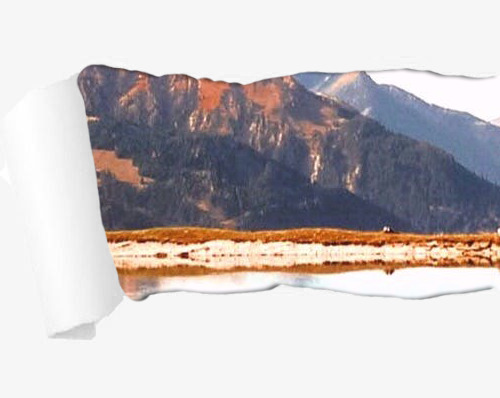
... your brain is perfectly capable of imagining the rest. You can imagine the mountain peaks and the rest of the lake. You don't need to see them to understand they're there and imagine what they look like.
That said, if I say, "Brenda appeared, wearing her signature torn jeans and favorite band t-shirt..." that's a pretty good image of what this person is wearing. The reader doesn't need to know what cut or color the t-shirt is, whether it's tucked in or loose, what band is depicted or what the specific design is, what color and cut the jeans are, where the holes are, what shoes they're wearing... none of that matters unless it does.
Give the Reader the Details That Are Important - If it's important that Brenda is wearing tennis shoes because later she'll be identified in a security video because of those shoes, then that then becomes an important detail you'd want to include in that description. Otherwise, don't bother. The reader doesn't need to know she's wearing white high-tops unless that's important for some reason.
So, when a character enters a new place or encounters a character for the first time (or encounters them in a new scene/situation), you want to give a little bit of detail to help the reader imagine what they should be seeing in their mind's eye. You also want to give them any details that are important for them to know later. You just don't want to overwhelm the reader with a bunch of unnecessary details.
Here are some other posts that will help:
Guide: Describing Character Appearance and Clothing The Right Amount of Description (5 Tips!) The 3 Fundamental Truths of Description Description: Style vs Excess/Deficiency Weaving Details into the Story How to Make Your Description More Vivid Adding Description to Your Writing
•••••••••••••••••••••••••••••••••
I’ve been writing seriously for over 30 years and love to share what I’ve learned. Have a writing question? My inbox is always open!
LEARN MORE about WQA
SEE MY ask policies
VISIT MY Master List of Top Posts
COFFEE & FEEDBACK COMMISSIONS ko-fi.com/wqa
338 notes
·
View notes
Text
from the interview published by chinanews network with xiao zhan ❤️
Guo Jing, ushering in the "Xiao Zhan moment"


The last time director Tsui Hark and writer Jin Yong collaborated was a remake of "Smiling Proud Jianghu" more than 30 years ago. At that time, actor Xiao Zhan was still very young. For the "post-90s" of that era, in the distant and plump dreams of the rivers and lakes, Jin Yong and Tsui Hark are definitely heroic.
The arrangement of fate can be called a coincidence. More than 30 years later, when Tsui Hark remade Jin Yong's work again and took up the guide of "The Legend of the Condor Heroes: The Great Hero", Xiao Zhan, who was already an actor, became the hero in the story.
"Encountered" with Guo Jing, Xiao Zhan used his body and mind to portray the character arc of "The Great Man of Chivalry".
The classic Guo Jing, who belongs to several generations, is also in the spotlight again, ushering in a "Xiao Zhan moment".
The following is a conversation with Xiao Zhan:
When an actor meets a character
After meeting "Guo Jing", Xiao Zhan spent several months getting close to the character.
He received systematic physical and martial arts training, practiced Mongolian hard, formed muscle memory, and tried to integrate with the role. It was undoubtedly a very fulfilling process for him.
Q: How long did it take to "become" Guo Jing from the beginning of the script reading?
A: From the beginning of the training to the end of the last shot, I have been trying to get close to this role and become this role, and it took more than 7 months before and after, and more than 2 months for training.
Q: When you became, did you make any attempts that you hadn't done before?
A: Yes, for example, horseback riding skills. I used to ride horses, but I wasn't so skilled. Then there is a very systematic physical fitness, martial arts training, and most importantly, the dabbling in the Mongolian language.
For me, it's a new language indeed. I need to master it quickly and perform it in Mongolian, which can be a big challenge for me.
Q: Are there any tips for learning Mongolian?
A: There are a lot of Mongolian lines in the original script. The first time I saw the Mongolian lines, I was worried about myself because I couldn't read them. All I could do was communicate with my Mongolian teacher non-stop, just like I did when I was a kid learning English.
When the Mongolian teacher said a sentence, I read it with headphones on, first grasping the intonation and speed of the language, and then performing it in Mandarin for the script, making notes and marks.
For example, if there are emotions that I should be a little more intense or something, I mark them clearly and then convert them into Mongolian, and then apply them to the Mongolian context and add emotions to them. It's such a process, it's more complicated.
Q: What is your daily routine like during the training camp?
A: Everyday life is just like going to school. It's not so hot in the morning, so I get up early every day and rush to the horse farm for horseback riding training. The horseback riding course probably includes getting familiar with the horse, running laps, then sprinting in a straight line, jumping obstacles, riding with one hand, riding with weapons, and picking up things, which will make us familiar with the skill of riding a horse first.
I'll find out why later. When the horse arrives at the grassland, it is easy to lose control, and at this time, the actor must have the skills to control the out-of-control situation, so preliminary preparation is very important.
After riding, take advantage of lunch time to go back to the studio for martial arts training. Martial arts training will have some basic skills training, such as kicking, warm-up, punching some basic routines, and then designing different moves according to different roles.
For example, many of my moves are "palms", eighteen palms of dragon descending, and fists; Huang Rong and Hua Zheng are sticks, and then knives. After these trainings, there will be WIA training. It's a very fulfilling process.
The highest level of intelligence
When he was a child, Xiao Zhan watched the story of "The Legend of the Condor Heroes". At that time, his impression of Guo Jing was very intuitive: this person must not be stupid.
Later, he found that Guo Jing has a characteristic: he can devote himself to doing things wholeheartedly and have no distractions, which is the highest state of intelligence.
Q: How do you understand "chivalry"?
A: Before filming the movie, my understanding of "chivalry" was that martial arts are strong and chivalrous. After filming "The Legend of the Condor Heroes: The Great Hero", I have a new understanding of "chivalry".
"Chivalry" is not only to have a skill, but also the stronger your ability, the greater the responsibility you need to shoulder, "chivalry" is a very important spiritual core from the inside out.
Q: Why do you feel that you are most similar to Guo Jing's spiritual traits? What are some of the places that are particularly like?
A: It's a little embarrassing to say, like boasting. I think Guo Jing is a very powerful existence, both his martial arts and his spiritual core, they are very powerful. The similarity between me and him is that I may be more serious and focused in doing things.
Sometimes when an actor plays a role, he can't grasp too many things, so I started with Guo Jing's serious energy from the beginning.
Q: In the tidbits, you have been writing notes on the set, what is the content?
A: It's Mongolian. At the shooting site, the filming of any film and television drama is changing at any time, and there will be some changes in the Mongolian language when it comes to me, maybe the Mongolian language I prepared two or three days in advance will have some changes after arriving at the scene.
Q: When did you feel that Guo Jing was not "stupid"?
A: That's what I thought from start to finish. When I watched "Shooting the Condor" for the first time when I was a child, I felt that he must not be a trait like "stupid", otherwise it would be impossible to learn a skill.
So I discussed with the director from the beginning, and the director also told me that Guo Jing is definitely not a "fool", he is a very powerful person, and he is a very smart person.
I mean the clever point is that he knows what he doesn't want. For example, when learning a skill, he will devote himself to it wholeheartedly, and there will be no distractions, which is the highest state of intelligence, rather than playing some small tricks.
Q: What were the biggest challenges during the filming of this film?
A: There are challenges on all fronts. For example, in the past, riding a horse was just a trot, but when it comes to training, you have to ride a horse and gallop. I don't know if you've ever had the experience of when you release the reins or you give the horse the first command to start, the horse will run out like an arrow, and at that moment you're a little weightless, which is the first hurdle at the beginning.
The second is martial arts training. For me, the pre-training martial arts instructor requires fists to the flesh, so we all have to be in touch with each other; And then to Weiya in the back, although I have also had the experience of filming Weiya before, but director Tsui Hark pursues a sense of realism, he repeatedly tells us about realism, he thinks that people have to have gravity, even if there is Weiya, many actions need to be your own force, including the feeling of gravity when landing, so this is also a new attempt of mine.
How to find the core of Guo Jing's body, this is the most difficult. We went directly to shoot the second half of "Shooting the Condor", in fact, he has become Guo Daxia at this time, omitting the previous processes, how can I find out what Guo Jing is thinking at the moment? What is his spiritual core? He grew up in such a complex environment, how should he face the nation and the general righteousness, and then make a choice? That's a tough one for me.
Q: At what point in the process do you feel as if you have entered this state?
A: Actually, I feel like I'm always in a cycle of self-doubt, self-recognition, and then self-doubt. It seems that the actor can constantly solve a problem and overcome it. I'm supposed to be in such a state anyway.
Guo Jing's "staying power"
Xiao Zhan handed in his answer. When the director announced the "filming was completed", his feeling was "it's finally over."
However, for actors, those roles they have interpreted with heart will always leave traces in their lives. Guo Jing's perseverance and persistence also gave Xiao Zhan support and faith invisibly.
Q: Did the role of Guo Jing leave any traces on actor Xiao Zhan?
A:Of course. Every role leaves something in me or takes something away from me. The character of Guo Jing is very powerful. His perseverance and persistence subtly gave me a lot of support and faith later on.
Q: What was the last shot when filming Guo Jing?
A: The last shot is Huang Rong and I riding horses. We are galloping on our horses and then heading towards the sunset. This is the last shot of me and Rong'er.
Q: What was your first feeling when the director shouted “Wrap Up”?
A: My first feeling is that it has finally come to an end.
Q: How do you feel about working with director Tsui Hark and Mr. Tony Leung Ka Fai?
A: Working with the director is a wonderful and unforgettable experience, and it is a rewarding experience.
Director Tsui Hark strives for perfection in every aspect, and he truly loves movies and devotes himself to them. This has given me a lot of inspiration. When I am on the set, I will always remind myself to devote myself to it and do my best to shape it well. The character of Guo Jing.
Teacher Liang is very professional. He doesn’t need to say much when he arrives at the scene. Just a glance can pull me into the situation. Teacher Liang was also very helpful to us. When he had no scenes to film, he would come to the set to give us suggestions and guidance on our performance.
Q: When filming Guo Jing, the director mentioned the grasp of "degree". What do you think are the most difficult parts?
A: I think the director knows exactly what he wants, and that “degree” may be something I have to find myself.
For example, the director told me and Zhuang Dafei at the beginning that we were the "rock musician" versions of Guo Jing and Huang Rong. He also told me later that Guo Jing was actually a "returnee" who grew up in a complicated environment. Grown in two different regions.
So I think the director always knows where his "degree" is, and this "degree" is a process that I need to find and then become one with the role.
Q: Do you still feel that the role of Guo Jing has some staying power in you?
A:Of course. As I just said, the similarity between me and Guo Jing is that we are both serious about things. Now, I often think that I should do everything well and focus on the present moment, just like Guo Jing. When you are doing something, don't have too many distractions and just do it well.
-END.
47 notes
·
View notes
Note
hellooo!! first of all: I ADORE YOU your art is amazing and your animatics are so gorgeous and inspiring!! I'm sure you've already been asked this question but I couldn't find an answer so I figured it couldn't hurt to ask again: what program(s) do you use to animate? What's your process like?? I've been wanting to try and learn to make my own but I have no idea where to start and I figured I should ask a master :P
ello! I appreciated your kind words :D
sorry about the delayed reply, I thought I could have drawn my process out for you but it turns out I don't have enough time so here I go
I use Clip Studio Ex (still on ver.1) only Ex can do animation If you considering buying it
CSP Pro can only animate 12-24 frames which is difficult to work with
I wish to get back on Toonboom but I'm hella out of practice (It's a good program tho, though just not so friendly with beginners)
My process is to find inspiration first, for example
when I do fan animation/animatic like Hermitcraft or Life series
I just listen to the audio or songs on a loop until I have a rough idea in my head of what I want to draw
(When you start something, Just use the idea of "What you want to draw/express" not what others want to see, Just make sure you're having fun, and we can figure out along the way later)
TIP : If you don't feel like starting making animatic right away, I suggest you make other kinds of art for that Idea first, like some sketching art, illustration for catching the vibe you want to go for, or just character design as a reference! :D
after that, make rough sketches, It doesn't have to be pretty, just do a quick sketch so you won't forget the vibe and energy (it can be on paper, I recommend using a pen instead of a pencil cuz you won't have to delete and redraw, just make a new one, it's quicker)
I make re-sketching sometimes to fix composite or make a better pose sometimes, timing and spacing are also very important to make the movement smooth
I make a line of action guide for some difficult movements sometimes
When I do Lineart I just open all the videos to watch while head empty cleaning Lineart
There are many more processes for professional animators
I recommend you check out videos, there are tons on YouTube
here's some that I learned from
youtube
youtube
youtube
youtube
youtube
104 notes
·
View notes
Note
hi! i'm currently writing a blind character in a futuristic sci-fi setting (think fifth element). some backstory just so there's additional context: she's orphaned as a baby, and while very young, contracts a virus that leaves her with minimal light and shadow perception. she later gets adopted, and her father acts as her guide until she's 12. when she turns 12, she's gifted a droid who acts as her mobility aid (visually, her droid is similar in design/size of r2-d2 from star wars). i thought this fit the futuristic setting. here's my question. originally, i had her (let's call her C) commission a special pair of glasses that connect to her droid so it can see what she sees and better help it guide her in public spaces, especially if it's too loud for her to hear it or if they get separated somehow, because the glasses have an auditory link for them to communicate with each other. after doing more research, i've learned that the "blind character covering their eyes" trope is super common and kind of looked down upon in the blind community. i'm really worried now, as someone sighted, that i've fallen for it by designing C's mobility aid this way. have i? and if i have, what is some advice or tips for ways i could alter this to where it doesn't come across as trope-y? should i get rid of the glasses, scrap the droid idea completely, etc?
Guide Droid And Character Covering Her Eyes With Glasses
The glasses remind me a bit of the OrCam My Eye, which is a pair glasses and an ear piece. You have an already-existing precedent for this. Additionally, my main concern with covering eyes, which I discuss here, [link], is that there is often no thought or explanation behind why a character’s eyes must be covered. Narratives often twist themselves into knots simply to cover a blind person’s eyes with something like sunglasses or a blindfold, which the character never removes.
Regular glasses are, however, a different story. Regular glasses are transparent. They are usually for protection of the eyes. They may also make objects slightly clearer, which can reduce eye strain. Not that your character will need to worry about that.
The glasses are not able to correct vision. They serve a purpose, and one that isn’t covering the person’s eyes.
My suggestion is to provide an explanation for the glasses and make sure they are see-through. They shouldn’t be sunglasses unless she has transition lenses, which can protect her from damaging UV rays.
The key is not to cover up your character’s eyes. Especially for no particular reason.
However, if you are worried about the glasses, you can also simply have bone-conducting ear piece that sits on top of her ear. Avoid implants or anything that might disrupt her hearing or other senses.
The Guide Droid
Speaking of senses, having a droid as her guide means she will miss out on a lot of tactile information provided by a cane and, to a lesser extent, a guide dog. For example, a handler can feel elevation.
Walking behind a droid is not going to provide that same information.
Yes, there is a step down, but where? Is it an even step or does it curve? Are the steps the same width?
I suggest giving her a cane, as they can be used with sighted guide and to a lesser degree, service animals. Her using a cane won’t interfere with a droid the same way it might with a guide dog or horse.
Alternatively, you can also find a way to connect them so she can get tactile information. Another, cuter option might be a droid service animal with a more futuristic harness.
About Using Sighted Guide Until She is 12
Something about this bothers me.
Sighted guide is a legitimate form of O&M and can increase independence in a way only blind folks can relate to. I also know that sighted guide may be more encouraged in some cultures that value interdependence. Sighted guide is a great and should be used more in fiction. I personally prefer it in unfamiliar areas and at night time.
However, it also feels off to me that she so happens to use a human guide all her life and not a cane. It may be because I am imagining times where her father may not be able to accompany her. Or perhaps I am sensitive to the lack of mobility aids in fiction that feature blind characters.
Lastly, cane skills are a part of O&M, which is needed before being able to work properly with a guide animal. I think she should have at least some cane skills and some navigation techniques even if she prefers to have her father guide her. This also gives her more agency to experiment and choose what is comfortable for her.
Here is a post I made about mobility aids that might help.
I hope this helps.
#blind#blind characters#writing blind characters#blind characters covering their eyes#ask#creating guide animals#disability#white canes#scheduled post
36 notes
·
View notes
Note
i like ur art. its great and interesting!! i really like your artstyle and i really like the way u draw hsy, yjh, and kdj. you captured them so well in terms of vibes/character. also i was wondering do u have any advice to improve on drawing anatomy/poses/faces?
wahh thank you so much...!! i feel like im still trying to figure them out in a lot of ways but i do really like ironing out my visual interpretations of them so im really happy to hear if people like what im coming up with
also anon you super activated the part of my brain that cant help but yap about art theory... i spent some time writing as many tips as i could think of. unfortunately i dont think i have the time currently to do a fully illustrated guide, but ill still try to include some visual examples:
[incoming wall of text lol]
ANATOMY:
to preface i think that like 100% of the time you should reference a real life photo for anatomy rather than other artwork or drawn references. the best way to learn the body is by… well, actually looking at the body! but also artwork is informed by a person's own artistic ability/stylization choices/sense of idealism, so while looking at art can help give you an idea on how to break down forms, i think you would be best served observing real life references. i labor on this point because i do think that having over relied on drawn reference material and avoiding photographic references on the basis of not being interested on realism hindered me as a largely self-taught artist as a kid, so i want to encourage live or photographic reference since anatomy is one of the foundations from which everything else is built on. that being the case, all of my doodles i'm doing for this are going to be for the sake of example rather than to strictly say how you should or should not be drawing something
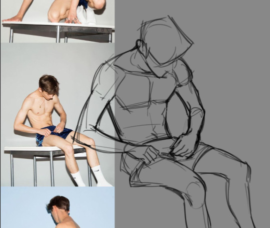
-> when you are doing a study of a photo, just try copying it as best as you can. pay close attention to the natural lines and shapes of the body -- the S-curve shape of the leg, the triangular shape of the forearm, the trapezoid shape of hips/thighs when they sit, and so on. note where the body folds or squishes or pulls; how mass will shift to accommodate a certain position. if a form is hard to visualize, focus on the negative space and carve that out, rather than strictly drawing the positive space.
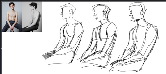
don't expect to get it perfect the first time. in fact, iterate on it multiple times to build understanding. try doing it to a timer of 15, then 10, then 5 minutes. doing this will force you to have to prioritize the most important shapes. you can help reinforce this by using a thicker brush or a brush with no pen pressure (no joke ms paint works great for this) to force you to be loose and not become preoccupied with details.
-> pinterest is a great resource for finding and compiling photo reference material
-> organic shapes are curved, so embracing/emphasizing that (particularly for the extremities) can help make your drawings look more natural or fluid
POSES: -> it all begins & ends with contrapposto… you've probably heard of the line of action, which is related. if you're offsetting the shoulders & hips, it: makes poses more natural, more dynamic, and helps the pose sort of "draw itself" -- the legs will follow the direction of the hips, and you can use the arms to reinforce the angles
-> context is key. don't ask: what pose should i draw? instead ask: what do i want this character to convey? what does happiness, anger, sadness, and so forth look on this particular character? how do they express that? consider these drawings: these are both ostensibly the same pose, but look at how changing just the shape of the spine recontextualizes it.
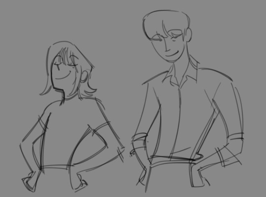
for more on pose design i recommend watching Tracer & Pose Design 101 - The Animation of Overwatch by New Frame Plus (i promise this is a genuinely super informative video).
to expand on this, in general, all of the components of a piece (background, composition, pose, etc.) are best considered in conjunction rather than separately. it is difficult to choose a pose and then choose a background because they are missing the context that would make a piece cohesive. when you are planning a drawing, try to begin with your general concept/idea/prompt and then do several thumbnails -- small and quick doodles that should take no longer than 5 minutes each -- developing it: you may find that the pose and bg will naturally fall into place.
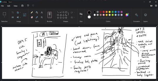
-> silhouette: the degree to which you need to push this varies by style but generally speaking the pose needs to be readable; i.e. instantly recognizable. try to keep important elements of the gesture outside of the silhouette. for example, if the character is pointing, keep that arm out of the interior of the body. the same pose can be more or less readable or dynamic depending on where the character is pointed in relation to the viewer
-> exaggeration!! goes along with the previous point. push the pose as much as you can (and what makes sense for your style) to communicate your pose as clearly and as intensely as possible.
FACES: -> i highly recommend the app Handy Art Reference Tool by Belief Engine for all things related to drawing hands/heads/feet. its on both android and ios. it isn't free -- it costs around $3 -- but that is seriously such a small price to pay for the amount of utility you get out of it: the hands models are fully poseable (there's also pose presets), you can rotate the head models however you want, and there is 3-point customizable lighting. it is really helpful for getting those super tricky and hyperspecific head angles that you just can't find a real life reference for. that being said given that there's only a few different head model variants, bear in mind how differences in features can affect what exactly a face will look like in those angles.
-> i still recommend doing studies of real people. as with anything else, learning generalized proportions is important, even if you are going to later on bend or break this depending on style
-> as for my own approach... it kind of depends on the style i'm doing at that particular time. for my paintings (what id consider my main style) i approach a character with a few real-world features in mind and then apply them to the best of my ability. it usually will take a few iterations to land on an interpretation i really like as i try out different things. a lot of the face also gets developed during rendering rather than through my initial sketch too, as i adjust for lighting and correct proportions on the fly
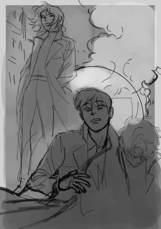
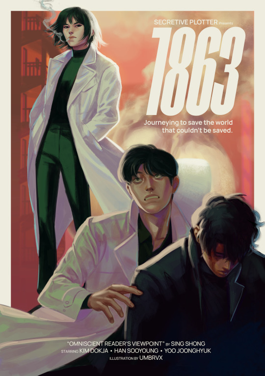
(look how much this image changes between sketch and render lol)
if i were to recommend anything, i think it would be to nail down your most distinct features first -- the ones that will make your character's face recognizable, and could apply regardless of art style. in my case with kim dokja, i knew when i first started drawing him that i wanted to give him a longer face and down-turned eyes. when i decided to do the disco elysium inspired set, in which i was breaking out of my comfort zone by letting go of any idealizations focusing on conveying characterization/making them feel "real", i landed on some more specific traits (defined lower lids/perpetually tired eyes/eyebags(?) the crease there idk how to describe it) which i continue to try to evoke even if im drawing something much more cartoony
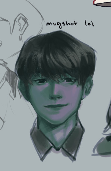
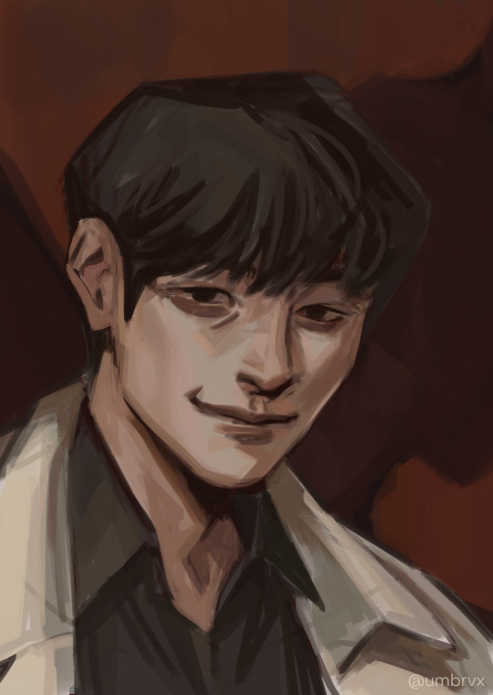

(pictured are my first kdj -> disco elysium style -> my post de-style kdj)
as a side note, this very same process changed yjh much more dramatically

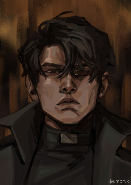
(^ that first guy is mad someone else)
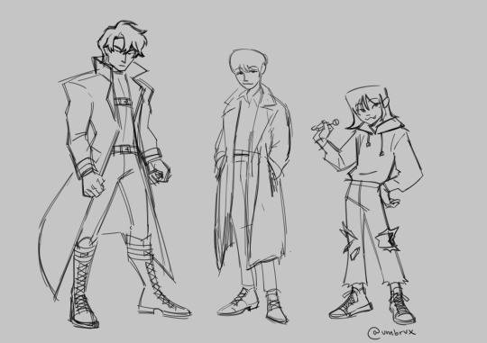
those handful of key features will be the thing that you can then take into a simpler style and simplify or exaggerate to whatever degree suits you. you can also play with shape theory (square = sturdy/solid, circle = natural/smooth/welcoming, triangle = energetic/dangerous). shape theory doesn't necessarily need to be so rigid -- you can combine shapes as you please to convey whatever vibe you're going for -- so please think of it as a tool that may help rather than a rigid law you must abide by.
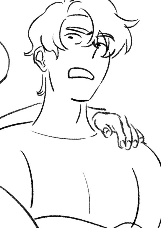
-> expressions: exaggerate them. thats kind of it!! make it big!!! you wanna be able to really feel those emotions. the principles of squash & stretch help here: think of how the muscles move when you, say, open the eyes or mouth really big. as one side of the face stretches open, the other side squashes to accommodate it

even without changing the position of the jaw here, moving the nose and scrunching the eyes will sell the expression
you can also play with squash/stretch to break proportions to sell a feeling more
since expressions are just, well, poses for the face, everything else for poses applies here (and facial expressions & pose should also be considered in tandem). while the term contrapposto itself just refers to the offset of the shoulders & hips, the similar principle of asymmetry also carries here as that will help make the expression a bit more dynamic.
and i think... that's it!! all i can think of at least. i hope it helps anon!!!
#umbrvx.ask#sorry the reply took a minute i have been writing this post since i got the ask im so serious#i tried to determine what advice i could give that would be the most immediately actionable#also sorry its a huge wall of text im a little crazy about learning and discussing art theory . oops (the yapper)
44 notes
·
View notes
Text
Want to learn something new
Want to learn something new in 2022??
Absolute beginner adult ballet series (fabulous beginning teacher)
40 piano lessons for beginners (some of the best explanations for piano I’ve ever seen)
Excellent basic crochet video series
Basic knitting (probably the best how to knit video out there)
Pre-Free Figure Skate Levels A-D guides and practice activities (each video builds up with exercises to the actual moves!)
How to draw character faces video (very funny, surprisingly instructive?)
Another drawing character faces video
Literally my favorite art pose hack
Tutorial of how to make a whole ass Stardew Valley esque farming game in Gamemaker Studios 2??
Introduction to flying small aircrafts
French/Dutch/Fishtail braiding
Playing the guitar for beginners (well paced and excellent instructor)
Playing the violin for beginners (really good practical tips mixed in)
Color theory in digital art (not of the children’s hospital variety)
Retake classes you hated but now there’s zero stakes:
Calculus 1 (full semester class)
Learn basic statistics (free textbook)
Introduction to college physics (free textbook)
Introduction to accounting (free textbook)
Learn a language:
Ancient Greek
Latin
Spanish
German
Japanese (grammar guide) (for dummies)
French
Russian (pretty good cyrillic guide!)

Jan 2, 2023
Want to learn something new in 2023??
Cooking with flavor bootcamp (used what I learned in this a LOT this year)
Beekeeping 101
Learn Interior Design from the British Academy of Interior Design (free to audit course - just choose the free option when you register)
Video on learning to read music that actually helped me??
How to use and sew with a sewing machine
How to ride a bike (listen. some of us never learned, and that's okay.)
How to cornrow-braid hair (I have it on good authority that this video is a godsend for doing your baby niece's black hair)
Making mead at home (I actually did this last summer and it was SO good)
How to garden
Basics of snowboarding (proceed with caution)
How to draw for people who (think they) suck at art (I know this website looks like a 2003 monstrosity, but the tutorials are excellent)
Pixel art for beginners so you can make the next great indie game
Go (back) to school
Introduction to Astronomy (high school course - free textbook w/ practice problems)
Principals of Economics (high school course - free textbook w/ practice problems)
Introduction to philosophy (free college course)
Computer science basics (full-semester Harvard course free online)
Learn a language
Japanese for Dummies (link fix from 2022)
Ukrainian
Portuguese (Brazil)
American Sign Language (as somebody who works with Deaf people professionally, I also strongly advise you to read up on Deaf/HoH culture and history!)
Chinese (Mandarin, Simplified)
Quenya (LOTR fantasy elf language)

Dec 26, 2023
Want to learn something new in 2024??
Beginner-oriented video on how to sail
This guy has so many videos on baking different types of bread. SO very many.
Coding in Python - one of the most flexible and adaptable high-level programming languages out there - explained through projects making video games
Learn to swim! (for adult learners. I don’t care if you live in Kansas or Mali or wherever. LEARN TO SWIM.)
Learn how quantum mechanics works. Then read some more about it
[Learn about quantum mechanics again, but in a more advanced engineering/mathematics class. Then read more about the math and physics of it]
Poetry Handbook, by Mary Oliver
Something I learned this year: how to sew a quilt (Here’s a very easy beginning pattern that looks amazing and can be done with pre-cut fabric!)
How to hit the ball in softball
Tutorial video on what is under the hood of most (gas) cars + weird engine sounds and what they mean
Full beginner mechanics technical training, if you want to go more in depth
Playlist on how car engine physics work if you want to go ultra in depth
Lecture series on architecture design through study of buildings
How (American income) taxes & tax law work (choose “audit course” at checkout for free class)
Pickleball for beginners (so you can finally join your neighbor/friend/distant cousin who is always insisting you join their team)
+ Para-Pickleball for beginners (for mobility aid users!)
School is so much more fun when there’s no tests:
American Law - Contracts
Shakespeare’s Life and Plays
Fairy Tales: Meanings, Messages, and Morals
Modern Poetry
World History [Part 1, Part 2]
Learn a language:
Arabic + Resource Guide compiled from Reddit (includes info on different dialects)
Chinese (Cantonese) (audio)
Urdu (frequently recommended course on Reddit) + Resource Guide
Yucatec Maya
33 notes
·
View notes
Text
Title: Prayer and Ink Fandom: Dragon Age: Origins Rating: T Status: One-Shot Characters: Allys Mahariel, Zevran Ships: Mahariel/Zevran Additional Notes: Dalish Lore, Character Study, Quiet Moments Word Count: 1.4k Summary: A conversation about tattoos and vallaslin leads Zevran to reconsider what it means to have faith in something- and in someone.
read below or here on ao3
“Do they mean anything?”
The question catches Zevran by surprise. It’s been a long, tedious day of marching across the Imperial Highway, and the relative privacy and cool shade of the tent coupled with the rhythmic sensation of Allys’s fingers tracing against his skin has nearly lulled him to sleep. He slowly opens his eyes and turns his head, although Allys remains just out of view as she continues to lightly draw her fingertips over the designs that curl across his back.
“The tattoos?” he asks, and Allys hums thoughtfully.
“Is that what you call them?” Her fingers continue their journey, following the curves and lines of dark ink that wind between his shoulder blades, along his spine, down his hips.
Zevran gives her a half-shrug, gently so as not to disturb her inspection. “They are pretty. Must they have a meaning beyond that?” A grin creeps across his face. “And of course, they invite the attention of lovely Wardens.”
Allys laughs and ends her study of Zevran’s tattoos to reposition herself so that she is once again lying next to him, her bright brown eyes level with his. Her hair has been released from its typical tight bun and now falls past her shoulders, framing her face in a halo of dark curls. Even after a day of trudging through the Fereldan dirt and mud, her smile is warm as the sun.
She laughs at his compliments, but Zevran isn’t joking in the slightest when he calls her lovely.
“You know, when I first saw you, I thought they were a different type of vallaslin,” she says, resting her chin in her hand as her eyes roam over the tattooed path from Zevran’s brow down to his jawline. “I thought they might be meant for some god I didn’t recognize.”
“I suppose they still could be-is there a god for devilishly handsome sinners?”
Allys rolls her eyes. “I’m serious! Getting my vallaslin hurt like mad-but the pain is a sign of our devotion to the gods. That was the point, and the purpose made it easier. So it didn't make sense to me that someone would go through that without a reason."
“What can I say? We Antivans are willing to suffer for beauty.” Zevran flashes another smile, but it fades slightly as studies the vallaslin- the blood writing, they call it- across Allys’s face. He knows the lore behind the markings; his time with the Dalish provided him the chance to learn, and even to hear some of the legends of the gods. But his time with the clan was short and his education quick and basic, so there is much he still does not know. “What of yours, then? What purpose do they hold for you?”
With a gentle touch, Allys takes Zevran’s hand in hers and brings it to her face, so that his fingertips brush against the dark marks of her vallaslin. She guides his fingers across her features, tracing the lines of ink up her chin, across her cheekbones, over her brow. “These are for Andruil.”
“Ah, I remember her stories. She is the Huntress, yes? How very fitting.”
“I thought so, too,” Allys answers, pleased. She closes her eyes, leans into Zevran’s touch, and after a moment begins reciting something in elvhen. “Vir assan. Vir bor’assan. Vir adahlen.”
Zevran has no inkling what the words mean- he hadn’t stayed with the Dalish nearly long enough to learn any of the ancient language- but Allys’s voice, low and melodic, gives them a certain weight. It’s as if the meaning is right on the tip of his tongue, but he can’t quite capture it.
Noticing his expression, Allys explains. “It’s the Way of the Hunt- Andruil’s code. I started learning that code from the time I was tall enough to fire a bow. I’ve spent so much of my life in the woods, learning the teachings of Andruil. When the time came to choose my vallaslin, it seemed appropriate to honor her.”
Zevran is silent for a moment, thinking back to his time with the Dalish. He’s learned the legends and the names of their gods, but the reverence with which the Dalish speak of their Pantheon…that isn’t something so easily taught. “Do you really believe in all those legends? They are good tales to tell, I give you that, but…”
Allys’s voice betrays no doubt when she answers. “I do.”
“Even in the midst of…” Zevran vaguely waves his hand, motioning to the entire world of calamity beyond the quiet sanctity of their tent. “…of all of this?”
“Even so.” Allys’s smile turns thoughtful, and her eyes go distant for a moment. “Maybe the gods themselves cannot step in and stop the Blight for us, but their presence is felt- by the Dalish, by me. It is because of Andruil and her lessons that I am alive today, that I have the skills to bring this destruction to an end.”
And there it is again- that sensation of being so close to something, but not managing to grasp it enough to even identify the feeling. In a way, it reminds Zevran of the Andrastians and their Maker. Something that just almost speaks to Zevran, but isn’t quite his.
Perhaps Zevran’s contemplation is showing on his face, for Allys gives him a searching look and asks, “What do you believe?”
Zevran quickly banishes his muddled thoughts and gives her a wry smile. “I am an assassin. The only things we believe in are steel and gold.”
Yes, steel and gold. Things that are solid and real, if somewhat less poetic than songs and prayer. It could be that in another life- one where the Crows weren’t constantly on his tail, one where he was able to settle somewhere for more than a few short weeks, perhaps even one where his mother never separated from her clan in the first place- he would have been able to take the time to study and prove himself and become part of the Dalish in truth, earning his own vallaslin. Perhaps in that life, he believes in a purpose for himself, believes that a god may look his way.
But that is not a life that belongs to him, nor one that he can truly imagine.
And yet Allys looks at him with a softness in her gaze. She leans closer and tenderly presses a kiss against his temple, at the start of his curving tattoo, then follows the mark down his cheekbone, planting more soft kisses along the way. Finally she moves to his lips, and whispers, “I don’t think that’s true. And I don’t think you do, either. You’re a better person that you give yourself credit for, and you don’t get that way through greed and violence. Maybe it’s not the gods, but you must believe in something greater than what the Crows taught you.”
“What makes you so certain of that, dear Warden?”
“Because I have faith in you.” Allys kisses his lips, softly, and then pulls back, the previous mischief returning to her expression. “And just so you know, that’s why I like your tattoos. Because whatever meaning they do or don’t have, they’re yours.”
Zevran does not know what to say. He wants to tell her she’s wrong, to try and make her see that these tattoos she admires are nothing but decoration and embellishment, just as dashing and shallow as every other tool of his trade. But his throat is thick and the words won’t come, so he just kisses her again, deeper this time, and tries not to dwell too much on her words or the look in her eyes.
He thinks about it all later that night, of course. The thoughts simply won’t leave, and a part of him wishes he could go back to when things like this were easy. This should be easy. Just another mission, another conquest. But maybe…maybe Allys is not entirely wrong. Zevran is not a Crow any longer. In truth, he doesn’t know what he is. But when he thinks of the woman in his arms- the woman who not only spared his life, but showed him what his life could be worth- he realizes there is nowhere in this world he wouldn’t follow her.
It is terrifying, and exhilarating, and Zevran wonders if perhaps this is what it feels like to have faith.
2 notes
·
View notes
Text
Hello dear followers of mine (with rizz). I decided with love to share some of my silly art tips and tricks. I love teaching people new things or just being of some sort of help, so I hope this silly goofy series of posts helps someone!
Today's soup tip deals with the greatest evil of mankind:
H a n d s.
It goes without saying that it takes practice and time, and truly it really does take practice and time, you're not going to master anything overnight, and drawing hands are definitely not an exception. I'm not incredible at drawing hands in any way, there's plenty I could improve on in the hands department, but for the most part I think I do pretty well.
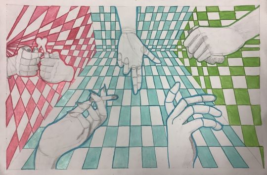
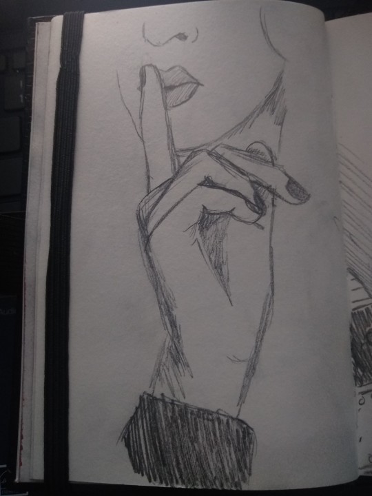
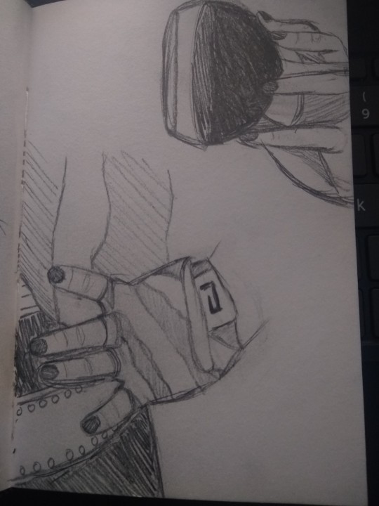
It definitely took practice and years of hard work, but here's some little things I found made drawing hands easier for me!
1. FNAF - yes. As a gen z kid growing up, I, like many others of my age, became obsessed with FNAF. I continue to be a huge fan of the games and keep up with the lore for the most part but the most important thing about this is Sister Location! Sister location's animatronics have newer features and characters with slightly more human design. This includes the hands!
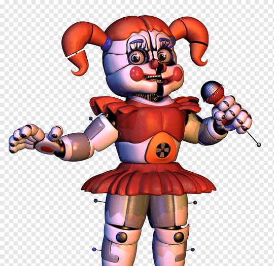
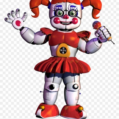
Baby is a great example, as you can see her hands pretty well. The hands for the most part are a pretty good model of a deconstructed hand. It's not perfect, but it definitely works! So yes I am telling you to try drawing animatronic hands because they will definitely help give you an idea of how hands should look.
2. Using your own hands - sometimes you just can't find the right reference image or you need something in the right angle. Congratulations you have a free and easy to use tool right at your finger tips. Literally! I like to use my phone and pose my hand however I want and take a picture and use that as a reference. It also helps if you take that picture and mark it up to help you. I've used my own hand many times before and I usually find it much easier to draw my own hand than one i find on Pinterest. You could also mark up your hand with washable marker.
3. Practicing some basic exercises - boring but unfortunately true. I found a few quick drawing exercises extremely helpful, specifically drawing boxes in perspective and filling a page with ellipses. This is a good tip for drawing ANYTHING.
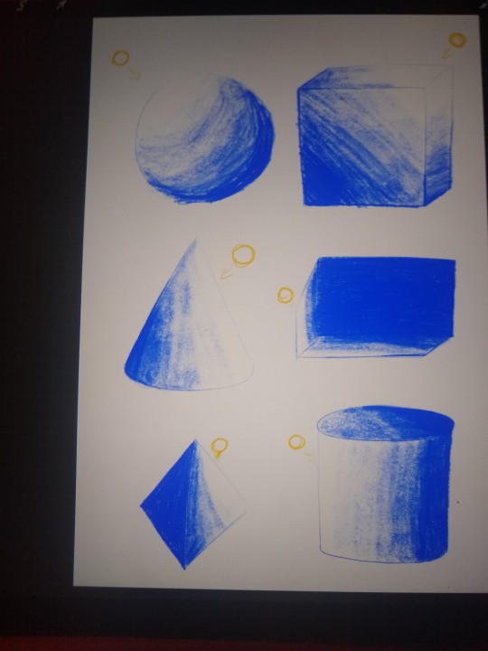

Another thing I found helpful was drawing things in real life. So yeah grab your favorite coffee mug or Paul Stanley funko pop and prop it up somewhere and try drawing it to the best of your ability. Try figuring out how to break it down into simple 3D shapes, how to shade certain areas, etc.
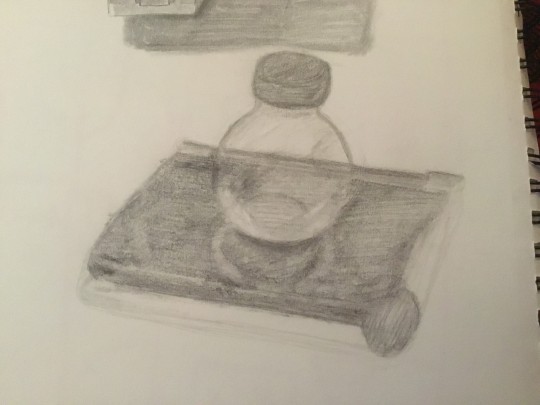
A good tip for this is to use your pencil and eye to measure. You might be familiar with movies or shows where the artist uses their pencil or paintbrush or thumb to measure something and that's exactly what im talking about here. Try to measure using your eye and a pencil as a guide. It'll help you learn "how long is this part in relation to the whole object? How wide?" Etc etc. I will do a post in the future with step by step pictures of this process :3
AND THOSE ARE MY ARTIST TIPS FOR TODAY
I hope this helps someone, since these are all things that helped me over the years and recently, but if it doesn't work for you, something eventually will. Different things work for different people. 🧡
7 notes
·
View notes
Note
What kind of studies are you doing for a film career? If we wanted to follow the same path what should we do? I'm very interested in the topics you post about 💞
oh man. oh that's an interesting question nonnie. and one that is a little complicated to answer just because there's a lot of stuff that goes into it and I don't really think there's a set "path" for a lot of the kind of stuff that I learn about and what I hope to do in the future... which are kindof two very different things, but they have some interconnectedness here and there... it's kinda messy but I will do my best to explain:
So in terms of school stuff? currently I'm a Lit major with a minor in film and television studies- which at my school specifically there is a lot more of an emphasis on film THEORY than film PRODUCTION, and a lot of it overlaps with the english major just because the disciplines are so similar (so basically, even though I'm listed as a minor it might as well be a major). The difference between them is that theory is a lot more like literary studies, except rather than deep-analysis of a physical text, the thing you're analyzing is films, and taking into account everything within the moving image down to the form itself and how the director and productions designers use that form to create meaning that opens up readings of that film for us; the people who study them. Production of course rather focuses on making films themselves, and my school has some focus on this, but not an extraordinary amount. And honestly, if you want to get into the theory end of things, it doesn't really matter all too much what school you get into (whereas if you wanted to focus more on the production end of things there are definitely some better schools for this than others. and most of them are in california and disgustingly expensive and pretentious. and unfortunately I might try to go to one of them for grad school. like a fool. unless some other shit I want to try to do after I get out of here works out for me). I mean I stayed in-state for school and I really enjoyed the theory programs offered here for the most part (of course, there's no accounting for certain professors tastes. that's always going to be hit or miss- but I've still managed to find some really good ones that I like over the years) but honestly... it's not the only avenue for learning this kind of stuff. I mean once you have a foundation for it, and know what to look for, it becomes a lot easier to just... know how to do this stuff on your own. Like honestly, I feel like I have learned just as much about film out of class as I did in it. And to that end, here are my tips, and some stuff to watch/read to give you an idea of the kind of stuff I study
Slavoj Zizek's films are absolutely incredible. I actually met the guy through my program and yes: he is exactly like that in real life. But he's absolutely one of the must-watch film theory scholars/philosophers of this day and age, and anyone who has been in a film theory class knows about him. "The Pervert's Guide" films on cinema and Ideology are both quintessential film theory texts and very eye-opening, if not heavy-handed and very wordy.
Other philosophy and psychoanalysis that I've had to read a lot of include these three individuals more than any others: Lacan, Derrida, and Freud (specifically: on dreams, mourning and melancholia, and on jokes- because Freud isn't much use for real life person psychoanalysis, but as a theoretical framework for film characters he's pretty aces).
no film school is your best friend. This Article has basically all the jargon you really need to know to talk about film (weirdly the only thing I think is missing is high and low-key lighting, but honestly that stuff is very easy to find)
my best tip in terms of what to watch is: watch whatever you want, and watch everything. I've heard a lot of folks complain in my classes that they don't want to watch anything anymore outside of class because they have too much shit to watch for classes OR that film theory has ruined watching movies for them, but from my experience that's detrimental and kindof silly and weak-minded of them. To be perfectly honest film professors can assign as much niche stuff they like: and it can be good sometimes- and it IS good to reach out of your comfort zone and experience different directors, whether they be new or old, from your home country or from somewhere completely different, BUT none of the studying is really worth it unless you take it to what you're interested in and apply it there. because if there's anything I've learned in my time doing this is that there is ALWAYS some intentional film theory rigor available even in the shittiest movies imaginable. there is always something to talk about- whether it be how something was shot, or the cultural context that it exists in, and absolutely nothing in the world is too stupid and it can actually be REALLY fun to unpack when it is. it also helps a lot of this become second-nature and a lot less of a slog.
also any time you want I would happily give a list of some of the best films/directors I've watched for my film studies (especially in the last couple of years I think I've gathered up a great list of films from my favorite professors and ones that have been especially more memorable than some of the earlier stuff I had to sludge through) but that'll have to be a different post and a different ask because this thing is long enough and I'm tired 😂😂😂 But yeah. there you go. I hope this fuckin helps nonnie lmao
0 notes
Note
Any tips on how to avoid making your OC a copy of a canon character when writing fanfiction? Not as in appearance and doesn't have to be personality I think but more so to their beliefs, backstory, goals, etc. Whenever I try to brainstorm creating an OC with a unique perspective from a certain fiction for them to be included, there's always going to be another canon character to already take that place and I end up stuck to how the hell can I do something different that won't make my readers asleep.
Fan-Fiction: Coming Up with Original OC
I would start by making a quick reference document that has the attributes you're concerned about (beliefs, backstory, goals, etc.) for the canon characters you want to avoid copying.
Next, look at each of the attributes you want to come up with and brainstorm possibilities. You might even Google each attribute "how to come up with character beliefs" or "how to come up with character backstory" for pointers and guides on coming up with those specific attributes. I'll put in some of my general character development guides, too, in case they'll be helpful.
Once you have your OC planned out, go through each attribute and check it against the quick reference document. It's ok to have one or two similarities with each character, but if you see more than that or see things that are too similar, immediately think of a way to tweak it for your character so it's not so similar.
Here are some character development posts that might help:
5 Tips for Getting Attached to Your Characters Character Design Sheet: The Necessary Stuff Character Arc Tips Recognizing a Flat Character Important Points of Character Personality Making Personalities Unique and Keeping Them Straight Giving Your Characters a Unique Voice Choosing the Traits That Define a Character Fleshing Out Characters Writing Realistic Characters Character Flaws the Right Way Understanding Goals and Conflict
•••••••••••••••••••••••••••••••••
I’ve been writing seriously for over 30 years and love to share what I’ve learned. Have a writing question? My inbox is always open!
LEARN MORE about WQA
SEE MY ask policies
VISIT MY Master List of Top Posts
COFFEE & FEEDBACK COMMISSIONS ko-fi.com/wqa
81 notes
·
View notes
Note
super hope u dont mind me replying, iv been checking back to read things ppl add bc i find it honestly fascinating. but i wanted to add some more ramblings to see if it resonates.
i dont See things in my mind, but like i said in the original ask, i can imagine and apple with enough detail to think of the condensation droplets on the crunchy skin, the way the speckles of colour are not solid [in the case of a red apple] if u look closely u can see the yellow and pink in between the brigth reds. the way the light reflects off the skin harshly, the texture of the stem coming out of the top. however i put myself at a 5. because no matter how much i am Conceptualising the apple in my mind, it is not at all visual.
when i think of a character i like, or an intricate design that i am Very fmailir with, i can imagine each individual component. i can think of what its like to hold even? i can imagine how much space it takes up in the world, but again, i am not SEEING it. when a guided mediation asks me to picture myself on a beach, i cannot. i can fall into the sense memory of sand beneath my body and sun on my skin but i see black behind my eyes.
and in speaking with people who claim other stages, i have very clearly asked if it is like a Picture, with actual visuals as if they are seeing it, and they say yes. i also know its different to SEEING because i have been under the influence of drugs and had it happen, and sometimes in the time between sleep and waking i am capable of conjuring images. which is kind of how iv confirmed that theres less about personal interpretation of what is SEEING vs CONCEPTUALISING [which is just the way i have come to describe it myself because that seems to make it easier for people to grasp what im asking] and an actual definite difference in the way minds work person to person
I also have ADHD, and a brain that zips about like a hummingbird, which can make it infinitely harder to focus when i want to do the conceptualising and often leads to the ideas not being permanent and flitting in and out or changing.
I saw another post once about imagining a ball on a table. then imagine a person walks up and tips the table and the ball rolls. and then the post asked, what did the person look like? what colour was the ball? how fast did the ball roll? did it fall off the table? if it did, did it bounce when it hit the ground? that test showed that people closer to 1 on the scale had these answers already there, they couldnt possibly imagine the scenario without having all of those things involved. And those closer to 5 had to go back and think or only conjured those details once asked. itrs truly fascinating to think about i love to learn things like this
i am also an artist [and a damn good one if u ask me] and i do it in spite of having head empty no visuals in my brain, but i also recognise sometimes that if i DID have visuals it would make my life marginally easier when i wanted to draw. but at the end of the day, even when u have a clear image in ur mind, the skill to get that from brain to canvas is another thing in itself. so i agree with u there that people can stop wirrying about having a black void in their head holding them back, i paint incredible shit on the regular with zip going on, so can anyone
heres another fun one for u, id heard a long time ago that when we think of music in our minds, that we are not hearing the music. but we hear what our inner voice would sound like mimicking those instruments. now this turned out to be true for me and i was like YOOOOO bc thats funny, my brains going "duff duff duff" making drum sounds and "twang twang" for guitars or whatever, but its MY VOICE. until i learned a friend of mine could play music in their head and hear it exact as if it were a CD. which blew my mind.
exceotionally fascinating stuff
might be an odd question, but i have a theory after noticing trends amongst artists iv known in my life and SO FAR it's rung true so im expanding sample size
IDK if u know what aphantasia is already so I'm including reference [forgive me if uv already spoken abt this also]
Where would u say u fit on the scale?
For me I cannot see an apple, I know I am supposed to, or I will see concepts of it [like how the flesh is shiny and holds water droplets but i do not SEE it nor can i hold a clear visual of anything in my mind for that matter it is always flashing IDEAS like components of a visual, never the whole thing]
I'm asking because of people I've asked about this, there's a quality of their art that [i dont know how to put into words WHY] reminds me of each other, and I'm wondering if u will give me the same answer they have because I am a curious little bastard
I'm pretty sure I'm 1? I think I might have one of those brains that operate mostly on visuals. I don't need to close my eyes to see the image in my mind, it just sort of "opens in a different window" and I'm looking at reality and the mental image simultaneously.
It's never a flat picture, I see a 3D model of sorts, and I can rotate it around, cut it into pieces, look "through it" to see it from outside and inside at the same time, and arrange it to different poses if it's a character. Sometimes when I'm drawing something, I imagine what it would feel like to touch it and hold it in my hands, and that helps me to figure out how to convey a better sense of volume and tangibility.
I also think in images (or, like, gifs?) and I've never had an internal monologue. It surprised me when I heard that some people actually have a narrator in their heads, I can't imagine what it's like.
It's not always fun though, sometimes I get pretty nasty intrusive thoughts and they come in forms of vivid and very unpleasant mental images. Like visiting a relative's grave and being hit with a crisp picture of their decomposing body. Or getting those "I could walk in front of that car/ jump down from here" call of the void thoughts and instantly getting a brain illustration of it playing out from an onlooker's point of view and what the aftermath would look like. They're most distressing when it's bad things happening to someone I care about, for example I have a really persistent one about accidentally slamming a door on my cat and seeing him crushed and dying.
Oddly enough it doesn't extend to all visual thinking. My mind's eye and visual memory work well, but I also have severe face blindness and practically nonexistent ability to form mental spatial maps of my surroundings.
454 notes
·
View notes
Note
Do you have any tips for decorating a blog? Mine's kinda plain and I'd like to spice it up
The RPC lately has been trending more towards blog customization with graphics -- fancy icons, post banners, etc. That is a good way to make your blog look unique and people can have a lot of fun with it. If you want to go that route, you can find lots of graphic templates both here on Tumblr and on DeviantArt.
That being said, I will always stand by having a nice blog theme. Finding just the right theme can take a while, but I always enjoy getting a blog looking just right, and I think it makes your content stand out in a way that solely post graphics can never quite manage.
Tumblr recently made it so blogs are dash-only by default, and only have a separate web theme if you enable it. To do that, you'll need to go into blog settings and toggle the custom theme switch.
My favorite places to find themes are:
@theme-hunter - they also have a guide for how to install a custom theme if you've never done it before
@roleplay-theme-recs
@codingcabin
And off the top of my head, in no particular order, some of my favorite theme makers are:
@glenthemes
@magnusthemes
@octomoosey
@ctrlsugar
@phantasyreign
@xuethms
I've got some themes on this blog as well. If you want something really unique, you can also make your own theme or commission someone, but I recognize that not everyone has the coding skill or the spare cash for those options. You can still get something great looking with free options, though.
As far as general tips for customization:
Try to think about what suits your character. What kind of colors, fonts, etc. Are they more of a light theme or dark theme character? Do they suit something more sleek and modern, or something retro, or something old-fashioned with fancy fonts?
As tempting as it can be to go for a crowded theme with lots of visual elements and colors and fonts, those are really hard to pull off well. Unless you feel very comfortable with your design skills, typically something simple but well thought out will be both more effective and easier to read/navigate.
Pick a color palette and stick to it. I typically go with a background color, text color, and 1-2 accent colors. Coolors.co is a great site for generating color palettes, and Canva can generate a color palette based on a specific image (for example, the image you're using as your sidebar or background).
Don't forget about accessibility. Text should be a decent size and have good contrast (you can use checkers such as WebAim to help there). Navigation links should be clear and easy to find. A lot of that is on the original theme maker, but you should also be mindful of it when setting things up. If you don't trust your eye for that sort of thing, having someone else look it over is always a good idea.
If a theme doesn't exactly match what you want, but is pretty close, you can usually make minor tweaks for your own preferences. Maybe you don't like the font, so you want to swap it for another. Or maybe you want the sidebar picture to be a different size. Sites like W3Schools have lots of CSS and HTML tutorials to help you figure out how to do that, and you can likely find tutorials for some of the more common changes here on Tumblr as well. (Always check the theme maker's policies before you start messing with their code.)
Custom blog pages can also be a great way to show your content -- you can find them on @theme-hunter as well -- but they do typically require more coding knowledge to customize. Most theme makers are pretty good about making them as straightforward as possible, but if you've never worked with any code before, there may still be a learning curve.
87 notes
·
View notes
Note
Hi! I am working on an assignment for school, and I am trying to find information on how animal crossing is styled. Through my scrounging of the internet I saw a link that lead me to your website that was a "Animal Crossing Style Guide" but it no longer exists. I was wondering if you might have some pointers that I could learn from for my project?
Hi there,
You're about 2 weeks shy of that link working. I just changed web hosts and rebuilt my website and ended up taking down the blog section, which is where that content lived. The Animal Crossing Style Guide was an article / blog post I wrote a few years ago around the time New Horizons came out discussing the topic of animal crossing character designs for artists. While the post no longer exists online, I did archive it to hopefully host again in the future, but I havent gotten around to remaking the blog yet. In the meantime here's literally the entire thing in a tumblr post, and if I remember, I'll try to update whatever links I can. Sorry if it reads or is formatted a little weird on tumblr, but rest assured it's identical except for some shopping / sponsor links that dont need to be on this version. No idea if this is the sort of thing you need for your project, but good luck and enjoy!
Animal Crossing Style Guide: Artist Tips for Drawing Your Favorite Characters
Apr 24 | Written By Birdy
Hello and welcome to this week’s edition of Fandom Friday. If you’re like every Nintendo Switch owner right now, you’ve been playing Animal Crossing nonstop for the last month. And who can blame you? This irresistible chore simulator has no trouble winning the hearts of the masses by helping us fall in love all over again with our favorite animal neighbors. Nintendo found a way to make tedium fun by implementing a fun reward system and fully embracing the rule of cool, or rather, the rule of cute if there is such a thing. Why do I like it? I don’t know, man!! It’s adorable! It turns my brain chemicals into a relaxed, happy soup.
If you’re an artist it’s possible you’ve seen these cute character designs and thought “I want a piece of that for myself.” I know I have. If you love to draw the Animal Crossing cast or have some OCs of your own who you want to mesh with the AC universe, read on for some mini tips for drawing in the Animal Crossing style. I’ve been studying the style for the past few weeks and this guide is a pretty compact version of what I’ve learned, but feel free to let me know if you guys want more. It was fun to study these characters and I’d love to expand upon this with a more definitive guide or deep dive into more specific aspects of the style!
On to the basics!
Villager Bodies
In the graphic below I describe that most animals are a little over 2 heads tall. That’s because the characters in animal crossing tend to have very large, bulbous heads as part of their appeal. You’ll find that certain species, such as eagles and gorillas, do break this convention slightly, often appearing with their anatomical midpoint lower on the chest than most smaller animals.
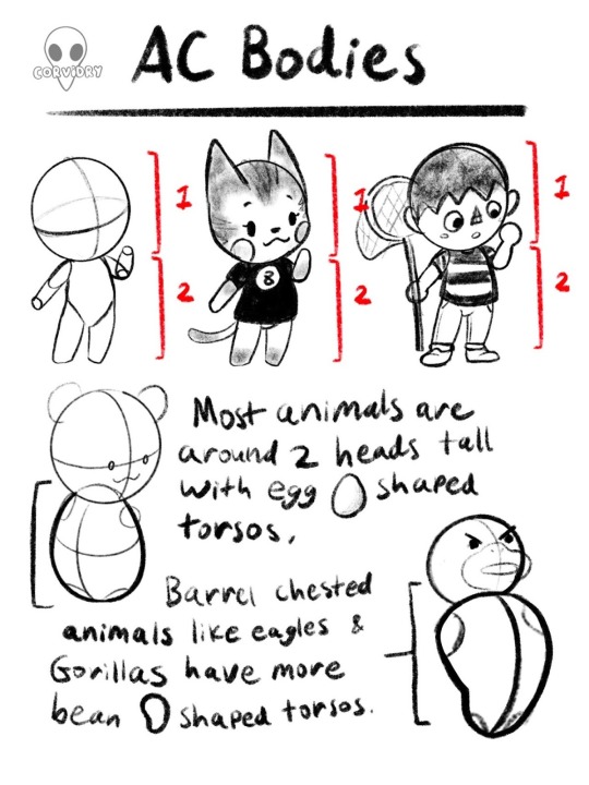
That said, this isn’t a hard and fast rule necessarily. While the height and shape of AC bodies is generally in the neighborhood of what’s stated above, there is some variation between installments of AC. Compare the following images and you’ll see what I mean.


As you can see, Bob’s shape and proportions vary between Wild World and New Leaf, as do many of the other characters. While many current players likely think of New Horizons as the definitive style for now, I would encourage my fellow artists to experiment here. Play around with height in the 2 to 3 heads tall range and see what you like. Stylize the torsos to your taste. It’s entirely possible to remain within the AC style of drawing while still making some details your own.
Heads
Heads of AC characters are a bit of a complex subject because there are literally so many different species of animals who all have their own goofy, lovable little faces. I’ve done my best to break them down to the basics without getting too specific about one species or another.
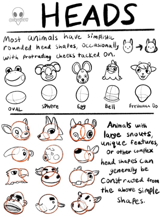
As you can see, even the the more complicated animals can be broken down into these simplistic, bulbous shapes that Animal Crossing loves so well. When designing a new character, it’s wise to plan their head and body using basic shapes before you tack on any other extraneous features. By doing this you can ensure that your character has the round, soft features that are key to Animal Crossing before you ever have to decide what their face looks like or what their personality should be. When in doubt, round it out. You’ll be drowning in the cute in no time.
Speaking of faces, feel free to let me know on social media if you’d like me to expand upon this guide in terms of facial features and placement. I avoided the topic in this case because I wanted to focus more on foundational elements, and animal faces felt it a bit broad for that scope. The sheer expanse of animal individuality in this game allows for quite a lot of different faces with quite varied placement. And that’s not even including the human character options!
Limbs
Arms are perhaps the simplest section of this guide because there are so few styles of arm in Animal Crossing. The vast majority of characters you encounter will have the cylindrical arm style, or something close to it. At that point, all you’ll have to do is vary the length to suit the character.
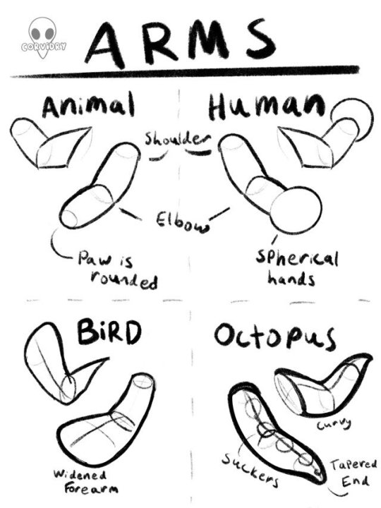
Birds and octopi are one exception to this rule, with birds in particular being the more complex of the two. In most instances, bird characters will have those flattened out oar shapes for forearms with a simple texture stretched over the shape, but on occasion some birds will have distinct feathering as part of their model, which can at times distort the underlying shape for the artist trying to make sense of it. Our owl friends, Celeste and Blathers, are good examples of this.
With birds and octopi in particular, don’t be afraid to experiment a bit with the design of the limb. Some birds, like Blathers and Celeste, have wider forearms, and many octopi have interesting textures for their suckers. In addition, don’t be afraid of extending or shortening the standard cylindrical arm shape, as this shape can be applied to all different sized animals, from cats to hamsters and beyond. Some animals will have very short stumpy arms while others will have longer ones. Some villagers have slender, delicate arms, while others have bulkier ones. You can adjust the proportions of the shape to suit the character you’re drawing.
Legs on the other hand….those are a different can of worms. I’d like to preface this by saying that legs are another topic I’d love to go into greater detail on if there is interest because this graphic could afford to do the topic a bit more justice.
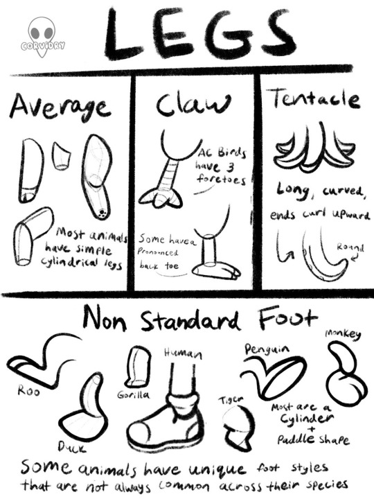
As with arms, most animals have the same simple cylinder that can be widened and extended as needed to suit the body of the animal. Birds once again have a unique trait in this department, but beyond that, leg styles vary widely. Mostly in the foot department, I should say. When starting off you’ll find that most animals maintain a cylindrical leg even if they have a unique foot, and in most cases the foot can be constructed out of a dome shape attached to the cylinder. Not unlike a plunger, if for some reason the stick was on one side of the plunger rather than in the center. On top of that, human characters can now wear a large variety of shoes, making this a second topic that I felt went beyond the scope of this exercise. If you’re interested in a more thorough explanation of Animal Crossing legs and feet, feel free to let me know. I just might write about it in more detail in a future installment.
But never fear! Feet, like most unique animal traits, do share similar design elements across the entire game even when they don’t look particularly alike.
Designing Unique Features
So you’re an artist who wants to draw a specific character, or maybe you want to design a brand new character. You can construct a simple animal body, but then what? What makes this character Your Character™ rather than Bob or Molly or Flora?
Despite how similar these animals all are in basic constructions, each animal and human has their own unique design elements that set them apart from one another. It is nigh impossible to cover every single interesting design element of every single animal in every single game, so here are some tips that will aid you in drawing any element you decide to apply to a character while still keeping them cute as a button.
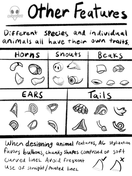
Just like up top, I reiterate. Big, round, soft shapes. Even the most hardcore animals in Animal Crossing look soft and huggable to some degree.

Take for example, these animals who all should be at least a little bit scary. Animal Crossing’s art style keeps them appealing even with their rougher traits on display. Alfonso the alligator should logically be among the most feared of reptiles, yet his sleepy eyes, gently sloping snout, chubby cheeks, and tubby belly give him all the charm of a stuffed animal. His pointy teeth feel more like a clumsy after thought than a mechanism for killing prey.
Coco the bunny is designed to look like a haniwa figure, an item commonly buried with the dead during the Yayoi period of Japanese history. Coco’s Japanese name is, in fact, Yayoi. In addition, many items in her house are reminiscent of Japanese funeral decor. She’s supposed to be a little unsettling. Her facial expression does not change like those of other villagers, so she can’t smile at you or put you at ease the way other characters can. Indeed, Coco wears a permanent somber appearance, but even so, she looks sweet and pleasant to touch. Her face is completely curved and she is given the body of a bunny villager. Her huge, round ears and tiny, dainty paws evoke the charm of a little rabbit even from a villager whose whole design is meant to remind one of death.
Rasher the pig and Spike the rhino have similar charm. Both of them don scars all over their bodies and in some cases wear aggressive looking shirts in their rough or rustic homes. Still, with Rasher’s big sleepy eyes and friendly round belly, he could almost give you a Winnie the Pooh vibe if you squint hard enough. Spike, meanwhile, has had his horns rounded ever so slightly at the tips and his curved hooves and short tail make him seem far from threatening. Even the most edgy creatures in the Animal Crossing universe can appear somehow friendly by making use of these softening design elements.
Go Forth and Draw
And that, in essence, has been my broad overview of Animal Crossing’s art style. I consider that last tidbit to be the most valuable tip of all. By closely studying the way Animal Crossing characters use round bodies, gradual slopes, and pleasant curves, you can make even the most threatening of animal characters look cute and perfectly cuddly for your town, village, or island.
Once again, please let me know if there are particular elements of the Animal Crossing style you’d like me to look into more closely. This has been a very broad and very general overview of the character designs, but I would absolutely love to dive deeper into this art style. If you use this guide to improve your Animal Crossing drawings, feel free to tag me on Instagram, Deviantart, or Tumblr, so I can see what cool art you’ve made!
Have a great weekend, The Internet! Can’t wait to see you again for the next Fandom Friday. If you need me, I’ll be waterscaping a moat around Raymond’s house.
64 notes
·
View notes