#there are smarter and more digestible ways to transmit this information to the audience
Explore tagged Tumblr posts
Text

can they seriously not chill with the page-long exposition dumps goddam
0 notes
Text

Posted by Madeline Blasberg
Ever take the time to really think about the gateway into your business’ website? Yes—we’re talking about your homepage. Your website homepage design should be enticing enough to draw “window shoppers” further into your website and to eventually convert them into customers.
If you’ve felt pressured to hire a professional to handle your homepage design (or redesign), you’re not alone—but it’s also (probably) not necessary.
Simply by spending some time to square away your strategy and brush up on current homepage design trends, you can mimic professional web designers (without incurring the expense).
So, drumroll, please… From design aesthetics to user experience, here are ten homepage design trends to help you boost your homepage engagement to draw visitors further into the depths of your website.
Top 10 homepage design trends to help you stand out from the crowd:
1 – Show. Don’t just tell.
Humans have the attention span of a goldfish. According to data by Tony Haile of Chartbeat, a website only has 15 seconds to capture your attention … Because of this, your website has to work quickly to captivate & communicate, and this can be done through captivating visuals. Utilize imagery and photography to convey a message and greater brand story. Let your visual cue’s answer “what’s in it for me” and “what is this business all about” on your homepage design.
A #website only has 15 seconds to capture your attention. That’s why it’s important to utilize imagery and photography to convey a message and greater brand story.
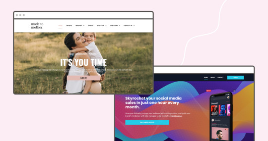
Fullscreen and minimal hero sections can help set the tone of your homepage and bring focus on your business’ main M.O. “The application of hero images can spruce up the design of a web page while also building depth into page content,” says design blog Envato. “Most of these images are photographs which directly relate to the content. But designers have gotten crafty with vector backgrounds, illustrated artwork, and even animated video.”
And when previously designers shied away from below-the-fold designs, this is no longer the case. Now, there is no need to cram everything above the fold as most visitors inherently know to scroll down.
2 – Less is more
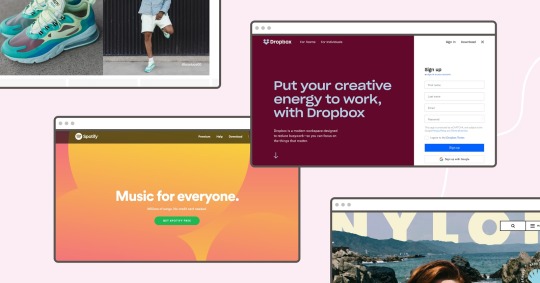
Similar to general website design trends in 2019, layouts and sections should remain uncluttered. Minimalism helps focus the message and reinforces a sense of professionalism.
“The fewer elements and content on a website, the less your audience will have to think. If a website is designed in the right way, it will show the user exactly what she is looking for.”– says 99designs
Here’s how to put this tip to practice: incorporate negative space to give elements breathing room and help visitors more easily digest information. If you’re worried about being too boring, consider implementing a minimalist layout spruced with vibrant pops of color—this 2019 web design trend is gaining mass appeal. These drops of color sprinkled in a simple yet effective website design can breathe life into your brand. Just take it from Dropbox, Spotify, Nylon, and Nike.
Keeping your design minimal also aids in your page load speed, which affects conversions, sales revenue, organic search rankings, and PPC ad quality score.
So, what can minify load time, you wonder? Here are some tips:
Use CSS to create animations and path-based design elements when possible
Utilize flat design: open space, bold colors, and simple illustrations—as these are much less data-heavy and load more quickly
“The fewer elements and content on a #website, the less your audience will have to think. If a website is designed in the right way, it will show the user exactly what to looking for.” @99designs
3 – Responsive design matters for your homepage, too
While 30% of all website traffic comes from a handheld device like a mobile phone or tablet, 90% of small business websites don’t design for these devices’ screen size.
Refresher! Here‘s what makes aresponsive design:
It adapts to any screen size
It loads quickly
Flexible images and layout
So, if you thought responsive design doesn’t matter, you thought wrong. Design consideration of user devices is more important than ever. In fact, failing to have a “responsive” site or one optimized for these devices can drive away customers, hinder your search engine rankings and look unprofessional.
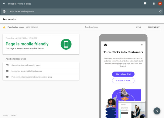
To tell if your small business website is responsive, or needs a little work, use Google’s mobile-friendly test tool. All you have to do is enter your URL and Google will rate your website’s mobile-friendliness using handy color-coded guides. (For instance, you will get a green light if your website passes, a yellow light if there is potential for improvement, and a red light if you need a lot of help. It ranks everything from mobile page speed to screen capacity.)
And, remember: if your homepage looks great on a desktop computer, it may not communicate effectively on a smaller mobile device; nor will it load quickly. To design responsively, make sure your visual assets can scale on any device.
4 – Keep it consistent

Utilize design systems to keep typography uniform and your website buttons consistent. This helps visitors understand what to expect from your site as they venture through your website.
As a business owner, your goal is to create massive brand appeal in just a matter of seconds. As the “gateway” of your brand, your homepage should portray a clear brand image. And that image should be consistent with all marketing channels and webpages on your site.
To maintain a consistent brand on your homepage, consider these things:
Your message: Keeping marketing messages consistent in all marketing channels.
Your visual assets: Maintaining consistent imagery (particularly the hero visual) and the color palette is key.
Your tone: Never falter when it comes to swapping the voice, tone, or content of your campaign.
5 – Grayscale it!
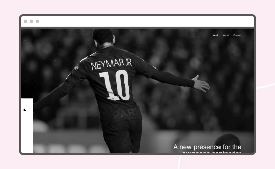
Homepage color cultivates a mood and personality. So, are you wondering what 2019 website color trends are out there?
Black, white, and gray can help facilitate that mood. You can tone down your homepage design by converting your color palette into these simple, yet powerful colors.
Why does this design principle work? A few reasons:
It emphasizes textures and shapes while drawing focus on your messaging.
It’s classy (and a little artsy!) if that’s your jam.
It offers an easy way to maintain brand standards as the color palette is simple.
6 – Animation and micro-interactions
“Movement is the visual path a viewer follows when viewing a composition. With proper movement, a composition can create a narrative and provide high-quality user experience,” says Hubspot. Previously movement was achieved through stagnant lines, shapes, and colors, today animation, and micro-interactions are more trendy than ever.
What is a micro-interaction? They surprise the user and create an event that is inviting and human. They can come in the form of GIFSs, chimes, scrolling animations, and pop-ups.
There are three reasons why animation and micro-interactions rock:
They create moments of delight for the user while reinforcing subtle messaging.
They can serve as visual metaphors to reinforce overarching brand messaging.
They can signal a user to take the next steps—like venture further into your website.
They heighten a sense of interactivity, which helps engage a web visitor. They involve your audience in your website, to subtly transmit information to the users about their actions and usage, and make web pages feel a little smarter.
Ex. https://useless.london/
7 – Diversity
Gone are the days where only middle-aged Caucasian people were imaged on homepages. Today’s person is diverse—in color, race, religion, and beliefs. And brands are finally modifying their marketing to reflect the world’s true population—in a rainbow of differences.
So, it’s vital to include a diverse range of race and gender in photography and illustrations, otherwise, you run the risk of alienating a potential user base. If you’re looking for a good resource on this, look no further than here.
8 – Unique layouts
Walk into any department store and you’ll see products brimming with symmetrical, staggered graphical elements are in. Deconstructed, broken grids are super popular when it comes to not only sweatshirt design, but also homepage design themes. Need to view this idea in real life? Here are some design examples from the Webflow blog.
To think outside the conventional homepage grid layout, do the following:
Vary box sizes
Find a unique way to display your navigation pattern
Switch up hero image placement
Change up type treatments
Modify other cues help organize and prioritize content on the homepage
Try a magazine layout
9- Retro elements
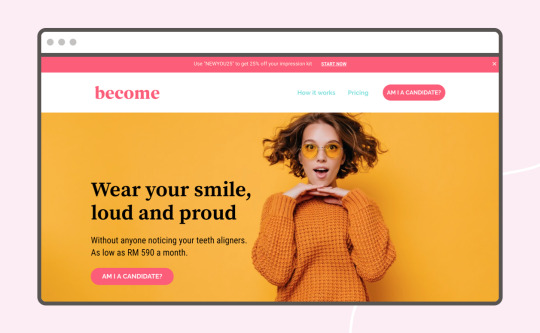
There has been a recent surge of retro-inspired brand elements. Serif fonts, chunky fonts, and 60s inspired fonts are so in. These fonts are emphasized by bright, pop-arty color palettes, playing upon nostalgia and breaking pre-established web design traditions.
Why do this website design And everyone likes a surprise. Using retroelements breaks up the visual stagnation of traditional fonts and adds character and personality, while also reinforcing the credibility of a brand by playing into nostalgia that surrounds design.
10 – Functionality & User Experience
We are decades beyond the internet’s infancy. When once websites were a set it and forget it endeavor for business owners, today’s website is now known to be fluid. The best homepages out there evolve based on your visitors’ needs.
A homepage layout should not only anticipate user needs, but it should also well-paced. It should answer “Where will my visitors land next?” and “What do my visitors want to know about?”
Focus on the user by helping visitors quickly identify with what you’re offering and determine if their needs can be fulfilled. In addition, it should provide examples and inspiration to help visitors imagine themselves using your product or service. In addition, make sure to provide easy-to-view, sticky navigation, so visitors can easily get to where they need to go on your website.
Pro tip: Take visitors on a journey & build a relationship by offering relevant info in exchange for their email (don’t expect them to book/buy on the first visit).
Bonus tip: Calls to action
Don’t forget that at the end of the day, you own a business, and businesses need…well – business.
Odds are, your business goals align very closely if not directly with your website goals and should, therefore, be represented accordingly on your website. We’d argue they’re the most important part of your website.
Whether you’re selling something, collecting emails, or getting someone to sign up for your newsletter, calls to action (also known as buttons) is a borderline necessity.
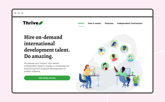
Don’t hide what you’re offering on a secondary or tertiary page, put it right at the top in big bold letters with a button to “buy now” or “get early access” close by.
Bonus tip #2: Favicons
Pronounced /fav-ih-con/.
We have one! Notice the little purple icon on this browser tab?
Favicons have been around for a while and aren’t TECHNICALLY part of your homepage design, but like your homepage, they are often part of your first impression. Also, in a world where internet explorers often have 10k tabs open in their browser, it might be the only piece of your brand visible at the moment. Make it count.
Wrapping up
That’s it! From retro fonts to minimalist layouts, we’ve shared the top homepage design trends of 2019. Get in the trenches—test out which 2019 design trends work best for your business. We trust that you’ll implement these tips with ease and precision!
Go to our website: www.ncmalliance.com
10 Homepage Design Trends to Make a Splash in 2019 Posted by Madeline Blasberg Ever take the time to really think about the gateway into your business’ website?
0 notes