#then it looks bad so I redo it lineless
Explore tagged Tumblr posts
Text
Goddddddd I’m so bad at lineart
#I always do a sketch and go#hey :) I should line this!#then it looks bad so I redo it lineless#and I should STOP doing THAT#BECAUSE THEN ILL NEVER IMPROVE AT LINEART#AAAAGGGAAHAGAHHHAGGRRRAAAAHAAHAHAAAAA#thx for coming to my Ted talk
1 note
·
View note
Text
sawrry i have near exclusively been drawing my hom.estuck fantrolls lately . i only have wips ens.tars wise. i had one of fems.tars w.ataru (who looks near identical to canon wataru anyway) rollerblading but its just kinda sitting there half coloured
#who knew that fe.mstars would motivate me to draw ens.tars more despite me otherwise not caring for it#clearly it doesnt motivate me enough though LOL#anyway i need to redo the colours on that one because they are bad#and bc its lineless im gonna be forced to render it at least semi properly or else ill lose details from the sketch#and if theres one thing i hate its drawing a great sketch and then not getting to see that in the finished image#granted the rollerblades might look a bit dorky but like i think they are pretty good for a guy who refuses to ever use proper references#the way i do references is if i really HAVE to use one ill find one of the object or thing sitting there regularly#and then use my mind powers to imagine what itd be like from another angle#so i only have to half use a reference#im like that guy who was like 'redraw the whole thing from a diff perspective to find out where to put the shadows!'#anyway i think i am off to do anything but continue that drawing. peace
1 note
·
View note
Text

ID: A lineless digital drawing of, Hollyleaf, a dark green cat with pink skin and lining and dark yellow eyes, teeth, and claws. She is reaching up at a cracked dark yellow star. She is glaring and baring her teeth and her ears are pulled back.
Hollyleaf in Bee yourself
Part of @m-chromatic’s Color Palette Challenge.
I made the background transparent because a pink background didn't look good, a yellow background wouldn't work with the yellow star, and I didn't want to redo the outlines on Hollyleaf in pink in order to have a dark green background. So it's just transparent. My first piece of art for this color palette challenge I made on Firealpaca. Too bad Tumblr murders the quality.
The song for this one is Alligator Teeth.
#warriors#warrior cats#art#my art#wc#hollyleaf#color palette#color palette challenge#digital art#warriors fanart#warrior cats fanart#wc fanart
17 notes
·
View notes
Text
Sooooo... i wanted to stick this little rambly thing at the bottom of the redraw but it would have made it look UGLY so im doing this separately... just wanna talk about the whole thing and What Not.
TLDR: its been a slash positive ride thats been worth it to try "something new" every year and my favorite piece out of all of them is the 9th. also for the curious heres the comparison of the 5th anni piece to the recent one (2018 -> 2023)

anyway. personal post time.
oh where to begin *rocks on my rocking chair* i guess it would be with the 5th anniversary piece...at the time it had been a long while since i did lineless art and i thought it would be cool to try it again for that one so i did by redrawing an old piece from 2014... that was the first "finished piece" i made of Them. i think i even made it into a wallpaper for myself lmao. anyway after i posted it i was like "aw man i should draw something every year until the 10th" but i thought yeah right. im going to forget next year like the idiot i am. but i Some How managed to do one every year... th worms got me... i honestly didnt think id make it all the way to the 10th but i did!! AND WITHOUT MISSING A DAY EXCEPT FOR THE 7TH WHERE I WAS A WEEK LATE???? UNREAL especially when fun fact! every year i had no idea what i wanted to do! all i knew for sure is that i wanted each piece to be out of my comfot zone to push me to do something a little different. unfortunately the subjects tm where always the same so it feels a little. samey. but these are my celebratory posts I GET TO ONLY POST ABOUT THE OTP SUPER BLORBOS OF ALL TIME
the 6th anniversary was a redraw of that one scene. you know the one. the helicopter one. fucking hate that scene btw it actually causes me psychic damage i cant watch with the audio or ill scream. but it is my favorite scene of mine despite all the horrors it causes <3 and i wanted to redraw it as if it was a cartoon... like i had taken screencaps from the lcu cartoon in my head. i still remember the backgrounds being such a pain in the ass. honestly id like to go back and redo this one one day too or do something similar to the concept because its a fun one that i always saw done growing up and i wanted to try it myself.
for the 7th anniversary you can see the turn.. no more humans... return to lego... i was getting a little more confident in drawing them in the lego form so i did another redraw this time with the ending!! honestly i still like this one and how it looks even with how late it was but i wanted to test my confidence and do a real True and Finished piece with COLORED LINES and EVERYTHING!!!!! im glad i ended up taking the turn because for the LONGEST TIME i wanted to try and draw them as lego so bad because all i did was draw them as humans and its funny because now its the exact opposite. glad this piece was kinda the solidification in my head that yeah okay im a bit better at drawing the stylized lego toy now i can keep drawing them like this without feeling like im going to want to delete this in 2 weeks.
the 8th anniversary one is so weird. somewhere toward the beginning of the year it got into my head that i wanted to do a comic of them but time/school would have gotten in the way so i ended up opting for a page. another redraw of the ending scene which honestly out of all of them this is my least favorite one and its solely because its all so off. i def could have formated it better so the background shot doesnt take up the entire fucking page but then again im not a comic guy and this was my first time so the layout was bound to look HORRID but this is something id like to come back to ive had the idea of making like a genuine short comic about them since FOREVER and now that im a bit more experienced (lying) i would like to make one day!!!! just gotta stop getting caught up in my scripts!! and going in circles!! Because im obviously not a writer and i keep getting first-hand embarrassment from these!! but ill get over it one day lol.
OH THE 9TH ANNIVERSARY PIECE MY BELOVED. ONE OF MY FAVORITE PIECES ACTUALLY i love this stupid thing so much you have no idea.i know its re-using lineless but i just loved the idea of what it would look like lineless AND IT CAME OUT SO PERFECT I LOVE IT SO MUCH obv it needs a few touch-ups so the main issues dont stand out to me but god. i love this piece so much. idk what came out of me to make this but its so good ill never get over it. and the little lego them as a cake topper ITS JUST SO CUTE I DONT HAVE MUCH TO SAY OTHER THAN I LOVE THIS SO MUCH SORRY
finally. the 10th anniversary piece. oh my god. okay. i need everyone to understand this. i had woken up with this fucking Unbearable pounding headache that was trying to kill me. my body the entire day wanted me to stop and lie down, but last night i was already done with a good chunk of it and all i had to do that day was finish some lines and the coloring?? i literally don't remember all i remember is my body actively trying to shut down and force me to stop and sleep which i took a nap? didnt help. so i said fuck it im finishing this. i was. an entire goddamn corpse arched over my laptop. i was so delirious the entire time its a fucking miracle it even came out as good as it did but honestly. i still hate how it fucking looks. like you can TELL when i gave up (the shading) and it sticks out like a sore fucking thumb to me and it pisses me off because i knew i could have done so much better if i wasnt being stricken down by gods hand and his every attempt to get me to rest. idk like im generally proud ot it, with this one i wanted to go out with a bang tm so i tried to draw every important and relevant character instead of ALL of them like I was originally planning LMAO but ah well. maybe one day when im faster at drawing. this one i defiantly wanna go back and touch up but i everytime i open the file i can see 40 more things wrong with it and it drives me nuts. so ill just have to wait for when im ready. i guess.
can i just say though. the improvement is crazy. it always catches me off guard because tbh i uh. dont like my own art. im getting better at not fucking hating it because i can pinpoint everything wrong with it but whenever i see the side by sides it always surprises me. i always dont think im improving but then i see it and its like wow i really am getting better! i still suck at 3000 things but im getting better! and its overall just a nice thing to see after having drawn them for as long as i have... the power of the worms is strong and has ruined my brain...... speaking of i know ive said a few times that i fucking hate certain pieces, not just LCU related ones but almost anything i post, but if you love them and are able to look at them with a twinkle in your eye then thank you. genuinely. i honestly love looking over the tags of people exploding and saying nice things. it warms my cold little heart and im glad there are people out there that genuinely love some of the things what i do! even if its just fanart and its just their blorbo. thank you for sticking around even tho all i do is draw my otp super blorbos :'^) this game means the world to me and im glad like more than 2 people wanna spread it around.
to wrap back around to the anniversary stuff and speaking of big love to the people out there THE FREAKING EPIC ZINE i was just a small thing but it came out amazing even for how small it was thank you to the contributors and thank you to everyone whos downloaded it!! its still getting the occasional and i love getting the notif in my email about it. i love that there are still people out there who wanna see it and all the hard work everyone put into it to celebrate the games 10th just thank you again i really does mean alot to me ALSO IF YOU HAVENT CHECKED IT OUT PLEASE DO IT IS 100% WORK YOUR TIME AND ITS DIGITAL WITH PRINT AT HOME STICKERS AND YOU CAN KEEP IT AND LOOK AT IT FOREVER
uh to end this off....would I like to do this again..... I mean I kinda am? by that i mean ill do the big numbers (15, 20, 25, 30, 40, etc) till the day i freaking die!!!! but yeah no countdown stuff ever again!!!!! sorry :^( it was super fun to do though!!!! and im glad i did it that piece is the conclusion to the whole thing but that doesnt mean ill stop drawing them. duh. theyre my characters now! but heres to many more anniversaries and to hopefully another game! or to just see them again in any other lego media! or even better... a mischaracterized cameo in ninjago!
#long ass post lmao congrats if you actually read it all and made it to the bottom :'^)#i typed this all out yesterday thats how i got it out so quick lol
13 notes
·
View notes
Text


MACHINE-INDUCED INSANITY 💔💔💔💔
more ranting below the cut
got a windows surface tablet recently cause i needed a standalone drawing tablet and since i once had a display tablet that hooked up to my puter i’m most familiar with windows apps like firealpaca; my display tablet broke a while ago (also why i got the surface pro) and after readjusting to firealpaca (and drawing on a tablet again in general. i’ve been restricted to drawing on my phone since my display tab broke up until now) i decided v0 was due for a new ref
some things of note: this tablet only has like 4gb of ram. which works fine for what i’m using it for but that means it gets a bit slow if i have too many layers/too many tabs/try to do things real fast. this tablet also doesn’t have gesture comprehension so i cant do things like double tap/triple tap to undo/redo, i have to tap the buttons on the screen manually. i also don’t have a keyboard attachment yet and i’m not really looking to get one i just need that xp pen thingy that has all the button shortcuts but until i have that i have to manually select to and from each tool and i can’t use shift or ctrl which limits me from quite a few things (like straight line tool, the ability to select multiple things at once, etc). it’s not that much of an issue but it is a hinderance ALSO this things touch sensitivity is a bit high so even with my smudge guard, i accidentally tap on things all the time with my palm if i dare press my hand down with any pressure at all
(P.S. this isn’t to say the tablet is bad. if you’re looking for a windows drawing tablet or something it’s very nice and the one i have (i think it’s the 6?) was a very good price. would recommend. most the issues are circumventable)
anyways i was working on v0’s new ref right. that shit took me 5-6 hours for just the fucking sketch and lines the most i’ve done color wise is the clipping layer and that’s it. and i cant continue rn because 1: don’t have an image i can get v0’s colors from saved on my tablet yet (and i’m not currently at home so i have no wifi. cant get a ref image til i get home) and 2: i forgot i was supposed to be drawing it on vc tonight with another friend of mine (@cikdik) so i’m waiting til then anyways
mind you i have to color this thing lineless. i had to do actual lineart however becayse i needed the clipping layer to be seamless and also guidelines you know. so that’s another like 4+ hours at best
and that’s just for the fucking front facing view wgich i have also. yet to line its tail to and its wing things onto it so that’s not even done yet and whenever i do get done with that i have to then draw a side view and a back view and i’ve been holding my pen so long without break up until now my hand hurts just a little bit
anyways sorry about the impossibly long post i just needed to talk more so i didn’t get mad about it. thank you for coming to my ted talk and thank you @athiav2 for listening to the bullshit i was spouting
#if i start adding more than the necessary tags to this i will have ten million tags so#self control#matryx speaks#ultrakill#ultrakill oc#v0#long post#uhh#yeah that’s good enough
4 notes
·
View notes
Note
who are your biggest artistic influences my furry friend? we had art classes together for years but i still feel like i don’t know 😭
😭😭😭 honestly thats probably cus a lot of my artistic influences are specifically internet artists that ive been following for several years and not things i couldve brought up in art class. you know that lame ass mr smith wouldve hated me if i said 'yeah i draw like this cus of some bts fanart girlie on twitter'. thankfully i have the Archivist's Temperament and save like literally everything thats had an effect on my style... so below is a journey thru my artistic influences (and various insp folders on my computer) as far as i can remember
of course the most basal Dorian Influence is disney movies. you are my brother in arms in the lion king fandom so you know this. whenever i am feeling extremely artistically bankrupt i try to revitalize myself by rewatching the lion king, atlantis, and treasure planet. and also the prince of egypt but thats dreamworks LOL
in 2016 i found the first "online" artists i distinctly remember wanting to imitate, which were sara kipin and celia lowenthal because i was obsessed with how they used color to block out their illustrations. ive also been following dimetrodone(/dimetrodrawn/deinocheirus) on here since 2016 and love all the shapes and colors in her work
in 2017 i started doing more detailed shading because i saw bts fanart by the artist tyu_naxx on twitter and loved how they did it (below is like THE piece that made me change my whole shit up)
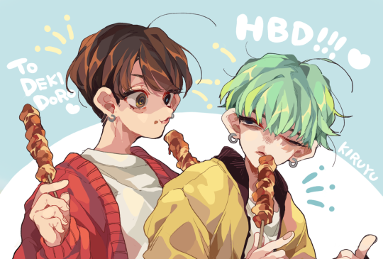
around then is also when i started trending towards using limited palettes and that was mostly inspired by various national parks promo artworks that would only have like 5 colors in them. wish i remembered who made these but heres ancient scans of some postcards i got at sequoia national park that changed me

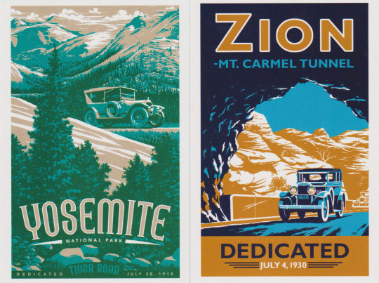
in early 2019 i started wanting my style to be more cartoony so i would constantly peruse the backlogs of kiwi, officialspec, skunkes and mimiadraws to get whatever inspiration i could from them
in late 2019 i completely pivoted for some reason and started doing lineless rendered semirealistic stuff instead. i think that was mostly cus i hated doing lineart. one of my biggest inspirations in that era was atissi
in 2020 i remember i went crazy stupid on using glow effects and chromatic aberration on stuff and i genuinely think all of it can be traced to this ONE piece of bts fanart by lordizxy on twitter like i was fully obsessed (putting it below also in case it gets deleted somehow)
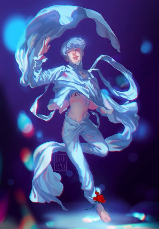
mid 2021 was when i got tired of semirealism and thought it was too amorphous and restricting so i went back to cartoony shit. i was still looking at the artists i listed for early 2019 but i also added artists like iplidl, catmunches, and chunkysoup22 to the mix
2022 was an inspirationless nightmare i have no clue what i was doing for that entire year. the artblock was BAD. i mostly just looked at art from all the artists i mentioned before while artistically wandering in circles. a lot of this was me trying and failing to figure out whether i wanted to do more dynamic yet less rendered art or... the opposite of that
thankfully in 2023 i finally FIGURED THAT SHIT OUT. i would say the current dorian art era started with this silly drawing of graydon and riley hivemind as a dogboy and a catboy ⬇️

you can kinda see the influences of all the cartoonists i listed above but a lot of the way i draw now is just. me trying to not make myself hate doing art. ive always hated redoing a line 30000000 times for clean lineart so now its sketchy. rendering my art was making my drawings feel super stiff so now thats all messy too. etc etc
i think Right Now the artists i go to for inspiration the most are still kiwi and skunkes, but i also found the artist robottoast recently who makes RIDICULOUSLY good furry art, its so full of life and personality and i definitely need to commission them someday. the most recent singular piece thats changed my whole shit up is this scott pilgrim fanart by benadieshekiel (also below) because i really liked how the clothes were fully rendered while the skin and hair are less detailed with clear lineart. so sometimes i do that too

ok i think that is as full of a chronicle of Dorian Influences that i can give you rn. i was not lying when i said i wanted to yap. hope you enjoy <3
#ask#saintsdead#also obviously have influences for the themes in my original work but i do not feel like going into all that tbh#how my art Looks is MUCH easier to trace
6 notes
·
View notes
Text
Summary of March:
Bouncing between focus and being completely scattered. Mental health very poor. Managed to take some time to play games without feeling guilty about it, which was good. No scenes again because I still always think of either these big elaborate ideas that are a day+ of actual work (and so don't get done) or just 'sketch of character doing nothing so I can try to get their likeness'. Really need to find out how I can add perspective backgrounds to portraits or something lol
Still reducing workload until I get onto something I can actually complete in a month.
Plan from February:
All monthly/weekly goals for the year ✗ no backgrounds
10x 5 minute What Am I Scared Of sessions (inc photo drawovers) ✓ don't know how much it helped though!
Thumbnail/sketch for K/ylux calendar ✗ might drop out of this
DAB Lesson 7 - redo form intersections ✓
DAB Lesson 7 - 4 vehicles ✓
FEH design ✓
Proko - review notes ✓
Proko - next body part ✗ took notes for this, started doing initial tracing
April plan:
3x 100 comp
5x scared
DAB Lesson 7 - 2 vehicles
Proko - shoulder bones
DrawThis - 2x 2h videos
Rough sketches for all 5 FEH alt ideas
1x background sketch/screencap study (1h timer)
1x simple form studies (1h timer)
Look at how FEH artists handle small details/trims with lineart ✓
notes and improvements from finished stuff:
USE PHOTO REFERENCE FOR EXPRESSIONS and try more open mouths ✗ no expressions this month. fuck, do more hair studies ✗, use photo reference to figure out stylised ¾ eyes ✓ still haven't figured it out though, push unhorizontalness ✓, try to unstiffen poses before doing lineart (separate pass)✗ but this did improve from the unhorizontalness thing
guy: eyes too sunken in OR far side of face/chin sticks out too much, folds on shoulder don't take into account that there actually is a shoulder there, arm is completely straight, pose is pushed a bit too much but I actually don't mind that
m/ichalis: lines REALLY messy (due to rushing to finish for a self-imposed deadline), eyes too flat/centreline of nose doesn't stick out enough, flat jaw area (mouth doesn't imply any curvature to mandible area), ears on rabbit aren't oriented correctly (v hard angle though), collar thickness is different on either side, hair doesn't follow contours of head at side (common problem), pose doesn't make any sense but was the only way I could think of to get the rabbit into frame so I guess I can let it slide, temple area shaded way more 3D than the rest of the face and looks weird
s/eth: nose/mid-face too long, drawing details like trims with lineart looks weird, hands not 3D, sword doesn't quite fit comfortably into hands (copied hand reference too faithfully), wasn't sure how to do top contours for thigh high boots because I didn't know exactly how the slightly raised leg worked or interacted with pelvis, also wasn't sure how to handle material on tunic moving with raised leg
a/yra: back chestplate thing too curved (looks like turtle shell), sword pose impractical, sword blade looks really thick and not sharp at all, tree in background too abstract - doesn't look like tree (holes in foliage make it look like a flat shape stuck onto the trunk), hair looks like it's stuck together, Small Other Eye Syndrome
a/rvis: TOO DARK, shading inconsistent with lightsource (looks like facing him but the background is a rimlight), not fully lineless or lined - lazy, shading on nose really bad because of the light coming from the direction it is, hair doesn't follow contour of shoulders/chest, do like how lost edges were executed though
v/alter: drew leg armour without really knowing how it would fit over the leg (couldn't figure out how to make the cutout not dig into the thigh) and so had no idea how to shade it either, shapes on knee guard inconsistent between sides, silhouette very static/horizontal, arm at his side looks really awkward (I did intentionally want it by his side and not in a more dynamic pose but it looks like he's pushing it down), glow isn't glowy enough, colouring messy (I did clean up the lineart though which is a good step forward)
ACTIONABLES: USE PHOTO REFERENCE FOR EXPRESSIONS and try more open mouths, do more hair studies, use photo reference to figure out stylised ¾ eyes AND NOSE, push unhorizontalness, see how other (FEH) artists handle trims
5MIN SCARED IDEAS: find good hair examples and trace, find ¾ photos and trace eyes/nose, trace torsos for gesture, review/learn leg muscles, trace thigh high boot opening contours from actual photos
0 notes
Text
I’m doing this for fun simply because I'm rewatching them all so,
Here's my personal ranking for Every Gorillaz Music video, based both on song and the video itself:
(This is going to be a long post)
PHASE ONE:
Tomorrow Comes Today: 7/10. I love this song and the video fits its vibe, but its still pretty simplistic and not a whole lot of actual animation and no story, so it gets points off for that.
Clint Eastwood: 10/10. I love this one honestly. Its still so charming after all this time and showcases the band well for their early days. Love the more moody tone of it, and I always love seeing the band actually play instruments in their videos too. Bonus points for Murdoc's laugh opening this one because I love that.
Rock The House: 9/10. Pure fun. I don't have a lot of commentary for it, I just think its fun and I love the song itself too. One point off for Murdoc thrusting his hips too many times for my eyes tho.
19-2000: 10/10. This one was the first Gorillaz video that I saw and it really is just a nice non plot connected video. The 3D animation still manages to hold up because of its mix with 2D animation in my opinion and I enjoy it.
Rockit: 5/10. I like the song but the video is kinda meh.
PHASE ONE MV'S OVERALL: Overall I like phase one and I miss Del. Bring him back.
PHASE TWO:
Dirty Harry: 8/10. 2D is just vibing so hard in this video and I'm living for it. That’s all that matters. (Side note but I love the version of this video they did for the BRIT's as well.)
DARE: 10/10. Noodles time to shine, a perfect song, what more could you ask for?? (Also love the bit with Murdoc at the end of course.)
Feel Good Inc: 10/10. This one is obvious if you know me at all. Murdoc playing his bass is what sells this one for me cause I enjoy the animation. The songs amazing and one I find comforting to listen to, and the mood of the video fits it perfectly. Theres some really fun shots with lighting while 2D is standing at the window too in the tower in here that I've always liked.
El Mañana: 6/10. I love this song but it makes me sad and so does the video.
PHASE TWO MV'S OVERALL: Phase One is iconic for its art style and for being The Beginning, but Phase Two is my favorite of the two for its art. I love how these videos are animated, and even if Demon Dayz is my least favorite album, the songs in these videos are all very good. Pretty solid as a whole all things considered.
PHASE THREE:
Stylo: 10/10 LISTEN, I KNOW SOME PEOPLE HATE THE CGI, BUT I LOVE IT. It’s so expressive, this song is one of my absolute faves, I’m sorry to be such a Murdoc liker but hes so much fun in this video and so expressive and it starts the story off for Plastic Beach. I love it so much.
On Melancholy Hill: 7/10. It’s not a bad video, and I love the song a lot, but...not a lot actually happens in the video aside from the bits with Noodle. Bonus points however go to just how seamlessly it puts 2D and 3D animation together, and for how cute 2D looks this whole video.
Rhinestone Eyes: 9/10. WOULD BE A 10/10 IF WE’D GOTTEN OFFICIAL ANIMATION FOR IT ;-; (The fan animated video for it tho is Very very good and i applaud that whole team.) Amazing song, this video has the most story packed into it so far from all the other videos and it’s memorable from its storyboards for that alone.
Doncamatic: 10/10 Listen...Listen I know its a one off and it doesn't really have anything in it but I’m obsessed because its one of my favorite Gorillaz songs tbh and I love Daley’s outfit in it so it gets a full pass from it.
PHASE THREE MV’S OVERALL: I love every video this phase tbh, none of them are bad. All of them are fun,and even if Melancholy Hill is a little slow, it’s still enjoyable. I love this phase because they all connect and I know I’m not the only one who feels that way either.
PHASE FOUR:
Hallelujah Money: 7/10. It’s not at all bad, but I’m as not fond of this song, and the video itself is much too trippy for me. Still has its own merits tho that I won’t knock it for even if it’s not my personal taste.
Saturn Barz: 10/10. Everything about this video is amazing. Character designs and as a comeback for the bands animated counterparts, it was perfect. I loved hearing them actually speak again too it made the whole thing so fun. The song is fuckin awesome and it fits the vibe of the whole video. Bonus points for the more lineless animation style they gave everyone in this video, it was a really neat change from past phases. My one complaint is again stop making me see so much naked Murdoc, I may like him but not like that.
Sleeping Powder: 6/10. I am so split when it comes to the mo cap models. This songs good but the video is again too trippy for me.
Strobalite: 9/10. Would have been 10/10 if Russel got to dance with 2D and Noodle, but other than that its pretty damn good. The mo cap looks way less awkward in here, particularly Murdoc and Russel. Also hilarious that Murdoc made a deal with the devil, and the guy who played him is actually his voice actor irl. This songs too much fun to vibe to as well.
PHASE FOUR MV’S OVERALL: Not much for story, but makes up for it in updated art and great music again. Solid overall yet again. I like it.
PHASE FIVE:
Humility: 20/10. Literally every single person I know who’s seen this video loved it. The animation is Beautiful, the song is so fuckin catchy, Jack Black is in it! What more do you want!! (The only thing I could have asked for was to see more of Ace but that’s its only flaw.)
Tranz: 9/10. I love this song so much but this video is Again just a little too trippy for me. However, we get to see Ace just jamming out in this video and I’ll take the trippiness just for that.
PHASE FIVE MV’S OVERALL: I was surprised there wasn't at least one more video for this phase honestly? I feel like Kansas or Souk Eye would have made for great videos for this phase. That aside tho, both the videos it does have are a lot of fun. My literal only complaint is that I wanted to see more of Ace. Bring him back in the future.
PHASE SIX:
Momentary Bliss: 8/10. This songs fine, but what sells it for me is the video is more slice of life/a day in the life of the studio. I’m always a fan of those moments. Bonus points goes to Murdoc trying to fuckin poison Jamie and it backfiring on him.
Désolé: 10/10: ooooh this song is so beautiful...I love it so much. 2D Noodle and Russel got to have such a fun time in this video and they deserve it. And poor Murdoc, having his little sad times by his asshole self. I love him but I think he deserved it. The others needed a good break from the bullshit and I’m glad they got it.
Aries: 6/10. Video itself is kinda boring, but the song is nice. Murdoc deserved to be left behind in Désolé after what he tried to pull here.
Friday the 13th: 3/10. I don’t care for this video and I really don’t care for the song. Not much else to say.
PAC-MAN: 6/10. Video’s fine, I like some of the little details in it, but it’s nothing special. The song itself is nice tho, super calming, I like it.
Strange Timez: 20/20 MY GOD I LOVE THIS ONE SO MUCH...VISUALS ARE SO FUN, I LOVE ROBERT SMITH SO I LOVE HIM IN HERE, ITS JUST A GOOD TIME ALL AROUND!
The Pink Phantom: 5/10 I just don’t really care for this song?? I like Elton John but I couldn’t get myself to like this one no matter how many times I’ve listened. 2D got to be happy in this video tho so I’ll give it a pass.
The Valley of the Pagans: 6/10. This song fuckin slaps but the video feels like a boring redo of 19-2000 except for it’s ending. It gets points for giving everyone Plastic Beach feelings at the end and hyping up the video after it.
The Lost Chord: 20/20. Y’all knew this was coming. This was something I’d BEEN hoping for story wise and I finally got it. Was it maybe a little rushed? Yes. But GOD it was such a nice thing to see them say “hey we’ve wrapped up this part of the story for good and want everyone to move on from it, so we’ve given it a properly acknowledged final send off.” And tangibly seeing everyone's emotions laid out about the island and their times there was very nice. And I know Jamie and Damon have stated Murdoc is irredeemable, blah blah yes I know hes an asshole still, but I WILL think about Murdoc in this video and how he seemed actually regretful and what that means to me and the fact that it was no one else but 2D himself being the one to reach out to Murdoc in the end to save him until my dying breath, thank you very much. And this song?? Fuckin beautiful, it had those Plastic Beach vibes again and felt good for it’s send off song, I love it.
PHASE SIX MV’S OVERALL: I may be a little split on some of them and on Song Machine as a whole, but tbh I love the phase six art style so much and most times the videos were pretty good. Bringing back PB in the end was something I always wanted too so it really does get bonus points from me for that. I’m 50/50 on them overall. The great ones are great, and the meh ones are just kinda boring, so it evens out in the end.
STAND ALONE VIDEOS MENTION:
Do Ya Thing: 10/10. I’ve said before I love the 3D animation and the slice of life stuff, so this one’s obviously a favorite, and you really cant go wrong with an Andre 3000 feature either.
Superfast Jellyfish: 3/10. This song is kinda fun but I don’t give a single shit about the music video.
Garage Palace: 8/10. Very fun pixel visuals for a change along with a killer song, super enjoyable.
So what’s my final verdict on Gorillaz and their long music video history?
Honestly for a group thats been going as long as they have, I dont think they have too many misses in their catalog. The ones that aren’t as fun are just kinda there, but the videos that really stand out stand out far above the ones that don’t hit the mark as well and in the end it all feels like a good balance. No band has a perfect video every time, but the ones that Gorillaz did well they did amazing on and I enjoy it immensely when that happens.
Sidenotes after watching all of those:
For the love of god please put Russel in the videos more, please, he deserves it and I would love to see him more.
On that note, BRING DEL BACK WITH HIM TOO!!
And speaking of characters to bring back, I want Ace to come back and join Murdoc sometimes, even if its only once or twice more, I need to see them interact PLEASE.
Last note but Jamie, please, I’m begging, show less of mostly naked or fully naked of Murdoc in future videos, we’ve had our fill by now.
#can you tell im hyperfixating again??? anyways#kief rambles about gorillaz#gorillaz#this was fun but good lord
19 notes
·
View notes
Text
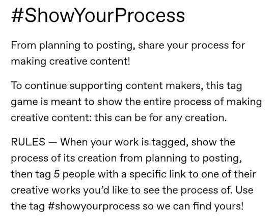
the always wonderful shelley @shanheling tagged me to do this thank u so much!! i think that everyone i wanted to tag has already been tagged to do this but if you feel like doing this feel free to consider urself tagged by me!! im putting this under a readmore bc its long and i ramble a lot
the piece i was tagged to explain my process on is this oc piece! unfortunately i have a habit of deleting my original clip studio file once ive finished my art and saved it as a new png file, so i dont have the file to show the sketch and different stages of this piece. but I still can go through my general process and talk about how i did that piece!
1. planning
honestly i think about the art that i want to do a lot, and in this last year or so ive thought about the art i want to do more than ive been able to actually create and finish that art that i want to do. for my planning i tend to do a lot of different thumbnail sketches for the art im thinking of
these are some examples of thumbnails, a lot of times ill do thumbnails just on pencil and paper and with some of these theyre done quickly with my fingers on my phone note function on a day where i was feeling too bad to get up and draw on paper but still wanted to get the thumbnail ideas down. two of these are for the same songxiao piece that i still havent finished and i have more thumbnails digitally on clip studio for the same piece, i do a lot more thumbnails when a piece isnt working the way i want it to and theres times where ill completely scratch a thumbnail or a sketch and start over in order to do more thumbnails because i dont feel happy with some aspect of it.
two of these are small gouche painting thumbnails for two pieces i did maybe a month or so ago, i did the thumbnails and then tried to expand on them digitally and im wanting to do more thumbnail paintings like this in the future because it was fun
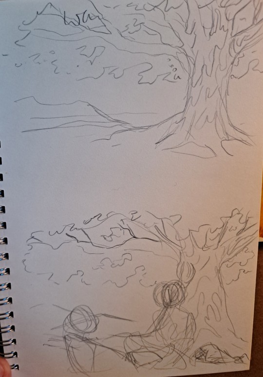
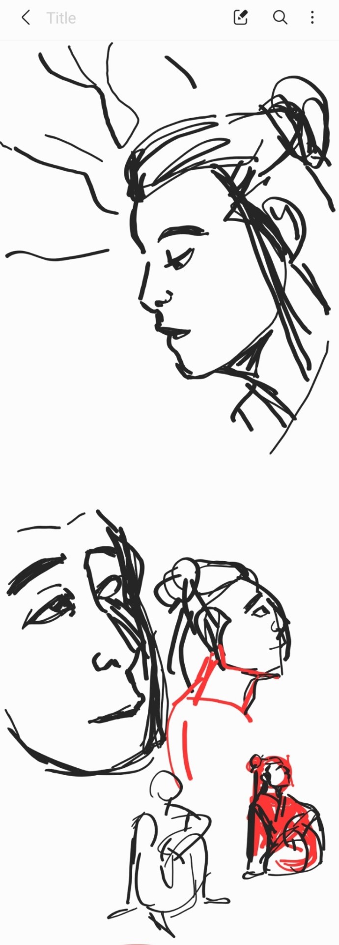
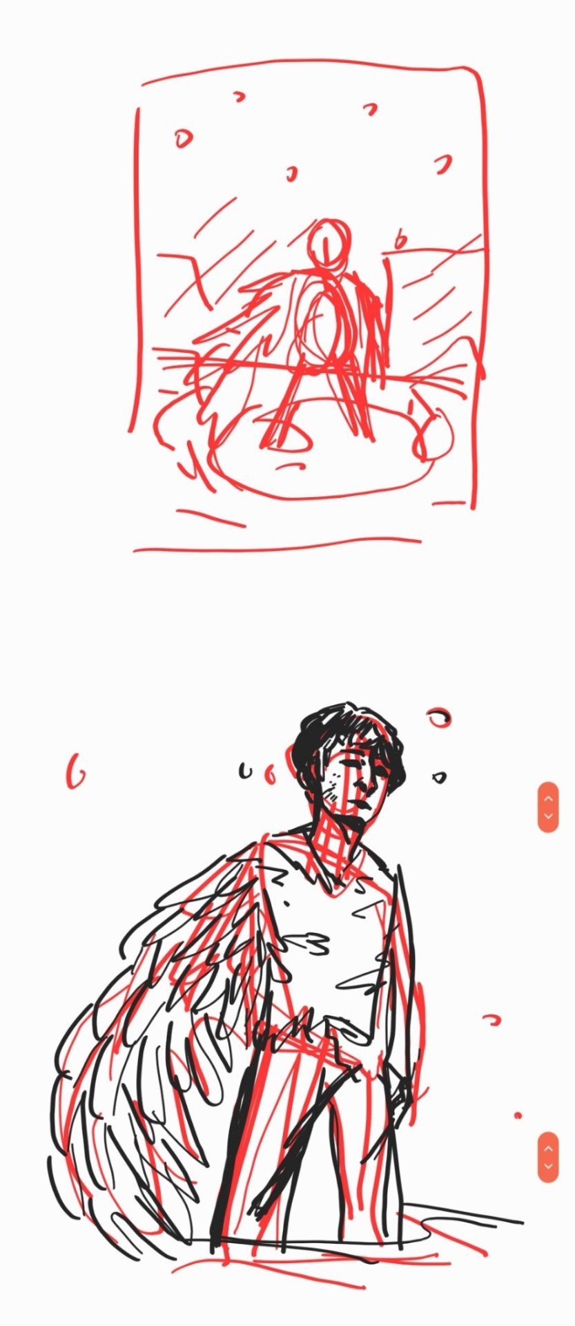
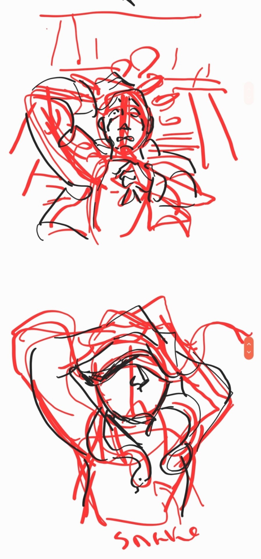
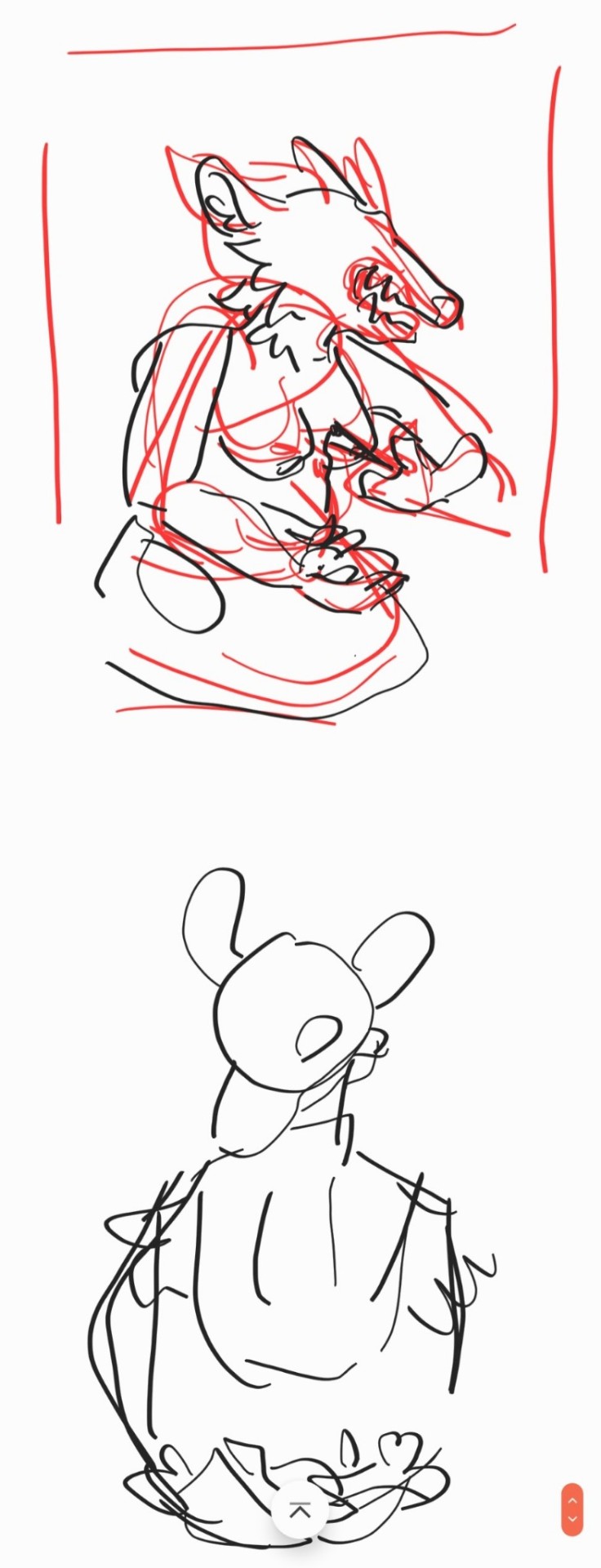
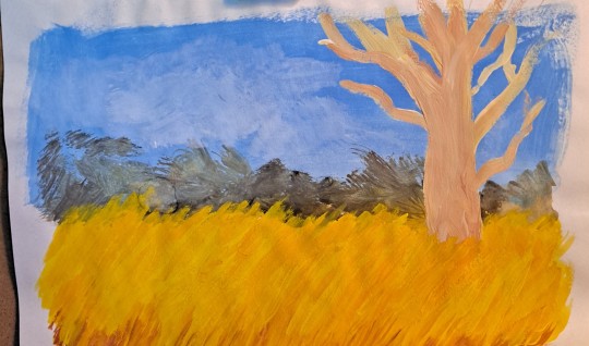
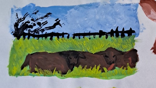
for the piece of my oc trio it was based off a series of ask prompts i got for a few different outfit prompt memes i had reblogged, so i based their outfits on the ones in the meme. when im drawing figures i tend to try and get the movement down in the poses when im sketching, i do several rough sketches of the pose before beginning to start setting down lines (if im doing lineart at all because sometimes i dont like doing lineart and do a more lineless painting kind of style). i really try to get my art to convey some kind of emotion, in the oc piece i wanted it to feel fun and like youre seeing three best friends while theyre out on the town having a fun night
2. creating
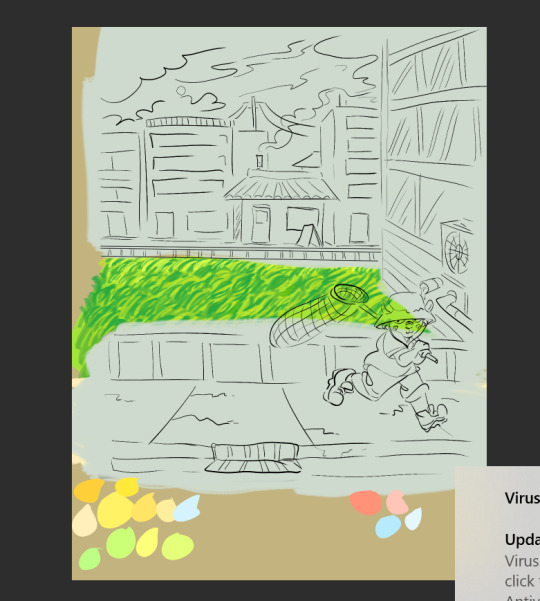
this is the only real example i have of a piece in the middle of being filled in and created, this piece is one that im really not very happy with & have had lying around for a while and ill probably scrap it and try to come at it from a different perspective at some point. but anyway it still shows what i do, i lay down a kind of neutral gray color underneath my final sketch/lineart if im doing lineart in that piece and then i start picking out the colors that i want for the piece and kind of setting out a pallette for myself. i dont do this color pallette thing 100% of the time but i do it really often, especially if im working on a commission or a larger piece where i know theres going to be a lot of colors or if its a piece where im not sure exactly what color scheme i want so laying out the colors together helps me kind of decide what kind of scheme i want. i am sooooo picky about my colors in my art i am genuinely obsessed with colors in art and there are times where i really have to stop myself from working on something forever just constantly adding more colors or putting little tiny changes and gradients in the colors.
after ive got the colors i want down i tend to try and block out parts of the piece with the base color for that section, and then i start to paint with the colors that i want to go on top of that base color from there.
once im satisfied with the colors/shading/rendering and everything ill go back and look over things and will fix things that look off or sometimes completely redo segments if they dont look right to me. when i was younger and mainly doing digital art using my phone and my fingers i would use a lot of filters and overlays on top of my art once i was done, and honestly im glad to not be doing that anymore because i dont think it made my art look any better. i do color adjustments and sometimes will put on a color overlay or a layer to emphasize the shadows and the light in the piece, but i try to keep those layers to a minimum and like i said before i have a tendency to obsess over the colors and ill spend a good amount of time in the color adjustment tool of clip studio and then ill just decide "actually it looks fine as it is" so yeah!
3. posting
i feel like i dont have a lot to say here gbfm i mean i honestly have a lot of thoughts about the relationship between artists and social media and how social media changes our views on art including our own art and how we can feel like we constantly need to be posting new art and just become content machines churning out new stuff. but ill save that rant for another time. i used to be really concerned about how many notes my art would get when i was younger, and i dont at all blame anyone who still is very concerned about that bc it sucks when u work hard on something youve created and then you dont get a lot of recognition for it, but honestly within the last two years or so i feel like ive begun to have a lot healthier relationship with posting my art. i really just post my art on my art blog, reblog it to my main blog, and then thats that yknow! i do really appreciate any and all support people give me, it means the world to me, but for me having the mentality where i dont need to post all the art i make and i dont need to be posting every day or every week or every month even has been a lot healthier for me because then im not constantly asking myself why didnt this get notes is my art awful??? and yeah i just kind of post it and my brain goes okay were done with that art we gotta make more
ive honestly been struggling a lot with art thru the pandemic and if youre reading this and have been struggling with creating in any way recently or even before the pandemic, please know theres no shame in having trouble creating and it doesnt make you bad at whatever it is u create!
thank you for reading this, feel free to consider urself tagged by me again if u want to do this!! love u all
6 notes
·
View notes
Text
Meet the Creator!

Introducing: Mochi!
Commissions: I do have commissions which are currently open right now--I've done them in the past.
Social Media: Instagram: https://www.instagram.com/_mochibun/ AO3: https://archiveofourown.org/users/mochibun/pseuds/mochibun
Tell us a little bit about yourself!
Some hobbies I have are gardening, gaming, and writing. I also sew in my free time--anything creative makes me happy.
What got you into creating? what inspires you to keep creating?
What got me into creating was just reading a lot of books and consuming a lot of media. I wanted to try my hand at it from a young age, but it wasn’t until a rough time in my life did I begin to pursue it seriously to distract myself. Now I stick with it because I love creating and making people happy, and creating constantly allows me to see how far I have come in terms of both creativity but also as a person.
What's your creative process like?
It’s all over the place, honestly! But usually I sketch, and depending on my mood and style, I’ll either line it or go straight to coloring for lineless. I try to make the flats as nice as possible, but even still, I’ll usually have to add a lot of layers that have overlay/multiply/etc. effects on them to really create the sort of atmosphere and aesthetic I’m going for.
What kind of mediums do you like to use?
I definitely do use my computer and then your traditional paper and pencils. However, I also really like doing photography as well--especially as a gardener; I like taking pictures in my backyard of the garden to get my inspiration going.
Is there a specific scene wrote that you are particularly proud of?
“No, it’s not,” Link said. Her bottom lip trembled, and there was something ugly and vicious twisting within her, demanding to be let out. Link had not learned yet that silence is damning, but every inch of her was screaming. “I will not let you be painted into something you are not. I don’t want a princess, I don’t—I don’t *need a princess!* Outset, Windfall, the ocean, it doesn’t need a ruler!” “The sea takes what it wants,” the princess said, and for a moment she looked like a pirate captain. “But—“ “We don’t need a princess! *I* don’t need a princess! I need *you!”*
Is there someone who inspires you and your writing or art?
Everyone I meet, honestly. Sometimes it’s their own art, but other times it’s the words they say, or just how incredible everyone’s very own existence is. Like, you’re here on earth, and you’re thriving in this terrible time--or at least trying your damnedest to. And that’s pretty incredible to me.
Is there something that you struggled with that made you grow as a creator?
There was a pretty rough period of time in my life where I had to move schools and make new friends. It made me seriously consider what I wanted to do in life and how I needed to approach things, which ultimately led me to my creative career now--additionally, the ample time quarantine gives me means I am finally able to declutter my space.
What got you into writing or art?
My parents and every single fantasy series I read. I used to have these little picture books about old fairy tales, and I guess that love for fantasy--for a different world that can still be just like our own--has stuck with me to this day.
What's your favorite part of the creative process?
The freedom it gives. You can go anywhere, do anything, and if it’s awful--you can always reshape it, or redo it, or let it sit for a bit and then come back.
What's your least favorite part of the creative process?
The freedom it gives--it’s a double edged sword. You can do anything, yes, but it makes you feel kind of bad when you’re like, “Well if it can be anything it wants to be, why can’t it be better?!”
What's your favorite type of scene to write?
The aftermath of a hurt scene--I live for scenes dealing with daily life, with healing, with not being okay but accepting that it’s okay. To me, these are reflective of daily life and issues that are often unrepresented in the media. And also worldbuilding. Love me some worldbuilding.
What's the hardest for you to create?
Pacing, pacing, pacing. I hate pacing so much, because it’s this awful grab bag of It Could Go Great or It Will Be Awful.
What's your favorite genre to write?
Hurt/comfort. The best of both worlds.
What fandoms do you enjoy creating for?
Kimetsu no Yaiba (Demon Slayer)--The relationships between each wonderfully written character is just so real and raw that I cry. And also some epic visuals. Legend of Zelda--it’s just such a classic tale with characters that represent the core tropes we see in stories like this. We have Link, the classic hero who is just so good that he doesn’t mind helping anyone out despite who they are. And then we have Ganon, who is the opposite of that in every possible sense of the word. Zelda stands as the medium between the two, and it’s just this very incredible and delicious dynamic that makes me so happy. Linked Universe--Jojo’s writing and art is just some of the best I’ve seen.
What's the work you are most proud of?
Art: https://www.instagram.com/p/B_EWO-JFNSw/? Fic: https://archiveofourown.org/works/23744245
Do you have any fics inspired by real life stories?
I do! Sometimes I write fics focused on issues often not seen. I wrote one about Twilight from Linked Universe struggling with his cultural and ethnic identity.
Where do you post your finished works?
Ao3 is my go to spot! https://archiveofourown.org/users/mochibun/pseuds/mochibun
If you have any fun stories about the pieces you made, please do share!
If you have any fun stories about the pieces you made, please do share! God himself laughed at me when I ended up doing the line art on the sketch layer and also did not save my art so it all deleted itself.
43 notes
·
View notes
Photo


for my narrative illustration class we were supposed to pick one idea and create a visual development book for it the whole semester
I dropped the ball on this class hard as my mental health got bad. as it was all drawing and I couldn’t draw for too long and so I fell really far behind and didn’t do it right. cause there should be several designs for each character at least, it’s a development process after all. I tried at least a kind of lineless style for the colour that I do like the look of but yeah. the two other characters were super rushed and I didn’t finish.
the idea was based off of this 4 panel comic/story I did last year (which when I’m better I should redo because oof that anatomy and the composition/backgrounds).

#;; my art#;; class work#;; Original#when i retake this class and any future classes. i'm making sure I don't get the same prof. it was my first time having him as a teacher#and he was the only prof who wasn't helpful at all and he actually complained to me about students sending him emails#just a general bad vibe from him even before i asked for help/accommodations for my injury and he basically brushed me off#all my other profs and even my uni's advisor were all much more supportive. understanding and kind to me however
1 note
·
View note