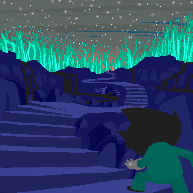
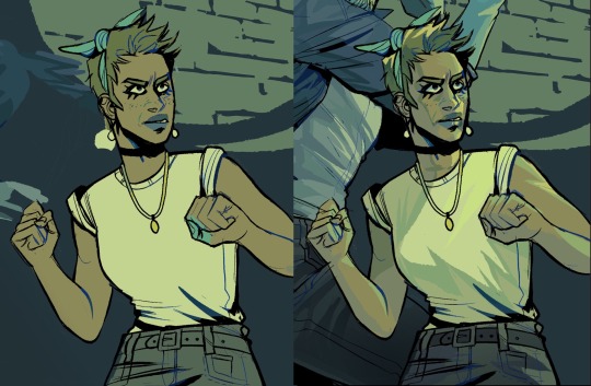
#then i freehanded the rendering and the background
Explore tagged Tumblr posts
Visit Tumblr Blog
Explore Tumblr blogs with no restrictions, modern design and the best experience.
Last Seen Tumblr Blogs


Fun Fact
1,644 Tumblr posts in 1 second.
Text

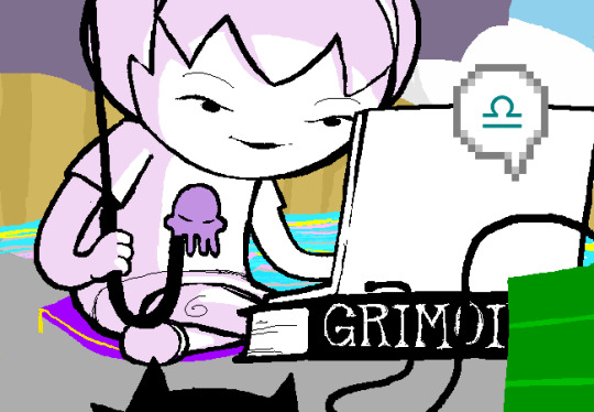
can i get a kiss? and can you make it last forever?
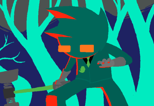
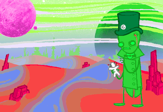
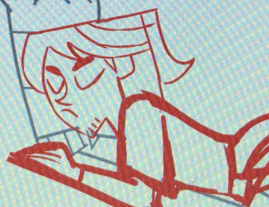
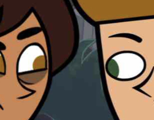
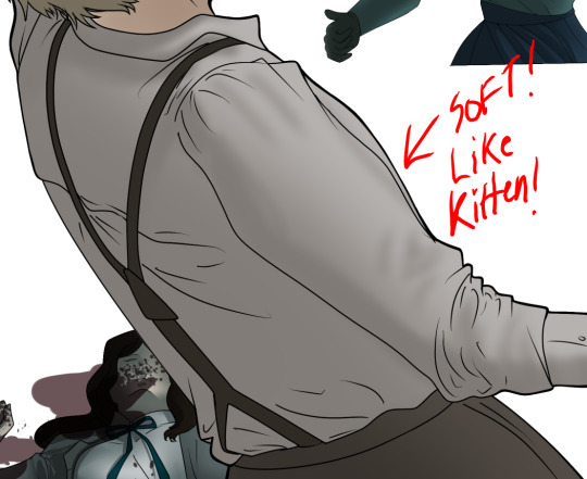
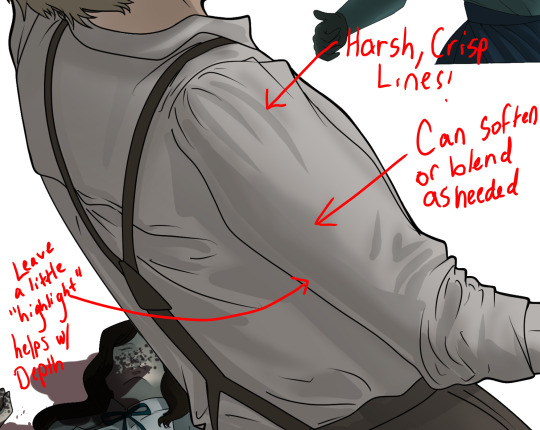
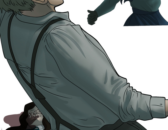
i got emotional listening to See You Again by tyler, the creator. i thought of how long mario and peach have been a part of each other’s lives, and so i wanted to paint one of their very first romantic moments. painting in the N64 style was TONS of fun!
#smb#mario#peach#mareach#no id#giddly’s art#rip to that one toad whose head i deleted out of this frame for the sake of giving them some privacy lmao#btw i initially did a simple trace over the screenshot in order to block out the shapes#then i freehanded the rendering and the background
269 notes
·
View notes
Note
How do you go about your backgrounds? Particularly interiors where believable looking perspective makes or breaks the scene.. Do you use vanishing points or is it something you just intuitively build around the character?
I will often just freehand it, starting with the character and then building a scene around them, but for more complex or rendered pieces I do make use of perspective tools. If you use Clip Studio, I highly recommend downloading the TOPGYN(The Only Perspective Grid You Need) assets, I've been using it a lot recently and it's very useful.
I'll use this recent commission as an example to show my process. I usually start with just freehanding perspective when I'm sketching. I don't like worrying too much about being 100% accurate with the perspective at the start, I just wanna be able to feel out the image I have in my head, then I can worry about accuracy later.
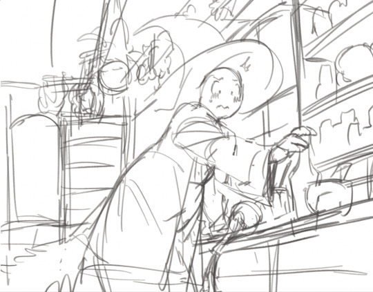
Depending on how rough I am with the initial sketch, the perspective probably gonna be at least a little off in terms of accuracy or "believability". So I'll set up TOPGYN and focus on setting up the background as close to the initial sketch's perspective as possible
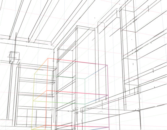
And once I have all of the rough shapes blocked out, I just use this as a guide to draw everything else back into the scene.
I don't really use the perspective tools for any of the details at this point, it's just too much hassle to block out the perspective for ever little object in a scene so I just do my best to eyeball it from there. And from that point I just paint it, that's basically my whole process for setting up backgrounds and perspective! I don't know how novel any of this info about my workflow is but I hope it's at least somewhat useful ^_^;;
962 notes
·
View notes
Note
How do you go about drawing your backgrounds? Do you have a 3D model for common scenes, or references so you know what goes where?
It depends on the complexity. Simple, one-off stuff I either freehand or make using a perspective ruler (the ruler mostly to lay down the foundation).
Scenes that I plan to reuse or ones with very intricate details or composition, I'll do using a 3D model that I build in Blender. When I do that, I try to not build everything in 3D or make everything perfect, so that there's enough freedom for me to draw. I also avoid using 3D rendered lighting cause it quickly begins looking artificial.
I always use references. A shit ton of them.
Here are some example timelapses (don't ask me why every video is embedded differently lol)
1. Free handing (with perspective ruler base)
2. Free handing (using 3D model for some parts)
3. Tracing lines of 3D base, then painting the rest
youtube
Hope this helps!
153 notes
·
View notes
Text
Evolution of Homestuck’s Art Style, Pages 1-1550

[page 1, 1434]
Since Act 4 began, I’ve been blown away by the visual difference between this and the earlier comic – there’s been a big shift in style, and huge increase in the use of color. So, re-reading and just looking at the art style, here’s an overview of the changes so far.
[a short one – 2.8k words below the cut + some very beautiful panels. I was limited to 30 images in a post, so would recommend looking up page references for the ones tumblr wouldn't let me include <3]

[page 4, 16]
Act 1 mostly uses sprite art and clean, tidy images; the white background is the dominant color in most panels. Where John is drawn freehand, he’s drawn as close to his sprite as possible, with a thick black outline and blocky shapes. This is often done to give him a more complex pose or facial expression than a sprite would allow (for example, p.16). John’s house is relatively tidy, filled with discrete items that it’s easy to move around and manipulate to create new panels – these are mostly either imported photographs rendered in black and white, or line drawings similar to John’s sprite. Occasional items are drawn in color – some due to their importance (Sburb logos) but some due more to common sense (blood capsules).
John’s captchalogue and strife systems are colored overlays on panels that are still mostly black and white. Full color panels show up when John (or Rose) uses a computer, showing their desktop background, or when John looks or goes outside and observes his neighborhood. Here, his near monochrome, thick-lined sprite stands out against the lineless background (the car and mailbox help soften this for now).

[page 195, 246]
Over the next few acts, Homestuck will develop an art style typified by its lack of outlines and straights, abundance of curves and swirls, use of patterned blocks of solid color to create light and depth effects, and emphasis on motion. Act 1 has the earliest steps towards this – my favorite is page 195, where John looks through his telescope and sees the meteor heading towards him. These styles of sky, clouds, wind, and small animated elements that don’t dominate the panel are all still common techniques in Act 4. The final shot of the meteor cloud in the End of Act 1 flash animation (p.246) – which is almost entirely full color outdoors shots – is another great example.
Act 1 is definitely not dull or colorless, and there's a real charm to its style, but it is overall functional. Panels are designed to give information, show the results of commands, and communicate a change of state from the previous panel – it’s unlikely someone would look at them just for aesthetic value. Act 1 has the closest to an ‘adventure game’ look, as lots of John’s items look like they should be clicked on for more information, and rooms are often rendered in an isometric style. In a narrative comic, this also makes John feel boxed in and stifled by the imposing walls and lack of color. His world is stark, monotonous, and cut-and-paste, somewhere he has been placed instead of somewhere he naturally belongs.


[page 312, 363]
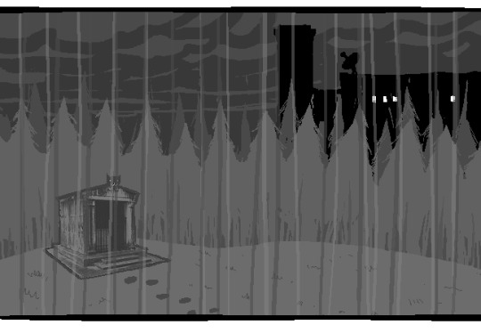
Act 2 stays primarily monochrome, but panels are busier on average. Dave’s room (p.312) has so much going on in comparison to John’s (p.4) that in a video game, it’d be hard to know what to click on first. John’s room has become much busier now that it’s been looted and smeared by imps, which makes it harder to keep the art consistent between different panels and angles. Like John and Rose, Dave’s computer, house exterior, and inventory systems are shown in color. Dave’s living room is monochrome but has a fair amount of color through his brothers’ puppets, while John’s now has imps in harlequin outfits, build grist, and Nannasprite.
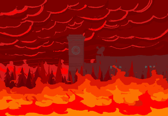
Rose is unique among the kids for never being placed on a white background. When she’s first introduced, her room is shown in pale gray to indicate that it’s getting dark in her house. This color is unobtrusive, close to white, and doesn’t feel like it makes the panels more complex. As a wildfire creeps closer, the sky around Rose tints red – a slight burgundy on page 398, and a more dangerous wine red on page 985. The mausoleum is also gray, with a soft lineless background unlike other indoor spaces. Rose is the first beta kid to leave her house entirely and go to a secondary location, heading down to the Skaianet Laboratory on page 840 – a much more visually complex area in which she’s shown against a green background until she goes back to the fire. If there’s any examples of her in a white space, I missed them!

[page 444, 665]
The kids are still drawn close to their sprite style, with occasional variation. Dave’s sprite is shaded in red and yellow on page 444 to represent the ‘sick heat’ he’s trapped in, and he’s shown in red silhouette as he steps onto the roof on page 665. In ‘WV: Ascend’ (p.757), every frame is full color and more detailed than most previous panels, and the kids’ and guardians’ sprites stand out as the only cut and pasted element. The landscapes are changing faster than the characters, which creates a feeling of unfamiliarity and their struggle to keep up with their new circumstances.

[page 248, 558]
The Wayward Vagabond’s panels immediately look different from the kids’. Page 248 is easily the most complex still image up to that point, with the greatest color diversity (four shades in the sky, one in the city, and I think as many as eight in the sand). It’s very different from the blocky blue sky at John’s house. WV has a sprite too, but his is full color, meaning that when he’s drawn freehand he’s drawn without an outline. This makes him feel ‘part’ of the background instead of pasted on top of it, merged with his landscape while the kids are at odds with theirs. The 100-page Wayward Vagabond point of view section is the first extended sequence of full color panels, but by this point they’ve shown up enough that it doesn’t feel jarring.
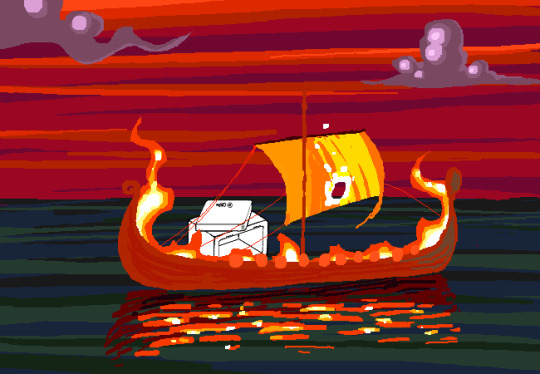
Act 2 has the first panel where the art itself blows me away. Page 558, with its fiery boat sailing into the sunset, goes harder than any panel that’s come before it entirely in service of the Vaulthalla pun.


[page 760, 840]
Act 3 introduces Jade in the typical sprite style and monochrome interior, but she appears in her windowed garden atrium, so at least half of her first panel is in full color. The exterior of her house is more colorful and prominent than any kid before her, with various colors of clouds and plants; the same is true of her computer, which surrounds her in three-dimensional spinning colors instead of being a two-dimensional screen. Jade’s room is the biggest and messiest yet, as in just two acts the comic is already feeling limited by its ‘character stuck in a room’ format.
[page 225, 986]
This act shows the art style in transition, with even more color and complexity introduced into what are technically indoor panels of the kids, and more excuses found to draw in the softer, lineless style. On page 840, the tunnel Rose walks through is sketched like a sky, when an act earlier it might have been made of simpler, blockier shapes. Page 986 shows a very similar view to page 225, and the new version isn't necessarily more complex but it is more Homestuck, with increased texture and definition in the clouds and a fire moving through layered lines of color.
Just like in Act 2, ‘Years in the future…’ pages lead the charge with the changing art style. Pages 924, 1005 and 1035 provide lush post-apocalyptic landscapes with a beauty that isn’t seen on present-day Earth – even Jade’s island on page 1080, clearly designed to be visually interesting, doesn’t have quite the liveliness and definition of the post-apocalyptic pages (in my opinion).


[page 1051, 1147]
Act 3 also introduces the aesthetic vertical page. Previously, vertical pages are used occasionally for their aspect ratio, showing a book or the entirety of John’s house. Page 1051’s art isn’t giving information or showing a changed state, but stands out as an impressive visual and a pause for breath in between panels that do give information. Page 1147 is similar, and I believe it’s also the first time a beta kid is drawn in the lineless style (with detail to their form, not just a silhouette). This page comes right before the end of act flash, showing the final form the art has now achieved.

[page
Besides the monochrome sprite art associated with the kids’ houses and the lineless style associated with the outdoors, Act 3 introduces a couple more styles. One is the scribble style, first introduced with WV’s Can Town fantasies and murals, and then scattered throughout Jade and the exiles’ scenes in Act 3. Some panels in this style are explicitly intended to be drawn or imagined by an in-universe character, while other times they represent a strong emotion or sudden interruption.
The other new style is the color-adjusted jpeg, seen in Prospit (p.1029) and the dark kingdom (p.886), where the background is composed of externally-sourced images that have been manipulated and recolored. The over-saturation of a single color makes the location recognizable without need for its own distinctive art style – Prospit is entirely gold or yellow, the dark kingdom is entirely purple, and the Felt’s mansion is entirely green.

[page 1236, 1337]
The Intermission is made almost exclusively in this style, which adds a lot of detail to backgrounds while sacrificing some distinctiveness. While sprite art is used, the sprites themselves are entirely black or green, so they complement their environment the same way John complements his Act 1 house. By using images of a mansion’s interior as panel backgrounds, the Intermission is arguably more ‘realistic-looking’ than the representational art and medieval castles of the Acts, which ties into its grittier and more grounded tone.
With its goal of a fast production pace in advance of a more complex Act 4, there aren’t many artistic standout pages in the Intermission. A rare exception are the pre-city wasteland panels, such as page 1236, which blend the jpeg technique (for the stars and planets) with a lineless alien landscape of pleasantly rolling dunes. Pages 1188 and 1337 also blend these styles, but this is the extent of the lineless panels until Slick enters the safe.
[page 1358, 1407]
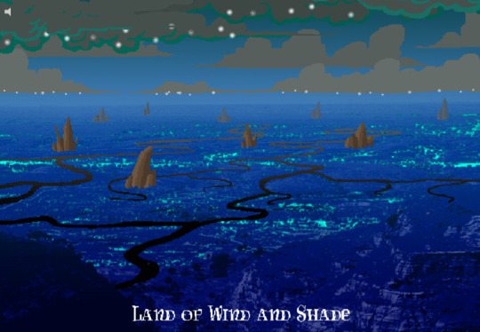
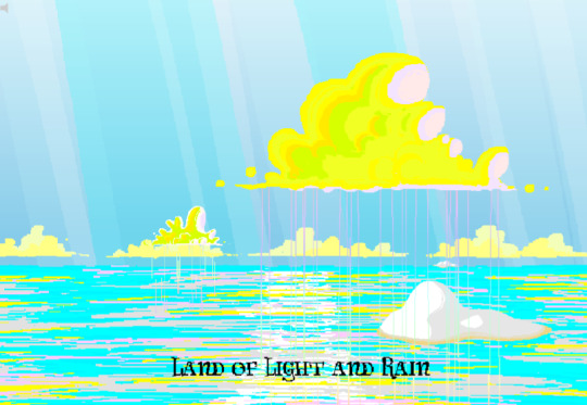
Act 4 introduces the Land of Wind and Shade (LOWAS) and the Land of Light and Rain (LOLAR), two planets with distinct designs in the lineless style where John and Rose’s scenes now exclusively take place. Both are stunning – LOWAS is mostly dark blue with gray clouds, and a focus on bioluminescence through its mushrooms and fireflies, while LOLAR is mostly white landmasses amid a sea of pastel blue, pink and yellow. Since Act 1, Homestuck has taken care to set its animated pages primarily outside the kids’ houses, with the notable exception of page 253’s walkaround. This is likely because color makes flash pages more interesting to watch and easier to interpret – but character or plot developments have still been the focus. Page 1407, which introduces LOLAR, is the first flash with a primarily aesthetic function.

[page 1446, 1457]
In Act 4, panels that might have been standouts in previous acts are now commonplace, such as John answering messages on page 1391-2. Use of brown and yellow keeps the exiles’ pages visually distinct from John and Rose’s, but they’re no longer a clear upgrade. This helps the comic skip back and forth between John, Rose and the exiles without a narrative transition, as the art change is less jarring. Pages that take place in Dave’s monochrome room are now the outliers, while Rose and John’s sprites (and Dad’s car) really feel like relics of previous acts. Even with John’s new full-color suit and Rose’s land including a lot of white, their stark lines and lack of shading don’t merge well with their landscapes and always become the focal point when these sprites are used.
As such, there’s more examples of John and Rose in a lineless style, which feels long overdue and catches them up with changes that have already happened. Fully lineless panels tend to be very well composed with clear artistic intent; easy to interpret and pleasing to look at. They often represent movement even when not animated, so work well for transitioning to or away from a character. Sprite panels, on the other hand, have much lazier composition. Messes don’t get cleaned up, and panels show irrelevant objects often half-inside the panel and half-outside, so even when they’re communicating clearly they’re often less pleasant to look at – I find this true of AR’s introduction in Act 3 (p.1100-1111) and all the Dave and Jade scenes in Act 4. Page 1446, for example, features the first prototyping of Dave’s sprite, but it’s hard to focus on the crow-sword’s move through the room with so much else in the way (in contrast with page 185, where the harlequin doll is clearly in focus for its prototyping).


[page 39, 1523]
As a final comparison to illustrate this change, let’s look at page 39 side by side with page 1523. In both cases, a character is typing in Pesterchum. The reader has already seen the kid’s location and nearby possessions, so the images do nothing more than illustrate that the character is on their computer, while the meat of the page is in the Pesterlog.
On page 39, this is situated between two John panels where he takes different actions (assigns Hammerkind and captchalogues a book), so page 39’s image feels necessary to the sequence. On page 1523, this is immediately followed up by another image of Rose, still on her computer, and one that feels far more dynamic. Rose gets a facial expression and sitting position that give her some character, the close-up shot feels intimate for an important conversation, and the background is still present through the ocean behind Rose and the shading from her umbrella. So while there’s nothing wrong with page 1523 (which does successfully re-establish Rose after some pages away from her) or with the sprite style in general, the upgrades to other areas of the art do make the sprite pages feel weaker by comparison.
[page 1524]
Whether intended or otherwise, the kids’ houses being the only monochrome, heavily outlined spaces while all other locations are full color and mostly lineless, is really evocative of the comic’s title. The first full-color panel is John’s desktop on page 24 featuring the Slimer background he made himself, and later his computer becomes a gateway to the Medium where he can access a whole world of color designed just for him. In contrast to being ‘stuck’ in defined dimensions and copied images, the kids are entering a world of beauty, motion and art for its own sake. The exiles’ panels introducing the lineless style and the kids’ following reflects the exiles guiding the kids into the Medium and towards their eventual quests. LOWAS and LOLAR’s fantastical designs add a sense of magic to the story, bringing it away from games and technology and towards more esoteric, unknowable forces. Their unique designs compared to the kids’ similar-styled houses recalls Rose and gallowsCalibrator’s mentions of Sburb’s ‘flexible mythological framework’ (p.440) or ‘HYP3R FL3XIBL3 MYTHOLOGY’ (p.1524), which apparently extends to the level of art style.
Personally, I think the swirling, lineless art style Homestuck has developed is very pretty, but does take away the ‘point and click game’ feeling of Act 1. It’s interesting that the art style develops alongside the reader-command format – Act 1 is almost entirely reader commands, while Acts 2 and 3 mix reader commands with author-driven exile commands and ==> pages, and Act 4 has already seen the reader suggestion boxes close for good. I think the question of ‘is Homestuck a game?’ is still relevant, but needs a different answer in Act 4 compared to Act 1. The level design of LOWAS, LOLAR, Prospit and the dark kingdom is excellent, but they’re for running around and fighting, not standing still and clicking. The genre has changed, and the characters’ roles in the game are being reconfigured alongside the players’ and narrators’ roles.
So, how will Homestuck’s art develop from here? My guess is that there will be a decrease in GIFs and an increase in still images, as the new style is likely harder to animate and better at conveying motion without animation. Act 4 is setting up to bring Dave and Jade into the Medium as quickly as possible, at which point there will be five planets (including post-apocalyptic Earth) each with their own distinctive designs. Once this happens, there will be no need for scenes inside the kids’ houses, and the comic will be able to eliminate the kids’ sprites altogether (or at least re-design them with more color and fewer stark lines, more similar to the trolls’, exiles’ or Felt members’ sprites). Dave and Jade’s sprites being prototyped may further affect the Medium, perhaps affecting the light and dark kingdoms as planets as well as just their agents. Finally, I think there will be a focus on how the kids’ actions physically change the landscape of their planets, as this has already been the case with their modifications to their houses.
[page 1395]
#homestuck#analysis#i like to look at it! it's a beautiful comic there's a whole bunch of panels id get framed for my wall#if i had money or a house!#act 3 also doesn't have a super defined identity so thinking abt it as a transitional act for the art is cool to me#also wish id thought a lil more abt facial expressions and emotions and how they are represented in sprites#but im trying to keep posts short and simple and not let them get away from me. so. i will stop here <3#chrono
22 notes
·
View notes
Note
Your art is so incredible. especially your aftg art—they are filled with so much beauty and so much soul. I adore your messy rendering style and your freehand lines. I hope you don't mind but I have the jeanneilkevin trio art as my home screen and I love staring at it for minutes on end. you capture them so perfectly and so beautifully, and your art style is so unique and so ziegenkind094. that beautiful balance between mute tones and vibrant, that little pop of color in the hair and wherever else... the absolute life in your art as you draw people so naturally.
I like to interpret the trio art as Neil being out in the white as he has accepted his fate and moves towards a better future, even with all its shortcomings. Kevin sits by similarly, but a small amount of darkness lingers, because the trauma will be difficult to stop remembering. Jean sits in a darkness that seems to be fading, showing his difficult past and the memories he thinks he can never forget. but he turns towards them, secretly hoping to be like them, free despite trapped. a spark of jealousy that he hates himself for, deems himself undeserving of such a luxurious yet horrible emotion. how his forever partner glances at him, and he sees the what ifs.
I'm not sure if you meant anything by the background choices, but regardless you did something 🌸🌸 forever my favourite ziegenkind094 art, amongst many others.
it's so embarrassing how much I'm gushing over you and your art so I'm going to go as anon. I hope your days are filled with endless joy and peace. I hope you'll forever find happiness in the art you create, and I hope you'll forever give us the honour of seeing it in all its glory.
Thank you so, so much for taking the time out of your day to send this lovely message, dear anon. I kept it in my inbox for a while and read it many times, especially when I needed a pick-me-up. It means the world to me. ❤️ And I'm so happy that someone realized the symbolism in this drawing! I usually don't pay a lot of attention to such things, but this time I did and it's great when people notice. 🙆♀️
16 notes
·
View notes
Text
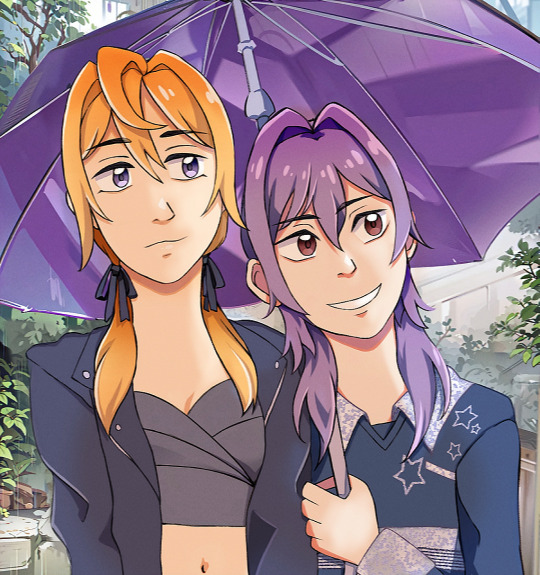
Now drummrollll... A drawing I colored MYSELF to the best I could! I kinda love how it turned out. Altho Mii-chan's face is a lil uncanny, but it's still cute, I think<<33
Well I have to admit I still had to use AI for the umbrella and background rendering (Yeah I'm physically unable, so see it as using assets/ I took a real scenery from google and slapped the filter on).
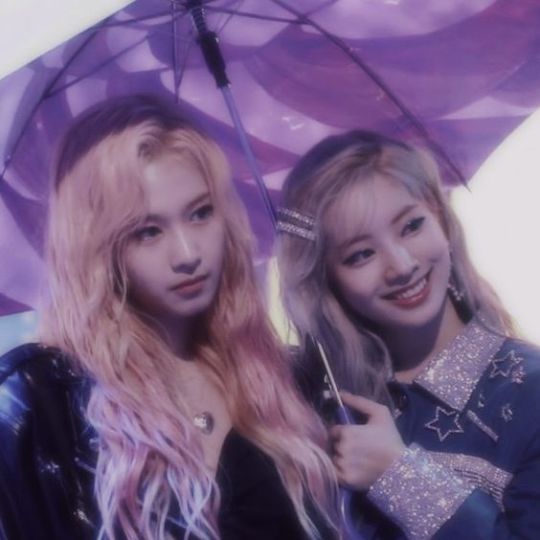
Sketch (I fixed a lot, this was freehand) + Reference

Shinoa x Mitsuba
8 notes
·
View notes
Note
how do you make your oc screencap edits?? i also have a td oc and i dont really know where to start 😭
ok so!!! i use firealpaca which is just my usual drawing program. so i'll keep using it as a reference for my steps but of course im sure whatever similar program u use should have similar features
i'll be long winded for funsies as usual 💕
FINDING YOUR SCREENSHOTS
the key to decent td edits is to flat out trace screenshots whenever possible. stock pics will do, but of course itll be a lot more fun and less obvious if u use a screenshot from the show and put it into your new context
in terms of making your ocs, you will likely have to do what someone once called "frankensteining" your pics. this is where you use pics of other characters for their specific features and put them together since your oc doesnt have official screenshots to trace. this also absolutely comes in handy w canon characters! maybe you have a pose but u need them to be sitting. so try to stitch together two different pics to get what u need
it will look very scary but just trust the process. here is a random example i made using a dawn screenshot (where i removed the background), gwens eyes and eyebrows, and kittys hair

the sketching part is semi-optional. if you think you can freehand the lineart then go ahead but i assume your oc wont be a complete copy of something found in canon and therefore you will have to draw the newer/different features (such as the hair or the outfit) at least a little bit. and sometimes when i frankenstein the pics, my brain gets all overwhelmed so sketching makes me feel better jfbdjdnd
(in terms of my own oc, i screwed myself over bc his body type is so unique i gotta freehand it like all the time 😭
you can see i traced his head from his render (ALWAYS DO THIS BTW!!! TRACE CONSTANTLY), but then the body was freehanded using a canon pic as reference because tracing the pic wouldve been inaccurate)
THE LINEART
yes the iconic td thick, sharp, flat lineart. i achieve this by using a normal pen tool, turning off the pen pressure, and then turning up my pen stability to 40-60 (very high). you could use a curve tool if that works for you! but i would suggest against that for ALL of it bc the tool just wont respond well to rly drastic curves and such
the pen size varies on the pic. if the characters are close-up, itll likely be a bigger one. and then the characters' little details and facial features are usually a slightly but definitely noticeable smaller size. for the most part, ive had the bigger pen size at 13 while the details are around 9. or big size 10 and smaller size 7.
heres my technique:
as u can see, all of my lines go a bit too far. this is so that when im done drawing them, i can go back in and slowly erase where they meet and get them all sharp and pointy. this is just how i personally do it lmao. when it comes to facial features and other stuff that doesnt connect to anything, just get a close look at your reference to see how thick or how thin the edges get and do ur best to erase the edges to the point where they should be
THE COLORING
not much to it! the bucket tool is the best way to go. again just get a good look at your references just in case any parts have the lineart also colored in
THE BACKGROUND
you can find some generic td background pics on google or u could get them from the show and try to erase any character in the way lmao. if ur recreating something like, say, a dunc/ney scene w a different ship, then its very tedious but youll have to do your best to erase the canon characters and piece the background back together.
i like using the smudge tool a lot for this!!! just kinda pulling whats already there towards the characters. to save time, put your drawing visible on a top layer as you do this so that you dont have to edit the ENTIRE background, just what you need
THE RENDERING
ok so heres a big one imo. after youre done, youre gonna have to fuck up the quality at least a little. well not that u HAVE to but like..... to match the standard quality of a td screenshot? ive never seen a td screenshot in perfect hd quality outside of stock art. so u could blur ur drawing just a little bit. maybe add in the teeniest bit of chromatic aberration (just set it to 1 or -1). not ALL of them together but u do whatever u gotta do
my personal favorite is blurring just a little and then saving it as a jpeg (around 65-80%) so that its pretty crunchy and looks all the more real
obviously not a NECESSARY step but just something to point out. especially if ur background isnt the best quality so the characters have to match it
this one from yesterday i didnt even redraw topher bc i was lazy and he looks fine enough. i just put danny onto the pic to cover the other character. so i blurred danny a little bit and then saved it in a pretty low quality so that they match one another. look at those pixels. that crunch.
SO THE TLDR IS just trace and copy your references as close as possible. if you cant find a reference for your character, try finding another character w something close enough
28 notes
·
View notes
Note
Your process videos really ruined your art for me. I like your concepts but you're just painting over photographs and it's... weird. You don't seem to change anything to be uniquely 'yours'... just painting over photomanips which doesn't come across as genuine, especially considering the contrast between your photomanip illustrations and freehand work. Have you thought about working more on references and actual studies?
been thinking about how to answer this for a couple minutes now so here we go
What I do is a variation of photobashing-- really just painting over photos to achieve realism. After everything is rendered to how I want it (I usually take out a lot of extraneous details from backgrounds), I stop using the reference photos to do my own lighting, effects, etc. Small details to create the ambience that the base photos don't have.
I definitely get what you're saying here because I've seen other realism artists get variations of this same ask. My particular paintings rely on this uncanny realism that I can't reproduce as effectively when I eyeball things (especially perspective). The "weird" is part of it. I could just do a photomanip but instead I meticulously painted over every detail instead--what does this add? What does it take away? Do my hours of effort mean anything when I'm just "painting over photographs"?
Anyways, when I do traditional art, everything is drawn by eyeballing. I do lots of studies digitally and traditionally.
#piratedllama art#ask#critique#anon what about the process doesn't feel genuine? i am curious about this#sorry for the long response lol the Art Student™ came out of me#yall remember when euclase got these asks all the time#i feel like a true tumblr artist now
29 notes
·
View notes
Text
this week's progress....

For bigger sprites, I really do have a better time freehanding spritework instead of trying to work off a base body sprite. I had the same realization back when making sprites for CotO, but yeah working from the exact same sprite bases is really... limiting for me lmao. It literally took me more time trying to get this sprite looking good in the confines of the sprite base than just drawing over it.
Anyway, I realized I MAY wanna run back Knight01's color palette in the sprites. It's a lot easier to make things out with Mage01's varied colors compared to Knight01's primarily white palette... I'm understanding why games sometimes have wildly different tones of color between the character's big rendered art and their small sprite art (beyond old consoles' color limit). Easier to see what's what without everything being a shade of white or accidentally blending in the background.
Ya realize something new every day that's tha beauty of life and all.
#progress post#knight01's srpg sprite is fine since those are small enough.#but the walk sprite had a lot of extra shading going on BECAUSE the similar shades of white kept blending w/ each other & the yellows#everything was too pale basically. lacked saturation. i wasn't expecting to be realizing so much this early in this whole asset thing.#but i welcome it 💃💃🕺💃🕺
1 note
·
View note
Text
Okay for the anon who asked about my process, i’m an idiot and accidentally deleted the ask so here we go.
I go about it a few different ways:


Sometimes I use myself as reference to set up my composition and poses, and ngl it looks super goofy but it works and I find it to be a lot faster than thumbnailing or sketching. Afterwards I do my lineart(no sketch). Then comes the part were in a separate layer I use the paint bucket tool to color the surrounding characters (the red part). I hide my line art layer and underneath the red layer I’ll fill in the blank space with another color (in this case light blue). I delete the red layer and now I have my characters colored, mostly. On a new layer on top of that I block in the colors that I might use and then use my light blue layer with locked transparency to fill in the gaps of color. I usually merge these two layers so I don’t have a step-by-step of this. After my base colors are done I will color in my line art.
I will still mess around with the colors some, once I get to a point where I like I’ll add texture or text if need be.

However, a lot of the times I will freehand my poses. My line art can be considered a very cleaned up sketch since I usually don’t sketch a base. I personally find that a lot of the drawings energy is lost when you sketch something and then line over it. If I do use a rough sketch I use a huge semi transparent brush so that I don’t get any details in and risk losing that energy in the process. Its more like creating a rough silhouette.
For shading, once I have my color palette roughly picked out in my head I just blob it in and then “sharpen” it
Backgrounds are a whole different beast and most times I would just say fuck it and freehand it in (left). A few times though I’ll actually try, like on the right I used Adobe illustrator’s 3-D space to create some buildings.
Here’s a speedpaint of something I fully rendered (x)
My process changes around a lot, but this is roughly how it goes most of the time!
#this is my third time attempting to make this post why does technology hate me#anyways never be afraid of using references I have so many goofy looking pictures of me on my iPad for reference#I pray none of my friends ever look into it#art process#my art#good luck!#I hope some of this made sense
282 notes
·
View notes
Text
Drawpile 2.1 architecture overview
Recently, I dusted off the old "Rustpile" branch (my attempt to integrate my experimental Rust based reimplementation of the paint engine to Drawpile itself) and, to my pleasant surprise, discovered it was in a much better shape than I remembered. So, I've been reading through Drawpile's code and drawing a diagram of its overall architecture to get a better idea what it would take to complete the integration.
Here are my notes on the current state of Drawpile's architecture. If it seems unnecessarily complex, that's because it is. There are vestigial structures that no longer make sense and are streamlined away in the Rustpile version. But more on that in the future, here is the present:
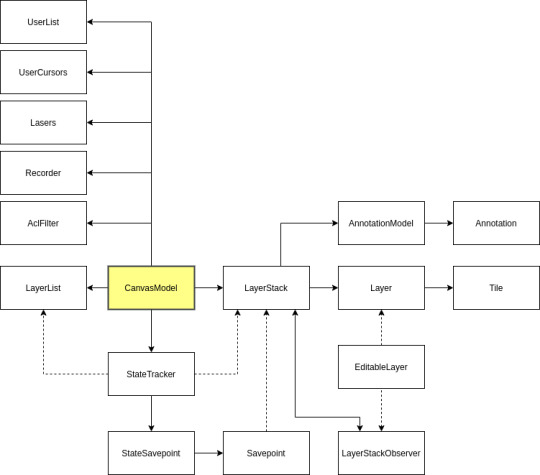
The CanvasModel class that contains the state of the canvas, including the layer stack itself, as well as associated models needed by the GUI.
The StateTracker handles drawing commands and applies them to the layer stack. A big change in version 2.1 was that brush state is now entirely local, what is sent over the wire is a list of precomputed dabs. This made the protocol much less stateful, meaning the only thing the state tracker needs to keep track of anymore is the undo history. The Rustpile equivalent is called "CanvasState".
LayerList is a Qt list model. It is used by the layer list GUI widget. Its content is kept in sync with the actual layers in the layerstack.
LayerStack contains the actual layers, as well as other things related to the actual canvas content: the background tile and the annotations.
Layer contains tiles which contain the actual pixel data. Layers are sparse: fully transparent tiles can be presented by null pointers. This is an important optimization, as when multiple layers are used, most layers tend to be mostly transparent. Layers and tiles utilize copy-on-write, which makes copying layers very efficient. This is essential for the undo functionality, that relies on snapshots of the canvas state.
AnnotationModel is a Qt model that contains all the annotations. Annotations work much like text layers, but are not true layers: their stacking order is undefined, there are no guarantees that they render the same on all clients and they are always drawn on top of the canvas. This is a Qt model so that it can be easily accessed via QML (which is not yet implemented, so there is presently no need for this to be a Qt model.)
LayerStack Savepoint is a snapshot of the LayerStack's content. A savepoint can be created from a LayerStack and can then be used to revert the LayerStack to that point. This is unnecessarily complex. In the Rustpile implementation, whole LayerStack instances can be copied cheaply and lack interior mutability thus have no need for savepoints.
A LayerStackObserver is registered with a LayerStack to be notified of changes. An EditableLayer is created to wrap a Layer and add editing functions to it. It notifies the observers of the owning LayerStack when changes are made. In the Rustpile implementation, there is no EditableLayer wrapper, as layers cannot be mutated in place. Instead, all editing operations return an area of effect object that describes the affected area. These can be merged together and dispatched to observers when the LayerStack is updated.
A layerstack can have multiple observers, but in practice just one is enough. A specialized observer class instance that caches the flattened canvas as a QPixmap is shared by all GUI widgets (the canvas view and the navigator.)
The AclFilter stores the state of the access control list used to filter incoming messages. When a message is received, it's first passed to the AclFilter, which either accepts or rejects it. Certain messages affect the ACL itself (e.g. those setting layer lock bits.)
When a Recorder instance exists, it writes a copy of each received message into a recording file that can be later played back. When playing back a recording, ACL filtering is not necessary, since rejected messages were not saved. (For debugging purposes, rejected messages can be stored but marked as such, so they are ignored during playback.)
The Lasers, UserCursors and UserList models store the state of laser pointer lines, the positions of each users cursors and the list of logged in users, respectively. They are Qt models used by the GUI widgets. (Lasers and UserCursors are Qt models only for use in QML, which isn't presently done.)
Additionally, not visible in the diagram, is that the state tracker and the layer stack are referenced in various places:
In the layer list dock, the layerstack's censored bit is checked
The layer stack's view mode is set by an action in the main window
The layerstack is used by the flipbook window
The built-in thick server uses the layer stack, state tracker and ACL filter
The reset dialog needs access to the state trackers savepoints
The canvas view item and navigator reference the cached pixmap layer stack observer
The canvas scene references the annotation, laser and user cursor models
The canvas view widget needs to know the size of the canvas
The annotation editor references the annotation model
The canvas saver runnable needs a copy of the layer stack
The document class references the state tracker and the layerstack
The playback controller uses the state tracker
The annotation tool uses the annotation model
The bezier tool creates preview sublayers
The floodfill tool needs read-only access to the layer stack
Freehand tool needs read-only access to sample colors
The selection tool copies pixel data and creates temporary eraser sublayers
One big problem with the present architecture is that when the paint engine is heavily loaded (for example, when logging into a session and downloading the session history,) it blocks the main thread which leads to the GUI locking up and even disconnects as network traffic isn't being processed.
The solution to this would be to run the paint engine in a separate thread. However, this has proven challenge. From the list above, one can see that the layer stack is referenced in many places. The current workaround is to periodically relinquish control back to the eventloop when paint command execution is taking too long. However, the Rustpile work is an opportunity to fix the architecture to be more multithread compatible. Since in Rustpile, LayerStacks are easily copied, one can be kept around in the main thread for read-only access while a new version is being processed in the paint engine thread. More on this later...
5 notes
·
View notes
Text
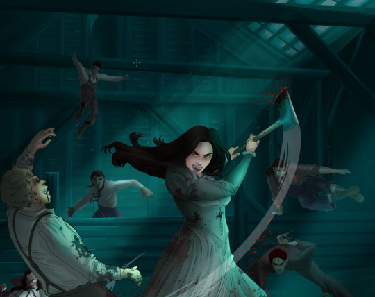
How I Digitally Paint like a Scenic Artist/Designer
Aka: how I did this and put my degree to good use.
LONG POST WARNING
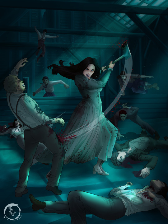
Step 1: Research.
First off, get to your image search. If you are going to be using Google, you may want to type “-pinterest” in the search to eliminate the countless boards.
I had to figure out clothing that is vaguely late 1800s. I found a multitude of reference images that were fancier clothes- but I wanted to find images of clothing for kindred across all social classes. Photographs from the era and paintings are your friend. They will more accurately showcase what was worn.
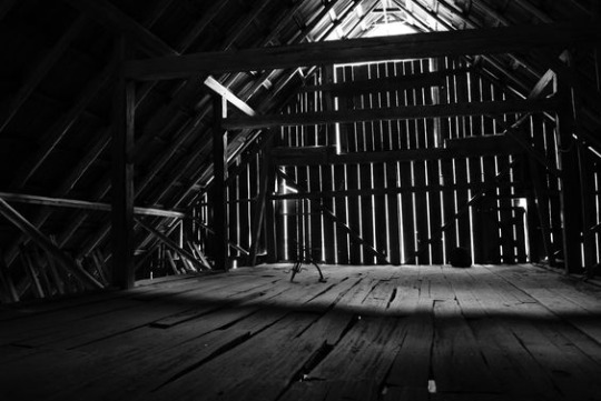
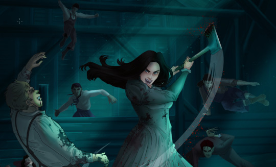
After Fashion research comes location research. The 1890s in America is known for the rapid industrialization. Factories were getting bigger and work days were getting longer. But, I wanted the moonlight to be cascading into the place, illuminating the scene. This means I needed to find a structure that had skylights or let sunlight in. And the best images I found? Slaughterhouses. Fitting, huh?
The same rule for fashion still stands- if you can find photographs or paintings from the era- they’re better. There are tons of places still standing today from the 1800s. But today, they look WAY different. Ya know, Abandoned! So just be sure to take this into consideration if you search “abandoned slaughterhouses” or go trespassing like I did.
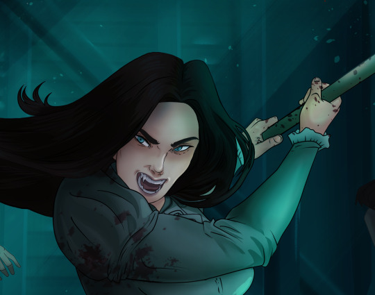
Lastly, pose research. Finding the poses for a fight scene can be tedious. So, I enlisted some help from a few fight choreographers and stunt men. You can record their fights and play them back at quarter or half speed. You can also get a mirror and flop on the floor a bunch. I did both. This lets you see the action/motion lines you are going to replicate in the drawing. Heres how we initially did fina’s pose:
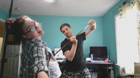

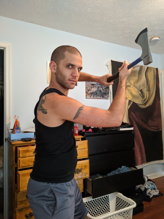
And sometimes you have to go back and get a clean shot. I ended up using this pose for the axe.
Step 2: Set up and Background!
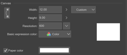
When you open a new file, set it to the dimensions and resolution you want. I was working at 600. Usually, I’m working at 300-350. You can always reduce resolution. Its hard to prevent fuzzy lines if you increase it later.
I cannot stress the following enough:
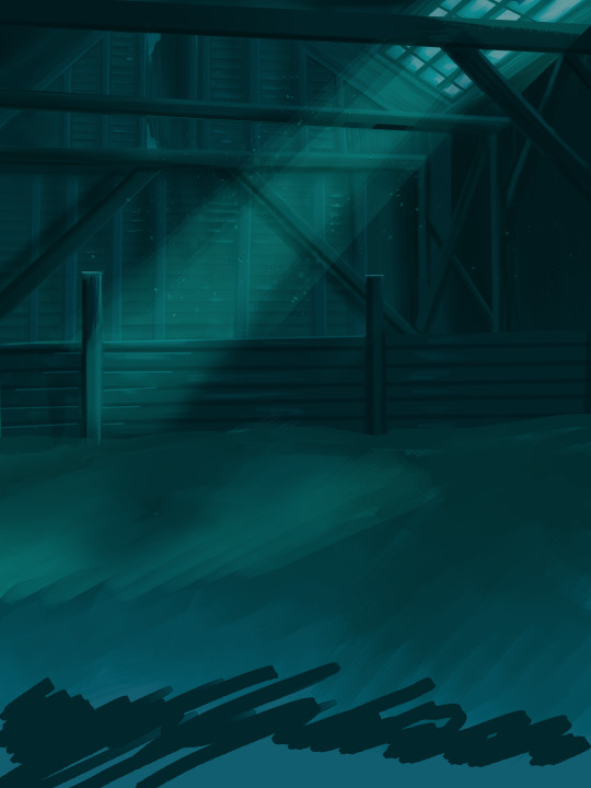
You work background to foreground. Big Shapes and areas to little shapes. Work your way forward. What this means is you need to fill in as much space as possible first. Then build your details. I prefer working as follows: Big Solid tones, Soft shadows, Dark Shadows, Highlights, then final blend. Once you finish this, put an overlay on top. This knocks everything back and helps create the illusion of depth. See this at work with the video below or here
Step 3: Figure Drawings + Composition
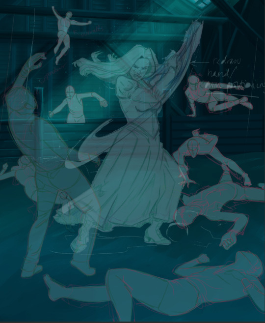
Utilize that research and images you collected to pose your characters. I create subfolders for each set of figures. Organization is important here. This will help keep you on the right layer and prevent the eternal digital artist struggle of “Fuck that was on the wrong layer!”
Even after you move on to lineart and shading, Keep the sketch layer as a reference. You may need to see what youre original notes/ figures looked like as you do the lineart and shade. Don’t be afraid to move them around and alter the composition rn. You want to be able to make changes. Make notes! Detail light sources!
I’m about to through out some art jargon:
You want to think about asymmetric balance. The easiest way to achieve this in an eye-pleasing manner is to use the Fibonacci spiral. Yeah. This boi:

Place your figures and actions in a similar sequence to the spiral and the viewer’s eye tends to naturally follow it. This is sometimes called the Golden Ratio in the art world.
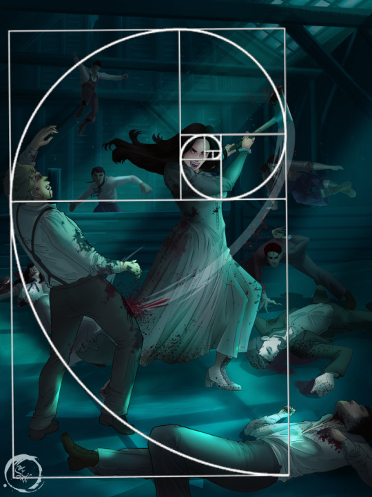
Doesn’t need to be perfectly on the spiral. You can break it- but its an excellent tool to plan how things move in the piece.
Step 4: Lineart
Once you got things sketched- its time to do the lineart. I’m using clip studio paint’s standard brushes. Nothing fancy. I often switch between the G-pen and the For Effect Liner. Mapping and Turnip are for thicker lines.

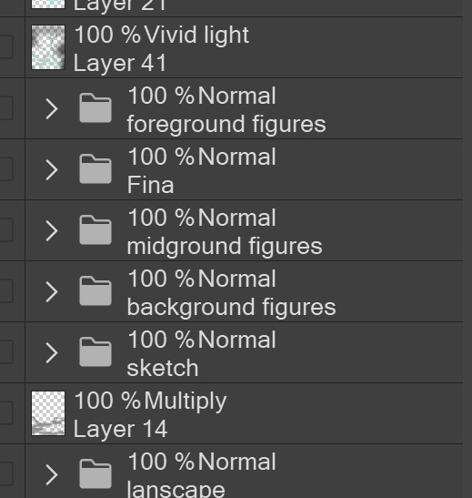
Usually I set these pens to a specific thickness depending on where I’m drawing.
My background figures are lined at 0.05 thickness, the midground is .1 to .2, Fina is .3 and the foreground is .4. I set my stabilization high to help keep my lines smooth. Stabilization 100 means there’s a significant delay between where the pen is and the cursor. I like the stabilization to be at 20 for freehanding and at 50 ish for outlining. Dont become completely reliant on the stabilization though. Good and smooth lineart is drawn from the arm not the wrist. Your range of motion is severely limited if you only move your wrist. Practice moving from your elbow and you’ll be surprised how much smoother your lines get.

Once I finish lining the figures, I usually go around it with an outline. This does three things:
1. Solidifies the figure and cleans lineart for paint bucket tool. More on that in the next step.
2. Its a stylistic choice. Helps give it that comic book feel with a heavy outline.
3. Pushes figures forward or back in the composition. Thicker outline helps denote that a figure is farther forward than another. My background figures have no outline to push them away
Step 5: Digitally coloring
For each figure you are going to select outside the lineart.
Create a new layer under the lineart
Invert the selection. Paint bucket. You should now have a solid shape of the figure under the lineart. Do not deselect.
Create a new layer above the one color. Title it solid colors. Paint in thick, solid tones. I like to use the mapping pen and turnip pen to color in my solid tones: skin, clothing, hair, etc.
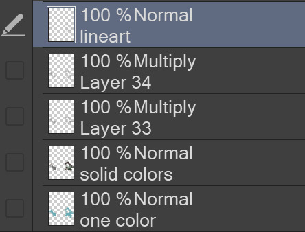
After that, deselect. Create a multiply layer if you can. If your program does not have a multiplier function, Pick a tone you want to use for shadows and lower the opacity (usually 30-40% I like to use lavenders or blue tones). It will not be as vibrant, but you can edit it in post. Select off of the solid colors layer. I like to start with skin tones. Use the airbrush tool to create soft shadows. You don’t want to create harsh lines on this layer.
Then repeat this process with harsh lines.
Then knock it all back with an overlay. If you dont have the ability to create an overlay, you can again drop a solid color and lower the opacity, but you’ll have to mess with the color balance/ brightness/contrast to let all the hard work come through.
You’re going to repeat this for every single figure. Here’s a few color theory tips though.
Your overlay colors should be darker (not more vibrant) in the foreground and lighter (avoid using pure white) in the background. This helps with the depth of the piece. Things closer tend to be darker (not always true, depends on lighting)
You can choose to use color theory to aid your shadows. Instead of choosing black or grey for shadows, choose a complimentary color. I used a lot of green for this piece, I used red for really dark shadows. Its not that black drains color- its just loses some depth if not used carefully.
Keep your colors consistent. Helps unify the piece. You can strategically break the consistency to draw focus. For example, Fina is the only figure with a true blue overlay. This helps her stand out from the other figures who have reds and greens.
Step 6: Touch Ups and Final Renderings
Now comes the most tedious part. If you’re like me, your computer fans have been whirring for the last few hours trying to render this monster of a file. If you havent already, SAVE FOR THE LOVE OF ALL THINGS GOOD

These are the last four layers I have for the entire piece. Here, I am trying to create effective and believable lighting. This kind of work I have only been able to achieve in clip studio or photoshop. You can do it with normal layers, but choose your colors CAREFULLY. Stay away from pure white. Carefully utilize your knowledge of light and shadow to create soft highlights. Harsh lines tend to be a stylistic choice for me. The final layer, subtract, dulls out harsh red tones. I used this as a final overlay to help put everyone and everything in the scene. Without it, things are a little too green and skin tones are a little too blushed for vampires.
The challenge here is I want to tone down the red, but not lose the vibrancy of the blood. So, shift it to a blue. This also helped reinforce the “nighttime” effect. Its only a slight change.
Final thoughts:
Whenever you finish something, its important to reflect.
1. I am so FUCKING PROUD OF MYSELF. This is easily one of the most complicated pieces I’ve done in a while- and I’ve made 16′ tall faux stained glass. Brag. Let yourself feel awesome cuz you just made something awesome.
2. I timed myself on the piece. I could have easily spent another 7 hours on it. But its important to know when to stop messing with it. Partially for budget reasons but also when you get down to the details you can make yourself go insane. Theres also a ton of detail work I lost cuz of overlays or its just too small to notice. Fina’s face? hard to see cuz its not close enough.
3. I needed to take frequent breaks for this piece. That was good. Resting and stretching was very important. That is one of the reasons why I was able to work so fast.
4. I started doing more digital art in April 2020. I have to say, practice makes perfect. I practice drawing and digital painting for at least 3 hours a day.
That discipline has allowed me to improve so rapidly. So- I don’t wanna hear shit about I can’t possibly get this good! Or I couldn’t even draw a stick figure! BULLSHIT. You can. Get yourself some free software like Krita or Autodesk sketchbook and start playing!
And thats what I got! Thanks for coming with me on this long post!
27 notes
·
View notes
Text
OK its posted i can talk about it now. classic stamatin family art commentary
- freehanded the entire thing which im v proud of! did one analog sketch, then scanned and modified it a whole bunch...
- peters hand had an extra finger that i didn’t notice for 90% of the process!! this has happened before!!!
- andrey and eva’s earrings match :) peter’s ears are pierced too but he doesn’t have anything in them
- the background isnt very rendered because i sort of... put it together from memory just as a basis for the “final” background... and then decided it was good actually LOL. discord mutuals know why i remember this view off the top of my head
- my favorite part personally is the texture of eva’s dress top thing! least favorite is the stamatin shirts those took so many redos and im still not thrilled with em
8 notes
·
View notes
Text
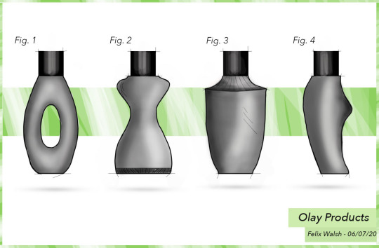
Week 5
To start the class off there was a number of freehand practice sketches to be completed. This would prove to be a great practice and allow for personal sketching ability to be improved over time. Some of the freehand tasks were harder than others but this allowed for more thinking and visualisation to be used to achieve the end result. I spent more time on the more complex ones but with the continual attempts at achieving a good result. I believe i pushed my visualisation and created a solid example for what i need to practice in the future! The best examples can be seen below, these document line weights, shadow and texture/shape.
The second task was to re-design a bottle shape in a developmental style. This was done using sketching and photoshop. Originally i took the idea to paper and figured out a number of shapes. This i then took to photoshop using the masking tool with the brush. Then using opacity and brush hardness shadows and highlights were added to lift the image of the page. The the addition of line weights and texture was added with the brush tool. This also added a concept feel to the design. Then personal touches were added such as the splatter brush, shadow angle, background banner, opacity changes and titles. Overall i am happy with the results and i will be converting a photoshop file to a preset for future use for concept style projection. This will create a constant and professional look to the design development!

This weeks tasks were both challenging ad enjoyable. I believe this week has opened my eyes to further digital rendering and sketching techniques.
6 notes
·
View notes
Text
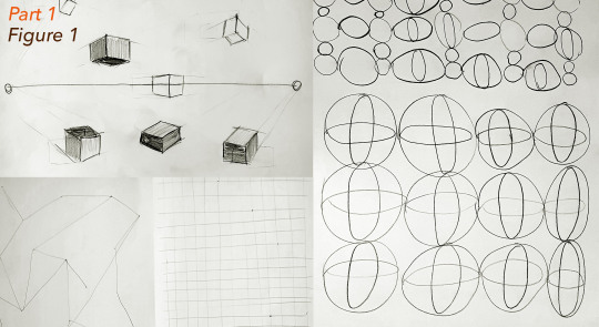
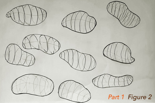
Week 5 - Sketching Workshop
Week 5 has been a really interesting yet challenging week as we were introduced to digital rendering. Whilst I had difficulties, I gained a lot from both the lectures and the studio task.
Part 1: Freehand Sketching
Part 1 was surprisingly useful, I didn’t realise that it would be beneficial or even necessary to warm up for sketches, and by the end of the process, I felt that my sketches were more accurate and intentional. I learnt that its really important not to rush into sketching without being appropriately warmed up, it prepares you both physically and mentally and results in a better standard of work.
Ellipses are something that is going to take some time and practise to get right, (see Fig. 5) as such I will need to work on this in my spare time. Overall I am glad that we were introduced to these techniques and I would recommend them to anyone attempting to sketch in the future.
Part 2: Digital Rendering
I felt I learnt a lot from completing the digital rendering task this week, and I enjoyed the opportunity to translate some previous experience using photoshop into this task.
Sketches:
The purpose of these sketches was just to get my thought process going prior to beginning the digital rendering. Whilst I didn't use all them, I learnt that it was actually a really good thing to do as it helped me establish what might look good and what will not.
If I did this again, I might try to complete these initial sketches to a higher standard, so there is less design decisions to be made when the sketches are translated to photoshop.

Process Video:
The video below shows my process from start to finish during the digital rendering task. Overall, I found it really challenging, many portions of this video see me going back on mistakes and completely changing elements of the composition. I struggled with understanding the layering and masking and the overall complexity of this. I overcame this partly through re-watching the recording of the week 5 lecture.
Despite reviewing the lecture, I still struggled, partly due to the quality of the recording, but also I would do the same thing as Rob, however it would result in a different outcome. This was highly frustrating and took a lot of perseverance and help from resources like Graphics Wizardry and Michael DiTullo on youtube to overcome. In the end I managed to find workarounds for the issues I was having, and I am reasonably pleased with he result.
My advice to anyone trying to do this task is again to ensure that the foundations are correct. It was very easy for me once I had the correct layers and masks to edit and play around with designs, however when the masking and layers were wrong, nothing would really go as planned. This says a lot about setting yourself up for success right from the start, and I will do my best to achieve this in the future.
youtube
Final Composition:
Overall, I am happy with the result, however if I were to do it again, I would I put more time into the shadowing as it isn't as effective as I thought it was going to be. I chose to use green for the background as it is a neutral colour that represents health and good luck, and as this is intended for presentation, I thought it may help the customers remember my design as positive. I considered putting notes or centre lines on this composition, but in the end it felt unnecessary for such simple products, and might have cluttered the page.
4 notes
·
View notes
Text
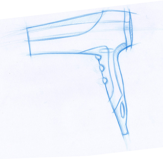
Week 8 - Photoshop Rendering
I found this week’s task to be the most intriguing by far. We used Adobe Photoshop to create a digital rendering of a hair dryer.
Having used Adobe Illustrator for a few years now made switching to Photoshop a bit easier than starting off as a total beginner to Adobe products. The walkthrough we are provided with is also very helpful in guiding us through the entire process.
Starting with a sketch...
We started with an already made handsketch, which we had to change the levels and saturation of in order to use it as an underlay for the digital sketch.
Levels
We used “Levels” to adjust the brightness, contrast, and tonal range of the image so that the background is white and the outline is clean and crisp.

Creating Paths
The “Pen” tool is used to create a path that outlines the hairdryer. As an Adobe Illustrator user, I am very familiar with using the pen tool. It is important to use as little control points as possible to create a smooth curve that is not jagged. The curve can be adjusted using the “convert point” tool by pulling the handles of control points.

Select Inverse
As I filled my clipping masked groups using “Edit > Fill”, I realised that selections of the background were made instead of the actual object. Hence, I had to redo the clipping masks, making sure I clicked on “Select inverse” every time.

Subtract Mask from Selection
Similar the Rhino, trimming is available on Photoshop. The only difference is instead of trimming a path, a selection needs to be trimmed.


Blending Mode
Blending mode changes the way a layer reacts with the layer underneath it. Creating 2 layers, one with the “Multiply” mode, the other with the “Overlay” mode allows shading and highlights to be added to the render respectively.

Rendering - Lighting, Shading & Highlights
The Brush tool (shortcut: B) is used to add shading to the hairdryer to make it more photorealistic. Using the brush tool with a mouse is quite tricky as I have to be very steady with the way I handle the mouse. I might look into other methods of rendering such as using a tablet which could makes drawing freehand curves easier.

Gaussian Blur
The glow around the LED lights are made using the effect “Gaussian Blur” found in Filter > Blur.

Texture
This feature is great for making surfaces appear more matted.

Opacity & Colour
Opacity is another word for transparency. Adjusting the opacity of different brush strokes creates the effect in the shaded box.
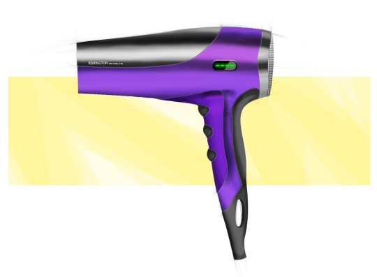
Reflection
This exercise was quite a relaxing and enjoyable one. It was great working in a group because when one of us got stuck, the others could help and in doing so we all learnt more than we would have if we did the task individually.
I’m quite satisfied with the final rendering of the hairdryer. The only thing I didn’t like was the air inlet texture. The array of small circles are too uniformed and even though you cannot tell from afar, it actually looke quite odd when you zoom in. It would look more realistic if the circles were arranged in a radial manner and varied in size.
6 notes
·
View notes