#the whole 1920s/Dada vibe
Explore tagged Tumblr posts
Text
youtube
#I am obsessed with this dance#Molly Long choreography#I know she's super controversial#coughageappropriatecough#but this dance is incredible#the subtle music hits#the whole 1920s/Dada vibe#great fusion of eras#and jesus christ the PRECISION#Molly Long#Project 21#You Don't Love Me#Youtube
0 notes
Text
Week 5 Journal Entry
"Design History and Your World"
Pull at least two examples of design from Chapters 2 (pages 95-102) and 3 (all) from your textbook or from this week's lectures. Write a paragraph that compares your chosen works with at least two examples of design you see around you on a daily basis. Take photographs of these with your phone. In your journal post, provide images of all works (both the famous works and objects from your daily life). Label each image. Your analysis should include some in-text citations from the textbook to prove you have engaged with Chapters 2 (pages 95-102) and 3 (all).
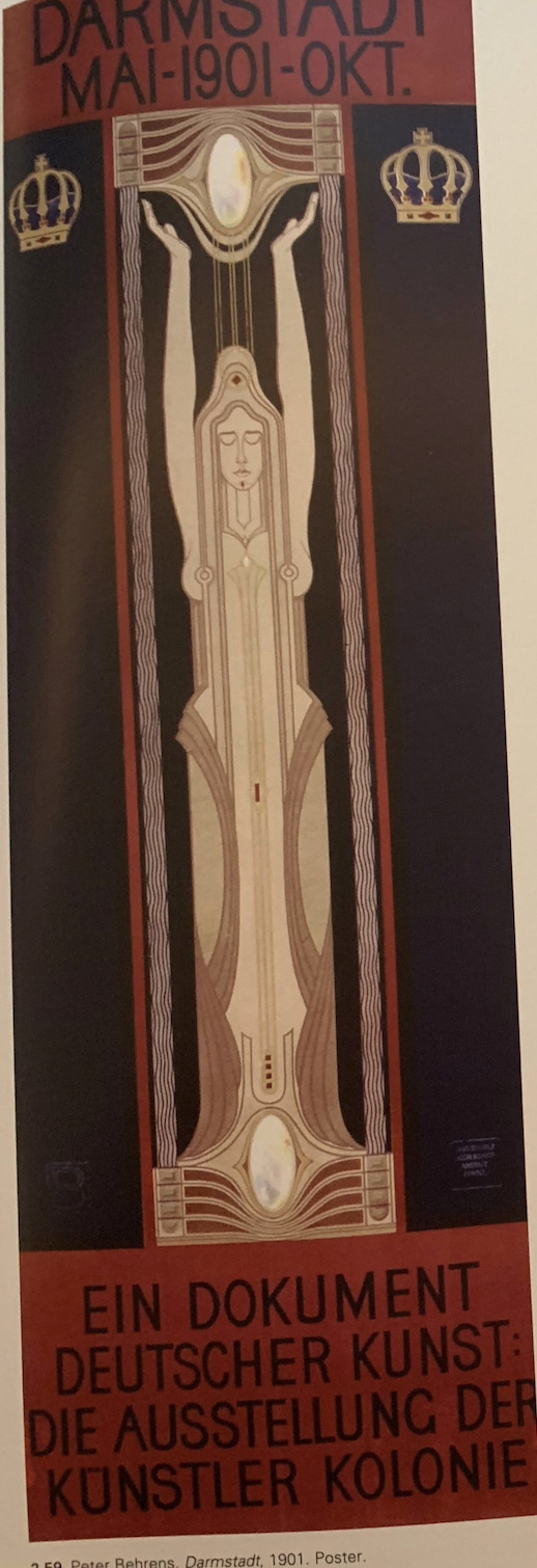
From chapters 2 and 3 I choose Peter Behrens, Darmstadt, 1901 poster, and Tristan Tzara’s Bulletin Dada, no.6. 1920, periodical -- two graphic poster styled works. I am comparing these with my Make Art Not War sticker by Obey and my Collectivo collectible poster (free from Collectivo).
Peter Behrens, a German architect, was a well-known member of the Darmstadt art colony established in 1899, which sought to “promote high standards for crafts made in the region,” Eskilson 102. Being one of the more accomplished designers at the colony, Behrens career focused on the fine and applied arts, and he was invaluable in the spread of new, non-academics styles in the fine arts. His 1901 Darmstadt Poster is as if Early Art deco had a baby with Art Novvouue. Typical of Scottish and Viennese work, Behrens poster is in a vertical format, with a much more subdued stylization of the female figure, and a relatively plain text. There are not many frills decorating the poster aside from the symmetrical crowns and the vertical lines emulating the rectangular format of the entire poster surrounding either side of the female figure, and the text is very plain, condensed, capital letters that reverses the color scheme of the image, Eskilson 102. Like art nouveau, I catch very Alphonse-Mucha-esque vibes front these pieces as well. The thin graceful vertical position of the poster is very an art nouveau portrait style that Behrens utilizes, as well as the lithe, elegantly clothed female figurine in the center of the poster. The female figure in the middle is reminiscent of a goddess holding and standing upon to glowing white orbs, and on either side of her raised hands are the aforementioned crowns, the duke’s coat of arms, representing the notion that the Darmstadt Art Colony is one of the elite artists with a higher understanding of art and the ability to create art in a unified style.


I compare this piece to the Make Art, Not War (MANW) poster by Shepard Fairey. I see this poster in the form of a sticker on my laptop every time I use it. The MANW poster is a very symmetrical piece of art with the same color scheme as THe Darmstadt poster -- red, white, and black. They are also both fairly symmetrical and have a female figure represented in the middle of the work, although on my MANW sticker (which is normally a poster, or sweatshirt decal) is only the head of the woman. They also both have very plan, sans serif fonts even though the font on the MANW is curved to fit around the head of the female centerpiece. I think I would consider both works to be extremely similar, and kind of meant to spark inspiration and aspiration in those who look at them -- join Darmstadt, save the human race from itself, the same thing.

(I could not find a picture of the Colectivo poster! I'm currently at. home and will not be able to get a picture from my dorm room until Sunday -- I will email the photo.)
20 years later…
I'm looking at the Bulletin Dada Periodical by Tristan Tzara. Tzara gained influence from the journal he founded, Dada, and a “new generation” of French writers who some went on to begin the surrealist movement after Dada. Issue no. 6, Bulletin Dada, of his journal, Dada, features a wide range of eclectic typeface, in an array of different ways and forms. Red and black letters stand out against the white of the paper, although ith can be hard to read some text because it has been overlaid on top of other text. Tzara purposefully overpriced blocks of text and used random typefaces to boost a sense of delicate improvisation. Even though the Bulletin Dada is quite a baffling and crazy piece of art for its times, there is enough clarity in the pieces to introduce a new slew of Dadaists, “a whole new roster of Dadaists who were scheduling several new public performances.” Eskilon 133.
I compare this piece to one of the collectible Colectivo posters that I got for free. I’d go as far as to say that the two pieces of art are almost opposites. The Colectivo post at a soft mustard yellow is a tangle of black and white text and a black and white skull, somewhat blending until its hard to make out what it says. The collectible poster was made for a completely different purpose than the Dada Bulletin. It is a piece of art meant to be pretty and admired by customers who frequent Colectivo, the Bulletin Dada was meant to introduce new dadaists and serve as a form of satirical work, that plays with the boundaries of art.
Thank you, Lamyra Adams
0 notes