#the struggle of wanting to create a web and printed comic
Explore tagged Tumblr posts
Text
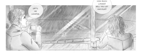
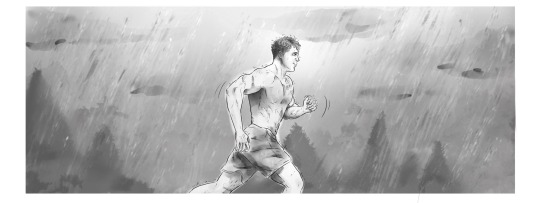
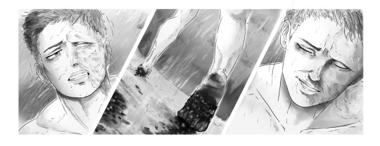
quality test re-post
#please don't mind me reposting and experimenting with this page a little#I cropped it and posted it as three pictures to try and bump up the image quality#I really like the stile but have to figure out a way to post it online and not loose the high image quality needed for print later#and why is what you need to make it work online or in print oposite of one another?!#the struggle of wanting to create a web and printed comic#seriously why is there so little useful information on canvas size and dpi and image size and aaaaaaaaaahhhhhhh#either it looks shitty posted online or shitty in print?!#what is this??????#sorry I'm just so confuesed and frustrated rn#I just want to make pretty art that I can share with yall#and not have the style super duper symplefied#please someone send help T__T
6 notes
·
View notes
Text
I typed up a resignation letter which I was gonna print while on my break but the company internet has Gmail blocked -_- so I'll just ask my boss for her email
I'm putting in my two weeks immediately, my roommates are gonna work out something with me financially, my bf is also willing to help support me
I'm nervous but ... this industry sucks right now and I can't tolerate what was done to me. I'll at least have more time for art, which means more time for commissions, more time to create things for etsy, bogleech in particular has been wanting to collab for awf hosp charms and merch which he'll be paying me for, as well as paying me for doing an entire arc for the web comic and mortasheen illustrations
I ALSO will finally return to twitch streaming which has been in high request from you guys for over 2 years. I hope you'll consider supporting me via Kofi donations
The bottom line is I'd rather struggle a bit more with my finances and ask for help instead of being emotionally pushed around at my job that I bent over backwards for, it might pay well but it's not worth the toll it's taking on me mentally and physically
If things go alright, my plan is to stay 6 more month until my lease end date, giving my roommates time to search for a new roommate and me to find an apartment in a more affordable and accessible area for me
Wish me the best and like I said, please consider supporting me, I'll reblog later with my Kofi link and etsy and such
16 notes
·
View notes
Text
Why ‘Spider-Man: Into the Spider-Verse’s Animation is So Amazing

So those followers of my blog may know that I posted a full film review of Spider-Man: Into the Spider-Verse rather recently. You’re welcome to go check it out if you haven’t yet, but the short version of it is that it’s my favorite movie of 2018 and is, in my opinion, the best comic book film ever made. But I wanted to address something about the film that I keep seeing coming up. I’ve been watching a handful of reviews for the film online and in a great deal of them I hear people bring up how they were skeptical of the animation style when they first saw the trailers because it “looked choppy”. One film critic in particular by the name of Roger Moore actually still held that critique against the film even after seeing it when he posted his review of it. Most people have come around to enjoying the films animation and have put the idea of it being choppy at the backs of their heads. But what did they mean initially? The problem with a lot of film critics when it comes to judging an animated feature is that sadly they can come from a misinformed place about the medium and create this negative stigma around a film that isn’t justified. Animation is already fighting a number of prejudices (people saying it’s only for kids, saying it’s a genre and not a medium and any other amount of reasons why they may think they are above it) so this added one does not help what is easily the most spectacular animated film of 2018. But I myself am an animator, so I feel I can come from a place of explaining the visuals in a way that may make the still skeptical viewers more appreciative of what the film is trying to accomplish. With that in mind, here’s why the films animation works so well.
Animating on 2s, not on 1s

When it comes to animation, whether it be 2D or 3D, audiences are typically used to a consistent and fluid motion where there is virtually no break in the motion of a character or object. Simply put; it’s as fluid as fluid animation can be. In these cases, this is because the animation was done on “1s”. But what does that mean?
With a few exceptions, it’s a universal rule that animation runs at 24 frames per second. That means every second of footage you see of an animated film can have as many as 24 unique drawings or adjusted poses in them. That’s a lot of work, but animation legends like Richard Williams (director of Who Framed Roger Rabbit?) are famous for having classical animation of this stature. However, just because you CAN fill each second with that many drawings doesn’t mean everybody does. Alternatively you could have 12 drawings in each frame and just double the amount of time you see them go by. When you do this, it’s called animating on “2s”. It’s half the work for a result that may not be quite as fluid as animating on 1s but still looks convincing enough to deceive the human eye. You could even go as far as animating on 3s and animating on 4s, but the higher you go the more you increase the risk of your animation looking “choppy”. Spider-Verse in particular has most of their frames on 2s, with a few exceptions being when the characters have to keep up with complex camera work and so they go back to 1s. So that would explain why a lot of people initially thought the animation was “choppy” . . . .but are there any advantages to doing animation this way aside from having less frames to fill? Indeed there is. When you increase the exposure of any frame, the layout and composition of said frame as well as any small details has a greater chance of sticking out in the viewers mind. Spider-Verse takes exceptional advantage of this fact because every little action in this film is like a beautiful work of pop art. There can be other ways you can inject great appeal in your animation besides making it “fluid” like making every drawing crisp and full of detail and if you’re a skilled enough animator you can make your animation deceive the eye through a number of other tricks which we will go into in a bit. I can’t think of a finer example of this point than Legendary indie animator Bill Plympton.
youtube
Bill Plympton is famous for having his drawing exposures in the 3s and 4s, having every drawing have vivid detail with complex shading and sketchy lines, but he still manages to create believably moving and behaving characters and set pieces in spite of this limitation.
So how is it done? How does an animator make convincing and appealing movement with a decisively limited amount of drawings? Let’s start with good posing.
Posing
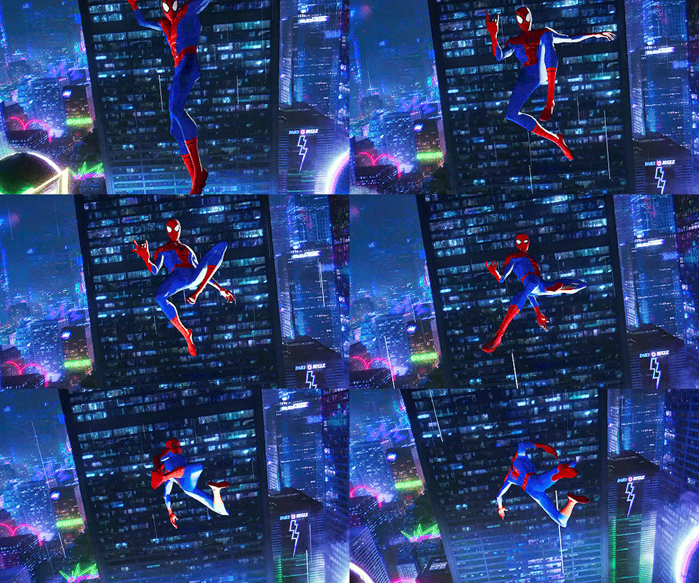
I’m of the opinion that Spider-Man lends himself to good animation more than any other superhero. Because of all superheroes, nobody has as many interesting poses, weight shifting and as much natural progression between actions as the web slinger. His main mode of transportation is swinging around, using his weight distribution and kicks and lunges to propel himself in any direction he wants and as he tries to make a turn he has to push himself into another direction, fighting the force that pushed him the other way to begin with. Contrast this with Superman who can just fly right over to where he needs to be without much movement of his arms and legs and without much struggle with incoming obstacles (fun fact, the whole reason Superman can even fly in the first place is because it’s easier to animate than have him leap everywhere). But anyway, back to Spidey. In most animation you develop key poses. Key poses are the main storytelling positions a character may have just to communicate the idea that they’re doing whatever it is they’re doing. So for example if you were to animate a jump, you would start by drawing the position of your character bending their legs to launch themselves up, then you would have them in mid air, then you would have them land again.
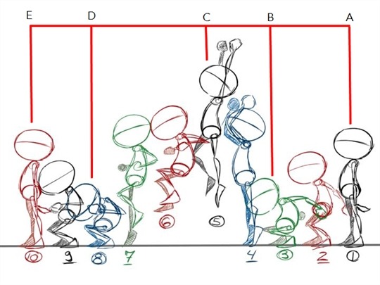
Once you create poses that tell the story well enough, you would fill in the rest between. But the key poses are VERY important to get right. To make sure there couldn’t possibly be any confusion as to what the characters are doing or even who they are, animators often ask themselves “would I know what’s happening here even if I put it in silhouette”? To add to the fluidity of the animation in a way that doesn’t compromise the chosen amount of frame exposure, poses also tend to follow a “line of action”. Basically the whole body follows the direction of a drawn line and maintains it’s course in order to really sell the action. It helps for exaggeration and for developing after aspects like arcs.
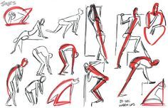
Now as I said before, Spider-Man is a particularly advantageous character when it comes to this stuff. Because he’s acrobatic. He’s shifts his weight a lot. His most iconic poses as a character lend themselves greatly to silhouette. Also, he happens to be very easy to draw. Even if all you did was draw a red stickman with spider eyes we could instantly tell who it is.
youtube
The animators for Spider-Verse knew exactly what kind of beast they were dealing with and MAN OH MAN did they have fun with it. Not only did they perfectly capture the way the classic Spidey moves, but they also gave every different Spider-Person their own take on it. Spider-Gwen moves with the grace and elegance of a ballet dancer, Noir Spidey has a less ambitious and more straight forward way of moving around (kind of “old school) if you will. Then of course you have Peni Parker recreating the anime aesthetic and Spider-Ham with all the elasticity of a cartoon.
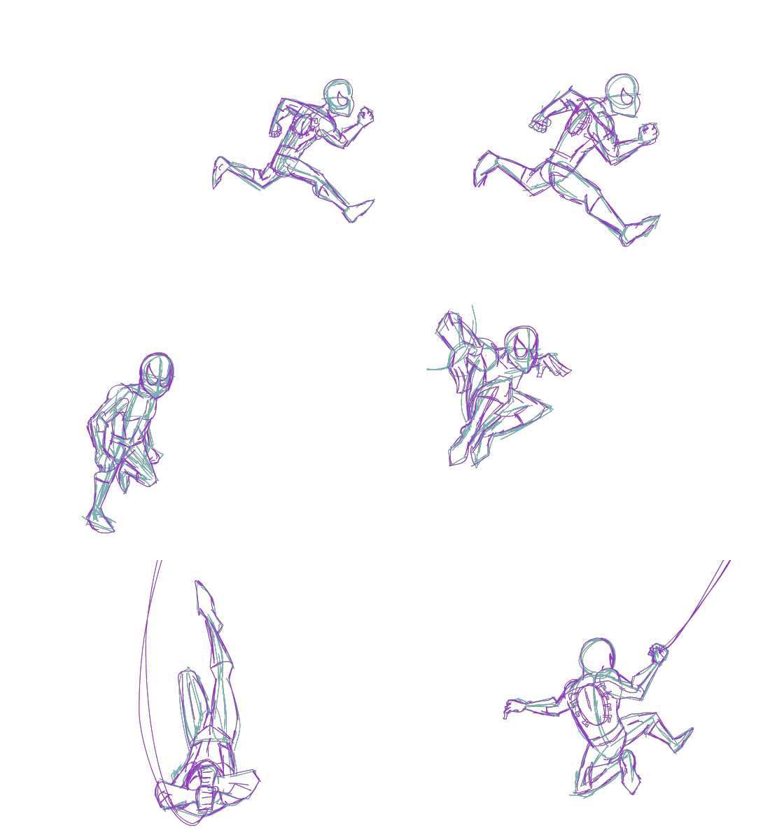
*here’s a little Spidey animation I did a while ago.
Squash and Stretch, Anticipation, Overlapping Action, Follow Through
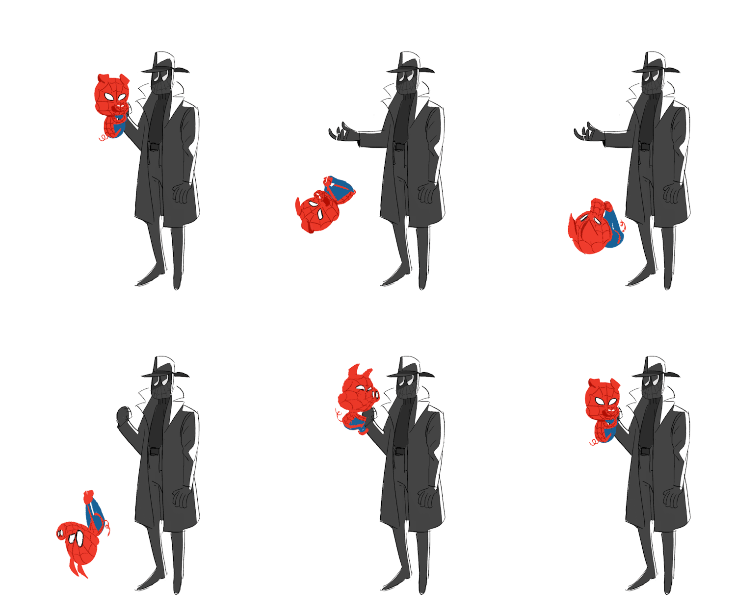
If anybody takes an animation class or tries to learn animation on their own, chances are Squash and Stretch will be the first animation principle listed. It’s exactly what it sounds like. Animators will often contort the model of their character to give whatever is happening more elasticity and to fill the gaps of an arc if drawings are a considerable distance away from each other. It helps the human eye track where an object is going and it can also help with principles like anticipation and follow through. Anticipation is the build up to an action. Think bending your knees before you lunge yourself upward for a jump. Because that momentum has to come from somewhere. Then there’s overlapping action, which is when dragging items on a character’s design such as clothes, capes, long ears, tails or what have you, are trailing along and need to catch up to the rest of the body. Spider-Verse does great with both these principles, especially with Spider-Ham and Noir Spidey. Spider-Ham is obviously influenced by Looney Tunes and other cartoony inspirations so he’ll be prone to doing a lot of squishing and stretching, where as Noir Spidey has the long trenchcoat and hat and you can bet that they’ll always be the last part of him to reach his destination (as well as be the most susceptible to wind). And of course, every character in Spider-Verse has great anticipation . . . as well as what I think of as anticipation’s opposite, follow through. When an action stops, the body needs a moment to adjust itself into the resting position. Think catching yourself with your legs after a jump, crouching down and then standing back up again. Just like how momentum has to come from somewhere, it has to go somewhere when the action is over.
Appeal
So everything I covered thus far is stuff that’s universal across all forms of animation. But What does Spider-Verse do that makes it special? What separates it from other animated films in the theater? The answer is appeal. Appeal is just having a style and aesthetic that’s pleasing to look at . . . and man does Spider-Verse ever cover that. The film goes so far out of it’s way to look like a comic book that every texture has ben-day-dots so it literally looks like a comic print. Every Spider-Person has their own way of moving, their own way of behaving, their own sets of priorities when it comes to the 12 principles of animation. But the film also has a lot of really clever cheats. One of my favorite examples of this is how the film cheats forced perspective. There are many shots in the film where Miles is falling through the city as the buildings rush past him. The animators actually skewed the models of the buildings for these shots to imitate depth, as when they tried it without the skewing it didn’t looks like they were falling fast enough. They also implemented more classical cheats like smears, basically an animators method of imitating motion blur.
I could go on and on with the animation lecture, but honestly, I covered what I wanted to cover. I just wanted to showcase to anybody who may not be aware that animation is more than just “fluidity” and a seamless framerate and that there’s more ways to create appealing visuals than just that. If you haven’t seen it yet, go see Spider-Verse. It is a masterpiece.
2K notes
·
View notes
Text
How to Read Marvel's Absolute Carnage Crossover
New Post has been published on https://gamerszone.tn/how-to-read-marvels-absolute-carnage-crossover/
How to Read Marvel's Absolute Carnage Crossover
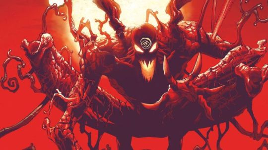
The dust has barely settled from War of the Realms, but already the next major Marvel crossover is brewing. Absolute Carnage officially kicks off on Wednesday, August 7, as Earth’s heroes unite against a deadly attack from a super-charged version of Carnage, Spider-Man and Venom’s eternal foe.Whether you’re a hardcore Marvel reader or simply have fond memories of the Maximum Carnage crossover and its tie-in video game, we have a full breakdown of this new superhero epic and how you can follow the story.
What Is Absolute Carnage?
Absolute Carnage might be described as a spiritual sequel to 1993’s Maximum Carnage. While its plot isn’t directly connected to Maximum Carnage, Absolute Carnage again features Spider-Man and Venom teaming up with a wide variety of Marvel heroes to deal with the threat posed by Cletus Kasady.

Art by Ryan Stegman. (Image Credit: Marvel Comics)
This time around, however, Carnage is flying solo. Where in the past Cletus Kasady was interested only in causing chaos and bloodshed, he now has a more specific mission. He’s intent on killing everyone who’s ever bonded with a symbiote, hero or villain. By absorbing the trace remnants of the symbiotes in their bodies, Carnage hopes to achieve his ultimate power and finally free Knull, the god of the symbiotes, from his eternal prison.
Marvel’s New Symbiote Mythology
If you haven’t been reading comics like Venom recently, you may not be aware of Knull or his place in the mythology of the symbiotes. The current volume of Venom has introduced Knull, a godlike being revealed to be the creator of symbiotes like Venom and Carnage. Knull existed in the black void before the Big Bang. He was angered when light and life exploded into being and invaded his endless dark realm. Ever since the Big Bang, Knull has been waging war against the Celestials and other cosmic deities, hoping to restore the perfect nothingness that used to be everywhere.
Venom’s 30 Most WTF Moments

During the course of that war, Knull created the symbiote race known as the Klyntar. The symbiotes exist as a hive mind controlled by Knull himself, and their weakness to fire and sound is basically a design flaw created from their original forging. However, the connection between Knull and his creations (also known as the codex) was severed, and now Knull remains trapped in a prison within the Klyntar homeworld, waiting for the day when he can break free and resume his war on creation. Through Cletus Kasady, Knull has found his most devoted and capable servant.
The Road to Absolute Carnage
Before getting to the main event, we should cover the essential comics fans should read to prepare for Absolute Carnage.
A Visual History of Venom

Most of the direct build-up to Absolute Carnage has taken place in the current volume of Venom, which is written by Donny Cates and mostly drawn by artist Ryan Stegman. That makes sense, as Cates and Stegman are also the creators behind Absolute Carnage itself. Interested readers should check out the first trade paperback, Venom by Donny Cates Vol. 1: Rex. This book collects the story that rewrites Venom’s Marvel history and introduces Knull. The second volume, Abyss, is less directly relevant to the events of Absolute Carnage, but it does deal with some important developments in Eddie Brock’s personal life.
Also key is a one-shot special titled Web of Venom: Cult of Carnage #1, from writer Frank Tieri and artist Joshua Cassara. This book, as much as any other, directly sets the stage for Absolute Carnage. It resurrects Cletus Kasady (following a brief period where he was dead and Norman Osborn inherited the Carnage symbiote), reveals the bond he’s shared with Knull since birth and establishes Kasady’s new mission of hunting down and killing every person who’s ever bonded a symbiote. That includes traditional Spider-Man characters like Peter Parker, Eddie Brock and Mac Gargan as well as other Marvel heroes like Captain America, The Thing and Wolverine. All of them are now in Carnage’s crosshairs, as he seeks to absorb their trace symbiote fragments, reassemble the codex and open a doorway for Knull.

Art by Danilo Beyruth. (Image Credit: Marvel Comics)
Finally, readers should also hunt down the recent Free Comic Book Day 2019 – Spider-Man/Venom comic. The Venom portion is handled by Cates and Stegman and acts as a direct prologue to Absolute Carnage. It may be tough to find a print copy at this point, but the digital version is available to read for free on Comixology.
Absolute Carnage: What to Read
The Absolute Carnage crossover officially begins with the release of Absolute Carnage #1 on Wednesday, August 7 and runs until early November. In addition to the core Absolute Carnage miniseries (which was originally announced as being four issues but has since expanded to five), Marvel will publish a number of other Absolute Carnage-branded tie-in books. Alongside those releases, both the ongoing Venom and Amazing Spider-Man titles will tie into Absolute Carnage. Marvel released this checklist for all the comics involved in Absolute Carnage:
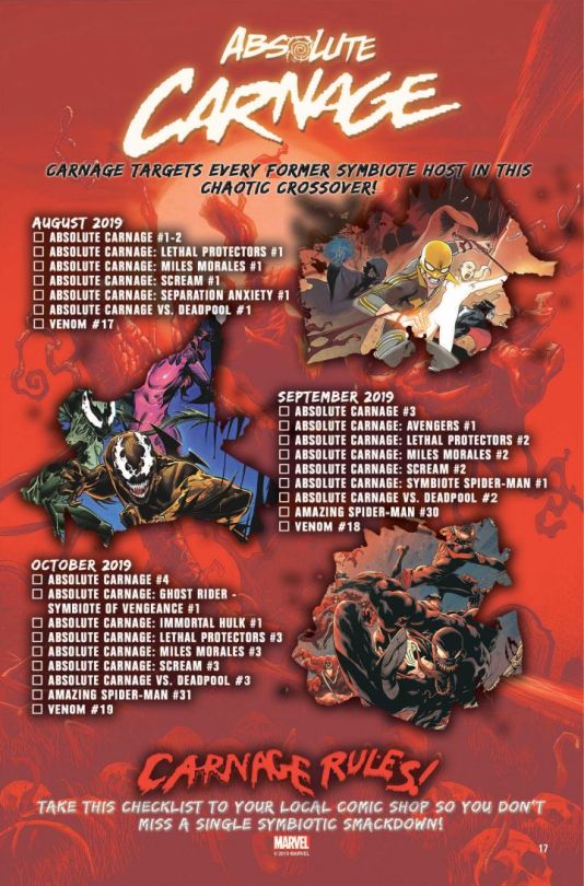
Naturally, fans who want to follow the main story threads without buying dozens of tie-in books can follow Absolute Carnage alone and get a complete story. The rest of these books will focus more on how other characters like Spider-Man Miles Morales, Deadpool, Ghost Rider and Hulk are impacted by Carnage’s global attack. Amazing Spider-Man will build on the recent “Red Goblin” storyline from 2018, as Norman Osborn and his grandson Normie are targeted by Cletus Kasady.
If any tie-in book is worth prioritizing, it’s probably Venom. This is the only Absolute Carnage tie-in also written by Cates. This book will deal with Eddie Brock struggle to protect his son Dylan from an army of symbiotes.
What’s Next for Marvel?
As massive as Absolute Carnage is in terms of scope and importance to the Spider-Man/Venom franchise, it also serves as the next step towards a major mystery project Marvel has been teasing in 2019. According to this image, Absolute Carnage, along with War of the Realms and House of X and Powers of X, is a piece of a larger puzzle that culminates in a new project in December 2019.
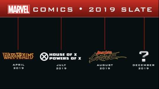
What this mystery project might be is still anyone’s guess. We don’t expect Marvel to reveal much until their December 2019 solicitations are revealed in September. However, we wouldn’t be surprised if this book revolves around Knull. If Carnage is ultimately successful in freeing his god, then the entire Marvel Universe will have reason to fear the wrath of Knull. Marvel has already been making efforts to tie Knull to other Marvel characters through books like Thor and Silver Surfer: Black. That could all be in preparation for a Knull-focused crossover event to cap off 2019.

Another, wildly different possibility is that Marvel is setting the stage for an X-Men vs. Fantastic Four crossover. The two teams were shown butting heads in the recent House of X #1. With Charles Xavier’s recent power grab reverberating across the Marvel Universe, these former allies may find themselves becoming bitter enemies, with powerful mutant Franklin Richards caught in the middle.Jesse is a mild-mannered writer for IGN. Allow him to lend a machete to your intellectual thicket by following @jschedeen on Twitter.
Source : IGN
4 notes
·
View notes
Text
7 Zines That Helped People Work through Mental Health Issues
For the uninitiated, a “zine” is often defined as a self-published, small-circulation magazine that documents the happenings of a subculture or a niche topic. But in practice, the art of the zine is governed by “non-rules.” A zine can be consist of 40 pages, or just one. It can be entirely made up of pictures or feature no pictures at all. It can make sense, but it doesn’t have to.
During the 1980s, zine-making often involved taking a pile of collages, poems, essays, images, or doodles; lining them up, just so, over the glass of a Xerox machine; then making copies, and stapling together a series of printed pages like this. Copies might be shared with friends or left in a stack at a local record store. Today, publishing a zine can be as simple as one person creating a web page or as elaborate as a small editorial team collaborating on a printed periodical with a cover star. But the non-rules haven’t changed: If you make it and publish it yourself, and it has text, images, or both, you can probably call it a zine.
Perhaps because of this flexibility, artists and other creatives have found in zines a judgment-free space, and for some, it’s a prime medium for discussing serious, personal issues, like mental health. This point was made late last month when an art exhibition in India, organized by one of Time magazine’s 100 most influential people, Dr. Vikram Patel, illustrated how zines can help break down the stigma surrounding mental health. To explore the topic further, we share below seven examples of such zines, with insights from their creators on how these creative projects helped them navigate their own experiences with mental health.
For Girls Who Cry Often (2016)
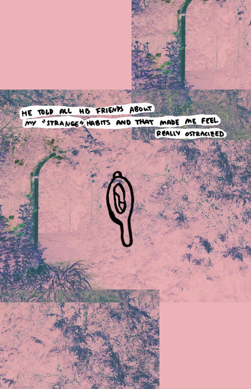
Excerpt from Lina Wu, For Girls Who Cry Often, 2016. Courtesy of the artist.
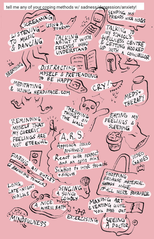
Excerpt from Lina Wu, For Girls Who Cry Often, 2016. Courtesy of the artist.
Lina Wu, a Toronto-based artist and illustrator, collected stories and testimonies from over 20 contributors to create the 40-page zine For Girls Who Cry Often. “It’s a nice feeling to be a part of something bigger,” she said of the collaborative creation process.
For the zine, Wu focused on exploring mental health through a femme lens and let her own experiences inform her process. “For much of my life, I noticed that ‘getting emotional’ was seen as a girly or feminine thing—meaning it is often dismissed as dramatic and frivolous,” she explained.
Wu created a dreamy pink atmosphere to backdrop the contributors’ candid and sometimes dark confessions. The zine’s adolescent tone is a nod to the fanzines of the 1990s that gave teenage girls a voice. In fact, Wu points out that zines are accessible art objects because people can easily share and buy them (readers buying copies of For Girls Who Cry Often are encouraged to pay what they can afford).
An interdisciplinary artist, Wu experiments with poetry, illustrations, comics, photography, and design in her zines. And while she doesn’t bring For Girls Who Cry Often to zine fairs anymore, she noted that making it has helped her grow as an artist.
Fuck This Life (2005–present)
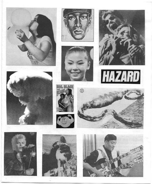
Excerpt from Dave Sander, Fuck This Life, 2018. Courtesy of 8ball Community.
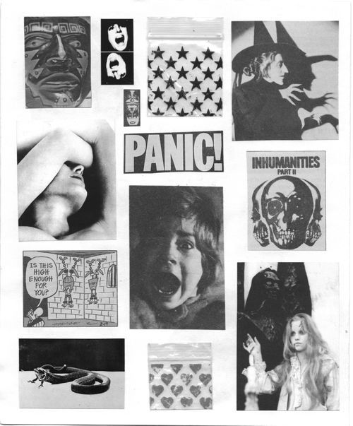
Excerpt from Dave Sander, Fuck This Life, 2018. Courtesy of 8ball Community.
Today, Dave Sander (a.k.a. “Weirdo Dave”) is a visual artist known for collaborations with Vans and Supreme. But back in 2005, Sander was cramming newspaper and magazine clippings into his desk drawer almost out of habit. “After I got a lot,” Sander said, “I thought it would be time to make a zine.”
Flipping through the pages of any issue of Fuck This Life is like witnessing the end-of-life montage people describe after a near-death experience. For Sander, zine-making can be an aggressively cathartic process: “You get to kill shit in your own way,” he offered.
Fuck This Life is a stream-of-consciousness compilation of found imagery—like the mushroom cloud of an atomic bomb or porn stars mid-orgasm—the result of Sander channeling his pain to “create a beautiful, loud, brutal fantasyland.” He refers to the zine ashis deepest, darkest best friend. “It was my reason for living, so I guess it saved me,” he said.
Grief Poems (2017)
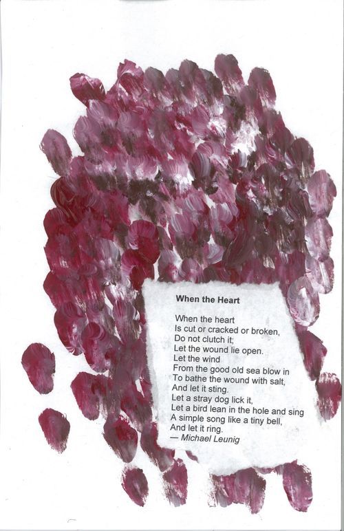
Excerpt from Chloe Zelkha, Grief Poems, 2017. Courtesy of the artist.
Excerpt from Chloe Zelkha, Grief Poems, 2017. Courtesy of the artist.
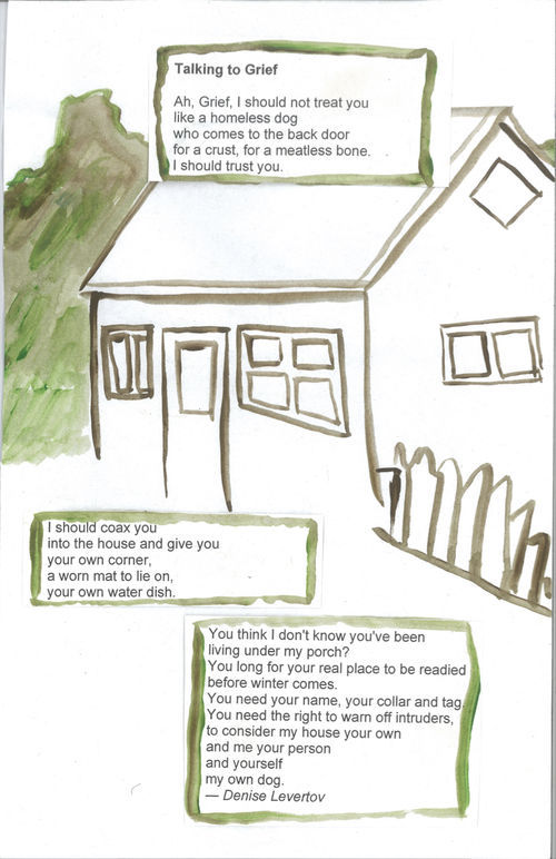
Chloe Zelkha describes her father’s death as a “sudden, heartbreaking shock.” Within months, she’d printed out a collection of poems she found in books or discovered through teachers and grieving groups, then spread them out on her kitchen table. There, the Berkeley-based Zelkha began painting onto the pages, cranking out one after another in succession, without drafting or revising. As she found more poems, she created more pages. The result was Grief Poems, a 26-page exercise in letting go.
Zelkha’s introduction to zines was Project NIA’s The Prison Industrial Complex Is… (2010–11), a straightforward explainer zine with minimal text and simple black-and-white illustrations. She sees zines are an inherently raw medium. “That permission that’s kind of baked into the form,” she said, “is liberating.”
Poems by everyone from Kobayashi Issa to W.S. Merwin are coated in Zelkha’s uninhibited brushstrokes. She compared her process with child’s play or dreaming: “If you watch a kid play on their own for long enough, you’ll see lots of fears, feelings, ideas eeking their way into their game, and then transforming in real time. Or when we dream, and different people, places, concerns visit us in weird ways.”
Identity Crisis (2017)
Librarian–slash–zine-maker Poliana Irizarry is probably better known for their autobiographical black-and-white zines, like My Left Foot (2016) and Training Wheels (2013). But with Identity Crisis, the San Jose–based artist seemed the most vulnerable they’ve ever been. “My abuela suffered many miscarriages at the hands of American doctors, and her surviving offspring also struggle with reproductive issues,” Irizarry wrote. “Many Puerto Ricans do.”
Before the birth control pill was approved by the FDA in 1960, nearly 1,500 Puerto Rican women were unknowingly part of one of the earliest human trials for the pill. Between the 1930s and ’70s, nearly one-third of Puerto Rico’s female population of childbearing age had undergone “the operation,” often without being properly educated on its effects.
Irizarry made Identity Crisis,their first full-color art zine,during a South Bay DIY Zine Collective workshop. Personal and family histories intersect across fragmented pictures of succulents and Southwestern landscapes in a half-prose, half-verse journey through Irizarry’s identity. In just a few pages, Irizarry wrestles with intergenerational trauma and their own post-traumatic stress disorder (PTSD). Irizarry speaks directly to their oppressors, defiant and resolute: “I live in spite of you.”
Shit I Made When I Was Sad (a.k.a. sad zine)(2018)

Excerpt from Shit I Made When I Was Sad a.k.a. sad zine, 2018. Courtesy of Malin Rantzer and Anna Persmark.
Excerpt from Shit I Made When I Was Sad a.k.a. sad zine, 2018. Courtesy of Malin Rantzer and Anna Persmark.
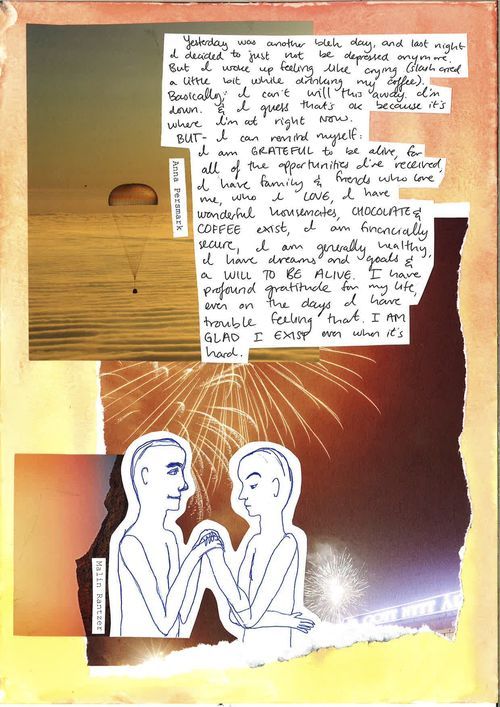
It started when Swedish friends Malin Rantzer and Anna Persmark were showing each other drawings and writing in journals they’d made while they were feeling low. “I noticed that some of the stuff we’d drawn resembled the other’s drawing,” Malin remembered, “and I think at that point we realized we should make a zine about being sad.” Rantzer turned to social media and put out a “swenglish/svengelska” (Swedish-English) call for submissions.
The then–Sweden-based duo (Persmark has since relocated to Portland, Oregon) made sad zine by cutting out and taping or pasting their artworks onto new pages, then scanning them and folding them into a booklet. Persmark sees zine-making as one of the most intimate ways of sharing her feelings; she goes out in person to share copies with her community.
“Even if all the submitters did not know each other,” Malin explained, “they were all friends’ friends or friends’ friends’ friends, and maybe that also can contribute to an atmosphere where it is safe to be vulnerable.” While making the individual works helped them heal, Persmack noted that the process of compiling the zine proved to be revelatory: “Sadness is both intensely personal and universal,” she said.
Sula Collective Issue 3: Mental Health (2015)
Oyinda Yemi-Omowum, An Emotional Response to Colours, 2015. Excerpt from Sula Collective Issue 3: Mental Health, 2015. Courtesy of Sula Collective.
Sula Collective calls itself an online “[maga]zine for and by people of colour.” Initially an exclusively online zine—different from a blog in name and ethos—it reflected its Gen-Y creators and their new ideas of what a zine could be. It’s one of the more visible new zines, among many, with the purpose of turning an online network into an IRL community. Ever since they founded it in 2015, co-creators Kassandra Piñero and Sophia Yuet See knew they wanted to dedicate an issue to mental health.
Sula Collective Issue 3: Mental Health sheds light on how teenagers of color navigate their parents’ more conservative understanding of mental health issues. “We wanted to discuss the things we kept hidden from our parents or couldn’t talk about with friends,” Piñero and Yuet See explained.
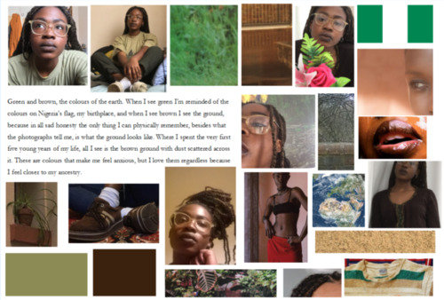
The issue was published in November 2015 and serves as a record of how today’s young artists are taking intersectional approaches to dealing with mental health issues. For example, Oyinda, a then–16-year-old Nigerian girl living in London, submitted a color-coded collage of self-portraits and textures called An Emotional Response to Colours. The literary submissions are paired with original artworks, sourced from Sula Collective’ssubmissions inbox, which range from digital art to watercolors. When asked about what makes zines a unique medium, Piñero and Yuet See answered, simply, “control.”
Shrinks: A Retrospective (2018)
Excerpt from Karla Keffer, Shrinks: A Retrospective, 2018. Courtesy of the artist.
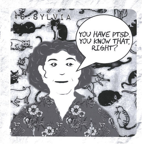
Excerpt from Karla Keffer, Shrinks: A Retrospective, 2018. Courtesy of the artist.
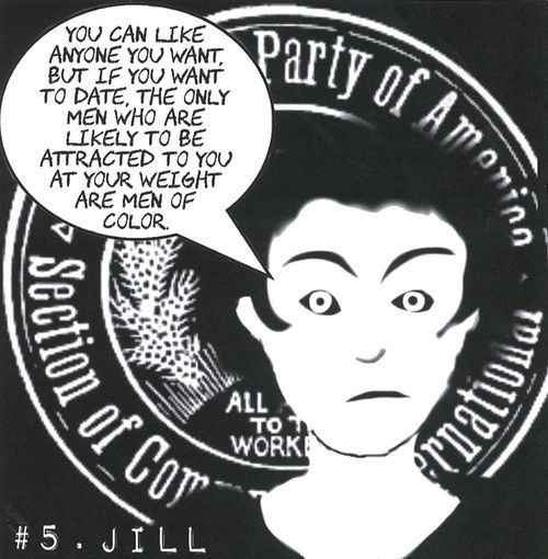
Shrinks is part of Karla Keffer’s zine series “The Real Ramona,” where she discusses being diagnosed with and treated for PTSD after almost 30 years in therapy. The Mississippi-based artist found a sense of direction for her work, and Shrinks in particular, through learning about the Satanic Panic of the 1980s.
This phenomenon (which gave daytime television hosts the ratings of their dreams) involved psychologists across America fueling a nationwide hysteria by diagnosing patients with satanic ritual abuse (SRA) and sending them off to tough-love camps.
“Shrinks are human and fallible,” Keffer explained. “I had put a great deal of trust in their infallibility.” In Shrinks, Keffer created profiles of every therapist she’s ever had—like Julie the gaslighter and Jill the racist. Survivors of abuse are often—and paradoxically—burdened with the task of seeing through the abuse and saving themselves. “One of the things I found difficult was sorting out what had happened with each therapist—like, did she/he really say that outlandish thing?” Keffer recalled.
So much of zine-making is about reclaiming—reclaiming the freedom of expression, reclaiming space, reclaiming the past. And, as Keffer put it, “you’ve made your own book, which is not something you experience when you’re writing short stories and sending them to lit mags.” If any one thing can define zines as a medium, it’s the unbridled control it gives artists.
from Artsy News
4 notes
·
View notes
Text
Save on Frames!
Framing is expensive! Framing large things gets ridiculously expensive. Not to mention transporting your gigantic painting/poster/picture. And who doesn’t like to save money?
I devised three ways to save on framing at my house:
Cheap Already-Framed Pictures
Okay, so this one’s easy and useful. I go to the Goodwill, or a similar reseller, when I need a regular sized frame. They have plenty to choose from, just ignore the picture that’s already in it! Find a frame you like and bring it home. Take out the glass by removing the back. (It may need to be cut off.) If you don’t like the color of the frame, this is a good time to paint it.
Color is a good way to make mismatched frames look like a set.
Put the glass back in, then your picture. There might be space in the margins around your picture, so use blank paper as a backing, or fancy it up with some glitter, fabric, paint, etc.
A Wooden Crate
I think shadow boxes are so rad! They have a dimensional aspect and allow for more variety, such as being able to display non-flat items. Sometimes wooden crates can be found or purchased inexpensively, especially if damaged or dirty. Damage adds character and dirt can be cleaned! When I moved into my house, the previous owners left us several interesting items. One of them was this shallow crate I used as a frame.
It was covered in spider webs and dirt, but I saw potential. I had recently picked up this amazing giant squid print at the Emerald City Comic Con and I knew the box was the perfect way to display it. I cleaned and oiled the wood and cut the edges of the print so that it would fit perfectly inside. I struggled with a way to fix the print to the wood, I didn’t want it to just sit at the bottom. It turns out that oiled wood is difficult to get something to adhere to (like tape). I was finally able to get it stuck on with hot glue.
Frame with Trim Board
I especially liked this idea because it potentially saved me hundreds! I don’t know how much it would have cost to frame this giant map. I wracked my brain for months to figure out how to frame my map without forking over a large sum of cash. (Plus transporting the thing!) I finally realized that I could just tape the laminated map onto the wall with painters' tape and nail trim boards around it to create a “custom frame”.
I bought the boards and the paint I wanted for the frame. I measured the lengths that I would need from each piece. I wanted the two side pieces for the outside edge that was the ends wouldn’t be visible at eye level. After the boards were cut to the right lengths, I painted them. I used a nail gun (and a lovely assistant) to fix the boards in place and filled in the nail holes with putty. Lastly, I painted over the putty and any blemishes.
0 notes
Photo
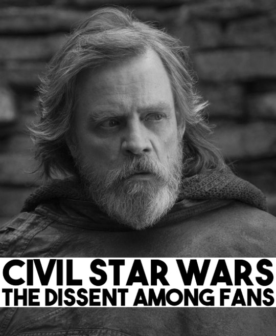
It seems Disney underestimated the power of the Dark Side of its fan base with the box office failure of Solo: A Star Wars Story. It shows a fracturing among viewers and how future movies will be received (or not received) by audiences around the world. The major issue with the fans isn't that people outright hate the new direction of the series but many are upset that the universe they know and love for long is changing before them. Some of those changes are for the better with new stronger female leads in the movies (which was needed) and then there are changes that for the worse such as changing the established lore of the force and cutting back the extended universe, which ironically took dozens of strong female characters with it. So yay! Progress?
So I plan to make the case for being critical of the new movies. I plan to also chastize those jerkoffs who decided to attack female actresses for being role models for young girls. I plan to make a rational argument for the removed content cut away by Disney writers. I also plan on talking about how we can bridge these divides and bring everyone back together. You might not agree with everything I say or maybe you will. Most people almost never share 100% of their opinions with another person which was kind of the problem in all this... dissent was widdled down to either or and those fans with legit criticisms were pushed into the camp of those assholes who hate women and the concept of social justice/equity. Because there was no discourse or room for dissent, Disney Ultimately gambled on that disgruntled fanbase not being as influential as it is and they were wrong.
No Room For Dissent
This is a common problem in society these days, where we view things in absolutes; be it politics, movies, religion and so on. Perhaps we have always been like that (I only been around since 1985) but it feels pretty bad these day especially in regards to politics being so divisive or movies that look to present more female roles and ethnic roles in their casts taking so much flak. While I might make some political parallels to create examples, I intend on focusing on the cultural divides taking place in these popular movies.
There is plenty of blame to go around for the tribal mentality that comes when critiquing a movie. Studios benefit from having a cultural high ground because it's easier to say “You’re being sexist or racist” instead of handling a critique and having to answer for poor choices they made while making the movie. I imagine this is what happened in the case of the Ghostbusters reboot, some people asked why the black character wasn't the scientist and the studio reacted with “Why don't you like women?” A kind of deflection mentality that avoided a valid critique of the movie and shames the critic from raising his or her voice again.
The blame also falls at the feet of the very worst patrons of our society. On one side you have the army of trolls of the web who are by far the worst people the interwebs (and the world) has to offer. These are the sort of guys who see any female lead role as an insult and seek out to harass them in the real world forcing the said actresses to abandon social media. These sort of people (most of them male) leave me gritting my teeth because this isn't so much a passion of a fandom they want to protect as it is a lifestyle of attacking people who are not them. Everything is a fucking battle and anything that progresses or enhances another race/gender/sexuality beyond their own is considered a threat to their manhood.
On the other side, we have people who you would call PC and they are sometimes PC to a fault. I tend to find myself agreeing with people on this side more often than not but even then we have our moments where I am wondering what the fuck the objective is. They become advocates for a worthwhile cause but become blinded to valid points or arguments. Back to Star Wars, I wondered why Admiral Holdo was even in the movie because she was killed right away and Akbar or Leia could have had the noble death. The response is defensive of the female role simply because it's a female role. Studios obviously love these advocates because they still don't have to answer the questions and its a private army of people to protect their franchise.
The last group is fans which is a wide spectrum of people from little girls who see Rey and get excited to see a girl kicking ass on the screen to long-term fans who have questions about the lore of the movies being changed or questions why the movie changed directions. Most of us reside here between the two extremes; the PC movie defenders who see the film as a tool to improve society and those little troll fuckers who want to see the world burn.
The failing in this discussion about the movie is the fact those two polar opposites dictated the discourse for the rest of us. You either accepted the movie as it was and enjoyed being on the moral high ground or join the trolls if you have any small critiques of the movie whatsoever. Perhaps we more moderate critics failed a bit by letting the trolls become the loudest voice in the room and let them write letters where they basically bashed women became the only thing people could see. Much like a peaceful protest where 97% of the people are there to say their piece with civility and clarity but its those 3% (the Trolls) throwing trash cans thru the window that get the cameras on them and they define the protest with the media coverage.
I blame also the Directors and Disney for playing this absolutist mentality where they say anyone who is complaining about the movie is a baby, sexist, racist or some other insult. They didn't seem to want to have any criticism and why would they?! Having a golden franchise that can basically prints money and where you can say anyone who dissents against us is a bigot of some sort, is a hell of a defense. No one wants to be with the trolls and be labeled as chauvinist or racist but because there was no spectrum or room for dissent they ultimately pushed critics and concerned fans to that side.
Respecting The Lore/Establish A Vision
Disney may not realize this but they fucked up pretty bad by cutting away the extended universe. I understand WHY they did it; thousands of characters, hundreds of worlds, dozens of stories to consider compiled over 40 years? I imagine the collective writers of Disney who saw the scope of what other people had built together and collectively shit their pants. It's a massive undertaking to try and apply the lore in a way that fans might enjoy or explore plots that we would love to see executed. The problem is instead of looking at this expanded universe as a foundation to build their movies on, they decided to slice it away and leave nothing but the core movies and a cartoon. I will try and break down why that was a mistake.
Fans Invested Most of Their Time Into The SWEU
What they may have not realized is the original trilogy and the prequel trilogy was not where fans invested most of their time. Yes, we loved those movies for being the gateway into this great fictional universe but ultimately watching the 6 films would take only 13 hours. Knights of the Old Republic a single game of that Star Wars Universe (that they cut away), takes at least 28 to 48 hours to complete. Then you add on other games Knights of the Old Republic 2, The Old Republic MMO, Shadows of the Empire, Battlefront 1/2, The Force Unleashed, Rogue Squadron, Empire at War, Dark Forces, Jedi Knight, Jedi Academy, Republic Commando and so on you are now looking at hundreds of hours invested to a single play thru or more likely THOUSANDS of hours for true gamers play each game a few times.
This is where the true long-term fans who buy Star Wars merchandise over a lifetime instead of a holiday season reside. It stays fresh in our minds as books, comics, games, and yes the movies become part of regular media diet. Disney perhaps felt overwhelmed by it or perhaps wanted to reboot the universe decided to take the vast majority of where our love resides in the Star Wars Universe and scrapped it. Like it or not this is where they lost most of their following and since they did it just before the release of the The Last Jedi they have since been dealing with the fallout of loyal fans who feel betrayed and I am not talking just about the bitchy trolls from online either.
Removal of Strong Female Roles
I like seeing Ray as a strong female character and we all, of course, we all love Leia as well. There is no doubt the Star Wars movies while centered around some strong female characters have been pretty much been male-dominated for those first six films. So the change is not only warranted but welcomed.
What is a shame as while that was true for the movies it was far from the truth for the SWEU content where there were literally dozens of strong female leads they could have been explored by Disney.
Meetra Surik
Mara Jade
Bastila Shan
Mission Vao
Juno Eclipse
Iden Versio
Jaina Solo
Maris Brood
Visas Marr
Jan Ors
And so many more...
These women come different walks of life being the daughter of Han and Leia (Jaina Solo), plucky engineers who travel with a Wookie (Mission Vao), former Sith turned to the Light Side (Mara Jade), former Imperial Pilots and Soldiers fighting for the Rebellion (Juno and Iden), or even one of the most powerful Jedi’s in the Galaxy (Meetra Surik). I suppose what is best about them being fictional is that they still exist and if Disney wants to start mending bridges they should star readapting these characters into the canon universe.
The Best Stories Exist Before And After The Movies
I suppose for some the story of Skywalker family struggle was enough for them but the bigger stories existed long before the Empire/First Order and greatest conflict took place years after. The Mandalorian Wars, where warriors raider world after world forcing the Galactic Republic to step in. The Great Galactic War pitting the Sith against Jedi across the galaxy. The Invasion of the Yuuzhan Vong leaving trillions dead across hundreds of worlds and nearly destroying all life.
These stories are part of that extended universe and far more compelling than the recycled Death Star plot we saw in 4 of the 10 Star Wars movies. The audience craved to see the Jedi at their peak when they maintained peace across the universe, or they wish to see the Sith exist not in pairs but as an Empires themselves. If Disney wants to explore this franchise than embrace the stories that have not yet been shown on screen.
Establishing A Vision
Disney has enjoyed great success with the MCU and dozens of movies its created. They also managed to get their mittens on the Star Wars Universe and seek to milk it much the same. The problem is they don't seem to have a clear idea where they want to go with the movies or what they should do with it. I already discussed how complex the universe is with all its lore but you (Disney) have control over the movies. The rights to the toys, games, books, comics and films an like it or not we are at your mercy of where you decide to take it.
I suppose I am advocating having a vision for the future of this series. Marvel Cinematic Universe works because the stories were planned out with a sort of climactic point to be explored (IE the Infinity Wars) so we know you can practice good foresight. On the other hand... John Carter, The Sorcerer’s Apprentice and the Lone Ranger display a carelessness of other franchises. Not trying to be mean, just stating a fact. We saw it happen with other movies like Batman in the 90′s where the objective was selling toys and not making a quality film that could encourage people to buy merchandise for decades. I guess what I am trying to say is Harry Potter this franchise, treat it with love and care that the fanboys and fangirls so we can go with you on this adventure into a galaxy far far away.
A Letter to You Troll Douchbags
Some of us critics truly love movies. We see the flaws as they are and we want to be able to say our views with other people around a table. I had my issues with the magical properties of the heart-shaped herb in Black Panther. I wish they continued Ghostbusters 3 with Oscar (Jason Gordon Lovitt) taking over and having some young black scientists (played by Donald Glover and Jessica Williams) being the Ghostbusters (and Role Models) in the movie. I have some issues with The Last Jedi and how they changed the flow of the movie from one director to the next but you little bitches keep making these debates about race and fucking gender every fucking time. You see a woman on screen and you write up a review of a movie that isn't even out yet because you’re somehow afraid of the 50 movies released over the year you somehow won't be represented.
Cut your fucking shit out you little pricks. We cant make honest critiques now because you’re the first fucking twits to review a film and all you spew is the vial fucking hate raging against everything that isn't you. Honestly, the rest of us just want to enjoy ourselves, we are grown up enough to know white isn't the only skin color in the seats of the movie theater and male isn't the only gender of a hero (we call them heroines) in movies.
I picked these movies on purpose because they were topical and I had my issues with them (and I have my issue with every movie save Shaun of the Dead which is fucking perfect). I wanted to write reviews that were balanced because I want to believe we can have that discourse again where we can chat why a movie works or doesn't work without the risk of having labels like sexist or racist applied to us because you want to act out. So please for the love of god either commit to shoving your head further up your ass so we can't hear you or pull your head out and join the rest of the world. Either way, I am tired of having to apologize and denounce your rhetoric... it's honestly fucking exhausting.
Regards Michael California
#Star Wars#Disney#The Force Awakens#The Last Jedi#Star Wars Expanded Universe#Personal Rant#MovieReview
1 note
·
View note
Text
10 SIGNS YOU SHOULD INVEST IN A NEW LOGO

When you think of McDonald’s, Apple, Coca-Cola, or Starbucks, what is the first thing that comes to mind? If you think like most of the population, it’s probably their logo. The golden arches, script “Coca-Cola”, and more are images forever ingrained in your mind- this company has left an impression on you. Shouldn’t you be trying to do the same? Below are just 10 reasons you may need to change your logo.
No .eps File
Not having a vector version of a logo means there are very few ways you can actually use it. If there’s always a white or black square around your logo, you’ve got a problem. The logo with a transparent background is ideal for print, design, and much more!
Created in Word or Paint
If your logo is old enough or designed by someone not experienced in graphic design, it needs a change now. To some of us, this idea may seem unrealistic, but it’s more common than you would think.
You Only Have One Version of Your Logo
With all of the different print and web possibilities in 2020, it’s important to have options. An icon, a full-text header, and a normal everyday use logo- all in several different formats can be useful to your business.
People are Confused by Your Logo
If people can’t tell even the basics about your business from your logo, it needs to change. Let your new logo represent what your business is and what you do.
You Still Have Your Original Logo
How long has your business been around? Do you still have the same, original logo? Take a page out of these brands book’s and change your long-standing logo today.
Your Logo Uses Common fonts
If your font uses Comic Sans, Papyrus, or Times New Roman, you need to choose a font that better represents your business and logo.
There’s a Background or Images in Your Logo
Are there sparkles around your logo or lines all around it? It may look crafty, but it doesn’t look professional.
Your Brand is Growing
If you’re growing and expanding, that probably means your services or products have changed since your last logo redesign, so make sure everything still matches.
You’re Struggling to Stand Out
Are you in a busy industry that’ constantly growing and changing? Is one of your competitors experiencing the growth you want? Maybe it’s time to evaluate your brand experience versus theirs.
You Want to Improve Your Reputation
We already established that a logo can be the first thing you think when you hear a brand name, so if your customers may have had a negative experience with your brand, it’s important to create a new logo.
Still unsure about investing in a new logo? Then it is strongly recommended to contact the expert web designers in Lakewood, CO.
0 notes
Text
Welcome to the 2017 Politics and Prose Holiday Newsletter. As always, we’re proud to present a selection of some of the year’s most impressive books. Happy holidays to all!
Science and Technology

The future is almost upon us! In their new book, Soonish (@thepenguinpress), husband-and- wife team Zach and Kelly Weinersmith focus on ten areas of emerging technology in which we will see the next big developments. From deep space exploration to the 3-D printing of human organs, the Weinersmiths take us on a tour of what is on the horizon. This is pop science at its best. Kelly, an adjunct faculty member in the biosciences department at Rice University, makes the details clear and fascinating, while Zach, the cartoonist behind Saturday Morning Breakfast Cereal, ensures that the illustrations and comics sparkle and delight. You’ll learn what’s holding us back from asteroid mining, for example, and all the new ways scientists think they can make it happen. Some visions are closer to fruition than others. The giant space elevator that would take people directly into orbit is farther away than augmented reality, for instance. So close is augmented reality that its chapter had to be updated before the book went to press due to recent technological advances in just the last year, including the Pokémon Go phenomenon. This is a fun and informative read, and will make you the smartest futurist of the new year! - Keith V.

Sir Isaac Newton famously discovered that an object at rest or in motion will remain in that state unless acted upon by an outside force. Before Scott Kelly “slipped the surly bonds of earth” as an astronaut, this Newtonian law played out in a serendipitous fashion in his early life. As he describes in his tremendous Endurance: A Year in Space, a Lifetime of Discovery (Knopf), he was on a trajectory to nowhere in particular. Growing up in New Jersey, Kelly was a lackluster student. He drifted and daydreamed all the way to college but hadn’t settled on a direction. During his freshman year the outside force arrived in the form of The Right Stuff by Tom Wolfe. Never having been much of a reader, Kelly uncharacteristically devoured this book, finding inspiration in the tale of those early test pilots and astronauts. As a result, Kelly altered the course of his life and after years of struggle he proved he had the right stuff. The highlight of his memoir is his chronicle of his year aboard the International Space Station. Kelly vividly portrays not only the important work being done on the ISS but also daily life for a human floating in orbit. A moving, funny, and uplifting story, this is the closest you will get to experiencing the final frontier without strapping yourself to a rocket. - Michael T.

Do you ever find yourself looking at the starry sky and wondering how it all came to be, asking what is a universe and what is our place in it? Do you wish you knew more but are just too busy with your everyday life to start exploring and looking for answers? Well, then, Neil deGrasse Tyson’s new book, Astrophysics for People in a Hurry (@wwnorton), is just what you need. And even though Tyson starts with the premise that “the universe is under no obligation to make sense to you,” he will try to explain. There’s no reason to feel intimidated; I’m sure you remember learning about Einstein’s E=mc² and Sir Isaac Newton’s Universal Law of Gravitation, and that’s all you need to start reading this book. How it all begun, the Big Bang and the expansion of the cosmos, dark matter and black holes, everything is explained in clear and understandable language with short chapters that you can read whenever you find a spare minute. You will learn that the observable universe may contain a hundred billion galaxies, bright and beautiful and packed with stars, and that “we are stardust brought to life then empowered by the universe to figure itself out—and we have only just begun.” - Marija D.

Kelli Anderson is a graphic designer whose works on paper don’t stay flat on a table. Previously she’s made, among other things, a paper record player and a paper camera. Her newest project, This Book Is a Planetarium (@chroniclebooks), is not so much a pop-up book as it is a book of pop-up mechanisms. In addition to being a planetarium that can project the autumn night sky on your ceiling, it’s also a decoder ring to encrypt secret messages, a spiralgraph to create unique designs, a smart phone speaker, a perpetual calendar, and a paper lyre. Each contraption is accompanied by easy-to-understand explanations of why and how they work. In addition to its contents, the book itself is a stunningly engineered object and beautiful, too. As you open each page, the colors pop at the same time the gadget unfurls. The sturdy cardboard construction will hold up well to repeated use and two elastic bands are cleverly positioned to hold the book open when investigating each device. Get ready to be amazed and delighted. - Suzanne M.

Adding his voice to other compelling critiques of present-day technology, Franklin Foer passionately and deftly goes after Google, Facebook, Amazon, and Apple for threatening our culture and individuality. He warns that these technology giants are doing nothing less than “reordering the production and consumption of knowledge” and becoming “the most powerful gatekeepers the world has ever known.” In World Without Mind: The Existential Threat of Big Tech (@thepenguinpress), Foer recounts the rise of the biggest tech players and examines how their vast efforts at data profiling and media control have come to influence much of what we do and think. To illustrate the difficulties of maintaining a cultural institution in the digital age, Foer writes as well about his own ill-fated experience at the New Republic, where he clashed with a new owner whose wealth derived from Facebook stock and who sought to turn what had been a little magazine into an engine of considerable social media traffic. Foer also offers some prescriptions, both large and small, for lessening the dangers he perceives. - Brad G.

Gamergate is one of the darkest chapters in the history of the internet. It began in 2014 when independent video-game developer Zoe Quinn, who had recently ended an abusive relationship with a tech-savvy man, was deluged by a tidal wave of hatred. Her attacker made false allegations about Quinn online, knowing he would spark a backlash. In her extraordinary Crash Override (PublicAffairs), Quinn chronicles her experience—and the details are shocking. Gamergate compromised all facets of her online persona. Professional opportunities evaporated. The mounting threats endangered not only Quinn but anyone she was in contact with. Against these incredible odds, Quinn persevered. She fought back, organizing a movement dedicated to fighting online hate. While I called Gamergate “history,” Quinn shows that it’s not. It is now. It is here. It is going on every day. She illustrates the toxicity people from marginalized communities face daily on the internet, and often from those they turn to for help. This insightful and inspiring book is a clarion call for widespread action that all internet users should heed. - Michael T.

A self-taught computer programmer and one of the few women in the industry, Ellen Ullman wrote code from the 1970s to the 1990s. Then, to redeem the human from the machine, she wrote a pair of brilliant novels and the sharply observed, engaging, and very smart essays gathered here. Life in Code (MCD) both evaluates the promise and reality of the internet and looks back at important moments —Y2k, the dotcom boom and bust, several generations of hard- and software—that brought us to where we are today. Ullman is a deeply informed, witty, and often passionate writer. Unlike most of her colleagues, she never aspired to change the world with technology, though she believes the web should be more than a platform for shopping, advertising, and surveillance. Also unlike the young white and Asian men who still define “the closed society where code gets written,” Ullman craves human contact. Conversation. Openness. She wants to “stick a needle into the shiny bubble of the technical world’s received wisdom,” and remind it of messy human emotions, bodies, and stories. By putting her insights about technology into the context of difficult bosses, gentrification, marriage, cats, and dinner parties (how would a programmer translate social cues and multiple forks for a robot?), she vividly reminds us that even today, as more and more people adopt the 24/7-online habits of alienated tech geeks, “technology is not the driver of change, what drives technology is human desire.” People are still in charge. - Laurie G.
36 notes
·
View notes
Text
Adult Coloring Books for Men
I used to be attempting to determine an excellent reward for my dad who’s beginning to have indicators of Alzheimer’s for Christmas and remembered that since he was a child, he beloved to design and paint giant mannequin airplanes… so why not coloring books for males? But in fact, he most likely wasn’t going to benefit from the flowery, tangled kind that I like so I began my search for Coloring Books for Grownup Guys.
Men’s Coloring Books for All Occasions
Intricate Ink Animals in Detail Volume three by Tim Jeffs
Son of a Mother Trucker
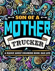
A Manly Adult Coloring Book: Dad Life: Clean Dad Swears & Old Coot-isms: A Unique & Funny Antistress Coloring Gift for Men
Click to Order Amazon US, UK or Canada
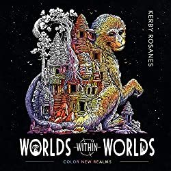
One of the most well-liked books for males in our coloring group proper now could be the most recent one from Kerby Rosanes World inside Worlds.
World Within Worlds
I personally personal this pretty e-book and the largest downside is deciding which cool image to paint first. Paper high quality is nice too.
Click to Order Amazon US, UK or Canada
Dad & Me Coloring Book

I obtained a replica of this lovely e-book and was very impressed with each the illustrations, the standard however principally with the distinctive concept of the softer aspect of fatherhood being present and celebrated all through the e-book. The pages are perforated and TOP sure so it’s great for lefties in addition to those that need to show their creations after you shade them in.
Click to Order Amazon US, UK or Canada
The Men’s Coloring Book by Nathaniel Wake

Nathaniel says it’s a Manly Mans Adult Coloring Book with Cyborg Women, Military Machines, Futuristic Battles, Western Armory, Fish Illustrations and Cars… nonetheless I completely beloved this e-book so that you might need to struggle your feminine vital different for among the illustrations on this e-book.
Click to Order Amazon US, UK or Canada
Mythomorphia: An Extreme Coloring and Search Challenge by Kerby Rosanes

Click to Order on Amazon: US UK Canada or Book Depository
Animorphia
An wonderful coloring e-book for adults that includes the super-detailed animal pictures from artist Kerby Rosanes. Known for his common Sketchy Stories weblog, Kerby works in intricately detailed black and white line to create creatures, characters, patterns, and tiny components to type compositions of mind-boggling complexity. Bring your creativity to finish the breath-taking drawings and discover hidden treasures and creatures scattered all through its pages

Order on Amazon US ~ Amazon UK ~ Amazon Canada ~ Book Depository
Imagimorphia Coloring Book by Kerby Rosanes

Fans of grownup coloring books are invited to enter the extraordinary world of Kerby Rosanes, the illustrator behind the Sketchy Stories weblog and Animorphia, the worldwide phenomenon and New York Times bestseller. In Imagimorphia, animals, and objects morph and explode into astounding element. Bring every intricate picture to life with shade and discover the objects hidden all through the e-book.
Printed on high quality paper, Imagimorphia is a unusual coloring and search e-book for followers of grownup coloring books like no different.
Dad Life – A Manly Adult Coloring Book
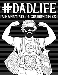
Color in humorous issues that EVERYONE’s Dad says to them.
Click to Order Amazon US, UK or Canada
ColorArt Coloring Book – Real Men Color
This e-book is spiral sure eight half x 11 pages with over 100 pictures to paint in.

Click to Order Amazon US, UK or Canada
The Art of the Cigar: Vintage Labels Coloring Book
Based on the attractive lithographs of cigar field labels from years passed by. Each of the 40 gorgeous labels is pre-1920 with elegant designs that wrap you within the nostalgia of an age when life was less complicated and folks knew easy methods to benefit from the second. The pages on this e-book are one-sided professionally printed by Vintage Pen Press.

Click to Order Amazon US, UK or Canada
Oldtimer Grayscale Adult Coloring Book for Men
This e-book contains 43 Oldtimer Images of Vintage Rustic Cars, Trucks, Tractors, Tools, Motorcycles and different Things for Men to Color. Creator Timothy Parks has his pictures printed on eight half x 11 paper printed solely on one aspect. He has penned a couple of different coloring books with related themes however this one has the most effective opinions.

Click to Order Amazon US, UK or Canada
Die Hard Coloring Book

If you reside in a home the place Die Hard IS a Christmas film custom, then this coloring e-book is for you. All your favourite scenes and quotes are on this official Die Hard coloring and exercise e-book. This coloring e-book from Harper Design is superb high quality. I obtained a pattern of it from the writer and it’s Coloring Book Addict accepted!
Hans Gruber and his posse crash the Christmas social gathering at Nakatomi and take the tower hostage;John McClane’s limo trip with Argyle;The tension-filled crawl via the constructing vents;John’s morbid message supply to Hans (written on the corpse of one in every of Hans’ males);The well-known bloody footprints;And in fact, John leaping off the Nakatomi tower.
The Book of Beasts
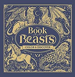
A buddy of mine in Scotland (Kemberlee) ordered this e-book within the UK and he or she couldn’t cease gushing about how fabulous it was. It’s obtained a hardcover with fabulous paper and wonderful illustrations of Dragons of all kinds. Filled with legendary monsters from around the globe, The Book of Beasts will take younger readers on an epic coloring quest via historical lands and lore. As they fill within the pages, kids will encounter creatures from Aboriginal, African, Mesoamerican, Greek, Roman, Indian, Norse, Chinese, and Japanese tales. On the again of every web page, children will discover background on the beasts within the e-book.
Click to ORDER Amazon US ~ Amazon UK ~ Amazon Canada ~ Book Depository
Full Metal Coloring – A Book of Down Range Reflection

Along with the pages to paint, you’ll discover some historic background of the firearms and weapons on every of the pages which had been written by a aggressive shooter and veteran who can be the artist. I’ve a replica of this e-book from the artist and have gifted it to the gun fanatic in my life. Its unique artwork on respectable paper. As at all times use a sheet between your pages to keep away from bleed-through and stress marks.
Click to Order Amazon US
Bennett Klein’s model is very detailed tattoo inked line artwork.
Colour my Sketchbook – DRAGONS by Bennett Klein


The coloured in dragons on this cowl had been executed by members of his Facebook web page linked right here.
Click to order Amazon US Amazon UK Amazon Canada Book Depository
This is simply one of many Bennett Klein Books, discover the remainder right here.
Tattoo Art Coloring Books for Men
The Tattoo Art of Freddy Negrete
I obtained this e-book from the writer and was fairly happy with the number of pictures contained inside. There is so much to select from however most do have a Hispanic, Chicano, Mexican taste to them. There are a lot of the Virgin Mary in addition to Sugar Skulls which make sense culturally. There’s even a sugar cranium Virgin Mary to paint in. As a colorist, most weren’t tremendous detailed so when you choose that kind of coloring e-book this one most likely received’t be your cup of tea, however when you like so as to add your personal patterning or are studying and working towards shading and contouring this e-book is ideal.

Click to Order Amazon US UK or Canada
Kitchen Overlord’s Colorable Compendium of Geek History: An Adult Coloring Book and Companion to the Illustrated Geek Cookbook
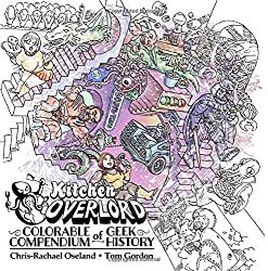
I haven’t seen this one in particular person, however its on my record and from the opinions, it seems enjoyable. “The creators of Kitchen Overlord’s Illustrated Geek Cookbook invite you to paint together with 120 years of geek historical past!
Start with H.G. Wells Time Machine in 1885 and produce the black and white pages to life because the world grows geekier with each decade.
See Cthulhu rise in 1928, shade Captain America in 1941, depart the Shire for Mordor in 1954, boldly go on a 5 12 months mission beginning in 1966, lastly be taught what “inconceivable” means in 1973, struggle Zuul and Gozer in 1984, assist the Scooby gang shield Sunnydale in 1997, turn into a Big Damn Hero in 2002, and assist Ichabod Crane turn into a contemporary man in 2012.
You recover from 50 enjoyable illustrations representing your favourite books, comics, motion pictures, TV, and video games – organized chronologically so you possibly can see how geekdom has developed over greater than a century.” Click to order AMAZON US AMAZON UK AMAZON CANADA BOOK DEPOSITORY
Guys have a tendency to like Science Fiction so most of the books on my nerds and geeks web page would possibly work for the boys in your record too!
Military Coloring Books for Men
The very first thing to do is work out hobbies and issues that the person in your life is into.. my dad loves airplanes and was within the USAF in order that was my first search. I discovered these two: Airplanes of the Second World War and Jet Fighters. Both are Dover Coloring Books so the worth level is correct, underneath $5.

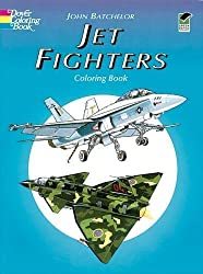
If you want freebies take a look at the free coloring web page and e-book excepts from Dover too.
Other Military Coloring Books for Men embody:
Many of those navy books additionally work in case your man is a historical past buff.
American Muscle Cars Coloring Books for Men
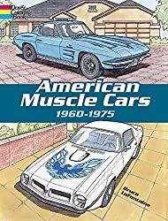
Expertly rendered illustrations of quick, flashy, and highly effective sports activities vehicles, amongst them the 1962 Ford Thunderbird, 1964 Corvette Stingray, 1968 Chevy Impala SS427, 1969 Camaro Z-28, 1970 Ford Torino Fastback, 1971 Mustang Boss 351, 1974 Firebird Trans-Am, and 37 others. For coloring e-book lovers and “muscle car” followers. Click right here to Order American Muscle Cars Coloring Book There’s additionally Classic Cars of the 50’s Coloring Book Luxury Cars Coloring Book Sports Cars Coloring Book & History of Trucks
Motorcycles Coloring Book – This assortment chronicles over 100 years of bike historical past with illustrations of 45 precisely detailed fashions, together with Gottlieb Daimler Motor Bicycle (1885), 1913 Royal Enfield, 1947 Indian “Chief,” 1966 BSA A65 Lightning, and the Honda ES21 Future Motorcycle Concept Prototype.
Dover Books has an excellent number of History Coloring Books
Looking for an excellent historic coloring e-book? Dover may also help you add shade to among the most exceptional occasions in historical past! From dinosaurs, the Old West, the Civil War, Native Americans, the house race, American presidents and first women to classic cars and trains, castles and cathedrals, well-known explorers and inventors, historic structure like Famous Buildings of Frank Lloyd Wright and landmarks. Black historical past coloring books function genuine illustrations in regards to the Underground Railroad, the Amistad, Barack Obama, and extra. Each version gives fantastically detailed illustrations and fact-filled captions.
Click right here to see the complete choice.
The Bicycle Coloring Book

This e-book blew me away once I began seeing coloured in photos from it. It is full of cityscapes and countryside illustrations that function a motorbike and a cat. It’s like nothing you’ve ever seen earlier than. The paper is fabulous artwork high quality and the illustrations are one-sided with a middle fold-out part for a big poster-sized creation. On the dealing with aspect of the web page is an illustration of the identical cat you see in every image (generally you must hunt to seek out him) however what’s actually cool in regards to the cat is that once you flip the pages he animates. This will for certain convey you again to your faculty days once you used to make flipbooks. If you’re a bicycle fanatic or the person in your life is, you possibly can’t go fallacious with this coloring e-book. It’s eight.2 x zero.eight x 10.eight inches and has 144 pages.
Click to order Amazon US Amazon UK Amazon Amazon Canada Book Depository
100 Animals by Jade Summer
An Adult Coloring Book with Lions, Elephants, Owls, Horses, Dogs, Cats and extra. 100 pictures printed on one aspect of the web page.

Click to Order Amazon US, UK & Canada
Ill-Gotten Brain Coloring Books by Chris Guest
I wished so as to add a few books from a brand new illustrator that I do know guys will love. Thanks to one in every of my coloring group, Shawn B. for the heads up about his enjoyable books! Meet Chris Guest aka IllGottenBrain. He has 2 books out, Beyond the Fairytale Forest and Monsters Eat Everything that you’re certain to get pleasure from.
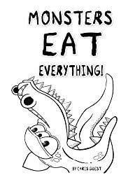
His books remind me of Steve Squidoodle’s illustrations too.. enjoyable and funky, verify his work out right here.
Walking Dead Coloring Book
This e-book is completed in a graphic novel model so LOTS of black and background particulars so it’s alongside the strains of a grayscale coloring e-book. The illustrations are from the Walking Dead graphic novels and it’s very detailed. We are hoping they arrive out with one other that follows the TV present a bit extra but when you recognize a Walking Dead addict, this may be an ideal reward.

Click to order Amazon US ~ Amazon UK ~ Amazon Canada ~ Book Depository
Steampunk Devices
Dudes like to tinker with devices so this Steampunk Devices can be an excellent alternative for the artsy man in your purchasing record.
Click to order Amazon US Amazon UK Amazon Canada Book Depository

We discover heaps extra Steampunk and Science Fiction choices for guys right here.
Intricate Ink – Animals in Detail


After seeing colorings from this e-book on Instagram I bought it on Amazon. It’s a greyscale e-book that makes your colorings actually come to life. It’s a hardbound e-book that opens on the prime so nice for left-handed colorists too.
Click to Purchase Amazon US
Lost Ocean by Johanna Basford
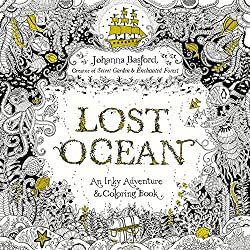
Although Johanna Basford is understood for her fairly flowers and delicate leaves, guys can fall just a little in love along with her illustrations in her third Inky e-book, “Lost Ocean”
Visit coral reefs and barnacle-studded shipwrecks, uncover intricate shells and pirate treasure. Secret Garden and Enchanted Forest followers and newcomers alike will welcome this artistic journey into an inky new world.
Click right here to order Lost Ocean Amazon US Amazon Canada Amazon UK Book Depository
Bugs & Creepy Crawling Coloring Books for Men
Maybe your grown guys nonetheless have that little boy in them that loves spiders and snakes… There are some decisions for them too. Check out this Complicated Spiders Coloring Book… This distinctive coloring e-book is eight inches broad x 9 inches excessive, it has 25 completely different illustrations of intricately adorned spiders; every illustration is printed within the e-book twice, one on a black background and the identical illustration on a white background with mild grey strains. Lots of spider and bug e-book right here too.

Fantasy and Dragon Coloring Books For Men
Amazon has dozens of Fantasy & Dragon coloring books that guys would possibly like right here.

Funny Coloring Books

Coloring for Grown-Ups: The Adult Activity Book
Electile Disfunction – The Story of the 2016 Presidential Election Coloring Book

Click to Order Amazon US
You can see extra Political Coloring Books right here.
Unicorns Are Jerks: a coloring e-book exposing the chilly, exhausting, sparkly reality

Coloring for Grown-ups – Holiday Fun Book
There are extra right here of the extra “R” rated variations as nicely.
See a big itemizing of our favourite humorous naughty & horny coloring books right here.
Steve MacDonald’s Cityscapes e-book “Fantastic Cities“ will even attraction to the fellows our there with a e-book the place no flowers or fairies are anyplace to be seen. Steve McDonald applies his distinctive photo-based strategy to create lovely, detailed line drawings of wonderful buildings and different constructions from around the globe in Fantastic Structures and his third e-book contains less complicated designs in Fantastic Collections,

Comic Book and Graphic Novel Coloring Books
DC Comics Coloring Book
Featuring iconic paintings by famend comedian artists, DC Comics Coloring Book contains gorgeous line artwork of beloved characters corresponding to Batman, Superman, and Wonder Woman. Click to Order on Amazon
Wonder Woman Coloring Book

This graphic novel options basic illustrations from among the most well-known Wonder Woman artists of all time, together with George Pérez, Jim Lee, Brian Bolland, Amanda Conner, Ross Andru, H.G. Peter, Cliff Chiang, and Phil Jimenez printed on each side of the web page. Click to Order the Wonder Woman Coloring Book
Coloring DC Batman Hush Volume 1

This grownup coloring e-book options chapters from one of many biggest graphic novels of all-time, BATMAN: HUSH. Illustrated by Jim Lee, identified for his intricate strains and distinctive element, this story is ideal for coloring. Click to Order this totally illustrated Batman graphic novel right here

Civil War – All your favourite Avengers battle on this graphic novel coloring e-book
120 pages of all-out costumed warfare, that includes Steve McNiven’s exquisitely rendered paintings simply ready for you so as to add the colour! Captain America and Iron Man are the feuding Avengers main the 2 sides of heroes that battle it out over the rights and wrongs of Superhuman Registration. Click to order Civil War
Color Your Own Age of Ultron
Color in your favourite Marvel Heros and Sinister Bad guys on this graphic novel. Difficulty ranges from simple to superior so there’s something for each graphic novel fan.
Click to Order Age of Ultron Here.
Color Deadpool Graphic Novel
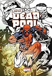
This e-book contains covers from New Mutants 98, old-fashioned Pool, New Pool, the Daniel Way years, and Deadpool vs; Thanos, carnage, zombies, Cable, and Spider-Man. Click to order Deadpool
Assassins Creed Coloring Book
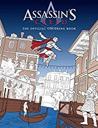
Click to Order Assasins Creed Coloring Book
Guys which are into Science Fiction and Fantasy can discover a big number of SciFi Coloring Books right here.
Steve Squidoodle has a implausible following on Facebook which is the place I found him. Like Bennett Klein, he’s at all times gifting away freebies on his fan web page. Learn extra about Steve Turner the illustrator right here.
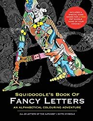
Squidoodle’s Book of Fancy Letters – Click to Order
All 26 letters of the alphabet, on single aspect pages with doodles objects to paint in. Taken from the intricate hand-drawn pen drawings of Steve Turner a.ok.a Squidoodle. Each letter is detailed and ornate, with doodled objects starting with that letter.
Each letter sits centrally on the web page, away from the backbone – you possibly can minimize the letters out, shade them and provides them as presents to household or mates. All the pages inside this e-book are taken from the hand-drawn illustrations by Steve Squidoodle Turner. He rigorously chosen objects to be contained in every letter – making it enjoyable for children and adults alike. The A incorporates an astronaut, an apple, an aeroplane, an anchor…. The B incorporates a bee, Big Ben, a beetle, balloons…. you get the concept!!
Squidoodle’s Book of Fancy Letters: An Adult Coloring Book – Click to Order
A Day on the Beach by Squidoodle – Steve Turner
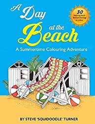
The Natural Atlas by Squidoodle – Steve Turner

Creative Insults for Foul-Mouthed Beasts – A UK Sweary Coloring Book by Squidoodle – Steve Turner
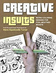
I STRONGLY advocate downloading the Hobby Lobby & Michaels App to your smartphone. That manner you at all times have the coupons with you. Being the clumsy particular person I’m.. I ALWAY neglect the coupons at house or within the different automotive or the opposite purse.. you get me.. proper? You can usually discover artwork provides there for a very good worth with the coupon however most frequently I purchase books and provides on Amazon.
AMAZON PRIME – If you aren’t a member it’s best to look into it. You get free 2-day transport daily at Amazon with Amazon Prime. You can attempt it for free proper now.
The Amazon Prime membership program gives different particular advantages for simply $99 per 12 months. Members can immediately watch over 40,000 motion pictures and TV episodes and borrow 1000’s of books from the Kindle Owners’ Lending Library.
Have the boys in your record loved coloring books I haven’t listed right here? Please let me know within the feedback beneath or on one in every of my social media accounts.
The post Adult Coloring Books for Men appeared first on XNX Adult Store.
0 notes
Text
Black Woman Creator: Nilah Magruder
Nilah Magruder is a writer and artist based in Los Angeles. From her beginnings in the woods of Maryland she developed an eternal love for three things: nature, books, and animation. Her young adult web comic, M.F.K., won the inaugural Dwayne McDuffie Award for Diversity in 2015, and has been published in print by Insight Comics. Her first picture book, How to Find a Fox, was published by Feiwel & Friends in 2016. She has written for Marvel and drawn storyboards for DreamWorks and Disney. When she is not working, Nilah is reading fantasy novels, watching movies, roller-skating, and fighting her cat for control of her desk chair.
Black Girls Create: What do you create?
I create children's books and comics.
BGC: What about children’s books and comics spoke to you when you got started?
I’ve always been interested in children's media. I grew up loving animation and from a young age I wanted to work in animation. A lot of the media that I consumed growing up was targeted towards kids and as I got older I never lost my love of that. I love Disney movies and animation from anywhere really. As I got a little older, that migrated to manga and a lot of that was targeted towards teens. That’s what I always loved consuming and wanted to put back in the world in my own words.
Now that I’m older I really think the kind of content we give kids is important, because they're going to grow up with this just like I did. These are stories and experiences that will form the basis of their knowledge and understanding of the world. You don’t always grow out of those early ideas that you ingest when you’re young. I think how we speak to kids and the sorts of stories we tell kids are very important.
BGC: Why do you create?
I just need to do it. If I don’t have this I drive myself crazy. Even when I wasn’t working in the arts, I used to be a journalist and work in marketing and this was my stress relief. It’s what I did to unwind and get away from real life and the things that stress me out. I’ve always loved art. In school when I wasn’t doing visual art, my passion was music and for a long time I thought I’d go to school for music and join a symphony, but then I veered over on this path. Art is something that has always spoken to me, it feeds me in a way. It’s become this thing where I need to do it. Even when I try to get away from it and not think about it my mind always circles back to looking at art and images and thinking about story and characters. It’s always been kind of an escape for me.
BGC: Now that is your job, do you need a new form of stress relief or has your stress just gone down?
No, my work is not my stress relief, it’s just a new form of stress. [LAUGH] I don’t draw for fun anymore, when I draw it’s with purpose. It’s thinking about the next story or it’s for work or it’s freelance. So to unwind I read a lot. I play video games on occasion when I have time, I roller skate, I go for walks, I go out with friends. At some point I want to take up gardening, but right now I’m just propagating a little plant. I used to garden when I was younger but a lot of hobbies are time consuming. I haven’t found that balance yet of having a hobby I can really lose myself in but also maintaining my work.
BGC: What are some of your all-time favorite comics or manga?
I was just recently reminded of Beck, which is a manga serialized in US as Mongolian Chop Squad. Beck is a manga about music and I was obsessed when I was a teenager, I loved it. Paradise Kiss always comes to mind because it’s about art and teenagers and feelings, and the art is amazing. Smile by Raina Telgemeier, was a very real story for me because I was also a middle schooler with teeth problems and braces. For Shonen manga I love Naruto, Bleach, and Shaman King. Those are really my favorites. When webcomics came along Strings of Fate by Jen Wang was my jam.
BGC: What exposed you to manga and comics growing up?
I guess it all started with Sailor Moon and that happened around the time that home internet became a big thing. The timing of both of those things was crucial to my entry into manga. I didn’t know anything about manga back then but I knew cartoons. From learning about Sailor Moon on the internet I learned there are other anime and a most of them are based on comic books, manga. Not a lot of it was being translated but very soon after that Tokyo Pop formed and started bringing over so much manga. That was my entry point right there, really cartoons was always the bridge into comics.
I should mention my brother kind of introduced me to anime and it really took hold with my first anime-con when I was 16. I learned about this through the internet and friends going to the conventions and learned of Otakon which was our local convention. The first time I went, everything you need is right there, the exhibit hall is full of anime and manga, that was a huge education for me.
BGC: Who or what inspired you to do what you do?
I’ve just always wanted to bombard people with my stories. I have a lot of little nieces and nephews and cousins and I just want them to think I’m cool so I keep working hard. I grew up in this area where art was a very traditional thing. I feel like there’s a very different appreciation for art on the West Coast so art has room to be seen as a viable career but on the East Coast it’s traditional, more fine arts. It’s about painting and photography and it’s just not a very practical thing. I grew up being very discouraged about pursuing a career in the arts and I’d love to share with kids that just because you’re getting older, you don’t have to give up art. Art is not a juvenile thing, in elementary school you take art class every week but then that falls away. Once you get to middle and high school, arts becomes an elective and I think that leads to a lack of appreciation for art in our society. I think it’s unfortunate that people devalue art, they don’t understand its purpose or how much of it impacts our world. I would love to hit kids when they’re young and show them art is an important part our society and culture. You don’t have to give it up, you don’t have to have it as a career, you can just have it as a hobby if you want. You don’t need to be an artist to appreciate art. Aside from just loving to tell stories that’s what keeps me doing this, to be an example and be part of the larger conversation of art as a thing in our world.
BGC: Why is it important to you as a Black person to create?
"There are so many other experiences, especially in America, that get erased and a lot of people get talked over. " -- Nilah Magruder
Children’s books, film, television it’s all predominantly white, it prioritizes one experience. There are so many other experiences, especially in America, that get erased and a lot of people get talked over. There are many Black women who do comics and who are interested in art, but I get this question all the time from people, “Where are the Black women? I never see Black women at Comic Con, I never see Black women working in comics.” I actually had one guy tell me, “In my experience Black women just aren’t interested in writing comics.” I do feel a responsibility to be here because we need people fighting this battle to break through these barriers that exist. People really will sell that lie that Black women don’t exist, don’t have agency, can’t embody a variety of roles, and have no stories to tell. I just vehemently disagree with that. I love art but also feel a responsibility to keep at it and be the antithesis to that lie.
BGC: What do you think about how difficult it is to hear that lie repeated to you and said to your face? Does it ever get discouraging to be in a place that feels so unwelcoming and how do you find the day to day strength to continue to go into an unwelcoming space and prove that you deserve to be there?
It gets really hard sometimes. There are days when I feel animation is crap, comics is crap, why am I doing this, why am I here? Luckily I’m apart of a welcoming community, I’m in tune with the other Black women who work in comics and work in animation, with non-Black women who work in comics and animation, and we keep each other strong and pull each other up and keep moving forward together. It still gets discouraging, I can’t be positive every single day. I can’t always put my brave face on and plunge ahead, but even on those days when I feel weak I know there are other Black women who are in this industry who are still ploughing ahead. That’s enough, there are enough of us so I don’t have to be strong every day. I do have these moments where I have to sit back and reflect. I have to ask myself why am I really doing this. I love it so much that I eventually rally, and I’ve never hit the point that the negative outweighs the positive. I’ve been very fortunate in my career, I have a lot of supportive people in my life. I try as best as I can to offer whatever resources and knowledge to other people, to other Black women, so that they can find their path too. It’s about the community, there are a lot of stupid people in this industry who have backwards or outdated ways of thinking and I don’t know if you can do anything about those people but what we can do is stay strong, stay united, and keep telling our stories. That’s something they can’t stop.
BGC: How do you balance creating with the rest of your life?
It’s really hard and I’m not doing a very good job at it right now, it gets overwhelming. Sometimes there are just not enough hours in the day and art takes so long to do. I’m not always able to do as much as I want to do. Even if my brain is ready to work, my body isn’t. I’ve hit this age where my body fights against me sometimes so I’m not always physically able to work even when I want to. It’s a struggle to stay in balance. I try to be as organized as I can, and that usually helps. I try to be realistic about my capabilities and just knowing for myself, this is what I can accomplish in this amount of time. In the course of a day, these are the pockets of time that I can work with, but the best I can do is just try not to overwhelm myself because if I get burnt out then that’s it. Just avoiding over extending myself is a real challenge but I’m good as long as I can make a little bit of forward movement everyday. Even if I’m not drawing or writing. If i’m always thinking about it and always planning then usually I’m able to keep some momentum that way. It’s a real challenge and I’m not always great at time management but I do my best. Having a community, having friends and colleagues that I can call on for assistance or who can hold me accountable, that helps a lot too.
BGC: It’s nice to hear that no matter the industry, Black women creators make a point to help each other. It’s important to know that because it feels like we get pitted against each other, there can only be one, so you’re fighting for your one spot.
It feels like that’s what they want you to do because that’s a distraction. That keeps you focused on each other rather than focused on moving forward. I’ve fallen prey to that sometimes too but I’m trying to get better at staying focused on the path ahead and not dragging anyone down because I don’t need to do that as a creator. My success is not dependent on the downfall of other people, we can all move forward together. I’ve been trying harder to focus on that.
BGC: You have your own webcomic. Why is it important to you to create MFK and continue to keep it up when you are so busy? Why has that continued to maintain a level of importance to you?
I started MFK in 2002. That was around the time that I came up with the scenes of the first idea and it’s a story that never goes away. I’ve created other stories in that amount of time that have fallen away but MFK is the one that I always come back too. I think because it’s a very personal story for me. Abby was my first foray into writing a story with a Black girl lead. I’ve put a lot of time, thought, and work into developing this world so it’s a natural part of me. It’s not something that I can see ever letting go of, Abby is kind of my child. It may take a long time, I may not always keep up with it, I may have to take breaks like I am right now, but if I’m working on this for another 50 years than so be it. It’s the story of my heart and I love it and I don’t ever see myself walking away from it until the story is done. Hopefully, it won’t take 50 years but it’s a story that I made a commitment to. I had a choice, when I first decided to do a webcomic I had a couple of stories and this is the one I chose because I had already been sitting on this idea for 10 years and didn’t want to put it off any longer. I made that commitment and I want to see it through for myself.
BGC: What has been the response from the community so far?
It’s been really positive, I’m always bracing myself for the negative reviews or for someone to tell me this is crap but it hasn’t really happened yet and I’m kind of surprised. I’m still bracing myself because now that it’s being published in print it’s going to reach a larger audience. People really seem to enjoy it, a lot of people seem to connect to it which is a shock because it’s such a personal thing. I can see the relevance of it to me, but I can’t always see the relevance of it to other people so it’s always refreshing when I hear feedback and hear that people really do enjoy the story and the characters and they’re eager for more.
BGC: Do you have any advice for young creators/ones just starting?
Lately the advice I give is to start small, make some comics, don’t wait. You learn by doing, so go ahead and start making some comics and treat it as a learning experience, but start small. If you pick a problem that’s too big you can overwhelm yourself. If you want to start with that really big comic, that really epic idea then by all means do what you’re really passionate about but MFK was my first webcomic, it was not my first comic. I tried doing short comics first and also working on other people’s comics. I got acclimated to the medium before I launch my first epic. That’s what I would suggest. A big project can be overwhelming very quickly and if it’s too much for you to handle you’re setting yourself up for failure so just start small.
BGC: Do you have any future projects that you’re thinking about working on?
I illustrated a middle grade graphic novel that’s upcoming called Creaky Acres. It’s about a Black girl who moves to an all white rural community and joins their local horse riding club. It’s being written by Calista Brill and published by Dial Books for Young Readers. It’s coming out in 2019, I believe. That’s my other major project other than that and MFK I’m just deciding what else I want to work on.
Outside of comics, Canon Busters was recently announced, I did a bit of writing for that and it is an animated series coming to Netflix at some point.
BGC: Any last words of wisdom?
If art is intimidating for you, if you’re interested in comics and other medium, give it a shot. Learn to appreciate art by doing.
2 notes
·
View notes
Text
Tagged!
I was tagged by the excellent @whelvenwings (as always 😉) to answer some fun questions, so here we go!
Nickname: I have various nicknames, which is great - I love a good nickname, the more unique the better. There was a whole group of friends at my old work who used to call me "Knees", or sometimes "Knee-bearer".
Why? Well, I'm glad you asked. We used to ask each other quiz questions on Slack to pass the time/stave off the crushing despair of working for that company, and one time someone asked the question: "What is genuphobia a fear of?"
Based on the French word "genoux", I guessed "knees". When the winner was announced my colleague said "The winner is... Rebecca with knees!"
And so I became Rebecca With Knees. Or Knees for short.
Zodiac: Ugh... Aries but I was born on the first day of it, and it doesn't fit my personality at all. I think I was meant to be a Pisces.
With that said, my Chinese zodiac year is the Ram, so I can say I'm a double Ram. Which is something we should all aspire to be.
Height: Not enough for high shelves
Last movie I saw: If we go with in the cinema, then it was the gorgeous wonder that is Into the Spider-Verse. If we're counting DVDs to cheer myself up because I have New Year's Blues, then it was Ocean's Eleven.
Last thing I Googled: ...genuphobia. To remember how it was spelt 😂
Favorite musician: My cousin Georgia, who is a flautist and plays a lot of experimental contemporary music and is generally cool 😊
Song stuck in my head: Whiskey in the Jar. I blame Starship Iris.
Other blogs: Eh... I have a couple of other Tumblogs I created for uni work (my data journalism project and my Masters final project, respectively) but nothing that I actually *use*.
Oh, and one that I created to boost a Peter Pan cyberpunk fanfic I was writing. I'd forgotten about that.
Do I get asks: 😂😂😂
no I do not
Following: 127 Tumblrs, which is way more than I thought. But I never really unfollow anyone.
Amount of sleep: n e v e r e n o u g h
Lucky number: 8!
What I’m wearing: A purple checked shirt (bought at a second hand sale thingy) under a grey sweatshirt with purple flowers embroidered on it. Dark grey jeans. Pink and black socks that don't match but they're like, the opposite of each other, so that's cool.
Dream job: Comics writer. I don't really care what kind of comics (well, hopefully ones I like) or what medium (digital or print), I just want to write comics.
But I've always thought it would be cool to write a whole variety of things, so like Visual Novels, games, short stories, novels, journalistic articles, maybe even a short film or web series. I want to write all the things! (And get paid for it preferably)
Dream trip: My dream/bucket list goal is to go and see the Northern Lights, so I'd do that with a few of my closest friends. From all over the world. And we'd have a really chilled out trip with lots of great conversations and lots of peaceful reading and everyone would get along super well and it'd be lovely.
Favorite food: Ugh, it's hard to pick. I'm eagerly awaiting a Chinese takeaway so I'm going to go with char siu bao which is fluffy, pillowy steamed buns with sweet barbecue pork inside. Mmmmmm nom nom.
Play any instruments: I play the French Horn (well, not actively, but I can play) and I tried to teach myself the ukulele years ago, which I keep meaning to come back to. And I would like to take the piano back up. I gave it up after Grade Four but it's so satisfying to play. I have a baby nephew whose parents own a piano (actually our parents' old piano) and I daydream about playing fun songs on it for my nephew to make him laugh.
Languages: I speak English (I... I think) and Spanish and Mandarin (when I concentrate). I learned French for many, many years but recently discovered how shocking my grammar is when I went back to France last year. I also used to speak Italian to a basic level but I also went to Italy last year and... I struggled. Actually, one of my plans for 2019 was to start learning it again. I'd almost forgotten!
Favourite songs: You want me to list like ... all of them?
Okay, let's have a selection.
A new love: Galvanize by The Chemical Brothers. I discovered it today and it's pretty long but it has a super cool electric violin melody in it.
An old favourite: Nemo by Nightwish
Favourite song to sing along to: One Way Or Another by Kate Voegele (no, not the Blondie song. A different One Way Or Another) or Pony (It's Okay) by Erin McCarley. Two very different songs to sing but both great fun.
Never get tired of: Dreaming by Smallpools. Did I mention I love that song?
Random fact: I'm typing this all out on a phone because I was too lazy to grab my laptop.
...I have some time to kill. (See above about the takeaway)
How to describe myself aesthetic: My aesthetic is strings of sparkly glass things hanging in windows, cute things with stars on them, dolphins and butterflies, purple and silver and turquoise, rainbows and windchimes. Whimsical clutter. Think a nine-year-old's bedroom meets a New Age shop.
I won't bother to tag anyone because no-one ever does these, but if you see this on your dash and want to do it, be my guest!
#and in case you were wondering#the takeaway just arrived#off to have some food!#whelvenwings#tagged#thank u that was pretty fun#haven't done one in a while#and a good workout for my thumbs
0 notes
Photo

John Mahoney’s Zentropa by Michelle Lam
John Mahoney, originally from New York City, is a faculty member of the CalArts Character Animation program who recently has had great success in publishing a beautifully produced, illustrative comic-novel Zentropa. Mahoney was initially inspired by the work of Moebius and other artists in Heavy Metal magazine, and this led him to create his own sci-fi graphic novel.
In the interview below, Mahoney describes the challenges he faced on this creative journey, offering insights that young aspiring artists will find motivational. Zentropa showcases a range of beautiful, intricate line drawings, fantastical characters, and unique ways of laying out each page. It also reflects a complex creative journey that Mahoney took. ML: So to start off, can we hear about some of your background information, or the journey you took to where you are today as an artist? JM: Ok, sure! Originally I went to school for illustration at Pratt Institute in Brooklyn, New York. I thought I wanted to be an illustrator. And then, around senior year I decided I wanted to get a bit more into filmmaking. So that’s when I ended up pursuing Disney and I got involved with working (for Disney) as a visual development artist. But even during that time I was always wishing I could do my own comic, or my own project -- something like that. That was something that was always in the back of my mind. ML: As someone who collects a lot of artistic inspiration, who or what was your initial motivation to create Zentropa? JM: Yeah, I was at, I think the first CTN show about five years ago, and I had a chance to meet Moebius. I didn’t realize this at the time, but he was my original inspiration because he created Heavy Metal Magazine. When I was growing up in high school, that was the only art I had to influence me. Getting a chance to meet him and see him draw was incredible-- and then a few months later he passed away, so I thought that to do a tribute to Moebius would be the most I could thank him. So that was in the back of my mind. And then, two years ago I got really sick. The doctors said, “You probably aren’t going to live.” And that was it. At that point, I just focused on survival. All I wanted to do is live. After some amazing surgery, I was notified that I will live after all. This helped me put a lot of things in perspective. So I thought to myself, “What’s the point of struggling to do a "good graphic novel", or do anything good? Why don’t I just create art and enjoy yourself?” So I decided at that point, I’m just going to do a bad graphic novel. I’m going to do something with no words, because I don’t like words. Words get in my way. So I just did it as a personal project for myself. I was recovering from surgery at that time, so I could really walk or anything, I was just kinda at my desk. So it was a great opportunity to focus on something, and it really helped me while I was healing. So many pages just started coming out. I would do a page a day, or two pages a day. Then, I showed some sample pages to a book dealer, Stuart Ng Books. He looked at the pages and he said, “This looks great! This could really sell.” I was like, “Really?” He put me in touch with a publisher to self publish my books. So I decided I would pay for the book and launch a kickstarter to hopefully pay me back for the initial investment, which was about $7,000 at the time. So at that point, I made the book and was so nervous about doing the kickstarter -- I didn’t launch the kickstarter for several months. It was just so nerve wracking, but when we finally did launch, we were able to raise the $7000 by the end of the first day. Within 30 days, we raised a total of $23,000. ML: According to your kick starter, Zentropa is in the style of old Heavy Metal comic strips. So what major aspects of Heavy Metal would you say you incorporated into Zentropa? JM: Well, the main thing is that it’s very individualistic/weird. Back in the old days, every single artist had their own style. You didn’t have to tell linear stories. You could just go in bizarre directions, or at least in the 70’s and 80’s, Heavy Metal allowed for that. So, I allowed myself to go into this world and kept talking about Heavy Metal as often as I could on social network. Little did I know that the CEO of Heavy Metal was following the project (Zentropa). ML: That’s so cool! JM: Yeah, I had not idea! At the end of the Kickstarter campaign, the CEO called me to set up a meeting. He said, “So what do you want to do with Heavy Metal?” I was trying to hold back my tears. This was the whole reason I did art -- because it was based on Heavy Metal’s magazine. They listed a bunch of possibilities then offered to publish ten pages of Zentropa in Heavy Metal every month until they do the whole book. They made me promise to color every page, so I’ve been doing that, and I’m on issue five now. That’s fifty pages so far for Heavy Metal. ML: That’s amazing! So the illustrations in Zentropa are extremely detailed and intricate. Would you mind explaining the time and process behind those drawings? JM: It’s kind of a strange process. I would experiment with rendering my Zbrush sculptures and put it these images up on facebook. Then someone mentioned how bad my renderings were. So for the fun of it, I started rendering stuff in pink and green, and make it look as terrible as possible -- Just to say, “Yeah, it’s bad and I can make it worse.” Then, I stumbled across this shader I invented that makes my 3D models look like outlined drawings. It looked interesting in the computer, so I wanted to see if I could print a comic book page in this style. So I printed a few pages out at Staples. I thought it was going to look completely digitalized. I started tearing up in the car because it looked like a real line drawing. I couldn’t believe it. I was like, “Oh my God,” and that was it. It’s based on my original line drawing style, but it’s mostly CG models that have been collaged together. ML: I didn’t even know that! When I was looking through your book, I was like, “How do you draw all of this?!” And now I learned that all of this was sculpted in 3D. That’s amazing. So I was also wondering if there’s a reason behind why some of the pages are in color, while the rest was in black and white? JM: Well, believe it or not, I did color most of the book. But the last, last minute, I contacted the publisher and took those colors out. It just has such a strong black and white quality to it. So, I only sparingly left a few of the colored pages in there. The whole end of the book is colored. I did that because I had no idea of what else to do. I just ran out of ideas, so I started doing these colored characters. I had around eight or nine characters on one photoshop file. I turned on all the layers by mistake once and it looked really cool! So that’s how all those intricate things came out at the end of the book, they were just all my layers on photoshop. ML: So Zentropa clearly has a story or narrative behind all the images. But, there isn’t really any dialogue provided. Do you want your audience to kind of develop their own interpretations, or is there a set story that we should figure out based on the images? JM: Well, I do have a basic idea or feeling of where this is going, almost. It’s kind of like a dream, but I wanted to allow the audience to come up with their own story. I have a friend right now who’s writing a screenplay, and he told me his interpretation. I was like, “That’s AWESOME! I never thought of that!” Also, when I was a kid, I would look at Marvel Comics. I wouldn’t read them, I would just look at them. I would stare at the images and imagine. So I want that audience to feel how I felt like when I was twelve or ten. The only way to ensure they would do that is to remove all the dialogue. So I did a pass with word bubbles, and I just felt like it was closing the door to people’s interpretations by me saying what it is. I started feeling a little depressed, so I pulled all those word bubbles out. ML: I see, that’s interesting. So besides other art inspirations, do you have any life experiences that inspired you to create this comic? JM: Not necessarily life experiences, because I think the whole thing is a life experience. Well, hold up, let me start again, because that’s a good question. Going through the operation and surviving all of that... once I looked through the book many months later, I realized that the characters are floating through this unknown space. If you look at all the sci-fi stuff, it feels very biological. I think that may have been the war that was going on inside of my body -- trying to fight it, winning sometimes, losing sometimes. So I do think there is a biological struggle that you can see in the images, which I didn’t see until many months after the book was done. I think it was a self conscious influence, and also consciously, I was watching the movie Gravity over and over again while I was making the book. ML: That’s really inspiring! Yeah, so this is the last question: What are some things you learned during the creation of Zentropa that you feel may help other aspiring artists and storytellers? JM: Yeah, the biggest thing is: Life is short. There is no time for self criticism. You don’t really need to self criticize. Just do it. If you enjoy it, that’s all that counts, even if no one else does. My goal was to have 7,000 books in my storage facility. I had no idea that people would respond to it so strongly. So, that will be my advice. Just trust yourself, and if you really enjoy what you’re doing, keep doing it. Even if you don’t think you’ll make a penny from it, or you think nobody else would like it. The gratification you will get from it is incredible. So many doors have opened up, which was not my intention at all from doing this project. So that would be my insider advice to people who might wanna do that. If anyone is interested in getting the book, here is the website: www.theinspirationstation.com
70 notes
·
View notes
Text
Hey all, Dani here.
A few months ago I did a wintery atmosphere recommendations post, and when I was trying to plan out my posts for March and April, I realized that I had had fun making the seasonal recommendation post, so why not try to keep going with it. So here we are, at the spring atmosphere recommendations.
Now, what makes for a spring atmosphere pick for me? Well, I find spring to sometimes be light and fun, and sometimes I find them to be books with a sense of hope for better times. Spring is that burst of brightness after the dreariness of winter, that inviting warmth leading us to the heat of summertime. So I wanted my books to reflect that.
Okay, first I need to talk about Donaya Haymond’s book Seasons Turning. I have been a long-time fan of this book, since long before it was in a bound print format. Also, this one definitely makes use of all of the seasons, but Spring herself is one of the main characters, so it feels even more appropriate for this list.
Next, I suppose it is natural to add romantic stories to a spring atmosphere story, but I also like my romances to have a little bit of magic in them. Fine, I do read non-fantastical contemporary or historical romances sometimes too. But this book, Heartstone by Ell Katharine White, is Pride and Prejudice meets dragon riders, and honestly I feel like that’s all I need to say to sell this book. I originally thought it was a standalone, but then learned it is a trilogy. The final book is out now (and I still need to read it), but I adore this book so much.
Then I have a couple of contemporaries to talk about. One is a cute YA contemporary romance that features fantasy without actually being a fantasy book. I’m talking about Now A Major Motion Picture by Cori McCarthy. The main characters are the granddaughter of a famous fantasy author and the actor cast in the lead role of the book’s film adaptation. It’s a fantastic story, one that I got so distracted reading while at work that I ended up losing track of time and coming back from break late. oops. Also, somehow I never wrote a review for this book, which is upsetting. I guess I’m going to have to re-read it so I can write up a nice review.
Finally for this grouping I have Eliza and Her Monsters by Francesca Zappia. This book spoke to the creative being within me. Eliza is an artist and online content creator, and things get a bit complicated when one of her biggest fans turns out to be the new kid at her school. Of course nobody knows she’s the creator of this awesome web comic. It’s a cute and inspiring romance that I feel touches the soul of all of us who create artistic content.
First up for this grouping is The Philosopher’s Flight by Tom Miller. Whoa, actually this particular grouping are the only male authors in this whole list, but they are both extraordinary, so I feel good about recommending them. In this alternative history book with a little bit of magic/science, our main character wants to be a flier, a job that is solely filled with women. It is an uphill struggle for him to achieve his dream, but following his story just made me hope for better things to come.
And to wrap up this section, I need to talk about the Princess series by Jim C. Hines. Obviously, I find fairy tale stories and fairy tale twists or fairy tale retellings to be full of hope and eventual happiness. Well…this series is and isn’t that feeling. These books start after “happily ever after” has happened. So Cinderella has married her prince, Sleeping Beauty has been woken from her slumber (same with Snow White). But these stories have darker twists to them, and our heroines have more adventure they still need to accomplish…and some happiness and new happy endings can be found along the way. Also…I totally ship Sleeping Beauty and Snow White, because yes, that is a thing in this series. I love it so much.
I mentioned it earlier, but springtime is when I turn to romance more than most other seasons. Well, sometimes winter, but that’s just because I think that cute or steamy romances make me feel all warm inside. Anyway, there are a number of Christina Lauren books I could recommend here, but I’m going to pick My Favorite Half-Night Stand because of all of the co-author duo’s books I’ve read so far, this one seemed the most light hearted and fun to me. Plus it has friends-to-lovers and a love triangle that really is more of a secret identity thing, and I just really had a good time reading it.
If you want cute and heart-warming look no further than Catana Comics. You can follow these comics on Facebook or Instagram, but there are now two bound books that have been released, which feature several comics that were not released online. Follow Catana and John through adorable day-to-day romantic moments and every day moments. These are just adorable, and so darn relatable.
Obviously if you want a fun read, why not try a hilarious historical read. This is a book that is totally fine being not at all serious and sort of making fun of itself. So don’t go into this looking for something mostly serious with moments of humor. I should know; it took me three tries to finally read all the way through this book and enjoy it. My Lady Jane by Cynthia Hand, Brodi Ashton, and Jodi Meadows (known as The Lady Janies) is definitely that light and fun read for your spring mood.
And the final book I have on my recommendations list is Again, But Better by Christine Riccio. Bonus points: it takes place during the spring semester of a year in college, so definitely appropriate for a spring atmosphere recommendations post. This is endearing and relatable and pretty fun, honestly. I actually probably need to re-read this time, and now would be a pretty good time to do so.
Hmm…actually you know what, spring also makes me think of flowers blooming, and that makes me think of cherry blossoms…which then gives me two books I need to recommend solely based on the mental image of cherry blossoms flowering.
Shadow of the Fox takes place in a fantasy world inspired by Japanese mythology, and Wicked Fox is basically a K-Drama, but they both just come to mind when I think about cherry blossoms. Plus they have good mythology, fox-shifting leading ladies, and a definite emphasis on good food, which always makes for a good recommendation.
All right, well that is all from me for today. Feel free to recommend your own spring atmosphere books in the comments. I hope you all have a lovely weekend, and I will be back soon with more bookish content.
Recommendations: Spring Atmosphere Hey all, Dani here. A few months ago I did a wintery atmosphere recommendations post, and when I was trying to plan out my posts for March and April, I realized that I had had fun making the seasonal recommendation post, so why not try to keep going with it.
0 notes
Text
How The Internet Happened: From Netscape to the iPhone
Brian McCullough, who runs Internet History Podcast, also wrote a book named How The Internet Happened: From Netscape to the iPhone which did a fantastic job of capturing the ethos of the early web and telling the backstory of so many people & projects behind it’s evolution.
I think the quote which best the magic of the early web is
Jim Clark came from the world of machines and hardware, where development schedules were measured in years—even decades—and where “doing a startup” meant factories, manufacturing, inventory, shipping schedules and the like. But the Mosaic team had stumbled upon something simpler. They had discovered that you could dream up a product, code it, release it to the ether and change the world overnight. Thanks to the Internet, users could download your product, give you feedback on it, and you could release an update, all in the same day. In the web world, development schedules could be measured in weeks.
The part I bolded in the above quote from the book really captures the magic of the Internet & what pulled so many people toward the early web.
The current web - dominated by never-ending feeds & a variety of closed silos - is a big shift from the early days of web comics & other underground cool stuff people created & shared because they thought it was neat.
Many established players missed the actual direction of the web by trying to create something more akin to the web of today before the infrastructure could support it. Many of the “big things” driving web adoption relied heavily on chance luck - combined with a lot of hard work & a willingness to be responsive to feedback & data.
Even when Marc Andreessen moved to the valley he thought he was late and he had “missed the whole thing,” but he saw the relentless growth of the web & decided making another web browser was the play that made sense at the time.
Tim Berners-Lee was dismayed when Andreessen’s web browser enabled embedded image support in web documents.
Early Amazon review features were originally for editorial content from Amazon itself. Bezos originally wanted to launch a broad-based Amazon like it is today, but realized it would be too capital intensive & focused on books off the start so he could sell a known commodity with a long tail. Amazon was initially built off leveraging 2 book distributors ( Ingram and Baker & Taylor) & R. R. Bowker’s Books In Print catalog. They also did clever hacks to meet minimum order requirements like ordering out of stock books as part of their order, so they could only order what customers had purchased.
eBay began as an /aw/ subfolder on the eBay domain name which was hosted on a residential internet connection. Pierre Omidyar coded the auction service over labor day weekend in 1995. The domain had other sections focused on topics like ebola. It was switched from AuctionWeb to a stand alone site only after the ISP started charging for a business line. It had no formal Paypal integration or anything like that, rather when listings started to charge a commission, merchants would mail physical checks in to pay for the platform share of their sales. Beanie Babies also helped skyrocket platform usage.
The reason AOL carpet bombed the United States with CDs - at their peak half of all CDs produced were AOL CDs - was their initial response rate was around 10%, a crazy number for untargeted direct mail.
Priceline was lucky to have survived the bubble as their idea was to spread broadly across other categories beyond travel & they were losing about $30 per airline ticket sold.
The broader web bubble left behind valuable infrastructure like unused fiber to fuel continued growth long after the bubble popped. The dot com bubble was possible in part because there was a secular bull market in bonds stemming back to the early 1980s & falling debt service payments increased financial leverage and company valuations.
TED members hissed at Bill Gross when he unveiled GoTo.com, which ranked “search” results based on advertiser bids.
Excite turned down offering the Google founders $1.6 million for the PageRank technology in part because Larry Page insisted to Excite CEO George Bell ‘If we come to work for Excite, you need to rip out all the Excite technology and replace it with [our] search.’ And, ultimately, that’s—in my recollection—where the deal fell apart.”
Steve Jobs initially disliked the multi-touch technology that mobile would rely on, one of the early iPhone prototypes had the iPod clickwheel, and Apple was against offering an app store in any form. Steve Jobs so loathed his interactions with the record labels that he did not want to build a phone & first licensed iTunes to Motorola, where they made the horrible ROKR phone. He only ended up building a phone after Cingular / AT&T begged him to.
Wikipedia was originally launched as a back up feeder site that was to feed into Nupedia.
Even after Facebook had strong traction, Marc Zuckerberg kept working on other projects like a file sharing service. Facebook’s news feed was publicly hated based on the complaints, but it almost instantly led to a doubling of usage of the site so they never dumped it. After spreading from college to college Facebook struggled to expand ad other businesses & opening registration up to all was a hail mary move to see if it would rekindle growth instead of selling to Yahoo! for a billion dollars.
The book offers a lot of color to many important web related companies.
And many companies which were only briefly mentioned also ran into the same sort of lucky breaks the above companies did. Paypal was heavily reliant on eBay for initial distribution, but even that was something they initially tried to block until it became so obvious they stopped fighting it:
“At some point I sort of quit trying to stop the EBay users and mostly focused on figuring out how to not lose money,” Levchin recalls. … In the late 2000s, almost a decade after it first went public, PayPal was drifting toward obsolescence and consistently alienating the small businesses that paid it to handle their online checkout. Much of the company’s code was being written offshore to cut costs, and the best programmers and designers had fled the company. … PayPal’s conversion rate is lights-out: Eighty-nine percent of the time a customer gets to its checkout page, he makes the purchase. For other online credit and debit card transactions, that number sits at about 50 percent.
Here is a podcast interview of Brian McCullough by Chris Dixon.
How The Internet Happened: From Netscape to the iPhone is a great book well worth a read for anyone interested in the web.
Categories:
book reviews
from IM Tips And Tricks http://www.seobook.com/how-internet-happened-netscape-iphone from Rising Phoenix SEO https://risingphxseo.tumblr.com/post/184033605890
0 notes
Text
How The Internet Happened: From Netscape to the iPhone
Brian McCullough, who runs Internet History Podcast, also wrote a book named How The Internet Happened: From Netscape to the iPhone which did a fantastic job of capturing the ethos of the early web and telling the backstory of so many people & projects behind it's evolution.
I think the quote which best the magic of the early web is
Jim Clark came from the world of machines and hardware, where development schedules were measured in years—even decades—and where “doing a startup” meant factories, manufacturing, inventory, shipping schedules and the like. But the Mosaic team had stumbled upon something simpler. They had discovered that you could dream up a product, code it, release it to the ether and change the world overnight. Thanks to the Internet, users could download your product, give you feedback on it, and you could release an update, all in the same day. In the web world, development schedules could be measured in weeks.
The part I bolded in the above quote from the book really captures the magic of the Internet & what pulled so many people toward the early web.
The current web - dominated by never-ending feeds & a variety of closed silos - is a big shift from the early days of web comics & other underground cool stuff people created & shared because they thought it was neat.
Many established players missed the actual direction of the web by trying to create something more akin to the web of today before the infrastructure could support it. Many of the "big things" driving web adoption relied heavily on chance luck - combined with a lot of hard work & a willingness to be responsive to feedback & data.
Even when Marc Andreessen moved to the valley he thought he was late and he had "missed the whole thing," but he saw the relentless growth of the web & decided making another web browser was the play that made sense at the time.
Tim Berners-Lee was dismayed when Andreessen's web browser enabled embedded image support in web documents.
Early Amazon review features were originally for editorial content from Amazon itself. Bezos originally wanted to launch a broad-based Amazon like it is today, but realized it would be too capital intensive & focused on books off the start so he could sell a known commodity with a long tail. Amazon was initially built off leveraging 2 book distributors ( Ingram and Baker & Taylor) & R. R. Bowker's Books In Print catalog. They also did clever hacks to meet minimum order requirements like ordering out of stock books as part of their order, so they could only order what customers had purchased.
eBay began as an /aw/ subfolder on the eBay domain name which was hosted on a residential internet connection. Pierre Omidyar coded the auction service over labor day weekend in 1995. The domain had other sections focused on topics like ebola. It was switched from AuctionWeb to a stand alone site only after the ISP started charging for a business line. It had no formal Paypal integration or anything like that, rather when listings started to charge a commission, merchants would mail physical checks in to pay for the platform share of their sales. Beanie Babies also helped skyrocket platform usage.
The reason AOL carpet bombed the United States with CDs - at their peak half of all CDs produced were AOL CDs - was their initial response rate was around 10%, a crazy number for untargeted direct mail.
Priceline was lucky to have survived the bubble as their idea was to spread broadly across other categories beyond travel & they were losing about $30 per airline ticket sold.
The broader web bubble left behind valuable infrastructure like unused fiber to fuel continued growth long after the bubble popped. The dot com bubble was possible in part because there was a secular bull market in bonds stemming back to the early 1980s & falling debt service payments increased financial leverage and company valuations.
TED members hissed at Bill Gross when he unveiled GoTo.com, which ranked "search" results based on advertiser bids.
Excite turned down offering the Google founders $1.6 million for the PageRank technology in part because Larry Page insisted to Excite CEO George Bell ‘If we come to work for Excite, you need to rip out all the Excite technology and replace it with [our] search.’ And, ultimately, that’s—in my recollection—where the deal fell apart.”
Steve Jobs initially disliked the multi-touch technology that mobile would rely on, one of the early iPhone prototypes had the iPod clickwheel, and Apple was against offering an app store in any form. Steve Jobs so loathed his interactions with the record labels that he did not want to build a phone & first licensed iTunes to Motorola, where they made the horrible ROKR phone. He only ended up building a phone after Cingular / AT&T begged him to.
Wikipedia was originally launched as a back up feeder site that was to feed into Nupedia.
Even after Facebook had strong traction, Marc Zuckerberg kept working on other projects like a file sharing service. Facebook's news feed was publicly hated based on the complaints, but it almost instantly led to a doubling of usage of the site so they never dumped it. After spreading from college to college Facebook struggled to expand ad other businesses & opening registration up to all was a hail mary move to see if it would rekindle growth instead of selling to Yahoo! for a billion dollars.
The book offers a lot of color to many important web related companies.
And many companies which were only briefly mentioned also ran into the same sort of lucky breaks the above companies did. Paypal was heavily reliant on eBay for initial distribution, but even that was something they initially tried to block until it became so obvious they stopped fighting it:
“At some point I sort of quit trying to stop the EBay users and mostly focused on figuring out how to not lose money,” Levchin recalls. ... In the late 2000s, almost a decade after it first went public, PayPal was drifting toward obsolescence and consistently alienating the small businesses that paid it to handle their online checkout. Much of the company’s code was being written offshore to cut costs, and the best programmers and designers had fled the company. ... PayPal’s conversion rate is lights-out: Eighty-nine percent of the time a customer gets to its checkout page, he makes the purchase. For other online credit and debit card transactions, that number sits at about 50 percent.
Here is a podcast interview of Brian McCullough by Chris Dixon.
How The Internet Happened: From Netscape to the iPhone is a great book well worth a read for anyone interested in the web.
Categories:
book reviews
source http://www.seobook.com/how-internet-happened-netscape-iphone from Rising Phoenix SEO http://risingphoenixseo.blogspot.com/2019/04/how-internet-happened-from-netscape-to.html
0 notes