#the proportions are off because I drew directly with a pen
Explore tagged Tumblr posts
Visit Tumblr Blog
Explore Tumblr blogs with no restrictions, modern design and the best experience.
Last Seen Tumblr Blogs


Fun Fact
Tumblr Inc. is funded by 13 investors.
Text
Yesterday (and this morning) I failed to make those cute Vox's shimeji work on my pc (the lil Voxs that should run all around your desktop)
I was super sad but I did this doodle with a pen while installing and uninstalling java trying to make it work

#vox#vox hazbin hotel#hazbin hotel#the vees#valentino hazbin hotel#vox the tv demon#staticmoth#hazbin valentino#vox fanart#voxval#i felt like a failure EHEHEHEHEHE#BUT#at least this doodle is cute#the proportions are off because I drew directly with a pen#because cleaning eraser dirt from erasing pencil is a pain#plus my pc already has problems#pencil dirt would traumatize him#hazbin hotel vox#I SHOULD HAVE DRAWN IT DIGITALLY DAMN#NOW I AM SEEING THAT VOX'S HEAD IS ENORMOUS#but I remembered that Val's has antennas so yay!#I am still upset because I wanted the tiny Voxs running around my desktop#grr grr#but#anyway#my internet is also super slow so every download was a pain#that probably contribute to my bad mood#but doesn't matter#because today I bought a nice cooked meal for myself and It was super tasty!!! so yay!!!!
23 notes
·
View notes
Text
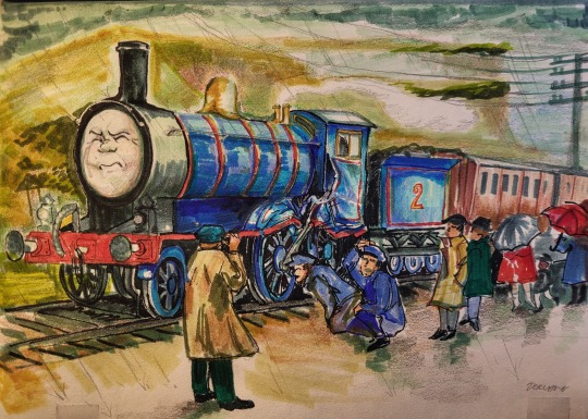
A redo of my Edwards Exploit drawing from ages ago, now in traditional mixed media!
I felt like I didn't capture the mood I wanted last time when I looked it over again (to the horror of everyone who got to see this early. Thank you for gassing up the old one, and keeping me motivated through the making of this)
this version is much more directly studied off the Peter and Gunvor Edwards' illustration, because I've grown into the opinion that the model adaptation of exploit was really weak (technical limitations!!! what a shame) and i want to get back into studying these illustrations, there's a lot to pick apart in them.
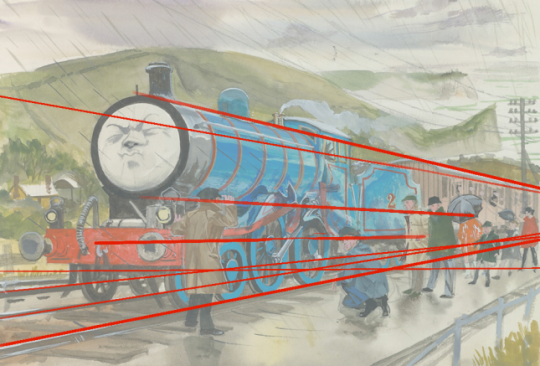
Here's a bunch of perspective lines i drew over it when I was sketching. (I don't normally do that when I redraw, but that's usually because I'm drawing from model era screencaps and I can rely on those being proportional, most of the time) Edwards face breaks perspective here just a bit to add more drama to the scene, everything else is proportional.
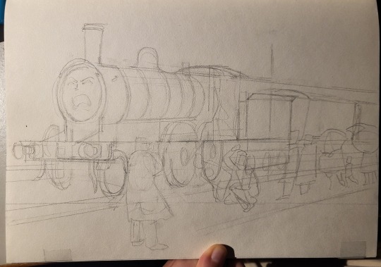
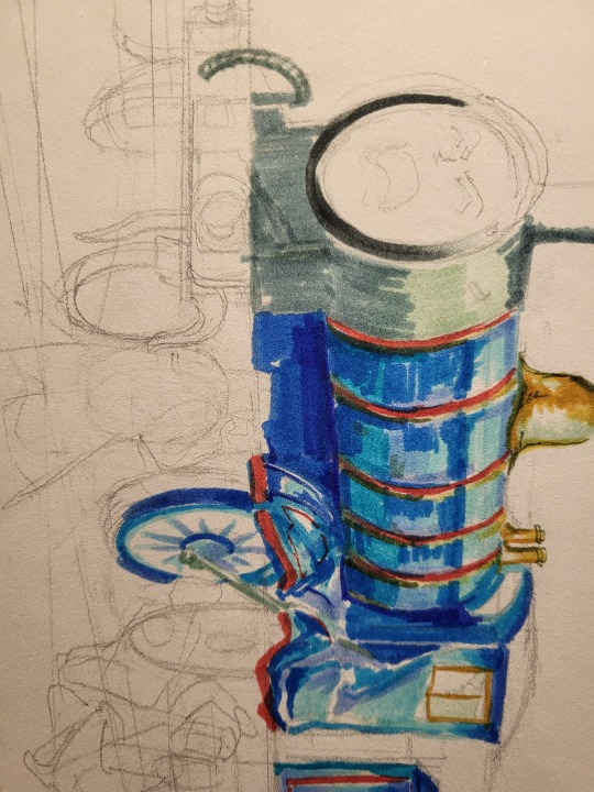
some in-progress pictures, during which I absolutely HATED how it looked and wanted to switch to digital because I feared I'd messed it up irreconcilably 😭 good thing I was able to look at it with fresh eyes after staring at it for like four hours, the first session of drawing ended at 1am. Believe me, if you hate how your drawing is turning out, put it down and come back to it later!!
Edward is also more referenced off a real K2 here because I really like how they look. Unfortunately they have painful geometry.

something frustrating about my traditional drawings is how they can't be viewed from multiple angles online. I use silver gel pen to highlight some parts (here it's Edward's handrails and the damage) but it doesn't show up well when I photograph it head on. I hope this picture shows a little bit of how it shows up in real life!
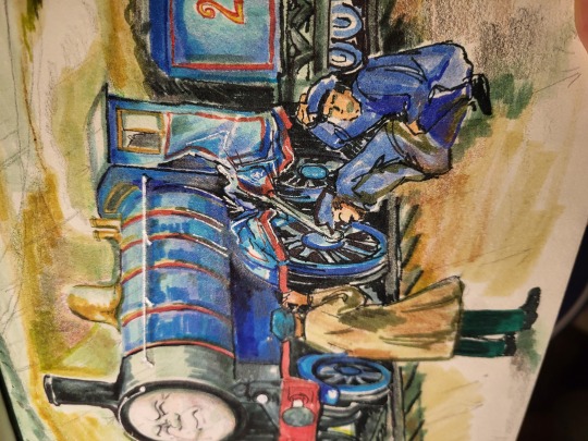
(if you can't see, look at the bottom of Edward's boiler bands)
Hopefully you enjoyed reading under the cut :] I like explaining my process and I appreciate it immensely when someone shares my enthusiasm for it.
#still feel like edwards chin is massive but oh well.#ttte#thomas the tank engine#ttte edward#ttte fanart#edwards exploit#the railway series#ttte redraw#kips art#kips cant shut up
296 notes
·
View notes
Photo
Ziggy Crossing
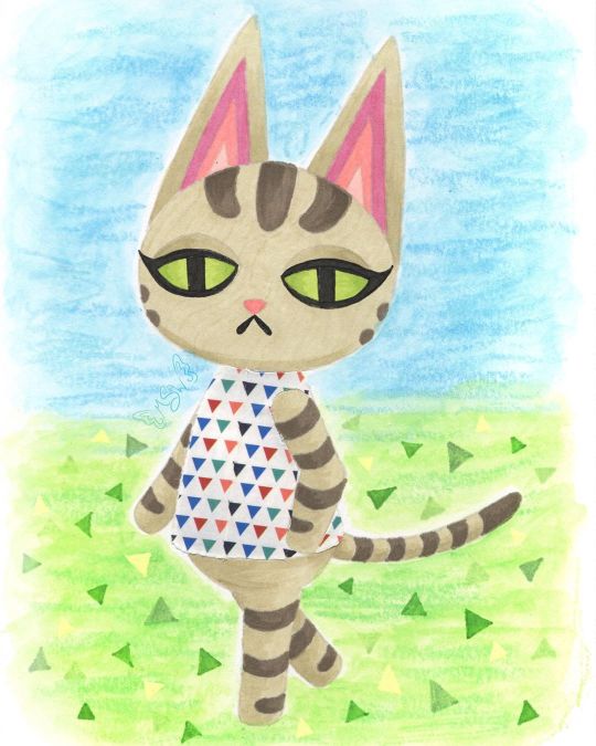
Still not quite sure I'm 100% back into the swing of things (posting regularly and being more present) yet, but time will tell. For now I'm testing the waters. Anyway. In the time I've been away, I ended up talking to some friends about (to the surprise of absolutely no one) Animal Crossing, and in that conversation, the idea of drawing my cat, Ziggy, as an Animal Crossing villager came up. I'd toyed with it before after seeing some other people draw their pets as villagers, and that conversation more or less sealed the deal for me to at least try it, even if my attempt didn't pan out and see the light of day. Obviously, things went pretty well because here I am posting this. The first step, as it is 90% of the time for me, was to come up with a sketch and go from there. I primarily used Olivia and Lolly [pre-existing Animal Crossing cat villagers] as my references--Olivia for the pose and eyes, Lolly for the stripes and some details regarding the ears and face--but I also checked certain things across the various cat villager models so that details could be consistent where they needed to be. I think if I missed the mark anywhere, it's probably in the proportions. Namely the size of the head and length of the body. But I think it's close enough that unless you compare it directly to Olivia's model that I referenced for the pose, the proportions aren't so off that it's distracting or off-putting. I did originally have trouble figuring out what pattern to put on her shirt though because the real Ziggy doesn't really have anything I could pull a pattern from. These days she does wear a white and silver collar, but that's not a whole lot to work with. So I left that alone while I pondered how I wanted to go about coloring the whole thing. My plan at the beginning was to use this sketch as a test piece for some acrylic paint markers I recently acquired (which you will be seeing me talk about in the future), but once the sketch was finished and I went back to check the colors I had (you know me; gotta have a swatch chart for everything), it was pretty obvious that if I want this to be my dear Ziggy and not just a random tabby cat, I needed to figure out a different coloring method. I could have just done regular acrylic paint, but that sounded like a chore and thus I was not interested. Same with gouache. Colored pencils were on the table, but the main problem I have with those is that they can be pretty slow and personally I think their texture really lends them better to replicating the 3DS/Animal Crossing: New Leaf style, as opposed to the look of New Horizons, and that's not what I was going for here. That left me with two main options: Watercolor, which was a hard pass for this kind of art (at least for Ziggy herself), and alcohol markers, which I did use quite a bit on the last Animal Crossing artwork I made, and they had worked out fairly well. Alcohol markers it was! Of course, even after that decision was made, there was the issue of how to handle the lines of the drawing. When I was planning on using the paint pens/acrylic markers/whatever, that seemed a lot simpler because, in theory, I could just use the same pen I wanted to color with to do the outlines and then fill them in. And because that would be using mostly opaque paint, if I needed to I could just cover up any overlap with relative ease. Alcohol markers don't play by the same rules though, so I had to re-think all that. In the end, I pulled out a pale warm gray Polychromos pencil close to the main color of alcohol marker that I had picked out that I figured would also be light enough to blend in everywhere else. That way I could have the defining lines that I needed without having to worry too much about them being visible in the final product. [For clarification: I picked a Polychromos because once sharpened they tend to hold a point longer and better than the other colored pencils at my disposal and I really needed to keep a sharp point as long as possible to do the lines here.] In retrospect, I do think it might have been to my benefit to pick out a pink for doing the inner ear lines, but the end result there isn't so awful that it single-handedly (paw-ed-ly?) ruins the drawing for me. It's just something to take note of for next time if there is a "next time." Once I had my lines (including doing the eyelashes and mouth with one of my usual black fineliners), the next challenge was the actual coloring. Mostly because I had to be very careful around the edges so that the marker ink didn't feather out too far (as alcohol markers do on any paper that isn't marketed as "bleed proof" because that's what bleed proof in paper actually means--not that it won't bleed through to the other side, though that is less common with that kind of paper, but that it won't "bleed" across the page), and I also had to be a little careful and choosy about how I did any blending or shading. Again, my blending and shading plan was going to be different had I used the acrylic markers. The main thing I ended up doing here was trying to find areas that needed to be layered so that the one-color shading could act as a line/barrier between sections. Best example: Where the ears meet the head, I shaded the bottom portion of the ears. You can also see this a little bit where Ziggy's tail meets her body and where the legs intersect at a few different points. By no means did this turn out perfectly, considering that I really wanted to stick to use as few colors as possible (which means pretty much all the shading is just layers of one color to darken it) which means there isn't as much distinction or variation as there could be. And I feel it necessary to note here that I was worried when I first finished the lines that the eyes looked wonky, but after coloring pretty much everything else in that concern dissolved because 1. It's harder to tell and 2. Even if they aren't exactly the same, it makes visual sense because it looks like her head is slightly turned, meaning the eyes wouldn't be identical anyway. Never underestimate the power of coloring your work in! Speaking of which, you might be wondering about her shirt by now. Well, after toying around with some ideas I got it in my head that a good way to tackle that problem might be with washi tape, as I've used it in this manner before and worked out pretty nicely. Even though it wasn't a lot to work with, I did like the idea of the base color for her top being white like the real Ziggy's collar, and that narrowed down my tape options considerably. Of the options I had that I thought would be suitable, I ended up having a choice between one with small rainbow-colored polka dots and the decidedly less vibrant small triangles that you see here. The polka dots seemed a little too peppy for Ziggy, so I went with the triangles. And this, I must say, is one of those artistic decisions that I feel even better about the longer that I see the end product. The main issue I have with using washi tape, and thus why I don't use it in this way that often, is because cutting the washi tape to fit a specific shape is a process that doesn't get much easier even with practice. And even if it did, that wouldn't eliminate the very real possibility of cutting or indenting the paper underneath while you're cutting the tape. Of which, I have not yet figured out how to totally avoid short of forming the washi tape on a separate piece of paper, cutting it there, and then moving it to the final piece. But that method comes with its own problems too, so... Still, I made the decision to go through with it here and just accept the rough edges/lack of precision and all that. Before I put the tape down though, I did do a little shading with some light gray markers that I was counting on showing through the tape to give it a little more dimension. Seeing it now, I do think I could've stood to go a little darker, but again this isn't something that totally ruins the end result for me. Just something worth noting. After all of the above, I was left with one lingering problem: The background. Which I've noticed seems to normally be a "problem" area for me in that I don't always have a solid idea for what to do with it. I did consider what exactly I wanted to do earlier on in the process, before I started on Ziggy on the final paper, even. Briefly, I thought I might cut her out and put her on a separate background as is sort of a go-to background method for me. Something just didn't feel right about doing that here though and it feels like I've done that a lot lately (you know, when I've not been drowning in mandalas for NaPoWriMo...). So it was at this early stage that I locked in the idea of adding in the background in later, probably doing something kind of loose to give a general idea that hopefully wouldn't take too much time or effort. We've already established that I wasn't super keen on the idea of using acrylic paints or gouache for this drawing, and that remained true for the background too. Although, I don't really like using alcohol markers for backgrounds either because it can be tricky to keep things smooth and consistent. That left me with colored pencils and watercolor. Colored pencils are usually hard pass for backgrounds for me for a number of reasons. So! Watercolor, hmm... I drew Ziggy here on my darling Strathmore 400 series mixed media paper because I love how it handles markers and it has enough weight and texture to it that it handles a lot of my other go-to options with little fuss. Watercolor is really the only thing I have trouble using on it, the main problem being that sometimes (not always) the paint doesn't like to blend out super smoothly and certain watercolor techniques don't work the same on it. This doesn't mean it's useless for watercolor (at least not for me), that just means I have to be more careful about how I choose to work with watercolor on it. In this case, the blending issues lined up with the idea I had of letting the background have more texture since Ziggy came out a lot smoother by the very nature of alcohol markers. Somewhere in all this, the idea struck me to use my Gelatos to leave behind some crayon-like texture. That idea seemed fitting to me since Animal Crossing is a fairly light-hearted and child-friendly game, themes that crayons go along with. The gelatos are water-soluble but not every color dissolves completely when activated with water. This should be pretty evident here because I didn't try to hide it. I wanted quick and easy, and without a doubt just letting the texture do whatever it wants is the quick n' easiest method to use with the gelatos. Once I'd done a bit of back and forth with two greens and two blues to give me the solid suggestions of a sky and ground, it still felt like it was missing something. Ultimately, it seemed like a good idea to me to try and mimic the triangle pattern/texture that New Horizons features. (In past games you could get squares or circles for a grass pattern at random.) And while I as per usual I had to think on how to go about this, in the end, the best solution I could come up with turned out to be drawing the triangles in with alcohol markers. Truly, I'm surprised to be reporting this because I fully expected the creamy nature of the gelatos to make using alcohol markers on top feel disguising and unproductive. But not so! At least not with the limited gelato use here. The creamier areas do soften the color of the marker, but I think that worked to my advantage. Although, I did end up using a little bit of my yellow Moonlight gel pen because I felt like I needed some yellow triangles for balance and I knew transparent yellow markers wouldn't do what I wanted. But that brings us to the final product. I'm happy with it. And I do really like how the grass ties in with Ziggy's green eyes. It's just a nice little touch of visual cohesion in my book. As I always say, I'm sure it's not perfect and there are some missteps here and there or things that could be improved. Nevertheless, it was a fun experiment and serves as good encouragement for me to continue playing with the lineless look, among other things. I do have to note though that it feels super weird to just leave the eyes like this with no indication of shine on them! I made the choice not to since it's not a common trait with the official character models (at least not for eyes in this same style) but part of me still feels like it's incomplete. As I've said before recently and I'll probably say again, I can't promise I'll be getting back to a regular upload schedule now, but it's on my mind. I want to get to that point soon. I do have the acrylic markers I mentioned to talk about and another supply in the mail, and some other art in my backlog. So if you can be patient with me a while longer, there will be more from me to look forward to. In the meantime, please be kind to yourself and others. ____ Artwork © me, MysticSparkleWings ____ Where to find me & my artwork: My Website | Commission Info + Prices | Ko-Fi | dA Print Shop | RedBubble | Twitter | Tumblr | Instagram
2 notes
·
View notes
Text
A New Plan for the International Society For Philosophers
I need to reassess my original plan and formulate a new one for the International Society For Philosophers.

I wrote one essay for the ISFP quite a while ago on this blog. The director liked it so much that he put a link on his website, but I never officially submitted it. Then, I didn't do the other three that I need to do to complete their Associate certification.
My original four ideas were: The Meaning of Life, The Most Important Question in Philosophy, The Creative Ape, and Violence and Society. Here's the original article on those four ideas.
http://www.jeffreyalexandermartin.com/2017/10/concerning-international-society-for.html
I did four blog posts on the most important question in philosophy. It came out well. Here's the link to the first in the series.
http://www.jeffreyalexandermartin.com/2017/10/the-most-important-question-in.html
I didn't do the other three ideas, even though I have published something like 100 blog posts since then. The meaning of life subject is a big one, maybe it has been too big. I've hit on that subject in several of my articles, but I haven't attacked it so directly. One of the most famous works on the subject is "Meaning in Life and Why It Matters" by Susan Wolf. I don't think that book is very good. Before I really formulate my own article I think I might do an extensive critical commentary on her work. I will need to get copyright permission to do that. Then, after that, maybe that would be the time to tackle my own view on the meaning of life. Or, to write them at the same time.
The idea of the creative ape is to dive into epistemology, or the theory of knowledge and knowing. I often comment on that subject in my other articles too. But, it's another huge subject. I think I shy from writing on these so directly because I'm still working out my thoughts on them. The issue with that is that my thoughts on these subjects will never be fully worked out. These are not things that you can fully solve, so it's easy to keep putting off writing about it. That's an issue that I've been getting over more and more. My starting to get past that personal hangup has been why I've been able to write on some controversial subjects like global warming, IQ, politics, and flat earth even though I would've preferred to know more about them before I did so. At some point you have to stop waiting. Studying can be good, but at some point you have to be productive. That's been a hard thing for me to enact.
The article about violence and society I'm not particularly interested in writing now. I recently wrote an article called "On Resentment as the Path to Destruction". In there I talked about a number of mass murderers and such. That's not very fun to write about. But, I do have notes on articles about political corruption and jurisprudence. Those subjects partially overlap. The resentment article is here.
http://www.jeffreyalexandermartin.com/2019/02/on-resentment-as-path-to-destruction.html
The word count for these four essays is between 2,500 and 4,000 words each. I already have the one article done, so I only need three more. I was thinking about new subjects, or adapting some of what I've already written. I also have notes for over 100 articles that I haven't written and published yet.
I've written two articles on Harry Potter that focused on evil, and one article where I talked about him as a hero. So, I thought about writing an article like "The Presentation of Good and Evil in Harry Potter". Here are the Potter articles.
http://www.jeffreyalexandermartin.com/2019/01/why-is-slytherin-house-bad.html
http://www.jeffreyalexandermartin.com/2019/01/what-makes-voldemort-grindelwald-and.html
http://www.jeffreyalexandermartin.com/2019/02/john-galt-harry-potter-and-hero-problems.html
A few articles that might work which I have notes on but haven't written yet would be about communication and the semantic triangle, motivation in literature and when a plot ends, closure in literature and how that works psychologically, and the fallacy of the association fallacy.
I've written two things that might work great. I'm just a little hesitant about them still because I named them after myself and that still seems a bit odd to me. But hey, I thought it was as good a name as any. The first is Jeff's Razor, which is the idea that the overall peace and prosperity of a society is directly proportional to the voluntary to involuntary transaction ratio. That has some strong supporters, but it was also ignored by several people I know in economics. It's more of a moral argument anyway. There's also Jeff's Hammer, which is an epistemological concept. It's a metaphor that helps to explain why any given thing is always more complex than your current conception of it. That article was oddly popular. I was surprised and happy with that. Here are the links for those.
Jeff's Razor
http://www.jeffreyalexandermartin.com/2018/11/introducing-jeffs-razor-framework-for.html
Jeff's Hammer
http://www.jeffreyalexandermartin.com/2019/02/jeffs-hammer-conceptual-tool.html
I wrote an article on why people may be turning towards the flat earth idea that is the best discussion I've ever heard of on the subject. But, it seems that there really isn't anyone that's interested. All of the people that like flat earth don't like it because I'm not on their side. Everyone else doesn't really care about it enough to read an article on it. Here's that article.
http://www.jeffreyalexandermartin.com/2019/01/flat-earth-truth-and-conspiracies.html
I wrote an article in favor of global warming that earned me both love and hate mail. That was interesting. It's polarizing, that's for sure. I'll probably write another article on that either way. Here's that one.
http://www.jeffreyalexandermartin.com/2019/01/pro-global-warming.html
I wrote an article on suicide that has had a lot of support, quite a number of shares in psychology groups on Facebook and positive comments from a number of psychologists. That also goes with my first philosophy essay that I already have done. So, that might be worth exploring as an option. That one is here.
http://www.jeffreyalexandermartin.com/2019/01/an-interesting-note-on-suicide-from.html
I wrote an article on the political spectrum and why it doesn't work that drew some attention. The major issue is that I didn't present a solution because I didn't have one. If I could work on a better solution that might be a worthy subject. That one's here.
http://www.jeffreyalexandermartin.com/2019/01/two-problems-with-current-political.html
I've also been thinking about a new theory and practice of literary analysis, but I haven't developed it yet. There's also Theoconceptualism, which is a religion that I've been working on laying the foundations for. I have a few articles on that, but it's still just emerging. Here's one of them.
http://www.jeffreyalexandermartin.com/2018/12/the-impetus-for-theoconceptualism.html
I have a major issue with deciding things like this. It has probably been the main problem in my life. If you can't decide what you want it's hard to get anything, if you can't decide where you want to go it's hard to get anywhere. It's an emotional issue. I have a sufficient intellect. But, even if you have a high IQ you can't figure out the outcomes for basically any decision. There are people that have a disconnection between the emotional and intellectual processing centers in the brain. These people can do just fine on IQ tests. But, they can't choose whether they want a black or blue pen. There are just too many possible consequences for such a choice, so they get stuck trying to analyze them. I'm not that bad, but it's the same problem. (I have tried many self-development methods for making these decisions, with little success. I have designed several myself without much success either, although they were probably as good as the famous self-development ones. I am in the process of designing a new one now. I have some hope for it. It currently has no name.)
Alright, let's list the ideas here and see what we're dealing with.
1 - The Meaning of Life
2 - The Most Important Question in Philosophy
3 - The Creative Ape
4 - Violence and Society
5 - On Resentment as the Path to Destruction
6 - Systemic Legal Political Corruption
7 - Truth and Jurisprudence
8 - Good and Evil in Harry Potter
9 - Squaring the Semantic Triangle
10 - When Does a Story End?
11 - Epistemological Closure in Literature
12 - The Association Fallacy Fallacy
13 - Jeff's Razor
14 - Jeff's Hammer
15 - The Flat Earth Mind
16 - Pro Global Warming
17 - Why Stay Alive?
18 - A Better Political Spectrum
19 - Towards a Better Religion
Well, those are the ideas that come to mind right now. I already did number 2, I would just have to edit it, which might be quite the job. I just need three more, but which three are the best options? Decisions, decisions.
I'm shying away from 1, and 3, and 4. I don't think I would like writing 5. I think Bastiat did pretty good at 6. I still need to work out what I'm doing with 7. 8 could be good, but is it cut out for this type of thing? Maybe. It might be so long that it would work for the dissertation though. 9 could be good. 10 will probably be too short. 11 will probably be pretty short too. I might do that one as an essay to go in a coffee table book as part of an art contest. 12 is probably going to get crazy the way I'll do it. I'll just do that on the blog I think. 13 is good, I just need to come at it from a different angle. 14 is good, I think. It seems like a small deal to me, but people seemed to connect with it. 15 seems to be boring to others. 16 probably won't work because I don't really want to study it enough. 17 could be good. 18, I'm not sure if I'll come up with a good solution. Even if I do it probably won't be anything profound. 19 won't do. That's really a different project entirely. We'll see if I get to that one in this lifetime. I forgot to put literary analysis on the list, but I'll skip that for now.
That means our real options are: 8, 9, 13, 14, and 17. Alright, that's more than three, but those are the ones I'll be thinking about. 9 is the only one out of those that I haven't written articles on yet, so I think I'll do that and then decide which ones I want to adapt for the final essays that I'll submit to the ISFP. Well, that's a plan at least.
________________________________________________
You can find more of what I'm doing at http://www.JeffreyAlexanderMartin.com
0 notes
Text
Have you ever experienced textile love at first sight? I have, and the object of my desire subsequently led me on an embroidery pilgrimage through Guatemala.
It was 2018: our first ever tour of Mexico had just finished. As part of the tour, we had obviously seen a lot of textiles and specifically, Mexican huipils. I thought I had seen all the huipil designs one could ever imagine. But then I wandered into one shop and saw something completely new to me. A purple and lilac striped huipil with incredibly intricate hand-embroidered birds perched around the neckline. At that moment, I was both lovestruck, and lovesick, to know of its origins as the colour combination was beautiful, the attention to detail spectacular and the craftsmanship so skilful. I asked the store owner where it was from and why was it so different from all the other huipils on sale in the shop and in Oaxaca in general. She told me why: this huipil was from Guatemala.
I bought the huipil in an instant and upon my return to the hotel, I immediately started researching #guatemalantextiles on Instagram and googling Guatemala huipil bird designs. The searches led me to a selection of photos of women wearing very similar woven huipils with stripes and bird embroidery to the one I had just bought. My near-obsessive research took me to the website of Cojolya Association, where I discovered that most of the women in their community of artisans were wearing the huipils I admired so much! I know from experience that ethnic communities around the world can be identified by the style of clothes they wear and the textiles they make after all this is one of the reasons I started my textile tour company in the first place. I reached out to Cojolya and asked them if it was possible to visit their project.
CLICK HERE TO VIEW OUR ANNUAL GUATEMALA: WEAVING, EMBROIDERY & COMMUNITY TOUR
On sale, new and second-hand huipils in the typical style worn by the women of Santiago Atitlan, all abundantly decorated with different species of birds in different sizes amongst local flora.
The base fabric of the huipil is always stripped.
The sizes and details of the birds varies from artisan to artisan
I am the first to admit that I have carved out a dream life for myself. Having the means and ability to follow my textile inspirations around the world to meet and learn from the artisans who make a particular garment is one of the best and greatest privileges of my life. And that is exactly what I did. In August 2019 I left Mexico and travelled to Panajachel on Lake Atitlan in Guatemala, exactly one year after I laid eyes on and bought my bird embroidered huipil.
I took a very rickety boat trip in the rain across the lake and after I got off at the pier, (feeling seasick as a dog, I might add) I walked uphill on the main thoroughfare through the charming town. There were textile shops everywhere and many, many different interpretations of the bird embroidery on striped woven fabric. I was obviously in the right place! This was indeed, a dream come true!
At the top of the hill, I reached the offices of Cojolya Association HQ. Along with many other activities and services they actually specialise in teaching backstrap weaving to local artisans in order to preserve the ancient technique.
The super supportive and helpful team at Cojolya informed me that although the bird embroidery is still practised by most women in the community, it is not particularly commercially viable for them to earn a living from due to the length of time that takes and the high price associated with the craftsmanship. This was to be the first embroidery workshop anyone from the association had organised.
The central thoroughfare of the town is lined with market stalls selling fresh produce and embroidery threads.
Second-hand huipils are on sale to both locals and foreigners
A local lady shows us one of her hand-made bird embroidered huipils for sale
After stopping in a local shop to choose colours for the embroidery (I picked pink, purple, green and yellow) I was taken to the family home of Andrea, who was to be my teacher for the day. We shared coffee with her other sisters and brother and then went out to work on their balcony.
She spoke a little English, I spoke a little Spanish and we made up for the rest with Google translate. I told her the story of the huipil I found in Oaxaca and how it had led me on an embroidery expedition to Guatemala, to Lake Atitlan and now to her very own front porch. It was a very beautiful and profound moment for me, reflecting on the journey and sharing the story with Andrea, one of the actual artisans who specialise in creating this deeply feminine cultural artefact which I had fallen in love with.
Andrea also told me the history of the bird embroidery motif, in particular, it is said to date back to when the houses of the town had thatched roofs. Women would embroider the beautiful, colourful birds who nested in the thatched beams of their homes. As a trade to the village increase, women were able to obtain books with illustrations of different birds from all over the world and thus their embroidered aviaries began to expand to incorporate the new species they learned about.
Andrea uses my huipil as inspiration for the bird we will embroider during our workshop.
Andrea uses her book of illustrated birds to use a reference for her embroidered designs
The internet also comes in handy for seeing different species worldwide.
Andrea showed me a selection of her collection of handmade huipils, as well as a bird encyclopedia she frequently used, so we could choose the best bird design to work with. We decided on a Tangara species and Andrea drew the design directly onto the garment with a biro pen.
The artisans from this town have been drawing birds their whole lives and understand the proportions of the delicate birds features so well that they can reproduce their dimensions quickly and accurately.
The technique is certainly not easy, but not impossible. If you take your time, watch and listen carefully, you can get into the flow of the embroidery after a few hours. The style is highly detailed and because the artisans are proud and precise they want you to produce the best embroidery possible. We used long and short embroidery stitches to effectively colour in the drawing. At the time I remember feeling that during the first few hours my bird looked as sophisticated as a child’s pencil colouring, but as I built up layers, and my confidence, the bird began to become more 3D and lifelike. We used a mix of blanket stitches around the edges and added fly stitched to create the texture of the feathers on the wings.
The process is as hard as it is deeply rewarding. After five hours, I was very pleased with the final outcome. There was such a sense of achievement and also even more respect for the craftsmanship and culture that goes into every one of these embroidered huipils.
Andrea in action, threading up the needle ready to add important details
The embroidery technique uses a combination of long and short stitch embroidery to fill the central areas
On my first visit to Andrea, I didn’t have an embroidery hoop and the local women don’t use them which made the process more difficult for me at times.
My teacher Andrea has been embroidering her own huipils with birds since she was around 10 years old. The huipil I am wearing in the photo was the one I bought in Mexico which inspired me to travel to Guatemala and find the community of artisans that made it.
Birds, butterflies, flowers and leafs have long been used as inspiration for decoration on the women’s huipils and the men’s pants in Santiago Atitlan.
French knots, blanket stitches and long and short stitches are used to build the texture of the bird’s feathers.
I returned to Andrea’s house a week later to work on a second bird – this time a green and yellow parrot – which was bigger and therefore included greater detail. I felt more confident but still needed a lot of help from Andrea and together we created a beautiful bird. It was very special to be able to return to work with Andrea and to continue to learn from her: we will reconnect again when I visit her every year before the start of our annual Guatemala: Weaving, Embroidery & Community textile tour.
Falling in love with that huipil in Oaxaca, Mexico, is absolutely what led me to discover Guatemala and the wealth of textile mastery that is still so integral to the culture. The experience was one of the most profound moments I’ve had since starting Haute Culture Textile Tours. It was a wonderful reality check to be able to appreciate how far the company has come. I feel so lucky and privileged to be able to fall in love with textile and then follow the story of its production right back to its roots. To be able to learn the technique myself directly from the community of artisans who make it part of their visual identity, and then share the experience with other textile enthusiasts, is why I’m doing what I’m doing.
Andrea and I with the finish bird design after 5 hours.
This bird embroidery with Cojolya Association is one of the many highlights on our Guatemala: Weaving, Embroidery and Community Tour.
The best way to fly to Guatemala
Are you looking for the best flights to Guatemala? We recommend searching with Skyscanner.
Click here find the best flight prices to Guatemala
Don’t forget your travel insurance
I recommend World Nomads insurance for their global, reliable and flexible cover. With 24/7 emergency assistance and 140+ activities covered, you’re in safe hands.
Check out the latest travel insurance prices and detail
Suggested further reading for Guatemala
MAKING MEMENTOS WITH PINE NEEDLES IN LAKE ATITLAN, GUATEMALA & BACKSTRAP WEAVING WORKSHOP IN GUATEMALA
Are you going to Lake Atitlan or Guatemala? Why not pin this post and save it for later?
My mission to make the beautiful bird embroidery of Guatemala with Cojolya Association Have you ever experienced textile love at first sight? I have, and the object of my desire subsequently led me on an embroidery pilgrimage through Guatemala.
0 notes