#the overall grainy look was just a side-affect of moving a hand-drawn piece to digital fof colouring
Explore tagged Tumblr posts
Text
"Totally normal drawing study" I say after spending way more time that I should've trying to undo and redo various adjustments before just saying "actually? Forget about it, we're gonna post it anyway"
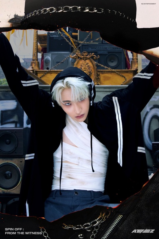
(insert redraw of that one promotional photo of Seonghwa with short white hair, an oversized hoodie, dark blue pants, and a bunch of dusty bandage wraps in place of a shirt.)


Originally I just wanted to draw a sketch. Then thought the sketch looked kinda nice, so I got the pen and added the lineart. Then I thought the colours in the photo were pretty, so I coloured it in digitally.
And it was supposed to be just flat colours, but it looked kinda boring, so I messed with the blur effect a little. Just adding some shadows and stuff. Still think I could've done better with that.
And then the background looked empty, but I didn't want it to be too detailed, so I kinda scribbled in some of the background elements. (There seems to be this big rusty golden thing in the background, with a lot of blue-grey audio speakers in it? And the golden thing isn't exactly a container, but it's kinda tied up, like the speakers are trapped inside? But there's more speakers outside of the golden thing too. There's just, a ton of them. That's maybe 90% of the background.)
So basically... It was supposed to just be a sketch, but it kinda snowballed from there.
Anyway, uh (clicks "post" and then leaves) happy holidays. Eat some soup. Don't freeze. Yeah
#ateez#2030kamenriders draws stuff#i dunno... I feel like the dust on the bandages don't have enough of a gritty look to them. it feels too airbrushed#well to be fair. that part was mostly airbrushed#the overall grainy look was just a side-affect of moving a hand-drawn piece to digital fof colouring#but I feel like the dust marks needed something more#...something for me to figure out later I guess#darn I'm rambling in the tags again#heyfio
2 notes
·
View notes
Text
How I Made: Victorian Gothic
1. A new/old start
Before I start I spend a lot of time gathering reference. For this piece I wanted to move away from using 3D models (which I had been using previously) and go for a more loose and painterly finish. I found a royalty-free image to base the composition on.
2. Tone down distractions
I used a combination of Levels adjustments, Desaturation and also a Smart Blur to get the feel of the buildings down into a narrow muddy value range. We don’t want detail (or people) to stand out at this stage and distract our eye. I also painted loosely over the top to further simplify and further reduce contrast. I added a new road that has more texture and some puddles to give a damp feel.
3. Force to fit
When you’re putting other architectural pieces into your image, they don’t have to fit your perspective perfectly, you can get away with quite a lot of distorting and skewing to force them to conform to your perspective grid. I always place vanishing points in a piece like this so that any additional images I add will adhere to a consistent perspective.
4. Bring on the night
I added three adjustment layers on top of the piece; a Levels just to further reduce contrast, a layer filled with blue and set to Hard Light and a Hue/Saturation adjustment just to take down the overall saturation. I stretched the mansion quite considerably and the result was that it looked really spiky and gothic. The light in the doorway was just an experiment to see how warm light could affect the scene.
5. Paint over the pieces
I started to ‘destroy’ the photos to make way for the painterly finish. It’s important to not rely too much on the photographic base when you want to make a digital painting, especially where architecture is concerned. For atmosphere, I added dense smoke and fog using custom brushes and some distant lights. The addition of chimneys adds a reason for the smoke as well as nice silhouettes.
6. Architectural adjustments
I found an image of an old house and placed it on the corner. The perspective was totally out so I had to hack it up and skew the front face and the side face separately, then paint over the left-over holes and gaps. Then I started to add paint to the rest of the street so I could add the details back in a more painterly fashion.
7. Bringing the detail back
This stage was all about painting in the details by hand and being careful about where the eye is getting drawn. It’s often about experimenting, putting something in, stepping back, seeing if it works. In Step 6 things looked messy but here, the overall direction of verticals and perspective lines are reinforced to add a bit more order.
8. Light it up
I brought the street to life with lights and people. It’s a good idea to make them seem like they’re not just placed in, but are part of some kind of motion or mini story. It may not be apparent at first, but there’s a guy looking up at the candle-lit lady on the balcony, and the running figure to help pull us through the street. Finally I adjusted the contrast of the overall image and added a layer of noise just to make it look a little grainy and film-like.
1 note
·
View note