#the only solution is i am the one who should do the deep dive recap but that’s just So much 😂😂
Explore tagged Tumblr posts
Text
the problem w watching ouat recaps/deep dives is that no one shares my exact perspective (aka the watched the show from the very beginning to an obsessive degree and also is a neal/swanfire girlie)
#teresa talks#i like hearing other people explain the show bc there’s so much that happens and it’s all insane#but i also have to spend the whole time bracing myself for their neal opinions bc he’s such a polarizing character 😂#the only solution is i am the one who should do the deep dive recap but that’s just So much 😂😂
1 note
·
View note
Text
Yugioh Ep 29 S4: Joey Wheeler, Dead Again
It took me kind of a while to get around to recapping again, been some drama on this end due to a couple natural disasters all happening in conjunction with eachother, but thankfully we are back in the green (sort of) there’s still wildfire smoke out my window but at least...at least the fires aren’t getting any bigger.
And it’s a shame we didn’t get to it sooner, because this episode has so many wild things in it, I don’t even know where to start. There was a lot of dueling, so I didn’t have to cap a whole lot...but even within such few caps, there’s some stuff to talk about. Like first off, the Kaiba’s inability to walk five feet without getting attacked by someone.
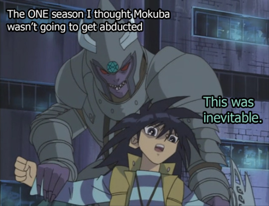
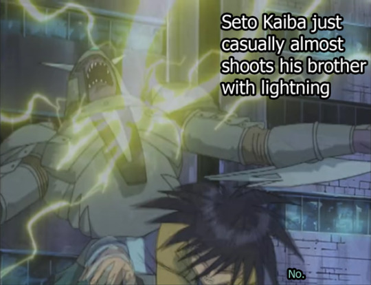
Seto still winning Brother of the year award even after nearly shooting his bro with real ass lightning. Because remember, this lightning is 100% real. None of these are holograms.
And by the way, a “hologram” just grabbed Mokuba with real ass hands and Seto was like “Clearly still a hologram!” Because that is how deep his denial runs.
Anyways, this is where the Kaibas will be until the remainder of this episode, so we’ll just leave them where they are.
(read more under the cut)
Back at the duel between Mai and Joey, we’re slowly working out what it is the Orichalcos even does.
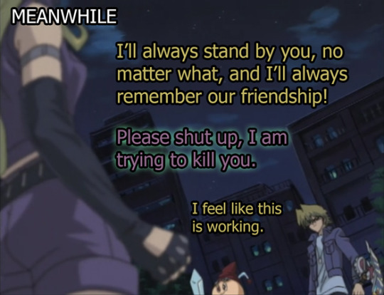
We have had very little indication you can break the Oricalchos control on people’s minds up to this duel, but because Joey showed heart and bravery or whatever--he’s been slowly chipping away at Mai’s crusty, neon green, outer shell.
(I had a littttle bit of a hunger for some Taco Bell Baja Blast, not gonna lie. A little bit tempted because of that weird color. And now that I’ve eaten popcorn, I am 80% itching to drive to Taco Bell and make some mistakes. But I won’t.)
Comparing this to Pharaoh and Kaiba and their Oricalchos duels (even Rex and Weevil’s) it kind of makes you wonder why this never happened.......to anyone else? I mean, obviously it’s plot reasons, but it would have been a little neat to have some character development for the other villains.
But this unnecessary duel to the death between Joey and Mai spends most of the time screaming about how deep and real their love friendship is. Just a whooole bunch of aggressive friendzoning for the lady who just aggressively hates everyone.
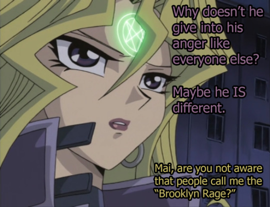
(Haven’t seen much of Yugioh Abridged because it’s spoiler territory but everyone who retweets Joey stuff puts “Brooklyn Rage” in there so I have learned the lingo through osmosis.)
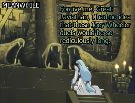
So because, someone’s absolutely going to die, lets start going through all of the flashbacks to remind the audience to feel something when they biff it. Lets recite the times we all spent with Mai.
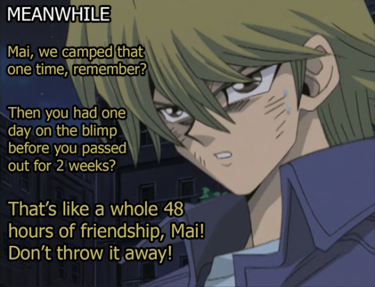
Remember how they brushed Mai under the rug for 3 seasons, and now that they actually need her, they’re shooting themselves in the foot because there’s actually very little evidence that they like eachother at all?
But they do show those few times they hung out: the camping trip where they almost got burned alive by PaniK, that time that Joey caught her smelling her own cards, that time that Yugi had a panic attack because he was convinced Pharaoh would murder her during a card game, that time that she almost got hit by a fireball and then Joey jumped in front of her.
PS, that fireball scene--they keep going back to that fireball scene but they cut out the part where, yes, Joey jumped in front of her--but then Yugi jumped in front of Joey, and then Yami took over and was like EFF YUGI DAMN IT while he got pegged with fireballs. Like...c’mon, Yugioh, there was a lot of fanservice in that particular episode, and you’re leaving out a majority of the ships.
Partial truth, Yugioh--you’re telling partial truths. If we’re saying friendzoning is a good replacement for some sort of romance, then this show is just a giant geometric shape of “who might possibly like who if they weren’t so addicted to friendship.” This show has “friendship” as the underlying tagline of every episode with every person.
In the process of removing romance--they accidentally made SO MUCH MORE romantic implications in this show. I just feel like this backfired in so many ways. Or...maybe this was exactly what they wanted. And by “they” I mean that one writer who stans Seto Kaiba in the back--just sitting there in the corner of the writer’s room tapping his fingers together and cackling like an evil villain. He knows what he did. Genius mastermind, slipping in his favorite ships by making every ship Yugioh-legal.
And, also the Joey/Mai duel was a lot of this type of questionable content:

Joey Freakin Wheeler.
So I forgot if I mentioned this, but my bro had this friend in college who go struck by lightning not once, but multiple times in his life. He lived in like Virginia or North Carolina--one of the monsoon States, and he’d go on this hike to the top of this mountain--and on two different occasions at the same spot, he got stuck by freakin lightning. So like...Joey Wheelers do exist. There are people out there who just...
They’re just lightning rods wherever they go and their brain is somewhat scrambled eggs because of it.
(PS fun fact I googled just now because I couldn’t remember which state Virginia was, a Virginian by the name of Roy Sullivan was supposedly struck by lightning 7 different times and survived all of them. The more you know. ((PS still on the Google deep dive and the same guy also claimed to have been attacked by a bear 22 times (he’s a park ranger, so that checks) and once he was attacked by a bear immediately after he got struck by lightning which is like some pretty pro strats by said bear.)))
But like...kinda weird that Joey’s now kinda into this, and got super into it during a lovers friendship quarrel.
Anyway, all things come to an end, so Mai decides after enough cards have been played and Joey is clearly about to die...maybe it’s time to just accept not being 1st in the world in cards. Which...would have meant she should have been playing Yugi during this duel but, wtv. She clearly wants to be mad at Joey, specifically.
And I think the show didn’t do such a good job explaining why she was focused on Joey and not any of the other duelists until the very end, but we’ll get there. We’ll finally get to an explanation of why she was so fixated on Wheeler, we just have to wait for him to die first.
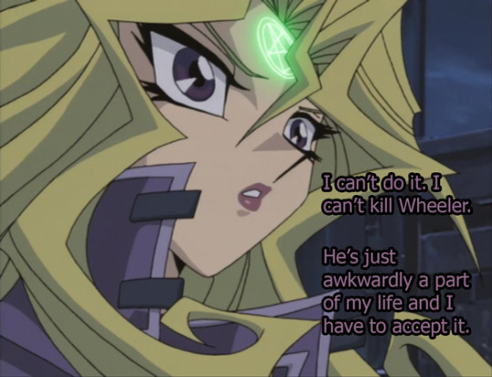

Because after the lightning strikes, and after putting so much effort into punching Valon right before this...Joey is too sleepy to continue.
So he’s just gonna die here instead...
2nd time he’s passed out in a duel by the way. Remember that Joey almost beat Marik, but was too damn sleepy after the electrocution? Same situation here. Look at that parallel.
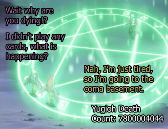
Reminder that Joey STARTED this duel.
It’s like when you’re playing a game with a toddler and then it just passes out halfway and without any warning with it’s face just flat into the carpet.
Anyway, Mai grabs him in her arms sobbing all over him like she just did with Valon and it’s like...damn, this girl can just turn it off and on huh? Like she’s only 100% or -100% when it comes to the relationship meter, huh? No in between?
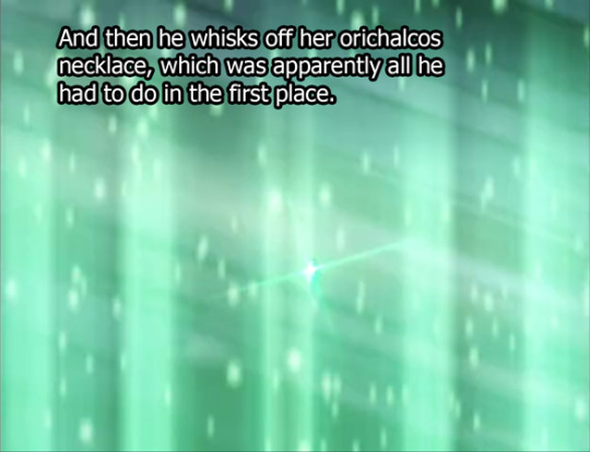
Mmmm cue that irony that Yugioh loves so much, this entire duel was unnecessary, because all you had to do was yoink that necklace.
Really the solution to dealing with a lot of assholes in Yugioh, to be honest.
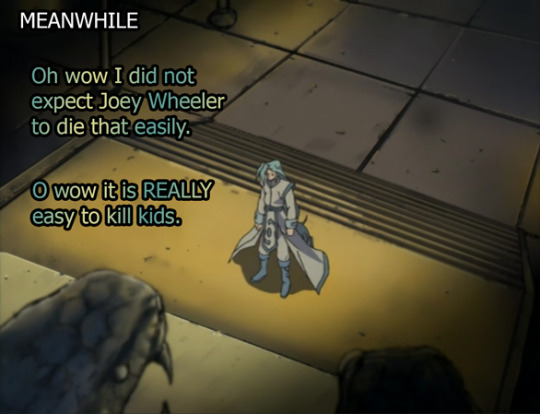
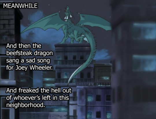

This really is what Seto says in the show, by the way--a glitch. I like that Seto does not accept that dragons can feel sadness, and is just ITCHING to patch that out in the next release of duel monsters. I imagine that he’ll make a meeting once this is all over with his code team and at the top of the list will be the demand “Make The Dragons Stop Crying.” triple underlined, bold, and in bright red font. The entire code team will side eye eachother, unsure if this is a literal bug or something that Seto just hears all the time but no one else can hear.
So back at the Joey death fort, Mai decides to finally illustrate with words why she had to go so hard on killing Joey wheeler.
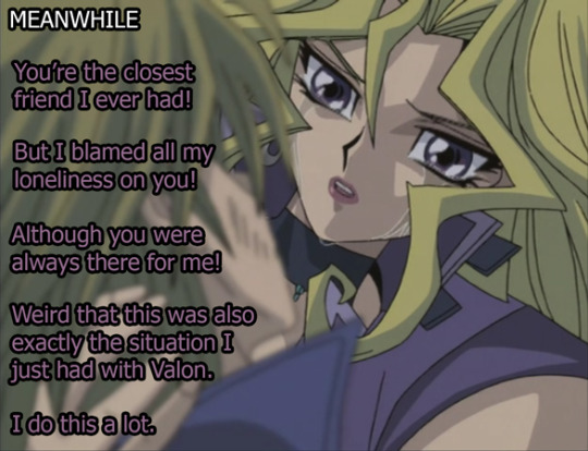
It was because she saw his kindness and his help as a weakness and a failure on her part. Mai, who always wants to be independent and in charge, could not accept that someone else had saved her or would want to save her. Which was apparently why she decided to peace out back at the end of the Marik arc.
It’s a bit of a complicated character for a kid’s show, I’m not sure how many kids understood the pride situation here, but it’s nice they stuck in something that wasn’t just “I want to be the best.” It was more that she didn’t want to be helped in order to become the best.
(PS, there’s this flashback scene where Joey’s like “bye” as she drives away and it was unintentionally a very awkward and funny cut and I may grab that little quip. I have to cap a couple of animations, tbh, I haven’t done that in a while)
So, now that she is fully recovered, she decides to complete the parallel of when Joey saved her in a death coma and now she will do the same (although it is SLIGHTLY different since in this version she kind of absolutely killed Joey Wheeler but...still works). She decides to do the job these stupid boys have not been able to do for the entirety of this season.
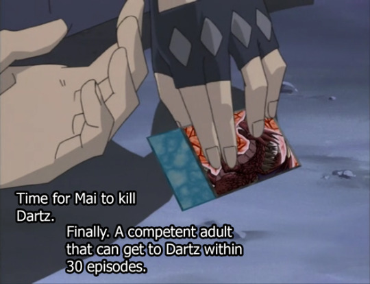
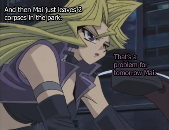
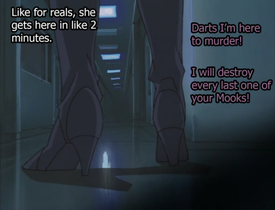
(these boots are REALLY well drawn, by the way. OBSESSED with Mai’s boots.)
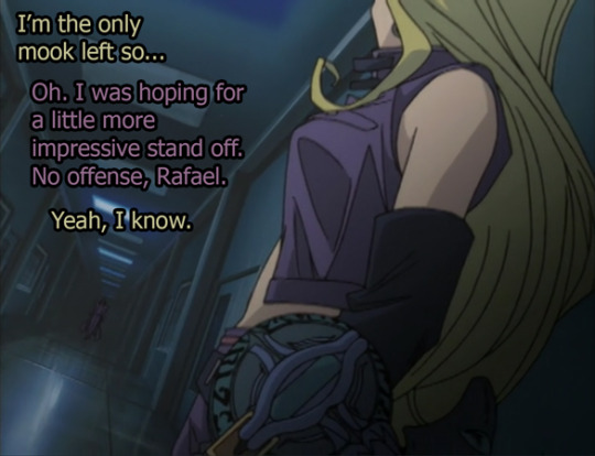
If only she swooped up Pharaoh and just stuck him on the back of her bike to get this final fight going.
But Pharaoh’s too busy getting lost in San Francisco, and stumbling upon Joey’s dead body.
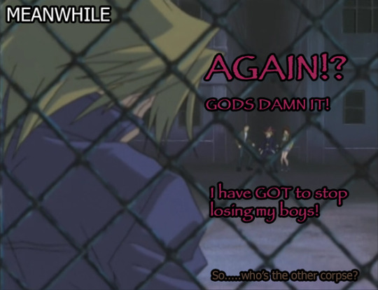
That this is the season where Yami can do nothing right and it just keeps happening.

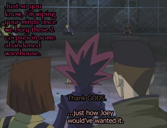
No idea how we’re going to resurrect Joey in so short a period of time, but we’re completely out of spooky necklaces, so I guess we can’t do the Pharaoh solution to just...stick him back in there.
Anyways, I’m off to recover from the trauma of my house burning down last week, so I’m gonna go eat a pint of ice cream while I dream of a life before quarantine (was there a time before quarantine? I honestly don’t remember)
If you just got here this is a link to these in chrono order.
https://steve0discusses.tumblr.com/tagged/yugioh/chrono
#ygo#yugioh#recap#episode recap#photo recap#Yugi Muto#Joey Wheeler#Mai Valentine#Tea Gardner#Tristan Taylor#Dartz#The Kaiba's#they were there for a few seconds#and just a million flashbacks to make my life as a recapper much much easier#S4#Ep29
25 notes
·
View notes
Text
Definitive Ranking of Book 1 Episodes, #12/12
12. 1x12 Endgame
Amon stands and lets Korra expose him for drama, Asami and Hiroshi are just like Kevin Bacon, let’s hide in an empty room from the bloodbender, people weren’t all that into justice anyway, and Aang brings the funk.
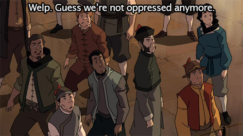
What? It hasn’t been over 4 months since I last did one of these...get out of here!
For those who don’t know, I’ve been going back and rewatching each LoK episode, then definitively ranking the entire season with a series of metas, starting from “worst” to “best.” Wait, no quotes because it’s DEFINITIVE.
I began with the beautiful, heart stopping, breathtaking, life-changing shitshow that was Book 2, because its flaws in some ways became the show’s greatest strength, so it felt very worth the dive. Then I went to Book 4 probably because that’s the time period that interests me a ton, and it was a solid season, but one that sort of felt like it needed some polish. Book 3 is damn near perfect in my opinion, and the one I want to end on for that reason.
So yup, we’re in Book 1! And here’s the thing: rewatching this show, the first season is the one that gives you the least back. It’s not particularly deep or nuanced. And that’s fine! It did a good job expanding the world building, the aesthetics were beyond on-point, and I’ll stand by the characterizations as pretty dang compelling, even if Mako never landed for me until Book 3.
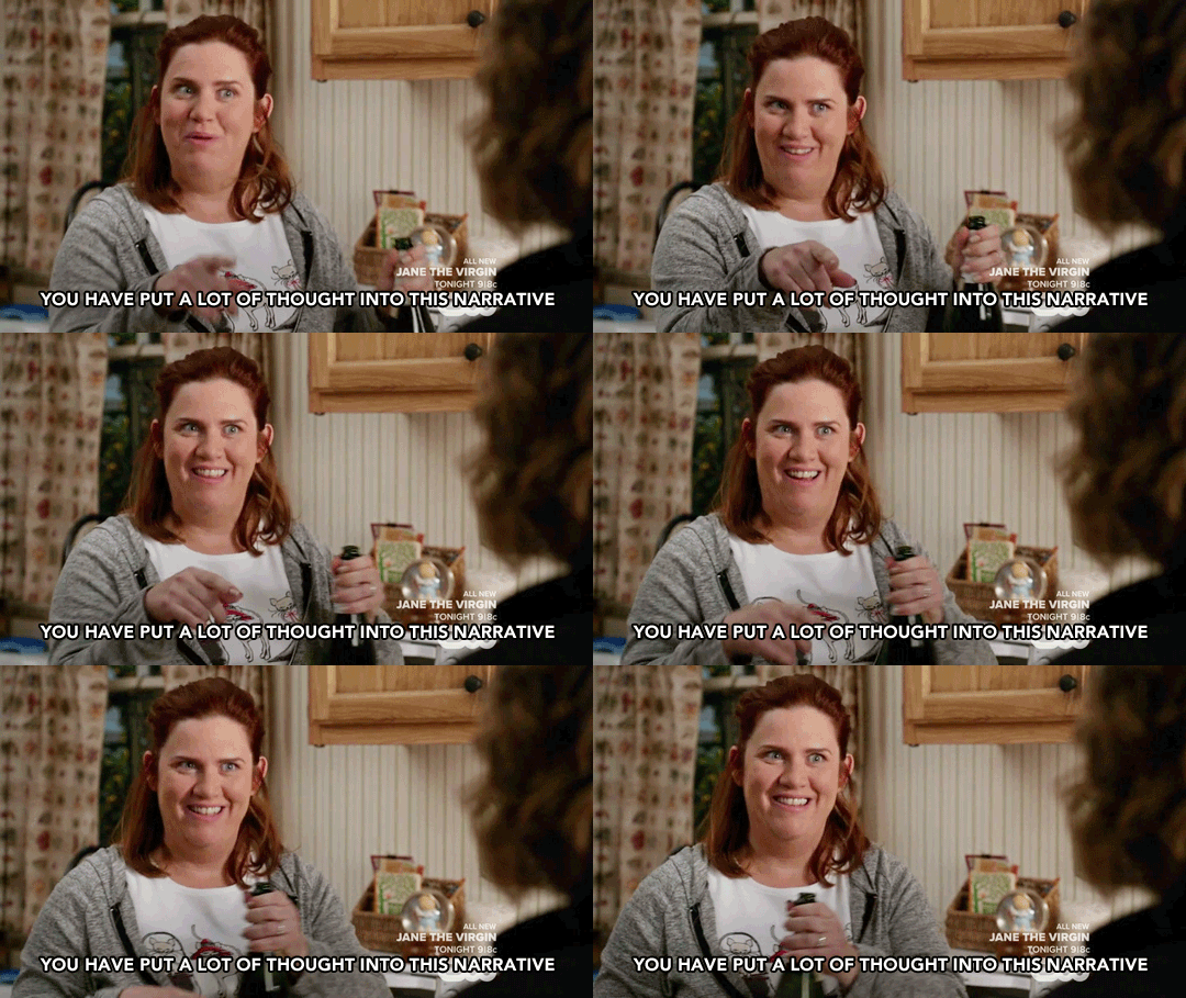
At the same time, had this been the one season mini-series it almost was...I just don’t see still talking about it. And yes, I say that knowing the end game (you see what I did there?) would have been a bit different. But it doesn’t really change that the greatest success of Book 1 was its set up and potential. So, I guess it’s not a shock that the episode at the bottom of this list is its finale. Which is best depicted here:

Yeah, it sounds harsh for something that was ~fine~, but each time I rewatch it, it gets even less fine. However, there’s also been a lot on this already. If you haven’t already, read @got-your-back-always-will’s piece on why it was so damn disappointing. Or you could read my words where I call it a narrative beer fart (I think I use this term a lot, to be fair), point out the leaps in logic and reasonable action necessary for it everything to occur, and then talk about kind of shitty, sexist, ableist implications. Hell, even my photo recap touches on this.
Yes, it was all unintentional, but just imagine a character as intersectional as Korra being sent off with her depression having been magically healed by a male character (yes I know Aang is her, but imagery matters and she was passively sitting while he did his thing) and then hooking up with the guy who treated another woman as something stuck to his shoe.

And I mean, add to that the way the main plotline just FIZZLED. Oh man, people aren’t oppressed anymore because the guy who wanted to help them was actually a bender? WHAT. Everything Amon and the Equalists were set-up to be, and it just ends with a crowd shrugging and looking sad.
Like...this ending isn’t the worst thing that’s been on TV. It’s just formulaic and feels not well-planned, which is kind of weird because wasn’t this the only season that *had* been fully scripted? I really don’t want to pile on as if it’s the most toxic thing ever (not by a long shot), but would this have actually been satisfying to anyone?

I feel like I’m going to just end repeating myself, and I really don’t want to pile on. So instead, I think it’s important to zoom out and look at what the season was supposed to be accomplishing as a whole.
Korra is the opposite of Aang. Not in a moral sense, but in the sense that Bryke’s process in creating her was literally, “instead of a spiritual, not-super-physical, reluctant male hero who was not happy about his role, what if we had a girl who was super into it, non-spiritual, and kind of a hockey-kid type?”. They talk about this on podcasts and stuff. Aang’s narrative was about how he needed to embrace his role since the world needed him. We’ve seen this before (though Aang and ATLA was very unique, don’t get me wrong) with stories like Harry Potter, or LOTR, or the Star Wars OT, and so on.

That kind of arc is sort of best summed up by this quote from our pal Dumbledore:
“It is a curious thing, Harry, but perhaps those who are best suited to power are those who have never sought it. Those who, like you, have leadership thrust upon them, and take up the mantle because they must, and find to their own surprise that they wear it well.”
But when you have a character that WANTS to be the hero, what do you do? You write a world that doesn’t want *them*. You write a struggle in their quest to find a place for themselves when the role they’re so ready to take on doesn’t really make sense anymore.
This is the point of the Equalists. Benders are the privileged minority, extorting the oppressed masses in the nonbenders. The Avatar in some ways represents the ultimate bender (with her inherent abilities), and is now in a world skeptical, scared, and teaming for revolution.

Specifically against her and her power structure. There’s the spiritual aspect to her role, but she was out-of-touch with it in the first season, while also facing a very here-and-now kind of problem.
The conclusion that Korra needed to reach as a character, and where she gets at the end of Book 2 actually (and then spends Books 3 and 4 fine-tuning that role while also going through a very powerful healing arc) is one where she stakes her OWN claim in the world. She defines her role in a way that’s significant to her and the meaning in her heroism comes from her assertion of that agency, and the way she basically screams for her right to exist into being. The world will find it *does* need her, and here’s why, damnit.
Book 1 didn’t get there at all. Fuck, it didn’t even address things like how Korra’s actions out of bravado were because of her horrible fear of appearing weak. That fear...it’s only something she got over after her healing arc, when she learned that being afraid isn’t a weakness, and she can recontextualize that fear and find a kind of strength in it. Now, it’s possible that whenever it was decided that Book 1 would be 1 of 4 seasons, they made sure to keep room for Korra’s character growth. Except...in 2x01 she’s rather backdialed, so it’s a difficult case to make.
Then, remember how her solution had been (more or less) to punch things? Which is why @projectvoicebend has been referred to as “biting satire” thanks to their exaggerated depiction of that? But in Endgame, she literally saves the day with brute force. Not that Amon *shouldn’t* have been knocked out of a window, but this is rather bizarre messaging.

She unlocked airbending in a time of desperation, and used it aggressively to get rid of the threat. Like...okay. But, we didn’t need to see an entire season to buy this kind of thing happening. Hell, if she had been de-bended in 1x04 and someone else was threatened, I could still see this happening.
Was the implication that it’s the power of love? Had it been Bolin or Tenzin there, just sucks for them? I kind of find that hard to swallow, too. Really, they just needed Amon to be unmasked, and this is the way they contrived Korra to do it. It wasn’t exactly a huge character moment as much as it was leveling up in a video game.

Now, I do think overall it’s good that Korra didn’t find a place for herself in the world at the end of the first season. That was hard-earned, and even creating the new spiritual age wasn’t the endpoint of that theme since people were resistant to change—of losing control. However, could there have at least been an indication that REFORM WAS GOING TO HAPPEN? Yeah, the revolutionaries aren’t exactly blameless here seeing as they bombed an entire city, but Endgame literally reset the tensions in Republic City. Well, until Shiro recapped the creation of an entire democracy for us in 2 sentences.
It was like...the set box that Bryke had created at the beginning of the season needed to stay perfectly intact. And it wasn’t organic at all for Korra to be the person upholding that, because she is inherently such a transgressive character. This is why I’ve called it a round peg in a square hole, and this is why had *that* been the ending to the series, my own reaction would have been as dejected as the people who realized Amon painted a scar on his face.

Hell, what does this even mean on a thematic level? Desperation breeds education? Never idolize anyone who promises simple solutions to your problems? Reincarnation has its uses if you’re in enough pain?
Really, this show is supposed to be about Korra’s growth and trajectory, and...I just am struggling to see much of anything here.
Frankly, it gets worse the longer I think about it too. Equalists are like, bad and junk. Bombing cities and brutalizing your enemies (while evoking genocidal language with that whole ‘impurity’ thing) is not good, mmkay? But from another entirely valid angle, isn’t part of what Amon stood for really about disarmament? Should they have been so cartoonishly evhul that they suddenly needed to de-bend the pacifistic airbender children?

The only thing that kind of worked in this plotline was Asami and Hiroshi. And yeah, I know I’m the ultimate Asami fangirl so it’s going to read biased, but I’m serious: she was the only nonbender we really heard from about this. She was the one who had the same pain that her father had (her mother’s death at the hands of bending gangs), and experienced the same type of oppression he did, and still resoundly rejected violence. I’m not sure what she saw as a pathway to reform, but she could tell that Hiroshi’s actions weren’t coming from a place of empathy any longer, even if it might have begun like that.
Rewatching everything today when nazi punching discourse is disturbingly not theoretical, there is something a little frustrating about how simplified even this conflict was made. I’m not saying the Equalists are fascists at all, but can we at least try and position ourselves in the nonbender perspective, when there’s a lot of valid grievances, and Amon is just doing exactly what Aang did to Yakone (initially, back when he was targeting just triad members)? That’s worth a conversation! Sure, we got Asami standing up to Tarrlok in 1x08, sure, but her drive to take down her father was so clearly personal thanks to the years of deception, that the nonbender oppression sort of got swallowed in it all.
I still think it worked better than anything else, especially how Asami was not able to bring herself to harm her father the way he was willing to do. It’s tragic, and I don’t even begrudge Bolin swooping in for the save for that reason, even though the whole passive-woman/active-man thing is what I’m bitching about for Korra. But it’s different. Right?
I also found Tarrlok and Amon’s ending perfectly fine (and VERY jarring for a Y7 show) given that it was another exploration into abuse, the cycle of violence, and a kind of poetic self-fulfilling prophecy. But that’s more for 1x11.
God, you know what it is? Bryke never figured out what they wanted to say with Book 1. They had great worldbuilding ideas, and the tensions set up were quite compelling. It just lacked a *point* beyond “this might be cool to explore.” It was, and then the time came to tie it up, so it splatted.
In the end, they’re just damn lucky that Korra had something to say of her own.

Book 2 ranking/essays found here
Book 4 ranking/essays found here
66 notes
·
View notes
Text
Alright, I think we can make it official, Demon Slayer: Kimetsu no Yaiba is really an exceptional horror-action anime. Whatever else it may be. Man, this episode made my skin crawl, all puns intended. We are going to get into all the creepy, dreadful and just plain sad details of episode 16 in just a bit. So you know, spoilers and all that. But First, Hi Crow! It’s been a rough week all around I think. How have you been?
Oh! I’m bold this week. Good to know… Yes, it’s been a rough week. Nothing compared to what others have gone through, certainly. But, strangely enough who writes for hours each day, I still can’t talk about it. It’s good to have something like this to focus on. So, buoyed by Inosuke’s excellent use of powers in the last episode, let’s dive in!
are you sure? there’s spiders…
I have been in a bit of a daze so the few seconds recapping episode 15 were actually pretty welcomed, and it was all I needed to get me right back on track. Inosuke and Tanjiro are in a creepy spider filled forest, tracking down a demon that uses spider webs to manipulate people like puppets. All the while, Zenitsu having been left behind is trying to track them down, mostly to get Nezuko back and then get out of there.
Right off the bat, we get to see the injured Demon Slayer Murata show us how he earned his place in the corp by stepping up and offering to cover Tanjiro and Inosuke’s retreat, buying them some time to get away from the possessed slayers. Because they’ve essentially given the main cast super powers, it’s easy to forget that all corp members are exceptional. No one survives the final trial by luck. I was cheering Murata on (even remembered his name and all!)
I almost cheered for Murata-san! Fear can overcome any of us. What’s important is how we react. Murata took courage from Tanjiro and (though he likely wouldn’t admit it!) from Inosuke, and he was ready to get back into the fight. He was better armed, now, too — with knowledge! He knew why his comrades were attacking him, and he knew how to counter them.
he looks a little like Levi
Pretty soon, our two heroes make it to a second wave of entangled slayers and this is where things go from creepy to gut-wrenching. The sheer amount of psychological and emotional trauma on that girl’s face, having been forced to murder her comrades by her own sword, her own body mangled in the process. The few slayers still alive made to move through excruciating pain on completely broken bodies. I have seen a lot of bleak anime but this was hard to watch even for me.
The contrast with Inosuke’s carelessness (thankfully toned way down) and the occasional almost funny action moments, made it all the more horrific to watch. As if puppets weren’t disturbing enough already.
it was a lot rougher in the moment
What hit me hardest was that she hadn’t given up. She was still in the fight, even though the webs controller her every motion. The only thing she knew to do was beg Tanjiro and Inosuke to flee and bring back more powerful Demon Slayers. Her desperation hurt, and her continued bravery made it even worse.
I had speculated last week that they may be some happy demon family that just wants to live in peace. Well, we got our first clue that I was wrong about the happy part. A point that’s going to get gracelessly hammered in later on. Still, this first scene of the younger demon boy we saw last week (apparently named Rui), coldly scolding his mother for taking too much time to eliminate the intruders and threatening to tell his father as the woman completely panics, added yet another layer of unsettling. What did you think of that scene Crow?
I went from wanting Inosuke and Tanjiro to put her down to wanting to protect her! Did you see the look of panting terror on her face after Rui walked away? You mentioned last week how the design of her face used colors and designs that were at once beautiful and terrifying. Now, combined with her fear, the whole experience was surreal. At this point, she’s acting purely out of terror.
That was an awesome moment!
you don’t hear monsters say that too often
I guess the show figured we needed a little breather at this point because we cut o a crying Zenitsu in the forest calling out specifically for Nezuko. Even though he’s doing his usual whiny coward schtick, it’s subdued. I liked it this week, as I did last week for that matter of fact. He’s grateful his sparrow comes back for him and so far, despite it all, he’s not running away.
When we meet up with Tanjiro and Inosuke, they’ve figured but how to incapacitate the victims without killing them. Get the threads tangled up in threes. Simple but smart! I liked that solution. Unfortunately, this does nothing but push the already distressed demon to panic furter and she twists all the slayers necks in desperation.
My notes at this point simply say, when Tanjiro gets mad, even Inosuke gets quiet.
I also don’t know what to say
The anger of a gentle man… And yeah, Inosuke was quiet. Not sure if he just sensed that was a good idea, or if he couldn’t speak.
At first, I was all like “Look how excited Insouke is! He loved the idea of tossing everyone into the trees so the webs would get tangled!” Then, as you said, the demon twisted all their necks and killed them.
There’s something about seeing something horrific when you’re in the middle of something frothy that makes the horror even more penetrating.
concise
Without time to mourn, the demon unleashes her strongest “doll”, which appears to be a large headless demon body. I’m not exactly sure what made this thing stronger than the slayers other than it being bigger (and implied that the skin was thicker). Since the same demon has been physically controlling all of them, we can assume they all have the same sword skills. They mention something about the threads getting thicker and stronger the closest you get to her (good explanation), but they’re more or less at the same place as the last batch of slayers they fought.
Maybe physics has the answer? The demon’s joints were more powerful than the humans’. Too much pressure and striking strength had shattered the bones in the humans. With the demon, it had a tougher frame. It made more sense before I wrote it down…
turns out I managed to avoid taking a pic of the guy
Anyways details. It’s a good excuse for some of that trademark gorgeous animation, and I’ll take it. This said, for me, the grimness of fighting was is a very dead headless corpse only enhanced how sad the situation was for all the victims.
The story slowly built the horror and unleashed it in that fight. Very well done!
Possibly to mirror this serious turn we go back to Zenitsu, for just a moment, and there is a second while hearing a disturbance in the forest, where Zenitsu seems not quite himself, muttering that he’s about to get mad. This is the fully conscious Zenitsu so maybe that part of him isn’t buried as deep as we think.
Sidenote, even though he wasn’t there, Zenitsu has probably heard everything, including the other slayers laments and explanations of the situation, yet he still went in. That’s impressive. Oh, yeah! His super power is hearing! Dang, Irina, you’re right — even knowing what was in that forest, he still went in.
bird on head is a great look
After defeating the big bad headless thingy, it’s finally time for Tanjiro to confront the demon directly and as has become something of a Demon Slayer tradition, in the end, she was more pathetic and miserable than truly monstrous and Tanjiro was ever merciful.
This time, I thought giving us the demon’s background was the wrong way to go. Her interactions with Rui and her dread of the mere mention of the father were more than enough to tell us exactly what was going on and seeing it actually play out on screen, I believe lessened the emotional impact. It was one step too far. Do you agree?
as below
When Tanjiro saw her switch from attack to acceptance, he changed his strike to Fifth Form, Blessed Rain After the Drought. He still decapitated her, but it was painless. She just felt a warm release.
And did you notice in the mid shot, you could see her head slowly tracing Tanjiro’s trajectory while her long hair, which his sword had severed, floated to the ground? That was a beautiful moment. It said as much about her as it did about Tanjiro (who I am not convinced is the combat form of Tooru Honda).
And of course I agree with your insight here. The scene should have ended there. Her fear before told us everything we needed to know about her past. I thought that was a rare misstep after such a meticulously crafted episode.
I liked the bob cut
So once again, we didn’t really get to see Nezuko at all. The series has used her sparingly so far, giving her plenty of excuses not to be there (i.e. sleeping off injuries or avoiding daylight), but this time they were fighting other demons in a dark forest at night time (we see the moon in several scenes) yet she stayed in a wildly swinging box. I’m wondering why this is. Any ideas?
Best I can figure, they want to show her sparingly. Cute is powerful, but its strength wanes with use. That sounds almost scientific, doesn’t it? Given how seldom we get to see her, each occasion is worth a celebration!
That said, I’d like to see more of her; I’d like her to lose the bamboo bit. But maybe the point is to keep me wanting that so I keep watching episodes in suspense!
that’s what we want to now
I liked this episode. I like the entire series when it sticks to its strengths (which in my opinion are flashy action to show off that animation, tense adventure and schlocky horror). As it seems we are in for more deep dark forest, having learned that one of the 12 kizuki is here, I’m thinking we still have a few pretty intense episodes coming our way and that’s great!
I want to see what happens when Zenitsu gets mad. That might be something to see!
Reviews of the Other Episodes
Demon Slayer: Kimetsu No Yaiba Episode 01: Cruelty
Demon Slayer: Kimetsu No Yaiba Episode 02: Trainer Sakonji Urokodaki
Demon Slayer: Kimetsu No Yaiba Episode 03: Sabito and Makomo
Demon Slayer: Kimetsu No Yaiba Episode 04: Final Selection
Demon Slayer: Kimetsu No Yaiba Episode 05: My Own Steel
Demon Slayer: Kimetsu No Yaiba Episode 06: A Friend fo All Humans
Demon Slayer: Kimetsu No Yaiba Episode 07: Muzan Kibutsuji
Demon Slayer: Kimetsu No Yaiba Episode 08: The Smell of Enchanting Blood
Demon Slayer: Kimetsu No Yaiba Episode 09: Temari Demon and Arrow Demon
Demon Slayer: Kimetsu No Yaiba Episode 10: Together Forever
Demon Slayer: Kimetsu No Yaiba Episode 11: Tsuzumi Mansion
Demon Slayer: Kimetsu No Yaiba Episode 12: The Boar Bears Its Fangs, Zenitsu Sleeps
Demon Slayer: Kimetsu No Yaiba Episode 13: Something More Important Than Life
Demon Slayer: Kimetsu No Yaiba Episode 14: The House with the Wisteria Family Crest
Demon Slayer: Kimetsu No Yaiba Episode 15: Mount Natagumo
you know how it goes, all the screeancaps for you!
Demon Slayer: Kimetsu no Yaiba Episode 16: Clearing away the Cobwebs Alright, I think we can make it official, Demon Slayer: Kimetsu no Yaiba is really an exceptional horror-action anime.
0 notes
Text
2018 Staff Favorites
Last year, the team here at CSS-Tricks compiled a list of our favorite posts, trends, topics, and resources from around the world of front-end development. We had a blast doing it and found it to be a nice recap of the industry as we saw it over the course of the year. Well, we're doing it again this year!
With that, here's everything that Sarah, Robin, Chris and I saw and enjoyed over the past year.
Sarah
Good code review
There are a few themes that cross languages, and one of them is good code review. Even though Nina Zakharenko gives talks and makes resources about Python, her talk about code review skills is especially notable because it applies across many disciplines. She’s got a great arc to this talk and I think her deck is an excellent resource, but you can take this a step even further and think critically about your own team, what works for it, and what practices might need to be reconsidered.
I also enjoyed this sarcastic tweet that brings up a good point:
When reviewing a PR, it’s essential that you leave a comment. Any comment. Even the PR looks great and you have no substantial feedback, find something trivial to nitpick or question. This communicates intelligence and mastery, and is widely appreciated by your colleagues.
— Andrew Clark (@acdlite) May 19, 2018
I've been guilty myself of commenting on a really clean pull request just to say something, and it’s healthy for us as a community to revisit why we do things like this.
Sophie Alpert, manager of the React core team, also wrote a great post along these lines right at the end of the year called Why Review Code. It’s a good resource to turn to when you'd like to explain the need for code reviews in the development process.
The year of (creative) code
So many wonderful creative coding resources were made this year. Creative coding projects might seem frivolous but you can actually learn a ton from making and playing with them. Matt DesLauriers recently taught a course called Creative Coding with Canvas & WebGL for Frontend Masters that serves as a good example.
CodePen is always one of my favorite places to check out creative work because it provides a way to reverse-engineer the work of other people and learn from their source code. CodePen has also started coding challenges adding yet another way to motivate creative experiments and collective learning opportunities. Marie Mosley did a lot of work to make that happen and her work on CodePen's great newsletter is equally awesome.
You should also consider checking out Monica Dinculescu's work because she has been sharing some amazing work. There's not one, not two, but three (!) that use machine learning alone. Go see all of her Glitch projects. And, for what it's worth, Glitch is a great place to explore creative code and remix your own as well.
GitHub Actions
I think hands-down one of the most game-changing developments this year is GitHub Actions. The fact that you can manage all of your testing, deployments, and project issues as containers chained in a unified workflow is quite amazing.
Containers are a great for actions because of their flexibility — you’re not limited to a single kind of compute and so much is possible! I did a writeup about GitHub Actions covering the feature in full. And, if you're digging into containers, you might find the dive repo helpful because it provides a way to explore a docker image and layer contents.
Actions are still in beta but you can request access — they’re slowly rolling out now.
UI property generators
I really like that we’re automating some of the code that we need to make beautiful front-end experiences these days. In terms of color there’s color by Adobe, coolors, and uiGradients. There are even generators for other things, like gradients, clip-path, font pairings, and box-shadow. I am very much here for all for this. These are the kind of tools that speed up development and allow us to use advanced effects, no matter the skill level.
Robin
Ire Aderinokun’s blog
Ire has been writing a near constant stream of wondrous articles about front-end development on her blog, Bits of Code, over the past year, and it’s been super exciting to keep up with her work. It seems like she's posting something I find useful almost every day, from basic stuff like when hover, focus and active states apply to accessibility tips like the aria-live attribute.
"The All Powerful Front-end Developer"
Chris gave a talk this year about the ways the role of front-end development are changing... and for the better. It was perhaps the most inspiring talk I saw this year. Talks about front-end stuff are sometimes pretty dry, but Chris does something else here. He covers a host of new tools we can use today to do things that previously required a ton of back-end skills. Chris even made a website all about these new tools which are often categorized as "Serverless."
Even if none of these tools excite you, I would recommend checking out the talk – Chris’s enthusiasm is electric and made me want to pull up my sleeves and get to work on something fun, weird and exciting.
youtube
Future Fonts
The Future Fonts marketplace turned out to be a great place to find new and experimental typefaces this year. Obviously is a good example of that. But the difference between Future Fonts and other marketplaces is that you can buy fonts that are in beta and still currently under development. If you get in on the ground floor and buy a font for $10, then that shows the developer the interest in a particular font which may spur more features for it, like new weights, widths or even OpenType features.
It’s a great way to support type designers while getting a ton of neat and experimental typefaces at the same time.
React Conf 2018
The talks from React Conf 2018 will get you up to speed with the latest React news. It’s interesting to see how React Hooks let you "use state and other React features without writing a class."
youtube
It's also worth calling out that a lot of folks really improved our Guide to React here on CSS-Tricks so that it now contains a ton of advice about how to get started and how to level up on both basic and advanced practices.
The Victorian Internet
This is a weird recommendation because The Victorian Internet is a book and it wasn’t published this year. But! It’s certainly the best book I've read this year, even if it’s only tangentially related to web stuff. It made me realize that the internet we’re building today is one that’s much older than I first expected. The book focuses on the laying of the Transatlantic submarine cables, the design of codes and the codebreakers, fraudsters that used the telegraph to find their marks, and those that used it to find the person they’d marry. I really can’t recommend this book enough.
amzn_assoc_tracking_id = "csstricks-20"; amzn_assoc_ad_mode = "manual"; amzn_assoc_ad_type = "smart"; amzn_assoc_marketplace = "amazon"; amzn_assoc_region = "US"; amzn_assoc_design = "enhanced_links"; amzn_assoc_asins = "B07JW5WQSR"; amzn_assoc_placement = "adunit"; amzn_assoc_linkid = "162040592X";
Figma
The browser-based design tool Figma continued to release a wave of new features that makes building design systems and UI kits easier than ever before. I’ve been doing a ton of experiments with it to see how it helps designers communicate, as well as how to build more resilient components. It’s super impressive to see how much the tools have improved over the past year and I’m excited to see it improve in the new year, too.
Geoff
Buzz about third party scripts
It seems there was a lot of chatter this year about the impact of third party scripts. Whether it’s the growing ubiquity of all-things-JavaScript or whatever, this topic covers a wide and interesting ground, including performance, security and even hard costs, to name a few.
My personal favorite post about this was Paulo Mioni’s deep dive into the anatomy of a malicious script. Sure, the technical bits are a great learning opportunity, but what really makes this piece is the way it reads like a true crime novel.
Gutenberg, Gutenberg and more Gutenberg
There was so much noise leading up to the new WordPress editor that the release of WordPress 5.0 containing it felt anti-climactic. No one was hurt or injured amid plenty of concerns, though there is indeed room for improvement.
Lara Schneck and Andy Bell teamed up for a hefty seven-party series aimed at getting developers like us primed for the changes and it’s incredible. No stone is left unturned and it perfectly suitable for beginners and experts alike.
Solving real life issues with UX
I like to think that I care a lot about users in the work I do and that I do my best to empathize so that I can anticipate needs or feelings as they interact with the site or app. That said, my mind was blown away by a study Lucas Chae did on the search engine experience of people looking for a way to kill themselves. I mean, depression and suicide are topics that are near and dear to my heart, but I never thought about finding a practical solution for handling it in an online experience.
So, thanks for that, Lucas. It inspired me to piggyback on his recommendations with a few of my own. Hopefully, this is a conversation that goes well beyond 2018 and sparks meaningful change in this department.
The growing gig economy
Freelancing is one of my favorite things to talk about at great length with anyone and everyone who is willing to talk shop and that’s largely because I’ve learned a lot about it in the five years I’ve been in it.
But if you take my experience and quadruple it, then you get a treasure trove of wisdom like Adam Coti shared in his collection of freelancing lessons learned over 20 years of service.
Freelancing isn’t for everyone. Neither is remote work. Adam’s advice is what I wish I had going into this five years ago.
Browser ecology
I absolutely love the way Rachel Nabors likens web browsers to a biological ecosystem. It’s a stellar analogy and leads into the long and winding history of browser evolution.
Speaking of history, Jason Hoffman’s telling of the history about browsers and web standards is equally interesting and a good chunk of context to carry in your back pocket.
These posts were timely because this year saw a lot of movement in the browser landscape. Microsoft is dropping EdgeHTML for Blink and Google ramped up its AMP product. 2018 felt like a dizzying year of significant changes for industry giants!
Chris
All the best buzzwords: JAMstack, Serverless, & Headless
"Don’t tell me how to build a front end!" we, front-end developers, cry out. We are very powerful now. We like to bring our own front-end stack, then use your back-end data and APIs. As this is happening, we’re seeing healthy things happen like content management systems evolving to headless frameworks and focus on what they are best at: content management. We’re seeing performance and security improvements through the power of static and CDN-backed hosting. We’re seeing hosting and server usage cost reductions.
But we’re also seeing unhealthy things we need to work through, like front-end developers being spread too thin. We have JavaScript-focused engineers failing to write clean, extensible, performant, accessible markup and styles, and, on the flip side, we have UX-focused engineers feeling left out, left behind, or asked to do development work suddenly quite far away from their current expertise.
GraphQL
Speaking of powerful front-end developers, giving us front-end developers a well-oiled GraphQL setup is extremely empowering. No longer do we need to be roadblocked by waiting for an API to be finished or data to be massaged into some needed format. All the data you want is available at your fingertips, so go get and use it as you will. This makes building and iterating on the front end faster, easier, and more fun, which will lead us to building better products. Apollo GraphQL is the thing to look at here.
While front-end is having a massive love affair with JavaScript, there are plenty of front-end developers happily focused elsewhere
This is what I was getting at in my first section. There is a divide happening. It’s always been there, but with JavaScript being absolutely enormous right now and showing no signs of slowing down, people are starting to fall through the schism. Can I still be a front-end developer if I’m not deep into JavaScript? Of course. I’m not going to tell you that you shouldn’t learn JavaScript, because it’s pretty cool and powerful and you just might love it, but if you’re focused on UX, UI, animation, accessibility, semantics, layout, architecture, design patterns, illustration, copywriting, and any combination of that and whatever else, you’re still awesome and useful and always will be. Hugs. 🤗
Just look at the book Refactoring UI or the course Learn UI Design as proof there is lots to know about UI design and being great at it requires a lot of training, practice, and skill just like any other aspect of front-end development.
Shamelessly using grid and custom properties everywhere
I remember when I first learned flexbox, it was all I reached for to make layouts. I still love flexbox, but now that we have grid and the browser support is nearly just as good, I find myself reaching for grid even more. Not that it’s a competition; they are different tools useful in different situations. But admittedly, there were things I would have used flexbox for a year ago that I use grid for now and grid feels more intuitive and more like the right tool.
I'm still swooning over the amazing illustrations Lynn Fisher did for both our grid and flexbox guides.
Massive discussions around CSS-in-JS and approaches, like Tailwind
These discussions can get quite heated, but there is no ignoring the fact that the landscape of CSS-in-JS is huge, has a lot of fans, and seems to be hitting the right notes for a lot of folks. But it’s far from settled down. Libraries like Vue and Angular have their own framework-prescribed way of handling it, whereas React has literally dozens of options and a fast-moving landscape with libraries popping up and popular ones spinning down in favor of others. It does seem like the feature set is starting to settle down a little, so this next year will be interesting to watch.
Then there is the concept of atomic CSS on the other side of the spectrum, and interesting in that doesn’t seem to have slowed down at all either. Tailwind CSS is perhaps the hottest framework out there, gaining enough traction that Adam is going full time on it.
What could really shake this up is if the web platform itself decides to get into solving some of the problems that gave rise to these solutions. The shadow DOM already exists in Web Components Land, so perhaps there are answers there? Maybe the return of <style scoped>? Maybe new best practices will evolve that employ a single-stylesheet-per-component? Who knows.
Design systems becoming a core deliverable
There are whole conferences around them now!
youtube
I’ve heard of multiple agencies where design systems are literally what they make for their clients. Not websites, design systems. I get it. If you give a team a really powerful and flexible toolbox to build their own site with, they will do just that. Giving them some finished pages, as polished as they might be, leaves them needing to dissect those themselves and figure out how to extend and build upon them when that need inevitably arrives. I think it makes sense for agencies, or special teams, to focus on extensible component-driven libraries that are used to build sites.
Machine Learning
Stuff like this blows me away:
I made a music sequencer! In JavaScript! It even uses Machine Learning to try to match drums to a synth melody you create!
✨🎧 https://t.co/FGlCxF3W9p pic.twitter.com/TTdPk8PAwP
— Monica Dinculescu (@notwaldorf) June 28, 2018
Having open source libraries that help with machine learning and that are actually accessible for regular ol’ developers to use is a big deal.
Stuff like this will have real world-bettering implications:
🔥 I think I used machine learning to be nice to people! In this proof of concept, I’m creating dynamic alt text for screenreaders with Azure’s Computer Vision API. 💫https://t.co/Y21AHbRT4Y pic.twitter.com/KDfPZ4Sue0
— Sarah Drasner (@sarah_edo) November 13, 2017
And this!
Well that's impressive and dang useful. https://t.co/99tspvk4lo Cool URL too.
(Remove Image Background 100% automatically – in 5 seconds – without a single click) pic.twitter.com/k9JTHK91ff
— CSS-Tricks (@css) December 17, 2018
OK, OK. One more
You gotta check out the Unicode Pattern work (more) that Yuan Chuan does. He even shared some of his work and how he does it right here on CSS-Tricks. And follow that name link to CodePen for even more. This <css-doodle> thing they have created is fantastic.
See the Pen Seeding by yuanchuan (@yuanchuan) on CodePen.
The post 2018 Staff Favorites appeared first on CSS-Tricks.
2018 Staff Favorites published first on https://deskbysnafu.tumblr.com/
0 notes
Text
2018 Staff Favorites
Last year, the team here at CSS-Tricks compiled a list of our favorite posts, trends, topics, and resources from around the world of front-end development. We had a blast doing it and found it to be a nice recap of the industry as we saw it over the course of the year. Well, we're doing it again this year!
With that, here's everything that Sarah, Robin, Chris and I saw and enjoyed over the past year.
Sarah
Good code review
There are a few themes that cross languages, and one of them is good code review. Even though Nina Zakharenko gives talks and makes resources about Python, her talk about code review skills is especially notable because it applies across many disciplines. She’s got a great arc to this talk and I think her deck is an excellent resource, but you can take this a step even further and think critically about your own team, what works for it, and what practices might need to be reconsidered.
I also enjoyed this sarcastic tweet that brings up a good point:
When reviewing a PR, it’s essential that you leave a comment. Any comment. Even the PR looks great and you have no substantial feedback, find something trivial to nitpick or question. This communicates intelligence and mastery, and is widely appreciated by your colleagues.
— Andrew Clark (@acdlite) May 19, 2018
I've been guilty myself of commenting on a really clean pull request just to say something, and it’s healthy for us as a community to revisit why we do things like this.
Sophie Alpert, manager of the React core team, also wrote a great post along these lines right at the end of the year called Why Review Code. It’s a good resource to turn to when you'd like to explain the need for code reviews in the development process.
The year of (creative) code
So many wonderful creative coding resources were made this year. Creative coding projects might seem frivolous but you can actually learn a ton from making and playing with them. Matt DesLauriers recently taught a course called Creative Coding with Canvas & WebGL for Frontend Masters that serves as a good example.
CodePen is always one of my favorite places to check out creative work because it provides a way to reverse-engineer the work of other people and learn from their source code. CodePen has also started coding challenges adding yet another way to motivate creative experiments and collective learning opportunities. Marie Mosley did a lot of work to make that happen and her work on CodePen's great newsletter is equally awesome.
You should also consider checking out Monica Dinculescu's work because she has been sharing some amazing work. There's not one, not two, but three (!) that use machine learning alone. Go see all of her Glitch projects. And, for what it's worth, Glitch is a great place to explore creative code and remix your own as well.
GitHub Actions
I think hands-down one of the most game-changing developments this year is GitHub Actions. The fact that you can manage all of your testing, deployments, and project issues as containers chained in a unified workflow is quite amazing.
Containers are a great for actions because of their flexibility — you’re not limited to a single kind of compute and so much is possible! I did a writeup about GitHub Actions covering the feature in full. And, if you're digging into containers, you might find the dive repo helpful because it provides a way to explore a docker image and layer contents.
Actions are still in beta but you can request access — they’re slowly rolling out now.
UI property generators
I really like that we’re automating some of the code that we need to make beautiful front-end experiences these days. In terms of color there’s color by Adobe, coolors, and uiGradients. There are even generators for other things, like gradients, clip-path, font pairings, and box-shadow. I am very much all for this. These are the kind of tools that speed up development and allow us to use advanced effects, no matter the skill level.
Robin
Ire Aderinokun’s blog
Ire has been writing a near constant stream of wondrous articles about front-end development on her blog, Bits of Code, over the past year, and it’s been super exciting to keep up with her work. It seems like she's posting something I find useful almost every day, from basic stuff like when hover, focus and active states apply to accessibility tips like the aria-live attribute.
"The All Powerful Front-end Developer"
Chris gave a talk this year about the ways the role of front-end development are changing... and for the better. It was perhaps the most inspiring talk I saw this year. Talks about front-end stuff are sometimes pretty dry, but Chris does something else here. He covers a host of new tools we can use today to do things that previously required a ton of back-end skills. Chris even made a website all about these new tools which are often categorized as "Serverless."
Even if none of these tools excite you, I would recommend checking out the talk – Chris’s enthusiasm is electric and made me want to pull up my sleeves and get to work on something fun, weird and exciting.
youtube
Future Fonts
The Future Fonts marketplace turned out to be a great place to find new and experimental typefaces this year. Obviously is a good example of that. But the difference between Future Fonts and other marketplaces is that you can buy fonts that are in beta and still currently under development. If you get in on the ground floor and buy a font for $10, then that shows the developer the interest in a particular font which may spur more features for it, like new weights, widths or even OpenType features.
It’s a great way to support type designers while getting a ton of neat and experimental typefaces at the same time.
React Conf 2018
The talks from React Conf 2018 will get you up to speed with the latest React news. It’s interesting to see how React Hooks let you "use state and other React features without writing a class."
youtube
It's also worth calling out that a lot of folks really improved our Guide to React here on CSS-Tricks so that it now contains a ton of advice about how to get started and how to level up on both basic and advanced practices.
The Victorian Internet
This is a weird recommendation because The Victorian Internet is a book and it wasn’t published this year. But! It’s certainly the best book I've read this year, even if it’s only tangentially related to web stuff. It made me realize that the internet we’re building today is one that’s much older than I first expected. The book focuses on the laying of the Transatlantic submarine cables, the design of codes and the codebreakers, fraudsters that used the telegraph to find their marks, and those that used it to find the person they’d marry. I really can’t recommend this book enough.
amzn_assoc_tracking_id = "csstricks-20"; amzn_assoc_ad_mode = "manual"; amzn_assoc_ad_type = "smart"; amzn_assoc_marketplace = "amazon"; amzn_assoc_region = "US"; amzn_assoc_design = "enhanced_links"; amzn_assoc_asins = "B07JW5WQSR"; amzn_assoc_placement = "adunit"; amzn_assoc_linkid = "162040592X";
Figma
The browser-based design tool Figma continued to release a wave of new features that makes building design systems and UI kits easier than ever before. I’ve been doing a ton of experiments with it to see how it helps designers communicate, as well as how to build more resilient components. It’s super impressive to see how much the tools have improved over the past year and I’m excited to see it improve in the new year, too.
Geoff
Buzz about third party scripts
It seems there was a lot of chatter this year about the impact of third party scripts. Whether it’s the growing ubiquity of all-things-JavaScript or whatever, this topic covers a wide and interesting ground, including performance, security and even hard costs, to name a few.
My personal favorite post about this was Paulo Mioni’s deep dive into the anatomy of a malicious script. Sure, the technical bits are a great learning opportunity, but what really makes this piece is the way it reads like a true crime novel.
Gutenberg, Gutenberg and more Gutenberg
There was so much noise leading up to the new WordPress editor that the release of WordPress 5.0 containing it felt anti-climactic. No one was hurt or injured amid plenty of concerns, though there is indeed room for improvement.
Lara Schneck and Andy Bell teamed up for a hefty seven-party series aimed at getting developers like us primed for the changes and it’s incredible. No stone is left unturned and it perfectly suitable for beginners and experts alike.
Solving real life issues with UX
I like to think that I care a lot about users in the work I do and that I do my best to empathize so that I can anticipate needs or feelings as they interact with the site or app. That said, my mind was blown away by a study Lucas Chae did on the search engine experience of people looking for a way to kill themselves. I mean, depression and suicide are topics that are near and dear to my heart, but I never thought about finding a practical solution for handling it in an online experience.
So, thanks for that, Lucas. It inspired me to piggyback on his recommendations with a few of my own. Hopefully, this is a conversation that goes well beyond 2018 and sparks meaningful change in this department.
The growing gig economy
Freelancing is one of my favorite things to talk about at great length with anyone and everyone who is willing to talk shop and that’s largely because I’ve learned a lot about it in the five years I’ve been in it.
But if you take my experience and quadruple it, then you get a treasure trove of wisdom like Adam Coti shared in his collection of freelancing lessons learned over 20 years of service.
Freelancing isn’t for everyone. Neither is remote work. Adam’s advice is what I wish I had going into this five years ago.
Browser ecology
I absolutely love the way Rachel Nabors likens web browsers to a biological ecosystem. It’s a stellar analogy and leads into the long and winding history of browser evolution.
Speaking of history, Jason Hoffman’s telling of the history about browsers and web standards is equally interesting and a good chunk of context to carry in your back pocket.
These posts were timely because this year saw a lot of movement in the browser landscape. Microsoft is dropping EdgeHTML for Blink and Google ramped up its AMP product. 2018 felt like a dizzying year of significant changes for industry giants!
Chris
All the best buzzwords: JAMstack, Serverless, & Headless
"Don’t tell me how to build a front end!" we, front-end developers, cry out. We are very powerful now. We like to bring our own front-end stack, then use your back-end data and APIs. As this is happening, we’re seeing healthy things happen like content management systems evolving to headless frameworks and focus on what they are best at: content management. We’re seeing performance and security improvements through the power of static and CDN-backed hosting. We’re seeing hosting and server usage cost reductions.
But we’re also seeing unhealthy things we need to work through, like front-end developers being spread too thin. We have JavaScript-focused engineers failing to write clean, extensible, performant, accessible markup and styles, and, on the flip side, we have UX-focused engineers feeling left out, left behind, or asked to do development work suddenly quite far away from their current expertise.
GraphQL
Speaking of powerful front-end developers, giving us front-end developers a well-oiled GraphQL setup is extremely empowering. No longer do we need to be roadblocked by waiting for an API to be finished or data to be massaged into some needed format. All the data you want is available at your fingertips, so go get and use it as you will. This makes building and iterating on the front end faster, easier, and more fun, which will lead us to building better products. Apollo GraphQL is the thing to look at here.
While front-end is having a massive love affair with JavaScript, there are plenty of front-end developers happily focused elsewhere
This is what I was getting at in my first section. There is a divide happening. It’s always been there, but with JavaScript being absolutely enormous right now and showing no signs of slowing down, people are starting to fall through the schism. Can I still be a front-end developer if I’m not deep into JavaScript? Of course. I’m not going to tell you that you shouldn’t learn JavaScript, because it’s pretty cool and powerful and you just might love it, but if you’re focused on UX, UI, animation, accessibility, semantics, layout, architecture, design patterns, illustration, copywriting, and any combination of that and whatever else, you’re still awesome and useful and always will be. Hugs. 🤗
Just look at the book Refactoring UI or the course Learn UI Design as proof there is lots to know about UI design and being great at it requires a lot of training, practice, and skill just like any other aspect of front-end development.
Shamelessly using grid and custom properties everywhere
I remember when I first learned flexbox, it was all I reached for to make layouts. I still love flexbox, but now that we have grid and the browser support is nearly just as good, I find myself reaching for grid even more. Not that it’s a competition; they are different tools useful in different situations. But admittedly, there were things I would have used flexbox for a year ago that I use grid for now and grid feels more intuitive and more like the right tool.
I'm still swooning over the amazing illustrations Lynn Fisher did for both our grid and flexbox guides.
Massive discussions around CSS-in-JS and approaches, like Tailwind
These discussions can get quite heated, but there is no ignoring the fact that the landscape of CSS-in-JS is huge, has a lot of fans, and seems to be hitting the right notes for a lot of folks. But it’s far from settled down. Libraries like Vue and Angular have their own framework-prescribed way of handling it, whereas React has literally dozens of options and a fast-moving landscape with libraries popping up and popular ones spinning down in favor of others. It does seem like the feature set is starting to settle down a little, so this next year will be interesting to watch.
Then there is the concept of atomic CSS on the other side of the spectrum, and interesting in that doesn’t seem to have slowed down at all either. Tailwind CSS is perhaps the hottest framework out there, gaining enough traction that Adam is going full time on it.
What could really shake this up is if the web platform itself decides to get into solving some of the problems that gave rise to these solutions. The shadow DOM already exists in Web Components Land, so perhaps there are answers there? Maybe the return of <style scoped>? Maybe new best practices will evolve that employ a single-stylesheet-per-component? Who knows.
Design systems becoming a core deliverable
There are whole conferences around them now!
youtube
I’ve heard of multiple agencies where design systems are literally what they make for their clients. Not websites, design systems. I get it. If you give a team a really powerful and flexible toolbox to build their own site with, they will do just that. Giving them some finished pages, as polished as they might be, leaves them needing to dissect those themselves and figure out how to extend and build upon them when that need inevitably arrives. I think it makes sense for agencies, or special teams, to focus on extensible component-driven libraries that are used to build sites.
Machine Learning
Stuff like this blows me away:
I made a music sequencer! In JavaScript! It even uses Machine Learning to try to match drums to a synth melody you create!
✨🎧 https://t.co/FGlCxF3W9p pic.twitter.com/TTdPk8PAwP
— Monica Dinculescu (@notwaldorf) June 28, 2018
Having open source libraries that help with machine learning and that are actually accessible for regular ol’ developers to use is a big deal.
Stuff like this will have real world-bettering implications:
🔥 I think I used machine learning to be nice to people! In this proof of concept, I’m creating dynamic alt text for screenreaders with Azure’s Computer Vision API. 💫https://t.co/Y21AHbRT4Y pic.twitter.com/KDfPZ4Sue0
— Sarah Drasner (@sarah_edo) November 13, 2017
And this!
Well that's impressive and dang useful. https://t.co/99tspvk4lo Cool URL too.
(Remove Image Background 100% automatically – in 5 seconds – without a single click) pic.twitter.com/k9JTHK91ff
— CSS-Tricks (@css) December 17, 2018
OK, OK. One more
You gotta check out the Unicode Pattern work (more) that Yuan Chuan does. He even shared some of his work and how he does it right here on CSS-Tricks. And follow that name link to CodePen for even more. This <css-doodle> thing they have created is fantastic.
See the Pen Seeding by yuanchuan (@yuanchuan) on CodePen.
The post 2018 Staff Favorites appeared first on CSS-Tricks.
😉SiliconWebX | 🌐CSS-Tricks
0 notes
Text
A Final Breakthrough! “DO YOU KNOW THE FIVE WEIGHT LOSS SECRETS GUARANTEE GIVE QUICK, SIMPLE & EASY WEIGHT LOSS RESULTS?”
Quote: “A diet is a plan, generally hopeless, for reducing your weight, which tests your will power but does little for your waistline.” ~Herbert B. Prochnow (He was a U.S. banking executive, noted toastmaster, and author during the middle 20th century. As Vice President of the First National Bank of Chicago, Prochnow wrote several popular books on public speaking)
P icture with me this scenario! You stare at yourself in the mirror. You turn this way and that, but all you see are those bulges, folds and unsightly puckers. You stand on the scale. Maybe if you exhaled all your breath, maybe if you removed your watch, your ring. Enough?
YOU COULD PAINT THESE WORDS picture of yourself endlessly, remember the last encounter with your scale, mirror or a swimsuit. The fact is, you’re altogether too familiar with the extent of your past caloric sins. What you need now is someone like me to help you get out of this mess.
Fear not! You came to the right place! This article could be your last and final solution to all your weight problems! Yes?
BUT HOLD YOUR HORSES FIRST! Just before you dive into the deep end of this ‘pool’ or article it would wise on your part to spend some quality time focusing your eyes onto the preview below! Serious!
Believe me, I will try and handle these really heavy complicated dieting secrets as best as possible. Alright? Firstly, you shouldn’t be too surprised that it is simply to cook and eat extra food for the following day's lunch. Moreover, you must consume the right types of healthy foods. Next, progressively do lessen the amount of calories you eat every day. Also don’t be stunned when I say the next secret you discover would be to eat a larger number of low calorie meals throughout the day. Plus do always monitor your weight after a period of reduced food intake. Easy to grasp these habits in the meantime? I hope so for your sake!
Read already? Okay? Then it’s time for us to go full speed. First thing first. True?
SECRET NO. 1 COOK AND EAT EXTRA FOOD FOR THE FOLLOWING DAY'S LUNCH.
Just to be crystal clear about the secret of cooking and eating extra food for the following day, let me state here and now it does and will create the next healthy and quick lunch without needing to plan. It may be even time savings as you can do more rewarding things other than thinking what to eat! Now that I’ve completely shaken one of the most fundamental belief of food preparation, then let me make a few more comments on the next secret. Agree or not?
SECRET NO. 2. CONSUME THE RIGHT TYPES OF FOOD
Yes, you heard me right! Do try to consume the right types of food if you are beginning a weight loss regimen. Don't assume that you won't eat the junk food in your kitchen. Get rid of it so that you don't fall prey to unhealthy food that is within your grasp. The first thing to do so you can lose weight is to start eating right. By the way, are we still on the same page or rather on the same screen, if you are then let’s leap over to secret number 3? Shall we?
SECRET NO. 3. PROGRESSIVELY REDUCE LESSER AMOUNTS OF CALORIES YOU EAT EVERY DAY.
Stop me if you have already read or know it for a fact. Nevertheless do remember that a single gram of fat contains twice as many calories as a gram of carbohydrate or fat. Furthermore do not eat high-fat foods, try not to use oil, and minimize your consumption of dairy. By the same token do include foods high in fibre such as fruit and vegetables. Trust me they give you the feeling of being full, while cutting down on the foods that are high in calories. Now that’s as close to magic as you’ll find. Can you connect the dots now? You bet!
Next, believe me I would not hold my breath for the next secret. Serious! Jokes aside!
SECRET NO. 4. EAT A LARGER NUMBER OF LOW CALORIE MEALS THROUGHOUT THE DAY.
That's right. You can believe your own eyes you will agree that you should eat a small healthy snack when hunger craving strikes you between normal meal times. Plus do avoid sweet, salty, or fatty snacks. And try to plan healthy alternatives if you think you will get hungry before your next meal. Trust me, your body is better able to maintain a higher metabolism this way. Get the picture?
Here is the best part of this article; which is secrets number 5. Don’t believe? Read on you will agree with me. In fact if you can prove me wrong, I will eat my hat and deserve a pie in my face. Honest! Jokes aside!
SECRET NO.5. ALWAYS MONITOR YOUR WEIGHT AFTER A PERIOD OF REDUCED FOOD INTAKE
No matter how you cut and dice it, this secret remains unchangeable. Hence it's important to make a habit of checking your weight at regular intervals while you're trying to reduce it. This will help you chart your progress. It enable you to see what is working with your plan. Even more, it is a good idea to record your progress on a chart. People who keep track of it have better results.
One moment please! At this juncture, all I ask you in return is a fair hearing- another two minutes of your time to read this wrap-up. For sure, it will finally change your life beyond measures. No problem, I guess!
Before you read this recap, would you first put on your thinking cap? Alright? If you remember you must cook and eat extra food for the following day's lunch. Not forgetting, you must at all cost consume the right types of healthy foods. Also do keep in mind you should progressively lessen the amount of calories you eat every day. Moreover, try to eat a larger number of low calorie meals throughout the day. Plus, don’t forget to regularly monitor your weight after a period of reduced food intake. Easy to remember? I am sure you can!
One moment please! As the clock dutifully clicks away, the moment of truth is not far especially when the answer to the five weight loss secrets are just one scroll down. Alright!
My one and only is just this! Nothing more, nothing less. In all sincerity, I hope this article will assist you in separating the diets that can help you from the ones that will just leave you frustrated or, worse yet, endanger your health. The more you know about your own body and the more realistic you are about your chances of losing and maintaining weight, the better those chances become. In dieting, as in most areas, knowledge is power, and I trust that I've given you lots of food for thought. Those are calories you really ought to be storing. Yeah? And must I say anymore? I guess not! And a BIG. . .
End of article.
0 notes
Text
2018 Staff Favorites
Last year, the team here at CSS-Tricks compiled a list of our favorite posts, trends, topics, and resources from around the world of front-end development. We had a blast doing it and found it to be a nice recap of the industry as we saw it over the course of the year. Well, we're doing it again this year!
With that, here's everything that Sarah, Robin, Chris and I saw and enjoyed over the past year.
Sarah
Good code review
There are a few themes that cross languages, and one of them is good code review. Even though Nina Zakharenko gives talks and makes resources about Python, her talk about code review skills is especially notable because it applies across many disciplines. She’s got a great arc to this talk and I think her deck is an excellent resource, but you can take this a step even further and think critically about your own team, what works for it, and what practices might need to be reconsidered.
I also enjoyed this sarcastic tweet that brings up a good point:
When reviewing a PR, it’s essential that you leave a comment. Any comment. Even the PR looks great and you have no substantial feedback, find something trivial to nitpick or question. This communicates intelligence and mastery, and is widely appreciated by your colleagues.
— Andrew Clark (@acdlite) May 19, 2018
I've been guilty myself of commenting on a really clean pull request just to say something, and it’s healthy for us as a community to revisit why we do things like this.
Sophie Alpert, manager of the React core team, also wrote a great post along these lines right at the end of the year called Why Review Code. It’s a good resource to turn to when you'd like to explain the need for code reviews in the development process.
The year of (creative) code
So many wonderful creative coding resources were made this year. Creative coding projects might seem frivolous but you can actually learn a ton from making and playing with them. Matt DesLauriers recently taught a course called Creative Coding with Canvas & WebGL for Frontend Masters that serves as a good example.
CodePen is always one of my favorite places to check out creative work because it provides a way to reverse-engineer the work of other people and learn from their source code. CodePen has also started coding challenges adding yet another way to motivate creative experiments and collective learning opportunities. Marie Mosley did a lot of work to make that happen and her work on CodePen's great newsletter is equally awesome.
You should also consider checking out Monica Dinculescu's work because she has been sharing some amazing work. There's not one, not two, but three (!) that use machine learning alone. Go see all of her Glitch projects. And, for what it's worth, Glitch is a great place to explore creative code and remix your own as well.
GitHub Actions
I think hands-down one of the most game-changing developments this year is GitHub Actions. The fact that you can manage all of your testing, deployments, and project issues as containers chained in a unified workflow is quite amazing.
Containers are a great for actions because of their flexibility — you’re not limited to a single kind of compute and so much is possible! I did a writeup about GitHub Actions covering the feature in full. And, if you're digging into containers, you might find the dive repo helpful because it provides a way to explore a docker image and layer contents.
Actions are still in beta but you can request access — they’re slowly rolling out now.
UI property generators
I really like that we’re automating some of the code that we need to make beautiful front-end experiences these days. In terms of color there’s color by Adobe, coolors, and uiGradients. There are even generators for other things, like gradients, clip-path, font pairings, and box-shadow. I am very much all for this. These are the kind of tools that speed up development and allow us to use advanced effects, no matter the skill level.
Robin
Ire Aderinokun’s blog
Ire has been writing a near constant stream of wondrous articles about front-end development on her blog, Bits of Code, over the past year, and it’s been super exciting to keep up with her work. It seems like she's posting something I find useful almost every day, from basic stuff like when hover, focus and active states apply to accessibility tips like the aria-live attribute.
"The All Powerful Front-end Developer"
Chris gave a talk this year about the ways the role of front-end development are changing... and for the better. It was perhaps the most inspiring talk I saw this year. Talks about front-end stuff are sometimes pretty dry, but Chris does something else here. He covers a host of new tools we can use today to do things that previously required a ton of back-end skills. Chris even made a website all about these new tools which are often categorized as "Serverless."
Even if none of these tools excite you, I would recommend checking out the talk – Chris’s enthusiasm is electric and made me want to pull up my sleeves and get to work on something fun, weird and exciting.
youtube
Future Fonts
The Future Fonts marketplace turned out to be a great place to find new and experimental typefaces this year. Obviously is a good example of that. But the difference between Future Fonts and other marketplaces is that you can buy fonts that are in beta and still currently under development. If you get in on the ground floor and buy a font for $10, then that shows the developer the interest in a particular font which may spur more features for it, like new weights, widths or even OpenType features.
It’s a great way to support type designers while getting a ton of neat and experimental typefaces at the same time.
React Conf 2018
The talks from React Conf 2018 will get you up to speed with the latest React news. It’s interesting to see how React Hooks let you "use state and other React features without writing a class."
youtube
It's also worth calling out that a lot of folks really improved our Guide to React here on CSS-Tricks so that it now contains a ton of advice about how to get started and how to level up on both basic and advanced practices.
The Victorian Internet
This is a weird recommendation because The Victorian Internet is a book and it wasn’t published this year. But! It’s certainly the best book I've read this year, even if it’s only tangentially related to web stuff. It made me realize that the internet we’re building today is one that’s much older than I first expected. The book focuses on the laying of the Transatlantic submarine cables, the design of codes and the codebreakers, fraudsters that used the telegraph to find their marks, and those that used it to find the person they’d marry. I really can’t recommend this book enough.
amzn_assoc_tracking_id = "csstricks-20"; amzn_assoc_ad_mode = "manual"; amzn_assoc_ad_type = "smart"; amzn_assoc_marketplace = "amazon"; amzn_assoc_region = "US"; amzn_assoc_design = "enhanced_links"; amzn_assoc_asins = "B07JW5WQSR"; amzn_assoc_placement = "adunit"; amzn_assoc_linkid = "162040592X";
Figma
The browser-based design tool Figma continued to release a wave of new features that makes building design systems and UI kits easier than ever before. I’ve been doing a ton of experiments with it to see how it helps designers communicate, as well as how to build more resilient components. It’s super impressive to see how much the tools have improved over the past year and I’m excited to see it improve in the new year, too.
Geoff
Buzz about third party scripts
It seems there was a lot of chatter this year about the impact of third party scripts. Whether it’s the growing ubiquity of all-things-JavaScript or whatever, this topic covers a wide and interesting ground, including performance, security and even hard costs, to name a few.
My personal favorite post about this was Paulo Mioni’s deep dive into the anatomy of a malicious script. Sure, the technical bits are a great learning opportunity, but what really makes this piece is the way it reads like a true crime novel.
Gutenberg, Gutenberg and more Gutenberg
There was so much noise leading up to the new WordPress editor that the release of WordPress 5.0 containing it felt anti-climactic. No one was hurt or injured amid plenty of concerns, though there is indeed room for improvement.
Lara Schneck and Andy Bell teamed up for a hefty seven-party series aimed at getting developers like us primed for the changes and it’s incredible. No stone is left unturned and it perfectly suitable for beginners and experts alike.
Solving real life issues with UX
I like to think that I care a lot about users in the work I do and that I do my best to empathize so that I can anticipate needs or feelings as they interact with the site or app. That said, my mind was blown away by a study Lucas Chae did on the search engine experience of people looking for a way to kill themselves. I mean, depression and suicide are topics that are near and dear to my heart, but I never thought about finding a practical solution for handling it in an online experience.
So, thanks for that, Lucas. It inspired me to piggyback on his recommendations with a few of my own. Hopefully, this is a conversation that goes well beyond 2018 and sparks meaningful change in this department.
The growing gig economy
Freelancing is one of my favorite things to talk about at great length with anyone and everyone who is willing to talk shop and that’s largely because I’ve learned a lot about it in the five years I’ve been in it.
But if you take my experience and quadruple it, then you get a treasure trove of wisdom like Adam Coti shared in his collection of freelancing lessons learned over 20 years of service.
Freelancing isn’t for everyone. Neither is remote work. Adam’s advice is what I wish I had going into this five years ago.
Browser ecology
I absolutely love the way Rachel Nabors likens web browsers to a biological ecosystem. It’s a stellar analogy and leads into the long and winding history of browser evolution.
Speaking of history, Jason Hoffman’s telling of the history about browsers and web standards is equally interesting and a good chunk of context to carry in your back pocket.
These posts were timely because this year saw a lot of movement in the browser landscape. Microsoft is dropping EdgeHTML for Blink and Google ramped up its AMP product. 2018 felt like a dizzying year of significant changes for industry giants!
Chris
All the best buzzwords: JAMstack, Serverless, & Headless
"Don’t tell me how to build a front end!" we, front-end developers, cry out. We are very powerful now. We like to bring our own front-end stack, then use your back-end data and APIs. As this is happening, we’re seeing healthy things happen like content management systems evolving to headless frameworks and focus on what they are best at: content management. We’re seeing performance and security improvements through the power of static and CDN-backed hosting. We’re seeing hosting and server usage cost reductions.
But we’re also seeing unhealthy things we need to work through, like front-end developers being spread too thin. We have JavaScript-focused engineers failing to write clean, extensible, performant, accessible markup and styles, and, on the flip side, we have UX-focused engineers feeling left out, left behind, or asked to do development work suddenly quite far away from their current expertise.
GraphQL
Speaking of powerful front-end developers, giving us front-end developers a well-oiled GraphQL setup is extremely empowering. No longer do we need to be roadblocked by waiting for an API to be finished or data to be massaged into some needed format. All the data you want is available at your fingertips, so go get and use it as you will. This makes building and iterating on the front end faster, easier, and more fun, which will lead us to building better products. Apollo GraphQL is the thing to look at here.
While front-end is having a massive love affair with JavaScript, there are plenty of front-end developers happily focused elsewhere
This is what I was getting at in my first section. There is a divide happening. It’s always been there, but with JavaScript being absolutely enormous right now and showing no signs of slowing down, people are starting to fall through the schism. Can I still be a front-end developer if I’m not deep into JavaScript? Of course. I’m not going to tell you that you shouldn’t learn JavaScript, because it’s pretty cool and powerful and you just might love it, but if you’re focused on UX, UI, animation, accessibility, semantics, layout, architecture, design patterns, illustration, copywriting, and any combination of that and whatever else, you’re still awesome and useful and always will be. Hugs. 🤗
Just look at the book Refactoring UI or the course Learn UI Design as proof there is lots to know about UI design and being great at it requires a lot of training, practice, and skill just like any other aspect of front-end development.
Shamelessly using grid and custom properties everywhere
I remember when I first learned flexbox, it was all I reached for to make layouts. I still love flexbox, but now that we have grid and the browser support is nearly just as good, I find myself reaching for grid even more. Not that it’s a competition; they are different tools useful in different situations. But admittedly, there were things I would have used flexbox for a year ago that I use grid for now and grid feels more intuitive and more like the right tool.
I'm still swooning over the amazing illustrations Lynn Fisher did for both our grid and flexbox guides.
Massive discussions around CSS-in-JS and approaches, like Tailwind
These discussions can get quite heated, but there is no ignoring the fact that the landscape of CSS-in-JS is huge, has a lot of fans, and seems to be hitting the right notes for a lot of folks. But it’s far from settled down. Libraries like Vue and Angular have their own framework-prescribed way of handling it, whereas React has literally dozens of options and a fast-moving landscape with libraries popping up and popular ones spinning down in favor of others. It does seem like the feature set is starting to settle down a little, so this next year will be interesting to watch.
Then there is the concept of atomic CSS on the other side of the spectrum, and interesting in that doesn’t seem to have slowed down at all either. Tailwind CSS is perhaps the hottest framework out there, gaining enough traction that Adam is going full time on it.
What could really shake this up is if the web platform itself decides to get into solving some of the problems that gave rise to these solutions. The shadow DOM already exists in Web Components Land, so perhaps there are answers there? Maybe the return of <style scoped>? Maybe new best practices will evolve that employ a single-stylesheet-per-component? Who knows.
Design systems becoming a core deliverable
There are whole conferences around them now!
youtube
I’ve heard of multiple agencies where design systems are literally what they make for their clients. Not websites, design systems. I get it. If you give a team a really powerful and flexible toolbox to build their own site with, they will do just that. Giving them some finished pages, as polished as they might be, leaves them needing to dissect those themselves and figure out how to extend and build upon them when that need inevitably arrives. I think it makes sense for agencies, or special teams, to focus on extensible component-driven libraries that are used to build sites.
Machine Learning
Stuff like this blows me away:
I made a music sequencer! In JavaScript! It even uses Machine Learning to try to match drums to a synth melody you create!
✨🎧 https://t.co/FGlCxF3W9p pic.twitter.com/TTdPk8PAwP
— Monica Dinculescu (@notwaldorf) June 28, 2018
Having open source libraries that help with machine learning and that are actually accessible for regular ol’ developers to use is a big deal.
Stuff like this will have real world-bettering implications:
🔥 I think I used machine learning to be nice to people! In this proof of concept, I’m creating dynamic alt text for screenreaders with Azure’s Computer Vision API. 💫https://t.co/Y21AHbRT4Y pic.twitter.com/KDfPZ4Sue0
— Sarah Drasner (@sarah_edo) November 13, 2017
And this!
Well that's impressive and dang useful. https://t.co/99tspvk4lo Cool URL too.
(Remove Image Background 100% automatically – in 5 seconds – without a single click) pic.twitter.com/k9JTHK91ff
— CSS-Tricks (@css) December 17, 2018
OK, OK. One more
You gotta check out the Unicode Pattern work (more) that Yuan Chuan does. He even shared some of his work and how he does it right here on CSS-Tricks. And follow that name link to CodePen for even more. This <css-doodle> thing they have created is fantastic.
See the Pen Seeding by yuanchuan (@yuanchuan) on CodePen.
The post 2018 Staff Favorites appeared first on CSS-Tricks.
2018 Staff Favorites published first on https://deskbysnafu.tumblr.com/
0 notes