#the new beardsley prints
Explore tagged Tumblr posts
Text


It's Fine Press Friday!
Red Wise, a Thousand and One Nights-like fable modelled after the life of the classical Arabic poet Abu Nowas, was written by English translator and poet Edward Powys Mathers (1892–1939) and was printed and published by his friend, the Irish printer and wood engraver Robert Gibbings (1889-1958) in 1926 two years after Gibbings acquired the Golden Cockerel Press. It was printed on handmade paper with Gibbings's own engravings in an edition of 500 copies. Mather was delighted with the production and wrote to Gibbings's wife Moira:
You have turned Red Wise into a really superb book; I can't tell you how pleased I am with it. And, . . . one or two people have managed to like the content already. . . .
Indeed, it was well reviewed by several publications, including the Times Literary Supplement, Bookman's Journal, and the New Statesman. The London Mercury thought otherwise, however:
Red Wise reminded me of a Beardsley hag rigged out as a fairy godmother. It is a well-done book, of slight indecency almost hidden beneath the decoration; but the mere ingenuity of the disguise shows the author has spent more time on it than is either healthy or profitable.
We haven't read the text, but we do like the wood engravings and the overall production. And it also has nice endpapers with glittery gold ink!


View more posts with engravings by Robert Gibbings.
View more posts from the Golden Cockerel Press.
View more posts with wood engravings!
#Fine Press Friday#fine press fridays#Golden Cockerel Press#Edward Powys Mathers#E. Powys Mathers#Abu Nowas#wood engravings#fine press books#fine press printing.
35 notes
·
View notes
Text
Belladonna of sadness is such a

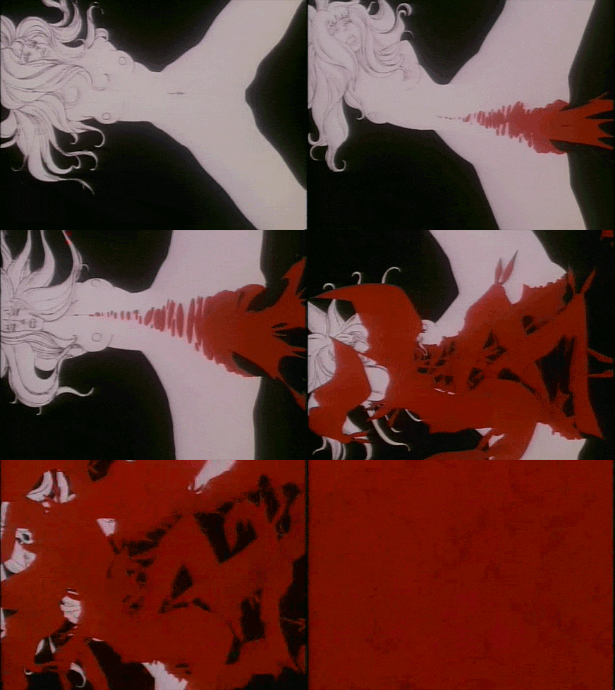
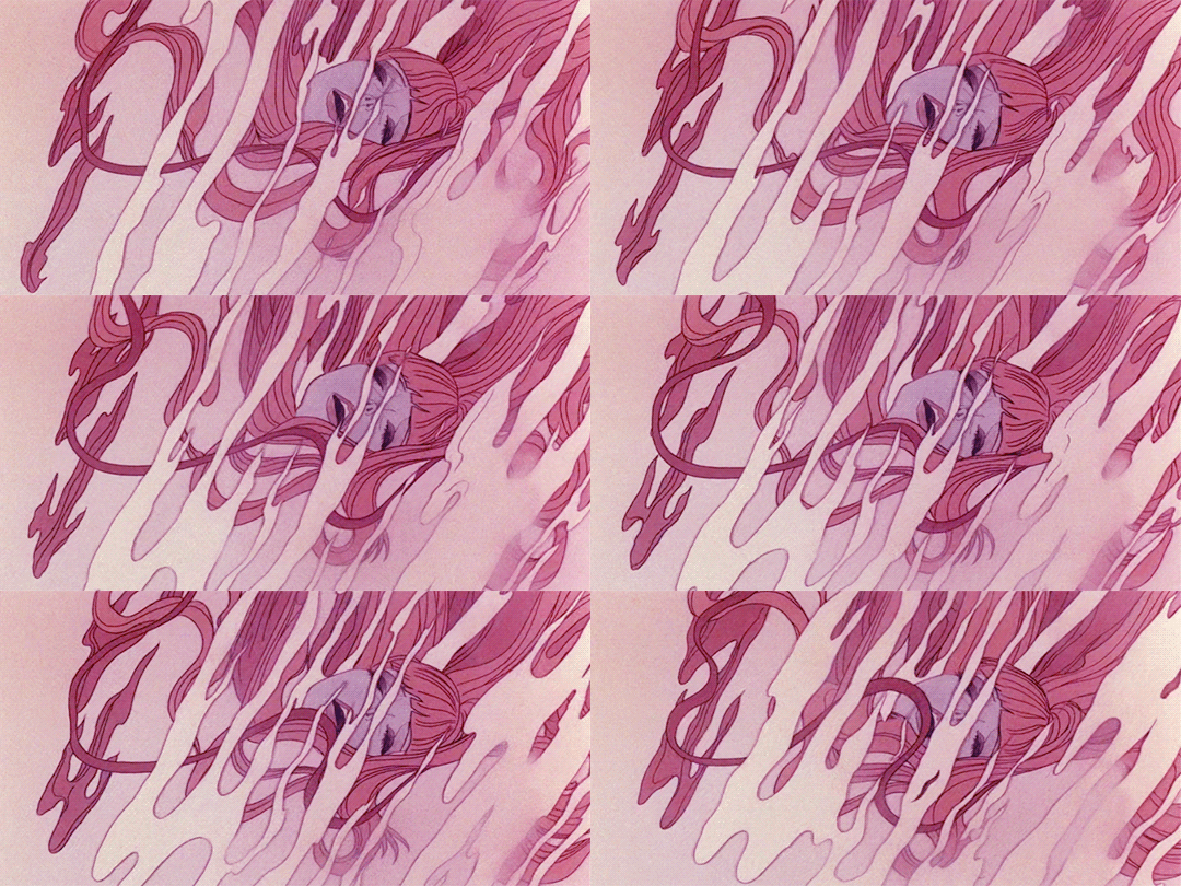

🪧
Kanashimi No Belladonna by Eiichi Yamamoto, 1973
Now that u watched this masterpiece time to throw some light into the ori go back of the story for future ref.
Via EG
The content of Belladonna's story was radically different from any other animated feature up to that point, Japanese or otherwise, but its method of storytelling was just as radical.
It becomes apparent early on when viewing Belladonna of Sadness (Kanashimi No Beradona) that this film is quite unique. Certainly the first, and possibly the only animated film that might be classified in the pinku genre. But even though the film is supposedly animated, nothing seems to be moving at first. You instead see a series of elegantly designed still drawings depicting a harmonious wedding between a peasant couple in 14th century France, as a woman sings her narration in the soulful style of a 70s rock opera.
This is the film's only joyous scene, as moments later the new groom is pleading with the local land baron to reduce the marriage tax he can't afford. The baron instead decides to exercise his "droit de seigneur" with the bride. It is here, several minutes into the film, that full animation is finally used, in order to depict the rape of the virgin bride with metaphorical imagery much more disturbing than what a literal depiction of the same events could provide.
A sign of things to come, as this is only the first in a series of tragic events that push this woman, through desperation, into the world of witchcraft.
Belladonna of Sadness is the product of an animation studio that knew it was doomed, and it shows. Osamu Tezuka's Mushi Productions, which had been so successful producing TV series like Astroboy and Kimba in the 60s, was faltering badly in the early 70s for a variety of reasons related to the oil crisis and Japan's economy in general. But in actuality, Mushi Pro's first venture into feature animation, 1969's 1001 Nights, had been successful enough to spawn a second film in 1970, Cleopatra.
Tezuka, always a trailblazer, had decided that Mushi Pro's feature films would be made to appeal to adult audiences so as to expand the potential for animation as a film medium (whether these first two films succeeded in that regard is debatable). But even though these two features did relatively well at the Japanese box office, the economy was beginning to take a toll on Mushi Pro, and Tezuka refused to downsize. When Tezuka left the studio in 1971 to focus on manga, the remaining employees must have known they were on the road to bankruptcy.
A filmmaker has two choices in a situation like this: cut your losses and go out with a whimper, or pour all your remaining resources and effort into one final, revolutionary labor of love. The folks at Mushi Pro chose the latter option and Belladonna is the result. Predictably, the film had a dreadful theatrical run of only 10 days and Mushi Pro went bankrupt within a few months.
A sort of late 60's psychedelic Art Nouveau revivalism inspired by the likes of Aubrey Beardsley's Victorian parodies, which were likewise inspired by erotic-grotesque shunga prints, thus coming full circle back to Japan.
Belladonna is an adaptation of La Sorcière, the 1862 novelized history of satanism and witchcraft in the late middle ages. The book was written by feminist, freethinker, and Frenchman Jules Michelet, who, like many other post-revolution French intellectuals, was eager to condemn the barbaric European forces of the prior few centuries. In Michelet's story, the practice of witchcraft is not simply the leftover trace of ancient pagan traditions, but an active rebellion against an oppressive church and system of government. While the church expected serfs to suffer and slave away during their time on earth with only the promise of a better afterlife to console them, witchcraft provided a glimpse of happiness in the here and now. Where the church feared the imperfections of nature, witchcraft embraced them. Where the church could only respond to ailments with prayer and holy water, witchcraft offered painkillers and psychoactive potions from datura plants.
According to Michelet, the spirit of rebellion and experimentation found in 14th century witchcraft was a progenitor of the enlightenment values yet to come. Furthermore, this was a movement led by women, those who likely suffered the most at the hands of the church and the feudal system. He insinuates that society's emancipation from oppression is contingent on female liberation and sexual empowerment. It's easy to imagine how these ideas must have resonated with the revolutionary leftist Japanese filmmakers of more than a century later (yes, they were working in animation too).
The film adaptation of La Sorcière is often very faithful to the book, to the point of replicating much of its dialogue. It tells the story of an archetypal witch (unnamed in the book, named Jeanne in the movie) who suffers a series of misfortunes that lead her down the path from being a chaste, obedient peasant's wife, to giving in to her awakened earthly desires, to finally blossoming into the bride of Satan himself.
The process of selling one's soul to the Devil can be interpreted literally or metaphorically, but keep in mind that at least according to Michelet, those who would enter into such a pact in the middle ages presumably believed they were literally sacrificing eternity for just a glimmer of relief from a cruel and bleak life. A pact with Satan was the ultimate act of desperation, not just a casual mistake. On the other hand, none of the "powers" that Jeanne acquires from the Devil require any sort of supernatural explanation. They are simply things that Medieval society has withheld from her: an independent spirit, a liberated sexual libido, communion with nature, an inquisitiveness that allows her to discover the medicinal properties of plants, an air of confidence that enhances her powers of persuasion.
Her relationship with the Devil may be nothing but a psychological coping mechanism for the brutality she suffers.
The content of Belladonna's story was radically different from any other animated feature up to that point, Japanese or otherwise (Ralph Bakshi included), but its method of storytelling was just as radical. The film was designed by illustrator Kuni Fukai, whose drawings may appear to be more Western than Japanese.
But his style seems to be a sort of late 60's psychedelic Art Nouveau revivalism inspired by the likes of Aubrey Beardsley's Victorian parodies, which were likewise inspired by erotic-grotesque shunga prints, thus coming full circle back to Japan. Much of the film features Fukai's drawings directly, with the camera panning over still frames, but the film often transitions seamlessly into full animation thanks to animation director Gisaburo Sugii.
This extra motion tends to happen during the film's numerous sex scenes, but they are generally not visually explicit. Instead, they are animated in a variety of highly stylized expressionistic ways, taking full advantage of animation's ability to caricature form and motion. Because of the film's aesthetic appearance and radical themes, it sometimes appears to be very much a product of its time--the early 70's--which is either good or bad depending on who you ask (the biggest giveaway is its great psychedelic rock / jazz fusion soundtrack which is occasionally reminiscent of J. A. Seazer). But it's important to remember that it is based on source material from over a century before, and that there really are no other comparable movies from that period that would justify an implication that it's at all derivative.
The story of an archetypal witch who suffers a series of misfortunes that lead her down the path from being a chaste, obedient peasant's wife, to giving in to her awakened earthly desires, to finally blossoming into the bride of Satan himself.
Japanese animation was still in its prolonged adolescence in 1973 (you could argue that it still is today). It was only five years earlier that adult political and social themes had begun to make an appearance in anime with Horus, Prince of the Sun. There had not been much experimentation with form or design aside from Tezuka's own independent shorts.
It's closest-related cousin is probably Hiroshi Harada's adaptation of ero-guro manga artist Suehiro Maruo's Midori, similar both for its technique of alternating short scenes of full animation with a "slideshow" of still images, and also for its story of unrelenting cruelty. The film probably has more in common with films from the likes of Koji Wakamatsu than it does with other anime.
Granted, it certainly took longer to make and cost a bit more than a typical pinku film (though it's clearly a low-budget flick), but like many of the best films in that genre, Belladonna manages to promote some form of feminist ideology while simultaneously exploiting the entertainment value of crass misogyny.
#kanashimi no belladonna#belladonna of sadness#internet archive#movies#cult#Japan#women#satanism#witchcraft#misogyny
20 notes
·
View notes
Text
1990 1st Edtn (Thus) Sealed LA MORTE DARTHUR By Sir Thomas Mallory Illus. Aubrey Beardsley Like New King Arthur
1990 1st Edition (Thus) , Sealed LA MORTE DARTHUR 19 full-page plate illustrations, wonderful and profuse decorations including in-text vignettes and chapter head and tail-pieces, all by the incomparable Aubrey Beardsley, leading figure in the aesthetic and Art Nouveau movements. By Sir Thomas Mallory Sir Thomas Malory was an English writer, the author of Le Morte d'Arthur, the classic English-language chronicle of the Arthurian legend, compiled and in most cases translated from French sources. Much of Malory's life history is obscure, but he identified himself as a "knight prisoner", apparently reflecting that he was either a criminal or a prisoner-of-war. Malory's identity has never been confirmed. However, since modern scholars began researching his identity the most widely accepted candidate has been Sir Thomas Malory of Newbold Revel in Warwickshire, who was imprisoned at various times for criminal acts and possibly also for political reasons during the Wars of the Roses. Illustrated By: Aubrey Beardsley Format: Hardcover, Language: English Dust Jacket: No Jacket, Dust Jacket Condition: No Jacket Published By: Studio Editions, London folio (fo 12 × 19 305 × 483),Pages 624 ISBN: 9781851706112 Le Morte d'Arthur (originally written as le morte Darthur; inaccurate Middle French for "The Death of Arthur") is a 15th-century Middle English prose reworking by Sir Thomas Malory of tales about the legendary King Arthur, Guinevere, Lancelot, Merlin and the Knights of the Round Table, along with their respective folklore. In order to tell a "complete" story of Arthur from his conception to his death, Malory compiled, rearranged, interpreted and modified material from various French and English sources. Today, this is one of the best-known works of Arthurian literature. Many authors since the 19th-century revival of the legend have used Malory as their principal source. Apparently written in prison at the end of the medieval English era, Le Morte d'Arthur was completed by Malory around 1470 and was first published in a printed edition in 1485 by William Caxton. Until the discovery of the Winchester Manuscript in 1934, the 1485 edition was considered the earliest known text of Le Morte d'Arthur and that closest to Malory's original version. Modern editions under myriad titles are inevitably variable, changing spelling, grammar and pronouns for the convenience of readers of modern English, as well as often abridging or revising the material. SKU: BTETM0001901 Approximate Package Dimensions H: 12.5, L: 30, W: 25 (Units: cm), W: 3Kg
Like New - As New. Sealed. Please see photos as part of condition report
0 notes
Text
youtube
Title: “Nice Work if You Can Get It” Jazz Standard Cover by Robyn Adele Anderson Description: 4 new prints, and 3 new albums! Even a discount if you bundle them 💋 https://ift.tt/OlIoZ4J Another Gershwin classic! Hope you enjoy my cover of “Nice Work If You Can Get It” 🖤 For more videos, support me on Patreon! https://ift.tt/zGWqnKf Check out all my music on your favorite platform! https://ift.tt/UQw3dob Subscribe to my YouTube channel! https://www.youtube.com/user/AdeleRobyn Find me on Facebook, Instagram, TikTok, and Twitter! https://ift.tt/eETwdIt https://ift.tt/EBw4JsS https://ift.tt/dt1Wj2R https://twitter.com/robynadele The Band: Vocals — Robyn Adele Anderson Keys— Ben Covello Bass— Charlie Himel Drums— Sam Martinelli Trumpet— Dustin Beardsley Trombone— Jacob Melsha Mix and Master — Jakob Reinhardt Audio — Amrish Mahabir Video — Jensen Gore Filmed at Smash Studios NYC Arranged by Robyn Adele Anderson “Nice Work If You Can Get It” Jazz Standard Cover by Robyn Adele Anderson All my videos are done live, using one take. YouTube URL: https://www.youtube.com/watch?v=t8dhWG71ndY
1 note
·
View note
Text

GARNET
I just drew this
#The New Beardsley Prince#encephalon#drawing#art#glen#the new Beardsley Prints#the new beardsley prince#glen beardsley#pen#ink#Garnet#SU#beach#steven universe
43 notes
·
View notes
Photo


"Japanese woodblock print, depicting the courtesan Takao holding a celebration to display her new bedclothes. These prints were avidly collected in 1800s, with their style having a huge influence on artists working in Britain, like Aubrey Beardsley." V&A
199 notes
·
View notes
Text
Artists I Like
(Listmaking is totally a creative exercise, right? Right? If that’s true then this is the longest running creative exercise I’ve ever indulged in lol)
Gerda Wegener - fashion & lesbian art nouveau/deco
Harry Watrous - enigmatic paintings of sophisticated women
Helen Frankenthaler - abstract expressionist paintings
Sergio Toppi - italian illustrations & comics
Dan Hillier - contemporary spooky angelic ink/print/collage
Mike Binge - 70s sci fi art
Gustave Dore - highly detailed wood-engravings prints, dante
Paul César Helleu - numerous portraits of beautiful society women
Roberto Ferri - making the old masters cool again
Gustav Vigeland - weird figure sculptures
NC Wyeth - one of america’s greatest illustrators
Andrew Wyeth - melancholy realism painter
Frank Frazetta - best fantasy & pulp artist
John Buscema - conan comics artist
Jose Luis Garcia-Lopez - wonder woman comics artist
Parker Hagarty - landscapes & figures
Henry Patrick Raleigh - star of golden age of illustration, high society drawings
Paul Lehr - 70s future-fantasy pulp illustrations
Stanley Meltzoff - 50s scifi/pulp cover illustrations
Alphonse Mucha - art nouveau
Kawase Hasui - japanese woodblock prints
Edmund Dulac - delicate detailed book illustrations
Makoto Takahashi - vintage shoujo manga
Harry Clarke - super detailed & dark art nouveau/deco illustrations
Sophie Lecuyer - contemporary spooky illustrations
Wassily Kandinsky - abstract geometry
George F. Kerr - book illustrations
Beatrix Potter - book illustrations
Mary Bauermeister - eclectic sculptures & drawings - geomancy
John William Waterhouse - Pre-Raphaelite paintings
Alexandre de Riquer - gorgeous mucha-esque posters & illustrations
Gianpaolo Pagni - patterned graphic designs
Giovanni Boldini - dynamic paintings/portraits, “Master of Swish”
Erté - art deco fashion ladies (new orleans!)
Cicely Mary Barker - fairy illustrations
Dorothy P. Lathrop - beautiful childrens book black n white illustrations
Kay Nielsen - glittering golden age illustrations
Coles Phillips - “fadeaway girl” golden age illustrations
Gustav Klimt - gold 💋
Koloman Moser - patterned art nouveau
Konstantin Tarasov - contemporary colorful & detailed digital drawings
Carlo Dolci - soft & dramatic chiaroscuro baroque religious portraits
Trung Le Nguyen aka Trungles - deviantart digital artist, colorful golden age mixed with anime illustrations
John Everett Millais - Pre-Raphaelite paintings
Arthur Rackham - English golden age illustrations, muted colors
Syd Mead - industrial & sci fi concept art
Mario Garbuglia - Barbarella set design
Henri Patrice Dillon - dreamy fadeaway muted illustrations/paintings
Frantisek Kupka - later Czech painter who began in representational art and evolved into pure abstraction
John Bauer - classic nordic fairy tale/myth illustrations
Aya Takano - superflat/anime but make it fine art
John Singer Sargent - heavenly portraits
Winslow Homer - masculine largely marine landscapes
George Barbier - art deco illustrations
Edward Okuń - polish art nouveau & symbolist painter
Robert Anning Bell - paintings & illustrations
Thomas Cooper Gotch - sorta preraphaelite paintings, portraits of girls
Jules Chéret - colorful french posters
Kaarina Kaila - dreamy soft children’s illustrations (almost kitsch)
Helen Hyde - japanese woodblock prints but actually they’re american
Melchior Lechter - paintings and book designs. “His hieratic, symbolic, decorative style combined gothic elements with art nouveau”
Jan Mankes - gentle unlined dutch paintings
Amrita Sher-Gil - contemporary indian paintings, mostly of woc
Sydney Long - australian watercolor landscapes
Carlos Schwabe - freaky religious/mythological symbolist paintings
Bob Pepper - groovy 60s-80s pulp illustrations
Frank R. Paul - scifi illustrations
Chéri Hérouard - La Vie Parisienne french illustrations
John Berkey - scifi illustrations/concept art
Aubrey Beardsley - fin de siecle black and white illustrations
Charles Caryl Coleman - pretty still lifes & landscapes, flowers & capri
Erich Schutz - Austrian illustrator of children's books, Schutz was influenced by Art Nouveau, and specialised in painting fairies and mermaids
Henri de Toulouse-Lautrec - French painter, printmaker, caricaturist and illustrator
Eleanor Fortescue-Brickdale - lush detailed paintings of richly dressed figures and scenes
Anne Claude de Caylus - not sure if he actually made them but print illustrations of peasantfolk
Friedrich König - Austrian prints & paintings, Klimt contemporary
Georges Barbier - french illustrations like erté
Betty Jiang - contemporary pretty pearly & dark digital art
Stephan Sinding - marble sculptures of lovers
Heikala - contemporary soft & sweet watercolor & ink illustrations anime inspired
Paul-Albert Besnard - french prints & paintings in between academic & impressionist
Henry Ossawa Tanner - biblical realism paintings
Norman Lindsay - etchings with lotsa great figures
Michael O’Toole - colorful landscapes
Caspar David Friedrich - moody Romantic paintings
Gian Lorenzo Bernini - iconic baroque marble sculptures
Francois Schuiten - french detailed architecture comic art
Adrienne Gaha - colorful contemporary half-abstract paintings
Tradd Moore - trippy silver surfer comic art
tono/rt0no (on tumblr) - super cute illustrations of victorian cats ;-;
Nanaco Yashiro - pretty colorful contemporary illustrations
Ramiro Sanchez - contemporary traditional painter, director of painting program at Florence Academy of Art
Isabella Fassler - contemporary colorful illustrations
Florence Harrison - art nouveau childrens book fairy tale illustrations
Shahzia Sikander - contemporary Pakistani-American visual artist
Atelier Heinrichs - trippy colorful collage covers for sci fi pulps
John Macallan Swan - pretty kitties
JC Leyendecker - our fave dapper gents
Frederick Sandys - pre raphaelite paintings
Stepan Kolesnikov - realist yet stylized russian paintings
Okumi Iyo - embroidered illustrations
William Henry Barribal - colorful art deco paintings
Ilya Glazunov - russian historical/orthodox paintings in the time of communism
Igor Karash - spooky illustrations
Daud Ahkriev - his drawings of fishermen
Seiichi Hayashi - pretty, contemporary japanese manga & illustrations ft women
Nola (nolawon.art) - pretty, detailed takashi murakami-esque illustrations
Harrison Fisher - classic american illustrator, pretty women
John Austen - gorgeous black n white detailed hamlet illustrations
Gustave Moreau - fantastical & aesthetic french paintings admired by proust
Ceri Richards - welsh abstract paintings of people indoors
Otto Mueller - highly textured angular colorful paintings with bold lines
Henri Privat-Livemont - Art Nouveau posters
Giovanni di Paolo - prolific painter and illustrator of manuscripts, including Dante's texts
Ben Reeves - contemporary painter, moody & blue-heavy collages of colors
Alex Niño - amazing abstracted comic artist
Ludovic Alleaume - dreamy french paintings
Yoshiko Fukushima - unsettling figures with strange colors, superflat paintings
Zinaida Serebriakova - kind realistic russian paintings of pretty women and children
Harold Robert Millar (H.R. Millar) - famous Scottish graphic artist and illustrator of the late nineteenth and early twentieth centuries
Alice Marshall - delicate illustrations of fairies on black background
Stanislaw Kamocki - colorful Polish landscape paintings
Bertha Lum - American version of Japanese woodblock prints
Raphael Kirchner - art deco fashion illustrations
Tamara de Lempicka - highly stylized art deco portraits of ladies, polish
Phil Greenwood - bright pop-y floral landscapes
Rose Cecil O'Neill - vintage illustrations & cartoons
John Rush - great use of color in figure drawings
Jean Delville - otherworldly paintings
Paul-albert Besnard - monochromatic prints
Helene Schjerfbeck - modernist subtle portraits
Heinrich Lefler - beautiful detailed narrative paintings/illustrations
Maximilian Liebenwein - art nouveau illustrations
Franklin Booth - detailed pen and ink drawings
Ulla Thynell - dreamy contemporary illustrations
Jun'ichi Nakahara - japanese graphic artist, early manga
K.F.E. von Freyhold - playful German book illustrations
Beth Billups - contemporary abstract painter
William McGregor Paxton - interior scenes of woman like Henry James depicts them
Ida Rentoul Outhwaite - Australian illustrator of children's books. Her work mostly depicted fairies
Ernest Biéler - Swiss painter, draughtsman and printmaker
Junko Ogawa (@junk_junk_junk on ig) - surreal anime style drawings
Marianne Stokes - Austrian painter, one of the leading women artists in Victorian England
Lee Mullican - abstract paintings
Rae Klein - creepy surreal paintings
#thoughts#scraps#if i cannot create then i can at least admire#recommend checking any or all of these artists out#and keeping your own artist list#it’s fun & insightful#you notice patterns#and pay more attention to the art you come across
177 notes
·
View notes
Text
Let's take a look at Clare Quilty's plays: source: cap 8, first part.
Here Humbert describes Clare for the first time (using his real name) Quilty, Clare, American dramatist. Born in Ocean City, N.J., 1911. Educated at Columbia University. Started on a commercial career but turned to playwriting. Author of The Little Nymph, The Lady Who Loved Lightning (in collaboration with Vivian Darkbloom), Dark Age, The strange Mushroom, Fatherly Love, and others. His many plays for children are notable. Little Nymph (1940) traveled 14,000 miles and played 280 performances on the road during the winter before ending in New York. Hobbies: fast cars, photography, pets.
Let's compare the names with other details we can found while reading the book.
The little nymph. Little Nymph (1940) traveled 14,000 miles and played 280 performances on the road during the winter before ending in New York. I personally link this to Lolita herself.
The lady who loved lightning - we have a reference here: cap 18 part 2, Lolita says during a storm: "I am not a lady and do not like lightning," said Lo, whose dread of electric storms gave me some pathetic solace.
Dark age. I believe this is about "nymphets": Between the age limits of nine and fourteen there occur maidens who, to certain bewitched travelers, twice or many times older than they, reveal their true nature which is not human, but nymphic (that is, demoniac); and these chosen creatures I propose to designate as "nymphets.".
The strange mushroom - This one is the creepiest. ". . .And perhaps your family doctor might like to examine her physically--just a routine check-up. She is in Mushroom--the last classroom along that passage." Beardsley School, it may be explained, copied a famous girls school in England by having "traditional" nicknames for its various classrooms: Mushroom, Room-In 8, B-Room, Room-BA and so on. Mushroom was smelly, with a sepia print [...] After that he made her touch him. Inside the fuck**** school.
Fatherly love. This one is easy. Humbert hides himself behind the picture of a perfect father. Lolita also considers him a father, as she has no references (hers died when she was 3). "How sweet it was to bring that coffee to her, and then deny it until she had done her morning duty. And I was such a thoughtful friend, such a passionate father […]" Dick did not know a thing of the whole mess. He thought I was her father. She asked me not to be dense. The past was the past. I had been a good father, she guessed--granting me that. "I do, Quilty. You see, I am her father."
13 notes
·
View notes
Photo


It’s Fine Press Friday!
On this Fine Press Friday we present some pages from Will Bradley’s design and printing of Stephen Crane’s War is Kind, published in New York by Frederick A. Stokes in 1899. Printed on dark grey paper, this is the only edition of Crane’s second collection of poems, published a year before his death.
An artist, illustrator, filmmaker, printer, and type designer, Will Bradley (1868-1962) was one of the foremost American graphic designers of the 20th century, and this work is one of the most visually-memorable American trade publications of the 1890s. Although Bradley’s style exhibits many of the hallmarks of Art Nouveau, his aesthetic was also strongly influenced by the Arts & Crafts movement. Often criticized as an American knock-off of Aubrey Beardsley, Bradley’s early style was already well-established before Beardsley’s popularity in the mid-1890s.
Our copy of War is Kind is yet another gift from our friend Jerry Buff.
View another post on Will Bradley’s type ornaments.
View more Fine Press Friday posts.
#Fine Press Friday#Fine Press Fridays#Will Bradley#Stephen Crane#War is Kind#Frederick A. Stokes#Art Nouveau#Arts & Crafts#fine press books#Jerry Buff
139 notes
·
View notes
Photo

Aubrey Beardsley by Frederick H. Evans, Metropolitan Museum of Art: Photography
Gilman Collection, Purchase, Mr. and Mrs. Henry R. Kravis Gift, 2005 Metropolitan Museum of Art, New York, NY Medium: Platinum print; photogravure
http://www.metmuseum.org/art/collection/search/283248
68 notes
·
View notes
Text

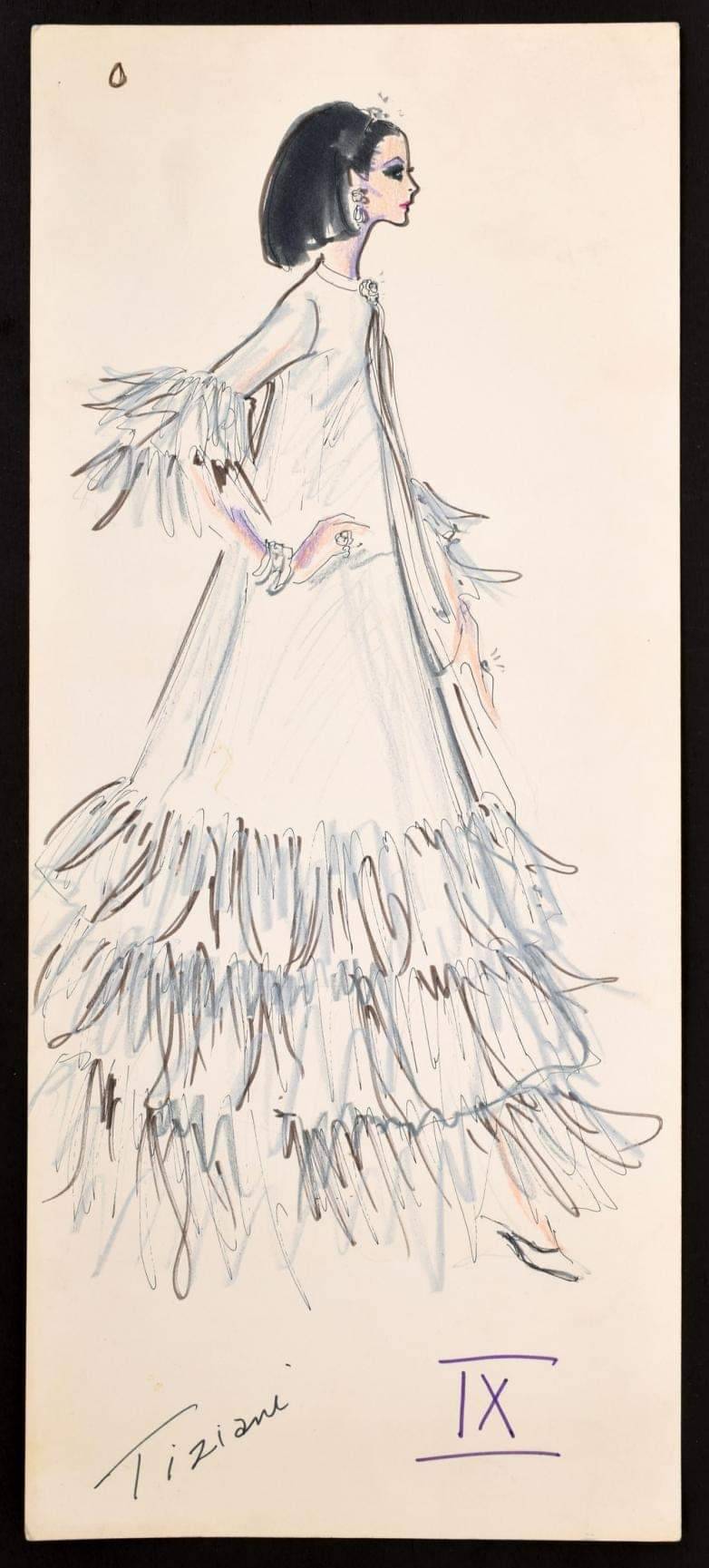


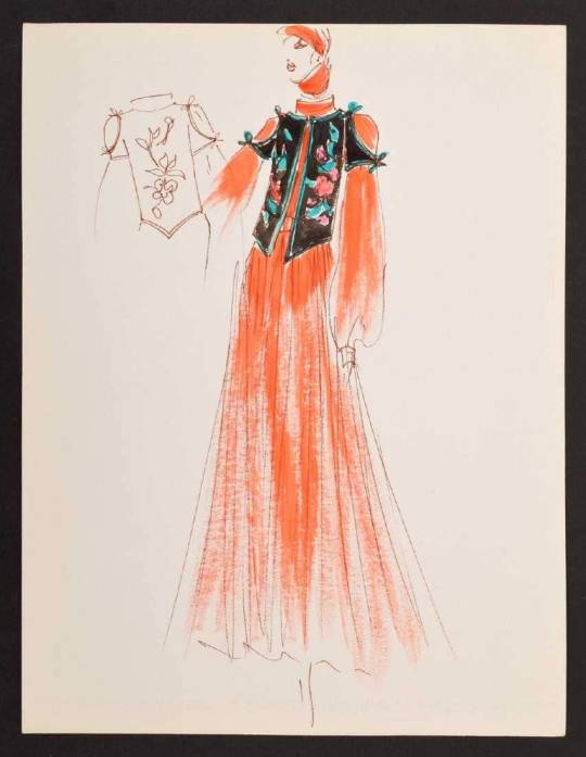


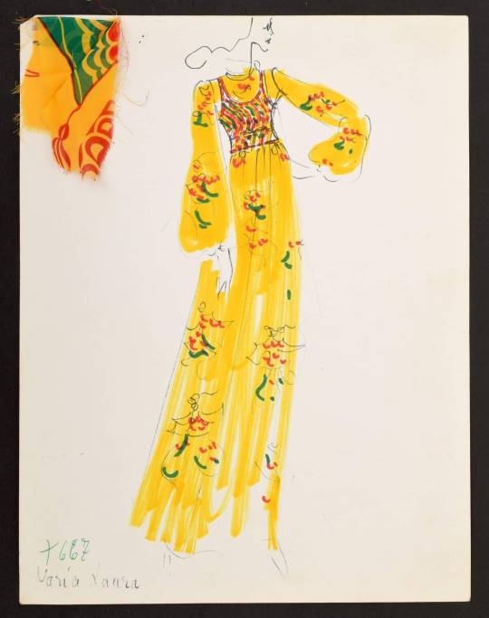
D'Artagnan.
" The late fashion designer Karl Lagerfeld (1933- 2018 ) was an interesting controversial figure in many respects and a man of eclectic taste.
If you look at the two Sotheby's auctions of his effects in December 2018 you will see what I mean.
Turning to his Wikipedia entry you will see homes he lived in; a sufficiently large number where he could store his exceedingly large collection of furniture ,artefacts and art works etc from many eras.
In 2007, Lagerfeld famously spoke of refusing to keep any posessions. “I throw everything away,” Lagerfeld told The New Yorker. “The most important piece of furniture in a house is the garbage can! I keep no archives of my own, no sketches, no photos, no clothes – nothing!”
Prior to working for Chanel ; Largerfeld worked for Fendi (which he later owned )as well as Chloé.
In his very early years he worked for Jean Patou, Balmain and Tiziani. In 1963 Lagerfeld began working at the Roman couture house Tiziani where he stayed for six years .The Italian fashion house was patronised by Liz Taylor, Doris Duke and Gina Lollobrigida.
In 2014, Palm Beach Modern Auctions announced that many of Lagerfeld's early sketches for the House of Tiziani in Rome would be auctioned.Here are my some of my favourite fashion sketches from various sources and I have to confess I do like the work he did for Chloé.
#1 “Astoria” dress 1967
by Karl Lagerfeld for Chloé. © FIT
For this 1967 “Astoria” dress, he took inspiration from Thomas Malory’s book Le Morte d’Arthur, illustrated by Aubrey Beardsley in 1893.
The full-length, high-necked, and long-sleeved design stood out in a period of micro-mini, body-revealing styles, but Lagerfeld’s unique design sensibility is even more evident in the floral motifs hand-painted by Nicole Lefort.
The expanse of ivory silk crepe used to make the dress acted as a canvas for an array of colourful, stylized flowers that swirl around the entire garment – so precisely rendered that they look screen-printed, rather than hand-painted. Chloé’s ready-to-wear revolution had truly come into its own from “Paris Refashioned, 1957-1968” exhibition 2017 at The Museum at FIT in NYC.
Karl Lagerfeld, began working for the label in 1964. His sense of fantasy and exuberance, as well as his creative reinterpretations of historic styles, soon came to characterise the Chloé brand. His impact was such that his work took precedence over other Chloé designers By 1965 the credit line “Karl Lagerfeld for Chloé” appeared in Vogue Paris.
Other designers for the label included Christiane Bailly, Maxime de la Falaise, Graziella Fontana, Tan Giudicelli, Gérard Pipart, and Michèle Rosier, but it is Largerfeld who is best remembered for the rise of the Chloé brand.
#2 Karl Largerfeld sketch for Tiziani for Liz Taylor
#3 Karl Largerfeld sketch for Tiziani
#4 Karl Largerfeld Rachmaninov dress S/S 1972 for Chloé
#5 Sketch of the same S/S 1972 for Chloé
#6 Rachmaninov Dress S/S 1972 for Chloé on a mannequin via Marco Kessler
#7 Karl Largerfeld sketch for Tiziani
#8 Karl Largerfeld sketch for Tiziani
#9 Karl Largerfeld sketch for Tiziani
#10 Karl Largerfeld sketch for Tiziani
~~~000~~~
https://en.wikipedia.org/wiki/Karl_Lagerfeld
https://www.sothebys.com/.../karl-karl-lagerfelds-estate...
https://www.sothebys.com/.../karl-karl-lagerfelds-estate
Love D’Artagnan xxx".
2 notes
·
View notes
Text
A whistle-stop tour of book cover design
The practical leather-bound books of the middle ages
Book covers historically were only required to do one thing - protect the book. Although this didn’t stop them from being works of art in themselves. Leather-bound books with gold and silver clasps, lined with gems and detailed with embroidery were not an uncommon sight on a 13th Century Book-Shelf (Domestika, 2020). These books were mostly if not all handwritten and therefore needed something sturdy to ensure they were not damaged.
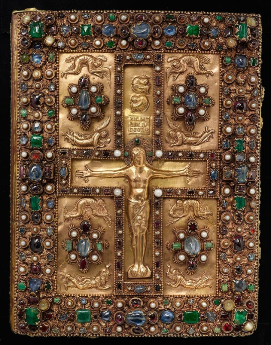
Lindau Gospels. Court School of Charles the Bald Lindau Gospels, in Latin, Switzerland, Abbey of St. Gall, late ninth centuryAvailable at: The Morgan Library & Museum https://www.themorgan.org/exhibitions/magnificent-gems
In 1450, the invention of type printing by Johannes Gutenberg changed the world of books, but leather binding of books continued to be the normal. However, in the 16th century, we began to see title pages appear at the beginning of books. Information about the author and printing information of the book were traditionally placed at the end of the book - the colophon - but this gradually made it’s way to the beginning go the book. These would not only have information present but would often have illustrations as well.
Victorian adventures into new mediums
Not until the 1800s did we begin to see books that resemble what we know today. Books were now mass produced, and material like paper and cloth were used over leather. For a period of time in the 1830s, books would have an illustrated tissue paper cover that would protect the book during trade - an early version of the modern books dust cover. By 1840, new techniques allowed for coloured printing and illustration to be used on the book covers themselves. Chromolithography and halftone printing allowed for designs featuring text and images to appear right on the cover. This created a whole new avenue for designers - book cover design (Graphieine, 2017)
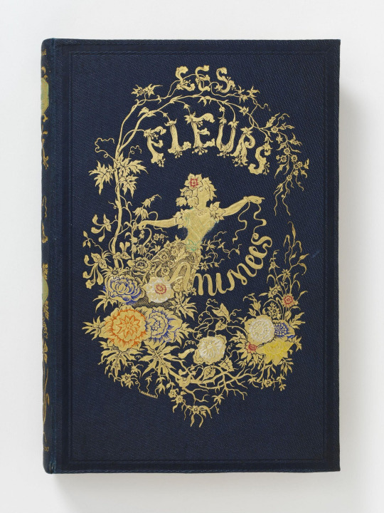
Les Fleurs Animées - J. J. Grandville. Published in Paris - Available at: https://collections.vam.ac.uk/item/O1317967/les-fleurs-animees-par-book-grandville-jean-jacques/les-fleurs-anim%C3%A9es--par-book-grandville-jean-jacques/
Due to these new techniques meaning printing designs was much more manageable on a large scale, books started to dawn intricate drawings. Yellowback books were on the rise - lightweight, lower cost books that could be read on the now more accessible trains. Yellowbacks were named after their yellow tinge - due to them being made from low quality wood pulp. These were the early examples of what we think of as paperbacks.
Speaking of yellow, the 1890s saw introduction of the British magazine The Yellow Book. The covers were designed by Aubrey Beardsley, who laughed at the idea of Victorian prudishness. This saw a shift in book covers being the of a Victorian style - with intricate art nouveau designs - to becoming much more abstract and contrasting illustrations of people and creatures. Design in general began to become much more modern, and as the 1900s began, book covers were becoming even more creative (Collie, 2017).
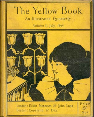
The Yellow Book - 1894 Elkin Matthews and John Lane, Illustrator Aubrey Beardsley. Available at: https://en.wikipedia.org/wiki/The_Yellow_Book#/media/File:Yellow_book_cover.jpg
20th century - graphic design lives
After the world war at the beginning of the 20th Century, a new era of design was afoot. Book covers began looking to cubist and abstract designs inspired by Soviet and German artists. There was also a move to paper covers on books - as was the end of illustrated bindings. Paper coverings were now much more convenient as fabric printing became too expensive. To have a paper cover meant more intricate and beautiful designs could be created.
In 1935 - the first paperback books were born. Much like their predecessors the yellow backs, these were much more lightweight and accessible, as they had shedded their heavy cardboard cover. Unlike the yellow backs, these books were of higher quality.

The first penguin book published - Ariel by Andre Maurois. Available at Penguin - https://www.penguin.co.uk/company/about-us/company-history/company-timeline.html
With a move towards illustration in television, film and advertising, graphic design became much more defined as a profession, and book cover design began to adopt influences - and become the main medium for many in the modern graphic design world.
References:
Collie, F., 2017. Graphic Design — ‘The Yellow Book’ — Aubrey Beardsley 1872–1898. [online] Medium. Available at: <https://medium.com/fgd1-the-archive/the-yellow-book-aubrey-beardsley-1872-1898-9bae4e9ca78d> [Accessed 21 February 2021].
Domestika. 2020. A Brief History of Book Covers | Blog | Domestika. [online] Available at: <https://www.domestika.org/en/blog/5484-a-brief-history-of-book-covers> [Accessed 21 February 2021].
Graphéine - Agence de communication Paris Lyon. 2017. A short history of book covers - 1/4. [online] Available at: <https://www.grapheine.com/en/history-of-graphic-design/history-of-book-covers-1> [Accessed 21 February 2021].
Graphéine - Agence de communication Paris Lyon. 2017. A short history of book covers - 2/4. [online] Available at: <https://www.grapheine.com/en/history-of-graphic-design/history-of-book-covers-2> [Accessed 21 February 2021].
6 notes
·
View notes
Text
youtube
Title: “The Way You Look Tonight” Jazz Standard Cover by Robyn Adele Anderson Description: 3 new albums, and a free print with the purchase of my new Box Set! https://ift.tt/VrpRmsO – Happy two year wedding anniversary Nick and Brian! I had never sang this song before you requested for me to sing it at your wedding- I wanted to do such a good job that I got nervous and forgot some of the words! 😅 So to make up for it I decided to make a recording of it just for you 🖤 Thank you again for including me on your special day and hope you like this version (complete with a live band and all the lyrics haha) – For more videos, support me on Patreon! https://ift.tt/eiDuHXM Check out all my music on your favorite platform! https://ift.tt/lX67iza Subscribe to my YouTube channel! https://www.youtube.com/user/AdeleRobyn Find me on Facebook, Instagram, TikTok, and Twitter! https://ift.tt/XZywaqs https://ift.tt/01rEHwW https://ift.tt/l1254Oe https://twitter.com/robynadele The Band: Vocals — Robyn Adele Anderson Keys— Ben Covello Bass— Charlie Himel Drums— Sam Martinelli Trumpet— Dustin Beardsley Trombone— Jacob Melsha ARRANGED BY ROBYN ADELE ANDERSON MIXED AND MASTERED BY JAKOB REINHARDT AUDIO ENGINEERING BY AMRISH MAHABIR VIDEOGRAPHY BY JENSEN GORE FILMED @ SMASH STUDIOS NYC "The Way You Look Tonight" Jazz Standard Cover by Robyn Adele Anderson All my videos are done live, using one take. YouTube URL: https://www.youtube.com/watch?v=Z3dTNPgt578
1 note
·
View note
Photo

We wanted to do something for the PDR community in these strange and (for most) mainly house-bound times, and so we made you a colouring book — free to download and print off at home! ⠀ ⠀ In addition to the colourable cover, we've chosen twenty images from a wide range of artists, including Hokusai, Albrecht Dürer, Harry Clarke, Virginia Frances Sterrett, Jessie M. King, and Aubrey Beardsley. Arranged in vague order of difficulty — from a simple 17th-century kimono pattern to an intricate thousand-flowered illustration — we hope there is something for all ages and colouring prowess!⠀ ⠀ To download the PDF go to the blog post on our site (if from here, then click link in bio and go to "blog" in the main menu, or see link our instagram story).⠀ ⠀ We are making it available for free but if you did want to donate something to help cover costs then, of course, this is very welcome — you can do so through the support page on our site. ⠀ ⠀ We'd love to see your coloured-in pages when you are done, so please do share on social media using the hashtags #isolationcoloration and #pdrcoloringbook. And do share news of the book far and wide with all who you think might enjoy it!⠀ .⠀ .⠀ .⠀ .⠀ .⠀ #coloringbook #colouringbook #free #stayhome #selfisolation #stayinghome https://www.instagram.com/p/B-clrMepc5m/?igshid=134pfq0b37kuv
#isolationcoloration#pdrcoloringbook#coloringbook#colouringbook#free#stayhome#selfisolation#stayinghome
108 notes
·
View notes
Text
Good books don’t give up all their secrets at once. [PBC Brief]
The Aesthetic Era of Book Cover Design
The Aesthetic Movement took hold in the mid 19th Century and started a whole new generation of trailblazers, determined to overthrow everything they were meant to say and do in the Victorian era. The movement was provocative and modern, rebelling against the conservative mainstream Victorian traditions & values and the monarch's power over the people. At a glance, this fine art movement may seem just that, about the fine art, however it took over every aspect of life – from interior design, fashion, literature, music and of course, books. It was of an “art for arts sake” mindset and the forerunners truly pursued beauty, self-expression and taste over what were considered moral and social obligations during the Victorian era. This movement paved the way for 20th century modern art.

In the book world, the term ‘decadence’ was further applied to the writers of this era – a word that typically means ‘moral or cultural decline by excessive indulgence in pleasure or luxury’ but applied to the writers in this way felt more like a nod towards refinement - think Oscar Wilde’s novel The Picture of Dorian Gray or Arthur Symons 1893 essay ‘The Decedent Movement of Literature’.
Aubrey Beardsley’s Perverse World
One of the most notorious counts of decadence would come from artist Aubrey Beardsley – a now infamous name in the book cover design world. Beardsley’s illustrations were iconic due to their grotesque wit, distinct, controversial and often erotic images made of black ink, white space and innovative shapes inspired by Japanese wood cutting. He provided illustrations for some of the most iconic publications of the era - beautifully created, the volumes drew the attention of the reader. ‘The Yellow Book’ being the most iconic – it was a journal containing a wide range of aesthetic & decedent works of art, illustration, prose, writing and so on. Beardsley was the first known art director for the publication and used colors that were reminiscent of bruising – greens, browns and yellows.

- Various editions of The Yellow Book - from left to right - Volume 2: block printing on yellow cloth, Volume 4 & 1: smooth yellow binding with black ink pressed by brass, Volume 1: tanned card binding
Beardsley's cover designs were experimental, his graphic art striking & intense with the ability to marry sophistication with the technical elements of Victorian binding. They were mounted on many different materials (dyed cloth, vellum & paper) and for some works, swirling gilt patterns of gold were used extensively.

- Aubrey Beardsleys books: the Poems of Ernest Dowson an art nouveau binding and Volpone, a heavily guilted blue cloth cover

- Some graphically brilliant examples of Aubrey Beardsley’s work
The Dust Jacket
It was during this period that publishers began to understand the importance of making the book cover look pretty as well as the spine of the book and thus in the 1920’s, dust jackets became more intricate and informative than before. The bindings below became simpler and the work of the jacket more decorative. Some jackets simply mimicked the binding below with the introduction of flaps to hold more information on the jacket. There was a brief period in the 1940’s where even paperbacks came with dust jackets however when the golden age of binding books came to an end, the disposable aspect of a dust jacket was no more.

Sources Used
Images pulled from Google Images
Dust Jackets
Aubrey Beardsley
Aestheticism & Decadence
Aesthetic Movement
Decadence Definition
2 notes
·
View notes
Photo

DRAWING OF BLUE DIAMOND
from Abril 2 2020
SU Future HOMEWORLD BOUND
MY LITTLE REASON WHY PAUSE SCREEN IN COLOR PENCIL
#creyola#drawing#art#color pencil#su future#steven universe#steven universe future#blue diamond#Blue#Spinel#clouds#happy#my little reason why#song#singing#homeworld bound#homeworld#suf#suf stuff#the new beardsley prints#the new beardsley prince#glen beardsley#Beardsley
75 notes
·
View notes