#the illusts stand out against the dark background because the characters are pale-skinned
Explore tagged Tumblr posts
Text
Casual analysis of graphic design and composition (ft. a bit of colour theory) since I’m a bit rusty and haven’t thought about them in a while
Hm? Some shots in Al-Haitham’s and Kaveh’s demos share a similar composition…
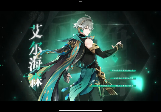
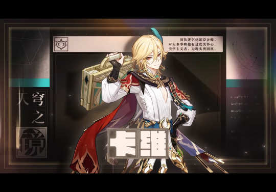
But it’s interesting that the more logical one uses informal symmetry in his character title card and the more emotional one uses formal symmetry… So many rectangles in Kaveh’s card (‘course it helps that hanzi characters are in squares)… It’s kinda surprising, but still it brings out the flow of the illustration well. (Of course, Chinese hanzi can be read horizontally or vertically, so they’ve more freedom in typography, but I bet they changed the graphic layout a bit for the English demo…)
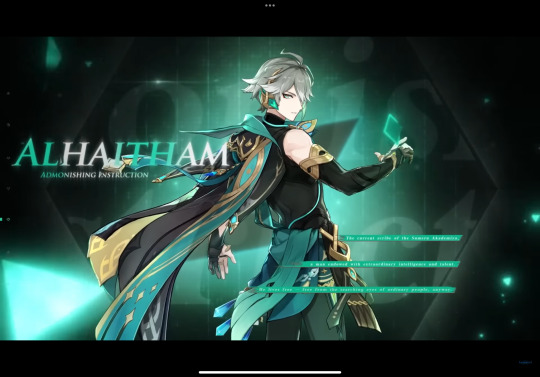
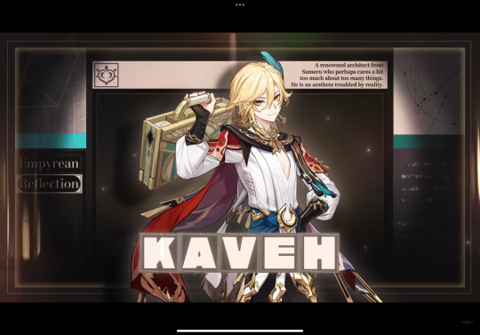
hah, yeah, I thought so. See how Kaveh’s cape can’t frame the center boxes anymore, and how there’s no space to the right of the synopsis in the upper right, and most of all how the two squares on the bottom left is now a quarter of the original size, leaving an empty space there (though if they rotated the words vertically it could fit into the rectangular space well).
Al-Haitham’s English title card isn’t bad, per se, but they could’ve put some shadow on the left side of the illustration so the text could stand out, and move the three green lines to the right side a bit more, so not everything is slightly to the left side when there’s no reason to. (The negative space on the two sides in the Chinese version is roughly the same size.)


These two shots are both long shots that show the character’s full body, but Al-Haitham is in a slightly low angle, and Kaveh is eye-level with the “camera”
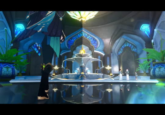
This one’s another low angle full shot with Al-Haitham’s lower body, with a bunch of analogous colours. Also this one’s background uses formal symmetry again (even reflecting off the ground) while the placement of the characters are in informal symmetry (the large image of Al-Haitham balances out the small figures near the fountain)
#procrastinating… on syntax assignment#Al-Haitham would probably tell me to go finish it#but. if their models have dark skin#to reflect their inspirations#of the Arab mathematician and physicist al-Haytham#and Iranian mythological figure Kaveh the Blacksmith#then their title cards have to use different colours since the official colour scheme#(the value contrast) in the demos ride on the fact that the characters are pale-skinned#in other words#the illusts stand out against the dark background because the characters are pale-skinned#dusk analysis#Genshin impact#kaveh#genshin kaveh#composition#art composition#graphic design#al haitham#al-haitham#alhaitham#genshin alhaitham#genshin analysis#long post
46 notes
·
View notes