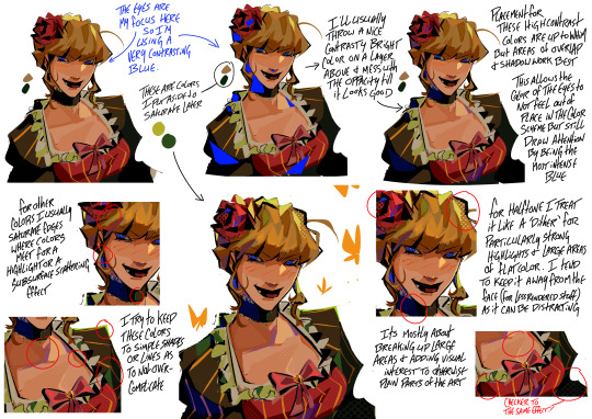
#the halftone bit in the beato breakdown was cuz i initially tried to answer both this ask and an ask about halftone
Explore tagged Tumblr posts
Note
im not sure if youve answered this before, but im really curious about how you decide which contrasting colors to add where! i know about adding a reflected color of something next to it (idk how to explain that sorry) but i always find when i try to add little splashes of color while shading a piece, they look out of place!!
heres a rough general explanation feat. Beato + some extra stuff!


What I focus on with making a color feel cohesive is seeing where exactly i can use that color again through out the piece that way it balances everything out. To choose the colors themselves i normally just take the base color and saturate it in my preferred direction (i.e. parts of her blonde hair becoming green, her headpiece becoming hot pink)
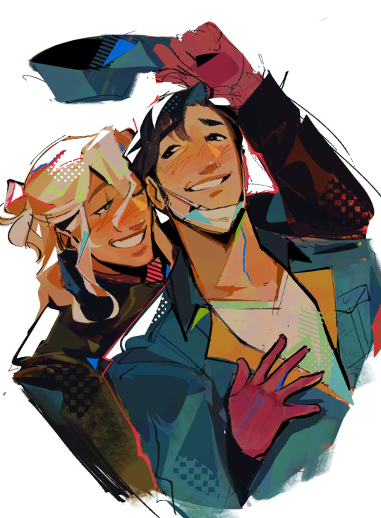
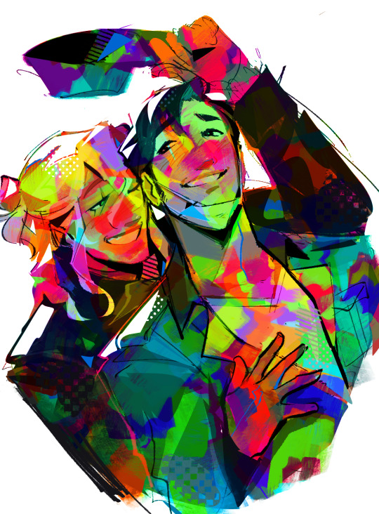
for something with a Lot of added/different pops of color I tend to unify the whole thing by throwing a layer of overlayed color jitter on like 10% or less which helps those colors not feel so out of place (also this piece you can see more of where im adding color at overlaps or areas of interest instead of just the shadows)


something that can also help if you are going a more painterly route is having a base layer of a bright color and then laying down your flats lightly over top allowing the under layer to peak through which is what i showed in this breakdown (which you can also see me adding a complimentary color to areas of visual interest)

And lastly a lot of this is just kinda trial and error! as I said before i tend to work on one layer but for these final embellishment type things (added pops of color, halftone, patterns, etc.) i mostly save that for last and keep them on a layer above the piece because a part of the process is just messing around with a bunch of stuff and seeing what looks good
#art help#hopefully that all makes sense! this is such a gut feeling based thing for me that its hard to put it into words#but like i said just fuck around and find out#the halftone bit in the beato breakdown was cuz i initially tried to answer both this ask and an ask about halftone#but i decided to make a seperate thing for that later#lizard inbox
519 notes
·
View notes